
鸿蒙原生 ArkTS 布局深度解析:RelativeContainer 与 AbsoluteContainer 实战对比
鸿蒙原生 ArkTS 布局深度解析:RelativeContainer 与 AbsoluteContainer 实战对比
API 版本:HarmonyOS NEXT API 24
语言:ArkTS(鸿蒙原生声明式 UI)
一、前言
HarmonyOS NEXT 彻底剥离了 Android 兼容层,实现了从内核到框架的全面自主化。开发者需要掌握一套全新的 UI 范式——ArkTS 声明式 UI 框架。
在 ArkUI 布局体系中,RelativeContainer(相对布局)和 Stack + position()(绝对布局,API 24 也可用 AbsoluteContainer)常被对比讨论。虽然两者都能实现"自由定位",但其设计哲学、适配能力和适用场景截然不同。本文通过一个完整对比示例应用,深入剖析这两种布局的核心原理与最佳实践。
二、项目结构一览
Index.ets(约 730 行)
├── @Entry Index(主入口 + Tab 切换)
│   ├── Tab 0: RelativeContainerDemo
│   │   ├── 场景1:五种基本对齐方式
│   │   ├── 场景2:兄弟锚点链式定位
│   │   ├── 场景3:居中 + offset 微调
│   │   └── 总结卡片
│   └── Tab 1: AbsoluteContainerDemo(Stack + position)
│       ├── 场景1:绝对坐标定位 + zIndex 层叠
│       ├── 场景2:商品卡片 Badge 覆盖层
│       ├── 场景3:仪表盘模拟
│       └── 总结卡片 + 选型指南
└── @Component Card(复用组件)
用户通过 Tab 切换即可实时对比两种布局。
三、RelativeContainer(相对布局)
3.1 核心原理
子组件通过**锚点(Anchor)**关联到父容器或其他兄弟组件,实现相对定位。类似 CSS position: relative,但更强调显式的锚点绑定。
3.2 关键 API
| API | 说明 |
|---|---|
.id(value: string) |
为组件设置唯一锚点标识 |
.alignRules(rules) |
定义对齐规则 |
__container__ |
内置常量,代表父容器 |
.offset({x,y}) |
在 alignRules 基础上微调偏移 |
3.3 alignRules 类型详解
alignRules({
  left?:   { anchor: string, align: HorizontalAlign }
  right?:  { anchor: string, align: HorizontalAlign }
  center?: { anchor: string, align: VerticalAlign }   // ← 垂直方向
  top?:    { anchor: string, align: VerticalAlign }
  bottom?: { anchor: string, align: VerticalAlign }
  middle?: { anchor: string, align: HorizontalAlign } // ← 水平方向
})
常见误区:center 和 middle 容易搞混。
center控制垂直方向(想象一条竖线穿过圆心)middle控制水平方向(想象一条横线穿过腰部)
HorizontalAlign:Start(起点)、Center(居中)、End(终点)
VerticalAlign:Top(顶部)、Center(居中)、Bottom(底部)
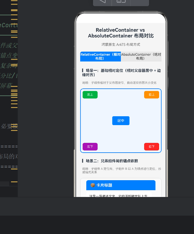
3.4 场景一:五种基本对齐
在一个 RelativeContainer 中放置五个文本块,分别对齐到父容器的五个方位:
RelativeContainer() {
  Text('居中').id('centerText')
    .width(70).height(36).backgroundColor('#007DFF')
    .alignRules({
      center: { anchor: '__container__', align: VerticalAlign.Center },
      middle: { anchor: '__container__', align: HorizontalAlign.Center }
    })

  Text('左上').id('topLeftText')
    .alignRules({
      left: { anchor: '__container__', align: HorizontalAlign.Start },
      top:  { anchor: '__container__', align: VerticalAlign.Top }
    })

  Text('右上').id('topRightText')
    .alignRules({
      right: { anchor: '__container__', align: HorizontalAlign.End },
      top:   { anchor: '__container__', align: VerticalAlign.Top }
    })

  // 左下、右下同理…
}
.width('100%').height(260)
效果:无论容器尺寸如何变化,五个文本块始终固定在各目的方位,这就是 RelativeContainer 的天然自适应能力。
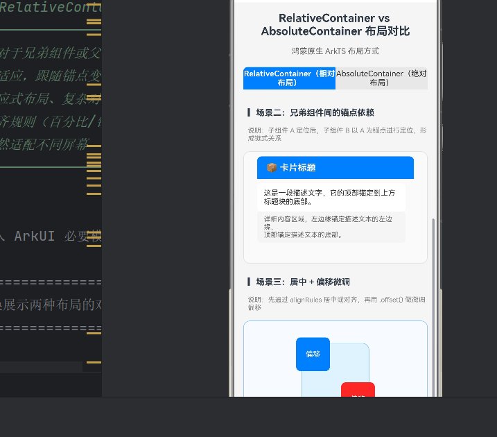
3.5 场景二:兄弟锚点链式定位
RelativeContainer 最强大的特性——链式依赖。组件 A 锚定父容器,B 锚定 A,C 锚定 B,形成依赖链:
RelativeContainer() {
  Text('📦 卡片标题').id('cardTitle')
    .alignRules({
      top:    { anchor: '__container__', align: VerticalAlign.Top },
      middle: { anchor: '__container__', align: HorizontalAlign.Center }
    })

  Text('这是一段描述文字…').id('cardDesc')
    .alignRules({
      left: { anchor: 'cardTitle', align: HorizontalAlign.Start },
      top:  { anchor: 'cardTitle', align: VerticalAlign.Bottom }
    }).offset({ y: 8 })

  Text('详细内容区域…').id('cardContent')
    .alignRules({
      left: { anchor: 'cardDesc', align: HorizontalAlign.Start },
      top:  { anchor: 'cardDesc', align: VerticalAlign.Bottom }
    }).offset({ y: 8 })
}
关键洞察:当 cardTitle 位置/尺寸变化时,cardDesc 和 cardContent 自动跟随,无需手动计算。这种声明式联动大幅降低了维护成本。
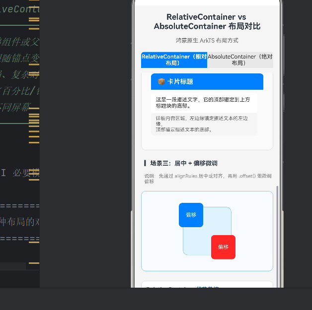
3.6 场景三:居中 + offset 微调
"大致居中、再偏移一点点"的模式:
RelativeContainer() {
  Text('').id('bgSquare')
    .width(120).height(120).backgroundColor('#E3F2FD')
    .alignRules({
      center: { anchor: '__container__', align: VerticalAlign.Center },
      middle: { anchor: '__container__', align: HorizontalAlign.Center }
    })

  Text('偏移').id('offsetSquare')
    .width(60).height(60).backgroundColor('#F44336')
    .alignRules({
      center: { anchor: '__container__', align: VerticalAlign.Center },
      middle: { anchor: '__container__', align: HorizontalAlign.Center }
    }).offset({ x: 40, y: 40 })

  Text('偏移').id('offsetSquare2')
    .width(60).height(60).backgroundColor('#007DFF')
    .alignRules({
      center: { anchor: '__container__', align: VerticalAlign.Center },
      middle: { anchor: '__container__', align: HorizontalAlign.Center }
    }).offset({ x: -40, y: -40 })
}
3.7 RelativeContainer 适用场景
| 场景 | 推荐度 | 原因 |
|---|---|---|
| 卡片内部布局 | ⭐⭐⭐⭐⭐ | 锚点链天然适合结构化卡片 |
| 响应式页面骨架 | ⭐⭐⭐⭐⭐ | 自动适配不同屏幕尺寸 |
| 列表项模板 | ⭐⭐⭐⭐⭐ | 相同模板保持对齐 |
| 表单布局 | ⭐⭐⭐⭐ | 左对齐 + 顶部对齐 |
| 可折叠面板 | ⭐⭐⭐⭐ | 内容变化时下游自动跟随 |
| 游戏 HUD / 浮层 | ⭐⭐ | 像素级精确控制力不足 |
四、Stack + position()(绝对布局)
4.1 核心原理
API 24 可通过两种方式实现绝对定位:AbsoluteContainer(API 24 新增)或 Stack + .position()(全版本兼容)。推荐使用 Stack + .position() 作为通用方案。
4.2 关键 API
| API | 说明 |
|---|---|
Stack() |
层叠容器,子组件按添加顺序层叠 |
.position({x,y}) |
设置相对于父容器的绝对坐标 |
.zIndex(n) |
控制层叠顺序,值越大越靠上 |
.rotate({angle}) |
旋转组件 |
.clip(false) |
允许子组件超出父容器边界 |
4.3 场景一:绝对坐标 + zIndex 层叠
Stack() {
  Text('(0, 0) 左上').width(80).height(30)
    .backgroundColor('#4CAF50').position({ x: 0, y: 0 })

  Text('(220, 0) 右上').width(80).height(30)
    .backgroundColor('#FF9800').position({ x: 220, y: 0 })

  Text('(110, 100) 居中').width(80).height(30)
    .backgroundColor('#007DFF')
    .position({ x: 110, y: 100 }) // 手动计算:(300-80)/2=110

  Text('底层').position({ x: 135, y: 60 })
    .backgroundColor('rgba(0,0,0,0.3)').zIndex(1)

  Text('顶层').position({ x: 145, y: 50 })
    .backgroundColor('rgba(255,0,0,0.7)').zIndex(2)
}
.width(300).height(260).borderColor('#FF6B00').borderWidth(2)
与 RelativeContainer 对比:
- 居中需手动计算
(300-80)/2 = 110,容器尺寸变化时需重算 - 各组件位置独立,无依赖关系
- 通过
zIndex精确控制层叠
绝对定位的核心特征:精确但僵硬。
4.4 场景二:覆盖层 / 浮层
绝对定位最经典的应用——Badge 和标签,悬浮在卡片之上,不干扰主布局:
Stack() {
  // 主卡片
  Column() {
    Row().width('100%').height(100).backgroundColor('#BBDEFB')
    Text('精美商品名称').fontSize(14).fontWeight(FontWeight.Bold)
    Text('¥ 199.00').fontSize(13).fontColor('#F44336')
  }.width('100%').height(160).backgroundColor('#FFFFFF')

  // 右上角 "热卖" Badge
  Text('热卖').fontSize(10).fontColor('#FFFFFF')
    .width(44).height(20).backgroundColor('#F44336')
    .borderRadius({ topRight: 12, bottomLeft: 8 })
    .position({ x: 0, y: 0 })

  // 左下角 "-30%" 折扣标签
  Text('-30%').fontSize(11).fontColor('#FFFFFF')
    .width(50).height(24).backgroundColor('#FF6B00')
    .borderRadius({ topRight: 8, bottomRight: 8, bottomLeft: 8 })
    .position({ x: 0, y: 72 })
}.clip(false)
为什么不用 RelativeContainer? Badge 位置是固定像素值,不应随卡片内容变化而移动,也不需要自适应。
4.5 场景三:仪表盘模拟
固定区域内精确排布多个元素,位置由几何公式决定:
Stack() {
  // 圆形背景
  Text('').width(180).height(180)
    .backgroundColor('#E8E8E8').borderRadius(90)
    .position({ x: 60, y: 10 })

  // 刻度数字
  Text('12').position({ x: 140, y: 18 })
  Text('3') .position({ x: 226, y: 90 })
  Text('6') .position({ x: 140, y: 165 })
  Text('9') .position({ x: 56,  y: 90 })

  // 指针(旋转45度)
  Text('').width(4).height(70)
    .backgroundColor('#F44336').borderRadius(2)
    .position({ x: 148, y: 100 }).rotate({ angle: 45 })

  // 中心圆点
  Text('').width(14).height(14)
    .backgroundColor('#333333').borderRadius(7)
    .position({ x: 143, y: 93 })
}
.width(300).height(200)
4.6 适用场景
| 场景 | 推荐度 | 原因 |
|---|---|---|
| 徽章 / Badge / 角标 | ⭐⭐⭐⭐⭐ | 固定偏移,不参与布局流 |
| 遮罩层 / 弹窗背景 | ⭐⭐⭐⭐⭐ | 全屏覆盖,独立于主布局 |
| 游戏 UI(血条、小地图) | ⭐⭐⭐⭐⭐ | 像素级精确控制 |
| 仪表盘 / 图表坐标绘制 | ⭐⭐⭐⭐⭐ | 数学计算坐标 |
| 浮动按钮(FAB) | ⭐⭐⭐⭐ | 固定于屏幕角落 |
| 自适应卡片内容区 | ⭐ | 无法自动适配变化 |
五、核心对比总表
| 维度 | RelativeContainer | Stack / AbsoluteContainer |
|---|---|---|
| 定位方式 | 锚点相对定位 | 坐标绝对定位 |
| 关键 API | .id() + .alignRules() |
.position({x,y}) |
| 坐标单位 | 锚点对齐(自动计算) | vp 像素值 |
| 屏幕适配 | ✅ 天然自适应 | ❌ 需手动计算 |
| 内容驱动 | ✅ 内容变化时跟随 | ❌ 固定不动 |
| 层叠控制 | ❌ 不支持 zIndex | ✅ .zIndex() |
| 组件依赖 | ✅ 可形成依赖链 | ❌ 完全独立 |
| 学习曲线 | 中等(理解锚点语义) | 低(直觉式 x/y) |
| 可维护性 | 高(声明式联动) | 低(硬编码坐标) |
| SDK 版本 | API 11+ | 全版本(Stack) |
六、实战选型决策树
需要放置子组件?
├── 子组件需要自适应屏幕变化? → RelativeContainer
├── 子组件间有对齐依赖? → RelativeContainer(锚点链)
├── 需要层叠覆盖效果? → Stack + position()
├── 位置由数学计算决定? → Stack + position()
└── 犹豫不决 → 默认 RelativeContainer,覆盖层用 Stack
混合使用模式
两种布局不互斥,复杂页面可采用混合架构:
Column (页面框架)
├── RelativeContainer (自适应导航栏)
│   ├── 返回按钮(锚定左侧)
│   ├── 标题(锚定居中)
│   └── 操作按钮(锚定右侧)
├── Stack (内容区 + 浮层)
│   ├── RelativeContainer (自适应卡片)
│   │   ├── 标题 → 描述 → 时间戳(链式锚定)
│   └── Text "热卖" (绝对定位 Badge)
└── RelativeContainer (底部安全区)
外层 RelativeContainer 保证自适应骨架,内层 Stack 处理不影响主布局的浮层。
七、性能与最佳实践
7.1 RelativeContainer 注意事项
- 避免过深锚点链:建议控制在 3〜4 层以内,否则布局计算复杂度上升。
- 合理使用 offset:offset 不影响锚点计算,适合微调;大幅偏移说明锚点选错了。
- 循环依赖检测:编译器会自动检测,运行时若出现死循环请检查锚点关系。
7.2 Stack + position 注意事项
- 避免大量绝对定位元素:独立布局计算,过多元素影响性能。
- 善用 clip(false):子元素超出边界时需显式设置,否则被裁剪。
- zIndex 分层规划:建议底层=0,内容层=10,浮层=100,遮罩=1000。
7.3 通用建议
- 优先用 RelativeContainer:它更符合"声明式 UI"哲学——声明"要什么",而非"怎么算"。
- 限制绝对定位范围:仅用于覆盖层、装饰等局部区域。
- 提取 @Component:封装复用逻辑,提高代码可测试性。
八、常见问题
Q:为什么 center 用 VerticalAlign 而非 HorizontalAlign?
这是 API 设计选择:center 控制垂直方向(竖穿圆心),middle 控制水平方向(横穿腰部)。记忆口诀:center 像铅垂线(垂直),middle 像腰带(水平)。
Q:AbsoluteContainer 和 Stack 有何区别?
AbsoluteContainer 的子组件必须用 position();Stack 可选。API 24 中推荐 Stack 作为通用方案。
Q:RelativeContainer 子组件能超出父容器边界吗?
不能。如需 Tooltip、下拉菜单等越界效果,用 Stack + clip(false)。
Q:position 的单位是 vp 还是 px?
默认 vp(虚拟像素),屏幕密度无关。可用 px2vp() / vp2px() 转换。
九、核心代码摘要
主入口
@Entry
@Component
struct Index {
  @State currentTabIndex: number = 0;

  build() {
    Column({ space: 12 }) {
      Text('RelativeContainer vs Stack 布局对比')
        .fontSize(20).fontWeight(FontWeight.Bold).width('100%')

      Row({ space: 0 }) {
        Text('RelativeContainer')
          .height(40).width('50%')
          .backgroundColor(this.currentTabIndex === 0 ? '#007DFF' : '#E8E8E8')
          .onClick(() => { this.currentTabIndex = 0; })

        Text('Stack + position')
          .height(40).width('50%')
          .backgroundColor(this.currentTabIndex === 1 ? '#FF6B00' : '#E8E8E8')
          .onClick(() => { this.currentTabIndex = 1; })
      }

      if (this.currentTabIndex === 0) RelativeContainerDemo();
      else AbsoluteContainerDemo();
    }
    .width('100%').height('100%').backgroundColor('#F5F5F5')
  }
}
复用卡片组件
@Component
struct Card {
  @Prop title: string = '';
  @Prop items: string[] = [];
  @Prop accentColor: string = '#007DFF';

  build() {
    Column() {
      Text(this.title).fontSize(14).fontWeight(FontWeight.Bold)
        .fontColor(this.accentColor)
      ForEach(this.items, (item: string) => {
        Text(item).fontSize(12).fontColor('#444444')
          .padding({ top: 3, bottom: 3 })
      })
    }
    .width('100%').padding(12)
    .backgroundColor('#FFFFFF').borderRadius(10)
    .borderWidth(1).borderColor('#E0E0E0')
  }
}
十、总结
RelativeContainer 是"自适应"的代名词。它通过锚点声明式定义组件关系,让布局具备内容驱动、自动适配的能力。在卡片、列表、表单、导航等绝大多数场景中,它是更优的选择。
Stack + position() 是"精确控制"的利器。当需要像素级位置、覆盖层效果、或动态计算坐标时,绝对定位不可替代。它不响应屏幕变化,适合局部的静态 UI 元素。
最佳实践是两者结合:用 RelativeContainer 搭建自适应骨架,用 Stack + position() 点缀精确布局的装饰元素。理解每种容器的设计意图,才能在鸿蒙开发中写出优雅、高效、可维护的 ArkTS 代码。
附录
本文配套示例应用完整源代码位于项目 entry/src/main/ets/pages/Index.ets。

作为“人工智能6S店”的官方数字引擎,为AI开发者与企业提供一个覆盖软硬件全栈、一站式门户。
更多推荐


 0
0 0
0- 0


 已为社区贡献36条内容

所有评论(0)