
React Native鸿蒙跨平台使用类别用 CATEGORIES 常量驱动,选中态取决于 category id以枚举或常量资源表统一
本文探讨了商品上架页面表单状态管理的跨平台实现方案,重点分析了复合表单、多媒体处理和分类选择器的架构设计。通过细粒度状态拆分和集中式验证体系确保多平台一致性,针对鸿蒙平台特性提出图片处理抽象、表单序列化和输入法适配等关键技术。在性能优化方面,介绍了图片懒加载、组件记忆化等技术,同时强调了数据安全验证和隐私合规设计的重要性。该方案为复杂表单的跨平台开发提供了可扩展的技术框架,特别关注了鸿蒙平台的适配
复合表单状态管理
商品上架页面展现了复杂表单状态的精细化管理系统:
const [productName, setProductName] = useState('');
const [productDescription, setProductDescription] = useState('');
const [price, setPrice] = useState('');
const [category, setCategory] = useState(CATEGORIES[0].id);
const [stock, setStock] = useState('');
const [images, setImages] = useState<string[]>([]);
这种细粒度状态拆分在跨平台开发中具有重要的战略意义。每个状态变量都有明确的业务语义,状态更新逻辑相互独立。在鸿蒙平台上,这种设计可以确保状态管理逻辑在各个平台上表现一致,同时为分布式状态同步提供了良好的基础架构。
复合表单验证体系
代码实现了完整的表单验证流程:
const handleSubmit = () => {
  if (!productName.trim()) {
    Alert.alert('提示', '请输入商品名称');
    return;
  }

  if (!price.trim()) {
    Alert.alert('提示', '请输入商品价格');
    return;
  }

  if (parseFloat(price) <= 0) {
    Alert.alert('提示', '商品价格必须大于0');
    return;
  }
  // ... 其他验证逻辑
};
这种集中式的验证体系在跨平台开发中至关重要。通过将业务规则集中管理,可以确保不同平台上的验证行为完全一致。在鸿蒙平台上,开发者需要特别注意数值解析和本地化格式处理的平台差异。
多媒体处理架构
图片管理状态系统
代码实现了复杂的图片管理逻辑:
const [images, setImages] = useState<string[]>([]);

// 模拟添加图片
const addImage = () => {
  const newImage = `https://picsum.photos/seed/${Date.now()}/300/300`;
  setImages([...images, newImage]);
};

// 删除图片
const removeImage = (index: number) => {
  const newImages = [...images];
  newImages.splice(index, 1);
  setImages(newImages);
};
这种图片管理方案在跨平台开发中需要特别注意以下几点:
- 内存管理优化:图片资源在不同平台上的内存占用和释放策略
- 缓存策略:跨平台的图片缓存和预加载机制
- 性能考虑:大量图片处理时的性能优化
响应式图片网格布局
imageGrid: {
  flexDirection: 'row',
  flexWrap: 'wrap',
},
imageItem: {
  position: 'relative',
  marginRight: 10,
  marginBottom: 10,
},
这种响应式网格布局在鸿蒙平台上需要适配不同的屏幕尺寸和设备特性。开发者需要考虑鸿蒙设备的屏幕比例、像素密度以及特殊的屏幕形态(如折叠屏)。
分类选择器架构设计
动态选项渲染模式
代码实现了灵活的分类选择器:
<View style={styles.categoryContainer}>
  {CATEGORIES.map((cat) => (
    <TouchableOpacity
      key={cat.id}
      style={[
        styles.categoryOption,
        category === cat.id && styles.selectedCategory
      ]}
      onPress={() => setCategory(cat.id)}
    >
      <Text style={[
        styles.categoryText,
        category === cat.id && styles.selectedCategoryText
      ]}>
        {cat.name}
      </Text>
    </TouchableOpacity>
  ))}
</View>
这种动态渲染模式在跨平台开发中具有良好的灵活性。在鸿蒙平台上,开发者可以考虑使用鸿蒙的原生选择器组件来获得更好的性能和用户体验。
鸿蒙跨端适配关键技术
图片处理跨平台抽象
在鸿蒙平台上,图片处理需要特别的适配:
// 伪代码:跨平台图片处理
const CrossPlatformImage = {
  processImage: (imageUri) => {
    if (Platform.OS === 'harmony') {
      return harmonyNative.processImage(imageUri);
    }
    return defaultProcessImage(imageUri);
  },
  optimizeForPlatform: (imageData) => {
    if (Platform.OS === 'harmony') {
      return harmonyNative.optimizeImage(imageData);
    }
    return imageData;
  }
};
表单数据序列化策略
鸿蒙的分布式特性要求表单数据具有良好的序列化能力:
// 伪代码:表单数据序列化
const FormSerializer = {
  serialize: (formState) => {
    const serializableState = {
      ...formState,
      images: formState.images.map(img => ({
        uri: img,
        metadata: getImageMetadata(img)
      }))
    };
    if (Platform.OS === 'harmony') {
      return harmonyNative.serializeForm(serializableState);
    }
    return JSON.stringify(serializableState);
  }
};
输入法适配优化
鸿蒙平台的输入法系统有其独特之处:
// 伪代码:输入法适配
const KeyboardAdapter = {
  adjustForPlatform: (inputRef, inputType) => {
    if (Platform.OS === 'harmony') {
      switch (inputType) {
        case 'numeric':
          harmonyNative.setNumericKeyboard(inputRef);
          break;
        case 'email':
          harmonyNative.setEmailKeyboard(inputRef);
          break;
        default:
          harmonyNative.setDefaultKeyboard(inputRef);
      }
    }
  }
};
性能优化体系
图片加载优化策略
// 伪代码:图片性能优化
const ImagePerformance = {
  optimizeLoading: () => {
    if (Platform.OS === 'harmony') {
      harmonyNative.enableImageLazyLoading();
      harmonyNative.setImageCacheSize(50);
    }
  },
  prefetchImages: (imageUrls) => {
    if (Platform.OS === 'harmony') {
      harmonyNative.prefetchImages(imageUrls);
    }
  }
};
表单渲染性能优化
复杂表单的渲染性能需要特别关注:
- 组件记忆化:使用React.memo避免不必要的重渲染
- 列表虚拟化:对长列表使用虚拟化技术
- 状态更新优化:避免在渲染函数中创建新对象
安全与合规考量
数据验证与清理
// 伪代码:安全验证
const SecurityValidator = {
  validateProductData: (productData) => {
    // XSS防护
    const sanitizedData = sanitizeHTML(productData);

    // 价格验证
    if (isNaN(parseFloat(sanitizedData.price))) {
      throw new Error('Invalid price format');
    }

    // 图片URL验证
    sanitizedData.images.forEach(img => {
      if (!isValidUrl(img.uri)) {
        throw new Error('Invalid image URL');
      }
    });

    return sanitizedData;
  }
};
隐私合规设计
// 伪代码:隐私合规
const PrivacyCompliance = {
  checkDataCollection: () => {
    if (Platform.OS === 'harmony') {
      return harmonyNative.checkPrivacyCompliance('product_data');
    }
    return true;
  },
  getUserConsent: () => {
    if (Platform.OS === 'harmony') {
      return harmonyNative.requestDataConsent();
    }
    return Promise.resolve(true);
  }
};
测试与质量保障
跨平台测试策略
- 视觉回归测试:确保各平台UI表现一致
- 表单交互测试:验证完整的表单提交流程
- 性能基准测试:监控各平台的性能指标
鸿蒙专项测试
- 分布式场景测试:多设备协同的表单填写测试
- 原子化服务测试:作为独立服务的功能测试
- 方舟编译器兼容性测试:验证编译后的运行效果
架构演进方向
状态管理库集成
对于如此复杂的表单,建议引入专业状态管理库:
// 使用Formik或React Hook Form
import { useForm } from 'react-hook-form';

const { register, handleSubmit, errors } = useForm();
微前端架构集成
// 伪代码:微前端集成
const MicroFrontend = {
  integrateProductForm: () => {
    if (Platform.OS === 'harmony') {
      harmonyNative.registerMicroComponent('product_form', {
        fields: ['name', 'description', 'price', 'images'],
        validation: productValidationRules
      });
    }
  }
};
概览
- 表单由受控输入管理,状态包含名称/描述/价格/库存/类别/图片数组;提交前进行同步校验并二次确认,成功后重置
- 图片选择与网格展示是核心交互;当前采用远程占位图模拟添加,删除使用索引操作
- 跨端关键在输入治理、媒体选择与上传能力桥接、键盘适配与滚动、金额与本地化格式、对话框统一与无障碍一致性
输入治理与校验
- 文本输入建议统一去除首尾空格、不可见字符,避免“看起来有效、校验却失败”的不一致;邮箱/手机号不涉及,但产品名/描述应限制长度与敏感字符
- 价格与库存使用 keyboardType="numeric"仅提供键盘提示,不能保证纯数字;需要在 onChangeText 中做过滤(保留 0–9 与一个小数点),提交前再做 parse 与范围校验
- 价格建议使用十进制库或以“分”为单位进行整数存储,展示层再格式化为货币,避免 toFixed 与浮点精度差异在两端表现不一致
- 库存为整数、不可为负;空库存解释为“不限”是展示层语义,持久化层建议明确 nullable 或标志位
图片添加与网格
-
addImage 当前存在语法问题:字符串模板写成了带空格的反引号拼接,会导致运行时错误;应使用标准模板字符串
-
正确示例
const addImage = () => {
  const newImage = `https://picsum.photos/seed/${Date.now()}/300/300`
  setImages(prev => [...prev, newImage])
}
-
-
删除图片通过索引 splice;建议保持函数式更新,避免闭包旧值;大批量图片时改用 FlatList 提升滚动与回收性能
-
Image 远程加载需考虑失败回退与加载占位(onError 显示占位图,onLoadStart 显示加载指示);两端缓存策略与超时一致,避免频繁重刷
类别选择与交互
- 类别用 CATEGORIES 常量驱动,选中态取决于 category id;建议以枚举或常量资源表统一,避免硬编码文案在多语言下漂移
- 交互不应仅靠颜色表达选中,需附加可访问语义(role=“button”、accessibilityState={{ selected: true }}),两端读屏一致
对话框与事务
- 提交使用 Alert 进行占位确认;跨端需统一为“对话框服务”(确认/错误/成功),鸿蒙 ArkUI 映射 Dialog/CustomDialog,统一遮罩、焦点顺序与返回手势
- 上架事务要保证原子性:校验通过 → 构建 payload → 上传图片(必要时)→ 提交商品 → 成功回执与重置;失败时提供可读错误与重试
- 成功后重置多个字段属于批量状态更新;建议封装 resetForm() 保证一致性与可测性
键盘与滚动适配
- 长表单使用 ScrollView,易出现键盘遮挡;RN 端加入 KeyboardAvoidingView 或在焦点变更时 scrollTo,使输入区域始终可见;鸿蒙 ArkUI 侧保持键盘安全区与滚动行为一致
- 错误定位:校验失败后滚动到第一个错误输入项,统一动效与节流,提升可用性
金额与本地化
- 货币符号与千分位格式建议由格式器统一(Intl.NumberFormat 或自建格式器),不同区域可能使用不同符号与分隔符;两端保持一致策略
- 税费/折扣不在此页,但后续扩展应用同一计算链与格式器,避免业务分叉
能力桥接:媒体与网络
- 添加图片在生产环境应接入系统图片选择器/相机能力;RN 可用 ImagePicker/MediaLibrary,鸿蒙 ArkUI 需桥接媒体能力(权限申请、相册访问、拍照)
- 上传需进行压缩与尺寸治理(如等比缩放至最大边),控制文件大小与网络耗时;失败重试与取消在服务层统一;两端保持相同错误码与重试策略
- 多图上传使用队列并行/限流,提供进度与状态事件;UI 仅订阅事件并渲染结果
无障碍与可访问性
- 所有按钮与可点击区域提供 accessibilityLabel/role 与状态(selected/disabled);图片删除按钮的尺寸较小,建议增大命中区(hitSlop)与可读提示(“删除该图片”)
- 表单必填项在语义上标注,错误提示既可读也可被读屏捕获;对话框包含焦点锁定,避免穿透到底部操作栏
常见坑与修正
- 模板字符串错误与闭包旧值:addImage/删除/重置均采用函数式更新;避免快速点击导致状态回跳
- 数字输入容错:在 onChangeText 层面清洗非法字符,提交再严格校验,避免 parseFloat NaN 进入计算链
- 图片过多的性能问题:超过一定数量用 FlatList + getItemLayout 优化;绑定稳定 key,避免重排抖动
- 操作入口分叉:顶部“上架”与底部“立即上架”功能一致,避免双入口逻辑不一致;统一走同一提交管线
示例片段:数字输入清洗与提交校验
const sanitizePrice = (s: string) => s.replace(/[^\d.]/g, '').replace(/^(\d*\.\d{0,2}).*$/, '$1')
const onPriceChange = (s: string) => setPrice(sanitizePrice(s))

const handleSubmit = () => {
  const p = Number(price)
  if (!productName.trim()) return Alert.alert('提示', '请输入商品名称')
  if (!price || Number.isNaN(p) || p <= 0) return Alert.alert('提示', '商品价格必须大于0')
  if (!productDescription.trim()) return Alert.alert('提示', '请输入商品描述')
  if (images.length === 0) return Alert.alert('提示', '请至少添加一张商品图片')
  // 通过对话框服务统一确认并走能力层提交
}
鸿蒙 ArkUI 映射要点
- 输入:TextInput → ArkUI TextField(composition 事件一致、键盘类型匹配、禁用自动更正按需)
- 媒体:Image → ArkUI Image/PixelMap;图片选择与拍照由桥接能力实现(权限、相册、相机)
- 对话框:Alert → Dialog/CustomDialog;统一交互语义与焦点管理
- 布局与滚动:ScrollView → ArkUI 列表/容器;键盘安全区与滚动行为一致;长表单建议轻路由覆盖层承载弹窗表单
- 资源与格式:图标从 emoji 迁移到矢量资源/字体图标,货币/日期走统一格式器
完整的示例代码:
// app.tsx
import React, { useState } from 'react';
import { SafeAreaView, View, Text, StyleSheet, TouchableOpacity, ScrollView, TextInput, Image, Dimensions, Alert } from 'react-native';

// 图标库
const ICONS = {
  camera: '📷',
  save: '💾',
  cancel: '❌',
  edit: '✏️',
  category: '🏷️',
  tag: '💰',
  image: '🖼️',
  check: '✅',
};

const { width } = Dimensions.get('window');

// 商品类别选项
const CATEGORIES = [
  { id: 'electronics', name: '电子产品' },
  { id: 'clothing', name: '服装' },
  { id: 'books', name: '图书' },
  { id: 'home', name: '家居用品' },
  { id: 'beauty', name: '美妆' },
];

// 商品上架页面组件
const NewProductListing: React.FC = () => {
  const [productName, setProductName] = useState('');
  const [productDescription, setProductDescription] = useState('');
  const [price, setPrice] = useState('');
  const [category, setCategory] = useState(CATEGORIES[0].id);
  const [stock, setStock] = useState('');
  const [images, setImages] = useState<string[]>([]);

  // 模拟添加图片
  const addImage = () => {
    const newImage = `https://picsum.photos/seed/${Date.now()}/300/300`;
    setImages([...images, newImage]);
  };

  // 删除图片
  const removeImage = (index: number) => {
    const newImages = [...images];
    newImages.splice(index, 1);
    setImages(newImages);
  };

  // 提交商品
  const handleSubmit = () => {
    if (!productName.trim()) {
      Alert.alert('提示', '请输入商品名称');
      return;
    }

    if (!price.trim()) {
      Alert.alert('提示', '请输入商品价格');
      return;
    }

    if (parseFloat(price) <= 0) {
      Alert.alert('提示', '商品价格必须大于0');
      return;
    }

    if (!productDescription.trim()) {
      Alert.alert('提示', '请输入商品描述');
      return;
    }

    if (images.length === 0) {
      Alert.alert('提示', '请至少添加一张商品图片');
      return;
    }

    Alert.alert(
      '确认上架',
      `您即将上架商品:\n\n名称:${productName}\n价格:¥${price}\n库存:${stock || '不限'}\n类别:${CATEGORIES.find(c => c.id === category)?.name}`,
      [
        { text: '取消', style: 'cancel' },
        {
          text: '确认',
          onPress: () => {
            Alert.alert('上架成功', '商品已成功上架!', [
              {
                text: '确定',
                onPress: () => {
                  // 重置表单
                  setProductName('');
                  setProductDescription('');
                  setPrice('');
                  setStock('');
                  setImages([]);
                }
              }
            ]);
          }
        }
      ]
    );
  };

  return (
    <SafeAreaView style={styles.container}>
      {/* 头部 */}
      <View style={styles.header}>
        <TouchableOpacity style={styles.cancelButton}>
          <Text style={styles.cancelButtonText}>{ICONS.cancel}</Text>
        </TouchableOpacity>
        <Text style={styles.title}>新品上架</Text>
        <TouchableOpacity style={styles.saveButton} onPress={handleSubmit}>
          <Text style={styles.saveButtonText}>{ICONS.check} 上架</Text>
        </TouchableOpacity>
      </View>

      {/* 主内容 */}
      <ScrollView style={styles.content}>
        {/* 商品名称 */}
        <View style={styles.inputGroup}>
          <Text style={styles.label}>商品名称 *</Text>
          <TextInput
            style={styles.input}
            placeholder="请输入商品名称"
            value={productName}
            onChangeText={setProductName}
          />
        </View>

        {/* 商品描述 */}
        <View style={styles.inputGroup}>
          <Text style={styles.label}>商品描述 *</Text>
          <TextInput
            style={[styles.input, styles.textArea]}
            placeholder="详细描述商品特点、规格等信息"
            multiline
            numberOfLines={4}
            value={productDescription}
            onChangeText={setProductDescription}
          />
        </View>

        {/* 价格和库存 */}
        <View style={styles.row}>
          <View style={[styles.inputGroup, { flex: 1, marginRight: 8 }]}>
            <Text style={styles.label}>价格 *</Text>
            <View style={styles.priceInputContainer}>
              <Text style={styles.currency}>¥</Text>
              <TextInput
                style={[styles.input, styles.priceInput]}
                placeholder="0.00"
                keyboardType="numeric"
                value={price}
                onChangeText={setPrice}
              />
            </View>
          </View>
          <View style={[styles.inputGroup, { flex: 1, marginLeft: 8 }]}>
            <Text style={styles.label}>库存</Text>
            <TextInput
              style={styles.input}
              placeholder="数量"
              keyboardType="numeric"
              value={stock}
              onChangeText={setStock}
            />
          </View>
        </View>

        {/* 类别选择 */}
        <View style={styles.inputGroup}>
          <Text style={styles.label}>商品类别</Text>
          <View style={styles.categoryContainer}>
            {CATEGORIES.map((cat) => (
              <TouchableOpacity
                key={cat.id}
                style={[
                  styles.categoryOption,
                  category === cat.id && styles.selectedCategory
                ]}
                onPress={() => setCategory(cat.id)}
              >
                <Text style={[
                  styles.categoryText,
                  category === cat.id && styles.selectedCategoryText
                ]}>
                  {cat.name}
                </Text>
              </TouchableOpacity>
            ))}
          </View>
        </View>

        {/* 图片上传 */}
        <View style={styles.inputGroup}>
          <Text style={styles.label}>商品图片 *</Text>
          <View style={styles.imageUploadContainer}>
            {images.length > 0 ? (
              <View style={styles.imageGrid}>
                {images.map((img, index) => (
                  <View key={index} style={styles.imageItem}>
                    <Image source={{ uri: img }} style={styles.imagePreview} />
                    <TouchableOpacity
                      style={styles.removeImageButton}
                      onPress={() => removeImage(index)}
                    >
                      <Text style={styles.removeImageText}>{ICONS.cancel}</Text>
                    </TouchableOpacity>
                  </View>
                ))}
                {images.length < 5 && (
                  <TouchableOpacity style={styles.addImageButton} onPress={addImage}>
                    <Text style={styles.addImageText}>{ICONS.camera}</Text>
                    <Text style={styles.addImageLabel}>添加图片</Text>
                  </TouchableOpacity>
                )}
              </View>
            ) : (
              <TouchableOpacity style={styles.uploadPlaceholder} onPress={addImage}>
                <Text style={styles.uploadIcon}>{ICONS.camera}</Text>
                <Text style={styles.uploadText}>点击添加商品图片</Text>
                <Text style={styles.uploadHint}>最多可上传5张图片</Text>
              </TouchableOpacity>
            )}
          </View>
        </View>

        {/* 商品特色 */}
        <View style={styles.featureSection}>
          <Text style={styles.featureTitle}>商品特色</Text>
          <View style={styles.featureList}>
            <View style={styles.featureItem}>
              <Text style={styles.featureIcon}>{ICONS.check}</Text>
              <Text style={styles.featureText}>正品保证</Text>
            </View>
            <View style={styles.featureItem}>
              <Text style={styles.featureIcon}>{ICONS.check}</Text>
              <Text style={styles.featureText}>七天无理由退换</Text>
            </View>
            <View style={styles.featureItem}>
              <Text style={styles.featureIcon}>{ICONS.check}</Text>
              <Text style={styles.featureText}>包邮服务</Text>
            </View>
          </View>
        </View>
      </ScrollView>

      {/* 底部操作栏 */}
      <View style={styles.bottomActions}>
        <TouchableOpacity style={styles.draftButton}>
          <Text style={styles.draftButtonText}>保存草稿</Text>
        </TouchableOpacity>
        <TouchableOpacity style={styles.publishButton} onPress={handleSubmit}>
          <Text style={styles.publishButtonText}>立即上架</Text>
        </TouchableOpacity>
      </View>
    </SafeAreaView>
  );
};

const styles = StyleSheet.create({
  container: {
    flex: 1,
    backgroundColor: '#f8fafc',
  },
  header: {
    flexDirection: 'row',
    alignItems: 'center',
    justifyContent: 'space-between',
    padding: 20,
    backgroundColor: '#ffffff',
    borderBottomWidth: 1,
    borderBottomColor: '#e2e8f0',
  },
  cancelButton: {
    padding: 8,
  },
  cancelButtonText: {
    fontSize: 18,
    color: '#64748b',
  },
  title: {
    fontSize: 18,
    fontWeight: 'bold',
    color: '#1e293b',
  },
  saveButton: {
    backgroundColor: '#3b82f6',
    paddingHorizontal: 16,
    paddingVertical: 8,
    borderRadius: 6,
  },
  saveButtonText: {
    color: '#ffffff',
    fontSize: 14,
    fontWeight: '500',
  },
  content: {
    flex: 1,
    padding: 16,
  },
  inputGroup: {
    marginBottom: 20,
  },
  label: {
    fontSize: 14,
    fontWeight: '500',
    color: '#1e293b',
    marginBottom: 8,
  },
  input: {
    borderWidth: 1,
    borderColor: '#cbd5e1',
    borderRadius: 8,
    padding: 12,
    fontSize: 16,
    backgroundColor: '#ffffff',
  },
  textArea: {
    height: 100,
    textAlignVertical: 'top',
  },
  row: {
    flexDirection: 'row',
    marginBottom: 20,
  },
  priceInputContainer: {
    flexDirection: 'row',
    alignItems: 'center',
    borderWidth: 1,
    borderColor: '#cbd5e1',
    borderRadius: 8,
    backgroundColor: '#ffffff',
  },
  currency: {
    fontSize: 16,
    color: '#1e293b',
    paddingLeft: 12,
    paddingRight: 8,
  },
  priceInput: {
    flex: 1,
    paddingVertical: 10,
    fontSize: 16,
  },
  categoryContainer: {
    flexDirection: 'row',
    flexWrap: 'wrap',
  },
  categoryOption: {
    paddingHorizontal: 16,
    paddingVertical: 8,
    borderRadius: 20,
    backgroundColor: '#f1f5f9',
    marginRight: 8,
    marginBottom: 8,
  },
  selectedCategory: {
    backgroundColor: '#3b82f6',
  },
  categoryText: {
    fontSize: 14,
    color: '#64748b',
  },
  selectedCategoryText: {
    color: '#ffffff',
  },
  imageUploadContainer: {},
  uploadPlaceholder: {
    alignItems: 'center',
    justifyContent: 'center',
    borderStyle: 'dashed',
    borderWidth: 2,
    borderColor: '#cbd5e1',
    borderRadius: 8,
    padding: 20,
    backgroundColor: '#f8fafc',
  },
  uploadIcon: {
    fontSize: 32,
    color: '#94a3b8',
    marginBottom: 8,
  },
  uploadText: {
    fontSize: 16,
    color: '#64748b',
    marginBottom: 4,
  },
  uploadHint: {
    fontSize: 12,
    color: '#94a3b8',
  },
  imageGrid: {
    flexDirection: 'row',
    flexWrap: 'wrap',
  },
  imageItem: {
    position: 'relative',
    marginRight: 10,
    marginBottom: 10,
  },
  imagePreview: {
    width: 100,
    height: 100,
    borderRadius: 8,
  },
  removeImageButton: {
    position: 'absolute',
    top: -5,
    right: -5,
    width: 24,
    height: 24,
    borderRadius: 12,
    backgroundColor: '#ef4444',
    alignItems: 'center',
    justifyContent: 'center',
  },
  removeImageText: {
    color: '#ffffff',
    fontSize: 12,
  },
  addImageButton: {
    width: 100,
    height: 100,
    borderWidth: 1,
    borderColor: '#cbd5e1',
    borderStyle: 'dashed',
    borderRadius: 8,
    alignItems: 'center',
    justifyContent: 'center',
    backgroundColor: '#f8fafc',
  },
  addImageText: {
    fontSize: 24,
    color: '#94a3b8',
    marginBottom: 4,
  },
  addImageLabel: {
    fontSize: 12,
    color: '#64748b',
  },
  featureSection: {
    marginTop: 20,
  },
  featureTitle: {
    fontSize: 16,
    fontWeight: 'bold',
    color: '#1e293b',
    marginBottom: 12,
  },
  featureList: {
    flexDirection: 'row',
    justifyContent: 'space-between',
  },
  featureItem: {
    flexDirection: 'row',
    alignItems: 'center',
    backgroundColor: '#ffffff',
    padding: 12,
    borderRadius: 8,
    flex: 1,
    marginRight: 8,
    elevation: 1,
    shadowColor: '#000',
    shadowOffset: { width: 0, height: 1 },
    shadowOpacity: 0.1,
    shadowRadius: 2,
  },
  featureIcon: {
    fontSize: 16,
    color: '#10b981',
    marginRight: 8,
  },
  featureText: {
    fontSize: 12,
    color: '#1e293b',
  },
  bottomActions: {
    flexDirection: 'row',
    padding: 16,
    backgroundColor: '#ffffff',
    borderTopWidth: 1,
    borderTopColor: '#e2e8f0',
  },
  draftButton: {
    flex: 1,
    backgroundColor: '#f1f5f9',
    paddingVertical: 16,
    borderRadius: 8,
    alignItems: 'center',
    marginRight: 8,
  },
  draftButtonText: {
    color: '#64748b',
    fontSize: 16,
    fontWeight: '500',
  },
  publishButton: {
    flex: 1,
    backgroundColor: '#3b82f6',
    paddingVertical: 16,
    borderRadius: 8,
    alignItems: 'center',
    marginLeft: 8,
  },
  publishButtonText: {
    color: '#ffffff',
    fontSize: 16,
    fontWeight: '500',
  },
});

export default NewProductListing;
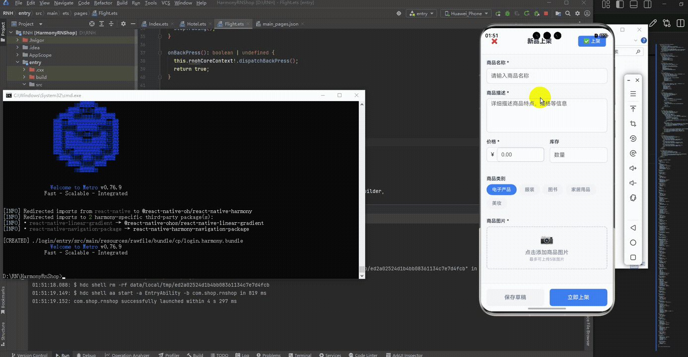
打包
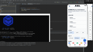
接下来通过打包命令npn run harmony将reactNative的代码打包成为bundle,这样可以进行在开源鸿蒙OpenHarmony中进行使用。

打包之后再将打包后的鸿蒙OpenHarmony文件拷贝到鸿蒙的DevEco-Studio工程目录去:

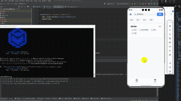
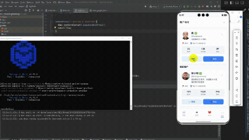
最后运行效果图如下显示:
欢迎大家加入开源鸿蒙跨平台开发者社区,一起共建开源鸿蒙跨平台生态。

作为“人工智能6S店”的官方数字引擎,为AI开发者与企业提供一个覆盖软硬件全栈、一站式门户。
更多推荐
 13
13 0
0- 0


 已为社区贡献6条内容

所有评论(0)