
React Native鸿蒙跨平台通过将用户数据、发送消息回调和关注回调作为 props 传入,组件与业务逻辑完全解耦
跨平台用户资料卡片组件开发 本文探讨了基于TypeScript的跨平台用户资料卡片组件开发,重点分析了类型系统、状态管理、组件设计和性能优化等关键技术。 类型驱动开发:通过严格定义User类型确保数据一致性,提升代码可维护性和IDE智能提示能力。 组件化架构: 采用高阶卡片组件设计实现业务逻辑解耦 精心设计的嵌套层级结构支持多平台样式适配 状态管理: 使用不可变数据更新模式确保状态一致性 考虑分布
TypeScript 类型驱动开发
用户资料卡片组件展示了 TypeScript 类型系统在企业级应用中的深度应用:
type User = {
  id: number;
  name: string;
  username: string;
  avatar: string;
  bio: string;
  location: string;
  joinDate: string;
  followers: number;
  following: number;
  posts: number;
  isVerified: boolean;
  isFollowing: boolean;
};
这种类型定义在跨平台开发中具有重要的战略意义。通过将用户实体的所有属性进行明确的类型约束,代码的可维护性和团队协作效率得到了显著提升。在鸿蒙平台上,这种类型驱动的开发模式可以确保数据在不同平台间传递时的一致性,避免运行时类型错误导致的崩溃。类型系统的另一个重要优势是 IDE 的智能提示能力,开发者在编写代码时可以快速了解每个属性的类型和用途,这在大规模团队协作中尤为重要。
复合组件状态管理
代码实现了复杂的多状态管理机制:
const [users] = useState<User[]>([/* 用户数据 */]);
const [currentUser, setCurrentUser] = useState<User>({/* 当前用户 */});
这种状态拆分策略体现了良好的架构设计原则。users 数组存储推荐用户列表,而 currentUser 独立管理当前登录用户的信息,两者虽然类型相同,但业务语义完全不同。在鸿蒙的分布式场景中,这种清晰的状态划分可以更好地支持用户数据在多设备间的同步和隔离。例如,当用户在手机上查看自己的资料时,平板设备可以实时同步显示相同的用户信息,而不会混淆不同用户的数据。
组件化架构深度解析
高阶卡片组件设计
用户卡片组件采用了高度可复用的设计模式:
const UserCard = ({
  user,
  onSendMessage,
  onFollow
}: {
  user: User;
  onSendMessage: (userId: number) => void;
  onFollow: (userId: number) => void
}) => {
  // 组件实现
};
这种组件设计在跨平台开发中展现了其强大的灵活性。通过将用户数据、发送消息回调和关注回调作为 props 传入,组件与业务逻辑完全解耦。在鸿蒙平台上,开发者可以轻松替换组件的内部实现而不影响上层调用,例如使用鸿蒙的原生物图组件替代 React Native 的 Image 组件,或者集成鸿蒙的分布式用户系统。这种松耦合设计是企业级应用架构的核心原则,它使得代码更易于测试、维护和扩展。
嵌套组件层级结构
用户卡片内部采用了精心设计的嵌套结构:
<View style={styles.userCard}>
  <View style={styles.userHeader}>
    <Image source={{ uri: user.avatar }} style={styles.avatar} />
    <View style={styles.userInfo}>
      <View style={styles.nameRow}>
        <Text style={styles.name}>{user.name}</Text>
        {user.isVerified && <Text style={styles.verifiedIcon}>{ICONS.verified}</Text>}
      </View>
      <Text style={styles.username}>@{user.username}</Text>
      <Text style={styles.bio}>{user.bio}</Text>
    </View>
  </View>
  <View style={styles.userDetails}>{/* 位置和加入日期 */}</View>
  <View style={styles.statsContainer}>{/* 统计数据 */}</View>
  <View style={styles.actionButtons}>{/* 操作按钮 */}</View>
</View>
这种层级结构在跨平台开发中具有多重技术考量。首先,每个子组件都有独立的样式定义,避免了样式冲突和覆盖问题。其次,条件渲染部分(如验证图标)采用了简洁的逻辑表达式,使得代码既高效又易读。在鸿蒙平台上,开发者需要注意不同设备的屏幕尺寸和像素密度对这些布局的影响,确保卡片在各种设备上都能保持良好的视觉效果。
列表渲染与数据管理
映射模式的数据渲染
代码展示了 React Native 中高效的数据列表渲染:
{users.map(user => (
  <UserCard
    key={user.id}
    user={user}
    onSendMessage={handleSendMessage}
    onFollow={handleFollow}
  />
))}
这种映射渲染模式是 React Native 开发中的标准实践。key 属性的正确使用对于列表性能至关重要,它帮助 React 识别哪些元素发生了变化,从而实现高效的差量更新。在鸿蒙平台上,开发者需要考虑长列表的性能优化问题,可以使用 FlatList 或 SectionList 替代简单的 ScrollView 映射,以获得虚拟化渲染的能力。对于用户数量可能达到数千甚至数万的社交应用,这种优化可以显著提升应用的性能和用户体验。
状态更新与数据流
代码实现了精确的状态更新逻辑:
const handleFollow = (userId: number) => {
  const updatedUsers = users.map(user =>
    user.id === userId ? { ...user, isFollowing: !user.isFollowing } : user
  );
  setCurrentUser(prev => ({
    ...prev,
    following: prev.following + (updatedUsers.find(u => u.id === userId)?.isFollowing ? 1 : -1)
  }));
};
这种不可变数据更新模式在跨平台开发中具有重要意义。通过使用展开运算符创建新的对象引用,React 可以准确检测到状态变化并触发重新渲染。在鸿蒙平台上,这种模式同样适用,但开发者需要注意分布式状态同步时的数据一致性问题。例如,当用户在手机上关注某个用户时,需要确保该操作在其他已登录设备上也能正确反映,这可能需要额外的同步机制和数据冲突解决策略。
交互设计与用户体验
条件样式与视觉反馈
代码实现了丰富的条件样式切换:
<TouchableOpacity
  style={[
    styles.actionButton,
    user.isFollowing ? styles.unfollowButton : styles.followButton
  ]}
  onPress={() => onFollow(user.id)}
>
  <Text style={[
    styles.actionButtonText,
    user.isFollowing ? styles.unfollowButtonText : styles.followButtonText
  ]}>
    {user.isFollowing ? '取消关注' : ICONS.add + ' 关注'}
  </Text>
</TouchableOpacity>
这种条件样式设计在跨平台开发中需要特别注意各平台在交互反馈上的差异。Android 设备通常具有更明显的水波纹效果,而 iOS 则倾向于使用缩放动画。在鸿蒙平台上,开发者可以使用平台的原生触摸反馈 API 来实现与系统风格一致的交互效果。此外,状态切换时的颜色对比度和可访问性也需要认真考虑,确保色盲用户也能准确识别按钮的当前状态。
确认对话框与操作保护
代码实现了用户操作的二次确认机制:
const handleFollow = (userId: number) => {
  Alert.alert(
    '关注操作',
    `确定要${users.find(u => u.id === userId)?.isFollowing ? '取消关注' : '关注'}该用户吗?`,
    [
      { text: '取消', style: 'cancel' },
      {
        text: '确定',
        => { onPress: () /* 执行操作 */ }
      }
    ]
  );
};
这种操作保护机制在跨平台开发中是用户体验设计的重要组成部分。Alert API 在不同平台上的表现略有不同,但功能基本一致。在鸿蒙平台上,开发者可以利用系统原生的对话框组件来获得更好的性能和用户体验。同时,对于高频操作(如关注/取消关注),可以考虑添加节流或防抖机制,避免用户在快速点击时触发多次无效的网络请求。
鸿蒙跨端适配关键技术
分布式用户系统集成
鸿蒙的分布式特性可以为用户资料卡片带来创新体验:
// 伪代码:分布式用户系统
const DistributedUserSystem = {
  syncUserData: (userId) => {
    if (Platform.OS === 'harmony') {
      harmonyNative.syncUserData(userId);
    }
  },
  getCrossDeviceUser: (userId) => {
    if (Platform.OS === 'harmony') {
      return harmonyNative.getUserFromAnyDevice(userId);
    }
    return localUserData;
  },
  enableRealTimeSync: () => {
    if (Platform.OS === 'harmony') {
      harmonyNative.enableUserDataSync();
    }
  }
};
这种分布式用户系统集成需要考虑多个技术层面的问题。首先是数据同步的一致性问题,需要设计合适的冲突解决策略来处理多设备同时修改用户数据的情况。其次是网络不稳定性情况下的离线支持,确保用户在没有网络连接时也能正常使用基本功能。最后是隐私和安全问题,用户资料可能包含敏感信息,需要在同步过程中进行加密传输和存储。
图像加载性能优化
用户头像的加载在跨平台场景下需要特别优化:
// 伪代码:图像性能优化
const ImageOptimization = {
  useImageCache: (uri) => {
    if (Platform.OS === 'harmony') {
      return harmonyNative.cachedImageSource(uri);
    }
    return { uri };
  },
  enableProgressiveLoading: () => {
    if (Platform.OS === 'harmony') {
      harmonyNative.enableProgressiveAvatars();
    }
  },
  prefetchUserImages: (userIds) => {
    if (Platform.OS === 'harmony') {
      harmonyNative.prefetchAvatars(userIds);
    }
  }
};
原生组件性能提升
在鸿蒙平台上,可以利用原生组件提升性能:
// 伪代码:原生组件适配
const NativeComponents = {
  useHarmonyUserCard: (userData) => {
    if (Platform.OS === 'harmony') {
      return harmonyNative.renderNativeUserCard(userData);
    }
    return defaultUserCardComponent;
  },
  optimizeListRendering: () => {
    if (Platform.OS === 'harmony') {
      harmonyNative.enableNativeListOptimization();
    }
  }
};
性能优化体系
列表渲染优化策略
// 伪代码:性能优化
const ListOptimization = {
  useVirtualization: () => {
    // 使用 FlatList 替代 Map 渲染
    if (Platform.OS === 'harmony') {
      harmonyNative.enableListVirtualization();
    }
  },
  implementWindowing: (windowSize = 10) => {
    if (Platform.OS === 'harmony') {
      harmonyNative.setListWindowSize(windowSize);
    }
  },
  optimizeImages: () => {
    if (Platform.OS === 'harmony') {
      harmonyNative.configureImagePipeline({
        maxCacheSize: 50 * 1024 * 1024, // 50MB
        memoryCacheSize: 20 * 1024 * 1024 // 20MB
      });
    }
  }
};
智能化用户推荐
// 伪代码:智能推荐
const SmartRecommendation = {
  analyzeUserBehavior: () => {
    if (Platform.OS === 'harmony') {
      harmonyNative.enableUserBehaviorAnalysis();
    }
  },
  predictFollowProbability: (userData, currentUser) => {
    if (Platform.OS === 'harmony') {
      return harmonyNative.predictFollow(userData, currentUser);
    }
    return defaultPrediction;
  }
};
微前端架构集成
// 伪代码:微前端集成
const MicroFrontendIntegration = {
  loadUserModule: () => {
    if (Platform.OS === 'harmony') {
      harmonyNative.loadUserMicroservice();
    }
  }
};
类型建模与组件边界
- User 类型以结构化字段建模,组件内部完全通过 props 传递渲染语义与交互意图,形成“哑组件 + 父级调度”的边界。跨端语义保持纯 JS 数据,不依赖平台分支,利于在鸿蒙端复用。
- UserCard 以 onSendMessage/onFollow 回调承载业务动作,不直接触碰外部状态源;这种“从子到父的意图上报”在 RN Bridge 上仅携带函数引用与参数,桥面负载较低,三端一致性好。
- 头像、认证、统计、按钮等都在同一组件内组合,渲染路径只使用 RN 核心视图栈(View/Text/Image/TouchableOpacity),避免平台特有控件,跨端风险低。
状态与数据流的正确性与不可变更新
- 页面级状态包含 users 与 currentUser;当前实现仅对 users 执行初始化,未持有 setUsers。handleFollow 中“计算 updatedUsers 但不写回状态”会导致推荐用户卡片的 isFollowing 与按钮文案不更新,属于不可变更新缺失的典型问题。
- currentUser 的 following 数量用 updatedUsers 的结果派生,但当前没有同步更新 currentUser.isFollowing(针对“我”的卡片),导致“我”的关注按钮状态与计数可能不一致。
- 跨端一致性依赖于不可变数据流:在 RN 上任何 UI 更新都需触发 setState 才会过桥到原生视图树。建议对 users 使用 setUsers 写回、对 currentUser 同步更新 isFollowing 与 following,保证 UI 与数据同源。
交互与原生桥:Alert 与回调闭包
- Alert.alert 在 RN 中映射为平台原生弹窗(iOS UIAlertController、Android AlertDialog);鸿蒙端若采用 ArkUI 后端,同样通过桥接实现。当前代码使用动态按钮配置与闭包 onPress,属于典型的“JS 闭包捕获状态 → 调度状态更新”的路径。
- 跨端注意:弹窗回调发生在原生线程调度返回 JS 线程时机,若回调中执行多次 setState,建议合并更新,降低 JS→UI 批处理压力,避免低端设备上出现交互延迟。
图片加载管线与资源约束
- Image 的 source 采用网络 URI 是跨端通用方案,但当前 avatar 字段字符串包含反引号与多余空格(’
https://...'),这会导致 URI 解析失败。应提供纯净字符串才能触发 RN 的网络解码、缓存与尺寸计算。 - 网络头像在三端的缓存策略不同,建议在列表场景使用轻量的预取与占位策略(如 Image.prefetch 或使用 FastImage 等具备原生缓存能力的库,前提是鸿蒙端桥接可用)。
- 宽高与圆角在 JS 布局层确定,避免在图片层做平台特化处理;这能减少不同后端对裁剪与合成的实现差异带来的视觉偏差。
列表渲染与性能边界
- 推荐用户通过 ScrollView + map 渲染,适合中小数据量;一旦接近上百项,跨端都建议升级为 FlatList(虚拟化、回收与窗口化),可以显著降低 RN Bridge 传输与原生视图树压力。
- 回调函数在 map 中被新建,对纯函数子组件会触发不必要的重渲染;用 useCallback 以及 React.memo 包裹 UserCard 能稳定三端的重绘频率,尤其在鸿蒙端 ArkUI 后端中减少视图树重排。
- Dimensions.get(‘window’) 的 width 未使用,属于冗余查询;跨端尺寸访问需要谨慎,避免不必要的同步桥调用。
完整的示例:
// app.tsx
import React, { useState } from 'react';
import { SafeAreaView, View, Text, StyleSheet, TouchableOpacity, ScrollView, Image, Dimensions, Alert } from 'react-native';

// 图标库
const ICONS = {
  message: '💬',
  add: '➕',
  more: '⋯',
  verified: '✅',
  location: '📍',
  calendar: '📅',
  heart: '❤️',
  share: '📤',
};

const { width } = Dimensions.get('window');

// 用户类型
type User = {
  id: number;
  name: string;
  username: string;
  avatar: string;
  bio: string;
  location: string;
  joinDate: string;
  followers: number;
  following: number;
  posts: number;
  isVerified: boolean;
  isFollowing: boolean;
};

// 用户卡片组件
const UserCard = ({
  user,
  onSendMessage,
  onFollow
}: {
  user: User;
  onSendMessage: (userId: number) => void;
  onFollow: (userId: number) => void
}) => {
  return (
    <View style={styles.userCard}>
      {/* 用户头像和基本信息 */}
      <View style={styles.userHeader}>
        <Image
          source={{ uri: user.avatar }}
          style={styles.avatar}
        />
        <View style={styles.userInfo}>
          <View style={styles.nameRow}>
            <Text style={styles.name}>{user.name}</Text>
            {user.isVerified && <Text style={styles.verifiedIcon}>{ICONS.verified}</Text>}
          </View>
          <Text style={styles.username}>@{user.username}</Text>
          <Text style={styles.bio}>{user.bio}</Text>
        </View>
        <TouchableOpacity style={styles.moreButton}>
          <Text style={styles.moreIcon}>{ICONS.more}</Text>
        </TouchableOpacity>
      </View>

      {/* 位置和加入日期 */}
      <View style={styles.userDetails}>
        <View style={styles.detailItem}>
          <Text style={styles.detailIcon}>{ICONS.location}</Text>
          <Text style={styles.detailText}>{user.location}</Text>
        </View>
        <View style={styles.detailItem}>
          <Text style={styles.detailIcon}>{ICONS.calendar}</Text>
          <Text style={styles.detailText}>加入于 {user.joinDate}</Text>
        </View>
      </View>

      {/* 关注统计 */}
      <View style={styles.statsContainer}>
        <View style={styles.statItem}>
          <Text style={styles.statNumber}>{user.posts}</Text>
          <Text style={styles.statLabel}>帖子</Text>
        </View>
        <View style={styles.statItem}>
          <Text style={styles.statNumber}>{user.followers}</Text>
          <Text style={styles.statLabel}>关注者</Text>
        </View>
        <View style={styles.statItem}>
          <Text style={styles.statNumber}>{user.following}</Text>
          <Text style={styles.statLabel}>关注</Text>
        </View>
      </View>

      {/* 操作按钮 */}
      <View style={styles.actionButtons}>
        <TouchableOpacity
          style={[styles.actionButton, styles.messageButton]}
          onPress={() => onSendMessage(user.id)}
        >
          <Text style={styles.messageButtonText}>{ICONS.message} 私信</Text>
        </TouchableOpacity>
        <TouchableOpacity
          style={[
            styles.actionButton,
            user.isFollowing ? styles.unfollowButton : styles.followButton
          ]}
          onPress={() => onFollow(user.id)}
        >
          <Text style={[
            styles.actionButtonText,
            user.isFollowing ? styles.unfollowButtonText : styles.followButtonText
          ]}>
            {user.isFollowing ? '取消关注' : ICONS.add + ' 关注'}
          </Text>
        </TouchableOpacity>
      </View>
    </View>
  );
};

// 用户卡片页面组件
const UserCardPage: React.FC = () => {
  const [users] = useState<User[]>([
    {
      id: 1,
      name: '张小明',
      username: 'zhangxiaoming',
      avatar: 'https://randomuser.me/api/portraits/men/32.jpg',
      bio: '前端开发工程师,热爱技术分享,喜欢旅行和摄影',
      location: '北京',
      joinDate: '2022年3月',
      followers: 1245,
      following: 324,
      posts: 128,
      isVerified: true,
      isFollowing: false,
    },
    {
      id: 2,
      name: '李美华',
      username: 'limeihua',
      avatar: 'https://randomuser.me/api/portraits/women/44.jpg',
      bio: 'UI/UX设计师,专注于移动应用界面设计',
      location: '上海',
      joinDate: '2021年8月',
      followers: 2156,
      following: 489,
      posts: 87,
      isVerified: true,
      isFollowing: true,
    },
    {
      id: 3,
      name: '王大伟',
      username: 'wangdawei',
      avatar: 'https://randomuser.me/api/portraits/men/22.jpg',
      bio: '产品经理,关注用户体验和产品创新',
      location: '深圳',
      joinDate: '2020年11月',
      followers: 876,
      following: 234,
      posts: 56,
      isVerified: false,
      isFollowing: false,
    },
  ]);

  const [currentUser, setCurrentUser] = useState<User>({
    id: 999,
    name: '我',
    username: 'myaccount',
    avatar: 'https://randomuser.me/api/portraits/men/11.jpg',
    bio: '这是我的个人资料',
    location: '杭州',
    joinDate: '2023年1月',
    followers: 120,
    following: 89,
    posts: 24,
    isVerified: true,
    isFollowing: false,
  });

  const handleSendMessage = (userId: number) => {
    Alert.alert('发送消息', `正在向用户 ${userId} 发送消息`);
  };

  const handleFollow = (userId: number) => {
    Alert.alert(
      '关注操作',
      `确定要${users.find(u => u.id === userId)?.isFollowing ? '取消关注' : '关注'}该用户吗?`,
      [
        { text: '取消', style: 'cancel' },
        {
          text: '确定',
          onPress: () => {
            const updatedUsers = users.map(user =>
              user.id === userId ? { ...user, isFollowing: !user.isFollowing } : user
            );
            setCurrentUser(prev => ({
              ...prev,
              following: prev.following + (updatedUsers.find(u => u.id === userId)?.isFollowing ? 1 : -1)
            }));
          }
        }
      ]
    );
  };

  return (
    <SafeAreaView style={styles.container}>
      {/* 头部 */}
      <View style={styles.header}>
        <Text style={styles.title}>用户卡片</Text>
        <TouchableOpacity style={styles.settingsButton}>
          <Text style={styles.settingsIcon}>{ICONS.more}</Text>
        </TouchableOpacity>
      </View>

      {/* 主内容 */}
      <ScrollView style={styles.content}>
        {/* 当前用户卡片 */}
        <UserCard
          user={currentUser}
          onSendMessage={handleSendMessage}
          onFollow={handleFollow}
        />

        {/* 推荐用户卡片 */}
        <Text style={styles.sectionTitle}>推荐用户</Text>
        {users.map(user => (
          <UserCard
            key={user.id}
            user={user}
            onSendMessage={handleSendMessage}
            onFollow={handleFollow}
          />
        ))}

        {/* 用户功能列表 */}
        <Text style={styles.sectionTitle}>用户功能</Text>
        <View style={styles.functionList}>
          <TouchableOpacity style={styles.functionItem}>
            <Text style={styles.functionIcon}>{ICONS.heart}</Text>
            <Text style={styles.functionText}>我的点赞</Text>
          </TouchableOpacity>
          <TouchableOpacity style={styles.functionItem}>
            <Text style={styles.functionIcon}>{ICONS.share}</Text>
            <Text style={styles.functionText}>我的分享</Text>
          </TouchableOpacity>
          <TouchableOpacity style={styles.functionItem}>
            <Text style={styles.functionIcon}>{ICONS.message}</Text>
            <Text style={styles.functionText}>我的消息</Text>
          </TouchableOpacity>
          <TouchableOpacity style={styles.functionItem}>
            <Text style={styles.functionIcon}>{ICONS.calendar}</Text>
            <Text style={styles.functionText}>活动日历</Text>
          </TouchableOpacity>
        </View>
      </ScrollView>

      {/* 底部导航 */}
      <View style={styles.bottomNav}>
        <TouchableOpacity style={styles.navItem}>
          <Text style={styles.navIcon}>{ICONS.message}</Text>
          <Text style={styles.navText}>消息</Text>
        </TouchableOpacity>
        <TouchableOpacity style={styles.navItem}>
          <Text style={styles.navIcon}>{ICONS.add}</Text>
          <Text style={styles.navText}>发现</Text>
        </TouchableOpacity>
        <TouchableOpacity style={styles.navItem}>
          <Text style={styles.navIcon}>{ICONS.heart}</Text>
          <Text style={styles.navText}>关注</Text>
        </TouchableOpacity>
        <TouchableOpacity style={[styles.navItem, styles.activeNavItem]}>
          <Text style={styles.navIcon}>{ICONS.more}</Text>
          <Text style={styles.navText}>我的</Text>
        </TouchableOpacity>
      </View>
    </SafeAreaView>
  );
};

const styles = StyleSheet.create({
  container: {
    flex: 1,
    backgroundColor: '#f8fafc',
  },
  header: {
    flexDirection: 'row',
    alignItems: 'center',
    justifyContent: 'space-between',
    padding: 16,
    backgroundColor: '#ffffff',
    borderBottomWidth: 1,
    borderBottomColor: '#e2e8f0',
  },
  title: {
    fontSize: 18,
    fontWeight: 'bold',
    color: '#1e293b',
  },
  settingsButton: {
    padding: 8,
  },
  settingsIcon: {
    fontSize: 20,
    color: '#64748b',
  },
  content: {
    flex: 1,
    padding: 16,
  },
  userCard: {
    backgroundColor: '#ffffff',
    borderRadius: 12,
    padding: 16,
    marginBottom: 16,
    elevation: 2,
    shadowColor: '#000',
    shadowOffset: { width: 0, height: 1 },
    shadowOpacity: 0.1,
    shadowRadius: 2,
  },
  userHeader: {
    flexDirection: 'row',
    alignItems: 'flex-start',
    marginBottom: 12,
  },
  avatar: {
    width: 60,
    height: 60,
    borderRadius: 30,
    marginRight: 12,
  },
  userInfo: {
    flex: 1,
  },
  nameRow: {
    flexDirection: 'row',
    alignItems: 'center',
    marginBottom: 4,
  },
  name: {
    fontSize: 18,
    fontWeight: 'bold',
    color: '#1e293b',
    marginRight: 6,
  },
  verifiedIcon: {
    color: '#3b82f6',
    fontSize: 16,
  },
  username: {
    fontSize: 14,
    color: '#64748b',
    marginBottom: 6,
  },
  bio: {
    fontSize: 14,
    color: '#475569',
    lineHeight: 20,
  },
  moreButton: {
    padding: 8,
  },
  moreIcon: {
    fontSize: 20,
    color: '#94a3b8',
  },
  userDetails: {
    flexDirection: 'row',
    marginBottom: 12,
  },
  detailItem: {
    flexDirection: 'row',
    alignItems: 'center',
    marginRight: 16,
  },
  detailIcon: {
    fontSize: 14,
    color: '#94a3b8',
    marginRight: 4,
  },
  detailText: {
    fontSize: 12,
    color: '#64748b',
  },
  statsContainer: {
    flexDirection: 'row',
    justifyContent: 'space-around',
    marginBottom: 16,
    paddingVertical: 12,
    backgroundColor: '#f1f5f9',
    borderRadius: 8,
  },
  statItem: {
    alignItems: 'center',
  },
  statNumber: {
    fontSize: 16,
    fontWeight: 'bold',
    color: '#1e293b',
  },
  statLabel: {
    fontSize: 12,
    color: '#64748b',
    marginTop: 4,
  },
  actionButtons: {
    flexDirection: 'row',
    justifyContent: 'space-between',
  },
  actionButton: {
    flex: 1,
    paddingVertical: 12,
    borderRadius: 8,
    alignItems: 'center',
    marginRight: 8,
  },
  messageButton: {
    backgroundColor: '#e0f2fe',
    marginRight: 8,
  },
  followButton: {
    backgroundColor: '#3b82f6',
  },
  unfollowButton: {
    backgroundColor: '#f1f5f9',
  },
  messageButtonText: {
    color: '#0369a1',
    fontSize: 14,
    fontWeight: '500',
  },
  actionButtonText: {
    fontSize: 14,
    fontWeight: '500',
  },
  followButtonText: {
    color: '#ffffff',
  },
  unfollowButtonText: {
    color: '#64748b',
  },
  sectionTitle: {
    fontSize: 16,
    fontWeight: 'bold',
    color: '#1e293b',
    marginBottom: 12,
  },
  functionList: {
    flexDirection: 'row',
    flexWrap: 'wrap',
    justifyContent: 'space-between',
  },
  functionItem: {
    width: '48%',
    backgroundColor: '#ffffff',
    padding: 16,
    borderRadius: 8,
    marginBottom: 12,
    alignItems: 'center',
    elevation: 1,
    shadowColor: '#000',
    shadowOffset: { width: 0, height: 1 },
    shadowOpacity: 0.1,
    shadowRadius: 2,
  },
  functionIcon: {
    fontSize: 24,
    color: '#3b82f6',
    marginBottom: 8,
  },
  functionText: {
    fontSize: 14,
    color: '#1e293b',
    textAlign: 'center',
  },
  bottomNav: {
    flexDirection: 'row',
    justifyContent: 'space-around',
    backgroundColor: '#ffffff',
    borderTopWidth: 1,
    borderTopColor: '#e2e8f0',
    paddingVertical: 12,
  },
  navItem: {
    alignItems: 'center',
  },
  activeNavItem: {
    paddingBottom: 2,
    borderBottomWidth: 2,
    borderBottomColor: '#3b82f6',
  },
  navIcon: {
    fontSize: 20,
    color: '#94a3b8',
    marginBottom: 4,
  },
  activeNavIcon: {
    color: '#3b82f6',
  },
  navText: {
    fontSize: 12,
    color: '#94a3b8',
  },
  activeNavText: {
    color: '#3b82f6',
    fontWeight: '500',
  },
});

export default UserCardPage;
打包
接下来通过打包命令npn run harmony将reactNative的代码打包成为bundle,这样可以进行在开源鸿蒙OpenHarmony中进行使用。

打包之后再将打包后的鸿蒙OpenHarmony文件拷贝到鸿蒙的DevEco-Studio工程目录去:

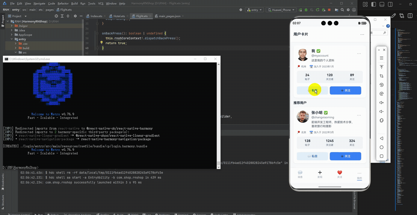
最后运行效果图如下显示:
欢迎大家加入开源鸿蒙跨平台开发者社区,一起共建开源鸿蒙跨平台生态。

作为“人工智能6S店”的官方数字引擎,为AI开发者与企业提供一个覆盖软硬件全栈、一站式门户。
更多推荐


 0
0 0
0- 0


 已为社区贡献4条内容

所有评论(0)