
React Native 鸿蒙跨平台开发:BottomSheet 底部面板详解
欢迎加入开源鸿蒙跨平台社区:https://openharmonycrossplatform.csdn.net。BottomSheet 组件使用。面板组件渲染了但看不见。点击遮罩层面板没有关闭。
·
一、核心原理:BottomSheet 的设计与实现
1.1 BottomSheet 的设计理念
BottomSheet 是从屏幕底部弹出的面板组件,主要用于:
- 功能操作:提供多个操作选项,如分享、删除、编辑等
- 信息展示:展示详细信息或表单内容
- 输入交互:提供用户输入界面,如评论、搜索等
- 导航菜单:提供底部导航菜单或选项卡
1.2 BottomSheet 的核心要素
一个完整的 BottomSheet 需要考虑:
- 动画效果:从底部滑入和滑出的平滑动画
- 遮罩层:半透明背景,点击可关闭面板
- 内容区域:面板内部的内容展示
- 拖拽手柄:顶部的拖拽指示器
- 状态管理:控制显示/隐藏状态
- 层级控制:确保面板在最上层显示
- 高度控制:固定高度或自适应高度
1.3 实现原理
BottomSheet 的核心实现原理:
- 使用绝对定位的 View 作为容器
- 使用 Animated 实现滑动动画
- 使用 translateY 控制面板的显示和隐藏
- 使用 Pressable 实现遮罩层的点击关闭
- 设置合适的 z-index 和 elevation 确保层级正确
- 不使用 Modal 组件,避免鸿蒙端兼容问题
二、基础 BottomSheet 实现
2.1 组件结构
BottomSheet 组件包含以下部分:
- 容器层:绝对定位的容器,覆盖整个屏幕
- 遮罩层:半透明背景,点击可关闭面板
- 面板容器:包含所有面板内容的容器
- 拖拽手柄:顶部的拖拽指示器
- 标题区域:可选,显示面板标题
- 内容区域:面板内部的内容展示
2.2 完整代码实现
import React, { useState, useCallback, memo } from 'react';
import {
  View,
  Text,
  StyleSheet,
  TouchableOpacity,
  Pressable,
  Animated,
  Dimensions,
} from 'react-native';

const { height } = Dimensions.get('window');

// BottomSheet 组件 Props 类型
interface BottomSheetProps {
  visible: boolean;
  onClose: () => void;
  title?: string;
  height?: number;
  children?: React.ReactNode;
}

// BottomSheet 组件
const BottomSheet = memo<BottomSheetProps>(({
  visible,
  onClose,
  title,
  height = 400,
  children,
}) => {
  const translateY = useState(new Animated.Value(height))[0];

  const show = useCallback(() => {
    Animated.timing(translateY, {
      toValue: 0,
      duration: 300,
      useNativeDriver: true,
    }).start();
  }, [translateY]);

  const hide = useCallback((callback?: () => void) => {
    Animated.timing(translateY, {
      toValue: height,
      duration: 300,
      useNativeDriver: true,
    }).start(() => {
      callback?.();
    });
  }, [translateY, height]);

  React.useEffect(() => {
    if (visible) {
      show();
    }
  }, [visible, show]);

  const handleClose = useCallback(() => {
    hide(onClose);
  }, [hide, onClose]);

  if (!visible) return null;

  return (
    <View style={styles.container}>
      <Pressable
        style={styles.overlay}
        onPress={handleClose}
      >
        <Animated.View
          style={[
            styles.bottomSheet,
            {
              transform: [{ translateY }],
              height,
            }
          ]}
        >
          <View style={styles.handle} />
          {title && (
            <Text style={styles.title}>{title}</Text>
          )}
          {children}
        </Animated.View>
      </Pressable>
    </View>
  );
});

BottomSheet.displayName = 'BottomSheet';
设计要点:
- 初始值设置为屏幕高度,使面板在屏幕外
- 显示时从屏幕底部滑入(translateY 从 height 变为 0)
- 隐藏时滑出屏幕(translateY 从 0 变为 height)
- 使用
useNativeDriver: true提升动画性能 - z-index 设置为 9999,确保在最上层显示
- 使用
useState存储 Animated.Value
2.3 样式实现
const styles = StyleSheet.create({
  // ======== 容器层 ========
  container: {
    position: 'absolute',
    top: 0,
    left: 0,
    right: 0,
    bottom: 0,
    zIndex: 9999,
  },
  overlay: {
    flex: 1,
    backgroundColor: 'rgba(0, 0, 0, 0.5)',
    justifyContent: 'flex-end',
  },

  // ======== 面板容器 ========
  bottomSheet: {
    backgroundColor: '#FFFFFF',
    borderTopLeftRadius: 20,
    borderTopRightRadius: 20,
    paddingBottom: 40,
    shadowColor: '#000000',
    shadowOffset: { width: 0, height: -4 },
    shadowOpacity: 0.15,
    shadowRadius: 12,
    elevation: 20,
  },
  handle: {
    width: 40,
    height: 4,
    backgroundColor: '#DCDFE6',
    borderRadius: 2,
    alignSelf: 'center',
    marginTop: 12,
    marginBottom: 16,
  },
  title: {
    fontSize: 18,
    fontWeight: '600',
    color: '#303133',
    textAlign: 'center',
    marginBottom: 16,
  },
});
三、核心实现要点
3.1 动画实现
使用 Animated 实现平滑的滑动动画:
const translateY = useState(new Animated.Value(height))[0];

// 显示面板
const show = useCallback(() => {
  Animated.timing(translateY, {
    toValue: 0,
    duration: 300,
    useNativeDriver: true,
  }).start();
}, [translateY]);

// 隐藏面板
const hide = useCallback((callback?: () => void) => {
  Animated.timing(translateY, {
    toValue: height,
    duration: 300,
    useNativeDriver: true,
  }).start(() => {
    callback?.();
  });
}, [translateY, height]);
动画设计要点:
- 初始值设置为屏幕高度,使面板在屏幕外
- 显示时 translateY 从 height 变为 0
- 隐藏时 translateY 从 0 变为 height
- 使用
useNativeDriver: true提升动画性能 - 动画完成后执行回调函数
3.2 遮罩层实现
使用 Pressable 实现遮罩层,点击可关闭面板:
<Pressable
  style={styles.overlay}
  onPress={handleClose}
>
  <Animated.View style={styles.bottomSheet}>
    {/* 面板内容 */}
  </Animated.View>
</Pressable>
遮罩层设计要点:
- 半透明背景
rgba(0, 0, 0, 0.5) - 点击整个遮罩层都会触发关闭
- 面板内容在遮罩层内部,不会触发关闭事件
- 使用 Pressable 而不是 TouchableOpacity,提供更好的触控反馈
3.3 层级控制
确保面板在最上层显示:
const styles = StyleSheet.create({
  container: {
    position: 'absolute',
    top: 0,
    left: 0,
    right: 0,
    bottom: 0,
    zIndex: 9999,
  },
  bottomSheet: {
    elevation: 20,
    shadowColor: '#000000',
    shadowOffset: { width: 0, height: -4 },
    shadowOpacity: 0.15,
    shadowRadius: 12,
  },
});
层级设计要点:
- z-index 设置为 9999,确保在最上层
- elevation 设置为 20,确保在鸿蒙端有正确的层级
- shadowColor 和 shadowOffset 提供阴影效果
- 使用
position: absolute确保覆盖整个屏幕
3.4 高度控制
支持固定高度和自适应高度:
<Animated.View
  style={[
    styles.bottomSheet,
    {
      transform: [{ translateY }],
      height: height, // 固定高度
    }
  ]}
>
高度设计要点:
- 默认高度为 400
- 可以通过 props 自定义高度
- 如果需要自适应高度,可以使用
onLayout计算内容高度
四、性能优化
4.1 使用 memo 优化
BottomSheet 组件使用 memo 包装:
const BottomSheet = memo<BottomSheetProps>(({ visible, onClose, title, height, children }) => {
  // ...
});
为什么使用 memo?
- BottomSheet 通常是纯展示组件,props 相同时渲染结果相同
- 避免不必要的重新渲染,提升性能
- 在复杂应用中,避免父组件更新时重新渲染所有面板
4.2 使用 useCallback 优化
使用 useCallback 缓存回调函数:
const show = useCallback(() => {
  Animated.timing(translateY, {
    toValue: 0,
    duration: 300,
    useNativeDriver: true,
  }).start();
}, [translateY]);

const hide = useCallback((callback?: () => void) => {
  Animated.timing(translateY, {
    toValue: height,
    duration: 300,
    useNativeDriver: true,
  }).start(() => {
    callback?.();
  });
}, [translateY, height]);
为什么使用 useCallback?
- 避免每次渲染都创建新函数
- 减少子组件的重新渲染
- 提升整体性能
4.3 优化动画性能
使用 useNativeDriver: true 提升动画性能:
Animated.timing(translateY, {
  toValue: 0,
  duration: 300,
  useNativeDriver: true,
}).start();
为什么使用 useNativeDriver?
- 使用原生动画驱动器,避免 JS 线程和原生线程的通信
- 提升动画流畅度,避免卡顿
- 在鸿蒙端表现更好
五、常见问题与解决方案
5.1 面板不显示
问题现象: 面板组件渲染了但看不见
可能原因:
- z-index 层级不够高
- translateY 初始值设置错误
- 面板被其他元素遮挡
- visible 属性为 false
解决方案:
// 1. 设置高 z-index
<View style={{ zIndex: 9999 }}>

// 2. 确保初始值正确
const translateY = useState(new Animated.Value(height))[0];

// 3. 检查父容器布局
<View style={{ position: 'absolute', top: 0, left: 0, right: 0, bottom: 0 }}>

// 4. 确保 visible 为 true
<BottomSheet visible={true} />
5.2 动画不流畅
问题现象: 面板滑动时有卡顿
可能原因:
- 未使用
useNativeDriver - 动画持续时间过长
- 面板内容过于复杂
- 面板高度过大
解决方案:
// 1. 使用 useNativeDriver
Animated.timing(translateY, {
  toValue: 0,
  duration: 300,
  useNativeDriver: true,
}).start();

// 2. 减少动画持续时间
duration: 200,

// 3. 简化面板内容
// 移除不必要的组件和动画

// 4. 减小面板高度
height: 300
5.3 点击遮罩层不关闭
问题现象: 点击遮罩层面板没有关闭
可能原因:
- 遮罩层没有设置 onPress
- 事件被面板内容拦截
- handleClose 函数未正确调用
- Pressable 的 activeOpacity 设置为 1
解决方案:
// 1. 确保遮罩层有 onPress
<Pressable style={styles.overlay} onPress={handleClose}>

// 2. 检查事件冒泡
// 确保面板内容没有阻止事件冒泡

// 3. 确保 handleClose 正确实现
const handleClose = useCallback(() => {
  hide(onClose);
}, [hide, onClose]);

// 4. 检查 activeOpacity
<Pressable style={styles.overlay} activeOpacity={0.7}>
5.4 面板高度不正确
问题现象: 面板高度与预期不符
可能原因:
- height 参数未正确传递
- 样式中的 height 覆盖了 props
- 内容高度超过面板高度
- 使用了百分比高度导致计算错误
解决方案:
// 1. 确保 height 参数正确传递
<BottomSheet height={400} />

// 2. 检查样式中的 height
const styles = StyleSheet.create({
  bottomSheet: {
    // 不要在这里设置固定高度
    // height: 400, // 删除这一行
  },
});

// 3. 使用内联样式
<Animated.View style={[styles.bottomSheet, { height }]}>

// 4. 避免使用百分比高度
// 不要使用 height: '50%'
六、扩展用法
6.1 添加拖拽功能
支持用户通过拖拽手柄关闭面板:
import { PanResponder } from 'react-native';

const panResponder = useRef(
  PanResponder.create({
    onMoveShouldSetPanResponder: (_, gestureState) => {
      return gestureState.dy > 0;
    },
    onPanResponderMove: (_, gestureState) => {
      if (gestureState.dy > 0) {
        translateY.setValue(gestureState.dy);
      }
    },
    onPanResponderRelease: (_, gestureState) => {
      if (gestureState.dy > 100) {
        hide(onClose);
      } else {
        show();
      }
    },
  })
).current;

<View style={styles.handle} {...panResponder.panHandlers} />
6.2 添加高度自适应
根据内容动态调整面板高度:
const [sheetHeight, setSheetHeight] = useState(400);

useEffect(() => {
  // 根据内容计算高度
  const contentHeight = calculateContentHeight(content);
  setSheetHeight(Math.min(contentHeight, height * 0.9));
}, [content]);
6.3 添加多个面板
支持同时显示多个面板:
const [activeSheet, setActiveSheet] = useState<string | null>(null);

const sheets = {
  menu: <BottomSheet visible={activeSheet === 'menu'} onClose={() => setActiveSheet(null)} title="菜单" />,
  settings: <BottomSheet visible={activeSheet === 'settings'} onClose={() => setActiveSheet(null)} title="设置" />,
  share: <BottomSheet visible={activeSheet === 'share'} onClose={() => setActiveSheet(null)} title="分享" />,
};

return (
  <View style={styles.container}>
    {Object.entries(sheets).map(([key, sheet]) => (
      <View key={key}>
        {sheet}
      </View>
    ))}
  </View>
);
6.4 添加快照效果
支持从不同位置弹出面板:
interface BottomSheetProps {
  visible: boolean;
  onClose: () => void;
  title?: string;
  height?: number;
  snapPoint?: 'top' | 'middle' | 'bottom';
  children?: React.ReactNode;
}

const BottomSheet = memo<BottomSheetProps>(({
  visible,
  onClose,
  title,
  height = 400,
  snapPoint = 'bottom',
  children,
}) => {
  const getInitialValue = useCallback(() => {
    switch (snapPoint) {
      case 'top':
        return -height;
      case 'middle':
        return (height - height) / 2;
      case 'bottom':
      default:
        return height;
    }
  }, [height, snapPoint]);

  const translateY = useState(new Animated.Value(getInitialValue()))[0];

  const show = useCallback(() => {
    Animated.spring(translateY, {
      toValue: 0,
      friction: 8,
      tension: 40,
      useNativeDriver: true,
    }).start();
  }, [translateY]);

  const hide = useCallback((callback?: () => void) => {
    Animated.spring(translateY, {
      toValue: getInitialValue(),
      friction: 8,
      tension: 40,
      useNativeDriver: true,
    }).start(() => {
      callback?.();
    });
  }, [translateY, getInitialValue]);

  // ... 其他代码
});
七、完整代码示例
import React, { useState, useCallback, memo } from 'react';
import {
View,
Text,
StyleSheet,
TouchableOpacity,
Pressable,
Animated,
Dimensions,
SafeAreaView,
} from 'react-native';
const { height } = Dimensions.get('window');
// BottomSheet 组件 Props 类型
interface BottomSheetProps {
visible: boolean;
onClose: () => void;
title?: string;
height?: number;
children?: React.ReactNode;
}
// BottomSheet 组件
const BottomSheet = memo<BottomSheetProps>(({
visible,
onClose,
title,
height = 400,
children,
}) => {
const translateY = useState(new Animated.Value(height))[0];
const show = useCallback(() => {
Animated.timing(translateY, {
toValue: 0,
duration: 300,
useNativeDriver: true,
}).start();
}, [translateY]);
const hide = useCallback((callback?: () => void) => {
Animated.timing(translateY, {
toValue: height,
duration: 300,
useNativeDriver: true,
}).start(() => {
callback?.();
});
}, [translateY, height]);
React.useEffect(() => {
if (visible) {
show();
}
}, [visible, show]);
const handleClose = useCallback(() => {
hide(onClose);
}, [hide, onClose]);
if (!visible) return null;
return (
<View style={styles.container}>
<Pressable
style={styles.overlay}
onPress={handleClose}
>
<Animated.View
style={[
styles.bottomSheet,
{
transform: [{ translateY }],
height,
}
]}
>
<View style={styles.handle} />
{title && (
<Text style={styles.title}>{title}</Text>
)}
{children}
</Animated.View>
</Pressable>
</View>
);
});
BottomSheet.displayName = 'BottomSheet';
const App = () => {
const [bottomSheetVisible, setBottomSheetVisible] = useState(false);
return (
<SafeAreaView style={styles.container}>
{/* 标题区域 */}
<View style={styles.header}>
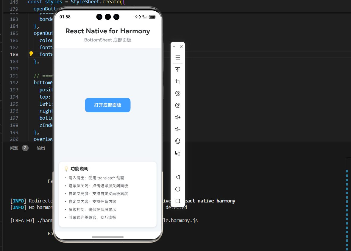
<Text style={styles.pageTitle}>React Native for Harmony</Text>
<Text style={styles.subtitle}>BottomSheet 底部面板</Text>
</View>
{/* 内容区域 */}
<View style={styles.content}>
<TouchableOpacity
style={styles.openButton}
onPress={() => setBottomSheetVisible(true)}
>
<Text style={styles.openButtonText}>打开底部面板</Text>
</TouchableOpacity>
</View>
{/* BottomSheet */}
<BottomSheet
visible={bottomSheetVisible}
onClose={() => setBottomSheetVisible(false)}
title="底部面板"
height={400}
>
<View style={styles.sheetContent}>
<Text style={styles.sheetText}>这是底部面板的内容区域</Text>
<Text style={styles.sheetText}>可以在这里放置任何内容</Text>
<TouchableOpacity
style={styles.sheetButton}
onPress={() => setBottomSheetVisible(false)}
>
<Text style={styles.sheetButtonText}>关闭</Text>
</TouchableOpacity>
</View>
</BottomSheet>
{/* 说明区域 */}
<View style={styles.infoCard}>
<Text style={styles.infoTitle}>💡 功能说明</Text>
<Text style={styles.infoText}>• 滑入滑出:使用 translateY 动画</Text>
<Text style={styles.infoText}>• 遮罩层关闭:点击遮罩层关闭面板</Text>
<Text style={styles.infoText}>• 自定义高度:支持自定义面板高度</Text>
<Text style={styles.infoText}>• 自定义内容:支持任意内容</Text>
<Text style={styles.infoText}>• 层级控制:确保在顶层显示</Text>
<Text style={styles.infoText}>• 鸿蒙端完美兼容,交互流畅</Text>
</View>
</SafeAreaView>
);
};
const styles = StyleSheet.create({
container: {
flex: 1,
backgroundColor: '#F5F7FA',
},
// ======== 标题区域 ========
header: {
padding: 20,
backgroundColor: '#FFFFFF',
borderBottomWidth: 1,
borderBottomColor: '#EBEEF5',
},
pageTitle: {
fontSize: 24,
fontWeight: '700',
color: '#303133',
textAlign: 'center',
marginBottom: 8,
},
subtitle: {
fontSize: 16,
fontWeight: '500',
color: '#909399',
textAlign: 'center',
},
// ======== 内容区域 ========
content: {
flex: 1,
justifyContent: 'center',
alignItems: 'center',
},
openButton: {
backgroundColor: '#409EFF',
paddingHorizontal: 32,
paddingVertical: 16,
borderRadius: 12,
},
openButtonText: {
color: '#FFFFFF',
fontSize: 16,
fontWeight: '600',
},
// ======== BottomSheet 容器 ========
container: {
position: 'absolute',
top: 0,
left: 0,
right: 0,
bottom: 0,
zIndex: 9999,
},
overlay: {
flex: 1,
backgroundColor: 'rgba(0, 0, 0, 0.5)',
justifyContent: 'flex-end',
},
bottomSheet: {
backgroundColor: '#FFFFFF',
borderTopLeftRadius: 20,
borderTopRightRadius: 20,
paddingBottom: 40,
shadowColor: '#000000',
shadowOffset: { width: 0, height: -4 },
shadowOpacity: 0.15,
shadowRadius: 12,
elevation: 20,
},
handle: {
width: 40,
height: 4,
backgroundColor: '#DCDFE6',
borderRadius: 2,
alignSelf: 'center',
marginTop: 12,
marginBottom: 16,
},
title: {
fontSize: 18,
fontWeight: '600',
color: '#303133',
textAlign: 'center',
marginBottom: 16,
},
// ======== 面板内容 ========
sheetContent: {
paddingHorizontal: 16,
paddingVertical: 20,
},
sheetText: {
fontSize: 16,
color: '#606266',
marginBottom: 12,
textAlign: 'center',
},
sheetButton: {
backgroundColor: '#409EFF',
paddingHorizontal: 32,
paddingVertical: 12,
borderRadius: 8,
alignItems: 'center',
marginTop: 20,
},
sheetButtonText: {
color: '#FFFFFF',
fontSize: 16,
fontWeight: '600',
},
// ======== 信息卡片 ========
infoCard: {
backgroundColor: '#FFFFFF',
borderRadius: 12,
padding: 16,
margin: 16,
marginTop: 0,
shadowColor: '#000000',
shadowOffset: { width: 0, height: 2 },
shadowOpacity: 0.08,
shadowRadius: 8,
elevation: 4,
},
infoTitle: {
fontSize: 16,
fontWeight: '600',
color: '#303133',
marginBottom: 12,
},
infoText: {
fontSize: 14,
color: '#606266',
lineHeight: 22,
marginBottom: 6,
},
});
export default App;

@欢迎加入开源鸿蒙跨平台社区:https://openharmonycrossplatform.csdn.net

作为“人工智能6S店”的官方数字引擎,为AI开发者与企业提供一个覆盖软硬件全栈、一站式门户。
更多推荐
 6
6 0
0- 0


 已为社区贡献16条内容

所有评论(0)