
HarmonyOS 校园应用系列之条件渲染驱动:鸿蒙应用开发下,自习室预约记录页 Tab 过滤与双按钮卡片
HarmonyOS 校园应用系列之条件渲染驱动:鸿蒙应用开发下,自习室预约记录页 Tab 过滤与双按钮卡片
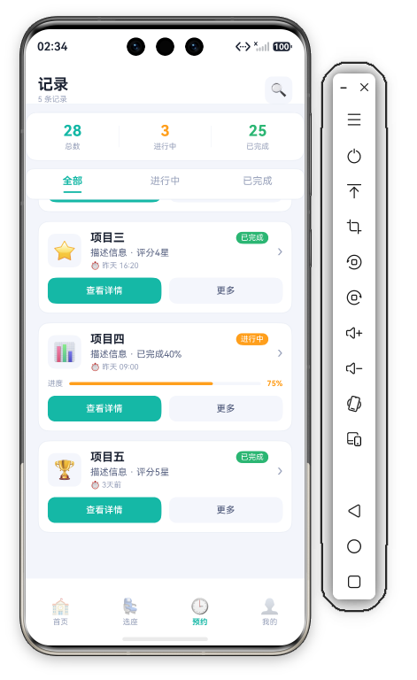
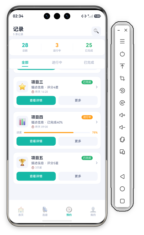
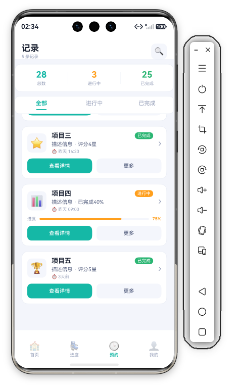
应用背景:09 自习室预约的记录页(Func2Tab.ets,153 行)展示用户的预约历史。本文聚焦 StatsCard 三维统计、TabBar 状态过滤、RecordCard if 条件渲染 + 双按钮操作 三大模块的实现细节。

一、整体架构
记录页采用 "固定头部 + 统计卡 + Tab 过滤 + 列表" 布局——Header/StatsCard/TabBar 都在 Scroll 之外,仅记录列表滚动:
Column
├── Header(标题"记录"+副标题+🔍 搜索图标按钮)
├── StatsCard(三维统计:总数/进行中/已完成)
├── TabBar(全部/进行中/已完成)
└── Scroll (.scrollBar Off)
    ├── RecordList(ForEach 渲染记录卡片)
    └── Blank(底部安全区留白)

二、Header —— 固定标题栏
Row({ space: 12 }) {
  Column({ space: 2 }) {
    Text('记录').fontSize(20).fontWeight(FontWeight.Bold).fontColor(C.text)
    Text(`${this.records.length} 条记录`).fontSize(10).fontColor(C.textDim)
  }.alignItems(HorizontalAlign.Start)
  Blank()
  Row() { Text('🔍').fontSize(18) }
    .width(36).height(36).backgroundColor(C.cardSoft).borderRadius(D.rSm).justifyContent(FlexAlign.Center)
    .onClick(() => { promptAction.showToast({ message: '搜索' }); })
}
.width('100%').height(this.safeTop + 60)
.padding({ top: this.safeTop, left: D.pad, right: D.pad })
.backgroundColor(C.card).alignItems(VerticalAlign.Bottom)
.border({ width: { bottom: 1 }, color: C.stroke })
Header 在 Scroll 之外天然固定,.height(this.safeTop + 60) 适配状态栏,.alignItems(VerticalAlign.Bottom) 内容沉底。右侧搜索图标是 36vp 圆角方块,点击 Toast 提示。
三、StatsCard —— 三维语义统计
Row() {
  ForEach(this.stats, (s: StatItem, idx: number) => {
    Column({ space: 3 }) {
      Text(s.value).fontSize(20).fontWeight(FontWeight.Bold).fontColor(s.color)
      Text(s.label).fontSize(10).fontColor(C.textDim)
    }.layoutWeight(1)
    if (idx < this.stats.length - 1) { Divider().vertical(true).height(28).color(C.stroke) }
  }, (s: StatItem) => s.label)
}
.width('100%').height(64).backgroundColor(C.card).borderRadius(D.rMd)
.border({ width: 1, color: C.stroke }).justifyContent(FlexAlign.SpaceAround)
.margin({ top: 10, left: D.pad, right: D.pad })
三项统计指标:
| 指标 | 值 | 颜色 | 含义 |
|---|---|---|---|
| 总数 | 28 | C.primary | 全部预约 |
| 进行中 | 3 | C.warn | 活跃预约 |
| 已完成 | 25 | C.ok | 历史完成 |
if (idx < length-1) 在相间插入竖向 Divider 分隔——与首页 HeroCard 同款内联分隔线模式(此处用系统 Divider 而非自绘 Column)。
四、TabBar —— 状态过滤栏
Row({ space: 0 }) {
  ForEach(this.tabs, (t: string, idx: number) => {
    Column({ space: 6 }) {
      Text(t).fontSize(13)
        .fontColor(this.activeTab === idx ? C.primary : C.textDim)
        .fontWeight(this.activeTab === idx ? FontWeight.Bold : FontWeight.Normal)
      Column().width(24).height(2).borderRadius(1)
        .backgroundColor(this.activeTab === idx ? C.primary : 'transparent')
    }
    .layoutWeight(1).padding({ top: 8, bottom: 8 })
    .onClick(() => { this.activeTab = idx; })
  }, (t: string) => t)
}
.width('100%').backgroundColor(C.card).borderRadius(D.rSm)
.border({ width: 1, color: C.stroke })
.margin({ top: 10, left: D.pad, right: D.pad })
下划线指示器:选中 tab 下方显示 2vp 高、24vp 宽的主色圆角条,未选中同尺寸但背景 transparent——确保文字不跳动。
三种过滤模式(Tab 切换仅更新 activeTab 状态,列表渲染本身未按状态过滤):
- 全部(idx=0)
- 进行中(idx=1)
- 已完成(idx=2)
五、RecordCard —— 条件渲染记录卡
这是本页最复杂的组件——根据状态 条件渲染不同 UI:
5.1 基础结构
Column({ space: 10 }) {
  // 首行:图标 + 标题/描述/时间 + 状态标签 + 箭头
  Row({ space: 12 }) {
    Row() { Text(item.emoji).fontSize(24) }
      .width(44).height(44).backgroundColor(C.cardSoft).borderRadius(D.rSm).justifyContent(FlexAlign.Center)
    Column({ space: 4 }) {
      Row() {
        Text(item.title).fontSize(15).fontWeight(FontWeight.Bold).fontColor(C.text).layoutWeight(1)
        Text(item.status).fontSize(10).fontColor('#FFFFFF')
          .backgroundColor(item.statusColor)
          .padding({ left: 6, right: 6, top: 2, bottom: 2 }).borderRadius(D.rSm)
      }.width('100%')
      Text(item.desc).fontSize(12).fontColor(C.textSub)
      Text(`⏱ ${item.time}`).fontSize(10).fontColor(C.textDim)
    }.alignItems(HorizontalAlign.Start).layoutWeight(1)
    Text('›').fontSize(20).fontColor(C.textDim)
  }.width('100%')

  // 条件:进行中才显示进度条
  if (item.status === '进行中') { ... }

  // 操作按钮行
  Row({ space: 10 }) {
    Button('查看详情')...
    Button('更多')...
  }.width('100%')
}
.width('100%').padding(12).backgroundColor(C.card).borderRadius(D.rMd)
.border({ width: 1, color: C.stroke })
5.2 if 条件渲染
if (item.status === '进行中') {
  Row() {
    Text('进度').fontSize(10).fontColor(C.textDim)
    Stack({ alignContent: Alignment.Start }) {
      Column().width('100%').height(4).backgroundColor(C.cardSoft).borderRadius(2)
      Column().width('75%').height(4).borderRadius(2).backgroundColor(C.warn)
    }.layoutWeight(1).margin({ left: 8, right: 8 })
    Text('75%').fontSize(10).fontColor(C.warn).fontWeight(FontWeight.Bold)
  }.width('100%')
}
if (item.status === '进行中') 是核心分支逻辑——仅进行中的记录显示进度条和百分比。进度条为 Stack 双 Column(cardSoft 轨道 + warn 填充),填充宽度和百分比文字硬编码 75%。已完成记录直接省略此区块,界面更简洁。
5.3 状态标签内联实现
Text(item.status).fontSize(10).fontColor('#FFFFFF')
  .backgroundColor(item.statusColor)
  .padding({ left: 6, right: 6, top: 2, bottom: 2 }).borderRadius(D.rSm)
状态标签不是独立组件,而是内联 Text——白字 + item.statusColor 实底(数据里进行中为 C.warn 橙、已完成为 C.ok 绿),rSm 圆角小胶囊。
5.4 双按钮操作
每张记录卡底部两个等宽按钮:
- 查看详情:主色填充(
.backgroundColor(C.primary),白字,高 34,rSm 圆角) - 更多:浅底样式(
.backgroundColor(C.cardSoft),textSub 灰字)
两者均 .layoutWeight(1) 平分宽度,点击分别 Toast 记录标题和"更多操作"。

六、数据渲染逻辑
Scroll() {
  Column({ space: 12 }) {
    ForEach(this.records, (item: RecordItem) => {
      this.RecordCard(item)
    }, (item: RecordItem) => item.id.toString())
    Blank().height(this.safeBottom + 20)
  }
  .width('100%').padding({ left: D.pad, right: D.pad, top: 6 })
}
.layoutWeight(1).scrollBar(BarState.Off).align(Alignment.Top)
列表用 ForEach 全量渲染 this.records(键值 item.id.toString()),没有按 Tab 状态过滤的 getter——activeTab 仅驱动 TabBar 自身的选中样式。底部 Blank().height(this.safeBottom + 20) 预留导航条安全区。
七、总结
记录页的技术要点:
- StatsCard 内联 Divider:
if (idx < length-1)分隔统计列,数值按语义着色(primary/warn/ok) - TabBar 下划线指示器:选中态 24×2 主色圆角条,未选中 transparent 占位防抖动
- RecordCard if 条件渲染:进行中显示进度条,已完成省略
- 状态标签内联:白字 + statusColor 实底胶囊,颜色由数据字段驱动
- 固定头部 + 独立滚动区:Header/StatsCard/TabBar 在 Scroll 外,仅列表滚动

作为“人工智能6S店”的官方数字引擎,为AI开发者与企业提供一个覆盖软硬件全栈、一站式门户。
更多推荐



 0
0 0
0- 0



 已为社区贡献213条内容

所有评论(0)