
HarmonyOS 校园应用系列之鸿蒙原生实战:用 ArkUI 搭校园打印首页 —— 把首页做成数据驾驶舱
HarmonyOS 校园应用系列之鸿蒙原生实战:用 ArkUI 搭校园打印首页 —— 把首页做成数据驾驶舱
一、页面概览与沉浸式全屏适配
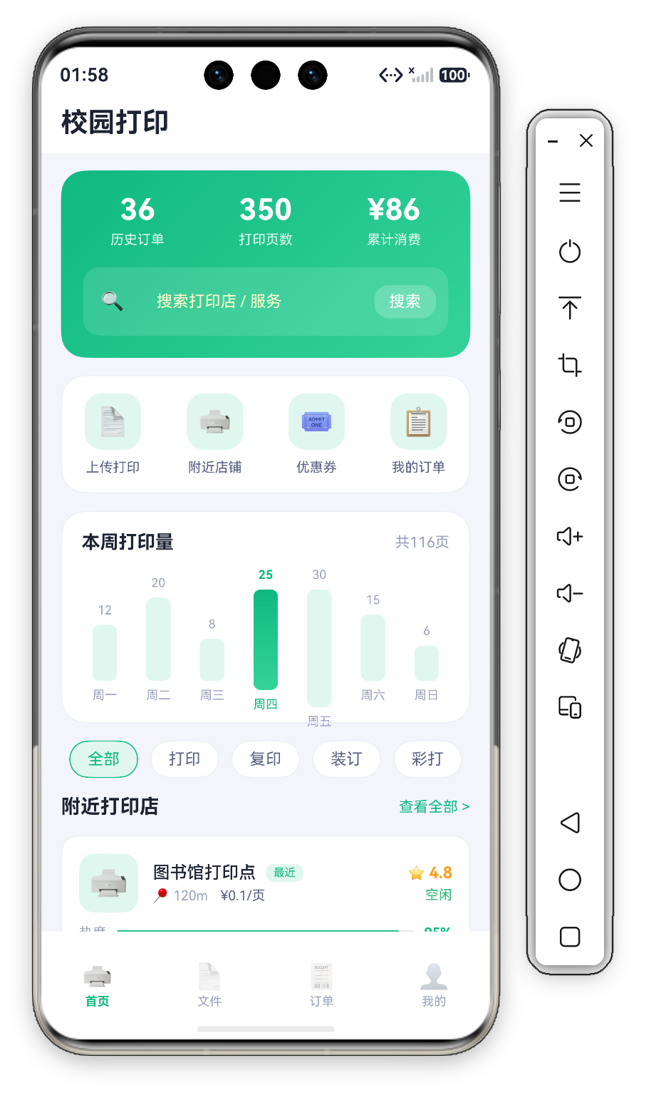
校园打印(Campus Print)是本系列中 首个以「服务工具」为定位的应用——它模拟了高校校园内常见的自助打印服务平台,首页承担着 "数据总览 + 服务入口 + 商家发现" 三重职责。页面采用经典的 "Hero Card → 快捷操作 → 数据图表 → 筛选标签 → 商家列表 → 排行榜" 自上而下的信息架构。
首页最显著的特征是 业务数据的强呈现:HeroCard 展示 历史订单数、打印页数、累计消费 三维真实业务数据,让首页从"导航跳板"升级为 "数据驾驶舱"。
1.1 沉浸式全屏实现
build() {
  Column() {
    this.Header()
    Scroll() {
      Column({ space: 14 }) {
        this.HeroCard()
        this.QuickActionRow()
        this.WeekChart()
        this.ChipRow()
        this.SectionTitle('附近打印店', '查看全部')
        this.ShopList()
        this.SectionTitle('人气排行', '更多')
        this.RankCard()
      }
      .width('100%')
      .padding({ left: D.pad, right: D.pad, top: 14, bottom: D.pad + this.safeBottom + 20 })
    }
    .layoutWeight(1).scrollBar(BarState.Off).align(Alignment.Top)
  }
  .width('100%').height('100%').backgroundColor(C.bg)
}

@Builder
Header() {
  Column() {
    Text('校园打印')
      .fontSize(22).fontWeight(FontWeight.Bold).fontColor(C.text)
      .width('100%')
      .padding({ top: this.safeTop + 10, left: D.pad, right: D.pad, bottom: 12 })
  }
  .width('100%').backgroundColor(C.card)
}
页面底色为 C.bg(#F2F5FB 浅灰蓝),比纯白更有层次感,同时保持足够亮度确保文字可读性。安全区通过 @StorageProp('safeTop') 从 AppStorage 单向读取——EntryAbility 启动时通过 getWindowAvoidArea() 计算实际数值并写入 AppStorage,Header 的 padding({ top: this.safeTop + 10 }) 据此动态下移标题,滚动区底部的 padding 同样叠加了 safeBottom。


二、HeroCard —— 绿色渐变统计卡片
HeroCard 是首页视觉焦点——一个两段式翠绿线性渐变背景卡片:
@Builder
HeroCard() {
  Column({ space: 16 }) {
    Row({ space: 16 }) {
      ForEach(this.stats, (s: StatItem) => {
        Column({ space: 4 }) {
          Text(s.value).fontSize(24).fontWeight(FontWeight.Bold).fontColor('#FFFFFF')
          Text(s.label).fontSize(11).fontColor('#FFFFFF').opacity(0.85)
        }
        .layoutWeight(1)
      }, (s: StatItem) => s.label)
    }
    .width('100%')

    Row({ space: 10 }) {
      Text('🔍').fontSize(16)
      TextInput({ placeholder: '搜索打印店 / 服务' })
        .fontSize(13).fontColor('#FFFFFF').layoutWeight(1)
        .backgroundColor('transparent')
        .placeholderColor('#FFFFFFCC')
        .placeholderFont({ size: 13 })
        .onChange((v: string) => { this.searchText = v; })
      Text('搜索').fontSize(13).fontColor('#FFFFFF')
        .padding({ left: 12, right: 12, top: 6, bottom: 6 })
        .backgroundColor('#33FFFFFF').borderRadius(12)
        .onClick(() => { promptAction.showToast({ message: '搜索: ' + this.searchText }); })
    }
    .width('100%')
    .padding({ left: 14, right: 10, top: 8, bottom: 8 })
    .backgroundColor('#22FFFFFF').borderRadius(D.rMd)
  }
  .width('100%')
  .padding(18)
  .borderRadius(D.rLg)
  .linearGradient({ angle: 135, colors: [[C.primary, 0.0], [C.accent, 1.0]] })
}
2.1 两段式渐变配置
angle: 135 表示左上→右下方向。颜色数组定义了 两段式过渡:主色 C.primary(#10B981,position 0.0)→ 强调色 C.accent(#34D399,position 1.0)。双色渐变干净利落,视觉重心稳定落在主色区域,是品牌卡片最常用的配置。
2.2 内嵌搜索栏的设计巧思
HeroCard 底部嵌入半透明白色搜索条(#22FFFFFF,即约 13% 不透明度的白色),这是 "功能前置" 设计模式——最常用的搜索功能就在视线焦点处。搜索图标是 emoji Text('🔍'),输入框为透明背景的 TextInput,占位符用 80% 不透明度白色(#FFFFFFCC)与输入正文区分。右侧"搜索"按钮用 #33FFFFFF(20% 白色) 胶囊背景(borderRadius(12)),与搜索条同色系但更深一档,既可点击又不与渐变主色竞争。
三、统计数字排版 —— ForEach 数据驱动
Row({ space: 16 }) {
  ForEach(this.stats, (s: StatItem) => {
    Column({ space: 4 }) {
      Text(s.value).fontSize(24).fontWeight(FontWeight.Bold).fontColor('#FFFFFF')
      Text(s.label).fontSize(11).fontColor('#FFFFFF').opacity(0.85)
    }
    .layoutWeight(1)
  }, (s: StatItem) => s.label)
}
.width('100%')
关键设计点:
layoutWeight(1)让三个统计项均分宽度- 字号对比 24 vs 11(约 2.2:1 比例)——数据仪表盘设计的黄金法则
- 颜色透明度差异 —— 数字纯白,标签
.opacity(0.85)半透明形成信息层级 - 数据驱动 —— 统计项来自
stats: StatItem[]数组(36 历史订单 / 350 打印页数 / ¥86 累计消费),ForEach的键值生成器用s.label保证项的唯一性
四、QuickActionRow —— 四宫格快捷入口
@Builder
QuickActionRow() {
  Row() {
    ForEach(this.quickActions, (a: QuickAction) => {
      Column({ space: 8 }) {
        Row() {
          Text(a.icon).fontSize(22)
        }
        .width(46).height(46)
        .backgroundColor(C.primarySoft).borderRadius(14)
        .justifyContent(FlexAlign.Center)
        Text(a.label).fontSize(11).fontColor(C.textSub)
      }
      .layoutWeight(1)
      .onClick(() => { promptAction.showToast({ message: a.label }); })
    }, (a: QuickAction) => a.id.toString())
  }
  .width('100%')
  .padding({ top: 14, bottom: 14 })
  .backgroundColor(C.card).borderRadius(D.rLg)
  .border({ width: 1, color: C.stroke })
}
四个入口(📄 上传打印 / 🖨️ 附近店铺 / 🎟️ 优惠券 / 📋 我的订单)均来自 quickActions: QuickAction[] 数组,图标是 emoji Text,统一放在 C.primarySoft(#E0F7EF)浅绿底、borderRadius(14) 的 46×46 圆角方块中。统一的浅绿图标底 + C.textSub 标签文字保持了视觉一致性,layoutWeight(1) 保证四项均分整行宽度,点击后弹出对应功能的 toast。
五、WeekChart —— 纯代码柱状图
这是最具技术含量的可视化组件——不依赖任何第三方图表库,仅用 ArkUI 基础组件实现完整柱状图:
@Builder
WeekChart() {
  Column({ space: 12 }) {
    Row() {
      Text('本周打印量').fontSize(15).fontWeight(FontWeight.Bold).fontColor(C.text)
      Blank()
      Text('共116页').fontSize(12).fontColor(C.textDim)
    }
    .width('100%')
    Row({ space: 6 }) {
      ForEach(this.weekData, (d: DayData, idx: number) => {
        Column({ space: 6 }) {
          Text(d.value.toString()).fontSize(10)
            .fontColor(this.selectedDay === idx ? C.primary : C.textDim)
            .fontWeight(this.selectedDay === idx ? FontWeight.Bold : FontWeight.Normal)
          Column() {
            Blank()
          }
          .width(20)
          .height(d.value * 2.8 + 12)
          .borderRadius(6)
          .linearGradient(this.selectedDay === idx
            ? { angle: 180, colors: [[C.primary, 0.0], [C.accent, 1.0]] }
            : { angle: 180, colors: [[C.primarySoft, 0.0], [C.primarySoft, 1.0]] })
          Text(d.day).fontSize(10)
            .fontColor(this.selectedDay === idx ? C.primary : C.textDim)
        }
        .layoutWeight(1)
        .onClick(() => { this.selectedDay = idx; })
      }, (d: DayData, idx: number) => d.day + idx)
    }
    .width('100%').height(110).alignItems(VerticalAlign.Bottom)
  }
  .width('100%')
  .padding(16)
  .backgroundColor(C.card).borderRadius(D.rLg)
  .border({ width: 1, color: C.stroke })
}
5.1 核心技术点
1. 底部对齐 alignItems(VerticalAlign.Bottom) —— 所有柱子基线(X 轴)在同一水平线。默认的 Start 对齐会让短柱子"悬浮"在上方。
2. 绝对值高度 height(d.value * 2.8 + 12) —— 将页数线性映射为像素高度:每页 2.8vp,再加 12vp 基础高度保证最小柱子也可见。最大值周五 30 页对应 96vp,最小值周日 6 页对应 28.8vp。
3. 选中高亮 selectedDay === idx —— 点击任意柱子将 selectedDay 更新为对应下标(初始值 3,即周四)。选中柱体使用主色→强调色纵向渐变,未选中柱体为 C.primarySoft 纯色,顶部数值与底部星期文字同步变绿加粗。
4. 四角圆角 .borderRadius(6) —— 柱体宽度固定 20vp,四角统一 6vp 圆角,配合 layoutWeight(1) 让七根柱子均分整行宽度。
六、ChipRow —— 横向滚动标签筛选器
@Builder
ChipRow() {
  Scroll() {
    Row({ space: 10 }) {
      ForEach(this.cats, (cat: string, idx: number) => {
        Text(cat)
          .fontSize(13)
          .fontColor(this.activeCat === idx ? C.primary : C.textSub)
          .padding({ left: 14, right: 14, top: 7, bottom: 7 })
          .backgroundColor(this.activeCat === idx ? C.primarySoft : C.card)
          .borderRadius(16)
          .border({ width: 1, color: this.activeCat === idx ? C.primary : C.stroke })
          .onClick(() => { this.activeCat = idx; })
      }, (cat: string) => cat)
    }
  }
  .scrollable(ScrollDirection.Horizontal).scrollBar(BarState.Off).width('100%')
}
外层 Scroll 设置 scrollable(ScrollDirection.Horizontal) 并通过 scrollBar(BarState.Off) 隐藏滚动条,标签超出屏幕宽度时可横向滑动,适合数量不固定的筛选标签场景。选中态使用 "浅绿底 + 绿字 + 绿边框"(C.primarySoft + C.primary),未选中为白底灰字灰边框,比单纯改变边框或下划线更明确。
七、ShopList —— 商家列表多维度展示
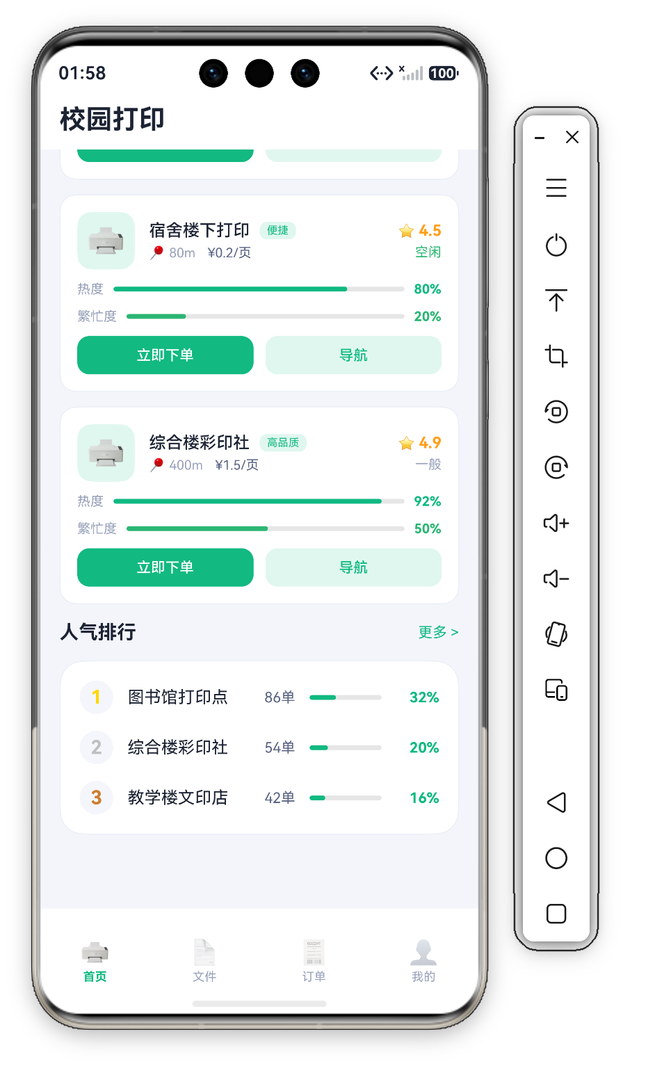
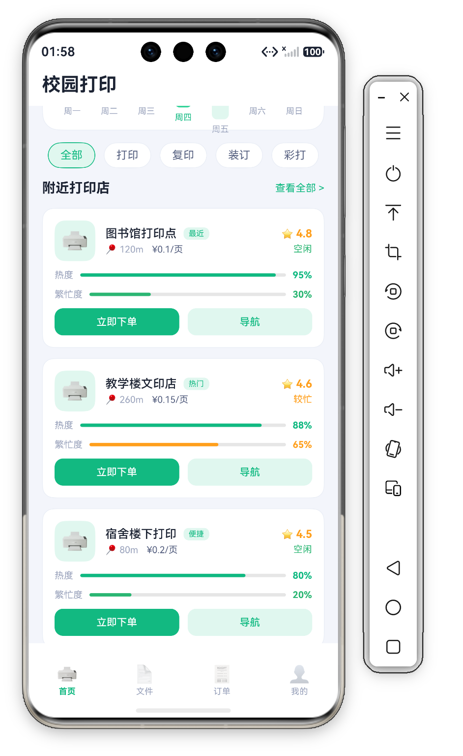
每个 Shop 接口包含 9 个字段(id、name、dist、price、rating、busy、tag、heat、progress),卡片分为四层布局:
- 头部:🖨️ 图标 + 店名与类型标签、距离与价格 + 评分与繁忙状态
- 热度行:热度 Progress 进度条
- 繁忙度行:繁忙度 Progress 进度条
- 底部:双按钮(立即下单 + 导航)
7.1 双进度条语义设计
| 进度条 | 颜色 | 含义 |
|---|---|---|
| 热度 | 绿色 C.primary(#10B981) | 受欢迎程度 |
| 繁忙度 | progress > 60 时橙色 C.warn,否则绿色 C.ok | 当前排队/负载 |
两个维度共同帮助用户做出 "选近的还是选快的" 决策。
7.2 Progress 系统组件
Row({ space: 8 }) {
  Text('热度').fontSize(11).fontColor(C.textDim)
  Progress({ value: s.heat, total: 100 })
    .color(C.primary).layoutWeight(1).height(6)
  Text(s.heat + '%').fontSize(11).fontColor(C.primary).fontWeight(FontWeight.Bold)
}
.width('100%')

Row({ space: 8 }) {
  Text('繁忙度').fontSize(11).fontColor(C.textDim)
  Progress({ value: s.progress, total: 100 })
    .color(s.progress > 60 ? C.warn : C.ok).layoutWeight(1).height(6)
  Text(s.progress + '%').fontSize(11)
    .fontColor(s.progress > 60 ? C.warn : C.ok).fontWeight(FontWeight.Bold)
}
.width('100%')
这里没有手绘进度条,而是直接使用系统 Progress 组件:Progress({ value, total: 100 }) 传入当前值与总量,.color() 控制填充色,.layoutWeight(1) 让轨道弹性占满剩余宽度,.height(6) 压扁成细条。每行固定"标签 + 弹性轨道 + 百分比"三段式结构,繁忙度超过 60% 时轨道与数值同步切换为警示橙色。
八、RankCard —— 人气排行榜
Row({ space: 12 }) {
  Text(r.rank.toString())
    .fontSize(16).fontWeight(FontWeight.Bold)
    .fontColor(r.rank === 1 ? '#FFD700' : (r.rank === 2 ? '#C0C0C0' : '#CD7F32'))
    .width(28).height(28).textAlign(TextAlign.Center)
    .backgroundColor(C.cardSoft).borderRadius(14)
  Text(r.name).fontSize(14).fontColor(C.text).layoutWeight(1)
  Text(r.count + '单').fontSize(12).fontColor(C.textSub)
  Progress({ value: r.pct, total: 100 })
    .color(C.primary).width(60).height(6)
  Text(r.pct + '%').fontSize(12).fontColor(C.primary).fontWeight(FontWeight.Bold)
    .width(36).textAlign(TextAlign.RIGHT)
}
.width('100%')
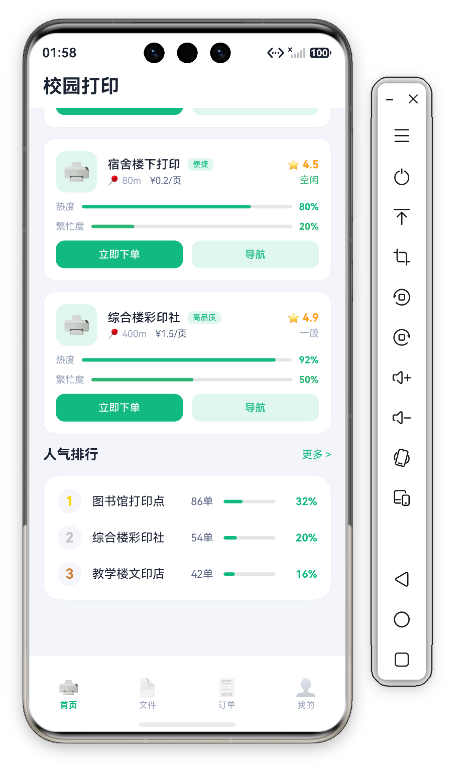
排名数字使用 奖牌配色:第 1 名金色 #FFD700、第 2 名银色 #C0C0C0、第 3 名铜色 #CD7F32,均为 fontColor 文字着色,统一放在 C.cardSoft 底、borderRadius(14) 的 28×28 圆形底座上。每行右侧有内联进度条——系统 Progress 组件(.width(60).height(6)),值取自数据字段 r.pct(32% / 20% / 16%),实现 "表格 + 图表混合" 展示。
九、Scroll 与 @StorageProp 性能优化
主内容区已经包裹在 Scroll 中:.layoutWeight(1).scrollBar(BarState.Off).align(Alignment.Top)——layoutWeight(1) 让滚动区占满 Header 以下的全部剩余空间,align(Alignment.Top) 保证内容从顶部开始排列,scrollBar(BarState.Off) 隐藏滚动条保持界面干净。首页通过 @StorageProp('safeTop') 读取安全区数值——单向只读绑定,确保安全区数值的单一数据源(只在 EntryAbility 中写入),只有当 AppStorage 中对应 key 的值真正变化时才触发重新渲染。
总结
| 组件 | 技术要点 | 复杂度 |
|---|---|---|
| HeroCard | 两段式渐变 + TextInput 内嵌搜索栏 | ⭐⭐⭐ |
| WeekChart | 纯 ArkUI 柱状图(无第三方库) | ⭐⭐⭐⭐ |
| ChipRow | Scroll 横向滚动标签 + 浅绿选中态 | ⭐⭐⭐ |
| ShopList | 9 字段信息 + 双 Progress 进度条 + 双按钮 | ⭐⭐⭐⭐ |
| RankCard | 前三名奖牌配色 + 内联 Progress 进度条 | ⭐⭐⭐ |
纯代码柱状图 和 多维度商家卡片 是最具学习价值的两个组件——前者展示如何在不引入重型依赖的情况下实现专业级数据可视化,后者演示如何在有限空间内有条理地呈现大量结构化信息。

作为“人工智能6S店”的官方数字引擎,为AI开发者与企业提供一个覆盖软硬件全栈、一站式门户。
更多推荐

 1
1 0
0- 0



 已为社区贡献213条内容

所有评论(0)