
HarmonyOS 校园应用系列之鸿蒙原生实战:用 ArkUI 搭会议室首页 —— 描边卡片与可点击柱状图
·
HarmonyOS 校园应用系列之鸿蒙原生实战:用 ArkUI 搭会议室首页 —— 描边卡片与可点击柱状图
一、页面定位与架构差异
会议室预约首页延续经典架构,三处差异:
- C/D 双类主题:颜色收归
C类,尺寸收归D类 - 边框卡片风格:卡片用
.border({ width: 1, color: C.stroke })描边 - 交互式柱状图:WeekChartCard 柱体点击切换渐变
build() {
  Column() {
    Scroll() {
      Column({ space: 14 }) {
        this.HeroCard()
        this.QuickActionRow()
        this.WeekChartCard()
        this.CategoryBar()
        this.ItemList()
        Blank().height(this.safeBottom + 20)
      }.width('100%').padding({ left: D.pad, right: D.pad })
    }.layoutWeight(1).scrollBar(BarState.Off).align(Alignment.Top)
  }.width('100%').height('100%').backgroundColor(C.bg)
}
全部内容用 Scroll 包裹,.scrollBar(BarState.Off) 隐藏滚动条。
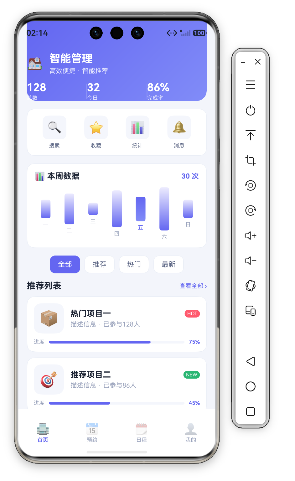

二、HeroCard —— 渐变头部 + 分隔线统计
@Builder HeroCard() {
  Column({ space: 12 }) {
    Row({ space: 12 }) {
      Text('🏠').fontSize(24)
      Column({ space: 4 }) {
        Text('智能管理').fontSize(20).fontWeight(FontWeight.Bold).fontColor('#FFFFFF')
        Text('高效便捷 · 智能推荐').fontSize(12).fontColor('rgba(255,255,255,0.85)')
      }.alignItems(HorizontalAlign.Start).layoutWeight(1)
    }.width('100%')

    Row() {
      ForEach(this.stats, (s: StatItem, idx: number) => {
        Column({ space: 2 }) {
          Text(s.value).fontSize(20).fontWeight(FontWeight.Bold).fontColor('#FFFFFF')
          Text(s.label).fontSize(10).fontColor('rgba(255,255,255,0.8)')
        }.alignItems(HorizontalAlign.Start).layoutWeight(1)
        if (idx < this.stats.length - 1) {
          Column().width(1).height(28).backgroundColor('rgba(255,255,255,0.25)')
        }
      }, (s: StatItem) => s.label)
    }.width('100%')
  }
  .width('100%').padding(18).padding({ top: this.safeTop + 20 })
  .borderRadius({ bottomLeft: D.rLg, bottomRight: D.rLg })
  .linearGradient({ angle: 135, colors: [[C.primary, 0.0], [C.accent, 1.0]] })
}
2.1 分隔线统计的视觉创新
通过 if (idx < length-1) 在相间插入 1vp 半透明白色分隔线:
Column().width(1).height(28).backgroundColor('rgba(255,255,255,0.25)')
这种 "内联分隔线" 让统计像刻度分区。
2.2 渐变配置
.linearGradient(...) 从靛蓝 #6366F1 过渡到浅靛蓝 #818CF8。
三、QuickActionRow —— Emoji 图标四宫格
@Builder QuickActionRow() {
  Row() {
    ForEach(this.actions, (item: QuickAction) => {
      Column({ space: 6 }) {
        Row() { Text(item.icon).fontSize(22) }
          .width(44).height(44).backgroundColor(C.cardSoft)
          .borderRadius(D.rSm).justifyContent(FlexAlign.Center)
        Text(item.title).fontSize(10).fontColor(C.textSub)
      }.layoutWeight(1).onClick(() => promptAction.showToast({ message: item.title }))
    }, (item: QuickAction) => item.title)
  }
  .width('100%').padding(12).backgroundColor(C.card).borderRadius(D.rMd)
  .border({ width: 1, color: C.stroke }).justifyContent(FlexAlign.SpaceAround)
}
3.1 Emoji vs Image 资源
本应用用 Emoji 字符 作图标:零资源依赖,代价是无法控制 fillColor。
3.2 边框卡片风格
.border() 加 1vp 细描边,存在但不突兀。
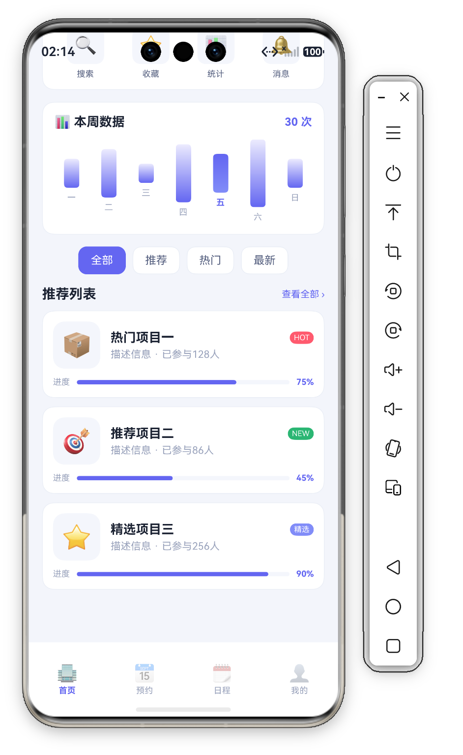
四、WeekChartCard —— 可交互式渐变柱状图
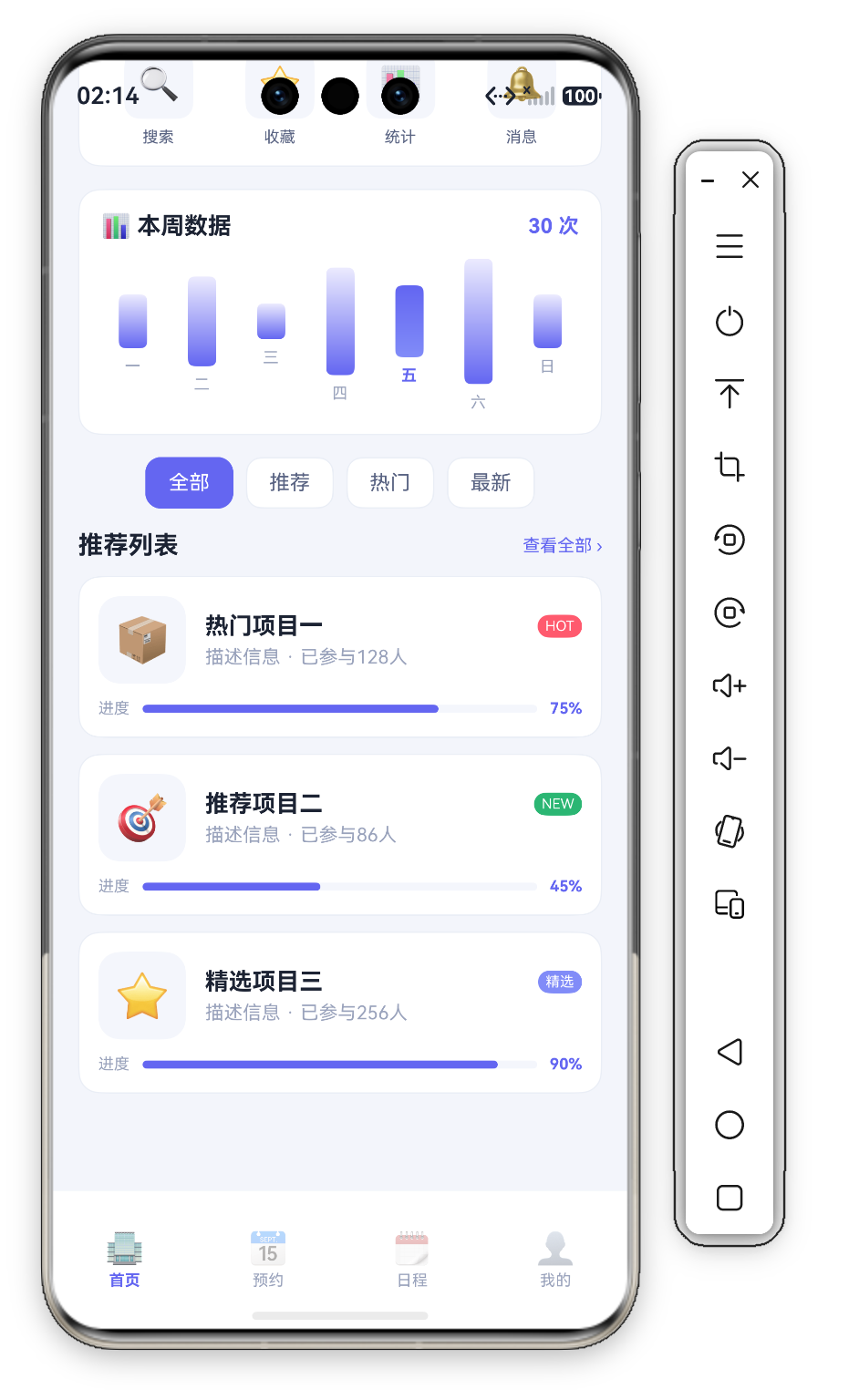
这是本页技术含量最高的组件——柱体点击选中后切换渐变:
@Builder WeekChartCard() {
  Column({ space: 12 }) {
    Row() {
      Text('📊 本周数据').fontSize(15).fontWeight(FontWeight.Bold).fontColor(C.text)
      Blank()
      Text('30 次').fontSize(13).fontWeight(FontWeight.Bold).fontColor(C.primary)
    }.width('100%')

    Row({ space: 4 }) {
      ForEach(this.weekBars, (b: WeekBar, idx: number) => {
        Column({ space: 6 }) {
          Column()
            .width(18).height(Math.max(6, b.value / 7 * 80))
            .borderRadius(4)
            .linearGradient({ angle: 180, colors: idx === this.selectedBar
              ? [[C.primary, 0.0], [C.accent, 1.0]]
              : [[C.primarySoft, 0.0], [C.primary, 1.0]] })
          Text(b.day).fontSize(10)
            .fontColor(idx === this.selectedBar ? C.primary : C.textDim)
            .fontWeight(idx === this.selectedBar ? FontWeight.Bold : FontWeight.Normal)
        }.layoutWeight(1).alignItems(HorizontalAlign.Center)
        .onClick(() => { this.selectedBar = idx; })
      }, (b: WeekBar) => b.day)
    }.width('100%')
  }
  .width('100%').padding(14).backgroundColor(C.card).borderRadius(D.rMd)
  .border({ width: 1, color: C.stroke })
}
4.1 交互状态驱动的动态渐变
选中态由 selectedBar 决定:三元切换渐变与字色,默认选中索引 4(周五,值 4);本周峰值实为周六(值 7)。
4.2 高度计算公式
Math.max(6, b.value/7*80):原值(27)映射约 2380vp,下限 6vp 兜底。
五、CategoryBar —— 横向滚动分类标签
@Builder CategoryBar() {
  Scroll() {
    Row({ space: 8 }) {
      ForEach(this.cats, (cat: string, idx: number) => {
        Text(cat).fontSize(13)
          .fontColor(this.activeCat === idx ? '#FFFFFF' : C.textSub)
          .backgroundColor(this.activeCat === idx ? C.primary : C.card)
          .borderRadius(D.rSm)
          .border({ width: 1, color: this.activeCat === idx ? C.primary : C.stroke })
          .padding({ left: 14, right: 14, top: 8, bottom: 8 })
          .onClick(() => { this.activeCat = idx; })
      }, (cat: string) => cat)
    }
  }.scrollable(ScrollDirection.Horizontal).scrollBar(BarState.Off).width('100%')
}
外层 Scroll 水平滚动;选中态"反色+描边"双重标记。
六、ItemList —— 带进度条的项目卡片
// 进度条(Stack 实现)
Row() {
  Text('进度').fontSize(10).fontColor(C.textDim)
  Stack({ alignContent: Alignment.Start }) {
    Column().width('100%').height(5).backgroundColor(C.cardSoft).borderRadius(3)
    Column().width(`${item.progress}%`).height(5).borderRadius(3).backgroundColor(C.primary)
  }.layoutWeight(1).margin({ left: 8, right: 8 })
  Text(`${item.progress}%`).fontSize(10).fontColor(C.primary).fontWeight(FontWeight.Bold)
}.width('100%')
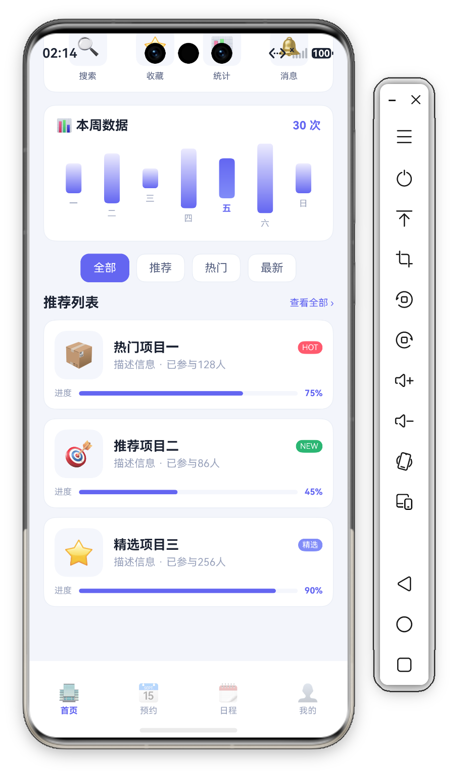
进度条用 Stack 实现——轨道+填充,自动对齐左边缘。
标签条件着色:item.tag === 'HOT' ? C.danger : item.tag === 'NEW' ? C.ok : C.accent(红/绿/紫对应热门/新上线/精选)。
七、D 类设计令牌体系
Theme.ets 用 D 类 集中管理尺寸令牌:
| 属性 | 值 | 用途 |
|---|---|---|
D.pad | 16vp | 页面水平内边距 |
D.rSm | 10vp | 小圆角 |
D.rMd | 14vp | 中圆角(卡片) |
D.rLg | 20vp | 大圆角(HeroCard) |
颜色/尺寸双类分离 是企业级标准,换肤与调密度互不干扰。
八、总结
| 组件 | 技术亮点 | 复杂度 |
|---|---|---|
| HeroCard | 内联分隔线统计 + 双色渐变 | ⭐⭐⭐ |
| QuickActionRow | Emoji 图标 + 边框卡片 | ⭐⭐ |
| WeekChartCard | 可交互式渐变柱状图 | ⭐⭐⭐⭐⭐ |
| CategoryBar | 水平 Scroll + 反色描边 | ⭐⭐⭐ |
| ItemList | Stack 进度条 + 条件标签 | ⭐⭐⭐⭐ |
可交互式柱状图 最具学习价值。

作为“人工智能6S店”的官方数字引擎,为AI开发者与企业提供一个覆盖软硬件全栈、一站式门户。
更多推荐


 0
0 0
0- 0



 已为社区贡献213条内容

所有评论(0)