
HarmonyOS 校园应用系列之鸿蒙原生实战:自习室我的页 —— 负 Margin 统计卡与成就墙组合技
HarmonyOS 校园应用系列之鸿蒙原生实战:自习室我的页 —— 负 Margin 统计卡与成就墙组合技
应用背景:09 自习室预约的个人中心页(ProfileTab.ets,225 行)是用户信息与成就体系的总览。本文聚焦 UserCard 渐变用户卡、StatRow 负 Margin 重叠、AchievementWall 成就徽章、MenuList 功能菜单 四大模块的实现细节。

一、整体架构
个人中心页采用 "渐变头部 → 统计重叠 → 图表 → 成就墙 → 菜单列表" 五段式布局:
Scroll (.scrollBar Off)
├── UserCard(渐变用户卡:头像/等级/经验 + 签到/报告按钮)
├── StatRow(四维统计,负 Margin 上移重叠)
├── WeekChartCard(本周使用趋势柱状图)
├── AchievementWall(成就徽章墙 4/6 解锁)
├── MenuList(功能菜单列表)
└── About(版本信息页脚)

二、UserCard —— 渐变用户卡
2.1 整体结构
Column({ space: 12 }) {
  Row({ space: 14 }) {
    // 头像 Stack(含等级角标)+ 用户信息列
  }.width('100%').padding({ left: D.pad, right: D.pad, top: this.safeTop + 30, bottom: 16 })

  Row() {
    // 每日签到按钮 + Blank + 数据报告按钮
  }.width('100%').padding({ left: D.pad, right: D.pad, bottom: 14 })
}
.width('100%').linearGradient({ angle: 135, colors: [[C.primary, 0.0], [C.accent, 1.0]] })
渐变直接设在外层 Column 上(非 Stack 分层),135 度从 C.primary 到 C.accent。顶部 padding safeTop + 30 适配状态栏。
2.2 头像与等级角标
Stack({ alignContent: Alignment.BottomEnd }) {
  Row() { Text('👤').fontSize(34) }
    .width(60).height(60).backgroundColor('rgba(255,255,255,0.35)').borderRadius(D.rLg).justifyContent(FlexAlign.Center)
    .border({ width: 2, color: 'rgba(255,255,255,0.7)' })
  Row() { Text('Lv.4').fontSize(9).fontColor('#FFFFFF').fontWeight(FontWeight.Bold) }
    .padding({ left: 5, right: 5, top: 1, bottom: 1 })
    .backgroundColor(C.warn).borderRadius(4).border({ width: 1.5, color: '#FFFFFF' })
}
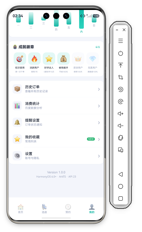
头像是 60vp Emoji 方块(半透明白底 + 2vp 白描边 + rLg 圆角),等级角标用 Stack({ alignContent: Alignment.BottomEnd }) 沉在右下角——C.warn 橙底白字 + 1.5vp 白描边,社交 App 常用的"等级角标"模式。
2.3 用户信息与经验进度条
Column({ space: 5 }) {
  Row({ space: 8 }) {
    Text('小明同学').fontSize(18).fontWeight(FontWeight.Bold).fontColor('#FFFFFF')
    Text('认证').fontSize(9).fontColor('#FFFFFF')
      .backgroundColor('rgba(255,255,255,0.3)').padding({ left: 5, right: 5, top: 1, bottom: 1 }).borderRadius(3)
  }
  Text('活跃用户 · 已使用 28 天').fontSize(11).fontColor('rgba(255,255,255,0.85)')
  Row({ space: 4 }) {
    Text('距 Lv.5 还需').fontSize(9).fontColor('rgba(255,255,255,0.7)')
    Text('120').fontSize(11).fontColor('#FFFFFF').fontWeight(FontWeight.Bold)
    Text('经验').fontSize(9).fontColor('rgba(255,255,255,0.7)')
  }
  Stack({ alignContent: Alignment.Start }) {
    Column().width('100%').height(4).backgroundColor('rgba(255,255,255,0.25)').borderRadius(2)
    Column().width('74%').height(4).backgroundColor('#FFFFFF').borderRadius(2)
  }.width(140)
}.alignItems(HorizontalAlign.Start).layoutWeight(1)
经验进度条为 Stack 双 Column:轨道 25% 白色透明,填充纯白硬编码 74% 宽。升级提示"距 Lv.5 还需 120 经验"三段小字组合。
2.4 签到与报告按钮
Row({ space: 5 }) {
  Text('🎁').fontSize(11)
  Text('每日签到').fontSize(11).fontColor('#FFFFFF')
}
.padding({ left: 12, right: 12, top: 6, bottom: 6 })
.backgroundColor('rgba(255,255,255,0.2)').borderRadius(D.rSm)
.onClick(() => { promptAction.showToast({ message: '签到成功 +5 经验' }); })
底部一行两个半透明胶囊按钮(每日签到🎁 / 数据报告📊),中间 Blank() 撑开,点击分别 Toast 提示。
三、StatRow —— 负 Margin 重叠统计卡
Row() {
  ForEach(this.stats, (s: StatItem, idx: number) => {
    Column({ space: 3 }) {
      Text(s.value).fontSize(18).fontWeight(FontWeight.Bold).fontColor(s.color)
      Text(s.label).fontSize(10).fontColor(C.textDim)
    }.layoutWeight(1)
    if (idx < this.stats.length - 1) { Divider().vertical(true).height(32).color(C.stroke) }
  }, (s: StatItem) => s.label)
}
.width('92%').height(76).backgroundColor(C.card).borderRadius(D.rMd)
.border({ width: 1, color: C.stroke })
.justifyContent(FlexAlign.SpaceAround).alignItems(VerticalAlign.Center).margin({ top: -28 })
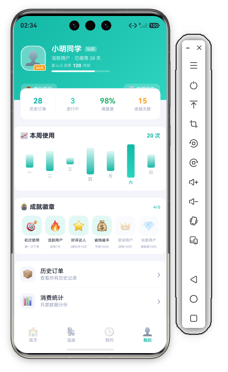
.margin({ top: -28 }) 让统计卡上移 28vp 形成 卡片重叠,白色卡片浮于渐变之上。宽度 92% 两侧留出呼吸空间,SpaceAround + VerticalAlign.Center 让四列均匀居中。
四维统计:
| 指标 | 值 | 颜色 |
|---|---|---|
| 历史订单 | 28 | C.primary |
| 进行中 | 3 | C.accent |
| 满意度 | 98% | C.ok |
| 连续天数 | 15 | C.warn |
四、WeekChartCard —— 使用趋势图
Row({ space: 4 }) {
  ForEach(this.weekBars, (b: WeekBar, idx: number) => {
    Column({ space: 6 }) {
      Column()
        .width(18)
        .height(Math.max(6, b.value / 5 * 80))
        .borderRadius(4)
        .linearGradient({
          angle: 180,
          colors: idx === 5 ? [[C.primary, 0.0], [C.accent, 1.0]] : [[C.primarySoft, 0.0], [C.primary, 1.0]]
        })
      Text(b.day).fontSize(10).fontColor(idx === 5 ? C.primary : C.textDim)
        .fontWeight(idx === 5 ? FontWeight.Bold : FontWeight.Normal)
    }.layoutWeight(1).alignItems(HorizontalAlign.Center)
  }, (b: WeekBar) => b.day)
}.width('100%')
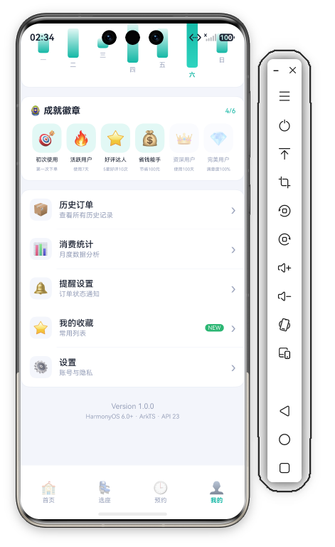
与首页差异:本页柱状图 无交互(无 onClick、无 @State selectedBar),固定高亮周六(idx===5)——柱体渐变与标签颜色直接用 idx === 5 三元判断。柱高 Math.max(6, b.value / 5 * 80) 按数据值换算(最小 6vp),数据为 一2/二3/三1/四4/五3/六5/日2。标题行 '📈 本周使用'(15 Bold)+ 右侧硬编码 '20 次'(13 Bold 主色)。
五、AchievementWall —— 成就徽章墙
5.1 标题行与解锁计数
Row() {
  Text('🏅 成就徽章').fontSize(15).fontWeight(FontWeight.Bold).fontColor(C.text)
  Blank()
  Text(`${this.achievements.filter(a => a.unlocked).length}/${this.achievements.length}`)
    .fontSize(11).fontColor(C.primary)
}.width('100%')
右侧计数用 filter(a => a.unlocked).length 实时统计解锁数——数据驱动,增删成就自动更新。
5.2 徽章行(Row + ForEach 等分)
Row() {
  ForEach(this.achievements, (item: Achievement) => {
    Column({ space: 6 }) {
      Row() { Text(item.icon).fontSize(24) }
        .width(48).height(48).borderRadius(D.rMd).justifyContent(FlexAlign.Center)
        .backgroundColor(item.unlocked ? C.primarySoft : C.cardSoft)
        .opacity(item.unlocked ? 1 : 0.4)
      Text(item.title).fontSize(9).fontColor(item.unlocked ? C.text : C.textDim)
      Text(item.desc).fontSize(7).fontColor(C.textDim).maxLines(1)
    }.layoutWeight(1)
  }, (item: Achievement) => item.title)
}.width('100%')
六个徽章用 Row + ForEach + layoutWeight(1) 一行六等分(非 Flex Wrap),无独立 Badge 组件。
锁定态双重区分:
- 图标底
.opacity(0.4)整体淡化(解锁用 primarySoft 浅青底,锁定用 cardSoft 灰底) - 标题颜色
C.textvsC.textDim
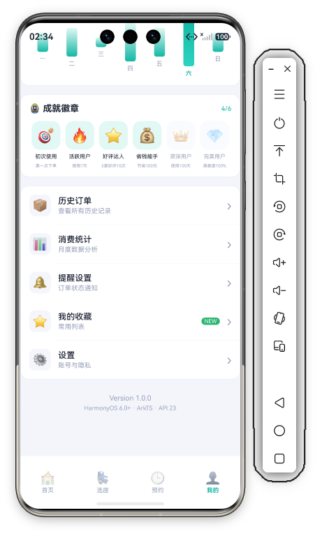
六枚成就:初次使用🎯 / 活跃用户🔥 / 好评达人⭐ / 省钱能手💰 / 资深用户👑 / 完美用户💎(4/6 已解锁)。
六、MenuList —— 功能菜单
6.1 菜单项结构(内联 ForEach)
Column() {
  ForEach(this.menus, (m: MenuItem, idx: number) => {
    Column() {
      Row({ space: 12 }) {
        Row() { Text(m.emoji).fontSize(20) }
          .width(36).height(36).backgroundColor(C.cardSoft).borderRadius(D.rSm).justifyContent(FlexAlign.Center)
        Column({ space: 2 }) {
          Text(m.title).fontSize(14).fontWeight(FontWeight.Medium).fontColor(C.text)
          Text(m.desc).fontSize(11).fontColor(C.textDim)
        }.alignItems(HorizontalAlign.Start).layoutWeight(1)
        if (m.badge.length > 0) {
          Text(m.badge).fontSize(9).fontColor('#FFFFFF')
            .backgroundColor(m.badge === 'NEW' ? C.ok : C.danger)
            .padding({ left: 5, right: 5, top: 1, bottom: 1 }).borderRadius(D.rSm)
        }
        Text('›').fontSize(22).fontColor(C.textDim)
      }
      .width('100%').padding(14)
      .onClick(() => { promptAction.showToast({ message: m.title }); })
      if (idx < this.menus.length - 1) { Divider().color(C.stroke).margin({ left: 58 }) }
    }
  }, (m: MenuItem) => m.title)
}
.width('100%').backgroundColor(C.card).borderRadius(D.rMd).border({ width: 1, color: C.stroke })
.margin({ top: 14, left: D.pad, right: D.pad }).clip(true)
菜单项不是独立组件,而是 ForEach 内联渲染:36vp Emoji 图标方块 + 标题/描述双行文字 + 可选角标 + › 箭头。点击统一 Toast 菜单标题。外层 Column .clip(true) 裁剪圆角,防止首尾行溢出。
6.2 NEW 角标
m.badge.length > 0 时显示角标——badge === 'NEW' 用 C.ok 绿底,其他值用 C.danger 红底,白字 9vp 小胶囊。五个菜单中仅"我的收藏⭐"带 NEW 角标。
6.3 分割线裁剪
if (idx < this.menus.length - 1) {
  Divider().color(C.stroke).margin({ left: 58 }) // 左侧留出图标+间距不画线
}
.margin({ left: 58 }) 让分割线从文字起始位置开始(14 padding + 36 图标 + 8 间距),避开图标区域——视觉更整洁。
七、About —— 版本信息页脚
@Builder
About() {
  Column({ space: 4 }) {
    Text('Version 1.0.0').fontSize(12).fontColor(C.textDim)
    Text('HarmonyOS 6.0+ · ArkTS · API 23').fontSize(10).fontColor(C.textDim)
  }
  .width('100%').padding({ top: 24, bottom: 10 }).alignItems(HorizontalAlign.Center)
}
页脚是两行居中的灰色小字(版本号 + 技术栈说明),非弹窗——AlertDialog 与 showAbout 状态在本页并不存在。
八、总结
个人中心页的技术要点:
- 渐变用户卡 + Stack 等级角标:linearGradient 直设外层 Column,BottomEnd 对齐角标
- 负 Margin(-28) 重叠统计卡:白色卡片浮于渐变之上,四色数值语义化
- Row 六等分成就墙:opacity + 背景色双重区分解锁/锁定,filter 实时计数
- MenuList 内联渲染 + NEW 角标:badge 字段驱动角标显隐与配色
- 分割线 margin 左缩进 + clip(true):避开图标区域的视觉裁剪

作为“人工智能6S店”的官方数字引擎,为AI开发者与企业提供一个覆盖软硬件全栈、一站式门户。
更多推荐



 0
0 0
0- 0



 已为社区贡献213条内容

所有评论(0)