
HarmonyOS 6.1 实战:bottomTabItem Builder是底部导航栏的通用项模板
引言
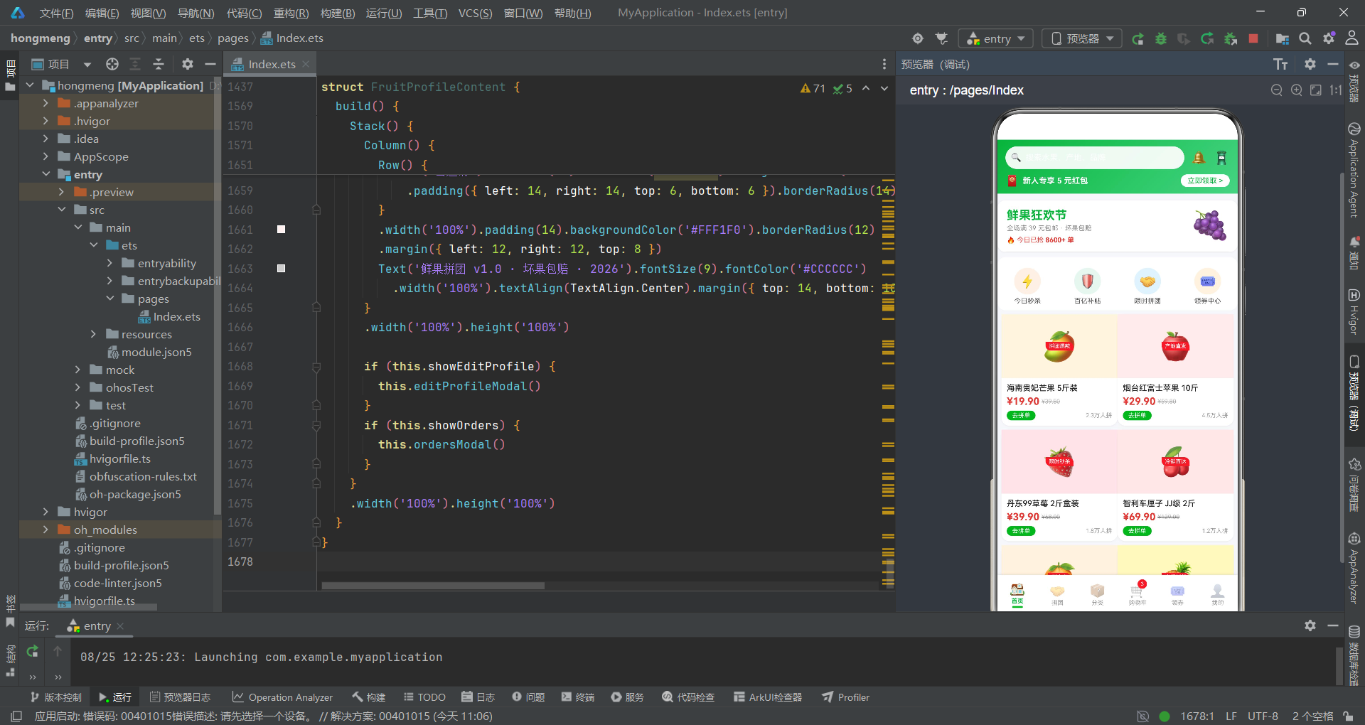
生鲜电商作为近年来增长最为迅猛的垂直赛道,其核心痛点在于如何在有限的移动端屏幕空间内高效展示海量商品信息,同时通过拼团、优惠券等社交化营销手段提升转化率。本文解析的鲜果拼团商城应用正是基于HarmonyOS ArkTS声明式UI框架构建的拼多多风格生鲜电商页面,采用绿色生态主题配色,集成了首页瀑布双列商品流、万人拼团进度追踪、分类左右分栏浏览、购物车结算管理、领券中心数据可视化和个人中心六大核心模块,完整覆盖了生鲜电商从浏览到下单的用户全旅程。
在技术架构层面,本应用采用了多组件分离架构,与单文件页面不同,它将六个功能模块拆分为六个独立的@Component结构体——HomeContent、GroupContent、CategoryContent、CartContent、CouponContent和FruitProfileContent,由入口组件FruitGroupApp通过@Builder contentArea()统一调度渲染。这种架构使得每个模块可以独立管理自己的@State状态变量和弹框逻辑,互不干扰。数据层通过@Observed装饰器定义了可观察的GoodsItem类,配合全局mock数据数组和工具函数实现了数据驱动的UI更新。设计令牌(Design Tokens)如GREEN_GRADIENT渐变配置、QUICK_NAVS快捷入口元数据、CATES分类配置和COUPONS优惠券模板均以常量形式集中声明,确保了视觉风格的一致性。
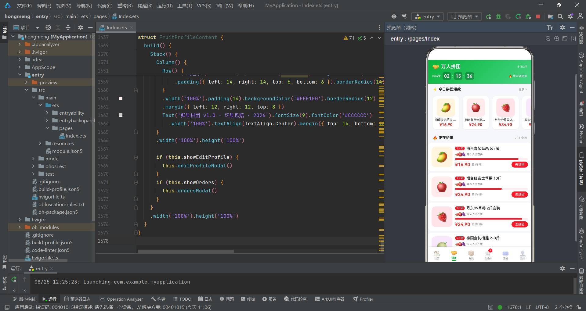
在业务设计层面,应用的每个模块都有独特的布局策略。首页采用瀑布流双列布局,通过两个layoutWeight(1)的Column分别承载奇偶索引商品卡片,模拟出不等高的瀑布流效果;拼团页以倒计时头部和横向爆款滚动区开场,核心是拼团进度卡和拼友列表的动态展示;分类页采用经典的左侧分类栏加右侧商品网格的左右分栏布局;购物车页集成了商品勾选、数量步进、地址管理和结算条四个功能区域;领券页以优惠券卡片列表配合本周领取热度柱状图和券类型占比进度条两种数据可视化组件;个人中心页则包含渐变头部、订单状态宫格、功能菜单和拼团邀请广告四个内容区块。六个模块共集成了十余个弹框,覆盖了商品详情、搜索提示、拼团详情、加入购物车、删除确认、地址管理、领券成功、编辑资料和拼团记录等交互场景。
类型定义与数据模型
接口与可观察类定义
应用首先定义了一组接口用于描述各种元数据结构,随后通过@Observed装饰器定义了可观察的商品数据类,这是ArkTS响应式数据体系的核心。
interface QuickNavMeta {
  label: string
  icon: string
  bg: string
}

interface CateMeta {
  label: string
  icon: string
  color: string
}

interface CouponMeta {
  label: string
  condition: string
  amount: string
  type: string
  color: string
  bg: string
  valid: string
}

interface AddressMeta {
  name: string
  phone: string
  region: string
  detail: string
  isDefault: boolean
}

interface GroupMemberMeta {
  name: string
  avatar: string
  time: string
}

@Observed
export class GoodsItem {
  id: number = 0
  name: string = ''
  tag: string = ''
  price: number = 0
  originalPrice: number = 0
  sales: number = 0
  icon: string = ''
  bg: string = ''
  category: string = ''
  rating: number = 0
  stock: number = 0
  qty: number = 1
  constructor(id: number, name: string, tag: string, price: number, originalPrice: number,
              sales: number, icon: string, bg: string, category: string, rating: number,
              stock: number, qty: number) {
    this.id = id
    this.name = name
    this.tag = tag
    this.price = price
    this.originalPrice = originalPrice
    this.sales = sales
    this.icon = icon
    this.bg = bg
    this.category = category
    this.rating = rating
    this.stock = stock
    this.qty = qty
  }
}
@Observed装饰器是ArkTS响应式系统的关键组成部分。被@Observed标注的GoodsItem类实例,其属性变更能够被框架自动追踪并触发依赖该属性的UI组件重新渲染。GoodsItem类包含了12个字段:id唯一标识、name商品名、tag营销标签、price拼团价、originalPrice原价、sales销量、icon emoji图标、bg背景色、category分类、rating评分、stock库存(在拼团场景中复用为还差成团人数)和qty购物车数量。构造函数接受全部12个参数进行初始化,确保每个商品实例的数据完整性。五个接口则分别描述了快捷入口、分类、优惠券、收货地址和拼团成员的元数据结构,这些接口仅用于类型约束,不涉及响应式追踪。
设计令牌与全局常量
应用将视觉设计规范抽象为设计令牌常量,包括渐变色配置、快捷入口数组、分类配置和优惠券模板,确保了全局视觉风格的一致性和可维护性。
const GREEN_GRADIENT: LinearGradientOptions = {
  angle: 135,
  colors: [['#07B53B', 0.0], ['#45D483', 1.0]]
}

const QUICK_NAVS: QuickNavMeta[] = [
  { label: '今日秒杀', icon: '⚡', bg: '#FFF1E6' },
  { label: '百亿补贴', icon: '🛡️', bg: '#E8F6EF' },
  { label: '限时拼团', icon: '🤝', bg: '#E3F2FD' },
  { label: '领券中心', icon: '🎟️', bg: '#FFF3E0' }
]

const CATES: CateMeta[] = [
  { label: '水果', icon: '🍎', color: '#E53935' },
  { label: '零食', icon: '🍪', color: '#FB8C00' },
  { label: '饮料', icon: '🥥', color: '#1E88E5' },
  { label: '海鲜', icon: '🦐', color: '#00897B' }
]

const COUPONS: CouponMeta[] = [
  { label: '全场满减券', condition: '满99元可用', amount: '¥20', type: '满减', color: '#E53935', bg: '#FFF1F0', valid: '2026.08.31 到期' },
  { label: '生鲜无门槛券', condition: '无门槛使用', amount: '¥5', type: '无门槛', color: '#07B53B', bg: '#E8F6EF', valid: '2026.08.30 到期' },
  { label: '新人折扣券', condition: '首单8折', amount: '8折', type: '折扣', color: '#FF9800', bg: '#FFF6E8', valid: '领取后7天' },
  { label: '拼团成功券', condition: '拼团成功返', amount: '¥10', type: '返券', color: '#7B1FA2', bg: '#F5E9FB', valid: '2026.09.15 到期' },
  { label: '水果专区券', condition: '满49元可用', amount: '¥8', type: '满减', color: '#1E88E5', bg: '#EAF4FE', valid: '2026.09.01 到期' },
  { label: '周末狂欢券', condition: '满199元可用', amount: '¥30', type: '满减', color: '#E91E63', bg: '#FDEAF1', valid: '仅周末可用' }
]
GREEN_GRADIENT是应用的核心渐变色定义,采用135度角的从深绿#07B53B到浅绿#45D483的线性渐变,贯穿了首页头部、拼团页头部、分类页子标题和个人中心头部等所有主要区域。QUICK_NAVS定义了首页的四个快捷入口,每个入口包含标签、emoji图标和背景色,背景色采用浅色系以配合白色卡片底色。CATES分类配置为每个分类分配了专属颜色——水果红色、零食橙色、饮料蓝色、海鲜青色,这些颜色在分类页左侧栏的选中态文字和右侧标题中复用。COUPONS优惠券模板包含六种不同类型的券,每种券都有独立的主题色和背景色,在领券页的卡片渲染中动态应用。
Mock数据与工具函数
应用预置了大量mock数据数组作为各页面的数据源,同时定义了一组工具函数处理价格格式化、销量格式化和分类数据路由等通用逻辑。
const mockFruits: GoodsItem[] = [
  new GoodsItem(1, '海南贵妃芒果 5斤装', '拼团爆款', 19.9, 39.8, 23000, '🥭', '#FFF4E0', '水果', 4.8, 3, 1),
  new GoodsItem(2, '烟台红富士苹果 10斤', '产地直发', 29.9, 59.8, 45000, '🍎', '#FFECEC', '水果', 4.9, 2, 1),
  new GoodsItem(3, '丹东99草莓 2斤盒装', '限时秒杀', 39.9, 68.0, 18000, '🍓', '#FFE4E8', '水果', 4.7, 5, 1),
  new GoodsItem(4, '智利车厘子 JJ级 2斤', '冷链直达', 69.9, 129.0, 12000, '🍒', '#FDE8E8', '水果', 4.9, 1, 1),
  new GoodsItem(5, '广西沃柑 8斤带箱', '甜度高', 24.9, 45.0, 67000, '🍊', '#FFF3E0', '水果', 4.8, 4, 1),
  new GoodsItem(6, '徐闻菠萝 3个装', '当季新货', 15.9, 29.0, 9800, '🍍', '#FFF9C4', '水果', 4.6, 2, 1),
  new GoodsItem(7, '泰国金枕榴莲 2-3斤', '进口好果', 89.9, 159.0, 8600, '🍈', '#F5E9FB', '水果', 4.5, 1, 1),
  new GoodsItem(8, '麒麟西瓜 1个约8斤', '沙瓤脆甜', 19.9, 35.0, 54000, '🍉', '#E8F6EF', '水果', 4.7, 3, 1)
]

const mockGroups: GoodsItem[] = [
  new GoodsItem(1, '海南贵妃芒果 5斤装', '2人团', 16.9, 39.8, 87, '🥭', '#FFF4E0', '水果', 4.8, 1, 1),
  new GoodsItem(2, '烟台红富士苹果 10斤', '3人团', 24.9, 59.8, 64, '🍎', '#FFECEC', '水果', 4.9, 2, 1),
  new GoodsItem(3, '丹东99草莓 2斤盒装', '2人团', 34.9, 68.0, 92, '🍓', '#FFE4E8', '水果', 4.7, 1, 1)
]

function fmtPrice(p: number): string {
  return '¥' + p.toFixed(2)
}

function fmtSales(s: number): string {
  if (s >= 10000) {
    return (s / 10000).toFixed(1) + '万'
  }
  return s.toString()
}

function getCateData(label: string): GoodsItem[] {
  if (label === '零食') { return mockSnacks }
  if (label === '饮料') { return mockDrinks }
  if (label === '海鲜') { return mockSeafood }
  return mockFruits
}
Mock数据的设计高度贴近真实电商场景。mockFruits包含12条水果商品数据,每条都包含拼团价、原价、销量、emoji图标和背景色等完整字段。mockGroups是拼团专用的6条数据,其tag字段值为"2人团""3人团"等拼团规格,sales字段值较小(87、64、92等)代表当前拼团参与人数。fmtPrice工具函数将数字格式化为带"¥"前缀和两位小数的字符串,fmtSales函数在销量超过1万时自动转换为"x.x万"的简写形式。getCateData函数作为分类数据路由器,根据分类标签返回对应的mock数据数组,实现了分类页右侧商品列表的动态切换。
入口组件与底部Tab导航
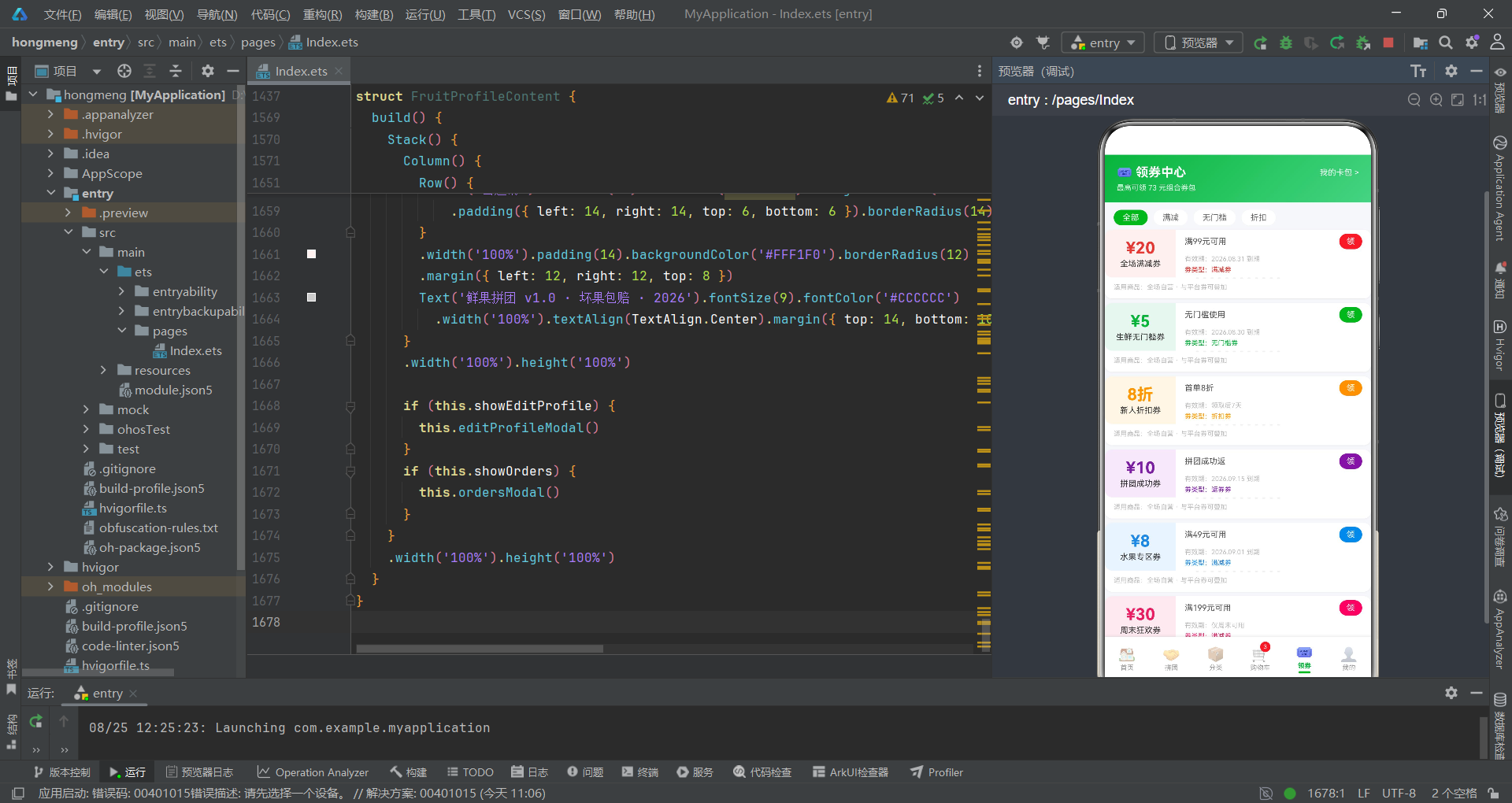
FruitGroupApp入口组件
入口组件FruitGroupApp通过@State activeTab管理当前激活的Tab页面,使用MainTab枚举确保Tab索引的类型安全性,并通过contentArea和bottomTabItem两个Builder完成内容区和底部导航栏的构建。
enum MainTab {
  HOME = 0,
  GROUP = 1,
  CATE = 2,
  CART = 3,
  COUPON = 4,
  PROFILE = 5
}

@Entry
@Component
struct FruitGroupApp {
  @State activeTab: MainTab = MainTab.HOME

  @Builder contentArea() {
    Column() {
      if (this.activeTab === MainTab.HOME) {
        HomeContent()
      } else if (this.activeTab === MainTab.GROUP) {
        GroupContent()
      } else if (this.activeTab === MainTab.CATE) {
        CategoryContent()
      } else if (this.activeTab === MainTab.CART) {
        CartContent()
      } else if (this.activeTab === MainTab.COUPON) {
        CouponContent()
      } else {
        FruitProfileContent()
      }
    }
    .layoutWeight(1)
  }

  @Builder bottomTabItem(icon: string, label: string, tab: MainTab, badge: string) {
    Column() {
      Stack() {
        Text(icon).fontSize(19).opacity(this.activeTab === tab ? 1.0 : 0.45)
        if (badge !== '') {
          Text(badge).fontSize(8).fontColor('#FFFFFF').backgroundColor('#E53935')
            .width(14).height(14).borderRadius(7).textAlign(TextAlign.Center)
            .position({ x: 15, y: -5 })
        }
      }
      .width(30).height(24)
      Text(label).fontSize(9)
        .fontColor(this.activeTab === tab ? '#07B53B' : '#999999')
        .fontWeight(this.activeTab === tab ? FontWeight.Bold : FontWeight.Normal)
        .margin({ top: 1 })
      if (this.activeTab === tab) {
        Column().width(16).height(3).backgroundColor('#07B53B').borderRadius(2).margin({ top: 2 })
      }
    }
    .layoutWeight(1)
    .alignItems(HorizontalAlign.Center)
    .padding({ top: 5, bottom: 4 })
    .onClick(() => { this.activeTab = tab })
  }
MainTab枚举的定义是入口组件类型安全设计的关键。通过枚举值而非裸数字索引,代码可读性大幅提升——MainTab.HOME比0更加语义化。contentArea Builder通过if-else if条件链根据activeTab的值渲染对应的子组件,每个子组件(如HomeContent())都是一个独立的@Component结构体。bottomTabItem Builder是底部导航栏的通用项模板,接受图标、标签、Tab枚举和角标四个参数。选中态通过三重视觉反馈表达:图标透明度从0.45提升到1.0、文字颜色从灰色变为绿色并加粗、底部出现16x3像素的绿色指示条。购物车Tab的角标"3"通过position({ x: 15, y: -5 })定位到图标右上角,红色圆形背景配合白色数字形成醒目的未读提示。
build函数与页面装配
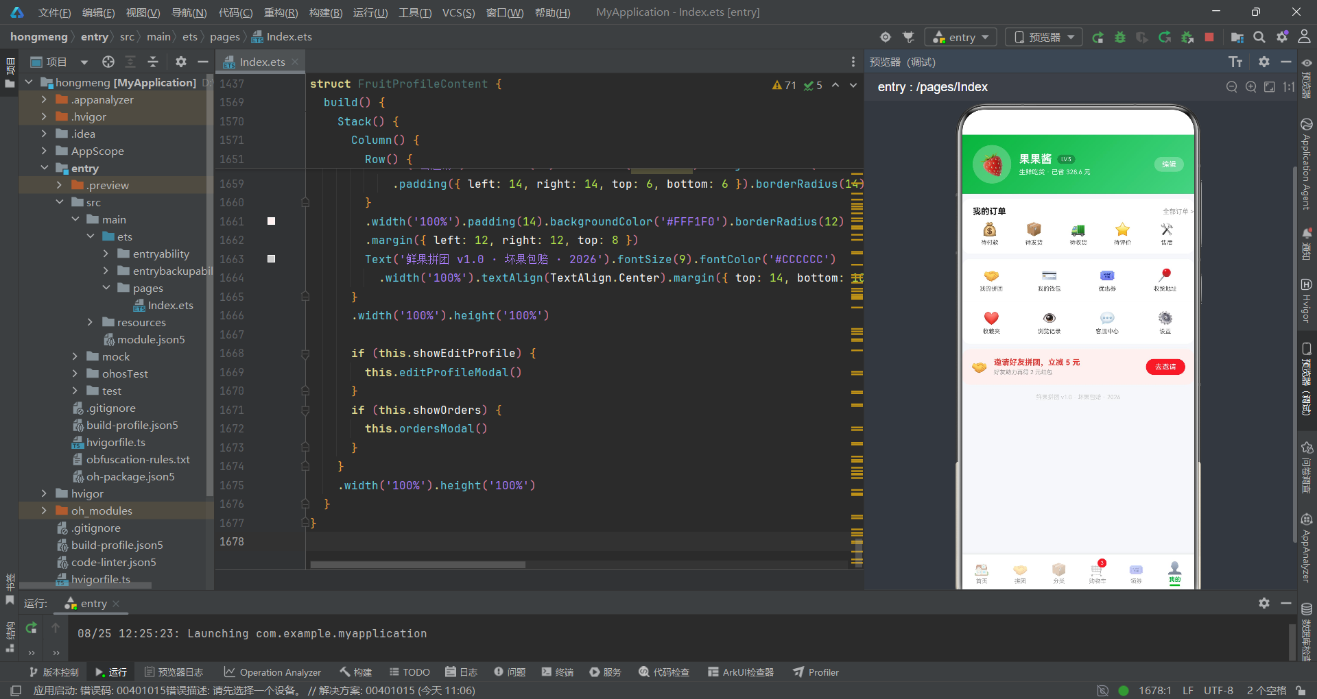
入口组件的build函数将内容区和底部导航栏垂直排列,底部栏通过ForEach调用bottomTabItem生成六个Tab项,整体使用灰色背景#F5F7FA和白色阴影底栏。
  build() {
    Column() {
      this.contentArea()
      Row() {
        this.bottomTabItem('🏠', '首页', MainTab.HOME, '')
        this.bottomTabItem('🤝', '拼团', MainTab.GROUP, '')
        this.bottomTabItem('📦', '分类', MainTab.CATE, '')
        this.bottomTabItem('🛒', '购物车', MainTab.CART, '3')
        this.bottomTabItem('🎟️', '领券', MainTab.COUPON, '')
        this.bottomTabItem('👤', '我的', MainTab.PROFILE, '')
      }
      .width('100%')
      .backgroundColor('#FFFFFF')
      .padding({ top: 4, bottom: 6 })
      .shadow({ radius: 8, color: '#1A000000', offsetY: -2 })
    }
    .width('100%').height('100%')
    .backgroundColor('#F5F7FA')
  }
}
页面装配的层次结构清晰明了。最外层Column铺满全屏并设置浅灰背景色#F5F7FA,内容区通过layoutWeight(1)占据除底部导航栏外的所有空间。底部导航栏使用白色背景配合向上的阴影shadow({ radius: 8, color: '#1A000000', offsetY: -2 }),营造浮于内容之上的层次感。六个Tab项直接在Row中依次调用bottomTabItem Builder,其中购物车项传入了角标参数’3’表示当前有3件商品待结算。这种装配方式简洁直接,避免了过度封装,使得Tab配置一目了然。
首页:瀑布双列与商品详情弹框
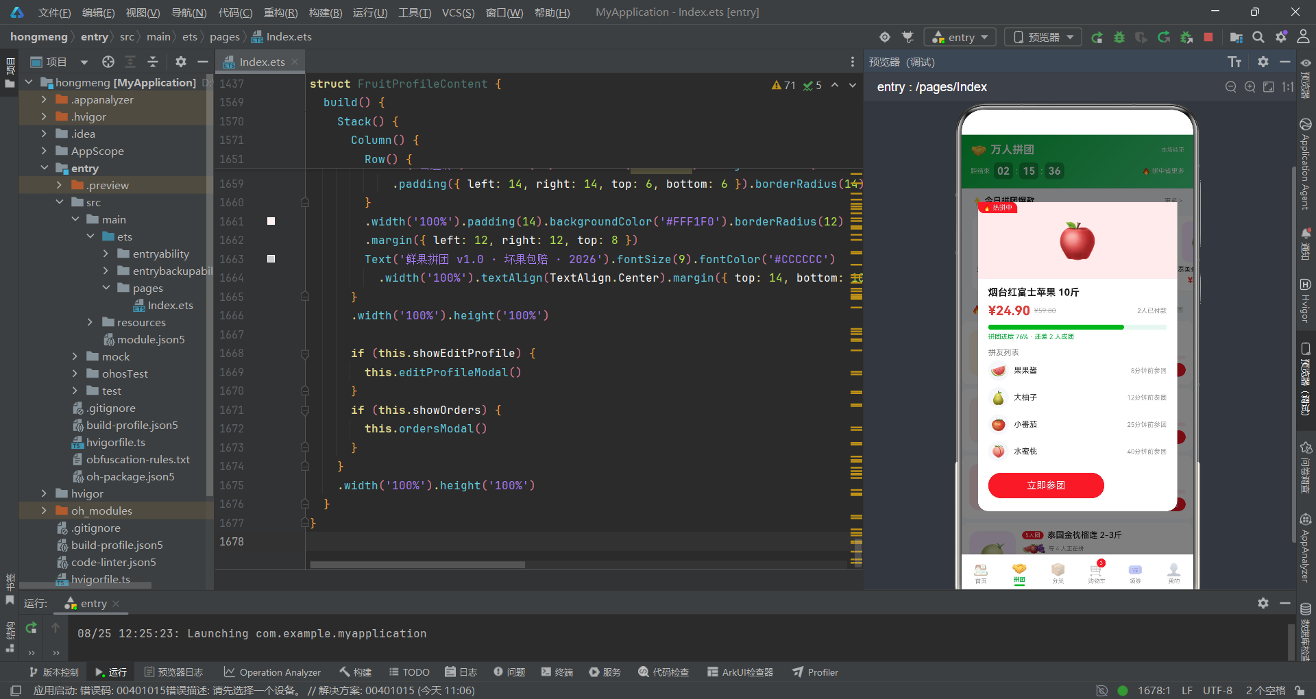
绿色电商头部与活动横幅
首页的头部采用绿色渐变背景,集成了搜索栏、消息图标、红包横幅和活动横幅四个功能区域,通过linearGradient实现了品牌色的统一应用。
@Component
struct HomeContent {
  @State showDetail: boolean = false
  @State showSearchTip: boolean = false
  @State selectedGoods: GoodsItem | null = null
  @State formQty: number = 1

  build() {
    Stack() {
      Column() {
        Column() {
          Row() {
            Row() {
              Text('🔍').fontSize(13).margin({ left: 8 })
              Text('搜索水果、产地、品牌').fontSize(12).fontColor('rgba(255,255,255,0.9)').margin({ left: 6 })
            }
            .layoutWeight(1).height(34).backgroundColor('rgba(255,255,255,0.92)').borderRadius(17)
            .onClick(() => { this.showSearchTip = true })
            Text('🔔').fontSize(19).margin({ left: 10 }).fontColor('#FFFFFF')
            Text('📮').fontSize(19).margin({ left: 10 }).fontColor('#FFFFFF')
          }
          .width('100%').padding({ left: 12, right: 12, top: 10, bottom: 8 })
          Row() {
            Text('🧧').fontSize(16)
            Text('新人专享 5 元红包').fontSize(12).fontWeight(FontWeight.Bold).fontColor('#FFFFFF').margin({ left: 6 })
            Column().layoutWeight(1)
            Text('立即领取 >').fontSize(11).fontColor('#07B53B').backgroundColor('#FFFFFF')
              .padding({ left: 10, right: 10, top: 3, bottom: 3 }).borderRadius(10)
          }
          .width('100%').padding({ left: 12, right: 12, bottom: 10 })
        }
        .width('100%').linearGradient(GREEN_GRADIENT)

        Row() {
          Column() {
            Text('鲜果狂欢节').fontSize(18).fontWeight(FontWeight.Bold).fontColor('#07B53B')
            Text('全场满 39 元包邮 · 坏果包赔').fontSize(10).fontColor('#8C8C8C').margin({ top: 3 })
            Row() {
              Text('🔥 今日已抢').fontSize(10).fontColor('#E53935').margin({ top: 6 })
              Text(' 8600+ 单').fontSize(10).fontWeight(FontWeight.Bold).fontColor('#E53935').margin({ top: 6 })
            }
          }
          .layoutWeight(1).alignItems(HorizontalAlign.Start)
          Text('🍇').fontSize(44)
        }
        .width('100%').margin({ left: 12, right: 12, top: 10 })
        .padding({ left: 14, right: 14, top: 12, bottom: 12 })
        .backgroundColor('#FFFFFF').borderRadius(12)
        .shadow({ radius: 6, color: '#0D000000', offsetY: 2 })
头部区域的核心技术是linearGradient(GREEN_GRADIENT)的应用,将预定义的135度绿色渐变直接绑定到Column的背景上。搜索栏采用半透明白色背景rgba(255,255,255,0.92)配合圆角17的胶囊造型,点击后触发showSearchTip状态变更弹出搜索提示弹框。红包横幅的"立即领取"按钮使用绿色文字白色背景的反色设计,与绿色渐变头部形成鲜明对比。活动横幅卡片使用白色背景、圆角12和向下偏移的阴影shadow({ radius: 6, color: '#0D000000', offsetY: 2 }),从灰色页面背景中浮起,左侧是活动标题和规则文案,右侧是大号emoji图标作为视觉点缀。
瀑布双列商品流
首页的商品展示采用瀑布双列布局,通过两个layoutWeight(1)的Column分别承载奇数索引和偶数索引的商品卡片,实现了模拟瀑布流的不等高排列效果。
        Scroll() {
          Column() {
            Row() {
              Column() {
                this.fruitCard(mockFruits[0])
                this.fruitCard(mockFruits[2])
                this.fruitCard(mockFruits[4])
                this.fruitCard(mockFruits[6])
                this.fruitCard(mockFruits[8])
                this.fruitCard(mockFruits[10])
              }
              .layoutWeight(1).alignItems(HorizontalAlign.Center)
              Column() {
                this.fruitCard(mockFruits[1])
                this.fruitCard(mockFruits[3])
                this.fruitCard(mockFruits[5])
                this.fruitCard(mockFruits[7])
                this.fruitCard(mockFruits[9])
                this.fruitCard(mockFruits[11])
              }
              .layoutWeight(1).alignItems(HorizontalAlign.Center)
            }
            .width('100%').alignItems(VerticalAlign.Top)
            .padding({ left: 6, right: 6, bottom: 16 })
          }
          .width('100%')
        }
        .layoutWeight(1).scrollBar(BarState.Off)
瀑布双列的实现原理是将12条商品数据按奇偶索引分配到两列。左列渲染索引0、2、4、6、8、10的商品,右列渲染索引1、3、5、7、9、11的商品。由于每个fruitCard的高度取决于商品名行数和标签数量,两列卡片的高度自然参差不齐,形成了瀑布流的视觉效果。外层Scroll组件配合scrollBar(BarState.Off)隐藏滚动条,使瀑布流区域看起来更加干净。这种手动分列的方式虽然不如真正的瀑布流算法智能,但在商品数量固定且已知的场景下完全够用,且实现简单直接。
商品卡片Builder
fruitCard是首页最核心的Builder,定义了单个商品卡片的完整布局——包括emoji图标区、营销标签、商品名、价格行和拼单按钮五个区域。
  @Builder fruitCard(g: GoodsItem) {
    Column() {
      Stack() {
        Column() {
          Text(g.icon).fontSize(42)
        }
        .width('100%').height(96)
        .backgroundColor(g.bg)
        .alignItems(HorizontalAlign.Center).justifyContent(FlexAlign.Center)
        if (g.tag !== '') {
          Text(g.tag).fontSize(8).fontColor('#FFFFFF').backgroundColor('#E53935')
            .padding({ left: 5, right: 5, top: 2, bottom: 2 })
            .borderRadius({ topRight: 8, bottomLeft: 8 })
        }
      }
      .width('100%').height(96)
      Column() {
        Text(g.name).fontSize(12).fontWeight(FontWeight.Medium).fontColor('#212121')
          .maxLines(1).textOverflow({ overflow: TextOverflow.Ellipsis }).width('100%')
        Row() {
          Text(fmtPrice(g.price)).fontSize(15).fontWeight(FontWeight.Bold).fontColor('#E53935')
          Text(fmtPrice(g.originalPrice)).fontSize(9).fontColor('#BBBBBB')
            .decoration({ type: TextDecorationType.LineThrough }).margin({ left: 3 })
          Column().layoutWeight(1)
        }
        .width('100%').margin({ top: 4 })
        Row() {
          Text('去拼单').fontSize(9).fontColor('#FFFFFF').backgroundColor('#07B53B')
            .padding({ left: 8, right: 8, top: 2, bottom: 2 }).borderRadius(9)
          Column().layoutWeight(1)
          Text(fmtSales(g.sales) + '人拼').fontSize(9).fontColor('#999999')
        }
        .width('100%').margin({ top: 5 })
      }
      .padding(8).alignItems(HorizontalAlign.Start)
    }
    .width('100%').backgroundColor('#FFFFFF').borderRadius(12)
    .margin({ left: 6, right: 6, top: 6 })
    .shadow({ radius: 6, color: '#0D000000', offsetY: 2 })
    .onClick(() => { this.selectedGoods = g; this.formQty = 1; this.showDetail = true })
  }
商品卡片的技术亮点在于营销标签的定位方式。Stack容器将emoji图标区与标签叠放,标签通过borderRadius({ topRight: 8, bottomLeft: 8 })实现左上角直角、右下角圆角的不对称圆角,紧贴卡片左上角显示。价格行通过fmtPrice函数格式化为带两位小数的字符串,原价使用TextDecorationType.LineThrough添加删除线效果,与红色拼团价形成对比。"去拼单"绿色按钮和"x.x万人拼"灰色文字的左右分布通过Column().layoutWeight(1)占位实现。卡片整体的点击事件链式设置了三个状态变量:selectedGoods保存被点击商品、formQty重置数量为1、showDetail触发详情弹框显示。
首页商品详情弹框
详情弹框的居中卡片布局
商品详情弹框采用居中卡片样式,包含emoji图标区、商品信息、规格选择、数量步进和操作按钮五个区域,通过modalOverlay遮罩层实现模态覆盖。
  @Builder modalOverlay(onClose: () => void) {
    Column()
      .width('100%').height('100%')
      .backgroundColor('rgba(0,0,0,0.5)')
      .onClick(onClose)
  }

  @Builder detailModal() {
    Column() {
      this.modalOverlay(() => { this.showDetail = false })
      Column() {
        Stack() {
          Column() {
            Text(this.selectedGoods?.icon ?? '🍎').fontSize(64)
          }
          .width('100%').height(140)
          .backgroundColor(this.selectedGoods?.bg ?? '#FFF4E0')
          .alignItems(HorizontalAlign.Center).justifyContent(FlexAlign.Center)
          if (this.selectedGoods?.tag !== '') {
            Text(this.selectedGoods?.tag ?? '').fontSize(10).fontColor('#FFFFFF').backgroundColor('#E53935')
              .padding({ left: 8, right: 8, top: 3, bottom: 3 })
              .borderRadius({ topRight: 10, bottomLeft: 10 })
              .position({ x: 0, y: 0 })
          }
        }
        .width('100%').height(140)
        .borderRadius({ topLeft: 16, topRight: 16 })
        Column() {
          Text(this.selectedGoods?.name ?? '').fontSize(16).fontWeight(FontWeight.Bold).fontColor('#212121')
            .width('100%')
          Row() {
            Text(fmtPrice(this.selectedGoods?.price ?? 0)).fontSize(20).fontWeight(FontWeight.Bold).fontColor('#E53935')
            Text(fmtPrice(this.selectedGoods?.originalPrice ?? 0)).fontSize(11).fontColor('#BBBBBB')
              .decoration({ type: TextDecorationType.LineThrough }).margin({ left: 6 })
            Column().layoutWeight(1)
            Text('已拼' + fmtSales(this.selectedGoods?.sales ?? 0) + '件').fontSize(10).fontColor('#999999')
          }
          .width('100%').margin({ top: 6 })
          Text('规格').fontSize(12).fontColor('#888888').width('100%').margin({ top: 10 })
          Row() {
            Text('标准装').fontSize(11).fontColor('#FFFFFF').backgroundColor('#07B53B')
              .padding({ left: 12, right: 12, top: 5, bottom: 5 }).borderRadius(12)
            Text('礼盒装').fontSize(11).fontColor('#07B53B').backgroundColor('#E8F6EF')
              .padding({ left: 12, right: 12, top: 5, bottom: 5 }).borderRadius(12).margin({ left: 8 })
          }
          .width('100%').margin({ top: 6 })
modalOverlay是一个通用的遮罩Builder,接受onClose回调函数作为参数,通过半透明黑色背景rgba(0,0,0,0.5)覆盖全屏,点击遮罩区域即触发关闭回调。这种高阶Builder的设计使得所有弹框可以复用同一个遮罩逻辑,减少了代码重复。详情弹框的内容区域通过position({ x: '6%', y: '18%' })居中显示,宽度88%。图标区的背景色直接绑定到selectedGoods?.bg,使用了null合并运算符??提供默认值。规格选择采用两个Chip样式按钮——"标准装"为选中态(白字绿底),"礼盒装"为未选中态(绿字浅绿底),通过颜色对比直观表达当前选择。所有对selectedGoods属性的访问都通过??运算符提供默认值,确保在selectedGoods为null时不会崩溃。
数量步进器与操作按钮
详情弹框底部包含数量步进器和两个操作按钮,步进器通过减号和加号按钮控制formQty状态变量,操作按钮分别处理加入购物车和立即拼单两个转化路径。
          Row() {
            Text('数量').fontSize(12).fontColor('#888888')
            Column().layoutWeight(1)
            Text('−').fontSize(18).fontColor('#666666').width(28).height(28).borderRadius(14)
              .backgroundColor('#F5F5F5').textAlign(TextAlign.Center)
              .onClick(() => { this.formQty = Math.max(1, this.formQty - 1) })
            Text(this.formQty.toString()).fontSize(14).fontWeight(FontWeight.Bold).fontColor('#212121')
              .width(36).textAlign(TextAlign.Center)
            Text('+').fontSize(18).fontColor('#FFFFFF').width(28).height(28).borderRadius(14)
              .backgroundColor('#07B53B').textAlign(TextAlign.Center)
              .onClick(() => { this.formQty = this.formQty + 1 })
          }
          .width('100%').margin({ top: 12 })
          Row() {
            Text('加入购物车').fontSize(13).fontColor('#07B53B').backgroundColor('#E8F6EF')
              .borderRadius(18).padding({ left: 20, right: 20, top: 9, bottom: 9 })
              .onClick(() => { this.showDetail = false })
            Text('立即拼单').fontSize(13).fontColor('#FFFFFF').backgroundColor('#E53935')
              .borderRadius(18).padding({ left: 20, right: 20, top: 9, bottom: 9 })
              .margin({ left: 10 })
              .onClick(() => { this.showDetail = false })
          }
          .width('100%').justifyContent(FlexAlign.Center).margin({ top: 16 })
        }
        .padding({ left: 16, right: 16, top: 12, bottom: 16 })
        .alignItems(HorizontalAlign.Start)
      }
      .width('88%').backgroundColor('#FFFFFF').borderRadius(16)
      .alignItems(HorizontalAlign.Center)
      .position({ x: '6%', y: '18%' })
    }
    .width('100%').height('100%').position({ x: 0, y: 0 }).zIndex(999)
  }
数量步进器的减号按钮使用灰色背景#F5F5F5和灰色文字,加号按钮使用绿色背景#07B53B和白色文字,通过颜色对比引导用户使用加号增加数量。减号按钮的onClick回调使用Math.max(1, this.formQty - 1)确保数量不会低于1。两个操作按钮采用了差异化设计——"加入购物车"为浅绿底绿字的次要按钮,"立即拼单"为红色底白字的主要按钮,通过margin({ left: 10 })控制间距,justifyContent(FlexAlign.Center)使按钮组居中排列。弹框整体使用zIndex(999)确保层叠在所有内容之上。
拼团页:倒计时与进度追踪
渐变头部与倒计时
拼团页头部使用绿色渐变背景,展示了万人拼团的倒计时器,倒计时通过天、时、分三个独立的黑色背景数字块呈现。
@Component
struct GroupContent {
  @State showGroupModal: boolean = false
  @State selectedGroup: GoodsItem | null = null
  groupDays: string = '02'
  groupHours: string = '15'
  groupMins: string = '36'

  build() {
    Stack() {
      Column() {
        Column() {
          Row() {
            Text('🤝').fontSize(20)
            Text('万人拼团').fontSize(17).fontWeight(FontWeight.Bold).fontColor('#FFFFFF').margin({ left: 6 })
            Column().layoutWeight(1)
            Text('本场结束').fontSize(9).fontColor('rgba(255,255,255,0.85)')
          }
          .width('100%')
          Row() {
            Text('距结束').fontSize(10).fontColor('rgba(255,255,255,0.9)')
            Text(this.groupDays).fontSize(16).fontWeight(FontWeight.Bold).fontColor('#FFFFFF')
              .width(30).height(26).backgroundColor('rgba(0,0,0,0.25)').borderRadius(6).textAlign(TextAlign.Center).margin({ left: 6 })
            Text(':').fontSize(14).fontColor('#FFFFFF').margin({ left: 3 })
            Text(this.groupHours).fontSize(16).fontWeight(FontWeight.Bold).fontColor('#FFFFFF')
              .width(30).height(26).backgroundColor('rgba(0,0,0,0.25)').borderRadius(6).textAlign(TextAlign.Center).margin({ left: 3 })
            Text(':').fontSize(14).fontColor('#FFFFFF').margin({ left: 3 })
            Text(this.groupMins).fontSize(16).fontWeight(FontWeight.Bold).fontColor('#FFFFFF')
              .width(30).height(26).backgroundColor('rgba(0,0,0,0.25)').borderRadius(6).textAlign(TextAlign.Center).margin({ left: 3 })
            Column().layoutWeight(1)
            Text('🔥 拼中省更多').fontSize(10).fontColor('#FFFFFF')
          }
          .width('100%').margin({ top: 8 })
        }
        .width('100%').linearGradient(GREEN_GRADIENT).padding({ left: 14, right: 14, top: 12, bottom: 14 })
倒计时器的实现采用了三个独立的Text组件分别显示天、时、分,每个数字块使用30x26像素的尺寸、半透明黑色背景rgba(0,0,0,0.25)和6像素圆角,形成了类似电子时钟的数字方块效果。数字之间通过冒号":"分隔符隔开,整体通过Row的顺序排列形成完整的倒计时显示。需要注意的是,这里的倒计时值(‘02’、‘15’、‘36’)是静态字符串而非动态计算,实际应用中需要配合定时器定期更新这些值。头部右侧的"🔥 拼中省更多"文案通过Column().layoutWeight(1)推到右侧,与左侧倒计时形成对称布局。
拼团进度卡与拼友列表
拼团进度卡是拼团页的核心组件,通过进度条百分比和拼友列表直观展示拼团进度,点击卡片触发拼团详情弹框。
  @Builder groupCard(g: GoodsItem) {
    Row() {
      Column() {
        Text(g.icon).fontSize(34)
      }
      .width(72).height(72).backgroundColor(g.bg).borderRadius(14)
      .alignItems(HorizontalAlign.Center).justifyContent(FlexAlign.Center)
      Column() {
        Row() {
          Text(g.tag).fontSize(9).fontColor('#FFFFFF').backgroundColor('#E53935')
            .padding({ left: 5, right: 5, top: 1, bottom: 1 }).borderRadius(8)
          Text(g.name).fontSize(13).fontWeight(FontWeight.Medium).fontColor('#212121')
            .maxLines(1).textOverflow({ overflow: TextOverflow.Ellipsis }).layoutWeight(1).margin({ left: 6 })
        }
        .width('100%')
        Row() {
          Text('🍉').fontSize(14)
          Text('🍎').fontSize(14).margin({ left: -8 })
          Text('🍇').fontSize(14).margin({ left: -8 })
          Text('等 ' + (g.sales % 3 + 2).toString() + ' 人正在拼').fontSize(9).fontColor('#999999').margin({ left: 4 })
        }
        .width('100%').margin({ top: 5 })
        Row() {
          Column()
            .width((g.sales % 100).toFixed(0) + '%')
            .height(6).backgroundColor('#E53935').borderRadius(3)
          Column().layoutWeight(1)
        }
        .width('100%').height(6).backgroundColor('#FFEBEE').borderRadius(3).margin({ top: 5 })
        Row() {
          Text(fmtPrice(g.price)).fontSize(16).fontWeight(FontWeight.Bold).fontColor('#E53935')
          Text('已拼' + (g.sales % 100).toString() + '件').fontSize(9).fontColor('#999999').margin({ left: 6 })
          Column().layoutWeight(1)
          Text('去拼团').fontSize(11).fontColor('#FFFFFF').backgroundColor('#E53935')
            .padding({ left: 12, right: 12, top: 4, bottom: 4 }).borderRadius(12)
        }
        .width('100%').margin({ top: 6 })
      }
      .layoutWeight(1).alignItems(HorizontalAlign.Start).padding({ left: 10 })
    }
    .width('100%').padding(12).backgroundColor('#FFFFFF').borderRadius(12)
    .margin({ left: 12, right: 12, top: 6 })
    .onClick(() => { this.selectedGroup = g; this.showGroupModal = true })
  }
拼团进度卡的技术亮点在于进度百分比的计算方式。g.sales % 100将销量值取模100得到一个0-99的百分比数字,再通过.toFixed(0)转换为字符串拼接"%"作为进度条宽度。这种设计将sales字段复用为拼团进度数据,虽然不是精确的拼团人数,但在mock数据场景下足以模拟真实的进度效果。卡片中部的拼友头像行使用三个emoji图标叠加显示,通过margin({ left: -8 })的负边距实现头像重叠效果,配合"等 x 人正在拼"的文字描述。底部价格行同时展示了拼团价、已拼件数和"去拼团"红色按钮,三个元素通过layoutWeight(1)空Column实现左右分布。整个卡片的点击事件设置了selectedGroup和showGroupModal两个状态变量,触发拼团详情弹框。
拼团详情弹框
拼团详情弹框展示了完整的拼团信息,包括商品图标、价格、进度条、拼友列表和参团按钮,是拼团转化的最终确认环节。
  @Builder groupModal() {
    Column() {
      this.modalOverlay(() => { this.showGroupModal = false })
      Column() {
        Stack() {
          Column() {
            Text(this.selectedGroup?.icon ?? '🍎').fontSize(56)
          }
          .width('100%').height(120)
          .backgroundColor(this.selectedGroup?.bg ?? '#FFF4E0')
          .alignItems(HorizontalAlign.Center).justifyContent(FlexAlign.Center)
          Text('🔥 热拼中').fontSize(10).fontColor('#FFFFFF').backgroundColor('#E53935')
            .padding({ left: 8, right: 8, top: 3, bottom: 3 })
            .borderRadius({ topRight: 10, bottomLeft: 10 })
            .position({ x: 0, y: 0 })
        }
        .width('100%').height(120)
        .borderRadius({ topLeft: 16, topRight: 16 })
        Column() {
          Text(this.selectedGroup?.name ?? '').fontSize(15).fontWeight(FontWeight.Bold).fontColor('#212121')
            .width('100%')
          Row() {
            Text(fmtPrice(this.selectedGroup?.price ?? 0)).fontSize(20).fontWeight(FontWeight.Bold).fontColor('#E53935')
            Text(fmtPrice(this.selectedGroup?.originalPrice ?? 0)).fontSize(11).fontColor('#BBBBBB')
              .decoration({ type: TextDecorationType.LineThrough }).margin({ left: 6 })
            Column().layoutWeight(1)
            Text((this.selectedGroup?.stock ?? 0).toString() + '人已付款').fontSize(10).fontColor('#999999')
          }
          .width('100%').margin({ top: 8 })
          Row() {
            Column()
              .width(((100 - (this.selectedGroup?.stock ?? 1) * 12).toFixed(0)) + '%')
              .height(8).backgroundColor('#07B53B').borderRadius(4)
            Column().layoutWeight(1)
          }
          .width('100%').height(8).backgroundColor('#E8F6EF').borderRadius(4).margin({ top: 10 })
          Text('拼团进度 ' + (100 - (this.selectedGroup?.stock ?? 1) * 12).toFixed(0) + '% · 还差 ' + (this.selectedGroup?.stock ?? 1) + ' 人成团')
            .fontSize(10).fontColor('#07B53B').width('100%').margin({ top: 5 })
          Text('拼友列表').fontSize(12).fontColor('#888888').width('100%').margin({ top: 12 })
          ForEach([0, 1, 2, 3], (i: number) => {
            Row() {
              Text(getGroupMemberAvatar(i)).fontSize(20).width(32).height(32).borderRadius(16)
                .backgroundColor('#F5F7FA').textAlign(TextAlign.Center)
              Text(getGroupMemberName(i)).fontSize(12).fontColor('#333333').margin({ left: 8 })
              Column().layoutWeight(1)
              Text(getGroupMemberTime(i) + '参团').fontSize(10).fontColor('#999999')
            }
            .width('100%').padding({ top: 5, bottom: 5 })
          })
          Text('立即参团').fontSize(15).fontColor('#FFFFFF')
            .backgroundColor('#E53935').borderRadius(22)
            .padding({ left: 60, right: 60, top: 11, bottom: 11 })
            .margin({ top: 12, bottom: 4 })
            .onClick(() => { this.showGroupModal = false })
        }
        .padding({ left: 16, right: 16, top: 12, bottom: 16 })
        .alignItems(HorizontalAlign.Start)
      }
      .width('86%').backgroundColor('#FFFFFF').borderRadius(16)
      .alignItems(HorizontalAlign.Center)
      .position({ x: '7%', y: '16%' })
    }
    .width('100%').height('100%').position({ x: 0, y: 0 }).zIndex(999)
  }
拼团详情弹框的进度计算公式是100 - stock * 12,其中stock字段在拼团场景中被复用为"还差成团人数"(值为1-5),通过乘以12再被100减去,得到一个28%-88%的进度百分比范围。这种设计使得stock值越大(还差人数越多),进度百分比越低,符合拼团进度的语义逻辑。拼友列表通过ForEach([0, 1, 2, 3])渲染四行,每行调用getGroupMemberAvatar(i)、getGroupMemberName(i)和getGroupMemberTime(i)三个工具函数获取对应索引的拼友信息。参团按钮使用红色背景配合大圆角22和较宽的水平padding(60px),形成醒目的转化入口。
分类页:左右分栏布局
左侧分类栏与右侧商品网格
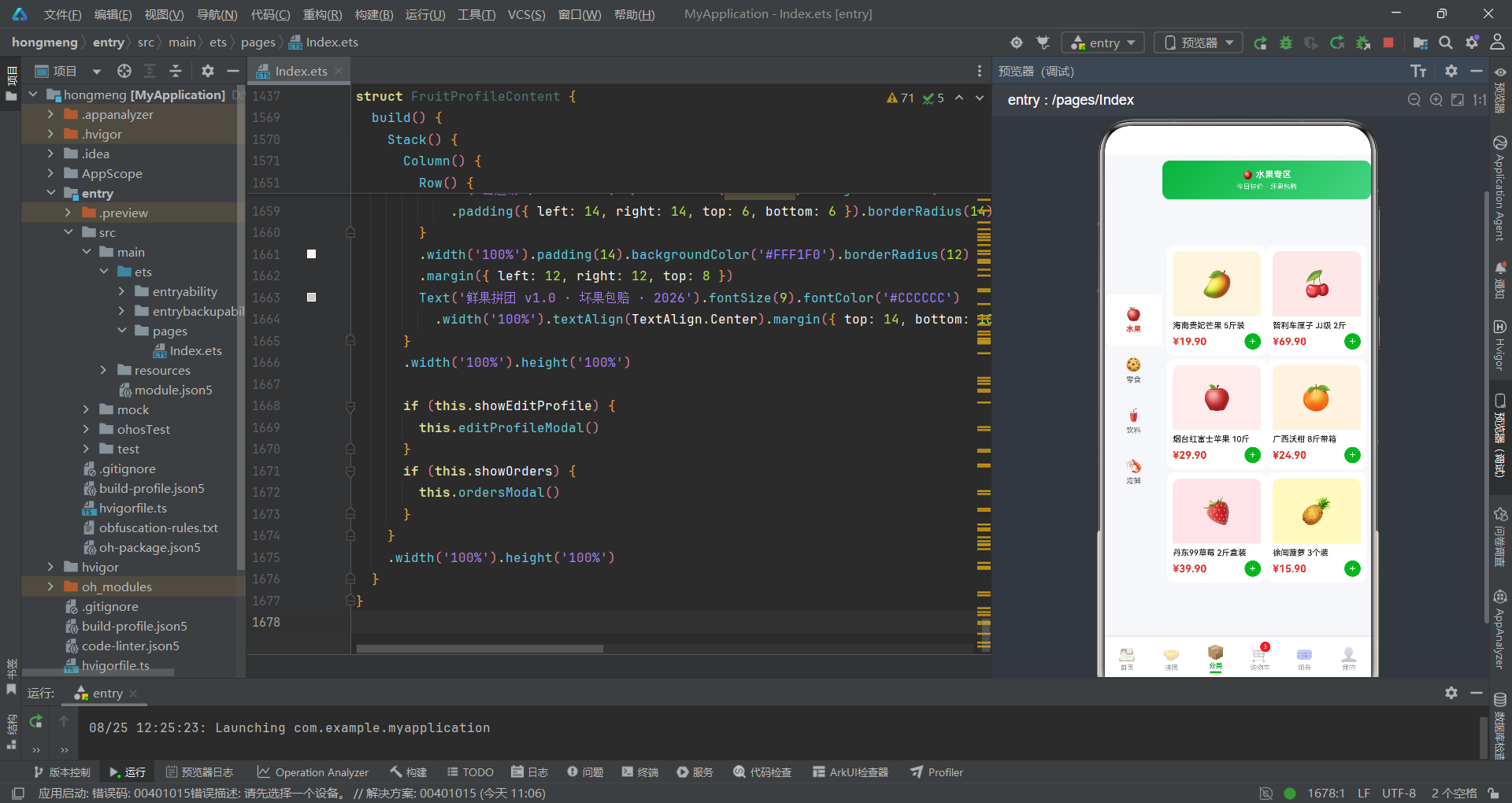
分类页采用经典的左侧分类栏加右侧商品网格的左右分栏布局,左侧栏宽度固定78像素,右侧区域通过layoutWeight(1)自适应剩余空间。
@Component
struct CategoryContent {
  @State selectedCate: string = '水果'
  @State rightProducts: GoodsItem[] = mockFruits
  @State showAddModal: boolean = false
  @State formQty: number = 1

  build() {
    Stack() {
      Row() {
        Scroll() {
          Column() {
            ForEach(CATES, (c: CateMeta) => {
              Column() {
                Text(c.icon).fontSize(18)
                Text(c.label).fontSize(10).margin({ top: 4 })
                  .fontColor(this.selectedCate === c.label ? c.color : '#666666')
                  .fontWeight(this.selectedCate === c.label ? FontWeight.Bold : FontWeight.Normal)
              }
              .width('100%').padding({ top: 16, bottom: 16 })
              .backgroundColor(this.selectedCate === c.label ? '#FFFFFF' : '#F5F7FA')
              .borderRadius({ topLeft: 8, bottomLeft: 8 })
              .onClick(() => {
                this.selectedCate = c.label
                this.rightProducts = getCateData(c.label)
              })
            })
          }
          .width('100%')
        }
        .scrollBar(BarState.Off).width(78).backgroundColor('#F5F7FA')

        Column() {
          Column() {
            Text(CATES[0].icon + ' ' + this.selectedCate + '专区').fontSize(12)
              .fontColor('#FFFFFF').fontWeight(FontWeight.Bold)
            Text('今日特价 · 坏果包赔').fontSize(9).fontColor('rgba(255,255,255,0.9)').margin({ top: 4 })
          }
          .width('100%').padding({ top: 12, bottom: 12 })
          .linearGradient(GREEN_GRADIENT).borderRadius(10)
          .margin({ left: 8, right: 8, top: 8 })

          Scroll() {
            Row() {
              Column() {
                ForEach(this.rightProducts.slice(0, 3), (g: GoodsItem) => {
                  this.rightCard(g)
                })
              }
              .layoutWeight(1)
              Column() {
                ForEach(this.rightProducts.slice(3, 6), (g: GoodsItem) => {
                  this.rightCard(g)
                })
              }
              .layoutWeight(1)
            }
            .width('100%').alignItems(VerticalAlign.Top)
            .padding({ left: 6, right: 6, bottom: 16 })
          }
          .layoutWeight(1).scrollBar(BarState.Off)
        }
        .layoutWeight(1).alignItems(HorizontalAlign.Center)
      }
      .width('100%').height('100%')
左侧分类栏的技术核心是选中态的视觉反馈。当selectedCate === c.label时,分类项的文字颜色变为该分类的专属颜色(从CateMeta.color获取)、字重变为Bold、背景色从灰色变为白色,实现了选中态的三重视觉强化。左侧栏圆角borderRadius({ topLeft: 8, bottomLeft: 8 })仅设置左上和左下圆角,与右侧白色内容区形成弧形衔接。点击分类项时,onClick回调同时更新两个状态变量:selectedCate更新选中分类标签,rightProducts通过getCateData(c.label)切换右侧商品数据源。右侧内容区的标题栏使用绿色渐变背景,文字内容动态绑定到this.selectedCate,确保标题与选中分类同步。商品网格采用slice(0, 3)和slice(3, 6)将六条数据分成两列三行,通过两个layoutWeight(1)的Column实现等宽分布。
右侧商品卡片与加入购物车弹框
右侧商品卡片rightCard采用紧凑的竖向布局,包含图标区、商品名、价格和加号按钮,点击触发加入购物车弹框。
  @Builder rightCard(g: GoodsItem) {
    Column() {
      Column() {
        Text(g.icon).fontSize(34)
      }
      .width('100%').height(88).backgroundColor(g.bg)
      .alignItems(HorizontalAlign.Center).justifyContent(FlexAlign.Center)
      .borderRadius({ topLeft: 10, topRight: 10 })
      Text(g.name).fontSize(11).fontWeight(FontWeight.Medium).fontColor('#212121')
        .maxLines(1).textOverflow({ overflow: TextOverflow.Ellipsis }).width('100%').margin({ top: 6 })
      Row() {
        Text(fmtPrice(g.price)).fontSize(14).fontWeight(FontWeight.Bold).fontColor('#E53935')
        Column().layoutWeight(1)
        Text('+').fontSize(15).fontColor('#FFFFFF').backgroundColor('#07B53B')
          .width(22).height(22).borderRadius(11).textAlign(TextAlign.Center)
      }
      .width('100%').margin({ top: 4 })
    }
    .width('100%').padding(8).backgroundColor('#FFFFFF').borderRadius(10)
    .margin({ left: 5, right: 5, top: 5 })
    .onClick(() => { this.formQty = 1; this.showAddModal = true })
  }
rightCard的设计比首页的fruitCard更加紧凑,去掉了营销标签和销量信息,将加号按钮直接放在价格行右侧,方便用户快速加入购物车。图标区使用borderRadius({ topLeft: 10, topRight: 10 })仅设置顶部圆角,与卡片整体的圆角10配合形成完整的圆角效果。加号按钮使用22x22像素的圆形绿色背景,是整张卡片中唯一的交互入口。点击卡片后重置formQty为1并显示加入购物车弹框,弹框中包含商品摘要、数量步进和确认按钮,采用与详情弹框类似的居中卡片布局。
购物车页:勾选与结算
购物车列表与勾选逻辑
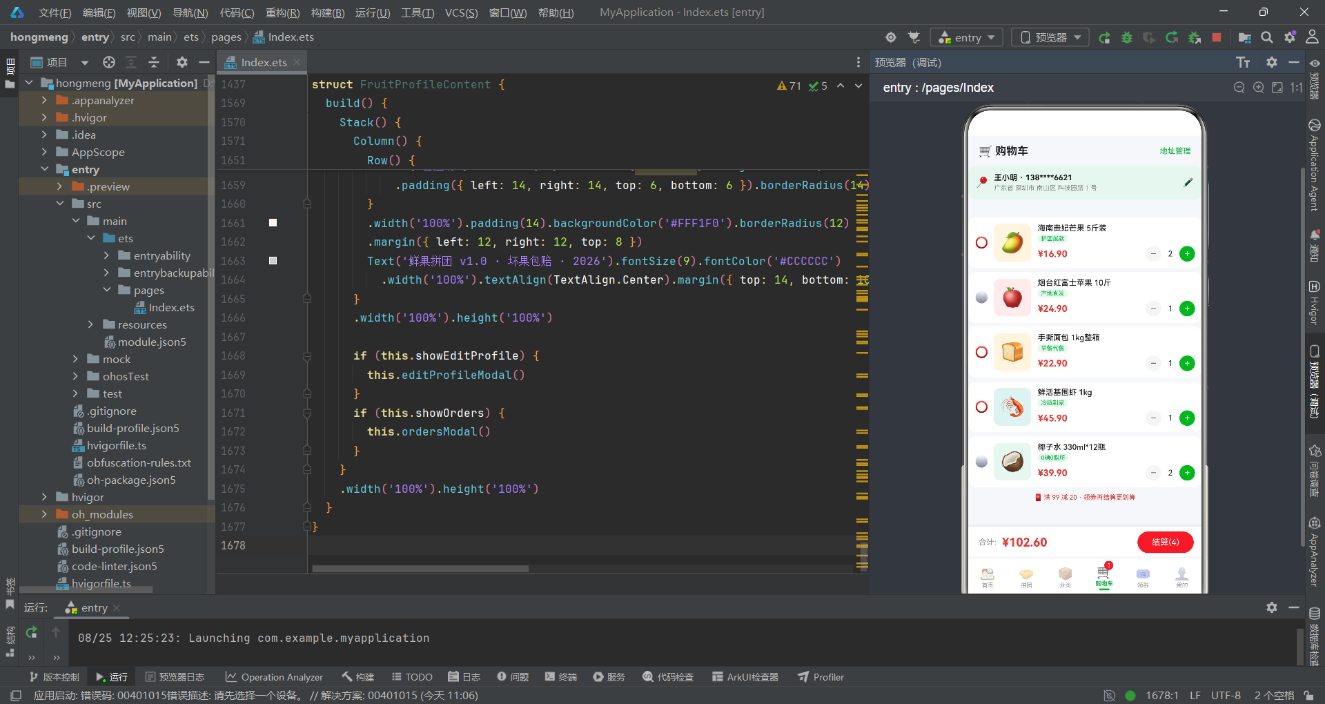
购物车页的核心是商品勾选和数量管理逻辑,通过selectedIds数组维护已勾选商品的ID列表,toggleSelect和updateQty方法处理勾选和数量变更操作。
@Component
struct CartContent {
  @State cartItems: GoodsItem[] = mockCart
  @State selectedIds: number[] = [1, 3, 4]
  @State showDeleteConfirm: boolean = false
  @State showAddressModal: boolean = false
  @State showEditAddressModal: boolean = false
  @State editingAddress: AddressMeta | null = null

  isSelected(id: number): boolean {
    return this.selectedIds.indexOf(id) >= 0
  }

  toggleSelect(id: number) {
    if (this.isSelected(id)) {
      let arr: number[] = []
      for (let i = 0; i < this.selectedIds.length; i++) {
        if (this.selectedIds[i] !== id) {
          arr.push(this.selectedIds[i])
        }
      }
      this.selectedIds = arr
    } else {
      let arr: number[] = this.selectedIds.slice()
      arr.push(id)
      this.selectedIds = arr
    }
  }

  updateQty(g: GoodsItem, qty: number) {
    g.qty = Math.max(1, g.qty + qty)
    this.cartItems = this.cartItems.slice()
  }

  calcTotal(): number {
    let total: number = 0
    for (let i = 0; i < this.cartItems.length; i++) {
      if (this.isSelected(this.cartItems[i].id)) {
        total = total + this.cartItems[i].price * this.cartItems[i].qty
      }
    }
    return total
  }

  calcCount(): number {
    let c: number = 0
    for (let i = 0; i < this.cartItems.length; i++) {
      if (this.isSelected(this.cartItems[i].id)) {
        c = c + this.cartItems[i].qty
      }
    }
    return c
  }
购物车的状态管理是该页面最复杂的部分。selectedIds数组存储已勾选商品的ID,初始值为[1, 3, 4]表示默认选中了三件商品。toggleSelect方法实现了勾选切换逻辑——如果商品已选中则从数组中移除(通过遍历重建新数组),如果未选中则通过slice()复制数组后push新ID。这种不可变更新模式确保了ArkUI框架能够检测到数组引用的变化并触发重新渲染。updateQty方法直接修改GoodsItem实例的qty属性(得益于@Observed装饰器的响应式追踪),然后通过this.cartItems = this.cartItems.slice()触发数组层面的重新渲染。calcTotal和calcCount两个计算方法遍历购物车列表,仅累加已勾选商品的价格和数量,实时反映在结算条上。
购物车行与结算条
购物车行cartRow展示了勾选圆圈、商品图标、商品信息和数量步进器,结算条固定在底部显示合计金额和结算按钮。
  @Builder cartRow(g: GoodsItem) {
    Row() {
      Text(this.isSelected(g.id) ? '⭕' : '⚪').fontSize(17)
        .fontColor(this.isSelected(g.id) ? '#07B53B' : '#CCCCCC')
        .onClick(() => { this.toggleSelect(g.id) })
      Column() {
        Text(g.icon).fontSize(30)
      }
      .width(58).height(58).backgroundColor(g.bg).borderRadius(10)
      .alignItems(HorizontalAlign.Center).justifyContent(FlexAlign.Center).margin({ left: 8 })
      Column() {
        Text(g.name).fontSize(12).fontWeight(FontWeight.Medium).fontColor('#212121')
          .maxLines(1).textOverflow({ overflow: TextOverflow.Ellipsis }).width('100%')
        Text(g.tag).fontSize(9).fontColor('#07B53B').backgroundColor('#E8F6EF')
          .padding({ left: 5, right: 5, top: 1, bottom: 1 }).borderRadius(6).margin({ top: 3 })
          .alignSelf(ItemAlign.Start)
        Row() {
          Text(fmtPrice(g.price)).fontSize(14).fontWeight(FontWeight.Bold).fontColor('#E53935')
          Column().layoutWeight(1)
          Text('−').fontSize(15).fontColor('#666666').width(24).height(24).borderRadius(12)
            .backgroundColor('#F5F5F5').textAlign(TextAlign.Center)
            .onClick(() => { this.updateQty(g, -1) })
          Text(g.qty.toString()).fontSize(12).fontColor('#212121').width(28).textAlign(TextAlign.Center)
          Text('+').fontSize(15).fontColor('#FFFFFF').width(24).height(24).borderRadius(12)
            .backgroundColor('#07B53B').textAlign(TextAlign.Center)
            .onClick(() => { this.updateQty(g, 1) })
        }
        .width('100%').margin({ top: 5 })
      }
      .layoutWeight(1).alignItems(HorizontalAlign.Start).padding({ left: 10 })
    }
    .width('100%').padding(10).backgroundColor('#FFFFFF').borderRadius(12)
    .margin({ left: 12, right: 12, top: 6 })
  }
购物车行的勾选状态通过emoji图标的切换实现——选中时显示绿色实心圆"⭕",未选中时显示灰色空心圆"⚪"。营销标签使用alignSelf(ItemAlign.Start)确保标签左对齐于Column的起始边。数量步进器与详情弹框中的步进器设计一致,减号灰色背景加号绿色背景,步进器通过updateQty(g, -1)和updateQty(g, 1)调用改变商品数量。结算条使用shadow({ radius: 8, color: '#1A000000', offsetY: -2 })营造浮于列表之上的效果,合计金额通过calcTotal()实时计算,结算按钮的文案动态显示已选商品总数量calcCount()。
购物车地址管理弹框
新增地址表单弹框
购物车页集成了完整的新增收货地址弹框,包含收货人、手机号、所在地区、详细地址四个表单字段和默认地址开关,通过TextInput和TextArea组件收集用户输入。
  @Builder addressModal() {
    Column() {
      this.modalOverlay(() => { this.showAddressModal = false })
      Column() {
        Row() {
          Text('📍 新增收货地址').fontSize(16).fontWeight(FontWeight.Bold).fontColor('#212121')
          Column().layoutWeight(1)
          Text('✕').fontSize(18).fontColor('#999999')
            .onClick(() => { this.showAddressModal = false })
        }
        .width('100%').padding({ left: 16, right: 16, top: 14, bottom: 10 })
        Divider().color('#F0F0F0')
        Column() {
          Row() {
            Column() {
              Text('收货人').fontSize(11).fontColor('#888888')
              TextInput({ placeholder: '姓名' }).placeholderColor('#BBBBBB').fontSize(13)
                .backgroundColor('#F5F7FA').borderRadius(8).height(38).margin({ top: 4 })
                .onChange((v: string) => { this.formName = v })
            }
            .layoutWeight(1).alignItems(HorizontalAlign.Start)
            Column() {
              Text('手机号').fontSize(11).fontColor('#888888')
              TextInput({ placeholder: '138****0000' }).placeholderColor('#BBBBBB').fontSize(13)
                .backgroundColor('#F5F7FA').borderRadius(8).height(38).margin({ top: 4 })
                .onChange((v: string) => { this.formPhone = v })
            }
            .layoutWeight(1).alignItems(HorizontalAlign.Start).margin({ left: 10 })
          }
          .width('100%')
          Text('所在地区').fontSize(11).fontColor('#888888').width('100%').margin({ top: 12 })
          TextInput({ placeholder: '省 市 区' }).placeholderColor('#BBBBBB').fontSize(13)
            .backgroundColor('#F5F7FA').borderRadius(8).height(38).width('100%').margin({ top: 4 })
            .onChange((v: string) => { this.formRegion = v })
          Text('详细地址').fontSize(11).fontColor('#888888').width('100%').margin({ top: 12 })
          TextArea({ placeholder: '街道、楼栋、门牌号' }).placeholderColor('#BBBBBB').fontSize(13)
            .backgroundColor('#F5F7FA').borderRadius(8).height(60).width('100%').margin({ top: 4 })
            .onChange((v: string) => { this.formDetail = v })
          Row() {
            Text(this.formDefault ? '☑' : '☐').fontSize(16).fontColor('#07B53B')
              .onClick(() => { this.formDefault = !this.formDefault })
            Text('设为默认地址').fontSize(12).fontColor('#333333').margin({ left: 6 })
            Column().layoutWeight(1)
            Text('保存后自动下单默认使用').fontSize(9).fontColor('#BBBBBB')
          }
          .width('100%').margin({ top: 14 })
        }
        .padding({ left: 16, right: 16, top: 12 })
        .constraintSize({ maxHeight: '58%' })
        Row() {
          Text('取消').fontSize(13).fontColor('#888888').backgroundColor('#F5F5F5')
            .borderRadius(18).padding({ left: 24, right: 24, top: 9, bottom: 9 })
            .onClick(() => { this.showAddressModal = false })
          Text('保存地址').fontSize(13).fontColor('#FFFFFF').backgroundColor('#07B53B')
            .borderRadius(18).padding({ left: 24, right: 24, top: 9, bottom: 9 })
            .margin({ left: 10 })
            .onClick(() => { this.showAddressModal = false })
        }
        .width('100%').justifyContent(FlexAlign.Center)
        .padding({ left: 16, right: 16, top: 14, bottom: 14 })
      }
      .width('90%').backgroundColor('#FFFFFF').borderRadius(16)
      .alignItems(HorizontalAlign.Center)
      .position({ x: '5%', y: '18%' })
    }
    .width('100%').height('100%').position({ x: 0, y: 0 }).zIndex(999)
  }
地址弹框的表单设计遵循了移动端表单的最佳实践。收货人和手机号字段使用Row包裹两个layoutWeight(1)的Column实现并排布局,节省垂直空间。所有输入框统一使用#F5F7FA浅灰背景和8像素圆角,placeholder使用#BBBBBB灰色。onChange回调将输入值实时同步到对应的@State变量(formName、formPhone、formRegion、formDetail),实现了双向数据绑定。默认地址开关通过emoji字符"☑"和"☐"的切换实现,点击时翻转formDefault布尔值。弹框内容区使用constraintSize({ maxHeight: '58%' })限制最大高度,配合内层Scroll组件(编辑地址弹框中)支持长表单滚动。取消和保存按钮采用与全局一致的样式——灰色次要按钮和绿色主要按钮,通过justifyContent(FlexAlign.Center)居中排列。
领券页:卡片与数据可视化
优惠券卡片设计
领券页的核心是优惠券卡片的渲染,每张券卡采用左右分区设计——左侧为金额展示区,右侧为条件和领取按钮,底部以虚线分隔。
  @Builder couponCard(c: CouponMeta) {
    Column() {
      Row() {
        Column() {
          Text(c.amount).fontSize(22).fontWeight(FontWeight.Bold).fontColor(c.color)
          Text(c.label).fontSize(11).fontColor('#333333').margin({ top: 2 })
        }
        .width(96).alignItems(HorizontalAlign.Center)
        .padding({ top: 12, bottom: 12 })
        .backgroundColor(c.bg)
        .borderRadius({ topLeft: 10, bottomLeft: 10 })
        Column() {
          Row() {
            Text(c.condition).fontSize(11).fontColor('#555555')
            Column().layoutWeight(1)
            Text('领').fontSize(11).fontColor('#FFFFFF').backgroundColor(c.color)
              .padding({ left: 10, right: 10, top: 4, bottom: 4 }).borderRadius(12)
              .onClick(() => { this.showSuccess = true })
          }
          .width('100%')
          Text('有效期:' + c.valid).fontSize(9).fontColor('#BBBBBB').width('100%').margin({ top: 8 })
          Text('券类型:' + c.type + '券').fontSize(9).fontColor(c.color).width('100%').margin({ top: 4 })
        }
        .layoutWeight(1).alignItems(HorizontalAlign.Start).padding({ left: 12, right: 12 })
      }
      .width('100%')
      Row() {
        ForEach([0, 1, 2, 3, 4, 5, 6, 7, 8, 9, 10, 11], (d: number) => {
          Column().width(4).height(2).backgroundColor('#F0F0F0').borderRadius(1).margin({ left: 3, right: 3 })
        })
      }
      .width('100%').justifyContent(FlexAlign.Center)
      Row() {
        Text('适用商品:全场自营 · 与平台券可叠加').fontSize(9).fontColor('#BBBBBB')
      }
      .width('100%').padding({ left: 12, top: 6, bottom: 10 }).backgroundColor('#FFFFFF')
      .borderRadius({ bottomLeft: 10, bottomRight: 10 })
    }
    .width('100%').backgroundColor('#FFFFFF').borderRadius(10)
    .margin({ left: 12, right: 12, top: 6 })
    .shadow({ radius: 5, color: '#0D000000', offsetY: 2 })
  }
优惠券卡片的设计高度还原了真实电商平台的券卡视觉。左侧金额区使用96像素固定宽度,背景色绑定到CouponMeta.bg,文字颜色绑定到CouponMeta.color,每种券都有独立的配色方案。右侧信息区通过layoutWeight(1)自适应剩余宽度,包含使用条件、"领"按钮、有效期和券类型四行信息。虚线分隔的实现是本组件的技术亮点——通过ForEach渲染12个4x2像素的小矩形,每个矩形之间通过margin({ left: 3, right: 3 })的间距形成虚线效果,这种纯ArkTS实现方式避免了使用图片资源。底部适用商品说明区使用borderRadius({ bottomLeft: 10, bottomRight: 10 })仅设置底部圆角,与左侧金额区的左圆角和右侧信息区共同构成完整的卡片圆角。
领取热度柱状图与券类型占比
领券页底部集成了两种数据可视化组件——本周领取热度柱状图和券类型占比进度条,分别以柱状图和横向进度条的形式展示领券数据。
            Column() {
              Text('📊 本周领券热度').fontSize(13).fontWeight(FontWeight.Bold).fontColor('#212121')
                .width('100%').padding({ left: 16, top: 12, bottom: 8 })
              Row() {
                ForEach([0, 1, 2, 3, 4, 5, 6], (d: number) => {
                  Column() {
                    Text(this.couponChartData[d].toString()).fontSize(9).fontColor('#07B53B')
                    Column()
                      .width(22)
                      .height((this.couponChartData[d] / 100 * 64).toFixed(0) + 'vp')
                      .backgroundColor(d === 3 ? '#07B53B' : '#B7EBC3')
                      .borderRadius({ topLeft: 4, topRight: 4 })
                    Text(this.weekDays[d]).fontSize(8).fontColor('#999999').margin({ top: 3 })
                  }
                  .layoutWeight(1).alignItems(HorizontalAlign.Center)
                })
              }
              .width('100%').padding({ left: 12, right: 12, bottom: 10 })
            }
            .width('100%').backgroundColor('#FFFFFF').borderRadius(12)
            .margin({ left: 12, right: 12, top: 8 })
            Column() {
              Text('📁 券类型占比').fontSize(13).fontWeight(FontWeight.Bold).fontColor('#212121')
                .width('100%').padding({ left: 16, top: 12, bottom: 8 })
              Column() {
                Row() { Text('满减券').fontSize(11).fontColor('#E53935').layoutWeight(1); Text('46%').fontSize(11).fontColor('#888888') }
                Row() { Column().width('46%').height(6).backgroundColor('#E53935').borderRadius(3); Column().layoutWeight(1) }
                .width('100%').margin({ top: 4, bottom: 8 })
                Row() { Text('无门槛券').fontSize(11).fontColor('#07B53B').layoutWeight(1); Text('32%').fontSize(11).fontColor('#888888') }
                Row() { Column().width('32%').height(6).backgroundColor('#07B53B').borderRadius(3); Column().layoutWeight(1) }
                .width('100%').margin({ top: 4, bottom: 8 })
                Row() { Text('折扣券').fontSize(11).fontColor('#FF9800').layoutWeight(1); Text('22%').fontSize(11).fontColor('#888888') }
                Row() { Column().width('22%').height(6).backgroundColor('#FF9800').borderRadius(3); Column().layoutWeight(1) }
                .width('100%').margin({ top: 4 })
              }
              .padding({ left: 16, right: 16, bottom: 14 })
            }
            .width('100%').backgroundColor('#FFFFFF').borderRadius(12)
            .margin({ left: 12, right: 12, top: 8, bottom: 16 })
柱状图的实现使用couponChartData数组[40, 70, 55, 90, 65, 80, 100]作为数据源,每个柱子的高度通过couponChartData[d] / 100 * 64的归一化公式计算,最大值100对应64vp的高度。柱子颜色根据索引判断——d === 3(周四)为深绿#07B53B表示当日领券热度最高,其他日期为浅绿#B7EBC3。每个柱子顶部显示数值,底部显示星期缩写,通过layoutWeight(1)实现七列均匀分布。券类型占比进度条采用三组横向进度条,每组的填充宽度直接使用百分比字符串如'46%',配合对应颜色的6像素高度进度条,简洁地展示了满减券46%、无门槛券32%和折扣券22%的占比分布。
个人中心:资料编辑与拼团记录
渐变个人头部与订单状态
个人中心页以绿色渐变头部开场,展示用户头像、昵称、等级标签和省钱金额,下方是五格订单状态入口和八宫格功能菜单。
@Component
struct FruitProfileContent {
  @State showEditProfile: boolean = false
  @State showOrders: boolean = false
  @State formNick: string = ''
  @State formSign: string = ''
  orderStatus: string[] = ['待付款', '待发货', '待收货', '待评价', '售后']
  orderIcons: string[] = ['💰', '📦', '🚚', '⭐', '🛠️']
  menuLabels: string[] = ['我的拼团', '我的钱包', '优惠券', '收货地址', '收藏夹', '浏览记录', '客服中心', '设置']
  menuIcons: string[] = ['🤝', '💳', '🎟️', '📍', '❤️', '👁️', '💬', '⚙️']

  build() {
    Stack() {
      Column() {
        Column() {
          Row() {
            Column() {
              Text('🍓').fontSize(34)
            }
            .width(60).height(60).backgroundColor('rgba(255,255,255,0.25)').borderRadius(30)
            .alignItems(HorizontalAlign.Center).justifyContent(FlexAlign.Center)
            Column() {
              Row() {
                Text('果果酱').fontSize(17).fontWeight(FontWeight.Bold).fontColor('#FFFFFF')
                Text('LV.5').fontSize(9).fontColor('#FFFFFF').backgroundColor('rgba(0,0,0,0.25)')
                  .padding({ left: 6, right: 6, top: 2, bottom: 2 }).borderRadius(8).margin({ left: 8 })
              }
              Text('生鲜吃货 · 已省 328.6 元').fontSize(10).fontColor('rgba(255,255,255,0.9)').margin({ top: 4 })
            }
            .layoutWeight(1).alignItems(HorizontalAlign.Start).padding({ left: 12 })
            Text('编辑').fontSize(11).fontColor('#FFFFFF').backgroundColor('rgba(255,255,255,0.25)')
              .padding({ left: 12, right: 12, top: 5, bottom: 5 }).borderRadius(12)
              .onClick(() => { this.showEditProfile = true })
          }
          .width('100%')
        }
        .width('100%').linearGradient(GREEN_GRADIENT).padding({ left: 16, right: 16, top: 16, bottom: 16 })

        Column() {
          Row() {
            Text('我的订单').fontSize(13).fontWeight(FontWeight.Bold).fontColor('#212121')
            Column().layoutWeight(1)
            Text('全部订单 >').fontSize(10).fontColor('#999999')
              .onClick(() => { this.showOrders = true })
          }
          .width('100%').padding({ left: 16, top: 12, bottom: 8 })
          Row() {
            ForEach([0, 1, 2, 3, 4], (i: number) => {
              Column() {
                Text(this.orderIcons[i]).fontSize(20)
                Text(this.orderStatus[i]).fontSize(9).fontColor('#555555').margin({ top: 4 })
              }
              .layoutWeight(1).alignItems(HorizontalAlign.Center)
              .onClick(() => { this.showOrders = true })
            })
          }
          .width('100%').padding({ left: 8, right: 8, bottom: 12 })
        }
        .width('100%').backgroundColor('#FFFFFF').borderRadius(12)
        .margin({ left: 12, right: 12, top: 8 })
个人头部的设计采用了半透明叠加的视觉手法。用户头像区使用rgba(255,255,255,0.25)的半透明白色背景圆角方块,叠加在绿色渐变头部上形成磨砂玻璃效果。等级标签"LV.5"使用rgba(0,0,0,0.25)的半透明黑色背景,与白色文字配合形成低对比度的辅助信息。"编辑"按钮同样使用半透明白色背景,点击后触发showEditProfile状态变更弹出编辑资料弹框。订单状态区使用五个layoutWeight(1)的Column实现五等分均匀分布,每个入口包含emoji图标和状态文字,点击任意入口都会触发showOrders状态弹出拼团记录弹框。
编辑资料弹框
编辑资料弹框包含头像选择、昵称输入和个性签名输入三个区域,头像选择通过五行emoji图标提供五个选项,昵称和签名分别使用TextInput和TextArea收集用户输入。
  @Builder editProfileModal() {
    Column() {
      this.modalOverlay(() => { this.showEditProfile = false })
      Column() {
        Row() {
          Text('✏️ 编辑个人资料').fontSize(16).fontWeight(FontWeight.Bold).fontColor('#212121')
          Column().layoutWeight(1)
          Text('✕').fontSize(18).fontColor('#999999')
            .onClick(() => { this.showEditProfile = false })
        }
        .width('100%').padding({ left: 16, right: 16, top: 14, bottom: 10 })
        Divider().color('#F0F0F0')
        Column() {
          Text('选择头像').fontSize(11).fontColor('#888888').width('100%')
          Row() {
            ForEach(['🍎', '🍉', '🍇', '🥭', '🍑'], (a: string) => {
              Text(a).fontSize(24).width(44).height(44).borderRadius(22).backgroundColor('#F5F7FA')
                .textAlign(TextAlign.Center).margin({ left: 6, right: 6 })
            })
          }
          .width('100%').margin({ top: 8 })
          Text('昵称').fontSize(11).fontColor('#888888').width('100%').margin({ top: 14 })
          TextInput({ placeholder: '请输入昵称' }).placeholderColor('#BBBBBB').fontSize(13)
            .backgroundColor('#F5F7FA').borderRadius(8).height(38).width('100%').margin({ top: 4 })
            .onChange((v: string) => { this.formNick = v })
          Text('个性签名').fontSize(11).fontColor('#888888').width('100%').margin({ top: 12 })
          TextArea({ placeholder: '介绍一下自己吧' }).placeholderColor('#BBBBBB').fontSize(13)
            .backgroundColor('#F5F7FA').borderRadius(8).height(56).width('100%').margin({ top: 4 })
            .onChange((v: string) => { this.formSign = v })
        }
        .padding({ left: 16, right: 16, top: 12 })
        .constraintSize({ maxHeight: '58%' })
        Row() {
          Text('取消').fontSize(13).fontColor('#888888').backgroundColor('#F5F5F5')
            .borderRadius(18).padding({ left: 24, right: 24, top: 9, bottom: 9 })
            .onClick(() => { this.showEditProfile = false })
          Text('保存资料').fontSize(13).fontColor('#FFFFFF').backgroundColor('#07B53B')
            .borderRadius(18).padding({ left: 24, right: 24, top: 9, bottom: 9 })
            .margin({ left: 10 })
            .onClick(() => { this.showEditProfile = false })
        }
        .width('100%').justifyContent(FlexAlign.Center)
        .padding({ left: 16, right: 16, top: 14, bottom: 14 })
      }
      .width('88%').backgroundColor('#FFFFFF').borderRadius(16)
      .alignItems(HorizontalAlign.Center)
      .position({ x: '6%', y: '20%' })
    }
    .width('100%').height('100%').position({ x: 0, y: 0 }).zIndex(999)
  }
头像选择区通过ForEach渲染五个水果emoji图标,每个图标使用44x44像素的圆形浅灰背景,用户可以直观地点击选择喜欢的头像。昵称输入框使用TextInput组件配合onChange回调实时更新formNick状态变量,个性签名使用TextArea组件提供多行输入能力,高度56像素比昵称输入框的38像素更高,适配较长文本。弹框内容区使用constraintSize({ maxHeight: '58%' })限制最大高度,确保在小屏设备上不会超出可视区域。取消和保存按钮的样式与全局保持一致——灰色次要按钮配合绿色主要按钮,通过justifyContent(FlexAlign.Center)居中分布。
拼团记录弹框
拼团记录弹框以列表卡片形式展示用户的拼团订单,每个订单包含商品图标、名称、状态描述和操作按钮,不同状态使用不同背景色区分。
  @Builder ordersModal() {
    Column() {
      this.modalOverlay(() => { this.showOrders = false })
      Column() {
        Row() {
          Text('🤝 我的拼团记录').fontSize(16).fontWeight(FontWeight.Bold).fontColor('#212121')
          Column().layoutWeight(1)
          Text('✕').fontSize(18).fontColor('#999999')
            .onClick(() => { this.showOrders = false })
        }
        .width('100%').padding({ left: 16, right: 16, top: 14, bottom: 10 })
        Divider().color('#F0F0F0')
        Scroll() {
          Column() {
            Row() {
              Text('🥭').fontSize(24)
              Column() {
                Text('海南贵妃芒果 5斤装').fontSize(12).fontColor('#333333')
                Text('成团 · 已发货 · 单号 SF88492016').fontSize(10).fontColor('#999999').margin({ top: 3 })
              }
              .layoutWeight(1).alignItems(HorizontalAlign.Start).padding({ left: 10 })
              Text('查看物流').fontSize(10).fontColor('#07B53B')
            }
            .width('100%').padding(12).backgroundColor('#F5F7FA').borderRadius(10)
            .margin({ top: 8 })
            Row() {
              Text('🍎').fontSize(24)
              Column() {
                Text('烟台红富士苹果 10斤').fontSize(12).fontColor('#333333')
                Text('拼团中 · 还差 1 人').fontSize(10).fontColor('#E53935').margin({ top: 3 })
              }
              .layoutWeight(1).alignItems(HorizontalAlign.Start).padding({ left: 10 })
              Text('邀请好友').fontSize(10).fontColor('#FFFFFF').backgroundColor('#E53935')
                .padding({ left: 10, right: 10, top: 4, bottom: 4 }).borderRadius(10)
            }
            .width('100%').padding(12).backgroundColor('#FFF6E8').borderRadius(10)
            .margin({ top: 8 })
            Row() {
              Text('🍓').fontSize(24)
              Column() {
                Text('丹东99草莓 2斤盒装').fontSize(12).fontColor('#333333')
                Text('已成团 · 待收货 · 单号 SF44526713').fontSize(10).fontColor('#999999').margin({ top: 3 })
              }
              .layoutWeight(1).alignItems(HorizontalAlign.Start).padding({ left: 10 })
              Text('确认收货').fontSize(10).fontColor('#FFFFFF').backgroundColor('#07B53B')
                .padding({ left: 10, right: 10, top: 4, bottom: 4 }).borderRadius(10)
            }
            .width('100%').padding(12).backgroundColor('#E8F6EF').borderRadius(10)
            .margin({ top: 8 })
          }
          .padding({ left: 14, right: 14, bottom: 14 })
        }
        .layoutWeight(1).scrollBar(BarState.Off)
        .constraintSize({ maxHeight: '52%' })
      }
      .width('90%').backgroundColor('#FFFFFF').borderRadius(16)
      .alignItems(HorizontalAlign.Center)
      .position({ x: '5%', y: '20%' })
    }
    .width('100%').height('100%').position({ x: 0, y: 0 }).zIndex(999)
  }
拼团记录弹框的设计亮点在于通过卡片背景色区分订单状态。已发货订单使用浅灰色#F5F7FA背景配合绿色"查看物流"文字按钮;拼团中订单使用浅橙色#FFF6E8背景配合红色"邀请好友"实心按钮,红色文字"拼团中 · 还差 1 人"营造紧迫感;待收货订单使用浅绿色#E8F6EF背景配合绿色"确认收货"实心按钮。这三种背景色与订单状态语义高度匹配——灰色代表已完成流程、橙色代表进行中需行动、绿色代表待确认收货。Scroll组件配合constraintSize({ maxHeight: '52%' })限制了列表的最大高度,当订单数量较多时支持内部滚动浏览。
应用交互流程概览
上述流程图完整描绘了六个Tab页面之间的导航关系和各页面内部的弹框触发链路。从首页的商品详情弹框到拼团页的拼团详情弹框,从分类页的加入购物车弹框到购物车页的地址管理和结算确认弹框,从领券页的领取成功弹框到个人中心的编辑资料和拼团记录弹框,每个弹框都由独立的@State布尔变量控制显隐,通过modalOverlay通用遮罩实现模态覆盖。整个应用的状态管理分布在六个组件中,每个组件独立管理自己的弹框状态,互不干扰,体现了多组件架构的状态隔离优势。
技术对比分析
| 技术维度 | 首页(HomeContent) | 拼团页(GroupContent) | 分类页(CategoryContent) | 购物车(CartContent) | 领券页(CouponContent) | 个人中心(FruitProfileContent) |
|---|---|---|---|---|---|---|
| 布局策略 | 瀑布双列Scroll | 倒计时+横向滚动+列表 | 左右分栏Row | 列表+固定结算条 | 卡片列表+图表 | 渐变头部+宫格 |
| 弹框数量 | 2(详情+搜索提示) | 1(拼团详情) | 1(加入购物车) | 4(删除确认+地址+编辑地址+结算) | 1(领取成功) | 2(编辑资料+拼团记录) |
| 数据可视化 | 无 | 拼团进度条 | 无 | 无 | 柱状图+占比进度条 | 无 |
| 表单组件 | 数量步进器 | 无 | 数量步进器 | 多字段表单 | 无 | 头像选择+昵称+签名 |
| 渐变背景 | 头部 | 头部 | 子标题 | 无 | 头部 | 头部 |
| 滚动方式 | 垂直Scroll | 垂直+水平Scroll | 左侧垂直+右侧垂直 | 垂直Scroll | 垂直Scroll | 垂直Scroll |
| 核心状态 | selectedGoods/formQty | selectedGroup | selectedCate/rightProducts | selectedIds/cartItems | showSuccess | showEditProfile/showOrders |
| 卡片圆角 | 12px | 12px | 10px | 12px | 10px | 12px |
| 阴影效果 | offsetY:2 | 无 | 无 | offsetY:-2 | offsetY:2 | 无 |
| 弹框维度 | 商品详情弹框 | 拼团详情弹框 | 加入购物车弹框 | 地址表单弹框 | 编辑资料弹框 |
|---|---|---|---|---|---|
| 定位方式 | position居中 | position居中 | position居中 | position居中 | position居中 |
| 宽度 | 88% | 86% | 84% | 90% | 88% |
| 垂直位置 | y:18% | y:16% | y:36% | y:18% | y:20% |
| 遮罩复用 | modalOverlay | modalOverlay | modalOverlay | modalOverlay | modalOverlay |
| 最大高度限制 | 无 | 无 | 无 | 58% | 58% |
| 内容滚动 | 无 | 无 | 无 | 无 | 无 |
| 表单输入 | 无 | 无 | 数量步进 | 4字段+开关 | 昵称+签名+头像 |
| 确认按钮 | 加入购物车+立即拼单 | 立即参团 | 确认加入 | 保存地址 | 保存资料 |
| 按钮颜色 | 绿色+红色 | 红色 | 绿色 | 绿色 | 绿色 |
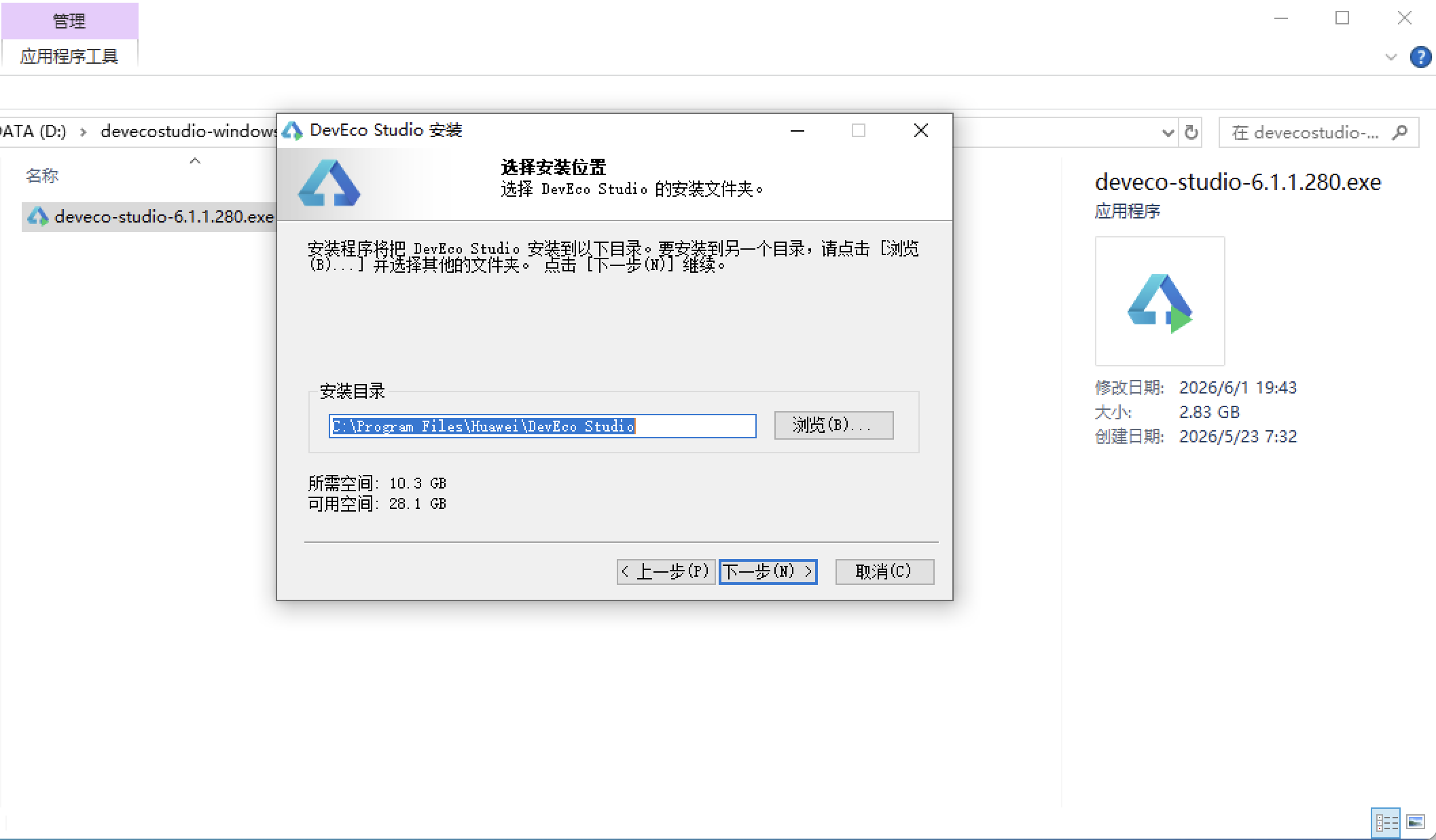
安装DevEco Studio程序
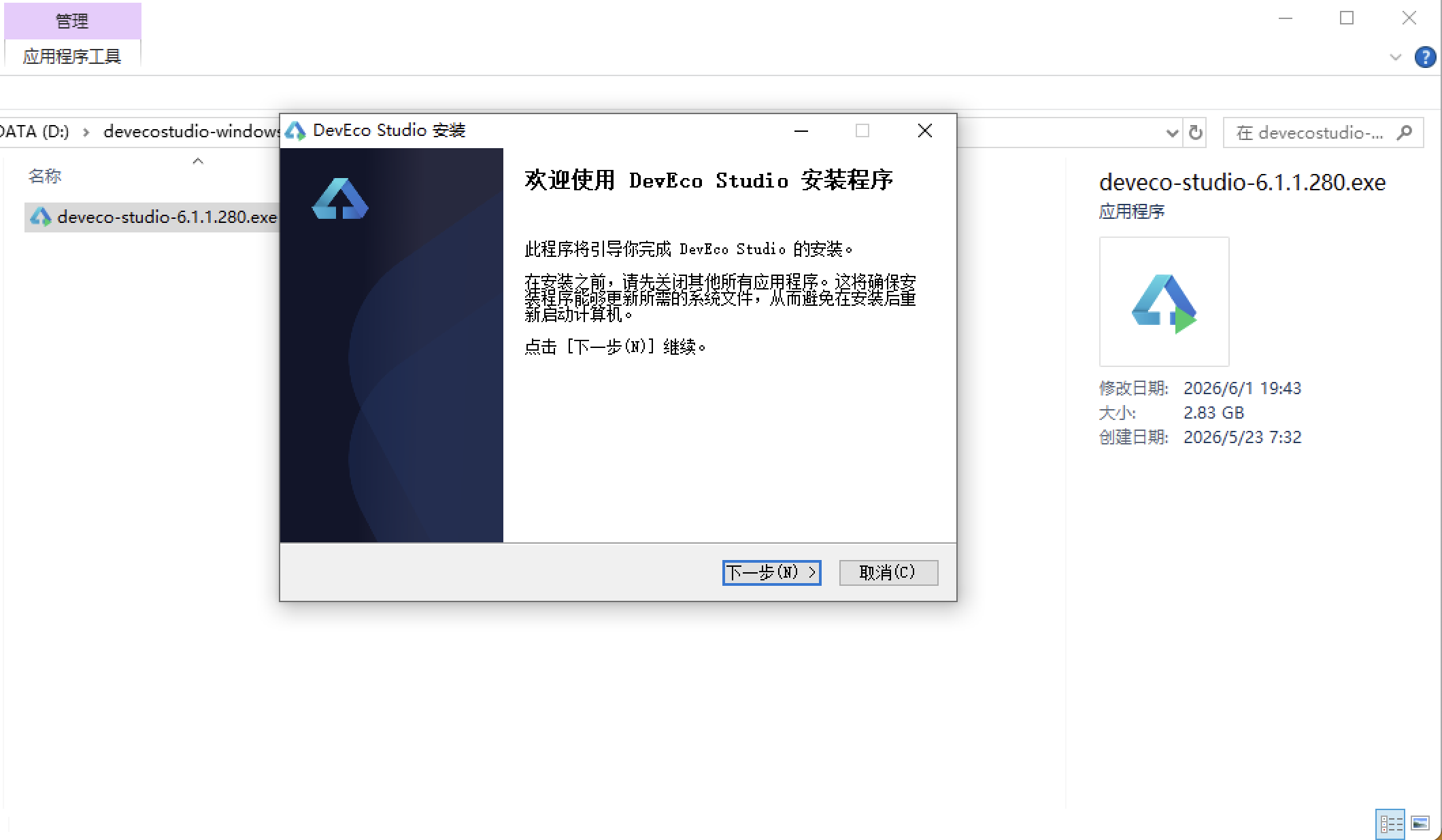
选择目标安装目录:
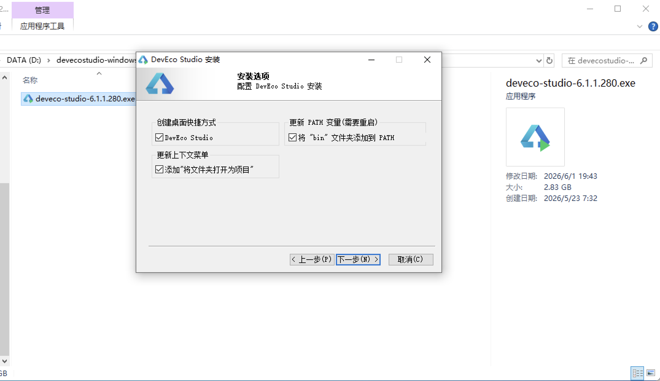
设置环境变量,但是需要重启一下:
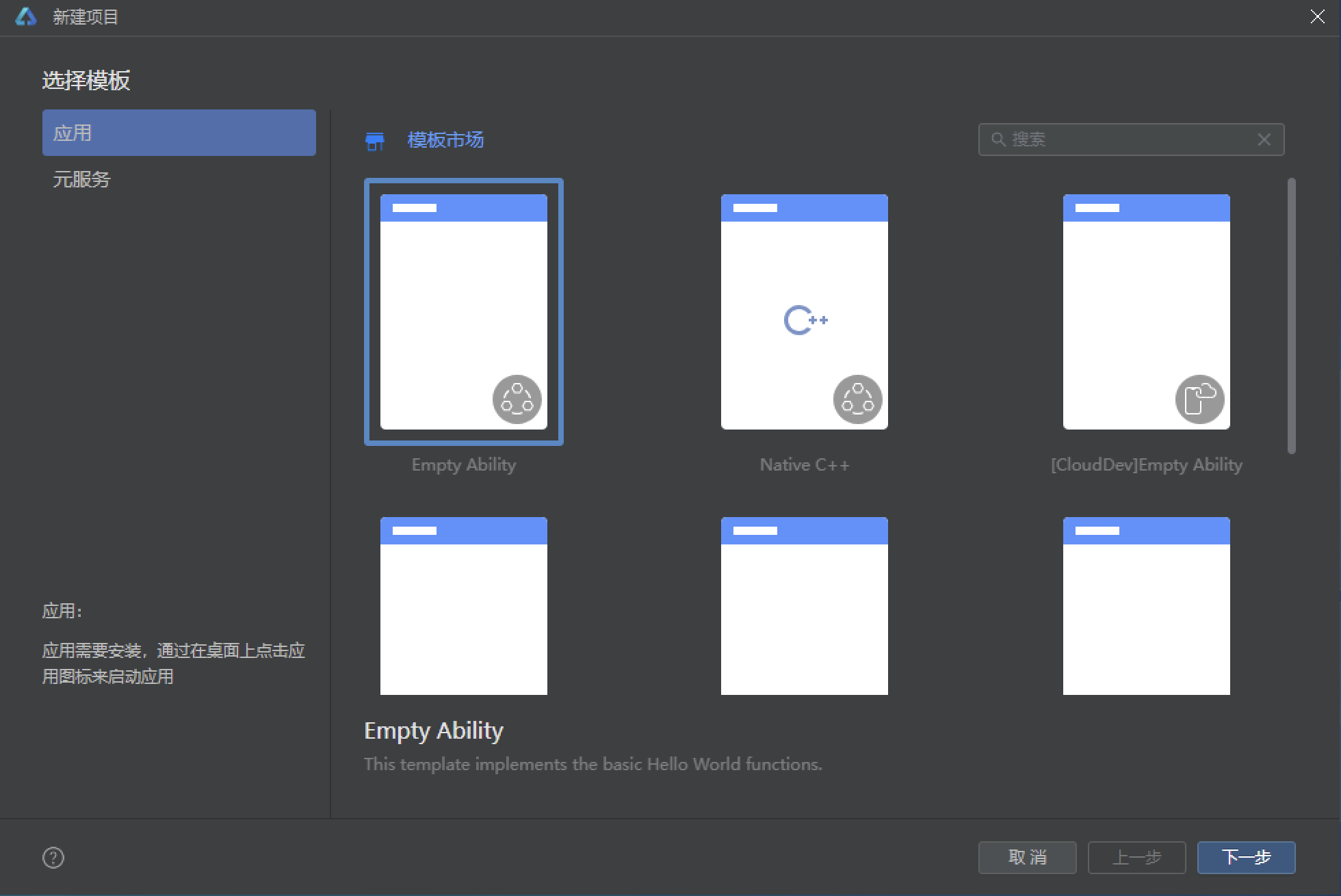
新建一个空白模板:
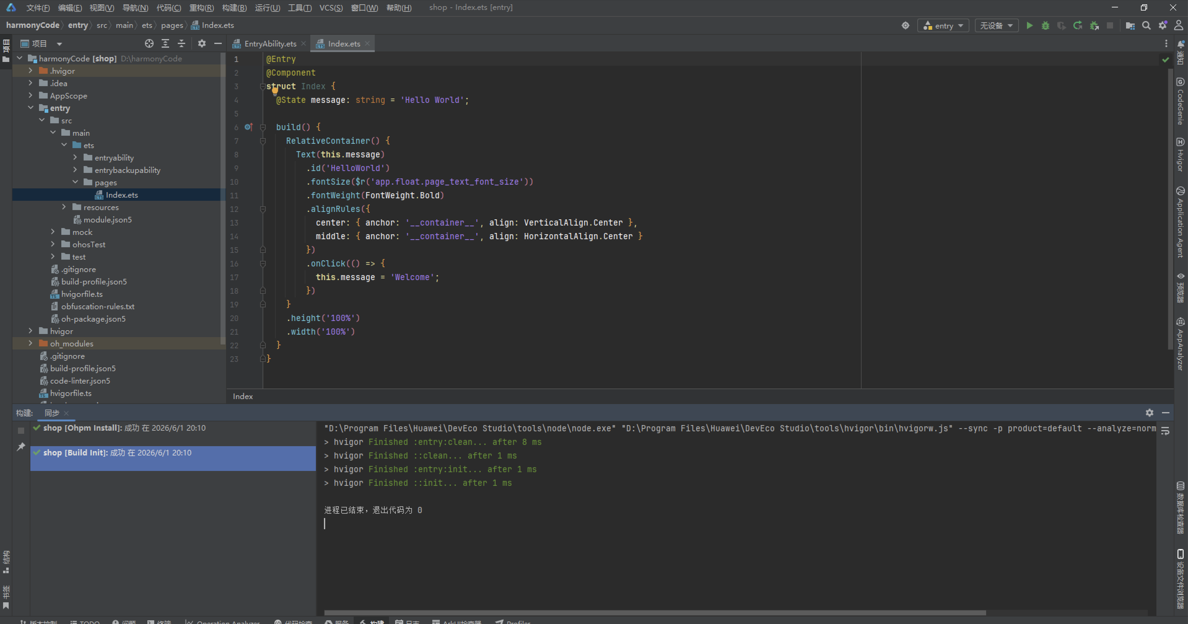
设置API为24的模板项目: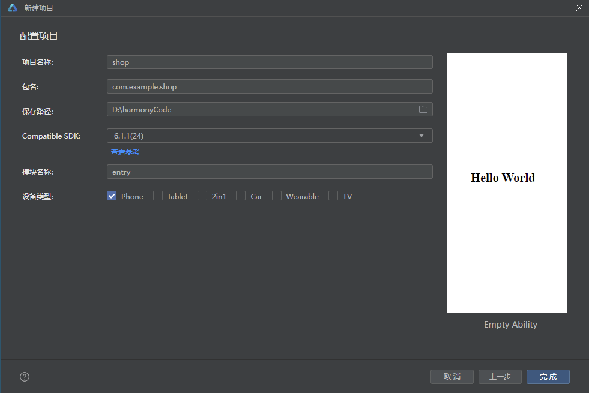
初始化项目,自动下载相关依赖:
完整代码:
// 场景:水果生鲜拼团 · 绿色电商主题
// 布局差异:首页瀑布双列 / 拼团进度卡 / 分类左右分栏 / 购物车结算条 / 领券卡片+图表 / 个人中心

// ============ 类型定义 ============
interface QuickNavMeta {
  label: string
  icon: string
  bg: string
}

interface CateMeta {
  label: string
  icon: string
  color: string
}

interface CouponMeta {
  label: string
  condition: string
  amount: string
  type: string
  color: string
  bg: string
  valid: string
}

interface AddressMeta {
  name: string
  phone: string
  region: string
  detail: string
  isDefault: boolean
}

interface GroupMemberMeta {
  name: string
  avatar: string
  time: string
}

// ============ 商品数据模型 ============
@Observed
export class GoodsItem {
  id: number = 0
  name: string = ''
  tag: string = ''
  price: number = 0
  originalPrice: number = 0
  sales: number = 0
  icon: string = ''
  bg: string = ''
  category: string = ''
  rating: number = 0
  stock: number = 0
  qty: number = 1
  constructor(id: number, name: string, tag: string, price: number, originalPrice: number, sales: number, icon: string, bg: string, category: string, rating: number, stock: number, qty: number) {
    this.id = id
    this.name = name
    this.tag = tag
    this.price = price
    this.originalPrice = originalPrice
    this.sales = sales
    this.icon = icon
    this.bg = bg
    this.category = category
    this.rating = rating
    this.stock = stock
    this.qty = qty
  }
}

// ============ 设计令牌 ============
const GREEN_GRADIENT: LinearGradientOptions = {
  angle: 135,
  colors: [['#07B53B', 0.0], ['#45D483', 1.0]]
}

const QUICK_NAVS: QuickNavMeta[] = [
  { label: '今日秒杀', icon: '⚡', bg: '#FFF1E6' },
  { label: '百亿补贴', icon: '🛡️', bg: '#E8F6EF' },
  { label: '限时拼团', icon: '🤝', bg: '#E3F2FD' },
  { label: '领券中心', icon: '🎟️', bg: '#FFF3E0' }
]

const CATES: CateMeta[] = [
  { label: '水果', icon: '🍎', color: '#E53935' },
  { label: '零食', icon: '🍪', color: '#FB8C00' },
  { label: '饮料', icon: '🥤', color: '#1E88E5' },
  { label: '海鲜', icon: '🦐', color: '#00897B' }
]

const COUPONS: CouponMeta[] = [
  { label: '全场满减券', condition: '满99元可用', amount: '¥20', type: '满减', color: '#E53935', bg: '#FFF1F0', valid: '2026.08.31 到期' },
  { label: '生鲜无门槛券', condition: '无门槛使用', amount: '¥5', type: '无门槛', color: '#07B53B', bg: '#E8F6EF', valid: '2026.08.30 到期' },
  { label: '新人折扣券', condition: '首单8折', amount: '8折', type: '折扣', color: '#FF9800', bg: '#FFF6E8', valid: '领取后7天' },
  { label: '拼团成功券', condition: '拼团成功返', amount: '¥10', type: '返券', color: '#7B1FA2', bg: '#F5E9FB', valid: '2026.09.15 到期' },
  { label: '水果专区券', condition: '满49元可用', amount: '¥8', type: '满减', color: '#1E88E5', bg: '#EAF4FE', valid: '2026.09.01 到期' },
  { label: '周末狂欢券', condition: '满199元可用', amount: '¥30', type: '满减', color: '#E91E63', bg: '#FDEAF1', valid: '仅周末可用' }
]

// ============ 全局写死数据 ============
const mockFruits: GoodsItem[] = [
  new GoodsItem(1, '海南贵妃芒果 5斤装', '拼团爆款', 19.9, 39.8, 23000, '🥭', '#FFF4E0', '水果', 4.8, 3, 1),
  new GoodsItem(2, '烟台红富士苹果 10斤', '产地直发', 29.9, 59.8, 45000, '🍎', '#FFECEC', '水果', 4.9, 2, 1),
  new GoodsItem(3, '丹东99草莓 2斤盒装', '限时秒杀', 39.9, 68.0, 18000, '🍓', '#FFE4E8', '水果', 4.7, 5, 1),
  new GoodsItem(4, '智利车厘子 JJ级 2斤', '冷链直达', 69.9, 129.0, 12000, '🍒', '#FDE8E8', '水果', 4.9, 1, 1),
  new GoodsItem(5, '广西沃柑 8斤带箱', '甜度高', 24.9, 45.0, 67000, '🍊', '#FFF3E0', '水果', 4.8, 4, 1),
  new GoodsItem(6, '徐闻菠萝 3个装', '当季新货', 15.9, 29.0, 9800, '🍍', '#FFF9C4', '水果', 4.6, 2, 1),
  new GoodsItem(7, '泰国金枕榴莲 2-3斤', '进口好果', 89.9, 159.0, 8600, '🍈', '#F5E9FB', '水果', 4.5, 1, 1),
  new GoodsItem(8, '麒麟西瓜 1个约8斤', '沙瓤脆甜', 19.9, 35.0, 54000, '🍉', '#E8F6EF', '水果', 4.7, 3, 1),
  new GoodsItem(9, '赣南脐橙 5斤装', '果肉细腻', 22.9, 42.0, 33000, '🍋', '#FFF8E1', '水果', 4.8, 6, 1),
  new GoodsItem(10, '新疆库尔勒香梨 4斤', '皮薄多汁', 21.9, 38.0, 21000, '🍐', '#EAF4FE', '水果', 4.7, 5, 1),
  new GoodsItem(11, '阳光玫瑰葡萄 2斤', '无籽脆甜', 29.9, 55.0, 15000, '🍇', '#F3E5F5', '水果', 4.8, 2, 1),
  new GoodsItem(12, '陕西冬枣 3斤装', '脆甜核小', 17.9, 32.0, 7600, '🫐', '#FDEAF1', '水果', 4.6, 4, 1)
]

const mockGroups: GoodsItem[] = [
  new GoodsItem(1, '海南贵妃芒果 5斤装', '2人团', 16.9, 39.8, 87, '🥭', '#FFF4E0', '水果', 4.8, 1, 1),
  new GoodsItem(2, '烟台红富士苹果 10斤', '3人团', 24.9, 59.8, 64, '🍎', '#FFECEC', '水果', 4.9, 2, 1),
  new GoodsItem(3, '丹东99草莓 2斤盒装', '2人团', 34.9, 68.0, 92, '🍓', '#FFE4E8', '水果', 4.7, 1, 1),
  new GoodsItem(4, '泰国金枕榴莲 2-3斤', '5人团', 79.9, 159.0, 41, '🍈', '#F5E9FB', '水果', 4.5, 3, 1),
  new GoodsItem(5, '麒麟西瓜 1个约8斤', '2人团', 15.9, 35.0, 78, '🍉', '#E8F6EF', '水果', 4.7, 1, 1),
  new GoodsItem(6, '阳光玫瑰葡萄 2斤', '4人团', 25.9, 55.0, 53, '🍇', '#F3E5F5', '水果', 4.8, 2, 1)
]

const mockSnacks: GoodsItem[] = [
  new GoodsItem(1, '每日坚果 30包混合装', '办公室必备', 39.9, 79.8, 56000, '🥜', '#FFF6E8', '零食', 4.8, 2, 1),
  new GoodsItem(2, '海苔脆片 16g*20包', '儿童零食', 19.9, 39.0, 38000, '🍙', '#EAF4FE', '零食', 4.7, 5, 1),
  new GoodsItem(3, '手撕面包 1kg整箱', '早餐代餐', 22.9, 45.0, 88000, '🍞', '#FFF4E0', '零食', 4.6, 3, 1),
  new GoodsItem(4, '辣条大礼包 30包', '追剧必备', 29.9, 55.0, 42000, '🌶️', '#FFECEC', '零食', 4.5, 6, 1),
  new GoodsItem(5, '燕麦巧克力 500g', '即食冲饮', 15.9, 30.0, 26000, '🍫', '#F5E9FB', '零食', 4.6, 4, 1),
  new GoodsItem(6, '芒果干 500g装', '果肉厚实', 23.9, 46.0, 31000, '🥭', '#FFF9C4', '零食', 4.7, 2, 1)
]

const mockDrinks: GoodsItem[] = [
  new GoodsItem(1, '椰子水 330ml*12瓶', '0糖0脂肪', 39.9, 69.0, 22000, '🥥', '#E8F6EF', '饮料', 4.7, 3, 1),
  new GoodsItem(2, '气泡水 480ml*15瓶', '夏季解暑', 29.9, 58.0, 64000, '🧊', '#EAF4FE', '饮料', 4.6, 5, 1),
  new GoodsItem(3, 'NFC橙汁 300ml*10盒', '鲜榨还原', 35.9, 65.0, 18000, '🍊', '#FFF3E0', '饮料', 4.8, 2, 1),
  new GoodsItem(4, '无糖茶饮 500ml*15瓶', '零卡零脂', 25.9, 52.0, 47000, '🍵', '#E8F6EF', '饮料', 4.5, 4, 1),
  new GoodsItem(5, '酸奶 200g*12杯', '低温发酵', 29.9, 49.0, 39000, '🥛', '#FDEAF1', '饮料', 4.7, 3, 1),
  new GoodsItem(6, '豆乳 250ml*12盒', '植物蛋白', 27.9, 50.0, 15000, '🫘', '#FFF8E1', '饮料', 4.6, 6, 1)
]

const mockSeafood: GoodsItem[] = [
  new GoodsItem(1, '鲜活基围虾 1kg', '冷链到家', 45.9, 88.0, 29000, '🦐', '#E0F2F1', '海鲜', 4.8, 1, 1),
  new GoodsItem(2, '深海带鱼段 2kg', '去头去尾', 33.9, 62.0, 21000, '🐟', '#EAF4FE', '海鲜', 4.7, 3, 1),
  new GoodsItem(3, '三文鱼刺身 300g', '挪威进口', 59.9, 108.0, 9700, '🍣', '#FFE4E8', '海鲜', 4.9, 1, 1),
  new GoodsItem(4, '扇贝肉 500g*2袋', '无沙免洗', 25.9, 48.0, 13000, '🦪', '#FDEAF1', '海鲜', 4.6, 4, 1),
  new GoodsItem(5, '花蛤 1.5kg装', '吐沙干净', 16.9, 30.0, 34000, '🦀', '#FFF6E8', '海鲜', 4.5, 5, 1),
  new GoodsItem(6, '鱿鱼须 800g', '烧烤食材', 27.9, 52.0, 11000, '🦑', '#F5E9FB', '海鲜', 4.6, 2, 1)
]

const mockCart: GoodsItem[] = [
  new GoodsItem(1, '海南贵妃芒果 5斤装', '拼团爆款', 16.9, 39.8, 23000, '🥭', '#FFF4E0', '水果', 4.8, 3, 2),
  new GoodsItem(2, '烟台红富士苹果 10斤', '产地直发', 24.9, 59.8, 45000, '🍎', '#FFECEC', '水果', 4.9, 2, 1),
  new GoodsItem(3, '手撕面包 1kg整箱', '早餐代餐', 22.9, 45.0, 88000, '🍞', '#FFF4E0', '零食', 4.6, 3, 1),
  new GoodsItem(4, '鲜活基围虾 1kg', '冷链到家', 45.9, 88.0, 29000, '🦐', '#E0F2F1', '海鲜', 4.8, 1, 1),
  new GoodsItem(5, '椰子水 330ml*12瓶', '0糖0脂肪', 39.9, 69.0, 22000, '🥥', '#E8F6EF', '饮料', 4.7, 3, 2)
]

const mockGroupMembers: GroupMemberMeta[] = [
  { name: '果果酱', avatar: '🍉', time: '8分钟前' },
  { name: '大柚子', avatar: '🍐', time: '12分钟前' },
  { name: '小番茄', avatar: '🍅', time: '25分钟前' },
  { name: '水蜜桃', avatar: '🍑', time: '40分钟前' }
]

const mockAddresses: AddressMeta[] = [
  { name: '王小明', phone: '138****6621', region: '广东省 深圳市 南山区', detail: '科技园路 1 号 腾讯大厦 18 楼', isDefault: true },
  { name: '李晓芳', phone: '137****3308', region: '广东省 深圳市 福田区', detail: '深南大道 2008 号 华强北商业区', isDefault: false }
]

// ============ 工具函数 ============
function fmtPrice(p: number): string {
  return '¥' + p.toFixed(2)
}

function fmtSales(s: number): string {
  if (s >= 10000) {
    return (s / 10000).toFixed(1) + '万'
  }
  return s.toString()
}

function getCateData(label: string): GoodsItem[] {
  if (label === '零食') {
    return mockSnacks
  }
  if (label === '饮料') {
    return mockDrinks
  }
  if (label === '海鲜') {
    return mockSeafood
  }
  return mockFruits
}

function getGroupMemberName(i: number): string {
  if (i === 0) {
    return mockGroupMembers[0].name
  }
  if (i === 1) {
    return mockGroupMembers[1].name
  }
  if (i === 2) {
    return mockGroupMembers[2].name
  }
  return mockGroupMembers[3].name
}

function getGroupMemberAvatar(i: number): string {
  if (i === 0) {
    return mockGroupMembers[0].avatar
  }
  if (i === 1) {
    return mockGroupMembers[1].avatar
  }
  if (i === 2) {
    return mockGroupMembers[2].avatar
  }
  return mockGroupMembers[3].avatar
}

function getGroupMemberTime(i: number): string {
  if (i === 0) {
    return mockGroupMembers[0].time
  }
  if (i === 1) {
    return mockGroupMembers[1].time
  }
  if (i === 2) {
    return mockGroupMembers[2].time
  }
  return mockGroupMembers[3].time
}

// ============ 底部 Tab 枚举 ============
enum MainTab {
  HOME = 0,
  GROUP = 1,
  CATE = 2,
  CART = 3,
  COUPON = 4,
  PROFILE = 5
}

// ============ 入口页面 ============
@Entry
@Component
struct FruitGroupApp {
  @State activeTab: MainTab = MainTab.HOME

  @Builder contentArea() {
    Column() {
      if (this.activeTab === MainTab.HOME) {
        HomeContent()
      } else if (this.activeTab === MainTab.GROUP) {
        GroupContent()
      } else if (this.activeTab === MainTab.CATE) {
        CategoryContent()
      } else if (this.activeTab === MainTab.CART) {
        CartContent()
      } else if (this.activeTab === MainTab.COUPON) {
        CouponContent()
      } else {
        FruitProfileContent()
      }
    }
    .layoutWeight(1)
  }

  @Builder bottomTabItem(icon: string, label: string, tab: MainTab, badge: string) {
    Column() {
      Stack() {
        Text(icon).fontSize(19).opacity(this.activeTab === tab ? 1.0 : 0.45)
        if (badge !== '') {
          Text(badge).fontSize(8).fontColor('#FFFFFF').backgroundColor('#E53935')
            .width(14).height(14).borderRadius(7).textAlign(TextAlign.Center)
            .position({ x: 15, y: -5 })
        }
      }
      .width(30).height(24)
      Text(label).fontSize(9)
        .fontColor(this.activeTab === tab ? '#07B53B' : '#999999')
        .fontWeight(this.activeTab === tab ? FontWeight.Bold : FontWeight.Normal)
        .margin({ top: 1 })
      if (this.activeTab === tab) {
        Column().width(16).height(3).backgroundColor('#07B53B').borderRadius(2).margin({ top: 2 })
      }
    }
    .layoutWeight(1)
    .alignItems(HorizontalAlign.Center)
    .padding({ top: 5, bottom: 4 })
    .onClick(() => { this.activeTab = tab })
  }

  build() {
    Column() {
      this.contentArea()
      Row() {
        this.bottomTabItem('🏠', '首页', MainTab.HOME, '')
        this.bottomTabItem('🤝', '拼团', MainTab.GROUP, '')
        this.bottomTabItem('📦', '分类', MainTab.CATE, '')
        this.bottomTabItem('🛒', '购物车', MainTab.CART, '3')
        this.bottomTabItem('🎟️', '领券', MainTab.COUPON, '')
        this.bottomTabItem('👤', '我的', MainTab.PROFILE, '')
      }
      .width('100%')
      .backgroundColor('#FFFFFF')
      .padding({ top: 4, bottom: 6 })
      .shadow({ radius: 8, color: '#1A000000', offsetY: -2 })
    }
    .width('100%').height('100%')
    .backgroundColor('#F5F7FA')
  }
}

// ============ 首页(瀑布双列) ============
@Component
struct HomeContent {
  @State showDetail: boolean = false
  @State showSearchTip: boolean = false
  @State selectedGoods: GoodsItem | null = null
  @State formQty: number = 1

  @Builder modalOverlay(onClose: () => void) {
    Column()
      .width('100%').height('100%')
      .backgroundColor('rgba(0,0,0,0.5)')
      .onClick(onClose)
  }

  // 弹框:商品详情(居中卡片 + 规格选择 + 数量步进)
  @Builder detailModal() {
    Column() {
      this.modalOverlay(() => { this.showDetail = false })
      Column() {
        Stack() {
          Column() {
            Text(this.selectedGoods?.icon ?? '🍎').fontSize(64)
          }
          .width('100%').height(140)
          .backgroundColor(this.selectedGoods?.bg ?? '#FFF4E0')
          .alignItems(HorizontalAlign.Center).justifyContent(FlexAlign.Center)
          if (this.selectedGoods?.tag !== '') {
            Text(this.selectedGoods?.tag ?? '').fontSize(10).fontColor('#FFFFFF').backgroundColor('#E53935')
              .padding({ left: 8, right: 8, top: 3, bottom: 3 })
              .borderRadius({ topRight: 10, bottomLeft: 10 })
              .position({ x: 0, y: 0 })
          }
        }
        .width('100%').height(140)
        .borderRadius({ topLeft: 16, topRight: 16 })
        Column() {
          Text(this.selectedGoods?.name ?? '').fontSize(16).fontWeight(FontWeight.Bold).fontColor('#212121')
            .width('100%')
          Row() {
            Text(fmtPrice(this.selectedGoods?.price ?? 0)).fontSize(20).fontWeight(FontWeight.Bold).fontColor('#E53935')
            Text(fmtPrice(this.selectedGoods?.originalPrice ?? 0)).fontSize(11).fontColor('#BBBBBB')
              .decoration({ type: TextDecorationType.LineThrough }).margin({ left: 6 })
            Column().layoutWeight(1)
            Text('已拼' + fmtSales(this.selectedGoods?.sales ?? 0) + '件').fontSize(10).fontColor('#999999')
          }
          .width('100%').margin({ top: 6 })
          Text('规格').fontSize(12).fontColor('#888888').width('100%').margin({ top: 10 })
          Row() {
            Text('标准装').fontSize(11).fontColor('#FFFFFF').backgroundColor('#07B53B')
              .padding({ left: 12, right: 12, top: 5, bottom: 5 }).borderRadius(12)
            Text('礼盒装').fontSize(11).fontColor('#07B53B').backgroundColor('#E8F6EF')
              .padding({ left: 12, right: 12, top: 5, bottom: 5 }).borderRadius(12).margin({ left: 8 })
          }
          .width('100%').margin({ top: 6 })
          Row() {
            Text('数量').fontSize(12).fontColor('#888888')
            Column().layoutWeight(1)
            Text('−').fontSize(18).fontColor('#666666').width(28).height(28).borderRadius(14)
              .backgroundColor('#F5F5F5').textAlign(TextAlign.Center)
              .onClick(() => { this.formQty = Math.max(1, this.formQty - 1) })
            Text(this.formQty.toString()).fontSize(14).fontWeight(FontWeight.Bold).fontColor('#212121')
              .width(36).textAlign(TextAlign.Center)
            Text('+').fontSize(18).fontColor('#FFFFFF').width(28).height(28).borderRadius(14)
              .backgroundColor('#07B53B').textAlign(TextAlign.Center)
              .onClick(() => { this.formQty = this.formQty + 1 })
          }
          .width('100%').margin({ top: 12 })
          Row() {
            Text('加入购物车').fontSize(13).fontColor('#07B53B').backgroundColor('#E8F6EF')
              .borderRadius(18).padding({ left: 20, right: 20, top: 9, bottom: 9 })
              .onClick(() => { this.showDetail = false })
            Text('立即拼单').fontSize(13).fontColor('#FFFFFF').backgroundColor('#E53935')
              .borderRadius(18).padding({ left: 20, right: 20, top: 9, bottom: 9 })
              .margin({ left: 10 })
              .onClick(() => { this.showDetail = false })
          }
          .width('100%').justifyContent(FlexAlign.Center).margin({ top: 16 })
        }
        .padding({ left: 16, right: 16, top: 12, bottom: 16 })
        .alignItems(HorizontalAlign.Start)
      }
      .width('88%').backgroundColor('#FFFFFF').borderRadius(16)
      .alignItems(HorizontalAlign.Center)
      .position({ x: '6%', y: '18%' })
    }
    .width('100%').height('100%').position({ x: 0, y: 0 }).zIndex(999)
  }

  @Builder fruitCard(g: GoodsItem) {
    Column() {
      Stack() {
        Column() {
          Text(g.icon).fontSize(42)
        }
        .width('100%').height(96)
        .backgroundColor(g.bg)
        .alignItems(HorizontalAlign.Center).justifyContent(FlexAlign.Center)
        if (g.tag !== '') {
          Text(g.tag).fontSize(8).fontColor('#FFFFFF').backgroundColor('#E53935')
            .padding({ left: 5, right: 5, top: 2, bottom: 2 })
            .borderRadius({ topRight: 8, bottomLeft: 8 })
        }
      }
      .width('100%').height(96)
      Column() {
        Text(g.name).fontSize(12).fontWeight(FontWeight.Medium).fontColor('#212121')
          .maxLines(1).textOverflow({ overflow: TextOverflow.Ellipsis }).width('100%')
        Row() {
          Text(fmtPrice(g.price)).fontSize(15).fontWeight(FontWeight.Bold).fontColor('#E53935')
          Text(fmtPrice(g.originalPrice)).fontSize(9).fontColor('#BBBBBB')
            .decoration({ type: TextDecorationType.LineThrough }).margin({ left: 3 })
          Column().layoutWeight(1)
        }
        .width('100%').margin({ top: 4 })
        Row() {
          Text('去拼单').fontSize(9).fontColor('#FFFFFF').backgroundColor('#07B53B')
            .padding({ left: 8, right: 8, top: 2, bottom: 2 }).borderRadius(9)
          Column().layoutWeight(1)
          Text(fmtSales(g.sales) + '人拼').fontSize(9).fontColor('#999999')
        }
        .width('100%').margin({ top: 5 })
      }
      .padding(8).alignItems(HorizontalAlign.Start)
    }
    .width('100%').backgroundColor('#FFFFFF').borderRadius(12)
    .margin({ left: 6, right: 6, top: 6 })
    .shadow({ radius: 6, color: '#0D000000', offsetY: 2 })
    .onClick(() => { this.selectedGoods = g; this.formQty = 1; this.showDetail = true })
  }

  build() {
    Stack() {
      Column() {
        // 绿色电商头部:搜索栏 + 消息
        Column() {
          Row() {
            Row() {
              Text('🔍').fontSize(13).margin({ left: 8 })
              Text('搜索水果、产地、品牌').fontSize(12).fontColor('rgba(255,255,255,0.9)').margin({ left: 6 })
            }
            .layoutWeight(1).height(34).backgroundColor('rgba(255,255,255,0.92)').borderRadius(17)
            .onClick(() => { this.showSearchTip = true })
            Text('🔔').fontSize(19).margin({ left: 10 }).fontColor('#FFFFFF')
            Text('📮').fontSize(19).margin({ left: 10 }).fontColor('#FFFFFF')
          }
          .width('100%').padding({ left: 12, right: 12, top: 10, bottom: 8 })
          // 领红包横幅
          Row() {
            Text('🧧').fontSize(16)
            Text('新人专享 5 元红包').fontSize(12).fontWeight(FontWeight.Bold).fontColor('#FFFFFF').margin({ left: 6 })
            Column().layoutWeight(1)
            Text('立即领取 >').fontSize(11).fontColor('#07B53B').backgroundColor('#FFFFFF')
              .padding({ left: 10, right: 10, top: 3, bottom: 3 }).borderRadius(10)
          }
          .width('100%').padding({ left: 12, right: 12, bottom: 10 })
        }
        .width('100%').linearGradient(GREEN_GRADIENT)

        // 活动横幅
        Row() {
          Column() {
            Text('鲜果狂欢节').fontSize(18).fontWeight(FontWeight.Bold).fontColor('#07B53B')
            Text('全场满 39 元包邮 · 坏果包赔').fontSize(10).fontColor('#8C8C8C').margin({ top: 3 })
            Row() {
              Text('🔥 今日已抢').fontSize(10).fontColor('#E53935').margin({ top: 6 })
              Text(' 8600+ 单').fontSize(10).fontWeight(FontWeight.Bold).fontColor('#E53935').margin({ top: 6 })
            }
          }
          .layoutWeight(1).alignItems(HorizontalAlign.Start)
          Text('🍇').fontSize(44)
        }
        .width('100%').margin({ left: 12, right: 12, top: 10 })
        .padding({ left: 14, right: 14, top: 12, bottom: 12 })
        .backgroundColor('#FFFFFF').borderRadius(12)
        .shadow({ radius: 6, color: '#0D000000', offsetY: 2 })

        // 快捷入口
        Row() {
          ForEach(QUICK_NAVS, (q: QuickNavMeta) => {
            Column() {
              Column() {
                Text(q.icon).fontSize(20)
              }
              .width(40).height(40).backgroundColor(q.bg).borderRadius(20)
              .alignItems(HorizontalAlign.Center).justifyContent(FlexAlign.Center)
              Text(q.label).fontSize(10).fontColor('#555555').margin({ top: 4 })
            }
            .layoutWeight(1).alignItems(HorizontalAlign.Center).margin({ top: 10 })
          })
        }
        .width('100%').backgroundColor('#FFFFFF').borderRadius(12)
        .margin({ left: 12, right: 12, top: 8 }).padding({ top: 6, bottom: 8 })

        // 瀑布双列商品
        Scroll() {
          Column() {
            Row() {
              Column() {
                this.fruitCard(mockFruits[0])
                this.fruitCard(mockFruits[2])
                this.fruitCard(mockFruits[4])
                this.fruitCard(mockFruits[6])
                this.fruitCard(mockFruits[8])
                this.fruitCard(mockFruits[10])
              }
              .layoutWeight(1).alignItems(HorizontalAlign.Center)
              Column() {
                this.fruitCard(mockFruits[1])
                this.fruitCard(mockFruits[3])
                this.fruitCard(mockFruits[5])
                this.fruitCard(mockFruits[7])
                this.fruitCard(mockFruits[9])
                this.fruitCard(mockFruits[11])
              }
              .layoutWeight(1).alignItems(HorizontalAlign.Center)
            }
            .width('100%').alignItems(VerticalAlign.Top)
            .padding({ left: 6, right: 6, bottom: 16 })
          }
          .width('100%')
        }
        .layoutWeight(1).scrollBar(BarState.Off)
      }
      .width('100%').height('100%')

      if (this.showDetail) {
        this.detailModal()
      }
      if (this.showSearchTip) {
        Column() {
          this.modalOverlay(() => { this.showSearchTip = false })
          Column() {
            Text('🔍').fontSize(30).margin({ top: 20 })
            Text('搜索功能演示').fontSize(16).fontWeight(FontWeight.Bold).fontColor('#212121').margin({ top: 8 })
            Text('这是首页搜索栏的点击反馈弹框').fontSize(12).fontColor('#888888').margin({ top: 6 })
            Text('知道了').fontSize(13).fontColor('#FFFFFF').backgroundColor('#07B53B')
              .borderRadius(18).padding({ left: 32, right: 32, top: 9, bottom: 9 })
              .margin({ top: 16, bottom: 20 })
              .onClick(() => { this.showSearchTip = false })
          }
          .width('72%').backgroundColor('#FFFFFF').borderRadius(16)
          .alignItems(HorizontalAlign.Center)
          .position({ x: '14%', y: '38%' })
        }
        .width('100%').height('100%').position({ x: 0, y: 0 }).zIndex(999)
      }
    }
    .width('100%').height('100%')
  }
}

// ============ 拼团页(倒计时 + 进度卡) ============
@Component
struct GroupContent {
  @State showGroupModal: boolean = false
  @State selectedGroup: GoodsItem | null = null
  groupDays: string = '02'
  groupHours: string = '15'
  groupMins: string = '36'

  @Builder modalOverlay(onClose: () => void) {
    Column()
      .width('100%').height('100%')
      .backgroundColor('rgba(0,0,0,0.5)')
      .onClick(onClose)
  }

  // 弹框:拼团详情(进度 + 拼友列表 + 大按钮)
  @Builder groupModal() {
    Column() {
      this.modalOverlay(() => { this.showGroupModal = false })
      Column() {
        Stack() {
          Column() {
            Text(this.selectedGroup?.icon ?? '🍎').fontSize(56)
          }
          .width('100%').height(120)
          .backgroundColor(this.selectedGroup?.bg ?? '#FFF4E0')
          .alignItems(HorizontalAlign.Center).justifyContent(FlexAlign.Center)
          Text('🔥 热拼中').fontSize(10).fontColor('#FFFFFF').backgroundColor('#E53935')
            .padding({ left: 8, right: 8, top: 3, bottom: 3 })
            .borderRadius({ topRight: 10, bottomLeft: 10 })
            .position({ x: 0, y: 0 })
        }
        .width('100%').height(120)
        .borderRadius({ topLeft: 16, topRight: 16 })
        Column() {
          Text(this.selectedGroup?.name ?? '').fontSize(15).fontWeight(FontWeight.Bold).fontColor('#212121')
            .width('100%')
          Row() {
            Text(fmtPrice(this.selectedGroup?.price ?? 0)).fontSize(20).fontWeight(FontWeight.Bold).fontColor('#E53935')
            Text(fmtPrice(this.selectedGroup?.originalPrice ?? 0)).fontSize(11).fontColor('#BBBBBB')
              .decoration({ type: TextDecorationType.LineThrough }).margin({ left: 6 })
            Column().layoutWeight(1)
            Text((this.selectedGroup?.stock ?? 0).toString() + '人已付款').fontSize(10).fontColor('#999999')
          }
          .width('100%').margin({ top: 8 })
          Row() {
            Column()
              .width(((100 - (this.selectedGroup?.stock ?? 1) * 12).toFixed(0)) + '%')
              .height(8).backgroundColor('#07B53B').borderRadius(4)
            Column().layoutWeight(1)
          }
          .width('100%').height(8).backgroundColor('#E8F6EF').borderRadius(4).margin({ top: 10 })
          Text('拼团进度 ' + (100 - (this.selectedGroup?.stock ?? 1) * 12).toFixed(0) + '% · 还差 ' + (this.selectedGroup?.stock ?? 1) + ' 人成团')
            .fontSize(10).fontColor('#07B53B').width('100%').margin({ top: 5 })
          Text('拼友列表').fontSize(12).fontColor('#888888').width('100%').margin({ top: 12 })
          ForEach([0, 1, 2, 3], (i: number) => {
            Row() {
              Text(getGroupMemberAvatar(i)).fontSize(20).width(32).height(32).borderRadius(16)
                .backgroundColor('#F5F7FA').textAlign(TextAlign.Center)
              Text(getGroupMemberName(i)).fontSize(12).fontColor('#333333').margin({ left: 8 })
              Column().layoutWeight(1)
              Text(getGroupMemberTime(i) + '参团').fontSize(10).fontColor('#999999')
            }
            .width('100%').padding({ top: 5, bottom: 5 })
          })
          Text('立即参团').fontSize(15).fontColor('#FFFFFF')
            .backgroundColor('#E53935').borderRadius(22)
            .padding({ left: 60, right: 60, top: 11, bottom: 11 })
            .margin({ top: 12, bottom: 4 })
            .onClick(() => { this.showGroupModal = false })
        }
        .padding({ left: 16, right: 16, top: 12, bottom: 16 })
        .alignItems(HorizontalAlign.Start)
      }
      .width('86%').backgroundColor('#FFFFFF').borderRadius(16)
      .alignItems(HorizontalAlign.Center)
      .position({ x: '7%', y: '16%' })
    }
    .width('100%').height('100%').position({ x: 0, y: 0 }).zIndex(999)
  }

  @Builder groupCard(g: GoodsItem) {
    Row() {
      Column() {
        Text(g.icon).fontSize(34)
      }
      .width(72).height(72).backgroundColor(g.bg).borderRadius(14)
      .alignItems(HorizontalAlign.Center).justifyContent(FlexAlign.Center)
      Column() {
        Row() {
          Text(g.tag).fontSize(9).fontColor('#FFFFFF').backgroundColor('#E53935')
            .padding({ left: 5, right: 5, top: 1, bottom: 1 }).borderRadius(8)
          Text(g.name).fontSize(13).fontWeight(FontWeight.Medium).fontColor('#212121')
            .maxLines(1).textOverflow({ overflow: TextOverflow.Ellipsis }).layoutWeight(1).margin({ left: 6 })
        }
        .width('100%')
        Row() {
          Text('🍉').fontSize(14)
          Text('🍎').fontSize(14).margin({ left: -8 })
          Text('🍇').fontSize(14).margin({ left: -8 })
          Text('等 ' + (g.sales % 3 + 2).toString() + ' 人正在拼').fontSize(9).fontColor('#999999').margin({ left: 4 })
        }
        .width('100%').margin({ top: 5 })
        Row() {
          Column()
            .width((g.sales % 100).toFixed(0) + '%')
            .height(6).backgroundColor('#E53935').borderRadius(3)
          Column().layoutWeight(1)
        }
        .width('100%').height(6).backgroundColor('#FFEBEE').borderRadius(3).margin({ top: 5 })
        Row() {
          Text(fmtPrice(g.price)).fontSize(16).fontWeight(FontWeight.Bold).fontColor('#E53935')
          Text('已拼' + (g.sales % 100).toString() + '件').fontSize(9).fontColor('#999999').margin({ left: 6 })
          Column().layoutWeight(1)
          Text('去拼团').fontSize(11).fontColor('#FFFFFF').backgroundColor('#E53935')
            .padding({ left: 12, right: 12, top: 4, bottom: 4 }).borderRadius(12)
        }
        .width('100%').margin({ top: 6 })
      }
      .layoutWeight(1).alignItems(HorizontalAlign.Start).padding({ left: 10 })
    }
    .width('100%').padding(12).backgroundColor('#FFFFFF').borderRadius(12)
    .margin({ left: 12, right: 12, top: 6 })
    .onClick(() => { this.selectedGroup = g; this.showGroupModal = true })
  }

  build() {
    Stack() {
      Column() {
        // 渐变头部 + 倒计时
        Column() {
          Row() {
            Text('🤝').fontSize(20)
            Text('万人拼团').fontSize(17).fontWeight(FontWeight.Bold).fontColor('#FFFFFF').margin({ left: 6 })
            Column().layoutWeight(1)
            Text('本场结束').fontSize(9).fontColor('rgba(255,255,255,0.85)')
          }
          .width('100%')
          Row() {
            Text('距结束').fontSize(10).fontColor('rgba(255,255,255,0.9)')
            Text(this.groupDays).fontSize(16).fontWeight(FontWeight.Bold).fontColor('#FFFFFF')
总结
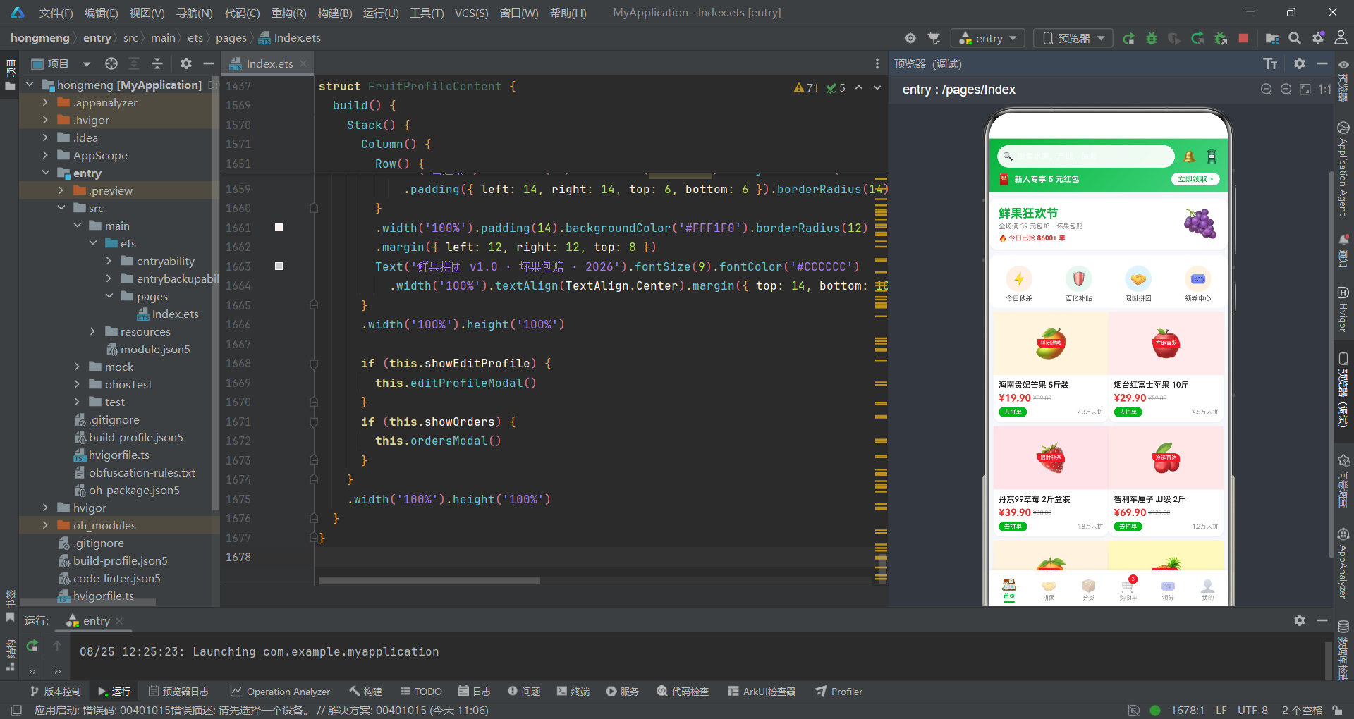
本文深入解析了一款基于HarmonyOS ArkTS声明式UI框架构建的鲜果拼团商城应用。该应用采用多组件分离架构,将首页瀑布流、拼团进度追踪、分类左右分栏、购物车结算管理、领券中心数据可视化和个人中心六大功能模块拆分为六个独立的@Component结构体,由入口组件FruitGroupApp通过MainTab枚举统一调度渲染。在数据层面,应用通过@Observed装饰器定义了可观察的GoodsItem类,配合五组mock数据数组(mockFruits、mockGroups、mockSnacks、mockDrinks、mockSeafood、mockCart)和四个工具函数(fmtPrice、fmtSales、getCateData、getGroupMember*)构建了完整的数据驱动UI体系。设计令牌系统将渐变色配置、快捷入口、分类和优惠券模板集中声明为常量,确保了六个模块间视觉风格的高度一致性。
从技术实现角度来看,应用的核心设计模式体现在四个方面。首先是modalOverlay高阶Builder的复用设计——所有弹框共享同一个遮罩Builder,通过传入不同的onClose回调实现定制化关闭逻辑,大幅减少了遮罩代码的重复。其次是@Observed类的响应式追踪——GoodsItem实例的属性变更(如购物车中的qty修改)能够被框架自动追踪并触发UI更新,配合cartItems.slice()的数组引用更新确保了列表层面的重新渲染。第三是进度条和柱状图的原生实现——所有数据可视化组件完全基于Column组件的动态宽高属性实现,无需引入第三方图表库,进度条百分比通过数值运算或取模推导,柱状图高度通过归一化公式计算。第四是多组件间的状态隔离——每个组件独立管理自己的@State变量和弹框逻辑,六个组件共十余个弹框互不干扰,体现了ArkTS多组件架构的模块化优势。
从工程实践角度来看,该应用展现了ArkTS声明式UI在复杂电商场景下的完整能力。瀑布双列布局通过两个layoutWeight(1)的Column分别承载奇偶索引商品实现了模拟瀑布流效果;拼团进度卡通过sales % 100取模运算将销量数据复用为进度百分比,通过100 - stock * 12的公式计算拼团完成度;购物车的勾选逻辑通过selectedIds数组的不可变更新模式确保了框架的变更检测;优惠券卡片的虚线分隔通过ForEach渲染12个小矩形实现,避免了图片资源的依赖;地址表单通过TextInput和TextArea组件的双向数据绑定收集用户输入,配合constraintSize的最大高度限制确保了小屏适配。整体而言,该应用为HarmonyOS平台的社交电商类应用开发提供了一个架构清晰、交互完整、视觉精致的参考实现,充分展示了ArkTS声明式UI框架在多组件协作、响应式数据管理和复杂数据可视化方面的技术能力。

作为“人工智能6S店”的官方数字引擎,为AI开发者与企业提供一个覆盖软硬件全栈、一站式门户。
更多推荐

 4
4 0
0- 0


 已为社区贡献66条内容

所有评论(0)