
鸿蒙原生ArkTS布局方式之vp/fp自适应单位布局深度解析
项目演示
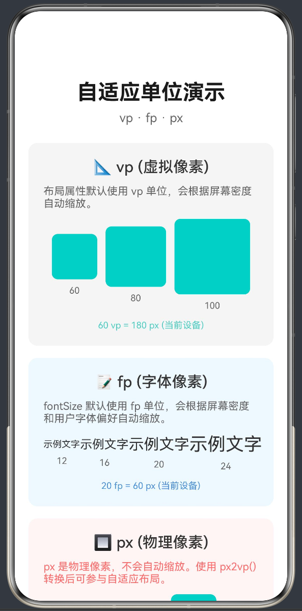
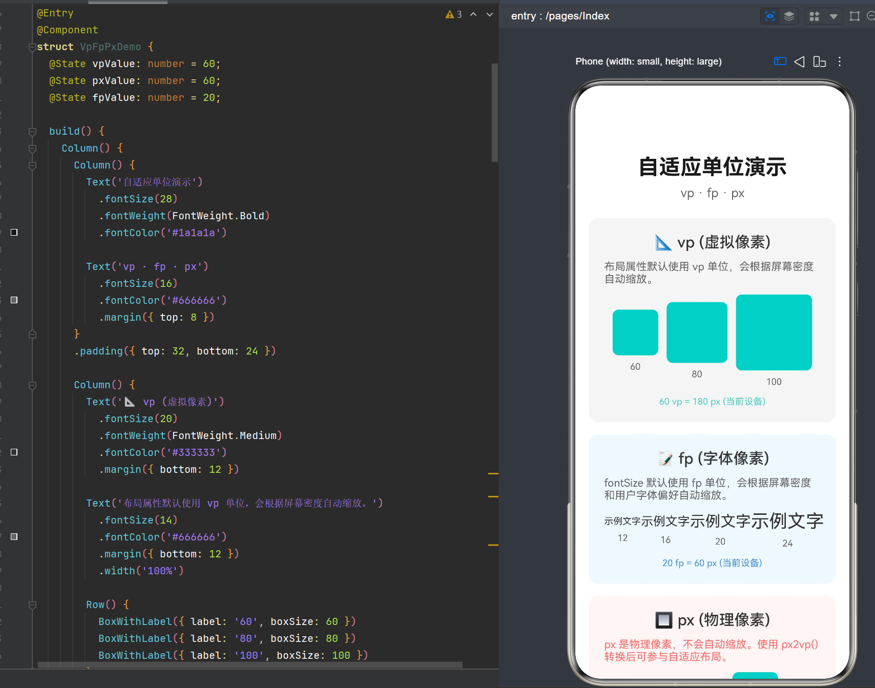
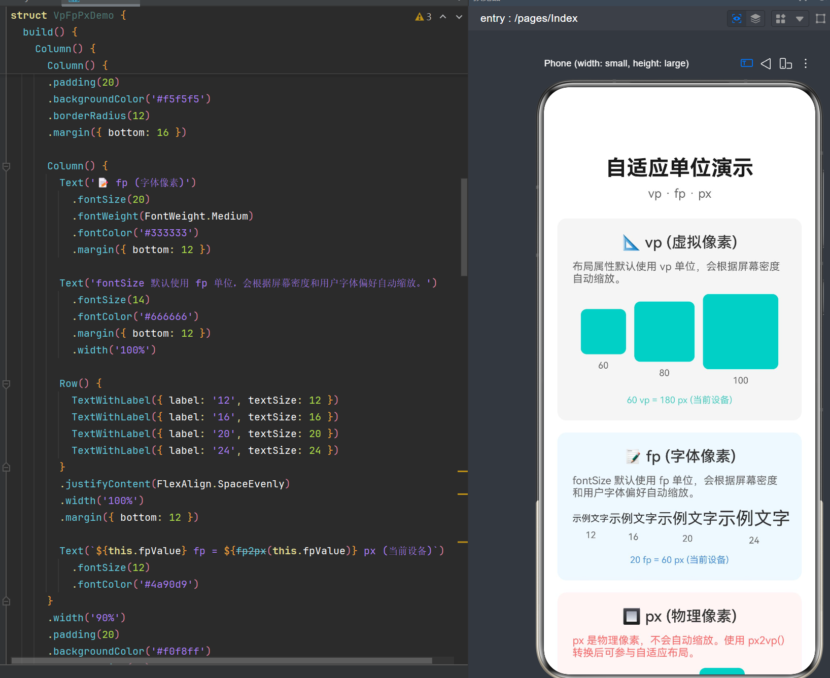
目录
- 引言
- 自适应单位体系概述
- vp(虚拟像素)深度解析
- fp(字体像素)深度解析
- px(物理像素)深度解析
- LengthMetrics类型详解
- UIContext单位转换接口
- 自适应布局最佳实践
- 常见问题与解决方案
- 综合案例实战
1. 引言
1.1 跨设备适配的挑战
在鸿蒙生态中,应用需要运行在多种不同类型的设备上,包括手机、平板、折叠屏、智慧屏、穿戴设备等。这些设备的屏幕尺寸、像素密度、分辨率差异巨大,给UI布局带来了严峻挑战:
- 屏幕尺寸差异:从手表的1.5英寸到智慧屏的65英寸以上
- 像素密度差异:从低分辨率的240dpi到高分辨率的640dpi以上
- 屏幕形态差异:普通屏幕、折叠屏(展开/折叠状态)、旋转屏
如果使用传统的物理像素(px)进行布局,同一个应用在不同设备上的显示效果会截然不同,甚至出现布局错乱、元素过小或过大等问题。
1.2 自适应单位的解决方案
为了解决跨设备适配问题,鸿蒙ArkUI框架提供了一套完整的自适应单位体系,核心包括:
- vp(Virtual Pixel,虚拟像素):基于屏幕密度自适应的布局单位
- fp(Font Pixel,字体像素):基于屏幕密度和用户字体偏好的字体单位
- px(Physical Pixel,物理像素):设备屏幕的实际像素点
- lpx(Logical Pixel,逻辑像素):基于屏幕逻辑宽度的自适应单位
本文将深入探讨vp和fp这两个核心自适应单位的原理、使用方法和最佳实践。
1.3 API版本说明
本文基于HarmonyOS API Version 24进行讲解,涉及的关键API包括:
LengthMetrics(API 12+):长度度量类型UIContext(API 12+):UI上下文,提供单位转换能力getUIContext()(API 12+):获取UI上下文实例
2. 自适应单位体系概述
2.1 单位分类与核心特性
鸿蒙ArkUI提供了四种基本像素单位,每种单位都有其特定的应用场景和自适应机制:
| 单位 | 全称 | 核心特性 | 适用场景 | 默认行为 |
|---|---|---|---|---|
| vp | Virtual Pixel | 根据屏幕密度动态换算 | 布局尺寸(宽高、边距、内边距等) | 数字默认单位 |
| fp | Font Pixel | 根据屏幕密度和系统字体偏好换算 | 字体大小 | fontSize默认单位 |
| px | Physical Pixel | 固定物理像素,不做换算 | 精确像素控制(如图标对齐) | 需显式指定 |
| lpx | Logical Pixel | 根据逻辑宽度比例换算 | 大屏自适应布局 | 需显式指定 |
2.2 单位换算关系
各种单位之间的换算关系如下:
vp = px / (DPI / 160)
fp = vp × 系统字体缩放系数
lpx = 实际屏幕宽度 / designWidth(默认720)
其中DPI(Dots Per Inch)是屏幕像素密度,表示每英寸包含的像素点数。
2.3 不同DPI设备的换算示例
以常见设备为例,展示不同DPI下的单位换算:
| 设备类型 | 典型DPI | 1vp = ? px | 100vp = ? px |
|---|---|---|---|
| 低分辨率设备 | 240 | 1.5px | 150px |
| 中等分辨率设备 | 320 | 2px | 200px |
| 高清设备 | 480 | 3px | 300px |
| 超高清设备 | 640 | 4px | 400px |
这意味着使用vp单位时,同一个布局在不同密度的设备上,物理尺寸保持一致,但实际像素数量不同。
3. vp(虚拟像素)深度解析
3.1 vp的定义与原理
vp(Virtual Pixel,虚拟像素) 是ArkUI框架的默认单位,也是最重要的自适应布局单位。其核心原理是:
vp是一种与屏幕密度无关的虚拟像素单位,1vp在不同密度的屏幕上会自动换算为不同数量的物理像素,以保证元素的物理尺寸在各种设备上保持一致。
换算公式:
vp = px / (DPI / 160)
其中:
px是物理像素数DPI是屏幕像素密度160是基准像素密度(mdpi)
3.2 vp的设计理念
vp的设计基于以下理念:
- 物理尺寸一致性:相同vp值的元素在不同设备上具有相同的物理尺寸
- 触控体验一致性:确保按钮、图标等可交互元素的触控区域大小合适
- 视觉比例一致性:保持布局在不同设备上的视觉比例协调
3.3 vp的使用方式
3.3.1 数字形式(默认vp)
当使用数字作为长度值时,ArkUI默认使用vp单位:
@Entry
@Component
struct VpDemo {
  build() {
    Column() {
      Text('默认vp单位')
        .fontSize(28)
        .width(200)
        .height(80)
        .margin(20)
        .padding(16)
        .backgroundColor('#f0f0f0')
    }
    .width('100%')
    .height('100%')
  }
}
在上述代码中:
fontSize(28)→ 28fp(字体大小默认使用fp)width(200)→ 200vpheight(80)→ 80vpmargin(20)→ 20vppadding(16)→ 16vp
3.3.2 字符串形式(显式指定vp)
可以通过字符串形式显式指定vp单位:
Text('显式vp单位')
  .width('200vp')
  .height('80vp')
  .margin('20vp')
3.3.3 LengthMetrics形式(API 12+)
使用LengthMetrics.vp()方法创建带vp单位的长度值:
import { LengthMetrics } from '@kit.ArkUI';

Text('LengthMetrics vp')
  .width(LengthMetrics.vp(200))
  .height(LengthMetrics.vp(80))
  .margin(LengthMetrics.vp(20))
3.4 vp的应用场景
vp适用于以下场景:
- 组件尺寸:width、height、minWidth、minHeight、maxWidth、maxHeight
- 间距:margin、padding
- 定位:position、offset
- 边框与圆角:borderWidth、borderRadius
- 阴影:shadow的radius、offsetX、offsetY
3.5 vp的优势与局限性
优势
- 自适应屏幕密度:自动适配不同DPI的设备
- 物理尺寸一致:保证触控区域和视觉元素的物理大小
- 使用简单:默认单位,无需额外声明
局限性
- 不适用于字体大小:字体大小应使用fp单位,因为需要考虑用户字体偏好
- 无法处理屏幕尺寸差异:仅解决密度问题,不解决尺寸问题(需配合lpx或百分比)
4. fp(字体像素)深度解析
4.1 fp的定义与原理
fp(Font Pixel,字体像素) 是专门用于字体大小的自适应单位。其核心原理是:
fp是一种与屏幕密度和系统字体偏好相关的字体单位,1fp在不同密度的屏幕上会自动换算为不同数量的物理像素,同时会跟随用户设置的系统字体大小进行缩放。
换算公式:
fp = vp × 系统字体缩放系数
其中系统字体缩放系数由用户在"设置"->“显示与亮度”->"字体大小和界面缩放"中设置,通常范围为0.85~1.3。
4.2 fp与vp的关系
fp和vp的关系可以总结为:
| 特性 | vp | fp |
|---|---|---|
| 密度适配 | 支持 | 支持 |
| 系统字体缩放 | 不支持 | 支持 |
| 默认使用场景 | 布局尺寸 | 字体大小 |
简单来说,fp = vp + 系统字体缩放。
4.3 fp的使用方式
4.3.1 数字形式(默认fp)
当使用数字作为fontSize值时,ArkUI默认使用fp单位:
@Entry
@Component
struct FpDemo {
  build() {
    Column() {
      Text('默认fp单位')
        .fontSize(28)  // 28fp
        .fontWeight(FontWeight.Bold)

      Text('系统字体大小会影响此文字')
        .fontSize(16)  // 16fp
        .margin({ top: 12 })
    }
    .width('100%')
    .height('100%')
    .padding(20)
  }
}
4.3.2 字符串形式(显式指定fp)
可以通过字符串形式显式指定fp单位:
Text('显式fp单位')
  .fontSize('28fp')
4.3.3 LengthMetrics形式(API 12+)
使用LengthMetrics.fp()方法创建带fp单位的长度值:
import { LengthMetrics } from '@kit.ArkUI';

Text('LengthMetrics fp')
  .fontSize(LengthMetrics.fp(28))
4.4 fp的应用场景
fp适用于以下场景:
- 字体大小:fontSize
- 字体相关的间距:行高、字间距等
4.5 fp的优势
- 自适应屏幕密度:保证文字在不同DPI设备上的可读性
- 尊重用户偏好:跟随系统字体大小设置,提升可访问性
- 统一字体体验:确保应用内字体大小与系统保持一致
4.6 fp在可访问性中的重要性
使用fp单位对于应用的可访问性至关重要:
- 视障用户:可以通过系统设置放大字体,提升阅读体验
- 老年用户:可以设置更大的字体,方便阅读
- 个性化需求:不同用户有不同的字体偏好
5. px(物理像素)深度解析
5.1 px的定义与特性
px(Physical Pixel,物理像素) 是设备屏幕的最小显示单元,代表屏幕上的一个实际像素点。
特点:
- 固定不变:1px始终等于屏幕上的一个物理像素点
- 不做换算:不会根据屏幕密度或系统设置进行调整
- 适配性差:在不同密度的设备上,相同px值的元素视觉大小差异很大
5.2 px的使用方式
5.2.1 字符串形式
必须通过字符串形式显式指定px单位:
Text('物理像素')
  .width('200px')
  .height('80px')
5.2.2 LengthMetrics形式(API 12+)
使用LengthMetrics.px()方法创建带px单位的长度值:
import { LengthMetrics } from '@kit.ArkUI';

Text('LengthMetrics px')
  .width(LengthMetrics.px(200))
  .height(LengthMetrics.px(80))
5.3 px的应用场景
px适用于以下场景:
- 图标对齐:需要精确像素对齐的图标或图形
- 边框细线:1px的边框(如分割线)
- 位图尺寸:图片资源的原始尺寸
- 性能优化:避免不必要的单位换算(特定场景)
5.4 px的局限性
px主要存在以下局限性:
- 适配性差:在不同DPI设备上视觉大小不一致
- 不推荐用于布局:使用px进行布局会导致应用在不同设备上显示效果差异巨大
- 无法响应系统设置:不会跟随系统字体大小或界面缩放进行调整
5.5 px与vp的对比示例
@Entry
@Component
struct PxVsVpDemo {
  build() {
    Column() {
      Row() {
        Text('60px')
          .width('60px')
          .height('60px')
          .backgroundColor('#ff6b6b')
          .fontColor('#ffffff')
          .fontSize(12)
          .textAlign(TextAlign.Center)

        Text('60vp')
          .width(60)
          .height(60)
          .backgroundColor('#4ecdc4')
          .fontColor('#ffffff')
          .fontSize(12)
          .textAlign(TextAlign.Center)
      }
      .justifyContent(FlexAlign.SpaceEvenly)
      .width('100%')
      .padding(20)

      Text('在高DPI设备上,60vp会比60px大')
        .fontSize(14)
        .fontColor('#666666')
        .margin({ top: 12 })
    }
    .width('100%')
    .height('100%')
  }
}
在480DPI的设备上:
- 60px = 60物理像素
- 60vp = 60 × (480/160) = 180物理像素
因此,60vp的视觉大小是60px的3倍。
6. LengthMetrics类型详解
6.1 LengthMetrics的定义
LengthMetrics(API 12+)是ArkUI框架提供的长度度量类型,用于创建和管理带单位的长度值。
定义如下:
export declare class LengthMetrics {
  constructor(value: number, unit?: LengthUnit);
  static px(value: number): LengthMetrics;
  static vp(value: number): LengthMetrics;
  static fp(value: number): LengthMetrics;
  static percent(value: number): LengthMetrics;
  static lpx(value: number): LengthMetrics;
  static resource(value: Resource): LengthMetrics;

  public unit: LengthUnit;
  public value: number;
}
6.2 LengthMetrics的静态方法
| 方法 | 说明 | 示例 |
|---|---|---|
LengthMetrics.px(value) |
创建px单位的长度值 | LengthMetrics.px(100) |
LengthMetrics.vp(value) |
创建vp单位的长度值 | LengthMetrics.vp(100) |
LengthMetrics.fp(value) |
创建fp单位的长度值 | LengthMetrics.fp(28) |
LengthMetrics.percent(value) |
创建百分比单位的长度值 | LengthMetrics.percent(50) |
LengthMetrics.lpx(value) |
创建lpx单位的长度值 | LengthMetrics.lpx(360) |
LengthMetrics.resource(value) |
创建基于资源的长度值 | LengthMetrics.resource($r('app.float.size')) |
6.3 LengthMetrics的使用场景
6.3.1 类型安全的长度设置
在需要强类型长度值的场景中使用:
import { LengthMetrics } from '@kit.ArkUI';

@Entry
@Component
struct LengthMetricsDemo {
  // 定义带单位的常量
  private readonly cardWidth: LengthMetrics = LengthMetrics.vp(200);
  private readonly cardHeight: LengthMetrics = LengthMetrics.vp(120);
  private readonly cardMargin: LengthMetrics = LengthMetrics.vp(16);
  private readonly titleFontSize: LengthMetrics = LengthMetrics.fp(18);

  build() {
    Column() {
      Text('类型安全的长度设置')
        .fontSize(this.titleFontSize)
        .width(this.cardWidth)
        .height(this.cardHeight)
        .margin(this.cardMargin)
        .backgroundColor('#f5f5f5')
        .textAlign(TextAlign.Center)
    }
    .width('100%')
    .height('100%')
  }
}
6.3.2 动态单位转换
结合UIContext进行单位转换:
import { LengthMetrics } from '@kit.ArkUI';

@Entry
@Component
struct DynamicConversionDemo {
  build() {
    Column() {
      Text('动态单位转换')
        .fontSize(20)
        .fontWeight(FontWeight.Medium)
        .margin({ bottom: 16 })

      // 使用getUIContext()获取上下文
      Text(`100vp = ${getUIContext().vp2px(100)} px`)
        .fontSize(14)
        .margin({ bottom: 8 })

      Text(`100px = ${getUIContext().px2vp(100)} vp`)
        .fontSize(14)
        .margin({ bottom: 8 })

      Text(`20fp = ${getUIContext().fp2px(20)} px`)
        .fontSize(14)
    }
    .width('100%')
    .height('100%')
    .padding(20)
  }
}
6.4 LengthMetrics的优势
- 类型安全:提供编译时类型检查,避免单位错误
- 语义清晰:明确指定单位,代码可读性更好
- 灵活性:支持多种单位类型,适应不同场景
- 资源支持:可以直接使用资源文件定义的值
7. UIContext单位转换接口
7.1 UIContext的定义
UIContext(API 12+)是UI上下文对象,提供了单位转换、屏幕信息获取等能力。
核心接口:
interface UIContext {
  vp2px(value: number): number;
  px2vp(value: number): number;
  fp2px(value: number): number;
  px2fp(value: number): number;
  lpx2px(value: number): number;
  px2lpx(value: number): number;

  // 屏幕信息
  readonly screenWidth: number;
  readonly screenHeight: number;
  readonly density: number;
}
7.2 获取UIContext
使用getUIContext()函数获取UIContext实例:
const uiContext = getUIContext();
const pxValue = uiContext.vp2px(100);
7.3 单位转换方法详解
7.3.1 vp2px
将vp单位转换为px单位:
const uiContext = getUIContext();
const vpValue = 100;
const pxValue = uiContext.vp2px(vpValue);
// 在480DPI设备上:pxValue = 300
7.3.2 px2vp
将px单位转换为vp单位:
const uiContext = getUIContext();
const pxValue = 300;
const vpValue = uiContext.px2vp(pxValue);
// 在480DPI设备上:vpValue = 100
7.3.3 fp2px
将fp单位转换为px单位:
const uiContext = getUIContext();
const fpValue = 28;
const pxValue = uiContext.fp2px(fpValue);
// 结果受系统字体缩放系数影响
7.3.4 px2fp
将px单位转换为fp单位:
const uiContext = getUIContext();
const pxValue = 84;
const fpValue = uiContext.px2fp(pxValue);
// 结果受系统字体缩放系数影响
7.4 屏幕信息获取
7.4.1 screenWidth 和 screenHeight
获取屏幕的宽高(以px为单位):
const uiContext = getUIContext();
const screenWidth = uiContext.screenWidth;  // 屏幕宽度(px)
const screenHeight = uiContext.screenHeight;  // 屏幕高度(px)
7.4.2 density
获取屏幕密度:
const uiContext = getUIContext();
const density = uiContext.density;  // 屏幕密度(DPI/160)
7.5 单位转换的应用场景
7.5.1 动态布局计算
根据屏幕尺寸动态计算布局参数:
@Entry
@Component
struct DynamicLayoutDemo {
  private cardWidth: number = 0;

  aboutToAppear() {
    const uiContext = getUIContext();
    // 卡片宽度为屏幕宽度的80%,减去左右边距
    this.cardWidth = uiContext.px2vp(uiContext.screenWidth * 0.8) - 32;
  }

  build() {
    Column() {
      Text('动态布局计算')
        .fontSize(20)
        .fontWeight(FontWeight.Medium)
        .margin({ bottom: 16 })

      Column()
        .width(this.cardWidth)
        .height(120)
        .backgroundColor('#f5f5f5')
        .borderRadius(12)
        .padding(16)
    }
    .width('100%')
    .height('100%')
    .padding(16)
  }
}
7.5.2 第三方库集成
当与第三方库(如图表库、地图库)集成时,可能需要进行单位转换:
@Entry
@Component
struct ThirdPartyIntegrationDemo {
  build() {
    Column() {
      // 第三方库通常使用px单位
      const chartWidthPx = getUIContext().vp2px(300);
      const chartHeightPx = getUIContext().vp2px(200);

      // 传递px值给第三方组件
      // ThirdPartyChart({ width: chartWidthPx, height: chartHeightPx })

      Text(`图表尺寸:${chartWidthPx} × ${chartHeightPx} px`)
        .fontSize(14)
        .margin({ top: 16 })
    }
    .width('100%')
    .height('100%')
    .padding(20)
  }
}
7.6 废弃的全局转换函数
重要提示:从API Version 18开始,全局的
vp2px、px2vp、fp2px、px2fp、lpx2px、px2lpx函数已被废弃,建议使用UIContext接口替代。
废弃函数的问题:
- UI上下文不明确:全局函数无法确定当前所在的UI实例,可能导致转换结果不准确
- 线程安全问题:在非UI线程调用可能导致异常
- 维护成本高:全局函数难以维护和扩展
推荐的替代方式:
// 废弃方式(不推荐)
const pxValue = vp2px(100);

// 推荐方式
const uiContext = getUIContext();
const pxValue = uiContext.vp2px(100);
8. 自适应布局最佳实践
8.1 布局单位选择原则
遵循以下原则选择合适的单位:
- 布局尺寸使用vp:width、height、margin、padding、borderRadius等
- 字体大小使用fp:fontSize
- 避免使用px:除非有特殊需求(如图标对齐)
- 大屏适配使用lpx或百分比:针对折叠屏、平板等设备
8.2 组件属性单位映射表
| 属性类型 | 推荐单位 | 示例 |
|---|---|---|
| 宽度/高度 | vp | .width(200) |
| 外边距/内边距 | vp | .margin(16) |
| 圆角 | vp | .borderRadius(12) |
| 边框宽度 | vp或px | .borderWidth(1) |
| 字体大小 | fp | .fontSize(28) |
| 行高 | fp | .lineHeight(40) |
| 阴影半径 | vp | .shadow({ radius: 4 }) |
8.3 响应式布局策略
8.3.1 使用百分比
对于需要随屏幕大小变化的元素,使用百分比:
@Entry
@Component
struct ResponsiveLayoutDemo {
  build() {
    Column() {
      // 占满父容器宽度的80%
      Column()
        .width('80%')
        .height(200)
        .backgroundColor('#f5f5f5')
        .borderRadius(12)
        .margin({ bottom: 16 })

      // 占满父容器宽度的60%
      Column()
        .width('60%')
        .height(150)
        .backgroundColor('#e8f4f8')
        .borderRadius(12)
    }
    .width('100%')
    .height('100%')
    .padding(20)
  }
}
8.3.2 使用弹性布局
使用Flex布局实现弹性响应式设计:
@Entry
@Component
struct FlexResponsiveDemo {
  build() {
    Column() {
      Row() {
        // 三个等宽的子元素
        Column()
          .flexGrow(1)
          .height(100)
          .backgroundColor('#ff6b6b')
          .margin({ right: 8 })

        Column()
          .flexGrow(1)
          .height(100)
          .backgroundColor('#4ecdc4')
          .margin({ right: 8 })

        Column()
          .flexGrow(1)
          .height(100)
          .backgroundColor('#45b7d1')
      }
      .width('100%')
      .margin({ bottom: 16 })

      Row() {
        // 不同比例的子元素
        Column()
          .flexGrow(2)
          .height(80)
          .backgroundColor('#96ceb4')
          .margin({ right: 8 })

        Column()
          .flexGrow(1)
          .height(80)
          .backgroundColor('#ffeaa7')
      }
      .width('100%')
    }
    .width('100%')
    .height('100%')
    .padding(20)
  }
}
8.4 字体大小适配策略
8.4.1 使用fp单位
始终使用fp作为字体大小单位:
@Entry
@Component
struct FontSizeDemo {
  build() {
    Column() {
      // 标题
      Text('标题文本')
        .fontSize(28)  // 28fp
        .fontWeight(FontWeight.Bold)
        .margin({ bottom: 8 })

      // 副标题
      Text('副标题文本')
        .fontSize(22)  // 22fp
        .fontWeight(FontWeight.Medium)
        .margin({ bottom: 8 })

      // 正文
      Text('正文文本内容')
        .fontSize(16)  // 16fp
        .margin({ bottom: 8 })

      // 辅助文字
      Text('辅助说明文字')
        .fontSize(14)  // 14fp
        .fontColor('#999999')
    }
    .width('100%')
    .height('100%')
    .padding(20)
  }
}
8.4.2 使用资源文件
将字体大小定义在资源文件中,便于统一管理:
resources/base/element/float.json:
{
  "float": [
    {
      "name": "font_size_title",
      "value": "28fp"
    },
    {
      "name": "font_size_subtitle",
      "value": "22fp"
    },
    {
      "name": "font_size_body",
      "value": "16fp"
    },
    {
      "name": "font_size_caption",
      "value": "14fp"
    }
  ]
}
使用资源:
@Entry
@Component
struct ResourceFontSizeDemo {
  build() {
    Column() {
      Text('标题文本')
        .fontSize($r('app.float.font_size_title'))
        .fontWeight(FontWeight.Bold)
        .margin({ bottom: 8 })

      Text('副标题文本')
        .fontSize($r('app.float.font_size_subtitle'))
        .fontWeight(FontWeight.Medium)
        .margin({ bottom: 8 })

      Text('正文文本内容')
        .fontSize($r('app.float.font_size_body'))
        .margin({ bottom: 8 })

      Text('辅助说明文字')
        .fontSize($r('app.float.font_size_caption'))
        .fontColor('#999999')
    }
    .width('100%')
    .height('100%')
    .padding(20)
  }
}
8.5 间距设计规范
8.5.1 间距系统
建立统一的间距系统,确保布局的一致性:
// 间距常量定义
const SPACING_XXS = 4;   // 4vp - 极小间距
const SPACING_XS = 8;    // 8vp - 小间距
const SPACING_S = 12;    // 12vp - 较小间距
const SPACING_M = 16;    // 16vp - 中等间距
const SPACING_L = 24;    // 24vp - 较大间距
const SPACING_XL = 32;   // 32vp - 大间距
const SPACING_XXL = 48;  // 48vp - 极大间距

@Entry
@Component
struct SpacingSystemDemo {
  build() {
    Column() {
      Text('间距系统演示')
        .fontSize(24)
        .fontWeight(FontWeight.Bold)
        .margin({ bottom: SPACING_L })

      Column()
        .width('100%')
        .height(80)
        .backgroundColor('#f5f5f5')
        .borderRadius(8)
        .padding(SPACING_M)
        .margin({ bottom: SPACING_M })

      Row() {
        Column()
          .flexGrow(1)
          .height(60)
          .backgroundColor('#e8f4f8')
          .borderRadius(8)
          .margin({ right: SPACING_S })

        Column()
          .flexGrow(1)
          .height(60)
          .backgroundColor('#fff5f5')
          .borderRadius(8)
      }
      .width('100%')
    }
    .width('100%')
    .height('100%')
    .padding(SPACING_L)
  }
}
8.5.2 响应式间距
根据屏幕尺寸调整间距:
@Entry
@Component
struct ResponsiveSpacingDemo {
  private spacing: number = 16;

  aboutToAppear() {
    const uiContext = getUIContext();
    const screenWidthVp = uiContext.px2vp(uiContext.screenWidth);

    // 根据屏幕宽度调整间距
    if (screenWidthVp > 720) {
      // 平板或大屏设备
      this.spacing = 24;
    } else if (screenWidthVp > 480) {
      // 中等屏幕设备
      this.spacing = 20;
    } else {
      // 小屏设备
      this.spacing = 16;
    }
  }

  build() {
    Column() {
      Text('响应式间距')
        .fontSize(24)
        .fontWeight(FontWeight.Bold)
        .margin({ bottom: this.spacing })

      Column()
        .width('100%')
        .height(100)
        .backgroundColor('#f5f5f5')
        .borderRadius(12)
        .padding(this.spacing)
    }
    .width('100%')
    .height('100%')
    .padding(this.spacing)
  }
}
9. 常见问题与解决方案
9.1 编译错误:单位后缀语法错误
问题描述
尝试使用24vp、28fp等单位后缀语法,导致编译错误:
Error: '24vp' is not defined
原因分析
ArkTS不支持24vp、28fp这种单位后缀语法,数字默认就是vp单位(布局属性)或fp单位(字体属性)。
解决方案
使用纯数字或字符串形式:
// 错误方式(不支持)
Text('示例')
  .width(24vp)
  .fontSize(28fp)

// 正确方式 - 纯数字(推荐)
Text('示例')
  .width(24)      // 默认24vp
  .fontSize(28)   // 默认28fp

// 正确方式 - 字符串形式
Text('示例')
  .width('24vp')
  .fontSize('28fp')

// 正确方式 - LengthMetrics(API 12+)
import { LengthMetrics } from '@kit.ArkUI';

Text('示例')
  .width(LengthMetrics.vp(24))
  .fontSize(LengthMetrics.fp(28))
9.2 编译错误:类型不匹配
问题描述
使用字符串或其他类型赋值给期望LengthMetrics类型的属性:
Error: Type 'string' is not assignable to type 'LengthMetrics'
原因分析
某些API(特别是API 12+引入的新API)要求使用LengthMetrics类型。
解决方案
使用LengthMetrics的静态方法创建正确类型的值:
import { LengthMetrics } from '@kit.ArkUI';

// 错误方式
Text('示例')
  .width('200vp')  // 某些API要求LengthMetrics类型

// 正确方式
Text('示例')
  .width(LengthMetrics.vp(200))
9.3 布局错乱:使用px导致的适配问题
问题描述
在高DPI设备上,使用px单位的元素显示过小,导致布局错乱。
原因分析
px是物理像素单位,不会根据屏幕密度进行换算。在高DPI设备上,相同px值的元素视觉上会更小。
解决方案
将px转换为vp:
// 错误方式
Text('示例')
  .width('200px')

// 正确方式
Text('示例')
  .width(200)  // 200vp,自动适配屏幕密度

// 或者使用px2vp转换(如果必须使用px)
const uiContext = getUIContext();
Text('示例')
  .width(uiContext.px2vp(200))
9.4 字体不跟随系统设置
问题描述
用户在系统设置中调整了字体大小,但应用中的字体大小没有变化。
原因分析
可能使用了vp或px单位设置字体大小,而不是fp单位。
解决方案
确保字体大小使用fp单位(默认就是fp):
// 错误方式
Text('示例')
  .fontSize(LengthMetrics.vp(28))  // 不会跟随系统字体设置

// 正确方式
Text('示例')
  .fontSize(28)  // 默认28fp,会跟随系统字体设置

// 或者显式使用fp
Text('示例')
  .fontSize(LengthMetrics.fp(28))
9.5 全局转换函数弃用警告
问题描述
使用vp2px、px2vp等全局函数时,编译器提示"deprecated"警告。
原因分析
从API Version 18开始,全局的单位转换函数已被废弃,推荐使用UIContext接口。
解决方案
使用getUIContext()获取UIContext实例:
// 废弃方式(不推荐)
const pxValue = vp2px(100);

// 推荐方式
const uiContext = getUIContext();
const pxValue = uiContext.vp2px(100);
9.6 组件属性命名冲突
问题描述
自定义组件的属性名与系统属性名冲突:
Error: Property 'size' in type 'MyComponent' is not assignable to the same property in base type 'CustomComponent'
原因分析
自定义组件的属性名(如size、fontSize)与组件基类的属性名冲突。
解决方案
重命名自定义属性:
// 错误方式
@Component
struct BoxWithLabel {
  label: string = '';
  size: number = 60;  // 与系统属性冲突
}

// 正确方式
@Component
struct BoxWithLabel {
  label: string = '';
  boxSize: number = 60;  // 修改属性名
}
9.7 组件参数传递错误
问题描述
传递参数给自定义组件时出现类型错误:
Error: Type '"60"' has no properties in common with type '{ label?: string; boxSize?: number; }'
原因分析
自定义组件需要对象形式的参数传递,而不是多个独立参数。
解决方案
使用对象形式传递参数:
// 错误方式
BoxWithLabel('60', 60)

// 正确方式
BoxWithLabel({ label: '60', boxSize: 60 })
10. 综合案例实战
10.1 案例概述
本案例实现一个商品列表页面,展示vp/fp自适应单位的综合应用。页面包含:
- 顶部导航栏
- 商品列表(包含商品图片、标题、价格、购买按钮)
- 底部信息栏
10.2 完整代码
/**
 * 商品列表页面 - vp/fp自适应单位综合案例
 *
 * 本案例演示了:
 * 1. 布局属性使用vp单位(默认)
 * 2. 字体大小使用fp单位(默认)
 * 3. 响应式布局设计
 * 4. 间距系统应用
 * 5. UIContext单位转换
 */

@Entry
@Component
struct ProductListPage {
  // 商品数据
  @State products: Product[] = [
    {
      id: 1,
      name: '智能手表 Pro',
      price: 1299,
      originalPrice: 1599,
      image: 'https://example.com/watch.jpg',
      description: '高性能智能手表,支持心率监测、运动追踪、消息提醒等功能',
      tag: '热销'
    },
    {
      id: 2,
      name: '无线蓝牙耳机',
      price: 399,
      originalPrice: 499,
      image: 'https://example.com/earbuds.jpg',
      description: '高品质无线蓝牙耳机,支持主动降噪,续航长达30小时',
      tag: '新品'
    },
    {
      id: 3,
      name: '便携充电宝',
      price: 199,
      originalPrice: 299,
      image: 'https://example.com/powerbank.jpg',
      description: '大容量便携充电宝,支持快充,轻薄便携',
      tag: '特价'
    }
  ];

  // 间距常量
  private readonly SPACING_S = 12;
  private readonly SPACING_M = 16;
  private readonly SPACING_L = 24;

  // 字体大小常量
  private readonly FONT_TITLE = 18;
  private readonly FONT_BODY = 14;
  private readonly FONT_CAPTION = 12;
  private readonly FONT_PRICE = 22;

  build() {
    Column() {
      // ========== 顶部导航栏 ==========
      Column() {
        Row() {
          Text('商品列表')
            .fontSize(28)
            .fontWeight(FontWeight.Bold)
            .fontColor('#1a1a1a')

          Blank()

          Text(`共${this.products.length}件商品`)
            .fontSize(this.FONT_BODY)
            .fontColor('#666666')
        }
        .width('100%')
        .height(56)
        .padding({ left: this.SPACING_M, right: this.SPACING_M })
        .alignItems(VerticalAlign.Center)
      }
      .backgroundColor('#ffffff')
      .shadow({ radius: 4, color: '#00000010', offsetY: 2 })

      // ========== 商品列表 ==========
      Scroll() {
        Column() {
          ForEach(this.products, (product: Product) => {
            ProductCard({ product: product })
              .margin({ bottom: this.SPACING_M })
          })
        }
        .width('100%')
        .padding({ top: this.SPACING_M })
      }
      .width('100%')
      .flexGrow(1)
      .backgroundColor('#f5f5f5')

      // ========== 底部信息栏 ==========
      Column() {
        Row() {
          Column() {
            Text('合计')
              .fontSize(this.FONT_CAPTION)
              .fontColor('#666666')

            Text(`¥${this.getTotalPrice()}`)
              .fontSize(this.FONT_PRICE)
              .fontWeight(FontWeight.Bold)
              .fontColor('#ff4757')
          }

          Blank()

          Text('去结算')
            .fontSize(this.FONT_BODY)
            .fontWeight(FontWeight.Medium)
            .fontColor('#ffffff')
            .backgroundColor('#ff4757')
            .padding({ top: 12, right: 32, bottom: 12, left: 32 })
            .borderRadius(32)
        }
        .width('100%')
        .padding({ top: this.SPACING_M, right: this.SPACING_M, bottom: this.SPACING_M, left: this.SPACING_M })
        .backgroundColor('#ffffff')
      }
      .shadow({ radius: 4, color: '#00000010', offsetY: -2 })
    }
    .width('100%')
    .height('100%')
    .backgroundColor('#f5f5f5')
  }

  // 计算总价
  getTotalPrice(): number {
    return this.products.reduce((sum, product) => sum + product.price, 0);
  }
}

/**
 * 商品接口定义
 */
interface Product {
  id: number;
  name: string;
  price: number;
  originalPrice: number;
  image: string;
  description: string;
  tag: string;
}

/**
 * 商品卡片组件
 */
@Component
struct ProductCard {
  private product: Product = {} as Product;

  // 间距常量
  private readonly SPACING_S = 12;
  private readonly SPACING_M = 16;

  // 字体大小常量
  private readonly FONT_TITLE = 18;
  private readonly FONT_BODY = 14;
  private readonly FONT_CAPTION = 12;
  private readonly FONT_PRICE = 22;

  build() {
    Column() {
      Row() {
        // 商品图片占位
        Column()
          .width(120)
          .height(120)
          .backgroundColor('#e8f4f8')
          .borderRadius(8)
          .margin({ right: this.SPACING_M })

        // 商品信息
        Column() {
          Row() {
            Text(this.product.name)
              .fontSize(this.FONT_TITLE)
              .fontWeight(FontWeight.Medium)
              .fontColor('#1a1a1a')
              .flexGrow(1)

            Text(this.product.tag)
              .fontSize(this.FONT_CAPTION)
              .fontColor('#ffffff')
              .backgroundColor('#ff4757')
              .padding({ top: 2, right: 8, bottom: 2, left: 8 })
              .borderRadius(4)
          }
          .width('100%')
          .margin({ bottom: 8 })

          Text(this.product.description)
            .fontSize(this.FONT_BODY)
            .fontColor('#666666')
            .width('100%')
            .maxLines(2)
            .margin({ bottom: 12 })

          Row() {
            Column() {
              Text('¥' + this.product.price)
                .fontSize(this.FONT_PRICE)
                .fontWeight(FontWeight.Bold)
                .fontColor('#ff4757')

              Text('¥' + this.product.originalPrice)
                .fontSize(this.FONT_CAPTION)
                .fontColor('#999999')
                .decoration({ type: TextDecorationType.LineThrough })
            }

            Blank()

            Text('加入购物车')
              .fontSize(this.FONT_BODY)
              .fontColor('#ffffff')
              .backgroundColor('#ff4757')
              .padding({ top: 6, right: 16, bottom: 6, left: 16 })
              .borderRadius(20)
          }
          .width('100%')
        }
        .flexGrow(1)
      }
      .width('100%')
    }
    .width('100%')
    .padding(this.SPACING_M)
    .backgroundColor('#ffffff')
    .borderRadius(12)
    .shadow({ radius: 4, color: '#00000008', offsetY: 2 })
  }
}
10.3 代码解析
10.3.1 布局单位应用
在本案例中,所有布局属性都使用默认的vp单位:
.width(120)→ 120vp.height(120)→ 120vp.margin({ bottom: 16 })→ 16vp.padding(16)→ 16vp.borderRadius(12)→ 12vp
10.3.2 字体单位应用
所有字体大小都使用默认的fp单位:
.fontSize(28)→ 28fp.fontSize(18)→ 18fp.fontSize(14)→ 14fp.fontSize(12)→ 12fp
10.3.3 间距系统
定义了统一的间距常量:
private readonly SPACING_S = 12;  // 12vp
private readonly SPACING_M = 16;  // 16vp
private readonly SPACING_L = 24;  // 24vp
10.3.4 响应式设计
使用Scroll组件实现列表滚动,使用flexGrow实现弹性布局,确保页面在不同屏幕尺寸下都能正常显示。
10.4 运行效果
在不同设备上运行时:
- 手机设备:商品卡片宽度约占屏幕宽度的90%,间距适中
- 平板设备:商品卡片宽度自动适应,视觉比例保持一致
- 系统字体调整:用户调整系统字体大小时,所有文字都会相应缩放
- 不同DPI设备:相同vp值的元素在不同密度设备上物理尺寸一致
总结
本文深入探讨了鸿蒙ArkTS布局方式中vp和fp自适应单位的原理、使用方法和最佳实践。核心要点如下:
- vp是布局的默认单位:用于width、height、margin、padding等布局属性,根据屏幕密度自动换算
- fp是字体的默认单位:用于fontSize,根据屏幕密度和系统字体偏好自动换算
- px应尽量避免:仅在需要精确像素控制的特殊场景使用
- LengthMetrics提供类型安全:API 12+引入的长度度量类型,支持显式单位声明
- UIContext提供单位转换:API 12+引入的UI上下文,替代废弃的全局转换函数
- 遵循最佳实践:布局用vp,字体用fp,避免使用单位后缀语法
通过正确使用vp和fp单位,开发者可以轻松实现跨设备的自适应布局,确保应用在各种鸿蒙设备上都能提供一致的用户体验。

作为“人工智能6S店”的官方数字引擎,为AI开发者与企业提供一个覆盖软硬件全栈、一站式门户。
更多推荐

 4
4 0
0- 0


 已为社区贡献22条内容

所有评论(0)