
鸿蒙原生ArkTS布局方式之width/height动态变化布局深度解析
项目演示
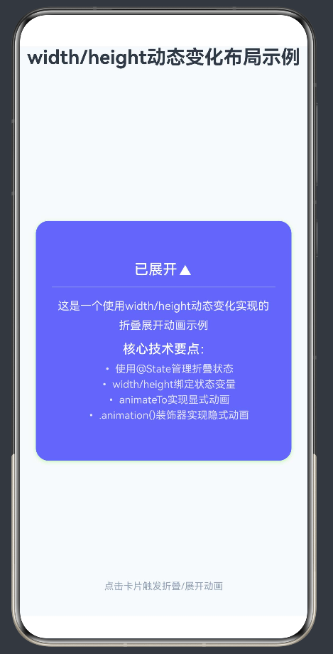
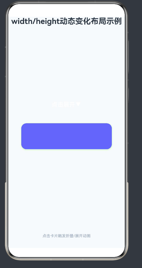
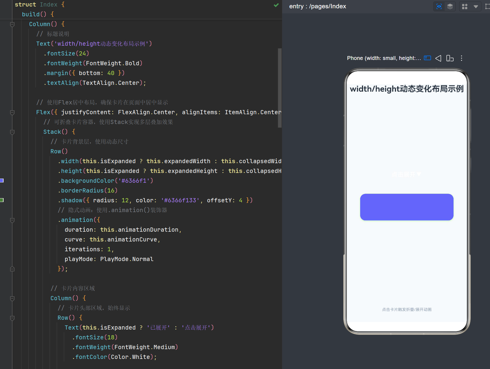
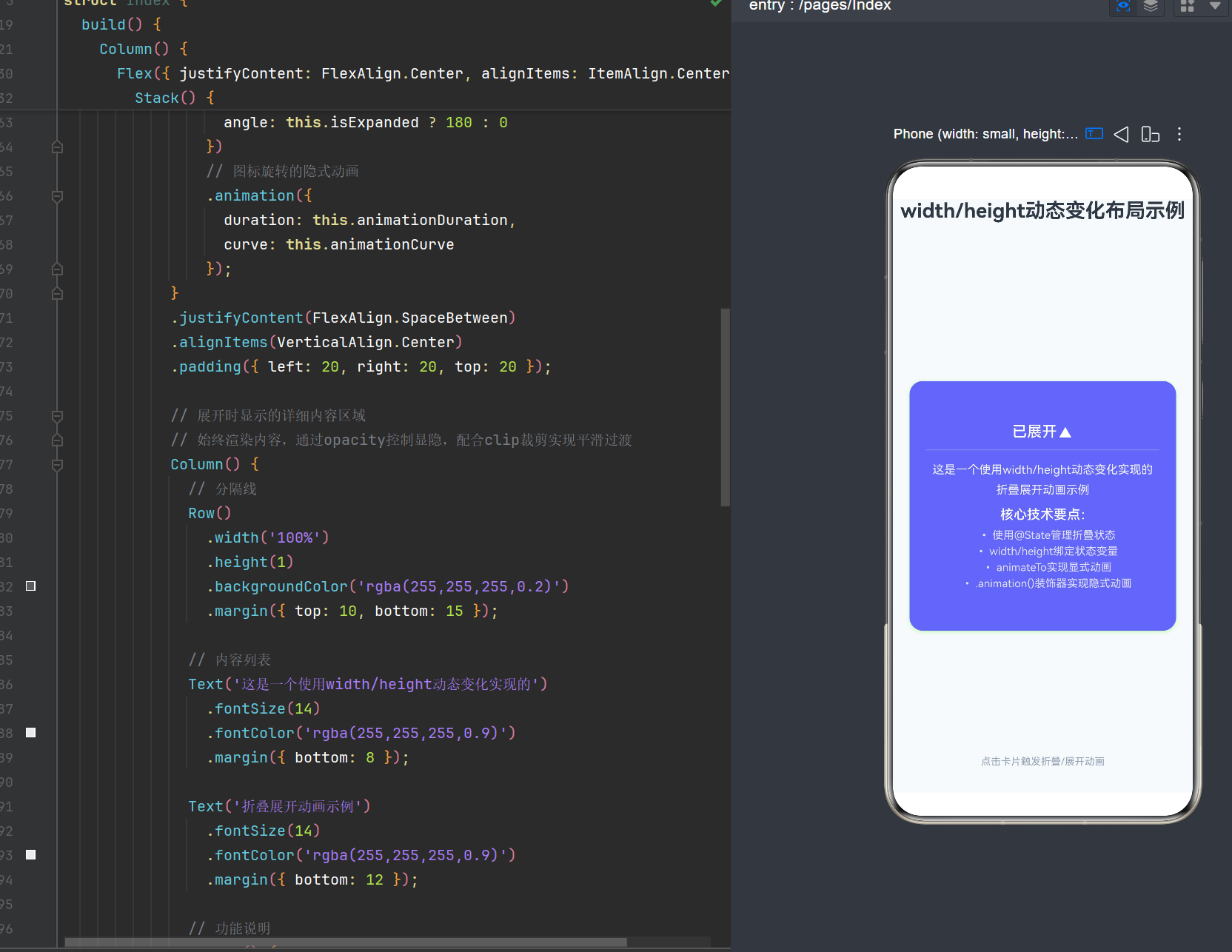
概述
在HarmonyOS NEXT应用开发中,布局是构建高质量UI的核心技术之一。其中,width/height动态变化布局是实现组件尺寸动态调整的重要手段,广泛应用于折叠面板、展开收起、弹窗动画等交互场景。本文将深入探讨ArkTS中width/height动态变化布局的原理、实现方式、动画效果及最佳实践,帮助开发者掌握这一核心布局技术。
目录
- 核心概念与原理
- width/height属性基础
- 状态管理与响应式布局
- animateTo显式动画详解
- 属性动画与隐式动画
- 动画曲线与缓动效果
- 实战场景:折叠展开动画
- 高级技巧与性能优化
- 常见问题与解决方案
- 总结与展望
1. 核心概念与原理
1.1 布局系统概述
HarmonyOS ArkUI框架提供了一套声明式UI布局系统,开发者通过描述组件的属性和状态来构建界面。布局系统负责计算组件的位置和大小,确保界面在不同设备上正确显示。
1.2 width/height动态变化的本质
width/height动态变化布局的核心在于:组件的宽度和高度不再是固定值,而是根据状态变量动态计算。当状态变化时,布局系统重新计算组件尺寸,并通过动画过渡实现平滑的视觉效果。
1.3 布局流程
状态变化 → 属性更新 → 布局计算 → 渲染绘制 → 动画过渡
- 状态变化:用户操作或业务逻辑触发状态变量改变
- 属性更新:组件的width/height属性根据新状态重新计算
- 布局计算:布局系统重新测量和排列组件
- 渲染绘制:图形渲染管线绘制新的组件外观
- 动画过渡:通过animateTo或属性动画实现平滑过渡效果
2. width/height属性基础
2.1 属性类型与取值
在ArkTS中,width和height属性支持多种取值方式:
// 1. 固定数值(单位:vp)
.width(200)
.height(100)

// 2. 百分比(相对于父容器)
.width('50%')
.height('80%')

// 3. 自适应内容
.width('wrap_content')
.height('wrap_content')

// 4. 填充父容器
.width('match_parent')
.height('match_parent')

// 5. 动态计算值
.width(this.isExpanded ? 300 : 100)
.height(this.calculateHeight())
2.2 尺寸单位
ArkTS支持以下尺寸单位:
| 单位 | 说明 | 使用场景 |
|---|---|---|
| vp | 虚拟像素,适配不同屏幕密度 | 布局尺寸的主要单位 |
| fp | 字体像素,适配不同屏幕密度 | 字体大小 |
| px | 物理像素 | 精确像素控制(不推荐) |
| % | 百分比,相对于父容器 | 响应式布局 |
2.3 最小尺寸约束
组件的width和height属性受最小尺寸约束:
.width(0)    // 最小宽度为0
.width(10)   // 最小宽度为10vp
2.4 示例:基础尺寸设置
@Entry
@Component
struct SizeDemo {
  build() {
    Column() {
      // 固定尺寸
      Row()
        .width(200)
        .height(80)
        .backgroundColor('#6366f1')
        .borderRadius(8)
        .margin({ bottom: 10 });

      // 百分比尺寸
      Row()
        .width('80%')
        .height('20%')
        .backgroundColor('#8b5cf6')
        .borderRadius(8)
        .margin({ bottom: 10 });

      // 自适应内容
      Row() {
        Text('自适应宽度')
          .fontSize(16)
          .fontColor(Color.White);
      }
      .width('wrap_content')
      .height('wrap_content')
      .backgroundColor('#ec4899')
      .borderRadius(8)
      .padding(10);
    }
    .width('100%')
    .height('100%')
    .padding(20);
  }
}
3. 状态管理与响应式布局
3.1 @State装饰器
@State是ArkTS中最基础的状态管理装饰器,用于管理组件内部状态:
@Entry
@Component
struct StateDemo {
  @State count: number = 0;

  build() {
    Column() {
      Text(`当前计数: ${this.count}`)
        .fontSize(20)
        .margin({ bottom: 20 });

      Button('点击增加')
        .onClick(() => {
          this.count++;
        });
    }
    .width('100%')
    .height('100%')
    .justifyContent(FlexAlign.Center);
  }
}
3.2 状态驱动的尺寸变化
通过@State管理尺寸状态,实现动态布局:
@Entry
@Component
struct DynamicSizeDemo {
  @State isExpanded: boolean = false;

  build() {
    Column() {
      Row()
        .width(this.isExpanded ? 300 : 100)
        .height(this.isExpanded ? 200 : 50)
        .backgroundColor('#6366f1')
        .borderRadius(8)
        .margin({ bottom: 20 })
        .onClick(() => {
          this.isExpanded = !this.isExpanded;
        });
    }
    .width('100%')
    .height('100%')
    .justifyContent(FlexAlign.Center);
  }
}
3.3 @Link与@Prop状态传递
在父子组件间传递尺寸状态:
// 父组件
@Entry
@Component
struct ParentComponent {
  @State isExpanded: boolean = false;

  build() {
    Column() {
      ChildComponent({ isExpanded: $isExpanded });

      Button('切换状态')
        .onClick(() => {
          this.isExpanded = !this.isExpanded;
        });
    }
    .width('100%')
    .height('100%');
  }
}

// 子组件
@Component
struct ChildComponent {
  @Link isExpanded: boolean;

  build() {
    Row()
      .width(this.isExpanded ? 300 : 100)
      .height(this.isExpanded ? 200 : 50)
      .backgroundColor('#6366f1')
      .borderRadius(8);
  }
}
3.4 @Watch状态监听
使用@Watch监听状态变化并执行逻辑:
@Entry
@Component
struct WatchDemo {
  @State @Watch('onSizeChange') isExpanded: boolean = false;

  onSizeChange() {
    console.info(`尺寸状态变化: ${this.isExpanded}`);
  }

  build() {
    Column() {
      Row()
        .width(this.isExpanded ? 300 : 100)
        .height(this.isExpanded ? 200 : 50)
        .backgroundColor('#6366f1')
        .borderRadius(8)
        .onClick(() => {
          this.isExpanded = !this.isExpanded;
        });
    }
    .width('100%')
    .height('100%')
    .justifyContent(FlexAlign.Center);
  }
}
4. animateTo显式动画详解
4.1 animateTo概述
animateTo是HarmonyOS提供的全局显式动画接口,用于指定由于闭包代码导致的状态变化插入过渡动效:
animateTo(animationOptions: AnimateParam, event: () => void): void
4.2 AnimateParam参数详解
| 参数 | 类型 | 默认值 | 说明 |
|---|---|---|---|
| duration | number | 1000 | 动画持续时间(毫秒) |
| tempo | number | 1.0 | 动画播放速度 |
| curve | Curve | string | ICurve | Curve.Ease | 动画曲线 |
| delay | number | 0 | 动画延迟时间(毫秒) |
| iterations | number | 1 | 动画重复次数 |
| playMode | PlayMode | PlayMode.Normal | 动画播放模式 |
| onFinish | () => void | - | 动画完成回调 |
4.3 基础使用示例
@Entry
@Component
struct AnimateToDemo {
  @State widthValue: number = 100;
  @State heightValue: number = 50;

  build() {
    Column() {
      Row()
        .width(this.widthValue)
        .height(this.heightValue)
        .backgroundColor('#6366f1')
        .borderRadius(8)
        .margin({ bottom: 20 })
        .onClick(() => {
          animateTo({
            duration: 400,
            curve: Curve.EaseInOut
          }, () => {
            this.widthValue = this.widthValue === 100 ? 300 : 100;
            this.heightValue = this.heightValue === 50 ? 200 : 50;
          });
        });
    }
    .width('100%')
    .height('100%')
    .justifyContent(FlexAlign.Center);
  }
}
4.4 动画播放模式
// 正常播放
.playMode(PlayMode.Normal)

// 反向播放
.playMode(PlayMode.Reverse)

// 交替播放
.playMode(PlayMode.Alternate)

// 交替反向播放
.playMode(PlayMode.AlternateReverse)
4.5 动画完成回调
animateTo({
  duration: 400,
  curve: Curve.EaseInOut,
  onFinish: () => {
    console.info('动画完成');
  }
}, () => {
  this.isExpanded = !this.isExpanded;
});
4.6 多属性同步动画
animateTo({
  duration: 400,
  curve: Curve.EaseInOut
}, () => {
  this.widthValue = 300;
  this.heightValue = 200;
  this.opacityValue = 1;
  this.backgroundColor = '#8b5cf6';
});
5. 属性动画与隐式动画
5.1 属性动画概述
属性动画是指组件的某些通用属性变化时,通过.animation()装饰器实现渐变过渡效果:
Row()
  .width(this.widthValue)
  .height(this.heightValue)
  .animation({
    duration: 400,
    curve: Curve.EaseInOut
  });
5.2 支持动画的属性
| 属性类别 | 支持的属性 |
|---|---|
| 尺寸 | width, height, minWidth, minHeight, maxWidth, maxHeight |
| 位置 | x, y, translate |
| 透明度 | opacity |
| 缩放 | scale |
| 旋转 | rotate |
| 背景 | backgroundColor |
| 圆角 | borderRadius |
5.3 属性动画示例
@Entry
@Component
struct PropertyAnimationDemo {
  @State widthValue: number = 100;
  @State heightValue: number = 50;

  build() {
    Column() {
      Row()
        .width(this.widthValue)
        .height(this.heightValue)
        .backgroundColor('#6366f1')
        .borderRadius(8)
        .margin({ bottom: 20 })
        // 属性动画
        .animation({
          duration: 400,
          curve: Curve.EaseInOut,
          iterations: 1,
          playMode: PlayMode.Normal
        })
        .onClick(() => {
          this.widthValue = this.widthValue === 100 ? 300 : 100;
          this.heightValue = this.heightValue === 50 ? 200 : 50;
        });
    }
    .width('100%')
    .height('100%')
    .justifyContent(FlexAlign.Center);
  }
}
5.4 显式动画vs隐式动画
| 特性 | 显式动画 (animateTo) | 隐式动画 (.animation()) |
|---|---|---|
| 触发方式 | 主动调用,闭包内修改状态 | 被动触发,属性变化时自动执行 |
| 控制粒度 | 高,可精确控制多个属性 | 中,单个组件的单个属性 |
| 适用场景 | 复杂状态变化、多组件联动 | 简单属性变化、单个组件 |
| 性能开销 | 较低,批量处理状态变化 | 较高,每个属性独立计算 |
5.5 组合使用
在实际开发中,显式动画和隐式动画常常组合使用:
@Entry
@Component
struct CombinedAnimationDemo {
  @State isExpanded: boolean = false;

  build() {
    Column() {
      Stack() {
        // 背景层 - 使用属性动画
        Row()
          .width(this.isExpanded ? 300 : 100)
          .height(this.isExpanded ? 200 : 50)
          .backgroundColor('#6366f1')
          .borderRadius(8)
          .animation({
            duration: 400,
            curve: Curve.EaseInOut
          });

        // 内容层 - 使用属性动画
        Text(this.isExpanded ? '已展开' : '点击展开')
          .fontSize(18)
          .fontColor(Color.White)
          .animation({
            duration: 400,
            curve: Curve.EaseInOut
          });
      }
      .onClick(() => {
        // 使用显式动画包裹状态变化
        animateTo({
          duration: 400,
          curve: Curve.EaseInOut
        }, () => {
          this.isExpanded = !this.isExpanded;
        });
      });
    }
    .width('100%')
    .height('100%')
    .justifyContent(FlexAlign.Center);
  }
}
6. 动画曲线与缓动效果
6.1 内置曲线
ArkTS提供了丰富的内置动画曲线:
// 线性曲线
Curve.Linear

// 缓入曲线
Curve.Ease

// 缓出曲线
Curve.EaseOut

// 缓入缓出曲线(最常用)
Curve.EaseInOut

// 弹性曲线
Curve.Spring

// 反弹曲线
Curve.Bounce
6.2 自定义贝塞尔曲线
使用Curve.CubicBezier创建自定义曲线:
curve: Curve.CubicBezier(0.25, 0.1, 0.25, 1.0)
参数说明:
- 第一个参数:x1,控制点1的x坐标(0-1)
- 第二个参数:y1,控制点1的y坐标
- 第三个参数:x2,控制点2的x坐标(0-1)
- 第四个参数:y2,控制点2的y坐标
6.3 弹簧曲线
弹簧曲线提供物理模拟效果:
// 基础弹簧曲线
Curve.SpringMotion

// 响应式弹簧曲线
Curve.ResponsiveSpringMotion

// 插值弹簧曲线
curve: Curve.InterpolatingSpring({
  stiffness: 100,    // 刚度
  damping: 10,       // 阻尼
  mass: 1,           // 质量
  velocity: 0        // 初始速度
})
6.4 曲线选择指南
| 场景 | 推荐曲线 | 说明 |
|---|---|---|
| 常规过渡 | Curve.EaseInOut | 平滑自然,应用广泛 |
| 快速反馈 | Curve.EaseOut | 快速启动,缓慢结束 |
| 强调效果 | Curve.Bounce | 带反弹效果,吸引注意 |
| 物理模拟 | Curve.SpringMotion | 弹簧效果,自然流畅 |
| 匀速运动 | Curve.Linear | 线性变化,机械感 |
6.5 曲线对比示例
@Entry
@Component
struct CurveDemo {
  @State startAnimation: boolean = false;

  build() {
    Column() {
      // EaseInOut曲线
      Row()
        .width(this.startAnimation ? 200 : 50)
        .height(40)
        .backgroundColor('#6366f1')
        .borderRadius(8)
        .animation({
          duration: 500,
          curve: Curve.EaseInOut
        })
        .margin({ bottom: 10 });

      // Spring曲线
      Row()
        .width(this.startAnimation ? 200 : 50)
        .height(40)
        .backgroundColor('#8b5cf6')
        .borderRadius(8)
        .animation({
          duration: 500,
          curve: Curve.Spring
        })
        .margin({ bottom: 10 });

      // Bounce曲线
      Row()
        .width(this.startAnimation ? 200 : 50)
        .height(40)
        .backgroundColor('#ec4899')
        .borderRadius(8)
        .animation({
          duration: 500,
          curve: Curve.Bounce
        })
        .margin({ bottom: 20 });

      Button('开始动画')
        .onClick(() => {
          this.startAnimation = false;
          setTimeout(() => {
            this.startAnimation = true;
          }, 100);
        });
    }
    .width('100%')
    .height('100%')
    .padding(20)
    .justifyContent(FlexAlign.Center);
  }
}
7. 实战场景:折叠展开动画
7.1 场景描述
实现一个可折叠的卡片组件,点击时展开显示详细内容,再次点击时折叠隐藏内容。
7.2 技术要点
- 使用
@State管理折叠状态 - 使用
width/height动态绑定状态变量 - 使用
animateTo实现显式动画 - 使用
opacity控制内容显隐 - 使用
rotate实现箭头旋转
7.3 完整实现代码
@Entry
@Component
struct ExpandableCard {
  // 控制折叠/展开状态的布尔变量
  @State isExpanded: boolean = false;

  // 折叠状态下的尺寸
  private readonly collapsedHeight: number = 80;
  private readonly collapsedWidth: number = 280;

  // 展开状态下的尺寸
  private readonly expandedHeight: number = 300;
  private readonly expandedWidth: number = 320;

  // 动画配置参数
  private readonly animationDuration: number = 400;
  private readonly animationCurve: Curve = Curve.EaseInOut;

  build() {
    // 使用Column布局作为页面根容器,垂直居中
    Column() {
      // 标题说明
      Text('width/height动态变化布局示例')
        .fontSize(24)
        .fontWeight(FontWeight.Bold)
        .margin({ bottom: 40 })
        .textAlign(TextAlign.Center);

      // 使用Flex居中布局,确保卡片在页面中居中显示
      Flex({ justifyContent: FlexAlign.Center, alignItems: ItemAlign.Center }) {
        // 可折叠卡片容器,使用Stack实现多层叠加效果
        Stack() {
          // 卡片背景层,使用动态尺寸
          Row()
            .width(this.isExpanded ? this.expandedWidth : this.collapsedWidth)
            .height(this.isExpanded ? this.expandedHeight : this.collapsedHeight)
            .backgroundColor('#6366f1')
            .borderRadius(16)
            .shadow({ radius: 12, color: '#6366f133', offsetY: 4 })
            // 隐式动画:使用.animation()装饰器
            .animation({
              duration: this.animationDuration,
              curve: this.animationCurve,
              iterations: 1,
              playMode: PlayMode.Normal
            });

          // 卡片内容区域
          Column() {
            // 卡片头部区域,始终显示
            Row() {
              Text(this.isExpanded ? '已展开' : '点击展开')
                .fontSize(18)
                .fontWeight(FontWeight.Medium)
                .fontColor(Color.White);

              // 展开/折叠图标,使用旋转动画
              Text('▼')
                .fontSize(20)
                .fontWeight(FontWeight.Bold)
                .fontColor(Color.White)
                .rotate({
                  angle: this.isExpanded ? 180 : 0
                })
                // 图标旋转的隐式动画
                .animation({
                  duration: this.animationDuration,
                  curve: this.animationCurve
                });
            }
            .justifyContent(FlexAlign.SpaceBetween)
            .alignItems(VerticalAlign.Center)
            .padding({ left: 20, right: 20, top: 20 });

            // 展开时显示的详细内容区域
            // 始终渲染内容,通过opacity控制显隐,配合clip裁剪实现平滑过渡
            Column() {
              // 分隔线
              Row()
                .width('100%')
                .height(1)
                .backgroundColor('rgba(255,255,255,0.2)')
                .margin({ top: 10, bottom: 15 });

              // 内容列表
              Text('这是一个使用width/height动态变化实现的')
                .fontSize(14)
                .fontColor('rgba(255,255,255,0.9)')
                .margin({ bottom: 8 });

              Text('折叠展开动画示例')
                .fontSize(14)
                .fontColor('rgba(255,255,255,0.9)')
                .margin({ bottom: 12 });

              // 功能说明
              Column() {
                Text('核心技术要点:')
                  .fontSize(16)
                  .fontWeight(FontWeight.Medium)
                  .fontColor(Color.White)
                  .margin({ bottom: 8 });

                Text('• 使用@State管理折叠状态')
                  .fontSize(13)
                  .fontColor('rgba(255,255,255,0.8)')
                  .margin({ bottom: 4 });

                Text('• width/height绑定状态变量')
                  .fontSize(13)
                  .fontColor('rgba(255,255,255,0.8)')
                  .margin({ bottom: 4 });

                Text('• animateTo实现显式动画')
                  .fontSize(13)
                  .fontColor('rgba(255,255,255,0.8)')
                  .margin({ bottom: 4 });

                Text('• .animation()装饰器实现隐式动画')
                  .fontSize(13)
                  .fontColor('rgba(255,255,255,0.8)');
              }
              .padding({ left: 10 });
            }
            .width('100%')
            .padding({ left: 20, right: 20, bottom: 20 })
            // 根据展开状态控制透明度,实现淡入淡出效果
            .opacity(this.isExpanded ? 1 : 0)
            // 内容区域的隐式动画,配合容器裁剪实现平滑过渡
            .animation({
              duration: this.animationDuration,
              curve: this.animationCurve
            });
          }
          // 内容区域的宽度跟随卡片宽度变化
          .width(this.isExpanded ? this.expandedWidth : this.collapsedWidth)
          // 内容区域的隐式动画
          .animation({
            duration: this.animationDuration,
            curve: this.animationCurve
          });
        }
        // 给整个Stack绑定点击事件,触发折叠/展开切换
        .onClick(() => {
          // 显式动画:使用animateTo包裹状态变化
          animateTo({
            duration: this.animationDuration,
            curve: this.animationCurve,
            delay: 0,
            iterations: 1,
            playMode: PlayMode.Normal,
            // 动画完成回调
            onFinish: () => {
              console.info('折叠/展开动画完成,当前状态:' + this.isExpanded);
            }
          }, () => {
            // 在animateTo的闭包内修改@State变量,触发动画效果
            this.isExpanded = !this.isExpanded;
          });
        });
      }
      // 弹性布局占满剩余空间,使卡片居中
      .flexGrow(1);

      // 底部说明文字
      Text('点击卡片触发折叠/展开动画')
        .fontSize(12)
        .fontColor('#94a3b8')
        .margin({ bottom: 30 });
    }
    // 页面根容器占满全屏
    .width('100%')
    .height('100%')
    .backgroundColor('#f8fafc');
  }
}
7.4 关键代码解析
7.4.1 状态管理
@State isExpanded: boolean = false;
使用@State装饰器管理折叠状态,初始值为false(折叠状态)。
7.4.2 尺寸绑定
.width(this.isExpanded ? this.expandedWidth : this.collapsedWidth)
.height(this.isExpanded ? this.expandedHeight : this.collapsedHeight)
通过三元表达式将width和height属性绑定到状态变量,实现尺寸的动态变化。
7.4.3 显式动画
animateTo({
  duration: this.animationDuration,
  curve: this.animationCurve,
  onFinish: () => {
    console.info('折叠/展开动画完成');
  }
}, () => {
  this.isExpanded = !this.isExpanded;
});
使用animateTo包裹状态变化,实现平滑的尺寸过渡动画。
7.4.4 隐式动画
.animation({
  duration: this.animationDuration,
  curve: this.animationCurve
});
通过.animation()装饰器为组件添加隐式动画,确保属性变化时有平滑过渡。
7.4.5 内容显隐控制
.opacity(this.isExpanded ? 1 : 0)
.animation({
  duration: this.animationDuration,
  curve: this.animationCurve
});
使用opacity属性控制内容的显隐,配合动画实现淡入淡出效果。
8. 高级技巧与性能优化
8.1 renderFit属性
renderFit属性用于控制组件内容在尺寸变化时的渲染方式:
Row()
  .width(this.widthValue)
  .height(this.heightValue)
  .renderFit(RenderFit.Cover)
  .animation({
    duration: 400,
    curve: Curve.EaseInOut
  });
RenderFit枚举值:
RenderFit.Cover:内容覆盖整个组件区域RenderFit.Contain:内容保持比例适应组件RenderFit.Fill:内容拉伸填充组件RenderFit.None:内容不做适配处理
8.2 避免过度渲染
在动态布局中,过度渲染会导致性能下降。以下是优化建议:
// 避免频繁的状态更新
@State count: number = 0;

// 使用requestAnimationFrame批量更新
updateLayout() {
  requestAnimationFrame(() => {
    this.widthValue = 200;
    this.heightValue = 100;
  });
}

// 使用条件渲染减少不必要的组件
if (this.showContent) {
  Column() {
    // 内容组件
  }
}
8.3 使用@Builder复用组件
对于复杂的动态布局,使用@Builder装饰器复用组件:
@Entry
@Component
struct BuilderDemo {
  @State isExpanded: boolean = false;

  @Builder
  buildCardContent() {
    Column() {
      Text('卡片内容')
        .fontSize(16)
        .fontColor(Color.White);
    }
    .width('100%')
    .padding(20);
  }

  build() {
    Column() {
      Row()
        .width(this.isExpanded ? 300 : 100)
        .height(this.isExpanded ? 200 : 50)
        .backgroundColor('#6366f1')
        .borderRadius(8)
        .animation({
          duration: 400,
          curve: Curve.EaseInOut
        })
        .onClick(() => {
          animateTo({
            duration: 400,
            curve: Curve.EaseInOut
          }, () => {
            this.isExpanded = !this.isExpanded;
          });
        })
        .justifyContent(FlexAlign.Center)
        .alignItems(VerticalAlign.Center)
        .buildCardContent();
    }
    .width('100%')
    .height('100%')
    .justifyContent(FlexAlign.Center);
  }
}
8.4 使用@Extend扩展组件
使用@Extend装饰器扩展现有组件的属性:
@Extend(Text)
function cardText() {
  .fontSize(16)
  .fontColor(Color.White)
  .fontWeight(FontWeight.Medium);
}

@Entry
@Component
struct ExtendDemo {
  @State isExpanded: boolean = false;

  build() {
    Column() {
      Row()
        .width(this.isExpanded ? 300 : 100)
        .height(this.isExpanded ? 200 : 50)
        .backgroundColor('#6366f1')
        .borderRadius(8)
        .animation({
          duration: 400,
          curve: Curve.EaseInOut
        })
        .onClick(() => {
          animateTo({
            duration: 400,
            curve: Curve.EaseInOut
          }, () => {
            this.isExpanded = !this.isExpanded;
          });
        })
        .justifyContent(FlexAlign.Center)
        .alignItems(VerticalAlign.Center) {
          Text(this.isExpanded ? '已展开' : '点击展开')
            .cardText();
        }
    }
    .width('100%')
    .height('100%')
    .justifyContent(FlexAlign.Center);
  }
}
8.5 动画性能优化
// 使用will-change提前告知浏览器即将变化的属性
Row()
  .width(this.widthValue)
  .height(this.heightValue)
  .willChange(['width', 'height'])
  .animation({
    duration: 400,
    curve: Curve.EaseInOut
  });

// 使用transform替代width/height变化(仅适用于缩放场景)
Row()
  .scale({
    x: this.scaleValue,
    y: this.scaleValue
  })
  .animation({
    duration: 400,
    curve: Curve.EaseInOut
  });

// 避免在动画中修改布局属性
// 推荐:使用transform进行位移和缩放
// 不推荐:频繁修改margin、padding等布局属性
9. 常见问题与解决方案
9.1 动画不生效
问题现象:修改状态后,组件尺寸直接跳变,没有动画效果。
原因分析:
animateTo的闭包内没有修改@State变量- 组件没有添加
.animation()装饰器 - 状态变量没有正确绑定到
width/height属性
解决方案:
// 确保在animateTo闭包内修改@State变量
animateTo({
  duration: 400,
  curve: Curve.EaseInOut
}, () => {
  // 正确:在闭包内修改状态
  this.isExpanded = !this.isExpanded;
});

// 确保组件添加了.animation()装饰器
Row()
  .width(this.isExpanded ? 300 : 100)
  .height(this.isExpanded ? 200 : 50)
  .animation({
    duration: 400,
    curve: Curve.EaseInOut
  });
9.2 内容闪烁
问题现象:动画过程中,组件内容出现闪烁或跳动。
原因分析:
- 内容区域使用了条件渲染(if/else)
- 布局计算导致内容重新排列
- 缺少
renderFit属性配置
解决方案:
// 避免条件渲染,使用opacity控制显隐
Column() {
  // 始终渲染内容
  Text('详细内容')
    .opacity(this.isExpanded ? 1 : 0)
    .animation({
      duration: 400,
      curve: Curve.EaseInOut
    });
}

// 使用renderFit属性控制内容适配
Row()
  .width(this.widthValue)
  .height(this.heightValue)
  .renderFit(RenderFit.Contain)
  .animation({
    duration: 400,
    curve: Curve.EaseInOut
  });
9.3 动画卡顿
问题现象:动画过程中出现卡顿或掉帧。
原因分析:
- 动画持续时间过短
- 同时动画的属性过多
- 组件层级过深导致重绘开销大
解决方案:
// 合理设置动画持续时间(推荐300-500ms)
animateTo({
  duration: 400,  // 合适的持续时间
  curve: Curve.EaseInOut
}, () => {
  this.isExpanded = !this.isExpanded;
});

// 减少同时动画的属性数量
// 优先动画width/height,其他属性使用过渡效果

// 优化组件层级
// 将复杂内容抽离为独立组件,减少重绘范围
9.4 尺寸计算错误
问题现象:组件尺寸不符合预期。
原因分析:
- 单位使用错误(如使用px而非vp)
- 父容器尺寸未正确设置
- 嵌套组件的尺寸约束冲突
解决方案:
// 使用vp单位(推荐)
.width(200)    // 200vp
.height(100)   // 100vp

// 确保父容器尺寸正确
Column()
  .width('100%')
  .height('100%') {
    Row()
      .width('80%')
      .height(200);
  }

// 检查嵌套组件的尺寸约束
// 避免子组件的width/height超出父容器范围
9.5 动画顺序问题
问题现象:多个组件的动画不同步。
原因分析:
- 不同组件的动画配置不一致
- 使用了不同的动画曲线
- 状态更新时机不同
解决方案:
// 使用统一的动画配置
const animationConfig = {
  duration: 400,
  curve: Curve.EaseInOut
};

// 在同一个animateTo闭包内更新所有状态
animateTo(animationConfig, () => {
  this.cardWidth = 300;
  this.cardHeight = 200;
  this.contentOpacity = 1;
  this.iconRotate = 180;
});

// 使用相同的动画曲线
.animation(animationConfig);
10. 总结与展望
10.1 核心要点回顾
- width/height动态变化布局是实现组件尺寸动态调整的核心技术
- @State是管理布局状态的基础装饰器
- animateTo用于实现显式动画,控制状态变化的过渡效果
- **.animation()**装饰器用于实现隐式动画,自动响应属性变化
- 动画曲线(Curve)决定了动画的缓动效果,影响用户体验
- 性能优化是动态布局开发中的重要考虑因素
10.2 最佳实践总结
| 实践要点 | 说明 |
|---|---|
| 状态管理 | 使用@State、@Link、@Prop合理管理布局状态 |
| 动画选择 | 简单属性变化使用隐式动画,复杂状态变化使用显式动画 |
| 曲线选择 | 常规场景使用EaseInOut,特殊效果使用Spring或Bounce |
| 性能优化 | 避免过度渲染,使用@Builder复用组件,合理设置动画持续时间 |
| 代码组织 | 将动画配置抽离为常量,提高代码可维护性 |
10.3 未来发展方向
随着HarmonyOS NEXT的持续演进,width/height动态变化布局技术将不断完善:
- 更丰富的动画曲线:支持更多物理模拟效果
- 更好的性能优化:硬件加速和渲染优化
- 更便捷的状态管理:响应式布局的进一步简化
- 跨设备适配:更好的多设备布局适配能力
- 可视化工具:提供布局调试和动画预览工具
10.4 学习建议
- 深入理解布局原理:学习ArkUI布局系统的底层机制
- 实践多种场景:尝试不同的动态布局场景,积累经验
- 关注性能优化:学习渲染管线和性能调优技术
- 阅读官方文档:及时了解API更新和最佳实践
- 参与社区交流:分享经验,学习他人的解决方案
附录:API版本兼容性说明
本文代码基于API Version 24编写,以下是关键API的版本兼容性:
| API | 最低版本 | 说明 |
|---|---|---|
| @State | 7 | 状态管理基础装饰器 |
| animateTo | 7 | 显式动画接口 |
| .animation() | 7 | 属性动画装饰器 |
| Curve.EaseInOut | 7 | 缓入缓出曲线 |
| RenderFit | 12 | 内容渲染适配 |
| @Builder | 7 | 组件构建器 |
| @Extend | 8 | 组件扩展装饰器 |
注意:在实际开发中,请根据目标设备的API版本选择合适的API,避免使用高于目标版本的特性。
参考文献

作为“人工智能6S店”的官方数字引擎,为AI开发者与企业提供一个覆盖软硬件全栈、一站式门户。
更多推荐
 2
2 0
0- 0


 已为社区贡献28条内容

所有评论(0)