
鸿蒙原生ArkTS布局方式之SweepGradient扇形渐变布局深度解析
项目演示
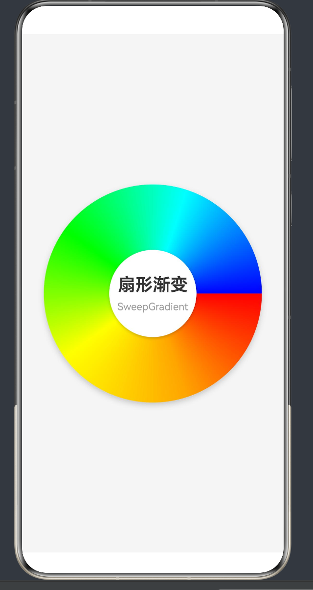
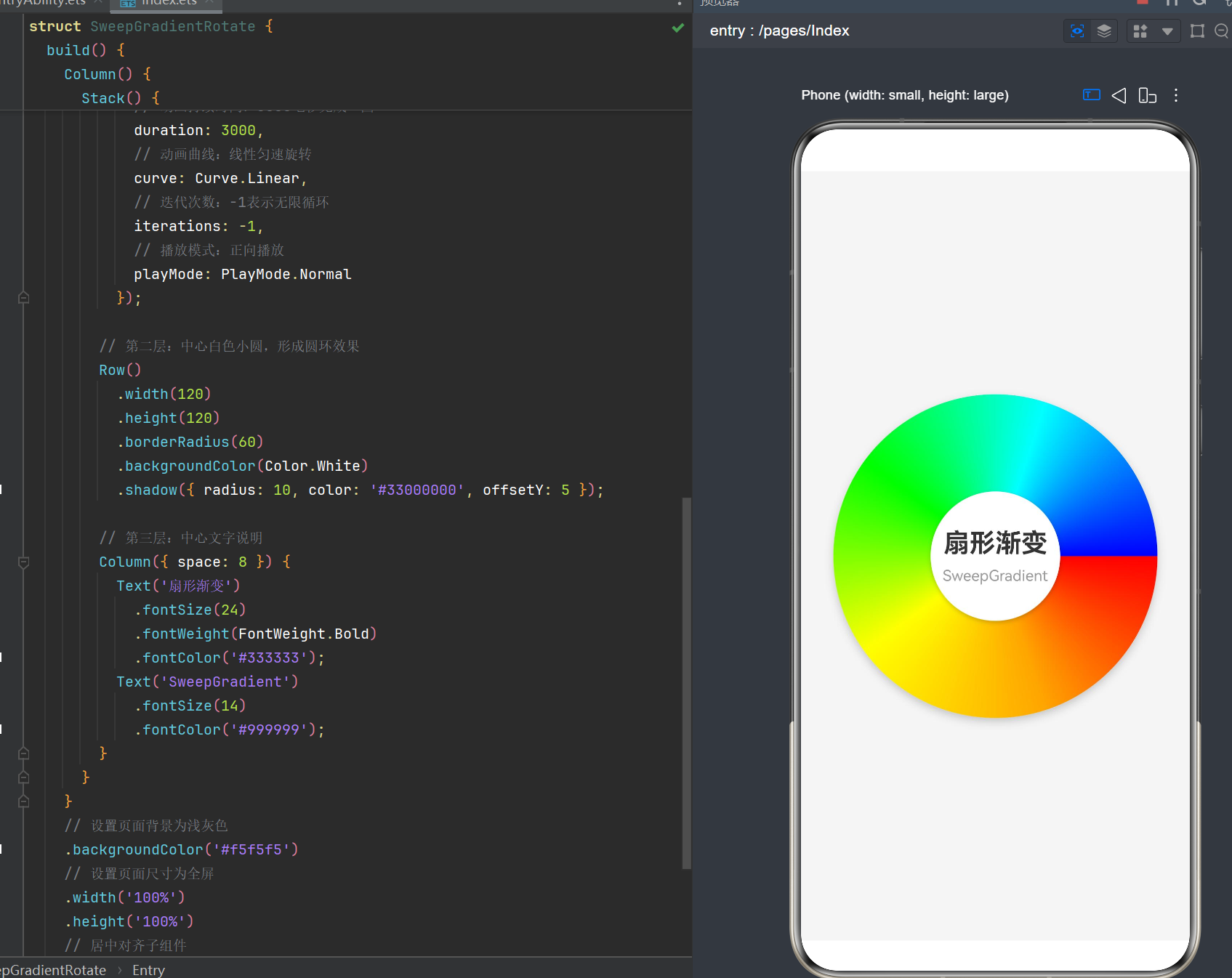
目录
- 引言
- HarmonyOS NEXT 与 API 24 概述
- SweepGradient 核心概念与原理
- SweepGradient API 24 完整参数详解
- 基础使用示例
- 旋转扇形渐变效果实现
- 高级应用场景
- 动画与交互
- 性能优化策略
- 常见问题与解决方案
- 最佳实践与设计模式
- 总结与展望
1. 引言
在HarmonyOS NEXT应用开发中,视觉效果是提升用户体验的关键要素之一。颜色渐变作为一种重要的视觉表现手段,能够为应用界面增添层次感和艺术美感。HarmonyOS ArkUI框架提供了三种核心的渐变方式:线性渐变(LinearGradient)、径向渐变(RadialGradient)和扇形渐变(SweepGradient)。
其中,**扇形渐变(SweepGradient)**是一种以中心点为基准,按照角度方向进行颜色过渡的渐变方式。它独特的放射状效果使其在实现仪表盘、雷达扫描、旋转动画等场景中具有不可替代的优势。
本文将深入探讨HarmonyOS API 24环境下SweepGradient扇形渐变的原理、用法、高级特性及最佳实践,帮助开发者掌握这一强大的视觉工具。
2. HarmonyOS NEXT 与 API 24 概述
2.1 HarmonyOS NEXT 简介
HarmonyOS NEXT是华为公司推出的新一代智能终端操作系统,采用全新的架构设计,支持多种设备形态的无缝协同。ArkTS作为HarmonyOS的主要开发语言,结合声明式UI框架ArkUI,为开发者提供了高效、直观的开发体验。
2.2 API 24 新特性
API 24(对应HarmonyOS 6.1.1版本)带来了多项重要更新:
- 全新的ArkTS语法体系:增强类型系统,支持更严格的类型检查
- Stage模型增强:完善的应用生命周期管理
- Canvas 2D增强:支持更多绘图API,提升自定义绘图能力
- 渐变效果优化:优化SweepGradient等渐变渲染性能
- 动画系统升级:更流畅的属性动画支持
2.3 开发环境要求
- DevEco Studio版本:6.1.0+
- SDK版本:6.1.1(24)
- 编译配置:
targetSdkVersion = "6.1.1(24)"
3. SweepGradient 核心概念与原理
3.1 什么是扇形渐变
扇形渐变(SweepGradient),也称为角度渐变或圆锥渐变,是一种以指定中心点为原点,按照顺时针方向围绕该点进行颜色过渡的渐变效果。想象一下将彩虹围绕一个中心点展开,形成一个完整的圆形色谱,这就是扇形渐变的基本视觉效果。
3.2 工作原理
扇形渐变的工作原理可以分为以下几个步骤:
- 确定中心点:用户指定一个中心点坐标(center),所有颜色围绕该点展开
- 定义角度范围:设置起始角度(start)和结束角度(end),确定渐变覆盖的角度范围
- 配置颜色断点:在角度范围内设置多个颜色断点,每个断点包含颜色值和位置比例
- 插值计算:系统根据颜色断点自动计算中间过渡颜色
- 旋转控制:通过rotation参数控制整个渐变的旋转角度
3.3 坐标系与角度方向
在HarmonyOS的SweepGradient中,角度坐标系遵循以下规则:
- 原点位置:渐变中心点(center参数指定)
- 0度方向:3点钟方向(水平向右)
- 正方向:顺时针方向
- 角度范围:0°到360°
3.4 与其他渐变的对比
| 渐变类型 | 特点 | 适用场景 |
|---|---|---|
| LinearGradient | 沿直线方向渐变 | 按钮、背景、分割线 |
| RadialGradient | 从中心向外辐射渐变 | 发光效果、球体、按钮高光 |
| SweepGradient | 沿角度方向渐变 | 仪表盘、雷达扫描、旋转动画 |
4. SweepGradient API 24 完整参数详解
4.1 函数签名
sweepGradient(value: SweepGradientOptions): T
该方法属于组件的通用属性,可应用于任何支持渐变的组件(如Row、Column、Container、Shape等)。
4.2 SweepGradientOptions 接口定义
根据API 24规范,SweepGradientOptions包含以下参数:
interface SweepGradientOptions {
  center: [number, number];           // 渐变中心点坐标,必填
  start?: number | string;            // 起始角度,可选,默认0
  end?: number | string;              // 结束角度,可选,默认360
  rotation?: number | string;         // 旋转角度,可选,默认0
  colors: Array<[ResourceColor, number]>;  // 颜色断点数组,必填
  repeating?: boolean;                // 是否重复渐变,可选,默认false
}
4.3 参数详细说明
4.3.1 center(必填)
类型:[number, number]
说明:渐变中心点的坐标,相对于组件左上角的像素位置。
示例:
[50, 50]:中心点位于组件左上角向右50px、向下50px处[150, 150]:中心点位于300x300组件的正中心
注意事项:
- 坐标值使用物理像素(px)单位
- 中心点可以超出组件边界,但渐变效果仍在组件范围内显示
- 对于圆形组件,建议将center设置为圆心位置
4.3.2 start(可选)
类型:number | string
说明:渐变的起始角度,默认值为0。
取值范围:
- 数字类型:0到360之间的数值
- 字符串类型:支持角度单位deg、grad、rad、turn
示例:
0:从3点钟方向开始90:从6点钟方向开始"45deg":从45度方向开始
角度方向说明:
- 0°:水平向右(3点钟方向)
- 90°:垂直向下(6点钟方向)
- 180°:水平向左(9点钟方向)
- 270°:垂直向上(12点钟方向)
4.3.3 end(可选)
类型:number | string
说明:渐变的结束角度,默认值为360。
取值范围:与start参数相同
角度范围计算:
- 当end > start时:渐变从start角度顺时针方向延伸到end角度
- 当end < start时:渐变跨越360°边界继续延伸
4.3.4 rotation(可选)
类型:number | string
说明:整个渐变的旋转角度,用于动态调整渐变的起始位置。
作用机制:
- rotation参数会叠加到start和end角度上
- 常用于实现旋转动画效果
- 支持负值,表示逆时针旋转
示例:
rotation: 45:整个渐变顺时针旋转45度rotation: -90:整个渐变逆时针旋转90度
4.3.5 colors(必填)
类型:Array<[ResourceColor, number]>
说明:颜色断点数组,每个元素包含颜色值和位置比例。
数组元素结构:
- 第一个元素:颜色值(ResourceColor类型)
- 第二个元素:位置比例(0.0到1.0之间的数值)
颜色值支持格式:
- 16进制颜色:
0xFFFF0000、#FF0000 - RGB/RGBA:
rgb(255, 0, 0)、rgba(255, 0, 0, 0.5) - 颜色常量:
Color.Red、Color.Green - 资源引用:
$r('app.color.primaryColor')
位置比例说明:
0.0:对应起始角度位置1.0:对应结束角度位置- 中间值:按比例分布在角度范围内
示例:
colors: [
  [0xFFFF0000, 0.0],   // 起始位置:红色
  [0xFFFFFF00, 0.5],   // 中间位置:黄色
  [0xFF00FF00, 1.0]    // 结束位置:绿色
]
4.3.6 repeating(可选)
类型:boolean
说明:是否重复渐变效果,默认值为false。
作用机制:
repeating: true:当颜色断点的位置范围小于1.0时,重复显示渐变效果repeating: false:颜色断点范围之外使用最后一个颜色填充
示例对比:
// 不重复:只在0-0.3范围内显示渐变,其余区域使用最后一个颜色
sweepGradient({
  center: [50, 50],
  colors: [[0xFF0000, 0.0], [0x00FF00, 0.3]]
})

// 重复:在整个角度范围内重复0-0.3的渐变效果
sweepGradient({
  center: [50, 50],
  repeating: true,
  colors: [[0xFF0000, 0.0], [0x00FF00, 0.3]]
})
5. 基础使用示例
5.1 最简示例
@Entry
@Component
struct SimpleSweepGradient {
  build() {
    Column() {
      Row()
        .width(200)
        .height(200)
        .borderRadius(100)
        .sweepGradient({
          center: [100, 100],
          colors: [
            [Color.Red, 0.0],
            [Color.Yellow, 0.5],
            [Color.Blue, 1.0]
          ]
        })
    }
    .width('100%')
    .height('100%')
    .justifyContent(FlexAlign.Center)
    .alignItems(HorizontalAlign.Center)
  }
}
效果说明:
- 创建一个200x200的圆形组件
- 渐变中心点位于圆心(100, 100)
- 颜色从红色(0°)过渡到黄色(180°)再到蓝色(360°)
5.2 指定角度范围
@Entry
@Component
struct AngleRangeSweepGradient {
  build() {
    Column() {
      Row()
        .width(200)
        .height(200)
        .borderRadius(100)
        .sweepGradient({
          center: [100, 100],
          start: 45,
          end: 225,
          colors: [
            [Color.Green, 0.0],
            [Color.Cyan, 0.5],
            [Color.Blue, 1.0]
          ]
        })
    }
    .width('100%')
    .height('100%')
    .justifyContent(FlexAlign.Center)
    .alignItems(HorizontalAlign.Center)
  }
}
效果说明:
- 渐变范围限制在45°到225°之间(180°范围)
- 形成一个半圆的渐变效果
5.3 重复渐变
@Entry
@Component
struct RepeatingSweepGradient {
  build() {
    Column() {
      Row()
        .width(200)
        .height(200)
        .borderRadius(100)
        .sweepGradient({
          center: [100, 100],
          repeating: true,
          colors: [
            [Color.Magenta, 0.0],
            [Color.Cyan, 0.2]
          ]
        })
    }
    .width('100%')
    .height('100%')
    .justifyContent(FlexAlign.Center)
    .alignItems(HorizontalAlign.Center)
  }
}
效果说明:
- 渐变颜色只定义了0到0.2的范围(洋红到青色)
- 由于repeating设置为true,该渐变效果在整个360°范围内重复显示
- 形成多个重复的颜色段
6. 旋转扇形渐变效果实现
6.1 实现思路
旋转扇形渐变效果是SweepGradient最经典的应用场景之一。实现思路如下:
- 定义状态变量:使用@State装饰器定义旋转角度变量
- 绑定rotation参数:将状态变量绑定到sweepGradient的rotation属性
- 启动动画:通过setTimeout或animateTo触发状态变量变化
- 配置动画属性:设置duration、curve、iterations等动画参数
6.2 完整实现代码
@Entry
@Component
struct RotatingSweepGradient {
  // 旋转角度状态变量,初始值为0
  @State rotationAngle: number = 0;

  // 页面即将显示时启动旋转动画
  aboutToAppear() {
    setTimeout(() => {
      this.rotationAngle = 360;
    }, 200);
  }

  build() {
    // 根容器:全屏居中
    Column() {
      // 层叠布局:渐变圆 + 中心圆 + 文字
      Stack() {
        // 第一层:扇形渐变背景圆
        Row()
          .width(300)
          .height(300)
          .borderRadius(150)
          .sweepGradient({
            // 渐变中心点:圆心位置
            center: [150, 150],
            // 渐变起始角度
            start: 0,
            // 渐变结束角度:完整的360度
            end: 360,
            // 旋转角度:绑定状态变量实现动画
            rotation: this.rotationAngle,
            // 启用重复渐变
            repeating: true,
            // 彩虹渐变色组
            colors: [
              [0xFFFF0000, 0.0],   // 红色
              [0xFFFFA500, 0.16],  // 橙色
              [0xFFFFFF00, 0.33],  // 黄色
              [0xFF00FF00, 0.5],   // 绿色
              [0xFF00FFFF, 0.66],  // 青色
              [0xFF0000FF, 0.83],  // 蓝色
              [0xFFFF00FF, 1.0]    // 紫色
            ]
          })
          // 阴影效果增强立体感
          .shadow({ radius: 20, color: '#33000000', offsetY: 10 })
          // 动画配置:无限循环匀速旋转
          .animation({
            duration: 3000,
            curve: Curve.Linear,
            iterations: -1,
            playMode: PlayMode.Normal
          });

        // 第二层:中心白色小圆,形成圆环效果
        Row()
          .width(120)
          .height(120)
          .borderRadius(60)
          .backgroundColor(Color.White)
          .shadow({ radius: 10, color: '#33000000', offsetY: 5 });

        // 第三层:中心文字说明
        Column({ space: 8 }) {
          Text('扇形渐变')
            .fontSize(24)
            .fontWeight(FontWeight.Bold)
            .fontColor('#333333');
          Text('SweepGradient')
            .fontSize(14)
            .fontColor('#999999');
        }
      }
    }
    .backgroundColor('#f5f5f5')
    .width('100%')
    .height('100%')
    .justifyContent(FlexAlign.Center)
    .alignItems(HorizontalAlign.Center);
  }
}
6.3 代码解析
6.3.1 状态管理
@State rotationAngle: number = 0;
- 使用@State装饰器定义响应式状态变量
- 当rotationAngle变化时,UI会自动更新
- 初始值为0,表示渐变从默认位置开始
6.3.2 动画触发
aboutToAppear() {
  setTimeout(() => {
    this.rotationAngle = 360;
  }, 200);
}
- 在组件即将显示时触发动画
- 使用setTimeout延迟200ms,确保组件已完成初始渲染
- 将rotationAngle从0设置为360,触发完整的旋转动画
6.3.3 渐变配置
.sweepGradient({
  center: [150, 150],
  start: 0,
  end: 360,
  rotation: this.rotationAngle,
  repeating: true,
  colors: [...]
})
- center: 中心点设置为(150, 150),即300x300组件的正中心
- start/end: 设置0到360度,覆盖完整的圆形范围
- rotation: 绑定到状态变量,实现动态旋转
- repeating: 启用重复渐变,确保颜色过渡平滑
- colors: 彩虹配色方案,均匀分布在0到1的位置范围内
6.3.4 动画属性
.animation({
  duration: 3000,
  curve: Curve.Linear,
  iterations: -1,
  playMode: PlayMode.Normal
})
- duration: 动画持续时间3000毫秒(3秒完成一圈)
- curve: 使用线性曲线(Curve.Linear),实现匀速旋转
- iterations: 设置为-1,表示无限循环
- playMode: 正向播放模式
7. 高级应用场景
7.1 仪表盘效果
@Entry
@Component
struct GaugeDashboard {
  @State value: number = 75;

  build() {
    Column() {
      Stack() {
        // 背景圆环
        Row()
          .width(200)
          .height(200)
          .borderRadius(100)
          .sweepGradient({
            center: [100, 100],
            start: 135,
            end: 405,
            colors: [
              [0xFF00FF00, 0.0],   // 绿色:0-50%
              [0xFFFFFF00, 0.5],   // 黄色:50-75%
              [0xFFFF0000, 1.0]    // 红色:75-100%
            ]
          });

        // 进度遮罩
        Row()
          .width(200)
          .height(200)
          .borderRadius(100)
          .backgroundColor('#f5f5f5')
          .clip(true)
          .rotate({
            angle: 135 + (this.value / 100) * 270
          });

        // 中心数值
        Text(`${this.value}%`)
          .fontSize(28)
          .fontWeight(FontWeight.Bold);
      }

      // 进度调节滑块
      Slider({
        value: this.value,
        min: 0,
        max: 100,
        style: SliderStyle.OutSet
      })
        .margin({ top: 30 })
        .onChange((value: number) => {
          this.value = value;
        });
    }
    .width('100%')
    .height('100%')
    .justifyContent(FlexAlign.Center)
    .alignItems(HorizontalAlign.Center)
    .backgroundColor('#f5f5f5');
  }
}
效果说明:
- 实现一个半圆形仪表盘(135°到405°,即270°范围)
- 颜色从绿色过渡到黄色再到红色,表示不同的进度等级
- 通过Slider组件动态调节进度值
- 使用clip遮罩实现进度条效果
7.2 雷达扫描效果
@Entry
@Component
struct RadarScanEffect {
  @State scanAngle: number = 0;

  aboutToAppear() {
    setTimeout(() => {
      this.scanAngle = 360;
    }, 100);
  }

  build() {
    Column() {
      Stack() {
        // 雷达背景网格
        Canvas(this.ctx)
          .width(300)
          .height(300)
          .onReady(() => {
            this.drawRadarGrid();
          });

        // 扫描扇形
        Row()
          .width(300)
          .height(300)
          .borderRadius(150)
          .sweepGradient({
            center: [150, 150],
            start: this.scanAngle,
            end: this.scanAngle + 45,
            colors: [
              ['rgba(0, 255, 0, 0.8)', 0.0],
              ['rgba(0, 255, 0, 0)', 1.0]
            ]
          })
          .animation({
            duration: 2000,
            curve: Curve.Linear,
            iterations: -1
          });
      }
    }
    .width('100%')
    .height('100%')
    .backgroundColor('#0a0a0a')
    .justifyContent(FlexAlign.Center)
    .alignItems(HorizontalAlign.Center);
  }

  private ctx: CanvasRenderingContext2D = new CanvasRenderingContext2D();

  private drawRadarGrid() {
    const ctx = this.ctx;
    ctx.strokeStyle = 'rgba(0, 255, 0, 0.3)';
    ctx.lineWidth = 1;

    for (let r = 50; r <= 150; r += 50) {
      ctx.beginPath();
      ctx.arc(150, 150, r, 0, Math.PI * 2);
      ctx.stroke();
    }

    ctx.beginPath();
    ctx.moveTo(0, 150);
    ctx.lineTo(300, 150);
    ctx.stroke();

    ctx.beginPath();
    ctx.moveTo(150, 0);
    ctx.lineTo(150, 300);
    ctx.stroke();
  }
}
效果说明:
- 使用Canvas绘制雷达网格背景
- 扫描扇形使用透明到绿色的渐变
- 扇形角度范围为45度,形成扫描扇区
- 动画循环旋转,模拟雷达扫描效果
7.3 彩虹轮盘
@Entry
@Component
struct RainbowWheel {
  @State rotation: number = 0;

  aboutToAppear() {
    setTimeout(() => {
      this.rotation = 360;
    }, 100);
  }

  build() {
    Column() {
      Stack({ alignContent: Alignment.Center }) {
        // 外圈彩虹
        Row()
          .width(280)
          .height(280)
          .borderRadius(140)
          .sweepGradient({
            center: [140, 140],
            rotation: this.rotation,
            repeating: true,
            colors: [
              [0xFFFF0000, 0.0],
              [0xFFFF7F00, 0.14],
              [0xFFFFFF00, 0.28],
              [0xFF00FF00, 0.42],
              [0xFF0000FF, 0.57],
              [0xFF4B0082, 0.71],
              [0xFF8B00FF, 0.85],
              [0xFFFF0000, 1.0]
            ]
          })
          .animation({
            duration: 8000,
            curve: Curve.Linear,
            iterations: -1
          });

        // 内圈:反向旋转
        Row()
          .width(200)
          .height(200)
          .borderRadius(100)
          .sweepGradient({
            center: [100, 100],
            rotation: -this.rotation * 0.5,
            repeating: true,
            colors: [
              [0xFF1a1a1a, 0.0],
              [0xFF2a2a2a, 0.25],
              [0xFF1a1a1a, 0.5],
              [0xFF2a2a2a, 0.75],
              [0xFF1a1a1a, 1.0]
            ]
          })
          .animation({
            duration: 4000,
            curve: Curve.Linear,
            iterations: -1
          });

        // 中心装饰
        Row()
          .width(60)
          .height(60)
          .borderRadius(30)
          .backgroundColor(Color.White)
          .shadow({ radius: 5, color: '#33000000' });
      }
    }
    .width('100%')
    .height('100%')
    .backgroundColor('#1a1a1a')
    .justifyContent(FlexAlign.Center)
    .alignItems(HorizontalAlign.Center);
  }
}
效果说明:
- 双层旋转结构:外圈顺时针旋转,内圈逆时针旋转
- 外圈使用七色彩虹配色
- 内圈使用深色条纹,形成对比效果
- 不同的动画速度增加视觉层次感
8. 动画与交互
8.1 属性动画
属性动画是HarmonyOS中实现渐变动画的核心方式。通过绑定状态变量到sweepGradient的rotation属性,结合.animation()方法,可以实现平滑的动画效果。
8.1.1 基础动画配置
.animation({
  duration: 3000,           // 动画持续时间(毫秒)
  curve: Curve.Linear,      // 动画曲线
  delay: 200,               // 延迟启动(毫秒)
  iterations: -1,           // 迭代次数(-1表示无限)
  playMode: PlayMode.Normal // 播放模式
})
8.1.2 动画曲线类型
| 曲线类型 | 效果 | 适用场景 |
|---|---|---|
Curve.Linear |
匀速运动 | 旋转动画、扫描效果 |
Curve.Ease |
缓入缓出 | 自然过渡效果 |
Curve.EaseIn |
缓入 | 加速效果 |
Curve.EaseOut |
缓出 | 减速效果 |
Curve.EaseInOut |
缓入缓出 | 平滑过渡 |
Curve.Friction |
摩擦力效果 | 物理模拟 |
8.2 组合动画
通过组合多个动画效果,可以实现更复杂的视觉体验。
8.2.1 同步动画
@Entry
@Component
struct CombinedAnimation {
  @State rotation: number = 0;
  @State scale: number = 1;

  aboutToAppear() {
    setTimeout(() => {
      this.rotation = 360;
      this.scale = 1.2;
    }, 100);
  }

  build() {
    Column() {
      Row()
        .width(200)
        .height(200)
        .borderRadius(100)
        .sweepGradient({
          center: [100, 100],
          rotation: this.rotation,
          colors: [[Color.Red, 0], [Color.Blue, 1]]
        })
        .scale({ x: this.scale, y: this.scale })
        .animation({
          duration: 2000,
          curve: Curve.EaseInOut,
          iterations: -1,
          playMode: PlayMode.Alternate
        });
    }
    .width('100%')
    .height('100%')
    .justifyContent(FlexAlign.Center);
  }
}
效果说明:
- 同时进行旋转和缩放动画
- 使用PlayMode.Alternate实现往返效果
8.2.2 顺序动画
@Entry
@Component
struct SequentialAnimation {
  @State rotation: number = 0;
  @State opacity: number = 0;

  aboutToAppear() {
    // 先淡入
    setTimeout(() => {
      this.opacity = 1;
    }, 100);

    // 延迟后开始旋转
    setTimeout(() => {
      this.rotation = 360;
    }, 800);
  }

  build() {
    Column() {
      Row()
        .width(200)
        .height(200)
        .borderRadius(100)
        .sweepGradient({
          center: [100, 100],
          rotation: this.rotation,
          colors: [[Color.Green, 0], [Color.Yellow, 0.5], [Color.Red, 1]]
        })
        .opacity(this.opacity)
        .animation({
          duration: 3000,
          curve: Curve.Linear,
          iterations: -1
        });
    }
    .width('100%')
    .height('100%')
    .justifyContent(FlexAlign.Center);
  }
}
8.3 交互控制
8.3.1 点击暂停/播放
@Entry
@Component
struct InteractiveAnimation {
  @State rotation: number = 0;
  @State isPlaying: boolean = true;

  aboutToAppear() {
    this.startAnimation();
  }

  startAnimation() {
    setTimeout(() => {
      if (this.isPlaying) {
        this.rotation = this.rotation + 360;
      }
    }, 100);
  }

  build() {
    Column() {
      Row()
        .width(200)
        .height(200)
        .borderRadius(100)
        .sweepGradient({
          center: [100, 100],
          rotation: this.rotation,
          colors: [[Color.Cyan, 0], [Color.Magenta, 1]]
        })
        .animation({
          duration: 3000,
          curve: Curve.Linear,
          iterations: this.isPlaying ? -1 : 1
        })
        .onClick(() => {
          this.isPlaying = !this.isPlaying;
          if (this.isPlaying) {
            this.startAnimation();
          }
        });

      Text(this.isPlaying ? '点击暂停' : '点击播放')
        .margin({ top: 20 })
        .fontSize(16);
    }
    .width('100%')
    .height('100%')
    .justifyContent(FlexAlign.Center);
  }
}
8.3.2 手势控制
@Entry
@Component
struct GestureControl {
  @State rotation: number = 0;
  @State lastAngle: number = 0;

  build() {
    Column() {
      Row()
        .width(200)
        .height(200)
        .borderRadius(100)
        .sweepGradient({
          center: [100, 100],
          rotation: this.rotation,
          colors: [[Color.Red, 0], [Color.Green, 0.5], [Color.Blue, 1]]
        })
        .gesture(
          PanGesture({ fingers: 1, direction: PanDirection.All })
            .onActionUpdate((event: GestureEvent) => {
              const deltaX = event.offsetX;
              const deltaY = event.offsetY;
              const angle = Math.atan2(deltaY, deltaX) * 180 / Math.PI;
              this.rotation += angle - this.lastAngle;
              this.lastAngle = angle;
            })
            .onActionEnd(() => {
              this.lastAngle = 0;
            })
        );
    }
    .width('100%')
    .height('100%')
    .justifyContent(FlexAlign.Center);
  }
}
9. 性能优化策略
9.1 减少颜色断点数量
颜色断点数量直接影响渐变计算的复杂度。建议:
- 保持颜色断点数量在5-8个以内
- 对于简单渐变,使用3个断点即可
// 优化前:过多的颜色断点
colors: [
  [Color.Red, 0.0],
  [Color.Orange, 0.1],
  [Color.Yellow, 0.2],
  [Color.Lime, 0.3],
  [Color.Green, 0.4],
  [Color.Cyan, 0.5],
  [Color.Blue, 0.6],
  [Color.Indigo, 0.7],
  [Color.Violet, 0.8],
  [Color.Purple, 0.9],
  [Color.Magenta, 1.0]
]

// 优化后:精简颜色断点
colors: [
  [Color.Red, 0.0],
  [Color.Yellow, 0.33],
  [Color.Cyan, 0.66],
  [Color.Magenta, 1.0]
]
9.2 避免过度动画
过度的动画效果会消耗大量GPU资源。建议:
- 控制动画帧率和持续时间
- 对于静态页面,避免不必要的动画
- 使用低功耗模式优化动画效果
9.3 使用硬件加速
HarmonyOS默认启用硬件加速,但在某些复杂场景下需要特别注意:
- 避免在渐变组件上叠加过多的阴影效果
- 减少透明度过渡的复杂度
- 合理使用clip裁剪
9.4 复用渐变配置
将常用的渐变配置提取为常量或工具函数,避免重复创建:
const rainbowGradient = {
  center: [100, 100],
  start: 0,
  end: 360,
  repeating: true,
  colors: [
    [0xFFFF0000, 0.0],
    [0xFFFFFF00, 0.33],
    [0xFF00FF00, 0.66],
    [0xFF0000FF, 1.0]
  ]
};

// 使用
.sweepGradient(rainbowGradient)
10. 常见问题与解决方案
10.1 渐变不显示
问题现象:组件没有显示渐变效果
可能原因:
- 组件没有设置宽度和高度
- center坐标超出组件范围
- colors数组格式错误
解决方案:
// 确保组件有明确的尺寸
Row()
  .width(200)  // 必须设置
  .height(200) // 必须设置
  .sweepGradient({
    center: [100, 100],  // 中心点在组件范围内
    colors: [[Color.Red, 0.0], [Color.Blue, 1.0]]  // 正确的格式
  })
10.2 动画不生效
问题现象:状态变量已改变,但渐变没有动画效果
可能原因:
- 没有添加.animation()属性
- 状态变量没有绑定到正确的属性
- 动画配置不正确
解决方案:
@State angle: number = 0;

build() {
  Row()
    .width(200)
    .height(200)
    .sweepGradient({
      rotation: this.angle,  // 绑定状态变量
      // ...
    })
    .animation({  // 添加动画配置
      duration: 1000,
      iterations: -1
    });
}
10.3 颜色过渡不流畅
问题现象:颜色之间有明显的色块,过渡不平滑
可能原因:
- 颜色断点数量太少
- 颜色值差异过大
解决方案:
// 增加中间颜色断点
colors: [
  [Color.Red, 0.0],
  [Color.Orange, 0.25],  // 增加过渡色
  [Color.Yellow, 0.5],
  [Color.Green, 0.75],   // 增加过渡色
  [Color.Blue, 1.0]
]
10.4 渐变方向不正确
问题现象:渐变的起始位置不符合预期
可能原因:
- 对角度方向理解错误
- start和end参数设置不当
解决方案:
// 角度参考:0°=3点钟,90°=6点钟,180°=9点钟,270°=12点钟
.sweepGradient({
  center: [100, 100],
  start: 0,   // 从3点钟开始
  end: 180,   // 到9点钟结束(半圆)
  // ...
})
10.5 旋转方向错误
问题现象:渐变旋转方向与预期相反
可能原因:
- rotation参数符号错误
- 动画方向设置错误
解决方案:
// 顺时针旋转
@State angle: number = 0;
aboutToAppear() {
  setTimeout(() => {
    this.angle = 360;  // 正值:顺时针
  }, 100);
}

// 逆时针旋转
@State angle: number = 0;
aboutToAppear() {
  setTimeout(() => {
    this.angle = -360;  // 负值:逆时针
  }, 100);
}
11. 最佳实践与设计模式
11.1 组件封装模式
将常用的渐变效果封装为可复用组件:
@Component
struct RainbowRing {
  @State rotation: number = 0;
  private size: number = 200;
  private innerSize: number = 80;

  aboutToAppear() {
    setTimeout(() => {
      this.rotation = 360;
    }, 100);
  }

  build() {
    Stack({ alignContent: Alignment.Center }) {
      Row()
        .width(this.size)
        .height(this.size)
        .borderRadius(this.size / 2)
        .sweepGradient({
          center: [this.size / 2, this.size / 2],
          rotation: this.rotation,
          repeating: true,
          colors: [
            [0xFFFF0000, 0.0],
            [0xFFFFFF00, 0.16],
            [0xFF00FF00, 0.33],
            [0xFF00FFFF, 0.5],
            [0xFF0000FF, 0.66],
            [0xFFFF00FF, 0.83],
            [0xFFFF0000, 1.0]
          ]
        })
        .animation({
          duration: 4000,
          curve: Curve.Linear,
          iterations: -1
        });

      Row()
        .width(this.innerSize)
        .height(this.innerSize)
        .borderRadius(this.innerSize / 2)
        .backgroundColor(Color.White);
    }
  }
}

// 使用
@Entry
@Component
struct UsageExample {
  build() {
    Column() {
      RainbowRing()
      RainbowRing({ size: 150, innerSize: 60 })
    }
    .width('100%')
    .height('100%')
    .justifyContent(FlexAlign.Center)
    .alignItems(HorizontalAlign.Center);
  }
}
11.2 主题适配
结合HarmonyOS的主题系统,实现渐变颜色的动态切换:
@Entry
@Component
struct ThemedGradient {
  @State rotation: number = 0;

  aboutToAppear() {
    setTimeout(() => {
      this.rotation = 360;
    }, 100);
  }

  build() {
    Column() {
      Row()
        .width(200)
        .height(200)
        .borderRadius(100)
        .sweepGradient({
          center: [100, 100],
          rotation: this.rotation,
          colors: [
            [$r('app.color.primary'), 0.0],
            [$r('app.color.secondary'), 0.5],
            [$r('app.color.tertiary'), 1.0]
          ]
        })
        .animation({
          duration: 3000,
          curve: Curve.Linear,
          iterations: -1
        });
    }
    .width('100%')
    .height('100%')
    .justifyContent(FlexAlign.Center);
  }
}
在resources/base/element/color.json中定义主题颜色:
{
  "color": [
    {
      "name": "primary",
      "value": "#FF6200EE"
    },
    {
      "name": "secondary",
      "value": "#FF3700B3"
    },
    {
      "name": "tertiary",
      "value": "#FF03DAC6"
    }
  ]
}
11.3 响应式布局
结合Flex布局实现自适应渐变组件:
@Entry
@Component
struct ResponsiveGradient {
  @State rotation: number = 0;

  aboutToAppear() {
    setTimeout(() => {
      this.rotation = 360;
    }, 100);
  }

  build() {
    Column() {
      Flex({ wrap: FlexWrap.Wrap, justifyContent: FlexAlign.SpaceAround }) {
        // 小尺寸
        Row()
          .width('30%')
          .height(100)
          .borderRadius(50)
          .sweepGradient({
            center: ['50%', '50%'],
            rotation: this.rotation,
            colors: [[Color.Red, 0], [Color.Blue, 1]]
          })
          .animation({ duration: 2000, iterations: -1 });

        // 中尺寸
        Row()
          .width('45%')
          .height(150)
          .borderRadius(75)
          .sweepGradient({
            center: ['50%', '50%'],
            rotation: this.rotation * 0.5,
            colors: [[Color.Green, 0], [Color.Yellow, 0.5], [Color.Red, 1]]
          })
          .animation({ duration: 3000, iterations: -1 });

        // 大尺寸
        Row()
          .width('95%')
          .height(200)
          .borderRadius(100)
          .sweepGradient({
            center: ['50%', '50%'],
            rotation: this.rotation * 0.3,
            colors: [
              [Color.Cyan, 0],
              [Color.Magenta, 0.33],
              [Color.Yellow, 0.66],
              [Color.Cyan, 1]
            ]
          })
          .animation({ duration: 5000, iterations: -1 });
      }
    }
    .width('100%')
    .height('100%')
    .padding(10);
  }
}
12. 总结与展望
12.1 技术要点回顾
本文详细介绍了HarmonyOS API 24环境下SweepGradient扇形渐变的使用方法,核心要点包括:
- 参数配置:掌握center、start、end、rotation、colors、repeating六个参数的用法
- 角度系统:理解0°=3点钟方向,顺时针为正方向的角度体系
- 动画实现:通过@State状态变量+animation属性实现旋转动画
- 应用场景:仪表盘、雷达扫描、彩虹轮盘等高级效果
12.2 学习建议
- 从基础到进阶:先掌握基本用法,再尝试复杂动画和交互
- 参考官方文档:持续关注HarmonyOS官方API文档更新
- 实践项目:在实际项目中应用,积累经验
- 性能优化:注意渐变的性能影响,合理使用
12.3 未来发展
随着HarmonyOS NEXT的持续演进,SweepGradient可能会支持更多高级特性:
- GPU加速优化:进一步提升渲染性能
- 更多动画曲线:支持自定义动画曲线
- 动态颜色调整:支持运行时动态修改颜色
- 3D渐变效果:结合3D变换实现更丰富的视觉效果
附录:完整示例代码
以下是一个完整的旋转扇形渐变示例,可直接复制到DevEco Studio中运行:
@Entry
@Component
struct SweepGradientRotate {
  @State rotationAngle: number = 0;

  aboutToAppear() {
    setTimeout(() => {
      this.rotationAngle = 360;
    }, 200);
  }

  build() {
    Column() {
      Stack() {
        Row()
          .width(300)
          .height(300)
          .borderRadius(150)
          .sweepGradient({
            center: [150, 150],
            start: 0,
            end: 360,
            rotation: this.rotationAngle,
            repeating: true,
            colors: [
              [0xFFFF0000, 0.0],
              [0xFFFFA500, 0.16],
              [0xFFFFFF00, 0.33],
              [0xFF00FF00, 0.5],
              [0xFF00FFFF, 0.66],
              [0xFF0000FF, 0.83],
              [0xFFFF00FF, 1.0]
            ]
          })
          .shadow({ radius: 20, color: '#33000000', offsetY: 10 })
          .animation({
            duration: 3000,
            curve: Curve.Linear,
            iterations: -1,
            playMode: PlayMode.Normal
          });

        Row()
          .width(120)
          .height(120)
          .borderRadius(60)
          .backgroundColor(Color.White)
          .shadow({ radius: 10, color: '#33000000', offsetY: 5 });

        Column({ space: 8 }) {
          Text('扇形渐变')
            .fontSize(24)
            .fontWeight(FontWeight.Bold)
            .fontColor('#333333');
          Text('SweepGradient')
            .fontSize(14)
            .fontColor('#999999');
        }
      }
    }
    .backgroundColor('#f5f5f5')
    .width('100%')
    .height('100%')
    .justifyContent(FlexAlign.Center)
    .alignItems(HorizontalAlign.Center);
  }
}
文档版本:v1.0
适用API:HarmonyOS NEXT API 24
最后更新:2026年7月

作为“人工智能6S店”的官方数字引擎,为AI开发者与企业提供一个覆盖软硬件全栈、一站式门户。
更多推荐
 0
0 0
0- 0


 已为社区贡献14条内容

所有评论(0)