
鸿蒙原生ArkTS布局方式之State+animateTo交互式动画布局
项目演示
摘要
随着移动应用用户体验要求的不断提升,流畅的交互动画已经成为现代应用的标配。鸿蒙HarmonyOS NEXT提供了强大的ArkTS声明式UI框架,其中@State状态管理与animateTo动画API的结合,为开发者提供了一套简洁高效的交互式动画布局方案。本文深入剖析了这一技术组合的核心原理,通过完整的实战案例,系统介绍了如何利用状态驱动动画、手势交互响应、以及性能优化策略,构建高质量的鸿蒙原生应用。
关键词: 鸿蒙HarmonyOS;ArkTS;状态管理;animateTo;交互式动画;手势识别
1. 引言
1.1 鸿蒙ArkTS声明式UI框架概述
HarmonyOS NEXT引入的ArkTS是一种面向对象的声明式编程语言,它基于TypeScript扩展而来,专门为鸿蒙生态系统设计。ArkTS采用声明式UI范式,开发者只需描述UI的"状态",框架自动处理状态变化到UI渲染的映射过程。这种编程模型极大地简化了复杂UI的开发,尤其在处理动画和交互时具有显著优势。
1.2 交互式动画的重要性
在移动应用中,动画不仅仅是视觉装饰,更是用户体验的重要组成部分:
- 反馈机制:动画为用户操作提供即时反馈,让用户感知操作的有效性
- 引导体验:通过过渡动画引导用户关注重点内容
- 情感连接:流畅的动画能够提升应用的品质感和用户满意度
- 信息传递:动画可以直观地展示数据变化和状态转换
1.3 State+animateTo技术组合
@State是ArkTS中最基础也是最核心的状态管理装饰器,用于管理组件内部的可变状态。当@State装饰的变量发生变化时,框架会自动触发组件的重新渲染。
animateTo是ArkUI提供的关键动画API,它能够将状态变化包装成动画过渡效果。当在animateTo的闭包中修改@State变量时,框架会自动计算起始值和目标值之间的过渡动画。
这种"状态管理+动画包装"的模式,构成了鸿蒙ArkTS交互式动画的核心技术体系。
2. ArkTS状态管理机制
2.1 状态管理概述
在ArkTS中,状态管理是实现响应式UI的基础。框架提供了多种状态装饰器,每种装饰器适用于不同的组件通信场景:
| 装饰器 | 作用域 | 适用场景 |
|---|---|---|
| @State | 组件内部 | 组件私有状态,驱动自身UI更新 |
| @Prop | 父子组件 | 父组件向子组件单向传递状态 |
| @Link | 父子组件 | 父子组件双向同步状态 |
| @ObjectLink | 嵌套对象 | 监听嵌套对象属性变化 |
| @Provide/@Consume | 跨层级 | 祖孙组件间状态共享 |
| @Observed | 类装饰器 | 标记可观察对象,配合@ObjectLink使用 |
2.2 @State核心概念
2.2.1 @State的工作原理
@State装饰器用于声明组件的内部状态变量。当这些变量的值发生变化时,ArkUI框架会自动触发组件的重新渲染:
@Entry
@Component
struct StateDemo {
  @State count: number = 0;

  build() {
    Column() {
      Text(`计数: ${this.count}`)
        .fontSize(24)
      Button('增加')
        .onClick(() => {
          this.count++;  // 修改状态,自动触发UI更新
        })
    }
  }
}
在上述示例中,当用户点击按钮时,count变量的值发生变化,框架自动重新渲染Text组件,显示更新后的计数值。
2.2.2 @State的类型约束
ArkTS对@State变量的类型有严格要求:
- 支持基本类型:
number、string、boolean、enum - 支持数组类型:
Array<T>,但数组元素类型必须是可观察的 - 支持自定义类:需要使用
@Observed装饰器标记 - 不支持
any、unknown、null、undefined类型
2.2.3 @State的更新机制
@State的更新遵循"脏检查"机制:
- 当状态变量被修改时,框架将组件标记为"脏"状态
- 在下一个渲染周期,框架重新执行
build()方法 - 通过虚拟DOM对比,计算出需要更新的UI节点
- 将更新应用到实际的原生组件
2.3 @Observed装饰器详解
2.3.1 @Observed的作用
当@State变量是自定义类的实例时,框架无法自动感知类内部属性的变化。@Observed装饰器用于标记类,使其属性变化能够被框架检测到:
@Observed
class CardOffset {
  x: number = 0;
  y: number = 0;

  constructor(x: number, y: number) {
    this.x = x;
    this.y = y;
  }
}
2.3.2 @Observed与数组结合
在实际开发中,我们经常需要管理一组同类对象的状态,例如多个卡片的位置:
@State cardOffsets: Array<CardOffset> = [
  new CardOffset(0, 0),
  new CardOffset(0, 0),
  new CardOffset(0, 0)
];
当需要更新数组中某个元素时,必须创建新对象替换原有元素,而不是直接修改属性:
// 正确:创建新对象替换
this.cardOffsets[index] = new CardOffset(newX, newY);

// 错误:直接修改属性无法触发更新
this.cardOffsets[index].x = newX;
this.cardOffsets[index].y = newY;
这是因为ArkUI框架通过引用比较来检测数组元素的变化。直接修改对象属性不会改变引用,因此框架无法感知到变化。
2.4 状态驱动的UI渲染
2.4.1 单向数据流
ArkTS的状态管理遵循单向数据流原则:
- 用户交互触发状态变化
- 状态变化触发UI重新渲染
- 渲染结果展示给用户
这种模式保证了状态和UI的一致性,简化了调试和维护。
2.4.2 条件渲染与列表渲染
@State可以驱动条件渲染和列表渲染:
// 条件渲染
@State showPanel: boolean = false;

build() {
  Column() {
    if (this.showPanel) {
      Text('面板内容')
    }
    Button('切换')
      .onClick(() => {
        this.showPanel = !this.showPanel;
      })
  }
}

// 列表渲染
@State items: Array<string> = ['项1', '项2', '项3'];

build() {
  Column() {
    ForEach(this.items, (item: string) => {
      Text(item)
    })
  }
}
2.5 状态管理最佳实践
2.5.1 状态粒度设计
合理的状态粒度设计是优化性能的关键:
- 细粒度状态:每个独立变化的属性使用单独的状态变量
- 状态聚合:相关联的状态可以聚合到自定义类中
- 避免冗余状态:计算属性应该通过getter方法推导,而不是存储为状态
2.5.2 状态初始化
状态变量应该在声明时初始化,避免运行时null检查:
// 正确
@State count: number = 0;
@State name: string = '';

// 避免
@State data: DataClass | null = null;  // 需要额外的null检查
2.5.3 状态更新时机
避免在build()方法中直接修改状态,这会导致无限循环:
// 错误
build() {
  this.count++;  // 会导致无限循环渲染
  Column() {
    Text(`${this.count}`)
  }
}

// 正确
build() {
  Column() {
    Text(`${this.count}`)
      .onAppear(() => {
        this.count++;  // 在生命周期回调中修改
      })
  }
}
3. animateTo动画API详解
3.1 animateTo基础概念
3.1.1 animateTo的定义
animateTo是ArkUI提供的核心动画API,用于将状态变化转换为平滑的过渡动画:
animateTo(options: AnimateParam, event: () => void): void
options:动画参数配置对象event:状态变化的闭包函数
3.1.2 animateTo的工作原理
当调用animateTo时,框架会执行以下步骤:
- 快照记录:在执行闭包前,记录所有受影响状态变量的当前值
- 状态变更:执行闭包,修改状态变量
- 动画计算:根据起始值和目标值,结合动画曲线计算每一帧的插值
- 帧渲染:逐帧更新UI,直到动画完成
3.1.3 animateTo与状态的关系
animateTo必须与@State(或其他状态装饰器)配合使用。只有在闭包中修改的状态变量,其变化才会被动画化:
@State width: number = 100;

// 有动画效果
animateTo({ duration: 500 }, () => {
  this.width = 200;
});

// 无动画效果(非状态变量)
let tempWidth: number = 100;
animateTo({ duration: 500 }, () => {
  tempWidth = 200;
});
3.2 animateTo参数配置
3.2.1 duration(动画时长)
duration用于指定动画的持续时间,单位为毫秒:
animateTo({ duration: 300 }, () => {
  this.scale = 1.2;
});
常用的时长参考:
- 微交互(点击反馈):100-200ms
- 中等动画(面板展开):300-500ms
- 复杂动画(页面切换):500-800ms
3.2.2 curve(动画曲线)
curve用于控制动画的缓动效果,决定了动画速度的变化规律。ArkUI提供了丰富的内置曲线:
// 线性曲线(匀速)
animateTo({ duration: 500, curve: Curve.Linear }, () => {...});

// 缓出曲线(开始快,结束慢)
animateTo({ duration: 500, curve: Curve.EaseOut }, () => {...});

// 缓入曲线(开始慢,结束快)
animateTo({ duration: 500, curve: Curve.EaseIn }, () => {...});

// 缓入缓出曲线
animateTo({ duration: 500, curve: Curve.EaseInOut }, () => {...});
3.2.3 springMotion(弹性动画)
弹性动画是模拟物理弹簧效果的高级曲线,适用于需要自然回弹感的场景:
import { curves } from '@kit.ArkUI';

animateTo({
  duration: 500,
  curve: curves.springMotion(0.4, 0.3)
}, () => {
  this.offsetX = 0;
});
springMotion接受两个参数:
response:响应时间,单位为秒,值越小响应越快dampingFraction:阻尼系数,0~1之间,值越小回弹次数越多
3.2.4 delay(延迟执行)
delay用于设置动画开始前的延迟时间:
animateTo({ duration: 300, delay: 200 }, () => {
  this.opacity = 1;
});
3.2.5 iterations(重复次数)
iterations用于设置动画的重复次数:
// 重复3次
animateTo({ duration: 300, iterations: 3 }, () => {
  this.rotate = 360;
});

// 无限重复
animateTo({ duration: 300, iterations: -1 }, () => {
  this.rotate = 360;
});
3.2.6 playMode(播放模式)
playMode用于控制重复动画的播放模式:
// 正向播放
animateTo({
  duration: 300,
  iterations: 3,
  playMode: PlayMode.Normal
}, () => {...});

// 反向播放
animateTo({
  duration: 300,
  iterations: 3,
  playMode: PlayMode.Reverse
}, () => {...});

// 交替播放
animateTo({
  duration: 300,
  iterations: 3,
  playMode: PlayMode.Alternate
}, () => {...});
3.3 animateTo支持的动画属性
3.3.1 布局属性动画
width:宽度变化height:高度变化padding:内边距变化margin:外边距变化
3.3.2 变换属性动画
translate:位移变换scale:缩放变换rotate:旋转变换skew:倾斜变换
3.3.3 视觉属性动画
opacity:透明度变化backgroundColor:背景色变化fontColor:字体颜色变化borderRadius:圆角变化
3.4 animateTo的组合使用
3.4.1 多属性同时动画
在一个animateTo闭包中可以同时修改多个状态变量,实现复合动画效果:
animateTo({ duration: 300, curve: Curve.EaseOut }, () => {
  this.scale = 1.15;
  this.opacity = 0.9;
  this.panelHeight = 150;
});
3.4.2 嵌套animateTo
animateTo支持嵌套调用,实现动画序列:
animateTo({ duration: 300 }, () => {
  this.scale = 1.2;
  animateTo({ duration: 200, delay: 300 }, () => {
    this.opacity = 0;
  });
});
3.4.3 并行animateTo
多个animateTo可以并行执行,实现同时动画:
animateTo({ duration: 300 }, () => {
  this.cardScales[index] = 1.15;
});

animateTo({ duration: 300 }, () => {
  this.panelHeight = 150;
});
3.5 animateTo的性能考虑
3.5.1 renderGroup优化
对于包含多个子组件的容器,建议使用renderGroup(true)优化动画性能:
Column() {
  Text('内容')
  Image('icon.png')
}
.renderGroup(true)  // 将子组件合并为一个渲染层
.animation({ duration: 300 })
renderGroup会将组件及其子组件合并到一个渲染层中,减少渲染批次,提升动画流畅度。
3.5.2 避免布局属性动画
在动画过程中频繁改变布局属性(如width、height、margin)会触发重新布局,严重影响性能:
// 不推荐
animateTo({ duration: 300 }, () => {
  this.width = 200;  // 触发布局计算
});

// 推荐
animateTo({ duration: 300 }, () => {
  this.scaleX = 2;  // 仅触发渲染,不影响布局
});
3.5.3 动画性能监控
在开发过程中,可以通过以下方式监控动画性能:
- 使用DevEco Studio的Performance工具
- 观察帧率(FPS)是否稳定在60fps
- 检查CPU和GPU占用率
4. 手势交互系统
4.1 手势识别概述
ArkUI提供了丰富的手势识别能力,支持多种手势类型:
| 手势类型 | 描述 | 适用场景 |
|---|---|---|
| TapGesture | 点击手势 | 按钮点击、列表项选择 |
| PanGesture | 拖拽手势 | 卡片拖拽、滑动操作 |
| PinchGesture | 捏合手势 | 缩放操作 |
| RotationGesture | 旋转手势 | 旋转操作 |
| SwipeGesture | 滑动手势 | 页面切换、删除操作 |
| LongPressGesture | 长按手势 | 菜单弹出、拖拽开始 |
4.2 TapGesture点击手势
4.2.1 基本用法
Text('点击我')
  .gesture(
    TapGesture()
      .onAction(() => {
        console.log('被点击了');
      })
  )
4.2.2 点击次数配置
// 双击手势
TapGesture({ count: 2 })
  .onAction(() => {
    console.log('双击');
  })
4.2.3 点击区域配置
// 设置点击热区
TapGesture({ fingerList: [1, 2] })  // 支持单指和双指点击
  .onAction(() => {
    console.log('点击');
  })
4.3 PanGesture拖拽手势
4.3.1 基本用法
@State offsetX: number = 0;
@State offsetY: number = 0;

Text('拖拽我')
  .gesture(
    PanGesture()
      .onActionStart((event: GestureEvent) => {
        console.log('拖拽开始');
      })
      .onActionUpdate((event: GestureEvent) => {
        this.offsetX += event.offsetX;
        this.offsetY += event.offsetY;
      })
      .onActionEnd((event: GestureEvent) => {
        console.log('拖拽结束');
      })
  )
  .translate({ x: this.offsetX, y: this.offsetY })
4.3.2 GestureEvent详解
GestureEvent提供了丰富的手势信息:
| 属性 | 类型 | 描述 |
|---|---|---|
| offsetX | number | 相对于手势开始点的X偏移 |
| offsetY | number | 相对于手势开始点的Y偏移 |
| deltaX | number | 相对于上一帧的X增量 |
| deltaY | number | 相对于上一帧的Y增量 |
| fingerList | Array | 当前触摸的手指索引列表 |
| pressure | number | 触摸压力值(0~1) |
4.3.3 拖拽方向限制
// 只允许水平拖拽
PanGesture({ direction: PanDirection.Horizontal })
  .onActionUpdate((event: GestureEvent) => {
    this.offsetX += event.offsetX;
  })

// 只允许垂直拖拽
PanGesture({ direction: PanDirection.Vertical })
  .onActionUpdate((event: GestureEvent) => {
    this.offsetY += event.offsetY;
  })
4.4 GestureGroup手势组合
4.4.1 Exclusive模式
GestureMode.Exclusive表示互斥模式,只有一个手势会被识别:
GestureGroup(GestureMode.Exclusive,
  TapGesture()
    .onAction(() => {
      console.log('点击');
    }),
  PanGesture()
    .onActionUpdate((event: GestureEvent) => {
      console.log('拖拽');
    })
)
在互斥模式下,框架会根据手势的优先级决定哪个手势生效。通常,PanGesture的优先级高于TapGesture。
4.4.2 Parallel模式
GestureMode.Parallel表示并行模式,所有手势都会被识别:
GestureGroup(GestureMode.Parallel,
  TapGesture()
    .onAction(() => {
      console.log('点击');
    }),
  PanGesture()
    .onActionUpdate((event: GestureEvent) => {
      console.log('拖拽');
    })
)
在并行模式下,拖拽操作也会触发点击回调,需要注意避免冲突。
4.4.3 Sequence模式
GestureMode.Sequence表示顺序模式,手势按顺序依次识别:
GestureGroup(GestureMode.Sequence,
  LongPressGesture()
    .onAction(() => {
      console.log('长按开始');
    }),
  PanGesture()
    .onActionUpdate((event: GestureEvent) => {
      console.log('拖拽');
    })
)
在顺序模式下,必须先识别到长按手势,才能识别后续的拖拽手势。
4.5 手势与动画的协作
4.5.1 拖拽开始时的动画
当用户开始拖拽时,可以通过animateTo添加一个"提起"动画效果:
handlePanStart(index: number): void {
  animateTo({ duration: 200, curve: Curve.EaseOut }, () => {
    this.cardScales[index] = 1.1;  // 放大
    this.cardOpacities[index] = 0.9;  // 半透明
  });
}
4.5.2 拖拽过程中的实时更新
拖拽过程中需要实时更新组件位置,这时候不需要使用animateTo,直接修改状态即可:
handlePanUpdate(index: number, event: GestureEvent): void {
  let newX: number = this.initialPanX + event.offsetX;
  let newY: number = this.initialPanY + event.offsetY;
  this.cardOffsets[index] = new CardOffset(newX, newY);
}
4.5.3 拖拽结束时的回弹动画
当用户释放拖拽时,可以通过animateTo添加弹性回弹动画:
handlePanEnd(index: number): void {
  animateTo({
    duration: 500,
    curve: curves.springMotion(0.4, 0.3)
  }, () => {
    this.cardOffsets[index] = new CardOffset(0, 0);  // 回到原位
    this.cardScales[index] = 1;
    this.cardOpacities[index] = 1;
  });
}
4.6 手势冲突处理
4.6.1 拖拽与点击的冲突
在实际应用中,拖拽和点击经常发生冲突。解决方法:
- 使用
GestureMode.Exclusive让手势互斥 - 添加拖拽距离判断,超过一定距离才视为拖拽
- 设置
isDragging标志,在拖拽过程中禁止点击
private isDragging: boolean = false;

GestureGroup(GestureMode.Exclusive,
  TapGesture()
    .onAction(() => {
      if (!this.isDragging) {
        this.handleTap();
      }
    }),
  PanGesture()
    .onActionStart(() => {
      this.isDragging = false;
    })
    .onActionUpdate((event: GestureEvent) => {
      if (Math.abs(event.offsetX) > 5 || Math.abs(event.offsetY) > 5) {
        this.isDragging = true;
      }
    })
    .onActionEnd(() => {
      this.isDragging = false;
    })
)
4.6.2 嵌套组件的手势传递
当组件嵌套时,子组件的手势会优先于父组件识别。可以通过priority属性调整优先级:
// 父组件
Column()
  .gesture(
    TapGesture({ priority: 0 })
      .onAction(() => {
        console.log('父组件点击');
      })
  )

  // 子组件
  Text('子组件')
    .gesture(
      TapGesture({ priority: 1 })  // 更高优先级
        .onAction(() => {
          console.log('子组件点击');
        })
    )
5. 完整案例实现
5.1 案例概述
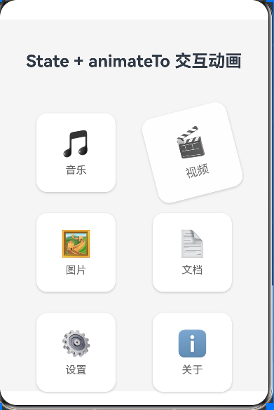
本案例实现一个交互式卡片布局应用,包含以下功能:
- 6个功能卡片的网格布局
- 点击卡片时的缩放和面板展开动画
- 拖拽卡片时的跟随和回弹动画
- 拖拽过程中的旋转倾斜效果
5.2 项目结构
entry/
├── src/
│   └── main/
│       └── ets/
│           └── pages/
│               └── Index.ets  # 主页面
5.3 核心代码实现
5.3.1 类型定义与状态声明
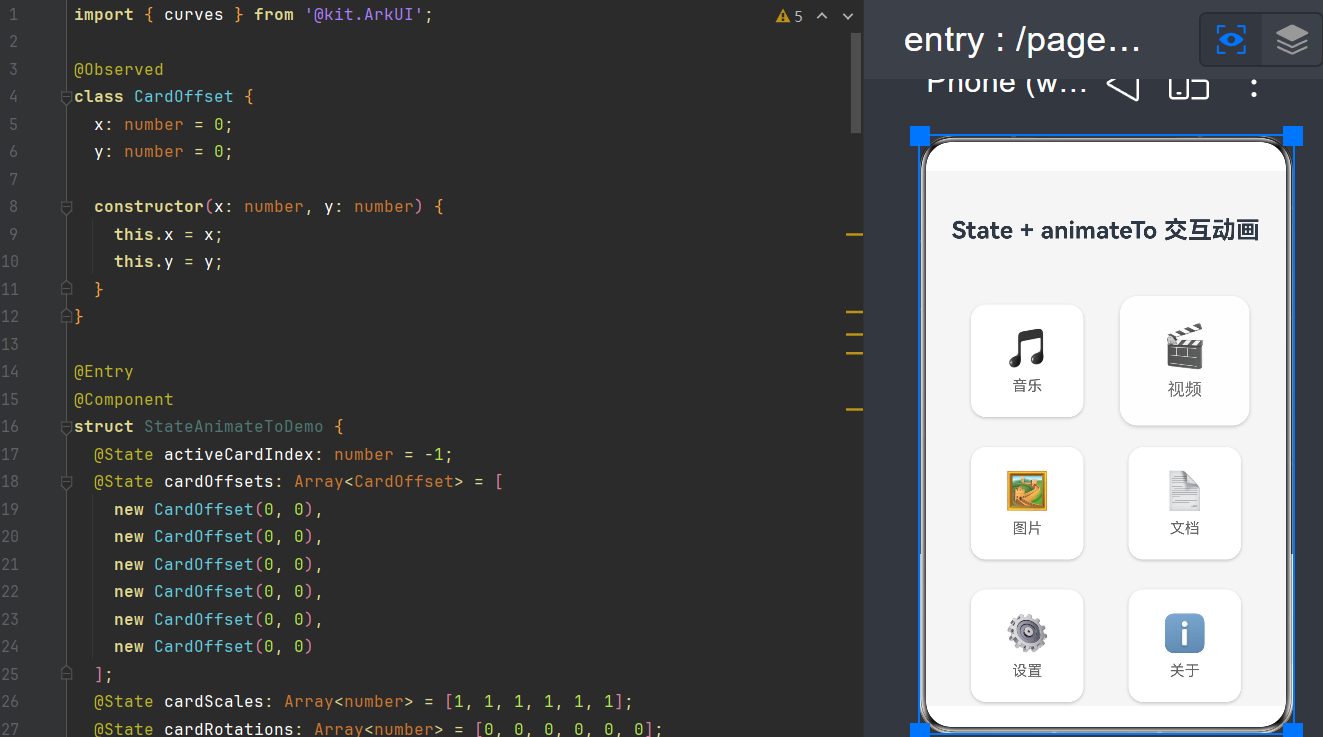
import { curves } from '@kit.ArkUI';

@Observed
class CardOffset {
  x: number = 0;
  y: number = 0;

  constructor(x: number, y: number) {
    this.x = x;
    this.y = y;
  }
}

@Entry
@Component
struct StateAnimateToDemo {
  // 当前激活的卡片索引
  @State activeCardIndex: number = -1;

  // 卡片位置偏移数组
  @State cardOffsets: Array<CardOffset> = [
    new CardOffset(0, 0),
    new CardOffset(0, 0),
    new CardOffset(0, 0),
    new CardOffset(0, 0),
    new CardOffset(0, 0),
    new CardOffset(0, 0)
  ];

  // 卡片缩放比例数组
  @State cardScales: Array<number> = [1, 1, 1, 1, 1, 1];

  // 卡片旋转角度数组
  @State cardRotations: Array<number> = [0, 0, 0, 0, 0, 0];

  // 卡片透明度数组
  @State cardOpacities: Array<number> = [1, 1, 1, 1, 1, 1];

  // 详情面板显示状态
  @State showDetailPanel: boolean = false;

  // 详情面板内容
  @State detailContent: string = '';

  // 详情面板高度
  @State panelHeight: number = 0;

  // 卡片标题
  private cardTitles: Array<string> = ['音乐', '视频', '图片', '文档', '设置', '关于'];

  // 卡片图标
  private cardIcons: Array<string> = ['🎵', '🎬', '🖼️', '📄', '⚙️', 'ℹ️'];

  // 拖拽初始位置记录
  private initialPanX: number = 0;
  private initialPanY: number = 0;
}
代码解析:
CardOffset类使用@Observed装饰,使其属性变化能够被框架检测cardOffsets数组存储每个卡片的位置偏移,初始值都为0cardScales、cardRotations、cardOpacities分别控制卡片的缩放、旋转和透明度showDetailPanel和panelHeight控制底部详情面板的显示和高度
5.3.2 UI构建部分
build() {
  Column() {
    // 页面标题
    Text('State + animateTo 交互动画')
      .fontSize(32)
      .fontWeight(FontWeight.Bold)
      .margin({ top: 60, bottom: 40 })
      .animation({ duration: 800, curve: Curve.EaseOut })

    // 卡片网格区域
    Flex({ wrap: FlexWrap.Wrap, justifyContent: FlexAlign.SpaceEvenly }) {
      ForEach(this.cardOffsets, (offset: CardOffset, index: number) => {
        // 单个卡片组件
        Column() {
          Text(this.cardIcons[index])
            .fontSize(48)
            .margin({ bottom: 10 })
          Text(this.cardTitles[index])
            .fontSize(20)
            .fontColor('#666666')
        }
        .backgroundColor('#ffffff')
        .borderRadius(20)
        .width(150)
        .height(150)
        .padding(20)
        .alignItems(HorizontalAlign.Center)
        .justifyContent(FlexAlign.Center)
        .shadow({ radius: 10, color: '#33000000', offsetY: 5 })
        .margin(20)
        .renderGroup(true)
        .translate({ x: offset.x, y: offset.y })
        .scale({ x: this.cardScales[index], y: this.cardScales[index] })
        .rotate({ angle: this.cardRotations[index] })
        .opacity(this.cardOpacities[index])
        .gesture(
          GestureGroup(GestureMode.Exclusive,
            TapGesture()
              .onAction(() => {
                this.handleCardTap(index);
              }),
            PanGesture()
              .onActionStart((event: GestureEvent) => {
                this.handlePanStart(index);
              })
              .onActionUpdate((event: GestureEvent) => {
                this.handlePanUpdate(index, event);
              })
              .onActionEnd((event: GestureEvent) => {
                this.handlePanEnd(index);
              })
          )
        )
      }, (item: CardOffset, index: number) => {
        return index.toString();
      })
    }
    .width('100%')
    .flexGrow(1)
    .padding(20)

    // 详情面板
    Column() {
      Text(this.detailContent)
        .fontSize(24)
        .fontWeight(FontWeight.Medium)
        .padding(30)
        .textAlign(TextAlign.Center)
    }
    .backgroundColor('#007DFF')
    .width('100%')
    .height(this.panelHeight)
    .borderRadius({ topLeft: 30, topRight: 30 })
    .renderGroup(true)
    .animation({ duration: 400, curve: Curve.EaseInOut })

    // 操作提示
    Text('💡 提示:点击卡片查看详情,拖拽卡片移动位置')
      .fontSize(16)
      .fontColor('#999999')
      .margin({ bottom: 20 })
      .animation({ delay: 500 })
  }
  .backgroundColor('#F5F5F5')
  .width('100%')
  .height('100%')
}
代码解析:
- 使用
Flex布局实现2列卡片网格,wrap: FlexWrap.Wrap允许自动换行 ForEach遍历卡片数组,动态渲染卡片组件- 每个卡片应用了
translate、scale、rotate、opacity四种变换 - 使用
GestureGroup(GestureMode.Exclusive)组合点击和拖拽手势,避免冲突 - 详情面板的高度由
panelHeight状态控制,配合animation实现平滑展开/收起
5.3.3 点击事件处理
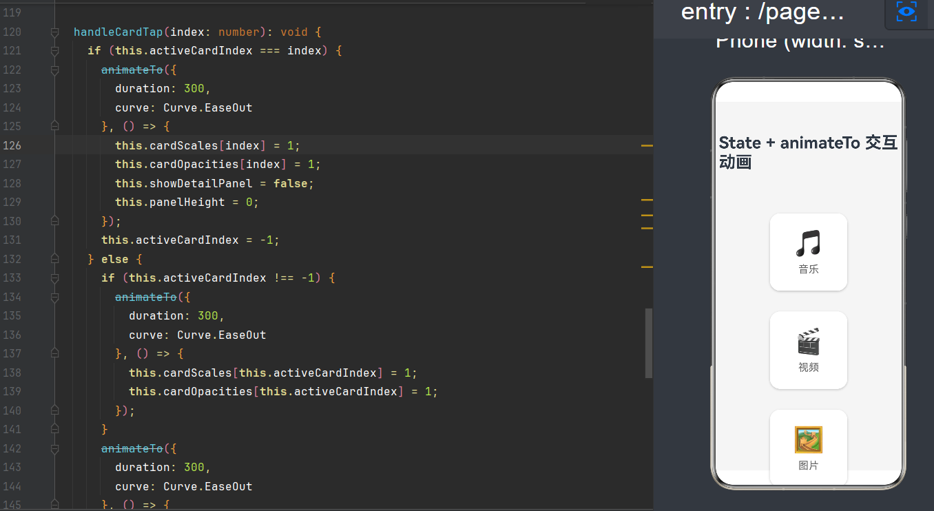
handleCardTap(index: number): void {
  // 如果点击的是当前激活的卡片,取消激活
  if (this.activeCardIndex === index) {
    animateTo({
      duration: 300,
      curve: Curve.EaseOut
    }, () => {
      this.cardScales[index] = 1;
      this.cardOpacities[index] = 1;
      this.showDetailPanel = false;
      this.panelHeight = 0;
    });
    this.activeCardIndex = -1;
  } else {
    // 如果有其他卡片处于激活状态,先取消它
    if (this.activeCardIndex !== -1) {
      animateTo({
        duration: 300,
        curve: Curve.EaseOut
      }, () => {
        this.cardScales[this.activeCardIndex] = 1;
        this.cardOpacities[this.activeCardIndex] = 1;
      });
    }
    // 激活新卡片
    animateTo({
      duration: 300,
      curve: Curve.EaseOut
    }, () => {
      this.cardScales[index] = 1.15;
      this.cardOpacities[index] = 0.9;
      this.showDetailPanel = true;
      this.detailContent = '您选择了「' + this.cardTitles[index] + '」功能';
      this.panelHeight = 150;
    });
    this.activeCardIndex = index;
  }
}
代码解析:
- 判断点击的卡片是否为当前激活的卡片
- 如果是,执行"取消激活"动画:卡片恢复原始大小,面板收起
- 如果不是,先取消之前激活卡片的状态,再激活新卡片
- 使用
animateTo将状态变化包装成平滑的过渡动画
5.3.4 拖拽开始处理
handlePanStart(index: number): void {
  this.activeCardIndex = index;
  // 记录初始位置,用于计算拖拽偏移
  this.initialPanX = this.cardOffsets[index].x;
  this.initialPanY = this.cardOffsets[index].y;
  // 添加"提起"动画效果
  animateTo({
    duration: 200,
    curve: Curve.EaseOut
  }, () => {
    this.cardScales[index] = 1.1;
    this.cardOpacities[index] = 0.9;
  });
}
代码解析:
- 记录拖拽开始时的初始位置,用于后续计算绝对位置
- 添加轻微的放大和半透明效果,模拟"提起"的视觉反馈
5.3.5 拖拽更新处理
handlePanUpdate(index: number, event: GestureEvent): void {
  // 计算新位置:初始位置 + 拖拽偏移
  let newX: number = this.initialPanX + event.offsetX;
  let newY: number = this.initialPanY + event.offsetY;
  // 创建新对象替换数组元素,触发UI更新
  this.cardOffsets[index] = new CardOffset(newX, newY);

  // 根据水平偏移计算旋转角度,增加拖拽的真实感
  let rotateAngle: number = (newX / 20) % 30 - 15;
  this.cardRotations[index] = rotateAngle;
}
代码解析:
event.offsetX和event.offsetY是相对于手势开始点的累计偏移- 创建新的
CardOffset对象替换数组元素,确保状态变化被框架检测 - 根据水平偏移计算旋转角度,使卡片在拖拽时产生倾斜效果
5.3.6 拖拽结束处理
handlePanEnd(index: number): void {
  animateTo({
    duration: 500,
    // 使用弹性曲线,使回弹效果更自然
    curve: curves.springMotion(0.4, 0.3)
  }, () => {
    // 恢复卡片到原始状态
    this.cardOffsets[index] = new CardOffset(0, 0);
    this.cardRotations[index] = 0;
    this.cardScales[index] = 1;
    this.cardOpacities[index] = 1;
    this.activeCardIndex = -1;
  });
}
代码解析:
- 使用
curves.springMotion(0.4, 0.3)创建弹性动画曲线 - 将卡片的所有变换属性恢复到初始状态
- 弹性效果使回弹动画更加自然流畅
5.4 动画效果总结
| 交互方式 | 动画效果 | 持续时间 | 动画曲线 |
|---|---|---|---|
| 点击卡片 | 卡片放大至1.15倍,面板展开 | 300ms | EaseOut |
| 取消选中 | 卡片恢复原始大小,面板收起 | 300ms | EaseOut |
| 拖拽开始 | 卡片放大至1.1倍,半透明 | 200ms | EaseOut |
| 拖拽过程 | 实时跟随手指移动,倾斜旋转 | - | 实时 |
| 拖拽结束 | 弹性回弹到原始位置 | 500ms | springMotion |
6. 最佳实践与性能优化
6.1 状态管理最佳实践
6.1.1 使用@Observed标记复杂对象
当状态变量是自定义类时,必须使用@Observed装饰器:
@Observed
class ComplexState {
  value1: number = 0;
  value2: string = '';
}
6.1.2 避免直接修改数组元素属性
数组中的对象元素需要通过替换整个对象来触发更新:
// 正确
this.items[index] = new Item(newValue);

// 错误
this.items[index].value = newValue;
6.1.3 合理组织状态结构
将相关的状态聚合到自定义类中,提高代码的可维护性:
@Observed
class CardState {
  offset: CardOffset = new CardOffset(0, 0);
  scale: number = 1;
  rotation: number = 0;
  opacity: number = 1;
}

@State cards: Array<CardState> = [...];
6.2 动画性能优化
6.2.1 使用renderGroup优化渲染
对于包含多个子组件的容器,使用renderGroup(true)合并渲染层:
Column() {
  Text('内容1')
  Text('内容2')
}
.renderGroup(true)
.animation({ duration: 300 })
6.2.2 优先使用变换属性
避免在动画中修改布局属性,优先使用translate、scale、rotate:
// 推荐
.translate({ x: offset })
.scale({ x: scale })

// 不推荐
.width(newWidth)
.margin({ left: marginLeft })
6.2.3 控制动画复杂度
避免同时执行过多的动画,保持动画的简洁性:
- 单次动画修改的属性不超过3-5个
- 避免嵌套过深的组件动画
- 使用
animation属性的delay参数错开动画时机
6.3 手势交互最佳实践
6.3.1 使用GestureGroup管理复杂手势
根据需求选择合适的手势组合模式:
- 需要互斥时使用
GestureMode.Exclusive - 需要同时识别时使用
GestureMode.Parallel - 需要顺序识别时使用
GestureMode.Sequence
6.3.2 添加手势反馈
在手势交互的各个阶段添加视觉反馈:
- 手势开始:轻微放大或高亮
- 手势进行:实时跟随或变形
- 手势结束:回弹或确认动画
6.3.3 处理手势冲突
当多个手势可能同时触发时,添加冲突处理逻辑:
- 设置合理的手势优先级
- 添加拖拽距离阈值判断
- 使用标志位控制手势响应
6.4 代码组织建议
6.4.1 分离UI和业务逻辑
将UI构建和业务逻辑分离到不同的方法中:
build() {
  Column() {
    this.buildHeader();
    this.buildContent();
    this.buildFooter();
  }
}

buildHeader(): void {
  // 头部UI
}

buildContent(): void {
  // 内容UI
}
6.4.2 抽取可复用组件
将通用的UI元素抽取为独立组件:
@Component
struct CardComponent {
  @Prop title: string = '';
  @Prop icon: string = '';
  @Prop scale: number = 1;

  build() {
    Column() {
      Text(this.icon)
      Text(this.title)
    }
    .scale({ x: this.scale, y: this.scale })
  }
}
6.4.3 使用常量管理配置
将魔法数字和配置值抽取为常量:
const CARD_WIDTH: number = 150;
const CARD_HEIGHT: number = 150;
const ANIMATION_DURATION: number = 300;
7. 总结与展望
7.1 本文总结
本文深入探讨了鸿蒙HarmonyOS NEXT中ArkTS的@State状态管理与animateTo动画API的组合使用,构建交互式动画布局的完整方案:
- 状态管理机制:详细介绍了
@State、@Observed等状态装饰器的工作原理和使用方法 - animateTo动画API:系统讲解了动画参数配置、动画曲线选择、以及性能优化策略
- 手势交互系统:全面覆盖了点击、拖拽等手势的使用,以及手势组合和冲突处理
- 完整案例实现:通过一个交互式卡片布局应用,展示了状态管理、动画和手势的协同工作
- 最佳实践:总结了状态管理、动画性能、手势交互等方面的最佳实践
7.2 技术优势
@State + animateTo组合具有以下技术优势:
- 声明式编程:只需描述状态变化,框架自动处理动画过渡
- 简洁高效:一行代码即可实现复杂的动画效果
- 性能优化:框架内置了渲染优化,保证动画流畅度
- 扩展性强:支持自定义动画曲线和复杂的手势组合
7.3 未来展望
随着鸿蒙生态的不断发展,ArkTS的动画能力也在持续增强:
- 更丰富的动画曲线:未来可能支持更多物理模拟曲线
- 3D动画支持:可能增加3D变换和视角动画
- 动画编排工具:可能提供可视化的动画编排工具
- 跨设备动画同步:支持多设备间的动画协同
附录:完整代码
import { curves } from '@kit.ArkUI';

@Observed
class CardOffset {
  x: number = 0;
  y: number = 0;

  constructor(x: number, y: number) {
    this.x = x;
    this.y = y;
  }
}

@Entry
@Component
struct StateAnimateToDemo {
  @State activeCardIndex: number = -1;
  @State cardOffsets: Array<CardOffset> = [
    new CardOffset(0, 0),
    new CardOffset(0, 0),
    new CardOffset(0, 0),
    new CardOffset(0, 0),
    new CardOffset(0, 0),
    new CardOffset(0, 0)
  ];
  @State cardScales: Array<number> = [1, 1, 1, 1, 1, 1];
  @State cardRotations: Array<number> = [0, 0, 0, 0, 0, 0];
  @State cardOpacities: Array<number> = [1, 1, 1, 1, 1, 1];
  @State showDetailPanel: boolean = false;
  @State detailContent: string = '';
  @State panelHeight: number = 0;
  private cardTitles: Array<string> = ['音乐', '视频', '图片', '文档', '设置', '关于'];
  private cardIcons: Array<string> = ['🎵', '🎬', '🖼️', '📄', '⚙️', 'ℹ️'];
  private initialPanX: number = 0;
  private initialPanY: number = 0;

  build() {
    Column() {
      Text('State + animateTo 交互动画')
        .fontSize(32)
        .fontWeight(FontWeight.Bold)
        .margin({ top: 60, bottom: 40 })
        .animation({ duration: 800, curve: Curve.EaseOut })

      Flex({ wrap: FlexWrap.Wrap, justifyContent: FlexAlign.SpaceEvenly }) {
        ForEach(this.cardOffsets, (offset: CardOffset, index: number) => {
          Column() {
            Text(this.cardIcons[index])
              .fontSize(48)
              .margin({ bottom: 10 })
            Text(this.cardTitles[index])
              .fontSize(20)
              .fontColor('#666666')
          }
          .backgroundColor('#ffffff')
          .borderRadius(20)
          .width(150)
          .height(150)
          .padding(20)
          .alignItems(HorizontalAlign.Center)
          .justifyContent(FlexAlign.Center)
          .shadow({ radius: 10, color: '#33000000', offsetY: 5 })
          .margin(20)
          .renderGroup(true)
          .translate({ x: offset.x, y: offset.y })
          .scale({ x: this.cardScales[index], y: this.cardScales[index] })
          .rotate({ angle: this.cardRotations[index] })
          .opacity(this.cardOpacities[index])
          .gesture(
            GestureGroup(GestureMode.Exclusive,
              TapGesture()
                .onAction(() => {
                  this.handleCardTap(index);
                }),
              PanGesture()
                .onActionStart((event: GestureEvent) => {
                  this.handlePanStart(index);
                })
                .onActionUpdate((event: GestureEvent) => {
                  this.handlePanUpdate(index, event);
                })
                .onActionEnd((event: GestureEvent) => {
                  this.handlePanEnd(index);
                })
            )
          )
        }, (item: CardOffset, index: number) => {
          return index.toString();
        })
      }
      .width('100%')
      .flexGrow(1)
      .padding(20)

      Column() {
        Text(this.detailContent)
          .fontSize(24)
          .fontWeight(FontWeight.Medium)
          .padding(30)
          .textAlign(TextAlign.Center)
      }
      .backgroundColor('#007DFF')
      .width('100%')
      .height(this.panelHeight)
      .borderRadius({ topLeft: 30, topRight: 30 })
      .renderGroup(true)
      .animation({ duration: 400, curve: Curve.EaseInOut })

      Text('💡 提示:点击卡片查看详情,拖拽卡片移动位置')
        .fontSize(16)
        .fontColor('#999999')
        .margin({ bottom: 20 })
        .animation({ delay: 500 })
    }
    .backgroundColor('#F5F5F5')
    .width('100%')
    .height('100%')
  }

  handleCardTap(index: number): void {
    if (this.activeCardIndex === index) {
      animateTo({
        duration: 300,
        curve: Curve.EaseOut
      }, () => {
        this.cardScales[index] = 1;
        this.cardOpacities[index] = 1;
        this.showDetailPanel = false;
        this.panelHeight = 0;
      });
      this.activeCardIndex = -1;
    } else {
      if (this.activeCardIndex !== -1) {
        animateTo({
          duration: 300,
          curve: Curve.EaseOut
        }, () => {
          this.cardScales[this.activeCardIndex] = 1;
          this.cardOpacities[this.activeCardIndex] = 1;
        });
      }
      animateTo({
        duration: 300,
        curve: Curve.EaseOut
      }, () => {
        this.cardScales[index] = 1.15;
        this.cardOpacities[index] = 0.9;
        this.showDetailPanel = true;
        this.detailContent = '您选择了「' + this.cardTitles[index] + '」功能';
        this.panelHeight = 150;
      });
      this.activeCardIndex = index;
    }
  }

  handlePanStart(index: number): void {
    this.activeCardIndex = index;
    this.initialPanX = this.cardOffsets[index].x;
    this.initialPanY = this.cardOffsets[index].y;
    animateTo({
      duration: 200,
      curve: Curve.EaseOut
    }, () => {
      this.cardScales[index] = 1.1;
      this.cardOpacities[index] = 0.9;
    });
  }

  handlePanUpdate(index: number, event: GestureEvent): void {
    let newX: number = this.initialPanX + event.offsetX;
    let newY: number = this.initialPanY + event.offsetY;
    this.cardOffsets[index] = new CardOffset(newX, newY);

    let rotateAngle: number = (newX / 20) % 30 - 15;
    this.cardRotations[index] = rotateAngle;
  }

  handlePanEnd(index: number): void {
    animateTo({
      duration: 500,
      curve: curves.springMotion(0.4, 0.3)
    }, () => {
      this.cardOffsets[index] = new CardOffset(0, 0);
      this.cardRotations[index] = 0;
      this.cardScales[index] = 1;
      this.cardOpacities[index] = 1;
      this.activeCardIndex = -1;
    });
  }
}

作为“人工智能6S店”的官方数字引擎,为AI开发者与企业提供一个覆盖软硬件全栈、一站式门户。
更多推荐
 6
6 0
0- 0


 已为社区贡献4条内容

所有评论(0)