
鸿蒙HarmonyOS ArkTS聊天界面布局深度解析
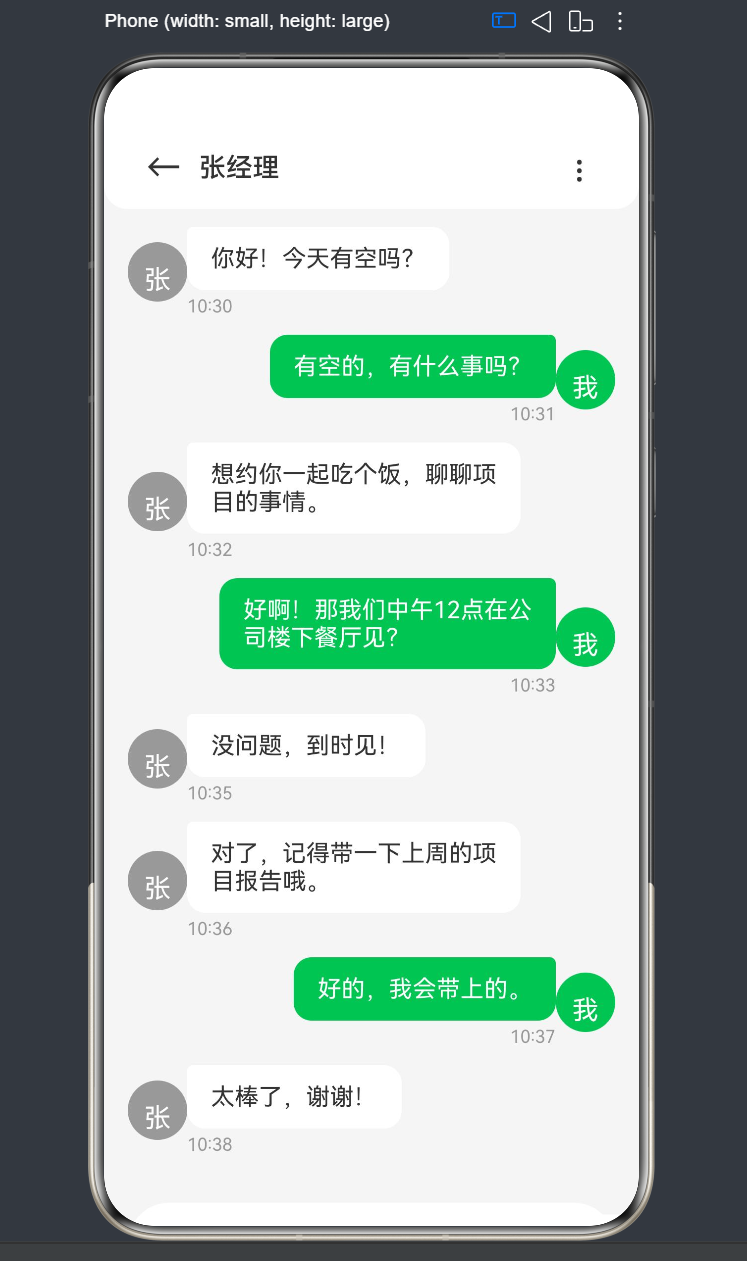
项目演示
前言
在移动应用开发中,聊天界面是最常见也是最复杂的UI场景之一。它不仅要求美观的视觉效果,还需要流畅的交互体验和良好的性能表现。鸿蒙HarmonyOS提供了强大的ArkTS语言和ArkUI框架,为开发者提供了一套完整的UI开发解决方案。
本文将以聊天界面布局为切入点,深入探讨鸿蒙原生ArkTS布局方式,涵盖消息气泡和输入框的实现细节。通过实际代码示例,帮助开发者掌握Column、Row、Scroll等核心布局组件的使用技巧,以及状态管理、交互逻辑等关键技术点。
一、ArkTS基础语法
1.1 ArkTS简介
ArkTS是HarmonyOS NEXT推出的一种声明式UI描述语言,它扩展了TypeScript,提供了丰富的装饰器和UI组件。ArkTS采用声明式编程范式,开发者只需描述UI的结构和状态,框架会自动处理UI的更新和渲染。
1.2 核心装饰器
@Entry装饰器
@Entry装饰器用于标记一个组件作为应用的入口。每个应用至少有一个入口组件,通常是首页。
@Entry
@Component
struct ChatPage {
  build() {
    Column() {
      Text('欢迎来到聊天界面')
    }
  }
}
@Component装饰器
@Component装饰器用于标记一个自定义组件。自定义组件是ArkUI中代码复用的基本单元。
@Component
struct MessageBubble {
  build() {
    Text('这是一条消息')
  }
}
@State装饰器
@State装饰器用于标记组件内部的状态变量。当状态变量发生变化时,框架会自动触发UI的重新渲染。
@State message: string = 'Hello World';
@Prop装饰器
@Prop装饰器用于接收父组件传递的属性。@Prop是单向绑定,子组件可以读取但不能修改父组件传递的值。
@Link装饰器
@Link装饰器用于双向绑定父组件的状态。子组件可以通过@Link修改父组件的状态。
1.3 组件树结构
ArkUI采用组件树的方式组织UI结构。每个组件可以包含多个子组件,形成层级关系。
Column() {
  Row() {
    Text('标题')
  }
  Scroll() {
    Column() {
      ForEach(items, item => {
        Text(item)
      })
    }
  }
}
二、布局系统详解
2.1 Flex布局基础
ArkUI的布局系统基于Flexbox布局模型,提供了Column、Row、Flex等布局组件。
Column组件
Column组件用于垂直方向的布局,子组件会从上到下依次排列。
Column() {
  Text('第一行')
  Text('第二行')
  Text('第三行')
}
常用属性:
width:宽度height:高度padding:内边距margin:外边距justifyContent:主轴对齐方式alignItems:交叉轴对齐方式flexGrow:弹性增长因子
Row组件
Row组件用于水平方向的布局,子组件会从左到右依次排列。
Row() {
  Text('左边')
  Text('中间')
  Text('右边')
}
常用属性:
width:宽度height:高度padding:内边距margin:外边距justifyContent:主轴对齐方式alignItems:交叉轴对齐方式flexGrow:弹性增长因子
Flex组件
Flex组件是一个通用的弹性布局组件,可以通过direction属性控制布局方向。
Flex({ direction: FlexDirection.Column }) {
  Text('垂直布局')
}

Flex({ direction: FlexDirection.Row }) {
  Text('水平布局')
}
2.2 对齐方式
justifyContent
justifyContent属性控制主轴方向上的对齐方式,适用于Column和Row组件。
// Column组件的主轴是垂直方向
Column() {
  Text('顶部')
  Text('中间')
  Text('底部')
}
.justifyContent(FlexAlign.Start)  // 顶部对齐
.justifyContent(FlexAlign.Center) // 居中对齐
.justifyContent(FlexAlign.End)    // 底部对齐
.justifyContent(FlexAlign.SpaceBetween) // 两端对齐
.justifyContent(FlexAlign.SpaceAround)  // 均匀分布
.justifyContent(FlexAlign.SpaceEvenly)  // 等间距分布

// Row组件的主轴是水平方向
Row() {
  Text('左边')
  Text('中间')
  Text('右边')
}
.justifyContent(FlexAlign.Start)  // 左对齐
.justifyContent(FlexAlign.Center) // 居中对齐
.justifyContent(FlexAlign.End)    // 右对齐
alignItems
alignItems属性控制交叉轴方向上的对齐方式。
// Column组件的交叉轴是水平方向
Column() {
  Text('左对齐')
  Text('居中')
  Text('右对齐')
}
.alignItems(HorizontalAlign.Start)  // 左对齐
.alignItems(HorizontalAlign.Center) // 居中对齐
.alignItems(HorizontalAlign.End)    // 右对齐

// Row组件的交叉轴是垂直方向
Row() {
  Text('顶部')
  Text('居中')
  Text('底部')
}
.alignItems(VerticalAlign.Top)    // 顶部对齐
.alignItems(VerticalAlign.Center) // 居中对齐
.alignItems(VerticalAlign.Bottom) // 底部对齐
2.3 Scroll滚动组件
Scroll组件用于实现可滚动的内容区域。当内容超出容器大小时,用户可以通过滚动查看更多内容。
Scroll() {
  Column() {
    ForEach([1, 2, 3, 4, 5], item => {
      Text(`第${item}条`)
        .width('100%')
        .height(50)
    })
  }
}
常用属性:
scrollBar:滚动条显示方式scrollBarColor:滚动条颜色scrollBarWidth:滚动条宽度
Scroller控制器:
通过Scroller控制器可以手动控制滚动位置。
scroller: Scroller = new Scroller();

Scroll(this.scroller) {
  // 内容
}

// 滚动到底部
this.scroller.scrollToIndex(items.length - 1);

// 滚动到顶部
this.scroller.scrollToIndex(0);

// 平滑滚动
this.scroller.scrollTo({ xOffset: 0, yOffset: 100 });
2.4 Blank占位组件
Blank组件用于在布局中占据剩余空间,通常用于实现弹性布局。
Row() {
  Text('左边')
  Blank() // 占据中间剩余空间
  Text('右边')
}
三、聊天界面架构设计
3.1 整体布局结构
聊天界面通常包含三个主要区域:
- 顶部标题栏:显示联系人信息、返回按钮等
- 消息列表区域:显示聊天消息,支持滚动
- 底部输入区域:输入框和发送按钮
Column() {
  // 顶部标题栏
  Row() { ... }

  // 消息列表区域
  Scroll() { ... }

  // 底部输入区域
  Row() { ... }
}
.width('100%')
.height('100%')
3.2 布局约束分析
高度约束
- 顶部标题栏:固定高度(如56vp)
- 底部输入区域:固定高度(根据内容自适应)
- 消息列表区域:占据剩余空间(使用flexGrow(1))
Column() {
  // 固定高度56vp
  Row() { ... }
    .height(56)

  // 占据剩余空间
  Scroll() { ... }
    .flexGrow(1)

  // 自适应高度
  Row() { ... }
}
宽度约束
- 顶部标题栏:占满全屏宽度
- 消息列表区域:占满全屏宽度
- 底部输入区域:占满全屏宽度
3.3 响应式设计考虑
在不同屏幕尺寸下,聊天界面需要保持良好的显示效果:
- 消息气泡最大宽度:限制在屏幕宽度的70%左右,避免过长的消息影响阅读
- 输入框自适应:输入框宽度随屏幕尺寸变化,发送按钮保持固定宽度
- 安全区域适配:考虑刘海屏、底部导航栏等特殊区域
四、消息数据模型
4.1 消息接口定义
在ArkTS中,我们需要定义消息的数据结构。根据经验,数据模型应该放在文件顶层,避免在struct内部定义导致编译错误。
interface MessageItem {
  id: number;
  content: string;
  isMine: boolean;
  time: string;
  avatar?: string;
  nickname?: string;
}
字段说明:
id:消息唯一标识,用于ForEach的keycontent:消息内容isMine:是否为自己发送的消息time:消息发送时间avatar:头像地址(可选)nickname:昵称(可选)
4.2 初始化消息列表
使用@State装饰器定义消息列表状态,并初始化一些示例数据。
@State messages: MessageItem[] = [
  { id: 1, content: '你好!今天有空吗?', isMine: false, time: '10:30' },
  { id: 2, content: '有空的,有什么事吗?', isMine: true, time: '10:31' },
  { id: 3, content: '想约你一起吃个饭,聊聊项目的事情。', isMine: false, time: '10:32' },
  { id: 4, content: '好啊!那我们中午12点在公司楼下餐厅见?', isMine: true, time: '10:33' },
  { id: 5, content: '没问题,到时见!', isMine: false, time: '10:35' },
];
4.3 状态管理原则
- 单一数据源:消息列表应该是唯一的数据源,所有操作都通过修改这个数组来实现
- 不可变更新:虽然ArkTS支持数组的push操作,但在复杂场景下建议创建新数组
- 响应式更新:使用
@State装饰器确保状态变化时UI自动更新
五、消息气泡实现
5.1 消息列表渲染
使用ForEach组件遍历消息列表,动态渲染每条消息。
Scroll(this.scroller) {
  Column() {
    ForEach(this.messages, (msg: MessageItem) => {
      // 渲染单条消息
      MessageItemComponent({ message: msg })
    }, (msg: MessageItem) => msg.id.toString())
  }
}
ForEach参数说明:
- 第一个参数:数据源数组
- 第二个参数:渲染函数,返回要渲染的组件
- 第三个参数:key生成函数,必须返回唯一标识
5.2 消息对齐方式
根据isMine属性,消息需要显示在不同的位置:
- 自己发送的消息:靠右对齐
- 他人发送的消息:靠左对齐
Row() {
  if (!msg.isMine) {
    // 他人消息:头像 + 气泡
    Image(msg.avatar)
    Column() {
      Text(msg.content)
      Text(msg.time)
    }
  } else {
    // 自己消息:气泡 + 头像
    Column() {
      Text(msg.content)
      Text(msg.time)
    }
    Image(msg.avatar)
  }
}
.justifyContent(msg.isMine ? FlexAlign.End : FlexAlign.Start)
5.3 气泡样式设计
接收消息气泡
Text(msg.content)
  .fontSize(16)
  .fontColor('#333')
  .backgroundColor('#fff')
  .padding({ left: 16, right: 16, top: 12, bottom: 12 })
  .borderRadius({
    topLeft: 4,
    topRight: 12,
    bottomLeft: 12,
    bottomRight: 12
  })
设计要点:
- 白色背景,深色文字
- 左侧边角较小,右侧边角较大
- 适当的内边距保证文字与边框的距离
发送消息气泡
Text(msg.content)
  .fontSize(16)
  .fontColor('#fff')
  .backgroundColor('#07C160')
  .padding({ left: 16, right: 16, top: 12, bottom: 12 })
  .borderRadius({
    topLeft: 12,
    topRight: 4,
    bottomLeft: 12,
    bottomRight: 12
  })
设计要点:
- 绿色背景,白色文字(微信风格)
- 右侧边角较小,左侧边角较大
- 与接收消息气泡形成对比
5.4 气泡宽度控制
在ArkTS中,Text组件不支持maxWidth属性。我们需要通过父容器来限制气泡的最大宽度。
Column() {
  Text(msg.content)
    // ...其他样式
  Text(msg.time)
}
.width('70%') // 限制最大宽度为父容器的70%
布局结构:
Row (占满宽度)
  ├── 头像 (固定宽度40vp)
  └── Column (最大宽度70%)
        ├── Text (消息内容,自动换行)
        └── Text (时间)
5.5 头像实现
使用Text组件模拟头像,显示联系人的首字母。
Row() {
  Text('张')
    .fontSize(18)
    .fontColor('#fff')
    .backgroundColor('#999')
    .width(40)
    .height(40)
    .borderRadius(20)
    .textAlign(TextAlign.Center)
    .lineHeight(40)
}
设计要点:
- 圆形头像:使用
borderRadius(20)实现(宽度的一半) - 文字居中:
textAlign(TextAlign.Center)+lineHeight(40) - 背景色:根据联系人首字母生成不同颜色
六、输入框实现
6.1 输入框布局
底部输入区域通常包含:
- 表情按钮
- 文本输入框
- 语音按钮
- 发送按钮
Row() {
  // 输入框容器
  Row() {
    Text('😊') // 表情按钮
    TextInput({ placeholder: '请输入消息...' })
    Text('🎤') // 语音按钮
  }
  .flexGrow(1)

  // 发送按钮
  Button('发送')
}
6.2 TextInput组件
TextInput组件用于接收用户输入的文本。
TextInput({ placeholder: '请输入消息...', text: this.inputText })
  .onChange((value: string) => {
    this.inputText = value;
  })
  .onSubmit(() => {
    this.sendMessage();
  })
  .fontSize(16)
  .fontColor('#333')
  .placeholderColor('#999')
  .backgroundColor('#fff')
  .padding({ left: 16, right: 16, top: 10, bottom: 10 })
  .borderRadius(24)
  .flexGrow(1)
  .maxLines(4)
常用属性:
placeholder:占位提示文本text:绑定的文本状态onChange:文本变化回调onSubmit:提交回调(回车/发送)fontSize:字体大小fontColor:字体颜色placeholderColor:占位文本颜色backgroundColor:背景颜色padding:内边距borderRadius:圆角flexGrow:弹性增长maxLines:最大行数
6.3 发送按钮
Button() {
  Text('发送')
    .fontSize(14)
    .fontColor('#fff')
    .fontWeight(FontWeight.Medium)
}
.width(64)
.height(48)
.backgroundColor('#07C160')
.borderRadius(24)
.margin({ left: 12 })
.onClick(() => {
  this.sendMessage();
})
6.4 输入框容器样式
Row() {
  // 表情按钮、输入框、语音按钮
}
.flexGrow(1)
.backgroundColor('#fff')
.padding({ left: 12, right: 12, top: 8, bottom: 8 })
.borderRadius(28)
.shadow({ radius: 4, color: '#00000010', offsetY: 2 })
七、发送消息逻辑
7.1 发送消息方法
sendMessage() {
  // 1. 验证输入内容
  if (this.inputText.trim() === '') {
    return;
  }

  // 2. 获取当前时间
  const now = new Date();
  const time = `${now.getHours().toString().padStart(2, '0')}:${now.getMinutes().toString().padStart(2, '0')}`;

  // 3. 添加新消息到列表
  this.messages.push({
    id: this.messages.length + 1,
    content: this.inputText,
    isMine: true,
    time: time
  });

  // 4. 清空输入框
  this.inputText = '';

  // 5. 滚动到底部
  setTimeout(() => {
    this.scroller.scrollToIndex(this.messages.length - 1);
  }, 100);
}
7.2 滚动到底部
使用Scroller控制器实现新消息发送后自动滚动到底部。
scroller: Scroller = new Scroller();

setTimeout(() => {
  this.scroller.scrollToIndex(this.messages.length - 1);
}, 100);
注意事项:
- 需要使用
setTimeout延迟执行,等待UI更新完成 - 延迟时间不宜过长,100ms左右比较合适
- 在实际项目中,建议使用
scrollTo方法配合动画效果
八、标题栏实现
8.1 标题栏布局
Row() {
  // 返回按钮
  Row() {
    Text('←')
      .fontSize(24)
      .fontColor('#333')
  }
  .width(48)
  .height(48)
  .justifyContent(FlexAlign.Center)
  .alignItems(VerticalAlign.Center)

  // 联系人名称
  Text('张经理')
    .fontSize(18)
    .fontWeight(FontWeight.Medium)
    .fontColor('#333')

  // 右侧占位
  Blank()

  // 更多按钮
  Row() {
    Text('⋮')
      .fontSize(24)
      .fontColor('#333')
  }
  .width(48)
  .height(48)
  .justifyContent(FlexAlign.Center)
  .alignItems(VerticalAlign.Center)
}
.width('100%')
.height(56)
.backgroundColor('#fff')
.padding({ left: 16, right: 16 })
.borderRadius({ bottomLeft: 16, bottomRight: 16 })
.shadow({ radius: 4, color: '#00000010', offsetY: 2 })
8.2 标题栏样式
设计要点:
- 固定高度56vp
- 白色背景
- 底部圆角,增加层次感
- 阴影效果,区分内容区域
九、完整代码示例
9.1 核心代码
interface MessageItem {
  id: number;
  content: string;
  isMine: boolean;
  time: string;
}

@Entry
@Component
struct ChatPage {
  @State messages: MessageItem[] = [
    { id: 1, content: '你好!今天有空吗?', isMine: false, time: '10:30' },
    { id: 2, content: '有空的,有什么事吗?', isMine: true, time: '10:31' },
    { id: 3, content: '想约你一起吃个饭,聊聊项目的事情。', isMine: false, time: '10:32' },
    { id: 4, content: '好啊!那我们中午12点在公司楼下餐厅见?', isMine: true, time: '10:33' },
    { id: 5, content: '没问题,到时见!', isMine: false, time: '10:35' },
    { id: 6, content: '对了,记得带一下上周的项目报告哦。', isMine: false, time: '10:36' },
    { id: 7, content: '好的,我会带上的。', isMine: true, time: '10:37' },
    { id: 8, content: '太棒了,谢谢!', isMine: false, time: '10:38' },
  ];

  @State inputText: string = '';

  scroller: Scroller = new Scroller();

  sendMessage() {
    if (this.inputText.trim() === '') {
      return;
    }

    const now = new Date();
    const time = `${now.getHours().toString().padStart(2, '0')}:${now.getMinutes().toString().padStart(2, '0')}`;

    this.messages.push({
      id: this.messages.length + 1,
      content: this.inputText,
      isMine: true,
      time: time
    });

    this.inputText = '';

    setTimeout(() => {
      this.scroller.scrollToIndex(this.messages.length - 1);
    }, 100);
  }

  build() {
    Column() {
      // 顶部标题栏
      Row() {
        Row() {
          Text('←')
            .fontSize(24)
            .fontColor('#333')
        }
        .width(48)
        .height(48)
        .justifyContent(FlexAlign.Center)
        .alignItems(VerticalAlign.Center)

        Text('张经理')
          .fontSize(18)
          .fontWeight(FontWeight.Medium)
          .fontColor('#333')

        Blank()

        Row() {
          Text('⋮')
            .fontSize(24)
            .fontColor('#333')
        }
        .width(48)
        .height(48)
        .justifyContent(FlexAlign.Center)
        .alignItems(VerticalAlign.Center)
      }
      .width('100%')
      .height(56)
      .backgroundColor('#fff')
      .padding({ left: 16, right: 16 })
      .borderRadius({ bottomLeft: 16, bottomRight: 16 })
      .shadow({ radius: 4, color: '#00000010', offsetY: 2 })

      // 消息列表区域
      Scroll(this.scroller) {
        Column() {
          ForEach(this.messages, (msg: MessageItem) => {
            Row() {
              if (!msg.isMine) {
                Row() {
                  Text('张')
                    .fontSize(18)
                    .fontColor('#fff')
                    .backgroundColor('#999')
                    .width(40)
                    .height(40)
                    .borderRadius(20)
                    .textAlign(TextAlign.Center)
                    .lineHeight(40)
                }

                Column() {
                  Text(msg.content)
                    .fontSize(16)
                    .fontColor('#333')
                    .backgroundColor('#fff')
                    .padding({ left: 16, right: 16, top: 12, bottom: 12 })
                    .borderRadius({ topLeft: 4, topRight: 12, bottomLeft: 12, bottomRight: 12 })
                    .shadow({ radius: 2, color: '#00000010', offsetY: 1 })

                  Text(msg.time)
                    .fontSize(12)
                    .fontColor('#999')
                    .margin({ top: 4 })
                }
                .alignItems(HorizontalAlign.Start)
                .width('70%')
              } else {
                Column() {
                  Text(msg.content)
                    .fontSize(16)
                    .fontColor('#fff')
                    .backgroundColor('#07C160')
                    .padding({ left: 16, right: 16, top: 12, bottom: 12 })
                    .borderRadius({ topLeft: 12, topRight: 4, bottomLeft: 12, bottomRight: 12 })
                    .shadow({ radius: 2, color: '#00000010', offsetY: 1 })

                  Text(msg.time)
                    .fontSize(12)
                    .fontColor('#999')
                    .margin({ top: 4 })
                }
                .alignItems(HorizontalAlign.End)
                .width('70%')

                Row() {
                  Text('我')
                    .fontSize(18)
                    .fontColor('#fff')
                    .backgroundColor('#07C160')
                    .width(40)
                    .height(40)
                    .borderRadius(20)
                    .textAlign(TextAlign.Center)
                    .lineHeight(40)
                }
              }
            }
            .width('100%')
            .padding({ left: 16, right: 16, top: 12 })
            .justifyContent(msg.isMine ? FlexAlign.End : FlexAlign.Start)
          }, (msg: MessageItem) => msg.id.toString())

          Blank()
            .height(20)
        }
        .width('100%')
      }
      .flexGrow(1)
      .backgroundColor('#f5f5f5')

      // 底部输入区域
      Row() {
        Row() {
          Text('😊')
            .fontSize(24)
            .margin({ right: 12 })

          TextInput({ placeholder: '请输入消息...', text: this.inputText })
            .onChange((value: string) => {
              this.inputText = value;
            })
            .onSubmit(() => {
              this.sendMessage();
            })
            .fontSize(16)
            .fontColor('#333')
            .placeholderColor('#999')
            .backgroundColor('#fff')
            .padding({ left: 16, right: 16, top: 10, bottom: 10 })
            .borderRadius(24)
            .flexGrow(1)
            .maxLines(4)

          Text('🎤')
            .fontSize(24)
            .margin({ left: 12 })
        }
        .flexGrow(1)
        .backgroundColor('#fff')
        .padding({ left: 12, right: 12, top: 8, bottom: 8 })
        .borderRadius(28)
        .shadow({ radius: 4, color: '#00000010', offsetY: 2 })

        Button() {
          Text('发送')
            .fontSize(14)
            .fontColor('#fff')
            .fontWeight(FontWeight.Medium)
        }
        .width(64)
        .height(48)
        .backgroundColor('#07C160')
        .borderRadius(24)
        .margin({ left: 12 })
        .onClick(() => {
          this.sendMessage();
        })
      }
      .width('100%')
      .backgroundColor('#f5f5f5')
      .padding({ left: 16, right: 16, top: 12, bottom: 20 })
    }
    .width('100%')
    .height('100%')
    .backgroundColor('#f5f5f5')
  }
}
9.2 代码结构分析
Index.ets
├── MessageItem 接口定义(文件顶层)
├── ChatPage 组件
│   ├── @State messages 消息列表状态
│   ├── @State inputText 输入框状态
│   ├── scroller Scroller控制器
│   ├── sendMessage() 发送消息方法
│   └── build() UI构建方法
│       ├── Column 外层容器
│       │   ├── Row 标题栏
│       │   ├── Scroll 消息列表
│       │   │   └── Column
│       │   │       └── ForEach 消息项渲染
│       │   └── Row 输入区域
│       │       ├── Row 输入框容器
│       │       └── Button 发送按钮
十、常见问题与解决方案
10.1 编译错误:Property ‘maxWidth’ does not exist
问题描述:
Error Message: Property 'maxWidth' does not exist on type 'TextAttribute'.
解决方案:
ArkUI的Text组件不支持maxWidth属性。需要通过父容器来限制宽度。
// 错误写法
Text(msg.content)
  .maxWidth('70%')

// 正确写法
Column() {
  Text(msg.content)
}
.width('70%')
10.2 消息气泡居中问题
问题描述:
消息气泡没有正确对齐到左侧或右侧,而是居中显示。
解决方案:
确保外层Row组件设置了正确的justifyContent属性。
Row() {
  // 消息内容
}
.width('100%') // 必须占满宽度
.justifyContent(msg.isMine ? FlexAlign.End : FlexAlign.Start)
10.3 滚动到底部不生效
问题描述:
发送新消息后,列表没有自动滚动到底部。
解决方案:
使用setTimeout延迟执行滚动操作,等待UI更新完成。
setTimeout(() => {
  this.scroller.scrollToIndex(this.messages.length - 1);
}, 100);
10.4 输入框被键盘遮挡
问题描述:
软键盘弹出时,输入框被遮挡。
解决方案:
使用window.getWindowProperties()获取键盘高度,动态调整布局。
import { window } from '@kit.AbilityKit';

@State keyboardHeight: number = 0;

onPageShow() {
  const props = window.getWindowProperties();
  this.keyboardHeight = props.keyboardHeight;
}

Row() {
  // 输入区域
}
.padding({ bottom: this.keyboardHeight + 20 })
10.5 深色模式适配
问题描述:
深色模式下,输入框和消息气泡仍然显示白色背景。
解决方案:
使用资源系统定义颜色,在base和dark目录分别配置。
// resources/base/element/color.json
{
  "color": [
    { "name": "app_background", "value": "#f5f5f5" },
    { "name": "app_input_background", "value": "#ffffff" },
    { "name": "app_bubble_receive", "value": "#ffffff" },
    { "name": "app_bubble_send", "value": "#07C160" }
  ]
}

// resources/dark/element/color.json
{
  "color": [
    { "name": "app_background", "value": "#1a1a1a" },
    { "name": "app_input_background", "value": "#333333" },
    { "name": "app_bubble_receive", "value": "#333333" },
    { "name": "app_bubble_send", "value": "#07C160" }
  ]
}
在代码中使用资源引用:
.backgroundColor($r('app.color.app_input_background'))
十一、性能优化建议
11.1 列表渲染优化
虚拟滚动:
当消息数量较多时,使用LazyForEach替代ForEach,实现虚拟滚动,只渲染可见区域的消息。
import { LazyForEach } from '@ohos.base';

Scroll(this.scroller) {
  Column() {
    LazyForEach(this.messages, (msg: MessageItem) => {
      MessageItemComponent({ message: msg })
    }, (msg: MessageItem) => msg.id.toString())
  }
}
注意事项:
LazyForEach要求数据源实现IList接口- 需要配合
Scroller使用,实现按需加载
11.2 图片资源优化
头像缓存:
对头像图片进行缓存,避免重复加载。
@State avatarCache: Map<string, PixelMap> = new Map();

loadAvatar(url: string) {
  if (this.avatarCache.has(url)) {
    return this.avatarCache.get(url);
  }

  // 加载图片并缓存
  const pixelMap = loadImage(url);
  this.avatarCache.set(url, pixelMap);
  return pixelMap;
}
11.3 状态更新优化
批量更新:
当需要更新多条消息时,使用批量更新方式,减少UI刷新次数。
updateMessages(newMessages: MessageItem[]) {
  this.messages = [...this.messages, ...newMessages];
}
11.4 避免不必要的渲染
条件渲染:
使用条件渲染避免渲染不可见的元素。
if (msg.avatar) {
  Image(msg.avatar)
} else {
  Text(msg.nickname?.charAt(0) || '?')
}
十二、扩展功能建议
12.1 消息类型扩展
支持多种消息类型:
- 文本消息
- 图片消息
- 语音消息
- 文件消息
- 表情消息
interface MessageItem {
  id: number;
  content: string;
  type: 'text' | 'image' | 'voice' | 'file' | 'emoji';
  isMine: boolean;
  time: string;
  mediaUrl?: string;
  duration?: number;
}
12.2 消息状态显示
显示消息发送状态:
- 发送中
- 已发送
- 已读
- 发送失败
interface MessageItem {
  id: number;
  content: string;
  isMine: boolean;
  time: string;
  status: 'sending' | 'sent' | 'read' | 'failed';
}
12.3 消息转发功能
实现消息转发:
forwardMessage(msg: MessageItem) {
  // 将消息转发给其他联系人
  router.pushUrl({
    url: 'pages/ChatPage',
    params: { forwardedMessage: msg }
  });
}
12.4 消息搜索功能
实现消息搜索:
@State searchText: string = '';

get filteredMessages() {
  return this.messages.filter(msg =>
    msg.content.includes(this.searchText)
  );
}
十三、总结
13.1 核心技术点回顾
- 布局组件:Column、Row、Scroll、Flex、Blank
- 状态管理:@State、@Prop、@Link装饰器
- 列表渲染:ForEach、LazyForEach
- 滚动控制:Scroller控制器
- 输入处理:TextInput组件
- 样式设计:padding、margin、borderRadius、shadow
13.2 布局最佳实践
- 外层容器占满全屏:确保Column宽度和高度均为100%
- 弹性布局分配空间:使用flexGrow(1)让消息列表占据剩余空间
- 消息行占满宽度:确保每条消息的Row组件width(‘100%’)
- 气泡宽度限制:通过父容器width(‘70%’)限制气泡最大宽度
- 对齐方式正确:使用justifyContent控制消息左右对齐
- 滚动到底部:使用Scroller和setTimeout实现自动滚动
13.3 常见陷阱
- Text组件不支持maxWidth:需要通过父容器限制宽度
- 消息气泡居中:确保外层Row设置了正确的justifyContent
- 滚动不生效:使用setTimeout延迟执行滚动操作
- 深色模式适配:使用资源系统定义颜色,避免硬编码
附录:API Level 24 支持的组件
核心布局组件
| 组件名 | 功能描述 |
|---|---|
| Column | 垂直方向布局容器 |
| Row | 水平方向布局容器 |
| Flex | 弹性布局容器 |
| Scroll | 滚动容器 |
| Blank | 占位组件 |
文本组件
| 组件名 | 功能描述 |
|---|---|
| Text | 文本显示组件 |
| TextInput | 文本输入组件 |
| TextArea | 多行文本输入组件 |
交互组件
| 组件名 | 功能描述 |
|---|---|
| Button | 按钮组件 |
| Image | 图片组件 |
| List | 列表组件 |
| ForEach | 列表渲染组件 |
装饰器
| 装饰器 | 功能描述 |
|---|---|
| @Entry | 入口组件装饰器 |
| @Component | 组件装饰器 |
| @State | 状态装饰器 |
| @Prop | 属性装饰器 |
| @Link | 双向绑定装饰器 |
| @Builder | 构建函数装饰器 |
| @Extend | 扩展装饰器 |
工具类
| 类名 | 功能描述 |
|---|---|
| Scroller | 滚动控制器 |
| Date | 日期工具类 |
| Math | 数学工具类 |
参考资料
本文完
作者:HarmonyOS ArkTS开发者
版本:1.0
日期:2026年7月

作为“人工智能6S店”的官方数字引擎,为AI开发者与企业提供一个覆盖软硬件全栈、一站式门户。
更多推荐

 0
0 0
0- 0


 已为社区贡献3条内容

所有评论(0)