
鸿蒙 ArkTS 实战:打造全场景自适应的响应式栅格布局

文章目录
前言
在上一期的实战中,我们掌握了丝滑的共享元素转场动画。今天,我们将迎来鸿蒙多端适配的“终极武器”——响应式栅格布局。
在鸿蒙生态中,应用需要运行在手机、平板、折叠屏甚至智慧屏等多种设备上。如果为每种设备单独写一套 UI,开发成本将极其高昂。而 ArkUI 提供的 GridRow 和 GridCol 栅格系统,配合断点(Breakpoint)机制,能够让我们用一套代码实现“全场景自适应”。
这个实战案例虽然代码精炼,但含金量极高,涵盖了以下核心知识点:
- 栅格系统实战:使用
GridRow和GridCol构建灵活的网格布局。 - 断点监听与响应:利用
onBreakpointChange实时感知屏幕尺寸变化。 - 动态样式适配:根据当前断点,动态计算并改变组件的列宽、高度、字体大小等样式。
- 自定义状态指示器:构建一个可视化的断点指示器,方便开发调试与状态展示。
下面,我们就对这段实现全场景自适应的代码进行一次深度解析。
完整代码结构预览
首先,让我们从整体上把握代码结构。它定义了一个 ResponsiveGridPage 入口组件,核心是栅格布局的搭建、断点状态的监听以及卡片组件的动态渲染。
interface SpanConfig {
  xs: number; sm: number; md: number; lg: number; xl: number;
}

interface CardInfo {
  id: string; title: string; subtitle: string; icon: string; color: string; span: SpanConfig;
}

@Entry
@Component
struct ResponsiveGridPage {
  // 1. 状态与数据定义
  @State currentBreakpoint: string = 'md'
  @State cards: CardInfo[] = [...]

  // 2. 响应式计算逻辑
  private onBreakpointChange(breakpoint: string): void { ... }
  private getColumnCount(): number { ... }
  private getCardHeight(): number { ... }
  private getFontSize(): number { ... }
  private getSpan(card: CardInfo): number { ... }

  // 3. 页面主体与自定义构建
  build() { ... }
  @Builder Header() { ... }
  @Builder CardItem(card: CardInfo) { ... }
  @Builder BreakpointIndicator() { ... }
}
第一部分:数据模型与状态管理
代码的开头定义了两个接口和几个关键的 @State 变量,它们是驱动响应式布局的核心。
interface SpanConfig {
  xs: number; sm: number; md: number; lg: number; xl: number;
}

interface CardInfo {
  id: string; title: string; subtitle: string; icon: string; color: string; span: SpanConfig;
}

@State currentBreakpoint: string = 'md'
@State cards: CardInfo[] = [
  { id: '1', title: '智能生活', ..., span: { xs: 2, sm: 2, md: 2, lg: 1, xl: 1 } },
  // ... 其他卡片数据
]
SpanConfig接口:定义了卡片在不同断点(xs, sm, md, lg, xl)下应该占据的栅格列数。cards数据源:每个卡片对象都包含了一个span属性,精确规定了它在不同屏幕宽度下的布局表现。例如,“新闻资讯”在md断点下占 1 列,而在xs断点下占 2 列。currentBreakpoint:这是整个页面的“响应式中枢”。它存储了当前设备所处的断点状态。当屏幕尺寸发生变化时,这个变量会随之更新,进而触发 UI 的重新渲染。
️ 第二部分:响应式计算逻辑
为了在不同设备上呈现最佳的视觉效果,我们封装了一系列根据 currentBreakpoint 动态返回数值的辅助函数。
private getColumnCount(): number {
  switch (this.currentBreakpoint) {
    case 'xs': return 2; case 'sm': return 2; case 'md': return 2;
    case 'lg': return 4; case 'xl': return 4; default: return 2;
  }
}

private getCardHeight(): number { ... }
private getFontSize(): number { ... }
private getIconSize(): number { ... }

private getSpan(card: CardInfo): number {
  switch (this.currentBreakpoint) {
    case 'xs': return card.span.xs; case 'sm': return card.span.sm;
    case 'md': return card.span.md; case 'lg': return card.span.lg;
    case 'xl': return card.span.xl; default: return card.span.md;
  }
}
getColumnCount():动态计算GridRow的总列数。在小屏设备(xs/sm/md)上,栅格系统被划分为 2 列;而在大屏设备(lg/xl)上,则扩展为 4 列,以容纳更多内容。getCardHeight()/getFontSize()/getIconSize():随着屏幕变大,卡片的高度、文字的字号以及图标的大小也会逐步递增。这种“渐进式”的样式放大,保证了在大屏设备上内容不会显得过于稀疏。getSpan():根据当前的断点,从卡片自身的span配置中提取出它当前应该占据的列数。
第三部分:栅格布局与断点监听 (GridRow + GridCol)
这是整个页面的核心骨架,展示了 GridRow 和 GridCol 的实战用法。
GridRow({
  columns: this.getColumnCount(),
  breakpoints: { value: ['320vp', '520vp', '840vp', '1200vp'], reference: BreakpointsReference.WindowSize }
}) {
  ForEach(this.cards, (card: CardInfo) => {
    GridCol({
      span: this.getSpan(card)
    }) {
      this.CardItem(card)
    }
    .margin({ right: 8, bottom: 8 })
  })
}
.width('100%')
.layoutWeight(1)
.padding({ left: 16, right: 16, top: 16, bottom: 16 })
.onBreakpointChange((breakpoint: string) => {
  this.onBreakpointChange(breakpoint)
})
GridRow容器:columns:绑定了我们之前定义的getColumnCount()函数,实现总列数的动态切换。breakpoints:自定义了断点阈值。当窗口宽度小于 320vp 为xs,320-520vp 为sm,520-840vp 为md,840-1200vp 为lg,大于 1200vp 为xl。onBreakpointChange:这是栅格系统的“监听器”。每当屏幕宽度跨越断点阈值时,回调函数就会被触发,更新currentBreakpoint状态。
GridCol子项:span:绑定了getSpan(card)。GridCol会根据这个值,在当前的columns总列数中占据相应的比例。例如在lg断点(总4列)下,如果span为 1,则该卡片占据 1/4 的宽度。
第四部分:自定义卡片与断点指示器
1. 动态卡片组件 (CardItem)
@Builder CardItem(card: CardInfo) {
  Stack({ alignContent: Alignment.Center }) {
    Column()
      .width('100%')
      .height(this.getCardHeight()) // 动态高度
      .backgroundColor(card.color)
      .borderRadius(20)

    Column({ space: 8 }) {
      Text(card.icon).fontSize(this.getIconSize()) // 动态图标大小
      Text(card.title).fontSize(this.getFontSize()) // 动态字体大小
      Text(card.subtitle).fontSize(this.getFontSize() - 4).opacity(0.8)
    }
    .alignItems(HorizontalAlign.Center)
  }
  .width('100%')
  .height(this.getCardHeight())
  .shadow({ radius: 12, color: card.color + '30', offsetX: 0, offsetY: 6 })
  .onClick(() => { console.log(`点击卡片: ${card.title}`) })
}
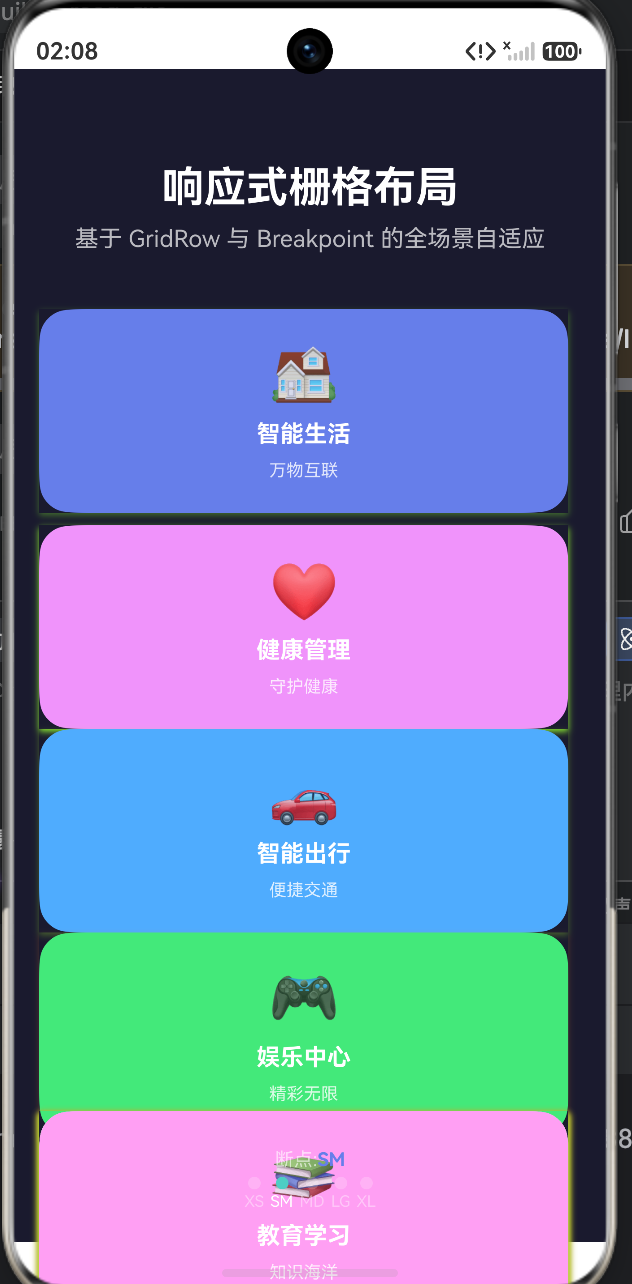
卡片的所有尺寸属性(高度、字体、图标)都调用了响应式计算函数。当用户拉伸窗口或旋转设备时,卡片不仅会改变排列方式,其内部的元素大小也会平滑地缩放。
2. 可视化断点指示器 (BreakpointIndicator)
@Builder BreakpointIndicator() {
  Row({ space: 8 }) {
    Column({ space: 4 }) {
      Row() {
        Text('断点:')...
        Text(this.currentBreakpoint.toUpperCase())... // 显示当前断点名称
      }
      Row({ space: 4 }) {
        this.BreakpointDot('xs', '#FF6B6B')
        this.BreakpointDot('sm', '#4ECDC4')
        // ... 其他断点
      }
    }
  }
  .width('100%')
  .padding({ left: 16, right: 16, bottom: 20 })
  .justifyContent(FlexAlign.Center)
}
这个指示器不仅是一个 UI 装饰,更是开发调试的神器。它通过对比 currentBreakpoint 和传入的标签,动态改变小圆点的颜色和透明度,直观地告诉开发者当前处于哪个断点区间。
完整代码
interface SpanConfig {
xs: number
sm: number
md: number
lg: number
xl: number
}
interface CardInfo {
id: string
title: string
subtitle: string
icon: string
color: string
span: SpanConfig
}
struct ResponsiveGridPage {
currentBreakpoint: string = 'md'
cards: CardInfo[] = [
{ id: '1', title: '智能生活', subtitle: '万物互联', icon: '🏠', color: '#667EEA', span: { xs: 2, sm: 2, md: 2, lg: 1, xl: 1 } },
{ id: '2', title: '健康管理', subtitle: '守护健康', icon: '❤️', color: '#F093FB', span: { xs: 2, sm: 2, md: 2, lg: 1, xl: 1 } },
{ id: '3', title: '智能出行', subtitle: '便捷交通', icon: '🚗', color: '#4FACFE', span: { xs: 2, sm: 2, md: 2, lg: 1, xl: 1 } },
{ id: '4', title: '娱乐中心', subtitle: '精彩无限', icon: '🎮', color: '#43E97B', span: { xs: 2, sm: 2, md: 2, lg: 1, xl: 1 } },
{ id: '5', title: '新闻资讯', subtitle: '实时热点', icon: '📰', color: '#FA709A', span: { xs: 2, sm: 2, md: 1, lg: 1, xl: 1 } },
{ id: '6', title: '天气服务', subtitle: '气象预报', icon: '🌤️', color: '#FECA57', span: { xs: 2, sm: 2, md: 1, lg: 1, xl: 1 } },
{ id: '7', title: '购物商城', subtitle: '品质精选', icon: '🛒', color: '#95E1D3', span: { xs: 2, sm: 2, md: 2, lg: 1, xl: 1 } },
{ id: '8', title: '金融服务', subtitle: '财富管理', icon: '💰', color: '#A8E6CF', span: { xs: 2, sm: 2, md: 2, lg: 1, xl: 1 } },
{ id: '9', title: '教育学习', subtitle: '知识海洋', icon: '📚', color: '#FF9FF3', span: { xs: 2, sm: 2, md: 2, lg: 2, xl: 2 } }
]
private onBreakpointChange(breakpoint: string): void {
this.currentBreakpoint = breakpoint
}
private getColumnCount(): number {
switch (this.currentBreakpoint) {
case 'xs': return 2
case 'sm': return 2
case 'md': return 2
case 'lg': return 4
case 'xl': return 4
default: return 2
}
}
private getCardHeight(): number {
switch (this.currentBreakpoint) {
case 'xs': return 120
case 'sm': return 130
case 'md': return 140
case 'lg': return 150
case 'xl': return 160
default: return 140
}
}
private getFontSize(): number {
switch (this.currentBreakpoint) {
case 'xs': return 14
case 'sm': return 15
case 'md': return 16
case 'lg': return 18
case 'xl': return 20
default: return 16
}
}
private getIconSize(): number {
switch (this.currentBreakpoint) {
case 'xs': return 32
case 'sm': return 36
case 'md': return 40
case 'lg': return 44
case 'xl': return 48
default: return 40
}
}
private getSpan(card: CardInfo): number {
switch (this.currentBreakpoint) {
case 'xs': return card.span.xs
case 'sm': return card.span.sm
case 'md': return card.span.md
case 'lg': return card.span.lg
case 'xl': return card.span.xl
default: return card.span.md
}
}
build() {
Column() {
this.Header()
GridRow({
columns: this.getColumnCount(),
breakpoints: { value: ['320vp', '520vp', '840vp', '1200vp'], reference: BreakpointsReference.WindowSize }
}) {
ForEach(this.cards, (card: CardInfo) => {
GridCol({
span: this.getSpan(card)
}) {
this.CardItem(card)
}
.margin({ right: 8, bottom: 8 })
})
}
.width('100%')
.layoutWeight(1)
.padding({ left: 16, right: 16, top: 16, bottom: 16 })
.onBreakpointChange((breakpoint: string) => {
this.onBreakpointChange(breakpoint)
})
this.BreakpointIndicator()
}
.width('100%')
.height('100%')
.backgroundColor('#1A1A2E')
}
Header() {
Column() {
Text('响应式栅格布局')
.fontSize(this.getFontSize() + 12)
.fontWeight(FontWeight.Bold)
.fontColor('#FFFFFF')
.margin({ top: 60, bottom: 8 })
Text('基于 GridRow 与 Breakpoint 的全场景自适应')
.fontSize(this.getFontSize())
.fontColor('#FFFFFF')
.opacity(0.7)
.margin({ bottom: 20 })
}
.width('100%')
.padding({ left: 16, right: 16 })
}
CardItem(card: CardInfo) {
Stack({ alignContent: Alignment.Center }) {
Column()
.width('100%')
.height(this.getCardHeight())
.backgroundColor(card.color)
.borderRadius(20)
Column({ space: 8 }) {
Text(card.icon)
.fontSize(this.getIconSize())
Text(card.title)
.fontSize(this.getFontSize())
.fontWeight(FontWeight.Bold)
.fontColor('#FFFFFF')
Text(card.subtitle)
.fontSize(this.getFontSize() - 4)
.fontColor('#FFFFFF')
.opacity(0.8)
}
.alignItems(HorizontalAlign.Center)
}
.width('100%')
.height(this.getCardHeight())
.shadow({ radius: 12, color: card.color + '30', offsetX: 0, offsetY: 6 })
.onClick(() => {
console.log(`点击卡片: ${card.title}`)
})
}
BreakpointIndicator() {
Row({ space: 8 }) {
Column({ space: 4 }) {
Row() {
Text('断点:')
.fontSize(12)
.fontColor('#FFFFFF')
.opacity(0.6)
Text(this.currentBreakpoint.toUpperCase())
.fontSize(12)
.fontWeight(FontWeight.Bold)
.fontColor('#667EEA')
}
Row({ space: 4 }) {
this.BreakpointDot('xs', '#FF6B6B')
this.BreakpointDot('sm', '#4ECDC4')
this.BreakpointDot('md', '#45B7D1')
this.BreakpointDot('lg', '#96CEB4')
this.BreakpointDot('xl', '#FFEAA7')
}
}
}
.width('100%')
.padding({ left: 16, right: 16, bottom: 20 })
.justifyContent(FlexAlign.Center)
}
BreakpointDot(label: string, color: string) {
Column({ space: 2 }) {
Row()
.width(8)
.height(8)
.borderRadius(4)
.backgroundColor(this.currentBreakpoint === label ? color : 'rgba(255,255,255,0.2)')
Text(label.toUpperCase())
.fontSize(10)
.fontColor('#FFFFFF')
.opacity(this.currentBreakpoint === label ? 1 : 0.4)
}
.alignItems(HorizontalAlign.Center)
}
}
核心组件与响应式策略总结
为了让你更清晰地掌握这个案例的架构,我整理了以下核心知识点总结表:
| 核心概念 | 代码体现 | 作用与场景 |
|---|---|---|
| GridRow | columns: this.getColumnCount() |
栅格容器,定义总列数和断点阈值,是响应式布局的基石。 |
| GridCol | span: this.getSpan(card) |
栅格子项,根据断点动态调整自身占据的列宽比例。 |
| 断点监听 | .onBreakpointChange(...) |
实时捕获屏幕尺寸变化,将断点状态同步到 @State 变量中。 |
| 动态样式 | fontSize(this.getFontSize()) |
抛弃硬编码的样式,根据断点动态返回字体、间距、高度等数值。 |
| BreakpointsReference | WindowSize |
指定断点变化的参考基准为窗口尺寸,适配折叠屏展开/折叠等场景。 |
给开发者的实战建议
- 移动优先(Mobile First):在设计
span配置时,建议先考虑最小屏幕(xs/sm)的布局,再逐步向大屏扩展。这能保证核心内容在小屏设备上得到优先展示。 - 善用
layoutWeight:在GridRow外层包裹Column时,给GridRow设置.layoutWeight(1),可以让栅格区域自动撑满剩余空间,底部指示器则能稳稳地固定在页面最下方。 - 断点阈值自定义:鸿蒙提供了默认的断点系统,但在实际业务中,建议像本案例一样,通过
breakpoints: { value: [...] }自定义阈值,以更精准地匹配你的 UI 设计稿。 - 性能意识:
onBreakpointChange触发频率较高,在回调中尽量只做轻量级的状态更新(如修改字符串或数字),避免在回调中执行复杂的计算或网络请求。
希望这篇详细的代码解析能帮你彻底掌握鸿蒙 ArkTS 的响应式栅格布局技巧!如果你觉得有用,欢迎点赞、收藏,我们下期再见!

作为“人工智能6S店”的官方数字引擎,为AI开发者与企业提供一个覆盖软硬件全栈、一站式门户。
更多推荐


 1
1 0
0- 0


 已为社区贡献98条内容

所有评论(0)