
鸿蒙原生ArkTS布局方式之Grid固定列数网格深度解析(HarmonyOS NEXT API 24)
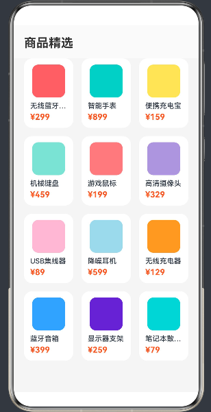
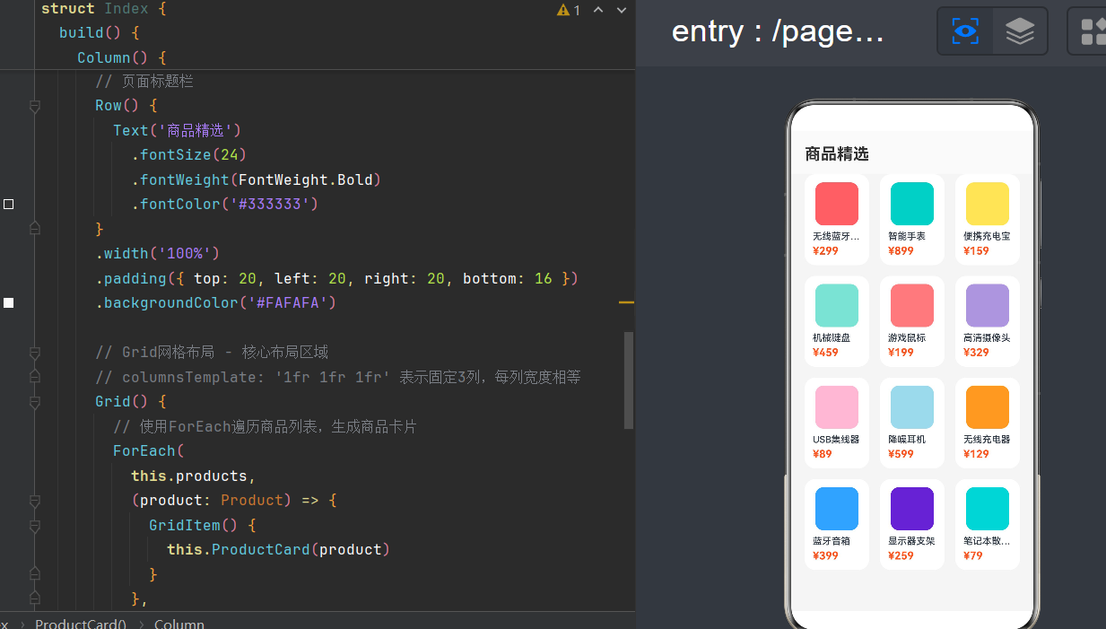
项目演示
一、引言
1.1 布局在鸿蒙开发中的重要性
在 HarmonyOS NEXT 应用开发中,布局是构建用户界面的基石。一个优秀的布局不仅能够提升用户体验,还能确保应用在不同设备上的一致性和可扩展性。鸿蒙系统提供了丰富的布局组件,包括线性布局(Column、Row)、弹性布局(Flex)、层叠布局(Stack)、相对布局(RelativeContainer)以及本文重点讲解的网格布局(Grid)。
网格布局作为一种二维布局系统,在处理商品展示、图库浏览、九宫格功能入口等场景时具有独特的优势。它能够同时控制行和列两个维度,避免了多层嵌套线性布局带来的代码冗余和性能损耗。
1.2 为什么选择固定列数网格
固定列数网格是 Grid 布局中最常用的模式之一,其核心特征是通过 columnsTemplate 属性定义固定的列数,例如 '1fr 1fr 1fr' 表示固定三列。这种布局模式具有以下优点:
- 视觉整齐:固定列数保证了每行元素数量一致,视觉效果规整
- 自适应能力:使用
fr单位时,列宽会根据容器宽度自动调整 - 开发效率高:只需定义列模板,无需手动计算每列宽度
- 跨设备兼容:在不同屏幕尺寸下都能保持良好的布局效果
1.3 API 24 的新特性
HarmonyOS NEXT API 24 对 Grid 组件做了进一步优化和增强,主要包括:
- repeat() 语法支持:简化重复模板的写法
- 更高效的懒加载机制:优化不可见项的回收策略
- 跨端适配增强:支持更灵活的单位组合
- 动画支持:间距动态变化的流畅效果
1.4 本文目标
通过本文,你将系统掌握以下知识:
- Grid 组件的核心概念和布局原理
columnsTemplate属性的三种单位体系及其应用场景- 固定列数网格的完整实现流程
- 五种实战场景的代码实现
- 性能优化策略和常见问题解决方案
- API 24 新特性的应用
二、Grid 组件核心概念
2.1 Grid 布局的基本原理
Grid 布局是一种二维网格布局系统,它将容器划分为由行(Row)和列(Column)相交形成的单元格矩阵。子组件(GridItem)放置在这些单元格中,形成一个规整的网格结构。
与传统的线性布局不同,Grid 布局具有以下特征:
- 二维控制:同时管理行方向和列方向
- 模板驱动:通过模板字符串定义行列尺寸
- 单元格对齐:每个 GridItem 可以独立控制内容对齐方式
- 跨行跨列:GridItem 可以跨越多个单元格
2.2 Grid 组件的基本结构
在 ArkTS 中,Grid 组件的基本使用结构如下:
Grid() {
  GridItem() {
    // 子组件内容
  }
}
.columnsTemplate('1fr 1fr 1fr')
.rowsTemplate('1fr 1fr')
.columnsGap(16)
.rowsGap(16)
.width('100%')
.height('100%')
2.3 Grid 核心属性详解
2.3.1 columnsTemplate
columnsTemplate 是 Grid 组件最重要的属性之一,用于定义列模板。它是一个字符串,由空格分隔的多个值组成,每个值表示一列的宽度。
语法格式:
.columnsTemplate('value1 value2 value3 ...')
支持的单位:
| 单位 | 名称 | 说明 | 示例 |
|---|---|---|---|
fr |
弹性比例 | 自动分配剩余空间,按比例分配 | '1fr 1fr 1fr' |
px |
固定像素 | 固定宽度,不随容器变化 | '100px 100px 100px' |
% |
百分比 | 按容器宽度的百分比分配 | '33.3% 33.3% 33.3%' |
混合使用:
.columnsTemplate('100px 1fr 2fr') // 第一列固定100px,第二列占1份,第三列占2份
2.3.2 rowsTemplate
rowsTemplate 用于定义行模板,语法与 columnsTemplate 类似:
.rowsTemplate('60px 1fr') // 第一行固定60px,第二行弹性分配
2.3.3 columnsGap 和 rowsGap
用于设置列间距和行间距:
.columnsGap(16) // 列间距16vp
.rowsGap(16)    // 行间距16vp
2.3.4 GridItem 的跨行列属性
GridItem 支持跨越多个单元格:
GridItem() {
  Text('跨行跨列')
}
.rowStart(0)
.rowEnd(2)
.columnStart(0)
.columnEnd(2)
三、columnsTemplate 三种单位体系深度剖析
3.1 fr(弹性比例单位)
3.1.1 基本原理
fr 是 fraction 的缩写,表示剩余空间的等分单位。当使用 fr 单位时,Grid 会先扣除固定尺寸的列(如果有),然后将剩余空间按比例分配给使用 fr 的列。
计算公式:
每fr单位宽度 = (容器宽度 - 固定宽度列总和 - 列间距总和) / fr总和
3.1.2 使用示例
Grid() {
  ForEach([1, 2, 3], (index: number) => {
    GridItem() {
      Text(`列${index}`)
        .fontColor('#FFFFFF')
        .textAlign(TextAlign.Center)
        .width('100%')
    }
    .backgroundColor('#3F7FFF')
    .borderRadius(8)
  })
}
.columnsTemplate('1fr 1fr 1fr') // 三列各占1份
.columnsGap(16)
.width('300px')
.height(100)
计算过程:
- 容器宽度:300px
- 列间距:16px × 2 = 32px
- 剩余空间:300 - 32 = 268px
- 每fr宽度:268 / 3 ≈ 89.33px
3.1.3 适用场景
fr 单位适用于以下场景:
- 响应式布局:列宽需要随容器宽度变化
- 等分布局:多列等宽分配
- 弹性占比:不同列按比例分配空间
- 自适应设计:适配不同屏幕尺寸
3.1.4 注意事项
fr单位不能为负数- 当容器空间不足时,
fr列可能会被压缩 - 建议配合
minWidth使用,避免列宽过小
3.2 px(固定像素单位)
3.2.1 基本原理
px 是固定像素单位,列宽不随容器宽度变化。这种方式提供了精确的尺寸控制,但缺乏自适应能力。
3.2.2 使用示例
Grid() {
  ForEach([1, 2, 3], (index: number) => {
    GridItem() {
      Text(`列${index}`)
        .fontColor('#FFFFFF')
        .textAlign(TextAlign.Center)
        .width('100%')
    }
    .backgroundColor('#FF6B6B')
    .borderRadius(8)
  })
}
.columnsTemplate('100px 100px 100px') // 每列固定100px
.columnsGap(16)
.width('350px')
.height(100)
3.2.3 适用场景
px 单位适用于以下场景:
- 固定宽度元素:如侧边栏、图标等
- 像素级精确控制:需要严格对齐的UI元素
- 特定尺寸要求:如图片缩略图、按钮等
3.2.4 注意事项
- 在不同屏幕密度的设备上,
px可能显示效果不同 - 当容器宽度小于所有列宽度总和时,可能会溢出
- 建议优先使用
vp单位(虚拟像素),而非px
3.3 %(百分比单位)
3.3.1 基本原理
% 是百分比单位,列宽按容器宽度的百分比分配。与 fr 不同,百分比是相对于容器宽度计算的,不会扣除其他列的宽度。
计算公式:
列宽度 = 容器宽度 × 百分比
3.3.2 使用示例
Grid() {
  ForEach([1, 2, 3], (index: number) => {
    GridItem() {
      Text(`列${index}`)
        .fontColor('#FFFFFF')
        .textAlign(TextAlign.Center)
        .width('100%')
    }
    .backgroundColor('#4ECDC4')
    .borderRadius(8)
  })
}
.columnsTemplate('30% 40% 30%') // 三列分别占30%、40%、30%
.columnsGap(16)
.width('300px')
.height(100)
计算过程:
- 容器宽度:300px
- 列1宽度:300 × 30% = 90px
- 列2宽度:300 × 40% = 120px
- 列3宽度:300 × 30% = 90px
- 总宽度:90 + 120 + 90 = 300px(未包含间距)
3.3.3 适用场景
% 单位适用于以下场景:
- 占比控制:需要精确控制各列占容器的比例
- 响应式设计:列宽随容器宽度变化
- 混合布局:与
fr、px混合使用
3.3.4 注意事项
- 百分比总和加上间距可能超过容器宽度
- 需要手动计算百分比,确保布局正确
- 建议与
fr单位混合使用,实现更灵活的布局
3.4 三种单位对比
| 特性 | fr | px | % |
|---|---|---|---|
| 自适应能力 | 强 | 无 | 中等 |
| 精确控制 | 弱 | 强 | 中等 |
| 计算复杂度 | 低(自动分配) | 低(固定值) | 高(手动计算) |
| 跨设备兼容 | 好 | 差 | 中等 |
| 适用场景 | 弹性布局 | 固定元素 | 占比控制 |
四、API 24 新特性:repeat() 语法
4.1 repeat() 语法简介
在 API 24 中,columnsTemplate 和 rowsTemplate 支持 repeat() 函数,大幅简化了重复模板的写法。
语法格式:
.columnsTemplate(`repeat(${count}, ${value})`)
参数说明:
count:重复次数(数字)value:重复的值(字符串)
4.2 使用示例
4.2.1 基本用法
// API 23 及之前
.columnsTemplate('1fr 1fr 1fr 1fr 1fr') // 5列等宽

// API 24 新写法
.columnsTemplate('repeat(5, 1fr)') // 等效于上面的写法
4.2.2 复杂用法
// 10列等宽网格
.columnsTemplate('repeat(10, 1fr)')

// 交替模式:100px 和 1fr 交替出现
.columnsTemplate('repeat(4, 100px 1fr)')
// 等效于:'100px 1fr 100px 1fr 100px 1fr 100px 1fr'
4.2.3 配合 rowsTemplate 使用
Grid() {
  // GridItem 内容
}
.columnsTemplate('repeat(4, 1fr)') // 4列等宽
.rowsTemplate('repeat(3, 80px)')  // 3行,每行80px
4.3 repeat() 语法的优势
- 代码简洁:避免重复书写相同的值
- 易于维护:修改列数只需改一个数字
- 可读性强:一眼就能看出列数和宽度模式
- 支持复杂模式:可以实现交替、循环等复杂布局
五、固定列数网格实战:商品列表展示
5.1 需求分析
我们需要实现一个商品列表页面,具有以下特点:
- 固定3列布局:每行显示3个商品
- 响应式设计:列宽随屏幕宽度自适应
- 商品卡片:包含图片、名称、价格
- 间距控制:行列间距统一
- 阴影效果:卡片带阴影和圆角
5.2 数据模型定义
class Product {
  name: string = '';
  price: string = '';
  imageRes: string = '#E0E0E0';

  constructor(name: string, price: string, imageRes: string) {
    this.name = name;
    this.price = price;
    this.imageRes = imageRes;
  }
}
5.3 完整代码实现
class Product {
  name: string = '';
  price: string = '';
  imageRes: string = '#E0E0E0';

  constructor(name: string, price: string, imageRes: string) {
    this.name = name;
    this.price = price;
    this.imageRes = imageRes;
  }
}

@Entry
@Component
struct ProductGridPage {
  @State products: Product[] = [
    new Product('无线蓝牙耳机 Pro', '¥299', '#FF6B6B'),
    new Product('智能手表 Ultra', '¥899', '#4ECDC4'),
    new Product('便携充电宝 20000mAh', '¥159', '#FFE66D'),
    new Product('机械键盘 RGB', '¥459', '#95E1D3'),
    new Product('游戏鼠标 无线版', '¥199', '#F38181'),
    new Product('高清摄像头 1080P', '¥329', '#AA96DA'),
    new Product('USB集线器 7口', '¥89', '#FCBAD3'),
    new Product('降噪耳机 头戴式', '¥599', '#A8D8EA'),
    new Product('无线充电器 15W', '¥129', '#FF9F43'),
    new Product('蓝牙音箱 迷你版', '¥399', '#54A0FF'),
    new Product('显示器支架 升降', '¥259', '#5F27CD'),
    new Product('笔记本散热器', '¥79', '#00D2D3')
  ];

  @Builder
  ProductCard(product: Product) {
    Column() {
      Row()
        .width('100%')
        .aspectRatio(1)
        .backgroundColor(product.imageRes)
        .borderRadius(12)
        .margin({ bottom: 8 })

      Text(product.name)
        .fontSize(14)
        .fontWeight(FontWeight.Medium)
        .textAlign(TextAlign.Start)
        .width('100%')
        .margin({ bottom: 4 })
        .maxLines(1)
        .textOverflow({ overflow: TextOverflow.Ellipsis })
        .fontColor('#333333')

      Text(product.price)
        .fontSize(16)
        .fontWeight(FontWeight.Bold)
        .textAlign(TextAlign.Start)
        .width('100%')
        .fontColor('#FF5722')
    }
    .width('100%')
    .padding(12)
    .backgroundColor('#FFFFFF')
    .borderRadius(16)
    .shadow({ radius: 4, color: '#00000010', offsetY: 2 })
  }

  build() {
    Column() {
      Row() {
        Text('商品精选')
          .fontSize(24)
          .fontWeight(FontWeight.Bold)
          .fontColor('#333333')
      }
      .width('100%')
      .padding({ top: 20, left: 20, right: 20, bottom: 16 })
      .backgroundColor('#FAFAFA')

      Grid() {
        ForEach(
          this.products,
          (product: Product) => {
            GridItem() {
              this.ProductCard(product)
            }
          },
          (product: Product) => product.name
        )
      }
      .columnsTemplate('repeat(3, 1fr)')
      .rowsGap(16)
      .columnsGap(16)
      .padding({ left: 20, right: 20, bottom: 20 })
      .width('100%')
      .height('100%')
    }
    .backgroundColor('#F5F5F5')
    .width('100%')
    .height('100%')
  }
}
5.4 代码解析
5.4.1 数据模型
Product 类定义了商品的数据结构,包含名称、价格和图片资源三个属性。
5.4.2 状态管理
使用 @State 装饰器管理商品列表状态,当数据变化时,UI 会自动刷新。
5.4.3 商品卡片组件
使用 @Builder 装饰器定义 ProductCard 组件,用于复用商品卡片布局。卡片包含:
- 商品图片区域(使用
Row模拟,通过aspectRatio(1)保持正方形) - 商品名称(支持省略号)
- 商品价格(橙色加粗显示)
5.4.4 Grid 布局
核心布局使用 columnsTemplate('repeat(3, 1fr)') 实现固定3列网格:
repeat(3, 1fr):重复3次,每次1fr,即三列等宽rowsGap(16):行间距16vpcolumnsGap(16):列间距16vppadding:Grid 容器内边距
5.5 运行效果
运行后,页面会显示:
- 顶部标题栏「商品精选」
- 下方 3×4 的商品网格
- 每个商品卡片包含彩色图片、名称和价格
- 卡片带有圆角和阴影效果
六、固定列数网格实战:图库浏览
6.1 需求分析
实现一个图库浏览页面,具有以下特点:
- 固定4列布局:每行显示4张图片
- 图片自适应:保持正方形比例
- 点击交互:点击图片可以查看大图
- 瀑布流效果:图片高度自适应内容
6.2 数据模型定义
class ImageItem {
  id: number = 0;
  color: string = '#E0E0E0';

  constructor(id: number, color: string) {
    this.id = id;
    this.color = color;
  }
}
6.3 完整代码实现
class ImageItem {
  id: number = 0;
  color: string = '#E0E0E0';

  constructor(id: number, color: string) {
    this.id = id;
    this.color = color;
  }
}

@Entry
@Component
struct GalleryPage {
  @State images: ImageItem[] = [];
  @State selectedId: number = -1;
  @State showDialog: boolean = false;

  aboutToAppear() {
    const colors: string[] = [
      '#FF6B81', '#5BC0EB', '#F9C74F', '#90BE6D',
      '#F9844A', '#43AA8B', '#577590', '#F94144',
      '#A06CD5', '#4D908E', '#F8961E', '#92CC41',
      '#3E92CC', '#A7194B', '#414A4C', '#009B77'
    ];
    for (let i = 0; i < 24; i++) {
      this.images.push(new ImageItem(i, colors[i % colors.length]));
    }
  }

  @Builder
  ImageCard(image: ImageItem) {
    Row()
      .width('100%')
      .aspectRatio(1)
      .backgroundColor(image.color)
      .borderRadius(8)
      .onClick(() => {
        this.selectedId = image.id;
        this.showDialog = true;
      })
  }

  build() {
    Column() {
      Row() {
        Text('相册')
          .fontSize(24)
          .fontWeight(FontWeight.Bold)
          .fontColor('#333333')
      }
      .width('100%')
      .padding({ top: 20, left: 20, right: 20, bottom: 16 })
      .backgroundColor('#FFFFFF')

      Grid() {
        ForEach(
          this.images,
          (image: ImageItem) => {
            GridItem() {
              this.ImageCard(image)
            }
          },
          (image: ImageItem) => `${image.id}`
        )
      }
      .columnsTemplate('repeat(4, 1fr)')
      .rowsGap(8)
      .columnsGap(8)
      .padding({ left: 16, right: 16, bottom: 16 })
      .width('100%')
      .height('100%')
    }
    .backgroundColor('#F5F5F5')
    .width('100%')
    .height('100%')

    if (this.showDialog) {
      CustomDialog({ builder: ImageDialog({
        color: this.images[this.selectedId]?.color || '#E0E0E0',
        onClose: () => { this.showDialog = false; }
      }) })
        .show()
    }
  }
}

@CustomDialog
struct ImageDialog {
  controller: CustomDialogController = new CustomDialogController({ builder: this });
  color: string = '#E0E0E0';
  onClose: () => void = () => {};

  build() {
    Column() {
      Row()
        .width('100%')
        .height(300)
        .backgroundColor(this.color)
        .borderRadius(12)

      Row() {
        Button('关闭')
          .width('100%')
          .height(48)
          .backgroundColor('#3F7FFF')
          .fontColor('#FFFFFF')
          .borderRadius(8)
          .onClick(() => {
            this.onClose();
          })
      }
      .width('100%')
      .margin({ top: 20 })
    }
    .width('80%')
    .padding(20)
    .backgroundColor('#FFFFFF')
    .borderRadius(16)
  }
}
6.4 代码解析
6.4.1 数据初始化
在 aboutToAppear() 生命周期方法中初始化图片数据,生成24张彩色图片。
6.4.2 图片卡片组件
ImageCard 组件使用 Row 模拟图片,通过 aspectRatio(1) 保持正方形,并添加点击事件。
6.4.3 网格布局
使用 columnsTemplate('repeat(4, 1fr)') 实现固定4列布局:
repeat(4, 1fr):四列等宽- 较小的间距(8vp),适合图片密集展示
6.4.4 点击交互
点击图片后,弹出 CustomDialog 显示大图预览。
七、固定列数网格实战:九宫格功能入口
7.1 需求分析
实现一个九宫格功能入口页面,具有以下特点:
- 固定3×3布局:9个功能入口
- 图标+文字:每个格子包含图标和文字
- 点击反馈:点击时有缩放效果
- 圆角设计:卡片带圆角
7.2 数据模型定义
class MenuItem {
  icon: string = '';
  label: string = '';
  color: string = '#3F7FFF';

  constructor(icon: string, label: string, color: string) {
    this.icon = icon;
    this.label = label;
    this.color = color;
  }
}
7.3 完整代码实现
class MenuItem {
  icon: string = '';
  label: string = '';
  color: string = '#3F7FFF';

  constructor(icon: string, label: string, color: string) {
    this.icon = icon;
    this.label = label;
    this.color = color;
  }
}

@Entry
@Component
struct NineGridPage {
  @State menus: MenuItem[] = [
    new MenuItem('🎵', '音乐', '#FF6B6B'),
    new MenuItem('📷', '相机', '#4ECDC4'),
    new MenuItem('📱', '电话', '#FFE66D'),
    new MenuItem('💬', '消息', '#95E1D3'),
    new MenuItem('📧', '邮件', '#F38181'),
    new MenuItem('📅', '日历', '#AA96DA'),
    new MenuItem('📝', '笔记', '#FCBAD3'),
    new MenuItem('🎮', '游戏', '#A8D8EA'),
    new MenuItem('⚙️', '设置', '#FF9F43')
  ];

  @State pressedIndex: number = -1;

  @Builder
  MenuCard(item: MenuItem, index: number) {
    Column() {
      Text(item.icon)
        .fontSize(32)
        .margin({ bottom: 8 })

      Text(item.label)
        .fontSize(12)
        .fontColor('#666666')
    }
    .width('100%')
    .height('100%')
    .justifyContent(FlexAlign.Center)
    .backgroundColor('#FFFFFF')
    .borderRadius(16)
    .scale(this.pressedIndex === index ? 0.95 : 1)
    .onTouch((event: TouchEvent) => {
      if (event.type === TouchType.Down) {
        this.pressedIndex = index;
      } else if (event.type === TouchType.Up || event.type === TouchType.Cancel) {
        this.pressedIndex = -1;
      }
    })
  }

  build() {
    Column() {
      Row() {
        Text('功能菜单')
          .fontSize(24)
          .fontWeight(FontWeight.Bold)
          .fontColor('#333333')
      }
      .width('100%')
      .padding({ top: 20, left: 20, right: 20, bottom: 20 })

      Grid() {
        ForEach(
          this.menus,
          (item: MenuItem, index: number) => {
            GridItem() {
              this.MenuCard(item, index)
            }
          },
          (item: MenuItem) => item.label
        )
      }
      .columnsTemplate('repeat(3, 1fr)')
      .rowsTemplate('repeat(3, 1fr)')
      .rowsGap(12)
      .columnsGap(12)
      .padding({ left: 20, right: 20 })
      .width('100%')
      .height(300)
    }
    .backgroundColor('#F5F5F5')
    .width('100%')
    .height('100%')
    .justifyContent(FlexAlign.Center)
  }
}
7.4 代码解析
7.4.1 九宫格布局
使用 columnsTemplate('repeat(3, 1fr)') 和 rowsTemplate('repeat(3, 1fr)') 实现3×3的九宫格布局。
7.4.2 点击反馈
通过 @State pressedIndex 状态变量和 .scale() 属性实现点击缩放效果:
- 按下时缩小到0.95倍
- 抬起或取消时恢复正常大小
7.4.3 居中布局
外层 Column 使用 justifyContent(FlexAlign.Center) 将九宫格居中显示。
八、固定列数网格实战:日历布局
8.1 需求分析
实现一个日历页面,具有以下特点:
- 固定7列布局:对应一周7天
- 动态行数:根据月份自动计算行数
- 日期显示:显示当月所有日期
- 选中状态:支持日期选中
8.2 数据模型定义
class DateItem {
  day: number = 0;
  isCurrentMonth: boolean = true;
  isSelected: boolean = false;

  constructor(day: number, isCurrentMonth: boolean = true, isSelected: boolean = false) {
    this.day = day;
    this.isCurrentMonth = isCurrentMonth;
    this.isSelected = isSelected;
  }
}
8.3 完整代码实现
class DateItem {
  day: number = 0;
  isCurrentMonth: boolean = true;
  isSelected: boolean = false;

  constructor(day: number, isCurrentMonth: boolean = true, isSelected: boolean = false) {
    this.day = day;
    this.isCurrentMonth = isCurrentMonth;
    this.isSelected = isSelected;
  }
}

@Entry
@Component
struct CalendarPage {
  @State dates: DateItem[] = [];
  @State selectedDay: number = new Date().getDate();
  @State currentMonth: number = new Date().getMonth() + 1;
  @State currentYear: number = new Date().getFullYear();

  aboutToAppear() {
    this.generateCalendar();
  }

  generateCalendar() {
    this.dates = [];
    const firstDay = new Date(this.currentYear, this.currentMonth - 1, 1).getDay();
    const daysInMonth = new Date(this.currentYear, this.currentMonth, 0).getDate();
    const daysInPrevMonth = new Date(this.currentYear, this.currentMonth - 1, 0).getDate();

    for (let i = firstDay - 1; i >= 0; i--) {
      this.dates.push(new DateItem(daysInPrevMonth - i, false));
    }

    for (let i = 1; i <= daysInMonth; i++) {
      this.dates.push(new DateItem(i, true, i === this.selectedDay));
    }

    const remainingDays = 42 - this.dates.length;
    for (let i = 1; i <= remainingDays; i++) {
      this.dates.push(new DateItem(i, false));
    }
  }

  @Builder
  DateCard(date: DateItem) {
    Column() {
      Text(`${date.day}`)
        .fontSize(16)
        .fontColor(date.isCurrentMonth ? '#333333' : '#CCCCCC')
        .fontWeight(date.isSelected ? FontWeight.Bold : FontWeight.Normal)
    }
    .width('100%')
    .height('100%')
    .justifyContent(FlexAlign.Center)
    .backgroundColor(date.isSelected ? '#3F7FFF' : 'transparent')
    .borderRadius(date.isSelected ? 30 : 0)
    .onClick(() => {
      if (date.isCurrentMonth) {
        this.selectedDay = date.day;
        this.generateCalendar();
      }
    })
  }

  build() {
    Column() {
      Row({ space: 20 }) {
        Button('<')
          .width(40)
          .height(40)
          .onClick(() => {
            this.currentMonth--;
            if (this.currentMonth < 1) {
              this.currentMonth = 12;
              this.currentYear--;
            }
            this.generateCalendar();
          })

        Text(`${this.currentYear}年${this.currentMonth}月`)
          .fontSize(20)
          .fontWeight(FontWeight.Bold)
          .fontColor('#333333')

        Button('>')
          .width(40)
          .height(40)
          .onClick(() => {
            this.currentMonth++;
            if (this.currentMonth > 12) {
              this.currentMonth = 1;
              this.currentYear++;
            }
            this.generateCalendar();
          })
      }
      .width('100%')
      .justifyContent(FlexAlign.Center)
      .padding({ top: 20, bottom: 20 })

      Grid() {
        ForEach(
          ['日', '一', '二', '三', '四', '五', '六'],
          (day: string) => {
            GridItem() {
              Text(day)
                .fontSize(14)
                .fontColor('#999999')
                .textAlign(TextAlign.Center)
            }
          },
          (day: string) => day
        )

        ForEach(
          this.dates,
          (date: DateItem) => {
            GridItem() {
              this.DateCard(date)
            }
          },
          (date: DateItem, index: number) => `${index}`
        )
      }
      .columnsTemplate('repeat(7, 1fr)')
      .rowsTemplate('repeat(7, 1fr)')
      .width('100%')
      .height(350)
      .padding({ left: 16, right: 16 })
    }
    .backgroundColor('#F5F5F5')
    .width('100%')
    .height('100%')
  }
}
8.4 代码解析
8.4.1 日历生成逻辑
generateCalendar() 方法计算:
- 当前月第一天是星期几
- 当前月有多少天
- 上个月有多少天
- 生成前后月份的填充日期
8.4.2 7×7网格布局
使用 columnsTemplate('repeat(7, 1fr)') 和 rowsTemplate('repeat(7, 1fr)') 实现7×7的日历网格:
- 第一行显示星期标题
- 其余六行显示日期
8.4.3 选中状态
通过 isSelected 属性和背景色变化实现日期选中效果。
九、固定列数网格实战:表单布局
9.1 需求分析
实现一个表单页面,具有以下特点:
- 固定2列布局:标签和输入框并排
- 对齐设计:标签右对齐,输入框左对齐
- 不同行高:标题行和内容行高度不同
- 表单验证:输入时显示验证状态
9.2 数据模型定义
class FormItem {
  label: string = '';
  value: string = '';
  placeholder: string = '';

  constructor(label: string, value: string = '', placeholder: string = '') {
    this.label = label;
    this.value = value;
    this.placeholder = placeholder;
  }
}
9.3 完整代码实现
class FormItem {
  label: string = '';
  value: string = '';
  placeholder: string = '';

  constructor(label: string, value: string = '', placeholder: string = '') {
    this.label = label;
    this.value = value;
    this.placeholder = placeholder;
  }
}

@Entry
@Component
struct FormPage {
  @State formItems: FormItem[] = [
    new FormItem('姓名', '', '请输入姓名'),
    new FormItem('手机号', '', '请输入手机号'),
    new FormItem('邮箱', '', '请输入邮箱'),
    new FormItem('地址', '', '请输入地址')
  ];

  @Builder
  FormLabel(label: string) {
    Text(label)
      .fontSize(16)
      .fontColor('#333333')
      .textAlign(TextAlign.End)
      .width('100%')
      .padding({ right: 16 })
  }

  @Builder
  FormInput(item: FormItem, index: number) {
    TextInput({ placeholder: item.placeholder })
      .fontSize(16)
      .fontColor('#333333')
      .width('100%')
      .height(40)
      .backgroundColor('#FFFFFF')
      .borderRadius(8)
      .padding({ left: 12, right: 12 })
      .onChange((value: string) => {
        this.formItems[index].value = value;
      })
  }

  build() {
    Column() {
      Row() {
        Text('用户信息')
          .fontSize(24)
          .fontWeight(FontWeight.Bold)
          .fontColor('#333333')
      }
      .width('100%')
      .padding({ top: 20, left: 20, right: 20, bottom: 20 })
      .backgroundColor('#FFFFFF')

      Grid() {
        this.FormLabel('姓名')
        this.FormInput(this.formItems[0], 0)

        this.FormLabel('手机号')
        this.FormInput(this.formItems[1], 1)

        this.FormLabel('邮箱')
        this.FormInput(this.formItems[2], 2)

        this.FormLabel('地址')
        this.FormInput(this.formItems[3], 3)
      }
      .columnsTemplate('1fr 2fr')
      .rowsTemplate('60px 60px 60px 60px')
      .rowsGap(12)
      .padding({ left: 20, right: 20, top: 20 })
      .width('100%')

      Row() {
        Button('提交')
          .width('100%')
          .height(48)
          .backgroundColor('#3F7FFF')
          .fontColor('#FFFFFF')
          .fontSize(16)
          .fontWeight(FontWeight.Bold)
          .borderRadius(8)
          .margin({ top: 20 })
      }
      .width('100%')
      .padding({ left: 20, right: 20 })
    }
    .backgroundColor('#F5F5F5')
    .width('100%')
    .height('100%')
  }
}
}
.backgroundColor('#F5F5F5')
.width('100%')
.height('100%')
}
}
### 9.4 代码解析

#### 9.4.1 2列不等宽布局

使用 `columnsTemplate('1fr 2fr')` 实现2列布局,标签列占1份,输入框列占2份。

#### 9.4.2 固定行高

使用 `rowsTemplate('60px 60px 60px 60px')` 为每行设置固定高度60px。

#### 9.4.3 表单交互

`TextInput` 通过 `onChange` 事件实时更新表单数据。

---

## 十、性能优化策略

### 10.1 懒加载优化

当 Grid 包含大量子项时,使用 `LazyForEach` 替代 `ForEach`:

```typescript
Grid() {
  LazyForEach(
    this.dataSource,
    (item: Product) => {
      GridItem() {
        this.ProductCard(item)
      }
    },
    (item: Product) => item.name
  )
}
.cachedCount(10) // 预缓存10个子项
10.2 避免嵌套布局
减少 GridItem 内部的布局嵌套层次:
// 不好的做法:多层嵌套
GridItem() {
  Column() {
    Row() {
      Image('')
    }
    Text('')
  }
}

// 好的做法:简化嵌套
GridItem() {
  Column() {
    Image('')
    Text('')
  }
}
10.3 使用 renderGroup
对于包含复杂子组件的 Grid,设置 renderGroup(true):
Grid() {
  // 子组件内容
}
.renderGroup(true)
10.4 减少不必要的状态更新
避免在循环中频繁修改状态变量:
// 不好的做法
ForEach(this.items, (item, index) => {
  GridItem() {
    Text(item.name)
      .fontColor(this.selectedIndex === index ? '#3F7FFF' : '#333333')
  }
  .onClick(() => {
    this.selectedIndex = index; // 每次点击都会触发整个Grid刷新
  })
})

// 好的做法:使用@Builder参数传递状态
@Builder
ItemCard(item, isSelected) {
  Text(item.name)
    .fontColor(isSelected ? '#3F7FFF' : '#333333')
}
10.5 合理设置 cachedCount
根据实际情况设置预缓存数量:
// 列表较短时,设置较小值
.cachedCount(5)

// 列表较长时,设置较大值
.cachedCount(20)
十一、常见问题与解决方案
11.1 问题:Grid 内容溢出
原因:列宽总和加上间距超过容器宽度
解决方案:
- 使用
fr单位代替px - 检查百分比总和是否超过100%
- 适当减少间距或列宽
11.2 问题:Grid 无法滚动
原因:Grid 默认不可滚动,需要设置高度或使用 Scroll 包裹
解决方案:
Scroll() {
  Grid() {
    // 子组件内容
  }
  .height('100%')
}
11.3 问题:GridItem 高度不一致
原因:子组件内容高度不同
解决方案:
- 设置固定行高:
.rowsTemplate('100px 100px') - 使用
aspectRatio保持比例 - 设置
alignItems(GridItemAlignment.Stretch)
11.4 问题:点击事件不响应
原因:GridItem 内部组件遮挡了点击区域
解决方案:
- 在 GridItem 上添加点击事件
- 设置内部组件的
touchTarget属性 - 确保 GridItem 有足够的尺寸
11.5 问题:动画效果不流畅
原因:动画过程中频繁修改布局属性
解决方案:
- 使用
animateTo包裹状态变化 - 避免在动画中修改
width、height等属性 - 使用
transform替代布局属性修改
十二、与其他布局方案的对比
12.1 Grid vs Column + Row 嵌套
| 特性 | Grid | Column + Row 嵌套 |
|---|---|---|
| 代码复杂度 | 低 | 高 |
| 行列控制 | 直接 | 需要手动计算 |
| 间距管理 | 统一 | 分散 |
| 自适应能力 | 强 | 弱 |
| 性能 | 好 | 较差(多层嵌套) |
12.2 Grid vs Flex
| 特性 | Grid | Flex |
|---|---|---|
| 布局维度 | 二维 | 一维 |
| 换行控制 | 自动 | 需要 wrap |
| 行列模板 | 支持 | 不支持 |
| 适用场景 | 网格布局 | 线性布局 |
12.3 Grid vs List
| 特性 | Grid | List |
|---|---|---|
| 布局维度 | 二维 | 一维 |
| 滚动优化 | 通用 | 专门优化 |
| 懒加载 | 支持 | 更好的支持 |
| 适用场景 | 网格展示 | 长列表 |
十三、总结与展望
13.1 核心知识点回顾
- Grid 组件:二维网格布局容器,通过
columnsTemplate和rowsTemplate定义行列模板 - columnsTemplate:支持三种单位——
fr(弹性比例)、px(固定像素)、%(百分比) - API 24 新特性:
repeat()语法简化重复模板写法 - 实战场景:商品列表、图库浏览、九宫格、日历、表单
13.2 最佳实践建议
- 优先使用 fr 单位:实现响应式布局
- 合理使用 repeat():简化代码,提高可读性
- 配合 @Builder:复用组件,减少代码冗余
- 注意性能优化:大量数据使用
LazyForEach - 测试不同屏幕:确保跨设备兼容性
13.3 未来展望
随着 HarmonyOS NEXT 的持续发展,Grid 组件还将不断增强:
- 更多布局模式:支持瀑布流、 masonry 等布局
- 更强大的动画:支持网格项的进入/退出动画
- 更好的跨端适配:自动适配不同屏幕尺寸和密度
- 增强的交互能力:拖拽排序、缩放等手势支持
附录:完整示例代码
以下是本文中所有示例的完整代码汇总,可直接复制到项目中使用。
附录 A:商品列表示例
class Product {
  name: string = '';
  price: string = '';
  imageRes: string = '#E0E0E0';

  constructor(name: string, price: string, imageRes: string) {
    this.name = name;
    this.price = price;
    this.imageRes = imageRes;
  }
}

@Entry
@Component
struct ProductGridPage {
  @State products: Product[] = [
    new Product('无线蓝牙耳机 Pro', '¥299', '#FF6B6B'),
    new Product('智能手表 Ultra', '¥899', '#4ECDC4'),
    new Product('便携充电宝 20000mAh', '¥159', '#FFE66D'),
    new Product('机械键盘 RGB', '¥459', '#95E1D3'),
    new Product('游戏鼠标 无线版', '¥199', '#F38181'),
    new Product('高清摄像头 1080P', '¥329', '#AA96DA'),
    new Product('USB集线器 7口', '¥89', '#FCBAD3'),
    new Product('降噪耳机 头戴式', '¥599', '#A8D8EA'),
    new Product('无线充电器 15W', '¥129', '#FF9F43'),
    new Product('蓝牙音箱 迷你版', '¥399', '#54A0FF'),
    new Product('显示器支架 升降', '¥259', '#5F27CD'),
    new Product('笔记本散热器', '¥79', '#00D2D3')
  ];

  @Builder
  ProductCard(product: Product) {
    Column() {
      Row()
        .width('100%')
        .aspectRatio(1)
        .backgroundColor(product.imageRes)
        .borderRadius(12)
        .margin({ bottom: 8 })

      Text(product.name)
        .fontSize(14)
        .fontWeight(FontWeight.Medium)
        .textAlign(TextAlign.Start)
        .width('100%')
        .margin({ bottom: 4 })
        .maxLines(1)
        .textOverflow({ overflow: TextOverflow.Ellipsis })
        .fontColor('#333333')

      Text(product.price)
        .fontSize(16)
        .fontWeight(FontWeight.Bold)
        .textAlign(TextAlign.Start)
        .width('100%')
        .fontColor('#FF5722')
    }
    .width('100%')
    .padding(12)
    .backgroundColor('#FFFFFF')
    .borderRadius(16)
    .shadow({ radius: 4, color: '#00000010', offsetY: 2 })
  }

  build() {
    Column() {
      Row() {
        Text('商品精选')
          .fontSize(24)
          .fontWeight(FontWeight.Bold)
          .fontColor('#333333')
      }
      .width('100%')
      .padding({ top: 20, left: 20, right: 20, bottom: 16 })
      .backgroundColor('#FAFAFA')

      Grid() {
        ForEach(
          this.products,
          (product: Product) => {
            GridItem() {
              this.ProductCard(product)
            }
          },
          (product: Product) => product.name
        )
      }
      .columnsTemplate('repeat(3, 1fr)')
      .rowsGap(16)
      .columnsGap(16)
      .padding({ left: 20, right: 20, bottom: 20 })
      .width('100%')
      .height('100%')
    }
    .backgroundColor('#F5F5F5')
    .width('100%')
    .height('100%')
  }
}
附录 B:图库浏览示例
class ImageItem {
  id: number = 0;
  color: string = '#E0E0E0';

  constructor(id: number, color: string) {
    this.id = id;
    this.color = color;
  }
}

@Entry
@Component
struct GalleryPage {
  @State images: ImageItem[] = [];
  @State selectedId: number = -1;
  @State showDialog: boolean = false;

  aboutToAppear() {
    const colors: string[] = [
      '#FF6B81', '#5BC0EB', '#F9C74F', '#90BE6D',
      '#F9844A', '#43AA8B', '#577590', '#F94144',
      '#A06CD5', '#4D908E', '#F8961E', '#92CC41',
      '#3E92CC', '#A7194B', '#414A4C', '#009B77'
    ];
    for (let i = 0; i < 24; i++) {
      this.images.push(new ImageItem(i, colors[i % colors.length]));
    }
  }

  @Builder
  ImageCard(image: ImageItem) {
    Row()
      .width('100%')
      .aspectRatio(1)
      .backgroundColor(image.color)
      .borderRadius(8)
      .onClick(() => {
        this.selectedId = image.id;
        this.showDialog = true;
      })
  }

  build() {
    Column() {
      Row() {
        Text('相册')
          .fontSize(24)
          .fontWeight(FontWeight.Bold)
          .fontColor('#333333')
      }
      .width('100%')
      .padding({ top: 20, left: 20, right: 20, bottom: 16 })
      .backgroundColor('#FFFFFF')

      Grid() {
        ForEach(
          this.images,
          (image: ImageItem) => {
            GridItem() {
              this.ImageCard(image)
            }
          },
          (image: ImageItem) => `${image.id}`
        )
      }
      .columnsTemplate('repeat(4, 1fr)')
      .rowsGap(8)
      .columnsGap(8)
      .padding({ left: 16, right: 16, bottom: 16 })
      .width('100%')
      .height('100%')
    }
    .backgroundColor('#F5F5F5')
    .width('100%')
    .height('100%')

    if (this.showDialog) {
      CustomDialog({ builder: ImageDialog({
        color: this.images[this.selectedId]?.color || '#E0E0E0',
        onClose: () => { this.showDialog = false; }
      }) })
        .show()
    }
  }
}

@CustomDialog
struct ImageDialog {
  controller: CustomDialogController = new CustomDialogController({ builder: this });
  color: string = '#E0E0E0';
  onClose: () => void = () => {};

  build() {
    Column() {
      Row()
        .width('100%')
        .height(300)
        .backgroundColor(this.color)
        .borderRadius(12)

      Row() {
        Button('关闭')
          .width('100%')
          .height(48)
          .backgroundColor('#3F7FFF')
          .fontColor('#FFFFFF')
          .borderRadius(8)
          .onClick(() => {
            this.onClose();
          })
      }
      .width('100%')
      .margin({ top: 20 })
    }
    .width('80%')
    .padding(20)
    .backgroundColor('#FFFFFF')
    .borderRadius(16)
  }
}
附录 C:九宫格示例
class MenuItem {
  icon: string = '';
  label: string = '';
  color: string = '#3F7FFF';

  constructor(icon: string, label: string, color: string) {
    this.icon = icon;
    this.label = label;
    this.color = color;
  }
}

@Entry
@Component
struct NineGridPage {
  @State menus: MenuItem[] = [
    new MenuItem('🎵', '音乐', '#FF6B6B'),
    new MenuItem('📷', '相机', '#4ECDC4'),
    new MenuItem('📱', '电话', '#FFE66D'),
    new MenuItem('💬', '消息', '#95E1D3'),
    new MenuItem('📧', '邮件', '#F38181'),
    new MenuItem('📅', '日历', '#AA96DA'),
    new MenuItem('📝', '笔记', '#FCBAD3'),
    new MenuItem('🎮', '游戏', '#A8D8EA'),
    new MenuItem('⚙️', '设置', '#FF9F43')
  ];

  @State pressedIndex: number = -1;

  @Builder
  MenuCard(item: MenuItem, index: number) {
    Column() {
      Text(item.icon)
        .fontSize(32)
        .margin({ bottom: 8 })

      Text(item.label)
        .fontSize(12)
        .fontColor('#666666')
    }
    .width('100%')
    .height('100%')
    .justifyContent(FlexAlign.Center)
    .backgroundColor('#FFFFFF')
    .borderRadius(16)
    .scale(this.pressedIndex === index ? 0.95 : 1)
    .onTouch((event: TouchEvent) => {
      if (event.type === TouchType.Down) {
        this.pressedIndex = index;
      } else if (event.type === TouchType.Up || event.type === TouchType.Cancel) {
        this.pressedIndex = -1;
      }
    })
  }

  build() {
    Column() {
      Row() {
        Text('功能菜单')
          .fontSize(24)
          .fontWeight(FontWeight.Bold)
          .fontColor('#333333')
      }
      .width('100%')
      .padding({ top: 20, left: 20, right: 20, bottom: 20 })

      Grid() {
        ForEach(
          this.menus,
          (item: MenuItem, index: number) => {
            GridItem() {
              this.MenuCard(item, index)
            }
          },
          (item: MenuItem) => item.label
        )
      }
      .columnsTemplate('repeat(3, 1fr)')
      .rowsTemplate('repeat(3, 1fr)')
      .rowsGap(12)
      .columnsGap(12)
      .padding({ left: 20, right: 20 })
      .width('100%')
      .height(300)
    }
    .backgroundColor('#F5F5F5')
    .width('100%')
    .height('100%')
    .justifyContent(FlexAlign.Center)
  }
}
附录 D:日历示例
class DateItem {
  day: number = 0;
  isCurrentMonth: boolean = true;
  isSelected: boolean = false;

  constructor(day: number, isCurrentMonth: boolean = true, isSelected: boolean = false) {
    this.day = day;
    this.isCurrentMonth = isCurrentMonth;
    this.isSelected = isSelected;
  }
}

@Entry
@Component
struct CalendarPage {
  @State dates: DateItem[] = [];
  @State selectedDay: number = new Date().getDate();
  @State currentMonth: number = new Date().getMonth() + 1;
  @State currentYear: number = new Date().getFullYear();

  aboutToAppear() {
    this.generateCalendar();
  }

  generateCalendar() {
    this.dates = [];
    const firstDay = new Date(this.currentYear, this.currentMonth - 1, 1).getDay();
    const daysInMonth = new Date(this.currentYear, this.currentMonth, 0).getDate();
    const daysInPrevMonth = new Date(this.currentYear, this.currentMonth - 1, 0).getDate();

    for (let i = firstDay - 1; i >= 0; i--) {
      this.dates.push(new DateItem(daysInPrevMonth - i, false));
    }

    for (let i = 1; i <= daysInMonth; i++) {
      this.dates.push(new DateItem(i, true, i === this.selectedDay));
    }

    const remainingDays = 42 - this.dates.length;
    for (let i = 1; i <= remainingDays; i++) {
      this.dates.push(new DateItem(i, false));
    }
  }

  @Builder
  DateCard(date: DateItem) {
    Column() {
      Text(`${date.day}`)
        .fontSize(16)
        .fontColor(date.isCurrentMonth ? '#333333' : '#CCCCCC')
        .fontWeight(date.isSelected ? FontWeight.Bold : FontWeight.Normal)
    }
    .width('100%')
    .height('100%')
    .justifyContent(FlexAlign.Center)
    .backgroundColor(date.isSelected ? '#3F7FFF' : 'transparent')
    .borderRadius(date.isSelected ? 30 : 0)
    .onClick(() => {
      if (date.isCurrentMonth) {
        this.selectedDay = date.day;
        this.generateCalendar();
      }
    })
  }

  build() {
    Column() {
      Row({ space: 20 }) {
        Button('<')
          .width(40)
          .height(40)
          .onClick(() => {
            this.currentMonth--;
            if (this.currentMonth < 1) {
              this.currentMonth = 12;
              this.currentYear--;
            }
            this.generateCalendar();
          })

        Text(`${this.currentYear}年${this.currentMonth}月`)
          .fontSize(20)
          .fontWeight(FontWeight.Bold)
          .fontColor('#333333')

        Button('>')
          .width(40)
          .height(40)
          .onClick(() => {
            this.currentMonth++;
            if (this.currentMonth > 12) {
              this.currentMonth = 1;
              this.currentYear++;
            }
            this.generateCalendar();
          })
      }
      .width('100%')
      .justifyContent(FlexAlign.Center)
      .padding({ top: 20, bottom: 20 })

      Grid() {
        ForEach(
          ['日', '一', '二', '三', '四', '五', '六'],
          (day: string) => {
            GridItem() {
              Text(day)
                .fontSize(14)
                .fontColor('#999999')
                .textAlign(TextAlign.Center)
            }
          },
          (day: string) => day
        )

        ForEach(
          this.dates,
          (date: DateItem) => {
            GridItem() {
              this.DateCard(date)
            }
          },
          (date: DateItem, index: number) => `${index}`
        )
      }
      .columnsTemplate('repeat(7, 1fr)')
      .rowsTemplate('repeat(7, 1fr)')
      .width('100%')
      .height(350)
      .padding({ left: 16, right: 16 })
    }
    .backgroundColor('#F5F5F5')
    .width('100%')
    .height('100%')
  }
}
附录 E:表单示例
class FormItem {
  label: string = '';
  value: string = '';
  placeholder: string = '';

  constructor(label: string, value: string = '', placeholder: string = '') {
    this.label = label;
    this.value = value;
    this.placeholder = placeholder;
  }
}

@Entry
@Component
struct FormPage {
  @State formItems: FormItem[] = [
    new FormItem('姓名', '', '请输入姓名'),
    new FormItem('手机号', '', '请输入手机号'),
    new FormItem('邮箱', '', '请输入邮箱'),
    new FormItem('地址', '', '请输入地址')
  ];

  @Builder
  FormLabel(label: string) {
    Text(label)
      .fontSize(16)
      .fontColor('#333333')
      .textAlign(TextAlign.End)
      .width('100%')
      .padding({ right: 16 })
  }

  @Builder
  FormInput(item: FormItem, index: number) {
    TextInput({ placeholder: item.placeholder })
      .fontSize(16)
      .fontColor('#333333')
      .width('100%')
      .height(40)
      .backgroundColor('#FFFFFF')
      .borderRadius(8)
      .padding({ left: 12, right: 12 })
      .onChange((value: string) => {
        this.formItems[index].value = value;
      })
  }

  build() {
    Column() {
      Row() {
        Text('用户信息')
          .fontSize(24)
          .fontWeight(FontWeight.Bold)
          .fontColor('#333333')
      }
      .width('100%')
      .padding({ top: 20, left: 20, right: 20, bottom: 20 })
      .backgroundColor('#FFFFFF')

      Grid() {
        this.FormLabel('姓名')
        this.FormInput(this.formItems[0], 0)

        this.FormLabel('手机号')
        this.FormInput(this.formItems[1], 1)

        this.FormLabel('邮箱')
        this.FormInput(this.formItems[2], 2)

        this.FormLabel('地址')
        this.FormInput(this.formItems[3], 3)
      }
      .columnsTemplate('1fr 2fr')
      .rowsTemplate('60px 60px 60px 60px')
      .rowsGap(12)
      .padding({ left: 20, right: 20, top: 20 })
      .width('100%')

      Row() {
        Button('提交')
          .width('100%')
          .height(48)
          .backgroundColor('#3F7FFF')
          .fontColor('#FFFFFF')
          .fontSize(16)
          .fontWeight(FontWeight.Bold)
          .borderRadius(8)
          .margin({ top: 20 })
      }
      .width('100%')
      .padding({ left: 20, right: 20 })
    }
    .backgroundColor('#F5F5F5')
    .width('100%')
    .height('100%')
  }
}

作为“人工智能6S店”的官方数字引擎,为AI开发者与企业提供一个覆盖软硬件全栈、一站式门户。
更多推荐


 1
1 0
0- 0


 已为社区贡献9条内容

所有评论(0)