
鸿蒙新特性:CustomDialog 对话框组件详解——从表单编辑到确认弹窗的完整指南
在移动应用开发中,对话框(Dialog)是最常见的交互模式之一。无论是编辑个人资料、确认删除操作,还是展示应用介绍,都离不开对话框的身影。HarmonyOS NEXT 的 ArkUI 框架提供了 CustomDialog 组件和 AlertDialog API,让开发者能够轻松构建各种样式的弹窗交互。
本文将深入讲解 CustomDialog 组件的核心机制,并通过一个完整的"个人设置中心"实战案例,演示表单编辑对话框、列表选择对话框、信息展示对话框和确认对话框四种常见场景的实现方式。
关键词:HarmonyOS、ArkUI、CustomDialog、AlertDialog、对话框、弹窗组件
一、鸿蒙对话框体系概览
HarmonyOS 的对话框系统分为两个层级:AlertDialog 和 CustomDialog。
AlertDialog 是系统级对话框,提供标准化的标题、正文和按钮布局。它通过静态方法 AlertDialog.show() 直接调用,适合快速实现简单确认和提示。它的优势在于开发效率——一行代码就能弹出一个系统风格的对话框,但样式较为固定,无法做深度定制。
CustomDialog 则是完全自定义的对话框方案。开发者使用 @CustomDialog 装饰器标记自定义组件,通过 CustomDialogController 控制器管理对话框的生命周期。这种方式赋予了开发者极大的自由度——你可以设计任意布局、任意样式的对话框内容,真正实现"所想即所得"。
两者的选择原则很简单:简单确认用 AlertDialog,复杂交互用 CustomDialog。
二、CustomDialog 核心机制
2.1 @CustomDialog 装饰器
@CustomDialog 是标记自定义对话框组件的装饰器,作用于 struct 声明之前。被标记的结构体必须包含一个 CustomDialogController 类型的属性——这是框架的硬性要求,用于支持框架注入对话框控制器。
@CustomDialog
struct MyDialog {
  controller!: CustomDialogController;  // 框架要求,必须存在
  // 自定义内容...
  build() {
    Column() {
      Text('自定义对话框内容')
      Button('关闭').onClick(() => { this.controller!.close(); })
    }
  }
}
2.2 CustomDialogController 控制器
CustomDialogController 是对话框的"遥控器",负责对话框的显示(open())和关闭(close())。创建控制器时,需要配置以下核心参数:
| 参数 | 类型 | 说明 |
|---|---|---|
builder |
CustomDialog |
必填,自定义对话框组件实例 |
autoCancel |
boolean |
是否允许点击蒙层关闭,默认 true |
alignment |
DialogAlignment |
对话框对齐位置,默认 Center |
customStyle |
boolean |
是否启用自定义样式,默认 false |
maskColor |
ResourceColor |
蒙层颜色,默认半透明黑色 |
其中 customStyle 参数值得特别注意。当设置为 true 时,对话框会去掉系统默认的背景和圆角,此时你需要自行在对话框内容中设置背景色和圆角:
@CustomDialog
struct StyledDialog {
  controller!: CustomDialogController;
  build() {
    Column() {
      Text('带样式的对话框')
    }
    .padding(24)
    .borderRadius(16)      // 自定义圆角
    .backgroundColor('#FFFFFF')  // 自定义背景
  }
}
2.3 对话框初始化时机
在实际开发中,CustomDialogController 的初始化是一个容易出错的地方。由于控制器需要引用 @CustomDialog 组件实例,而组件实例又需要持有控制器的引用,形成了某种程度的"循环引用"。
推荐的实践是使用 aboutToAppear() 生命周期回调来延迟初始化,而非在属性声明时直接赋值:
@Entry
@Component
struct MyPage {
  private myDialog!: CustomDialogController;

  aboutToAppear(): void {
    this.myDialog = new CustomDialogController({
      builder: MyDialog({ closeAction: () => { this.myDialog.close(); } }),
      autoCancel: true,
      alignment: DialogAlignment.Center,
      customStyle: true,
    });
  }
}
这种模式将控制器的创建推迟到页面生命周期启动时,配合"关闭回调"而非"传递控制器"的设计,有效规避了初始化时的引用问题。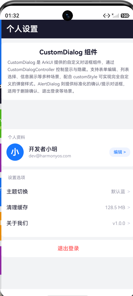
三、AlertDialog 快速调用
对于简单的确认场景,AlertDialog 提供了最直接的方式。通过静态方法 AlertDialog.show() 即可弹出:
AlertDialog.show({
  title: '退出登录',
  message: '确定要退出当前账号吗?退出后需要重新登录。',
  autoCancel: true,
  alignment: DialogAlignment.Center,
  primaryButton: {
    value: '取消',
    action: () => { /* 取消操作 */ }
  },
  secondaryButton: {
    value: '确定退出',
    fontColor: '#FF4D4F',
    action: () => { /* 执行退出 */ }
  }
});
primaryButton 通常是取消/次要操作,secondaryButton 是确认/主要操作。你可以通过 fontColor 为确认按钮着色(如红色表示危险操作),引导用户的注意力到正确的选择上。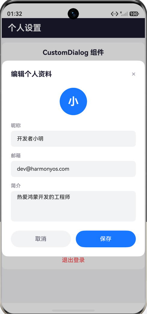
四、实战:个人设置中心
下面通过一个完整的"个人设置中心"实战案例,展示四种典型对话框模式。这个页面的设计思路是:以个人设置页为载体,每个设置项触发不同类型的对话框交互。
4.1 页面结构设计
页面分为四个区域:
- 顶部导航栏:标题"个人设置"
- 组件说明卡片:简要介绍 CustomDialog 和 AlertDialog
- 个人资料区:头像、昵称、邮箱,点击"编辑"按钮触发表单对话框
- 设置选项区:主题切换、清理缓存、关于我们三个入口
- 底部操作区:退出登录入口
4.2 表单编辑对话框
点击"编辑"按钮,弹出个人资料编辑对话框。这是最复杂的对话框类型,包含三个表单字段(昵称、邮箱、简介)和保存/取消按钮。
@CustomDialog
struct ProfileEditDialog {
  controller!: CustomDialogController;
  closeAction: () => void = () => {};
  @State inputName: string = '开发者小明';
  @State inputEmail: string = 'dev@harmonyos.com';
  @State inputBio: string = '热爱鸿蒙开发的工程师';

  build() {
    Column() {
      Row() {
        Text('编辑个人资料')
          .fontSize(18).fontColor('#1a1a2e').fontWeight(FontWeight.Bold)
        Blank()
        Text('×').fontSize(20).fontColor('#9999AA')
          .onClick(() => { this.closeAction(); })
      }
      .width('100%').margin({ bottom: 24 })

      // 头像占位
      Column() {
        Text('小').fontSize(28).fontColor('#FFFFFF').fontWeight(FontWeight.Bold)
      }
      .width(72).height(72).borderRadius(36).backgroundColor('#1677FF')
      .justifyContent(FlexAlign.Center).margin({ bottom: 20 })

      // 昵称输入
      Text('昵称').fontSize(13).fontColor('#666677')
        .width('100%').margin({ bottom: 6 })
      TextInput({ text: this.inputName, placeholder: '请输入昵称' })
        .width('100%').height(42).fontSize(14)
        .backgroundColor('#F2F3F5').borderRadius(8)
        .margin({ bottom: 16 })
        .onChange((value: string) => { this.inputName = value; })

      // 邮箱输入
      Text('邮箱').fontSize(13).fontColor('#666677')
        .width('100%').margin({ bottom: 6 })
      TextInput({ text: this.inputEmail, placeholder: '请输入邮箱' })
        .width('100%').height(42).fontSize(14)
        .backgroundColor('#F2F3F5').borderRadius(8)
        .margin({ bottom: 16 })
        .onChange((value: string) => { this.inputEmail = value; })

      // 简介输入
      Text('简介').fontSize(13).fontColor('#666677')
        .width('100%').margin({ bottom: 6 })
      TextArea({ text: this.inputBio, placeholder: '介绍一下自己...' })
        .width('100%').height(80).fontSize(14)
        .backgroundColor('#F2F3F5').borderRadius(8)
        .margin({ bottom: 24 })
        .onChange((value: string) => { this.inputBio = value; })

      // 按钮组
      Row() {
        Button('取消').fontSize(15).fontColor('#666677')
          .backgroundColor('#F2F3F5')
          .width('48%').height(44).borderRadius(22)
          .onClick(() => { this.closeAction(); })
        Button('保存').fontSize(15).fontColor('#FFFFFF')
          .backgroundColor('#1677FF')
          .width('48%').height(44).borderRadius(22)
          .onClick(() => { this.closeAction(); })
      }
      .width('100%').justifyContent(FlexAlign.SpaceBetween)
    }
    .width('100%').padding(24).borderRadius(16).backgroundColor('#FFFFFF')
  }
}
这个对话框的关键设计点:
- 独立状态管理:每个输入框的状态(
@State)在对话框内部独立管理,通过onChange回调同步用户输入 - 灵活关闭机制:通过
closeAction回调关闭对话框,避免直接依赖控制器引用 - 表单完整性:包含 TextInput(单行)和 TextArea(多行)两种输入控件,体现真实场景的复杂度
4.3 列表选择对话框
点击"主题切换",弹出主题选择对话框。它展示一个选项列表,用户点击某一项即选中,支持"确定"和"取消"操作。
@CustomDialog
struct ThemeSelectDialog {
  controller!: CustomDialogController;
  closeAction: () => void = () => {};
  themeList: ThemeOption[] = [
    { key: 'blue', name: '默认蓝', color: '#1677FF' },
    { key: 'dark', name: '暗夜黑', color: '#1a1a2e' },
    { key: 'green', name: '清新绿', color: '#52C41A' },
    { key: 'orange', name: '活力橙', color: '#FF9800' },
  ];
  @State selectedIdx: number = 0;

  build() {
    Column() {
      Row() {
        Text('选择主题').fontSize(18).fontColor('#1a1a2e')
          .fontWeight(FontWeight.Bold)
        Blank()
        Text('×').fontSize(20).fontColor('#9999AA')
          .onClick(() => { this.closeAction(); })
      }
      .width('100%').margin({ bottom: 24 })

      ForEach(this.themeList, (theme: ThemeOption, idx: number) => {
        Row() {
          Row().width(20).height(20).borderRadius(10)
            .backgroundColor(theme.color).margin({ right: 12 })
          Text(theme.name).fontSize(15)
            .fontColor(this.selectedIdx === idx ? '#1677FF' : '#1a1a2e')
            .fontWeight(
              this.selectedIdx === idx ? FontWeight.Medium : FontWeight.Normal
            )
          Blank()
          if (this.selectedIdx === idx) {
            Text('✓').fontSize(16).fontColor('#1677FF')
              .fontWeight(FontWeight.Bold)
          }
        }
        .width('100%').height(48)
        .padding({ left: 16, right: 16 }).borderRadius(10)
        .backgroundColor(
          this.selectedIdx === idx ? '#EEF3FF' : '#F2F3F5'
        )
        .margin({ bottom: 8 })
        .onClick(() => { this.selectedIdx = idx; })
      }, (theme: ThemeOption, idx: number) => idx.toString())

      Row() {
        Button('取消').fontSize(15).fontColor('#666677')
          .backgroundColor('#F2F3F5')
          .width('48%').height(44).borderRadius(22)
          .onClick(() => { this.closeAction(); })
        Button('确定').fontSize(15).fontColor('#FFFFFF')
          .backgroundColor('#1677FF')
          .width('48%').height(44).borderRadius(22)
          .onClick(() => { this.closeAction(); })
      }
      .width('100%').justifyContent(FlexAlign.SpaceBetween).margin({ top: 8 })
    }
    .width('100%').padding(24).borderRadius(16).backgroundColor('#FFFFFF')
  }
}
列表选择对话框的交互模式在移动端极为常见——语言选择、主题切换、地区筛选等场景都适用。要点在于通过视觉反馈(选中项高亮、勾选标记)清晰地传达当前选中状态。
4.4 信息展示对话框
点击"关于我们",弹出信息展示对话框。这种对话框通常用于展示版本信息、功能说明或帮助文档。
@CustomDialog
struct AboutDialog {
  controller!: CustomDialogController;
  closeAction: () => void = () => {};

  build() {
    Column() {
      Column() {
        Text('i').fontSize(36).fontColor('#1677FF')
          .fontWeight(FontWeight.Bold)
          .width(64).height(64).borderRadius(32)
          .backgroundColor('#EEF3FF')
          .textAlign(TextAlign.Center).margin({ bottom: 16 })
        Text('个人设置中心')
          .fontSize(18).fontColor('#1a1a2e').fontWeight(FontWeight.Bold)
          .margin({ bottom: 6 })
        Text('版本 1.0.0').fontSize(13).fontColor('#9999AA')
          .margin({ bottom: 16 })
        Text('本 Demo 演示 ArkUI CustomDialog 组件在个人设置场景中的多种用法,包括表单编辑、列表选择、信息展示和确认操作四种对话框类型,覆盖移动端常见的弹窗交互模式。')
          .fontSize(13).fontColor('#666677').lineHeight(20)
          .width('100%').margin({ bottom: 24 })
        Button('我知道了').fontSize(15).fontColor('#FFFFFF')
          .backgroundColor('#1677FF')
          .width('100%').height(44).borderRadius(22)
          .onClick(() => { this.closeAction(); })
      }
      .width('100%').padding(24).borderRadius(16)
      .backgroundColor('#FFFFFF')
    }
    .width('100%')
  }
}
信息展示对话框的设计原则是简洁明了——一个图标、一段说明文字、一个确认按钮。注意这里 customStyle: true 后需要自行设置 borderRadius 和 backgroundColor,否则对话框将无背景无圆角。
4.5 AlertDialog 确认对话框
对于"清理缓存"和"退出登录"这类操作安全相关的场景,使用 AlertDialog 是更好的选择。系统级的确认对话框能给予用户足够的"郑重感"。
清理缓存的确认对话框:
AlertDialog.show({
  title: '清理缓存',
  message: '确定要清理应用缓存数据吗?清理后不会影响正常使用。',
  autoCancel: true,
  alignment: DialogAlignment.Center,
  primaryButton: { value: '取消', action: () => {} },
  secondaryButton: {
    value: '确定清理',
    fontColor: '#FF4D4F',
    action: () => { this.cacheSize = '0 B'; }
  }
});
退出登录的确认对话框——操作完成后重置用户状态:
AlertDialog.show({
  title: '退出登录',
  message: '确定要退出当前账号吗?退出后需要重新登录。',
  autoCancel: true,
  alignment: DialogAlignment.Center,
  primaryButton: { value: '取消', action: () => {} },
  secondaryButton: {
    value: '确定退出',
    fontColor: '#FF4D4F',
    action: () => {
      this.profileName = '未登录';
      this.profileEmail = '请重新登录';
      this.currentTheme = '默认蓝';
      this.isLoggedIn = false;
    }
  }
});
五、主页面整合
主页面通过 Scroll 容器包裹个人资料卡片和设置选项列表,使用 @Builder 方法提取设置项的重复布局:
@Builder
SettingItem(label: string, value: string, onClick: () => void) {
  Row() {
    Text(label).fontSize(15).fontColor('#1a1a2e')
    Blank()
    Text(value).fontSize(13).fontColor('#9999AA').margin({ right: 6 })
    Text('>').fontSize(14).fontColor('#CCCCDD')
  }
  .width('100%').height(44)
  .onClick(onClick)
}
@Builder 方法是 ArkUI 中减少重复代码的核心手段。它允许你将可复用的 UI 片段提取为独立方法,保持代码整洁。
三个 CustomDialogController 在 aboutToAppear() 中完成初始化:
aboutToAppear(): void {
  this.profileDialog = new CustomDialogController({
    builder: ProfileEditDialog({
      closeAction: () => { this.profileDialog.close(); }
    }),
    autoCancel: true,
    alignment: DialogAlignment.Center,
    customStyle: true,
  });
  // ... themeDialog、aboutDialog 同理
}
六、设计原则与最佳实践
通过这个实战案例,总结出几条对话框设计的核心原则。
6.1 选择正确的对话框类型
不同场景适配不同对话框:
| 场景 | 推荐方案 | 原因 |
|---|---|---|
| 编辑表单 | CustomDialog | 需要复杂布局和交互控件 |
| 列表选择 | CustomDialog | 选项需自定义渲染 |
| 信息展示 | CustomDialog | 信息排布需灵活控制 |
| 删除确认 | AlertDialog | 操作严肃,系统样式更醒目 |
| 退出确认 | AlertDialog | 标准化确认,减少开发成本 |
| 权限请求 | AlertDialog | 系统级对话框更有信任感 |
6.2 状态管理策略
对话框内部的状态(如输入框内容、选中项)应通过 @State 在对话框组件内独立管理。对话框关闭时,通过回调或事件将最终结果传递回主页面。这种"局部状态 + 结果回调"的模式保持了数据流的清晰。
6.3 关闭机制设计
提供多种关闭路径:
- 点击关闭按钮(×)
- 点击取消按钮
- 点击蒙层(
autoCancel: true) - 操作完成后自动关闭
这四种路径覆盖了用户可能的所有操作方式,确保无论用户怎么交互,对话框都能正确关闭。
6.4 视觉层次
对话框的视觉层次应当分明:
- 蒙层(maskColor):半透明黑色,暗示"操作需先处理对话框"
- 对话框主体:白色背景 + 圆角,从蒙层中"浮起"
- 按钮区域:确认按钮使用品牌色,取消按钮使用灰色或透明
6.5 按钮语义设计
对于危险操作(删除、退出、清理),确认按钮应使用红色(#FF4D4F),并且通常放置在 secondaryButton 位置。取消按钮保持中性颜色。这种配色方案符合全球用户的直觉预期。
七、常见问题与解决方案
Q1:CustomDialogController 初始化报错"used before its initialization"
这是因为在声明时直接将 this.xxxDialog 传递给 builder 造成的。解决方案是使用 aboutToAppear() 延迟初始化,并通过 closeAction 回调替代直接传递 controller。
Q2:customStyle: true 后对话框无背景
customStyle: true 会移除系统默认背景。你需要在对话框内容的最外层容器上手动设置 backgroundColor('#FFFFFF') 和 borderRadius(16)。
Q3:AlertDialog.show() 被标记为 deprecated
这是 IDE 的提示信息,不影响编译和运行。AlertDialog.show() 是目前推荐的调用方式,此提示可能源于 ArkUI 内部 API 的版本标记调整。
Q4:@CustomDialog 中能否使用 @Prop 或 @Link
可以。@CustomDialog 组件支持 ArkUI 的常规状态管理装饰器。但注意 CustomDialogController 类型的属性必须存在,这是框架的硬性要求。
Q5:如何实现底部弹出式对话框(ActionSheet 风格)
将 alignment 参数设置为 DialogAlignment.Bottom,配合 customStyle: true 和自定义的底部弹出动画样式即可:
new CustomDialogController({
  builder: MyBottomSheet(),
  alignment: DialogAlignment.Bottom,
  customStyle: true,
  autoCancel: true,
});
八、总结
CustomDialog 是 HarmonyOS ArkUI 中一个"自由度极高"的组件。它不像 Refresh、Swiper 那样有固定的交互模式,而是提供了一张"空白画布",让开发者自由绘制对话框的内容和交互。
本文通过"个人设置中心"这个完整案例,覆盖了 CustomDialog 的四种核心用法:
- 表单编辑对话框——集成 TextInput、TextArea 等输入控件
- 列表选择对话框——ForEach 渲染可选列表,视觉反馈选中状态
- 信息展示对话框——展示版本信息、功能说明等只读内容
- AlertDialog 确认框——标准化确认操作,系统级交互
掌握 CustomDialog 组件,你就拥有了在鸿蒙应用中实现任意弹窗交互的能力。无论是简单的提示确认,还是复杂的表单编辑,都能从容应对。将 CustomDialog 和 AlertDialog 灵活组合,便构成了移动应用中"模态交互"的完整拼图。

作为“人工智能6S店”的官方数字引擎,为AI开发者与企业提供一个覆盖软硬件全栈、一站式门户。
更多推荐

 2
2 0
0- 0


 已为社区贡献171条内容

所有评论(0)