
鸿蒙系统开发的组件
·
目录
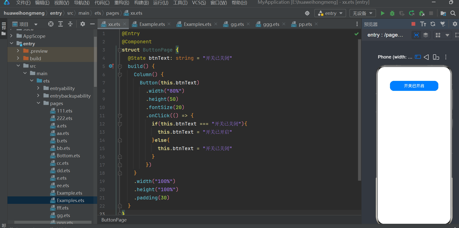
一,Button 组件
实例:
@Entry
@Component
struct ButtonPage {
  @State btnText: string = "开关已关闭"
  build() {
    Column() {
      Button(this.btnText)
        .width("80%")
        .height(50)
        .fontSize(20)
        .onClick(() => {
          if(this.btnText === "开关已关闭"){
            this.btnText = "开关已开启"
          }else{
            this.btnText = "开关已关闭"
          }
        })
    }
    .width("100%")
    .height("100%")
    .padding(30)
  }
}
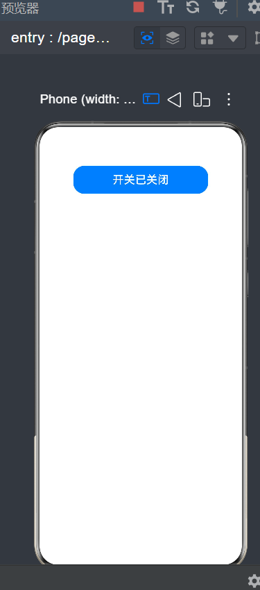
成果展示:
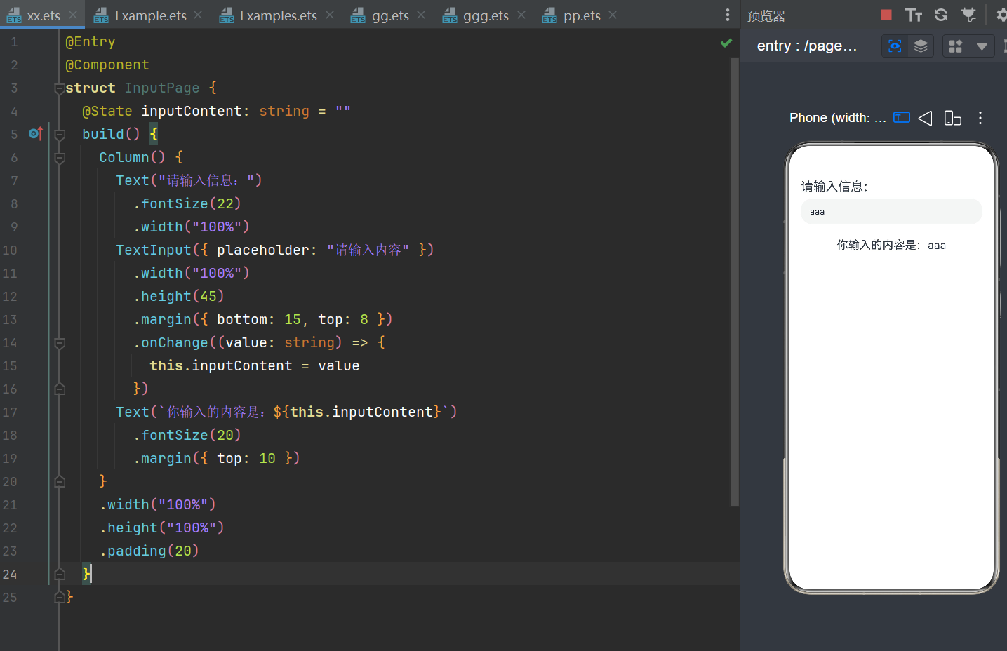
二,Textlnput组件
实例:
@Entry
@Component
struct InputPage {
  @State inputContent: string = ""
  build() {
    Column() {
      Text("请输入信息:")
        .fontSize(22)
        .width("100%")
      TextInput({ placeholder: "请输入内容" })
        .width("100%")
        .height(45)
        .margin({ bottom: 15, top: 8 })
        .onChange((value: string) => {
          this.inputContent = value
        })
      Text(`你输入的内容是:${this.inputContent}`)
        .fontSize(20)
        .margin({ top: 10 })
    }
    .width("100%")
    .height("100%")
    .padding(20)
  }
}
成果展示:
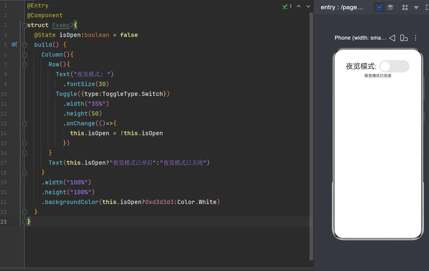
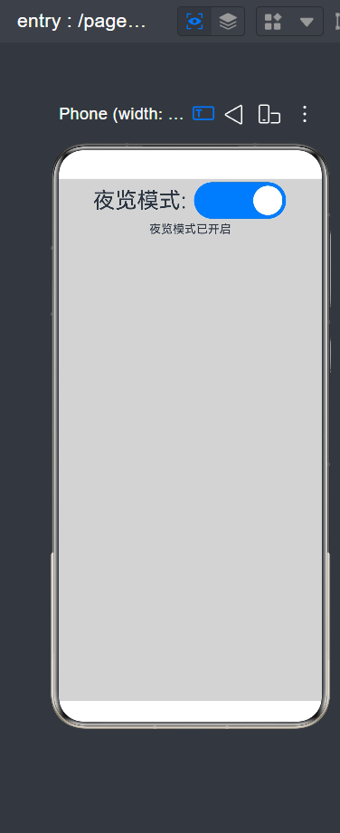
三,Toggle组件
实例:
@Entry
@Component
struct Examp2{
  @State isOpen:boolean = false
  build() {
    Column(){
      Row(){
        Text("夜览模式: ")
          .fontSize(30)
        Toggle({type:ToggleType.Switch})
          .width("35%")
          .height(50)
          .onChange(()=>{
            this.isOpen = !this.isOpen
          })
      }
      Text(this.isOpen?"夜览模式已开启":"夜览模式已关闭")
    }
    .width("100%")
    .height("100%")
    .backgroundColor(this.isOpen?0xd3d3d3:Color.White)
  }
}
成果展示:
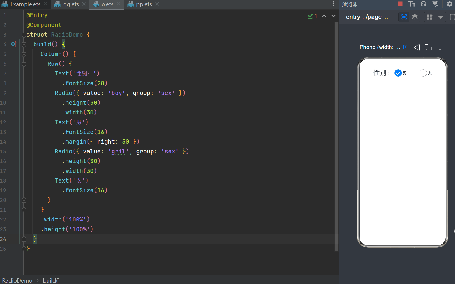
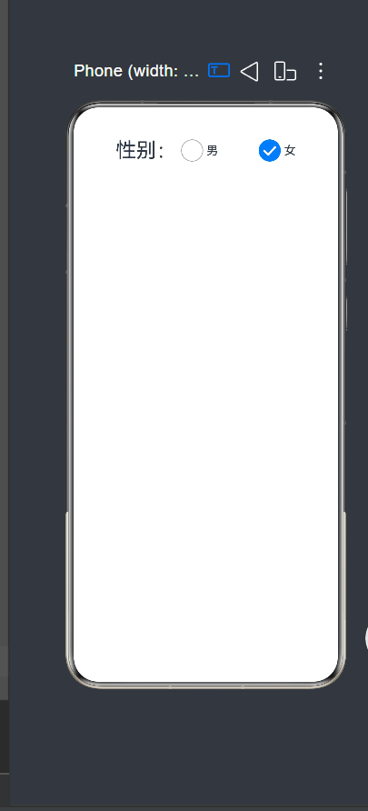
四,Radio 组件
实例:
@Entry
@Component
struct RadioDemo {
  build() {
    Column() {
      Row() {
        Text('性别:')
          .fontSize(28)
        Radio({ value: 'boy', group: 'sex' })
          .height(30)
          .width(30)
        Text('男')
          .fontSize(16)
          .margin({ right: 50 })
        Radio({ value: 'gril', group: 'sex' })
          .height(30)
          .width(30)
        Text('女')
          .fontSize(16)
      }
    }
    .width('100%')
    .height('100%')
  }
}
成果展示
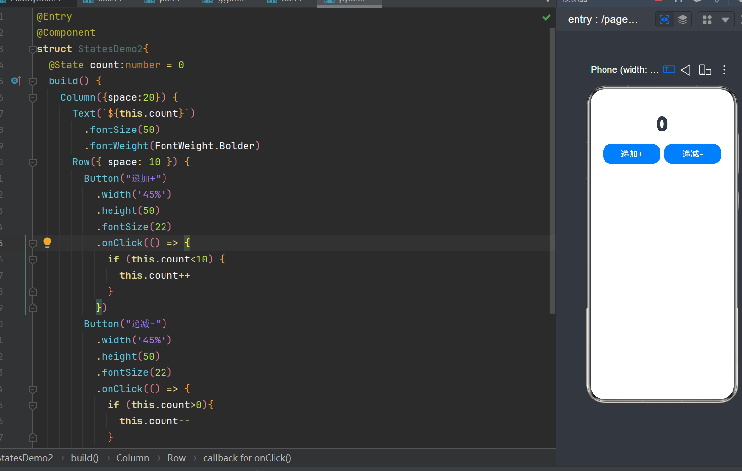
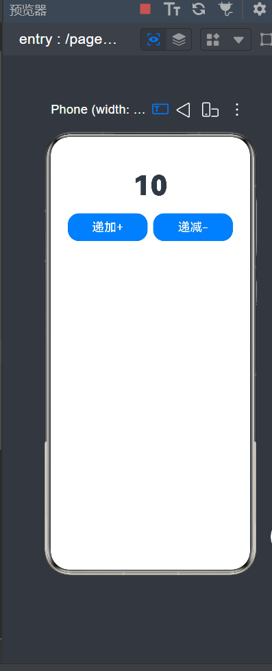
五,递加递减
实例:
@Entry
@Component
struct StatesDemo2{
  @State count:number = 0
  build() {
    Column({space:20}) {
      Text(`${this.count}`)
        .fontSize(50)
        .fontWeight(FontWeight.Bolder)
      Row({ space: 10 }) {
        Button("递加+")
          .width('45%')
          .height(50)
          .fontSize(22)
          .onClick(() => {
            if (this.count<10) {
              this.count++
            }
          })
        Button("递减-")
          .width('45%')
          .height(50)
          .fontSize(22)
          .onClick(() => {
            if (this.count>0){
              this.count--
            }
          })
      }
    }
    .height('100%')
    .width('100%')
    .padding(20)
  }
}
成果展示:

作为“人工智能6S店”的官方数字引擎,为AI开发者与企业提供一个覆盖软硬件全栈、一站式门户。
更多推荐
 1
1 0
0- 0


 已为社区贡献3条内容

所有评论(0)