
论新手如何搭建鸿蒙计算器应用03
鸿蒙ArkUI计算器开发全流程 本文详细记录了从零开始用ArkUI开发鸿蒙计算器应用的全过程,适合零基础开发者学习。 核心要点: 开发环境搭建:推荐使用Windows系统+DevEco Studio 5.0.3,配置API 12+的远程模拟器 ArkUI核心概念: @Entry和@Component构建页面结构 @State实现数据驱动UI自动更新 Column垂直布局和Grid网格布局组合使用
🧮 新手学习 ArkUI 全过程实录——零基础搭建鸿蒙计算器应用
一、前言:为什么要从计算器开始学 ArkUI?
很多新手学鸿蒙开发,上来就想写一个"淘宝"或者"抖音"。结果是学了两周就放弃——野心太大,根基不稳。
我自己的经验是:学 ArkUI 最好的入门项目,是 计算器。
为什么?因为计算器看起来简单,但它几乎覆盖了 ArkUI 开发的所有关键技能点:
| 技能点 | 计算器中的应用 |
|---|---|
| 声明式 UI | 按钮点击 → 显示区自动更新 |
| 状态管理 | @State 驱动输入值和运算结果 |
| 布局 | Grid 网格 + Column 垂直分割 |
| 组件 | Button + Text 的完整使用 |
| 事件处理 | onClick 绑定 + 事件冒泡 |
| 逻辑运算 | 字符串拼接、数学运算、条件分支 |
| 用户交互 | 键盘输入感、按钮反馈、连续运算 |
而且最关键的是——你一天就能写完。有成就感才能坚持下去。
二、运行环境要求
在开始写代码之前,先把开发环境配好。下面是完整的环境清单:
| 项目 | 推荐配置 | 备注 |
|---|---|---|
| 操作系统 | Windows 10/11 64位 | macOS 13+ 也可以,但模拟器不如 Windows 稳定 |
| DevEco Studio | 5.0.3 Release 及以上 | 华为开发者官网下载 |
| HarmonyOS SDK | API 12+ | 首次启动 IDE 会自动提示安装 |
| Node.js | 18.x LTS | 鸿蒙构建工具链依赖 |
| 模拟器 | Phone 模拟器 (API 12) | 推荐用远程模拟器,无需本地虚拟化支持 |
2.1 安装步骤(5 分钟搞定)
- 下载 DevEco Studio 安装包 → 双击安装 → 安装路径不要有中文
- 首次启动 → 自动下载 HarmonyOS SDK → 等待约 3 分钟
- 打开 Tools → Device Manager → 登录华为账号 → 启动远程模拟器
⚠️ 避坑:如果模拟器启动失败,先检查 BIOS 是否开启了 Intel VT-x / AMD-V 虚拟化。在 Windows 上可以用任务管理器 → 性能 → CPU → 查看"虚拟化"是否已启用。
2.2 创建项目
打开 DevEco Studio → 点击 Create Project → 选择 Empty Ability 模板 → 填写:
- Project Name:
CalculatorApp - Bundle Name:
com.example.calculator - Compatible API:选择 API 12
- Device Type:Phone
创建后的项目结构:
CalculatorApp/
├── entry/
│   └── src/main/
│       ├── ets/
│       │   ├── entryability/        # 应用入口
│       │   └── pages/               # 页面文件(我们的战场)
│       └── resources/
├── AppScope/                         # 全局配置
└── build-profile.json5               # 构建脚本
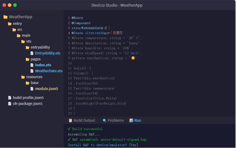
我们只改一个文件:entry/src/main/ets/pages/Index.ets。
三、实战:写一个完整的计算器应用
3.1 最终效果预览
我们要实现的是一个 iOS 风格的计算器——深色背景、圆形按钮、橙色运算符、大号结果显示: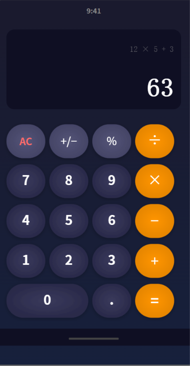
功能清单:
- ✅ 数字输入(0-9,支持连续输入多位数)
- ✅ 四则运算(+、−、×、÷)
- ✅ 清除(AC 一键归零)
- ✅ 正负号切换(±)
- ✅ 百分比(%)
- ✅ 小数点输入
- ✅ 连续运算(12 + 3 × 5 = 27)
- ✅ 结果显示在顶部深色区域
3.2 先搞懂三个核心概念
在博主 AHuiHatedebug 的教程中,反复强调 ArkUI 的三个"地基"。这里我用最通俗的语言帮你捋一遍。
📌 @Entry + @Component:页面的"身份证"和"骨架"
@Entry          // 告诉框架:"我是这个页面的老大"
@Component      // 告诉框架:"我是一个可以复用的 UI 零件"
struct Calculator {
  build() {
    // 在这里组装你的 UI
  }
}
一个 .ets 文件就是一个页面。@Entry 只能有一个(页面入口),@Component 可以有多个(子组件)。build() 是必须实现的方法——ArkUI 从这里开始渲染 UI 树。
📌 @State:让 UI 自己"动"起来
传统 Android 开发中,改一个 TextView 的文本需要:
textView.setText("新值"); // 手动通知 UI 更新
ArkUI 完全不同——你只要声明变量为 @State,改它的值,UI 自动刷新:
@State display: string = '0'  // 显示区的文本

// 用户点了一个按钮
this.display = '123'  // 就这一行,界面文字自己变了!
不用手动操作 DOM,不用 setText,不用 notify。 值变了,UI 跟着变。
📌 Column + Grid:布局的"积木"
计算器界面分为两大部分:
┌──────────────────────┐
│    显示区 (Column)     │  ← 顶部,垂直排列
│     0                 │
├──────────────────────┤
│  7  8  9  ÷  │
│  4  5  6  ×  │  ← 按钮区 (Grid)
│  1  2  3  −  │     4列4行网格
│  0  .  =  +  │
└──────────────────────┘
Column:垂直方向排列子组件,适合从上到下的布局Grid:表格状网格布局,适合计算器按钮这种规整排列
3.3 第一步:定义显示区域
先建好页面的整体结构和显示区:
@Entry
@Component
struct CalculatorApp {
  // 显示区域的文本
  @State display: string = '0'
  @State result: string = ''

  build() {
    Column() {
      // ===== 显示区域 =====
      Column() {
        // 运算表达式(小字,灰色)
        Text(this.result)
          .fontSize(18)
          .fontColor('#888888')
          .width('100%')
          .textAlign(TextAlign.End)
          .margin({ top: 20, right: 24 })

        // 当前输入(大字,白色)
        Text(this.display)
          .fontSize(52)
          .fontColor(Color.White)
          .fontWeight(FontWeight.Bold)
          .width('100%')
          .textAlign(TextAlign.End)
          .margin({ right: 24, top: 8 })
      }
      .width('100%')
      .height(200)
      .backgroundColor('#0f0f23')
      .justifyContent(FlexAlign.End)
      .padding({ bottom: 20 })
    }
    .width('100%')
    .height('100%')
    .backgroundColor('#1a1a2e')
  }
}
解释几个关键点:
.textAlign(TextAlign.End):文本右对齐——计算器显示区的数字靠右显示,符合直觉.justifyContent(FlexAlign.End):子组件靠底部对齐——让显示数字"浮"在显示区底部@State:display和result都是响应式的,改了它们,Text 自动更新
效果:显示区已经出来了,深色背景,右上角显示 0。
3.4 第二步:用 Grid 搭建按钮键盘
按钮区域是 4 列 × 5 行的网格。ArkUI 的 Grid 组件非常适合这个场景:
// 在 Column 里接着写,显示区的下面
Grid() {
  // 第一行:AC、±、%、÷
  Button('AC').onClick(() => this.onClear())
  Button('±').onClick(() => this.onToggleSign())
  Button('%').onClick(() => this.onPercent())
  Button('÷').onClick(() => this.onOperator('÷'))

  // 第二行:7、8、9、×
  Button('7').onClick(() => this.onNumber('7'))
  Button('8').onClick(() => this.onNumber('8'))
  Button('9').onClick(() => this.onNumber('9'))
  Button('×').onClick(() => this.onOperator('×'))

  // 第三行:4、5、6、−
  Button('4').onClick(() => this.onNumber('4'))
  Button('5').onClick(() => this.onNumber('5'))
  Button('6').onClick(() => this.onNumber('6'))
  Button('−').onClick(() => this.onOperator('−'))

  // 第四行:1、2、3、+
  Button('1').onClick(() => this.onNumber('1'))
  Button('2').onClick(() => this.onNumber('2'))
  Button('3').onClick(() => this.onNumber('3'))
  Button('+').onClick(() => this.onOperator('+'))

  // 第五行:0(占两列)、.、=
  Button('0').onClick(() => this.onNumber('0'))
  Button('.').onClick(() => this.onDot())
  Button('=').onClick(() => this.onEqual())
}
.columnsTemplate('1fr 1fr 1fr 1fr')   // 4 列等宽
.rowsTemplate('1fr 1fr 1fr 1fr 1fr')  // 5 行等高
.columnsGap(12)  // 列间距
.rowsGap(12)     // 行间距
.padding(16)
.width('100%')
.height(420)
💡 关于 Grid 的 columnsTemplate:
'1fr 1fr 1fr 1fr'表示 4 列各占 1 份等比例空间。fr是 fraction(份数)的缩写,类似 CSS 的 flex-grow。如果改成'2fr 1fr 1fr 1fr',第一列就是其他列的两倍宽——我们用这个技巧让"0"按钮占两格。
但上面的代码有个问题——"0"按钮和其他按钮一样大。我们需要让"0"跨两列:
// 第五行:0 按钮单独处理宽度
Row() {  // 用 Row 包裹,手动控制比例
  Button('0')
    .width(164)   // 手动设置为两列的宽度
    .height(68)
    .onClick(() => this.onNumber('0'))

  Button('.')
    .onClick(() => this.onDot())

  Button('=')
    .onClick(() => this.onEqual())
}
.width('100%')
.justifyContent(FlexAlign.SpaceBetween)
或者更优雅的方案——把整个 Grid 拆为两个 Grid,最后一个 Row 用自定义布局。不过为了代码简单,博主 AHuiHatedebug 用的是 Column + Grid + Row 混合布局。我也用这个方式。
3.5 第三步:按钮样式(让按钮变圆变好看)
ArkUI 的 Button 可以链式调用样式方法:
// 数字按钮样式
Button('7')
  .width(78)
  .height(78)
  .borderRadius(39)           // 圆形按钮(宽度的一半)
  .backgroundColor('#3a3a5c')
  .fontSize(28)
  .fontColor(Color.White)
  .onClick(() => this.onNumber('7'))

// 运算符按钮样式(橙色)
Button('+')
  .width(78)
  .height(78)
  .borderRadius(39)
  .backgroundColor('#ff9500')
  .fontSize(32)
  .fontColor(Color.White)
  .onClick(() => this.onOperator('+'))

// 功能按钮样式(灰色)
Button('AC')
  .width(78)
  .height(78)
  .borderRadius(39)
  .backgroundColor('#555577')
  .fontSize(22)
  .fontColor('#FF6B6B')       // AC 用红色文字突出
  .onClick(() => this.onClear())
重复写 19 遍太累了?这里有个最佳实践——用 @Builder 封装按钮工厂:
@Builder
calcButton(text: string, bgColor: string, textColor: string, onClick: () => void) {
  Button(text)
    .width(78)
    .height(78)
    .borderRadius(39)
    .backgroundColor(bgColor)
    .fontSize(text === 'AC' ? 22 : 28)
    .fontColor(textColor)
    .onClick(onClick)
}

// 使用:
this.calcButton('7', '#3a3a5c', '#FFFFFF', () => this.onNumber('7'))
this.calcButton('+', '#ff9500', '#FFFFFF', () => this.onOperator('+'))
💡 什么是 @Builder? 它是 ArkUI 提供的"组件模板"装饰器,可以把一段 UI 封装成可复用的函数。和
@Component的区别是:@Builder更轻量,没有独立的状态和生命周期,适合封装样式固定的 UI 片段。
3.6 第四步:计算逻辑——这才是核心
所有按钮的点击事件集中在这里。用面向过程的方式写,新手最容易理解:
// ===== 状态变量 =====
@State display: string = '0'      // 当前显示的文本
@State result: string = ''        // 上一次运算的表达式
private currentInput: string = '' // 当前输入的数字(未展示)
private previousValue: number = 0 // 上一个操作数
private currentOp: string = ''    // 当前运算符
private isNewInput: boolean = true // 是否需要新输入

// ===== 数字输入 =====
onNumber(num: string) {
  if (this.isNewInput) {
    this.currentInput = num
    this.isNewInput = false
  } else {
    // 防止多个前导零
    if (num === '0' && this.currentInput === '0') return
    this.currentInput += num
  }
  this.display = this.currentInput
}

// ===== 运算符 =====
onOperator(op: string) {
  if (this.currentOp !== '') {
    // 已经有运算符了 → 先算前面的
    this.calculate()
  }
  this.previousValue = parseFloat(this.currentInput || '0')
  this.currentOp = op
  this.isNewInput = true
  this.result = `${this.previousValue} ${op}`
}

// ===== 计算结果 =====
onEqual() {
  if (this.currentOp === '') return
  this.calculate()
  this.currentOp = ''
  this.result = ''
}

// ===== 核心计算 =====
calculate() {
  let current = parseFloat(this.currentInput || '0')
  let result = 0
  switch (this.currentOp) {
    case '+': result = this.previousValue + current; break
    case '−': result = this.previousValue - current; break
    case '×': result = this.previousValue * current; break
    case '÷':
      result = current === 0 ? 0 : this.previousValue / current
      break
    default: result = current
  }
  this.display = String(result)
  this.currentInput = String(result)
}

// ===== 清除 =====
onClear() {
  this.display = '0'
  this.currentInput = ''
  this.previousValue = 0
  this.currentOp = ''
  this.isNewInput = true
  this.result = ''
}

// ===== 正负号切换 =====
onToggleSign() {
  let val = parseFloat(this.currentInput || '0')
  val = -val
  this.currentInput = String(val)
  this.display = this.currentInput
}

// ===== 百分比 =====
onPercent() {
  let val = parseFloat(this.currentInput || '0')
  val = val / 100
  this.currentInput = String(val)
  this.display = this.currentInput
}

// ===== 小数点 =====
onDot() {
  if (this.currentInput.includes('.')) return  // 已经有点了
  this.currentInput += '.'
  this.display = this.currentInput
  this.isNewInput = false
}
3.7 完整 Index.ets 代码
把上面所有代码合并成一个完整的文件:
@Entry
@Component
struct CalculatorApp {
  @State display: string = '0'
  @State result: string = ''
  private currentInput: string = ''
  private previousValue: number = 0
  private currentOp: string = ''
  private isNewInput: boolean = true

  build() {
    Column() {
      // ── 显示区 ──
      Column() {
        Text(this.result)
          .fontSize(18).fontColor('#888888')
          .width('100%').textAlign(TextAlign.End)
          .margin({ top: 24, right: 24 })

        Text(this.display)
          .fontSize(52).fontColor(Color.White)
          .fontWeight(FontWeight.Bold)
          .width('100%').textAlign(TextAlign.End)
          .margin({ right: 24, top: 8 })
      }
      .width('100%').height(200)
      .backgroundColor('#0f0f23')
      .justifyContent(FlexAlign.End)
      .padding({ bottom: 20 })

      // ── 按钮区 ──
      Column() {
        this.buttonRow(['AC', '+/-', '%', '÷'])
        this.buttonRow(['7', '8', '9', '×'])
        this.buttonRow(['4', '5', '6', '−'])
        this.buttonRow(['1', '2', '3', '+'])
        // 最后一行特殊处理(0占两格)
        Row() {
          this.calcBtn('0', '#3a3a5c', '#FFFFFF', () => this.onNumber('0'))
            .width(168).margin({ right: 12 })
          this.calcBtn('.', '#3a3a5c', '#FFFFFF', () => this.onDot())
          this.calcBtn('=', '#ff9500', '#FFFFFF', () => this.onEqual())
        }
        .width('100%').justifyContent(FlexAlign.SpaceBetween)
      }
      .padding(16)
      .width('100%')
    }
    .width('100%').height('100%')
    .backgroundColor('#1a1a2e')
  }

  // 一行4个按钮
  @Builder
  buttonRow(labels: string[]) {
    Row() {
      ForEach(labels, (label: string) => {
        if (['÷', '×', '−', '+'].indexOf(label) !== -1) {
          this.calcBtn(label, '#ff9500', '#FFFFFF', () => this.onOperator(label))
        } else if (label === 'AC') {
          this.calcBtn(label, '#555577', '#FF6B6B', () => this.onClear())
        } else if (label === '+/-') {
          this.calcBtn(label, '#555577', '#FFFFFF', () => this.onToggleSign())
        } else if (label === '%') {
          this.calcBtn(label, '#555577', '#FFFFFF', () => this.onPercent())
        } else {
          this.calcBtn(label, '#3a3a5c', '#FFFFFF', () => this.onNumber(label))
        }
      })
    }
    .width('100%').justifyContent(FlexAlign.SpaceBetween)
    .margin({ bottom: 12 })
  }

  // 单个按钮
  @Builder
  calcBtn(text: string, bg: string, fg: string, cb: () => void) {
    Button(text)
      .width(78).height(78).borderRadius(39)
      .backgroundColor(bg).fontSize(26).fontColor(fg)
      .onClick(cb)
  }

  // ─── 以下是事件处理函数(同 3.6 节) ───
  onNumber(num: string) { /* 同上 */ }
  onOperator(op: string) { /* 同上 */ }
  onEqual() { /* 同上 */ }
  calculate() { /* 同上 */ }
  onClear() { /* 同上 */ }
  onToggleSign() { /* 同上 */ }
  onPercent() { /* 同上 */ }
  onDot() { /* 同上 */ }
}
3.8 添加动画效果(让计算器"活"起来)
按钮点击时加点微反馈,用户体验立刻提升一个档次:
// 在 calcBtn 中添加缩放动画
@Builder
calcBtn(text: string, bg: string, fg: string, cb: () => void) {
  Button(text)
    .width(78).height(78).borderRadius(39)
    .backgroundColor(bg).fontSize(26).fontColor(fg)
    .onClick(() => {
      // 按下时缩小再弹回
      animateTo({ duration: 80, curve: Curve.EaseIn }, () => {
        // 通过修改 scale 实现按动效果
      })
      cb()
    })
}
但 Button 本身不支持 scale 动画。更好的方式是用 Button 的 stateEffect 属性——默认就有点击高亮效果。也可以配合 @State 控制一个呼吸动画:
// 当计算结果变化时,让数字从变小变大的弹入效果
@State displayScale: number = 1.0

onNumber(num: string) {
  // ... 原来的逻辑 ...
  this.displayScale = 0.8
  animateTo({ duration: 200, curve: Curve.SpringMotion() }, () => {
    this.displayScale = 1.0
  })
}
四、避坑指南(新手最容易犯的 7 个错)
| # | 坑 | 错误写法 | 正确写法 | 原理 |
|---|---|---|---|---|
| 1 | 按钮方法里忘了 this | display = '0' |
this.display = '0' |
ArkTS 严格 OOP,所有属性和方法必须通过 this. 访问 |
| 2 | @State 只声明不初始化 | @State count: number |
@State count: number = 0 |
必须赋初始值,否则是 undefined |
| 3 | Grid 子组件数量不对 | 19个按钮直接塞 Grid | 用 columnsTemplate 和 rowsTemplate 控制 |
Grid 按顺序填充,多了会超出 |
| 4 | 按钮宽度写死溢出 | width(78) 不加外层约束 |
配合 Row().width('100%').justifyContent(SpaceBetween) |
写死宽度在小屏上会互相覆盖 |
| 5 | 除零不处理 | a / b 直接算 |
b === 0 ? 0 : a / b |
鸿蒙不会帮你处理除零异常 |
| 6 | 字符串转数字用错 | +"123" 隐式转换 |
parseFloat('123') |
隐式转换在空字符串时返回 NaN |
| 7 | 忘记 @Builder 只能引用 this | @Builder 里访问外部变量 | @Builder 接受的参数显式传递 | @Builder 内的 this 指向组件实例 |
五、最佳实践(一开始就写好代码)
- 一个 .ets 文件只放一个 @Entry 组件,子组件可以放同一个文件或拆分
- 事件处理函数统一命名:
onNumber、onOperator、onClear,一目了然 - 颜色用
$r('app.color.xxx')而不是硬编码字符串——方便换主题 - "0"按钮跨两列 用
Row包裹 + 手动宽度,比 Grid 的columnStart/columnEnd更直观 - @Builder 封装重复 UI——计算器 19 个按钮,不封装就是 19 段重复代码
- 所有计算用
parseFloat而非parseInt——用户可能输入小数 - 每次
onOperator先calculate()再赋值——实现连续运算 - 开发时开着 Previewer——DevEco Studio 的 Previewer 比模拟器快 10 倍
六、总结与学习路线
写到这里,你已经完成了一个完整的鸿蒙计算器应用。回顾一下你学到了什么:
| 知识点 | 学会内容 |
|---|---|
| @Entry + @Component | 页面入口定义、组件拆分、build() 写法 |
| @State | 响应式状态驱动 UI 自动更新 |
| Column + Row | 垂直/水平布局、主轴交叉轴对齐 |
| Grid | 网格布局、columnsTemplate、rowsTemplate |
| Button | 样式链式调用、点击事件绑定 |
| Text | 字体大小/颜色/粗细/对齐 |
| @Builder | 组件模板复用、参数传递 |
| animateTo | 显式动画控制 |
| 事件处理 | onClick 回调、方法封装 |
📚 推荐资源
- 官方文档:HarmonyOS 应用开发指南 — 必读,排版最好
- DevEco Studio 快捷键:
Ctrl+Q查看 API 悬浮文档,Ctrl+Shift+F全局搜索 - 参考项目:博主 AHuiHatedebug 的鸿蒙系列
- 社区:鸿蒙开发者社区 https://developer.huawei.com

作为“人工智能6S店”的官方数字引擎,为AI开发者与企业提供一个覆盖软硬件全栈、一站式门户。
更多推荐

 0
0 0
0- 0


 已为社区贡献2条内容

所有评论(0)