
鸿蒙NEXT新特性:HdsTabs悬浮页签栏barFloatingStyle完全入门指南
移动端应用发展至今,底部导航栏(Bottom Tab Bar)已经成为标配。从 iOS 的 UITabBar 到 Android 的 BottomNavigationView,各类框架都提供了自己的底部导航方案。但传统的底部导航栏有一个明显的视觉缺陷——它与内容区之间有一条生硬的分界线,让界面看起来像是被"切断"了。
一、引言
移动端应用发展至今,底部导航栏(Bottom Tab Bar)已经成为标配。从 iOS 的 UITabBar 到 Android 的 BottomNavigationView,各类框架都提供了自己的底部导航方案。但传统的底部导航栏有一个明显的视觉缺陷——它与内容区之间有一条生硬的分界线,让界面看起来像是被"切断"了。
HarmonyOS NEXT 带来的 HdsTabs 组件彻底改变了这一局面。借助其 barFloatingStyle 配置,开发者可以轻松实现悬浮式页签栏——页签栏不再紧贴屏幕底部边缘,而是以胶囊形态悬浮于内容区之上,配合渐变遮罩和系统材质效果,营造出极具现代感的视觉层次。
本文将带你从零开始,掌握 barFloatingStyle 的基础配置,搭建出第一个悬浮页签栏。
二、认识 HdsTabs 与 barFloatingStyle
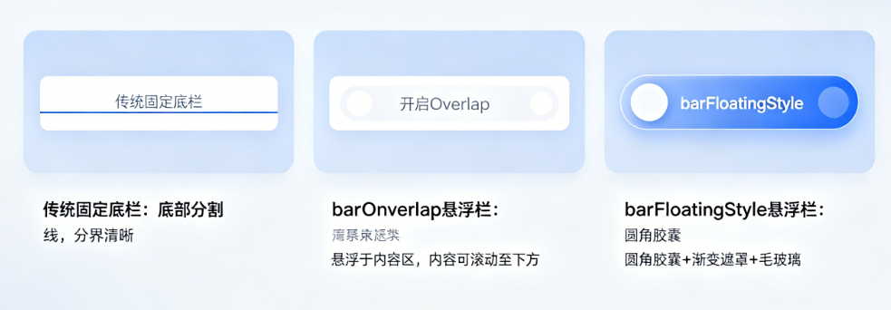
HdsTabs 是 HarmonyOS NEXT 设计套件(UIDesignKit)中的页签容器组件。它支持两种页签栏形态:
- 传统固定底栏:页签栏固定在屏幕底部,与内容区之间存在明确的视觉分隔
- 悬浮页签栏:页签栏悬浮在内容区上方,内容可以在页签栏下方滚动,产生层叠效果
barFloatingStyle 就是用来配置悬浮页签栏样式的核心属性。它提供了丰富的自定义能力:
- barOverlap:控制页签栏是否悬浮叠加在内容区之上
- barPosition:控制页签栏的放置位置(底部或顶部)
- vertical:控制页签栏是水平排列还是垂直排列
- barWidth:控制页签栏在不同屏幕尺寸下的宽度
- barBottomMargin:控制页签栏距离底部的间距
- gradientMask:配置页签栏与内容区之间的渐变遮罩
- systemMaterialEffect:配置系统级材质(毛玻璃)效果
- miniBar:配置与页签栏同行的迷你自定义内容区
本文先聚焦于前五个基础参数,视觉特效部分我们留到后续文章深入探讨。
三、环境准备
在开始编码之前,请确保你的开发环境已经配置好:
- DevEco Studio 5.0 及以上版本
- HarmonyOS SDK API 12 及以上
- 项目中引入 UIDesignKit 依赖
在 module.json5 中确认依赖声明:
// entry/src/main/module.json5
{
  "module": {
    "name": "entry",
    "dependencies": [
      {
        "bundleName": "com.huawei.uidesign",
        "moduleName": "UIDesignKit"
      }
    ]
  }
}
在代码顶部引入相关依赖:
import { HdsTabs, HdsTabsController, hdsMaterial } from '@kit.UIDesignKit';
四、从零搭建第一个悬浮页签栏
下面我们从最简代码开始,逐步配置完整的悬浮页签栏。
4.1 创建 HdsTabs 容器
首先创建一个 HdsTabs 实例,包含三个页签,每个页签显示一个渐变背景的卡片:
@Entry
@Component
struct MyFirstFloatingTab {
  private controller: HdsTabsController = new HdsTabsController();

  build() {
    Column() {
      HdsTabs({ controller: this.controller }) {
        // 第一个页签
        TabContent() {
          Scroll() {
            Column() {
              Column() {
                Text('Ocean 海洋')
                  .fontSize(24)
                  .fontColor('#FFFFFF')
                  .fontWeight(FontWeight.Bold)
              }
              .width('100%')
              .height(200)
              .borderRadius(16)
              .linearGradient({
                direction: GradientDirection.Top,
                colors: [['#007AFF', 0.0], ['#00C6FF', 1.0]]
              })
              .justifyContent(FlexAlign.Center)
              .margin({ left: 16, right: 16, top: 16 })

              Column() {
                Text('Desert 沙漠')
                  .fontSize(24)
                  .fontColor('#FFFFFF')
                  .fontWeight(FontWeight.Bold)
              }
              .width('100%')
              .height(200)
              .borderRadius(16)
              .linearGradient({
                direction: GradientDirection.Top,
                colors: [['#FF9500', 0.0], ['#FFCC00', 1.0]]
              })
              .justifyContent(FlexAlign.Center)
              .margin({ left: 16, right: 16, top: 12 })

              // 底部留白,确保最后一张卡片能完整显示
              Column().height(100)
            }
          }
          .scrollBar(BarState.Off)
        }
        .tabBar(new BottomTabBarStyle($r('sys.media.ohos_ic_public_clock'), '首页'))

        // 第二个页签
        TabContent() {
          Column() {
            Text('发现页')
              .fontSize(20)
              .fontWeight(FontWeight.Bold)
              .padding({ top: 16 })
          }
          .width('100%')
        }
        .tabBar(new BottomTabBarStyle($r('sys.media.ohos_ic_public_phone'), '发现'))

        // 第三个页签
        TabContent() {
          Column() {
            Text('我的页面')
              .fontSize(20)
              .fontWeight(FontWeight.Bold)
              .padding({ top: 16 })
          }
          .width('100%')
        }
        .tabBar(new BottomTabBarStyle($r('sys.media.wifi_router_fill'), '我的'))
      }
      // 这里配置 barFloatingStyle
      .barOverlap(true)
      .barPosition(BarPosition.End)
      .vertical(false)
      .barFloatingStyle({
        barWidth: {
          smallWidth: 200,
          mediumWidth: 300,
          largeWidth: 400
        },
        barBottomMargin: 28
      })
    }
    .width('100%')
    .height('100%')
    .backgroundColor('#F2F2F7')
  }
}
4.2 关键配置解析
让我们逐一看一下与 barFloatingStyle 直接相关的四个核心配置。
barOverlap(true)
这是悬浮页签栏的"开关"。设置为 true 时,页签栏脱离文档流,悬浮叠加在 TabContent 之上。此时,底部内容可以滚动到页签栏的"下方",产生 z 轴方向上的层级关系。如果设置为 false,页签栏退化为传统固定底栏的形式,与内容区之间存在明确的边界。
// 悬浮模式(推荐)
.barOverlap(true)

// 传统固定模式
.barOverlap(false)
barPosition(BarPosition.End)
控制页签栏出现在容器的哪一侧。BarPosition.End 表示底部(对于水平布局即屏幕底部),BarPosition.Start 表示顶部。绝大部分移动端应用的底部导航场景使用 BarPosition.End。
// 底部(移动端常规选择)
.barPosition(BarPosition.End)

// 顶部
.barPosition(BarPosition.Start)
vertical(false)
控制页签的排列方向。false 表示水平排列,页签从左到右依次排布。true 表示垂直排列,页签从上到下排列——这在平板或横屏场景下更为常用。
// 水平排列(手机常规选择)
.vertical(false)

// 垂直排列(平板/横屏场景)
.vertical(true)
4.3 barFloatingStyle 配置对象
barFloatingStyle 是真正的"样式配置中心",它是一个对象,包含以下可配置字段:
.barFloatingStyle({
  barWidth: {
    smallWidth: 200,   // 小屏设备宽度
    mediumWidth: 300,  // 中屏设备宽度
    largeWidth: 400    // 大屏设备宽度
  },
  barBottomMargin: 28, // 距离底部安全区的间距
  // gradientMask 和 systemMaterialEffect 后续介绍
})
barWidth — 响应式宽度控制。
barWidth 提供了三档宽度预设,分别对应小屏、中屏、大屏三种设备形态。系统会根据当前设备屏幕宽度自动选择最合适的一档。这个机制让同一套代码在手机、折叠屏、平板上都有良好的视觉表现。
建议参考值(可根据设计稿调整):
- smallWidth:160-240vp,适用于窄屏手机
- mediumWidth:280-360vp,适用于常规手机
- largeWidth:360-480vp,适用于平板或折叠屏展开态
barBottomMargin — 底部间距。
控制页签栏底部与屏幕底边的距离。这个参数在实际项目中非常重要,因为:
- 需要为底部安全区(如手势指示条)预留空间
- 间距大小直接影响页签栏的"悬浮感"——太小像固定栏,太大则浪费空间
常用取值:
- 0vp:完全贴底(常见于无手势条的设备)
- 12-20vp:微悬浮,接近底部
- 28vp:标准悬浮间距(推荐值)
- 36vp:明显悬浮,视觉轻盈
五、页签栏的三种宽度形态对比
为了直观理解 barWidth 的响应式行为,我们可以创建一个简单的交互式 Demo。在页面上方添加控制面板,通过按钮切换 smallWidth / mediumWidth / largeWidth 的值,实时观察页签栏的变化。
@Entry
@Component
struct FloatingTabDemo {
  private controller: HdsTabsController = new HdsTabsController();
  @State currentWidthIndex: number = 1; // 0: small, 1: medium, 2: large
  @State currentMarginIndex: number = 3; // 0-4 对应 0-36vp
  @State barOverlapEnabled: boolean = true;

  private widthPresets: number[] = [200, 300, 400];
  private widthLabels: string[] = ['Small(200vp)', 'Medium(300vp)', 'Large(400vp)'];
  private marginPresets: number[] = [0, 12, 20, 28, 36];
  private marginLabels: string[] = ['0vp', '12vp', '20vp', '28vp', '36vp'];

  build() {
    Column() {
      // 标题栏
      Row() {
        Text('悬浮页签栏 Demo')
          .fontSize(18)
          .fontWeight(FontWeight.Medium)
          .layoutWeight(1)
          .textAlign(TextAlign.Center)
      }
      .width('100%')
      .padding({ left: 16, right: 16, top: 40, bottom: 8 })
      .backgroundColor('#FFFFFF')

      // 控制面板
      Column() {
        // barOverlap 开关
        Row() {
          Text('barOverlap')
            .fontSize(13)
            .fontWeight(FontWeight.Medium)
            .fontColor('#182431')
            .width(110)
          Row({ space: 8 }) {
            Text('OFF')
              .fontSize(11)
              .fontColor(this.barOverlapEnabled ? '#99182431' : '#007AFF')
              .fontWeight(this.barOverlapEnabled ? FontWeight.Normal : FontWeight.Bold)
            Text('|').fontSize(11).fontColor('#E5E5EA')
            Text('ON')
              .fontSize(11)
              .fontColor(this.barOverlapEnabled ? '#007AFF' : '#99182431')
              .fontWeight(this.barOverlapEnabled ? FontWeight.Bold : FontWeight.Normal)
          }
          .padding({ left: 12, right: 12, top: 6, bottom: 6 })
          .backgroundColor('#F2F2F7')
          .borderRadius(16)
          .onClick(() => { this.barOverlapEnabled = !this.barOverlapEnabled })
        }
        .width('100%')
        .justifyContent(FlexAlign.SpaceBetween)
        .padding({ left: 16, right: 16, top: 4, bottom: 4 })

        // barWidth 宽度选择器
        Row() {
          Text('barWidth')
            .fontSize(13)
            .fontWeight(FontWeight.Medium)
            .fontColor('#182431')
            .width(110)
          Row({ space: 0 }) {
            ForEach(this.widthLabels, (label: string, idx: number) => {
              Text(label)
                .fontSize(10)
                .fontColor(idx === this.currentWidthIndex ? '#FFFFFF' : '#007AFF')
                .fontWeight(idx === this.currentWidthIndex ? FontWeight.Bold : FontWeight.Normal)
                .padding({ left: 10, right: 10, top: 6, bottom: 6 })
                .backgroundColor(idx === this.currentWidthIndex ? '#007AFF' : '#007AFF1A')
                .borderRadius(14)
                .onClick(() => { this.currentWidthIndex = idx })
            })
          }
        }
        .width('100%')
        .justifyContent(FlexAlign.SpaceBetween)
        .padding({ left: 16, right: 16, top: 4, bottom: 4 })

        // barBottomMargin 间距选择器
        Row() {
          Text('底部间距')
            .fontSize(13)
            .fontWeight(FontWeight.Medium)
            .fontColor('#182431')
            .width(110)
          Scroll() {
            Row({ space: 6 }) {
              ForEach(this.marginLabels, (label: string, idx: number) => {
                Text(label)
                  .fontSize(11)
                  .fontColor(idx === this.currentMarginIndex ? '#FFFFFF' : '#007AFF')
                  .padding({ left: 12, right: 12, top: 6, bottom: 6 })
                  .backgroundColor(idx === this.currentMarginIndex ? '#007AFF' : '#007AFF1A')
                  .borderRadius(14)
                  .onClick(() => { this.currentMarginIndex = idx })
              })
            }
          }
          .scrollable(ScrollDirection.Horizontal)
          .scrollBar(BarState.Off)
          .layoutWeight(1)
        }
        .width('100%')
        .justifyContent(FlexAlign.SpaceBetween)
        .padding({ left: 16, right: 16, top: 4, bottom: 4 })
      }
      .padding({ top: 8, bottom: 8 })
      .backgroundColor('#FAFAFA')

      Divider().color('#E5E5EA').height(0.5)

      // 当前配置信息
      Text('barOverlap=' + this.barOverlapEnabled
        + ' | width=' + this.widthPresets[this.currentWidthIndex] + 'vp'
        + ' | margin=' + this.marginPresets[this.currentMarginIndex] + 'vp')
        .fontSize(9)
        .fontColor('#99182431')
        .padding({ left: 16, right: 16, top: 6, bottom: 6 })

      // HdsTabs — 带动态 barFloatingStyle
      HdsTabs({ controller: this.controller }) {
        TabContent() {
          Scroll() {
            Column() {
              Column() {
                Text('悬浮页签栏')
                  .fontSize(22)
                  .fontWeight(FontWeight.Bold)
                  .fontColor('#FFFFFF')
                Text('barFloatingStyle 基础配置演示')
                  .fontSize(12)
                  .fontColor('#CCFFFFFF')
                  .margin({ top: 8 })
              }
              .width('100%')
              .height(180)
              .justifyContent(FlexAlign.Center)
              .borderRadius(16)
              .linearGradient({
                direction: GradientDirection.Top,
                colors: [['#007AFF', 0.0], ['#5856D6', 1.0]]
              })
              .margin({ top: 16, left: 16, right: 16 })

              // 模拟列表内容
              Column({ space: 8 }) {
                ForEach(['列表项 A', '列表项 B', '列表项 C',
                  '列表项 D', '列表项 E', '列表项 F'], (text: string) => {
                  Row() {
                    Text(text)
                      .fontSize(14)
                      .fontColor('#182431')
                  }
                  .width('100%')
                  .padding(16)
                  .backgroundColor('#FFFFFF')
                  .borderRadius(10)
                })
              }
              .width('100%')
              .padding({ left: 16, right: 16, top: 16, bottom: 100 })
            }
          }
          .scrollBar(BarState.Off)
        }
        .tabBar(new BottomTabBarStyle($r('sys.media.ohos_ic_public_clock'), '首页'))

        TabContent() {
          Column() {
            Text('发现页')
              .fontSize(20)
              .fontWeight(FontWeight.Bold)
              .padding({ top: 16, left: 16 })
          }
          .width('100%')
        }
        .tabBar(new BottomTabBarStyle($r('sys.media.ohos_ic_public_phone'), '发现'))

        TabContent() {
          Column() {
            Text('我的页')
              .fontSize(20)
              .fontWeight(FontWeight.Bold)
              .padding({ top: 16, left: 16 })
          }
          .width('100%')
        }
        .tabBar(new BottomTabBarStyle($r('sys.media.wifi_router_fill'), '我的'))
      }
      .barOverlap(this.barOverlapEnabled)
      .barPosition(BarPosition.End)
      .vertical(false)
      .barFloatingStyle({
        barWidth: {
          smallWidth: this.widthPresets[this.currentWidthIndex],
          mediumWidth: this.widthPresets[this.currentWidthIndex],
          largeWidth: this.widthPresets[this.currentWidthIndex]
        },
        barBottomMargin: this.marginPresets[this.currentMarginIndex]
      })
    }
    .width('100%')
    .height('100%')
    .backgroundColor('#F2F2F7')
  }
}
这个 Demo 的核心在于上方的控制面板。通过切换 barWidth 的三档值和 barBottomMargin 的五档值,你可以实时查看不同参数组合下页签栏的视觉效果。注意观察:
- barOverlap 关闭时,页签栏变为固定底栏,与内容区有明显分界
- barWidth 从 200vp 切换到 400vp 时,页签栏从窄胶囊变为宽胶囊
- barBottomMargin 从 0vp 增大到 36vp 时,页签栏逐渐"浮起来"
六、参数配置最佳实践
经过反复实践,我们总结出以下参数推荐配置:
移动端常规应用(推荐配置)
.barFloatingStyle({
  barWidth: {
    smallWidth: 200,  // 窄屏设备 200vp
    mediumWidth: 300, // 正常设备 300vp
    largeWidth: 400   // 宽屏设备 400vp
  },
  barBottomMargin: 28 // 标准悬浮间距
})
这个配置组合在绝大多数场景下都有良好的表现:页签栏宽度适中,悬浮间距既不会太贴底也不会浪费空间。
内容密集型应用(加宽页签栏)
.barFloatingStyle({
  barWidth: {
    smallWidth: 300,
    mediumWidth: 360,
    largeWidth: 480
  },
  barBottomMargin: 20 // 内容型应用可适当减小间距
})
沉浸式体验应用(大间距 + 宽页签)
.barFloatingStyle({
  barWidth: {
    smallWidth: 260,
    mediumWidth: 340,
    largeWidth: 440
  },
  barBottomMargin: 36 // 让页签栏"飘起来"
})
建议在实际开发中,利用上一节的交互式 Demo,在不同设备上测试参数组合,找到最适合产品设计语言的配置。
七、小结
本文介绍了 HdsTabs 悬浮页签栏 barFloatingStyle 的入门知识:
- barOverlap:悬浮模式的开关,true 开启悬浮效果
- barPosition:控制页签栏位置,End 为底部
- vertical:排列方向,false 水平排列
- barWidth:三档响应式宽度,适配不同屏幕尺寸
- barBottomMargin:底部间距,影响悬浮感强弱
掌握了这五个基础参数,你就已经可以搭建出一个视觉效果良好的悬浮页签栏了。在本文中页签内容使用了 BottomTabBarStyle 来定义图标和文字,它提供开箱即用的标准样式。如果后续需要更个性化的页签 UI——比如带角标的消息提示、选中态的特殊动画或品牌化定制的图标文字样式——HdsTabs 还支持通过 CustomBuilder 完全自定义页签栏,你可以查阅官方文档进一步了解。

作为“人工智能6S店”的官方数字引擎,为AI开发者与企业提供一个覆盖软硬件全栈、一站式门户。
更多推荐

 0
0 0
0- 0


 已为社区贡献35条内容

所有评论(0)