
鸿蒙NEXT实战:用HdsTabs构建沉浸式音乐播放器 WaveFlow
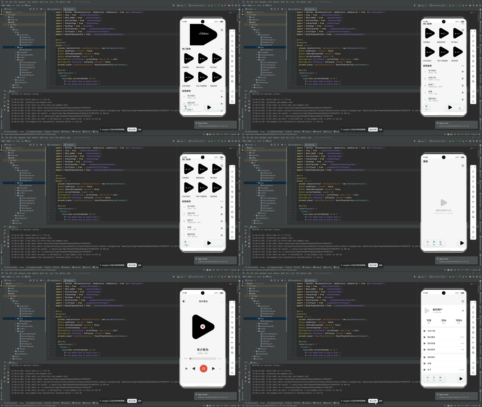
本文将以一个完整的音乐播放器应用——**WaveFlow**——为例,展示如何将 HdsTabs barFloatingStyle 的全部特性集成到一个真实的应用场景中。WaveFlow 不是一个简单的 Demo,它包含 4 个具有完整数据结构和交互逻辑的页签,以及一个与主内容区状态联动的"正在播放"迷你栏。
一、引言
逐一拆解了 HdsTabs 悬浮页签栏的各个特性——基础配置、自定义页签、视觉特效、迷你栏与动态控制。但在实际产品开发中,这些特性从来不会单独存在。它们在同一个界面中协同工作,才能真正发挥价值。
本文将以一个完整的音乐播放器应用——WaveFlow——为例,展示如何将 HdsTabs barFloatingStyle 的全部特性集成到一个真实的应用场景中。WaveFlow 不是一个简单的 Demo,它包含 4 个具有完整数据结构和交互逻辑的页签,以及一个与主内容区状态联动的"正在播放"迷你栏。
本文的代码经过精简,保留了核心架构和关键交互逻辑。
二、应用架构概述
2.1 页签结构
WaveFlow 包含四个页签:
- 浏览 — 音乐播放 Hero + 最近播放
- 发现 — 搜索 + 热门标签 + 排行榜
- 音乐库 — 统计数据 + 歌单列表
- 我的 — 个人中心 + 菜单列表
2.2 数据结构设计
在开始写 UI 之前,先定义好所有数据结构:
// 曲目数据
interface TrackItem {
  id: number;
  title: string;      // 曲目标题
  artist: string;     // 艺人名
  duration: string;   // 时长(如 "3:29")
  color1: string;     // 渐变色起始
  color2: string;     // 渐变色结束
}

// 歌单数据
interface PlaylistItem {
  id: number;
  name: string;       // 歌单名称
  count: number;      // 歌曲数量
  color: string;      // 主题色
}

// 统计数据
interface StatItem {
  label: string;      // 统计项名称
  count: string;      // 统计数值
}

// 菜单项
interface ProfileMenuItem {
  icon: Resource;     // 菜单图标
  label: string;      // 菜单标题
  desc: string;       // 菜单描述
}
2.3 初始化数据
private tracks: TrackItem[] = [
  { id: 1, title: 'Golden Hour', artist: 'JVKE', duration: '3:29',
    color1: '#FF9500', color2: '#FF3B30' },
  { id: 2, title: 'Midnight Rain', artist: 'Taylor Swift', duration: '2:54',
    color1: '#5856D6', color2: '#AF52DE' },
  { id: 3, title: 'Ocean Breeze', artist: 'Lofi Studio', duration: '4:12',
    color1: '#007AFF', color2: '#34C759' },
  { id: 4, title: 'Neon Lights', artist: 'The Weeknd', duration: '3:45',
    color1: '#FF3B30', color2: '#FF9500' },
  { id: 5, title: 'Morning Dew', artist: 'Chill Hop', duration: '3:18',
    color1: '#34C759', color2: '#007AFF' },
  { id: 6, title: 'Star Gazing', artist: 'Post Malone', duration: '3:52',
    color1: '#AF52DE', color2: '#5856D6' }
];

private playlists: PlaylistItem[] = [
  { id: 1, name: '今日推荐', count: 30, color: '#FF9500' },
  { id: 2, name: '收藏歌曲', count: 128, color: '#FF3B30' },
  { id: 3, name: '睡前放松', count: 22, color: '#5856D6' },
  { id: 4, name: '运动模式', count: 45, color: '#34C759' },
  { id: 5, name: '通勤路上', count: 56, color: '#007AFF' },
  { id: 6, name: '深度专注', count: 18, color: '#AF52DE' }
];

private stats: StatItem[] = [
  { label: '歌单', count: '12' },
  { label: '歌曲', count: '286' },
  { label: '艺人', count: '45' },
  { label: '专辑', count: '23' }
];

private menuItems: ProfileMenuItem[] = [
  { icon: $r('sys.media.ohos_ic_public_clock'), label: '我的收藏',
    desc: '收藏的歌曲和歌单' },
  { icon: $r('sys.media.ohos_ic_public_clock'), label: '播放历史',
    desc: '最近播放的 50 首歌曲' },
  { icon: $r('sys.media.ohos_ic_public_phone'), label: '下载管理',
    desc: '离线歌曲 32 首' },
  { icon: $r('sys.media.ohos_ic_public_clock'), label: '设置',
    desc: '音质、通知与隐私' },
  { icon: $r('sys.media.ohos_ic_public_phone'), label: '关于',
    desc: 'WaveFlow v2.0' }
];
三、浏览页签 — 沉浸式 Hero 播放区
浏览页是应用的主入口,它的核心是一个占据顶部大半屏幕的 Hero 播放区。这个区域的设计目标是让用户一眼就能看到当前正在播放的内容,并且可以直接从顶部的控制按钮组进行播放操作。
3.1 Hero 播放区代码
// 浏览页签的 Hero 播放区
Column() {
  // 专辑封面(带播放状态叠加层)
  Stack() {
    // 主封面
    Column()
      .width(160).height(160)
      .borderRadius(20)
      .linearGradient({
        direction: GradientDirection.Top,
        colors: [
          [this.tracks[this.currentTrackIndex].color1, 0.0],
          [this.tracks[this.currentTrackIndex].color2, 1.0]
        ]
      })
      .shadow({
        radius: 30,
        color: this.tracks[this.currentTrackIndex].color1 + '40',
        offsetX: 0,
        offsetY: 12
      })

    // 播放中动画圈(播放时显示)
    if (this.isPlaying) {
      Row()
        .width(60).height(60)
        .borderRadius(30)
        .border({ width: 2, color: '#FFFFFF30' })
        .position({ x: 50, y: 50 })
    }
  }
  .width(160).height(160)
  .margin({ top: 24 })

  // 曲目标题与艺人
  Text(this.tracks[this.currentTrackIndex].title)
    .fontSize(22)
    .fontWeight(FontWeight.Bold)
    .fontColor('#FFFFFF')
    .margin({ top: 16 })

  Text(this.tracks[this.currentTrackIndex].artist)
    .fontSize(14)
    .fontColor('#99FFFFFF')
    .margin({ top: 4 })

  // 播放进度条
  Row() {
    Text('1:24')
      .fontSize(10).fontColor('#99FFFFFF')
    Column()
      .height(2)
      .layoutWeight(1)
      .backgroundColor('#FFFFFF30')
      .borderRadius(1)
      .margin({ left: 8, right: 8 })
    Text(this.tracks[this.currentTrackIndex].duration)
      .fontSize(10).fontColor('#99FFFFFF')
  }
  .width('100%')
  .padding({ left: 40, right: 40, top: 12 })

  // 播放控制按钮组
  Row({ space: 24 }) {
    // 随机播放
    Row() {
      Image($r('sys.media.ohos_ic_public_arrow_left'))
        .width(16).height(16)
        .fillColor(this.isShuffled ? '#007AFF' : '#FFFFFF')
    }
    .width(36).height(36).borderRadius(18)
    .backgroundColor('#FFFFFF20')
    .justifyContent(FlexAlign.Center)
    .onClick(() => { this.isShuffled = !this.isShuffled })

    // 上一首
    Row() {
      Image($r('sys.media.ohos_ic_public_arrow_left'))
        .width(16).height(16).fillColor('#FFFFFF')
    }
    .width(40).height(40).borderRadius(20)
    .backgroundColor('#FFFFFF20')
    .justifyContent(FlexAlign.Center)
    .onClick(() => {
      const len = this.tracks.length;
      this.currentTrackIndex = (this.currentTrackIndex + len - 1) % len;
    })

    // 播放/暂停
    Row() {
      Image(this.isPlaying ?
        $r('sys.media.ohos_ic_public_pause') :
        $r('sys.media.ohos_ic_public_play'))
        .width(24).height(24).fillColor('#FFFFFF')
    }
    .width(56).height(56).borderRadius(28)
    .backgroundColor('#FFFFFF30')
    .justifyContent(FlexAlign.Center)
    .onClick(() => { this.isPlaying = !this.isPlaying })

    // 下一首
    Row() {
      Image($r('sys.media.ohos_ic_public_arrow_right'))
        .width(16).height(16).fillColor('#FFFFFF')
    }
    .width(40).height(40).borderRadius(20)
    .backgroundColor('#FFFFFF20')
    .justifyContent(FlexAlign.Center)
    .onClick(() => {
      this.currentTrackIndex = (this.currentTrackIndex + 1) % this.tracks.length;
    })

    // 循环模式
    Row() {
      Text(this.repeatMode === 2 ? '1' : this.repeatMode === 1 ? 'All' : '')
        .fontSize(8).fontColor('#FFFFFF')
    }
    .width(36).height(36).borderRadius(18)
    .backgroundColor('#FFFFFF20')
    .justifyContent(FlexAlign.Center)
    .onClick(() => { this.repeatMode = (this.repeatMode + 1) % 3 })
  }
  .margin({ top: 20, bottom: 12 })
}
.width('100%')
.borderRadius(16)
.linearGradient({
  direction: GradientDirection.Top,
  colors: [['#182431', 0.0], ['#2C3E50', 1.0]]
})
.margin({ top: 16, left: 16, right: 16 })
Hero 播放区使用了深色渐变背景(#182431 → #2C3E50),配合半透明白色控件,营造出高端音响设备般的视觉质感。封面使用渐变色模拟专辑封面,并通过阴影增强立体感。五个控制按钮(随机/上一首/播放暂停/下一首/循环模式)以等间距排列,主播放按钮置于视觉中心并放大至 56vp。
3.2 最近播放宫格
Hero 区下方是最近播放的曲目,以四宫格形式展示:
// 最近播放
Column() {
  Row() {
    Text('最近播放')
      .fontSize(16)
      .fontWeight(FontWeight.Medium)
      .fontColor('#182431')
  }
  .width('100%')
  .padding({ left: 4, top: 4, bottom: 8 })

  Row({ space: 10 }) {
    ForEach(this.tracks.slice(0, 4), (track: TrackItem, idx: number) => {
      Column() {
        // 小封面
        Column()
          .width(70).height(70)
          .borderRadius(12)
          .linearGradient({
            direction: GradientDirection.Top,
            colors: [[track.color1, 0.0], [track.color2, 1.0]]
          })

        // 曲目标题
        Text(track.title)
          .fontSize(11).fontColor('#182431')
          .maxLines(1)
          .textOverflow({ overflow: TextOverflow.Ellipsis })
          .margin({ top: 4 })
          .width(70)

        // 艺人
        Text(track.artist)
          .fontSize(9).fontColor('#99182431')
          .width(70)
      }
      .onClick(() => { this.currentTrackIndex = idx })
    })
  }
  .width('100%')
}
.width('100%')
.padding(16)
每个宫格包含渐变色封面、曲目名和艺人名。点击任意宫格会更新 currentTrackIndex,状态变更会联动到 Hero 区的封面颜色、曲目信息以及底部的迷你栏。
四、发现页签 — 搜索与排行榜
发现页签以内容发现为核心,包含搜索框、热门标签和排行榜三个模块。
4.1 搜索框
Row() {
  Image($r('sys.media.ohos_ic_public_clock'))
    .width(16).height(16)
    .fillColor('#8E8E93')
    .margin({ left: 12 })

  Text('搜索歌曲、艺人或专辑')
    .fontSize(14)
    .fontColor('#8E8E93')
    .layoutWeight(1)
    .margin({ left: 8 })
}
.width('100%')
.height(40)
.backgroundColor('#F2F2F7')
.borderRadius(20)
.margin({ top: 16, left: 16, right: 16 })
搜索框采用圆角胶囊形态(borderRadius: 20),背景为浅灰色,内部放置搜索图标和占位文字,视觉风格与 iOS 搜索栏一致。
4.2 热门标签
Row({ space: 8 }) {
  ForEach(['#流行', '#摇滚', '#电子', '#爵士', '#古典', '#R&B', '#嘻哈'],
    (tag: string) => {
    Text(tag)
      .fontSize(11)
      .fontColor('#AF52DE')
      .padding({ left: 12, right: 12, top: 6, bottom: 6 })
      .backgroundColor('#AF52DE10')
      .borderRadius(14)
  })
}
.width('100%')
.padding({ left: 16, right: 16, top: 12 })
标签使用品牌紫色文字配 10% 透明度的紫色背景,圆角标签形态。每个标签是独立的 Text 组件,未来可以扩展为可点击的筛选入口。
4.3 排行榜列表
排行榜是发现页的核心内容,每条记录包含排名序号、封面、曲目信息、时长和播放按钮:
Column({ space: 8 }) {
  ForEach(this.tracks, (track: TrackItem, idx: number) => {
    Row() {
      // 排名序号
      Text(String(idx + 1))
        .fontSize(16)
        .fontWeight(FontWeight.Bold)
        .fontColor(idx < 3 ? '#FF3B30' : '#8E8E93')
        .width(24)

      // 封面
      Column()
        .width(44).height(44)
        .borderRadius(8)
        .linearGradient({
          direction: GradientDirection.Top,
          colors: [[track.color1, 0.0], [track.color2, 1.0]]
        })
        .margin({ left: 8 })

      // 曲目信息
      Column() {
        Text(track.title).fontSize(14).fontColor('#182431')
        Text(track.artist).fontSize(11).fontColor('#99182431')
      }
      .alignItems(HorizontalAlign.Start)
      .layoutWeight(1)
      .margin({ left: 10 })

      // 时长
      Text(track.duration).fontSize(12).fontColor('#8E8E93')

      // 播放按钮
      Row() {
        Image($r('sys.media.ohos_ic_public_play'))
          .width(14).height(14).fillColor('#007AFF')
      }
      .width(28).height(28).borderRadius(14)
      .backgroundColor('#007AFF14')
      .justifyContent(FlexAlign.Center)
      .margin({ left: 8 })
      .onClick(() => { this.currentTrackIndex = idx })
    }
    .width('100%')
    .padding(12)
    .backgroundColor('#FFFFFF')
    .borderRadius(12)
  })
}
.width('100%')
.padding({ left: 16, right: 16 })
排名序号的前三名使用红色高亮(#FF3B30),其余使用灰色。点击播放按钮将当前曲目索引设置为对应条目,与 Hero 区和迷你栏联动。
五、音乐库页签 — 数据概览与歌单
音乐库页签以数据展示为主,上半部分是四个统计指标卡片,下半部分是歌单列表。
5.1 统计卡片
Row({ space: 12 }) {
  ForEach(this.stats, (stat: StatItem) => {
    Column() {
      Text(stat.count)
        .fontSize(20)
        .fontWeight(FontWeight.Bold)
        .fontColor('#182431')
      Text(stat.label)
        .fontSize(10)
        .fontColor('#99182431')
    }
    .layoutWeight(1)
    .padding(12)
    .backgroundColor('#FFFFFF')
    .borderRadius(12)
  })
}
.width('100%')
.padding({ top: 16, left: 16, right: 16 })
四个卡片通过 layoutWeight(1) 等宽分布,每个卡片包含大号数值和小号标签文字。这种布局适合在有限空间内呈现汇总数据。
5.2 歌单列表
Column({ space: 8 }) {
  ForEach(this.playlists, (pl: PlaylistItem) => {
    Row() {
      // 左侧色块图标
      Column()
        .width(48).height(48)
        .borderRadius(10)
        .backgroundColor(pl.color + '30')
        .justifyContent(FlexAlign.Center)

      // 歌单信息
      Column() {
        Text(pl.name)
          .fontSize(14)
          .fontWeight(FontWeight.Medium)
          .fontColor('#182431')
        Text(pl.count + ' 首歌曲')
          .fontSize(11)
          .fontColor('#99182431')
      }
      .alignItems(HorizontalAlign.Start)
      .layoutWeight(1)
      .margin({ left: 10 })

      // 箭头
      Image($r('sys.media.ohos_ic_public_arrow_right'))
        .width(16).height(16)
        .fillColor('#C7C7CC')
    }
    .width('100%')
    .padding(12)
    .backgroundColor('#FFFFFF')
    .borderRadius(12)
  })
}
.width('100%')
.padding({ left: 16, right: 16 })
每个歌单行包含三个元素:30% 透明度的主题色方块、歌单名称和歌曲数量、右侧导航箭头。这种行布局是移动端列表页的经典范式。
六、我的页签 — 个人中心
6.1 个人资料卡片
Column() {
  // 头像
  Column()
    .width(72).height(72)
    .borderRadius(36)
    .backgroundColor('#007AFF20')
    .justifyContent(FlexAlign.Center)
    .margin({ top: 20 })

  // 用户名
  Text('音乐爱好者')
    .fontSize(18)
    .fontWeight(FontWeight.Bold)
    .fontColor('#FFFFFF')
    .margin({ top: 10 })

  // 副标题
  Text('HarmonyOS NEXT · WaveFlow')
    .fontSize(12)
    .fontColor('#99FFFFFF')
    .margin({ top: 4 })
}
.width('100%')
.height(180)
.borderRadius(16)
.linearGradient({
  direction: GradientDirection.Top,
  colors: [['#007AFF', 0.0], ['#5856D6', 1.0]]
})
.margin({ top: 16, left: 16, right: 16 })
使用蓝色到紫色的渐变背景,白色文字居中对齐。头像区域使用半透明白色圆形替代真实头像图片。
6.2 菜单列表
Column({ space: 4 }) {
  ForEach(this.menuItems, (item: ProfileMenuItem) => {
    Row() {
      // 圆形图标背景
      Row() {
        Image(item.icon)
          .width(20).height(20)
          .fillColor('#007AFF')
      }
      .width(36).height(36)
      .borderRadius(18)
      .backgroundColor('#007AFF14')
      .justifyContent(FlexAlign.Center)
      .margin({ right: 12 })

      // 菜单文字
      Column() {
        Text(item.label)
          .fontSize(14)
          .fontWeight(FontWeight.Medium)
          .fontColor('#182431')
        Text(item.desc)
          .fontSize(11)
          .fontColor('#99182431')
      }
      .alignItems(HorizontalAlign.Start)
      .layoutWeight(1)

      // 右箭头
      Image($r('sys.media.ohos_ic_public_arrow_right'))
        .width(16).height(16)
        .fillColor('#C7C7CC')
    }
    .width('100%')
    .padding(14)
    .backgroundColor('#FFFFFF')
    .borderRadius(12)
  })
}
.width('100%')
.padding({ left: 16, right: 16, top: 16 })
每个菜单行结构为:圆形蓝色图标背景(36vp)+ 标题/描述文字 + 右箭头。Column 的间距设为 4vp 使各行紧密排列。
七、NowPlayingMiniBar — 播放中迷你栏
迷你栏是 WaveFlow 的点睛之笔。它在页签栏的同行右侧显示当前正在播放的曲目信息和控制按钮,无论用户切换到哪个页签,都能看到和操作播放状态。
迷你栏的状态与 Hero 区完全联动:currentTrackIndex 和 isPlaying 是共享的 @State 变量,任何一处的修改都会同时反映在 Hero 区和迷你栏中。
@Builder
NowPlayingMiniBar() {
  Row() {
    // 封面缩略图(36vp 小方块)
    Stack() {
      Column()
        .width(36).height(36)
        .borderRadius(6)
        .linearGradient({
          direction: GradientDirection.Top,
          colors: [
            [this.tracks[this.currentTrackIndex].color1, 0.0],
            [this.tracks[this.currentTrackIndex].color2, 1.0]
          ]
        })
    }
    .margin({ left: 4 })

    // 曲目信息(布局权重自动填满剩余空间)
    Column() {
      Text(this.tracks[this.currentTrackIndex].title)
        .fontSize(12)
        .fontWeight(FontWeight.Medium)
        .fontColor('#182431')
        .maxLines(1)
        .textOverflow({ overflow: TextOverflow.Ellipsis })

      Text(this.tracks[this.currentTrackIndex].artist
        + (this.isPlaying ? ' · 播放中' : ' · 已暂停'))
        .fontSize(9)
        .fontColor('#99182431')
        .maxLines(1)
        .textOverflow({ overflow: TextOverflow.Ellipsis })
    }
    .alignItems(HorizontalAlign.Start)
    .layoutWeight(1)
    .margin({ left: 8 })

    // 播放/暂停按钮(蓝色实心圆形)
    Row() {
      Image(this.isPlaying ?
        $r('sys.media.ohos_ic_public_pause') :
        $r('sys.media.ohos_ic_public_play'))
        .width(14).height(14)
        .fillColor('#FFFFFF')
    }
    .width(30).height(30)
    .borderRadius(15)
    .backgroundColor('#007AFF')
    .justifyContent(FlexAlign.Center)
    .margin({ right: 4 })
    .onClick(() => { this.isPlaying = !this.isPlaying })

    // 下一首按钮(蓝色透明圆形)
    Row() {
      Image($r('sys.media.ohos_ic_public_arrow_right'))
        .width(12).height(12)
        .fillColor('#007AFF')
    }
    .width(28).height(28)
    .borderRadius(14)
    .backgroundColor('#007AFF14')
    .justifyContent(FlexAlign.Center)
    .margin({ right: 4 })
    .onClick(() => {
      this.currentTrackIndex = (this.currentTrackIndex + 1)
        % this.tracks.length;
    })
  }
}
迷你栏使用了紧凑布局风格:左侧 36vp 封面缩略图、中间曲目信息(单行省略、状态副标题)、右侧两个控制按钮(播放/暂停为实心蓝底、下一首为透明蓝底)。所有数据源(currentTrackIndex、isPlaying、tracks 数组)均与主内容区共享,保证状态一致性。
八、barFloatingStyle 完整配置
整合所有特性的 barFloatingStyle 配置如下:
HdsTabs({ controller: this.controller }) {
  // ... 四个 TabContent
}
.barOverlap(true)         // 悬浮模式
.barPosition(BarPosition.End)  // 置于底部
.vertical(false)           // 水平排列
.barFloatingStyle({
  // 响应式宽度
  barWidth: {
    smallWidth: 200,
    mediumWidth: 300,
    largeWidth: 400
  },
  // 底部间距
  barBottomMargin: 28,
  // 渐变遮罩
  gradientMask: {
    maskColor: '#66F1F3F5',
    maskHeight: 92
  },
  // 系统材质
  systemMaterialEffect: {
    materialType: hdsMaterial.MaterialType.IMMERSIVE,
    materialLevel: hdsMaterial.MaterialLevel.ADAPTIVE
  },
  // 播放中迷你栏
  miniBar: {
    miniBarBuilder: () => this.NowPlayingMiniBar()
  }
})
这个配置选择了 IMMERSIVE 沉浸材质 + 92vp 渐变遮罩,在音乐播放器的沉浸式体验和实用性之间取得了良好平衡。迷你栏随状态变量响应式更新,页签栏宽度和间距使用推荐值。
九、页面间的状态联动机制
WaveFlow 的关键设计是多个页面共享同一组播放状态。无论是浏览页的 Hero 控件、发现页排行榜的播放按钮、还是迷你栏的控制按钮,它们都操作相同的 currentTrackIndex 和 isPlaying 状态变量:
@State currentTrackIndex: number = 0;  // 当前播放曲目的索引
@State isPlaying: boolean = true;       // 播放/暂停状态
@State isShuffled: boolean = false;     // 随机播放状态
@State repeatMode: number = 0;          // 循环模式 0=顺序 1=循环 2=单曲
状态变更的传播路径:
- 用户点击 Hero 区的"播放暂停"按钮 →
isPlaying反转 → Hero 区的图标和迷你栏图标同时更新 - 用户点击迷你栏的"下一首" →
currentTrackIndex+1 → Hero 区的封面颜色、曲目信息、迷你栏的封面和信息全部联动更新 - 用户在发现页排行榜点击播放 →
currentTrackIndex被设为该曲目索引 → 所有相关 UI 同步刷新
这种基于 @State 的响应式联动是 ArkUI 的核心优势——开发者只需维护一份状态,框架自动完成所有依赖该状态的 UI 刷新。
十、手动管理 currentTabIndex 同步
在 WaveFlow 中,由于没有使用 CustomBuilder 自定义页签,而是使用 BottomTabBarStyle,所以不需要维护选中态。但如果未来迁移到 CustomBuilder,需要注意在 HdsTabs 的 onChange 回调中同步 currentTabIndex:
HdsTabs({
  controller: this.controller,
  onTabChanged: (index: number) => {
    this.currentTabIndex = index;
  }
}) {
  // ...
}
十一、小结
本文通过 WaveFlow 音乐播放器的完整案例,展示了 HdsTabs barFloatingStyle 在实际项目中的综合运用:
- 浏览页:深色 Hero 区 + 完整播放控件组 + 最近播放宫格,构建应用的主视觉焦点
- 发现页:搜索框 + 热门标签 + 排行榜列表,经典内容发现模式
- 音乐库页:统计卡片 + 歌单列表,数据概览型页面范式
- 我的页:渐变资料卡片 + 菜单列表,个人中心标准布局
- 迷你栏:与所有页面共享播放状态,提供跨页签的播放控制
- 视觉配置:IMMERSIVE 材质 + 92vp 遮罩 + 28vp 间距,打造沉浸式音乐体验
这个案例的代码量约为 570 行,涵盖了 HdsTabs 悬浮页签栏的全部核心特性。你可以将其作为起点,根据实际产品的设计需求进行调整——比如替换模拟数据为真实 API、接入系统音频播放能力、或扩展更多页签和交互细节。

作为“人工智能6S店”的官方数字引擎,为AI开发者与企业提供一个覆盖软硬件全栈、一站式门户。
更多推荐

 5
5 0
0- 0


 已为社区贡献35条内容

所有评论(0)