
Flutter + OpenHarmony 时间轴组件开发实战
版权声明:本文为CSDN博主「Hello__7777」的原创文章,遵循CC 4.0 BY-SA版权协议,转载请附上原文出处链接及本声明。原文链接:https://blog.csdn.net/Hello_7777/article/details/160668972。四个不同颜色的标签:Flutter(主题色)、Dart(蓝色)、鸿蒙(红色)、OpenHarmony(橙色)6个职位标签:前端、后端、移
Flutter + OpenHarmony 时间轴组件开发实战
欢迎加入开源鸿蒙跨平台社区→ https://openharmonycrosplatform.csdn.net
一、效果展示
📱 运行效果预览
在鸿蒙虚拟机上运行后的实际效果如下:
订单追踪时间轴 :
-
四个状态节点:订单已提交 → 商家已接单 → 骑手已取货 → 订单已完成
-
每个节点显示图标、标题、副标题和时间
-
蓝色购物袋图标、绿色商店图标、橙色配送图标、绿色完成图标
-
垂直连接线串联所有节点
卡片样式时间轴 : -
项目进度展示:项目启动 → 需求分析 → 开发阶段 → 项目上线
-
每个节点内容包裹在卡片容器中
-
带阴影效果的圆角卡片
-
紫色火箭、蓝色分析、绿色代码、青色云图标
交替布局时间轴 : -
Flutter版本历程:2020年 → 2021年 → 2022年 → 2023年
-
偶数节点在左侧,奇数节点在右侧
-
Zigzag视觉效果,更具设计感
-
蓝绿橙紫四色图标交替
极简样式时间轴 : -
用户行为追踪:登录 → 浏览 → 加购 → 支付
-
紧凑布局,小尺寸图标
-
时间显示在左侧固定宽度区域
-
适合展示大量历史记录
🎨 三种布局方式图示
左侧布局:              右侧布
局:              交替布局:
●── 标题1              标题1
──●              ●── 标题1
│
│              标题2 ──●
●── 标题2              标题2
──●              ●── 标题3
│
│              标题4 ──●
●── 标题3              标题3 ──●
🎨 三种内容样式对比
默认样式:
●── 2024-01-15 10:30
    订单已提交
    您的订单已成功提交

卡片样式:
●── ┌─────────────────────┐
    │ 2024-01-15 10:30    │
    │ 订单已提交          │
    │ 您的订单已成功提交  │
    └─────────────────────┘

极简样式:
●── 10:30  订单已提交
二、组件概述
时间轴组件是展示事件序列、历史记录、进度追踪的理想选择。在电商应用中用于订单追踪,在项目管理中用于进度展示,在社交应用中用于动态记录。OpenHarmony 环境下的 Flutter 时间轴组件需要支持灵活的布局方式和丰富的自定义选项。
三、核心功能特性
✅ 三种布局方式 - 左对齐、右对齐、交替布局
✅ 三种内容样式 - 默认、卡片、极简
✅ 自定义图标颜色 - 每个节点独立配色
✅ 支持自定义内容 - 可嵌入任意Widget
✅ 入场动画效果 - 淡入滑动动画
✅ 完全可定制 - 线条粗细、图标大小、间距等
四、技术实现架构
4.1 布局对齐枚举
enum TimelineAlignment {
  left,      // 左对齐 - 图标在左
  right,     // 右对齐 - 图标在右
  alternate  // 交替 - 左右交替
}
4.2 内容样式枚举
enum TimelineItemStyle {
  default_style,  // 默认样式 - 简洁
  card,           // 卡片样式 - 带容器
  minimal         // 极简样式 - 紧凑
}
4.3 时间轴项数据模型
class TimelineItem {
  final String? title;        // 标
  题
  final String? subtitle;     // 副
  标题
  final String? time;         // 时
  间
  final Widget? content;      // 自
  定义内容
  final IconData? icon;       // 图
  标
  final Color? iconColor;     // 图
  标颜色
  final Color? lineColor;     // 连
  接线颜色
  final bool isFirst;         // 是
  否首项
  final bool isLast;          // 是
  否末项
}
五、CustomTimeline 核心实现
5.1 组件属性定义
class CustomTimeline extends
StatelessWidget {
  final List<TimelineItem>
  items;           // 时间轴项列表
  final TimelineAlignment
  alignment;        // 布局对齐
  final TimelineItemStyle
  style;            // 内容样式
  final double
  lineWidth;                   // 连
  接线宽度
  final double
  iconSize;                    // 图
  标大小
  final Color?
  lineColor;                   // 连
  接线颜色
  final Color?
  iconBackgroundColor;         // 图
  标背景色
  final EdgeInsetsGeometry?
  padding;        // 内边距

  const CustomTimeline({
    super.key,
    required this.items,
    this.alignment =
    TimelineAlignment.left,
    this.style = TimelineItemStyle.
    default_style,
    this.lineWidth = 2,
    this.iconSize = 24,
    this.lineColor,
    this.iconBackgroundColor,
    this.padding,
  });
}
5.2 布局方向判断
bool _isLeftSide(int index) {
  switch (alignment) {
    case TimelineAlignment.left:
      return true;
    case TimelineAlignment.right:
      return false;
    case TimelineAlignment.
    alternate:
      return index % 2 == 0;  // 偶
      数左,奇数右
  }
}
5.3 时间轴项构建
Widget _buildTimelineItem
(BuildContext context, TimelineItem
item, int index, bool isLeft) {
  final isDark = Theme.of(context).
  brightness == Brightness.dark;
  final themeColor = Theme.of
  (context).colorScheme.primary;
  final defaultLineColor =
  lineColor ?? (isDark ? Colors.grey
  [700]! : Colors.grey[300]!);

  return IntrinsicHeight(
    child: Row(
      crossAxisAlignment:
      CrossAxisAlignment.start,
      children: isLeft
          ? [
              _buildIconColumn
              (context, item,
              defaultLineColor,
              themeColor, isDark),
              const SizedBox(width:
              12),
              Expanded(child:
              _buildItemContent
              (context, item,
              isDark)),
            ]
          : [
              Expanded(child:
              _buildItemContent
              (context, item,
              isDark)),
              const SizedBox(width:
              12),
              _buildIconColumn
              (context, item,
              defaultLineColor,
              themeColor, isDark),
            ],
    ),
  ).animate().fadeIn(delay: (index
  * 100).ms).slideX(begin: isLeft ?
  -0.1 : 0.1, end: 0);
}
技术要点 :
- IntrinsicHeight 让Row子组件高度一致
- 根据布局方向调整图标和内容的位置
- flutter_animate 添加淡入滑动动画
5.4 图标列构建
Widget _buildIconColumn
(BuildContext context, TimelineItem
item, Color defaultLineColor, Color
themeColor, bool isDark) {
  return Column(
    children: [
      _buildIcon(context, item,
      themeColor, isDark),
      if (!item.isLast)
        Expanded(
          child: Container(
            width: lineWidth,
            color: item.
            lineColor ??
            defaultLineColor,
          ),
        ),
    ],
  );
}
连接线逻辑 :
- 最后一项不显示连接线
- 使用 Expanded 让连接线自动填充剩余高度
5.5 图标节点构建
Widget _buildIcon(BuildContext
context, TimelineItem item, Color
themeColor, bool isDark) {
  final iconBgColor =
  iconBackgroundColor ?? (isDark ?
  const Color(0xFF2A2A2A) : Colors.
  white);
  final iconFgColor = item.
  iconColor ?? themeColor;

  return Container(
    width: iconSize + 8,
    height: iconSize + 8,
    decoration: BoxDecoration(
      color: iconBgColor,
      shape: BoxShape.circle,
      border: Border.all(color:
      iconFgColor, width: 2),
      boxShadow: [
        BoxShadow(
          color: Colors.black.
          withOpacity(0.1),
          blurRadius: 4,
          offset: const Offset(0,
          2),
        ),
      ],
    ),
    child: Icon(
      item.icon ?? Icons.circle,
      size: iconSize * 0.5,
      color: iconFgColor,
    ),
  );
}
图标样式 :
- 圆形容器 + 边框
- 浅色阴影增加立体感
- 图标居中显示
5.6 默认内容样式
Widget _buildDefaultContent
(TimelineItem item, bool isDark) {
  return Padding(
    padding: const EdgeInsets.only
    (bottom: 24),
    child: Column(
      crossAxisAlignment:
      CrossAxisAlignment.start,
      children: [
        if (item.time != null)
          Text(item.time!, style:
          TextStyle(fontSize: 12,
          color: isDark ? Colors.
          grey[500] : Colors.grey
          [600])),
        if (item.title != null)
          Padding(
            padding: const
            EdgeInsets.only(top: 4),
            child: Text(item.
            title!, style: TextStyle
            (fontSize: 16,
            fontWeight: FontWeight.
            w600, color: isDark ?
            Colors.white : Colors.
            black87)),
          ),
        if (item.subtitle != null)
          Padding(
            padding: const
            EdgeInsets.only(top: 4),
            child: Text(item.
            subtitle!, style:
            TextStyle(fontSize: 14,
            color: isDark ? Colors.
            grey[400] : Colors.grey
            [600])),
          ),
        if (item.content != null)
          Padding(
            padding: const
            EdgeInsets.only(top: 8),
            child: item.content!,
          ),
      ],
    ),
  );
}
5.7 卡片内容样式
Widget _buildCardContent
(BuildContext context, TimelineItem
item, bool isDark) {
  return Padding(
    padding: const EdgeInsets.only
    (bottom: 24),
    child: Container(
      padding: const EdgeInsets.all
      (16),
      decoration: BoxDecoration(
        color: isDark ? const Color
        (0xFF1E1E1E) : Colors.white,
        borderRadius: BorderRadius.
        circular(12),
        boxShadow: [
          BoxShadow(
            color: Colors.black.
            withOpacity(0.08),
            blurRadius: 8,
            offset: const Offset(0,
            2),
          ),
        ],
      ),
      child: Column(
        crossAxisAlignment:
        CrossAxisAlignment.start,
        children: [
          // ... 内容同默认样式
        ],
      ),
    ),
  );
}
5.8 极简内容样式
Widget _buildMinimalContent
(TimelineItem item, bool isDark) {
  return Padding(
    padding: const EdgeInsets.only
    (bottom: 16),
    child: Row(
      crossAxisAlignment:
      CrossAxisAlignment.start,
      children: [
        if (item.time != null)
          SizedBox(
            width: 60,  // 固定宽度对
            齐时间
            child: Text(item.time!,
            style: TextStyle
            (fontSize: 12, color:
            isDark ? Colors.grey
            [500] : Colors.grey
            [600])),
          ),
        Expanded(
          child: Column(
            crossAxisAlignment:
            CrossAxisAlignment.
            start,
            children: [
              if (item.title !=
              null)
                Text(item.title!,
                style: TextStyle
                (fontSize: 14,
                fontWeight:
                FontWeight.w500,
                color: isDark ?
                Colors.white :
                Colors.black87)),
              if (item.subtitle !=
              null)
                Padding(
                  padding: const
                  EdgeInsets.only
                  (top: 2),
                  child: Text(item.
                  subtitle!, style:
                  TextStyle
                  (fontSize: 13,
                  color: isDark ?
                  Colors.grey[400]
                  : Colors.grey
                  [600])),
                ),
            ],
          ),
        ),
      ],
    ),
  );
}
极简样式特点 :
- 时间固定宽度60px,便于对齐
- 标题和副标题紧凑排列
- 适合展示大量数据
六、使用示例集锦
示例1:订单追踪
CustomTimeline(
  alignment: TimelineAlignment.left,
  style: TimelineItemStyle.
  default_style,
  items: [
    TimelineItem(
      title: '订单已提交',
      subtitle: '您的订单已成功提交',
      time: '2024-01-15 10:30',
      icon: Icons.
      shopping_bag_outlined,
      iconColor: Colors.blue,
    ),
    TimelineItem(
      title: '商家已接单',
      subtitle: '商家正在准备您的商品',
      time: '2024-01-15 10:35',
      icon: Icons.store,
      iconColor: Colors.green,
    ),
    TimelineItem(
      title: '订单已完成',
      subtitle: '感谢您的购买',
      time: '2024-01-15 11:30',
      icon: Icons.check_circle,
      iconColor: Colors.green,
      isLast: true,
    ),
  ],
)
示例2:项目进度(卡片样式)
CustomTimeline(
  alignment: TimelineAlignment.left,
  style: TimelineItemStyle.card,
  items: [
    TimelineItem(
      title: '项目启动',
      subtitle: '团队组建完成',
      time: '第1周',
      icon: Icons.rocket_launch,
      iconColor: Colors.purple,
    ),
    TimelineItem(
      title: '开发阶段',
      subtitle: '核心功能开发完成',
      time: '第3-6周',
      icon: Icons.code,
      iconColor: Colors.green,
    ),
    TimelineItem(
      title: '项目上线',
      subtitle: '成功上线运行',
      time: '第8周',
      icon: Icons.cloud_done,
      iconColor: Colors.teal,
      isLast: true,
    ),
  ],
)
示例3:历史记录(交替布局)
CustomTimeline(
  alignment: TimelineAlignment.
  alternate,
  style: TimelineItemStyle.
  default_style,
  items: [
    TimelineItem(
      title: '2020年',
      subtitle: 'Flutter 1.0 发布',
      icon: Icons.flag,
      iconColor: Colors.blue,
    ),
    TimelineItem(
      title: '2021年',
      subtitle: 'Flutter 2.0 发布',
      icon: Icons.web,
      iconColor: Colors.green,
    ),
    TimelineItem(
      title: '2022年',
      subtitle: 'Flutter 3.0 发布',
      icon: Icons.phone_android,
      iconColor: Colors.orange,
      isLast: true,
    ),
  ],
)
示例4:用户行为追踪(极简样式)
CustomTimeline(
  alignment: TimelineAlignment.left,
  style: TimelineItemStyle.minimal,
  iconSize: 16,
  items: [
    TimelineItem(
      title: '用户登录',
      time: '09:00',
      icon: Icons.login,
      iconColor: Colors.blue,
    ),
    TimelineItem(
      title: '浏览商品',
      time: '09:15',
      icon: Icons.
      shopping_bag_outlined,
      iconColor: Colors.grey,
    ),
    TimelineItem(
      title: '完成支付',
      time: '09:45',
      icon: Icons.payment,
      iconColor: Colors.green,
      isLast: true,
    ),
  ],
)
七、性能优化策略
7.1 渲染优化
- IntrinsicHeight :确保连接线高度正确
- 条件渲染 :使用 if 语句避免空Widget
- Expanded :连接线自动填充剩余空间
7.2 动画优化
- 延迟动画 : delay: (index * 100).ms 实现依次入场
- 轻量动画 :仅使用淡入和滑动效果
八、常见问题解答
Q1: 如何隐藏最后一项的连接线?
设置 isLast: true :
TimelineItem(title: '结束', isLast:
true)
Q2: 如何自定义连接线颜色?
设置 lineColor 参数:
TimelineItem(title: '标题',
lineColor: Colors.red)
Q3: 如何嵌入自定义内容?
使用 content 参数:
TimelineItem(
  title: '标题',
  content: Image.network('url'),
)
Q4: 如何调整图标大小?
设置 iconSize 参数:
CustomTimeline(iconSize: 20, items:
[...])
运行截图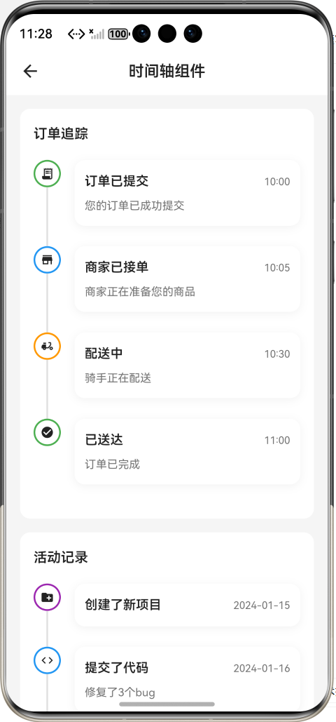
九、总结
本文详细介绍了如何在 Flutter + OpenHarmony 环境中开发一个功能完善的时间轴组件。该组件具备以下技术亮点:
🎯 灵活的布局系统 - 三种对齐方式适配不同场景
🎨 丰富的视觉样式 - 三种内容样式满足设计需求
⚡ 流畅的动画效果 - 入场动画提升用户体验
🔧 高度可定制 - 颜色、尺寸、间距全面可控
实际应用场景 :
- 订单物流追踪
- 项目进度展示
- 用户操作历史
- 版本更新日志
- 社交动态时间线

作为“人工智能6S店”的官方数字引擎,为AI开发者与企业提供一个覆盖软硬件全栈、一站式门户。
更多推荐
 11
11 0
0- 0


 已为社区贡献55条内容

所有评论(0)