
Flutter for OpenHarmony 实战:天气预报应用UI设计与主题切换
摘要 本文详细介绍了基于Flutter for OpenHarmony平台的天气预报应用UI设计实践。主要内容包括:1) 遵循Material Design原则的卡片式布局设计,强调信息层次清晰和视觉舒适度;2) 当前天气卡片的实现技巧,包含渐变背景、大字号温度显示和天气图标;3) 天气详情卡片的网格布局方式,展示湿度、风向等多维度数据。文章通过具体代码示例展示了如何在鸿蒙平台上构建美观实用的天气
Flutter for OpenHarmony 实战:天气预报应用UI设计与主题切换
文章目录
摘要
优秀的用户界面是提升应用体验的关键。本文以天气预报应用为例,深入讲解Flutter for OpenHarmony平台上的UI设计技巧,包括卡片式布局、主题切换系统、响应式设计、状态反馈等内容。通过本文学习,读者将掌握Flutter的Widget组合技巧,了解Material Design设计语言在鸿蒙平台上的实现方法。
一、UI设计原则与布局策略
1.1 天气应用UI设计原则
信息层次清晰
- 主要信息(温度、天气)突出显示
- 次要信息(湿度、风力)按重要性排列
- 辅助信息(更新时间)低调呈现
视觉舒适度
- 色彩搭配柔和,避免刺眼
- 留白充足,不拥挤
- 字体大小适中,易读性强
操作便捷性
- 常用功能(切换城市)易于触达
- 状态反馈及时明确
- 错误提示友好清晰
1.2 整体布局结构
天气预报应用采用垂直滚动的单页面布局:
AppBar (固定顶部)
    ↓
SingleChildScrollView (可滚动区域)
    ├── CitySelector (城市选择器)
    ├── CurrentWeatherCard (当前天气卡片)
    ├── WeatherDetails (天气详情网格)
    └── ForecastSection (未来预报列表)
布局优势
- 单页面减少导航复杂性
- 垂直滚动适合信息展示
- 模块化设计便于维护
1.3 布局Widget选择
| Widget | 用途 | 特点 |
|---|---|---|
| Column | 垂直排列子组件 | 主轴为垂直方向 |
| Row | 水平排列子组件 | 主轴为水平方向 |
| Container | 单个子组件容器 | 支持装饰和变换 |
| Expanded | 占据剩余空间 | 按比例分配空间 |
| SingleChildScrollView | 可滚动区域 | 支持单个子组件 |
二、卡片式组件设计
2.1 卡片设计规范
卡片是Material Design的核心组件,特点包括:
视觉特征
- 圆角边界(通常8-16px)
- 投影效果营造层次
- 内边距保证内容不拥挤
- 纯色或渐变背景
功能特征
- 独立的信息单元
- 可点击触发操作
- 支持动画过渡
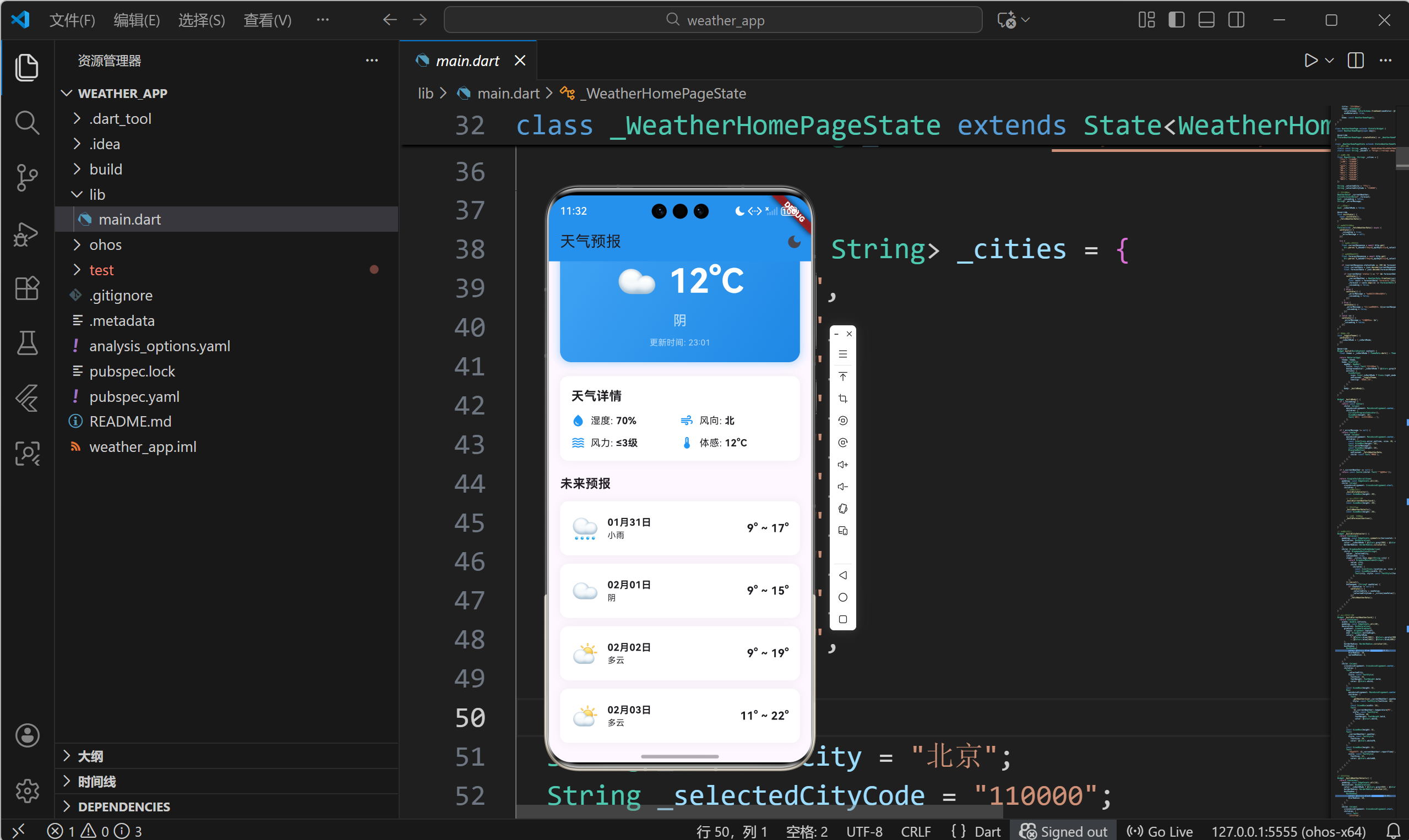
2.2 当前天气卡片
当前天气卡片是应用的视觉焦点:
Widget _buildCurrentWeatherCard() {
  return Container(
    width: double.infinity,
    padding: const EdgeInsets.all(20),
    decoration: BoxDecoration(
      // 渐变背景
      gradient: LinearGradient(
        begin: Alignment.topLeft,
        end: Alignment.bottomRight,
        colors: _isDarkMode
            ? [Colors.blue[900]!, Colors.purple[900]!]
            : [Colors.blue[400]!, Colors.blue[600]!],
      ),
      // 圆角
      borderRadius: BorderRadius.circular(16),
      // 阴影效果
      boxShadow: [
        BoxShadow(
          color: Colors.blue.withOpacity(0.3),
          blurRadius: 10,
          spreadRadius: 2,
        ),
      ],
    ),
    child: Column(
      crossAxisAlignment: CrossAxisAlignment.center,
      children: [
        // 城市名称
        Text(
          _selectedCity,
          style: const TextStyle(
            fontSize: 24,
            fontWeight: FontWeight.bold,
            color: Colors.white,
          ),
        ),
        const SizedBox(height: 8),

        // 天气图标和温度
        Row(
          mainAxisAlignment: MainAxisAlignment.center,
          children: [
            Text(
              _getWeatherIcon(_currentWeather!.weather),
              style: const TextStyle(fontSize: 48),
            ),
            const SizedBox(width: 16),
            Text(
              '${_currentWeather!.temperature}°C',
              style: const TextStyle(
                fontSize: 48,
                fontWeight: FontWeight.bold,
                color: Colors.white,
              ),
            ),
          ],
        ),
        const SizedBox(height: 8),

        // 天气描述
        Text(
          _currentWeather!.weather,
          style: const TextStyle(
            fontSize: 20,
            color: Colors.white70,
          ),
        ),
        const SizedBox(height: 8),

        // 更新时间
        Text(
          '更新时间: ${_currentWeather!.reportTime}',
          style: const TextStyle(
            fontSize: 12,
            color: Colors.white60,
          ),
        ),
      ],
    ),
  );
}
设计要点分析
- 渐变背景增强视觉吸引力
- 大字号温度突出核心信息
- 天气图标增加趣味性
- 白色文字确保可读性
2.3 天气详情卡片
天气详情采用网格布局展示多维度数据:
Widget _buildWeatherDetails() {
  return Container(
    padding: const EdgeInsets.all(16),
    decoration: BoxDecoration(
      color: _isDarkMode ? Colors.grey[850] : Colors.white,
      borderRadius: BorderRadius.circular(12),
      boxShadow: [
        BoxShadow(
          color: Colors.black.withOpacity(0.05),
          blurRadius: 10,
        ),
      ],
    ),
    child: Column(
      crossAxisAlignment: CrossAxisAlignment.start,
      children: [
        const Text(
          '天气详情',
          style: TextStyle(
            fontSize: 18,
            fontWeight: FontWeight.bold,
          ),
        ),
        const SizedBox(height: 12),

        // 第一行:湿度和风向
        Row(
          children: [
            Expanded(
              child: _buildDetailItem(
                Icons.water_drop,
                '湿度',
                '${_currentWeather!.humidity}%',
              ),
            ),
            Expanded(
              child: _buildDetailItem(
                Icons.air,
                '风向',
                _currentWeather!.windDirection,
              ),
            ),
          ],
        ),
        const SizedBox(height: 12),

        // 第二行:风力和体感
        Row(
          children: [
            Expanded(
              child: _buildDetailItem(
                Icons.waves,
                '风力',
                '${_currentWeather!.windPower}级',
              ),
            ),
            Expanded(
              child: _buildDetailItem(
                Icons.thermostat,
                '体感',
                '${_currentWeather!.temperature}°C',
              ),
            ),
          ],
        ),
      ],
    ),
  );
}

Widget _buildDetailItem(IconData icon, String label, String value) {
  return Row(
    children: [
      Icon(icon, size: 20, color: Colors.blue),
      const SizedBox(width: 8),
      Text(
        '$label: ',
        style: const TextStyle(fontSize: 14),
      ),
      Text(
        value,
        style: const TextStyle(
          fontSize: 14,
          fontWeight: FontWeight.bold,
        ),
      ),
    ],
  );
}
布局技巧
- 使用Row和Expanded实现2x2网格
- 图标增强信息识别度
- Expanded确保等宽分布
- SizedBox控制行间距
2.4 预报卡片列表
Widget _buildForecastSection() {
  return Column(
    crossAxisAlignment: CrossAxisAlignment.start,
    children: [
      const Text(
        '未来预报',
        style: TextStyle(
          fontSize: 18,
          fontWeight: FontWeight.bold,
        ),
      ),
      const SizedBox(height: 12),
      // 使用展开运算符生成卡片列表
      ...(_forecast?.map((data) => _buildForecastCard(data)) ?? []),
    ],
  );
}

Widget _buildForecastCard(ForecastData data) {
  return Container(
    margin: const EdgeInsets.only(bottom: 12),
    padding: const EdgeInsets.all(16),
    decoration: BoxDecoration(
      color: _isDarkMode ? Colors.grey[850] : Colors.white,
      borderRadius: BorderRadius.circular(12),
      boxShadow: [
        BoxShadow(
          color: Colors.black.withOpacity(0.05),
          blurRadius: 10,
        ),
      ],
    ),
    child: Row(
      mainAxisAlignment: MainAxisAlignment.spaceBetween,
      children: [
        // 左侧:图标和日期
        Row(
          children: [
            Text(
              _getWeatherIcon(data.dayWeather),
              style: const TextStyle(fontSize: 32),
            ),
            const SizedBox(width: 12),
            Column(
              crossAxisAlignment: CrossAxisAlignment.start,
              children: [
                Text(
                  data.date,
                  style: const TextStyle(
                    fontSize: 14,
                    fontWeight: FontWeight.bold,
                  ),
                ),
                Text(
                  data.dayWeather,
                  style: const TextStyle(fontSize: 12),
                ),
              ],
            ),
          ],
        ),
        // 右侧:温度范围
        Text(
          '${data.nightTemp}° ~ ${data.dayTemp}°',
          style: const TextStyle(
            fontSize: 16,
            fontWeight: FontWeight.bold,
          ),
        ),
      ],
    ),
  );
}
设计特点
- 每个预报项独立成卡片
- 日期和天气描述垂直排列
- 温度范围右对齐突出显示
- 底部间距分隔各卡片
三、主题系统实现
3.1 Flutter主题系统概述
Flutter使用ThemeData统一定义应用的外观:
MaterialApp(
  theme: ThemeData(
    // 主色调
    primarySwatch: Colors.blue,

    // 卡片主题
    cardTheme: CardTheme(
      elevation: 4,
      shape: RoundedRectangleBorder(
        borderRadius: BorderRadius.circular(12),
      ),
    ),

    // 文本主题
    textTheme: TextTheme(
      titleLarge: TextStyle(fontSize: 24),
    ),
  ),
  home: MyHomePage(),
);
3.2 日间/夜间主题切换
状态管理
class _WeatherHomePageState extends State<WeatherHomePage> {
  bool _isDarkMode = false;

  void _toggleTheme() {
    setState(() {
      _isDarkMode = !_isDarkMode;
    });
  }
}
动态应用主题
Widget build(BuildContext context) {
// 根据状态创建主题
final theme = _isDarkMode ? ThemeData.dark() : ThemeData.light();
return MaterialApp(
theme: theme,
home: Scaffold(
appBar: AppBar(
backgroundColor: _isDarkMode ? Colors.grey[900] : Colors.blue,
title: const Text('天气预报'),
actions: [
// 主题切换按钮
IconButton(
icon: Icon(_isDarkMode ? Icons.light_mode : Icons.dark_mode),
onPressed: _toggleTheme,
tooltip: '切换主题',
),
],
),
body: _buildBody(),
),
);
}
3.3 组件级主题适配
所有UI组件都需要根据主题模式调整颜色:
// 背景色适配
decoration: BoxDecoration(
  color: _isDarkMode ? Colors.grey[850] : Colors.white,
),

// 文字颜色适配
style: TextStyle(
  color: _isDarkMode ? Colors.white70 : Colors.black87,
),

// 图标颜色适配
Icon(
  Icons.location_on,
  color: _isDarkMode ? Colors.blue[300] : Colors.blue[700],
),
3.4 渐变色主题适配
decoration: BoxDecoration(
  gradient: LinearGradient(
    begin: Alignment.topLeft,
    end: Alignment.bottomRight,
    // 根据主题使用不同渐变
    colors: _isDarkMode
        ? [Colors.blue[900]!, Colors.purple[900]!]
        : [Colors.blue[400]!, Colors.blue[600]!],
  ),
),
四、响应式布局适配
4.1 屏幕尺寸适配
使用MediaQuery获取屏幕信息:
Widget build(BuildContext context) {
  // 获取屏幕宽度
  final screenWidth = MediaQuery.of(context).size.width;

  // 根据屏幕宽度调整布局
  final crossAxisCount = screenWidth > 600 ? 2 : 1;

  return GridView.count(
    crossAxisCount: crossAxisCount,
    // ...
  );
}
4.2 使用Expanded实现弹性布局
Row(
  children: [
    // 固定宽度
    Container(
      width: 50,
      child: Icon(Icons.menu),
    ),
    // 占据剩余空间
    Expanded(
      child: Text('标题'),
    ),
    // 固定宽度
    Container(
      width: 50,
      child: Icon(Icons.search),
    ),
  ],
)
4.3 使用AspectRatio保持宽高比
AspectRatio(
  aspectRatio: 16 / 9,
  child: Container(
    // 内容
  ),
)
4.4 使用Flexible和Expanded
Row(
  children: [
    // Flexible按比例分配空间
    Flexible(
      flex: 1,
      child: Container(color: Colors.red),
    ),
    Flexible(
      flex: 2,
      child: Container(color: Colors.blue),
    ),
    // Expanded占据所有剩余空间
    Expanded(
      child: Container(color: Colors.green),
    ),
  ],
)
五、加载状态与错误提示
5.1 三种状态设计
应用需要处理三种主要状态:
enum LoadingState {
  loading,    // 加载中
  success,    // 成功
  error,      // 错误
}
5.2 加载状态UI
if (_isLoading) {
  return const Center(
    child: Column(
      mainAxisAlignment: MainAxisAlignment.center,
      children: [
        CircularProgressIndicator(),
        SizedBox(height: 16),
        Text('正在加载天气数据...'),
      ],
    ),
  );
}
设计要点
- CircularProgressIndicator提供视觉反馈
- 文字说明当前操作
- 垂直居中排列
5.3 错误状态UI
if (_errorMessage != null) {
  return Center(
    child: Column(
      mainAxisAlignment: MainAxisAlignment.center,
      children: [
        // 错误图标
        const Icon(
          Icons.error_outline,
          size: 48,
          color: Colors.red,
        ),
        const SizedBox(height: 16),
        // 错误信息
        Text(_errorMessage!),
        const SizedBox(height: 16),
        // 重试按钮
        ElevatedButton(
          onPressed: _fetchWeatherData,
          child: const Text('重试'),
        ),
      ],
    ),
  );
}
5.4 空状态UI
if (_currentWeather == null) {
  return const Center(
    child: Column(
      mainAxisAlignment: MainAxisAlignment.center,
      children: [
        Icon(
          Icons.cloud_off,
          size: 64,
          color: Colors.grey,
        ),
        SizedBox(height: 16),
        Text(
          '暂无天气数据',
          style: TextStyle(
            fontSize: 16,
            color: Colors.grey,
          ),
        ),
      ],
    ),
  );
}
六、动画与交互优化
6.1 AnimatedSwitcher实现淡入淡出
AnimatedSwitcher(
  duration: const Duration(milliseconds: 300),
  child: _isLoading
      ? const CircularProgressIndicator(key: ValueKey('loading'))
      : const Icon(Icons.check, key: ValueKey('success')),
)
6.2 按钮点击效果
ElevatedButton(
  style: ElevatedButton.styleFrom(
    // 点击时的缩放效果
    animationDuration: const Duration(milliseconds: 100),
  ),
  onPressed: () {},
  child: const Text('刷新'),
)
6.3 列表项滑动动画
ListView.builder(
  itemBuilder: (context, index) {
    return TweenAnimationBuilder(
      duration: Duration(milliseconds: 300 + index * 50),
      tween: Tween(begin: 0.0, end: 1.0),
      builder: (context, double value, child) {
        return Opacity(
          opacity: value,
          child: Transform.translate(
            offset: Offset(0, 50 * (1 - value)),
            child: child,
          ),
        );
      },
      child: _buildForecastCard(_forecast![index]),
    );
  },
)
6.4 手势交互
GestureDetector(
  onTap: () {
    // 点击处理
  },
  onLongPress: () {
    // 长按处理
  },
  child: Container(
    // 内容
  ),
)
七、完整UI代码解析
7.1 城市选择器
Widget _buildCitySelector() {
  return Container(
    padding: const EdgeInsets.symmetric(horizontal: 12),
    decoration: BoxDecoration(
      color: _isDarkMode ? Colors.grey[800] : Colors.grey[200],
      borderRadius: BorderRadius.circular(8),
    ),
    child: DropdownButtonHideUnderline(
      child: DropdownButton<String>(
        value: _selectedCity,
        isExpanded: true,
        dropdownColor: _isDarkMode ? Colors.grey[800] : Colors.white,
        style: TextStyle(
          color: _isDarkMode ? Colors.white : Colors.black,
          fontSize: 16,
        ),
        items: _cities.keys.map((String city) {
          return DropdownMenuItem<String>(
            value: city,
            child: Row(
              children: [
                const Icon(Icons.location_on, size: 20),
                const SizedBox(width: 8),
                Text(city),
              ],
            ),
          );
        }).toList(),
        onChanged: (String? newValue) {
          if (newValue != null) {
            setState(() {
              _selectedCity = newValue;
              _selectedCityCode = _cities[newValue]!;
            });
            _fetchWeatherData();
          }
        },
      ),
    ),
  );
}
7.2 天气图标映射
String _getWeatherIcon(String weather) {
  if (weather.contains('晴')) return '☀️';
  if (weather.contains('多云')) return '⛅';
  if (weather.contains('阴')) return '☁️';
  if (weather.contains('雨')) return '🌧️';
  if (weather.contains('雪')) return '❄️';
  if (weather.contains('雾') || weather.contains('霾')) return '🌫️';
  return '🌤️';
}
7.3 主题切换按钮
AppBar(
  backgroundColor: _isDarkMode ? Colors.grey[900] : Colors.blue,
  title: const Text('天气预报'),
  actions: [
    IconButton(
      icon: Icon(_isDarkMode ? Icons.light_mode : Icons.dark_mode),
      onPressed: _toggleTheme,
      tooltip: '切换主题',
    ),
  ],
)
7.4 滚动视图包装
SingleChildScrollView(
  padding: const EdgeInsets.all(16),
  child: Column(
    crossAxisAlignment: CrossAxisAlignment.start,
    children: [
      _buildCitySelector(),
      const SizedBox(height: 20),
      _buildCurrentWeatherCard(),
      const SizedBox(height: 20),
      _buildWeatherDetails(),
      const SizedBox(height: 20),
      _buildForecastSection(),
    ],
  ),
)

八、总结
本文深入讲解了天气预报应用的UI设计与主题切换实现,主要内容包括:
- 卡片式设计:使用Container、BoxDecoration创建美观的卡片组件
- 布局技巧:熟练运用Row、Column、Expanded等Widget
- 主题系统:实现日间/夜间模式切换
- 状态反馈:提供加载、错误、空状态的友好提示
- 响应式设计:适配不同屏幕尺寸
- 交互动画:增强用户体验的细节优化
优秀的UI设计不仅要美观,更要注重用户体验。通过合理的信息层次、清晰的视觉反馈、流畅的交互动画,可以打造出让用户喜爱的应用。Flutter提供了强大的UI工具,开发者可以充分发挥创意,创造出独特而精美的界面。
欢迎加入开源鸿蒙跨平台社区: 开源鸿蒙跨平台开发者社区

作为“人工智能6S店”的官方数字引擎,为AI开发者与企业提供一个覆盖软硬件全栈、一站式门户。
更多推荐

 22
22 0
0- 0


 已为社区贡献6条内容

所有评论(0)