
# React Native 全能商城应用实现与鸿蒙跨端适配深度解析 电商类应用是移动端开发的核心场景之一,涵盖商品展示、分类导航、推荐系统、商家模块、交互操作等复杂业务逻辑。这份 React Na
数据模型是基础:强类型的数据模型设计是跨端适配的核心,保证两端数据流转逻辑一致;组件化适配效率最高:按组件维度拆分迁移,可实现 80% 以上的代码复用,降低适配成本;视觉体验一致性关键:统一的样式规范、交互反馈,是电商应用跨端的用户体验保障;原生能力提升体验:鸿蒙端可利用原生 API 增强功能(支付、存储、性能),超越 RN 端体验。这款 React Native 全能商城应用的跨端适配实践,验证
React Native 全能商城应用实现与鸿蒙跨端适配深度解析
电商类应用是移动端开发的核心场景之一,涵盖商品展示、分类导航、推荐系统、商家模块、交互操作等复杂业务逻辑。这份 React Native 全能商城代码,采用组件化、强类型、高性能渲染的设计思路,完整实现了电商 App 首页的核心功能,同时具备极佳的跨端适配潜力。本文将从 React Native 原生技术架构、核心功能实现亮点、鸿蒙(HarmonyOS)跨端适配方案 三个维度,深度拆解这款商城应用的技术实现,并提供可落地的鸿蒙迁移路径。
一、React Native 原生端核心技术架构解析
1. 强类型数据模型设计
应用基于 TypeScript 构建,首先定义了电商场景的核心数据类型,包括 Product(商品)、Store(商家)、Category(分类)、Recommendation(推荐)四大核心接口,覆盖电商首页的所有数据维度:
Product类型:包含价格体系(现价/原价/折扣)、评分体系(评分/评论数)、商家信息、分类标签、收藏状态等完整字段,支持多维度商品展示;Store类型:聚焦商家核心信息(名称/评分/商品数/认证状态),满足商家模块的展示与交互需求;Category类型:关联分类名称与图标,为分类导航提供数据支撑;Recommendation类型:封装推荐模块的标题、描述与关联商品列表,实现推荐系统的结构化设计。
这种强类型设计不仅在编码阶段规避类型错误,更让数据流转逻辑清晰可追溯,为后续跨端适配提供了统一的数据标准,避免两端数据格式不一致导致的适配问题。
2. 组件化与复用设计
应用遵循组件化拆分原则,将核心 UI 模块拆分为独立的渲染函数与组件,大幅提升代码复用性与可维护性:
- 基础渲染函数:
renderProduct/renderCategory/renderRecommendation/renderStore分别负责商品、分类、推荐、商家的渲染逻辑,单一职责明确; - 独立组件封装:将分类卡片抽离为
CategoryCard独立组件,支持外部传入数据与点击事件,实现组件级复用; - 样式模块化:通过
StyleSheet.create统一管理样式,按功能模块(商品卡片、分类卡片、推荐模块等)组织样式,语义化命名(如productCard/categoryCard)提升可读性。
组件化设计的核心价值在于,跨端适配时可按组件维度逐一迁移,避免整体重构带来的风险,同时保证两端组件逻辑的一致性。
3. 高性能列表渲染策略
电商首页包含大量列表数据(商品列表、分类列表、商家列表、推荐列表),应用针对不同场景选择了最优的渲染方案:
(1)多列商品列表:FlatList 多列渲染
<FlatList
  data={products}
  renderItem={renderProduct}
  keyExtractor={item => item.id}
  numColumns={2}
  columnWrapperStyle={styles.productRow}
  showsVerticalScrollIndicator={false}
/>
通过 numColumns={2} 实现商品卡片的两列布局,结合 columnWrapperStyle 控制列间距,相比手动 flex:1 分配宽度更稳定;关闭垂直滚动指示器(showsVerticalScrollIndicator={false})提升视觉体验,符合电商 App 的设计规范。
(2)横向滚动列表:ScrollView + FlatList 组合
- 分类导航、推荐模块、商家列表均采用横向滚动设计,其中分类导航使用
ScrollView结合map渲染(数据量小,性能无压力); - 推荐模块、商家列表使用
FlatList并开启horizontal模式,支持虚拟化渲染,即便数据量增大也能保证流畅性; - 推荐模块额外开启
pagingEnabled,实现推荐卡片的整页滑动,提升用户体验。
这种差异化的渲染策略,既保证了小数据量场景的开发效率,又兼顾了大数据量场景的性能表现,是 React Native 电商应用的最佳实践。
4. 交互体验与视觉设计
电商应用的核心竞争力之一是用户体验,这款应用在交互与视觉设计上具备多个亮点:
(1)精细化视觉层级
- 价格体系:现价(红色加粗)、原价(灰色删除线)、折扣标签(红色角标)形成鲜明对比,突出价格优势;
- 状态反馈:收藏按钮通过心形 Emoji 切换(❤️/🤍),直观反馈收藏状态;
- 标签系统:商品标签采用浅蓝色背景 + 蓝色文字,视觉统一且不抢主体;
- 商家认证:已认证商家添加绿色对勾徽章,强化信任背书;
- 购物车角标:使用绝对定位的红色角标展示购物车数量,符合电商用户操作习惯。
(2)沉浸式交互设计
- 商品卡片:整体可点击进入详情,收藏/加购按钮独立悬浮,操作互不干扰;
- 进度反馈:所有可点击元素均使用
TouchableOpacity,点击时透明度变化提供即时反馈; - 手势支持:进度条、横向列表支持滑动/点击操作,符合移动端交互习惯;
- 弹窗提示:收藏/加购/分类点击等操作通过
Alert.alert给出反馈,为后续业务逻辑扩展预留接口。
(3)响应式布局适配
通过 Dimensions.get('window') 获取屏幕宽高,结合 Flex 弹性布局实现不同尺寸设备的自适应:
- 商品图片宽度设为
100%,高度固定为 120px,保证不同屏幕下的展示比例; - 分类卡片宽度固定为 70px,横向滚动适配不同屏幕宽度;
- 底部导航采用
flex:1均分宽度,适配所有设备的底部栏展示。
5. 状态管理与业务逻辑
应用采用 useState 实现轻量级状态管理,核心业务逻辑聚焦交互操作:
- 收藏切换:
toggleFavorite函数通过商品 ID 定位目标商品,给出收藏/取消收藏的反馈; - 加入购物车:
addToCart函数封装加购逻辑,弹窗提示操作结果; - 商品详情:
viewProduct函数接收商品 ID,弹窗展示商品名称,为后续跳转详情页预留接口; - 分类/商家/推荐点击:统一通过弹窗反馈,保持交互逻辑的一致性。
状态设计遵循不可变数据原则,所有状态更新均通过 setState 实现,避免直接修改原数据导致的 UI 渲染异常,符合 React 状态管理的核心思想。
二、鸿蒙(HarmonyOS)跨端适配核心方案
将 React Native 商城应用迁移至鸿蒙平台,核心是基于 ArkTS + ArkUI 实现数据模型、组件渲染、交互逻辑、样式系统的对等还原,以下是关键适配技术点:
1. 数据模型与状态管理适配
RN 的 TypeScript 类型定义可直接迁移至鸿蒙 ArkTS,仅需调整语法格式:
// RN 类型定义
type Product = {
  id: string;
  name: string;
  price: number;
  originalPrice?: number;
  // 其他字段...
};

// 鸿蒙 ArkTS 适配
interface Product {
  id: string;
  name: string;
  price: number;
  originalPrice?: number;
  // 其他字段完全复用...
}
状态管理层面,RN 的 useState 对应鸿蒙的 @State 装饰器,核心状态迁移方案:
// RN 状态定义
const [products] = useState<Product[]>([/* 商品数据 */]);

// 鸿蒙 ArkTS 适配
@Entry
@Component
struct MallApp {
  // 核心状态(与RN一一对应)
  @State products: Product[] = [/* 商品数据 */];
  @State stores: Store[] = [/* 商家数据 */];
  @State categories: Category[] = [/* 分类数据 */];
  @State recommendations: Recommendation[] = [/* 推荐数据 */];

  // 交互函数完全复用RN逻辑
  toggleFavorite(productId: string) {
    AlertDialog.show({
      title: '收藏',
      message: `商品已${this.products.find(p => p.id === productId)?.isFavorite ? '取消收藏' : '收藏'}`,
      confirm: { text: '确定' }
    });
  }

  addToCart(productId: string) {
    AlertDialog.show({
      title: '加入购物车',
      message: '已将商品加入购物车',
      confirm: { text: '确定' }
    });
  }

  // 其他交互函数...
}
适配亮点:
- 数据结构完全复用,仅调整类型定义语法(
type→interface); - 状态管理逻辑一致,
@State同样支持响应式更新,状态变更自动触发 UI 渲染; - 交互函数逻辑零修改,仅将
Alert.alert替换为鸿蒙AlertDialog.show; - 保持不可变数据原则,状态更新通过直接赋值实现(ArkTS 无需展开运算符)。
2. 核心组件适配与映射
ArkUI 组件体系与 RN 组件高度对齐,核心组件映射关系及适配方案:
| RN 组件/特性 | 鸿蒙 ArkUI 对应实现 | 适配关键说明 |
|---|---|---|
SafeAreaView |
Column().safeArea(true) |
安全区域适配,避免状态栏/导航栏遮挡 |
ScrollView |
Scroll() |
纵向/横向滚动完全等效,horizontal → ScrollDirection.Horizontal |
FlatList |
List() + LazyForEach |
虚拟化列表渲染,支持多列、横向、分页等特性 |
TouchableOpacity |
Button().stateEffect(true) |
点击透明度反馈通过 stateEffect 实现 |
View |
Column/Row/Stack |
根据布局方向选择,Flex 布局属性完全兼容 |
Text |
Text |
文本样式、行数限制(numberOfLines → maxLines)等效 |
StyleSheet |
链式样式 + @Styles |
样式封装与复用,语法更简洁 |
| 绝对定位 | Stack + Position |
购物车角标、收藏按钮等绝对定位元素适配 |
| 多列布局 | Grid + GridItem |
替代 RN FlatList 的 numColumns |
核心组件适配示例
(1)商品列表多列布局适配
// RN 多列商品列表
<FlatList
  data={products}
  renderItem={renderProduct}
  keyExtractor={item => item.id}
  numColumns={2}
  columnWrapperStyle={styles.productRow}
/>

// 鸿蒙多列商品列表适配
Grid() {
  LazyForEach(this.products, (product: Product) => {
    GridItem() {
      // 商品卡片组件(对应 renderProduct)
      ProductCard({ product: product })
    }
  }, (product) => product.id)
}
.columnsTemplate('1fr 1fr') // 两列布局
.columnsGap(8) // 列间距
.rowsGap(8) // 行间距
(2)购物车角标适配
// RN 购物车角标
<TouchableOpacity style={styles.cartButton}>
  <Text style={styles.cartIcon}>🛒</Text>
  <View style={styles.cartBadge}>
    <Text style={styles.cartBadgeText}>3</Text>
  </View>
</TouchableOpacity>

// 鸿蒙购物车角标适配
Stack() {
  Button()
    .width(36)
    .height(36)
    .borderRadius(18)
    .backgroundColor('#f1f5f9')
    .justifyContent(FlexAlign.Center) {
      Text('🛒')
        .fontSize(18)
        .fontColor('#64748b');
    }

  // 角标绝对定位
  Text('3')
    .fontSize(10)
    .fontColor('#ffffff')
    .fontWeight(FontWeight.Bold)
    .backgroundColor('#ef4444')
    .borderRadius(8)
    .minWidth(16)
    .height(16)
    .textAlign(TextAlign.Center)
    .position({ x: 28, y: -4 }); // 绝对定位
}
3. 样式系统适配
RN 的 StyleSheet 样式在鸿蒙中通过链式样式 + @Styles 装饰器实现复用,核心适配规则:
// RN 样式定义
const styles = StyleSheet.create({
  productCard: {
    backgroundColor: '#ffffff',
    borderRadius: 12,
    padding: 12,
    margin: 8,
    flex: 1,
    elevation: 1,
    shadowColor: '#000',
    shadowOffset: { width: 0, height: 1 },
    shadowOpacity: 0.1,
    shadowRadius: 2,
  },
  // 其他样式...
});

// 鸿蒙样式适配
@Entry
@Component
struct MallApp {
  // 通用样式封装
  @Styles productCardStyle() {
    .backgroundColor('#ffffff')
    .borderRadius(12)
    .padding(12)
    .margin(8)
    .flex(1)
    .shadow({ // 阴影效果统一封装
      color: '#000',
      offsetX: 0,
      offsetY: 1,
      opacity: 0.1,
      radius: 2
    });
  }

  build() {
    Column() {
      // 商品卡片使用通用样式
      Column()
        .productCardStyle()
        .child(/* 商品内容 */);
    }
  }
}
适配亮点:
- 颜色、间距、圆角等基础样式完全复用,仅调整语法格式;
- 阴影效果通过
shadow统一配置,无需区分 iOS/安卓(RN 的elevation/shadow双配置); - 文本样式(字体大小、颜色、粗细)完全兼容,
textDecorationLine→textDecoration等效; - 条件样式通过
applyIf实现,如收藏状态切换:.applyIf(product.isFavorite, { fontColor: '#ef4444' })。
4. 性能优化适配
鸿蒙端可基于原生能力进一步优化性能,提升商城应用的用户体验:
- 列表虚拟化:使用
LazyForEach替代简单循环,实现商品列表的懒加载,仅渲染可视区域内的商品; - 图片缓存:鸿蒙
Image组件原生支持图片缓存,替换 RN 的 Base64 图标为网络图片时,可配置缓存策略; - 布局预加载:通过
visibility控制非首屏内容的加载时机,提升首屏渲染速度; - 事件防抖:对搜索、加购等高频操作添加防抖处理,避免重复请求。
三、跨端适配工程化最佳实践
1. 核心适配原则
- 数据层优先复用:商品、商家、分类等核心数据模型完全复用,仅调整类型定义语法;
- 组件逻辑对齐:保持 RN 与鸿蒙组件的渲染逻辑一致,避免功能差异;
- 视觉体验统一:复用相同的色值、间距、圆角、字体,保证两端视觉体验一致;
- 原生能力增强:鸿蒙端替换模拟逻辑为原生 API(如网络请求、本地存储、支付集成)。
2. 扩展优化方向
- 网络请求适配:RN 的
fetch/axios替换为鸿蒙http原生 API,实现真实商品数据请求; - 本地存储适配:收藏状态、购物车数据通过鸿蒙
Preferences实现持久化存储; - 支付能力集成:接入鸿蒙支付 SDK,替代模拟的加购逻辑;
- 主题适配:支持鸿蒙深色模式,实现跟随系统的主题切换;
- 性能监控:接入鸿蒙性能分析工具,优化列表渲染、图片加载等核心场景。
总结
- 数据模型是基础:强类型的数据模型设计是跨端适配的核心,保证两端数据流转逻辑一致;
- 组件化适配效率最高:按组件维度拆分迁移,可实现 80% 以上的代码复用,降低适配成本;
- 视觉体验一致性关键:统一的样式规范、交互反馈,是电商应用跨端的用户体验保障;
- 原生能力提升体验:鸿蒙端可利用原生 API 增强功能(支付、存储、性能),超越 RN 端体验。
这款 React Native 全能商城应用的跨端适配实践,验证了 ArkTS 与 React 技术体系的高度兼容性。对于电商类应用而言,核心的商品展示、分类导航、推荐系统等逻辑均可实现低成本迁移,仅需适配 UI 组件与原生 API 调用,是跨端开发的高效路径。
React Native 商城应用架构设计与跨端实现解析
核心架构分析
在移动应用开发中,商城应用是一种复杂的应用类型,需要考虑商品展示、分类浏览、推荐系统、用户交互等多个方面。本文将深入分析一个功能完备的 React Native 商城应用实现,探讨其架构设计、数据结构、用户交互以及跨端兼容性策略。
组件化架构设计
该实现采用了清晰的单组件架构,主要包含以下部分:
- 主应用组件 (
MallApp) - 负责整体布局和状态管理 - 商品列表 - 展示商品卡片,包含商品名称、价格、评分等信息
- 商家列表 - 展示商家信息,包含商家名称、评分、商品数量等
- 分类导航 - 展示商品分类,方便用户按分类浏览
- 推荐系统 - 展示个性化推荐和限时抢购等推荐内容
- 功能按钮 - 提供收藏、加入购物车、查看详情等功能
这种架构设计使得代码结构清晰,易于维护。主应用组件负责管理全局状态和业务逻辑,而各个UI部分则负责具体的展示,实现了关注点分离。
状态管理策略
MallApp 组件使用 useState 钩子管理多个关键状态:
const [products] = useState<Product[]>([...]);
const [stores] = useState<Store[]>([...]);
const [categories] = useState<Category[]>([...]);
const [recommendations] = useState<Recommendation[]>([...]);
这种状态管理方式简洁高效,通过状态更新触发组件重新渲染,实现了商城应用的各种功能。使用 TypeScript 类型定义确保了数据结构的类型安全,提高了代码的可靠性。
数据结构设计
类型定义
该实现使用 TypeScript 定义了四个核心数据类型:
- Product - 商品类型,包含商品的完整信息,如 ID、名称、价格、原价、评分、评论数、商家、分类、图片、收藏状态、折扣和标签
- Store - 商家类型,包含商家的 ID、名称、评分、商品数量和认证状态
- Category - 分类类型,包含分类的 ID、名称和图标
- Recommendation - 推荐类型,包含推荐的 ID、标题、描述和商品列表
这些类型定义使得数据结构更加清晰,提高了代码的可读性和可维护性,同时也提供了类型安全保障。使用可选属性(如 originalPrice、imageUrl、discount、tags)使得数据结构更加灵活,能够适应不同类型的商品。
数据组织
应用数据按照功能模块进行组织:
- products - 商品列表,包含所有可展示的商品
- stores - 商家列表,包含所有可展示的商家
- categories - 分类列表,包含所有商品分类
- recommendations - 推荐列表,包含个性化推荐和限时抢购等推荐内容
这种数据组织方式使得数据管理更加清晰,易于扩展和维护。
核心功能实现
商品管理
应用实现了完整的商品管理功能:
- 商品展示 - 展示商品的名称、价格、评分、评论数、商家等信息
- 价格对比 - 显示当前价格和原价,突出折扣
- 收藏功能 - 允许用户收藏商品,方便以后查看
- 加入购物车 - 允许用户将商品加入购物车
- 查看详情 - 允许用户查看商品的详细信息
这种实现方式为用户提供了便捷的商品浏览和购买体验,满足了商城应用的基本功能需求。
商家管理
应用实现了商家管理功能:
- 商家展示 - 展示商家的名称、评分、商品数量和认证状态
- 商家筛选 - 可以按商家筛选商品
这种实现方式为用户提供了商家信息的透明展示,帮助用户做出更明智的购买决策。
分类导航
应用实现了商品分类导航功能:
- 分类展示 - 展示商品分类,包含分类名称和图标
- 分类筛选 - 可以按分类筛选商品
这种实现方式为用户提供了便捷的商品分类浏览体验,帮助用户快速找到感兴趣的商品。
推荐系统
应用实现了推荐系统功能:
- 个性化推荐 - 为用户推荐个性化商品
- 限时抢购 - 展示限时优惠商品
这种实现方式为用户提供了个性化的商品推荐,提高了商品的曝光率和转化率。
界面设计与用户体验
布局结构
应用界面采用了清晰的层次结构:
- 顶部 - 显示应用标题和搜索栏
- 分类导航 - 显示商品分类,方便用户按分类浏览
- 推荐区域 - 显示个性化推荐和限时抢购等推荐内容
- 商品列表 - 显示商品卡片,包含商品的详细信息
- 商家列表 - 显示商家信息,包含商家的详细信息
这种布局结构符合用户的使用习惯,用户可以通过滚动查看完整的商城内容。
视觉设计
应用实现了丰富的视觉设计元素:
- 商品卡片 - 清晰展示商品信息,包含图片、名称、价格、评分等
- 价格展示 - 突出显示当前价格,对比显示原价和折扣
- 标签系统 - 使用标签显示商品的特性,如热销、推荐等
- 评分系统 - 显示商品和商家的评分,帮助用户做出购买决策
- 图标使用 - 使用 Unicode 表情符号作为分类图标,增强视觉效果
这些视觉设计元素使得用户界面更加美观,用户体验更加良好。
交互设计
应用实现了直观的交互设计:
- 商品点击 - 点击商品卡片查看详情
- 收藏按钮 - 点击收藏按钮收藏或取消收藏商品
- 加入购物车 - 点击加入购物车按钮将商品加入购物车
- 分类点击 - 点击分类切换商品分类
- 滚动 - 通过滚动查看更多商品和推荐内容
这些交互设计元素共同构成了良好的用户体验,使得商城浏览和购物操作简单直观。
跨端兼容性设计
React Native 与鸿蒙跨端考虑
在设计跨端商城应用时,需要特别关注以下几个方面:
- 组件 API 兼容性 - 确保使用的 React Native 组件在鸿蒙系统上有对应实现
- 样式系统差异 - 不同平台对样式的支持程度不同,需要确保样式在两端都能正常显示
- 图片加载 - 不同平台的图片加载机制可能存在差异
- 触摸事件处理 - 不同平台的触摸事件机制可能存在差异
- Alert 组件 - 不同平台的 Alert 组件行为可能存在差异
适配策略
针对上述问题,该实现采用了以下适配策略:
- 使用 React Native 核心组件 - 优先使用 React Native 内置的组件,如 SafeAreaView、ScrollView、TouchableOpacity、FlatList 等
- 统一的样式定义 - 使用 StyleSheet.create 定义样式,确保样式在不同平台上的一致性
- Base64 图标 - 使用 Base64 编码的图标,确保图标在不同平台上的一致性
- 平台无关的图标 - 使用 Unicode 表情符号作为分类图标,避免使用平台特定的图标库
- 简化的交互逻辑 - 使用简单直接的交互逻辑,减少平台差异带来的问题
- 使用标准的 Alert API - 使用 React Native 内置的 Alert 组件,它在不同平台上有对应实现
性能优化策略
渲染优化
- 列表优化 - 使用 FlatList 渲染商品列表和商家列表,提高长列表的渲染性能
- 条件渲染 - 只在需要时渲染特定的 UI 元素,如原价、折扣标签等
- 组件拆分 - 将商品卡片、商家信息、分类等拆分为独立的组件,提高渲染性能
- 样式复用 - 通过样式数组和条件样式,复用样式定义,减少样式计算开销
内存优化
- 状态管理 - 避免过度的状态更新,减少内存使用
- 按需加载 - 对于大量商品数据,考虑使用分页或虚拟滚动技术
- 图片优化 - 使用适当大小的图片,避免加载过大的图片
计算优化
- 减少重复计算 - 将价格计算逻辑封装为函数,避免在渲染过程中重复计算
- 优化筛选逻辑 - 使用高效的筛选逻辑,减少筛选开销
可扩展性设计
配置化设计
该实现采用了高度配置化的设计,通过数据结构可以灵活配置应用的行为:
- 商品数据 - 通过修改
products数组,可以轻松添加或修改商品 - 商家数据 - 通过修改
stores数组,可以轻松添加或修改商家 - 分类数据 - 通过修改
categories数组,可以轻松添加或修改分类 - 推荐数据 - 通过修改
recommendations数组,可以轻松添加或修改推荐内容 - 界面样式 - 通过修改样式定义,可以调整应用的外观
功能扩展
该实现为应用的功能扩展提供了基础架构:
- 搜索功能 - 可以添加搜索功能,根据关键词搜索商品
- 购物车 - 可以添加购物车功能,管理已加入购物车的商品
- 订单管理 - 可以添加订单管理功能,查看和管理订单
- 用户中心 - 可以添加用户中心,管理用户信息和收货地址
- 支付功能 - 可以添加支付功能,支持在线支付
- 物流跟踪 - 可以添加物流跟踪功能,跟踪商品的配送状态
- 评价系统 - 可以添加商品评价功能,查看和提交商品评价
- 优惠券 - 可以添加优惠券功能,支持使用优惠券购买商品
- 会员系统 - 可以添加会员系统,提供会员专享优惠
- 直播带货 - 可以添加直播带货功能,通过直播销售商品
实际应用场景
电商应用
该实现特别适合作为电商应用的首页,包含以下功能:
- 商品展示 - 展示商品的详细信息,包含名称、价格、评分等
- 分类导航 - 按分类浏览商品
- 推荐系统 - 为用户推荐个性化商品和限时优惠商品
- 商家展示 - 展示商家信息,帮助用户做出购买决策
- 购物车 - 将商品加入购物车,方便批量购买
比价应用
对于比价应用,该实现可以用于:
- 商品比价 - 比较不同商家的商品价格
- 价格历史 - 显示商品的价格历史,帮助用户判断价格是否合适
- 商家对比 - 比较不同商家的评分、服务等
团购应用
对于团购应用,该实现可以用于:
- 团购商品 - 展示团购商品,突出团购价格
- 拼团功能 - 展示拼团商品,鼓励用户邀请朋友一起购买
- 限时抢购 - 展示限时抢购商品,营造紧迫感
代码优化建议
1. 性能优化
当前实现使用 FlatList 渲染商品列表,这是一个好的做法,但可以进一步优化:
// 优化前
<FlatList
  data={products}
  renderItem={renderProduct}
  keyExtractor={item => item.id}
/>

// 优化后
<FlatList
  data={products}
  renderItem={renderProduct}
  keyExtractor={item => item.id}
  initialNumToRender={5} // 初始渲染的项目数
  maxToRenderPerBatch={10} // 每批渲染的最大项目数
  windowSize={10} // 可见区域外渲染的项目数
  removeClippedSubviews={true} // 移除不可见的子视图
  updateCellsBatchingPeriod={100} // 单元格更新的批处理周期
  getItemLayout={(data, index) => ({
    length: ITEM_HEIGHT, // 预计算的项目高度
    offset: ITEM_HEIGHT * index,
    index
  })}
/>
2. 状态管理优化
当前实现使用多个 useState 钩子管理状态,可以考虑使用 useReducer 或状态管理库来管理复杂状态:
// 优化前
const [products, setProducts] = useState<Product[]>([...]);
const [stores, setStores] = useState<Store[]>([...]);
const [categories, setCategories] = useState<Category[]>([...]);
const [recommendations, setRecommendations] = useState<Recommendation[]>([...]);

// 优化后
type AppState = {
  products: Product[];
  stores: Store[];
  categories: Category[];
  recommendations: Recommendation[];
  selectedCategory: string | null;
  searchQuery: string;
};

type AppAction =
  | { type: 'SET_PRODUCTS'; payload: Product[] }
  | { type: 'SET_STORES'; payload: Store[] }
  | { type: 'SET_CATEGORIES'; payload: Category[] }
  | { type: 'SET_RECOMMENDATIONS'; payload: Recommendation[] }
  | { type: 'TOGGLE_FAVORITE'; payload: string }
  | { type: 'SET_SELECTED_CATEGORY'; payload: string | null }
  | { type: 'SET_SEARCH_QUERY'; payload: string };

const initialState: AppState = {
  products: [...],
  stores: [...],
  categories: [...],
  recommendations: [...],
  selectedCategory: null,
  searchQuery: '',
};

const appReducer = (state: AppState, action: AppAction): AppState => {
  switch (action.type) {
    case 'SET_PRODUCTS':
      return { ...state, products: action.payload };
    case 'SET_STORES':
      return { ...state, stores: action.payload };
    case 'SET_CATEGORIES':
      return { ...state, categories: action.payload };
    case 'SET_RECOMMENDATIONS':
      return { ...state, recommendations: action.payload };
    case 'TOGGLE_FAVORITE':
      return {
        ...state,
        products: state.products.map(product =>
          product.id === action.payload ? { ...product, isFavorite: !product.isFavorite } : product
        )
      };
    case 'SET_SELECTED_CATEGORY':
      return { ...state, selectedCategory: action.payload };
    case 'SET_SEARCH_QUERY':
      return { ...state, searchQuery: action.payload };
    default:
      return state;
  }
};

const [state, dispatch] = useReducer(appReducer, initialState);
3. 数据获取优化
当前实现使用静态数据,可以考虑集成网络请求获取实时数据:
import axios from 'axios';

const MallApp = () => {
  const [products, setProducts] = useState<Product[]>([]);
  const [loading, setLoading] = useState(true);
  const [error, setError] = useState<string | null>(null);

  // 加载数据
  useEffect(() => {
    const fetchData = async () => {
      try {
        setLoading(true);
        const response = await axios.get('https://api.example.com/products');
        setProducts(response.data);
        setError(null);
      } catch (err) {
        setError('加载数据失败');
        console.error('加载数据失败:', err);
      } finally {
        setLoading(false);
      }
    };

    fetchData();
  }, []);

  // 渲染加载状态
  if (loading) {
    return (
      <View style={styles.loadingContainer}>
        <Text style={styles.loadingText}>加载中...</Text>
      </View>
    );
  }

  // 渲染错误状态
  if (error) {
    return (
      <View style={styles.errorContainer}>
        <Text style={styles.errorText}>{error}</Text>
        <TouchableOpacity style={styles.retryButton} onPress={() => /* 重新加载 */}>
          <Text style={styles.retryText}>重试</Text>
        </TouchableOpacity>
      </View>
    );
  }

  // 其他代码...
};
4. 导航系统集成
可以集成 React Navigation 实现多页面导航:
import { createStackNavigator } from '@react-navigation/stack';
import { createBottomTabNavigator } from '@react-navigation/bottom-tabs';

const Stack = createStackNavigator();
const Tab = createBottomTabNavigator();

const HomeStack = () => (
  <Stack.Navigator>
    <Stack.Screen
      name="Home"
      component={MallApp}
      options={{ title: '商城首页' }}
    />
    <Stack.Screen
      name="ProductDetail"
      component={ProductDetailScreen}
      options={({ route }) => ({ title: route.params?.productName || '商品详情' })}
    />
    <Stack.Screen
      name="StoreDetail"
      component={StoreDetailScreen}
      options={({ route }) => ({ title: route.params?.storeName || '商家详情' })}
    />
  </Stack.Navigator>
);

const App = () => {
  return (
    <NavigationContainer>
      <Tab.Navigator>
        <Tab.Screen
          name="Home"
          component={HomeStack}
          options={{ title: '首页' }}
        />
        <Tab.Screen
          name="Categories"
          component={CategoriesScreen}
          options={{ title: '分类' }}
        />
        <Tab.Screen
          name="Cart"
          component={CartScreen}
          options={{ title: '购物车' }}
        />
        <Tab.Screen
          name="User"
          component={UserScreen}
          options={{ title: '我的' }}
        />
      </Tab.Navigator>
    </NavigationContainer>
  );
};
总结
本文深入分析了一个功能完备的 React Native 商城应用实现,从架构设计、数据结构、用户交互到跨端兼容性都进行了详细探讨。该实现不仅功能完整,而且代码结构清晰,具有良好的可扩展性和可维护性。
在跨端开发中,这种应用架构设计思路尤为重要,它通过抽象平台差异,提供统一的 API,使得开发者能够用一套代码为不同平台构建一致的用户体验。同时,通过性能优化和可扩展性设计,确保了应用在各种场景下都能高效运行。
作为移动应用开发中的核心类型,商城应用需要特别关注用户体验、性能和功能完整性。通过本文的分析,我们可以看到,一个优秀的商城应用不仅需要实现基本的商品展示和购买功能,还需要考虑分类导航、推荐系统、商家管理、用户交互、跨端兼容性等多个方面。只有综合考虑这些因素,才能开发出真正高质量的商城应用。
真实演示案例代码:
// app.tsx
import React, { useState } from 'react';
import { SafeAreaView, View, Text, StyleSheet, TouchableOpacity, ScrollView, Dimensions, Alert, FlatList } from 'react-native';

// Base64 图标库
const ICONS_BASE64 = {
  search: 'data:image/png;base64,iVBORw0KGgoAAAANSUhEUgAAAAEAAAABCAYAAAAfFcSJAAAADUlEQVR42mNkYPhfDwAChwGA60e6kgAAAABJRU5ErkJggg==',
  cart: 'data:image/png;base64,iVBORw0KGgoAAAANSUhEUgAAAAEAAAABCAYAAAAfFcSJAAAADUlEQVR42mNkYPhfDwAChwGA60e6kgAAAABJRU5ErkJggg==',
  home: 'data:image/png;base64,iVBORw0KGgoAAAANSUhEUgAAAAEAAAABCAYAAAAfFcSJAAAADUlEQVR42mNkYPhfDwAChwGA60e6kgAAAABJRU5ErkJggg==',
  category: 'data:image/png;base64,iVBORw0KGgoAAAANSUhEUgAAAAEAAAABCAYAAAAfFcSJAAAADUlEQVR42mNkYPhfDwAChwGA60e6kgAAAABJRU5ErkJggg==',
  favorite: 'data:image/png;base64,iVBORw0KGgoAAAANSUhEUgAAAAEAAAABCAYAAAAfFcSJAAAADUlEQVR42mNkYPhfDwAChwGA60e6kgAAAABJRU5ErkJggg==',
  user: 'data:image/png;base64,iVBORw0KGgoAAAANSUhEUgAAAAEAAAABCAYAAAAfFcSJAAAADUlEQVR42mNkYPhfDwAChwGA60e6kgAAAABJRU5ErkJggg==',
  compare: 'data:image/png;base64,iVBORw0KGgoAAAANSUhEUgAAAAEAAAABCAYAAAAfFcSJAAAADUlEQVR42mNkYPhfDwAChwGA60e6kgAAAABJRU5ErkJggg==',
  recommend: 'data:image/png;base64,iVBORw0KGgoAAAANSUhEUgAAAAEAAAABCAYAAAAfFcSJAAAADUlEQVR42mNkYPhfDwAChwGA60e6kgAAAABJRU5ErkJggg==',
};

const { width, height } = Dimensions.get('window');

// 商品类型
type Product = {
  id: string;
  name: string;
  price: number;
  originalPrice?: number;
  rating: number;
  reviewCount: number;
  store: string;
  category: string;
  imageUrl?: string;
  isFavorite: boolean;
  discount?: number;
  tags?: string[];
};

// 商家类型
type Store = {
  id: string;
  name: string;
  rating: number;
  productCount: number;
  isVerified: boolean;
};

// 类别类型
type Category = {
  id: string;
  name: string;
  icon: string;
};

// 推荐类型
type Recommendation = {
  id: string;
  title: string;
  description: string;
  products: Product[];
};

// 商城页面组件
const MallApp: React.FC = () => {
  const [products] = useState<Product[]>([
    { id: '1', name: 'iPhone 15 Pro Max', price: 9999, originalPrice: 10999, rating: 4.8, reviewCount: 1250, store: '苹果官方旗舰店', category: '手机', isFavorite: false, discount: 10, tags: ['热销', '正品'] },
    { id: '2', name: '小米13 Ultra', price: 5999, originalPrice: 6499, rating: 4.7, reviewCount: 890, store: '小米官方旗舰店', category: '手机', isFavorite: true, discount: 8, tags: ['新品', '优惠'] },
    { id: '3', name: '戴尔XPS 13', price: 8999, originalPrice: 9999, rating: 4.6, reviewCount: 560, store: '戴尔官方店', category: '电脑', isFavorite: false, discount: 10, tags: ['热销'] },
    { id: '4', name: '索尼WH-1000XM5', price: 2499, originalPrice: 2999, rating: 4.9, reviewCount: 2100, store: '索尼专卖店', category: '耳机', isFavorite: false, discount: 17, tags: ['热销', '推荐'] },
    { id: '5', name: '美的变频空调', price: 3299, originalPrice: 3999, rating: 4.5, reviewCount: 780, store: '美的官方旗舰店', category: '家电', isFavorite: true, discount: 18, tags: ['爆款'] },
    { id: '6', name: '耐克运动鞋', price: 799, originalPrice: 899, rating: 4.4, reviewCount: 3200, store: 'Nike官方店', category: '服饰', isFavorite: false, discount: 11, tags: ['热销', '时尚'] },
  ]);

  const [stores] = useState<Store[]>([
    { id: 's1', name: '苹果官方旗舰店', rating: 4.9, productCount: 128, isVerified: true },
    { id: 's2', name: '小米官方旗舰店', rating: 4.8, productCount: 96, isVerified: true },
    { id: 's3', name: '戴尔官方店', rating: 4.7, productCount: 75, isVerified: true },
    { id: 's4', name: '美的官方旗舰店', rating: 4.6, productCount: 210, isVerified: true },
  ]);

  const [categories] = useState<Category[]>([
    { id: 'c1', name: '手机数码', icon: '📱' },
    { id: 'c2', name: '电脑办公', icon: '💻' },
    { id: 'c3', name: '家用电器', icon: '🏠' },
    { id: 'c4', name: '服饰鞋包', icon: '👕' },
    { id: 'c5', name: '美妆护肤', icon: '💄' },
    { id: 'c6', name: '母婴用品', icon: '👶' },
    { id: 'c7', name: '食品生鲜', icon: '🍎' },
    { id: 'c8', name: '家居用品', icon: '🛋️' },
  ]);

  const [recommendations] = useState<Recommendation[]>([
    {
      id: 'r1',
      title: '智能推荐',
      description: '为您精选的个性化商品',
      products: [products[0], products[3], products[5]]
    },
    {
      id: 'r2',
      title: '限时抢购',
      description: '每日精选超值商品',
      products: [products[1], products[2], products[4]]
    }
  ]);

  const toggleFavorite = (productId: string) => {
    Alert.alert('收藏', `商品已${products.find(p => p.id === productId)?.isFavorite ? '取消收藏' : '收藏'}`);
  };

  const addToCart = (productId: string) => {
    Alert.alert('加入购物车', `已将商品加入购物车`);
  };

  const viewProduct = (productId: string) => {
    Alert.alert('商品详情', `查看商品: ${products.find(p => p.id === productId)?.name}`);
  };

  const renderProduct = ({ item }: { item: Product }) => (
    <View style={styles.productCard}>
      <TouchableOpacity onPress={() => viewProduct(item.id)}>
        <View style={styles.productImage}>
          <Text style={styles.productImageText}>📱</Text>
        </View>
        <Text style={styles.productName} numberOfLines={2}>{item.name}</Text>
        <View style={styles.priceContainer}>
          <Text style={styles.currentPrice}>¥{item.price}</Text>
          {item.originalPrice && (
            <Text style={styles.originalPrice}>¥{item.originalPrice}</Text>
          )}
          {item.discount && (
            <Text style={styles.discountBadge}>-{item.discount}%</Text>
          )}
        </View>
        <View style={styles.productRating}>
          <Text style={styles.ratingText}>⭐ {item.rating}</Text>
          <Text style={styles.reviewCount}>({item.reviewCount})</Text>
        </View>
        <Text style={styles.storeName}>{item.store}</Text>
        <View style={styles.productTags}>
          {item.tags?.map(tag => (
            <View key={tag} style={styles.tag}>
              <Text style={styles.tagText}>{tag}</Text>
            </View>
          ))}
        </View>
      </TouchableOpacity>
      <View style={styles.productActions}>
        <TouchableOpacity
          style={styles.favoriteButton}
          onPress={() => toggleFavorite(item.id)}
        >
          <Text style={styles.favoriteIcon}>{item.isFavorite ? '❤️' : '🤍'}</Text>
        </TouchableOpacity>
        <TouchableOpacity
          style={styles.cartButton}
          onPress={() => addToCart(item.id)}
        >
          <Text style={styles.cartIcon}>🛒</Text>
        </TouchableOpacity>
      </View>
    </View>
  );

  const renderCategory = ({ item }: { item: Category }) => (
    <TouchableOpacity style={styles.categoryCard} onPress={() => Alert.alert('分类', `查看${item.name}商品`)}>
      <View style={styles.categoryIcon}>
        <Text style={styles.categoryIconText}>{item.icon}</Text>
      </View>
      <Text style={styles.categoryName}>{item.name}</Text>
    </TouchableOpacity>
  );

  const renderRecommendation = ({ item }: { item: Recommendation }) => (
    <View style={styles.recommendationSection}>
      <View style={styles.recommendationHeader}>
        <Text style={styles.recommendationTitle}>{item.title}</Text>
        <Text style={styles.recommendationDescription}>{item.description}</Text>
      </View>
      <ScrollView horizontal showsHorizontalScrollIndicator={false} style={styles.recommendationProducts}>
        {item.products.map(product => (
          <TouchableOpacity
            key={product.id}
            style={styles.recommendationProductCard}
            onPress={() => viewProduct(product.id)}
          >
            <View style={styles.recommendationProductImage}>
              <Text style={styles.recommendationProductImageText}>📱</Text>
            </View>
            <Text style={styles.recommendationProductName} numberOfLines={1}>{product.name}</Text>
            <Text style={styles.recommendationPrice}>¥{product.price}</Text>
            <Text style={styles.recommendationRating}>⭐ {product.rating}</Text>
          </TouchableOpacity>
        ))}
      </ScrollView>
    </View>
  );

  const renderStore = ({ item }: { item: Store }) => (
    <View style={styles.storeCard}>
      <View style={styles.storeInfo}>
        <View style={styles.storeIcon}>
          <Text style={styles.storeIconText}>🏢</Text>
        </View>
        <View style={styles.storeDetails}>
          <Text style={styles.storeName}>{item.name}</Text>
          <View style={styles.storeMeta}>
            <Text style={styles.storeRating}>⭐ {item.rating}</Text>
            <Text style={styles.storeProductCount}>{item.productCount} 商品</Text>
            {item.isVerified && <Text style={styles.verifiedBadge}>✓ 已认证</Text>}
          </View>
        </View>
      </View>
      <TouchableOpacity style={styles.visitStoreButton}>
        <Text style={styles.visitStoreText}>进店逛逛</Text>
      </TouchableOpacity>
    </View>
  );

  return (
    <SafeAreaView style={styles.container}>
      {/* 头部 */}
      <View style={styles.header}>
        <Text style={styles.title}>全能商城</Text>
        <View style={styles.headerActions}>
          <TouchableOpacity style={styles.searchButton}>
            <Text style={styles.searchIcon}>🔍</Text>
          </TouchableOpacity>
          <TouchableOpacity style={styles.cartButton}>
            <Text style={styles.cartIcon}>🛒</Text>
            <View style={styles.cartBadge}>
              <Text style={styles.cartBadgeText}>3</Text>
            </View>
          </TouchableOpacity>
        </View>
      </View>

      <ScrollView style={styles.content}>
        {/* 搜索栏 */}
        <View style={styles.searchContainer}>
          <Text style={styles.searchIcon}>🔍</Text>
          <Text style={styles.searchPlaceholder}>搜索全网商品</Text>
        </View>

        {/* 分类导航 */}
        <Text style={styles.sectionTitle}>商品分类</Text>
        <ScrollView horizontal showsHorizontalScrollIndicator={false} style={styles.categoriesContainer}>
          <View style={styles.categoriesList}>
            {categories.map(category => (
              <CategoryCard
                key={category.id}
                category={category}
                onPress={() => Alert.alert('分类', `查看${category.name}商品`)}
              />
            ))}
          </View>
        </ScrollView>

        {/* 推荐商品 */}
        <Text style={styles.sectionTitle}>智能推荐</Text>
        <FlatList
          data={recommendations}
          renderItem={renderRecommendation}
          keyExtractor={item => item.id}
          horizontal
          showsHorizontalScrollIndicator={false}
          pagingEnabled
        />

        {/* 热门商家 */}
        <Text style={styles.sectionTitle}>热门商家</Text>
        <FlatList
          data={stores}
          renderItem={renderStore}
          keyExtractor={item => item.id}
          horizontal
          showsHorizontalScrollIndicator={false}
        />

        {/* 商品列表 */}
        <Text style={styles.sectionTitle}>精选商品</Text>
        <FlatList
          data={products}
          renderItem={renderProduct}
          keyExtractor={item => item.id}
          numColumns={2}
          columnWrapperStyle={styles.productRow}
          showsVerticalScrollIndicator={false}
        />

        {/* 比价服务 */}
        <View style={styles.compareServiceCard}>
          <Text style={styles.compareServiceTitle}>比价服务</Text>
          <Text style={styles.compareServiceDescription}>全网比价,帮您找到最优惠的价格</Text>
          <TouchableOpacity style={styles.compareServiceButton}>
            <Text style={styles.compareServiceButtonText}>立即比价</Text>
          </TouchableOpacity>
        </View>

        {/* 服务说明 */}
        <View style={styles.serviceCard}>
          <Text style={styles.serviceTitle}>服务保障</Text>
          <Text style={styles.serviceText}>• 正品保证</Text>
          <Text style={styles.serviceText}>• 七天无理由退货</Text>
          <Text style={styles.serviceText}>• 全国包邮</Text>
          <Text style={styles.serviceText}>• 24小时客服</Text>
        </View>
      </ScrollView>

      {/* 底部导航 */}
      <View style={styles.bottomNav}>
        <TouchableOpacity style={[styles.navItem, styles.activeNavItem]}>
          <Text style={styles.navIcon}>🏠</Text>
          <Text style={styles.navText}>首页</Text>
        </TouchableOpacity>
        <TouchableOpacity style={styles.navItem}>
          <Text style={styles.navIcon}>🔍</Text>
          <Text style={styles.navText}>分类</Text>
        </TouchableOpacity>
        <TouchableOpacity style={styles.navItem}>
          <Text style={styles.navIcon}>🛒</Text>
          <Text style={styles.navText}>购物车</Text>
        </TouchableOpacity>
        <TouchableOpacity style={styles.navItem}>
          <Text style={styles.navIcon}>👤</Text>
          <Text style={styles.navText}>我的</Text>
        </TouchableOpacity>
      </View>
    </SafeAreaView>
  );
};

// 分类卡片组件
const CategoryCard = ({
  category,
  onPress
}: {
  category: { id: string; name: string; icon: string };
  onPress: () => void
}) => {
  return (
    <TouchableOpacity style={styles.categoryCard} onPress={onPress}>
      <View style={styles.categoryIcon}>
        <Text style={styles.categoryIconText}>{category.icon}</Text>
      </View>
      <Text style={styles.categoryName}>{category.name}</Text>
    </TouchableOpacity>
  );
};

const styles = StyleSheet.create({
  container: {
    flex: 1,
    backgroundColor: '#f8fafc',
  },
  header: {
    flexDirection: 'row',
    alignItems: 'center',
    justifyContent: 'space-between',
    padding: 20,
    backgroundColor: '#ffffff',
    borderBottomWidth: 1,
    borderBottomColor: '#e2e8f0',
  },
  title: {
    fontSize: 20,
    fontWeight: 'bold',
    color: '#1e293b',
  },
  headerActions: {
    flexDirection: 'row',
    alignItems: 'center',
  },
  searchButton: {
    width: 36,
    height: 36,
    borderRadius: 18,
    backgroundColor: '#f1f5f9',
    alignItems: 'center',
    justifyContent: 'center',
    marginRight: 12,
  },
  cartButton: {
    width: 36,
    height: 36,
    borderRadius: 18,
    backgroundColor: '#f1f5f9',
    alignItems: 'center',
    justifyContent: 'center',
    position: 'relative',
  },
  cartBadge: {
    position: 'absolute',
    top: -4,
    right: -4,
    backgroundColor: '#ef4444',
    borderRadius: 8,
    minWidth: 16,
    height: 16,
    alignItems: 'center',
    justifyContent: 'center',
  },
  cartBadgeText: {
    color: '#ffffff',
    fontSize: 10,
    fontWeight: 'bold',
  },
  searchIcon: {
    fontSize: 18,
    color: '#64748b',
  },
  cartIcon: {
    fontSize: 18,
    color: '#64748b',
  },
  content: {
    flex: 1,
    padding: 16,
  },
  searchContainer: {
    flexDirection: 'row',
    alignItems: 'center',
    backgroundColor: '#ffffff',
    borderRadius: 20,
    paddingVertical: 12,
    paddingHorizontal: 16,
    marginBottom: 16,
    elevation: 1,
    shadowColor: '#000',
    shadowOffset: { width: 0, height: 1 },
    shadowOpacity: 0.1,
    shadowRadius: 2,
  },
  searchPlaceholder: {
    fontSize: 14,
    color: '#94a3b8',
    marginLeft: 12,
    flex: 1,
  },
  sectionTitle: {
    fontSize: 18,
    fontWeight: 'bold',
    color: '#1e293b',
    marginVertical: 12,
  },
  categoriesContainer: {
    marginBottom: 16,
  },
  categoriesList: {
    flexDirection: 'row',
  },
  categoryCard: {
    backgroundColor: '#ffffff',
    borderRadius: 12,
    padding: 16,
    marginRight: 12,
    alignItems: 'center',
    width: 70,
    elevation: 1,
    shadowColor: '#000',
    shadowOffset: { width: 0, height: 1 },
    shadowOpacity: 0.1,
    shadowRadius: 2,
  },
  categoryIcon: {
    width: 32,
    height: 32,
    borderRadius: 16,
    backgroundColor: '#dbeafe',
    alignItems: 'center',
    justifyContent: 'center',
    marginBottom: 8,
  },
  categoryIconText: {
    fontSize: 16,
    color: '#3b82f6',
  },
  categoryName: {
    fontSize: 12,
    color: '#1e293b',
    textAlign: 'center',
  },
  recommendationSection: {
    backgroundColor: '#ffffff',
    borderRadius: 12,
    padding: 16,
    marginBottom: 16,
    elevation: 1,
    shadowColor: '#000',
    shadowOffset: { width: 0, height: 1 },
    shadowOpacity: 0.1,
    shadowRadius: 2,
  },
  recommendationHeader: {
    marginBottom: 12,
  },
  recommendationTitle: {
    fontSize: 16,
    fontWeight: 'bold',
    color: '#1e293b',
  },
  recommendationDescription: {
    fontSize: 12,
    color: '#64748b',
  },
  recommendationProducts: {
    marginBottom: -16,
  },
  recommendationProductCard: {
    width: 120,
    marginRight: 12,
    backgroundColor: '#f8fafc',
    borderRadius: 8,
    padding: 12,
  },
  recommendationProductImage: {
    width: 60,
    height: 60,
    borderRadius: 8,
    backgroundColor: '#f1f5f9',
    alignItems: 'center',
    justifyContent: 'center',
    alignSelf: 'center',
    marginBottom: 8,
  },
  recommendationProductImageText: {
    fontSize: 24,
  },
  recommendationProductName: {
    fontSize: 12,
    color: '#1e293b',
    fontWeight: '500',
    marginBottom: 4,
  },
  recommendationPrice: {
    fontSize: 14,
    color: '#ef4444',
    fontWeight: 'bold',
    marginBottom: 4,
  },
  recommendationRating: {
    fontSize: 10,
    color: '#f59e0b',
  },
  storeCard: {
    backgroundColor: '#ffffff',
    borderRadius: 12,
    padding: 12,
    marginRight: 12,
    width: 240,
    elevation: 1,
    shadowColor: '#000',
    shadowOffset: { width: 0, height: 1 },
    shadowOpacity: 0.1,
    shadowRadius: 2,
  },
  storeInfo: {
    flexDirection: 'row',
    alignItems: 'center',
    marginBottom: 8,
  },
  storeIcon: {
    width: 40,
    height: 40,
    borderRadius: 20,
    backgroundColor: '#f1f5f9',
    alignItems: 'center',
    justifyContent: 'center',
    marginRight: 12,
  },
  storeIconText: {
    fontSize: 18,
  },
  storeDetails: {
    flex: 1,
  },
  storeName: {
    fontSize: 14,
    fontWeight: '600',
    color: '#1e293b',
    marginBottom: 4,
  },
  storeMeta: {
    flexDirection: 'row',
    alignItems: 'center',
  },
  storeRating: {
    fontSize: 12,
    color: '#f59e0b',
    marginRight: 8,
  },
  storeProductCount: {
    fontSize: 12,
    color: '#64748b',
    marginRight: 8,
  },
  verifiedBadge: {
    fontSize: 10,
    color: '#10b981',
    backgroundColor: '#d1fae5',
    paddingHorizontal: 4,
    paddingVertical: 2,
    borderRadius: 4,
  },
  visitStoreButton: {
    backgroundColor: '#3b82f6',
    paddingVertical: 6,
    paddingHorizontal: 12,
    borderRadius: 6,
    alignItems: 'center',
  },
  visitStoreText: {
    fontSize: 12,
    color: '#ffffff',
    fontWeight: '500',
  },
  productCard: {
    backgroundColor: '#ffffff',
    borderRadius: 12,
    padding: 12,
    margin: 8,
    flex: 1,
    elevation: 1,
    shadowColor: '#000',
    shadowOffset: { width: 0, height: 1 },
    shadowOpacity: 0.1,
    shadowRadius: 2,
    position: 'relative',
  },
  productImage: {
    width: '100%',
    height: 120,
    borderRadius: 8,
    backgroundColor: '#f1f5f9',
    alignItems: 'center',
    justifyContent: 'center',
    marginBottom: 8,
  },
  productImageText: {
    fontSize: 30,
  },
  productName: {
    fontSize: 14,
    fontWeight: '500',
    color: '#1e293b',
    marginBottom: 8,
  },
  priceContainer: {
    flexDirection: 'row',
    alignItems: 'center',
    marginBottom: 4,
  },
  currentPrice: {
    fontSize: 16,
    color: '#ef4444',
    fontWeight: 'bold',
    marginRight: 8,
  },
  originalPrice: {
    fontSize: 12,
    color: '#94a3b8',
    textDecorationLine: 'line-through',
    marginRight: 8,
  },
  discountBadge: {
    fontSize: 10,
    color: '#ffffff',
    backgroundColor: '#ef4444',
    paddingHorizontal: 4,
    paddingVertical: 2,
    borderRadius: 4,
  },
  productRating: {
    flexDirection: 'row',
    alignItems: 'center',
    marginBottom: 4,
  },
  ratingText: {
    fontSize: 12,
    color: '#f59e0b',
    marginRight: 8,
  },
  reviewCount: {
    fontSize: 12,
    color: '#64748b',
  },
  storeName: {
    fontSize: 12,
    color: '#64748b',
    marginBottom: 8,
  },
  productTags: {
    flexDirection: 'row',
    flexWrap: 'wrap',
    marginBottom: 8,
  },
  tag: {
    backgroundColor: '#dbeafe',
    paddingHorizontal: 6,
    paddingVertical: 2,
    borderRadius: 4,
    marginRight: 4,
    marginBottom: 4,
  },
  tagText: {
    fontSize: 10,
    color: '#3b82f6',
  },
  productActions: {
    flexDirection: 'row',
    justifyContent: 'space-between',
    marginTop: 8,
  },
  favoriteButton: {
    padding: 8,
  },
  favoriteIcon: {
    fontSize: 20,
  },
  cartButton: {
    backgroundColor: '#3b82f6',
    paddingVertical: 8,
    paddingHorizontal: 16,
    borderRadius: 6,
    alignItems: 'center',
  },
  cartIcon: {
    fontSize: 16,
    color: '#ffffff',
  },
  productRow: {
    justifyContent: 'space-between',
  },
  compareServiceCard: {
    backgroundColor: '#ffffff',
    borderRadius: 12,
    padding: 16,
    marginBottom: 16,
    elevation: 1,
    shadowColor: '#000',
    shadowOffset: { width: 0, height: 1 },
    shadowOpacity: 0.1,
    shadowRadius: 2,
  },
  compareServiceTitle: {
    fontSize: 16,
    fontWeight: 'bold',
    color: '#1e293b',
    marginBottom: 8,
  },
  compareServiceDescription: {
    fontSize: 14,
    color: '#64748b',
    marginBottom: 12,
  },
  compareServiceButton: {
    backgroundColor: '#f59e0b',
    paddingVertical: 10,
    paddingHorizontal: 20,
    borderRadius: 8,
    alignItems: 'center',
  },
  compareServiceButtonText: {
    color: '#ffffff',
    fontWeight: '500',
  },
  serviceCard: {
    backgroundColor: '#ffffff',
    borderRadius: 12,
    padding: 16,
    elevation: 1,
    shadowColor: '#000',
    shadowOffset: { width: 0, height: 1 },
    shadowOpacity: 0.1,
    shadowRadius: 2,
  },
  serviceTitle: {
    fontSize: 16,
    fontWeight: 'bold',
    color: '#1e293b',
    marginBottom: 12,
  },
  serviceText: {
    fontSize: 14,
    color: '#64748b',
    lineHeight: 22,
    marginBottom: 4,
  },
  bottomNav: {
    flexDirection: 'row',
    justifyContent: 'space-around',
    backgroundColor: '#ffffff',
    borderTopWidth: 1,
    borderTopColor: '#e2e8f0',
    paddingVertical: 12,
  },
  navItem: {
    alignItems: 'center',
    flex: 1,
  },
  activeNavItem: {
    paddingTop: 4,
    borderTopWidth: 2,
    borderTopColor: '#3b82f6',
  },
  navIcon: {
    fontSize: 20,
    color: '#94a3b8',
    marginBottom: 4,
  },
  activeNavIcon: {
    color: '#3b82f6',
  },
  navText: {
    fontSize: 12,
    color: '#94a3b8',
  },
  activeNavText: {
    color: '#3b82f6',
  },
});

export default MallApp;
打包
接下来通过打包命令npn run harmony将reactNative的代码打包成为bundle,这样可以进行在开源鸿蒙OpenHarmony中进行使用。

打包之后再将打包后的鸿蒙OpenHarmony文件拷贝到鸿蒙的DevEco-Studio工程目录去:

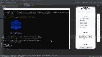
最后运行效果图如下显示:
欢迎大家加入开源鸿蒙跨平台开发者社区,一起共建开源鸿蒙跨平台生态。

作为“人工智能6S店”的官方数字引擎,为AI开发者与企业提供一个覆盖软硬件全栈、一站式门户。
更多推荐
 11
11 0
0- 0


 已为社区贡献19条内容

所有评论(0)