
React Native 鸿蒙跨平台开发:Badge 徽章组件代码实现
max?: number;color?: string;textColor?: string;size?style?: any;count是必需的,其他都是可选的size使用字面量类型,限制只能是三种尺寸style使用any类型,允许传入任意样式对象。
·
一、核心原理:徽章组件的设计与实现
1.1 为什么需要徽章组件?
徽章组件是移动应用中常见的 UI 元素,主要用于:
- 状态指示:显示通知、消息等未读数量
- 信息标记:标识内容的状态(如"新"、“热”)
- 视觉强调:突出显示重要信息
1.2 徽章组件的核心要素
一个完整的徽章组件需要考虑:
- 形状:圆形、圆角矩形
- 内容:数字、文字、图标
- 尺寸:小号、中号、大号
- 颜色:背景色、文字色
- 位置:绝对定位、相对定位
1.3 实现原理
徽章组件的核心实现原理:
- 使用
View作为容器,通过borderRadius实现圆形或圆角 - 使用
Text显示内容,通过justifyContent和alignItems实现居中 - 使用
position: 'absolute'实现图标徽章的定位 - 使用
minWidth确保徽章有最小宽度
二、数字徽章实现
2.1 基础实现
数字徽章是最常见的徽章类型,用于显示数量信息。
const NumberBadge = memo<NumberBadgeProps>(({
  count,
  max = 99,
  color = '#F56C6C',
  textColor = '#FFFFFF',
  size = 'medium',
  style,
}) => {
  const displayCount = count > max ? `${max}+` : count;

  const sizeStyles = {
    small: {
      minWidth: 16,
      height: 16,
      paddingHorizontal: 4,
      fontSize: 10,
    },
    medium: {
      minWidth: 20,
      height: 20,
      paddingHorizontal: 6,
      fontSize: 12,
    },
    large: {
      minWidth: 24,
      height: 24,
      paddingHorizontal: 8,
      fontSize: 14,
    },
  };

  const currentSize = sizeStyles[size] || sizeStyles.medium;

  return (
    <View style={[
      styles.badge,
      {
        backgroundColor: color,
        minWidth: currentSize.minWidth,
        height: currentSize.height,
        paddingHorizontal: currentSize.paddingHorizontal,
        borderRadius: currentSize.height / 2,
      },
      style,
    ]}>
      <Text style={[
        styles.badgeText,
        {
          color: textColor,
          fontSize: currentSize.fontSize,
        },
      ]}>
        {displayCount}
      </Text>
    </View>
  );
});
为什么这样设计?
- sizeStyles 对象:集中管理不同尺寸的样式,便于维护和扩展
- displayCount 处理:当数量超过最大值时显示 “99+”,避免徽章过宽
- borderRadius 计算:使用
height / 2确保始终是完美的圆形 - minWidth:确保单个数字时徽章仍有合理的宽度
2.2 TypeScript 类型定义
interface NumberBadgeProps {
  count: number;
  max?: number;
  color?: string;
  textColor?: string;
  size?: 'small' | 'medium' | 'large';
  style?: any;
}
类型设计要点:
count是必需的,其他都是可选的size使用字面量类型,限制只能是三种尺寸style使用any类型,允许传入任意样式对象
2.3 样式实现
const styles = StyleSheet.create({
  badge: {
    justifyContent: 'center',
    alignItems: 'center',
  },
  badgeText: {
    fontWeight: '600',
  },
});
样式说明:
justifyContent: 'center':垂直居中alignItems: 'center':水平居中fontWeight: '600':文字加粗,提高可读性
三、点状徽章实现
3.1 基础实现
点状徽章用于状态指示,不显示具体数量。
const DotBadge = memo<DotBadgeProps>(({
  color = '#F56C6C',
  size = 'medium',
  style,
}) => {
  const sizeStyles = {
    small: { width: 6, height: 6 },
    medium: { width: 8, height: 8 },
    large: { width: 10, height: 10 },
  };

  const currentSize = sizeStyles[size] || sizeStyles.medium;

  return (
    <View style={[
      styles.dotBadge,
      {
        backgroundColor: color,
        width: currentSize.width,
        height: currentSize.height,
        borderRadius: currentSize.width / 2,
      },
      style,
    ]} />
  );
});
为什么这样设计?
- 固定宽高:点状徽章不需要根据内容调整大小
- borderRadius 计算:使用
width / 2确保是完美的圆形 - 简洁的结构:不需要 Text 组件,纯 View 实现
3.2 使用场景
点状徽章适合以下场景:
- 在线状态指示(在线/离线)
- 未读消息提示(有/无)
- 内容更新标识
四、文字徽章实现
4.1 基础实现
文字徽章用于显示标签或状态文字。
const TextBadge = memo<TextBadgeProps>(({
  text,
  color = '#409EFF',
  textColor = '#FFFFFF',
  size = 'medium',
  style,
}) => {
  const sizeStyles = {
    small: {
      paddingHorizontal: 6,
      paddingVertical: 2,
      fontSize: 10,
      borderRadius: 10,
    },
    medium: {
      paddingHorizontal: 8,
      paddingVertical: 4,
      fontSize: 12,
      borderRadius: 12,
    },
    large: {
      paddingHorizontal: 12,
      paddingVertical: 6,
      fontSize: 14,
      borderRadius: 14,
    },
  };

  const currentSize = sizeStyles[size] || sizeStyles.medium;

  return (
    <View style={[
      styles.textBadge,
      {
        backgroundColor: color,
        paddingHorizontal: currentSize.paddingHorizontal,
        paddingVertical: currentSize.paddingVertical,
        borderRadius: currentSize.borderRadius,
      },
      style,
    ]}>
      <Text style={[
        styles.textBadgeText,
        {
          color: textColor,
          fontSize: currentSize.fontSize,
        },
      ]}>
        {text}
      </Text>
    </View>
  );
});
为什么这样设计?
- paddingHorizontal/Vertical:根据文字内容自动调整徽章大小
- borderRadius:使用固定值实现圆角矩形,不是圆形
- 文字居中:通过 View 的默认布局和 Text 的对齐实现
4.2 与数字徽章的区别
| 特性 | 数字徽章 | 文字徽章 |
|---|---|---|
| 形状 | 圆形 | 圆角矩形 |
| 宽度 | 固定 minWidth | 根据内容自适应 |
| 高度 | 固定 | 根据内容自适应 |
| 内容 | 数字 | 任意文字 |
五、图标徽章实现
5.1 基础实现
图标徽章在图标上叠加徽章,常用于通知图标。
const IconBadge = memo<IconBadgeProps>(({
  icon,
  count,
  max = 99,
  badgeColor = '#F56C6C',
  badgeTextColor = '#FFFFFF',
  size = 'medium',
  style,
}) => {
  const displayCount = count > max ? `${max}+` : count;

  const sizeStyles = {
    small: {
      iconSize: 20,
      badgeMinWidth: 16,
      badgeHeight: 16,
      badgePadding: 4,
      badgeFontSize: 10,
    },
    medium: {
      iconSize: 24,
      badgeMinWidth: 18,
      badgeHeight: 18,
      badgePadding: 5,
      badgeFontSize: 11,
    },
    large: {
      iconSize: 28,
      badgeMinWidth: 20,
      badgeHeight: 20,
      badgePadding: 6,
      badgeFontSize: 12,
    },
  };

  const currentSize = sizeStyles[size] || sizeStyles.medium;

  return (
    <View style={[styles.iconBadgeContainer, style]}>
      <Text style={[styles.iconBadgeIcon, { fontSize: currentSize.iconSize }]}>
        {icon}
      </Text>
      {count > 0 && (
        <View style={[
          styles.iconBadge,
          {
            backgroundColor: badgeColor,
            minWidth: currentSize.badgeMinWidth,
            height: currentSize.badgeHeight,
            paddingHorizontal: currentSize.badgePadding,
            borderRadius: currentSize.badgeHeight / 2,
          },
        ]}>
          <Text style={[
            styles.iconBadgeText,
            {
              color: badgeTextColor,
              fontSize: currentSize.badgeFontSize,
            },
          ]}>
            {displayCount}
          </Text>
        </View>
      )}
    </View>
  );
});
为什么这样设计?
- 嵌套结构:外层容器 + 图标 + 徽章
- 绝对定位:徽章使用
position: 'absolute'定位到右上角 - 条件渲染:只有 count > 0 时才显示徽章
- 尺寸关联:图标大小和徽章大小相关联
5.2 样式实现
const styles = StyleSheet.create({
  iconBadgeContainer: {
    position: 'relative',
    width: 32,
    height: 32,
    justifyContent: 'center',
    alignItems: 'center',
  },
  iconBadgeIcon: {},
  iconBadge: {
    position: 'absolute',
    top: -4,
    right: -4,
    justifyContent: 'center',
    alignItems: 'center',
  },
  iconBadgeText: {
    fontWeight: '600',
  },
});
关键样式说明:
position: 'relative':容器使用相对定位,作为绝对定位的参考position: 'absolute':徽章使用绝对定位top: -4, right: -4:徽章向右上角偏移,使其部分超出图标范围justifyContent和alignItems:徽章内部内容居中
六、性能优化
6.1 使用 memo 优化
所有徽章组件都使用 memo 包装,避免不必要的重新渲染。
const NumberBadge = memo<NumberBadgeProps>(({ count, ...props }) => {
  // ...
});

NumberBadge.displayName = 'NumberBadge';
为什么使用 memo?
- 徽章组件通常是纯展示组件,props 相同时渲染结果相同
- 在列表中使用时,避免每次父组件更新都重新渲染所有徽章
- 提升应用性能,特别是在大量使用徽章的场景
6.2 使用 StyleSheet
使用 StyleSheet.create 创建样式对象,而不是内联样式。
const styles = StyleSheet.create({
  badge: {
    justifyContent: 'center',
    alignItems: 'center',
  },
});
为什么使用 StyleSheet?
- 样式对象只创建一次,避免重复创建
- React Native 可以优化样式对象的传递
- 代码更清晰,易于维护
6.3 减少嵌套层级
尽量减少组件嵌套,避免过深的渲染树。
// 不推荐:多层嵌套
<View>
  <View>
    <View>
      <Text>Badge</Text>
    </View>
  </View>
</View>

// 推荐:扁平结构
<View>
  <Text>Badge</Text>
</View>
七、常见问题与解决方案
7.1 徽章不显示
问题现象: 徽章组件渲染了但看不见
可能原因:
width或height设置为 0backgroundColor与父容器颜色相同- 被其他元素遮挡
解决方案:
// 1. 确保尺寸至少为 1
<View style={{ width: 8, height: 8, backgroundColor: '#F56C6C' }} />

// 2. 使用对比明显的颜色
<View style={{ width: 8, height: 8, backgroundColor: '#000000' }} />

// 3. 检查 z-index 和布局
<View style={{ zIndex: 999, width: 8, height: 8, backgroundColor: '#F56C6C' }} />
7.2 徽章位置不对
问题现象: 徽章位置偏移或重叠
可能原因:
- 父容器没有设置
position: 'relative' top或right值设置不正确- 父容器尺寸不够
解决方案:
// 确保父容器有相对定位
<View style={{ position: 'relative', width: 32, height: 32 }}>
  <Text>🔔</Text>
  <View style={{ position: 'absolute', top: -4, right: -4 }}>
    <NumberBadge count={5} />
  </View>
</View>
7.3 徽章文字不居中
问题现象: 徽章中的文字没有居中显示
可能原因:
- 没有设置
justifyContent和alignItems padding或margin影响布局
解决方案:
<View style={{
  justifyContent: 'center',
  alignItems: 'center',
  paddingHorizontal: 6,
  paddingVertical: 0,
}}>
  <Text>5</Text>
</View>
7.4 徽章颜色不生效
问题现象: 设置的颜色没有显示
可能原因:
- 颜色值格式错误
- 被其他样式覆盖
- 使用了不支持的颜色格式
解决方案:
// 使用正确的颜色格式
<View style={{ backgroundColor: '#F56C6C' }} /> // ✅ 十六进制
<View style={{ backgroundColor: 'rgb(245, 108, 108)' }} /> // ✅ RGB
<View style={{ backgroundColor: 'red' }} /> // ✅ 颜色名称
八、完整代码示例
import React, { memo, useState } from 'react';
import {
View,
Text,
StyleSheet,
TouchableOpacity,
ScrollView,
} from 'react-native';
// 数字徽章组件 Props 类型
interface NumberBadgeProps {
count: number;
max?: number;
color?: string;
textColor?: string;
size?: 'small' | 'medium' | 'large';
style?: any;
}
// 数字徽章组件
const NumberBadge = memo<NumberBadgeProps>(({
count,
max = 99,
color = '#F56C6C',
textColor = '#FFFFFF',
size = 'medium',
style,
}) => {
const displayCount = count > max ? `${max}+` : count;
const sizeStyles = {
small: {
minWidth: 16,
height: 16,
paddingHorizontal: 4,
fontSize: 10,
},
medium: {
minWidth: 20,
height: 20,
paddingHorizontal: 6,
fontSize: 12,
},
large: {
minWidth: 24,
height: 24,
paddingHorizontal: 8,
fontSize: 14,
},
};
const currentSize = sizeStyles[size] || sizeStyles.medium;
return (
<View style={[
styles.badge,
{
backgroundColor: color,
minWidth: currentSize.minWidth,
height: currentSize.height,
paddingHorizontal: currentSize.paddingHorizontal,
borderRadius: currentSize.height / 2,
},
style,
]}>
<Text style={[
styles.badgeText,
{
color: textColor,
fontSize: currentSize.fontSize,
},
]}>
{displayCount}
</Text>
</View>
);
});
NumberBadge.displayName = 'NumberBadge';
// 点状徽章组件 Props 类型
interface DotBadgeProps {
color?: string;
size?: 'small' | 'medium' | 'large';
style?: any;
}
// 点状徽章组件
const DotBadge = memo<DotBadgeProps>(({
color = '#F56C6C',
size = 'medium',
style,
}) => {
const sizeStyles = {
small: { width: 6, height: 6 },
medium: { width: 8, height: 8 },
large: { width: 10, height: 10 },
};
const currentSize = sizeStyles[size] || sizeStyles.medium;
return (
<View style={[
styles.dotBadge,
{
backgroundColor: color,
width: currentSize.width,
height: currentSize.height,
borderRadius: currentSize.width / 2,
},
style,
]} />
);
});
DotBadge.displayName = 'DotBadge';
// 文字徽章组件 Props 类型
interface TextBadgeProps {
text: string;
color?: string;
textColor?: string;
size?: 'small' | 'medium' | 'large';
style?: any;
}
// 文字徽章组件
const TextBadge = memo<TextBadgeProps>(({
text,
color = '#409EFF',
textColor = '#FFFFFF',
size = 'medium',
style,
}) => {
const sizeStyles = {
small: {
paddingHorizontal: 6,
paddingVertical: 2,
fontSize: 10,
borderRadius: 10,
},
medium: {
paddingHorizontal: 8,
paddingVertical: 4,
fontSize: 12,
borderRadius: 12,
},
large: {
paddingHorizontal: 12,
paddingVertical: 6,
fontSize: 14,
borderRadius: 14,
},
};
const currentSize = sizeStyles[size] || sizeStyles.medium;
return (
<View style={[
styles.textBadge,
{
backgroundColor: color,
paddingHorizontal: currentSize.paddingHorizontal,
paddingVertical: currentSize.paddingVertical,
borderRadius: currentSize.borderRadius,
},
style,
]}>
<Text style={[
styles.textBadgeText,
{
color: textColor,
fontSize: currentSize.fontSize,
},
]}>
{text}
</Text>
</View>
);
});
TextBadge.displayName = 'TextBadge';
// 带图标的徽章组件 Props 类型
interface IconBadgeProps {
icon: string;
count: number;
max?: number;
badgeColor?: string;
badgeTextColor?: string;
size?: 'small' | 'medium' | 'large';
style?: any;
}
// 带图标的徽章组件
const IconBadge = memo<IconBadgeProps>(({
icon,
count,
max = 99,
badgeColor = '#F56C6C',
badgeTextColor = '#FFFFFF',
size = 'medium',
style,
}) => {
const displayCount = count > max ? `${max}+` : count;
const sizeStyles = {
small: {
iconSize: 20,
badgeMinWidth: 16,
badgeHeight: 16,
badgePadding: 4,
badgeFontSize: 10,
},
medium: {
iconSize: 24,
badgeMinWidth: 18,
badgeHeight: 18,
badgePadding: 5,
badgeFontSize: 11,
},
large: {
iconSize: 28,
badgeMinWidth: 20,
badgeHeight: 20,
badgePadding: 6,
badgeFontSize: 12,
},
};
const currentSize = sizeStyles[size] || sizeStyles.medium;
return (
<View style={[styles.iconBadgeContainer, style]}>
<Text style={[styles.iconBadgeIcon, { fontSize: currentSize.iconSize }]}>
{icon}
</Text>
{count > 0 && (
<View style={[
styles.iconBadge,
{
backgroundColor: badgeColor,
minWidth: currentSize.badgeMinWidth,
height: currentSize.badgeHeight,
paddingHorizontal: currentSize.badgePadding,
borderRadius: currentSize.badgeHeight / 2,
},
]}>
<Text style={[
styles.iconBadgeText,
{
color: badgeTextColor,
fontSize: currentSize.badgeFontSize,
},
]}>
{displayCount}
</Text>
</View>
)}
</View>
);
});
IconBadge.displayName = 'IconBadge';
const App = () => {
const [notificationCount, setNotificationCount] = useState(5);
const [messageCount, setMessageCount] = useState(99);
const [cartCount, setCartCount] = useState(3);
const handleIncrement = (setter) => {
setter(prev => prev + 1);
};
const handleDecrement = (setter) => {
setter(prev => Math.max(0, prev - 1));
};
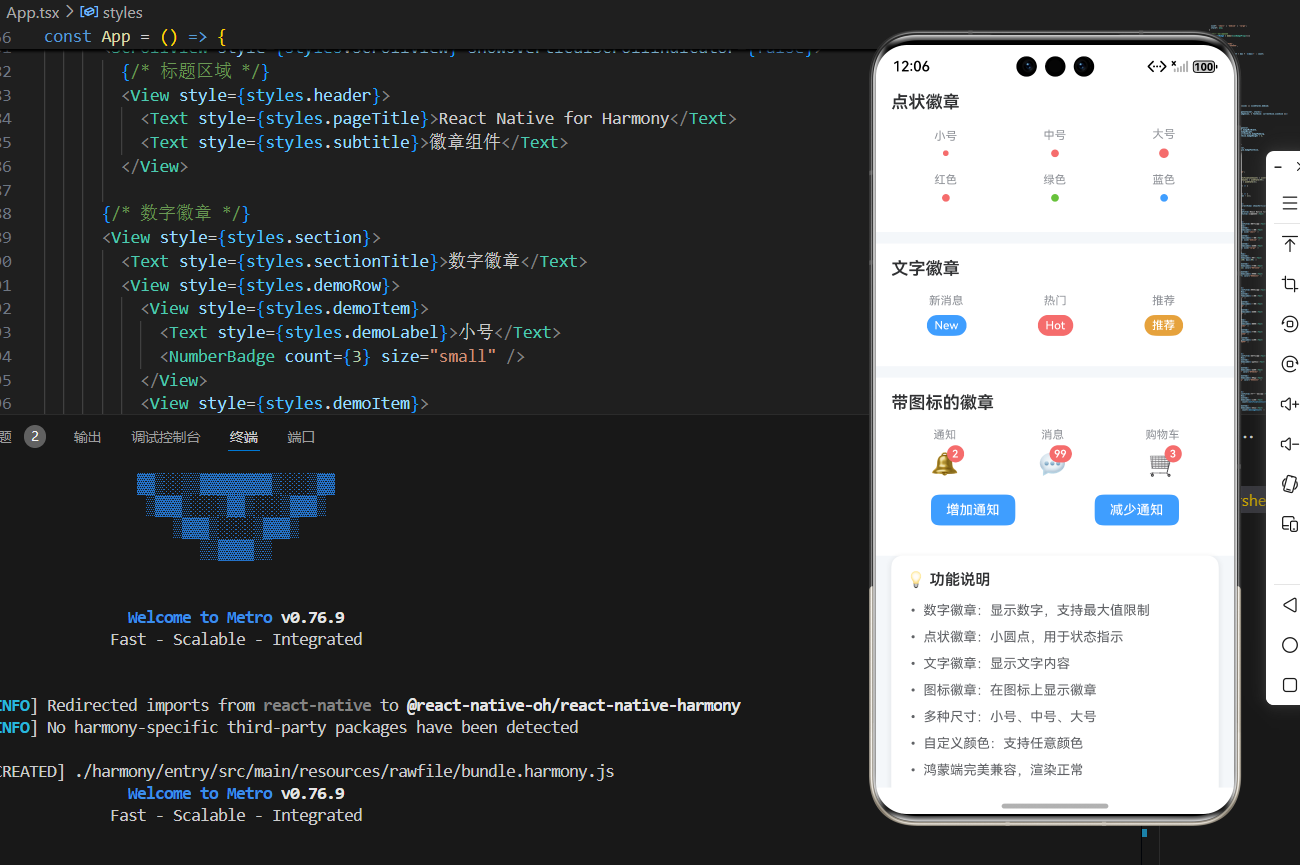
return (
<View style={styles.container}>
<ScrollView style={styles.scrollView} showsVerticalScrollIndicator={false}>
{/* 标题区域 */}
<View style={styles.header}>
<Text style={styles.pageTitle}>React Native for Harmony</Text>
<Text style={styles.subtitle}>徽章组件</Text>
</View>
{/* 数字徽章 */}
<View style={styles.section}>
<Text style={styles.sectionTitle}>数字徽章</Text>
<View style={styles.demoRow}>
<View style={styles.demoItem}>
<Text style={styles.demoLabel}>小号</Text>
<NumberBadge count={3} size="small" />
</View>
<View style={styles.demoItem}>
<Text style={styles.demoLabel}>中号</Text>
<NumberBadge count={5} size="medium" />
</View>
<View style={styles.demoItem}>
<Text style={styles.demoLabel}>大号</Text>
<NumberBadge count={8} size="large" />
</View>
</View>
<View style={styles.demoRow}>
<View style={styles.demoItem}>
<Text style={styles.demoLabel}>99+</Text>
<NumberBadge count={150} max={99} />
</View>
<View style={styles.demoItem}>
<Text style={styles.demoLabel}>绿色</Text>
<NumberBadge count={12} color="#67C23A" />
</View>
<View style={styles.demoItem}>
<Text style={styles.demoLabel}>橙色</Text>
<NumberBadge count={7} color="#E6A23C" />
</View>
</View>
</View>
{/* 点状徽章 */}
<View style={styles.section}>
<Text style={styles.sectionTitle}>点状徽章</Text>
<View style={styles.demoRow}>
<View style={styles.demoItem}>
<Text style={styles.demoLabel}>小号</Text>
<DotBadge size="small" />
</View>
<View style={styles.demoItem}>
<Text style={styles.demoLabel}>中号</Text>
<DotBadge size="medium" />
</View>
<View style={styles.demoItem}>
<Text style={styles.demoLabel}>大号</Text>
<DotBadge size="large" />
</View>
</View>
<View style={styles.demoRow}>
<View style={styles.demoItem}>
<Text style={styles.demoLabel}>红色</Text>
<DotBadge color="#F56C6C" />
</View>
<View style={styles.demoItem}>
<Text style={styles.demoLabel}>绿色</Text>
<DotBadge color="#67C23A" />
</View>
<View style={styles.demoItem}>
<Text style={styles.demoLabel}>蓝色</Text>
<DotBadge color="#409EFF" />
</View>
</View>
</View>
{/* 文字徽章 */}
<View style={styles.section}>
<Text style={styles.sectionTitle}>文字徽章</Text>
<View style={styles.demoRow}>
<View style={styles.demoItem}>
<Text style={styles.demoLabel}>新消息</Text>
<TextBadge text="New" />
</View>
<View style={styles.demoItem}>
<Text style={styles.demoLabel}>热门</Text>
<TextBadge text="Hot" color="#F56C6C" />
</View>
<View style={styles.demoItem}>
<Text style={styles.demoLabel}>推荐</Text>
<TextBadge text="推荐" color="#E6A23C" />
</View>
</View>
</View>
{/* 带图标的徽章 */}
<View style={styles.section}>
<Text style={styles.sectionTitle}>带图标的徽章</Text>
<View style={styles.demoRow}>
<View style={styles.demoItem}>
<Text style={styles.demoLabel}>通知</Text>
<IconBadge icon="🔔" count={notificationCount} />
</View>
<View style={styles.demoItem}>
<Text style={styles.demoLabel}>消息</Text>
<IconBadge icon="💬" count={messageCount} />
</View>
<View style={styles.demoItem}>
<Text style={styles.demoLabel}>购物车</Text>
<IconBadge icon="🛒" count={cartCount} />
</View>
</View>
<View style={styles.demoRow}>
<TouchableOpacity
style={styles.button}
onPress={() => handleIncrement(setNotificationCount)}
>
<Text style={styles.buttonText}>增加通知</Text>
</TouchableOpacity>
<TouchableOpacity
style={styles.button}
onPress={() => handleDecrement(setNotificationCount)}
>
<Text style={styles.buttonText}>减少通知</Text>
</TouchableOpacity>
</View>
</View>
{/* 说明区域 */}
<View style={styles.infoCard}>
<Text style={styles.infoTitle}>💡 功能说明</Text>
<Text style={styles.infoText}>• 数字徽章:显示数字,支持最大值限制</Text>
<Text style={styles.infoText}>• 点状徽章:小圆点,用于状态指示</Text>
<Text style={styles.infoText}>• 文字徽章:显示文字内容</Text>
<Text style={styles.infoText}>• 图标徽章:在图标上显示徽章</Text>
<Text style={styles.infoText}>• 多种尺寸:小号、中号、大号</Text>
<Text style={styles.infoText}>• 自定义颜色:支持任意颜色</Text>
<Text style={styles.infoText}>• 鸿蒙端完美兼容,渲染正常</Text>
</View>
</ScrollView>
</View>
);
};
const styles = StyleSheet.create({
container: {
flex: 1,
backgroundColor: '#F5F7FA',
},
scrollView: {
flex: 1,
},
// ======== 标题区域 ========
header: {
padding: 20,
backgroundColor: '#FFFFFF',
borderBottomWidth: 1,
borderBottomColor: '#EBEEF5',
},
pageTitle: {
fontSize: 24,
fontWeight: '700',
color: '#303133',
textAlign: 'center',
marginBottom: 8,
},
subtitle: {
fontSize: 16,
fontWeight: '500',
color: '#909399',
textAlign: 'center',
},
// ======== 区域 ========
section: {
marginTop: 12,
backgroundColor: '#FFFFFF',
padding: 16,
},
sectionTitle: {
fontSize: 18,
fontWeight: '600',
color: '#303133',
marginBottom: 16,
},
// ======== 演示行 ========
demoRow: {
flexDirection: 'row',
justifyContent: 'space-around',
alignItems: 'center',
marginBottom: 16,
},
demoItem: {
alignItems: 'center',
},
demoLabel: {
fontSize: 12,
color: '#909399',
marginBottom: 8,
},
// ======== 按钮 ========
button: {
backgroundColor: '#409EFF',
paddingHorizontal: 16,
paddingVertical: 8,
borderRadius: 8,
marginHorizontal: 8,
},
buttonText: {
color: '#FFFFFF',
fontSize: 14,
fontWeight: '500',
},
// ======== 徽章基础样式 ========
badge: {
justifyContent: 'center',
alignItems: 'center',
},
badgeText: {
fontWeight: '600',
},
// ======== 点状徽章 ========
dotBadge: {
borderRadius: 4,
},
// ======== 文字徽章 ========
textBadge: {},
textBadgeText: {
fontWeight: '500',
},
// ======== 图标徽章 ========
iconBadgeContainer: {
position: 'relative',
width: 32,
height: 32,
justifyContent: 'center',
alignItems: 'center',
},
iconBadgeIcon: {},
iconBadge: {
position: 'absolute',
top: -4,
right: -4,
justifyContent: 'center',
alignItems: 'center',
},
iconBadgeText: {
fontWeight: '600',
},
// ======== 信息卡片 ========
infoCard: {
backgroundColor: '#FFFFFF',
borderRadius: 12,
padding: 16,
margin: 16,
marginTop: 0,
shadowColor: '#000000',
shadowOffset: { width: 0, height: 2 },
shadowOpacity: 0.08,
shadowRadius: 8,
elevation: 4,
},
infoTitle: {
fontSize: 16,
fontWeight: '600',
color: '#303133',
marginBottom: 12,
},
infoText: {
fontSize: 14,
color: '#606266',
lineHeight: 22,
marginBottom: 6,
},
});
export default App;

@欢迎加入开源鸿蒙跨平台社区:https://openharmonycrossplatform.csdn.net

作为“人工智能6S店”的官方数字引擎,为AI开发者与企业提供一个覆盖软硬件全栈、一站式门户。
更多推荐

 4
4 0
0- 0


 已为社区贡献15条内容

所有评论(0)