
React Native 鸿蒙跨平台开发:DividerLine 分割线条代码指南
分割线虽然简单,但在界面设计中扮演着重要角色。掌握其实现原理和最佳实践对于构建高质量的移动应用至关重要。理解分割线的基本原理:使用 View + backgroundColor/边框样式区分水平和垂直分割线的实现差异掌握虚线分割线的特殊实现方式使用 Flexbox 实现文字分割线的布局采用性能优化策略:memo、StyleSheet、减少嵌套处理常见问题:不显示、边距失效、高度不对使用 memo
一、分割线的核心原理
分割线(Divider)是界面设计中用于分隔内容的重要元素,虽然在视觉上看似简单,但其实现涉及多个 CSS 属性的合理组合。理解这些原理对于创建高质量的分割线组件至关重要。
1.1 基本实现原理
分割线的本质是一个具有特定尺寸和颜色的矩形:
// 水平分割线
<View style={{ height: 1, backgroundColor: '#EBEEF5' }} />

// 垂直分割线
<View style={{ width: 1, backgroundColor: '#EBEEF5', height: '100%' }} />
关键属性的作用:
height:控制水平分割线的高度(粗细)width:控制垂直分割线的宽度(粗细)backgroundColor:设置分割线的颜色height: '100%':让垂直分割线占满父容器高度
1.2 为什么使用 View 而不是其他元素
在 React Native 中,分割线通常使用 View 组件实现,原因如下:
- 轻量级:View 是最基础的容器组件,性能开销最小
- 样式灵活:支持所有布局和样式属性
- 跨平台一致:在 iOS、Android 和鸿蒙上表现一致
- 无副作用:不会影响布局的其他部分
1.3 分割线的设计原则
良好的分割线设计应该遵循以下原则:
- 视觉平衡:颜色和粗细要与整体设计风格协调
- 适度使用:避免过度使用导致界面杂乱
- 语义明确:帮助用户理解内容的层次关系
- 响应式:在不同屏幕尺寸下保持一致的效果
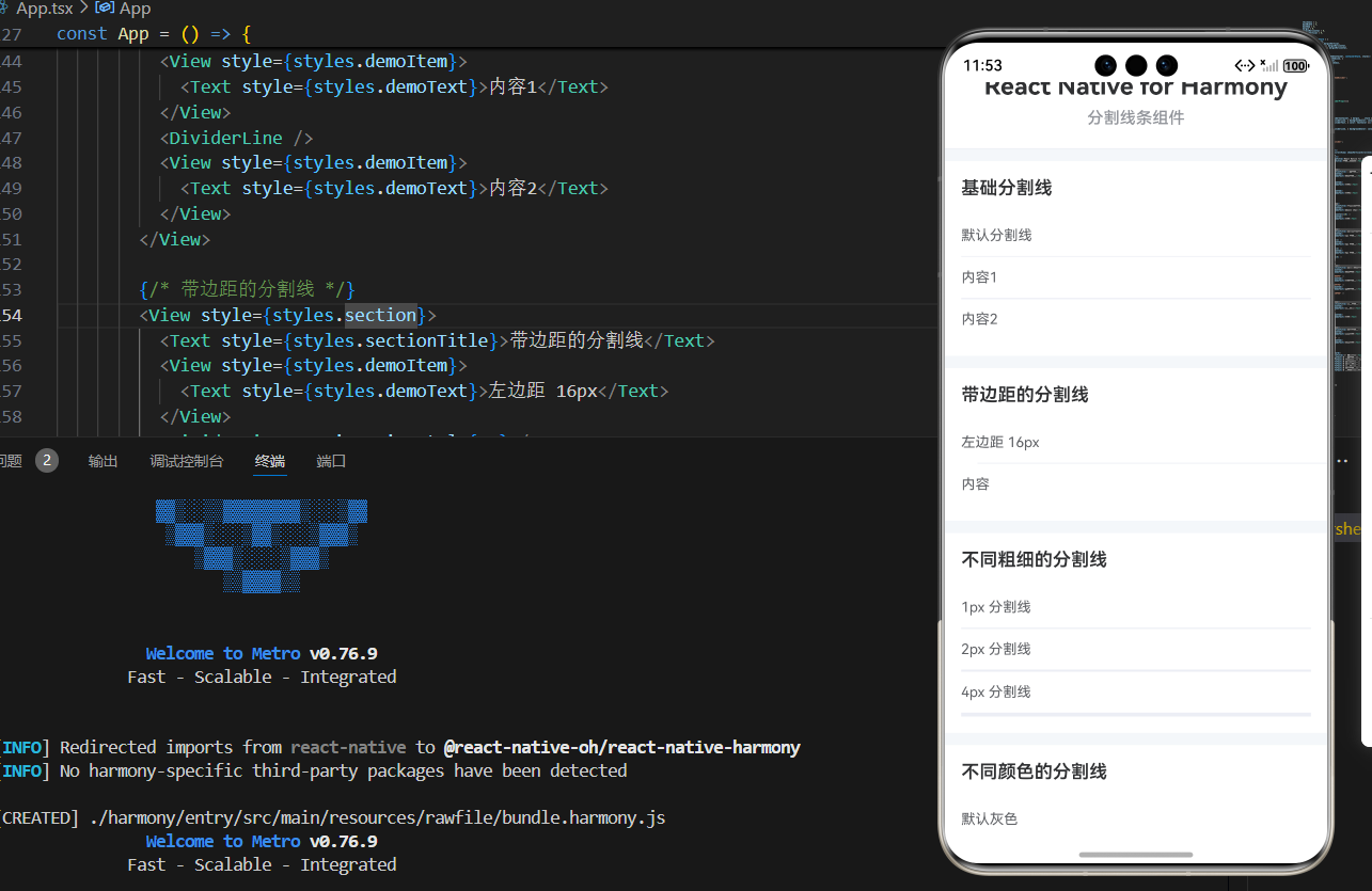
二、基础分割线的实现
2.1 水平分割线
水平分割线是最常见的分割线类型,用于分隔垂直排列的内容。
const HorizontalDivider = memo<DividerLineProps>(({
  color = '#EBEEF5',
  thickness = 1,
  margin = 0,
  marginHorizontal = 0,
  marginVertical = 0,
  style,
}) => {
  const dividerStyle = {
    height: thickness,
    backgroundColor: color,
    width: '100%',
    margin: margin || marginVertical,
    marginLeft: margin || marginHorizontal,
    marginRight: margin || marginHorizontal,
  };

  return (
    <View style={[styles.divider, dividerStyle, style]} />
  );
});
关键参数说明:
thickness:分割线的高度(像素值)color:分割线的背景色margin:统一的边距marginHorizontal:左右边距(优先使用)marginVertical:上下边距(优先使用)
为什么需要 width: ‘100%’?
- 确保分割线占满父容器宽度
- 即使有 margin,分割线本身仍然是 100% 宽度
- margin 会从父容器中扣除
2.2 垂直分割线
垂直分割线用于分隔水平排列的内容,实现方式略有不同。
const VerticalDivider = memo<DividerLineProps>(({
  color = '#EBEEF5',
  thickness = 1,
  margin = 0,
  marginHorizontal = 0,
  marginVertical = 0,
  style,
}) => {
  const dividerStyle = {
    width: thickness,
    backgroundColor: color,
    height: '100%',
    margin: margin || marginHorizontal,
    marginTop: margin || marginVertical,
    marginBottom: margin || marginVertical,
  };

  return (
    <View style={[styles.divider, dividerStyle, style]} />
  );
});
垂直分割线的特殊之处:
- 使用
width而不是height控制粗细 - 使用
height: '100%'占满父容器高度 - margin 的应用方向与水平分割线相反
使用场景:
- 分隔水平排列的按钮
- 分隔列表项中的不同信息
- 创建网格布局的分隔线
2.3 统一的分隔线组件
为了提高代码复用性,可以创建一个统一的分隔线组件:
interface DividerLineProps {
  direction?: 'horizontal' | 'vertical';
  color?: string;
  thickness?: number;
  margin?: number;
  marginHorizontal?: number;
  marginVertical?: number;
  style?: any;
}

const DividerLine = memo<DividerLineProps>(({
  direction = 'horizontal',
  color = '#EBEEF5',
  thickness = 1,
  margin = 0,
  marginHorizontal = 0,
  marginVertical = 0,
  style,
}) => {
  const dividerStyle = {
    backgroundColor: color,
    ...(direction === 'horizontal' ? {
      height: thickness,
      width: '100%',
      margin: margin || marginVertical,
      marginLeft: margin || marginHorizontal,
      marginRight: margin || marginHorizontal,
    } : {
      width: thickness,
      height: '100%',
      margin: margin || marginHorizontal,
      marginTop: margin || marginVertical,
      marginBottom: margin || marginVertical,
    }),
  };

  return (
    <View style={[styles.divider, dividerStyle, style]} />
  );
});
设计考虑:
- 使用
direction参数统一控制方向 - 使用展开运算符
...根据方向应用不同的样式 - 保持 API 的一致性和易用性
三、虚线分割线的实现
虚线分割线使用 CSS 边框样式实现,需要特殊处理。
3.1 边框样式实现
React Native 支持 borderStyle 属性来实现虚线效果:
const DashedDivider = memo<DashedDividerProps>(({
  color = '#EBEEF5',
  thickness = 1,
  dashWidth = 4,
  dashGap = 4,
  margin = 0,
  marginHorizontal = 0,
  marginVertical = 0,
  style,
}) => {
  const containerStyle = {
    height: thickness,
    margin: margin || marginVertical,
    marginLeft: margin || marginHorizontal,
    marginRight: margin || marginHorizontal,
  };

  return (
    <View style={[styles.dashedContainer, containerStyle, style]}>
      <View style={[styles.dashedLine, {
        borderBottomColor: color,
        borderBottomWidth: thickness,
        borderStyle: 'dashed',
      }]} />
    </View>
  );
});
为什么需要嵌套 View?
- 外层 View 控制高度和边距
- 内层 View 应用边框样式
- 避免边框样式影响布局
关键属性:
borderBottomWidth:边框宽度(等于分割线粗细)borderBottomColor:边框颜色borderStyle: 'dashed':虚线样式
3.2 虚线的控制参数
虚线分割线提供了更多的自定义选项:
interface DashedDividerProps {
  color?: string;
  thickness?: number;
  dashWidth?: number;    // 虚线段宽度(iOS)
  dashGap?: number;      // 虚线间隙(iOS)
  margin?: number;
  marginHorizontal?: number;
  marginVertical?: number;
  style?: any;
}
注意:
dashWidth和dashGap在 iOS 上有效- Android 和鸿蒙可能不精确控制虚线样式
- 跨平台时建议使用默认值
3.3 虚线分割线的样式
const styles = StyleSheet.create({
  dashedContainer: {
    backgroundColor: 'transparent',
  },
  dashedLine: {
    height: '100%',
    width: '100%',
    borderStyle: 'dashed',
  },
});
样式设计要点:
- 外层容器背景透明
- 内层边框占满 100% 宽高
- 使用
borderStyle: 'dashed'实现虚线
四、文字分割线的实现
文字分割线在中间显示文字,两侧是分割线,常用于"或者"等场景。
4.1 Flexbox 布局实现
使用 Flexbox 实现文字分割线是最简单的方式:
const TextDivider = memo<TextDividerProps>(({
  text,
  color = '#EBEEF5',
  textColor = '#909399',
  margin = 0,
  style,
}) => {
  return (
    <View style={[styles.textDividerContainer, { margin, ...style }]}>
      <View style={[styles.textDividerLine, { backgroundColor: color }]} />
      <Text style={[styles.textDividerText, { color: textColor }]}>
        {text}
      </Text>
      <View style={[styles.textDividerLine, { backgroundColor: color }]} />
    </View>
  );
});
布局结构:
[分割线] [文字] [分割线]
4.2 Flexbox 的关键属性
const styles = StyleSheet.create({
  textDividerContainer: {
    flexDirection: 'row',      // 水平排列
    alignItems: 'center',      // 垂直居中
    paddingVertical: 8,        // 上下内边距
  },
  textDividerLine: {
    flex: 1,                   // 占据剩余空间
    height: 1,                 // 分割线高度
  },
  textDividerText: {
    paddingHorizontal: 12,     // 左右内边距
    fontSize: 14,
    fontWeight: '500',
  },
});
为什么使用 flex: 1?
- 让两侧分割线自动占据相等的空间
- 无论文字多长,分割线都会自动调整
- 保持视觉平衡
4.3 文字分割线的 Props
interface TextDividerProps {
  text: string;           // 必需:显示的文字
  color?: string;         // 分割线颜色
  textColor?: string;     // 文字颜色
  margin?: number;        // 统一边距
  style?: any;            // 自定义样式
}
使用示例:
<TextDivider text="或者" />
<TextDivider text="更多选项" color="#409EFF" textColor="#409EFF" />
五、性能优化与最佳实践
5.1 使用 memo 优化组件
分割线组件通常会被频繁使用,使用 memo 可以避免不必要的重新渲染:
const DividerLine = memo<DividerLineProps>(({ /* ... */ }) => {
  // 组件实现
});

DividerLine.displayName = 'DividerLine';
memo 的工作原理:
- 对比 props 是否变化
- 只有 props 变化时才重新渲染
- 对于简单的分割线组件特别有效
5.2 样式优化
使用 StyleSheet 创建样式,提高性能:
const styles = StyleSheet.create({
  divider: {
    backgroundColor: '#EBEEF5',
  },
  dashedContainer: {
    backgroundColor: 'transparent',
  },
  dashedLine: {
    height: '100%',
    width: '100%',
    borderStyle: 'dashed',
  },
});
StyleSheet 的优势:
- 样式对象会被缓存
- 减少内存占用
- 提高渲染性能
5.3 避免过度嵌套
尽量减少 View 的嵌套层级:
// 不推荐:过度嵌套
<View>
  <View>
    <View style={styles.divider} />
  </View>
</View>

// 推荐:简洁结构
<View style={styles.divider} />
为什么减少嵌套?
- 减少渲染层级
- 提高性能
- 代码更易读
5.4 合理使用默认值
为所有可选参数提供合理的默认值:
const DividerLine = memo<DividerLineProps>(({
  direction = 'horizontal',
  color = '#EBEEF5',
  thickness = 1,
  margin = 0,
  marginHorizontal = 0,
  marginVertical = 0,
  style,
}) => {
  // ...
});
默认值的选择原则:
- 符合设计规范
- 满足大多数使用场景
- 易于覆盖和自定义
六、常见问题与解决方案
6.1 分割线不显示
问题现象: 分割线组件渲染了但看不见
可能原因:
height或width设置为 0backgroundColor与父容器颜色相同- 被其他元素遮挡
解决方案:
// 1. 确保尺寸至少为 1
<View style={{ height: 1, backgroundColor: '#EBEEF5' }} />

// 2. 使用对比明显的颜色
<View style={{ height: 1, backgroundColor: '#000000' }} />

// 3. 检查 z-index 和布局
<View style={{ zIndex: 999, height: 1, backgroundColor: '#EBEEF5' }} />
6.2 虚线不显示
问题现象: 虚线分割线显示为实线或不显示
可能原因:
borderBottomWidth未设置borderStyle不支持- 平台兼容性问题
解决方案:
// 确保设置所有必需属性
<View style={{
  borderBottomWidth: 1,      // 必需
  borderBottomColor: color,  // 必需
  borderStyle: 'dashed',     // 必需
}} />

// 平台兼容性处理
const dashedStyle = Platform.select({
  ios: { borderStyle: 'dashed' },
  android: { borderStyle: 'dashed' },
  default: { borderStyle: 'dashed' },
});
6.3 边距不生效
问题现象: 设置的 margin 没有生效
可能原因:
- margin 属性冲突
- 父容器布局限制
- 样式被覆盖
解决方案:
// 使用具体的 margin 属性
<View style={{
  height: 1,
  backgroundColor: '#EBEEF5',
  marginLeft: 16,   // 明确指定
  marginRight: 16,  // 明确指定
}} />

// 检查父容器布局
<View style={{ padding: 16 }}>  {/* 父容器有 padding */}
  <DividerLine marginHorizontal={16} />  {/* 可能无效 */}
</View>

// 使用 !important(不推荐,仅用于调试)
<View style={{ marginLeft: 16, marginRight: 16 }} />
6.4 垂直分割线高度不对
问题现象: 垂直分割线没有占满父容器高度
可能原因:
- 父容器高度未设置
- 使用了固定高度
- 布局限制
解决方案:
// 确保父容器有高度
<View style={{ flex: 1 }}>  {/* 父容器占满可用空间 */}
  <VerticalDivider />
</View>

// 使用 height: '100%'
<View style={{
  width: 1,
  height: '100%',  // 占满父容器高度
  backgroundColor: '#EBEEF5',
}} />

// 使用 flex: 1
<View style={{
  flex: 1,  // 占满剩余空间
  width: 1,
  backgroundColor: '#EBEEF5',
}} />
七、完整实战代码
import React, { memo } from 'react';
import {
  View,
  Text,
  StyleSheet,
  ScrollView,
} from 'react-native';

// 分割线组件 Props 类型
interface DividerLineProps {
  direction?: 'horizontal' | 'vertical';
  color?: string;
  thickness?: number;
  margin?: number;
  marginHorizontal?: number;
  marginVertical?: number;
  style?: any;
}

// 分割线组件
const DividerLine = memo<DividerLineProps>(({
  direction = 'horizontal',
  color = '#EBEEF5',
  thickness = 1,
  margin = 0,
  marginHorizontal = 0,
  marginVertical = 0,
  style,
}) => {
  const dividerStyle = {
    backgroundColor: color,
    ...(direction === 'horizontal' ? {
      height: thickness,
      width: '100%',
      margin: margin || marginVertical,
      marginLeft: margin || marginHorizontal,
      marginRight: margin || marginHorizontal,
    } : {
      width: thickness,
      height: '100%',
      margin: margin || marginHorizontal,
      marginTop: margin || marginVertical,
      marginBottom: margin || marginVertical,
    }),
  };

  return (
    <View style={[styles.divider, dividerStyle, style]} />
  );
});

DividerLine.displayName = 'DividerLine';

// 虚线分割线组件 Props 类型
interface DashedDividerProps {
  color?: string;
  thickness?: number;
  dashWidth?: number;
  dashGap?: number;
  margin?: number;
  marginHorizontal?: number;
  marginVertical?: number;
  style?: any;
}

// 虚线分割线组件
const DashedDivider = memo<DashedDividerProps>(({
  color = '#EBEEF5',
  thickness = 1,
  dashWidth = 4,
  dashGap = 4,
  margin = 0,
  marginHorizontal = 0,
  marginVertical = 0,
  style,
}) => {
  const containerStyle = {
    height: thickness,
    margin: margin || marginVertical,
    marginLeft: margin || marginHorizontal,
    marginRight: margin || marginHorizontal,
  };

  return (
    <View style={[styles.dashedContainer, containerStyle, style]}>
      <View style={[styles.dashedLine, {
        borderBottomColor: color,
        borderBottomWidth: thickness,
        borderStyle: 'dashed',
      }]} />
    </View>
  );
});

DashedDivider.displayName = 'DashedDivider';

// 文字分割线组件 Props 类型
interface TextDividerProps {
  text: string;
  color?: string;
  textColor?: string;
  margin?: number;
  style?: any;
}

// 文字分割线组件
const TextDivider = memo<TextDividerProps>(({
  text,
  color = '#EBEEF5',
  textColor = '#909399',
  margin = 0,
  style,
}) => {
  return (
    <View style={[styles.textDividerContainer, { margin, ...style }]}>
      <View style={[styles.textDividerLine, { backgroundColor: color }]} />
      <Text style={[styles.textDividerText, { color: textColor }]}>
        {text}
      </Text>
      <View style={[styles.textDividerLine, { backgroundColor: color }]} />
    </View>
  );
});

TextDivider.displayName = 'TextDivider';

const styles = StyleSheet.create({
  container: {
    flex: 1,
    backgroundColor: '#F5F7FA',
  },
  scrollView: {
    flex: 1,
  },
  divider: {
    backgroundColor: '#EBEEF5',
  },
  dashedContainer: {
    backgroundColor: 'transparent',
  },
  dashedLine: {
    height: '100%',
    width: '100%',
    borderStyle: 'dashed',
  },
  textDividerContainer: {
    flexDirection: 'row',
    alignItems: 'center',
    paddingVertical: 8,
  },
  textDividerLine: {
    flex: 1,
    height: 1,
  },
  textDividerText: {
    paddingHorizontal: 12,
    fontSize: 14,
    fontWeight: '500',
  },
});

export default App;

八、总结
分割线虽然简单,但在界面设计中扮演着重要角色。掌握其实现原理和最佳实践对于构建高质量的移动应用至关重要。
关键要点:
- 理解分割线的基本原理:使用 View + backgroundColor/边框样式
- 区分水平和垂直分割线的实现差异
- 掌握虚线分割线的特殊实现方式
- 使用 Flexbox 实现文字分割线的布局
- 采用性能优化策略:memo、StyleSheet、减少嵌套
- 处理常见问题:不显示、边距失效、高度不对
最佳实践:
- 使用 memo 优化组件性能
- 提供合理的默认值
- 避免过度嵌套 View
- 使用 StyleSheet 管理样式
- 考虑平台兼容性
- 保持 API 的一致性和易用性
欢迎加入开源鸿蒙跨平台社区:https://openharmonycrossplatform.csdn.net

作为“人工智能6S店”的官方数字引擎,为AI开发者与企业提供一个覆盖软硬件全栈、一站式门户。
更多推荐

 5
5 0
0- 0


 已为社区贡献15条内容

所有评论(0)