
鸿蒙开发-判定设备屏幕类型的方法
前言
截止2025年11月,鸿蒙设备已具备常规手机、双折叠、三折叠、阔折叠、平板、PC等类别,屏幕横纵比也涵盖了18:9,21:9,16:10等多种比例,为此,为了实现各屏幕下的界面适配,我们需要对以上屏幕进行识别和划分,以完成复杂适配。(尤其是光手机这个类别就涵盖了非常多的屏幕形式)
由于目前实践经验有限,故本文所述方法并不是最优的方法,只希望能够带来一些思路上的启发。并且本文目前将只针对手机端举例。
获取窗口信息
宽度和高度
这是最直接的方式,直接获取屏幕的实际像素进行判定。原则上来说,其他的判定方式都是通过这种方式实现的。以下是获取方式:
//在页面中任一方法中写入如下代码
display.getAllDisplays((err, data) => {
      let screenWidth: number = data[0].width
      let screenHeight: number = data[0].height
    });

//或如下方式

//EntryAbility.ets
//在EntryAbility.ets的onWindowStageCreate(windowStage: window.WindowStage)方法中写入如下方法:
let mainWindow: window.Window=windowStage.getMainWindowSync();
let screenWidth=mainWindow.getWindowProperties().windowRect.width;
let screenHeight=mainWindow.getWindowProperties().windowRect.height;

//根据需要可以使用AppStorage.setOrCreate传递到其他页面中去
当然,这种方式获取的是物理像素情况,如果有转为虚拟像素的需要,可以,这样做:
this.getUIContext().px2vp(需要转换的实际像素);横纵比例
借由上述方法,我们只需要稍加计算,即可计算出当前界面的横纵比:
let ratio = screenHeight / screenWidth;断点
这是鸿蒙所提供的一个非常有效的机制,具体可参看:
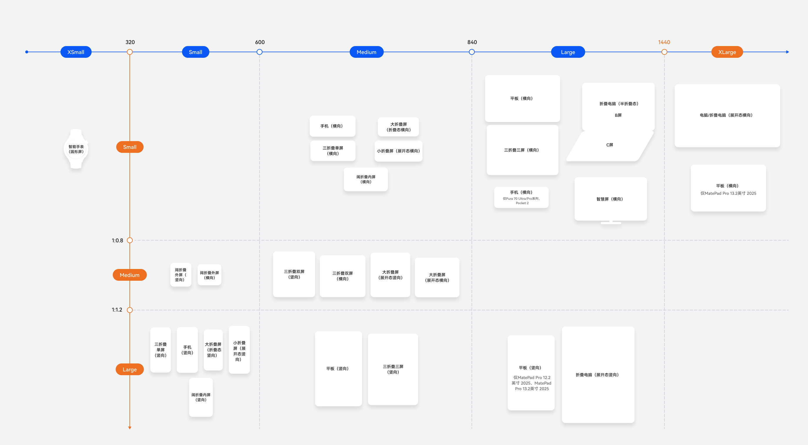
这里有一个重要的图(下面会用到)

如图所示,横向断点5个,纵向断点3个,依靠横向断点和纵向断点的结合,我们可以判断出设备的大体类别(下面再详述),此处,我们先介绍一下断点有哪些,怎么用。
先给出ArkUi提供的枚举值:
declare enum WidthBreakpoint {
    /**
     * Window width < 320vp type.
     *
     * @syscap SystemCapability.ArkUI.ArkUI.Full
     * @atomicservice
     * @since 13
     */
    WIDTH_XS = 0,
    /**
     * Window width >= 320vp and < 600vp type.
     *
     * @syscap SystemCapability.ArkUI.ArkUI.Full
     * @atomicservice
     * @since 13
     */
    WIDTH_SM = 1,
    /**
     * Window width >= 600vp and < 840vp type.
     *
     * @syscap SystemCapability.ArkUI.ArkUI.Full
     * @atomicservice
     * @since 13
     */
    WIDTH_MD = 2,
    /**
     * Window width >= 840vp and < 1440vp type.
     *
     * @syscap SystemCapability.ArkUI.ArkUI.Full
     * @atomicservice
     * @since 13
     */
    WIDTH_LG = 3,
    /**
     * Window width >= 1440vp type.
     *
     * @syscap SystemCapability.ArkUI.ArkUI.Full
     * @atomicservice
     * @since 13
     */
    WIDTH_XL = 4
}
/**
 * Type of window height breakpoint.
 *
 * @enum {number}
 * @syscap SystemCapability.ArkUI.ArkUI.Full
 * @atomicservice
 * @since 13
 */
declare enum HeightBreakpoint {
    /**
     * Window aspectRatio < 0.8 type.
     *
     * @syscap SystemCapability.ArkUI.ArkUI.Full
     * @atomicservice
     * @since 13
     */
    HEIGHT_SM = 0,
    /**
     * Window aspectRatio >= 0.8 and < 1.2 type.
     *
     * @syscap SystemCapability.ArkUI.ArkUI.Full
     * @atomicservice
     * @since 13
     */
    HEIGHT_MD = 1,
    /**
     * Window aspectRatio >= 1.2 type.
     *
     * @syscap SystemCapability.ArkUI.ArkUI.Full
     * @atomicservice
     * @since 13
     */
    HEIGHT_LG = 2
}
横向断点:XS、SM、MD、LG、XL,分别用0,1,2,3,4表示,类似的,纵向断点:SM、MD、LG,分别用0,1,2表示。
介绍完断点类型,现在说明怎么获取。
在任意界面使用以下方法获取:
context!.getWindowWidthBreakpoint();
context!.getWindowHeightBreakpoint();
例如:
      let widthBp : WidthBreakpoint= this.context!.getWindowWidthBreakpoint();
      let heightBp : HeightBreakpoint= this.uiContext!.getWindowHeightBreakpoint();
        //context是UIContext上下文对象
窗口状态
以上信息,是针对各种屏幕的,而在鸿蒙设备和安卓设备中有两个重要的窗口形态:小窗和分屏。
现给出ArkUi提供的枚举值:
    enum WindowStatusType {
        /**
         * Undefined status of the window
         *
         * @syscap SystemCapability.Window.SessionManager
         * @since 11
         */
        /**
         * Undefined status of the window
         *
         * @syscap SystemCapability.Window.SessionManager
         * @atomicservice
         * @since 12
         */
        /**
         * Undefined status of the window
         *
         * @syscap SystemCapability.Window.SessionManager
         * @crossplatform
         * @atomicservice
         * @since 20
         */
        UNDEFINED = 0,
        /**
         * Full screen status of the window
         *
         * @syscap SystemCapability.Window.SessionManager
         * @since 11
         */
        /**
         * Full screen status of the window
         *
         * @syscap SystemCapability.Window.SessionManager
         * @atomicservice
         * @since 12
         */
        /**
         * Full screen status of the window
         *
         * @syscap SystemCapability.Window.SessionManager
         * @crossplatform
         * @atomicservice
         * @since 20
         */
        FULL_SCREEN = 1,
        /**
         * Maximize status of the window
         *
         * @syscap SystemCapability.Window.SessionManager
         * @since 11
         */
        /**
         * Maximize status of the window
         *
         * @syscap SystemCapability.Window.SessionManager
         * @atomicservice
         * @since 12
         */
        MAXIMIZE = 2,
        /**
         * Minimize status of the window
         *
         * @syscap SystemCapability.Window.SessionManager
         * @since 11
         */
        /**
         * Minimize status of the window
         *
         * @syscap SystemCapability.Window.SessionManager
         * @atomicservice
         * @since 12
         */
        /**
         * Minimize status of the window
         *
         * @syscap SystemCapability.Window.SessionManager
         * @crossplatform
         * @atomicservice
         * @since 20
         */
        MINIMIZE = 3,
        /**
         * Floating status of the window
         *
         * @syscap SystemCapability.Window.SessionManager
         * @since 11
         */
        /**
         * Floating status of the window
         *
         * @syscap SystemCapability.Window.SessionManager
         * @atomicservice
         * @since 12
         */
        /**
         * Floating status of the window
         *
         * @syscap SystemCapability.Window.SessionManager
         * @crossplatform
         * @atomicservice
         * @since 20
         */
        FLOATING = 4,
        /**
         * Split screen status of the window
         *
         * @syscap SystemCapability.Window.SessionManager
         * @since 11
         */
        /**
         * Split screen status of the window
         *
         * @syscap SystemCapability.Window.SessionManager
         * @atomicservice
         * @since 12
         */
        /**
         * Split screen status of the window
         *
         * @syscap SystemCapability.Window.SessionManager
         * @crossplatform
         * @atomicservice
         * @since 20
         */
        SPLIT_SCREEN = 5
    }
UNDEFINED-0是无定义、FULL_SCREEN-1是全屏、MAXIMIZE-2是最大化、MINIMIZE-3是最小化、FLOATING-4是悬浮态(手机为小窗,平板、PC为自由多窗)、SPLIT_SCREEN-5是分屏。
获取方式为:
//EntryAbility.ets
//在EntryAbility.ets的onWindowStageCreate(windowStage: window.WindowStage)方法中写入如下方法:
let mainWindow: window.Window=windowStage.getMainWindowSync();
let windowStatusType = mainWindow.getWindowStatus();

//如果有需要可以用AppStorage.setOrCreate传到界面中去。
当然,更好的办法是这样写,实现自动监听:
//EntryAbility.ets
//在EntryAbility.ets的onWindowStageCreate(windowStage: window.WindowStage)方法中写入如下方法:
let windowClass: window.Window = windowStage.getMainWindowSync();
windowClass.on('windowStatusChange', (mode) => {
      console.log('当前窗口发生变化:', mode.toString());
      AppStorage.setOrCreate('windowStatus', mode);
    })
综合
以上都是简单的描述,实际运用中,我们可以通过ArkUi提供的监听方法,实现如下代码:
//EntryAbility.ets
//在EntryAbility.ets的onWindowStageCreate(windowStage: window.WindowStage)方法中写入如下方法:
let mainWindow: window.Window = windowStage.getMainWindowSync();    //获取mainWindow对象
let uiContext:UIContext=mainWindow.getUIContext();

let windowStatusType = mainWindow.getWindowStatus();
mainWindow.on('windowStatusChange', (windowStatus)=>{
   AppStorage.setOrCreate('windowStatus', windowStatus);
});     //监听窗口状态变化

// First time get window size.
let width: number = mainWindow.getWindowProperties().windowRect.width;
let height: number = mainWindow.getWindowProperties().windowRect.height;
let windowSize: window.Size = {
  width: width,
  height: height
}
mainWindowInfo.windowSize = windowSize;

let widthBp = this.uiContext.getWindowWidthBreakpoint();
let heightBp = this.uiContext.getWindowHeightBreakpoint();

//由于窗口尺寸和断点、横纵比都相关,故而一起处理:
mainWindow.on('windowSizeChange', (windowSize: window.Size)=>{
    AppStorage.setOrCreate('windowSize', windowSize);
    AppStorage.setOrCreate('windowRatio', windowSize.width/windowSize.height);
    AppStorage.setOrCreate('widthBp ', this.uiContext.getWindowWidthBreakpoint());
    AppStorage.setOrCreate('heightBp ', this.uiContext.getWindowHeightBreakpoint());
});
使用窗口信息
断点
断点是实践中最为常见的一种属性,在GridCol和GridRow中甚至可以不需要手动获取断点来实现,组件自动完成对断点的监控和自适应。当然,说回正题,断点的使用是判定窗口类型的重要手段,根据下图即可完成对设备窗口的判定:
这里给出一些判定的相关代码:
export class DeviceBreakPointType<T> {
  private _dv: T;             // 默认值
  private _square?: T;        // 正方形比例屏幕,小
  private _big_square?: T;    // 正方形比例屏幕,大
  private _rectangle_l?: T;   // 长方形比例屏幕,小,竖向
  private _rectangle_c?: T;   // 长方形比例屏幕,小,横向
  private _big_rectangle_l?: T; // 长方形比例屏幕,大,竖向
  private _big_rectangle_c?: T; // 长方形比例屏幕,大,横向

  constructor(defaultValue: T) {
    this._dv = defaultValue;
  }

  // 重命名方法,避免与属性名冲突
  setSquare(value: T): DeviceBreakPointType<T> {
    this._square = value;
    return this;
  }

  setBigSquare(value: T): DeviceBreakPointType<T> {
    this._big_square = value;
    return this;
  }

  setRectangleL(value: T): DeviceBreakPointType<T> {
    this._rectangle_l = value;
    return this;
  }

  setRectangleC(value: T): DeviceBreakPointType<T> {
    this._rectangle_c = value;
    return this;
  }

  setBigRectangleL(value: T): DeviceBreakPointType<T> {
    this._big_rectangle_l = value;
    return this;
  }

  setBigRectangleC(value: T): DeviceBreakPointType<T> {
    this._big_rectangle_c = value;
    return this;
  }

  // getter 属性
  get dv(): T { return this._dv; }                                    // 默认值
  get square(): T { return this._square ?? this._dv; }               // 正方形比例屏幕,小
  get big_square(): T { return this._big_square ?? this._dv; }       // 正方形比例屏幕,大
  get rectangle_l(): T { return this._rectangle_l ?? this._dv; }     // 长方形比例屏幕,小,竖向
  get rectangle_c(): T { return this._rectangle_c ?? this._dv; }     // 长方形比例屏幕,小,横向
  get big_rectangle_l(): T { return this._big_rectangle_l ?? this._dv; } // 长方形比例屏幕,大,竖向
  get big_rectangle_c(): T { return this._big_rectangle_c ?? this._dv; } // 长方形比例屏幕,大,横向

  getValue(widthBp: WidthBreakpoint, heightBp: HeightBreakpoint): T {
    let result: T;
    let matchedCase: string;
    setTimeout(()=>{
    },150)
    if(widthBp === WidthBreakpoint.WIDTH_SM && heightBp === HeightBreakpoint.HEIGHT_SM) {
      // 目前暂无该类型屏幕
      matchedCase = 'WIDTH_SM + HEIGHT_SM (暂无此类型屏幕)';
      result = this.dv;
    } else if(widthBp === WidthBreakpoint.WIDTH_SM && heightBp === HeightBreakpoint.HEIGHT_MD) {
      // 正方形_小:阔折叠外屏(横纵)
      matchedCase = 'WIDTH_SM + HEIGHT_MD -> square (阔折叠外屏)';
      result = this.square;
    } else if(widthBp === WidthBreakpoint.WIDTH_SM && heightBp === HeightBreakpoint.HEIGHT_LG) {
      // 矩形纵向:常规手机,双折叠、三折叠外屏,阔折叠内屏,小折叠屏内屏(纵)
      matchedCase = 'WIDTH_SM + HEIGHT_LG -> rectangle_l (常规手机竖屏等)';
      result = this.rectangle_l;
    } else if(widthBp === WidthBreakpoint.WIDTH_MD && heightBp === HeightBreakpoint.HEIGHT_SM) {
      // 矩形横向:常规手机,双折叠、三折叠外屏,阔折叠内屏,小折叠屏内屏(横)
      matchedCase = 'WIDTH_MD + HEIGHT_SM -> rectangle_c (常规手机横屏等)';
      result = this.rectangle_c;
    } else if(widthBp === WidthBreakpoint.WIDTH_MD && heightBp === HeightBreakpoint.HEIGHT_MD) {
      // 正方形比例:双折叠、三折叠内屏(双)展开
      matchedCase = 'WIDTH_MD + HEIGHT_MD -> big_square (双折叠内屏展开)';
      result = this.big_square;
    } else if(widthBp === WidthBreakpoint.WIDTH_MD && heightBp === HeightBreakpoint.HEIGHT_LG) {
      // 大矩形纵向:平板纵向
      matchedCase = 'WIDTH_MD + HEIGHT_LG -> big_rectangle_l (平板纵向)';
      result = this.big_rectangle_l;
    } else if(widthBp === WidthBreakpoint.WIDTH_LG && heightBp === HeightBreakpoint.HEIGHT_SM) {
      // 大矩形横向:平板横向、三折叠横向(完全展开)、折叠PC半屏、Pura70 Ultra及Pocket 2横向、智慧屏
      matchedCase = 'WIDTH_LG + HEIGHT_SM -> big_rectangle_c (平板横向/PC等)';
      result = this.big_rectangle_c;
    } else if(widthBp === WidthBreakpoint.WIDTH_LG && heightBp === HeightBreakpoint.HEIGHT_LG) {
      // 大矩形纵向:平板纵向、折叠电脑纵向
      matchedCase = 'WIDTH_LG + HEIGHT_LG -> big_rectangle_l (大平板纵向/折叠电脑)';
      result = this.big_rectangle_l;
    } else if(widthBp === WidthBreakpoint.WIDTH_XL && heightBp === HeightBreakpoint.HEIGHT_SM) {
      // 大矩形横向:PC及大尺寸平板
      matchedCase = 'WIDTH_XL + HEIGHT_SM -> big_rectangle_c (PC及大尺寸平板)';
      result = this.big_rectangle_c;
    } else {
      matchedCase = '未匹配到具体情况,使用默认值';
      result = this.dv;
    }

    // 输出匹配结果
    console.log('匹配结果:');
    console.log(`匹配情况: ${matchedCase}`);
    console.log(`返回值: ${result}`);
    console.log('─'.repeat(50));
    return result;
  }
}
通常来说依赖该图就可以完成判定,但是只靠断点似乎有些粗糙。因此,实际使用中,我们可能需要其他信息额外去判定。
横纵比
由于屏幕横纵比的差异,常规手机和阔折叠(Pura X)虽然在断点中划分在一起,但是,有些时候,需要额外考虑UI分布。因此想要判定普通手机和阔折叠(内屏)的区别时,仅靠断点就不够了,这时我们就需要引入横纵比去判定了。
当且仅当,横纵比在1.5~1.7这个范围时,且WidthBreakPoint为SM,HeightBreakPoint为LG时,是阔折叠。
窗口状态
这是专门为特殊屏幕做适配时需要的,它与断点的关系不太大。当界面在常规手机屏幕比例上显示正常,但小窗/分屏状态不正常时,需要使用窗口状态进行特别适配。
宽度和高度
目前在实际开发中,暂未使用到需要如此细致的适配。如果以后有场景需要,再进行补充。
进阶封装
在“综合”一节中使用的监听其实并不够优雅,如果监听逻辑更加复杂,将会导致维护困难和可读性下降,未来将补充封装程度更高的方式。代码目前还在整理中。。。。待更新。

作为“人工智能6S店”的官方数字引擎,为AI开发者与企业提供一个覆盖软硬件全栈、一站式门户。
更多推荐


 10
10 0
0- 0


 已为社区贡献1条内容

所有评论(0)