
RN项目鸿蒙化三方库集成实战:@react-native-oh-tpl/react-native-safe-area-context
@react-native-oh-tpl/react-native-safe-area-context是一个专为React Native跨平台应用设计的安全区域处理库,支持Android、iOS和HarmonyOS设备。它通过SafeAreaProvider和SafeAreaView组件,解决了原生SafeAreaView功能单一、灵活性不足等问题。安装需手动配置HarmonyOS原生端代码,包括
📋 前言
对于跨平台应用程序,处理设备的安全区域(Safe Area)是一个重要且常见的需求。不同设备(如 iPhone X 系列的刘海屏、Android 的异形屏、HarmonyOS 设备等)都有各自的安全区域限制。@react-native-oh-tpl/react-native-safe-area-context 是一个专为 React Native 跨平台应用(包括 HarmonyOS)设计的安全区域处理库,它提供了更强大和灵活的安全区域管理能力。
🎯 库简介
基本信息
- 库名称:
@react-native-oh-tpl/react-native-safe-area-context - 当前版本:
^4.7.4-0.2.1 - 官方仓库: 基于
react-native-safe-area-context,专为 HarmonyOS 适配 - 主要功能:
- 提供
SafeAreaProvider和SafeAreaView组件 - 支持获取设备安全区域边距信息
- 兼容 Android、iOS 和 HarmonyOS 三端
- 提供
- 版本信息:
- react-native-harmony: 0.72.31及以上
- DevEco Studio: 5.0.7.210及以上
- OH SDK: 5.0.2.126(API 14)及以上
- ROM: ALN-AL00 5.0.0.126及以上
为什么需要这个库?
虽然 React Native 内置了 SafeAreaView 组件,但它存在以下局限性:
- 功能单一: 只能提供基本的顶部和底部安全区域处理
- 灵活性不足: 无法获取具体的安全区域数值
- HarmonyOS 支持: 原生
SafeAreaView在 HarmonyOS 上可能表现不一致 - 高级特性缺失: 不支持边缘特定的安全区域处理
@react-native-oh-tpl/react-native-safe-area-context 解决了这些问题,提供了更强大的 API。
📦 安装步骤
1. 使用 npm 安装
在项目根目录执行以下命令:
npm install @react-native-oh-tpl/react-native-safe-area-context
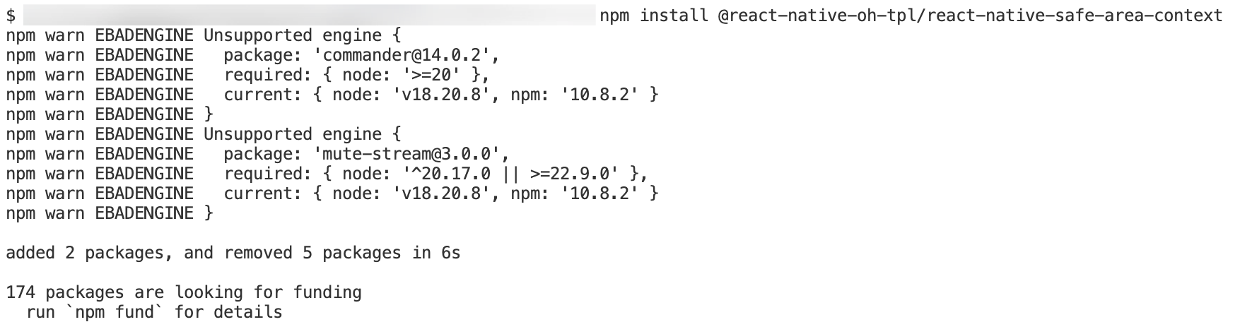
2. 验证安装
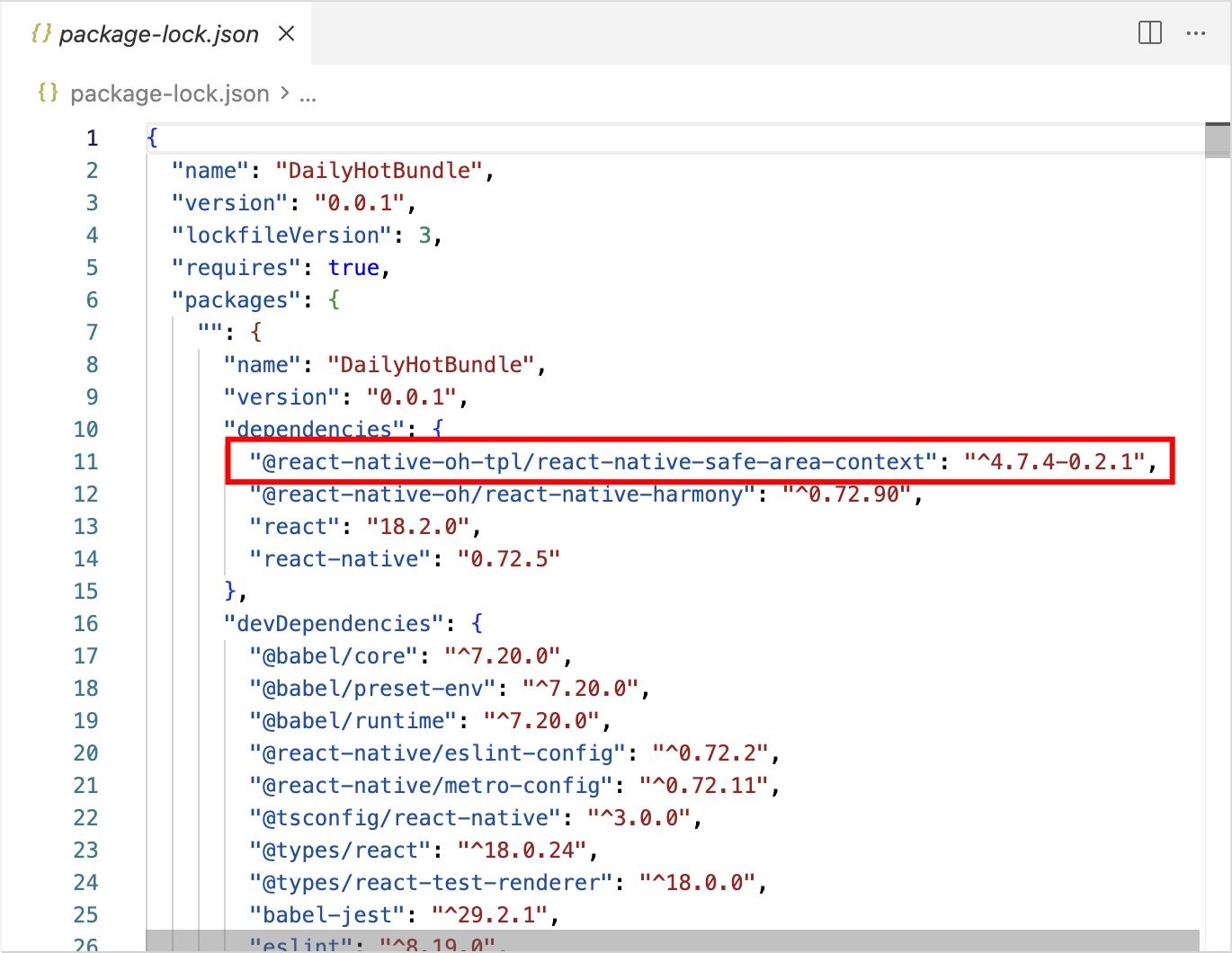
安装完成后,检查 package.json 文件,应该能看到新增的依赖:
{
  "dependencies": {
    "@react-native-oh-tpl/react-native-safe-area-context": "^4.7.4-0.2.1",
    // ... 其他依赖
  }
}
🔧 HarmonyOS 平台配置 ⭐
由于 HarmonyOS 暂不支持 AutoLink,需要手动配置原生端代码。
1 引入原生端代码
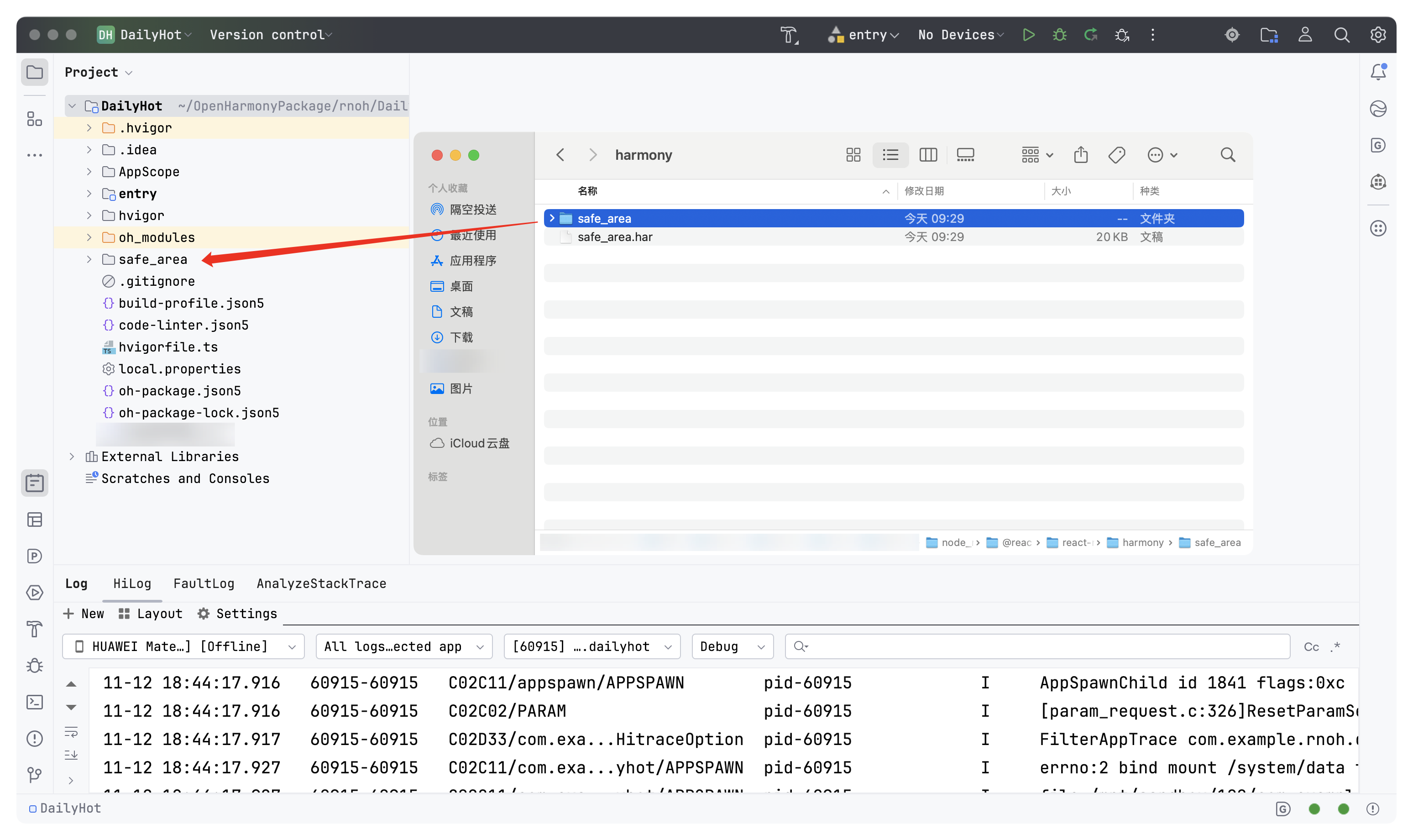
方法一:通过 har 包引入(推荐)
- 修改
entry/oh-package.json5
在工程根目录的 entry/oh-package.json5 中添加依赖:
{
  "dependencies": {
    "@rnoh/react-native-openharmony": "file:../react_native_openharmony",
    "@react-native-oh-tpl/react-native-safe-area-context": "file:../../node_modules/@react-native-oh-tpl/react-native-safe-area-context/harmony/safe_area.har"
  }
}
- 同步依赖
点击 DevEco Studio 右上角的 sync 按钮,或在终端执行:
cd entry
ohpm install
方法二:直接链接源码
如果方法一不适用,可以手动链接源码:目前 DevEco Studio 不支持通过源码引入外部 module,我们推荐使用 har 包的方式引入,如需要直接链接源码,请按照以下步骤操作,将源码通过操作改成 harmony 工程的内部模块。
把<RN工程>/node_modules/@react-native-oh-tpl/react-native-safe-area-context/harmony目录下的源码safe_area复制到harmony(鸿蒙壳工程)工程根目录下。
在harmony工程根目录的 build-profile.template.json5(若存在)和build-profile.json5 添加以下模块
modules:[
  ...
  {
    name: '<xxx>',
    srcPath: './<xxx>',
  },
  {
  	name: 'safe_area',
  	srcPath: './safe_area',
  }
]
打开safe_area/oh-package.json5,修改react-native-openharmony和项目的版本一致。
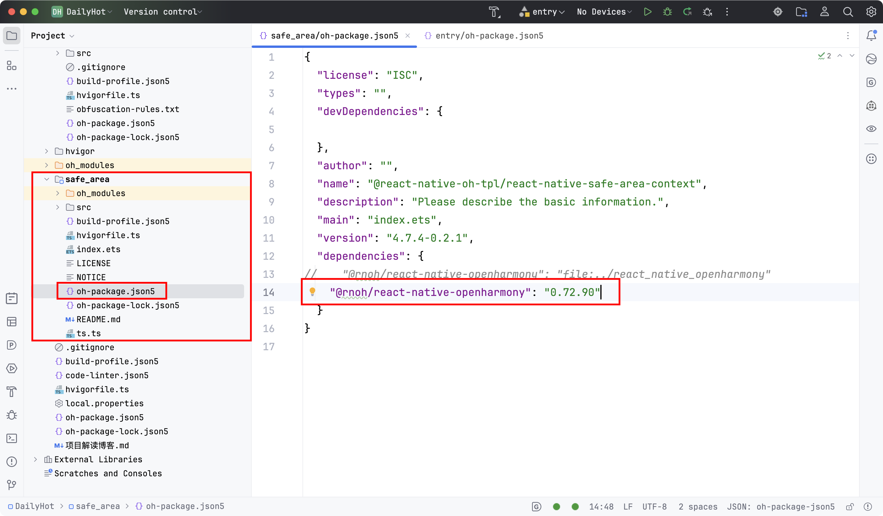
打开 entry/oh-package.json5,添加以下依赖
"dependencies": {
    "@rnoh/react-native-openharmony": "0.72.90",
    "@react-native-oh-tpl/react-native-safe-area-context": "file:../safe_area"
  }
点击右上角的 sync 按钮
2 配置CMakeLists和导入SafeAreaViewPackage
- 修改
entry/src/main/cpp/CMakeLists.txt
set(OH_MODULES "${CMAKE_CURRENT_SOURCE_DIR}/../../../oh_modules")
add_subdirectory("${OH_MODULE_DIR}/@react-native-oh-tpl/react-native-safe-area-context/src/main/cpp" ./safe-area)
target_link_libraries(rnoh_app PUBLIC rnoh_safe_area)
- 修改
entry/src/main/cpp/PackageProvider.cpp
#include "SafeAreaViewPackage.h"

std::vector<std::shared_ptr<Package>> PackageProvider::getPackages(Package::Context ctx) {
    return {
        // ... 其他包
        std::make_shared<SafeAreaViewPackage>(ctx),
    };
}
3 在ArkTs侧引入SafeAreaViewPackage
修改 entry/src/main/ets/RNPackagesFactory.ts
import { SafeAreaViewPackage } from '@react-native-oh-tpl/react-native-safe-area-context/ts';

export function createRNPackages(ctx: RNPackageContext): RNPackage[] {
  return [
    // ... 其他包
    new SafeAreaViewPackage(ctx),
  ];
}
💻 代码集成
1. 基础使用
步骤 1: 在应用根组件添加 SafeAreaProvider
修改 App.tsx,在最外层包裹 SafeAreaProvider:
import React from 'react';
import { View, StatusBar, useColorScheme } from 'react-native';
import { SafeAreaProvider, initialWindowMetrics } from '@react-native-oh-tpl/react-native-safe-area-context';

function App(): JSX.Element {
  const isDarkMode = useColorScheme() === 'dark';

  return (
    <SafeAreaProvider initialMetrics={initialWindowMetrics}>
      <View style={{ flex: 1, backgroundColor: isDarkMode ? '#121212' : '#f5f5f5' }}>
        <StatusBar
          barStyle={isDarkMode ? 'light-content' : 'dark-content'}
        />
        <MainContent isDarkMode={isDarkMode} />
      </View>
    </SafeAreaProvider>
  );
}

export default App;
步骤 2: 使用 SafeAreaView 替换普通 View
在需要处理安全区域的组件中使用 SafeAreaView:
import { SafeAreaView } from '@react-native-oh-tpl/react-native-safe-area-context';

function MainContent({ isDarkMode }: { isDarkMode: boolean }) {
  return (
    <SafeAreaView style={{ flex: 1, backgroundColor: isDarkMode ? '#000000' : '#ffffff' }}>
      {/* 你的内容 */}
    </SafeAreaView>
  );
}
2. DailyHotBundle 项目实际集成
在 DailyHotBundle 项目中,我们已经成功集成了 @react-native-oh-tpl/react-native-safe-area-context。以下是实际代码实现:
文件位置: App.tsx
关键改动:
- 导入库组件 (第 21-25 行):
import {
  SafeAreaProvider,
  SafeAreaView,
  initialWindowMetrics,
} from '@react-native-oh-tpl/react-native-safe-area-context';
- 在 App 组件最外层添加 SafeAreaProvider (第 39 行):
return (
  <SafeAreaProvider initialMetrics={initialWindowMetrics}>
    <View style={[backgroundStyle, { flex: 1 }] }>
      <StatusBar ... />
      <MainContent isDarkMode={isDarkMode} />
    </View>
  </SafeAreaProvider>
);
- 主内容区域使用 SafeAreaView 处理顶部和左右边缘 (第 91-94 行):
<SafeAreaView
  style={{ flex: 1, backgroundColor: isDarkMode ? Colors.black : Colors.white }}
  edges={['top', 'left', 'right']}
>
  {/* 顶部标题栏和内容区域 */}
</SafeAreaView>
- 底部导航栏单独使用 SafeAreaView 处理底部边缘 (第 103-106 行):
<SafeAreaView
  style={{ position: 'absolute', left: 0, right: 0, bottom: 0, ... }}
  edges={['bottom']}
>
  {/* 底部导航栏按钮 */}
</SafeAreaView>
设计说明:
- 主内容区域使用
edges={['top', 'left', 'right']}处理顶部和左右安全区域,避免内容被状态栏或刘海屏遮挡 - 底部导航栏使用独立的
SafeAreaView并设置edges={['bottom']},确保在 iPhone 等设备上不会被 Home Indicator 遮挡 - 使用
initialWindowMetrics提供初始度量,避免首次渲染时的布局闪烁
3. 完整集成示例(参考代码)
以下是完整的代码示例,可作为其他项目的参考:
/**
 * App.tsx - 主应用组件
 */
import React, { useRef, useState } from 'react';
import {
  ScrollView,
  StatusBar,
  Text,
  useColorScheme,
  View,
  Pressable,
  Vibration,
  Image,
} from 'react-native';
import {
  SafeAreaProvider,
  SafeAreaView,
  initialWindowMetrics,
} from '@react-native-oh-tpl/react-native-safe-area-context';
import { TAB_ITEMS, TabItem } from './bundles/tabs';

const Colors = {
  white: '#ffffff',
  black: '#000000',
  darker: '#121212',
  lighter: '#f5f5f5',
} as const;

function App(): JSX.Element {
  const isDarkMode = useColorScheme() === 'dark';

  const backgroundStyle = {
    backgroundColor: isDarkMode ? Colors.darker : Colors.lighter,
  };

  return (
    <SafeAreaProvider initialMetrics={initialWindowMetrics}>
      <View style={[backgroundStyle, { flex: 1 }]}>
        <StatusBar
          barStyle={isDarkMode ? 'light-content' : 'dark-content'}
          backgroundColor={backgroundStyle.backgroundColor}
        />
        <MainContent isDarkMode={isDarkMode} />
      </View>
    </SafeAreaProvider>
  );
}

function MainContent({ isDarkMode }: { isDarkMode: boolean }) {
  const [tab, setTab] = useState<'world60s' | 'bing' | 'rates' | 'history' | 'epic'>('world60s');
  const [refresh, setRefresh] = useState<Record<string, number>>({});
  const scrollRef = useRef<ScrollView>(null);
  const lastTapRef = useRef<{ key: string; time: number }>({ key: '', time: 0 });
  const barHeight = 52;

  const palette = {
    barBg: isDarkMode ? '#121212' : '#f7f7f7',
    activeBg: isDarkMode ? '#1f1f1f' : '#eaeaea',
    activeText: isDarkMode ? Colors.white : Colors.black,
    inactiveText: isDarkMode ? '#a6a6a6' : '#666',
  };

  const tabs: TabItem[] = TAB_ITEMS;
  const currentTitle = tabs.find(t => t.key === tab)?.title || '';

  return (
    <SafeAreaView
      style={{ flex: 1, backgroundColor: isDarkMode ? Colors.black : Colors.white }}
      edges={['top', 'left', 'right']}
    >
      {/* 顶部标题栏 */}
      <View
        style={{
          height: 48,
          alignItems: 'center',
          justifyContent: 'center',
          borderBottomWidth: 1,
          borderBottomColor: '#eaeaea',
          backgroundColor: isDarkMode ? Colors.black : Colors.white,
        }}
      >
        <Text
          style={{
            fontSize: 16,
            fontWeight: '600',
            color: isDarkMode ? Colors.white : Colors.black,
          }}
        >
          {currentTitle}
        </Text>
      </View>

      {/* 内容区域 */}
      <ScrollView
        ref={scrollRef}
        contentInsetAdjustmentBehavior="automatic"
        style={{ flex: 1 }}
        contentContainerStyle={{ paddingBottom: barHeight }}
      >
        <View style={{ paddingHorizontal: 16 }}>
          {tabs.map(item =>
            tab === item.key ? (
              <item.Screen key={`${item.key}-${refresh[item.key] || 0}`} />
            ) : null
          )}
        </View>
      </ScrollView>

      {/* 底部导航栏 - 使用 SafeAreaView 处理底部安全区域 */}
      <SafeAreaView
        style={{
          position: 'absolute',
          left: 0,
          right: 0,
          bottom: 0,
          flexDirection: 'row',
          borderTopWidth: 1,
          borderTopColor: '#eaeaea',
          paddingVertical: 6,
          paddingHorizontal: 6,
          backgroundColor: palette.barBg,
          minHeight: barHeight,
        }}
        edges={['bottom']}
      >
        {tabs.map(item => {
          const active = tab === (item.key as any);
          return (
            <Pressable
              key={item.key}
              onPress={() => {
                const now = Date.now();
                if (
                  active &&
                  now - lastTapRef.current.time < 300 &&
                  lastTapRef.current.key === item.key
                ) {
                  if (scrollRef.current)
                    scrollRef.current.scrollTo({ y: 0, animated: true });
                  Vibration.vibrate(15);
                } else {
                  setTab(item.key as any);
                  Vibration.vibrate(8);
                }
                lastTapRef.current = { key: item.key, time: now };
              }}
              onLongPress={() => {
                setRefresh(r => ({ ...r, [item.key]: (r[item.key] || 0) + 1 }));
                Vibration.vibrate(20);
              }}
              style={{
                flex: 1,
                alignItems: 'center',
                justifyContent: 'center',
                paddingVertical: 6,
                marginHorizontal: 4,
                borderRadius: 10,
                backgroundColor: active ? palette.activeBg : 'transparent',
              }}
            >
              <View style={{ alignItems: 'center', justifyContent: 'center' }}>
                {item.iconSource ? (
                  <Image source={item.iconSource} style={{ width: 22, height: 22 }} />
                ) : (
                  <Text style={{ fontSize: 20 }}>{item.icon}</Text>
                )}
              </View>
            </Pressable>
          );
        })}
      </SafeAreaView>
    </SafeAreaView>
  );
}

export default App;
4. 高级用法:获取安全区域数值
如果需要获取具体的安全区域数值(例如,用于自定义布局),可以使用 useSafeAreaInsets Hook:
import { useSafeAreaInsets } from '@react-native-oh-tpl/react-native-safe-area-context';

function CustomComponent() {
  const insets = useSafeAreaInsets();

  return (
    <View
      style={{
        paddingTop: insets.top,
        paddingBottom: insets.bottom,
        paddingLeft: insets.left,
        paddingRight: insets.right,
      }}
    >
      {/* 你的内容 */}
    </View>
  );
}
5. 边缘特定处理
SafeAreaView 支持 edges 属性,可以指定需要处理哪些边缘:
// 只处理顶部和底部
<SafeAreaView edges={['top', 'bottom']} style={{ flex: 1 }}>
  {/* 内容 */}
</SafeAreaView>

// 只处理底部(常用于底部导航栏)
<SafeAreaView edges={['bottom']} style={{ ... }}>
  {/* 底部导航栏内容 */}
</SafeAreaView>

// 处理所有边缘(默认)
<SafeAreaView edges={['top', 'bottom', 'left', 'right']} style={{ flex: 1 }}>
  {/* 内容 */}
</SafeAreaView>
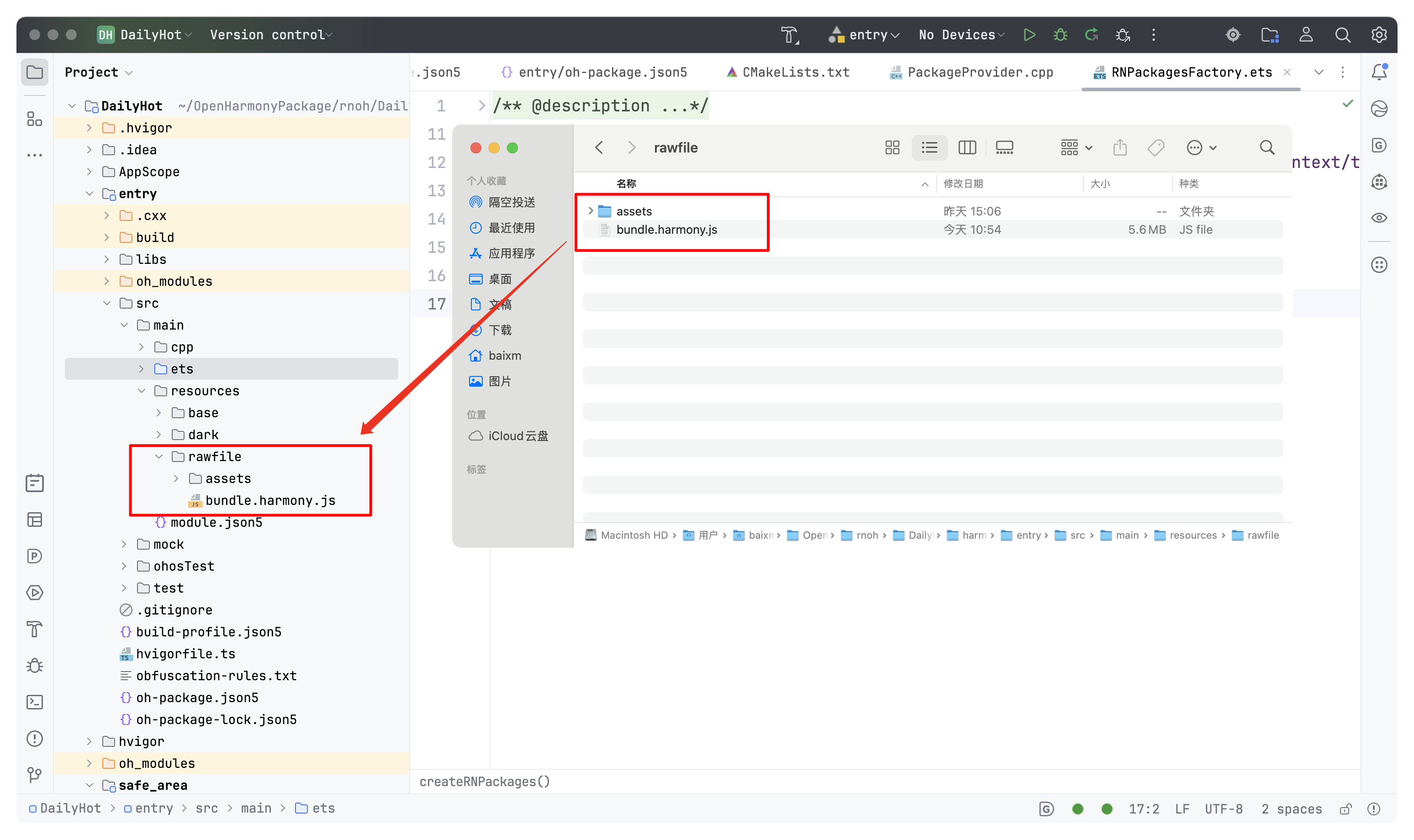
6. 执行npm run harmony命令,构建适用于鸿蒙的bundle文件,并拷贝到鸿蒙工程rawfile目录下。

🎨 实际应用场景
场景 1: 全屏内容布局
当需要内容铺满整个屏幕,但又要避开安全区域时:
<SafeAreaView style={{ flex: 1, backgroundColor: '#000000' }}>
  <Image
    source={{ uri: 'https://example.com/wallpaper.jpg' }}
    style={{ width: '100%', height: '100%' }}
    resizeMode="cover"
  />
</SafeAreaView>
场景 2: 底部导航栏
底部导航栏需要避开设备底部的安全区域(如 iPhone 的 Home Indicator):
<SafeAreaView
  edges={['bottom']}
  style={{
    flexDirection: 'row',
    backgroundColor: '#ffffff',
    borderTopWidth: 1,
    borderTopColor: '#eaeaea',
  }}
>
  {/* 导航栏按钮 */}
</SafeAreaView>
场景 3: 顶部状态栏区域
顶部内容需要避开状态栏和刘海区域:
<SafeAreaView edges={['top']} style={{ backgroundColor: '#ffffff' }}>
  <View style={{ height: 44, justifyContent: 'center', paddingHorizontal: 16 }}>
    <Text style={{ fontSize: 18, fontWeight: '600' }}>标题</Text>
  </View>
</SafeAreaView>
场景 4: 自定义边距计算
使用 useSafeAreaInsets 获取具体数值,用于复杂布局:
function CustomLayout() {
  const insets = useSafeAreaInsets();
  const headerHeight = 60;
  const tabBarHeight = 50;

  return (
    <View style={{ flex: 1 }}>
      {/* 顶部区域 */}
      <View
        style={{
          height: headerHeight + insets.top,
          paddingTop: insets.top,
          backgroundColor: '#ffffff',
        }}
      >
        {/* 头部内容 */}
      </View>

      {/* 内容区域 */}
      <ScrollView style={{ flex: 1 }}>
        {/* 内容 */}
      </ScrollView>

      {/* 底部区域 */}
      <View
        style={{
          height: tabBarHeight + insets.bottom,
          paddingBottom: insets.bottom,
          backgroundColor: '#f7f7f7',
        }}
      >
        {/* 底部内容 */}
      </View>
    </View>
  );
}
⚠️ 注意事项与最佳实践
1. SafeAreaProvider 的位置
SafeAreaProvider 应该放在应用的最外层,通常包裹整个 App 组件:
// ✅ 正确
<SafeAreaProvider>
  <App />
</SafeAreaProvider>

// ❌ 错误 - 放在组件内部
function App() {
  return (
    <View>
      <SafeAreaProvider>
        {/* 内容 */}
      </SafeAreaProvider>
    </View>
  );
}
2. initialWindowMetrics 的使用
initialWindowMetrics 用于提供初始的安全区域度量,有助于避免首次渲染时的布局闪烁:
<SafeAreaProvider initialMetrics={initialWindowMetrics}>
  {/* 内容 */}
</SafeAreaProvider>
3. 性能考虑
SafeAreaView会在每次安全区域变化时重新渲染,如果内容复杂,考虑使用React.memo优化- 避免在
SafeAreaView内部使用过多的嵌套组件
4. HarmonyOS 特殊处理
在 HarmonyOS 平台上,确保:
- 已正确配置原生端代码(参考上述 HarmonyOS 配置步骤)
- 测试不同设备的安全区域表现
- 注意 HarmonyOS 设备可能的安全区域差异
5. 与 StatusBar 的配合
SafeAreaView 会自动处理状态栏区域,通常不需要额外设置 StatusBar 的 translucent 属性:
// ✅ 推荐
<SafeAreaView style={{ flex: 1 }}>
  <StatusBar barStyle="dark-content" />
  {/* 内容 */}
</SafeAreaView>

// ⚠️ 如果使用 translucent,需要额外处理
<StatusBar translucent />
<SafeAreaView style={{ flex: 1, paddingTop: StatusBar.currentHeight }}>
  {/* 内容 */}
</SafeAreaView>
6. 样式继承
SafeAreaView 本质上是一个 View,支持所有 View 的样式属性:
<SafeAreaView
  style={{
    flex: 1,
    backgroundColor: '#ffffff',
    // 其他样式...
  }}
>
  {/* 内容 */}
</SafeAreaView>
🧪 测试验证
1. Android 平台测试
npm run android
测试要点:
- 检查状态栏区域是否正确避开
- 检查底部导航栏是否在安全区域内
- 测试不同 Android 版本的表现
2. iOS 平台测试
npm run ios
测试要点:
- 在 iPhone X 及以上设备测试刘海区域处理
- 检查底部 Home Indicator 区域
- 测试横屏和竖屏切换
3. HarmonyOS 平台测试
npm run harmony
测试要点:
- 验证原生代码是否正确链接
- 检查安全区域计算是否准确
- 测试不同 HarmonyOS 设备
4. 常见问题排查
问题 1: HarmonyOS 上 SafeAreaView 不生效
- 检查
oh-package.json5中的依赖配置 - 确认原生代码是否正确链接
- 查看 DevEco Studio 的构建日志
问题 2: 底部导航栏被遮挡
- 确保底部导航栏使用了
SafeAreaView或edges={['bottom']} - 检查是否有
position: 'absolute'覆盖了安全区域
问题 3: 顶部内容被状态栏遮挡
- 确保根组件使用了
SafeAreaView - 检查
StatusBar的配置
📊 对比:原生 SafeAreaView vs react-native-safe-area-context
| 特性 | 原生 SafeAreaView | react-native-safe-area-context |
|---|---|---|
| 基础功能 | ✅ | ✅ |
| 获取具体数值 | ❌ | ✅ (useSafeAreaInsets) |
| 边缘特定处理 | ❌ | ✅ (edges 属性) |
| HarmonyOS 支持 | ⚠️ 有限 | ✅ 完整支持 |
| 动态更新 | ⚠️ 有限 | ✅ 完整支持 |
| 灵活性 | ⚠️ 较低 | ✅ 高 |
📝 总结
通过集成 @react-native-oh-tpl/react-native-safe-area-context,我们为 DailyHotBundle 项目添加了强大的安全区域处理能力。这个库不仅解决了跨平台安全区域处理的痛点,还提供了灵活的 API 来满足各种复杂的布局需求。
项目集成成果
在项目中,我们已经成功完成了以下集成工作:
- ✅ 依赖安装: 已通过
npm install安装@react-native-oh-tpl/react-native-safe-area-context@^4.7.4-0.2.1 - ✅ 代码集成: 在
App.tsx中完成了完整的集成- 应用根组件使用
SafeAreaProvider包裹 - 主内容区域使用
SafeAreaView处理顶部和左右边缘 - 底部导航栏使用独立的
SafeAreaView处理底部边缘
- 应用根组件使用
- ✅ 边缘处理: 使用
edges属性精确控制需要处理的安全区域边缘 - ✅ 代码质量: 通过 ESLint 检查,无代码错误
关键要点回顾
- ✅ 安装依赖:
npm install @react-native-oh-tpl/react-native-safe-area-context - ✅ 配置平台: Android/iOS 自动链接,HarmonyOS 需要手动配置
- ✅ 集成代码: 使用
SafeAreaProvider和SafeAreaView - ✅ 高级用法:
useSafeAreaInsetsHook 和edges属性 - ✅ 测试验证: 确保三端表现一致
实际效果
- iPhone X 及以上设备: 顶部内容不会被刘海屏遮挡,底部导航栏不会被 Home Indicator 遮挡
- Android 异形屏: 正确处理状态栏和导航栏区域
- HarmonyOS 设备: 通过专用适配库,确保安全区域处理的一致性
希望这篇教程能帮助你顺利集成安全区域处理功能,提升应用的用户体验!

作为“人工智能6S店”的官方数字引擎,为AI开发者与企业提供一个覆盖软硬件全栈、一站式门户。
更多推荐

 15
15 0
0- 0


 已为社区贡献3条内容

所有评论(0)