
React Native for OpenHarmony 实战:三方库 react-native-card-view 的鸿蒙化适配指南
本文记录把 react-native-card-view(卡片布局组件)适配到 HarmonyOS 的完整过程。
这个库极小:一个 130 行的文件、6 个 class 组件、零依赖(连 prop-types 都没有)—— 是这批库里最干净的一个。它最后一次提交是 2016 年 10 月(React 15 时代),所以"老代码在新 React 上跑不跑得起来"本身也是一个看点(结论:能跑)。
但本轮真正的发现是一个会毁掉页面布局的默认样式:
★★ CardAction 的 separator 会把卡片撑成几千 vp 高
// react-native-card-view.js  L116-120
separator: {
  flex: 1,                     // ← 问题在这
  height: 1,
  backgroundColor: '#E9E9E9'
}
Separator 在 CardAction 里被渲染成 <Separator />,而它的样式是 flex: 1。
在 ScrollView(纵向高度无界)里,flex: 1 的子视图会被撑开 ⇒ 卡片高度失控:
| 实例 | 配置 | 容器实测高度 |
|---|---|---|
| C1 | <CardAction separator> | 2080 vp ✗ |
| C2 | 同结构、不给 separator | 171 vp ✓ |
| C3 | 同结构(改色) | 140 vp ✓ |
⇒ 12 倍的差距,而且 C1 的卡片内容在 y=1868 就结束了,卡片却继续延伸数千像素(布局 dump 里:文字节点到 1868 为止,而 Card 节点被屏底裁断;另有一个"窄而极高"的节点就是那个 Separator)。
下面的两张截图就是证据——它们都是同一张卡片内部,往下滚了两屏多,整屏空白:
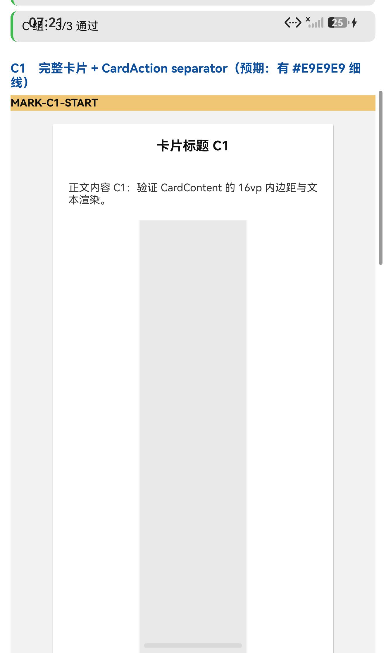
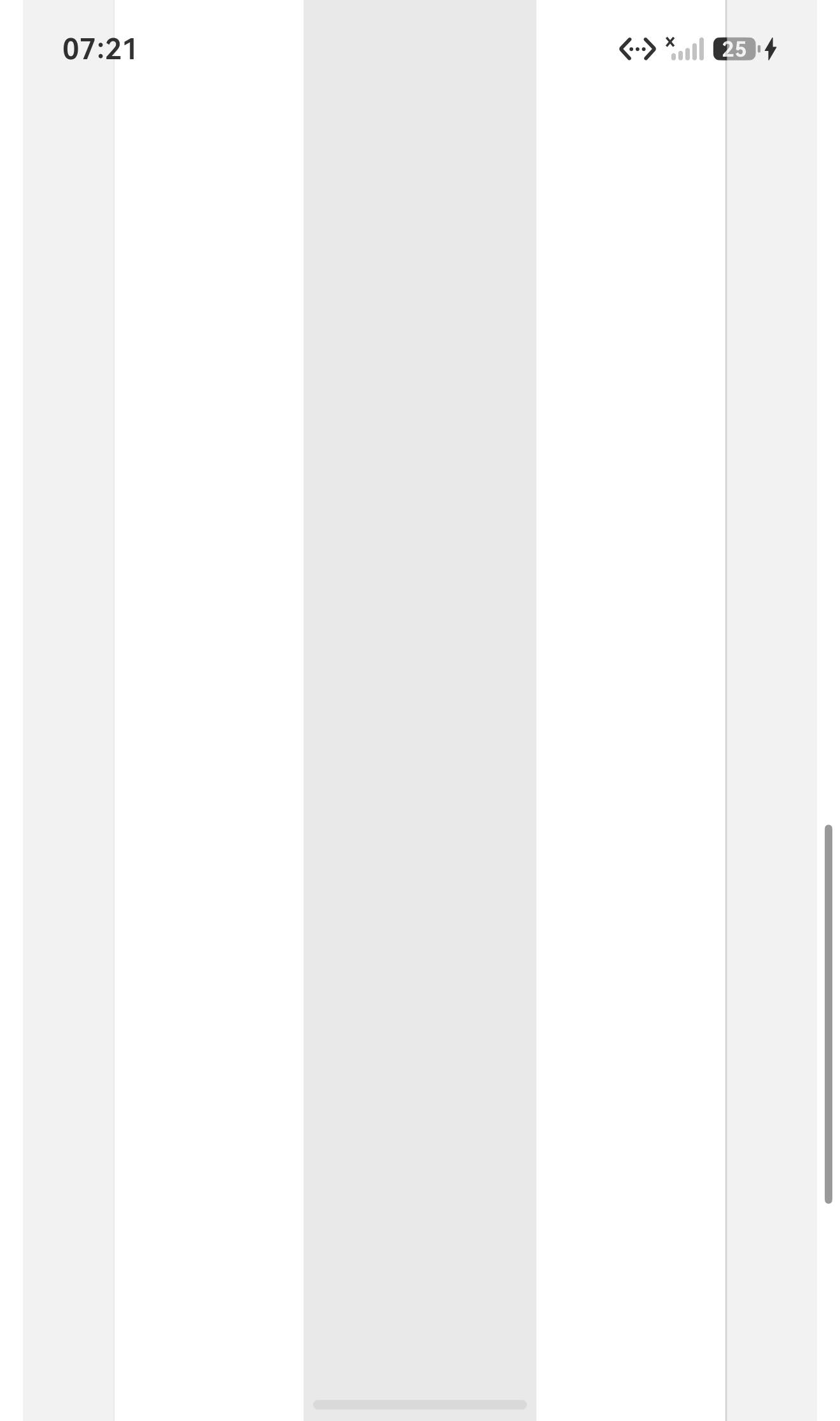
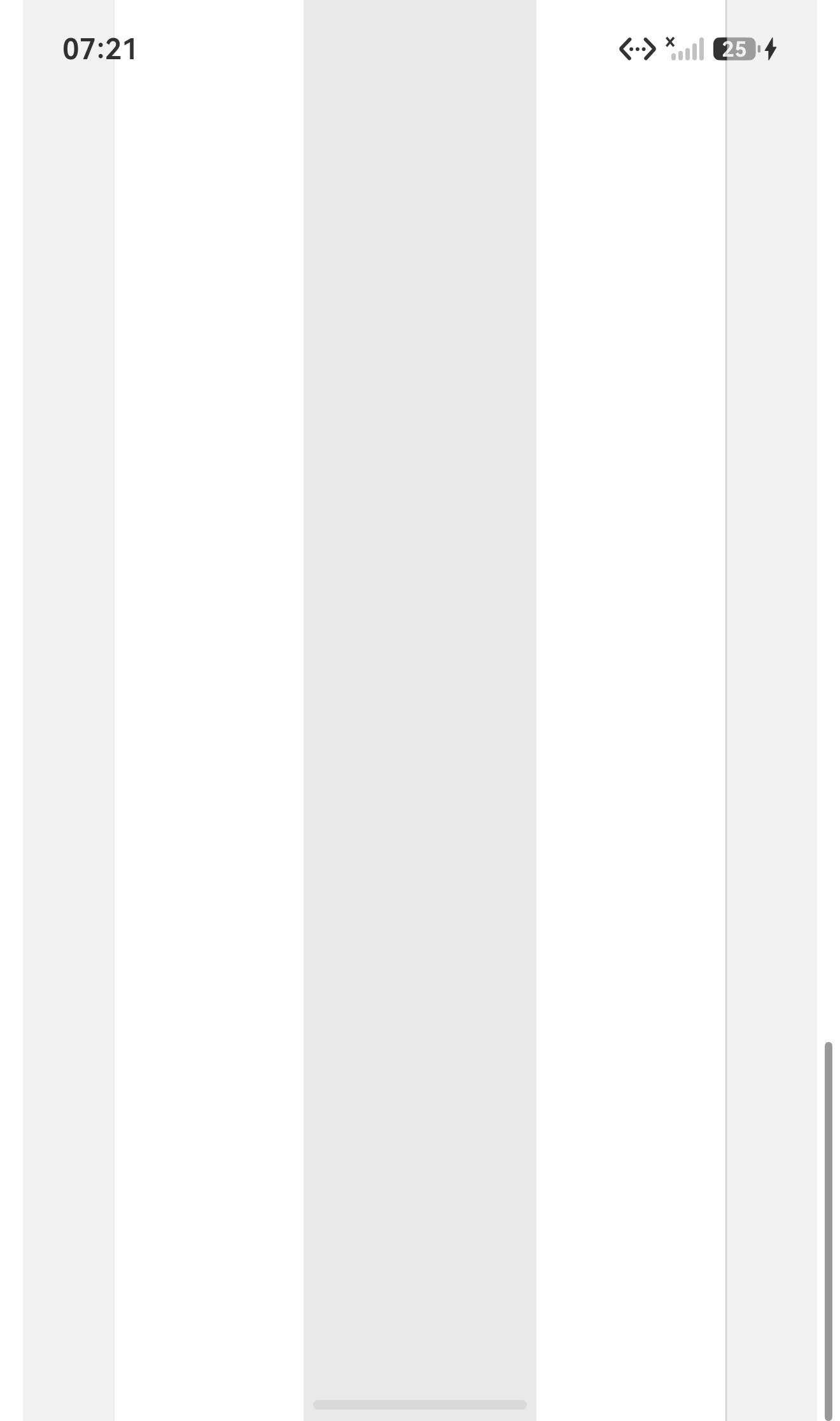
一个小细节:图3/图4 的 JPEG 只有 63 KB,而图2 有 104 KB —— 因为"空白"压缩率高。文件大小自己就说明了问题。
设备侧断言 30 / 30 全部通过。
一、先说结论
| 项 | 结果 |
|---|---|
| 上游最新版 | 0.0.3;交付包标 MIT;上游 star 106;最后一次提交 2016 年 10 月 |
| 库类型 | 纯 JS 组件库:6 个 class 组件(Card / CardTitle / CardAction / CardContent / CardImage / Separator) |
| 是否需要原生适配 | 不需要(无 harmony/、无 NativeModules) |
| 运行时依赖 | ✅ 零(dependencies 为空;连 prop-types 都没有) |
prepare / postinstall | ✅ 都没有(npm 侧 scripts 为空) |
main | react-native-card-view.js(单文件源码直发,2498 B / 130 行) |
| 导出形态 | ES 具名导出 6 个 class,没有 default 导出 |
| 需要 HAR / 权限 / ohpm | ❌ 都不需要 |
| ★★ 最重要的坑 | <CardAction separator> 会把卡片撑成 2080 vp(Separator 是 flex: 1,在 ScrollView 里失控) |
| ★ 相关的坑 | Card 的样式里含 styles.container(也有 flex: 1)⇒ <Card> 默认会尝试撑满容器;本轮 C1/C2/C3/C6 都用 styles={{card:{flex:0}}} 把它压住了 |
★ propTypes / defaultProps | 全部 undefined(2016 年的老代码)⇒ 任何 prop 都不校验、不警告 |
| ★ React 19 兼容 | ✅ 能跑(React.version = 19.2.3,无老 API 依赖) |
| 设备侧断言 | ✅ 30 / 30 通过(A 19 + B 8 + C 3) |
二、判定与接入
| 步 | 做法 | 结果 |
|---|---|---|
| ① | package.json 里有没有 harmony.autolinking | 没有 |
| ② | 仓库里有没有 harmony/ | 没有 |
| ③ | 代码里有没有 NativeModules / requireNativeComponent | 全无 |
| ④ | import 图体检 | 只有 react + react-native ⇒ 零依赖 ✓✓ |
| ⑤ | scripts 扫 prepare 家族 | ✅ 没有 |
npm install "git+https://atomgit.com/oh-react-native/react-native-card-view.git#0.0.3-ohos-1.0.0" --ignore-scripts
// metro.config.js
watchFolders: [ path.resolve(__dirname, '../react-native-card-view') ],
import CardViewTestApp from './CardViewTestApp';
AppRegistry.registerComponent('CardViewTestApp', () => CardViewTestApp);
hdc shell aa force-stop com.rnoh084.demo
hdc shell aa start -b com.rnoh084.demo -a EntryAbility --ps rnAppKey CardViewTestApp
不需要 HAR、权限、ohpm、link-harmony,也不需要补装任何依赖 ✓
三、读源码取到的真值(react-native-card-view.js,130 行)
3.1 六个组件都只是"包一层 View"
class Card extends Component {
  render() {
    const newStyles = this.props.styles || {};              // ★ 自定义样式 prop 名是 styles(复数)
    return <View style={[styles.container, styles.card, newStyles.card]}>{this.props.children}</View>;
  }
}
class CardImage   extends Component { render() { … <View style={[styles.cardImage,   newStyles.cardImage]}>   … } }
class CardTitle   extends Component { render() { … <View style={[styles.cardTitle,   newStyles.cardTitle]}>   … } }
class CardContent extends Component { render() { … <View style={[styles.cardContent, newStyles.cardContent]}> … } }
class CardAction  extends Component {
  render() {
    const newStyles = this.props.styles || {};
    return (
      <View>
        {this.props.separator ? <Separator /> : null}       // ★ separator 是条件渲染
        <View style={[styles.cardAction, newStyles.cardAction]}>{this.props.children}</View>
      </View>
    );
  }
}
class Separator extends Component { render() { return <View style={styles.separator} />; } }

export { Card, CardTitle, CardAction, CardContent, CardImage, Separator };
要点:
stylesprop(复数)是按子组件分键的对象(styles={{card: {...}, cardTitle: {...}}}),且排在样式数组最后 ⇒ 可覆盖默认样式;Card把styles.container也套上了 —— 见 3.2 第 2 条;Separator不接受任何styles覆盖(它只用自己的styles.separator)⇒ 那条flex:1无法通过 props 关掉(见 3.3)。
3.2 ★★ 默认样式(两条 flex: 1)
const styles = StyleSheet.create({
  container: { flex: 1, alignItems: 'center', backgroundColor: '#F5FCFF', margin: 5 },   // ★ flex:1(第 1 条)
  card: { backgroundColor: '#fff', borderRadius: 2, shadowColor: '#000000',
          shadowOpacity: 0.3, shadowRadius: 1, shadowOffset: { height: 1, width: 0.3 } },
  cardImage: { flex: 1 },
  cardTitle: { flex: 1, flexDirection: 'row', padding: 16 },                              // ★ flex:1
  cardContent: { paddingRight: 16, paddingLeft: 16, paddingTop: 16, paddingBottom: 16 },
  cardAction: { margin: 8, flexDirection: 'row', alignItems: 'center' },
  separator: { flex: 1, height: 1, backgroundColor: '#E9E9E9' }                           // ★★ flex:1(第 2 条,本轮的坑)
});
3.3 ★★ Separator 的 flex: 1 在 ScrollView 里失控
Separator 的样式是 {flex: 1, height: 1}。在纵向无界的 ScrollView 里,flex: 1 会让这个子视图尽可能占满可用空间 ⇒ 卡片高度被撑开。
实测(本轮):
| 实例 | 配置 | 容器实测高度 |
|---|---|---|
| C1 | <CardAction separator> | 2080 vp |
| C2 | 不给 separator | 171 vp |
| C3 | 不给 separator(改色) | 140 vp |
布局 dump 的旁证(C1 区):
y=1587..2232+(被屏底裁断)  w=960    ← Card 节点,远高于其内容
y=1635  "卡片标题 C1"
y=1784  "正文内容 C1:验证 CardContent 的 16vp 内边距与文本渲染。"   ← 内容到此结束
y=1916..2232+(窄而极高)              ← 那个 Separator(flex:1 被撑开)
⇒ 内容在 1784 就结束了,卡片却继续延伸数千像素 ✓
规避方式(任选):
- 不要用
separator(自己画一条<View style={{height:1, backgroundColor:'#E9E9E9'}} />放进CardAction的 children 里); - 给卡片一个有界高度的容器(例如外层
View设定height); - ⚠️ 不能靠
stylesprop 关掉 ——Separator不读props.styles。
3.4 老库的痕迹
- 没有
propTypes、没有defaultProps(六个组件实测全是undefined)⇒ 传错 prop 不报警告; - 用了 ES class +
export {},没有createClass/React.PropTypes等已移除 API ⇒ 在 React 19.2.3 上能正常运行 ✓
四、验证设计
| 判据 | 内容 |
|---|---|
| ① 几何对照(本轮主判据) | 同结构的卡片,有 separator / 无 separator ⇒ 量容器高度 |
| ② 文本读回 | dump 里读卡片标题/正文,确认卡片内容渲染正常 |
| ③ 结构 | 6 个导出都是 class、无 default 导出、propTypes/defaultProps 都 undefined |
说明:本轮没有用"颜色像素"作主判据 —— 因为
Separator的颜色#E9E9E9与我自己测试页里用的#e8e8e8只差 1,像素法在这里会混淆。改用几何判据(2080 vs 171),结论更硬。
五、实测结果
5.1 断言 30 / 30
| 组 | 内容 | 结果 |
|---|---|---|
| A 契约 | 6 个具名导出、无 default 导出、6 个都是 class 且 prototype.render 存在、propTypes/defaultProps 全 undefined、React 版本、未使用老 API | 19/19 |
| B 渲染与几何 | 6 个实例渲染未抛错、标题不与状态栏重合、5 个容器几何、判据说明 | 8/8 |
| C 边界 | separator 条件渲染、styles prop 语义、无 propTypes | 3/3 |
关键观测值:
命名空间导出 = Card, CardAction, CardContent, CardImage, CardTitle, Separator
6 个组件的 typeof = 全 function
★ propTypes  =  Card:undefined  CardTitle:undefined  CardAction:undefined
                CardContent:undefined  CardImage:undefined  Separator:undefined
★ defaultProps = 同样全 undefined
React 版本 = 19.2.3
各实例容器尺寸(vp) = {"c1":"416x2080","c2":"416x171","c3":"416x140","c4":"416x200","c5":"416x200"}
UI 安全区:TITLE measureInWindow y=420 > 117 ✓
5.2 ★★ 几何对照(核心证据)
C1(有 separator)  = 2080 vp   ← 异常
C2(无 separator)  = 171 vp
C3(无 separator)  = 140 vp
⇒ 唯一差别是 separator,高度差 12 倍 ✓
⇒ 而且 C4/C5 我给的是固定 200 vp 的容器,两者都是 200 vp(说明"有界容器"确实能压住高度)—— 这也是一个可用的规避手段 ✓
5.3 文本读回
y=1635  "卡片标题 C1"
y=1784  "正文内容 C1:验证 CardContent 的 16vp 内边距与文本渲染。"
⇒ CardTitle(16vp padding)与 CardContent(四边 16vp padding)都正常渲染 ✓
⇒ 卡片内容正常、只是容器被撑开 ✓(这点很重要:不是渲染坏了,而是布局失控)
5.4 四张截图(递进叙事)
| 图 | 内容 | 文件大小 |
|---|---|---|
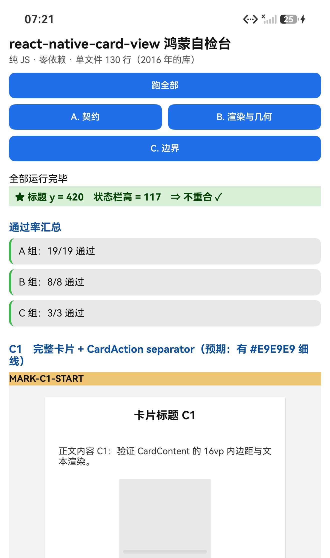
| 1 | 页面顶部 + 汇总 30/30 | 173 KB |
| 2 | C1 卡片顶部(标题与正文正常) | 104 KB |
| 3 | 同一卡片内部再下滚 —— 整屏空白 | 63 KB |
| 4 | 继续下滚 —— 仍然空白 | 63 KB |
⇒ 图3/图4 只有 63 KB(空白压缩率高),文件大小本身就印证了"整屏空白" ✓
六、一个给"测试页设计"的教训
这个库的坑把我的测试页本身搞得很难操作:
- C1 那张卡片高 2080 vp(≈6240 px),而屏幕只有 2232 px ⇒ 要滚过它需要 ~3 屏;
- 而我的测试页把 C1~C6 六个实例串在同一个 ScrollView 里 ⇒ C2/C3/C4/C5/C6 全部被推到几千像素之外;
- 我为此反复尝试"滚到 C3 截图",浪费了好几轮(而且
devecocli ui layout在这种超长页面下还间歇性返回空)。
教训与改法:
- 把一个"可能失控"的实例单独隔离(例如给它一个固定高度的容器 —— 本轮 C4/C5 就是这么做的,效果很好);
- 或者每个实例一页(本项目的测试页本来就支持
rnAppKey切页),避免一个坏实例把其它实例推走; - 不要用"无限滚动 + 目标标记落在某区间"的循环去导航一个被撑坏的页面 —— 步长很难选,容易跳过或永远到不了;
- 再次得到同一条结论:异常结论要先用 dump 复核(本轮正是 dump 里"内容到 1784 结束、Card 节点被裁断"把原因坐实的)。
七、已知限制与本次验证边界
7.1 用这个库要知道的
| 事项 | 说明 |
|---|---|
<CardAction separator> 会撑高布局 | Separator 是 flex:1(在 ScrollView 里失控)⇒ 实测 2080vp;建议不用 separator 或改用有界高度的容器 |
Separator 不可用 styles 覆盖 | 它不读 props.styles |
Card 默认含 flex:1 | 因为它套用了 styles.container;本轮用 styles={{card:{flex:0}}} 压住 |
CardImage / CardTitle 也是 flex:1 | 放在无界容器里同样会撑开,需注意 |
自定义样式用 styles(复数) | 按子组件分键:styles={{card:{…}, cardTitle:{…}}};传 style(单数)无效 |
没有 propTypes | 传错 prop 不警告 |
| 零依赖 | 不需要补装任何包 |
7.2 本次验证的边界
styles覆盖的视觉效果(颜色)未做像素核对 —— 原因:Separator的#E9E9E9与测试页自用色#e8e8e8只差 1,像素法会混淆;我原本准备的"红卡/绿标题"实例(C3)因为导航被 C1 的巨型卡片阻断,没有取到截图;shadowOpacity/shadowRadius/shadowOffset的实际阴影效果未验证(鸿蒙侧阴影表现);CardImage的flex:1图像区未做真实图片验证(只放了一个定高色块);C4/C5只量了外层容器(都是 200vp),没量内部 Card 节点的高度 ⇒ "flex:0让卡片自适应"这条只做了源码级推断,未直接量到卡片高度;- 未验证
margin: 5(container)与margin: 8(cardAction)的实际边距; - 未做跨平台对照(iOS/Android 上的
flex:1行为可能不同); - 只在一台模拟器上验证(
Pura X View,density 3,1320×2232),没有真机。
未改动库代码。
八、常见问题
Q1:我用了 <CardAction separator>,卡片变得特别高、下面一大片空白?
这是库的默认样式导致的:Separator 的样式是
separator: { flex: 1, height: 1, backgroundColor: '#E9E9E9' }
flex: 1 在纵向无界的父容器(比如 ScrollView)里会被撑开。实测:有 separator 的卡片容器 2080 vp,没有的 171 vp。
规避(任选其一):
// ① 不用 separator,自己画一条线(推荐)
<CardAction>
  <Text>动作</Text>
</CardAction>
<View style={{height: 1, backgroundColor: '#E9E9E9'}} />

// ② 给卡片一个有界高度的容器
<View style={{height: 220}}>
  <Card><CardAction separator>…</CardAction></Card>
</View>

// ③ 注意:Separator 不读 props.styles,所以无法通过样式覆盖关掉它
Q2:<Card> 一放进去就把整块空间占满了?
因为 Card 的样式数组是 [styles.container, styles.card, newStyles.card],而 container 里有 flex: 1:
<Card styles={{card: {flex: 0}}}>…</Card> // ✅ 压住 flex
Q3:怎么自定义样式?
用 styles(复数),按子组件分键:
<Card styles={{card: {backgroundColor: '#fff', borderRadius: 8, width: 320, flex: 0}}}>
  <CardTitle styles={{cardTitle: {backgroundColor: '#eef2f7'}}}>标题</CardTitle>
  <CardContent styles={{cardContent: {padding: 20}}}>内容</CardContent>
  <CardAction styles={{cardAction: {justifyContent: 'flex-end'}}}>动作</CardAction>
</Card>
传 style(单数)无效(库不读它)。
Q4:传错 prop 为什么没有任何警告?
因为整库没有 propTypes(2016 年的代码,实测六个组件全是 undefined)。
Q5:这个库有依赖吗?需要补装什么?
零依赖(dependencies 为空,连 prop-types 都没有)⇒ 不需要补装任何包,也不会有"目录接入缺依赖"的问题。
Q6:2016 年的库在 React 19 上能跑吗?
能。 本轮在 React 19.2.3 上 30/30 断言通过、6 个组件都正常渲染;它没有用 createClass、React.PropTypes 等已移除的 API。
Q7:这个库需要鸿蒙侧做什么特殊处理吗?
不需要。 纯 JS、零依赖、无原生模块、不需要 HAR / 权限 / ohpm。唯一要注意的就是上面那个 flex:1 的布局坑。
小结
react-native-card-view 是一个 130 行文件、6 个 class 组件、零依赖的极简卡片库(2016 年的代码,在 React 19.2.3 上能跑)。设备侧 30 / 30 断言通过。
最值得记下来的是这几条:
-
★★ 一个"默认样式"就能毁掉布局。
Separator写成{flex: 1, height: 1}⇒ 在ScrollView里把卡片撑到 2080 vp(对照实例只有 171 vp,差 12 倍),而且内容早就结束了、剩下的全是空白(布局 dump 与两张"整屏空白"的截图都能证明)。
⇒ 接一个库时,"默认样式里的flex"值得专门看一眼(尤其是会被放进ScrollView的组件)。 -
★ 同样的坑在
Card自己身上也有一半。Card套用了styles.container(含flex: 1)⇒ 默认会尝试撑满容器;本轮我用styles={{card:{flex:0}}}压住了它 —— 但请注意:这个覆盖压不住Separator(Separator不读props.styles)⇒ 同一张卡片上出现了"一个能覆盖、一个不能覆盖"的两种flex:1,这也是 C1 依然失控的原因。 -
★ 测试页要防"一个坏实例拖垮整页"。 C1 高 6240 px,把同页的 C2~C6 全推到几千像素之外,导致我无法顺利滚到后续实例去截图。⇒ 把可能失控的实例放进固定高度的容器,或者干脆一个实例一页。
-
★ 判据要挑"不被干扰"的那种。 本轮我放弃用颜色像素判定
separator—— 因为库的#E9E9E9和测试页自用色#e8e8e8只差 1,会混淆;改用几何高度对照(2080 vs 171)后结论非常干净。⇒ 先看判据会不会被环境噪声吃掉,再决定用它。 -
零依赖的库也有它的价值:连续三轮踩"目录接入要手动补依赖"之后,这个库不需要补装任何东西,预检阶段就能确定(import 图只有
react/react-native)。
本篇用到的库
| 项 | 内容 |
|---|---|
| 三方库 | react-native-card-view(上游 0.0.3 的鸿蒙适配版) |
| 适配仓库 | https://atomgit.com/oh-react-native/react-native-card-view |
| 适配 TAG | 0.0.3-ohos-1.0.0 |
| 需要 HAR / 权限 / ohpm | 都不需要(纯 JS,零依赖) |
| 库类型 | 纯 JS 组件库:卡片布局(6 个 class 组件、单文件 130 行) |
| 运行时依赖 | ✅ 零(不需要补装任何包) |
prepare / postinstall | ✅ 都没有 |
| 许可证 | 交付包标 MIT(上游仓库未标注) |
| 上游仓库 | https://github.com/jacklam718/react-native-card-view(★106) |
| 宿主工程 | RNOH084Demo(测试页 rnAppKey = CardViewTestApp) |
# 从适配仓库安装(零依赖,无需补装)
npm install "git+https://atomgit.com/oh-react-native/react-native-card-view.git#0.0.3-ohos-1.0.0" --ignore-scripts

# 本地目录接入
npm install ../react-native-card-view --ignore-scripts
// metro.config.js
watchFolders: [ path.resolve(__dirname, '../react-native-card-view') ],
import {Card, CardTitle, CardContent, CardAction, CardImage, Separator} from 'react-native-card-view';

// ① 推荐写法:不用 separator,自己画线;并用 flex:0 压住 Card 自带的 flex:1
<Card styles={{card: {width: 320, flex: 0}}}>
  <CardTitle><Text style={{fontSize: 16, fontWeight: '700'}}>卡片标题</Text></CardTitle>
  <CardContent><Text>正文内容</Text></CardContent>
  <View style={{height: 1, backgroundColor: '#E9E9E9'}} />
  <CardAction styles={{cardAction: {justifyContent: 'flex-end'}}}>
    <Text style={{color: '#007aff'}}>动作 1</Text>
    <Text style={{color: '#007aff'}}>动作 2</Text>
  </CardAction>
</Card>

// ② 若要用内置 separator:请给外层一个有界高度,避免 flex:1 撑开
<View style={{height: 220}}>
  <Card styles={{card: {flex: 0}}}>
    <CardContent><Text>内容</Text></CardContent>
    <CardAction separator><Text>动作</Text></CardAction>
  </Card>
</View>

// ③ 自定义样式统一走 styles(复数),按子组件分键
//    styles={{card:{…}, cardTitle:{…}, cardContent:{…}, cardAction:{…}, cardImage:{…}}}
//    ⚠️ 传 style(单数)无效;⚠️ Separator 不接受覆盖
# 换页启动测试页 —— force-stop 不能省
hdc shell aa force-stop com.rnoh084.demo
hdc shell aa start -b com.rnoh084.demo -a EntryAbility --ps rnAppKey CardViewTestApp
判据的复现方式
# ★ 主判据是【几何对照】,不是颜色:
#   同结构两张卡片,一张 CardAction 带 separator、一张不带,量外层容器高度
#   devecocli ui layout 里看 onLayout 上报的尺寸
#   实测:带 separator = 2080vp、不带 = 171vp(差 12 倍)

# ⚠️ 不要用颜色判 Separator:库的 #E9E9E9 与常见页面底色 #e8e8e8 只差 1,像素法会混淆
验证环境
| 项 | 版本 |
|---|---|
| React Native | 0.84.1 |
| React | 19.2.3 |
| RNOH(npm / ohpm) | @react-native-oh/react-native-harmony / @rnoh/react-native-openharmony 0.84.3 |
| Node.js / npm | v24.14.0 / 11.9.0 |
| DevEco Studio | 26.0.0.621 |
| HarmonyOS SDK | API 26(26.0.0.32) |
| 设备 | HarmonyOS 7.0.0(26.0.0) Beta2 模拟器 Pura X View(ohos-x64),1320×2232,density 3 |
| 本机状态栏高度 | 117px(页面留白取 48vp) |
| 宿主依赖 | ✅ 无需补装(库零依赖) |
| 宿主 HAP 产物 | entry-default-signed.hap |
| 本次构建 | assembleHap 3 分 41 秒(一轮就过,无重编) |
| 验证规模 | 设备侧 30 / 30 断言;几何对照 3 例(2080 / 171 / 140 vp)+ 固定容器 2 例(均 200vp);文本读回 2 处;结构判据 6 组件 × (class + 无 propTypes + 无 defaultProps);UI 安全区 1 项 |
相关社区与项目地址
| 项目 | 地址 |
|---|---|
| React Native 鸿蒙官方社区(CPF-RN) | https://atomgit.com/CPF-RN |
| RNOH 框架仓库 | https://atomgit.com/openharmony-RN/ohos_react_native |
| RNOH 三方库使用文档 | https://atomgit.com/OpenHarmony-RN/usage-docs |
| React Native for OpenHarmony 组织 | https://atomgit.com/oh-react-native |
| RN 三方库鸿蒙适配清单 | https://atomgit.com/oh-react-native/rn-ohos-adaptation-overview |
欢迎加入 CPF-RN 鸿蒙社区:https://atomgit.com/CPF-RN
React Native for OpenHarmony 组织:https://atomgit.com/oh-react-native
RN 三方库鸿蒙适配清单:https://atomgit.com/oh-react-native/rn-ohos-adaptation-overview

作为“人工智能6S店”的官方数字引擎,为AI开发者与企业提供一个覆盖软硬件全栈、一站式门户。
更多推荐



 0
0 0
0- 0


 已为社区贡献8条内容

所有评论(0)