
鸿蒙 ArkUI 动画系统学习笔记
鸿蒙 ArkUI 动画系统学习笔记
一、 实验目的
目标:学习鸿蒙 ArkUI 的动画系统,实现至少两种动画效果并展示学习成果。
二、 核心知识点
- 属性动画( .animation() ):对组件的属性(如宽度、高度、透明度、位置等)进行动画过渡,适合单个组件。
基础语法:
组件()
  .属性1(值1) // 变化的属性
  .animation({ 动画参数 }) //  自动给上面的属性加动画
动画参数:
| 参数名 | 含义 | 默认值 | 具体作用与详解 |
|---|---|---|---|
| duration | 动画时长 | 1000 | 单位:毫秒。 eg:1000是1秒. |
| curve | 动画曲线 | Curve.EaseInOut | Linear(线性匀速) Ease(缓动) EaseIn(缓入) EaseOut(缓出) EaseInOut(缓入缓出) FastOutSlowIn(快出缓入) LinearOutSlowIn(线性出慢入) FastOutLinearIn(快出线性入) ExtremeDeceleration(急停) Sharp(锐利) Rhythm(节奏感) Smooth(平滑) Friction(摩擦力)(类似滑动摩擦,缓慢停止) |
| delay | 延迟时间 | 0 | 单位:毫秒, 动画延迟多久才开始。 |
| iterations | 播放次数 | 1 | '-1’代表无限循环。 |
| playMode | 播放模式 | PlayMode.Normal | PlayMode.Normal(正常) PlayMode.Reverse(反向) PlayMode.Alternate(往返) |
| tempo | 播放速度 | 1.0 | eg:2.0代表2倍速。 |
| onFinish | 动画播放结束后的回调函数 | - | onFinish: () => { console.log("动画结束") } |
| finishCallbackType | 结束回调的触发类型 | REMOVED | REMOVED(动画移除时触发) LOGICALLY(逻辑完成时触发) |
| expectedFrameRateRange | 设置期望帧率范围 | - | min(最小帧率) max(最大帧率) expected(期望最优帧率) |
- 显示动画(animateTo):将属性变化包裹在
animateTo闭包中,实现平滑过渡。适合多个组件同时进行。
基础语法:
animateTo({ 动画参数 }, () => {
  //  只有写在这个大括号里的状态修改,才会带上动画
  this.变量1 = 新值;
  this.变量2 = 新值;
});
*注意:animateTo与.animation()的不同之处在于作用的组件个数。
- 转场动画(transition):组件出现或消失时的过渡动画(如淡入淡出、缩放)
基础语法:
// 1. 必须使用 if 控制组件是否显示
if (this.状态变量) {

  // 2. 正常的组件
  组件()
    .width(100)
    .height(100)

    // 3. 核心语法:绑定转场特效
    .transition(
      TransitionEffect.OPACITY // 基础特效:淡入淡出
    )
}
| 转场效果 | 说明 |
|---|---|
| OPACITY | 透明度渐变 |
| IDENTITY | 禁用转场效果 |
| SLIDE | 滑动转场 |
| scale | 缩放 |
| translate | 平移 |
| rotate | 旋转 |
| opacity | 透明度 |
| move | 通过TransitionEdge创建从窗口哪条边缘出来的效果 |
| asymmetric | 通过此方法组合非对称的出现消失转场效果,即出现、消失为两套独立不同的动画,效果不互为逆过程。 appear:出现转场的效果 disappear:消失转场的效果 |
| .combine() | 特效组合 |
opacity:
取值规则与默认值:
取值范围:[0, 1]。1 表示完全不透明,0 表示完全透明(组件隐藏但仍占据布局空间)。
越界处理:小于 0 的值按 0 处理,大于 1 的值按 1 处理。
默认值:1,未设置时组件呈现完全不透明状态。
scale:
参数 默认值 说明 x 默认值:1 X轴缩放倍数 y 默认值:1 Y轴缩放倍数 z 默认值:1 Z轴缩放倍数(二维模式下无效) centerX 默认值:‘50%’ 缩放中心点 X 坐标 centerY 默认值:‘50%’ 缩放中心点 Y 坐标 缩放倍数(x/y/z):
1:沿对应轴放大。
0 < 值 < 1:沿对应轴缩小。
= 0:组件在该轴方向完全消失。
< 0:沿对应轴反向缩放,倍数为绝对值。
中心点(centerX/centerY):
支持 number(默认单位 vp)或 string(如 ‘50%’、‘100px’)。
translate
参数 默认值 说明 x 默认值:0 水平方向移动距离,正值向右 y 默认值:0 垂直方向移动距离,正值向下 z 默认值:0 垂直屏幕方向移动距离,正值向前(靠近用户) 数值单位:
number 类型:默认单位是 vp(虚拟像素)。
string 类型:支持带单位的字符串,如 ‘10px’、‘10%’。百分比基于组件自身尺寸计算。
rotate:
平面旋转(绕 Z 轴):{ z: 1, angle: 45 },效果如同风车转动。
水平翻转(绕 Y 轴):{ y: 1, angle: 180 },效果如同翻书页,是实现卡片正反面翻转的常用方式。
垂直翻转(绕 X 轴):{ x: 1, angle: 180 },效果如同翻日历。
对角线翻转:{ x: 1, y: 1, angle: 180 },沿对角线方向斜着翻转。
- 粒子动画(Particle):粒子动画是通过在限定区域内随机生成大量粒子的运动,进而组合成的动画效果,通过Particle组件来实现。
基础语法:
Particle({ particles: [ /* 粒子配置数组 */ ] })
particles 参数是一个数组,数组的每一项代表一种粒子及其行为配置。
关键配置属性详解:
| 关键配置属性 | 说明 |
|---|---|
| emitter(发射器) | 定义粒子的初始属性(类型、位置),控制生成速率和生命周期。可通过 .emitter() 方法动态更新发射器位置。 |
| particle(粒子选项) | type(类型)、config(配置)、count(总数)、lifetime(生命周期,单位ms)、lifetimeRange(生命周期取值范围)。 |
| color(颜色) | 通过 range 指定初始颜色范围 |
| opacity(透明度) | 取值范围 [0.0, 1.0] |
| scale(缩放) | 设置粒子大小的变化范围 |
| acceleration(加速度) | 控制粒子的加速运动,包含 speed(速度)和 angle(方向) |
| spin(自旋) | 控制粒子的旋转角度变化 |
| emitRate | 控制粒子生成的速率 |
| position | 定义发射区域的位置 |
| shape | 定义生成粒子区域的形状 |
粒子扰动场 (disturbanceFields)
通过在粒子所在的空间区域内施加特定的力,扰动场能够改变粒子的轨迹和行为,进而实现更为复杂和自然的动画效果。
粒子属性动画 (ParticleUpdater)
ParticleUpdater updater 是粒子动画中控制属性随时间变化的核心机制。它让粒子不仅能“动”,还能在生命周期内“变”,从而实现淡入淡出、大小脉动、色彩流转等丰富的动态效果。在 Particle 组件中,updater 通常与 range 参数配合使用:range 定义属性在粒子生成瞬间的初始值范围,而 updater 则定义了该属性在粒子存活期间如何随时间变化。
更新器类型 说明 ParticleUpdater.RANDOM 随机变化,属性值在给定范围内随机取值 ParticleUpdater.CURVE 曲线变化,通过 ParticlePropertyAnimation 数组定义多段动画(如 0ms-3000ms、3000ms-5000ms 分别设置动画) 核心参数如下:
from;必填。属性变化的起始值。
to:必填。属性变化的目标值。
startMillis:必填。动画开始时间(毫秒)。
endMillis:必填。动画结束时间(毫秒)。
curve;可选。动画曲线,默认为线性。
三、 核心代码实战
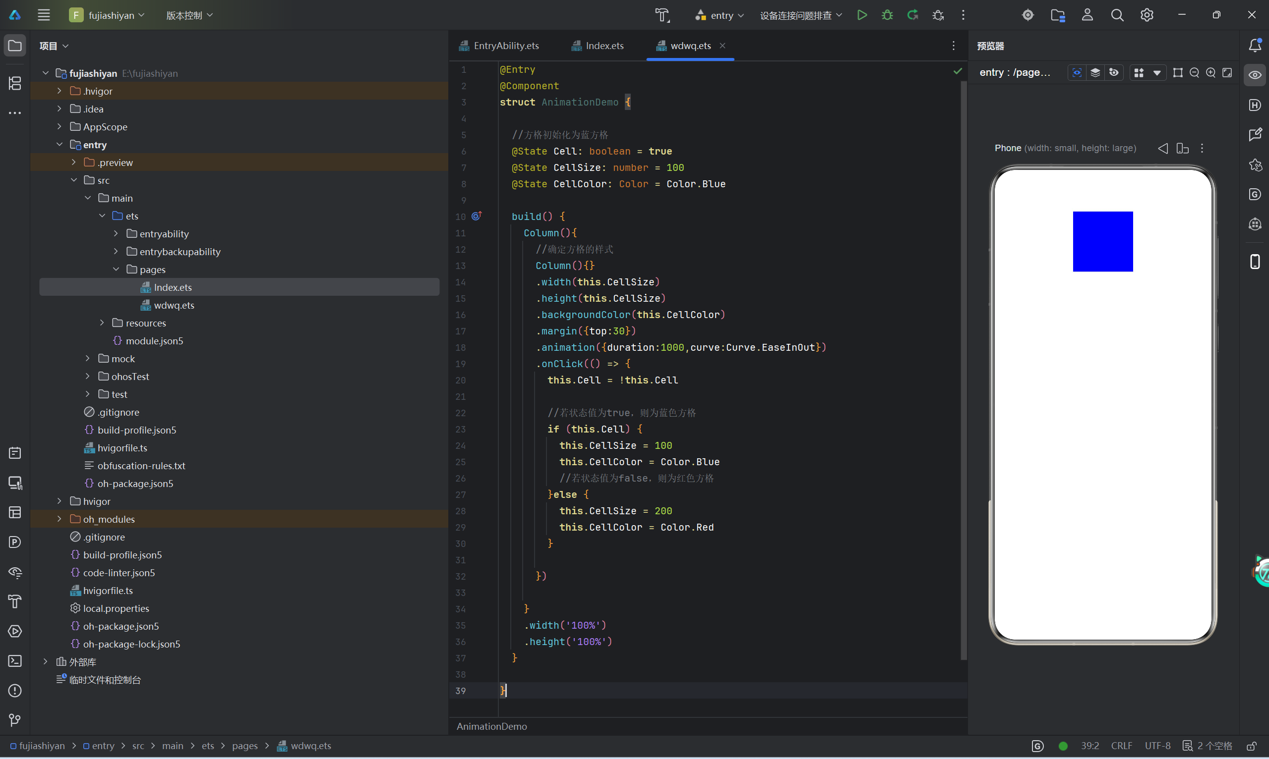
1. 属性动画( .animation() )
代码:
@Entry
@Component
struct AnimationDemo {

  //方格初始化为蓝方格
  @State Cell: boolean = true
  @State CellSize: number = 100
  @State CellColor: Color = Color.Blue

  build() {
    Column(){
      //确定方格的样式
      Column(){}
      .width(this.CellSize)
      .height(this.CellSize)
      .backgroundColor(this.CellColor)
      .margin({top:30})
      .animation({duration:1000,curve:Curve.EaseInOut})
      .onClick(() => {
        //三元运算符:条件 ? 条件为真时执行/返回的内容 : 条件为假时执行/返回的内容
        //!加在布尔值前面是取反器,例如:!true = false , !false = true
        this.Cell = !this.Cell
        this.CellSize = this.Cell ? 100 : 200
        this.CellColor = this.Cell ? Color.Blue : Color.Red
      })

    }
    .width('100%')
    .height('100%')
  }

}
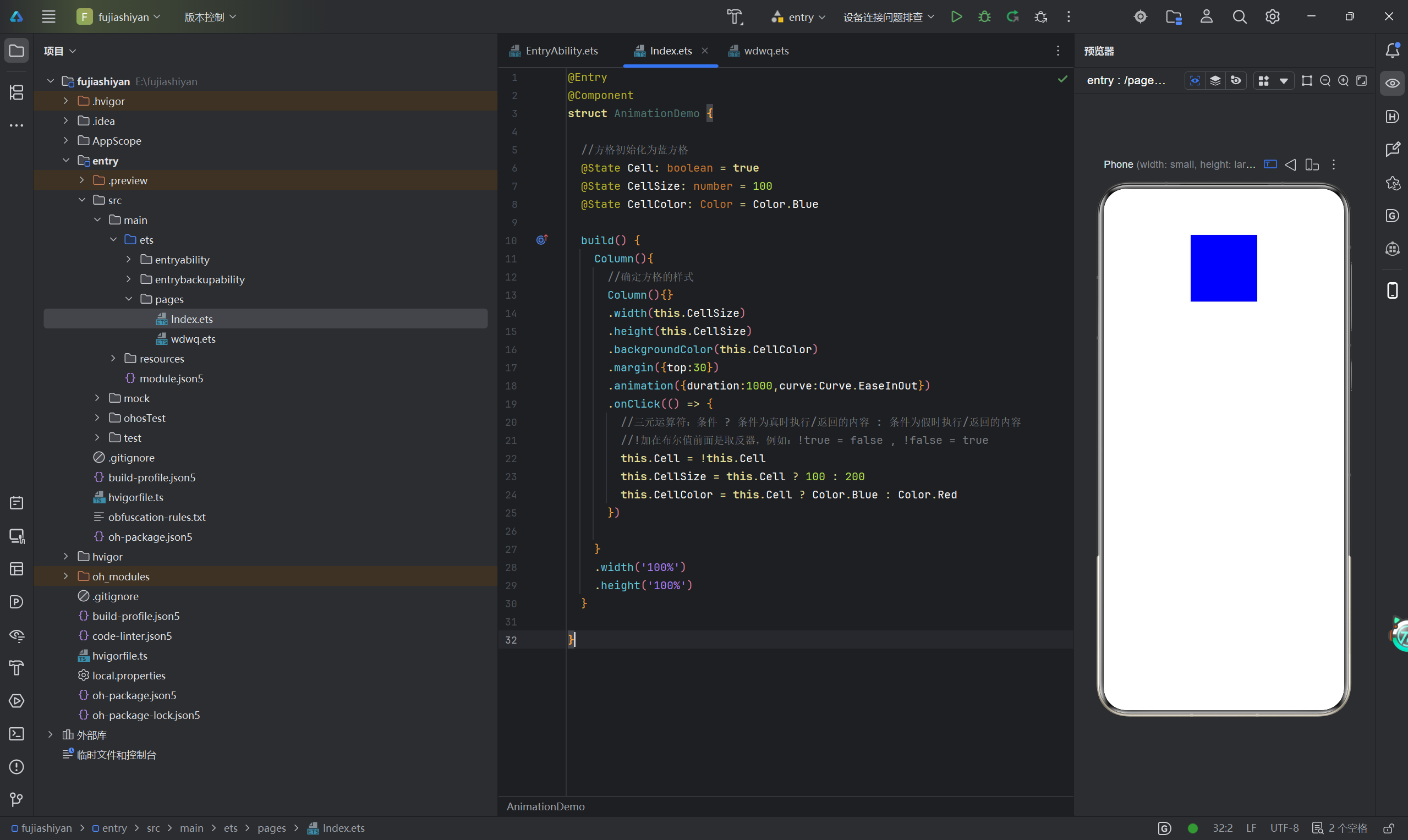
*补充:
.onClick(() => {
        //三元运算符:条件 ? 条件为真时执行/返回的内容 : 条件为假时执行/返回的内容
        //!加在布尔值前面是取反器,例如:!true = false , !false = true
        this.Cell = !this.Cell
        this.CellSize = this.Cell ? 100 : 200
        this.CellColor = this.Cell ? Color.Blue : Color.Red
      })
如上代码是简化模式,由如下代码简化而来:
.onClick(() => {
        this.Cell = !this.Cell

        //若状态值为true,则为蓝色方格
        if (this.Cell) {
          this.CellSize = 100
          this.CellColor = Color.Blue
          //若状态值为false,则为红色方格
        }else {
          this.CellSize = 200
          this.CellColor = Color.Red
        }

      })
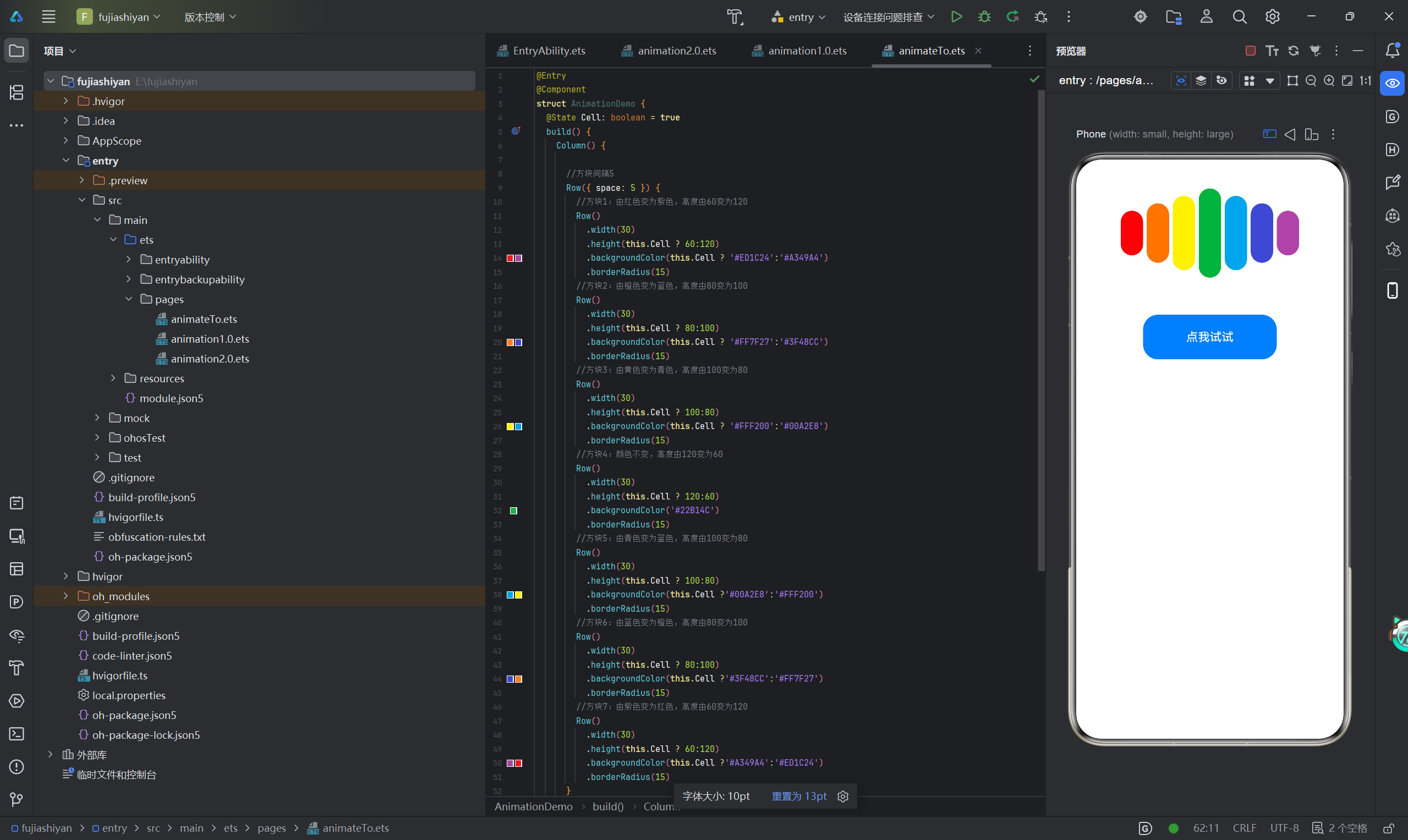
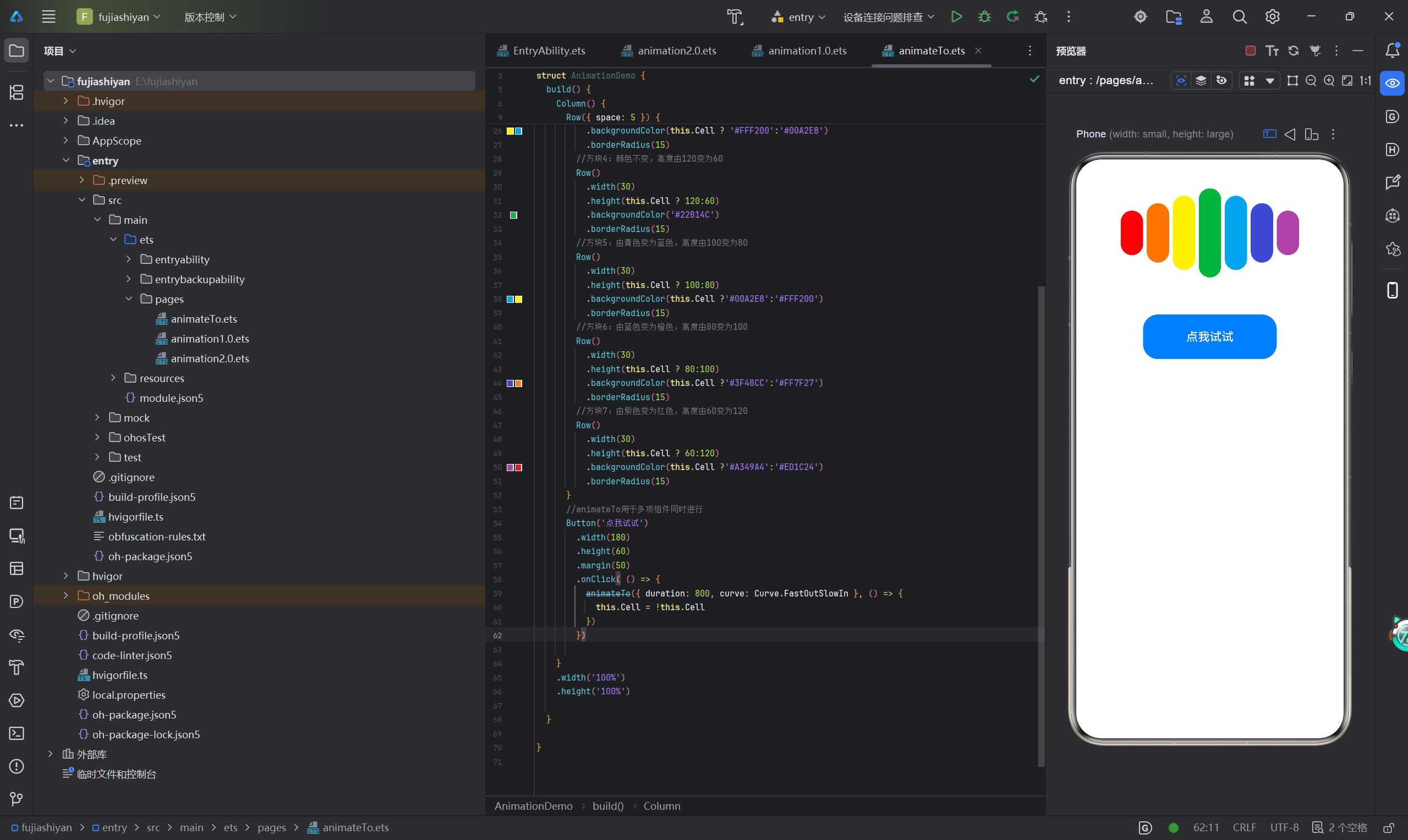
2. 显示动画(animateTo)
@Entry
@Component
struct AnimationDemo {
  @State Cell: boolean = true
  build() {
    Column() {

      //方块间隔5
      Row({ space: 5 }) {
        //方块1:由红色变为紫色,高度由60变为120
        Row()
          .width(30)
          .height(this.Cell ? 60:120)
          .backgroundColor(this.Cell ? '#ED1C24':'#A349A4')
          .borderRadius(15)
        //方块2:由橙色变为蓝色,高度由80变为100
        Row()
          .width(30)
          .height(this.Cell ? 80:100)
          .backgroundColor(this.Cell ? '#FF7F27':'#3F48CC')
          .borderRadius(15)
        //方块3:由黄色变为青色,高度由100变为80
        Row()
          .width(30)
          .height(this.Cell ? 100:80)
          .backgroundColor(this.Cell ? '#FFF200':'#00A2E8')
          .borderRadius(15)
        //方块4:颜色不变,高度由120变为60
        Row()
          .width(30)
          .height(this.Cell ? 120:60)
          .backgroundColor('#22B14C')
          .borderRadius(15)
        //方块5:由青色变为蓝色,高度由100变为80
        Row()
          .width(30)
          .height(this.Cell ? 100:80)
          .backgroundColor(this.Cell ?'#00A2E8':'#FFF200')
          .borderRadius(15)
        //方块6:由蓝色变为橙色,高度由80变为100
        Row()
          .width(30)
          .height(this.Cell ? 80:100)
          .backgroundColor(this.Cell ?'#3F48CC':'#FF7F27')
          .borderRadius(15)
        //方块7:由紫色变为红色,高度由60变为120
        Row()
          .width(30)
          .height(this.Cell ? 60:120)
          .backgroundColor(this.Cell ?'#A349A4':'#ED1C24')
          .borderRadius(15)
      }
      //animateTo用于多项组件同时进行
      Button('点我试试')
        .width(180)
        .height(60)
        .margin(50)
        .onClick( () => {
          animateTo({ duration: 800, curve: Curve.FastOutSlowIn }, () => {
            this.Cell = !this.Cell
          })
        })

    }
    .width('100%')
    .height('100%')

  }

}
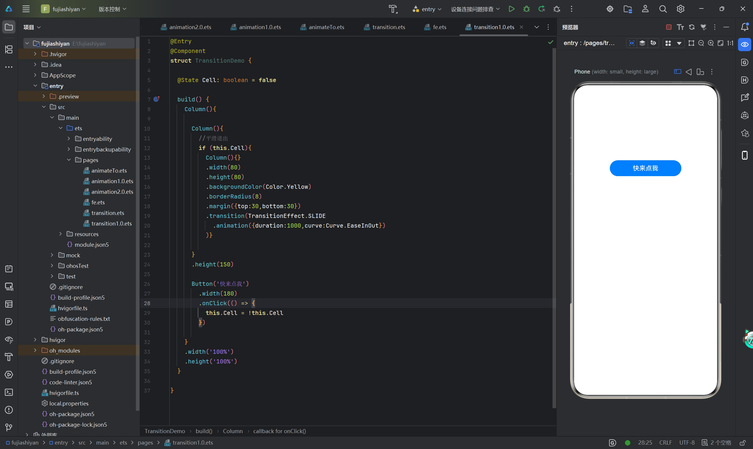
3. 转场动画(transition)
@Entry
@Component
struct TransitionDemo {

  @State Cell: boolean = false

  build() {
    Column(){

      Column(){
        //平滑进出
        if (this.Cell){
        Column(){}
        .width(80)
        .height(80)
        .backgroundColor(Color.Yellow)
        .borderRadius(8)
        .margin({top:30,bottom:30})
        .transition(TransitionEffect.SLIDE
          .animation({duration:1000,curve:Curve.EaseInOut})
        )}

      }
      .height(150)

      Button('快来点我')
        .width(180)
      .onClick(() => {
        this.Cell = !this.Cell
      })

    }
    .width('100%')
    .height('100%')
  }

}
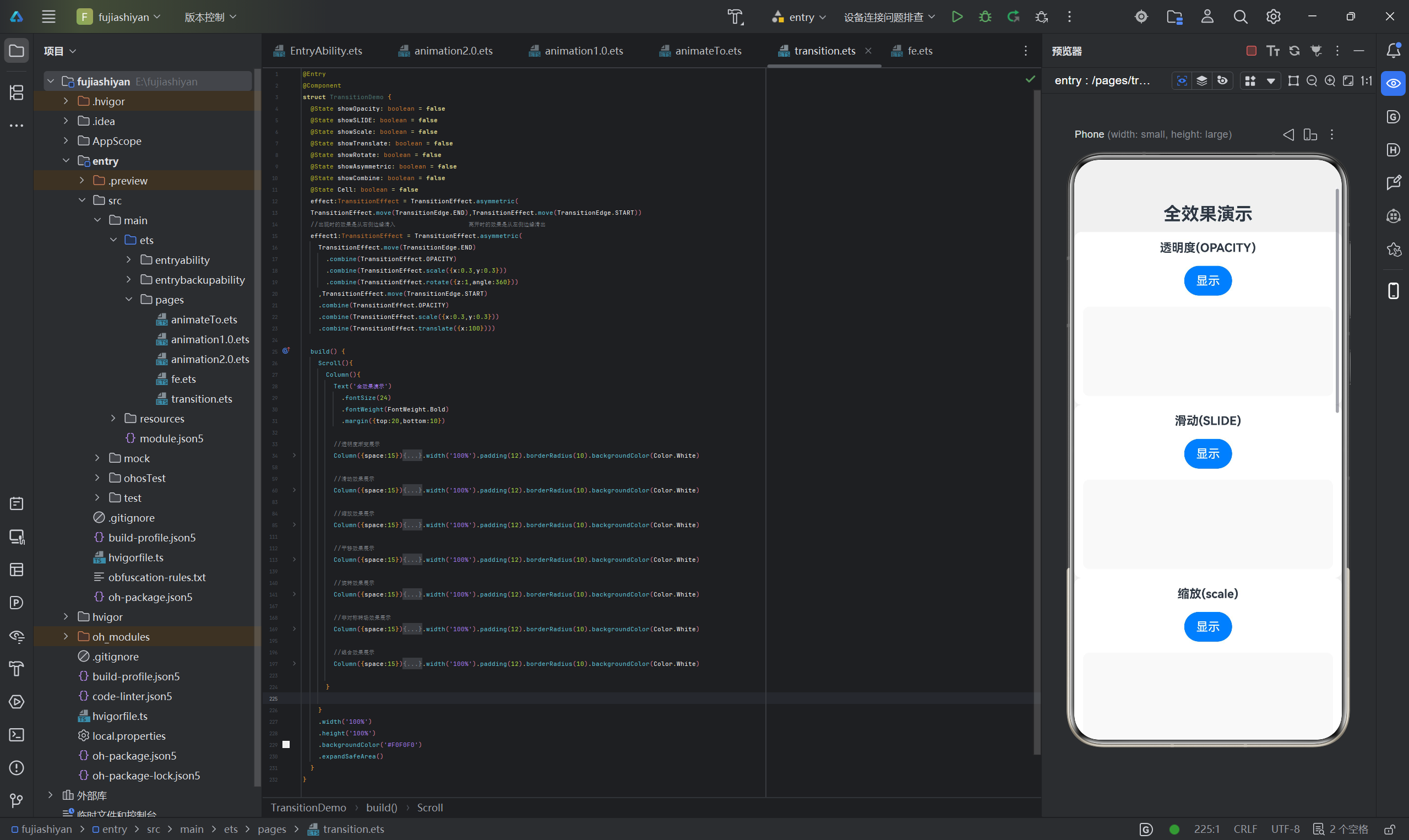
关于一些新的尝试:
@Entry
@Component
struct TransitionDemo {
  @State showOpacity: boolean = false
  @State showSLIDE: boolean = false
  @State showScale: boolean = false
  @State showTranslate: boolean = false
  @State showRotate: boolean = false
  @State showAsymmetric: boolean = false
  @State showCombine: boolean = false
  @State Cell: boolean = false
  effect:TransitionEffect = TransitionEffect.asymmetric(
  TransitionEffect.move(TransitionEdge.END),TransitionEffect.move(TransitionEdge.START))
  //出现时的效果是从右侧边缘滑入                   离开时的效果是从左侧边缘滑出
  effect1:TransitionEffect = TransitionEffect.asymmetric(
    TransitionEffect.move(TransitionEdge.END)
      .combine(TransitionEffect.OPACITY)
      .combine(TransitionEffect.scale({x:0.3,y:0.3}))
      .combine(TransitionEffect.rotate({z:1,angle:360}))
    ,TransitionEffect.move(TransitionEdge.START)
    .combine(TransitionEffect.OPACITY)
    .combine(TransitionEffect.scale({x:0.3,y:0.3}))
    .combine(TransitionEffect.translate({x:100})))

  build() {
    Scroll(){
      Column(){
        Text('全效果演示')
          .fontSize(24)
          .fontWeight(FontWeight.Bold)
          .margin({top:20,bottom:10})

        //透明度渐变展示
        Column({space:15}){
          //文本
          Text('透明度(OPACITY)')
            .fontSize(16)
            .fontWeight(FontWeight.Bold)//fontWeight用于设置字体粗细
          //按钮
          Button(this.showOpacity ? '隐藏':'显示')
            .onClick( () => {this.showOpacity = !this.showOpacity} )
          //小方格
          Stack(){
            if (this.showOpacity){
              Column()
                .width(80)
                .height(80)
                .backgroundColor('#ED1C24')
                .borderRadius(12)
                //取值规则与默认值
                // 取值范围:[0, 1]。1 表示完全不透明,0 表示完全透明(组件隐藏但仍占据布局空间)。
                // 越界处理:小于 0 的值按 0 处理,大于 1 的值按 1 处理。
                // 默认值:1,未设置时组件呈现完全不透明状态。
                .transition(TransitionEffect.OPACITY.animation({curve:Curve.Sharp}))
            }
          }
          .width('100%')
          .height(120)
          .backgroundColor('#F9F9F9')
          .borderRadius(8)
        }.width('100%').padding(12).borderRadius(10).backgroundColor(Color.White)

        //滑动效果展示
        Column({space:15}){
          //文本
          Text('滑动(SLIDE)')
            .fontSize(16)
            .fontWeight(FontWeight.Bold)//fontWeight用于设置字体粗细
          //按钮
          Button(this.showSLIDE ? '隐藏':'显示')
            .onClick( () => {this.showSLIDE = !this.showSLIDE} )
          //小方格
          Stack(){
            if (this.showSLIDE){
              Column()
                .width(80)
                .height(80)
                .backgroundColor('#FF7F27')
                .borderRadius(12)
                .transition(TransitionEffect.SLIDE.animation({curve:Curve.Sharp}))
            }
          }.width('100%')
          .height(120)
          .backgroundColor('#F9F9F9')
          .borderRadius(8)
        }.width('100%').padding(12).borderRadius(10).backgroundColor(Color.White)

        //缩放效果展示
        Column({space:15}){
          //文本
          Text('缩放(scale)')
            .fontSize(16)
            .fontWeight(FontWeight.Bold)//fontWeight用于设置字体粗细
          //按钮
          Button(this.showScale ? '隐藏':'显示')
            .onClick( () => {this.showScale = !this.showScale} )
          //小方格
          Stack(){
            if (this.showScale){
              Column()
                .width(80)
                .height(80)
                .backgroundColor('#FFF200')
                .borderRadius(12)
              //x	number	默认值:1	 X轴缩放倍数
              //y	number	默认值:1  Y轴缩放倍数
              //z	number	默认值:1	 Z轴缩放倍数(二维模式下无效)
              //centerX	  默认值:'50%'	 缩放中心点 X 坐标
              //centerY  	默认值:'50%'	 缩放中心点 Y 坐标
              //缩放倍数(x/y/z):
              //> 1:沿对应轴放大。
              //0 < 值 < 1:沿对应轴缩小。
              //= 0:组件在该轴方向完全消失。
              //< 0:沿对应轴反向缩放,倍数为绝对值。
              //中心点(centerX/centerY):
              //支持 number(默认单位 vp)或 string(如 '50%'、'100px')。
                .transition(TransitionEffect.scale({x:0.5,y:0.5}).animation({curve:Curve.Sharp}))
            }

          }
          .width('100%')
          .height(120)
          .backgroundColor('#F9F9F9')
          .borderRadius(8)

        }.width('100%').padding(12).borderRadius(10).backgroundColor(Color.White)

        //平移效果展示
        Column({space:15}){
          //文本
          Text('平移(translate)')
            .fontSize(16)
            .fontWeight(FontWeight.Bold)//fontWeight用于设置字体粗细
          //按钮
          Button(this.showTranslate ? '隐藏':'显示')
            .onClick( () => {this.showTranslate = !this.showTranslate} )
          //小方格
          Stack(){
            if (this.showTranslate){
              Column()
                .width(80)
                .height(80)
                .backgroundColor('#22B14C')
                .borderRadius(12)
              //x	水平方向移动距离,正值向右	默认值:0
              //y	垂直方向移动距离,正值向下	默认值:0
              //z	垂直屏幕方向移动距离,正值向前(靠近用户)	默认值:0
              //数值单位:
              //number 类型:默认单位是 vp(虚拟像素)。
              //string 类型:支持带单位的字符串,如 '10px'、'10%'。百分比基于组件自身尺寸计算。
                .transition(TransitionEffect.translate({x:25,y:50,z:250}).animation({curve:Curve.Sharp}))
            }

          }
          .width('100%')
          .height(120)
          .backgroundColor('#F9F9F9')
          .borderRadius(8)

        }.width('100%').padding(12).borderRadius(10).backgroundColor(Color.White)

        //旋转效果展示
        Column({space:15}){
          //文本
          Text('旋转(rotate)')
            .fontSize(16)
            .fontWeight(FontWeight.Bold)//fontWeight用于设置字体粗细
          //按钮
          Button(this.showRotate ? '隐藏':'显示')
            .onClick( () => {this.showRotate = !this.showRotate} )
          //小方格
          Stack(){
            if (this.showRotate){
              Column()
                .width(80)
                .height(80)
                .backgroundColor('#00A2E8')
                .borderRadius(12)
              //平面旋转(绕 Z 轴):{ z: 1, angle: 45 },效果如同风车转动。
              //水平翻转(绕 Y 轴):{ y: 1, angle: 180 },效果如同翻书页,是实现卡片正反面翻转的常用方式。
              //垂直翻转(绕 X 轴):{ x: 1, angle: 180 },效果如同翻日历。
              //对角线翻转:{ x: 1, y: 1, angle: 180 },沿对角线方向斜着翻转。
                .transition(TransitionEffect.rotate({x:1,angle:180}).animation({curve:Curve.Sharp}))
            }

          }
          .width('100%')
          .height(120)
          .backgroundColor('#F9F9F9')
          .borderRadius(8)

        }.width('100%').padding(12).borderRadius(10).backgroundColor(Color.White)

        //非对称转场效果展示
        Column({space:15}){
          //文本
          Text('非对称转场效果(asymmetric)')
            .fontSize(16)
            .fontWeight(FontWeight.Bold)//fontWeight用于设置字体粗细
          //按钮
          Button(this.showAsymmetric ? '隐藏':'显示')
            .onClick( () => {this.showAsymmetric = !this.showAsymmetric} )
          //小方格
          Stack(){
            if (this.showAsymmetric){
              Column()
                .width(80)
                .height(80)
                .backgroundColor('#3F48CC')
                .borderRadius(12)
                .transition(this.effect.animation({curve:Curve.Sharp}))
            }

          }
          .width('100%')
          .height(120)
          .backgroundColor('#F9F9F9')
          .borderRadius(8)

        }.width('100%').padding(12).borderRadius(10).backgroundColor(Color.White)

        //组合效果展示
        Column({space:15}){
          //文本
          Text('组合(combine)')
            .fontSize(16)
            .fontWeight(FontWeight.Bold)//fontWeight用于设置字体粗细
          //按钮
          Button(this.showCombine ? '隐藏':'显示')
            .onClick( () => {this.showCombine = !this.showCombine} )
          //小方格
          Stack(){
            if (this.showCombine){
              Column()
                .width(80)
                .height(80)
                .backgroundColor('#A349A4')
                .borderRadius(12)
                .transition(this.effect1.animation({curve:Curve.Sharp}))
            }

          }
          .width('100%')
          .height(120)
          .backgroundColor('#F9F9F9')
          .borderRadius(8)

        }.width('100%').padding(12).borderRadius(10).backgroundColor(Color.White)

      }

    }
    .width('100%')
    .height('100%')
    .backgroundColor('#F0F0F0')
    .expandSafeArea()
  }
}
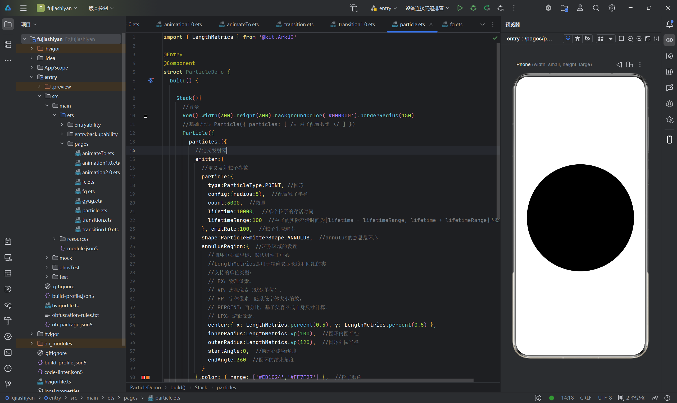
4. 粒子动画(particle)
import { LengthMetrics } from '@kit.ArkUI'

@Entry
@Component
struct ParticleDemo {
  build() {

    Stack(){
      //背景
      Row().width(300).height(300).backgroundColor('#000000').borderRadius(150)
      //基础语法:Particle({ particles: [ /* 粒子配置数组 */ ] })
      Particle({
        particles:[{
          //定义发射器
          emitter:{
            //定义发射粒子参数
            particle:{
              type:ParticleType.POINT, //圆形
              config:{radius:5},  //配置粒子半径
              count:3000,  //数量
              lifetime:10000,  //单个粒子的存活时间
              lifetimeRange:100  //粒子的实际存活时间为[lifetime - lifetimeRange, lifetime + lifetimeRange]内整数
            }, emitRate:100,  //粒子生成速率
            shape:ParticleEmitterShape.ANNULUS,  //annulus的意思是环形
            annulusRegion:{  //环形区域的设置
              //圆环中心点坐标,默认组件正中心
              //LengthMetrics是用于精确表示长度和间距的类
              //支持的单位类型:
              // PX:物理像素。
              // VP:虚拟像素(默认单位)。
              // FP:字体像素,随系统字体大小缩放。
              // PERCENT:百分比,基于父容器或自身尺寸计算。
              // LPX:逻辑像素。
              center:{ x: LengthMetrics.percent(0.5), y: LengthMetrics.percent(0.5) },
              innerRadius:LengthMetrics.vp(100),  //圆环内圆半径
              outerRadius:LengthMetrics.vp(120),  //圆环外园半径
              startAngle:0,  //圆环的起始角度
              endAngle:360  //圆环的结束角度
            }
          },color: { range: ['#ED1C24','#FF7F27'] },  //粒子颜色
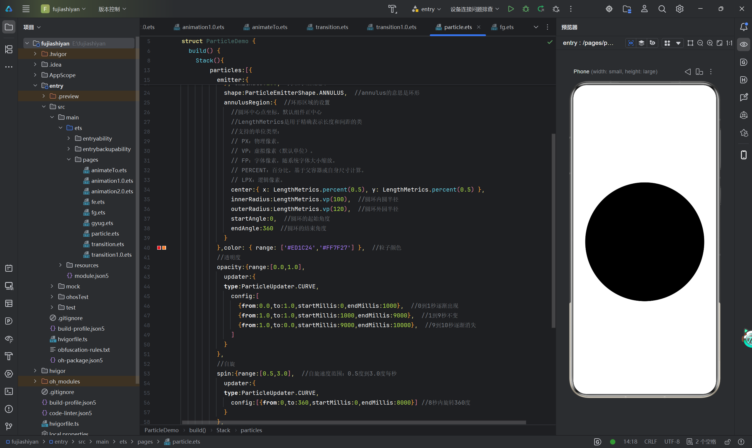
          //透明度
          opacity:{range:[0.0,1.0],
            updater:{
            type:ParticleUpdater.CURVE,
              config:[
                {from:0.0,to:1.0,startMillis:0,endMillis:1000},  //0到1秒逐渐出现
                {from:1.0,to:1.0,startMillis:1000,endMillis:9000},  //1到9秒不变
                {from:1.0,to:0.0,startMillis:9000,endMillis:10000},  //9到10秒逐渐消失
              ]
            }
          },
          //自旋
          spin:{range:[0.5,3.0],  //自旋速度范围:0.5度到3.0度每秒
            updater:{
            type:ParticleUpdater.CURVE,
              config:[{from:0,to:360,startMillis:0,endMillis:8000}] //8秒内旋转360度
            }
          },
          //加速度
          acceleration:{
            speed:{range:[5,10]},  //加速度大小为5到10vp每二次方秒
            angle:{range:[265,275]} //方向为水平向上
          }
        }]
      })
        .width(300)
        .height(600)
    }
    .width('100%')
    .height('100%')
  }
}
四、 学习过程
我的学习过程大概是这样:
首先我会先去B站找找相关视频,看看这个选题我是否感兴趣。很巧的是,这才第二个选题,我就十分感兴趣。
然后我会先去询问deepseek,了解相关知识点,同时上B站、鸿蒙官网或者实际操作去核实一下。
接着在了解相关知识点后,我会尝试一下基础的用法。在面对不认识的单词时,我会先对其翻译,然后询问AI,了解具体作用。在初步尝试时,我遇见问题会选择让AI翻译一下,同时让AI提供解决方案。
最后我会通过刚才学习的知识点,尝试一下好玩的想法。
五、 遇见困难与解决记录
- 困难:在看视频教程和AI辅助学习
.animation()和animateTo时,对this.flag = !this.flag中的感叹号和三元运算符十分好奇并对此感到困惑。
解决办法:借助AI工具,我仔细了解了相关知识点,并将其运用到实际代码操作过程中。 - 困难:在进行transition的尝试时发现,点击按钮后,由于原本的方块消失,导致按钮位置发生改变。
解决办法:在原有Column组件的基础上又套用了一个Column组件,并对其限制了高度,保证了按钮位置没有发生改变。 - 困难:在输入
.animation后,转场动画并没有如愿出现。
解决办法:初步尝试将.animation删除后预览,没有出现动画。接着开始尝试改变.animation位置,经过多番尝试后发现.animation位于transition()的括号内,动画出现。 - 困难:尝试transition的各项效果时,如旋转rotate,在()内输入
{z:90}时报错,同时发给AI帮忙改正时,AI并未给出确实有效的解决方案。
解决办法:我从三方面下手,第一是查询鸿蒙官网,看看官方的说明和示例,此处为链接。第二是在B站搜索相关视频。第三是开启新的AI对话,重新探讨这方面的知识点,防止AI幻觉的出现。最终,我知道了正确的写法为({z:1,angle:90}),进行预览时,正常运行。
六、 学习心得
学习这个动画确实很难,学习过程几番周折,耗费时长也比较多,但是当我真正做出来那种顺滑的效果出来后,那成就感是真足足的。最后,这个动画制作虽然很累人,但简直太好玩了。
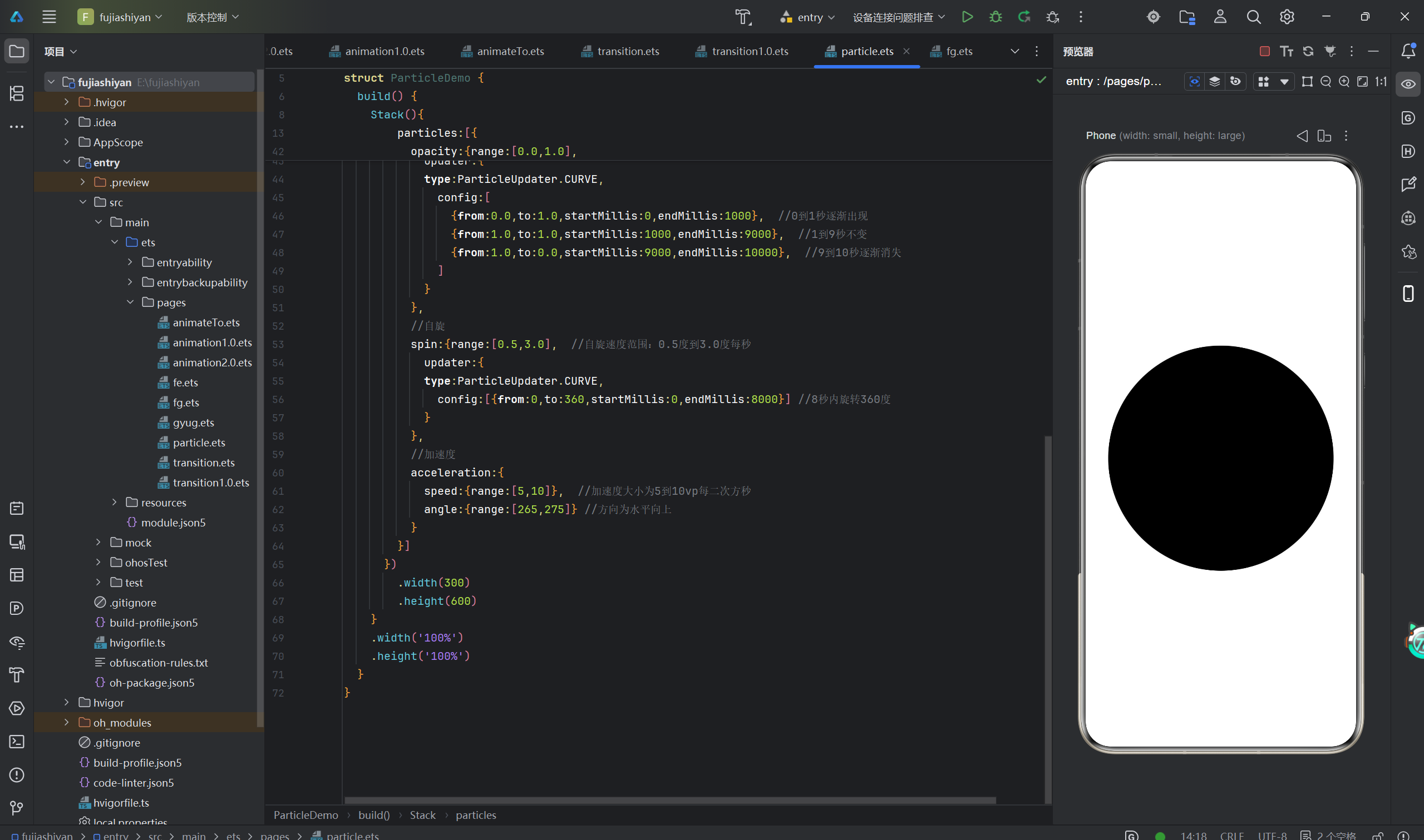
粒子动画
属性动画 简化
属性动画 未简化
显示动画(animateTo)
转场动画(transition) 2
转场动画(transition)

作为“人工智能6S店”的官方数字引擎,为AI开发者与企业提供一个覆盖软硬件全栈、一站式门户。
更多推荐


 1
1 0
0- 0


 已为社区贡献1条内容

所有评论(0)