
鸿蒙原生应用 ArkTS 表单工程:作品发布页的分类多选与实时预览
鸿蒙原生应用 ArkTS 表单工程:作品发布页的分类多选与实时预览
App 19「校园影像」发布 Tab(Func1Tab),是系列交互最丰富的作品发布表单——作品信息(标题/描述)+ 8 分类多选(已选计数) + 拍摄场景单选(教学楼/操场/图书馆/食堂/宿舍/湖边)+ 滤镜选择(原图/复古/黑白/暖色/冷色/胶片) + 隐私三态(公开/仅好友/私密)+ 实时预览卡(滤镜/标题/场景/隐私/描述/已选分类全联动) + 4 个快捷模板 + 发布按钮。本篇基于
19-campus-photo/entry/src/main/ets/pages/Func1Tab.ets(约 279 行)逐段拆解,附 4 张实机截图。
一、整体结构:7 个 @Builder + 2 个辅助方法的发布漏斗
Func1Tab 与 App 18 发现页同构(多选 + 预览 + 模板),但多了"场景选择"和"滤镜选择"两个模块:
build() {
  Column() {
    this.Header()
    Scroll() {
      Column({ space: 14 }) {
        this.FormSection()
        this.CategorySection()
        this.SceneSection()
        this.FilterSection()
        this.PreviewCard()
        this.TemplateSection()
        this.SubmitBtn()
      }
      .width('100%')
      .padding({ left: D.pad, right: D.pad, top: 14, bottom: D.pad + this.safeBottom + 20 })
    }
    .layoutWeight(1).scrollBar(BarState.Off).align(Alignment.Top)
  }
  .width('100%').height('100%').backgroundColor(C.bg)
}
7 个块按"填信息 → 选分类 → 选场景 → 选滤镜 → 看预览 → 用模板 → 发布"漏斗展开:
- FormSection — 标题 + 描述(输入)
- CategorySection — 8 分类多选(本页核心交互)
- SceneSection — 拍摄场景单选(6 个)
- FilterSection — 滤镜选择(6 个)+ 隐私三态
- PreviewCard — 实时预览(本页最大亮点)
- TemplateSection — 4 个快捷模板
- SubmitBtn — 发布作品
对比 App 18:App 18 是"3 组单选(学院/年龄/范围)+ 匿名 Toggle",App 19 是"场景单选 + 滤镜单选 + 隐私三态"——"滤镜"和"隐私三态"是本页新增。**"发布作品 = 填信息 + 选分类 + 选场景 + 选滤镜 + 定隐私"**是摄影 App 的完整发布流程。
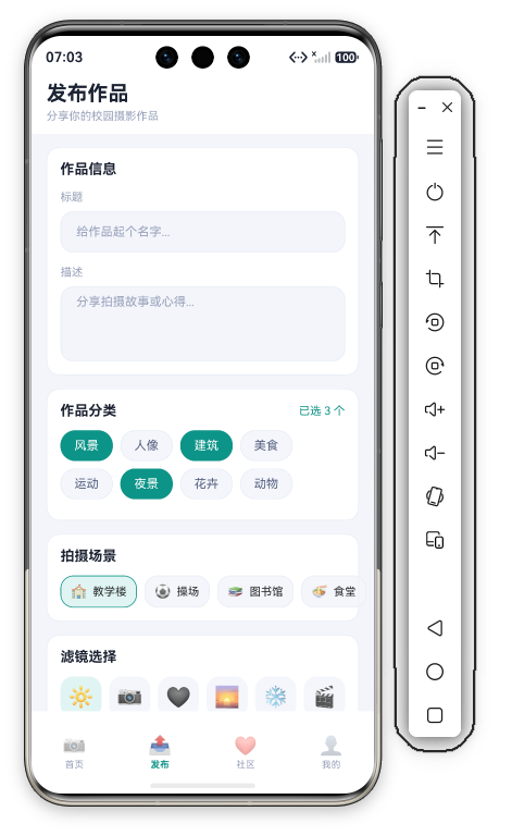
二、Header + FormSection:作品信息
Header 是"发布作品/分享你的校园摄影作品"两行品牌区。FormSection 是标题/描述输入(与 App 18 同款"上标签 + 描边输入框"):
@Builder FormSection() {
  Column({ space: 14 }) {
    Text('作品信息').fontSize(15).fontWeight(FontWeight.Bold).fontColor(C.text).width('100%')
    Column({ space: 8 }) {
      Text('标题').fontSize(12).fontColor(C.textDim).width('100%')
      TextInput({ placeholder: '给作品起个名字...', text: this.title })
        .onChange((val: string) => { this.title = val; })
        .height(44).borderRadius(D.rMd).backgroundColor(C.bg)
        .border({ width: 1, color: C.stroke }).placeholderColor(C.textDim).placeholderFont({ size: 13 })
    }.width('100%')
    Column({ space: 8 }) {
      Text('描述').fontSize(12).fontColor(C.textDim).width('100%')
      TextArea({ placeholder: '分享拍摄故事或心得...', text: this.desc })
        .onChange((val: string) => { this.desc = val; })
        .height(80).borderRadius(D.rMd).backgroundColor(C.bg)
        .border({ width: 1, color: C.stroke }).placeholderColor(C.textDim).placeholderFont({ size: 13 })
    }.width('100%')
  }
  .width('100%').padding(14).backgroundColor(C.card).borderRadius(D.rMd).border({ width: 1, color: C.stroke })
}
占位文案的"引导性":
- 标题:"给作品起个名字..."("给...起个名字"是口语化引导,比"请输入标题"亲切)
- 描述:"分享拍摄故事或心得..."("分享故事"是摄影 App 的文案调性——不只是填描述,而是"讲故事")
@State title + @State desc 双向绑定——输入实时存入状态,供 PreviewCard 读取。
三、CategorySection:8 分类多选(本页核心)
CategorySection 是 8 个分类标签的多选胶囊 + 已选计数:
@Builder CategorySection() {
  Column({ space: 12 }) {
    Row() {
      Text('作品分类').fontSize(15).fontWeight(FontWeight.Bold).fontColor(C.text)
      Blank()
      Text('已选 ' + this.selectedCount() + ' 个').fontSize(12).fontColor(C.primary)
    }.width('100%')
    Flex({ wrap: FlexWrap.Wrap }) {
      ForEach(this.categories, (item: CategoryTag) => {
        Text(item.label)
          .fontSize(13)
          .fontColor(item.selected ? '#FFFFFF' : C.textSub)
          .backgroundColor(item.selected ? C.primary : C.cardSoft)
          .borderRadius(16)
          .padding({ left: 14, right: 14, top: 8, bottom: 8 })
          .margin({ right: 8, bottom: 8 })
          .border({ width: 1, color: item.selected ? C.primary : C.stroke })
          .onClick(() => { this.toggleCategory(item.id); })
      }, (item: CategoryTag) => item.id.toString())
    }.width('100%')
  }
  .width('100%').padding(14).backgroundColor(C.card).borderRadius(D.rMd).border({ width: 1, color: C.stroke })
}
8 个分类:风景(选)/人像/建筑(选)/美食/运动/夜景(选)/花卉/动物——初始 3 个选中(风景/建筑/夜景)——"预选降低门槛"(App 18 同款设计)。
Flex({ wrap: FlexWrap.Wrap }) 自动换行 + margin({ right: 8, bottom: 8 }) 标签间距——"8 个长短不一标签"的最佳布局(同 App 18 发现页)。
toggleCategory(id) + selectedCount() 两个辅助方法(与 App 18 完全同构):
toggleCategory(id: number): void {
  for (let i = 0; i < this.categories.length; i++) {
    if (this.categories[i].id === id) {
      this.categories[i] = { id: this.categories[i].id, label: this.categories[i].label, selected: !this.categories[i].selected };
    }
  }
}

selectedCount(): number {
  let count: number = 0;
  for (let i = 0; i < this.categories.length; i++) {
    if (this.categories[i].selected) { count++; }
  }
  return count;
}
toggleCategory 创建新对象赋值(this.categories[i] = {...} 而非改字段)——ArkTS 响应式数组的"整体替换"写法(改字段不触发重渲染)。selectedCount() 线性遍历统计——右上角"已选 3 个"。
四、SceneSection:拍摄场景单选
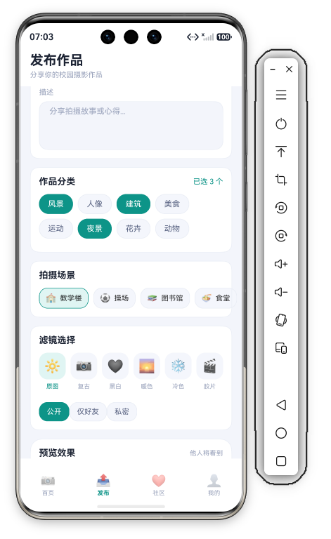
SceneSection 是 6 个拍摄场景的 emoji 胶囊单选:
@Builder SceneSection() {
  Column({ space: 12 }) {
    Text('拍摄场景').fontSize(15).fontWeight(FontWeight.Bold).fontColor(C.text).width('100%')
    Row({ space: 8 }) {
      ForEach(this.scenes, (s: SceneItem) => {
        Row({ space: 6 }) {
          Text(s.icon).fontSize(14)
          Text(s.name).fontSize(12)
        }
        .padding({ left: 10, right: 10, top: 8, bottom: 8 })
        .borderRadius(D.rMd)
        .backgroundColor(this.selectedScene === s.id ? C.primarySoft : C.cardSoft)
        .border({ width: 1, color: this.selectedScene === s.id ? C.primary : C.stroke })
        .onClick(() => { this.selectedScene = s.id; promptAction.showToast({ message: s.name }); })
      }, (s: SceneItem) => s.id.toString())
    }.width('100%')
  }
  .width('100%').padding(14).backgroundColor(C.card).borderRadius(D.rMd).border({ width: 1, color: C.stroke })
}
6 个场景:教学楼🏫/操场⚽/图书馆📚/食堂🍜/宿舍🏠/湖边🌊——"校园拍摄地全覆盖"。默认选中"教学楼"(selectedScene = 1)。
单选交互:selectedScene === s.id ? C.primarySoft : C.cardSoft(选中浅青绿 vs 未选浅灰)+ 青绿描边。点击还弹 Toast(s.name)——"选择反馈"。
与 App 18 学院选择的对比:App 18 是"学院",App 19 是"拍摄场景"——**"场景 = 照片拍摄地"**是摄影 App 特有的元数据(图库按地点分类)。
五、FilterSection:滤镜选择 + 隐私三态
FilterSection 是 6 个滤镜选择 + 3 档隐私(公开/仅好友/私密):
@Builder FilterSection() {
  Column({ space: 12 }) {
    Text('滤镜选择').fontSize(15).fontWeight(FontWeight.Bold).fontColor(C.text).width('100%')
    Row({ space: 8 }) {
      ForEach(this.filters, (f: FilterItem) => {
        Column({ space: 6 }) {
          Row() { Text(f.preview).fontSize(22) }
            .width(44).height(44).borderRadius(D.rMd)
            .backgroundColor(this.selectedFilter === f.id ? C.primarySoft : C.cardSoft)
            .justifyContent(FlexAlign.Center)
          Text(f.name).fontSize(10)
            .fontColor(this.selectedFilter === f.id ? C.primary : C.textDim)
        }.layoutWeight(1)
        .onClick(() => { this.selectedFilter = f.id; promptAction.showToast({ message: '滤镜: ' + f.name }); })
      }, (f: FilterItem) => f.id.toString())
    }.width('100%')
    Row() {
      ForEach(this.privacyOptions, (o: string, idx: number) => {
        Text(o)
          .fontSize(12).fontColor(this.privacy === idx ? '#FFFFFF' : C.textSub)
          .backgroundColor(this.privacy === idx ? C.primary : C.cardSoft)
          .borderRadius(D.rMd)
          .padding({ left: 12, right: 12, top: 8, bottom: 8 })
          .border({ width: 1, color: this.privacy === idx ? C.primary : C.stroke })
          .onClick(() => { this.privacy = idx; })
      }, (o: string, idx: number) => o + idx)
    }.width('100%').margin({ top: 8 })
  }
  .width('100%').padding(14).backgroundColor(C.card).borderRadius(D.rMd).border({ width: 1, color: C.stroke })
}
5.1 6 个滤镜(预览 emoji)
private filters: FilterItem[] = [
  { id: 1, name: '原图', preview: '🔆' },
  { id: 2, name: '复古', preview: '📷' },
  { id: 3, name: '黑白', preview: '🖤' },
  { id: 4, name: '暖色', preview: '🌅' },
  { id: 5, name: '冷色', preview: '❄️' },
  { id: 6, name: '胶片', preview: '🎬' }
];
"滤镜名 + 预览 emoji"——原图🔆/复古📷/黑白🖤/暖色🌅/冷色❄️/胶片🎬——"emoji 表达滤镜效果"(暖色用🌅夕阳、冷色用❄️冰雪、黑白用🖤)——"emoji 即滤镜预览"(demo 替代真实滤镜渲染)。
滤镜选中:44×44 图标块(C.primarySoft 浅青绿 vs 灰)+ 文字色。默认选中"原图"(selectedFilter = 1)。
FilterItem 的 preview: string 字段是"滤镜预览"的 demo 化——真实项目这里应该是"滤镜滤镜预览图"或"滤镜的 CSS/Shader 效果"。
5.2 隐私三态(公开/仅好友/私密)
Row() {
  ForEach(this.privacyOptions, (o: string, idx: number) => {
    Text(o)
      .fontSize(12).fontColor(this.privacy === idx ? '#FFFFFF' : C.textSub)
      .backgroundColor(this.privacy === idx ? C.primary : C.cardSoft)
      .borderRadius(D.rMd)
      .padding({ left: 12, right: 12, top: 8, bottom: 8 })
      .border({ width: 1, color: this.privacy === idx ? C.primary : C.stroke })
      .onClick(() => { this.privacy = idx; })
  }, (o: string, idx: number) => o + idx)
}
privacyOptions: string[] = ['公开', '仅好友', '私密'] + @State privacy: number = 0(默认公开)——"三态隐私"是社交内容发布的标准(微信朋友圈"公开/仅好友/私密"同款)——"隐私层级"设计。
选中态:白字青绿底 vs 灰字灰底。"公开/仅好友/私密"三档可见范围递增收窄——"内容可见性控制"。
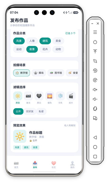
六、PreviewCard:实时预览(本页最大亮点)
PreviewCard 是实时预览卡——滤镜/标题/场景/隐私/描述/已选分类全部联动:
@Builder PreviewCard() {
  Column({ space: 12 }) {
    Row() {
      Text('预览效果').fontSize(15).fontWeight(FontWeight.Bold).fontColor(C.text)
      Blank()
      Text('他人将看到').fontSize(11).fontColor(C.textDim)
    }.width('100%')
    Row({ space: 14 }) {
      Row() { Text(this.filters[this.selectedFilter - 1].preview).fontSize(40) }
        .width(64).height(64).backgroundColor(C.primarySoft).borderRadius(D.rMd).justifyContent(FlexAlign.Center)
      Column({ space: 4 }) {
        Text(this.title.length > 0 ? this.title : '作品标题').fontSize(16).fontWeight(FontWeight.Bold).fontColor(C.text)
        Text(this.scenes[this.selectedScene - 1].name + ' · ' + this.filters[this.selectedFilter - 1].name)
          .fontSize(12).fontColor(C.textDim)
        Text('🔒 ' + this.privacyOptions[this.privacy]).fontSize(11).fontColor(C.textSub)
      }.alignItems(HorizontalAlign.Start).layoutWeight(1)
    }.width('100%')
    if (this.desc.length > 0) {
      Text(this.desc).fontSize(12).fontColor(C.textSub).width('100%').maxLines(2).textOverflow({ overflow: TextOverflow.Ellipsis })
    }
    Row({ space: 6 }) {
      ForEach(this.categories, (item: CategoryTag) => {
        if (item.selected) {
          Text(item.label).fontSize(11).fontColor(C.primary)
            .backgroundColor(C.primarySoft).borderRadius(4)
            .padding({ left: 8, right: 8, top: 4, bottom: 4 })
        }
      }, (item: CategoryTag) => item.id.toString())
    }.width('100%')
  }
  .width('100%').padding(14).backgroundColor(C.card).borderRadius(D.rLg).border({ width: 1, color: C.stroke })
}
6.1 滤镜联动(最精彩的联动)
Row() { Text(this.filters[this.selectedFilter - 1].preview).fontSize(40) }
filters[selectedFilter - 1].preview——预览卡的封面图 = 当前选中滤镜的预览 emoji——"选滤镜 → 预览封面换 emoji"(选"暖色"预览卡封面变🌅、选"黑白"变🖤)——"滤镜实时预览"是本页最直观的联动。
注意 selectedFilter - 1 的下标偏移——id 从 1 开始、数组下标从 0 开始(selectedFilter = 1 原图 → filters[0])——"id-1 取下标"的经典写法(本系列多次出现)。
6.2 标题/场景/隐私联动
Text(this.title.length > 0 ? this.title : '作品标题').fontSize(16).fontWeight(FontWeight.Bold).fontColor(C.text)
Text(this.scenes[this.selectedScene - 1].name + ' · ' + this.filters[this.selectedFilter - 1].name)
  .fontSize(12).fontColor(C.textDim)
Text('🔒 ' + this.privacyOptions[this.privacy]).fontSize(11).fontColor(C.textSub)
- 标题:
title.length > 0 ? title : '作品标题'(空时显示占位) - 场景+滤镜:
scenes[selectedScene-1].name + ' · ' + filters[selectedFilter-1].name("教学楼 · 原图")——场景和滤镜的拼接显示 - 隐私:
🔒 + privacyOptions[privacy]("🔒 公开")——锁图标 + 隐私状态
6.3 描述 + 已选分类联动
if (this.desc.length > 0) {
  Text(this.desc).fontSize(12).fontColor(C.textSub).width('100%').maxLines(2).textOverflow({ overflow: TextOverflow.Ellipsis })
}
Row({ space: 6 }) {
  ForEach(this.categories, (item: CategoryTag) => {
    if (item.selected) {
      Text(item.label).fontSize(11).fontColor(C.primary)
        .backgroundColor(C.primarySoft).borderRadius(4)
        .padding({ left: 8, right: 8, top: 4, bottom: 4 })
    }
  }, (item: CategoryTag) => item.id.toString())
}
- 描述:
if (desc.length > 0)有才显示 +maxLines(2)截断 - 分类:
if (item.selected)只显示已选标签——点选/取消分类,预览卡标签实时增删
"一次操作、五处联动"的完整闭环:
选滤镜 → 预览封面换 emoji + 场景·滤镜文字变
输标题 → 预览标题实时变
选场景 → 场景·滤镜文字变
选隐私 → 🔒 文字变
点分类 → 预览标签增删 + 计数变
5 个交互点全部实时反馈到预览卡——"发布即所见"是摄影 App 的信任设计(发布前完全掌控"别人看到的")。
七、TemplateSection + SubmitBtn
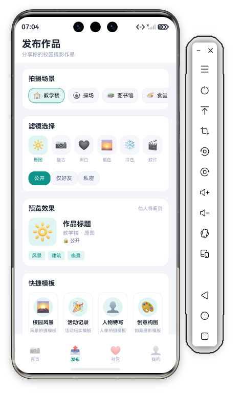
TemplateSection 是 4 个快捷模板(校园风景/活动记录/人物特写/创意构图),每行"emoji + 标题 + 描述":
@Builder TemplateSection() {
  Column({ space: 12 }) {
    Text('快捷模板').fontSize(15).fontWeight(FontWeight.Bold).fontColor(C.text).width('100%')
    Row({ space: 12 }) {
      ForEach(this.templates, (t: TemplateItem) => {
        Column({ space: 6 }) {
          Row() { Text(t.icon).fontSize(24) }
            .width(44).height(44).backgroundColor(C.primarySoft).borderRadius(22).justifyContent(FlexAlign.Center)
          Text(t.title).fontSize(12).fontWeight(FontWeight.Bold).fontColor(C.text)
          Text(t.desc).fontSize(10).fontColor(C.textDim).maxLines(1).textOverflow({ overflow: TextOverflow.Ellipsis })
        }
        .layoutWeight(1).padding({ top: 10, bottom: 10 })
        .backgroundColor(C.card).borderRadius(D.rMd).border({ width: 1, color: C.stroke })
        .alignItems(HorizontalAlign.Center)
        .onClick(() => { promptAction.showToast({ message: '应用模板: ' + t.title }); })
      }, (t: TemplateItem) => t.id.toString())
    }.width('100%')
  }
  .width('100%').padding(14).backgroundColor(C.card).borderRadius(D.rMd).border({ width: 1, color: C.stroke })
}
4 个模板 = 4 种摄影题材:校园风景🌄/活动记录🎉/人物特写👤/创意构图🎨——"模板即题材预设"(点击应自动填充标题/分类/场景/滤镜)。
SubmitBtn:"发布作品" 50vp 高青绿按钮——点击弹 Toast "作品发布中..."(发布流程占位)。
八、@State 的 6 状态设计
Func1Tab 有 6 个 @State:
| @State | 类型 | 用途 | 联动 |
|---|---|---|---|
title | string | 标题输入 | 预览卡标题 |
desc | string | 描述输入 | 预览卡描述 |
categories | CategoryTag[] | 8 分类选中 | 胶囊高亮/计数/预览标签 |
selectedScene | number | 场景(1-6) | 场景胶囊 + 预览场景名 |
selectedFilter | number | 滤镜(1-6) | 滤镜胶囊 + 预览封面/滤镜名 |
privacy | number | 隐私(0-2) | 隐私胶囊 + 预览🔒文字 |
6 个 @State 覆盖 6 个交互点——"@State 数量 = 交互点数"规律延续。
categories 是"对象数组 @State"(toggleCategory 整体替换元素)——ArkTS 响应式数组的关键知识点(与 App 18 相同)。
九、与 App 18 发现页的对比
| 维度 | App 18 发现匹配 | App 19 作品发布 |
|---|---|---|
| 核心 | 兴趣多选 + 匹配范围 | 分类多选 + 场景/滤镜 |
| 多选 | 10 兴趣 | 8 分类 |
| 单选 | 学院/年龄/范围 | 场景/滤镜 |
| 隐私 | 匿名 Toggle | 公开/仅好友/私密三态 |
| 预览 | 昵称/兴趣/匿名 | 滤镜封面/标题/场景/隐私/分类 |
| 特色 | 匿名模式 | 滤镜实时预览 |
App 19 的进步:① 场景选择(拍摄地元数据);② 滤镜选择 + 预览封面联动(filters[selectedFilter-1].preview 换 emoji);③ 隐私三态(比 App 18 的二元 Toggle 更细)。"发布表单 + 实时预览"模板已复用 2 次(App 18/19),未来 App 20+ 会继续。
十、滤镜选择的"emoji 预览"与真实滤镜的实现
App 19 的滤镜选择用 preview: '🔆'/'📷'/'🖤'/... 的 emoji 做"滤镜预览",这是 demo 的高明简化——真实项目的滤镜实现有 4 个层级:
1. 静态预览(emoji/色块)——demo 当前实现:选滤镜 → 预览卡封面换 emoji。适合原型/教学。
2. 颜色矩阵滤镜(CSS Filter/Canvas)——真实滤镜用"颜色矩阵"变换像素:黑白(去饱和度)、暖色(加红色调)、冷色(加蓝色调)——"每个滤镜 = 一组颜色矩阵参数":
// 伪代码:颜色矩阵滤镜
const FILTERS = {
  '黑白': { saturation: 0, contrast: 1.1 },
  '暖色': { temperature: 1.3, saturation: 1.1 },
  '冷色': { temperature: 0.8, saturation: 1.05 }
};
3. 叠加纹理(胶片颗粒/光晕)——胶片滤镜不只是调色,还叠加"颗粒感""暗角"纹理——"滤镜 = 颜色变换 + 纹理叠加"。
4. 一键增强(AI 滤镜)——AI 自动调色(智能白平衡/对比度/人像美颜)——"AI 滤镜"是现代相机 App 的标配。
"滤镜"的 UI 交互设计(App 19 的参考价值):
- 滤镜列表横滑(可滚动,6 个以上)
- 选中的滤镜实时应用到预览图
- 滤镜强度滑杆(原图 ↔ 滤镜效果可调)
"emoji 预览 → 颜色矩阵 → AI 滤镜"是滤镜实现的进化路径——App 19 的 emoji 版是"第 1 层",读者做真实产品时按需求选层。
十一、隐私三态与"内容可见性"设计
App 19 的隐私三态(公开/仅好友/私密)是内容型 App 的可见性模型:
三态可见性递进:
| 隐私 | 谁能看到 | 场景 |
|---|---|---|
| 公开 | 所有人(推荐/广场) | 想被更多人看到 |
| 仅好友 | 好友列表 | 私密分享 |
| 私密 | 仅自己 | 草稿/私人记录 |
"公开 → 仅好友 → 私密"是可见范围的递增收窄——微信朋友圈(公开/仅好友/私密)、小红书(公开/私密)同款——"三档可见性"是社交内容的标准模型。
"公开"的推荐逻辑:公开的作品 → 进首页推荐(PhotoList)、参与比赛、进分类排行——"公开 = 参与内容生态";"仅好友/私密"→ 不出现在公共列表——"可见性 = 内容分发"。
真实项目的隐私进阶:
- 分组可见(仅某分组好友可见)
- 指定不可见(拉黑名单)
- 时间限定(24 小时后转私密)
- 作品级权限(不同作品不同可见性)
"隐私三态 + 预览卡🔒联动"让用户在发布前就确认"谁将看到"——"可见性前置确认"是内容发布的信任设计(用户不怕"发错可见范围")。
十二、总结
App 19 作品发布页解析完毕。8 分类多选(toggleCategory 翻转)+ 6 场景单选 + 6 滤镜选择(预览联动)+ 隐私三态 + 实时预览卡(5 处联动)是五大亮点。"滤镜实时预览"是摄影 App 发布页的核心体验——发布前完全掌控作品效果。


作为“人工智能6S店”的官方数字引擎,为AI开发者与企业提供一个覆盖软硬件全栈、一站式门户。
更多推荐

 0
0 0
0- 0



 已为社区贡献241条内容

所有评论(0)