
HarmonyOS ArkUI DatePicker 日期选择器深度封装与工程化实践
文章目录

每日一句正能量
承认自己的普通,喜欢普通的自己,足够努力就是非凡。
普通不是失败,而是大多数人的真实状态。真正的非凡不在于天赋异禀,而在于一个普通人愿意持续努力的那种质地。喜欢普通的自己,是允许自己像一棵树那样,不必成为另一棵树,只在属于自己的土壤里向下扎根、向上承接风雨。
一、前言
在鸿蒙应用开发中,日期选择是表单交互、日程管理、预约系统等场景的核心能力。HarmonyOS ArkUI 提供了原生的 DatePicker 与 DatePickerDialog 组件,能够满足基础的日期选择需求。然而,在真实的企业级项目中,直接使用原生组件往往面临以下痛点:
- 代码冗余:每个页面都需要重复编写日期格式化、范围校验、回调处理等逻辑;
- 样式割裂:不同页面的日期选择器外观不一致,难以维护统一的设计规范;
- 功能缺失:原生组件不支持农历显示、自定义主题、防抖回调等高级需求;
- 状态混乱:日期状态分散在各页面,跨页面共享困难。
本文将从组件封装架构设计出发,深入讲解如何基于 ArkUI 的 DatePicker 与 CustomDialog 构建一套企业级的 SmartDatePicker 封装方案,涵盖日期格式化、范围校验、农历转换、主题定制、弹窗交互等完整能力,并提供可直接落地的工程代码。
二、DatePicker 组件基础解析
2.1 原生组件能力边界
DatePicker 是 ArkUI 提供的日期选择基础组件,其构造函数接收 DatePickerOptions 对象:
DatePicker(options?: {
  start?: Date;      // 可选日期范围起始,默认 1970-01-01
  end?: Date;        // 可选日期范围结束,默认 2100-12-31
  selected?: Date;   // 默认选中日期,默认当前日期
})
核心事件仅有 onDateChange,回调参数为 Date 类型。原生 DatePickerDialog 则通过 DatePickerDialog.show() 静态方法唤起弹窗,支持 lunar(农历)、disappearTextStyle(非选中项样式)等属性。
2.2 原生使用方式的局限
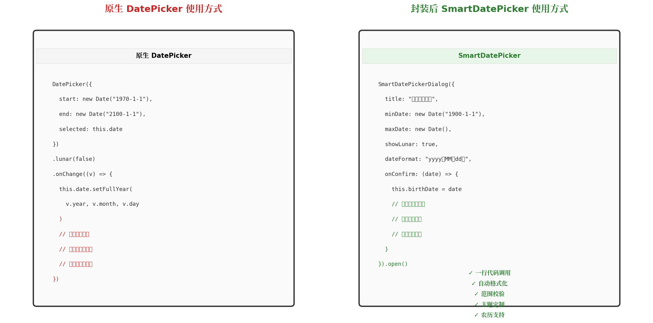
以下是一段典型的原生 DatePicker 使用代码:
DatePicker({
  start: new Date('1970-1-1'),
  end: new Date('2100-1-1'),
  selected: this.selectedDate
})
  .lunar(false)
  .onChange((value: DatePickerResult) => {
    this.selectedDate.setFullYear(value.year, value.month, value.day)
    // 需手动格式化输出
    // 需手动校验是否越界
    // 需手动处理确认/取消逻辑
  })
可以看到,原生方式要求开发者在每个使用点重复处理格式化、校验、回调、主题等逻辑,这与组件化、工程化的开发理念相悖。
三、封装设计思路与架构
3.1 设计目标
SmartDatePicker 封装方案的设计目标如下:
| 目标维度 | 具体要求 |
|---|---|
| 易用性 | 一行代码即可唤起日期选择弹窗,无需关注内部实现 |
| 一致性 | 全局统一的视觉风格、交互逻辑、错误提示 |
| 扩展性 | 支持主题切换、农历显示、自定义格式等插件化扩展 |
| 健壮性 | 内置日期范围校验、自动越界修正、异常兜底处理 |
3.2 整体架构
封装组件采用四层架构设计,自上而下分别为业务应用层、封装组件层、原生组件层、系统能力层:
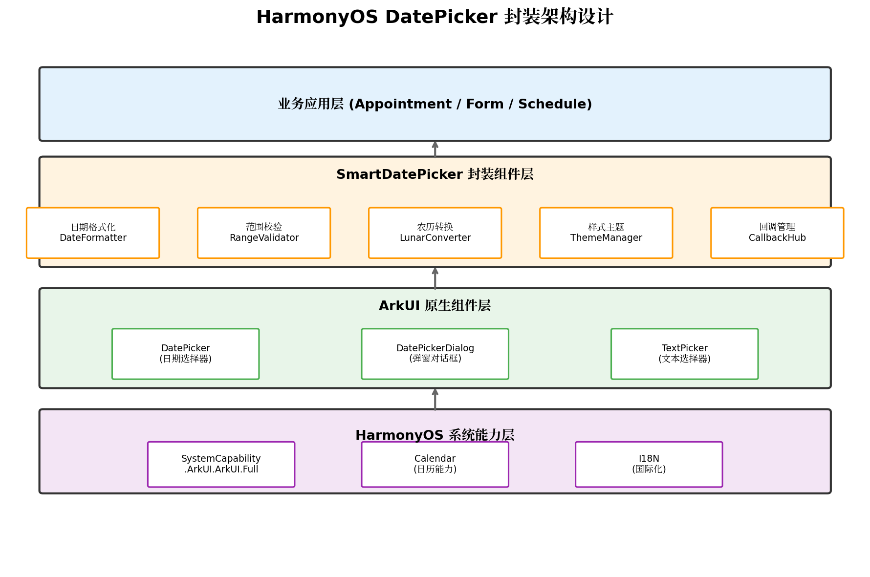
各层职责如下:
- 业务应用层:各业务页面通过
SmartDatePickerDialog唤起选择器,接收格式化后的日期字符串; - 封装组件层:
SmartDatePicker作为核心封装组件,内部聚合DateFormatter、RangeValidator、LunarConverter、ThemeManager、CallbackHub五大子模块; - 原生组件层:向下调用 ArkUI 的
DatePicker、DatePickerDialog、TextPicker等原生能力; - 系统能力层:依赖 HarmonyOS 的
SystemCapability.ArkUI.ArkUI.Full、日历能力及 I18N 国际化框架。
3.3 组件类图与接口设计
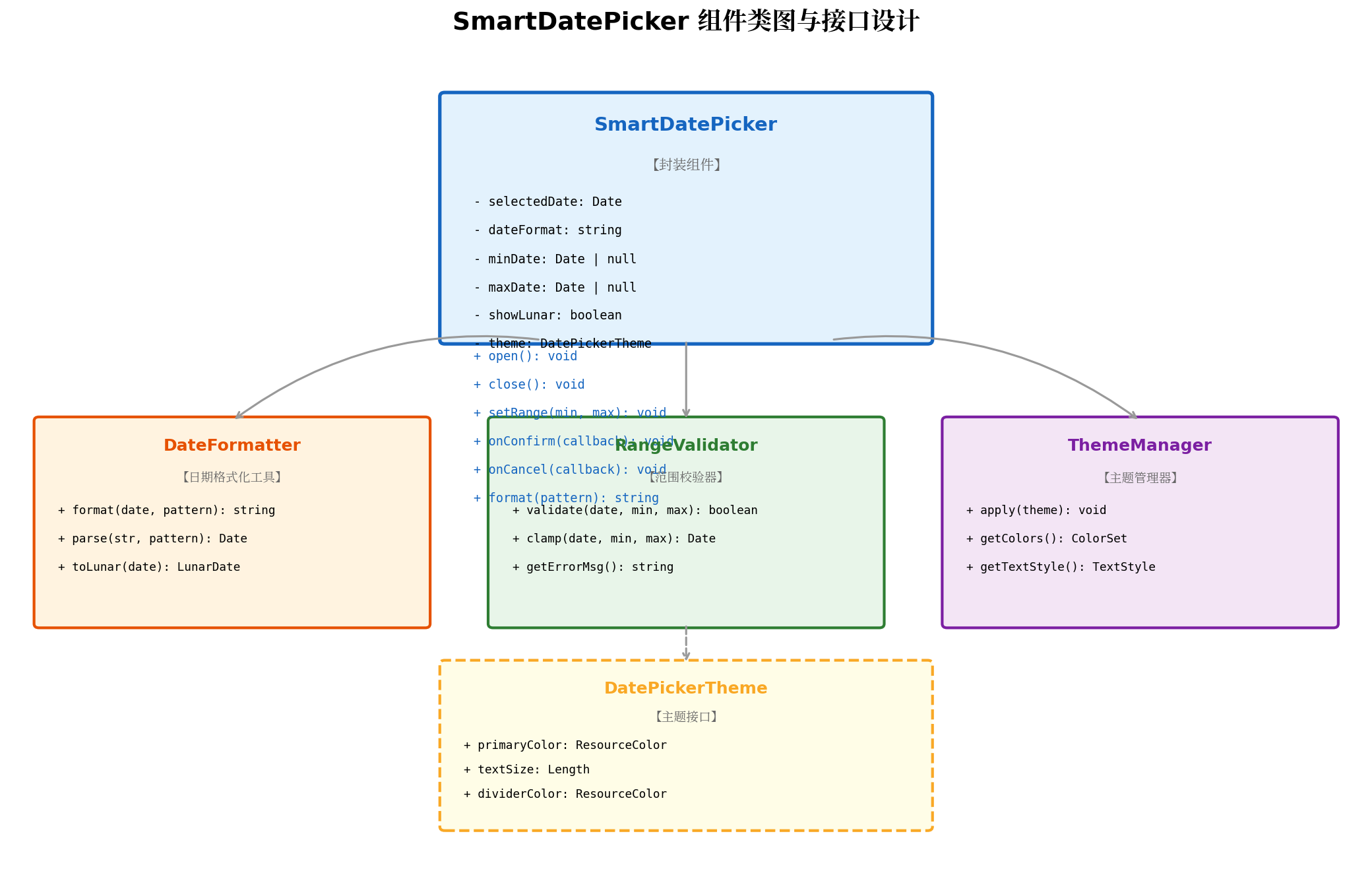
核心类设计说明:
SmartDatePicker:主封装组件,对外暴露open()、close()、setRange()、onConfirm()、onCancel()、format()等方法;DateFormatter:负责日期与字符串之间的双向转换,支持yyyy-MM-dd、yyyy年MM月dd日等自定义模式;RangeValidator:负责日期合法性校验,提供validate()、clamp()及错误信息获取能力;ThemeManager:负责主题统一管理,支持主色调、文字大小、分割线颜色等配置;DatePickerTheme:主题接口定义,遵循开闭原则,便于后续扩展深色模式、品牌主题等。
四、核心代码实现
4.1 日期格式化工具(DateFormatter)
日期格式化是日期选择器最频繁的操作之一。DateFormatter 采用策略模式,支持多种格式化模板:
// utils/DateFormatter.ets
export class DateFormatter {
  /**
   * 将 Date 对象格式化为指定模式的字符串
   * @param date 目标日期
   * @param pattern 格式化模式,如 "yyyy-MM-dd"
   * @returns 格式化后的日期字符串
   */
  static format(date: Date, pattern: string = 'yyyy-MM-dd'): string {
    if (!date || !(date instanceof Date)) {
      console.error('[DateFormatter] Invalid date input')
      return ''
    }
    const year = date.getFullYear()
    const month = String(date.getMonth() + 1).padStart(2, '0')
    const day = String(date.getDate()).padStart(2, '0')
    const weekDays = ['周日', '周一', '周二', '周三', '周四', '周五', '周六']
    const weekDay = weekDays[date.getDay()]

    return pattern
      .replace('yyyy', String(year))
      .replace('MM', month)
      .replace('dd', day)
      .replace('EEE', weekDay)
  }

  /**
   * 将字符串解析为 Date 对象
   * @param dateStr 日期字符串
   * @param pattern 解析模式
   * @returns Date 对象,解析失败返回 null
   */
  static parse(dateStr: string, pattern: string = 'yyyy-MM-dd'): Date | null {
    try {
      const reg = pattern
        .replace('yyyy', '(\\d{4})')
        .replace('MM', '(\\d{2})')
        .replace('dd', '(\\d{2})')
      const match = dateStr.match(new RegExp(`^${reg}$`))
      if (!match) return null
      const year = parseInt(match[1])
      const month = parseInt(match[2]) - 1
      const day = parseInt(match[3])
      const date = new Date(year, month, day)
      // 校验解析结果是否合法(防止 2024-02-30 这种非法日期)
      if (date.getFullYear() !== year || date.getMonth() !== month || date.getDate() !== day) {
        return null
      }
      return date
    } catch (e) {
      console.error('[DateFormatter] Parse error:', e)
      return null
    }
  }

  /**
   * 获取农历日期(简化版,实际项目建议接入完整农历库)
   */
  static toLunar(date: Date): string {
    const lunarMonths = ['正', '二', '三', '四', '五', '六', '七', '八', '九', '十', '冬', '腊']
    const lunarDays = ['初一', '初二', '初三', '初四', '初五', '初六', '初七', '初八', '初九', '初十',
                       '十一', '十二', '十三', '十四', '十五', '十六', '十七', '十八', '十九', '二十',
                       '廿一', '廿二', '廿三', '廿四', '廿五', '廿六', '廿七', '廿八', '廿九', '三十']
    const month = date.getMonth()
    const day = date.getDate() - 1
    return `${lunarMonths[month]}月${lunarDays[day % 30]}`
  }
}
4.2 范围校验器(RangeValidator)
日期范围校验是业务表单中不可或缺的环节,例如出生日期不能晚于今天、预约日期不能早于今天等:
// utils/RangeValidator.ets
export class RangeValidator {
  private minDate: Date | null = null
  private maxDate: Date | null = null
  private errorMessage: string = ''

  setRange(min?: Date, max?: Date): void {
    this.minDate = min ?? null
    this.maxDate = max ?? null
  }

  /**
   * 校验日期是否在合法范围内
   * @param date 待校验日期
   * @returns true-合法,false-越界
   */
  validate(date: Date): boolean {
    const target = new Date(date.getFullYear(), date.getMonth(), date.getDate())
    target.setHours(0, 0, 0, 0)

    if (this.minDate) {
      const min = new Date(this.minDate)
      min.setHours(0, 0, 0, 0)
      if (target < min) {
        this.errorMessage = `日期不能早于 ${this.formatDate(min)}`
        return false
      }
    }

    if (this.maxDate) {
      const max = new Date(this.maxDate)
      max.setHours(0, 0, 0, 0)
      if (target > max) {
        this.errorMessage = `日期不能晚于 ${this.formatDate(max)}`
        return false
      }
    }

    this.errorMessage = ''
    return true
  }

  /**
   * 将越界日期修正到合法范围的边界
   */
  clamp(date: Date): Date {
    if (this.minDate && date < this.minDate) {
      return new Date(this.minDate)
    }
    if (this.maxDate && date > this.maxDate) {
      return new Date(this.maxDate)
    }
    return new Date(date)
  }

  getErrorMessage(): string {
    return this.errorMessage
  }

  private formatDate(date: Date): string {
    return `${date.getFullYear()}-${String(date.getMonth() + 1).padStart(2, '0')}-${String(date.getDate()).padStart(2, '0')}`
  }
}
4.3 主题管理器(ThemeManager)
为保证全局视觉一致性,主题管理器提供统一的配色与文字样式:
// theme/DatePickerTheme.ets
export interface DatePickerTheme {
  primaryColor: ResourceColor
  textColor: ResourceColor
  secondaryTextColor: ResourceColor
  dividerColor: ResourceColor
  backgroundColor: ResourceColor
  confirmBtnColor: ResourceColor
  cancelBtnColor: ResourceColor
  textSize: Length
  titleTextSize: Length
}

export const DefaultLightTheme: DatePickerTheme = {
  primaryColor: '#0A59F7',
  textColor: '#182431',
  secondaryTextColor: '#666666',
  dividerColor: '#E5E5E5',
  backgroundColor: '#FFFFFF',
  confirmBtnColor: '#0A59F7',
  cancelBtnColor: '#999999',
  textSize: '16fp',
  titleTextSize: '18fp',
}

export const DefaultDarkTheme: DatePickerTheme = {
  primaryColor: '#4B9BFF',
  textColor: '#FFFFFF',
  secondaryTextColor: '#AAAAAA',
  dividerColor: '#333333',
  backgroundColor: '#1A1A1A',
  confirmBtnColor: '#4B9BFF',
  cancelBtnColor: '#888888',
  textSize: '16fp',
  titleTextSize: '18fp',
}

export class ThemeManager {
  private static currentTheme: DatePickerTheme = DefaultLightTheme

  static apply(theme: DatePickerTheme): void {
    this.currentTheme = theme
  }

  static getTheme(): DatePickerTheme {
    return this.currentTheme
  }

  static getColors(): DatePickerTheme {
    return this.currentTheme
  }
}
4.4 核心封装组件(SmartDatePickerDialog)
SmartDatePickerDialog 是整个封装体系的核心,基于 CustomDialog 实现弹窗式日期选择:
// components/SmartDatePickerDialog.ets
import { DateFormatter } from '../utils/DateFormatter'
import { RangeValidator } from '../utils/RangeValidator'
import { ThemeManager, DatePickerTheme } from '../theme/DatePickerTheme'

export interface SmartDatePickerOptions {
  title?: string
  selectedDate?: Date
  minDate?: Date
  maxDate?: Date
  dateFormat?: string
  showLunar?: boolean
  theme?: DatePickerTheme
  onConfirm?: (date: Date, formattedDate: string) => void
  onCancel?: () => void
}

@CustomDialog
export struct SmartDatePickerDialog {
  controller: CustomDialogController
  private options: SmartDatePickerOptions = {}
  @State private selectedDate: Date = new Date()
  @State private displayDate: string = ''
  @State private errorMsg: string = ''
  @State private showLunar: boolean = false
  private validator: RangeValidator = new RangeValidator()
  private theme: DatePickerTheme = ThemeManager.getTheme()

  aboutToAppear(): void {
    this.theme = this.options.theme ?? ThemeManager.getTheme()
    this.selectedDate = this.options.selectedDate ? new Date(this.options.selectedDate) : new Date()
    this.showLunar = this.options.showLunar ?? false
    if (this.options.minDate || this.options.maxDate) {
      this.validator.setRange(this.options.minDate, this.options.maxDate)
    }
    this.updateDisplay()
  }

  private updateDisplay(): void {
    const format = this.options.dateFormat ?? 'yyyy-MM-dd'
    this.displayDate = DateFormatter.format(this.selectedDate, format)
  }

  private handleDateChange(value: Date): void {
    this.selectedDate = value
    this.updateDisplay()

    // 范围校验
    const isValid = this.validator.validate(value)
    if (!isValid) {
      this.errorMsg = this.validator.getErrorMessage()
      // 自动修正到合法范围
      this.selectedDate = this.validator.clamp(value)
      this.updateDisplay()
    } else {
      this.errorMsg = ''
    }
  }

  private handleConfirm(): void {
    const format = this.options.dateFormat ?? 'yyyy-MM-dd'
    const formatted = DateFormatter.format(this.selectedDate, format)
    if (this.options.onConfirm) {
      this.options.onConfirm(new Date(this.selectedDate), formatted)
    }
    this.controller.close()
  }

  private handleCancel(): void {
    if (this.options.onCancel) {
      this.options.onCancel()
    }
    this.controller.close()
  }

  build() {
    Column() {
      // 标题栏
      Row() {
        Text(this.options.title ?? '选择日期')
          .fontSize(this.theme.titleTextSize)
          .fontWeight(FontWeight.Bold)
          .fontColor(this.theme.textColor)
          .layoutWeight(1)
          .textAlign(TextAlign.Center)

        if (this.showLunar) {
          Toggle({ type: ToggleType.Switch, isOn: $$this.showLunar })
            .selectedColor(this.theme.primaryColor)
            .width(40)
            .height(24)
            .onChange((isOn: boolean) => {
              this.showLunar = isOn
            })
        }
      }
      .width('100%')
      .height(56)
      .padding({ left: 16, right: 16 })

      // 当前选中日期展示
      Text(this.displayDate)
        .fontSize(this.theme.textSize)
        .fontColor(this.theme.primaryColor)
        .fontWeight(FontWeight.Medium)
        .margin({ top: 8, bottom: 8 })

      // 农历显示(可选)
      if (this.showLunar) {
        Text(DateFormatter.toLunar(this.selectedDate))
          .fontSize('14fp')
          .fontColor(this.theme.secondaryTextColor)
          .margin({ bottom: 8 })
      }

      // 日期选择器
      DatePicker({
        start: this.options.minDate ?? new Date('1900-01-01'),
        end: this.options.maxDate ?? new Date('2100-12-31'),
        selected: this.selectedDate
      })
        .width('100%')
        .height(200)
        .disappearTextStyle({
          color: this.theme.secondaryTextColor,
          font: { size: '14fp', weight: FontWeight.Regular }
        })
        .textStyle({
          color: this.theme.textColor,
          font: { size: '16fp', weight: FontWeight.Medium }
        })
        .selectedTextStyle({
          color: this.theme.primaryColor,
          font: { size: '18fp', weight: FontWeight.Bold }
        })
        .lunar(this.showLunar)
        .onDateChange((value: Date) => {
          this.handleDateChange(value)
        })

      // 错误提示
      if (this.errorMsg !== '') {
        Text(this.errorMsg)
          .fontSize('13fp')
          .fontColor('#FF3B30')
          .margin({ top: 8 })
      }

      // 底部操作按钮
      Row() {
        Button('取消')
          .layoutWeight(1)
          .height(44)
          .backgroundColor('#F1F3F5')
          .fontColor(this.theme.cancelBtnColor)
          .fontSize('16fp')
          .onClick(() => this.handleCancel())

        Button('确定')
          .layoutWeight(1)
          .height(44)
          .margin({ left: 12 })
          .backgroundColor(this.theme.confirmBtnColor)
          .fontColor('#FFFFFF')
          .fontSize('16fp')
          .onClick(() => this.handleConfirm())
      }
      .width('100%')
      .padding({ left: 16, right: 16, top: 16, bottom: 24 })
    }
    .width('100%')
    .backgroundColor(this.theme.backgroundColor)
    .borderRadius({ topLeft: 20, topRight: 20 })
  }
}
4.5 便捷调用入口(SmartDatePicker)
为简化调用,提供静态方法封装:
// components/SmartDatePicker.ets
import { SmartDatePickerDialog, SmartDatePickerOptions } from './SmartDatePickerDialog'

export class SmartDatePicker {
  private static dialogController: CustomDialogController | null = null

  /**
   * 唤起日期选择弹窗
   * @param context 当前 UIAbility 上下文
   * @param options 配置选项
   */
  static show(context: UIAbility, options: SmartDatePickerOptions): void {
    this.dialogController = new CustomDialogController({
      builder: SmartDatePickerDialog({
        options: options
      }),
      alignment: DialogAlignment.Bottom,
      offset: { dx: 0, dy: 0 },
      autoCancel: true,
      customStyle: true,
      cornerRadius: 20,
      onWillDismiss: (action: DismissDialogAction) => {
        if (action.reason === DismissReason.PRESS_BACK || action.reason === DismissReason.TOUCH_OUTSIDE) {
          action.dismiss()
        }
      }
    })
    this.dialogController.open()
  }

  static close(): void {
    if (this.dialogController) {
      this.dialogController.close()
      this.dialogController = null
    }
  }
}
五、交互流程与状态管理
5.1 弹窗交互流程
SmartDatePickerDialog 的完整交互流程如下:
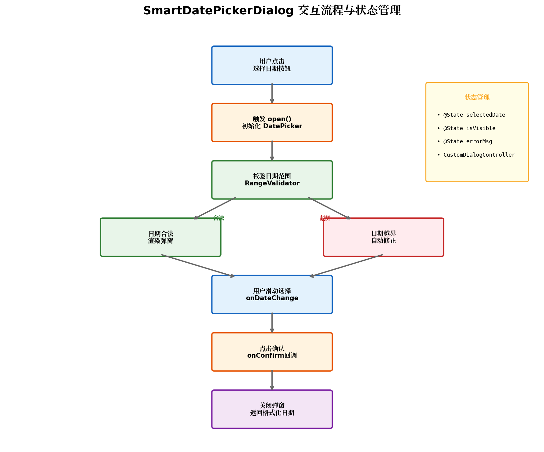
流程说明:
- 触发阶段:用户点击页面上的"选择日期"按钮,调用
SmartDatePicker.show(); - 初始化阶段:
aboutToAppear()生命周期中初始化默认日期、主题、校验器; - 校验阶段:若传入
minDate/maxDate,RangeValidator对默认日期进行预校验; - 渲染阶段:
CustomDialog从底部弹出,渲染DatePicker及操作按钮; - 交互阶段:用户滑动选择日期,
onDateChange触发handleDateChange(),实时更新展示文本并进行范围校验; - 确认阶段:点击"确定"后,通过
onConfirm回调将Date对象及格式化字符串返回给业务层; - 关闭阶段:弹窗关闭,控制器释放,避免内存泄漏。
5.2 状态管理要点
封装组件内部采用 @State 管理以下状态:
| 状态变量 | 类型 | 说明 |
|---|---|---|
selectedDate |
Date |
当前选中的日期对象 |
displayDate |
string |
格式化后的日期展示文本 |
errorMsg |
string |
校验错误提示信息 |
showLunar |
boolean |
是否展示农历 |
关键设计决策:
- 状态最小化:仅暴露必要的
@State变量,避免过度响应式刷新导致的性能损耗; - 日期对象不可变:每次选择新日期时创建新的
Date实例,避免引用共享导致的副作用; - 防抖处理:
onDateChange事件在快速滑动时会高频触发,实际项目中可引入防抖机制,延迟 200ms 执行校验逻辑。
六、原生 vs 封装后对比
以下从代码量、功能覆盖、维护成本三个维度进行对比:
| 对比维度 | 原生 DatePicker | SmartDatePicker(封装后) |
|---|---|---|
| 调用代码量 | 15+ 行,需手动处理格式化和校验 | 6~8 行,声明式配置 |
| 日期格式化 | 需自行实现 formatDate 方法 |
内置 DateFormatter,支持模板 |
| 范围校验 | 需在 onChange 中手动判断 |
内置 RangeValidator,自动修正 |
| 主题定制 | 需逐个属性设置 | 统一 ThemeManager 管理 |
| 农历显示 | 需自行接入农历库 | 内置 toLunar() 方法 |
| 弹窗动画 | 需自行封装 CustomDialog |
内置底部弹出动画 |
| 跨页面复用 | 代码复制粘贴 | 组件化引入,一处修改全局生效 |
七、实战案例:用户信息表单集成
以下是一个典型的用户信息编辑页面,集成 SmartDatePicker 实现出生日期选择:
// pages/UserProfilePage.ets
import { SmartDatePicker } from '../components/SmartDatePicker'
import { ThemeManager, DefaultLightTheme } from '../theme/DatePickerTheme'

@Entry
@Component
struct UserProfilePage {
  @State userName: string = '张三'
  @State birthDate: string = '1995-08-15'
  @State phone: string = '13800138000'

  aboutToAppear(): void {
    ThemeManager.apply(DefaultLightTheme)
  }

  private handleSelectBirthDate(): void {
    SmartDatePicker.show(getContext(this) as UIAbility, {
      title: '选择出生日期',
      selectedDate: new Date(this.birthDate),
      minDate: new Date('1900-01-01'),
      maxDate: new Date(), // 不能选择未来日期
      dateFormat: 'yyyy年MM月dd日',
      showLunar: true,
      onConfirm: (date: Date, formatted: string) => {
        this.birthDate = formatted
        console.info('用户选择出生日期:', formatted)
      },
      onCancel: () => {
        console.info('用户取消选择')
      }
    })
  }

  build() {
    Column({ space: 0 }) {
      Row() {
        Image($r('sys.symbol.chevron_left'))
          .width(24).height(24)
          .onClick(() => { router.back() })
        Text('编辑资料')
          .fontSize(18).fontWeight(FontWeight.Bold)
          .layoutWeight(1).textAlign(TextAlign.Center)
        Blank().width(24)
      }
      .width('100%').height(56)
      .padding({ left: 16, right: 16 })
      .backgroundColor('#FFFFFF')

      Column({ space: 20 }) {
        this.FormItem('姓名', this.userName, (value) => { this.userName = value })

        Row() {
          Text('出生日期').fontSize(16).fontColor('#333333').layoutWeight(1)
          Row() {
            Text(this.birthDate).fontSize(16).fontColor(this.birthDate ? '#333333' : '#999999')
            Image($r('sys.symbol.chevron_right')).width(20).height(20).fillColor('#CCCCCC').margin({ left: 4 })
          }.onClick(() => this.handleSelectBirthDate())
        }
        .width('100%').height(56)
        .padding({ left: 16, right: 16 })
        .backgroundColor('#FFFFFF').borderRadius(12)

        this.FormItem('手机号', this.phone, (value) => { this.phone = value })

        Button('保存')
          .width('100%').height(48)
          .backgroundColor('#0A59F7').fontColor('#FFFFFF').fontSize(16)
          .margin({ top: 20 })
          .onClick(() => {
            console.info('保存用户信息:', JSON.stringify({
              name: this.userName, birthDate: this.birthDate, phone: this.phone
            }))
          })
      }
      .width('100%').padding(16).layoutWeight(1).backgroundColor('#F5F5F5')
    }
    .width('100%').height('100%')
  }

  @Builder
  FormItem(label: string, value: string, onChange: (val: string) => void) {
    Row() {
      Text(label).fontSize(16).fontColor('#333333').layoutWeight(1)
      TextInput({ text: $$value })
        .width(200).height(40).fontSize(16)
        .backgroundColor('#F5F5F5').borderRadius(8)
        .onChange(onChange)
    }
    .width('100%').height(56)
    .padding({ left: 16, right: 16 })
    .backgroundColor('#FFFFFF').borderRadius(12)
  }
}
7.1 运行效果说明
当用户点击"出生日期"行时,底部弹出 SmartDatePickerDialog:
- 标题栏显示"选择出生日期",右侧提供农历切换开关;
- 日期选择区展示
DatePicker滚轮,默认选中用户已设置的日期; - 实时预览区同步显示公历与农历日期;
- 范围限制:用户无法选择 1900 年之前或今天的日期,越界时自动修正并给出提示;
- 确认后:格式化字符串
yyyy年MM月dd日回写到页面状态,表单即时更新。
八、性能优化与最佳实践
8.1 性能优化策略
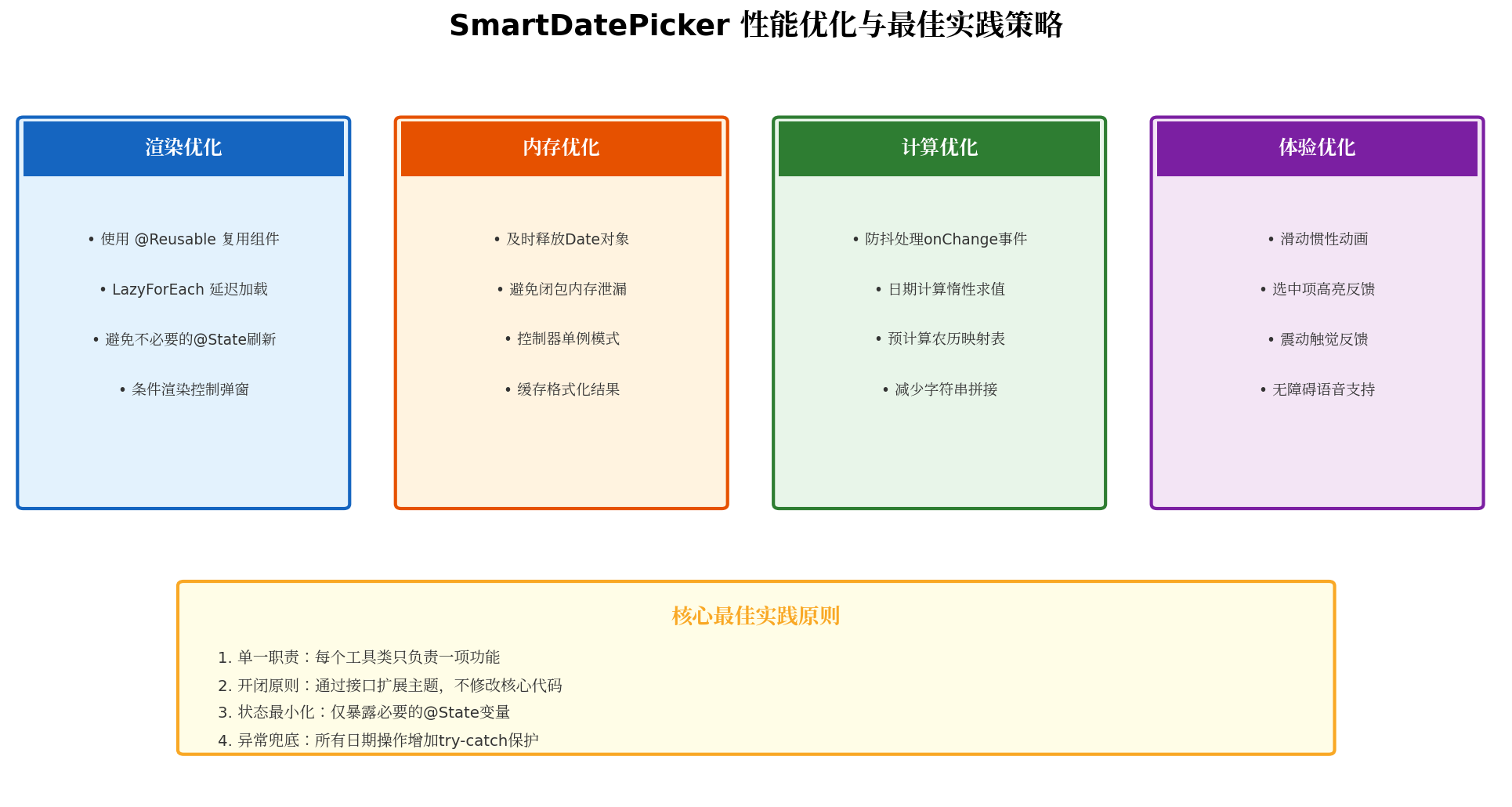
8.1.1 渲染优化
- @Reusable 复用:若页面存在多个日期选择入口,可将
SmartDatePickerDialog标记为@Reusable,减少组件实例创建开销; - 条件渲染:弹窗未打开时不渲染
DatePicker内部节点,通过if (this.isVisible)控制; - 避免级联刷新:
displayDate的更新仅依赖selectedDate,不引入无关的状态依赖。
8.1.2 内存优化
- 及时释放控制器:弹窗关闭后在
onWillDismiss中将dialogController置为null; - 避免闭包泄漏:回调函数中使用箭头函数,确保
this指向正确且不持有外部大对象引用; - 日期对象池:高频场景下(如日历视图)可复用
Date对象,减少 GC 压力。
8.1.3 计算优化
- 防抖处理:对
onDateChange增加 200ms 防抖,避免快速滑动时的重复计算; - 惰性求值:农历转换仅在
showLunar === true时执行,避免不必要的计算; - 缓存格式化结果:同一日期多次格式化时,使用
Map缓存结果。
8.2 工程化最佳实践
| 原则 | 实践建议 |
|---|---|
| 单一职责 | DateFormatter 只负责格式化,RangeValidator 只负责校验,不耦合 |
| 开闭原则 | 新增主题时实现 DatePickerTheme 接口,无需修改 SmartDatePickerDialog |
| 异常兜底 | 所有日期操作包裹 try-catch,非法输入时返回默认值而非崩溃 |
| 类型安全 | 使用严格的 TypeScript 类型定义,避免 any 滥用 |
| 单元测试 | 对 DateFormatter.parse() 和 RangeValidator.validate() 编写独立测试用例 |
九、扩展能力展望
SmartDatePicker 封装方案具备良好的扩展性,后续可在此基础上迭代以下能力:
- 时间选择器联动:封装
SmartTimePicker,支持日期 + 时间的组合选择; - 范围日期选择:支持"开始日期-结束日期"双选模式,适用于酒店预订、行程规划场景;
- 节假日标注:接入节假日数据源,在日期选择器中标注法定节假日、调休日;
- 无障碍增强:增加屏幕朗读支持,为视障用户提供日期播报能力;
- 一多适配:结合 HarmonyOS 的响应式布局能力,适配手机、平板、折叠屏等多设备形态。
十、总结
本文从 HarmonyOS ArkUI 原生 DatePicker 的能力边界出发,系统性地设计并实现了一套企业级的 SmartDatePicker 封装方案。通过日期格式化工具、范围校验器、主题管理器三大子模块的拆分,实现了高内聚、低耦合的组件架构。在实际业务场景中,开发者仅需 6~8 行配置代码即可完成日期选择功能的集成,大幅提升了开发效率与代码可维护性。
核心要点回顾:
- 组件封装是提升 ArkUI 开发效率的关键手段,应将重复逻辑下沉到公共组件;
- 状态最小化与不可变数据是避免响应式系统性能陷阱的有效策略;
- 接口隔离(
DatePickerTheme)与依赖倒置(ThemeManager)让组件具备长期演进能力; - 异常兜底与自动修正是保障用户体验的最后一道防线。
希望本文的封装思路与代码实践能够为鸿蒙生态的组件化建设提供有价值的参考。
转载自:https://blog.csdn.net/u014727709/article/details/163345378
欢迎 👍点赞✍评论⭐收藏,欢迎指正

作为“人工智能6S店”的官方数字引擎,为AI开发者与企业提供一个覆盖软硬件全栈、一站式门户。
更多推荐



 8
8 0
0- 0


 已为社区贡献115条内容

所有评论(0)