
鸿蒙原生开发深度解析:星海天文台应用架构与实现全解
鸿蒙操作系统(HarmonyOS)作为华为推出的面向全场景的分布式操作系统,其应用开发框架提供了声明式 UI 编程范式。开发者通过 ArkTS 语言——一种在 TypeScript 基础上扩展的语言——能够以极简的代码构建出功能丰富、交互流畅的原生应用。本文将以一个完整的天文观测社区应用为案例,逐段拆解其代码实现,深入剖析鸿蒙声明式 UI 的核心组件、状态管理、布局系统以及弹窗交互的工程实践。
在当今移动应用开发领域,跨平台框架层出不穷,但原生开发始终拥有性能与体验上的不可替代性。鸿蒙的 ArkUI 框架采用声明式编程模型,开发者只需描述界面的最终状态,框架便自动完成视图的更新与渲染。这种范式大幅降低了 UI 代码的复杂度,同时保留了原生渲染的性能优势。
本文分析的应用名为"星海天文台",是一个面向天文爱好者的一站式社区平台。它涵盖了天象预报、星座运势、望远镜机位预约、天文课程、观星商城、观测日志等完整功能模块。从架构角度看,该应用采用了"单页面 + 多 Tab 切换 + 模态弹窗"的经典移动端交互模式,通过组件化的方式将不同业务模块拆分为独立的 @Component 结构,再由主入口组件统一编排。
整体技术栈方面,该应用完全基于鸿蒙 ArkUI 的声明式范式构建,使用了 @Entry、@Component、@State、@Builder 等核心装饰器,布局方面大量运用了 Column、Row、Scroll、Stack 等容器组件,列表渲染则依赖 ForEach 进行数据驱动的 UI 生成。状态管理采用组件内 @State 响应式方案,通过回调函数实现父子组件间的通信。
一、类型定义层:数据模型的工程化设计
在任何规模的应用中,数据模型的定义是整个工程的基础。良好的类型定义不仅能够约束数据的结构,还能在编码阶段获得编辑器的智能提示,从而减少运行时错误。
interface SkyEvent {
  id: number
  title: string
  date: string
  time: string
  type: string
  desc: string
  hot: number
}
这是天象事件的数据接口定义。SkyEvent 描述了一个天文事件的完整信息,包括唯一标识 id、事件标题 title、发生日期 date、观测时段 time、事件类型 type(如流星雨、行星冲日等)、详细描述 desc 以及热度值 hot。
在 ArkTS 中,interface 的语法与 TypeScript 完全一致,使用键值对的形式声明属性名与类型。这种声明方式是纯声明性的,不会在运行时产生任何 JavaScript 对象,因此不会带来额外的内存开销。
值得注意的是 hot 字段使用 number 类型存储热度值,后续在 UI 渲染时会将其转换为百分比展示。这种将原始数值与展示逻辑分离的做法是良好的工程实践,数据层只负责存储真实值,展示格式由视图层决定。
interface StarSign {
  id: number
  name: string
  date: string
  element: string
  guardian: string
  luck: string
  intro: string
}
星座运势的数据接口 StarSign 包含了星座名称、日期区间、元素属性(火象、土象、风象、水象)、守护星、今日运势评级以及一句话简介。luck 字段使用字符串存储星级符号(如"★★★★☆"),这是一种在移动端 UI 中常见的轻量级评分展示方式。
interface ScopeItem {
  id: number
  name: string
  site: string
  aperture: string
  status: string
  fee: number
}
望远镜机位的 ScopeItem 接口描述了天文台可供预约的观测设备信息。aperture(口径)字段使用字符串类型而非数值,因为口径的表述方式多样——既可能是"203mm"这样的毫米数,也可能是"15x70"这样的倍率乘口径格式,还有可能是"H-alpha"这样的特殊波段标识。使用字符串类型能够灵活适配这些不同的表述。
status 字段存储机位的可预约状态,取值包括"可预约"、“维修中”、"已约满"三种。这种使用中文字符串作为状态值的方式在国内应用开发中非常常见,它的可读性极高,但在扩展性方面不如枚举类型——如果未来需要新增状态类型,需要修改多处条件判断逻辑。
interface AstroCourse {
  id: number
  title: string
  teacher: string
  time: string
  place: string
  level: string
  quota: number
  joined: number
}
天文课程接口 AstroCourse 包含了课程标题、授课教师、上课时间、地点、难度等级、名额上限 quota 和已报名人数 joined。quota 和 joined 两个数值字段的配合使用是报名系统的经典设计模式——通过比较两者可以判断课程是否已满,通过计算比值可以渲染报名进度条。
interface ShopGood {
  id: number
  name: string
  price: number
  oldPrice: number
  cat: string
  stock: string
}
商品接口 ShopGood 中,price 和 oldPrice 分别代表现价和原价,用于展示折扣信息。cat 字段是商品分类(器材、书籍、周边等),stock 是库存状态。原价字段的存在使得 UI 可以展示划线价,增强促销感。
interface ObsLog {
  id: number
  title: string
  date: string
  target: string
  quality: string
  note: string
}
观测日志接口 ObsLog 记录了每次天文观测的详细信息。quality 字段存储视宁度评价(优秀、良好、一般),这是一个主观评价字段。note 是自由文本记录,用户可以写下观测时的详细情况。
interface BookingItem {
  id: number
  scope: string
  date: string
  slot: string
  status: string
}
预约记录接口 BookingItem 直接存储了机位名称字符串 scope,而非引用 ScopeItem 的 id。这是一种反范式的设计,在展示预约列表时无需再进行关联查询。在纯前端模拟应用中,这种设计是合理的,因为不存在数据库层面的关联关系。
interface CourseChapter {
  name: string
  duration: string
  chapter: number
}

interface StarPic {
  id: number
  title: string
  star: string
  tag: string
}
课程章节 CourseChapter 和星空图片 StarPic 是两个辅助数据接口。前者用于课程详情中的章节目录展示,后者用于精选天文摄影作品的展示。这两个接口的字段都比较精简,专注于各自展示场景所需的信息。
在鸿蒙 ArkTS 开发中,interface 是定义数据结构的首选方式。与 class 不同,interface 不会在运行时被编译为构造函数,它纯粹是编译期的类型约束工具。这意味着你可以放心定义大量 interface 而无需担心运行时性能——它们在编译后会被完全擦除。
二、全局数据层:静态数据源的集中管理
该应用采用了"写死数据"的方式,将所有业务数据以常量数组的形式定义在全局作用域中。这种方式在原型开发阶段非常高效,开发者无需搭建后端服务即可获得完整的 UI 展示效果。
const SKY_EVENTS: SkyEvent[] = [
  { id: 1, title: '英仙座流星雨极大', date: '2026-08-13', time: '22:00-02:00', type: '流星雨', desc: '每小时天顶流量约 100 颗,最佳观测地在郊野光害少处。', hot: 98 },
  { id: 2, title: '土星冲日', date: '2026-09-21', time: '整夜', type: '行星', desc: '土星全年最亮时刻,光环清晰可见。', hot: 88 },
  { id: 3, title: '超级月亮', date: '2026-10-03', time: '19:30', type: '月球', desc: '年度最大满月,亮度提升约 14%。', hot: 92 },
  { id: 4, title: '猎户座流星雨', date: '2026-10-21', time: '23:00-03:00', type: '流星雨', desc: '来自哈雷彗星碎屑,速度极快。', hot: 85 },
  { id: 5, title: '水星东大距', date: '2026-11-11', time: '日落前后', type: '行星', desc: '水星今年最佳观测窗口之一。', hot: 76 },
  { id: 6, title: '双子座流星雨极大', date: '2026-12-14', time: '21:00-04:00', type: '流星雨', desc: '年度压轴流星雨,稳定高产出。', hot: 99 },
  { id: 7, title: '木星合月', date: '2026-11-28', time: '20:00', type: '合月', desc: '木星与月亮近距离相伴。', hot: 70 },
  { id: 8, title: '月掩昴星团', date: '2026-12-02', time: '03:30', type: '掩星', desc: '月球掠过昴星团,值得守候。', hot: 66 },
  { id: 9, title: '金星伴月', date: '2026-09-08', time: '黎明前', type: '伴月', desc: '金星与残月同框的绝美画面。', hot: 82 },
  { id: 10, title: '象限仪座流星雨', date: '2027-01-04', time: '23:00-05:00', type: '流星雨', desc: '新年首场流星雨,峰值短暂而集中。', hot: 90 }
]
SKY_EVENTS 数组包含了十条天象事件数据,覆盖了从流星雨、行星冲日到合月、掩星等多种天文现象。每条数据的 type 字段决定了在 UI 中的标签颜色和 Emoji 图标,这是通过后续的辅助函数实现的。
使用 const 关键字声明意味着这些数组引用不可变,但数组内部的元素属性在技术上是可以修改的。在更严格的工程实践中,可以使用 readonly 修饰符来确保数据的完全不可变性,但在本应用中,由于所有数据都是只读展示用的,const 已经足够。
数据内容设计得非常专业——英仙座流星雨、双子座流星雨都是真实的天文事件,热度值的设定也符合实际观测价值。土星冲日时确实是观测土星环的最佳时机,水星东大距也确实是水星最容易被观测的时刻。这些真实数据使得应用具有实际参考价值。
const STAR_SIGNS: StarSign[] = [
  { id: 1, name: '白羊座', date: '3.21-4.19', element: '火象', guardian: '火星', luck: '★★★★☆', intro: '热情直接的行动派' },
  { id: 2, name: '金牛座', date: '4.20-5.20', element: '土象', guardian: '金星', luck: '★★★☆☆', intro: '稳重踏实的享受家' },
  { id: 3, name: '双子座', date: '5.21-6.21', element: '风象', guardian: '水星', luck: '★★★★★', intro: '机敏好奇的百事通' },
  { id: 4, name: '巨蟹座', date: '6.22-7.22', element: '水象', guardian: '月亮', luck: '★★★☆☆', intro: '细腻温暖的守护者' },
  { id: 5, name: '狮子座', date: '7.23-8.22', element: '火象', guardian: '太阳', luck: '★★★★☆', intro: '自信耀眼的领航员' },
  { id: 6, name: '处女座', date: '8.23-9.22', element: '土象', guardian: '水星', luck: '★★★☆☆', intro: '追求完美的细节控' },
  { id: 7, name: '天秤座', date: '9.23-10.23', element: '风象', guardian: '金星', luck: '★★★★☆', intro: '优雅平衡的协调者' },
  { id: 8, name: '天蝎座', date: '10.24-11.22', element: '水象', guardian: '冥王星', luck: '★★★★★', intro: '深邃专注的探索者' },
  { id: 9, name: '射手座', date: '11.23-12.21', element: '火象', guardian: '木星', luck: '★★★★☆', intro: '乐观自由的冒险家' },
  { id: 10, name: '摩羯座', date: '12.22-1.19', element: '土象', guardian: '土星', luck: '★★★☆☆', intro: '坚韧务实的攀登者' },
  { id: 11, name: '水瓶座', date: '1.20-2.18', element: '风象', guardian: '天王星', luck: '★★★★☆', intro: '前卫独立的革新者' },
  { id: 12, name: '双鱼座', date: '2.19-3.20', element: '水象', guardian: '海王星', luck: '★★★★★', intro: '浪漫共情的梦想家' }
]
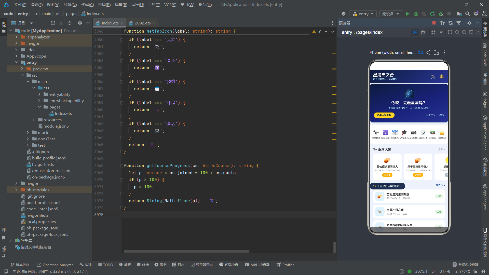
十二星座数据完整覆盖了黄道带的所有星座。element 字段的四元素分类(火、土、风、水)是西方占星学的经典体系,后续在 UI 渲染时会映射为对应的 Emoji 图标。luck 字段使用 Unicode 星号字符表示评级,这种文本化的星级展示在移动端兼容性极好,无需依赖图标字体或图片资源。
const SCOPE_LIST: ScopeItem[] = [
  { id: 1, name: '天枢·观星一号', site: '园区天台 A 区', aperture: '203mm', status: '可预约', fee: 20 },
  { id: 2, name: '天璇·深空二号', site: '园区天台 B 区', aperture: '254mm', status: '可预约', fee: 30 },
  { id: 3, name: '天玑·行星三号', site: '园区天台 C 区', aperture: '180mm', status: '维修中', fee: 20 },
  { id: 4, name: '天权·巡天四号', site: '郊外观测站', aperture: '406mm', status: '已约满', fee: 50 },
  { id: 5, name: '玉衡·双筒五号', site: '园区草坪', aperture: '15x70', status: '可预约', fee: 10 },
  { id: 6, name: '开阳·赤道六号', site: '郊外观测站', aperture: '305mm', status: '可预约', fee: 40 },
  { id: 7, name: '摇光·太阳七号', site: '园区天台 D 区', aperture: 'H-alpha', status: '可预约', fee: 15 },
  { id: 8, name: '北辰·便携八号', site: '园区草坪', aperture: '130mm', status: '已约满', fee: 25 }
]
望远镜机位数据使用了中国古代星名(天枢、天璇、天玑、天权、玉衡、开阳、摇光、北辰)作为设备编号,这组名称正是北斗七星的正式名称加上北极星的别称。这种命名方式既富有文化底蕴,又使得每个设备都有独特的辨识度。
口径数据从 130mm 到 406mm 不等,覆盖了从入门级到专业级的观测设备。费用设定也与设备规格正相关——口径越大,费用越高。H-alpha 滤光设备用于太阳观测,这是一个特殊的窄带观测设备。
const OBS_WEEK: number[] = [3, 5, 2, 6, 4, 8, 5]
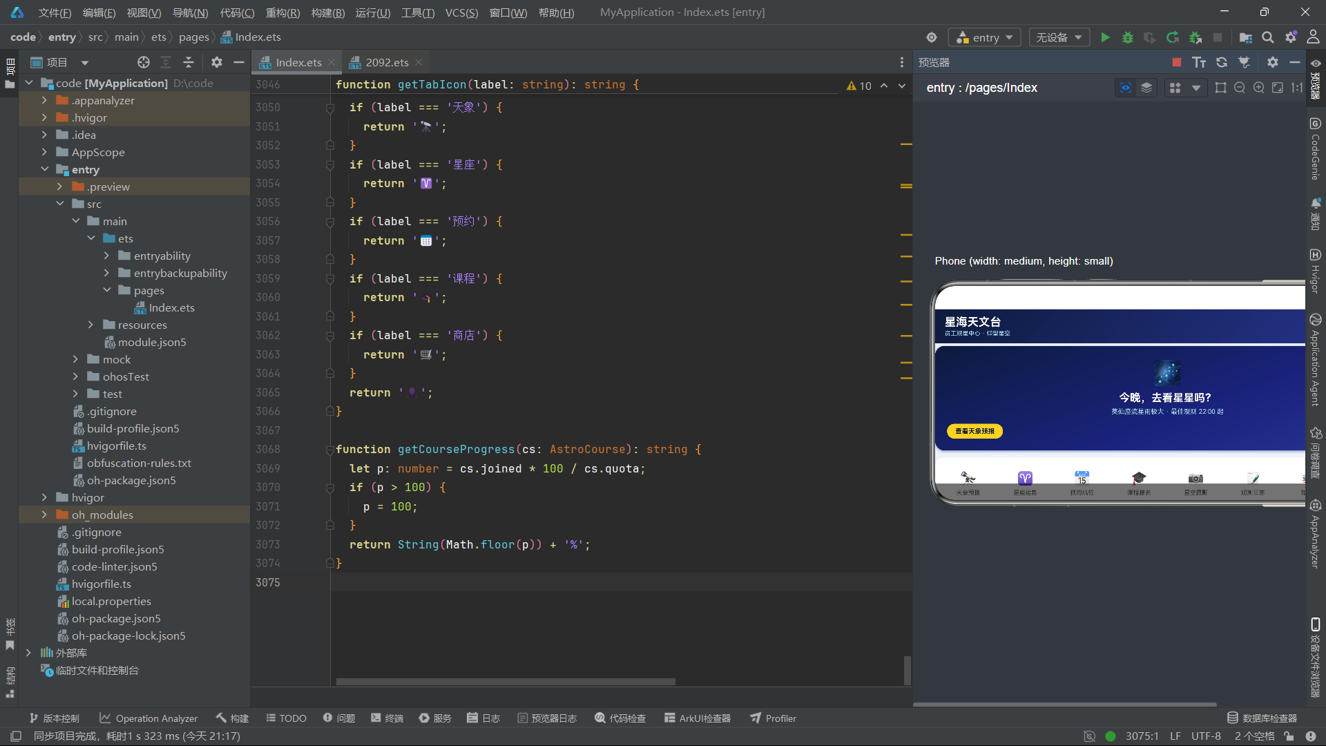
本周观测统计 OBS_WEEK 是一个简单的数值数组,七个数字分别代表周一到周日的观测次数。这个数组将在"我的"页面的柱状图中使用,通过计算将数值转换为柱子的高度。
三、全局辅助函数:业务逻辑的封装与复用
辅助函数层是该应用的重要组成部分,它将数据分片、颜色映射、Emoji 映射等纯逻辑操作封装为独立函数,保持了 UI 组件代码的整洁。
function getEventRows(): SkyEvent[] {
  return [SKY_EVENTS[0], SKY_EVENTS[2], SKY_EVENTS[4], SKY_EVENTS[6], SKY_EVENTS[8]];
}

function getEventRows2(): SkyEvent[] {
  return [SKY_EVENTS[1], SKY_EVENTS[3], SKY_EVENTS[5], SKY_EVENTS[7], SKY_EVENTS[9]];
}
这两个函数将 SKY_EVENTS 数组按奇偶索引拆分为两个子数组。这种"分列"策略用于双列瀑布流布局——第一列展示索引 0、2、4、6、8 的数据,第二列展示索引 1、3、5、7、9 的数据。通过辅助函数封装分片逻辑,UI 组件只需调用 getEventRows() 和 getEventRows2() 即可获得两列数据,无需在组件内部处理索引运算。
同样的模式被复用到了星座、机位、课程、商品、日志、预约等所有双列布局场景中,体现了代码组织的一致性。
function getBarHeight(v: number): number {
  return 20 + v * 9;
}
柱状图高度计算函数将观测次数映射为像素高度。基础高度 20 像素加上数值乘以 9 的系数——当观测次数为 8(本周最高值)时,柱子高度为 20 + 72 = 92 像素。这种线性映射函数是数据可视化的基础工具。
function getTypeColor(t: string): string {
  if (t === '流星雨') {
    return '#FFB300';
  }
  if (t === '行星') {
    return '#4FC3F7';
  }
  if (t === '月球') {
    return '#B0BEC5';
  }
  if (t === '深空') {
    return '#9575CD';
  }
  if (t === '掩星') {
    return '#EF5350';
  }
  return '#FF8A65';
}
天象类型颜色映射函数根据事件类型返回对应的十六进制颜色值。流星雨使用琥珀色(#FFB300),暗示流星划过夜空的温暖光芒;行星使用天蓝色(#4FC3F7),呼应行星的大气感;月球使用灰蓝色(#B0BEC5),模拟月光的冷调;深空使用紫色(#9575CD),营造宇宙的神秘感;掩星使用红色(#EF5350),表示特殊的天文现象。
这种基于字符串的 if-else 映射在数据量较小时是完全可行的,代码直观易读。但如果映射关系增多,可以考虑使用对象字面量作为查找表来优化性能和可读性。
function getEventEmoji(t: string): string {
  if (t === '流星雨') {
    return '☄️';
  }
  if (t === '行星') {
    return '🪐';
  }
  if (t === '月球') {
    return '🌕';
  }
  if (t === '掩星') {
    return '🌘';
  }
  if (t === '伴月') {
    return '🌙';
  }
  if (t === '合月') {
    return '🌝';
  }
  return '✨';
}
Emoji 映射函数与颜色映射函数结构一致,但返回的是 Emoji 字符串。使用 Emoji 作为图标是移动端 UI 的流行趋势——它无需引入图标库,跨平台兼容性好,且色彩丰富、表现力强。在本应用中,几乎所有的图标都使用 Emoji 实现,这使得整个应用的视觉风格统一且生动。
Emoji 作为 UI 图标的使用需要谨慎。虽然它带来了开发便利性和视觉表现力,但不同操作系统、不同设备上的 Emoji 渲染样式可能存在差异。在需要像素级精确的设计场景中,仍然建议使用 SVG 图标或自定义字体图标。但在快速原型开发和生活化应用中,Emoji 方案具有极高的效率优势。
四、首页 Tab 组件:信息聚合与导航枢纽
首页是用户打开应用后看到的第一屏,承担着信息聚合和快速导航的双重职责。
@Component
struct HomeTab {
  onOpenEvent: (id: number) => void = () => {
  }
  onOpenLog: (id: number) => void = () => {
  }
  onToast: (msg: string) => void = () => {
  }

  build() {
    Column() {
      Scroll() {
        Column() {
@Component 装饰器将 HomeTab 声明为一个可复用的 UI 组件。在鸿蒙 ArkUI 中,每个 @Component 都是一个独立的视图单元,拥有自己的 build() 方法来描述其 UI 结构。
组件通过三个回调函数属性与父组件通信:onOpenEvent 在用户点击天象事件时触发,onOpenLog 在用户点击观测日志时触发,onToast 用于显示临时提示消息。这种回调通信模式是鸿蒙组件间通信的基础方式——子组件不直接修改父组件的状态,而是通过回调通知父组件,由父组件决定如何响应。
build() 方法内部首先是一个 Column 容器作为根布局,其内嵌套了一个 Scroll 组件。Scroll 组件提供了垂直滚动能力,当内容超出屏幕高度时,用户可以上下滑动查看更多内容。在 Scroll 内部又是一个 Column,这个嵌套结构确保了所有内容以垂直方向排列,且支持整体滚动。
星空大标题卡
          // 星空大标题卡
          Column() {
            Text('🌌')
              .fontSize(40)
            Text('今晚,去看星星吗?')
              .fontSize(18)
              .fontWeight(FontWeight.Bold)
              .fontColor('#FFFFFF')
              .margin({ top: 8 })
            Text('英仙座流星雨极大 · 最佳观测 22:00 起')
              .fontSize(11)
              .fontColor('#B3E5FC')
              .margin({ top: 6 })
            Row() {
              Text('查看天象预报')
                .fontSize(11)
                .fontWeight(FontWeight.Bold)
                .fontColor('#0D1B3E')
                .padding({ left: 14, right: 14, top: 6, bottom: 6 })
                .backgroundColor('#FFD54F')
                .borderRadius(14)
                .onClick(() => {
                  this.onOpenEvent(SKY_EVENTS[0].id);
                })
              Text('')
                .layoutWeight(1)
              Text('云量 12% · 光害低')
                .fontSize(10)
                .fontColor('#B3E5FC')
            }
            .width('100%')
            .margin({ top: 14 })
          }
          .width('100%')
          .padding({ left: 20, right: 20, top: 22, bottom: 20 })
          .linearGradient({ angle: 160, colors: [['#0D1B3E', 0], ['#1A237E', 0.6], ['#283593', 1]] })
          .borderRadius(16)
          .margin({ left: 16, right: 16, top: 12 })
          .shadow({ radius: 10, color: 'rgba(13,27,62,0.4)', offsetY: 5 })
首页的顶部是一张视觉冲击力极强的"星空大标题卡"。这张卡片使用了 linearGradient 线性渐变背景,角度为 160 度,从深蓝色 #0D1B3E 过渡到藏青色 #1A237E 再到靛蓝 #283593,营造出深邃夜空的视觉效果。
Column 容器内的内容从上到下依次是:一个 40 号字号的 Galaxy Emoji 作为视觉焦点,一行加粗的白色标题文案"今晚,去看星星吗?",一行浅蓝色的辅助说明文案,以及底部的行动按钮和天气信息。
底部 Row 中的布局技巧值得注意:在"查看天象预报"按钮和"云量 12%"文本之间,插入了一个空 Text('').layoutWeight(1)。这是鸿蒙布局中实现"两端对齐"的经典手法——layoutWeight(1) 让空文本占据所有剩余空间,从而将两侧的元素推向两端。这种模式等同于 CSS Flexbox 中的 justify-content: space-between。
shadow 属性为卡片添加了阴影效果,offsetY: 5 使阴影向下偏移,模拟自然光线从上方照射的投影效果。rgba(13,27,62,0.4) 的半透明深蓝色阴影与卡片背景色系一致,比纯黑阴影更加和谐。
快捷功能宫格
          // 宫格
          Row() {
            ForEach(getQuickEntries(), (qe: string, qi: number) => {
              Column() {
                Text(getQuickIcon(qi))
                  .fontSize(22)
                Text(qe)
                  .fontSize(10)
                  .fontColor('#616161')
                  .margin({ top: 5 })
              }
              .layoutWeight(1)
              .padding({ top: 10, bottom: 10 })
              .onClick(() => {
                this.onToast(qe + ' 功能开发中');
              })
            }, (qe: string) => qe)
          }
          .width('100%')
          .padding({ left: 8, right: 8, top: 12, bottom: 12 })
          .backgroundColor('#FFFFFF')
          .borderRadius(14)
          .margin({ left: 16, right: 16, top: 12 })
快捷功能宫格使用 ForEach 组件渲染了一个包含八个入口的横向列表。ForEach 是鸿蒙 ArkUI 中用于列表渲染的核心组件,它接受三个参数:数据源数组、子项生成函数和键值生成函数。
getQuickEntries() 返回包含八个功能名称的数组(天象预报、星座运势、预约机位等),getQuickIcon(qi) 根据索引返回对应的 Emoji 图标。每个宫格项都是一个 Column 布局,上方是 Emoji 图标,下方是功能名称。
layoutWeight(1) 使得八个宫格项平均分配父容器的宽度。点击任意宫格项时,都会触发 onToast 回调显示"XX功能开发中"的提示——这表明这些快捷入口目前是展示性的,具体功能尚未实现。
ForEach 的第三个参数是键值生成函数 (qe: string) => qe,它使用功能名称作为唯一键。键值的作用是帮助框架在数据变化时高效地更新 DOM——当数组重新排序或增删时,框架通过键值判断哪些项需要重新渲染。
近期天象横滑列表
          Scroll() {
            Row() {
              ForEach(getHomeEvents(), (ev: SkyEvent) => {
                Column() {
                  Text(getEventEmoji(ev.type))
                    .fontSize(28)
                  Text(ev.title)
                    .fontSize(12)
                    .fontWeight(FontWeight.Bold)
                    .fontColor('#333333')
                    .margin({ top: 6 })
                    .maxLines(1)
                  Text(ev.date + ' ' + ev.time)
                    .fontSize(10)
                    .fontColor('#9E9E9E')
                    .margin({ top: 4 })
                  Text(ev.type)
                    .fontSize(10)
                    .fontColor('#FFFFFF')
                    .padding({ left: 8, right: 8, top: 3, bottom: 3 })
                    .backgroundColor(getTypeColor(ev.type))
                    .borderRadius(8)
                    .margin({ top: 6 })
                }
                .width(130)
                .padding({ top: 14, bottom: 14 })
                .backgroundColor('#FFFFFF')
                .borderRadius(12)
                .margin({ right: 10 })
                .onClick(() => {
                  this.onOpenEvent(ev.id);
                })
              }, (ev: SkyEvent) => String(ev.id))
            }
            .padding({ left: 16 })
          }
          .scrollable(ScrollDirection.Horizontal)
          .scrollBar(BarState.Off)
          .margin({ top: 10 })
这是一个横向滚动的天象卡片列表,使用了 Scroll 组件的横向滚动能力。关键在于 .scrollable(ScrollDirection.Horizontal) 将滚动方向设置为水平,而 .scrollBar(BarState.Off) 隐藏了滚动条,使得 UI 更加干净。
每张卡片固定宽度 130 像素,包含 Emoji 图标、事件标题、日期时间以及类型标签。maxLines(1) 限制了标题只显示一行,超出部分自动截断——这在固定宽度的卡片布局中非常重要,防止长标题撑破布局。
类型标签 Text(ev.type) 使用 getTypeColor 函数返回的颜色作为背景,白色文字在彩色背景上的对比度良好。borderRadius(8) 使标签呈现为圆角药丸形状。
横向滚动列表是移动端 UI 设计的经典模式,特别适合展示"精选"或"推荐"类内容。在鸿蒙 ArkUI 中实现横向滚动只需三步:外层 Scroll 组件设置水平滚动方向、内层 Row 容器排列子项、隐藏滚动条。相比传统的 ViewPager,这种实现方式更加轻量灵活。
最新观测日志列表
          Column() {
            ForEach(getHomeLogs(), (lg: ObsLog) => {
              Row() {
                Text(getTargetEmoji(lg.target))
                  .fontSize(20)
                  .width(42)
                  .height(42)
                  .textAlign(TextAlign.Center)
                  .backgroundColor('#E3F2FD')
                  .borderRadius(10)
                Column() {
                  Text(lg.title)
                    .fontSize(13)
                    .fontWeight(FontWeight.Bold)
                    .fontColor('#333333')
                    .maxLines(1)
                  Text(lg.date + ' · ' + lg.target)
                    .fontSize(11)
                    .fontColor('#9E9E9E')
                    .margin({ top: 3 })
                }
                .layoutWeight(1)
                .alignItems(HorizontalAlign.Start)
                .margin({ left: 10 })
                Text(lg.quality)
                  .fontSize(10)
                  .fontColor(getQualityColor(lg.quality))
                  .padding({ left: 8, right: 8, top: 3, bottom: 3 })
                  .backgroundColor('#E8F5E9')
                  .borderRadius(8)
              }
              .width('100%')
              .padding(10)
              .backgroundColor('#FFFFFF')
              .borderRadius(12)
              .margin({ bottom: 8 })
              .onClick(() => {
                this.onOpenLog(lg.id);
              })
            }, (lg: ObsLog) => String(lg.id))
          }
          .width('100%')
          .padding({ left: 16, right: 16, top: 10, bottom: 16 })
观测日志列表项采用了经典的"左图标 + 中文本 + 右标签"三段式布局。左侧的 Emoji 图标放在一个 42x42 的圆角方块背景中,使用 TextAlign.Center 居中显示。中间的 Column 使用 layoutWeight(1) 占据剩余空间,alignItems(HorizontalAlign.Start) 使文本左对齐。
右侧的视宁度标签使用 getQualityColor 函数根据评价等级返回不同颜色——优秀为绿色、良好为琥珀色、一般为灰色。这种颜色编码让用户一眼就能识别观测质量的好坏。
整个 HomeTab 的结构层次清晰:最外层 Column 作为根容器,内部 Scroll 提供滚动能力,Scroll 内的 Column 按顺序排列各个内容区块。这种"Column > Scroll > Column"的三层嵌套是鸿蒙 ArkUI 中实现可滚动页面的标准模式。
五、天象 Tab 组件:月历式事件列表
@Component
struct SkyTab {
  onOpenEvent: (id: number) => void = () => {
  }
  onToast: (msg: string) => void = () => {
  }

  build() {
    Column() {
      Row() {
        Text('🔭 天象预报')
          .fontSize(16)
          .fontWeight(FontWeight.Bold)
          .fontColor('#333333')
        Text('')
          .layoutWeight(1)
        Text('按月份 >')
          .fontSize(11)
          .fontColor('#9E9E9E')
          .onClick(() => {
            this.onToast('月份筛选');
          })
      }
      .width('100%')
      .padding({ left: 16, right: 16, top: 12 })

      Scroll() {
        Column() {
          Column() {
            ForEach(getEventRows(), (ev: SkyEvent) => {
              this.eventBlock(ev)
            }, (ev: SkyEvent) => String(ev.id))
            ForEach(getEventRows2(), (ev: SkyEvent) => {
              this.eventBlock(ev)
            }, (ev: SkyEvent) => String(ev.id))
          }
          .width('100%')
          .padding({ left: 16, right: 16, top: 12, bottom: 16 })
        }
        .width('100%')
      }
      .scrollBar(BarState.Off)
      .layoutWeight(1)
    }
    .width('100%')
    .height('100%')
    .backgroundColor('#EEF2FB')
  }
天象 Tab 的整体结构与首页类似,采用了 Column > Scroll > Column 的标准滚动布局。顶部是一个标题行,包含"天象预报"标题和"按月份"筛选入口。内容区使用两次 ForEach 分别渲染奇数索引和偶数索引的事件数据,虽然在这里是线性排列的,但分两次调用保持了与其他 Tab 一致的代码结构。
@Builder 事件块组件
  @Builder
  eventBlock(ev: SkyEvent) {
    Row() {
      Column() {
        Text(ev.date.substring(5, 7) + '月')
          .fontSize(10)
          .fontColor('#0D47A1')
        Text(ev.date.substring(8, 10) + '日')
          .fontSize(17)
          .fontWeight(FontWeight.Bold)
          .fontColor('#0D1B3E')
          .margin({ top: 2 })
      }
      .width(56)
      .padding({ top: 8, bottom: 8 })
      .backgroundColor('#E3F2FD')
      .borderRadius(10)

      Column() {
        Row() {
          Text(getEventEmoji(ev.type) + ' ' + ev.title)
            .fontSize(14)
            .fontWeight(FontWeight.Bold)
            .fontColor('#333333')
          Text('')
            .layoutWeight(1)
          Text(ev.type)
            .fontSize(10)
            .fontColor('#FFFFFF')
            .padding({ left: 8, right: 8, top: 3, bottom: 3 })
            .backgroundColor(getTypeColor(ev.type))
            .borderRadius(8)
        }
        .width('100%')
        Text(ev.time + ' · 热度 ' + String(ev.hot))
          .fontSize(11)
          .fontColor('#9E9E9E')
          .width('100%')
          .margin({ top: 5 })
      }
      .layoutWeight(1)
      .alignItems(HorizontalAlign.Start)
      .margin({ left: 12 })

      Text('详情')
        .fontSize(11)
        .fontColor('#0D47A1')
        .padding({ left: 10, right: 10, top: 5, bottom: 5 })
        .backgroundColor('#E3F2FD')
        .borderRadius(10)
        .onClick(() => {
          this.onOpenEvent(ev.id);
        })
    }
    .width('100%')
    .padding(10)
    .backgroundColor('#FFFFFF')
    .borderRadius(12)
    .margin({ bottom: 10 })
  }
@Builder 是鸿蒙 ArkUI 中用于定义可复用 UI 片段的装饰器。与 @Component 不同,@Builder 定义的不是一个独立组件,而是一个可以在组件内部调用的 UI 构建方法。在本例中,eventBlock 方法接收一个 SkyEvent 参数,构建一个包含日期块、事件信息和详情按钮的横向卡片。
日期块的实现使用了字符串截取:ev.date.substring(5, 7) 从"2026-08-13"中提取"08"作为月份,ev.date.substring(8, 10) 提取"13"作为日期。这种基于固定位置截取的方式适用于 ISO 日期格式,但不够健壮——如果日期格式变化,截取结果将不正确。
事件块的整体布局是三段式的:左侧固定宽度 56 像素的日期块、中间 layoutWeight(1) 的事件信息区、右侧的详情按钮。日期块使用浅蓝色背景区分,月份和日期上下排列,字号差异(10 号 vs 17 号)形成了视觉层级。
六、星座 Tab 组件:双列瀑布流卡片
@Component
struct SignTab {
  onOpenSign: (id: number) => void = () => {
  }
  onToast: (msg: string) => void = () => {
  }

  build() {
    Column() {
      Row() {
        Text('♈ 星座运势')
          .fontSize(16)
          .fontWeight(FontWeight.Bold)
          .fontColor('#333333')
        Text('')
          .layoutWeight(1)
        Text('今日星象 >')
          .fontSize(11)
          .fontColor('#9E9E9E')
          .onClick(() => {
            this.onToast('今日星象');
          })
      }
      .width('100%')
      .padding({ left: 16, right: 16, top: 12 })

      Row() {
        Text('⭐ 今日幸运星:')
          .fontSize(12)
          .fontColor('#616161')
        Text('双鱼座')
          .fontSize(12)
          .fontWeight(FontWeight.Bold)
          .fontColor('#F57C00')
        Text('')
          .layoutWeight(1)
        Text('宜观星 · 忌熬夜')
          .fontSize(11)
          .fontColor('#9E9E9E')
      }
      .width('100%')
      .padding({ left: 16, right: 16, top: 10, bottom: 10 })
      .backgroundColor('#FFF8E1')
      .borderRadius(10)
      .margin({ left: 16, right: 16, top: 10 })

      Scroll() {
        Column() {
          Row() {
            Column() {
              ForEach(getSignRows(), (sg: StarSign) => {
                this.signCard(sg)
              }, (sg: StarSign) => String(sg.id))
            }
            .layoutWeight(1)
            Column() {
              ForEach(getSignRows2(), (sg: StarSign) => {
                this.signCard(sg)
              }, (sg: StarSign) => String(sg.id))
            }
            .layoutWeight(1)
          }
          .width('100%')
          .padding({ left: 16, right: 16, top: 12, bottom: 16 })
          .alignItems(VerticalAlign.Top)
        }
        .width('100%')
      }
      .scrollBar(BarState.Off)
      .layoutWeight(1)
    }
    .width('100%')
    .height('100%')
    .backgroundColor('#EEF2FB')
  }
星座 Tab 的布局核心是双列瀑布流。通过在外层 Row 中放置两个 Column,每个 Column 设置 layoutWeight(1) 实现等宽分列,然后在每列中分别使用 ForEach 渲染星座卡片。
alignItems(VerticalAlign.Top) 确保两列从顶部对齐,当两列的卡片高度不完全一致时(虽然在本应用中高度相同),这个属性确保了顶部对齐效果。
顶部还有一个"今日幸运星"横幅条,使用浅黄色背景(#FFF8E1),展示今日运势最佳的星座。这种信息条是增强用户粘性的有效手段——每日打开应用就能看到自己的运势信息。
@Builder 星座卡片
  @Builder
  signCard(sg: StarSign) {
    Column() {
      Text(getSignEmoji(sg.element))
        .fontSize(30)
        .width('100%')
        .height(60)
        .textAlign(TextAlign.Center)
        .backgroundColor('#E3F2FD')
        .borderRadius(12)
      Text(sg.name)
        .fontSize(14)
        .fontWeight(FontWeight.Bold)
        .fontColor('#0D1B3E')
        .width('100%')
        .margin({ top: 8 })
      Text(sg.date)
        .fontSize(10)
        .fontColor('#9E9E9E')
        .width('100%')
        .margin({ top: 3 })
      Text(sg.element + ' · ' + sg.guardian)
        .fontSize(10)
        .fontColor('#0D47A1')
        .width('100%')
        .margin({ top: 4 })
      Text(sg.luck)
        .fontSize(11)
        .fontColor('#F9A825')
        .width('100%')
        .margin({ top: 4 })
      Text('查看详情')
        .fontSize(11)
        .fontWeight(FontWeight.Bold)
        .fontColor('#FFFFFF')
        .width('100%')
        .textAlign(TextAlign.Center)
        .padding({ top: 7, bottom: 7 })
        .backgroundColor('#1A237E')
        .borderRadius(8)
        .margin({ top: 8 })
    }
    .width('100%')
    .padding(10)
    .backgroundColor('#FFFFFF')
    .borderRadius(14)
    .margin({ bottom: 12 })
    .onClick(() => {
      this.onOpenSign(sg.id);
    })
  }
星座卡片是一个典型的信息卡片,从上到下依次包含:元素 Emoji 图标区、星座名称、日期区间、属性与守护星、运势评级、查看详情按钮。
整个卡片的点击事件绑定在最外层 Column 上,点击任意位置都能触发 onOpenSign 回调。这种"整卡可点击"的设计在移动端应用中是推荐的交互模式——增大了点击热区,降低了操作门槛。
七、预约 Tab 组件:机位预约卡片
@Component
struct ScopeTab {
  onBook: (id: number) => void = () => {
  }
  onToast: (msg: string) => void = () => {
  }

  build() {
    Column() {
      Row() {
        Text('📅 机位预约')
          .fontSize(16)
          .fontWeight(FontWeight.Bold)
          .fontColor('#333333')
        Text('')
          .layoutWeight(1)
        Text('我的预约 >')
          .fontSize(11)
          .fontColor('#9E9E9E')
          .onClick(() => {
            this.onToast('前往我的预约');
          })
      }
      .width('100%')
      .padding({ left: 16, right: 16, top: 12 })

      Scroll() {
        Column() {
          Row() {
            Column() {
              ForEach(getScopeRows(), (sc: ScopeItem) => {
                this.scopeCard(sc)
              }, (sc: ScopeItem) => String(sc.id))
            }
            .layoutWeight(1)
            Column() {
              ForEach(getScopeRows2(), (sc: ScopeItem) => {
                this.scopeCard(sc)
              }, (sc: ScopeItem) => String(sc.id))
            }
            .layoutWeight(1)
          }
          .width('100%')
          .padding({ left: 16, right: 16, top: 12, bottom: 16 })
          .alignItems(VerticalAlign.Top)
        }
        .width('100%')
      }
      .scrollBar(BarState.Off)
      .layoutWeight(1)
    }
    .width('100%')
    .height('100%')
    .backgroundColor('#EEF2FB')
  }
预约 Tab 的结构与星座 Tab 完全一致,都是双列瀑布流布局。区别在于卡片内容不同——这里展示的是望远镜机位信息,并且每张卡片底部有一个"立即预约"按钮。
@Builder 机位卡片
  @Builder
  scopeCard(sc: ScopeItem) {
    Column() {
      Text(getScopeEmoji(sc.name))
        .fontSize(32)
        .width('100%')
        .height(76)
        .textAlign(TextAlign.Center)
        .backgroundColor('#E3F2FD')
        .borderRadius(12)
      Text(sc.name)
        .fontSize(13)
        .fontWeight(FontWeight.Bold)
        .fontColor('#333333')
        .width('100%')
        .margin({ top: 8 })
        .maxLines(1)
      Text(sc.site)
        .fontSize(10)
        .fontColor('#9E9E9E')
        .width('100%')
        .margin({ top: 3 })
        .maxLines(1)
      Row() {
        Text(sc.aperture)
          .fontSize(10)
          .fontColor('#0D47A1')
          .padding({ left: 6, right: 6, top: 2, bottom: 2 })
          .backgroundColor('#E3F2FD')
          .borderRadius(8)
        Text('')
          .layoutWeight(1)
        Text(sc.status)
          .fontSize(10)
          .fontColor(getScopeStatusColor(sc.status))
      }
      .width('100%')
      .margin({ top: 6 })

      Text(sc.status === '可预约' ? '立即预约 ¥' + String(sc.fee) : '不可预约')
        .fontSize(11)
        .fontWeight(FontWeight.Bold)
        .fontColor('#FFFFFF')
        .width('100%')
        .textAlign(TextAlign.Center)
        .padding({ top: 8, bottom: 8 })
        .backgroundColor(sc.status === '可预约' ? '#1A237E' : '#BDBDBD')
        .borderRadius(8)
        .margin({ top: 8 })
        .onClick(() => {
          if (sc.status === '可预约') {
            this.onBook(sc.id);
          } else {
            this.onToast('该机位当前不可预约');
          }
        })
    }
    .width('100%')
    .padding(10)
    .backgroundColor('#FFFFFF')
    .borderRadius(14)
    .margin({ bottom: 12 })
  }
机位卡片中最值得关注的是底部按钮的条件渲染逻辑。使用三元运算符 sc.status === '可预约' ? ... : ... 同时控制了按钮文案、背景颜色和点击行为。
当机位状态为"可预约"时,按钮显示"立即预约 ¥XX",背景为藏青色,点击触发预约流程。当机位状态为"维修中"或"已约满"时,按钮显示"不可预约",背景为灰色,点击显示提示信息。
getScopeEmoji 函数通过检查设备名称中是否包含中文数字(一、二、三…)来返回对应的 Emoji。这种基于名称内容的映射方式虽然巧妙,但耦合度较高——如果设备命名规则变化,映射逻辑就需要同步修改。
八、课程 Tab 组件:课程目录与报名列表
@Component
struct CourseTab {
  onOpenCourse: (id: number) => void = () => {
  }
  onToast: (msg: string) => void = () => {
  }

  build() {
    Column() {
      Row() {
        Text('🎓 天文课程')
          .fontSize(16)
          .fontWeight(FontWeight.Bold)
          .fontColor('#333333')
        Text('')
          .layoutWeight(1)
        Text('我的课表 >')
          .fontSize(11)
          .fontColor('#9E9E9E')
          .onClick(() => {
            this.onToast('我的课表');
          })
      }
      .width('100%')
      .padding({ left: 16, right: 16, top: 12 })

      Column() {
        Row() {
          Text('📖 星空入门课程表')
            .fontSize(14)
            .fontWeight(FontWeight.Bold)
            .fontColor('#FFFFFF')
          Text('')
            .layoutWeight(1)
          Text('5 章')
            .fontSize(11)
            .fontColor('#B3E5FC')
        }
        .width('100%')
        .padding({ top: 10, bottom: 8 })
        Column() {
          ForEach(getChapters(), (ch: CourseChapter) => {
            Row() {
              Text('第' + String(ch.chapter) + '章')
                .fontSize(10)
                .fontColor('#FFFFFF')
                .padding({ left: 8, right: 8, top: 3, bottom: 3 })
                .backgroundColor('rgba(255,255,255,0.2)')
                .borderRadius(8)
              Text(ch.name)
                .fontSize(12)
                .fontColor('#E3F2FD')
                .layoutWeight(1)
                .margin({ left: 8 })
              Text(ch.duration)
                .fontSize(10)
                .fontColor('#90CAF9')
            }
            .width('100%')
            .padding({ top: 7, bottom: 7 })
            .borderRadius(8)
          }, (ch: CourseChapter) => String(ch.chapter))
        }
        .width('100%')
      }
      .width('100%')
      .padding({ left: 14, right: 14, bottom: 12 })
      .linearGradient({ angle: 180, colors: [['#0D1B3E', 0], ['#1A237E', 1]] })
      .borderRadius(14)
      .margin({ left: 16, right: 16, top: 12 })
课程 Tab 顶部有一个特殊的"课程表"卡片,使用深色渐变背景与白色文字形成强烈对比。这个卡片内使用 ForEach 渲染了五个章节的目录信息,每行包含章节编号标签、章节名称和时长。
backgroundColor('rgba(255,255,255,0.2)') 使用了半透明白色作为章节标签背景,这是在深色背景上创建"玻璃拟态"效果的简洁方式——透出底部的渐变色,同时保持标签的可辨识度。
@Builder 课程行
  @Builder
  courseRow(cs: AstroCourse) {
    Row() {
      Text(getCourseEmoji(cs.level))
        .fontSize(24)
        .width(52)
        .height(52)
        .textAlign(TextAlign.Center)
        .backgroundColor('#E3F2FD')
        .borderRadius(12)
      Column() {
        Text(cs.title)
          .fontSize(13)
          .fontWeight(FontWeight.Bold)
          .fontColor('#333333')
          .maxLines(1)
        Text(cs.teacher + ' · ' + cs.time)
          .fontSize(11)
          .fontColor('#9E9E9E')
          .margin({ top: 3 })
        Text(cs.place + ' · ' + cs.level + ' · 已报 ' + String(cs.joined) + '/' + String(cs.quota))
          .fontSize(10)
          .fontColor('#757575')
          .margin({ top: 3 })
      }
      .layoutWeight(1)
      .alignItems(HorizontalAlign.Start)
      .margin({ left: 10 })
      Text(cs.joined >= cs.quota ? '已满' : '报名')
        .fontSize(11)
        .fontWeight(FontWeight.Bold)
        .fontColor(cs.joined >= cs.quota ? '#BDBDBD' : '#FFFFFF')
        .padding({ left: 12, right: 12, top: 6, bottom: 6 })
        .backgroundColor(cs.joined >= cs.quota ? '#EEEEEE' : '#1A237E')
        .borderRadius(12)
        .onClick(() => {
          this.onOpenCourse(cs.id);
        })
    }
    .width('100%')
    .padding(10)
    .backgroundColor('#FFFFFF')
    .borderRadius(12)
    .margin({ bottom: 10 })
  }
课程行采用"图标 + 信息 + 按钮"的横向布局。按钮的状态判断使用了 cs.joined >= cs.quota 条件——当已报名人数大于等于名额上限时,显示"已满"且禁用报名功能,否则显示"报名"并允许点击。
第三行信息将地点、等级和报名进度拼接为一个字符串,使用中圆点分隔。这种紧凑的信息展示方式适合移动端的有限屏幕空间,但可读性略低于分行展示。
九、商店 Tab 组件:横幅与双列商品
@Component
struct ShopTab {
  onOpenGood: (id: number) => void = () => {
  }
  onToast: (msg: string) => void = () => {
  }

  build() {
    Column() {
      Row() {
        Text('🛒 观星商城')
          .fontSize(16)
          .fontWeight(FontWeight.Bold)
          .fontColor('#333333')
        Text('')
          .layoutWeight(1)
        Text('🛒 购物车')
          .fontSize(11)
          .fontColor('#0D47A1')
          .onClick(() => {
            this.onToast('购物车(2 件)');
          })
      }
      .width('100%')
      .padding({ left: 16, right: 16, top: 12 })

      Row() {
        Column() {
          Text('新手器材节')
            .fontSize(15)
            .fontWeight(FontWeight.Bold)
            .fontColor('#FFFFFF')
          Text('全场 8 折起 · 满 500 减 80')
            .fontSize(11)
            .fontColor('#B3E5FC')
            .margin({ top: 4 })
        }
        .alignItems(HorizontalAlign.Start)
        Text('')
          .layoutWeight(1)
        Text('🔭')
          .fontSize(30)
      }
      .width('100%')
      .padding({ left: 16, right: 16, top: 14, bottom: 14 })
      .linearGradient({ angle: 90, colors: [['#1A237E', 0], ['#0D47A1', 1]] })
      .borderRadius(14)
      .margin({ left: 16, right: 16, top: 12 })
商店 Tab 的顶部有一个促销横幅,使用 90 度水平渐变背景,左侧是促销文案,右侧是望远镜 Emoji。alignItems(HorizontalAlign.Start) 使左侧 Column 内的文字左对齐,与横幅左边距对齐。
@Builder 商品卡片
  @Builder
  goodCard(gd: ShopGood) {
    Column() {
      Text(getGoodsEmoji(gd.cat))
        .fontSize(32)
        .width('100%')
        .height(80)
        .textAlign(TextAlign.Center)
        .backgroundColor('#E3F2FD')
        .borderRadius(12)
      Text(gd.name)
        .fontSize(13)
        .fontWeight(FontWeight.Bold)
        .fontColor('#333333')
        .width('100%')
        .margin({ top: 8 })
        .maxLines(1)
      Text(gd.cat + ' · ' + gd.stock)
        .fontSize(10)
        .fontColor('#9E9E9E')
        .width('100%')
        .margin({ top: 3 })
      Row() {
        Text('¥' + String(gd.price))
          .fontSize(14)
          .fontWeight(FontWeight.Bold)
          .fontColor('#D32F2F')
        Text('¥' + String(gd.oldPrice))
          .fontSize(10)
          .fontColor('#BDBDBD')
          .decoration({ type: TextDecorationType.LineThrough })
          .margin({ left: 6 })
      }
      .width('100%')
      .margin({ top: 6 })
      Text('查看')
        .fontSize(11)
        .fontWeight(FontWeight.Bold)
        .fontColor('#FFFFFF')
        .width('100%')
        .textAlign(TextAlign.Center)
        .padding({ top: 8, bottom: 8 })
        .backgroundColor('#1A237E')
        .borderRadius(8)
        .margin({ top: 8 })
    }
    .width('100%')
    .padding(10)
    .backgroundColor('#FFFFFF')
    .borderRadius(14)
    .margin({ bottom: 12 })
    .onClick(() => {
      this.onOpenGood(gd.id);
    })
  }
商品卡片的价格区使用了双价格展示:现价使用大号红色加粗字体,原价使用小号灰色字体并添加删除线。TextDecorationType.LineThrough 是鸿蒙 ArkUI 的文本装饰类型,用于在文字中间绘制一条横线。
这种双价格展示是电商应用的标准设计——红色现价吸引注意力,灰色划线原价暗示折扣力度。两者并列展示,用户一眼就能感知到优惠幅度。
十、我的 Tab 组件:个人中心与数据可视化
"我的"页面是功能最丰富的 Tab,包含了会员卡、数据可视化图表、观测日志管理和预约记录管理。
@Component
struct MineTab {
  onOpenLog: (id: number) => void = () => {
  }
  onAddLog: () => void = () => {
  }
  onEditLog: (id: number) => void = () => {
  }
  onDelLog: (id: number) => void = () => {
  }
  onCancelBook: (id: number) => void = () => {
  }
  onToast: (msg: string) => void = () => {
  }

  build() {
    Column() {
      Scroll() {
        Column() {
          Row() {
            Column() {
              Text('🌌 星海会员')
                .fontSize(16)
                .fontWeight(FontWeight.Bold)
                .fontColor('#FFFFFF')
              Text('观星者 · 已观测 38 晚')
                .fontSize(11)
                .fontColor('#B3E5FC')
                .margin({ top: 4 })
            }
            .alignItems(HorizontalAlign.Start)
            Text('')
              .layoutWeight(1)
            Text('Lv.4')
              .fontSize(20)
              .fontWeight(FontWeight.Bold)
              .fontColor('#FFD54F')
          }
          .width('100%')
          .padding({ left: 18, right: 18, top: 18, bottom: 18 })
          .linearGradient({ angle: 135, colors: [['#0D1B3E', 0], ['#283593', 1]] })
          .borderRadius(14)
          .margin({ left: 16, right: 16, top: 12 })
          .shadow({ radius: 8, color: 'rgba(13,27,62,0.35)', offsetY: 4 })
会员卡区域使用了 135 度对角渐变,左侧是会员标题和用户等级信息,右侧是金色的等级数字。“Lv.4” 使用 #FFD54F 金色字体,与深色背景形成鲜明对比,营造出高级感。
本周观测柱状图
          Row() {
            ForEach(getObsWeek(), (v: number, vi: number) => {
              Column() {
                Text(String(v))
                  .fontSize(9)
                  .fontColor('#0D47A1')
                Column() {
                }
                .width(16)
                .height(getBarHeight(v))
                .backgroundColor(vi === 5 ? '#FFB300' : '#5C6BC0')
                .borderRadius({ topLeft: 3, topRight: 3 })
                .margin({ top: 2 })
                Text('周' + getWeekName(vi))
                  .fontSize(9)
                  .fontColor('#9E9E9E')
                  .margin({ top: 3 })
              }
              .layoutWeight(1)
              .alignItems(HorizontalAlign.Center)
              .justifyContent(FlexAlign.End)
              .height(90)
            }, (v: number, vi: number) => String(vi))
          }
          .width('100%')
          .padding({ left: 16, right: 16, top: 10, bottom: 10 })
          .backgroundColor('#FFFFFF')
          .borderRadius(14)
          .margin({ left: 16, right: 16, top: 10 })
这是一个纯 CSS 实现的简易柱状图,无需引入图表库。每根柱子使用一个空的 Column 组件,通过 height(getBarHeight(v)) 动态设置高度。backgroundColor(vi === 5 ? '#FFB300' : '#5C6BC0') 将周六(索引 5)的柱子标记为琥珀色,其他日期为靛蓝色,高亮了观测次数最多的一天。
borderRadius({ topLeft: 3, topRight: 3 }) 只设置顶部圆角,模拟柱状图常见的"圆顶"效果。justifyContent(FlexAlign.End) 使柱子在垂直方向上从底部对齐——这是柱状图的标准对齐方式。
FlexAlign是鸿蒙 ArkUI 中控制 Flex 布局主轴对齐方式的枚举类型。FlexAlign.End表示子元素在主轴末端对齐,相当于 CSS 的justify-content: flex-end。在本例中,由于外层Column的主轴是垂直方向,FlexAlign.End使内容贴底排列,实现了柱状图从底部生长的效果。
@Builder 日志卡片
  @Builder
  logCard(lg: ObsLog) {
    Row() {
      Text(getTargetEmoji(lg.target))
        .fontSize(20)
        .width(42)
        .height(42)
        .textAlign(TextAlign.Center)
        .backgroundColor('#E3F2FD')
        .borderRadius(10)
      Column() {
        Text(lg.title)
          .fontSize(13)
          .fontWeight(FontWeight.Bold)
          .fontColor('#333333')
          .maxLines(1)
        Text(lg.date + ' · ' + lg.target)
          .fontSize(11)
          .fontColor('#9E9E9E')
          .margin({ top: 3 })
      }
      .layoutWeight(1)
      .alignItems(HorizontalAlign.Start)
      .margin({ left: 10 })
      Text('✎')
        .fontSize(13)
        .fontColor('#1A237E')
        .padding(5)
        .onClick(() => {
          this.onEditLog(lg.id);
        })
      Text('🗑')
        .fontSize(12)
        .fontColor('#E53935')
        .padding(5)
        .onClick(() => {
          this.onDelLog(lg.id);
        })
    }
    .width('100%')
    .padding(10)
    .backgroundColor('#FFFFFF')
    .borderRadius(12)
    .margin({ bottom: 10 })
    .onClick(() => {
      this.onOpenLog(lg.id);
    })
  }
日志卡片在首页日志列表的基础上增加了编辑和删除两个操作按钮。✎ 和 🗑 两个 Emoji 分别作为编辑和删除的图标,颜色分别为藏青色和红色,传达了不同的操作语义。
这里有一个事件冒泡的细节:编辑和删除按钮的 onClick 与卡片整体的 onClick 同时存在。当用户点击编辑或删除按钮时,由于事件冒泡机制,卡片整体的点击事件也会触发。在实际运行中,由于编辑/删除操作会关闭弹窗或显示确认框,通常不会造成明显的交互冲突,但严格的工程实践中可能需要使用 hitTestBehavior 属性来阻止事件冒泡。
@Builder 预约行
  @Builder
  bookRow(bk: BookingItem) {
    Row() {
      Text('🔭')
        .fontSize(18)
        .width(40)
        .height(40)
        .textAlign(TextAlign.Center)
        .backgroundColor('#E3F2FD')
        .borderRadius(10)
      Column() {
        Text(bk.scope)
          .fontSize(13)
          .fontWeight(FontWeight.Bold)
          .fontColor('#333333')
          .maxLines(1)
        Text(bk.date + ' ' + bk.slot)
          .fontSize(11)
          .fontColor('#9E9E9E')
          .margin({ top: 3 })
      }
      .layoutWeight(1)
      .alignItems(HorizontalAlign.Start)
      .margin({ left: 10 })
      Text(bk.status === '待确认' ? '取消' : '')
        .fontSize(10)
        .fontColor('#E53935')
        .padding({ left: 10, right: 10, top: 4, bottom: 4 })
        .backgroundColor('#FFEBEE')
        .borderRadius(10)
        .onClick(() => {
          if (bk.status === '待确认') {
            this.onCancelBook(bk.id);
          }
        })
      Text(bk.status)
        .fontSize(10)
        .fontColor(getBookStatusColor(bk.status))
        .padding({ left: 8, right: 8, top: 3, bottom: 3 })
        .backgroundColor('#F5F5F5')
        .borderRadius(8)
        .margin({ left: 6 })
    }
    .width('100%')
    .padding(10)
    .backgroundColor('#FFFFFF')
    .borderRadius(12)
    .margin({ bottom: 10 })
  }
预约行的"取消"按钮使用了条件渲染:只有当状态为"待确认"时才显示"取消"文字,否则显示空字符串。onClick 内部也做了条件判断,双重保障确保非"待确认"状态的预约不会被取消。
状态标签 Text(bk.status) 使用 getBookStatusColor 函数根据状态返回颜色——已确认和已完成为蓝色、待确认为橙色、已取消为灰色。颜色编码帮助用户快速识别预约状态。
十一、主入口组件:全局状态管理与 Tab 路由
主入口组件 Index 是整个应用的中枢,负责 Tab 切换、弹窗管理和 Toast 提示的统一调度。
@Entry
@Component
struct Index {
  @State curTab: number = 0
  private tabs1: string[] = ['首页', '天象', '星座', '预约']
  private tabs2: string[] = ['课程', '商店', '我的']

  @State showEventDetail: boolean = false
  @State selEvent: SkyEvent | null = null
  @State showSignDetail: boolean = false
  @State selSign: StarSign | null = null
  @State showBook: boolean = false
  @State selScope: ScopeItem | null = null
  @State showCancelBook: boolean = false
  @State selBook: BookingItem | null = null
  @State showAddLog: boolean = false
  @State showEditLog: boolean = false
  @State selLog: ObsLog | null = null
  @State showDelLog: boolean = false
  @State showCourseDetail: boolean = false
  @State selCourse: AstroCourse | null = null
  @State showJoinCourse: boolean = false
  @State showGoodDetail: boolean = false
  @State selGood: ShopGood | null = null
  @State showPay: boolean = false
  @State showLogDetail: boolean = false

  @State fTitle: string = '流星雨之夜观测'
  @State fTarget: string = '流星雨'
  @State fQuality: string = '良好'
  @State fLevel: string = '入门'
  @State bookSlot: string = '19:00-20:30'
  @State payLevel: number = 68
  @State toast: string = ''
@Entry 装饰器标记 Index 为应用的入口组件。@State 装饰器声明的变量是响应式状态——当这些变量的值发生变化时,框架会自动重新渲染依赖这些状态的 UI 部分。
状态变量分为三类:
第一类是 Tab 导航状态。curTab 存储当前激活的 Tab 索引(0-6),tabs1 和 tabs2 分别存储底部两排导航的标签名。
第二类是弹窗显示状态。每个弹窗都有一对状态变量:showXXX: boolean 控制弹窗是否显示,selXXX: 类型 | null 存储弹窗需要展示的数据对象。当 showXXX 为 true 且 selXXX 不为 null 时,对应的弹窗才会渲染。这种"显示开关 + 数据载体"的状态模式是管理模态弹窗的经典方案。
第三类是表单状态。fTitle、fTarget、fQuality 等变量存储表单中的当前选择值,bookSlot 存储预约时段,payLevel 存储充值档位。这些状态在弹窗内部使用,通过 @State 实现表单选项的响应式更新。
toast 变量是一个特殊的状态——当其值非空时显示 Toast 提示,1.6 秒后自动清空。这种"自动消失"的提示机制是移动端应用的标准交互模式。
Tab 内容区条件渲染
  build() {
    Column() {
      Row() {
        Column() {
          Text('星海天文台')
            .fontSize(19)
            .fontWeight(FontWeight.Bold)
            .fontColor('#FFFFFF')
          Text('员工观星中心 · 仰望星空')
            .fontSize(10)
            .fontColor('#B3E5FC')
            .margin({ top: 2 })
        }
        .alignItems(HorizontalAlign.Start)
        Text('')
          .layoutWeight(1)
        Text('🔭')
          .fontSize(18)
          .padding(8)
          .onClick(() => {
            this.toast = '观测助手';
          })
        Text('🔔')
          .fontSize(18)
          .padding(8)
          .onClick(() => {
            this.toast = '天象提醒(3 条未读)';
          })
      }
      .width('100%')
      .padding({ left: 16, right: 12, top: 10, bottom: 10 })
      .linearGradient({ angle: 135, colors: [['#0D1B3E', 0], ['#283593', 1]] })
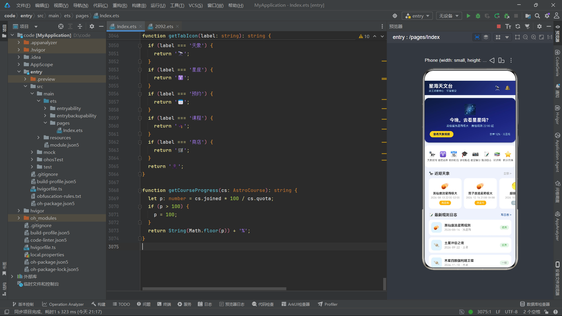
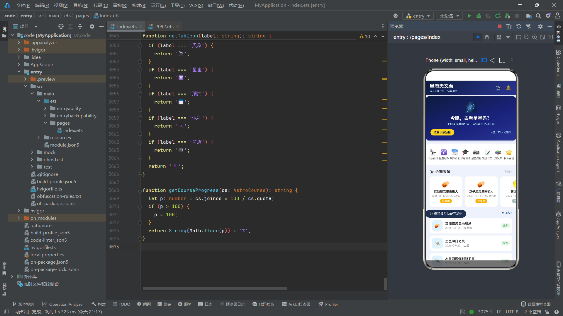
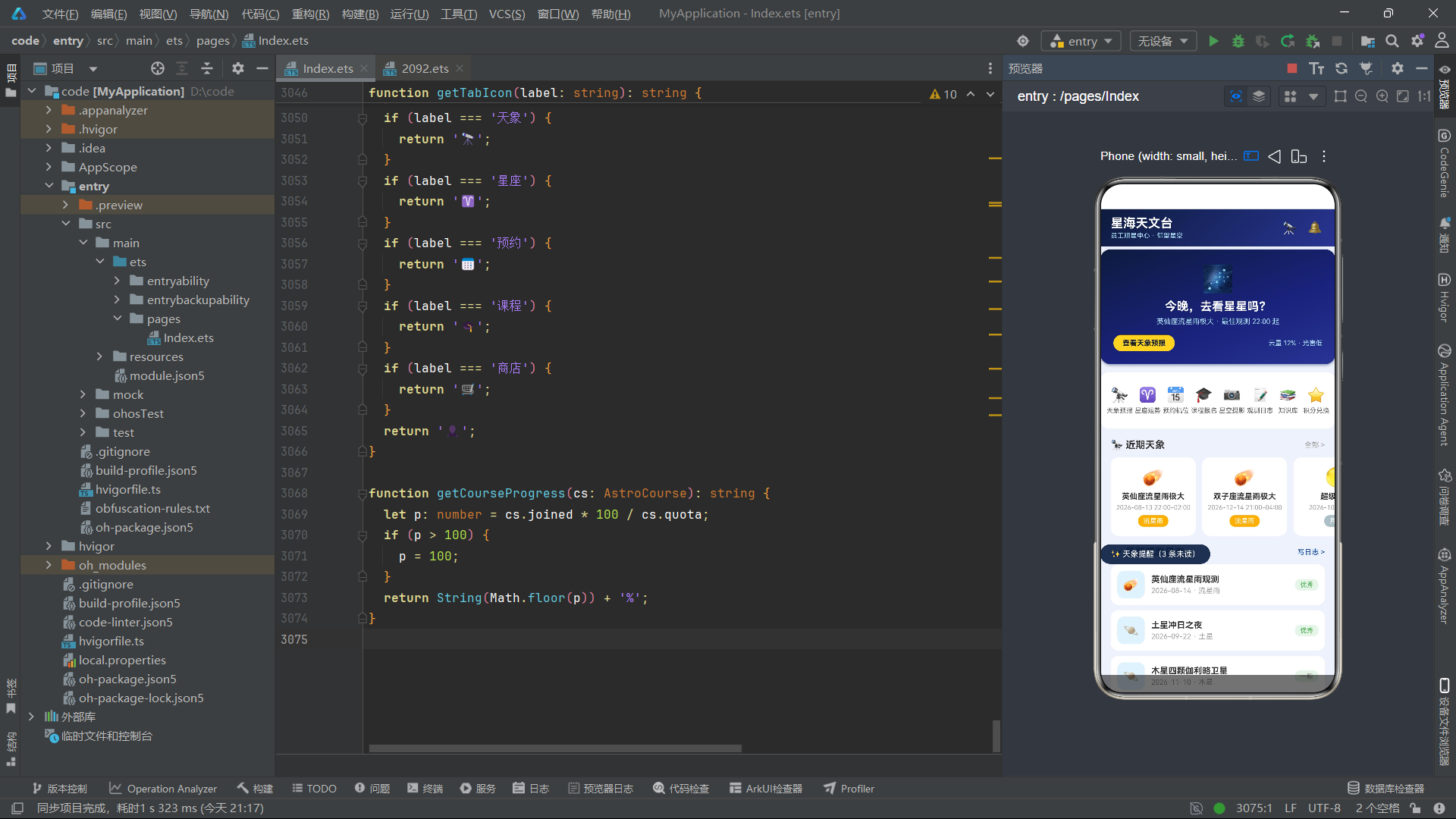
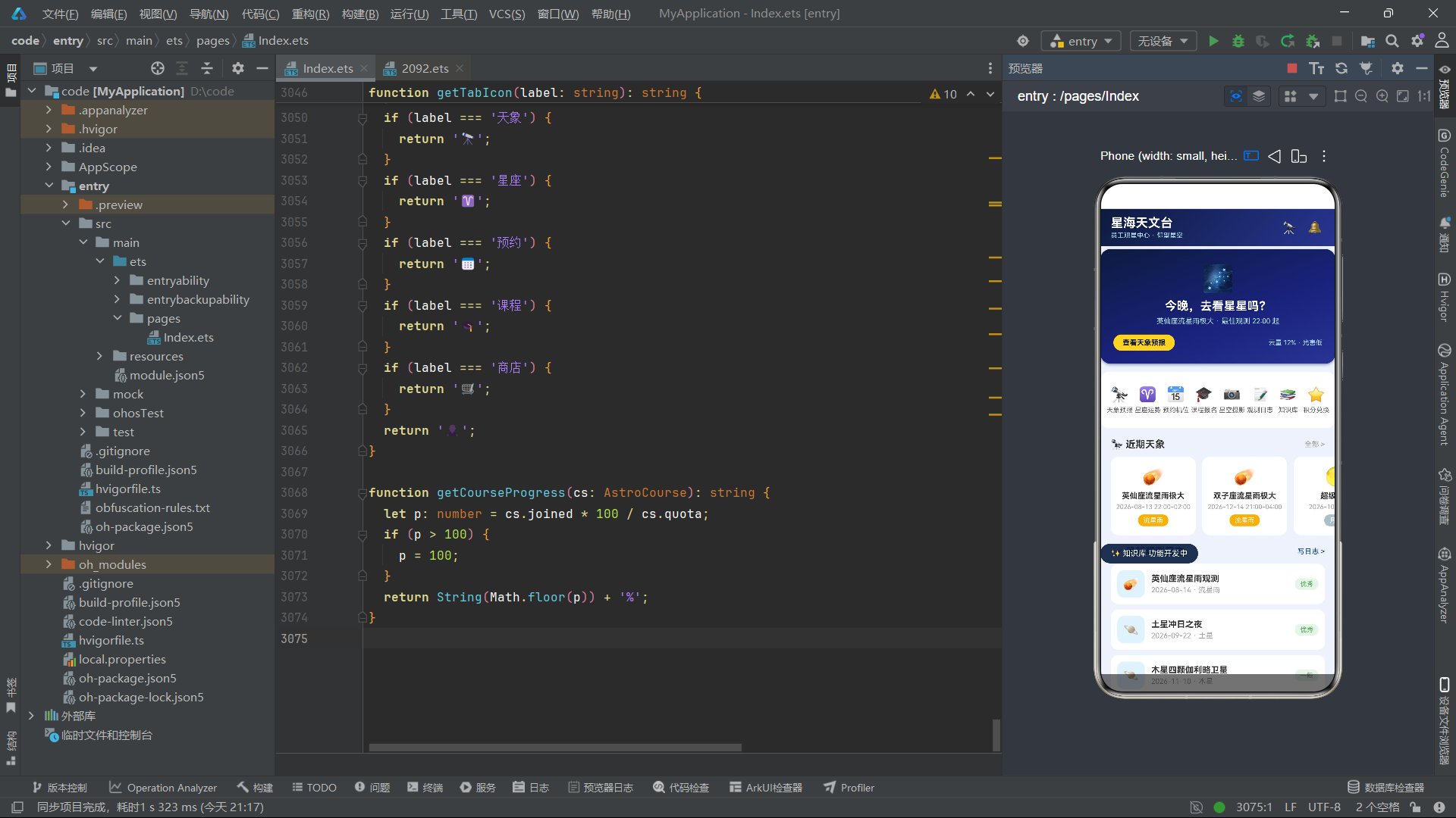
头部导航栏使用了与会员卡相同的深色渐变背景。左侧是应用名称和副标题,右侧是观测助手和通知两个图标按钮。点击这两个图标会设置 toast 状态,触发 Toast 提示显示。
      if (this.curTab === 0) {
        HomeTab({
          onOpenEvent: (id: number) => {
            this.selEvent = this.findEvent(id);
            this.showEventDetail = true;
          },
          onOpenLog: (id: number) => {
            this.selLog = this.findLog(id);
            this.showLogDetail = true;
          },
          onToast: (msg: string) => {
            this.toast = msg;
          }
        })
      } else if (this.curTab === 1) {
        SkyTab({
          onOpenEvent: (id: number) => {
            this.selEvent = this.findEvent(id);
            this.showEventDetail = true;
          },
          onToast: (msg: string) => {
            this.toast = msg;
          }
        })
      } else if (this.curTab === 2) {
        SignTab({
          onOpenSign: (id: number) => {
            this.selSign = this.findSign(id);
            this.showSignDetail = true;
          },
          onToast: (msg: string) => {
            this.toast = msg;
          }
        })
      }
Tab 内容区使用 if-else if 链根据 curTab 的值条件渲染对应的 Tab 组件。当 curTab 为 0 时渲染 HomeTab,为 1 时渲染 SkyTab,依此类推。
每个 Tab 组件在创建时都会传入回调函数。以 HomeTab 为例,它接收三个回调:onOpenEvent 在用户点击天象事件时调用,函数体内部先通过 findEvent(id) 查找完整的事件数据,然后设置 selEvent 和 showEventDetail 状态来打开天象详情弹窗。
这种"子组件触发回调 -> 父组件修改状态 -> 状态变化驱动 UI 更新"的模式是鸿蒙 ArkUI 单向数据流的体现。子组件不直接控制弹窗的显示,而是通过回调通知父组件,由父组件统一管理所有弹窗的状态。
底部导航栏
      Column() {
        Row() {
          ForEach(this.tabs1, (tb: string, ti: number) => {
            this.bottomTabItem(getTabIcon(tb), tb, ti)
          }, (tb: string, ti: number) => tb + String(ti))
        }
        .width('100%')
        .padding({ top: 6, bottom: 2 })

        Row() {
          ForEach(this.tabs2, (tb: string, ti: number) => {
            this.bottomTabItem(getTabIcon(tb), tb, ti + 4)
          }, (tb: string, ti: number) => tb + String(ti))
        }
        .width('100%')
        .padding({ top: 2, bottom: 6 })
      }
      .width('100%')
      .backgroundColor('#FFFFFF')
      .shadow({ radius: 8, color: 'rgba(0,0,0,0.08)', offsetY: -2 })
底部导航栏分为两排,第一排四个 Tab(首页、天象、星座、预约),第二排三个 Tab(课程、商店、我的)。两排 Tab 的索引是连续的——tabs1 使用 0-3,tabs2 使用 4-6(通过 ti + 4 偏移)。
bottomTabItem 是一个 @Builder 方法,接收图标、标签和索引三个参数,渲染单个 Tab 项。点击 Tab 项时设置 curTab 并清空 toast——清空 toast 是为了切换 Tab 时隐藏上一个 Tab 中可能残留的 Toast 提示。
双排底部导航在移动端应用中并不常见,但在功能模块较多的应用中是一种有效的解决方案。它避免了底部 Tab 过多导致单项过窄的问题,同时保持了所有功能入口的一屏可见性。本应用将七个 Tab 分为 4+3 两排,是一种平衡信息密度与操作便利性的设计选择。
弹窗统一管理
    if (this.showEventDetail && this.selEvent !== null) {
      this.modalOverlay(() => {
        this.showEventDetail = false;
      })
      this.eventDetailModal()
    }
    if (this.showSignDetail && this.selSign !== null) {
      this.modalOverlay(() => {
        this.showSignDetail = false;
      })
      this.signDetailModal()
    }
    if (this.showBook && this.selScope !== null) {
      this.modalOverlay(() => {
        this.showBook = false;
      })
      this.bookModal()
    }
弹窗区的渲染使用了统一的模式:每个弹窗都由两部分组成——遮罩层 modalOverlay 和内容层 XXXModal。遮罩层点击时关闭弹窗,内容层展示具体内容。
条件判断使用 && 运算符同时检查显示开关和数据对象:this.showEventDetail && this.selEvent !== null。只有当弹窗需要显示且数据已加载时,才渲染弹窗。这种双重判断避免了数据为 null 时弹窗内部访问属性导致的空指针异常。
Toast 提示
    if (this.toast.length > 0) {
      Column() {
        Text('✨ ' + this.toast)
          .fontSize(12)
          .fontColor('#FFFFFF')
          .padding({ left: 16, right: 16, top: 8, bottom: 8 })
      }
      .backgroundColor('rgba(13,27,62,0.9)')
      .borderRadius(18)
      .position({ x: 0, y: '72%' })
      .onAppear(() => {
        setTimeout(() => {
          this.toast = '';
        }, 1600);
      })
    }
Toast 提示使用 position 属性进行绝对定位,y: '72%' 将其放在屏幕 72% 高度的位置——这个位置既不会被底部导航栏遮挡,也不会被弹窗内容覆盖。
onAppear 是组件的生命周期回调,在组件首次渲染完成后触发。在 onAppear 中使用 setTimeout 设置 1.6 秒后清空 toast 状态,实现 Toast 的自动消失效果。当 toast 被清空为空字符串时,this.toast.length > 0 条件为 false,Toast 组件被从 DOM 中移除。
遮罩层
  @Builder
  modalOverlay(onClose: () => void) {
    Column() {
    }
    .width('100%')
    .height('100%')
    .backgroundColor('rgba(0,0,0,0.55)')
    .onClick(onClose)
  }
遮罩层是一个全屏的半透明黑色 Column,接收一个 onClose 回调函数。点击遮罩层时调用 onClose,通常是将对应的 showXXX 状态设为 false,从而关闭弹窗。
rgba(0,0,0,0.55) 使用 55% 不透明度的黑色,既保证了遮罩效果,又不会完全遮挡背景内容。这个透明度值是移动端弹窗遮罩的常用选择——太透明则遮罩效果不明显,太不透明则与弹窗内容的对比度不足。
数据查找函数
  findEvent(id: number): SkyEvent | null {
    for (let i = 0; i < SKY_EVENTS.length; i++) {
      if (SKY_EVENTS[i].id === id) {
        return SKY_EVENTS[i];
      }
    }
    return null;
  }
findEvent 函数使用线性搜索在 SKY_EVENTS 数组中查找指定 ID 的事件。返回类型 SkyEvent | null 表示可能找不到匹配项——当传入的 ID 不存在时返回 null。
应用中为每种数据类型都实现了对应的查找函数(findSign、findScope、findCourse、findGood、findLog、findBook),它们的结构完全一致,只是操作的数据源不同。在更复杂的工程中,可以考虑使用泛型函数来统一这些查找逻辑。
十二、模态弹窗系统:十二种交互场景
应用共实现了十二个模态弹窗,覆盖了查看详情、表单填写、确认操作等多种交互场景。以下选取几个代表性弹窗进行分析。
天象详情弹窗
  @Builder
  eventDetailModal() {
    Column() {
      Text(getEventEmoji(this.selEvent!.type))
        .fontSize(44)
        .margin({ top: 18 })
      Text(this.selEvent!.title)
        .fontSize(18)
        .fontWeight(FontWeight.Bold)
        .fontColor('#333333')
        .margin({ top: 8 })
      Row() {
        Text('📅 ' + this.selEvent!.date)
          .fontSize(12)
          .fontColor('#616161')
        Text('')
          .layoutWeight(1)
        Text('⏰ ' + this.selEvent!.time)
          .fontSize(12)
          .fontColor('#616161')
      }
      .width('100%')
      .padding({ top: 10 })
      Row() {
        Text('类型')
          .fontSize(12)
          .fontColor('#616161')
        Text('')
          .layoutWeight(1)
        Text(this.selEvent!.type)
          .fontSize(12)
          .fontWeight(FontWeight.Bold)
          .fontColor(getTypeColor(this.selEvent!.type))
      }
      .width('100%')
      .padding({ top: 8 })
      Row() {
        Text('观测热度')
          .fontSize(12)
          .fontColor('#616161')
        Text('')
          .layoutWeight(1)
        Text('🔥 ' + String(this.selEvent!.hot) + '%')
          .fontSize(12)
          .fontWeight(FontWeight.Bold)
          .fontColor('#F57C00')
      }
      .width('100%')
      .padding({ top: 8 })
      Text(this.selEvent!.desc)
        .fontSize(12)
        .fontColor('#616161')
        .width('100%')
        .lineHeight(20)
        .padding({ top: 10, bottom: 10, left: 12, right: 12 })
        .backgroundColor('#F5F8FF')
        .borderRadius(10)
        .margin({ top: 12 })
      Text('设为提醒')
        .fontSize(13)
        .fontWeight(FontWeight.Bold)
        .fontColor('#FFFFFF')
        .width('100%')
        .textAlign(TextAlign.Center)
        .padding({ top: 11, bottom: 11 })
        .backgroundColor('#1A237E')
        .borderRadius(20)
        .margin({ top: 14 })
        .onClick(() => {
          this.showEventDetail = false;
          this.toast = '已设提醒:' + this.selEvent!.title;
        })
    }
    .width('82%')
    .padding({ left: 20, right: 20, top: 16, bottom: 20 })
    .backgroundColor('#FFFFFF')
    .borderRadius(18)
    .clip(true)
    .transition(TransitionEffect.OPACITY.animation({ duration: 200 }))
  }
天象详情弹窗是一个居中卡片,宽度为屏幕的 82%。内容从上到下依次是:大号 Emoji 图标、事件标题、日期与时间行、类型行、热度行、描述文本和"设为提醒"按钮。
this.selEvent!.type 中的 ! 是 TypeScript/ArkTS 的非空断言操作符,告诉编译器 selEvent 此时一定不为 null。由于在渲染弹窗之前已经通过 this.selEvent !== null 条件判断保证了数据存在,所以这里使用非空断言是安全的。
transition(TransitionEffect.OPACITY.animation({ duration: 200 })) 为弹窗添加了 200 毫秒的透明度过渡动画。当弹窗出现时从透明渐变为不透明,消失时反向渐变。TransitionEffect.OPACITY 是鸿蒙 ArkUI 提供的内置过渡效果之一,使用 animation 方法可以指定动画时长。
描述文本区域使用 lineHeight(20) 设置行高为 20 像素,比默认行高更大,提高了多行文本的可读性。浅蓝色背景区域(#F5F8FF)将描述文本与其他信息视觉分离,突出正文内容。
clip(true) 属性确保弹窗内容不会超出圆角边界——当子元素的背景色或圆角与父容器不一致时,clip(true) 会裁剪超出部分,保持视觉整洁。
机位预约弹窗
  @Builder
  bookModal() {
    Column() {
      Row() {
        Text('📅 预约机位')
          .fontSize(17)
          .fontWeight(FontWeight.Bold)
          .fontColor('#212121')
        Text('')
          .layoutWeight(1)
        Text('✕')
          .fontSize(16)
          .fontColor('#9E9E9E')
          .padding(8)
          .onClick(() => {
            this.showBook = false;
          })
      }
      .width('100%')

      Text(getScopeEmoji(this.selScope!.name) + ' ' + this.selScope!.name)
        .fontSize(14)
        .fontWeight(FontWeight.Bold)
        .fontColor('#333333')
        .width('100%')
        .padding({ top: 10, bottom: 10, left: 12, right: 12 })
        .backgroundColor('#F5F8FF')
        .borderRadius(10)
        .margin({ top: 12 })

      Text('选择时段')
        .fontSize(12)
        .fontWeight(FontWeight.Bold)
        .fontColor('#333333')
        .margin({ top: 12, bottom: 6 })
      Row() {
        ForEach(getSlotList(), (sl: string) => {
          Text(sl)
            .fontSize(11)
            .padding({ left: 10, right: 10, top: 6, bottom: 6 })
            .backgroundColor(this.bookSlot === sl ? '#1A237E' : '#F5F5F5')
            .fontColor(this.bookSlot === sl ? '#FFFFFF' : '#616161')
            .borderRadius(10)
            .margin({ right: 8 })
            .onClick(() => {
              this.bookSlot = sl;
            })
        }, (sl: string) => sl)
      }
      .width('100%')

      Text('预约须知')
        .fontSize(11)
        .fontColor('#757575')
        .width('100%')
        .lineHeight(18)
        .padding({ top: 10, bottom: 10, left: 12, right: 12 })
        .backgroundColor('#FFF8E1')
        .borderRadius(10)
        .margin({ top: 12 })
      Text('如需取消请提前 2 小时,爽约将扣除积分。')
        .fontSize(11)
        .fontColor('#9E9E9E')
        .width('100%')
        .margin({ top: 6 })

      Text('确认预约')
        .fontSize(14)
        .fontWeight(FontWeight.Bold)
        .fontColor('#FFFFFF')
        .width('100%')
        .textAlign(TextAlign.Center)
        .padding({ top: 12, bottom: 12 })
        .backgroundColor('#1A237E')
        .borderRadius(24)
        .margin({ top: 14 })
        .onClick(() => {
          this.showBook = false;
          this.toast = '已预约 ' + this.selScope!.name + ' ' + this.bookSlot;
        })
    }
    .width('100%')
    .padding({ left: 16, right: 16, top: 16, bottom: 24 })
    .backgroundColor('#FFFFFF')
    .borderRadius({ topLeft: 18, topRight: 18 })
    .constraintSize({ maxHeight: '80%' })
    .transition(TransitionEffect.OPACITY.animation({ duration: 200 }))
  }
机位预约弹窗是一个底部抽屉式的表单弹窗。与居中弹窗不同,它只设置了顶部圆角(borderRadius({ topLeft: 18, topRight: 18 })),宽度为 100%,从屏幕底部弹出。
时段选择器使用了标签按钮组模式:四个时段选项横向排列,当前选中的时段使用深色背景和白色文字,未选中的使用浅灰背景和深灰文字。点击任一时段会更新 bookSlot 状态,由于 @State 的响应式特性,UI 会自动更新选中状态。
constraintSize({ maxHeight: '80%' }) 限制了弹窗的最大高度为屏幕的 80%,当内容超出时弹窗内部可以滚动。这在表单内容较多时尤为重要,防止弹窗内容超出屏幕范围。
"预约须知"区域使用浅黄色背景(#FFF8E1),与正文形成视觉区分,提示用户注意取消政策和爽约惩罚。这种"警告色"的使用是用户引导的有效手段。
删除日志确认弹窗
  @Builder
  delLogModal() {
    Column() {
      Text('🗑')
        .fontSize(40)
      Text('删除观测日志?')
        .fontSize(17)
        .fontWeight(FontWeight.Bold)
        .fontColor('#FFFFFF')
        .margin({ top: 10 })
      Text('「' + this.selLog!.title + '」删除后不可恢复。')
        .fontSize(12)
        .fontColor('#B0BEC5')
        .textAlign(TextAlign.Center)
        .margin({ top: 8 })
      Row() {
        Text('取消')
          .fontSize(13)
          .fontWeight(FontWeight.Bold)
          .fontColor('#BDBDBD')
          .padding({ left: 24, right: 24, top: 10, bottom: 10 })
          .backgroundColor('rgba(255,255,255,0.12)')
          .borderRadius(20)
          .onClick(() => {
            this.showDelLog = false;
          })
        Text('')
          .layoutWeight(1)
        Text('确认删除')
          .fontSize(13)
          .fontWeight(FontWeight.Bold)
          .fontColor('#FFFFFF')
          .padding({ left: 24, right: 24, top: 10, bottom: 10 })
          .backgroundColor('#E53935')
          .borderRadius(20)
          .onClick(() => {
            this.showDelLog = false;
            this.toast = '日志已删除';
          })
      }
      .width('100%')
      .margin({ top: 16 })
    }
    .width('78%')
    .padding({ top: 24, bottom: 22, left: 20, right: 20 })
    .linearGradient({ angle: 135, colors: [['#1A237E', 0], ['#0D1B3E', 1]] })
    .borderRadius(18)
    .transition(TransitionEffect.OPACITY.animation({ duration: 200 }))
  }
删除确认弹窗采用了深色背景设计,与天象详情弹窗的白色背景形成对比。深色背景传达了"危险操作"的视觉暗示——删除是不可逆的操作,深色调提醒用户谨慎。
底部两个按钮使用了对比设计:左侧"取消"按钮使用半透明白色背景(rgba(255,255,255,0.12))和灰色文字,视觉权重较低;右侧"确认删除"按钮使用红色背景(#E53935)和白色文字,视觉权重较高,吸引注意力。这种设计引导用户优先选择"取消"而非"删除",符合"防误操作"的交互设计原则。
课程详情弹窗与进度条
  @Builder
  courseDetailModal() {
    Column() {
      Column() {
        Text(getCourseEmoji(this.selCourse!.level))
          .fontSize(44)
        Text(this.selCourse!.title)
          .fontSize(17)
          .fontWeight(FontWeight.Bold)
          .fontColor('#FFFFFF')
          .margin({ top: 8 })
        Text(this.selCourse!.teacher + ' · ' + this.selCourse!.level)
          .fontSize(12)
          .fontColor('#B3E5FC')
          .margin({ top: 4 })
      }
      .width('100%')
      .padding({ top: 22, bottom: 22 })
      .linearGradient({ angle: 135, colors: [['#0D1B3E', 0], ['#283593', 1]] })
      .borderRadius({ topLeft: 18, topRight: 18 })

      Column() {
        Row() {
          Text('上课时间')
            .fontSize(12)
            .fontColor('#9E9E9E')
          Text('')
            .layoutWeight(1)
          Text(this.selCourse!.time)
            .fontSize(12)
            .fontColor('#333333')
        }
        .width('100%')
        .padding({ top: 8, bottom: 8 })

        Column() {
          Column() {
          }
          .width(getCourseProgress(this.selCourse!))
          .height('100%')
          .backgroundColor('#1A237E')
          .borderRadius(3)
        }
        .width('100%')
        .height(6)
        .backgroundColor('#E3E9F7')
        .borderRadius(3)
        .margin({ top: 6 })

        Text('报名课程')
          .fontSize(13)
          .fontWeight(FontWeight.Bold)
          .fontColor('#FFFFFF')
          .width('100%')
          .textAlign(TextAlign.Center)
          .padding({ top: 11, bottom: 11 })
          .backgroundColor('#1A237E')
          .borderRadius(20)
          .margin({ top: 14 })
          .onClick(() => {
            this.showCourseDetail = false;
            this.showJoinCourse = true;
          })
      }
      .width('100%')
      .padding(16)
      .backgroundColor('#FFFFFF')
      .borderRadius({ bottomLeft: 18, bottomRight: 18 })
    }
    .width('84%')
    .clip(true)
    .transition(TransitionEffect.OPACITY.animation({ duration: 200 }))
  }
课程详情弹窗采用了上下拼接的结构:顶部是深色渐变头部区域,底部是白色信息区域。两个区域分别设置不同的圆角——顶部左上和右上圆角,底部左下和右下圆角——拼接后形成完整的圆角矩形。
报名进度条是纯 CSS 实现的:外层 Column 设置固定高度 6 像素和浅灰色背景作为轨道,内层 Column 的宽度通过 getCourseProgress 函数动态计算(如"75%"),使用深色背景填充。这种进度条实现方式极其轻量,不需要任何图表库。
getCourseProgress 函数计算逻辑为 joined * 100 / quota,并使用 Math.floor 向下取整。当报名人数超过名额时,进度限制在 100%。
点击"报名课程"按钮触发了弹窗链式调用:先关闭课程详情弹窗(showCourseDetail = false),再打开报名确认弹窗(showJoinCourse = true)。这种弹窗间的跳转是通过状态变量的切换实现的,框架会自动处理旧弹窗的卸载和新弹窗的挂载。
function getCourseProgress(cs: AstroCourse): string {
  let p: number = cs.joined * 100 / cs.quota;
  if (p > 100) {
    p = 100;
  }
  return String(Math.floor(p)) + '%';
}
积分充值弹窗
  @Builder
  payModal() {
    Column() {
      Row() {
        Text('💳 积分充值')
          .fontSize(17)
          .fontWeight(FontWeight.Bold)
          .fontColor('#212121')
        Text('')
          .layoutWeight(1)
        Text('✕')
          .fontSize(16)
          .fontColor('#9E9E9E')
          .padding(8)
          .onClick(() => {
            this.showPay = false;
          })
      }
      .width('100%')

      Text('当前积分:280 分')
        .fontSize(12)
        .fontColor('#0D47A1')
        .width('100%')
        .textAlign(TextAlign.Center)
        .padding({ top: 10, bottom: 10 })
        .backgroundColor('#F5F8FF')
        .borderRadius(10)
        .margin({ top: 10 })

      Row() {
        ForEach(getPayLevels(), (pl: number, pi: number) => {
          Column() {
            Text('¥' + String(pl))
              .fontSize(15)
              .fontWeight(FontWeight.Bold)
              .fontColor(this.payLevel === pl ? '#FFFFFF' : '#1A237E')
            Text(getPayGifts()[pi])
              .fontSize(9)
              .fontColor(this.payLevel === pl ? '#B3E5FC' : '#9E9E9E')
              .margin({ top: 3 })
          }
          .layoutWeight(1)
          .padding({ top: 10, bottom: 10 })
          .backgroundColor(this.payLevel === pl ? '#1A237E' : '#F5F5F5')
          .borderRadius(12)
          .margin({ right: 8 })
          .alignItems(HorizontalAlign.Center)
          .onClick(() => {
            this.payLevel = pl;
          })
        }, (pl: number, pi: number) => String(pl) + String(pi))
      }
      .width('100%')

      Row() {
        Text('到账')
          .fontSize(12)
          .fontColor('#616161')
        Text('')
          .layoutWeight(1)
        Text(String(this.payLevel * 10) + ' 积分 + 赠礼')
          .fontSize(13)
          .fontWeight(FontWeight.Bold)
          .fontColor('#D32F2F')
      }
      .width('100%')
      .padding({ top: 12 })

      Text('立即充值')
        .fontSize(14)
        .fontWeight(FontWeight.Bold)
        .fontColor('#FFFFFF')
        .width('100%')
        .textAlign(TextAlign.Center)
        .padding({ top: 12, bottom: 12 })
        .backgroundColor('#1A237E')
        .borderRadius(24)
        .margin({ top: 14 })
        .onClick(() => {
          this.showPay = false;
          this.toast = '充值成功,到账 ' + String(this.payLevel * 10) + ' 积分';
        })
    }
    .width('100%')
    .padding({ left: 16, right: 16, top: 16, bottom: 24 })
    .backgroundColor('#FFFFFF')
    .borderRadius({ topLeft: 18, topRight: 18 })
    .constraintSize({ maxHeight: '80%' })
    .transition(TransitionEffect.OPACITY.animation({ duration: 200 }))
  }
充值弹窗展示了四个充值档位(30/68/128/328 元),每个档位配有对应的赠礼文案。ForEach 渲染时同时遍历 getPayLevels() 和 getPayGifts() 两个数组,使用相同的索引 pi 来获取对应的金额和赠礼。
"到账"金额通过 this.payLevel * 10 实时计算——充值金额的十倍即为到账积分。当用户切换档位时,payLevel 状态更新,到账积分会自动重新计算并显示。这种"选择即预览"的交互模式让用户在下单前就能清楚看到充值结果。
十三、底部 Tab 项与全局辅助函数
  @Builder
  bottomTabItem(icon: string, label: string, idx: number) {
    Column() {
      Text(icon)
        .fontSize(17)
        .fontColor(this.curTab === idx ? '#1A237E' : '#9E9E9E')
      Text(label)
        .fontSize(10)
        .fontColor(this.curTab === idx ? '#1A237E' : '#9E9E9E')
        .margin({ top: 1 })
    }
    .layoutWeight(1)
    .padding({ top: 4, bottom: 2 })
    .onClick(() => {
      this.curTab = idx;
      this.toast = '';
    })
  }
底部 Tab 项的 @Builder 方法接收三个参数:图标、标签和索引。通过 this.curTab === idx 条件判断当前 Tab 是否激活——激活时图标和文字使用藏青色(#1A237E),未激活时使用灰色(#9E9E9E)。
function getTabIcon(label: string): string {
  if (label === '首页') {
    return '🏠';
  }
  if (label === '天象') {
    return '🔭';
  }
  if (label === '星座') {
    return '♈';
  }
  if (label === '预约') {
    return '📅';
  }
  if (label === '课程') {
    return '🎓';
  }
  if (label === '商店') {
    return '🛒';
  }
  return '👤';
}
getTabIcon 函数根据 Tab 标签名返回对应的 Emoji 图标。这个函数定义在组件外部(全局作用域),因为它不需要访问组件的状态,纯粹是一个字符串到字符串的映射。
十四、架构总结与技术对比
以下表格对本应用中使用的核心鸿蒙 ArkUI 技术点进行系统总结:
| 技术点 | 作用 | 使用场景 | 代码示例 |
|---|---|---|---|
@Entry |
标记应用入口组件 | 主组件 Index | @Entry struct Index |
@Component |
声明可复用组件 | 七个 Tab 组件 | @Component struct HomeTab |
@State |
响应式状态管理 | Tab 切换、弹窗控制 | @State curTab: number = 0 |
@Builder |
定义可复用 UI 片段 | 卡片、列表项、弹窗 | @Builder eventBlock(ev: SkyEvent) |
Column |
垂直布局容器 | 页面根布局、卡片内容 | Column() { ... } |
Row |
水平布局容器 | 标题行、按钮组 | Row() { ... } |
Scroll |
可滚动容器 | 页面内容区、横向列表 | Scroll() { ... } |
ForEach |
列表渲染 | 数据驱动的卡片列表 | ForEach(data, item => {...}, key) |
layoutWeight |
弹性权重分配 | 等分布局、占位空间 | .layoutWeight(1) |
linearGradient |
线性渐变背景 | 头部、卡片、弹窗 | .linearGradient({angle, colors}) |
borderRadius |
圆角设置 | 卡片、按钮、标签 | .borderRadius(12) |
shadow |
阴影效果 | 卡片立体感 | .shadow({radius, color, offsetY}) |
transition |
过渡动画 | 弹窗出现/消失 | TransitionEffect.OPACITY |
position |
绝对定位 | Toast 提示 | .position({x, y}) |
clip |
内容裁剪 | 圆角容器 | .clip(true) |
FlexAlign |
主轴对齐方式 | 柱状图底部对齐 | FlexAlign.End |
TextDecorationType |
文本装饰 | 划线原价 | TextDecorationType.LineThrough |
constraintSize |
尺寸约束 | 弹窗最大高度 | constraintSize({maxHeight}) |
以下表格对比了应用中使用的不同弹窗类型及其设计特点:
| 弹窗名称 | 布局位置 | 宽度 | 圆角方向 | 背景风格 | 使用场景 |
|---|---|---|---|---|---|
| 天象详情 | 居中 | 82% | 四角 | 白色 | 信息展示 |
| 星座详情 | 居中 | 82% | 上下分区 | 深色头+白色体 | 属性展示 |
| 机位预约 | 底部抽屉 | 100% | 顶部两角 | 白色 | 表单填写 |
| 取消预约 | 居中 | 76% | 四角 | 白色 | 危险确认 |
| 新增日志 | 底部抽屉 | 100% | 顶部两角 | 白色 | 表单填写 |
| 编辑日志 | 底部抽屉 | 100% | 顶部两角 | 白色 | 表单修改 |
| 删除日志 | 居中 | 78% | 四角 | 深色渐变 | 危险确认 |
| 课程详情 | 居中 | 84% | 上下分区 | 深色头+白色体 | 信息展示 |
| 报名成功 | 居中 | 80% | 四角 | 白色+阴影 | 结果反馈 |
| 商品详情 | 居中 | 80% | 四角 | 白色 | 信息展示 |
| 积分充值 | 底部抽屉 | 100% | 顶部两角 | 白色 | 表单选择 |
| 日志详情 | 居中 | 82% | 四角 | 白色 | 信息展示 |
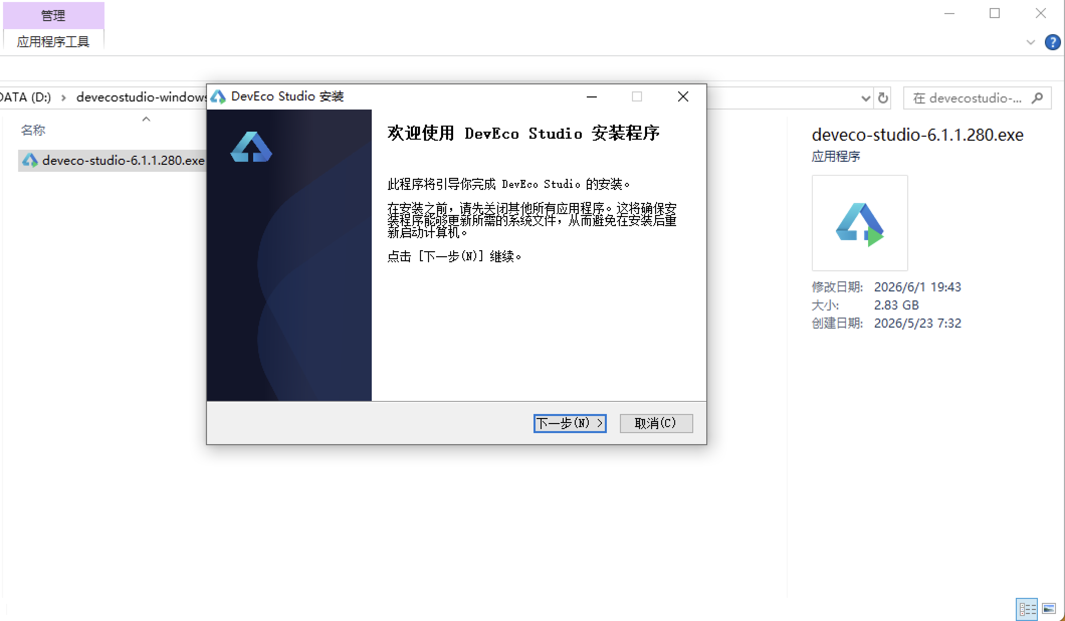
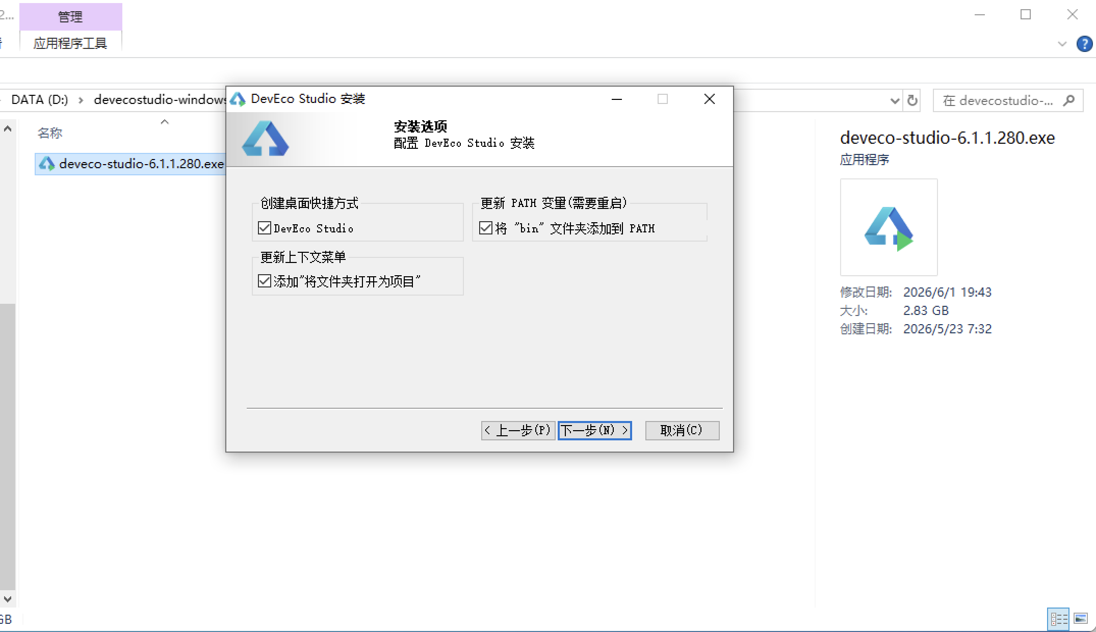
安装DevEco Studio程序
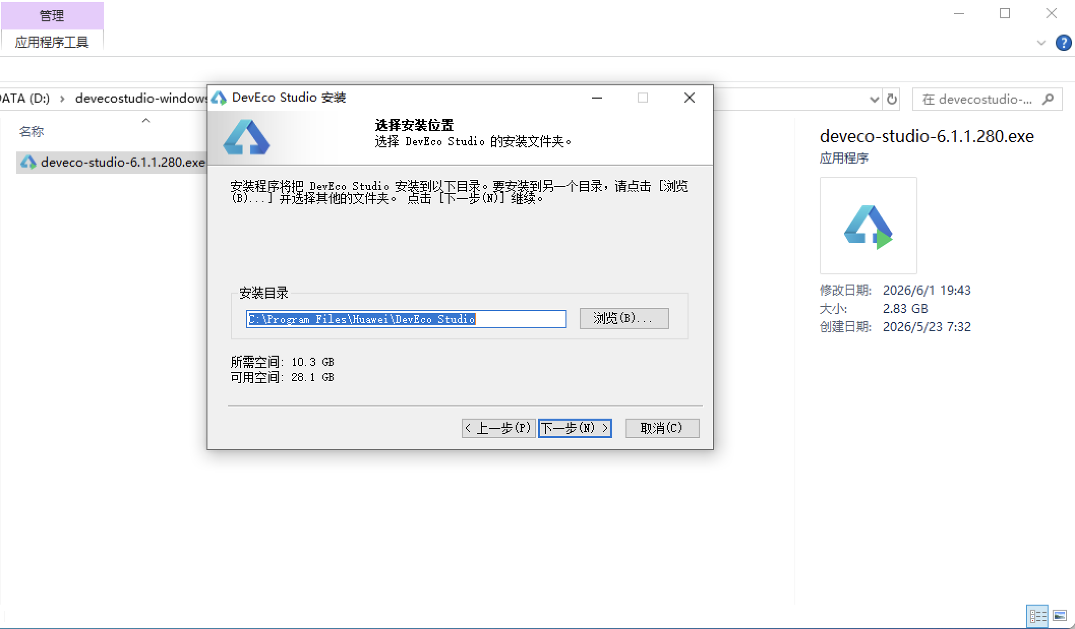
选择目标安装目录:
设置环境变量,但是需要重启一下:
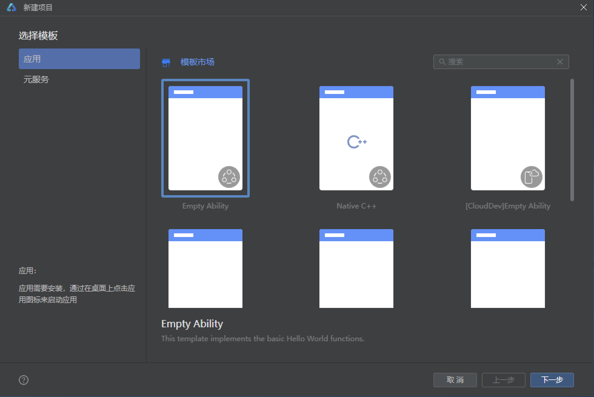
新建一个空白模板:
设置API为24的模板项目: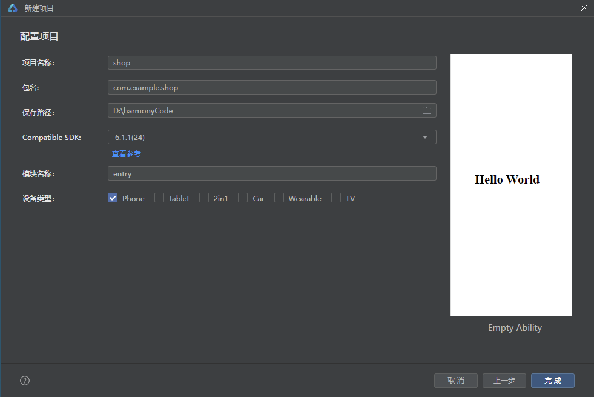
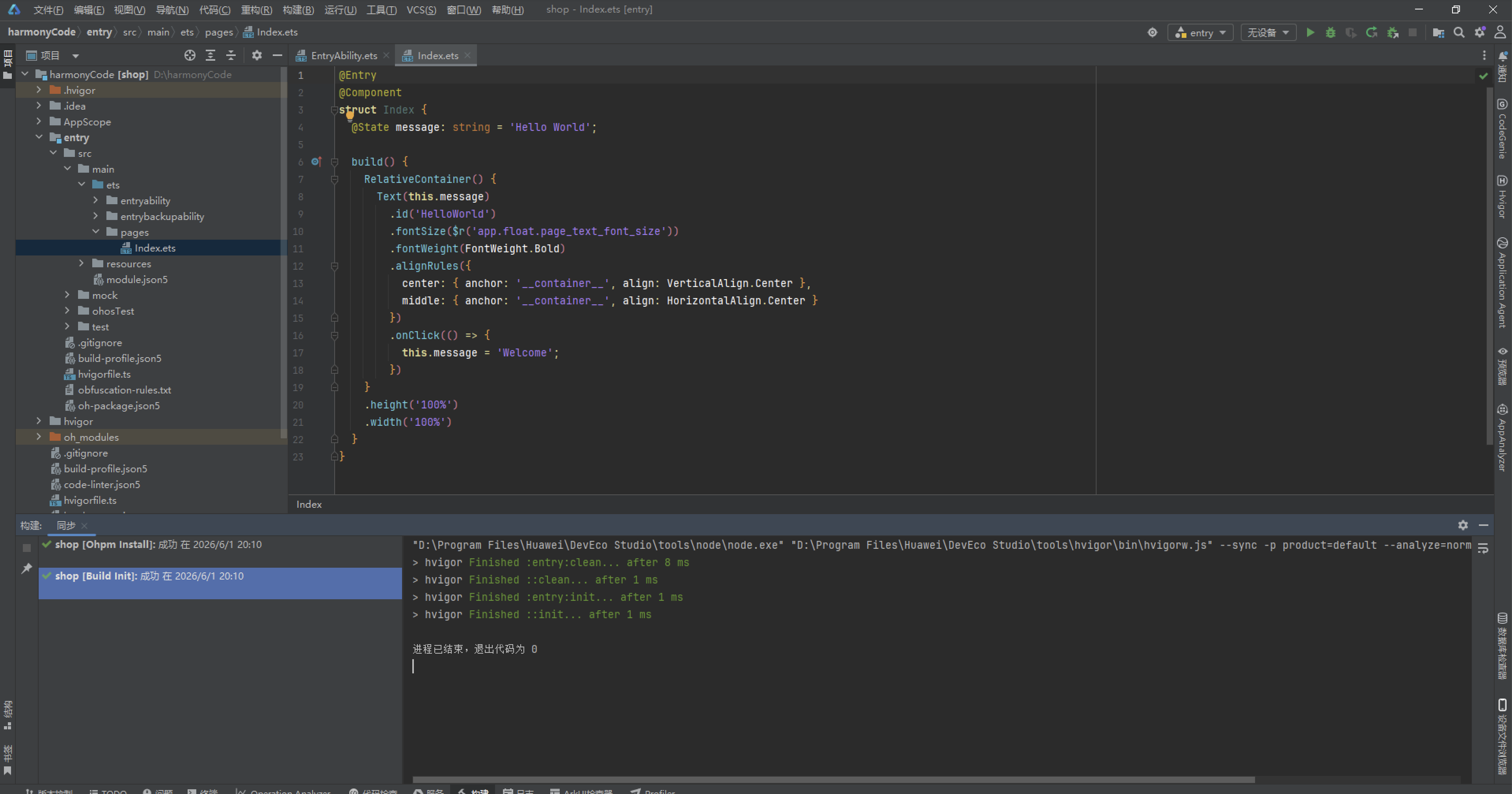
初始化项目,自动下载相关依赖:
完整代码:
// ============ 类型定义 ============
interface SkyEvent {
  id: number
  title: string
  date: string
  time: string
  type: string
  desc: string
  hot: number
}

interface StarSign {
  id: number
  name: string
  date: string
  element: string
  guardian: string
  luck: string
  intro: string
}

interface ScopeItem {
  id: number
  name: string
  site: string
  aperture: string
  status: string
  fee: number
}

interface AstroCourse {
  id: number
  title: string
  teacher: string
  time: string
  place: string
  level: string
  quota: number
  joined: number
}

interface ShopGood {
  id: number
  name: string
  price: number
  oldPrice: number
  cat: string
  stock: string
}

interface ObsLog {
  id: number
  title: string
  date: string
  target: string
  quality: string
  note: string
}

interface BookingItem {
  id: number
  scope: string
  date: string
  slot: string
  status: string
}

interface CourseChapter {
  name: string
  duration: string
  chapter: number
}

interface StarPic {
  id: number
  title: string
  star: string
  tag: string
}

// ============ 全局写死数据 ============
const SKY_EVENTS: SkyEvent[] = [
  { id: 1, title: '英仙座流星雨极大', date: '2026-08-13', time: '22:00-02:00', type: '流星雨', desc: '每小时天顶流量约 100 颗,最佳观测地在郊野光害少处。', hot: 98 },
  { id: 2, title: '土星冲日', date: '2026-09-21', time: '整夜', type: '行星', desc: '土星全年最亮时刻,光环清晰可见。', hot: 88 },
  { id: 3, title: '超级月亮', date: '2026-10-03', time: '19:30', type: '月球', desc: '年度最大满月,亮度提升约 14%。', hot: 92 },
  { id: 4, title: '猎户座流星雨', date: '2026-10-21', time: '23:00-03:00', type: '流星雨', desc: '来自哈雷彗星碎屑,速度极快。', hot: 85 },
  { id: 5, title: '水星东大距', date: '2026-11-11', time: '日落前后', type: '行星', desc: '水星今年最佳观测窗口之一。', hot: 76 },
  { id: 6, title: '双子座流星雨极大', date: '2026-12-14', time: '21:00-04:00', type: '流星雨', desc: '年度压轴流星雨,稳定高产出。', hot: 99 },
  { id: 7, title: '木星合月', date: '2026-11-28', time: '20:00', type: '合月', desc: '木星与月亮近距离相伴。', hot: 70 },
  { id: 8, title: '月掩昴星团', date: '2026-12-02', time: '03:30', type: '掩星', desc: '月球掠过昴星团,值得守候。', hot: 66 },
  { id: 9, title: '金星伴月', date: '2026-09-08', time: '黎明前', type: '伴月', desc: '金星与残月同框的绝美画面。', hot: 82 },
  { id: 10, title: '象限仪座流星雨', date: '2027-01-04', time: '23:00-05:00', type: '流星雨', desc: '新年首场流星雨,峰值短暂而集中。', hot: 90 }
]

const STAR_SIGNS: StarSign[] = [
  { id: 1, name: '白羊座', date: '3.21-4.19', element: '火象', guardian: '火星', luck: '★★★★☆', intro: '热情直接的行动派' },
  { id: 2, name: '金牛座', date: '4.20-5.20', element: '土象', guardian: '金星', luck: '★★★☆☆', intro: '稳重踏实的享受家' },
  { id: 3, name: '双子座', date: '5.21-6.21', element: '风象', guardian: '水星', luck: '★★★★★', intro: '机敏好奇的百事通' },
  { id: 4, name: '巨蟹座', date: '6.22-7.22', element: '水象', guardian: '月亮', luck: '★★★☆☆', intro: '细腻温暖的守护者' },
  { id: 5, name: '狮子座', date: '7.23-8.22', element: '火象', guardian: '太阳', luck: '★★★★☆', intro: '自信耀眼的领航员' },
  { id: 6, name: '处女座', date: '8.23-9.22', element: '土象', guardian: '水星', luck: '★★★☆☆', intro: '追求完美的细节控' },
  { id: 7, name: '天秤座', date: '9.23-10.23', element: '风象', guardian: '金星', luck: '★★★★☆', intro: '优雅平衡的协调者' },
  { id: 8, name: '天蝎座', date: '10.24-11.22', element: '水象', guardian: '冥王星', luck: '★★★★★', intro: '深邃专注的探索者' },
  { id: 9, name: '射手座', date: '11.23-12.21', element: '火象', guardian: '木星', luck: '★★★★☆', intro: '乐观自由的冒险家' },
  { id: 10, name: '摩羯座', date: '12.22-1.19', element: '土象', guardian: '土星', luck: '★★★☆☆', intro: '坚韧务实的攀登者' },
  { id: 11, name: '水瓶座', date: '1.20-2.18', element: '风象', guardian: '天王星', luck: '★★★★☆', intro: '前卫独立的革新者' },
  { id: 12, name: '双鱼座', date: '2.19-3.20', element: '水象', guardian: '海王星', luck: '★★★★★', intro: '浪漫共情的梦想家' }
]

const SCOPE_LIST: ScopeItem[] = [
  { id: 1, name: '天枢·观星一号', site: '园区天台 A 区', aperture: '203mm', status: '可预约', fee: 20 },
  { id: 2, name: '天璇·深空二号', site: '园区天台 B 区', aperture: '254mm', status: '可预约', fee: 30 },
  { id: 3, name: '天玑·行星三号', site: '园区天台 C 区', aperture: '180mm', status: '维修中', fee: 20 },
  { id: 4, name: '天权·巡天四号', site: '郊外观测站', aperture: '406mm', status: '已约满', fee: 50 },
  { id: 5, name: '玉衡·双筒五号', site: '园区草坪', aperture: '15x70', status: '可预约', fee: 10 },
  { id: 6, name: '开阳·赤道六号', site: '郊外观测站', aperture: '305mm', status: '可预约', fee: 40 },
  { id: 7, name: '摇光·太阳七号', site: '园区天台 D 区', aperture: 'H-alpha', status: '可预约', fee: 15 },
  { id: 8, name: '北辰·便携八号', site: '园区草坪', aperture: '130mm', status: '已约满', fee: 25 }
]

const COURSE_LIST: AstroCourse[] = [
  { id: 1, title: '星空入门:认识四季星座', teacher: '老谢', time: '每周三 19:00', place: '天文教室 A', level: '入门', quota: 30, joined: 24 },
  { id: 2, title: '行星观测实操课', teacher: '星野', time: '每周五 20:00', place: '天台 B 区', level: '进阶', quota: 16, joined: 12 },
  { id: 3, title: '天文摄影第一课', teacher: '小林', time: '每周六 15:00', place: '影像工坊', level: '入门', quota: 20, joined: 18 },
  { id: 4, title: '深空天体导览', teacher: '老谢', time: '每双周 21:00', place: '郊外观测站', level: '进阶', quota: 12, joined: 9 },
  { id: 5, title: '月面观测与摄影', teacher: '小楠', time: '每周日 19:30', place: '天台 D 区', level: '入门', quota: 20, joined: 20 },
  { id: 6, title: '流星雨观测守夜营', teacher: '全队', time: '流星夜', place: '郊外营地', level: '趣味', quota: 40, joined: 35 },
  { id: 7, title: '太阳活动与空间天气', teacher: '星野', time: '每月第一个周六', place: '天文教室 A', level: '进阶', quota: 24, joined: 11 },
  { id: 8, title: '宇宙学小史', teacher: '老谢', time: '每双周三 19:00', place: '天文教室 B', level: '兴趣', quota: 36, joined: 28 }
]

const SHOP_GOODS: ShopGood[] = [
  { id: 1, name: '星图海报·四季版', price: 39, oldPrice: 59, cat: '周边', stock: '现货' },
  { id: 2, name: '双筒望远镜 10x42', price: 899, oldPrice: 1099, cat: '器材', stock: '现货' },
  { id: 3, name: '星野摄影手册', price: 68, oldPrice: 88, cat: '书籍', stock: '现货' },
  { id: 4, name: '流星雨纪念徽章', price: 25, oldPrice: 35, cat: '周边', stock: '现货' },
  { id: 5, name: '指星笔·绿色', price: 129, oldPrice: 159, cat: '器材', stock: '现货' },
  { id: 6, name: '观星折叠椅', price: 199, oldPrice: 259, cat: '户外', stock: '现货' },
  { id: 7, name: '星座投影灯', price: 149, oldPrice: 199, cat: '家居', stock: '限量' },
  { id: 8, name: '星云马克杯', price: 45, oldPrice: 55, cat: '周边', stock: '现货' }
]

const OBS_LOGS: ObsLog[] = [
  { id: 1, title: '英仙座流星雨观测', date: '2026-08-14', target: '流星雨', quality: '优秀', note: '一小时内数到 86 颗流星' },
  { id: 2, title: '土星冲日之夜', date: '2026-09-22', target: '土星', quality: '优秀', note: '光环倾角很大,非常震撼' },
  { id: 3, title: '超级月亮拍摄', date: '2026-10-04', target: '月球', quality: '良好', note: '拍到环形山与月海细节' },
  { id: 4, title: '木星四颗伽利略卫星', date: '2026-11-10', target: '木星', quality: '一般', note: '云层较厚,只看到三颗' },
  { id: 5, title: '昴星团首拍', date: '2026-11-20', target: '深空', quality: '良好', note: '星芒漂亮,七姐妹清晰可辨' },
  { id: 6, title: '金星伴月', date: '2026-09-09', target: '金星', quality: '优秀', note: '清晨的绝美画面' },
  { id: 7, title: '猎户座大星云', date: '2026-11-25', target: '深空', quality: '优秀', note: '首次拍出红色核心' },
  { id: 8, title: '月掩昴星团', date: '2026-12-03', target: '掩星', quality: '良好', note: '准时守候,全程记录' }
]

const BOOKING_LIST: BookingItem[] = [
  { id: 1, scope: '天枢·观星一号', date: '2026-09-15', slot: '19:00-20:30', status: '已确认' },
  { id: 2, scope: '摇光·太阳七号', date: '2026-09-17', slot: '10:00-11:30', status: '已确认' },
  { id: 3, scope: '玉衡·双筒五号', date: '2026-08-30', slot: '21:00-22:30', status: '已完成' },
  { id: 4, scope: '开阳·赤道六号', date: '2026-08-22', slot: '20:00-22:00', status: '已完成' },
  { id: 5, scope: '天璇·深空二号', date: '2026-10-05', slot: '19:30-21:00', status: '待确认' },
  { id: 6, scope: '北辰·便携八号', date: '2026-07-28', slot: '21:00-22:30', status: '已取消' },
  { id: 7, scope: '天玑·行星三号', date: '2026-07-15', slot: '20:00-21:30', status: '已完成' },
  { id: 8, scope: '天权·巡天四号', date: '2026-06-30', slot: '22:00-24:00', status: '已完成' }
]

const COURSE_CHAPTERS: CourseChapter[] = [
  { name: '春季星空与狮子座', duration: '45 分钟', chapter: 1 },
  { name: '夏季大三角与银河', duration: '45 分钟', chapter: 2 },
  { name: '秋季星空与飞马座', duration: '45 分钟', chapter: 3 },
  { name: '冬季星空与猎户座', duration: '45 分钟', chapter: 4 },
  { name: '行星运动与黄道十二宫', duration: '60 分钟', chapter: 5 }
]

const STAR_PICS: StarPic[] = [
  { id: 1, title: '银河拱桥', star: '银河', tag: '获奖作品' },
  { id: 2, title: '猎户座全景', star: '猎户座', tag: '本周精选' },
  { id: 3, title: '月面细节', star: '月球', tag: '器材测试' },
  { id: 4, title: '昴星团', star: '昴星团', tag: '深空' },
  { id: 5, title: '流星雨之夜', star: '英仙座', tag: '人气榜' },
  { id: 6, title: '土星环', star: '土星', tag: '行星' }
]

const OBS_WEEK: number[] = [3, 5, 2, 6, 4, 8, 5]

// ============ 全局辅助函数 ============
function getEventRows(): SkyEvent[] {
  return [SKY_EVENTS[0], SKY_EVENTS[2], SKY_EVENTS[4], SKY_EVENTS[6], SKY_EVENTS[8]];
}

function getEventRows2(): SkyEvent[] {
  return [SKY_EVENTS[1], SKY_EVENTS[3], SKY_EVENTS[5], SKY_EVENTS[7], SKY_EVENTS[9]];
}

function getSignRows(): StarSign[] {
  return [STAR_SIGNS[0], STAR_SIGNS[2], STAR_SIGNS[4], STAR_SIGNS[6], STAR_SIGNS[8], STAR_SIGNS[10]];
}

function getSignRows2(): StarSign[] {
  return [STAR_SIGNS[1], STAR_SIGNS[3], STAR_SIGNS[5], STAR_SIGNS[7], STAR_SIGNS[9], STAR_SIGNS[11]];
}

function getScopeRows(): ScopeItem[] {
  return [SCOPE_LIST[0], SCOPE_LIST[2], SCOPE_LIST[4], SCOPE_LIST[6]];
}

function getScopeRows2(): ScopeItem[] {
  return [SCOPE_LIST[1], SCOPE_LIST[3], SCOPE_LIST[5], SCOPE_LIST[7]];
}

function getCourseRows(): AstroCourse[] {
  return [COURSE_LIST[0], COURSE_LIST[2], COURSE_LIST[4], COURSE_LIST[6]];
}

function getCourseRows2(): AstroCourse[] {
  return [COURSE_LIST[1], COURSE_LIST[3], COURSE_LIST[5], COURSE_LIST[7]];
}

function getGoodsRows(): ShopGood[] {
  return [SHOP_GOODS[0], SHOP_GOODS[2], SHOP_GOODS[4], SHOP_GOODS[6]];
}

function getGoodsRows2(): ShopGood[] {
  return [SHOP_GOODS[1], SHOP_GOODS[3], SHOP_GOODS[5], SHOP_GOODS[7]];
}

function getLogRows(): ObsLog[] {
  return [OBS_LOGS[0], OBS_LOGS[2], OBS_LOGS[4], OBS_LOGS[6]];
}

function getLogRows2(): ObsLog[] {
  return [OBS_LOGS[1], OBS_LOGS[3], OBS_LOGS[5], OBS_LOGS[7]];
}

function getBookRows(): BookingItem[] {
  return [BOOKING_LIST[0], BOOKING_LIST[2], BOOKING_LIST[4], BOOKING_LIST[6]];
}

function getBookRows2(): BookingItem[] {
  return [BOOKING_LIST[1], BOOKING_LIST[3], BOOKING_LIST[5], BOOKING_LIST[7]];
}

function getHomeEvents(): SkyEvent[] {
  return [SKY_EVENTS[0], SKY_EVENTS[5], SKY_EVENTS[2]];
}

function getHomeLogs(): ObsLog[] {
  return [OBS_LOGS[0], OBS_LOGS[1], OBS_LOGS[3]];
}

function getTopPics(): StarPic[] {
  return [STAR_PICS[0], STAR_PICS[1], STAR_PICS[4]];
}

function getChapters(): CourseChapter[] {
  return [COURSE_CHAPTERS[0], COURSE_CHAPTERS[1], COURSE_CHAPTERS[2], COURSE_CHAPTERS[3], COURSE_CHAPTERS[4]];
}

function getObsWeek(): number[] {
  return [OBS_WEEK[0], OBS_WEEK[1], OBS_WEEK[2], OBS_WEEK[3], OBS_WEEK[4], OBS_WEEK[5], OBS_WEEK[6]];
}

function getBarHeight(v: number): number {
  return 20 + v * 9;
}

function getTypeColor(t: string): string {
  if (t === '流星雨') {
    return '#FFB300';
  }
  if (t === '行星') {
    return '#4FC3F7';
  }
  if (t === '月球') {
    return '#B0BEC5';
  }
  if (t === '深空') {
    return '#9575CD';
  }
  if (t === '掩星') {
    return '#EF5350';
  }
  return '#FF8A65';
}

function getQualityColor(q: string): string {
  if (q === '优秀') {
    return '#4CAF50';
  }
  if (q === '良好') {
    return '#FFB300';
  }
  return '#9E9E9E';
}

function getBookStatusColor(s: string): string {
  if (s === '已确认' || s === '已完成') {
    return '#1E88E5';
  }
  if (s === '待确认') {
    return '#F57C00';
  }
  return '#BDBDBD';
}

function getScopeStatusColor(s: string): string {
  if (s === '可预约') {
    return '#43A047';
  }
  if (s === '已约满') {
    return '#EF5350';
  }
  return '#F57C00';
}

function getQuickEntries(): string[] {
  return ['天象预报', '星座运势', '预约机位', '课程报名', '星空摄影', '观测日志', '知识库', '积分兑换'];
}

function getQuickIcon(i: number): string {
  if (i === 0) {
    return '🔭';
  }
  if (i === 1) {
    return '♈';
  }
  if (i === 2) {
    return '📅';
  }
  if (i === 3) {
    return '🎓';
  }
  if (i === 4) {
    return '📷';
  }
  if (i === 5) {
    return '📝';
  }
  if (i === 6) {
    return '📚';
  }
  return '⭐';
}

function getSignEmoji(e: string): string {
  if (e === '火象') {
    return '🔥';
  }
  if (e === '土象') {
    return '⛰';
  }
  if (e === '风象') {
    return '🌬';
  }
  return '🌊';
}

function getEventEmoji(t: string): string {
  if (t === '流星雨') {
    return '☄️';
  }
  if (t === '行星') {
    return '🪐';
  }
  if (t === '月球') {
    return '🌕';
  }
  if (t === '掩星') {
    return '🌘';
  }
  if (t === '伴月') {
    return '🌙';
  }
  if (t === '合月') {
    return '🌝';
  }
  return '✨';
}

function getScopeEmoji(n: string): string {
  if (n.indexOf('一') >= 0) {
    return '🔭';
  }
  if (n.indexOf('二') >= 0) {
    return '🛰';
  }
  if (n.indexOf('三') >= 0) {
    return '🔬';
  }
  if (n.indexOf('四') >= 0) {
    return '🌌';
  }
  if (n.indexOf('五') >= 0) {
    return '🕶';
  }
  if (n.indexOf('六') >= 0) {
    return '⚙️';
  }
  if (n.indexOf('七') >= 0) {
    return '☀️';
  }
  return '🎒';
}

function getCourseEmoji(lv: string): string {
  if (lv === '入门') {
    return '🌱';
  }
  if (lv === '进阶') {
    return '🚀';
  }
  if (lv === '趣味') {
    return '🎪';
  }
  return '📖';
}

function getGoodsEmoji(c: string): string {
  if (c === '器材') {
    return '🔭';
  }
  if (c === '书籍') {
    return '📚';
  }
  if (c === '周边') {
    return '🎁';
  }
  if (c === '户外') {
    return '⛺';
  }
  return '💡';
}

function getTargetEmoji(t: string): string {
  if (t === '流星雨') {
    return '☄️';
  }
  if (t === '土星') {
    return '🪐';
  }
  if (t === '月球') {
    return '🌕';
  }
  if (t === '木星') {
    return '🪐';
  }
  if (t === '深空') {
    return '🌌';
  }
  if (t === '金星') {
    return '🌟';
  }
  if (t === '掩星') {
    return '🌘';
  }
  return '✨';
}

function getSlotList(): string[] {
  return ['19:00-20:30', '20:30-22:00', '22:00-23:30', '23:30-01:00'];
}

function getQuotaList(): number[] {
  return [1, 2, 3, 4];
}

function getCourseProgress(cs: AstroCourse): string {
  let p: number = cs.joined * 100 / cs.quota;
  if (p > 100) {
    p = 100;
  }
  return String(Math.floor(p)) + '%';
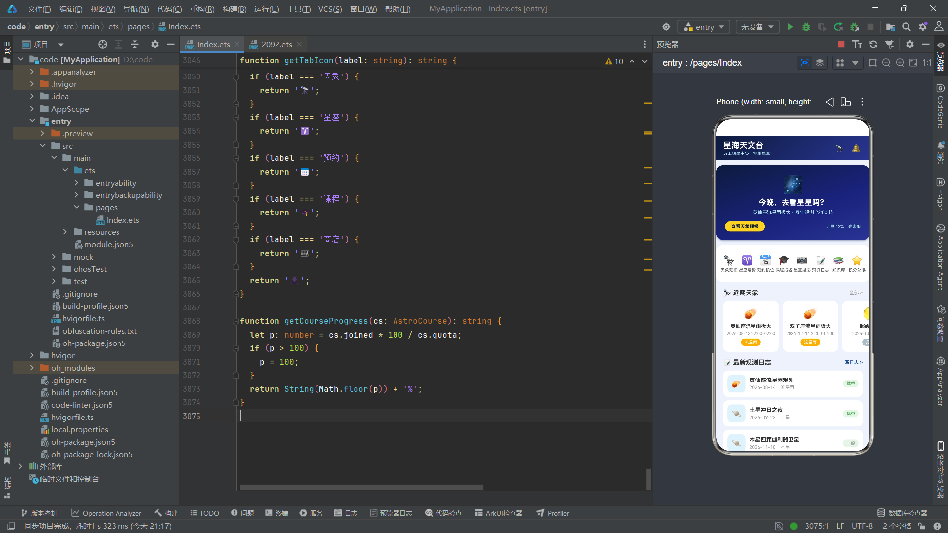
}
十五、总结
本文对"星海天文台"鸿蒙原生应用进行了逐段代码级别的深度解析。该应用以天文观测社区为核心业务场景,完整实现了天象预报、星座运势、机位预约、课程报名、观星商城、观测日志六大功能模块,涵盖了信息浏览、表单交互、预约管理、商品展示等移动端应用的典型交互模式。
从架构设计角度看,应用采用了清晰的分层结构。最底层是类型定义层,使用 interface 声明了九个数据接口,为整个应用的数据流转提供了类型安全保障。数据层使用全局常量数组存储所有业务数据,虽然这些数据在真实应用中应该来自网络请求,但在原型开发阶段,静态数据方案能够最大程度地降低开发复杂度,让开发者专注于 UI 实现和交互逻辑。辅助函数层封装了数据分片、颜色映射、Emoji 映射等纯逻辑操作,将业务逻辑与视图逻辑分离。视图层由七个 @Component Tab 组件和一个 @Entry 主组件构成,每个组件职责单一,内部通过 @Builder 方法定义可复用的 UI 片段。
从状态管理角度看,主组件 Index 承担了全局状态中枢的角色。它管理着 Tab 导航状态、十二个弹窗的显示与数据状态、表单选择状态以及 Toast 提示状态,共计二十余个 @State 变量。子组件通过回调函数与主组件通信,主组件修改状态后框架自动驱动 UI 更新,形成了清晰的单向数据流。这种集中式状态管理在中等规模应用中是合理的选择——所有状态变更在主组件中统一处理,便于调试和维护。
从 UI 实现角度看,应用大量运用了鸿蒙 ArkUI 的布局组件和样式属性。Column 和 Row 是最基础的布局容器,通过嵌套组合实现了各种复杂的页面结构。layoutWeight 是实现弹性布局的核心属性,配合空 Text 占位实现了两端对齐、等分布局等常见模式。ForEach 是列表渲染的唯一方案,通过键值生成函数确保列表更新时的高效渲染。linearGradient、shadow、borderRadius、transition 等样式属性为应用提供了丰富的视觉效果。
从交互设计角度看,弹窗系统是该应用的一大亮点。十二个弹窗覆盖了信息展示、表单填写、危险确认、结果反馈四种典型交互场景,每个弹窗的布局位置、尺寸比例、视觉风格都根据其交互目的进行了精心设计。居中弹窗用于信息展示和确认操作,底部抽屉用于表单填写,深色背景用于危险操作确认,这种弹窗分类设计体现了成熟的移动端交互设计思维。
纯 CSS 柱状图的实现展示了鸿蒙 ArkUI 在数据可视化方面的潜力。通过 Column 容器的高度和背景色属性,无需引入任何图表库即可实现基本的柱状图效果。虽然对于更复杂的图表(折线图、饼图等)仍需借助专业图表组件,但简单柱状图的纯 CSS 实现证明了 ArkUI 布局系统的灵活性。
该应用的代码组织也体现了良好的工程实践。辅助函数的命名遵循了统一的 getXXX 前缀模式,查找函数统一使用 findXXX 前缀,@Builder 方法统一使用 xxxCard 或 xxxModal 后缀。这种一致的命名约定使得代码具有良好的可读性和可维护性。

作为“人工智能6S店”的官方数字引擎,为AI开发者与企业提供一个覆盖软硬件全栈、一站式门户。
更多推荐



 0
0 0
0- 0


 已为社区贡献4条内容

所有评论(0)