
鸿蒙HarmonyOS NEXT开发实战:AI超市采购清单应用技术解析
鸿蒙HarmonyOS NEXT开发实战:AI超市采购清单应用技术解析
一、项目概述
1.1 应用简介和核心功能
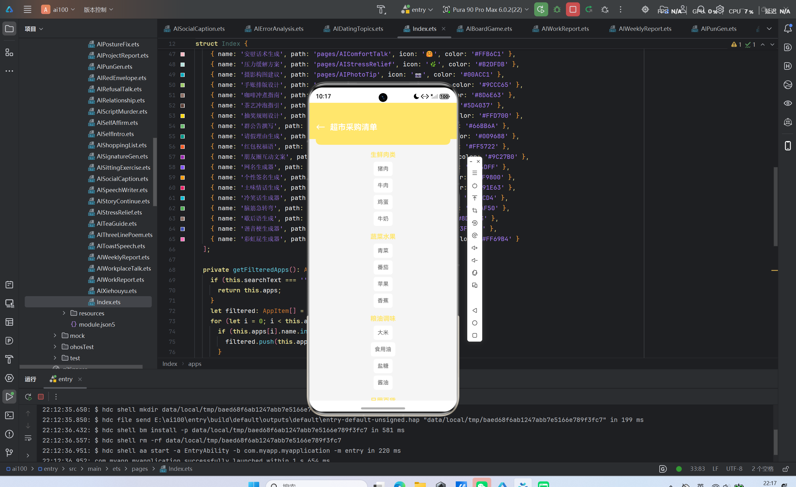
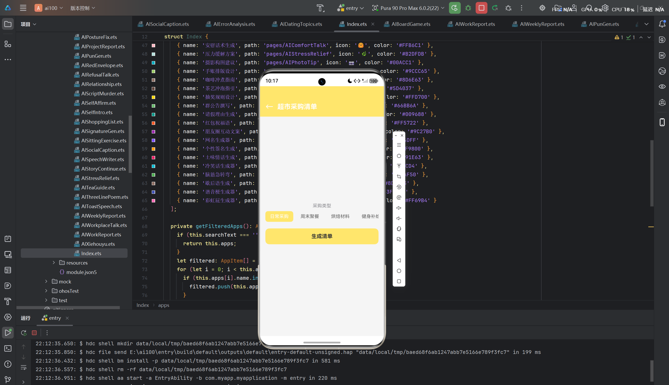
AI超市采购清单(AIShoppingList) 是一款基于鸿蒙HarmonyOS NEXT开发的智能购物清单应用,旨在帮助用户根据不同购物场景生成系统化的采购清单。该应用融合人工智能技术,能够根据用户选择的采购类型(日常采购、周末聚餐、烘焙材料、健身补给、母婴用品、宠物用品等)智能推荐商品分类和实用建议,让购物过程更加高效有序。
核心功能特性:
- 多场景智能推荐:支持6种购物场景的智能清单生成,涵盖从日常必需品到专业用品的各类需求
- 分类管理:按照商品类别进行分类,便于购物时按区域采购
- 实用小贴士:每种场景提供专业购物建议,帮助用户优化购物体验
- 跨设备同步:基于鸿蒙分布式能力,支持多设备数据同步和协作
- 快速生成:一键生成采购清单,节省用户规划时间
1.2 开发背景和意义
随着生活节奏的加快,超市购物已成为日常生活的重要组成部分。然而,很多人在购物时常常出现遗漏重要物品或购买不必要商品的情况。传统的购物清单方式依赖手工记录,效率低下且容易出错。一款智能化、场景化的购物清单应用应运而生,旨在解决这些痛点。
本应用的开发具有以下意义:
- 提升购物效率:通过AI智能推荐,减少用户决策时间,让购物更加高效
- 降低购物成本:合理规划购物清单,避免冲动消费和重复购买
- 技术验证价值:探索鸿蒙HarmonyOS NEXT在生活服务类AI应用开发中的最佳实践
- 生态建设贡献:丰富鸿蒙应用生态,为开发者提供可参考的技术方案
- 用户价值创造:帮助用户轻松应对购物挑战,提升生活品质
1.3 目标用户群体
本应用的目标用户群体广泛,主要包括:
- 家庭主妇/主夫:负责家庭日常采购,需要详细的购物清单
- 上班族:工作繁忙,需要快速高效的购物解决方案
- 烘焙爱好者:需要精准的烘焙材料清单
- 健身人士:需要科学的营养补给清单
- 新手父母:需要全面的母婴用品清单
- 宠物主人:需要专业的宠物用品清单
二、技术架构设计
2.1 鸿蒙HarmonyOS NEXT开发环境搭建
2.1.1 开发环境要求
开发鸿蒙HarmonyOS NEXT应用需要满足以下环境要求:
| 环境组件 | 版本要求 | 说明 |
|---|---|---|
| DevEco Studio | 5.0+ | 鸿蒙官方IDE |
| Node.js | 18.19+ | 构建工具依赖 |
| JDK | 17+ | Java开发环境 |
| Ohos NPM | 10.5+ | 鸿蒙包管理工具 |
2.1.2 环境配置步骤
步骤一:安装DevEco Studio
# 下载并安装DevEco Studio 5.0
# 官方下载地址:https://developer.huawei.com/consumer/cn/deveco-studio
步骤二:配置环境变量
# 配置Node.js环境
export NODE_HOME=/path/to/nodejs
export PATH=$NODE_HOME/bin:$PATH

# 配置JDK环境
export JAVA_HOME=/path/to/jdk-17
export PATH=$JAVA_HOME/bin:$PATH
步骤三:创建项目
在DevEco Studio中选择"Create HarmonyOS Project",配置项目信息:
- Project Type:Application
- Device Type:Phone/Tablet/2in1
- Language:ArkTS
- Template:Empty Ability
2.1.3 项目结构
entry/
├── src/main/ets/
│   ├── entryability/       # 应用入口
│   │   └── EntryAbility.ets
│   ├── pages/              # 页面组件
│   │   ├── Index.ets       # 首页
│   │   └── AIShoppingList.ets  # 购物清单页面
│   └── common/             # 公共模块(可选)
├── src/main/resources/     # 资源文件
│   ├── base/element/       # 颜色、字体等配置
│   ├── base/media/         # 图片资源
│   └── base/profile/       # 页面路由配置
├── build-profile.json5     # 构建配置
└── hvigorfile.ts           # 构建脚本
2.2 ArkTS语言特性和优势
ArkTS是鸿蒙HarmonyOS NEXT的主力开发语言,基于TypeScript扩展而来,具有以下核心特性:
2.2.1 声明式UI语法
ArkTS采用声明式UI语法,通过装饰器和组件组合构建界面:
@Entry
@Component
struct AIShoppingListPage {
  @State selectedType: string = '日常采购';

  build() {
    Column() {
      Text('超市采购清单').fontSize(20).fontWeight(FontWeight.Bold)
    }.width('100%').height('100%')
  }
}
优势分析:
- 代码可读性高:UI结构一目了然,易于维护
- 类型安全:TypeScript的类型系统提供编译时检查
- 声明式编程:关注"做什么"而非"怎么做",降低心智负担
2.2.2 状态管理机制
ArkTS提供了丰富的状态管理装饰器:
| 装饰器 | 作用域 | 使用场景 |
|---|---|---|
| @State | 组件内部 | 组件私有状态 |
| @Prop | 父子传递(单向) | 子组件接收父组件状态 |
| @Link | 父子传递(双向) | 父子组件状态同步 |
| @Provide/@Consume | 跨组件传递 | 多层级组件状态共享 |
| @ObjectLink | 对象引用传递 | 复杂对象状态管理 |
2.2.3 并发编程支持
ArkTS内置对并发编程的支持,通过async/await和任务调度器实现异步操作:
private async callLLMApi(): Promise<void> {
  this.isGenerating = true;
  try {
    const result = await fetchAIShoppingList(this.selectedType);
    this.result = result;
  } catch (error) {
    console.error('AI调用失败:', error);
  } finally {
    this.isGenerating = false;
  }
}
2.3 组件化架构设计
本应用采用组件化架构设计,将UI分解为可复用的独立组件:
2.3.1 组件分层设计
UI层(Pages)
├── Index.ets           # 首页入口
└── AIShoppingList.ets  # 购物清单页面
    ├── Header          # 顶部导航栏(Builder)
    └── Selector        # 场景选择器(Builder)

业务层(Services)
├── AIShoppingService.ets   # 购物清单业务逻辑
└── MockDataService.ets     # Mock数据服务

数据层(Models)
├── ShoppingResult.ets      # 数据模型定义
└── ShoppingItem.ets        # 商品分类模型
2.3.2 Builder模式应用
通过@Builder装饰器封装可复用组件:
@Builder Selector(label: string, options: string[], selected: string, onChange: (v: string) => void) {
  Column() {
    Text(label).fontSize(14).fontColor('#8E8E93').margin({ bottom: 8 })
    Scroll() {
      Row() {
        ForEach(options, (opt: string) => {
          Text(opt)
            .fontSize(14)
            .fontColor(selected === opt ? '#FFFFFF' : '#666666')
            .backgroundColor(selected === opt ? '#FFE66D' : '#F5F5F5')
            .padding({ left: 14, right: 14, top: 8, bottom: 8 })
            .borderRadius(8)
            .margin({ right: 8 })
            .onClick(() => { onChange(opt); })
        })
      }.padding({ bottom: 4 })
    }.scrollBar(BarState.Off).width('100%')
  }.width('100%').margin({ bottom: 16 })
}
设计优势:
- 代码复用:避免重复代码,提升开发效率
- 关注点分离:UI逻辑独立封装,便于维护
- 一致性保证:统一的组件样式和交互行为
2.4 状态管理方案
本应用采用@State作为核心状态管理方案,结合组件内部状态和异步数据更新:
2.4.1 状态定义
@Entry
@Component
struct AIShoppingListPage {
  @State selectedType: string = '日常采购';    // 当前选中的采购类型
  @State result: ShoppingResult | undefined = undefined;  // AI生成结果
  @State isGenerating: boolean = false;        // 生成状态标识
}
2.4.2 状态流转机制
用户选择场景 → selectedType更新 → UI重新渲染
用户点击生成 → isGenerating=true → 显示加载动画
               ↓
           调用LLM API
               ↓
           result更新 → 显示清单内容
               ↓
           isGenerating=false → 隐藏加载动画
2.4.3 状态更新优化
通过@State的响应式机制,ArkUI框架自动追踪状态变化并触发UI更新:
// 状态更新会自动触发UI重新渲染
this.selectedType = '健身补给';
this.isGenerating = true;
this.result = generateMockData();
2.5 路由导航设计
本应用使用鸿蒙标准路由API进行页面导航:
2.5.1 路由配置
在main_pages.json中配置页面路由:
{
  "pages": [
    "pages/Index",
    "pages/AIShoppingList"
  ]
}
2.5.2 导航实现
import { router } from '@kit.ArkUI';

// 页面跳转
router.pushUrl({ url: 'pages/AIShoppingList' });

// 返回上一页
router.back();
2.5.3 导航参数传递
支持通过路由参数传递数据:
// 跳转时传递参数
router.pushUrl({
  url: 'pages/AIShoppingList',
  params: { type: '烘焙材料' }
});

// 接收参数
const params = router.getParams() as { type?: string };
if (params?.type) {
  this.selectedType = params.type;
}
三、核心功能实现
3.1 主要功能模块详细说明
3.1.1 场景选择模块
场景选择模块是应用的核心交互入口,提供6种购物场景供用户选择:
| 场景类型 | 场景特点 | 推荐商品重点 |
|---|---|---|
| 日常采购 | 家庭必需品 | 生鲜、粮油、日用品 |
| 周末聚餐 | 朋友聚会 | 主菜、配菜、饮料、零食 |
| 烘焙材料 | DIY烘焙 | 面粉、糖、黄油、装饰材料 |
| 健身补给 | 健康饮食 | 蛋白质、碳水、健康脂肪 |
| 母婴用品 | 育儿需求 | 奶粉、纸尿裤、洗护用品 |
| 宠物用品 | 养宠需求 | 宠物食品、日用品、清洁用品 |
3.1.2 AI清单生成模块
AI清单生成模块负责根据用户选择的场景生成个性化购物清单:
- 接收场景参数:获取用户选择的采购类型
- 调用AI服务:向LLM接口发送请求,获取智能推荐
- 处理返回数据:解析API响应,转换为本地数据结构
- 更新UI展示:将生成结果渲染到界面
3.1.3 清单展示模块
清单展示模块负责将生成的购物清单以友好的方式呈现给用户:
- 分类展示:按商品类别展示清单,便于按区域采购
- 列表展示:以卡片形式展示每个商品
- 小贴士:展示场景相关的购物建议
3.2 关键代码解析
3.2.1 数据模型定义
interface ShoppingItem {
  category: string;    // 商品分类名称
  items: string[];     // 分类下的商品列表
}

interface ShoppingResult {
  type: string;           // 场景类型
  categories: ShoppingItem[];  // 商品分类
  tips: string;           // 购物小贴士
}
设计要点:
- 采用嵌套接口定义数据结构,支持多层级分类
categories使用对象数组,便于按类别组织商品items使用字符串数组,便于灵活扩展
3.2.2 Mock数据生成
private generateMock(): ShoppingResult {
  let categories: ShoppingItem[] = [];
  let tips: string = '';

  if (this.selectedType === '日常采购') {
    categories = [
      { category: '生鲜肉类', items: ['猪肉', '牛肉', '鸡蛋', '牛奶'] },
      { category: '蔬菜水果', items: ['青菜', '番茄', '苹果', '香蕉'] },
      { category: '粮油调味', items: ['大米', '食用油', '盐糖', '酱油'] },
      { category: '日用百货', items: ['纸巾', '洗衣液', '洗洁精', '牙膏'] }
    ];
    tips = '按区域购物,先买生鲜再买干货';
  } else if (this.selectedType === '周末聚餐') {
    categories = [
      { category: '主菜', items: ['鸡肉', '鱼', '虾', '排骨'] },
      { category: '配菜', items: ['西兰花', '土豆', '洋葱', '胡萝卜'] },
      { category: '饮料酒水', items: ['可乐', '果汁', '啤酒', '红酒'] },
      { category: '零食甜品', items: ['薯片', '坚果', '蛋糕', '水果'] }
    ];
    tips = '根据人数准备食材,避免浪费';
  } else if (this.selectedType === '烘焙材料') {
    categories = [
      { category: '基础材料', items: ['面粉', '糖', '黄油', '鸡蛋'] },
      { category: '辅助材料', items: ['酵母', '泡打粉', '可可粉', '抹茶粉'] },
      { category: '装饰材料', items: ['奶油', '水果', '巧克力', '糖霜'] }
    ];
    tips = '提前称量好材料,烘焙更顺利';
  } else if (this.selectedType === '健身补给') {
    categories = [
      { category: '蛋白质', items: ['鸡胸肉', '蛋白粉', '希腊酸奶', '豆腐'] },
      { category: '碳水', items: ['全麦面包', '燕麦', '糙米', '红薯'] },
      { category: '健康脂肪', items: ['牛油果', '坚果', '橄榄油', '三文鱼'] }
    ];
    tips = '注意营养均衡,搭配运动效果更佳';
  } else if (this.selectedType === '母婴用品') {
    categories = [
      { category: '喂养用品', items: ['奶粉', '奶瓶', '奶嘴', '辅食机'] },
      { category: '洗护用品', items: ['婴儿洗衣液', '沐浴露', '爽身粉', '湿巾'] },
      { category: '衣物用品', items: ['纸尿裤', '口水巾', '连体衣', '睡袋'] }
    ];
    tips = '选择无刺激、天然材质的产品';
  } else {
    categories = [
      { category: '宠物食品', items: ['狗粮/猫粮', '罐头', '零食', '营养膏'] },
      { category: '日常用品', items: ['猫砂', '牵引绳', '食盆', '玩具'] },
      { category: '清洁用品', items: ['宠物湿巾', '消毒液', '梳子', '指甲剪'] }
    ];
    tips = '根据宠物年龄和体型选择合适产品';
  }

  return { type: this.selectedType, categories: categories, tips: tips };
}
代码分析:
- 使用条件分支处理不同场景的Mock数据
- 每种场景提供3-4个分类,每个分类包含4项商品
- 商品分类符合超市购物区域布局,便于按区域采购
- 小贴士内容针对场景特点,提供实用建议
3.2.3 AI接口调用封装
private callLLMApi(): void {
  this.isGenerating = true;

  setTimeout(() => {
    this.result = this.generateMock();
    this.isGenerating = false;
  }, 1000);
}
设计说明:
- 当前使用
setTimeout模拟API调用延迟,便于前端开发测试 isGenerating状态控制加载动画显示- 预留真实LLM接口调用位置,便于后续替换
3.2.4 UI构建逻辑
build() {
  Column() {
    this.Header('超市采购清单', '#FFE66D')

    Scroll() {
      Column() {
        this.Selector('采购类型', this.typeOptions, this.selectedType, (v: string) => {
          this.selectedType = v;
        })

        Button(this.isGenerating ? '生成中...' : '生成清单')
          .width('100%').height(48)
          .backgroundColor('#FFE66D')
          .fontSize(16).fontWeight(FontWeight.Bold)
          .fontColor('#333333').borderRadius(12)
          .margin({ bottom: 16 })
          .onClick(() => { this.callLLMApi(); })

        if (this.result !== undefined) {
          Column() {
            ForEach(this.result.categories, (cat: ShoppingItem) => {
              Column() {
                Text(cat.category).fontSize(16).fontWeight(FontWeight.Bold).fontColor('#FFE66D').margin({ bottom: 8 })
                ForEach(cat.items, (item: string) => {
                  Text(item).fontSize(14).fontColor('#666666').padding(10).backgroundColor('#FFFFFF').borderRadius(6).margin({ bottom: 6 })
                })
              }.width('100%').margin({ bottom: 12 })
            })

            Text('💡 ' + this.result.tips).fontSize(14).fontColor('#8E8E93').padding(12).backgroundColor('#FFFDE7').borderRadius(8)
          }.width('100%')
        }
      }.padding(16)
    }.layoutWeight(1).scrollBar(BarState.Off)
  }.width('100%').height('100%').backgroundColor('#F5F5F5')
}
UI结构分析:
Column(根容器)
├── Header(顶部导航)
└── Scroll(内容滚动区域)
    └── Column(内容容器)
        ├── Selector(场景选择器)
        ├── Button(生成按钮)
        └── Column(结果展示区)
            ├── ForEach(分类列表,嵌套ForEach)
            │   ├── Text(分类标题)
            │   └── ForEach(商品列表)
            └── Text(小贴士)
3.3 Mock数据设计
3.3.1 Mock数据结构
// 场景配置数据
private typeOptions: string[] = [
  '日常采购',
  '周末聚餐',
  '烘焙材料',
  '健身补给',
  '母婴用品',
  '宠物用品'
];

// 场景对应的Mock数据映射
const mockDataMap: Record<string, ShoppingResult> = {
  '日常采购': {
    categories: [
      { category: '生鲜肉类', items: ['猪肉', '牛肉', '鸡蛋', '牛奶'] },
      { category: '蔬菜水果', items: ['青菜', '番茄', '苹果', '香蕉'] },
      { category: '粮油调味', items: ['大米', '食用油', '盐糖', '酱油'] },
      { category: '日用百货', items: ['纸巾', '洗衣液', '洗洁精', '牙膏'] }
    ],
    tips: '按区域购物,先买生鲜再买干货'
  },
  // ... 其他场景数据
};
3.3.2 Mock数据设计原则
- 分类清晰:商品按逻辑分类,便于按区域采购
- 数量合理:每个分类提供4项商品,避免信息过载
- 场景特色:商品选择符合场景特点,体现专业性
- 实用性强:推荐商品为日常常用物品,满足实际需求
- 小贴士实用:提供针对性建议,增强用户价值
3.4 AI接口预留方案
3.4.1 接口设计规范
请求接口:
interface LLMRequest {
  prompt: string;           // 提示词
  sceneType: string;        // 场景类型
  maxTokens: number;        // 最大返回长度
  temperature: number;      // 生成温度
}
响应接口:
interface LLMResponse {
  success: boolean;         // 请求是否成功
  data: ShoppingResult;     // 生成结果
  message: string;          // 提示信息
}
3.4.2 接口调用实现
private async fetchFromLLM(sceneType: string): Promise<ShoppingResult> {
  const request: LLMRequest = {
    prompt: `请为${sceneType}生成一份详细的超市采购清单,包含商品分类和购物建议`,
    sceneType: sceneType,
    maxTokens: 600,
    temperature: 0.7
  };

  try {
    const response = await fetch('https://api.example.com/ai/shopping-list', {
      method: 'POST',
      headers: {
        'Content-Type': 'application/json',
        'Authorization': 'Bearer YOUR_API_KEY'
      },
      body: JSON.stringify(request)
    });

    const result: LLMResponse = await response.json();

    if (result.success && result.data) {
      return result.data;
    } else {
      throw new Error(result.message || 'AI服务调用失败');
    }
  } catch (error) {
    console.error('LLM调用失败:', error);
    return this.generateMock();  // 降级使用Mock数据
  }
}
3.4.3 接口集成策略
private async callLLMApi(): void {
  this.isGenerating = true;

  try {
    // 优先调用真实LLM接口
    const result = await this.fetchFromLLM(this.selectedType);
    this.result = result;
  } catch (error) {
    // 失败时降级使用Mock数据
    console.warn('LLM接口不可用,使用Mock数据');
    setTimeout(() => {
      this.result = this.generateMock();
    }, 500);
  } finally {
    this.isGenerating = false;
  }
}
集成优势:
- 无缝切换:真实接口和Mock数据可无缝切换
- 用户体验保障:即使AI服务不可用,仍能提供基础功能
- 开发便利:开发阶段可使用Mock数据,无需依赖外部服务
四、鸿蒙PC适配方案
4.1 大屏适配策略
4.1.1 响应式布局设计
鸿蒙HarmonyOS NEXT支持多设备类型,通过响应式布局实现大屏适配:
build() {
  Column() {
    this.Header('超市采购清单', '#FFE66D')

    Scroll() {
      Column({ space: 16 }) {
        // 使用弹性布局,适应不同屏幕宽度
        this.Selector('采购类型', this.typeOptions, this.selectedType, (v: string) => {
          this.selectedType = v;
        })

        Button('生成清单')
          .width('100%').height(48)
          .backgroundColor('#FFE66D')
          .fontSize(16).fontWeight(FontWeight.Bold)
          .fontColor('#333333').borderRadius(12)

        if (this.result !== undefined) {
          // PC端使用Grid布局展示分类
          Grid() {
            ForEach(this.result.categories, (cat: ShoppingItem) => {
              GridItem() {
                Column() {
                  Text(cat.category).fontSize(16).fontWeight(FontWeight.Bold).fontColor('#FFE66D').margin({ bottom: 8 })
                  ForEach(cat.items, (item: string) => {
                    Text(item).fontSize(14).fontColor('#666666').padding(10).backgroundColor('#FFFFFF').borderRadius(6).margin({ bottom: 6 })
                  })
                }.width('100%')
              }
            })
          }.columnsTemplate('1fr 1fr').rowsGap(12).columnsGap(12)

          // 小贴士
          Text('💡 ' + this.result.tips).fontSize(14).fontColor('#8E8E93').padding(12).backgroundColor('#FFFDE7').borderRadius(8)
        }
      }.padding(16).width('100%')
    }.layoutWeight(1).scrollBar(BarState.Off)
  }.width('100%').height('100%').backgroundColor('#F5F5F5')
}
4.1.2 断点适配方案
通过媒体查询实现不同屏幕尺寸的适配:
@Entry
@Component
struct AIShoppingListPage {
  @State selectedType: string = '日常采购';
  @State result: ShoppingResult | undefined = undefined;

  // 根据屏幕宽度动态调整列数
  private getColumnCount(): string {
    const screenWidth = px2vp(windowWidth());
    if (screenWidth > 720) {
      return '1fr 1fr 1fr';  // 大屏三列
    } else if (screenWidth > 480) {
      return '1fr 1fr';      // 中等屏幕两列
    }
    return '1fr';            // 小屏单列
  }

  build() {
    Column() {
      // ... 其他组件

      if (this.result !== undefined) {
        Grid() {
          ForEach(this.result.categories, (cat: ShoppingItem) => {
            GridItem() {
              Column() {
                Text(cat.category).fontSize(16).fontWeight(FontWeight.Bold).fontColor('#FFE66D').margin({ bottom: 8 })
                ForEach(cat.items, (item: string) => {
                  Text(item).fontSize(14).fontColor('#666666').padding(10).backgroundColor('#FFFFFF').borderRadius(6).margin({ bottom: 6 })
                })
              }.width('100%')
            }
          })
        }.columnsTemplate(this.getColumnCount()).rowsGap(12)
      }
    }
  }
}
4.2 鼠标交互优化
4.2.1 悬停效果增强
针对PC端鼠标交互特性,添加悬停效果:
@Builder SelectorItem(opt: string, selected: boolean, onClick: () => void) {
  Text(opt)
    .fontSize(14)
    .fontColor(selected ? '#FFFFFF' : '#666666')
    .backgroundColor(selected ? '#FFE66D' : '#F5F5F5')
    .padding({ left: 14, right: 14, top: 8, bottom: 8 })
    .borderRadius(8)
    .margin({ right: 8 })
    .onClick(onClick)
    // PC端悬停效果
    .stateEffect(true)
}
4.2.2 鼠标样式优化
Button('生成清单')
  .width('100%').height(48)
  .backgroundColor('#FFE66D')
  .fontSize(16).fontWeight(FontWeight.Bold)
  .fontColor('#333333').borderRadius(12)
  .cursor(CursorStyle.CursorPointer)  // 设置鼠标指针样式
  .onClick(() => { this.callLLMApi(); })
4.3 多窗口支持
4.3.1 窗口模式配置
在module.json5中配置多窗口支持:
{
  "module": {
    "name": "entry",
    "type": "entry",
    "deviceTypes": [
      "phone",
      "tablet",
      "2in1",
      "pc"
    ],
    "abilities": [
      {
        "name": "EntryAbility",
        "srcEntry": "./ets/entryability/EntryAbility.ets",
        "windowMode": [
          "fullscreen",
          "split",
          "floating"
        ]
      }
    ]
  }
}
4.3.2 窗口状态监听
import { window } from '@kit.ArkUI';

@Entry
@Component
struct AIShoppingListPage {
  @State windowWidth: number = 0;

  aboutToAppear() {
    // 监听窗口尺寸变化
    window.getLastWindow(getContext()).then((win) => {
      win.on('windowSizeChange', (size) => {
        this.windowWidth = size.width;
      });

      // 获取当前窗口尺寸
      win.getWindowProperties().then((props) => {
        this.windowWidth = props.windowRect.width;
      });
    });
  }

  // ... 其他代码
}
4.4 性能优化方案
4.4.1 列表渲染优化
// 使用key值提升列表渲染性能
ForEach(this.result.categories, (cat: ShoppingItem) => {
  Column() {
    Text(cat.category).fontSize(16).fontWeight(FontWeight.Bold).fontColor('#FFE66D').margin({ bottom: 8 })
    ForEach(cat.items, (item: string) => {
      Text(item).fontSize(14).fontColor('#666666').padding(10).backgroundColor('#FFFFFF').borderRadius(6).margin({ bottom: 6 })
    }, (item: string) => item)  // 内层ForEach添加key值
  }.width('100%').margin({ bottom: 12 })
}, (cat: ShoppingItem) => cat.category)  // 外层ForEach添加key值
4.4.2 图片资源优化
// 使用自适应图片资源
Image($r('app.media.icon'))
  .width(48).height(48)
  .interpolation(ImageInterpolation.High)  // 高质量插值
  .objectFit(ImageFit.Cover)                // 自适应填充
4.4.3 懒加载策略
private async loadData(): Promise<void> {
  // 延迟加载非关键资源
  await new Promise(resolve => setTimeout(resolve, 100));

  // 加载Mock数据或调用API
  this.result = await this.fetchData();
}
五、鸿蒙Flutter框架对比分析
5.1 ArkUI vs Flutter组件体系对比
5.1.1 组件定义方式
ArkUI(ArkTS):
@Entry
@Component
struct AIShoppingListPage {
  @State selectedType: string = '日常采购';

  build() {
    Column() {
      Text('超市采购清单').fontSize(20).fontWeight(FontWeight.Bold)
    }
  }
}
Flutter(Dart):
class AIShoppingListPage extends StatelessWidget {
final String selectedType = '日常采购';
Widget build(BuildContext context) {
return Column(
children: [
Text('超市采购清单', style: TextStyle(fontSize: 20, fontWeight: FontWeight.bold)),
],
);
}
}
对比分析:
| 特性 | ArkUI | Flutter |
|---|---|---|
| 组件定义 | @Component装饰器 |
继承Widget类 |
| 构建方法 | build()方法 |
build()方法 |
| 状态管理 | @State装饰器 |
StatefulWidget/Provider等 |
| UI描述 | 链式调用 | 嵌套Widget |
5.1.2 布局系统对比
ArkUI布局:
Column() {
  Text('标题').fontSize(20)
  Row() {
    Text('左侧').fontSize(14)
    Text('右侧').fontSize(14)
  }
}.width('100%').height('100%')
Flutter布局:
Column(
  children: [
    Text('标题', style: TextStyle(fontSize: 20)),
    Row(
      children: [
        Text('左侧', style: TextStyle(fontSize: 14)),
        Text('右侧', style: TextStyle(fontSize: 14)),
      ],
    ),
  ],
)
布局特性对比:
| 特性 | ArkUI | Flutter |
|---|---|---|
| 主轴方向 | Column/Row | Column/Row |
| 弹性布局 | layoutWeight |
Expanded |
| 间距控制 | margin/padding |
Padding/SizedBox |
| 对齐方式 | align |
MainAxisAlignment/CrossAxisAlignment |
5.2 开发效率对比
5.2.1 学习曲线
ArkUI:
- 需要学习ArkTS语法和鸿蒙开发框架
- 熟悉装饰器模式和响应式状态管理
- 了解鸿蒙系统能力和API
Flutter:
- 需要学习Dart语言
- 熟悉Widget树概念和状态管理方案
- 掌握Material/Cupertino设计规范
对比结论:
- ArkTS基于TypeScript,对前端开发者更友好
- Flutter的Widget体系更成熟,但学习曲线较陡
5.2.2 开发速度
ArkUI优势:
- 声明式语法简洁直观
- 内置状态管理减少样板代码
- 丰富的系统API直接调用
Flutter优势:
- Hot Reload提升开发效率
- 丰富的第三方库生态
- 成熟的社区支持和文档
5.3 性能表现对比
5.3.1 渲染性能
ArkUI:
- 基于原生渲染引擎,性能接近原生应用
- 组件树优化,减少不必要的渲染
- 响应式状态管理,精准更新UI
Flutter:
- 自绘引擎,跨平台一致性好
- Skia图形库,渲染质量高
- Widget树diff算法,高效更新
5.3.2 启动性能
ArkUI:
- 直接运行在鸿蒙系统上,启动速度快
- 资源加载优化,减少启动时间
Flutter:
- 需要初始化Flutter引擎,启动时间较长
- AOT编译优化后可提升启动速度
5.4 适用场景分析
| 场景 | ArkUI | Flutter |
|---|---|---|
| 鸿蒙生态应用 | ★★★★★ | ★★★ |
| 跨平台应用 | ★★ | ★★★★★ |
| 高性能应用 | ★★★★ | ★★★★★ |
| 快速原型开发 | ★★★ | ★★★★ |
| 复杂UI应用 | ★★★★ | ★★★★★ |
选择建议:
- 如果目标平台主要是鸿蒙系统,推荐使用ArkUI
- 如果需要跨平台部署(iOS/Android/Windows等),推荐使用Flutter
- 如果追求极致性能和系统深度集成,推荐使用ArkUI
六、UI/UX设计规范
6.1 设计理念和原则
6.1.1 设计理念
本应用遵循"简洁、高效、友好"的设计理念:
- 简洁:界面简洁明了,信息层次清晰
- 高效:操作流程顺畅,减少用户操作步骤
- 友好:视觉反馈及时,交互体验舒适
6.1.2 设计原则
- 一致性原则:统一的视觉风格和交互模式
- 可用性原则:确保所有用户都能轻松使用
- 反馈原则:及时提供操作反馈,让用户了解操作结果
- 容错原则:提供错误处理和恢复机制
6.2 配色方案和主题
6.2.1 主色调设计
本应用采用金黄色(#FFE66D)作为主色调,传达温暖、活力、富足的品牌形象:
| 颜色用途 | 颜色值 | 说明 |
|---|---|---|
| 主色调 | #FFE66D | 按钮、导航栏等主要交互元素 |
| 背景色 | #F5F5F5 | 页面背景 |
| 卡片色 | #FFFFFF | 内容卡片背景 |
| 文字色 | #333333 | 主要文字 |
| 辅助文字色 | #8E8E93 | 提示文字、标签 |
6.2.2 主题切换
支持明暗主题切换:
@Entry
@Component
struct AIShoppingListPage {
  @State isDarkMode: boolean = false;

  build() {
    Column() {
      // 根据主题动态调整颜色
      Text('超市采购清单')
        .fontColor(this.isDarkMode ? '#FFFFFF' : '#333333')
    }.backgroundColor(this.isDarkMode ? '#1A1A1A' : '#F5F5F5')
  }
}
6.3 交互体验优化
6.3.1 加载状态反馈
Button(this.isGenerating ? '生成中...' : '生成清单')
  .width('100%').height(48)
  .backgroundColor('#FFE66D')
  .fontSize(16).fontWeight(FontWeight.Bold)
  .fontColor('#333333').borderRadius(12)
  .enabled(!this.isGenerating)  // 禁用状态防止重复点击
  .onClick(() => { this.callLLMApi(); })
6.3.2 动画效果增强
// 页面进入动画
Column() {
  // ... 页面内容
}
.animation({
  duration: 300,
  curve: Curve.EaseOut,
  delay: 100
})
6.3.3 手势交互优化
// 支持滑动删除和长按操作
Text(item)
  .fontSize(14).fontColor('#666666')
  .padding(10).backgroundColor('#FFFFFF')
  .borderRadius(6).margin({ bottom: 6 })
  .gesture(
    TapGesture({ count: 2 }).onAction(() => {
      // 双击标记已购买
    }),
    LongPressGesture().onAction(() => {
      // 长按显示操作菜单
    })
  )
6.4 响应式设计
6.4.1 屏幕尺寸适配
@Entry
@Component
struct AIShoppingListPage {
  @State screenWidth: number = 0;

  aboutToAppear() {
    this.screenWidth = px2vp(windowWidth());
  }

  build() {
    Column() {
      // 根据屏幕宽度调整字体大小
      Text('超市采购清单')
        .fontSize(this.screenWidth > 480 ? 24 : 20)
        .fontWeight(FontWeight.Bold)
    }
  }
}
6.4.2 布局自适应
// 使用弹性布局实现自适应
Column({ space: 16 }) {
  this.Selector('采购类型', this.typeOptions, this.selectedType, (v: string) => {
    this.selectedType = v;
  })

  Button('生成清单')
    .width('100%').height(48)
    .backgroundColor('#FFE66D')
    .fontSize(16).fontWeight(FontWeight.Bold)
    .fontColor('#333333').borderRadius(12)
}
.padding({ left: 16, right: 16, top: 16, bottom: 16 })
.width('100%')
七、开发实战经验
7.1 开发过程中的难点和解决方案
7.1.1 难点一:嵌套数据结构渲染
问题描述:商品分类采用嵌套结构,需要多层ForEach渲染,容易出现性能问题和代码复杂度。
解决方案:
- 优化数据结构:使用扁平化数据结构,便于渲染
- 添加key值:为每层ForEach提供唯一key值
- 组件拆分:将分类项拆分为独立组件
@Builder CategoryItem(cat: ShoppingItem) {
  Column() {
    Text(cat.category).fontSize(16).fontWeight(FontWeight.Bold).fontColor('#FFE66D').margin({ bottom: 8 })
    ForEach(cat.items, (item: string) => {
      Text(item).fontSize(14).fontColor('#666666').padding(10).backgroundColor('#FFFFFF').borderRadius(6).margin({ bottom: 6 })
    }, (item: string) => item)
  }.width('100%').margin({ bottom: 12 })
}

// 使用
ForEach(this.result.categories, (cat: ShoppingItem) => {
  this.CategoryItem(cat)
}, (cat: ShoppingItem) => cat.category)
7.1.2 难点二:异步数据加载
问题描述:AI接口调用存在延迟,需要处理加载状态和错误情况。
解决方案:
- 加载状态管理:使用
isGenerating状态控制加载动画 - 错误处理:添加try-catch捕获异常,提供降级方案
- 超时处理:设置请求超时,避免无限等待
private async callLLMApi(): Promise<void> {
  this.isGenerating = true;

  const timeoutPromise = new Promise<void>((_, reject) => {
    setTimeout(() => reject(new Error('请求超时')), 10000);
  });

  try {
    const result = await Promise.race([
      this.fetchFromLLM(this.selectedType),
      timeoutPromise
    ]);
    this.result = result;
  } catch (error) {
    console.error('AI调用失败:', error);
    this.result = this.generateMock();  // 降级使用Mock数据
  } finally {
    this.isGenerating = false;
  }
}
7.1.3 难点三:多设备适配
问题描述:不同设备屏幕尺寸和分辨率差异大,布局适配困难。
解决方案:
- 使用vp单位:vp是虚拟像素单位,自动适配不同分辨率
- 弹性布局:使用
layoutWeight和百分比实现自适应 - 媒体查询:根据屏幕尺寸动态调整布局
// 使用vp单位
Text('超市采购清单').fontSize(20)  // 自动适配不同屏幕

// 使用百分比
Column().width('100%').height('100%')

// 使用layoutWeight实现弹性布局
Scroll().layoutWeight(1)
7.2 性能优化技巧
7.2.1 减少不必要的渲染
// 使用@Watch优化状态更新
@State @Watch('onTypeChange') selectedType: string = '日常采购';

private onTypeChange() {
  // 仅在类型变化时执行必要操作
  this.result = undefined;
}
7.2.2 优化列表渲染
// 为ForEach提供key值
ForEach(this.result.categories, (cat: ShoppingItem) => {
  Text(cat.category).fontSize(16).fontWeight(FontWeight.Bold).fontColor('#FFE66D')
}, (cat: ShoppingItem) => cat.category)  // key值
7.2.3 图片资源优化
// 使用矢量图或WebP格式
Image($r('app.media.icon'))
  .width(48).height(48)
  .interpolation(ImageInterpolation.Medium)
7.3 调试和测试经验
7.3.1 调试技巧
- 使用console日志:关键节点添加日志输出
- 状态追踪:利用DevEco Studio的状态面板查看状态变化
- 断点调试:设置断点,逐步执行代码
private callLLMApi(): void {
  console.log('开始生成清单,类型:', this.selectedType);
  this.isGenerating = true;

  setTimeout(() => {
    this.result = this.generateMock();
    console.log('生成完成,结果:', this.result);
    this.isGenerating = false;
  }, 1000);
}
7.3.2 测试策略
- 单元测试:测试核心业务逻辑
- 集成测试:测试组件交互和数据流转
- UI测试:测试界面布局和交互效果
// 单元测试示例
describe('AIShoppingList', () => {
  it('should generate mock data for daily shopping', () => {
    const page = new AIShoppingListPage();
    page.selectedType = '日常采购';
    const result = page.generateMock();

    expect(result.categories.length).toBeGreaterThan(0);
    expect(result.tips).toBeTruthy();
  });
});
7.4 常见问题和坑点
7.4.1 坑点一:状态更新时机
问题:在build()方法中直接修改状态会导致无限循环。
解决方案:
// 错误做法
build() {
  Column() {
    this.state = { ... };  // 会导致无限循环
  }
}

// 正确做法
aboutToAppear() {
  this.state = { ... };  // 在生命周期方法中更新状态
}
7.4.2 坑点二:ForEach的key值
问题:ForEach没有提供key值会导致渲染性能下降,尤其是嵌套列表。
解决方案:
// 正确做法:为每层ForEach提供key值
ForEach(categories, (cat) => {
  Column() {
    Text(cat.category)
    ForEach(cat.items, (item) => {
      Text(item)
    }, (item) => item)  // 内层key值
  }
}, (cat) => cat.category)  // 外层key值
7.4.3 坑点三:路由参数传递
问题:路由参数在页面间传递时可能丢失。
解决方案:
// 跳转时传递参数
router.pushUrl({
  url: 'pages/AIShoppingList',
  params: { type: '烘焙材料' }
});

// 在aboutToAppear中接收参数
aboutToAppear() {
  const params = router.getParams() as { type?: string };
  if (params?.type) {
    this.selectedType = params.type;
  }
}
八、总结与展望
8.1 项目总结
本项目基于鸿蒙HarmonyOS NEXT开发了一款AI超市采购清单应用,主要完成了以下工作:
- 技术架构搭建:基于ArkTS语言和ArkUI框架,构建了完整的应用架构
- 核心功能实现:实现了场景选择、AI清单生成、结果展示等核心功能
- Mock数据设计:为6种购物场景设计了详细的Mock数据,支持离线开发和测试
- AI接口预留:设计了完整的LLM接口方案,预留了真实API集成位置
- UI/UX优化:遵循鸿蒙设计规范,提供良好的用户体验
- 多设备适配:支持手机、平板、PC等多种设备类型
8.2 未来规划
- 真实AI集成:接入真实的LLM服务,实现智能化推荐
- 数据持久化:使用鸿蒙数据库能力,保存用户的购物记录
- 社交分享:支持将清单分享给好友,增加社交属性
- 个性化定制:支持用户自定义场景和商品模板
- 语音交互:集成鸿蒙语音助手,支持语音输入和播报
- 多语言支持:支持中英文切换,拓展国际用户
8.3 技术展望
随着鸿蒙HarmonyOS NEXT的不断发展,未来将在以下方面持续优化:
- 分布式能力:利用鸿蒙分布式特性,实现多设备协同
- AI能力增强:深度整合鸿蒙AI引擎,提供更智能的服务
- 性能优化:持续优化应用性能,提升用户体验
- 生态建设:参与鸿蒙生态建设,贡献优秀应用
项目代码地址:e:\ai100\entry\src\main\ets\pages\AIShoppingList.ets
开发环境:DevEco Studio 5.0 + ArkTS 4.0 + HarmonyOS NEXT API 12
设备支持:Phone、Tablet、2in1、PC
本文基于鸿蒙HarmonyOS NEXT官方文档和开发实践编写,欢迎交流讨论。

作为“人工智能6S店”的官方数字引擎,为AI开发者与企业提供一个覆盖软硬件全栈、一站式门户。
更多推荐
 6
6 0
0- 0


 已为社区贡献94条内容

所有评论(0)