
HarmonyOS NEXT 主题切换应用开发实战
一、应用概述与功能
1.1 应用简介
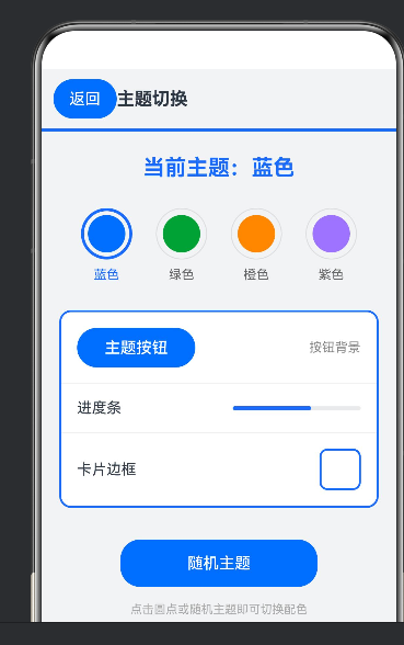
本案例(index90)是一个基于 HarmonyOS NEXT 平台开发的主题切换应用,完整展示了 ArkUI 框架中动态主题色管理、组件样式联动与交互反馈的有机结合。应用提供蓝、绿、橙、紫四套预置主题,用户点击即可切换全局主题色,所有相关组件(包括按钮、进度条、边框、文字等)的颜色将实时跟随主题变化。
1.2 核心功能点
- 四套预置主题:提供蓝色、绿色、橙色、紫色四套精心设计的配色方案
- 圆点选择器:采用圆形色块配合外圈选中状态指示的设计
- 全局样式联动:按钮、Progress 进度条、边框、Divider 分隔线等组件颜色实时跟随主题变化
- 随机切换功能:支持随机选择一套主题,增加交互趣味性
- 多组件效果演示:在卡片中集中展示主题色在多种组件上的应用效果### 1.3 技术亮点
应用采用 @State 装饰器声明 theme 状态变量来存储当前主题色值(十六进制颜色字符串),所有需要主题色的组件属性均直接绑定 this.theme。通过 this.themes.indexOf(this.theme) 方法可查找当前主题在数组中的索引,进而获取对应的主题名称。圆点选择器则通过边框宽度的差异来直观表示选中状态。
二、核心知识点
2.1 十六进制颜色
使用 #RRGGBB 格式的十六进制颜色字符串,这种格式简洁直观,便于在 ArkUI 中任何需要设置颜色的属性中直接使用,无需额外转换即可完成颜色赋值。### 2.2 圆点选择器
采用 Stack 布局嵌套 Column 组件实现圆形色块,通过动态调整边框宽度(选中状态 3px,未选中状态 1px)来清晰区分当前选中的主题,视觉反馈直观明了。### 2.3 全局主题绑定
所有需要主题色的属性均直接使用 this.theme 进行绑定,包括 backgroundColor、color、border.color、Divider.color 等,实现一处修改、全局生效的联动效果。
三、核心方法解析
3.1 themeName 方法
通过 indexOf 方法查找当前主题在 themes 数组中的索引位置,进而返回对应的主题名称,实现颜色值到名称的映射。
3.2 switchTheme 方法
直接为 @State 修饰的 theme 变量赋值为目标颜色,借助状态驱动机制自动触发全局界面重绘,实现主题的即时切换。
3.3 randomTheme 方法
Math.random() 生成索引,从 themes 数组中随机选择一套主题。
四、完整代码实现
import { router } from '@kit.ArkUI';
import { promptAction } from '@kit.ArkUI';

@Entry
@Component
struct Index90 {
  @State theme: string = '#1a6cff';
  private themes: string[] = ['#1a6cff', '#2f9e44', '#ff8f1f', '#9775fa'];
  private names: string[] = ['蓝色', '绿色', '橙色', '紫色'];

  private themeName(): string {
    const index: number = this.themes.indexOf(this.theme);
    if (index >= 0) { return this.names[index]; }
    return '自定义';
  }

  private switchTheme(color: string): void { this.theme = color; }

  private randomTheme(): void {
    const index: number = Math.floor(Math.random() * this.themes.length);
    this.theme = this.themes[index];
    promptAction.showToast({ message: '已切换到' + this.names[index] + '主题' });
  }

  build() {
    Column() {
      Row() {
        Button('返回').backgroundColor('#1a6cff').fontColor(Color.White)
          .onClick(() => { router.back(); })
        Text('主题切换').fontSize(18).fontWeight(FontWeight.Bold)
        Blank()
      }
      .width('100%').padding({ left: 12, right: 12, top: 10, bottom: 10 })

      Divider().color(this.theme).strokeWidth(3)

      Text('当前主题:' + this.themeName())
        .fontSize(22).fontWeight(FontWeight.Bold).fontColor(this.theme).margin({ top: 24 })

      Row() {
        ForEach(this.themes, (color: string, idx: number) => {
          Column() {
            Stack() {
              Column().width(38).height(38).borderRadius(19).backgroundColor(color)
            }
            .width(52).height(52).borderRadius(26)
            .border({
              width: this.theme === color ? 3 : 1,
              color: this.theme === color ? color : '#dddddd'
            })
            .onClick(() => { this.switchTheme(color); })
            Text(this.names[idx])
              .fontSize(13).fontColor(this.theme === color ? this.theme : '#666666')
              .margin({ top: 8 })
          }
          .margin({ left: idx === 0 ? 0 : 24 })
        }, (color: string, idx: number) => idx.toString())
      }
      .margin({ top: 28 })

      Column() {
        Row() {
          Button('主题按钮').backgroundColor(this.theme).fontColor(Color.White).width(120).height(40)
          Blank()
          Text('按钮背景').fontSize(13).fontColor('#888888')
        }
        .width('100%').padding(16)

        Divider().color('#eeeeee')

        Row() {
          Text('进度条').fontSize(15)
          Blank()
          Progress({ value: 60, total: 100, type: ProgressType.Linear })
            .color(this.theme).width(130)
        }
        .width('100%').padding(16)

        Divider().color('#eeeeee')

        Row() {
          Text('卡片边框').fontSize(15)
          Blank()
          Column().width(42).height(42).borderRadius(8).border({ width: 2, color: this.theme })
        }
        .width('100%').padding(16)
      }
      .width('90%').border({ width: 2, color: this.theme })
      .borderRadius(12).backgroundColor('#ffffff').margin({ top: 28 })

      Button('随机主题').width(200).height(48)
        .backgroundColor(this.theme).fontColor(Color.White).margin({ top: 32 })
        .onClick(() => { this.randomTheme(); })

      Text('点击圆点或随机主题即可切换配色')
        .fontSize(12).fontColor('#aaaaaa').margin({ top: 16 })
    }
    .width('100%').height('100%').backgroundColor('#f2f3f5')
  }
}
五、核心逻辑分析
5.1 主题色绑定
所有需要主题色的属性统一使用 this.theme。ArkUI 的 @State 机制确保 theme 变化时所有绑定属性自动更新。
5.2 选中状态指示
圆点选择器通过边框宽度(3px 选中 vs 1px 未选中)和边框颜色(主题色 vs 灰色)区分当前选中的主题。
5.3 效果演示
卡片中展示了主题色在 Button(背景色)、Progress(进度条颜色)、Divider(分隔线颜色)、Border(边框颜色)上的应用。
六、可扩展方向
- 主题持久化:保存主题选择到 Preferences
- 更多主题:增加更多预置配色
- 自定义主题:支持用户通过颜色选择器自定义
- 全局主题:将主题应用到整个应用的所有页面
七、总结
通过开发主题切换应用,我们掌握了动态主题管理、圆点选择器设计、多组件样式联动等 ArkUI 开发技术。单一颜色值驱动全局主题的设计模式是本案例的核心亮点。

作为“人工智能6S店”的官方数字引擎,为AI开发者与企业提供一个覆盖软硬件全栈、一站式门户。
更多推荐


 3
3 0
0- 0


 已为社区贡献41条内容

所有评论(0)