
【共创季稿事节】HarmonyOS 6.1 自适应布局(Adaptive Layout)实战:一码适配手机、平板、折叠屏

每日一句正能量
一个人最大的底气就是能够持续学习,不断突破自己。
底气不来自存量(已有的学历、财富),而来自增量能力。持续学习意味着你有应对未知的信心,不惧怕变化。这种成长型心态,是任何人都拿不走的底气。
摘要
摘要: 多设备形态的差异是鸿蒙应用开发面临的核心挑战之一。HarmonyOS 6.1 在自适应布局框架上做了系统性增强,提供了更细粒度的断点系统、更智能的响应式组件和更简洁的声明式 API。本文从断点原理出发,结合手机、平板、折叠屏三类设备的实际尺寸,演示如何使用一套代码实现多端自适应,帮助开发者真正做到"一次开发,多端部署"。
一、自适应布局概述
1.1 为什么需要自适应布局?
HarmonyOS 应用需要同时适配以下设备形态:
| 设备类型 | 典型分辨率 | 屏幕比例 | 使用场景 |
|---|---|---|---|
| 手机 | 1080×2400 | 9:20 ~ 9:22 | 单手操作、竖屏为主 |
| 平板 | 2000×1200 | 10:16 | 双手操作、横竖屏切换 |
| 折叠屏(内屏) | 2208×1768 | 接近 1:1 | 展开后类似平板 |
| 折叠屏(外屏) | 1080×2560 | 类似手机 | 折叠态单手操作 |
| 车机 | 1920×1080 | 16:9 | 横屏固定、远距离操作 |
如果没有自适应布局,开发者需要为每种设备维护一套独立的 UI 代码,维护成本极高。
1.2 HarmonyOS 6.1 自适应增强
相比 5.x 版本,6.1 在自适应布局上有以下升级:
| 能力 | 5.x | 6.1 |
|---|---|---|
| 断点数量 | 3 档(sm/md/lg) | 5 档(xs/sm/md/lg/xl) |
| 断点单位 | 仅 vp | vp + px + 百分比 |
| 响应式组件 | GridRow/GridCol | 新增 FoldSplit、AdaptiveContainer |
| 折叠屏适配 | 需手动监听折叠状态 | 内置 FoldingFeature 自动适配 |
| 字体缩放 | 手动计算 | 自动跟随系统设置 |
二、断点系统详解
2.1 五档断点定义
HarmonyOS 6.1 将屏幕宽度划分为五档断点:
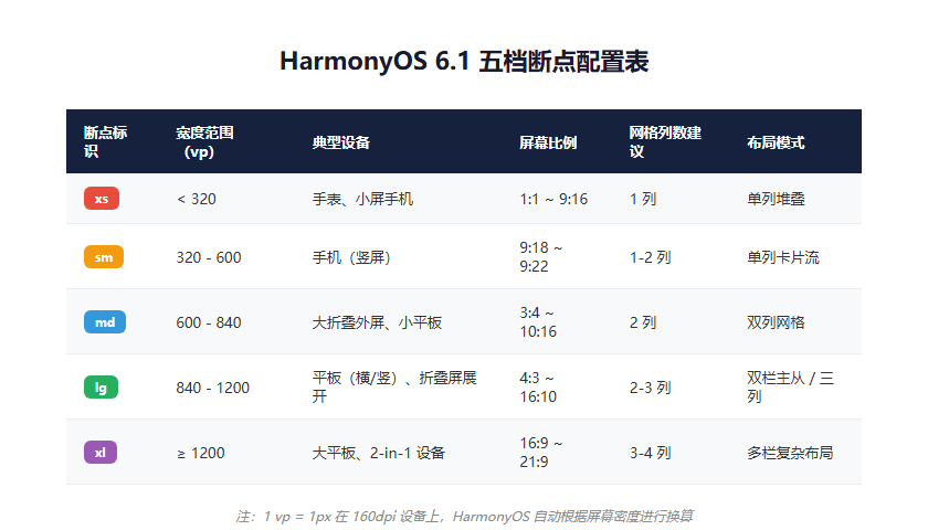
上图展示了五档断点的划分规则与对应设备类型。开发者可根据
widthBreakpoint的值,快速判断当前设备的形态类别。
| 断点标识 | 宽度范围(vp) | 典型设备 |
|---|---|---|
| xs | < 320 | 手表、小屏手机 |
| sm | 320 - 600 | 手机(竖屏) |
| md | 600 - 840 | 大折叠外屏、小尺寸平板 |
| lg | 840 - 1200 | 平板(横/竖)、折叠屏展开 |
| xl | ≥ 1200 | 大平板、2-in-1 设备 |
2.2 在代码中使用断点
// 方式一:使用媒体查询(推荐)
import { mediaquery } from '@kit.ArkUI';

@Entry
@Component
struct AdaptivePage {
  @State currentBreakpoint: string = 'sm';
  private listener: mediaquery.MediaQueryListener | null = null;

  aboutToAppear(): void {
    // 监听断点变化
    this.listener = mediaquery.matchMediaSync('(width < 320vp)');
    this.listener.on('change', (result) => {
      this.updateBreakpoint();
    });

    // 初始化断点
    this.updateBreakpoint();
  }

  aboutToDisappear(): void {
    this.listener?.off('change');
  }

  private updateBreakpoint(): void {
    const width = display.getDefaultDisplaySync().width;
    const widthVp = px2vp(width);

    if (widthVp < 320) this.currentBreakpoint = 'xs';
    else if (widthVp < 600) this.currentBreakpoint = 'sm';
    else if (widthVp < 840) this.currentBreakpoint = 'md';
    else if (widthVp < 1200) this.currentBreakpoint = 'lg';
    else this.currentBreakpoint = 'xl';
  }

  build() {
    Column() {
      if (this.currentBreakpoint === 'sm' || this.currentBreakpoint === 'xs') {
        PhoneLayout();
      } else if (this.currentBreakpoint === 'md') {
        FoldLayout();
      } else {
        TabletLayout();
      }
    }
    .width('100%')
    .height('100%');
  }
}
2.3 更简洁的方式:使用系统提供的断点工具
HarmonyOS 6.1 提供了更简洁的 BreakpointSystem:
import { BreakpointSystem, BreakpointType } from '@kit.ArkUI';

@Entry
@Component
struct AdaptivePageV2 {
  @State currentBreakpoint: string = BreakpointSystem.getCurrentBreakpoint();

  aboutToAppear(): void {
    BreakpointSystem.onBreakpointChange((breakpoint) => {
      this.currentBreakpoint = breakpoint;
    });
  }

  build() {
    Column() {
      // 使用 BreakpointType 根据断点自动选择值
      Text('自适应标题')
        .fontSize(new BreakpointType({
          xs: 14,
          sm: 16,
          md: 18,
          lg: 22,
          xl: 24
        }).getValue(this.currentBreakpoint))
        .fontWeight(FontWeight.Bold);

      // 使用 GridRow 实现响应式网格
      GridRow({
        columns: new BreakpointType({ xs: 1, sm: 1, md: 2, lg: 3, xl: 4 }).getValue(this.currentBreakpoint),
        gutter: 16
      }) {
        ForEach([1, 2, 3, 4, 5, 6], (item: number) => {
          GridCol() {
            CardItem({ index: item });
          }
        });
      }
      .width('100%');
    }
    .padding(new BreakpointType({ xs: 8, sm: 12, md: 16, lg: 24, xl: 32 }).getValue(this.currentBreakpoint));
  }
}
三、响应式组件实战
3.1 GridRow / GridCol 响应式网格
// 实现一个响应式商品列表
@Entry
@Component
struct ProductGrid {
  @State breakpoint: string = 'sm';
  private products: Product[] = [
    { id: 1, name: 'iPhone 16', price: 5999, image: $r('app.media.phone') },
    { id: 2, name: 'MatePad Pro', price: 3999, image: $r('app.media.tablet') },
    { id: 3, name: 'Watch GT 5', price: 1488, image: $r('app.media.watch') },
    { id: 4, name: 'FreeBuds Pro', price: 999, image: $r('app.media.earphone') },
    { id: 5, name: '智慧屏 V5', price: 8999, image: $r('app.media.tv') },
    { id: 6, name: 'MateBook X', price: 8999, image: $r('app.media.laptop') }
  ];

  build() {
    Column() {
      // 标题栏
      Row() {
        Text('热门商品')
          .fontSize(this.getFontSize(20, 24))
          .fontWeight(FontWeight.Bold);

        Text('查看更多 →')
          .fontSize(this.getFontSize(12, 14))
          .fontColor('#3498db');
      }
      .width('100%')
      .justifyContent(FlexAlign.SpaceBetween)
      .padding(this.getPadding());

      // 响应式网格
      GridRow({
        columns: this.getGridColumns(),
        columnsGap: 12,
        rowsGap: 12
      }) {
        ForEach(this.products, (product: Product) => {
          GridCol({
            span: { xs: 1, sm: 1, md: 1, lg: 1, xl: 1 }
          }) {
            ProductCard({ product });
          }
        });
      }
      .padding(this.getPadding());
    }
    .width('100%')
    .height('100%');
  }

  private getGridColumns(): number {
    const map: Record<string, number> = { xs: 1, sm: 2, md: 2, lg: 3, xl: 4 };
    return map[this.breakpoint] ?? 2;
  }

  private getFontSize(phone: number, tablet: number): number {
    return ['xs', 'sm'].includes(this.breakpoint) ? phone : tablet;
  }

  private getPadding(): number {
    const map: Record<string, number> = { xs: 8, sm: 12, md: 16, lg: 24, xl: 32 };
    return map[this.breakpoint] ?? 12;
  }
}

@Component
struct ProductCard {
  @Prop product: Product;

  build() {
    Column({ space: 8 }) {
      Image(this.product.image)
        .width('100%')
        .aspectRatio(1)
        .objectFit(ImageFit.Cover)
        .borderRadius(12);

      Text(this.product.name)
        .fontSize(14)
        .fontWeight(FontWeight.Medium)
        .maxLines(1)
        .textOverflow({ overflow: TextOverflow.Ellipsis });

      Text(`¥${this.product.price}`)
        .fontSize(16)
        .fontColor('#e74c3c')
        .fontWeight(FontWeight.Bold);
    }
    .width('100%')
    .padding(12)
    .backgroundColor('#f8f9fa')
    .borderRadius(12);
  }
}
3.2 FoldSplit 折叠屏适配
HarmonyOS 6.1 新增的 FoldSplit 组件专门针对折叠屏的折痕区域做适配:
import { FoldSplit } from '@kit.ArkUI';

@Entry
@Component
struct FoldAdaptivePage {
  @State foldState: FoldingFeature.FoldState = FoldingFeature.FoldState.FLAT;

  aboutToAppear(): void {
    // 监听折叠状态变化
    FoldingFeature.on('foldStateChange', (state) => {
      this.foldState = state;
    });
  }

  build() {
    FoldSplit({
      // 折叠态(外屏)布局
      foldLayout: () => { this.FoldOuterLayout(); },
      // 展开态(内屏)布局
      unfoldLayout: () => { this.FoldInnerLayout(); },
      // 半折叠态布局(悬停模式)
      halfFoldLayout: () => { this.FoldHalfLayout(); }
    });
  }

  @Builder
  private FoldOuterLayout() {
    // 外屏:手机式单列布局
    Column() {
      Header();
      Scroll() {
        Column({ space: 12 }) {
          ForEach([1, 2, 3, 4, 5], (item: number) => {
            ListCard({ index: item });
          });
        }
        .padding(12);
      }
      .layoutWeight(1);
    }
    .width('100%')
    .height('100%');
  }

  @Builder
  private FoldInnerLayout() {
    // 内屏:平板式双栏布局
    Row() {
      // 左侧列表
      Column() {
        Header();
        Scroll() {
          Column({ space: 12 }) {
            ForEach([1, 2, 3, 4, 5], (item: number) => {
              ListCard({ index: item });
            });
          }
          .padding(16);
        }
        .layoutWeight(1);
      }
      .width('40%')
      .height('100%')
      .backgroundColor('#f5f6fa');

      // 右侧详情
      Column() {
        DetailPanel();
      }
      .width('60%')
      .height('100%');
    }
    .width('100%')
    .height('100%');
  }

  @Builder
  private FoldHalfLayout() {
    // 半折叠:上屏显示内容,下屏显示操作按钮
    Column() {
      // 上半部分
      Column() {
        DetailPanel();
      }
      .layoutWeight(1)
      .padding(16);

      // 折痕区域留白
      Blank().height(32);

      // 下半部分
      Row({ space: 16 }) {
        Button('取消').width(120);
        Button('确认').width(120).type(ButtonType.Capsule);
      }
      .padding(16)
      .justifyContent(FlexAlign.Center);
    }
    .width('100%')
    .height('100%');
  }
}
四、三端效果对比
4.1 同一套代码的三端呈现
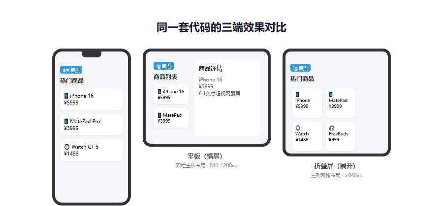
上图展示了同一套自适应代码在手机、平板、折叠屏三种设备上的呈现差异。手机端为单列卡片流,平板端为双栏主从布局,折叠屏展开态为三列网格布局。
4.2 布局代码截图
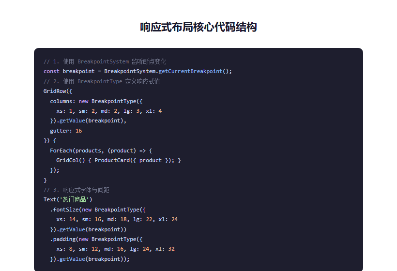
上图展示了实现三端适配的核心代码结构。通过
BreakpointType统一管理字体、间距、网格列数等响应式值,代码简洁且易于维护。
五、响应式最佳实践
5.1 设计原则
| 原则 | 说明 |
|---|---|
| 移动优先 | 先设计手机布局,再向大屏扩展 |
| 内容优先 | 根据内容多少决定布局,而非设备类型 |
| 触摸友好 | 所有可交互元素最小 44×44 vp |
| 间距弹性 | 使用比例间距而非固定像素 |
5.2 常见适配模式
// 模式一:侧边栏折叠(平板/折叠屏显示侧边栏,手机隐藏)
@Builder
private SidebarLayout() {
  Row() {
    if (this.currentBreakpoint === 'lg' || this.currentBreakpoint === 'xl') {
      SideMenu().width(240);
    }
    MainContent().layoutWeight(1);
  }
}

// 模式二:底部导航 → 侧边导航
@Builder
private NavigationLayout() {
  if (['xs', 'sm'].includes(this.currentBreakpoint)) {
    Column() {
      MainContent().layoutWeight(1);
      BottomNav().height(56);
    }
  } else {
    Row() {
      SideNav().width(72);
      MainContent().layoutWeight(1);
    }
  }
}

// 模式三:单列 → 双列 → 三列
@Builder
private GridLayout() {
  GridRow({
    columns: { xs: 1, sm: 1, md: 2, lg: 3, xl: 4 }
  }) {
    ForEach(this.items, (item) => {
      GridCol() { Card({ item }); }
    });
  }
}
5.3 字体与间距响应式
// 封装响应式设计令牌
class DesignTokens {
  static spacing(breakpoint: string): number {
    const map: Record<string, number> = {
      xs: 8, sm: 12, md: 16, lg: 24, xl: 32
    };
    return map[breakpoint] ?? 12;
  }

  static fontSize(breakpoint: string, base: number): number {
    const multipliers: Record<string, number> = {
      xs: 0.875, sm: 1, md: 1.0625, lg: 1.125, xl: 1.25
    };
    return base * (multipliers[breakpoint] ?? 1);
  }

  static cornerRadius(breakpoint: string): number {
    return ['xs', 'sm'].includes(breakpoint) ? 8 : 12;
  }
}
六、折叠屏专项适配
6.1 折叠状态监听
import { display } from '@kit.ArkUI';

@Entry
@Component
struct FoldAwarePage {
  @State isFolded: boolean = true;
  @State hingeBounds: Rect = { left: 0, top: 0, right: 0, bottom: 0 };

  aboutToAppear(): void {
    // 监听折叠状态
    display.on('foldStatusChange', (data) => {
      this.isFolded = (data.foldStatus === display.FoldStatus.FOLD_STATUS_FOLDED);
    });

    // 获取折痕区域(避免在折痕处放置重要内容)
    const foldInfo = display.getFoldInfo();
    this.hingeBounds = foldInfo.hingeBounds ?? { left: 0, top: 0, right: 0, bottom: 0 };
  }

  build() {
    Stack() {
      if (this.isFolded) {
        PhoneLayout();
      } else {
        TabletLayout();
      }

      // 折痕区域提示线(调试用,发布时移除)
      if (!this.isFolded) {
        Column()
          .width('100%')
          .height(2)
          .backgroundColor('rgba(255,0,0,0.3)')
          .position({
            x: 0,
            y: px2vp(this.hingeBounds.top)
          });
      }
    }
    .width('100%')
    .height('100%');
  }
}
6.2 悬停模式(Flex Mode)
折叠屏半开时的悬停模式需要特殊处理:
@Builder
private FlexModeLayout() {
  Column() {
    // 上屏区域
    Column() {
      VideoPlayer().aspectRatio(16 / 9);
    }
    .layoutWeight(1)
    .padding(16);

    // 折痕区域留白,不放置内容
    Blank()
      .height(px2vp(this.hingeBounds.bottom - this.hingeBounds.top));

    // 下屏区域
    Column() {
      Text('评论区')
        .fontSize(16)
        .fontWeight(FontWeight.Bold)
        .margin({ bottom: 12 });
      CommentList();
    }
    .layoutWeight(1)
    .padding(16);
  }
  .width('100%')
  .height('100%');
}
七、性能优化
7.1 避免频繁重排
// 不好:每次断点变化都重建整个布局
@State breakpoint: string = 'sm';

// 好:使用条件渲染减少重排
build() {
  Column() {
    // 公共头部
    Header();

    // 根据断点选择布局容器
    if (this.isSmallScreen) {
      SmallScreenLayout();
    } else {
      LargeScreenLayout();
    }
  }
}
7.2 图片自适应
Image($r('app.media.banner'))
  .width('100%')
  .aspectRatio(this.currentBreakpoint === 'sm' ? 16 / 9 : 21 / 9)
  .objectFit(ImageFit.Cover);
八、总结
HarmonyOS 6.1 的自适应布局框架让"一码多端"从口号变为现实。通过五档断点系统、响应式组件和折叠屏专用 API,开发者可以用一套代码覆盖手机、平板、折叠屏等多类设备。
核心要点回顾:
- 使用
BreakpointSystem替代手动的媒体查询,代码更简洁; - 用
BreakpointType统一管理响应式值(字体、间距、列数); -
GridRow/GridCol是实现响应式网格的最佳选择; - 折叠屏使用
FoldSplit和FoldingFeature做专项适配; - 悬停模式下,折痕区域留白,不放置可交互内容;
- 采用"移动优先"设计策略,从小屏向大屏扩展;
- 所有触摸目标不小于 44×44 vp,确保多设备可点击。
自适应布局不是简单的"缩放",而是根据不同设备的物理特性(尺寸、比例、交互距离)重新组织信息的呈现方式。掌握 HarmonyOS 6.1 的自适应布局框架,意味着你的应用可以无缝融入用户的任何鸿蒙设备。
转载自:https://blog.csdn.net/u014727709/article/details/162939500
欢迎 👍点赞✍评论⭐收藏,欢迎指正

作为“人工智能6S店”的官方数字引擎,为AI开发者与企业提供一个覆盖软硬件全栈、一站式门户。
更多推荐
 1
1 0
0- 0


 已为社区贡献70条内容

所有评论(0)