
鸿蒙原生 ArkTS 布局方式之 Transition 组件过渡动画完全指南(API 24)
项目演示
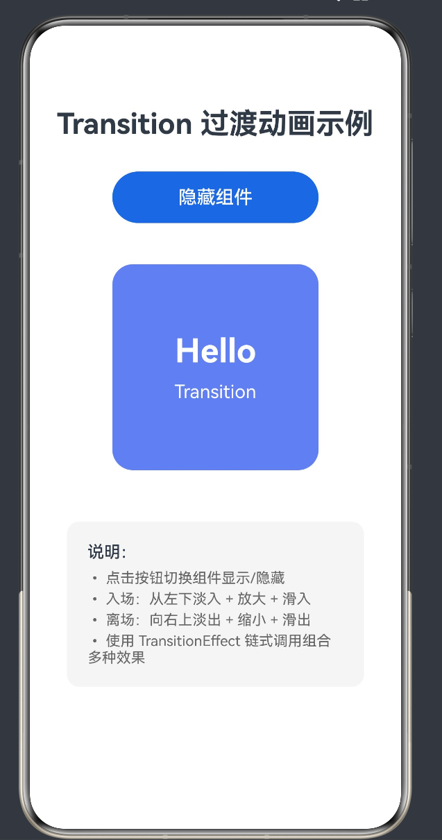
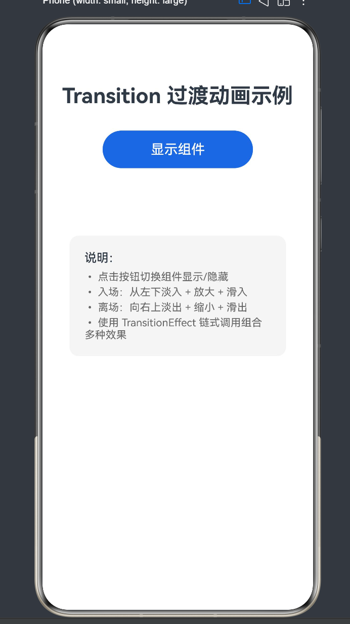
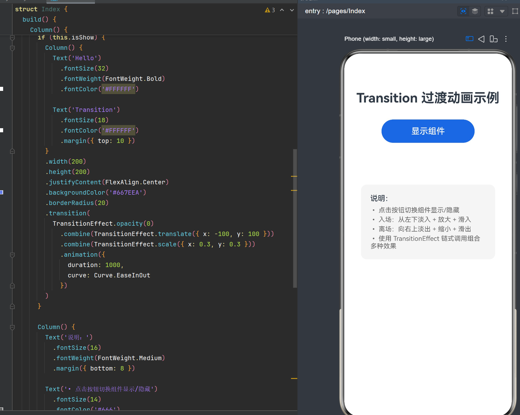
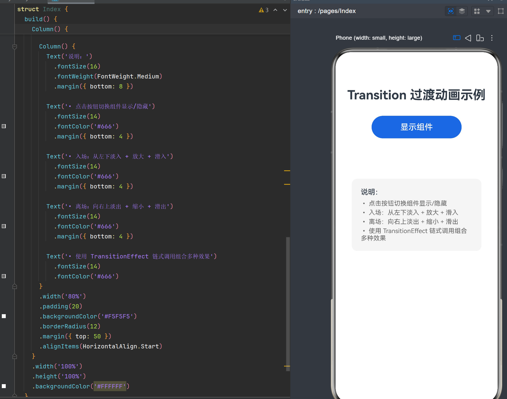
目录
- 前言:为什么需要过渡动画
- Transition 过渡动画核心概念
- API 24 中 TransitionEffect 详解
- 基础过渡效果详解
- 组合过渡效果实战
- 入场与离场动画的分别控制
- 动画曲线与缓动函数
- 列表场景的交错过渡动画
- 复杂布局中的过渡动画设计
- 性能优化与最佳实践
- 常见问题与解决方案
- 完整实战项目示例
- 总结与展望
前言:为什么需要过渡动画
在移动应用开发中,用户体验(UX)已经成为衡量应用质量的核心指标之一。一个优秀的应用不仅需要功能完善、性能稳定,更需要在视觉层面给用户带来愉悦的感受。过渡动画作为提升用户体验的重要手段,在鸿蒙应用开发中占据着举足轻重的地位。
1.1 过渡动画的价值
过渡动画不仅仅是"让界面动起来这么简单,它承载着多重价值:
第一,引导用户注意力。当界面状态发生变化时,适当的过渡动画能够自然地引导用户的视线,让用户清晰地感知到界面元素的变化过程,而不是突兀的出现或消失。例如,当一个新的组件从底部滑入时,用户的目光会自然地跟随动画轨迹移动,从而注意到新出现的内容。
第二,增强空间层次感。通过位移、缩放、透明度等动画效果,可以在二维屏幕上营造出三维空间感。组件的淡入淡出、缩放变化能够让用户直观地感受到元素之间的层级关系,理解哪个元素在前景、哪个元素在背景。
第三,提升操作反馈。用户的每一次操作都应该得到及时的视觉反馈。过渡动画可以作为操作反馈的一种形式,告诉用户"你的操作已经生效了"。比如点击按钮后,相关内容以动画形式展开,用户就能明确知道自己的点击产生了效果。
第四,塑造品牌调性。动画风格是应用品牌形象的一部分。轻快活泼的动画给人年轻时尚的感觉,稳重优雅的动画则传递出专业可靠的印象。通过统一的动画设计语言,可以强化应用的品牌辨识度。
1.2 鸿蒙系统中的动画体系
HarmonyOS NEXT(API 24)提供了完善的动画体系,大致可以分为以下几类:
- 组件过渡动画(Transition):组件插入/删除时的过渡效果,本文重点讨论
- 属性动画(animateTo):组件属性变化时的动画过渡
- 显式动画:通过 animation 属性直接绑定动画
- 页面转场动画:页面之间切换时的过渡效果
- 手势动画:跟随手势操作的实时动画
其中,transition 过渡动画专门用于处理组件的"出现"和"消失"场景,是 ArkUI 声明式开发范式中非常重要的动画能力。
1.3 本文的内容安排
本文将从基础概念入手,循序渐进地讲解 HarmonyOS NEXT API 24 中 transition 过渡动画的使用方法。全文包含大量可运行的代码示例,每个示例都配有详细的注释和效果说明。无论你是刚接触鸿蒙开发的新手,还是希望深入了解过渡动画的进阶开发者,都能从本文中获得有价值的内容。
Transition 过渡动画核心概念
2.1 什么是 Transition 过渡动画
Transition 过渡动画是 ArkUI 框架提供的一种组件级动画能力,用于描述组件在插入(Insert)和删除(Delete)时的动画效果。简单来说,就是当一个组件从无到有出现时,或者从有到无消失时,应该以什么样的动画方式呈现。
与属性动画不同,transition 动画的触发条件是组件的构建/销毁,而不是属性值的变化。这意味着 transition 必须配合条件渲染(if/else)使用。
2.2 核心要素:条件渲染
在 ArkUI 的声明式开发范式中,组件的显示与隐藏通常通过 if/else 条件渲染来控制。当条件为 true 时,组件被构建并插入到组件树中;当条件变为 false 时,组件从组件树中移除。
@State isShow: boolean = true

build() {
  Column() {
    if (this.isShow) {
      // 当 isShow 为 true 时,这个 Text 组件才会存在
      Text('Hello Transition')
        .fontSize(24)
    }

    Button('切换显示')
      .onClick(() => {
        this.isShow = !this.isShow
      })
  }
}
在上面的代码中,当点击按钮切换 isShow 的值时,Text 组件会直接出现或消失,没有任何过渡效果,视觉上会比较突兀。而 transition 动画的作用,就是让这个出现和消失的过程变得平滑自然。
2.3 API 24 的重大变化
在早期版本的 ArkUI 中,transition 的配置方式是通过传入一个配置对象:
// 旧版写法(API 12 及更早,已不推荐)
.transition({
  type: TransitionType.Insert,
  opacity: 0,
  translate: { x: 100 },
  animation: {
    duration: 500,
    curve: Curve.EaseInOut
  }
})
而在 HarmonyOS NEXT API 24 中,transition API 进行了重要升级,采用了 TransitionEffect 链式调用的方式:
// 新版写法(API 24,推荐)
.transition(
  TransitionEffect.opacity(0)
    .combine(TransitionEffect.translate({ x: 100 }))
    .animation({
      duration: 500,
      curve: Curve.EaseInOut
    })
)
这种新的 API 设计具有以下优势:
- 类型安全更强:通过方法链的方式,每一步都有明确的类型定义
- 组合更灵活:使用
combine方法可以清晰地组合多种效果 - 可读性更好:链式调用的代码结构更符合声明式 UI 的风格
- 扩展更方便:新增效果时只需添加新的方法,不破坏现有结构
本文所有示例均基于 API 24 的 TransitionEffect 新 API 编写。
2.4 过渡动画的生命周期
理解 transition 动画的生命周期对于正确使用它至关重要。一个完整的过渡动画生命周期包括以下几个阶段:
插入动画(Insert):
- 状态变化:条件从
false变为true - 初始状态:组件以 TransitionEffect 定义的初始状态开始(如透明度为 0、偏移一定距离)
- 动画执行:组件从初始状态平滑过渡到正常状态
- 动画结束:组件完全显示,处于正常渲染状态
删除动画(Delete):
- 状态变化:条件从
true变为false - 动画执行:组件从正常状态平滑过渡到 TransitionEffect 定义的结束状态
- 动画结束:组件完全消失,从组件树中移除
需要注意的是,在删除动画执行期间,虽然组件正在消失,但它仍然占据着布局空间,直到动画完全结束才会被真正移除。
API 24 中 TransitionEffect 详解
3.1 TransitionEffect 类概述
TransitionEffect 是 API 24 中新增的核心类,用于创建和组合过渡动画效果。它提供了一系列静态方法用于创建基础过渡效果,并通过实例方法进行组合和配置。
TransitionEffect 的设计遵循了链式调用和函数式组合的思想,每个方法都返回一个新的 TransitionEffect 实例,使得代码可以流畅地链式书写。
3.2 基础过渡效果的静态方法
TransitionEffect 提供了以下静态方法用于创建基础过渡效果:
| 方法 | 说明 | 参数 |
|---|---|---|
opacity(opacity: number) |
透明度过渡效果 | 目标透明度值(0~1) |
translate(translate: TranslateOptions) |
位移动画效果 | 位移配置对象 {x?, y?, z?} |
scale(scale: ScaleOptions) |
缩放动画效果 | 缩放配置对象 {x?, y?, z?, centerX?, centerY?} |
rotate(rotate: RotateOptions) |
旋转动画效果 | 旋转配置对象 {angle?, x?, y?, z?, centerX?, centerY?} |
move(edge: TransitionEdge) |
边缘移入/移出效果 | 边缘方向枚举值 |
下面我们逐一详细讲解每个方法。
3.3 opacity - 透明度过渡
opacity 是最常用的过渡效果之一,用于实现淡入淡出效果。
方法签名:
static opacity(opacity: number): TransitionEffect
参数说明:
opacity:目标透明度值,取值范围 0~1。0表示完全透明(不可见)1表示完全不透明(正常显示)- 中间值表示半透明状态
使用示例:
@Entry
@Component
struct OpacityDemo {
  @State isShow: boolean = true

  build() {
    Column() {
      Button('切换显示')
        .onClick(() => {
          this.isShow = !this.isShow
        })
        .margin({ bottom: 30 })

      if (this.isShow) {
        Text('淡入淡出效果')
          .fontSize(24)
          .fontColor('#FFFFFF')
          .padding(20)
          .backgroundColor('#36D')
          .borderRadius(12)
          .transition(
            TransitionEffect.opacity(0)
              .animation({ duration: 1000 })
          )
      }
    }
    .width('100%')
    .height('100%')
    .justifyContent(FlexAlign.Center)
  }
}
效果说明:
- 当组件出现时(Insert):从透明度 0 逐渐变为透明度 1(淡入)
- 当组件消失时(Delete):从透明度 1 逐渐变为透明度 0(淡出)
可以看到,opacity(0) 定义的是过渡的"初始状态"(对于插入)或"结束状态"(对于删除),而正常状态(opacity: 1)是动画的另一端。
3.4 translate - 位移动画
translate 用于实现组件的位移过渡效果,即组件从某个位置滑动进入/滑出。
方法签名:
static translate(translate: TranslateOptions): TransitionEffect
TranslateOptions 接口:
interface TranslateOptions {
  x?: number | string;  // X 轴位移量,单位 vp
  y?: number | string;  // Y 轴位移量,单位 vp
  z?: number | string;  // Z 轴位移量,单位 vp
}
位移方向说明:
x > 0:向右偏移x < 0:向左偏移y > 0:向下偏移y < 0:向上偏移
使用示例 - 从左侧滑入:
@Entry
@Component
struct TranslateDemo {
  @State isShow: boolean = true

  build() {
    Column() {
      Button('从左侧滑入/滑出')
        .onClick(() => {
          this.isShow = !this.isShow
        })
        .margin({ bottom: 30 })

      if (this.isShow) {
        Text('从左侧滑入')
          .fontSize(20)
          .fontColor('#FFFFFF')
          .padding({ left: 30, right: 30, top: 15, bottom: 15 })
          .backgroundColor('#4CAF50')
          .borderRadius(8)
          .transition(
            TransitionEffect.translate({ x: -150 })
              .animation({
                duration: 600,
                curve: Curve.EaseOut
              })
          )
      }
    }
    .width('100%')
    .height('100%')
    .justifyContent(FlexAlign.Center)
  }
}
效果说明:
- 入场:从左侧 150vp 外的位置向右滑动到正常位置
- 离场:从正常位置向左滑动 150vp 后消失
3.5 scale - 缩放动画
scale 用于实现组件的缩放过渡效果,可以让组件从小到大放大出现,或从大到小缩小消失。
方法签名:
static scale(scale: ScaleOptions): TransitionEffect
ScaleOptions 接口:
interface ScaleOptions {
  x?: number;           // X 轴缩放比例
  y?: number;           // Y 轴缩放比例
  z?: number;           // Z 轴缩放比例(3D)
  centerX?: number;     // 缩放中心点 X 坐标
  centerY?: number;     // 缩放中心点 Y 坐标
}
缩放比例说明:
1表示原始大小0表示缩小到看不见>1表示放大<1表示缩小
使用示例 - 从中心放大:
@Entry
@Component
struct ScaleDemo {
  @State isShow: boolean = true

  build() {
    Column() {
      Button('缩放效果')
        .onClick(() => {
          this.isShow = !this.isShow
        })
        .margin({ bottom: 30 })

      if (this.isShow) {
        Column() {
          Text('缩放')
            .fontSize(24)
            .fontWeight(FontWeight.Bold)
            .fontColor('#FFFFFF')
        }
        .width(150)
        .height(150)
        .justifyContent(FlexAlign.Center)
        .backgroundColor('#FF6B6B')
        .borderRadius(75)
        .transition(
          TransitionEffect.scale({ x: 0, y: 0 })
            .animation({
              duration: 800,
              curve: Curve.EaseOutBack
            })
        )
      }
    }
    .width('100%')
    .height('100%')
    .justifyContent(FlexAlign.Center)
  }
}
效果说明:
- 入场:从缩放比例 0(中心点)放大到原始大小,带有弹性效果
- 离场:从原始大小缩小到 0 后消失
3.6 rotate - 旋转动画
rotate 用于实现组件的旋转过渡效果。
方法签名:
static rotate(rotate: RotateOptions): TransitionEffect
RotateOptions 接口:
interface RotateOptions {
  angle?: number | string;  // 旋转角度,单位度
  x?: number;               // 旋转轴 X 分量
  y?: number;               // 旋转轴 Y 分量
  z?: number;               // 旋转轴 Z 分量
  centerX?: number | string; // 旋转中心 X 坐标
  centerY?: number | string; // 旋转中心 Y 坐标
}
使用示例 - 旋转入场:
@Entry
@Component
struct RotateDemo {
  @State isShow: boolean = true

  build() {
    Column() {
      Button('旋转效果')
        .onClick(() => {
          this.isShow = !this.isShow
        })
        .margin({ bottom: 30 })

      if (this.isShow) {
        Text('旋转出现')
          .fontSize(24)
          .fontColor('#FFFFFF')
          .padding(20)
          .backgroundColor('#9C27B0')
          .borderRadius(12)
          .transition(
            TransitionEffect.rotate({ angle: 180 })
              .animation({
                duration: 800,
                curve: Curve.EaseInOut
              })
          )
      }
    }
    .width('100%')
    .height('100%')
    .justifyContent(FlexAlign.Center)
  }
}
效果说明:
- 入场:旋转 180 度后恢复正常角度
- 离场:从正常角度旋转 180 度后消失
3.7 move - 边缘移入/移出
move 是一个便捷方法,用于实现组件从屏幕边缘滑入/滑出的效果。
方法签名:
static move(edge: TransitionEdge): TransitionEffect
TransitionEdge 枚举:
enum TransitionEdge {
  LEFT,    // 左边缘
  RIGHT,   // 右边缘
  TOP,     // 上边缘
  BOTTOM,  // 下边缘
}
使用示例 - 从底部滑入:
@Entry
@Component
struct MoveDemo {
  @State isShow: boolean = true

  build() {
    Column() {
      Button('底部滑入')
        .onClick(() => {
          this.isShow = !this.isShow
        })
        .margin({ bottom: 30 })

      if (this.isShow) {
        Text('从底部滑入')
          .fontSize(20)
          .fontColor('#FFFFFF')
          .padding(20)
          .backgroundColor('#FF9800')
          .borderRadius(12)
          .transition(
            TransitionEffect.move(TransitionEdge.BOTTOM)
              .animation({
                duration: 500,
                curve: Curve.Bounce
              })
          )
      }
    }
    .width('100%')
    .height('100%')
    .justifyContent(FlexAlign.Center)
  }
}
效果说明:
- 入场:从屏幕底部边缘滑入,带有弹跳效果
- 离场:向屏幕底部边缘滑出
3.8 combine - 组合多种效果
combine 是 TransitionEffect 最重要的实例方法之一,用于将多种过渡效果组合在一起,实现更丰富的动画效果。
方法签名:
combine(other: TransitionEffect): TransitionEffect
使用方式:
TransitionEffect.opacity(0)
  .combine(TransitionEffect.translate({ x: -100 }))
  .combine(TransitionEffect.scale({ x: 0.5, y: 0.5 }))
上面的代码将透明度、位移、缩放三种效果组合在了一起,组件会同时进行淡入、从左侧滑入、放大三种动画。
关于组合效果的更多实战内容,我们将在第 5 章详细讲解。
3.9 animation - 配置动画参数
animation 方法用于配置过渡动画的参数,包括时长、曲线、延迟等。
方法签名:
animation(value: AnimateParam): TransitionEffect
AnimateParam 接口:
interface AnimateParam {
  duration?: number;          // 动画时长,单位毫秒,默认 1000ms
  curve?: Curve | string;     // 动画曲线
  delay?: number;             // 动画延迟时间,单位毫秒
  iterations?: number;        // 动画播放次数
  playMode?: PlayMode;        // 动画播放模式
  tempo?: number;             // 动画播放速率
}
常用配置:
.transition(
  TransitionEffect.opacity(0)
    .animation({
      duration: 500,        // 动画时长 500ms
      curve: Curve.EaseOut, // 缓出曲线
      delay: 100            // 延迟 100ms 开始
    })
)
关于动画曲线的详细内容,我们将在第 7 章专门讲解。
基础过渡效果详解
在第 3 章中,我们简要介绍了各种基础过渡效果。本章将通过更多实际案例,深入讲解每种过渡效果的使用场景和技巧。
4.1 透明度过渡的艺术
透明度过渡是最基础也是最常用的过渡效果。虽然简单,但用好透明度动画能大大提升应用的质感。
4.1.1 不同时长的视觉感受
动画时长对用户体验有显著影响。让我们通过一个对比示例来感受一下:
@Entry
@Component
struct OpacityDurationDemo {
  @State isShow: boolean = true

  build() {
    Column({ space: 20 }) {
      Button('切换所有')
        .onClick(() => {
          this.isShow = !this.isShow
        })

      if (this.isShow) {
        Text('200ms - 快速')
          .fontSize(16)
          .padding(15)
          .backgroundColor('#E3F2FD')
          .borderRadius(8)
          .transition(
            TransitionEffect.opacity(0)
              .animation({ duration: 200 })
          )
      }

      if (this.isShow) {
        Text('500ms - 适中')
          .fontSize(16)
          .padding(15)
          .backgroundColor('#BBDEFB')
          .borderRadius(8)
          .transition(
            TransitionEffect.opacity(0)
              .animation({ duration: 500 })
          )
      }

      if (this.isShow) {
        Text('1000ms - 缓慢')
          .fontSize(16)
          .padding(15)
          .backgroundColor('#90CAF9')
          .borderRadius(8)
          .transition(
            TransitionEffect.opacity(0)
              .animation({ duration: 1000 })
          )
      }

      if (this.isShow) {
        Text('2000ms - 很慢')
          .fontSize(16)
          .padding(15)
          .backgroundColor('#64B5F6')
          .borderRadius(8)
          .transition(
            TransitionEffect.opacity(0)
              .animation({ duration: 2000 })
          )
      }
    }
    .width('100%')
    .padding(30)
  }
}
时长选择建议:
- 200ms 以内:非常快速,适用于频繁操作的小元素,给人灵敏的感觉
- 300ms ~ 500ms:最常用的范围,大多数 UI 元素的过渡都适合这个时长
- 500ms ~ 1000ms:稍慢,适用于重要内容的出现,给人郑重的感觉
- 1000ms 以上:很慢,通常用于特殊的仪式感动画或引导场景
4.1.2 透明度与层次感
在实际项目中,我们经常需要处理多层元素的显示和隐藏。通过给不同层级的元素设置不同的透明度和动画时长,可以营造出丰富的空间层次感。
@Entry
@Component
struct OpacityLayerDemo {
  @State isShow: boolean = false

  build() {
    Stack() {
      // 背景遮罩层
      if (this.isShow) {
        Column()
          .width('100%')
          .height('100%')
          .backgroundColor('rgba(0, 0, 0, 0.5)')
          .transition(
            TransitionEffect.opacity(0)
              .animation({ duration: 300 })
          )
      }

      // 内容卡片
      if (this.isShow) {
        Column() {
          Text('弹窗标题')
            .fontSize(20)
            .fontWeight(FontWeight.Bold)
            .margin({ bottom: 15 })

          Text('这是弹窗内容,背景遮罩先出现,内容后出现,形成层次感。')
            .fontSize(14)
            .fontColor('#666')

          Button('关闭')
            .margin({ top: 20 })
            .onClick(() => {
              this.isShow = false
            })
        }
        .width(300)
        .padding(25)
        .backgroundColor('#FFFFFF')
        .borderRadius(16)
        .transition(
          TransitionEffect.opacity(0)
            .animation({
              duration: 400,
              delay: 100  // 延迟 100ms,等遮罩出现一半再出现
            })
        )
      }

      // 打开按钮
      Button('打开弹窗')
        .onClick(() => {
          this.isShow = true
        })
    }
    .width('100%')
    .height('100%')
  }
}
设计要点:
- 背景遮罩的动画快一些(300ms),先出现
- 内容卡片的动画稍慢(400ms),并且延迟 100ms 开始
- 这样的时间差能让用户感受到"先变暗,再弹出内容"的层次
4.2 位移动画的方向性
位移动画是表达"从哪来、到哪去"的最佳方式。不同的滑动方向传递着不同的语义。
4.2.1 各方向位移的语义
| 滑动方向 | 语义含义 | 适用场景 |
|---|---|---|
| 从左往右 | 返回、前进 | 侧滑菜单、返回上一级 |
| 从右往左 | 进入新页面 | 详情页、新功能入口 |
| 从上往下 | 下拉、展开 | 下拉菜单、通知面板 |
| 从下往上 | 上推、弹出 | 底部弹窗、操作面板 |
| 从中心向外 | 展开、放大 | 菜单展开、详情展开 |
4.2.2 底部滑入面板实战
底部滑入面板(Bottom Sheet)是移动端非常常见的交互模式。让我们用 transition 来实现一个:
@Entry
@Component
struct BottomSheetDemo {
  @State isShow: boolean = false

  build() {
    Stack() {
      Column() {
        Text('主内容区域')
          .fontSize(24)
          .margin({ bottom: 30 })

        Button('打开底部面板')
          .onClick(() => {
            this.isShow = true
          })
      }
      .width('100%')
      .height('100%')
      .justifyContent(FlexAlign.Center)

      // 遮罩层
      if (this.isShow) {
        Column()
          .width('100%')
          .height('100%')
          .backgroundColor('rgba(0, 0, 0, 0.4)')
          .onClick(() => {
            this.isShow = false
          })
          .transition(
            TransitionEffect.opacity(0)
              .animation({ duration: 300 })
          )
      }

      // 底部面板
      if (this.isShow) {
        Column() {
          // 顶部拖拽条
          Row()
            .width(40)
            .height(4)
            .backgroundColor('#DDD')
            .borderRadius(2)
            .margin({ top: 12, bottom: 16 })

          Text('底部操作面板')
            .fontSize(18)
            .fontWeight(FontWeight.Medium)
            .margin({ bottom: 20 })

          // 操作项列表
          ForEach(['选项一', '选项二', '选项三', '选项四'], (item: string) => {
            Row() {
              Text(item)
                .fontSize(16)
                .layoutWeight(1)

              Text('>')
                .fontColor('#CCC')
            }
            .width('100%')
            .height(50)
            .padding({ left: 20, right: 20 })
            .borderRadius(8)
            .onClick(() => {
              this.isShow = false
            })
          })

          Button('取消')
            .width('90%')
            .height(44)
            .backgroundColor('#F5F5F5')
            .fontColor('#333')
            .margin({ top: 20, bottom: 20 })
            .onClick(() => {
              this.isShow = false
            })
        }
        .width('100%')
        .backgroundColor('#FFFFFF')
        .borderRadius({ topLeft: 20, topRight: 20 })
        .position({ left: 0, bottom: 0 })
        .transition(
          TransitionEffect.translate({ y: 400 })
            .animation({
              duration: 400,
              curve: Curve.EaseOut
            })
        )
      }
    }
    .width('100%')
    .height('100%')
  }
}
实现要点:
- 使用
Stack布局,底部面板通过position固定在底部 - 遮罩层使用透明度过渡,先于面板出现
- 面板使用
translate({ y: 400 })从下方 400vp 处滑入 - 使用
Curve.EaseOut曲线,让动画开始快结束慢,符合物理直觉
4.3 缩放动画的视觉张力
缩放动画具有很强的视觉冲击力,适用于强调重要元素或营造活泼的氛围。
4.3.1 不同缩放比例的效果
@Entry
@Component
struct ScaleVariantsDemo {
  @State isShow: boolean = true

  build() {
    Column({ space: 20 }) {
      Button('切换显示')
        .onClick(() => {
          this.isShow = !this.isShow
        })
        .margin({ bottom: 20 })

      Row({ space: 15 }) {
        if (this.isShow) {
          Column() {
            Text('0.5倍')
              .fontSize(12)
              .fontColor('#FFF')
          }
          .width(70)
          .height(70)
          .justifyContent(FlexAlign.Center)
          .backgroundColor('#FF6B6B')
          .borderRadius(8)
          .transition(
            TransitionEffect.scale({ x: 0.5, y: 0.5 })
              .animation({ duration: 500 })
          )
        }

        if (this.isShow) {
          Column() {
            Text('0倍')
              .fontSize(12)
              .fontColor('#FFF')
          }
          .width(70)
          .height(70)
          .justifyContent(FlexAlign.Center)
          .backgroundColor('#4ECDC4')
          .borderRadius(8)
          .transition(
            TransitionEffect.scale({ x: 0, y: 0 })
              .animation({ duration: 500 })
          )
        }

        if (this.isShow) {
          Column() {
            Text('1.5倍')
              .fontSize(12)
              .fontColor('#FFF')
          }
          .width(70)
          .height(70)
          .justifyContent(FlexAlign.Center)
          .backgroundColor('#FFA726')
          .borderRadius(8)
          .transition(
            TransitionEffect.scale({ x: 1.5, y: 1.5 })
              .animation({ duration: 500 })
          )
        }
      }
    }
    .width('100%')
    .padding(30)
    .justifyContent(FlexAlign.Center)
  }
}
效果说明:
0.5倍:从一半大小放大到正常大小,感觉比较柔和0倍:从无到有放大,视觉冲击力最强1.5倍:从 1.5 倍缩小到正常大小,有"弹回来"的感觉
4.3.2 缩放中心点的影响
默认情况下,缩放是以组件的中心点为基准的。但我们可以通过 centerX 和 centerY 来改变缩放的中心点,从而实现不同的效果。
@Entry
@Component
struct ScaleCenterDemo {
  @State isShow: boolean = true

  build() {
    Column({ space: 20 }) {
      Button('切换显示')
        .onClick(() => {
          this.isShow = !this.isShow
        })
        .margin({ bottom: 20 })

      Row({ space: 15 }) {
        if (this.isShow) {
          Column() {
            Text('左上角')
              .fontSize(11)
              .fontColor('#FFF')
          }
          .width(80)
          .height(80)
          .justifyContent(FlexAlign.Center)
          .backgroundColor('#E91E63')
          .borderRadius(8)
          .transition(
            TransitionEffect.scale({
              x: 0,
              y: 0,
              centerX: 0,
              centerY: 0
            })
            .animation({ duration: 600 })
          )
        }

        if (this.isShow) {
          Column() {
            Text('中心点')
              .fontSize(11)
              .fontColor('#FFF')
          }
          .width(80)
          .height(80)
          .justifyContent(FlexAlign.Center)
          .backgroundColor('#9C27B0')
          .borderRadius(8)
          .transition(
            TransitionEffect.scale({
              x: 0,
              y: 0
            })
            .animation({ duration: 600 })
          )
        }

        if (this.isShow) {
          Column() {
            Text('右下角')
              .fontSize(11)
              .fontColor('#FFF')
          }
          .width(80)
          .height(80)
          .justifyContent(FlexAlign.Center)
          .backgroundColor('#3F51B5')
          .borderRadius(8)
          .transition(
            TransitionEffect.scale({
              x: 0,
              y: 0,
              centerX: 80,
              centerY: 80
            })
            .animation({ duration: 600 })
          )
        }
      }
    }
    .width('100%')
    .padding(30)
    .justifyContent(FlexAlign.Center)
  }
}
4.4 旋转动画的巧思
旋转动画在合适的场景下能带来意想不到的惊喜效果。
4.4.1 翻转卡片效果
@Entry
@Component
struct FlipCardDemo {
  @State isFront: boolean = true

  build() {
    Column() {
      Stack() {
        if (this.isFront) {
          Column() {
            Text('正面')
              .fontSize(32)
              .fontWeight(FontWeight.Bold)
              .fontColor('#FFF')
          }
          .width(200)
          .height(280)
          .justifyContent(FlexAlign.Center)
          .backgroundColor('#FF6B6B')
          .borderRadius(16)
          .transition(
            TransitionEffect.rotate({
              angle: 180,
              y: 1  // 绕 Y 轴旋转
            })
            .animation({
              duration: 800,
              curve: Curve.EaseInOut
            })
          )
        }

        if (!this.isFront) {
          Column() {
            Text('背面')
              .fontSize(32)
              .fontWeight(FontWeight.Bold)
              .fontColor('#FFF')
          }
          .width(200)
          .height(280)
          .justifyContent(FlexAlign.Center)
          .backgroundColor('#4ECDC4')
          .borderRadius(16)
          .transition(
            TransitionEffect.rotate({
              angle: -180,
              y: 1
            })
            .animation({
              duration: 800,
              curve: Curve.EaseInOut
            })
          )
        }
      }
      .width(200)
      .height(280)
      .margin({ bottom: 30 })

      Button('翻转卡片')
        .onClick(() => {
          this.isFront = !this.isFront
        })
    }
    .width('100%')
    .height('100%')
    .justifyContent(FlexAlign.Center)
  }
}
组合过渡效果实战
单一的过渡效果往往难以满足复杂的设计需求,而通过 combine 方法组合多种效果,可以创造出丰富多样的过渡动画。
5.1 组合效果的基本原理
combine 方法的作用是将两个 TransitionEffect 组合在一起,让它们同时生效。组合后的效果是各个效果的叠加。
效果A + 效果B = 同时执行 A 和 B
例如:
opacity(0)+translate({x: -100})= 一边淡入一边从左侧滑入scale(0)+rotate({angle: 180})= 一边放大一边旋转opacity(0)+scale(0)+translate({y: 50})= 淡入 + 放大 + 上滑
5.2 经典组合效果一:淡入 + 上移
这是最常见的组合效果之一,元素在淡入的同时向上移动一小段距离,给人"浮现"的感觉。
@Entry
@Component
struct FadeInUpDemo {
  @State isShow: boolean = true

  build() {
    Column() {
      Button('切换效果')
        .onClick(() => {
          this.isShow = !this.isShow
        })
        .margin({ bottom: 40 })

      if (this.isShow) {
        Column() {
          Text('淡入上移')
            .fontSize(24)
            .fontWeight(FontWeight.Bold)
            .fontColor('#FFF')

          Text('Fade In Up')
            .fontSize(14)
            .fontColor('#FFF')
            .margin({ top: 8 })
        }
        .width(200)
        .height(150)
        .justifyContent(FlexAlign.Center)
        .backgroundColor('#667EEA')
        .borderRadius(16)
        .transition(
          TransitionEffect.opacity(0)
            .combine(TransitionEffect.translate({ y: 30 }))
            .animation({
              duration: 600,
              curve: Curve.EaseOut
            })
        )
      }
    }
    .width('100%')
    .height('100%')
    .justifyContent(FlexAlign.Center)
  }
}
设计要点:
- 透明度从 0 到 1,同时 Y 轴位移从 30 到 0
- 使用
EaseOut曲线,开始快结束慢,显得轻盈 - 位移量不宜过大,30vp 左右的轻微移动最优雅
5.3 经典组合效果二:缩放 + 弹性
给缩放动画加上弹性曲线,可以营造出活泼俏皮的感觉,非常适合用于互动性强的场景。
@Entry
@Component
struct BounceScaleDemo {
  @State isShow: boolean = true

  build() {
    Column() {
      Button('弹出效果')
        .onClick(() => {
          this.isShow = !this.isShow
        })
        .margin({ bottom: 40 })

      if (this.isShow) {
        Column() {
          Text('🎉')
            .fontSize(60)

          Text('恭喜你!')
            .fontSize(24)
            .fontWeight(FontWeight.Bold)
            .fontColor('#333')
            .margin({ top: 10 })

          Text('操作成功完成')
            .fontSize(14)
            .fontColor('#666')
            .margin({ top: 6 })
        }
        .width(250)
        .padding(30)
        .backgroundColor('#FFF')
        .borderRadius(20)
        .shadow({
          radius: 20,
          color: '#40000000',
          offsetY: 10
        })
        .transition(
          TransitionEffect.opacity(0)
            .combine(TransitionEffect.scale({ x: 0.5, y: 0.5 }))
            .animation({
              duration: 800,
              curve: Curve.EaseOutBack  // 弹性曲线
            })
        )
      }
    }
    .width('100%')
    .height('100%')
    .justifyContent(FlexAlign.Center)
    .backgroundColor('#F5F5F5')
  }
}
效果说明:
- 使用
EaseOutBack曲线,动画会先超过目标值再弹回来 - 配合缩放效果,就像一个气球被吹起来然后微微回弹
- 适用于成功提示、奖励发放等正向反馈场景
5.4 经典组合效果三:滑动 + 透明度 + 缩放
三种效果组合在一起,可以营造出更有空间感的过渡效果。
@Entry
@Component
struct SlideScaleFadeDemo {
  @State isShow: boolean = true

  build() {
    Column() {
      Button('组合效果')
        .onClick(() => {
          this.isShow = !this.isShow
        })
        .margin({ bottom: 40 })

      if (this.isShow) {
        Column() {
          Text('组合效果')
            .fontSize(28)
            .fontWeight(FontWeight.Bold)
            .fontColor('#FFF')

          Text('Slide + Scale + Opacity')
            .fontSize(14)
            .fontColor('#FFF')
            .opacity(0.8)
            .margin({ top: 8 })
        }
        .width(260)
        .height(180)
        .justifyContent(FlexAlign.Center)
        .backgroundColor('#4ECDC4')
        .borderRadius(20)
        .transition(
          TransitionEffect.opacity(0)
            .combine(TransitionEffect.translate({ x: -120, y: 60 }))
            .combine(TransitionEffect.scale({ x: 0.4, y: 0.4 }))
            .animation({
              duration: 900,
              curve: Curve.EaseInOut
            })
        )
      }
    }
    .width('100%')
    .height('100%')
    .justifyContent(FlexAlign.Center)
    .backgroundColor('#F0F2F5')
  }
}
效果分析:
- 入场:从左下方(-120, 60)的位置,以 0.4 倍大小、完全透明的状态,滑入到中心位置,同时放大到 1 倍、渐变为完全不透明
- 三种效果同时进行,营造出元素从远处"飞"过来的空间感
5.5 组合效果的设计原则
在设计组合过渡效果时,有几个原则需要遵循:
第一,简洁性原则。不要为了炫技而堆砌效果。一个好的过渡动画应该自然流畅,用户甚至感觉不到它的存在,但又会潜意识地觉得"这个应用很流畅"。通常组合 2-3 种效果就足够了。
第二,一致性原则。同一个应用内的过渡动画风格应该保持一致。如果页面 A 用的是淡入上移,页面 B 就不应该突然来个旋转缩放。统一的动画语言能提升应用的专业感。
第三,目的性原则。每一个动画效果都应该有它的目的。透明度用于表达层级,位移用于表达来源,缩放用于表达重要性。不要使用没有目的的动画。
第四,适度性原则。动画时长要适中,位移距离要合理。太长太慢会让用户觉得拖沓,太短太快又会让人看不清效果。
5.6 多元素组合过渡
在实际开发中,经常需要让多个元素同时进行过渡动画,并且它们之间需要有时间差,形成错落有致的效果。
@Entry
@Component
struct MultiElementDemo {
  @State isShow: boolean = true

  build() {
    Column() {
      Button('显示/隐藏全部')
        .onClick(() => {
          this.isShow = !this.isShow
        })
        .margin({ bottom: 40 })

      if (this.isShow) {
        Text('标题文字')
          .fontSize(28)
          .fontWeight(FontWeight.Bold)
          .fontColor('#333')
          .transition(
            TransitionEffect.opacity(0)
              .combine(TransitionEffect.translate({ y: -20 }))
              .animation({
                duration: 500,
                curve: Curve.EaseOut
              })
          )
      }

      if (this.isShow) {
        Text('这是一段描述文字,用于说明标题的内容。它会比标题晚一点出现。')
          .fontSize(16)
          .fontColor('#666')
          .margin({ top: 16, bottom: 24 })
          .transition(
            TransitionEffect.opacity(0)
              .combine(TransitionEffect.translate({ y: -20 }))
              .animation({
                duration: 500,
                curve: Curve.EaseOut,
                delay: 100  // 延迟 100ms
              })
          )
      }

      if (this.isShow) {
        Row({ space: 12 }) {
          Button('按钮一')
            .layoutWeight(1)
            .transition(
              TransitionEffect.opacity(0)
                .combine(TransitionEffect.translate({ y: 20 }))
                .animation({
                  duration: 500,
                  curve: Curve.EaseOut,
                  delay: 200  // 延迟 200ms
                })
            )

          Button('按钮二')
            .layoutWeight(1)
            .backgroundColor('#FFF')
            .fontColor('#36D')
            .transition(
              TransitionEffect.opacity(0)
                .combine(TransitionEffect.translate({ y: 20 }))
                .animation({
                  duration: 500,
                  curve: Curve.EaseOut,
                  delay: 300  // 延迟 300ms
                })
            )
        }
        .width('100%')
      }
    }
    .width('80%')
    .height('100%')
    .justifyContent(FlexAlign.Center)
  }
}
设计要点:
- 标题先出现(0ms 延迟)
- 描述文字其次(100ms 延迟)
- 两个按钮最后出现(200ms 和 300ms 延迟)
- 所有元素的动画时长和曲线保持一致
- 这样形成了从上到下、依次出现的视觉节奏
入场与离场动画的分别控制
在很多场景下,我们希望组件的入场动画和离场动画是不同的。比如,一个弹窗从底部滑入,但退出时是向右侧滑出。API 24 支持分别设置入场和离场动画。
6.1 为什么需要分别控制
入场和离场动画承担着不同的语义:
- 入场动画:吸引注意力,告知用户新内容的来源
- 离场动画:引导视线离开,告知用户内容去了哪里
让入场和离场使用不同的动画效果,可以让界面交互更加生动有趣。
6.2 分别设置入场和离场的方法
在 API 24 中,可以通过给 transition 传入两个 TransitionEffect 来分别控制入场和离场:
.transition(
  // 入场动画
  TransitionEffect.opacity(0)
    .combine(TransitionEffect.translate({ x: -100 }))
    .animation({ duration: 500 }),
  // 离场动画
  TransitionEffect.opacity(0)
    .combine(TransitionEffect.translate({ x: 100 }))
    .animation({ duration: 300 })
)
或者使用 TransitionEffect 的组合方式,第一个参数是入场,第二个是离场。
6.3 实战案例:左右滑入滑出
@Entry
@Component
struct InOutDifferentDemo {
  @State isShow: boolean = true
  @State currentText: string = '内容 A'

  switchContent() {
    this.isShow = false
    setTimeout(() => {
      this.currentText = this.currentText === '内容 A' ? '内容 B' : '内容 A'
      this.isShow = true
    }, 300)
  }

  build() {
    Column() {
      Button('切换内容')
        .onClick(() => {
          this.switchContent()
        })
        .margin({ bottom: 40 })

      if (this.isShow) {
        Column() {
          Text(this.currentText)
            .fontSize(32)
            .fontWeight(FontWeight.Bold)
            .fontColor('#FFF')
        }
        .width(250)
        .height(180)
        .justifyContent(FlexAlign.Center)
        .backgroundColor('#667EEA')
        .borderRadius(16)
        .transition(
          // 入场:从左侧滑入
          TransitionEffect.opacity(0)
            .combine(TransitionEffect.translate({ x: -150 }))
            .animation({
              duration: 500,
              curve: Curve.EaseOut
            }),
          // 离场:向右侧滑出
          TransitionEffect.opacity(0)
            .combine(TransitionEffect.translate({ x: 150 }))
            .animation({
              duration: 300,
              curve: Curve.EaseIn
            })
        )
      }
    }
    .width('100%')
    .height('100%')
    .justifyContent(FlexAlign.Center)
  }
}
效果说明:
- 入场:从左侧滑入,500ms,慢出曲线(优雅地出现)
- 离场:向右侧滑出,300ms,快入曲线(快速地离开)
- 离场比入场快,符合用户心理:用户已经看过内容了,离开不需要那么慢
6.4 实战案例:卡片展开与收起
@Entry
@Component
struct ExpandCollapseDemo {
  @State isExpanded: boolean = false

  build() {
    Column() {
      Text('卡片展开收起动画')
        .fontSize(24)
        .fontWeight(FontWeight.Bold)
        .margin({ bottom: 30 })

      Column() {
        // 卡片头部(始终显示)
        Row() {
          Text('可展开卡片')
            .fontSize(18)
            .fontWeight(FontWeight.Medium)
            .layoutWeight(1)

          Text(this.isExpanded ? '收起' : '展开')
            .fontSize(14)
            .fontColor('#36D')
        }
        .width('100%')
        .onClick(() => {
          this.isExpanded = !this.isExpanded
        })

        // 展开内容(条件渲染,有过渡动画)
        if (this.isExpanded) {
          Column() {
            Text('这是展开后的详细内容。')
              .fontSize(15)
              .fontColor('#666')
              .width('100%')
              .margin({ top: 12 })

            Text('点击卡片头部可以展开或收起内容。')
              .fontSize(15)
              .fontColor('#666')
              .width('100%')
              .margin({ top: 8 })

            Row({ space: 10 }) {
              Button('操作一')
                .layoutWeight(1)
                .height(36)
                .fontSize(13)

              Button('操作二')
                .layoutWeight(1)
                .height(36)
                .fontSize(13)
                .backgroundColor('#FFF')
                .fontColor('#36D')
            }
            .width('100%')
            .margin({ top: 16 })
          }
          .width('100%')
          .transition(
            // 入场:从上往下展开,同时淡入
            TransitionEffect.opacity(0)
              .combine(TransitionEffect.translate({ y: -20 }))
              .animation({
                duration: 400,
                curve: Curve.EaseOut
              }),
            // 离场:向上收起,同时淡出
            TransitionEffect.opacity(0)
              .combine(TransitionEffect.translate({ y: -20 }))
              .animation({
                duration: 250,
                curve: Curve.EaseIn
              })
          )
        }
      }
      .width('85%')
      .padding(20)
      .backgroundColor('#FFF')
      .borderRadius(16)
      .shadow({
        radius: 10,
        color: '#1A000000',
        offsetY: 2
      })
    }
    .width('100%')
    .height('100%')
    .padding({ top: 50 })
    .backgroundColor('#F5F7FA')
    .alignItems(HorizontalAlign.Center)
  }
}
6.5 入场离场不对称设计的技巧
在设计入场和离场动画时,可以参考以下技巧:
时长不对称:通常入场动画比离场动画慢一些。
- 入场:用户需要看到内容是怎么来的,需要时间感知
- 离场:用户已经看完了,快速离开即可,不要拖沓
推荐比例:入场时长 : 离场时长 ≈ 2 : 1 或 3 : 2
曲线不对称:
- 入场常用
EaseOut(慢出):开始快,结束慢,元素"滑入"并"稳稳停住" - 离场常用
EaseIn(快入):开始慢,结束快,元素"加速离开"
位移不对称:
- 入场位移可以稍大,让用户清楚地感知来源方向
- 离场位移可以稍小,快速消失即可
动画曲线与缓动函数
动画曲线(Animation Curve)决定了动画在执行过程中的速度变化规律。同样的位移和时长,使用不同的曲线会给人完全不同的感受。
7.1 为什么需要动画曲线
如果没有动画曲线(匀速运动),动画会显得非常机械和僵硬。而现实世界中的物体运动都是有加速度变化的:汽车启动时慢慢加速,停车时慢慢减速;球掉地上会弹几下。
好的动画曲线应该模拟真实世界的物理规律,让动画看起来自然、舒服。
7.2 Curve 枚举值详解
ArkUI 提供了丰富的预设动画曲线,定义在 Curve 枚举中:
| 曲线 | 说明 | 特点 |
|---|---|---|
Linear |
线性 | 匀速运动,机械感 |
Ease |
缓动 | 开始慢,中间快,结束慢 |
EaseIn |
缓入 | 开始慢,越来越快 |
EaseOut |
缓出 | 开始快,越来越慢 |
EaseInOut |
缓入缓出 | 开始和结束都慢,中间快 |
FastOutSlowIn |
快出慢入 | 类似 EaseInOut,更现代 |
LinearOutSlowIn |
线性出慢入 | 开始线性,结束变慢 |
FastOutLinearIn |
快出线性入 | 开始快,结束线性 |
EaseOutBack |
回弹 | 超过目标再弹回 |
EaseInBack |
反向后退 | 先退后再加速前进 |
EaseInOutBack |
前后都退 | 开始和结束都有回弹 |
Bounce |
弹跳 | 像球落地一样弹跳 |
Spring |
弹簧 | 类似弹簧的震荡效果 |
7.3 常用曲线对比示例
@Entry
@Component
struct CurveComparisonDemo {
  @State isAnimating: boolean = false

  build() {
    Column() {
      Button('播放动画')
        .onClick(() => {
          this.isAnimating = false
          setTimeout(() => {
            this.isAnimating = true
          }, 100)
        })
        .margin({ bottom: 30 })

      // Linear
      Row() {
        Text('Linear')
          .width(80)
          .fontSize(12)
          .fontColor('#666')

        if (this.isAnimating) {
          Column()
            .width(30)
            .height(30)
            .borderRadius(15)
            .backgroundColor('#FF6B6B')
            .transition(
              TransitionEffect.translate({ x: 200 })
                .animation({
                  duration: 1500,
                  curve: Curve.Linear
                })
            )
        }
      }
      .width('100%')
      .height(40)
      .alignItems(VerticalAlign.Center)

      // EaseIn
      Row() {
        Text('EaseIn')
          .width(80)
          .fontSize(12)
          .fontColor('#666')

        if (this.isAnimating) {
          Column()
            .width(30)
            .height(30)
            .borderRadius(15)
            .backgroundColor('#FFA726')
            .transition(
              TransitionEffect.translate({ x: 200 })
                .animation({
                  duration: 1500,
                  curve: Curve.EaseIn
                })
            )
        }
      }
      .width('100%')
      .height(40)
      .alignItems(VerticalAlign.Center)

      // EaseOut
      Row() {
        Text('EaseOut')
          .width(80)
          .fontSize(12)
          .fontColor('#666')

        if (this.isAnimating) {
          Column()
            .width(30)
            .height(30)
            .borderRadius(15)
            .backgroundColor('#4ECDC4')
            .transition(
              TransitionEffect.translate({ x: 200 })
                .animation({
                  duration: 1500,
                  curve: Curve.EaseOut
                })
            )
        }
      }
      .width('100%')
      .height(40)
      .alignItems(VerticalAlign.Center)

      // EaseInOut
      Row() {
        Text('EaseInOut')
          .width(80)
          .fontSize(12)
          .fontColor('#666')

        if (this.isAnimating) {
          Column()
            .width(30)
            .height(30)
            .borderRadius(15)
            .backgroundColor('#667EEA')
            .transition(
              TransitionEffect.translate({ x: 200 })
                .animation({
                  duration: 1500,
                  curve: Curve.EaseInOut
                })
            )
        }
      }
      .width('100%')
      .height(40)
      .alignItems(VerticalAlign.Center)

      // EaseOutBack
      Row() {
        Text('EaseOutBack')
          .width(80)
          .fontSize(12)
          .fontColor('#666')

        if (this.isAnimating) {
          Column()
            .width(30)
            .height(30)
            .borderRadius(15)
            .backgroundColor('#9C27B0')
            .transition(
              TransitionEffect.translate({ x: 200 })
                .animation({
                  duration: 1500,
                  curve: Curve.EaseOutBack
                })
            )
        }
      }
      .width('100%')
      .height(40)
      .alignItems(VerticalAlign.Center)

      // Bounce
      Row() {
        Text('Bounce')
          .width(80)
          .fontSize(12)
          .fontColor('#666')

        if (this.isAnimating) {
          Column()
            .width(30)
            .height(30)
            .borderRadius(15)
            .backgroundColor('#00BCD4')
            .transition(
              TransitionEffect.translate({ x: 200 })
                .animation({
                  duration: 1500,
                  curve: Curve.Bounce
                })
            )
        }
      }
      .width('100%')
      .height(40)
      .alignItems(VerticalAlign.Center)
    }
    .width('100%')
    .height('100%')
    .padding({ left: 20, top: 40 })
  }
}
7.4 曲线选择指南
不同的场景适合使用不同的动画曲线:
EaseOut(缓出) - 最常用的入场曲线
- 适用:元素进入屏幕、弹窗出现、内容展开
- 感受:快速出现,然后缓缓停稳,给人轻盈优雅的感觉
EaseIn(缓入) - 最常用的离场曲线
- 适用:元素离开屏幕、弹窗关闭、内容收起
- 感受:慢慢加速,快速离开,不拖沓
EaseInOut(缓入缓出) - 对称的动画
- 适用:状态切换、循环动画、强调性动画
- 感受:平滑自然,没有突兀感
EaseOutBack(回弹) - 有张力的入场
- 适用:按钮、重要提示、互动性强的元素
- 感受:活泼有趣,有弹性,能吸引注意力
Bounce(弹跳) - 卡通风格
- 适用:游戏类应用、儿童应用、趣味性场景
- 感受:活泼俏皮,充满活力
Linear(线性) - 谨慎使用
- 适用:进度条加载、颜色渐变、旋转动画
- 感受:机械、匀速,一般不用于位移动画
7.5 自定义贝塞尔曲线
除了预设曲线,ArkUI 还支持使用贝塞尔曲线自定义动画曲线:
// 使用 cubic-bezier 自定义曲线
.animation({
  duration: 500,
  curve: 'cubic-bezier(0.68, -0.55, 0.265, 1.55)'
})
贝塞尔曲线由四个控制点 P0(0,0)、P1(x1,y1)、P2(x2,y2)、P3(1,1) 定义,其中 P0 和 P3 是固定的,我们通过调整 P1 和 P2 来改变曲线形状。
常用的自定义曲线:
// 更强的回弹效果
cubic-bezier(0.68, -0.55, 0.265, 1.55)

// 非常柔和的缓动
cubic-bezier(0.445, 0.05, 0.55, 0.95)

// 快速的加速
cubic-bezier(0.55, 0.055, 0.675, 0.19)

// 慢速的减速
cubic-bezier(0.215, 0.61, 0.355, 1)
列表场景的交错过渡动画
列表是移动应用中最常见的布局形式之一。给列表项添加上交错过渡动画,能极大地提升列表的视觉吸引力。
8.1 什么是交错过渡
交错过渡(Staggered Transition)指的是列表中的每一项不是同时出现,而是依次有延迟地出现,形成"依次入场"的视觉效果。
这种效果的原理很简单:给每个列表项设置不同的 delay 值,第一项延迟 0ms,第二项延迟 100ms,第三项延迟 200ms,以此类推。
8.2 基础交错列表实现
@Entry
@Component
struct StaggeredListDemo {
  @State itemCount: number = 0

  aboutToAppear() {
    // 页面加载后 300ms 开始显示列表
    setTimeout(() => {
      this.itemCount = 8
    }, 300)
  }

  build() {
    Column() {
      Text('交错过渡列表')
        .fontSize(24)
        .fontWeight(FontWeight.Bold)
        .margin({ top: 40, bottom: 20 })

      Button('重新播放')
        .onClick(() => {
          this.itemCount = 0
          setTimeout(() => {
            this.itemCount = 8
          }, 300)
        })
        .margin({ bottom: 20 })

      Scroll() {
        Column({ space: 10 }) {
          ForEach(Array.from({ length: this.itemCount }, (_, i) => i), (index: number) => {
            if (index < this.itemCount) {
              Row() {
                Text(`${index + 1}`)
                  .width(36)
                  .height(36)
                  .textAlign(TextAlign.Center)
                  .fontSize(14)
                  .fontColor('#FFF')
                  .backgroundColor(this.getColor(index))
                  .borderRadius(18)

                Column() {
                  Text(`列表项 ${index + 1}`)
                    .fontSize(16)
                    .fontColor('#333')
                    .fontWeight(FontWeight.Medium)

                  Text('这是列表项的描述文字')
                    .fontSize(12)
                    .fontColor('#999')
                    .margin({ top: 4 })
                }
                .layoutWeight(1)
                .alignItems(HorizontalAlign.Start)
                .margin({ left: 12 })

                Text('>')
                  .fontColor('#CCC')
                  .fontSize(16)
              }
              .width('100%')
              .padding(16)
              .backgroundColor('#FFF')
              .borderRadius(12)
              .transition(
                TransitionEffect.opacity(0)
                  .combine(TransitionEffect.translate({ x: 60 }))
                  .animation({
                    duration: 500,
                    curve: Curve.EaseOut,
                    delay: index * 80  // 每项延迟 80ms
                  })
              )
            }
          }, (index: number) => index.toString())
        }
        .width('100%')
        .padding({ left: 16, right: 16 })
      }
      .layoutWeight(1)
    }
    .width('100%')
    .height('100%')
    .backgroundColor('#F5F7FA')
  }

  private getColor(index: number): string {
    const colors = [
      '#FF6B6B', '#4ECDC4', '#FFA726', '#667EEA',
      '#9C27B0', '#00BCD4', '#8BC34A', '#FF5722'
    ]
    return colors[index % colors.length]
  }
}
实现要点:
- 使用
ForEach遍历列表数据 - 每个列表项都用
if包裹,确保条件变化时触发 transition delay: index * 80让每项依次延迟 80ms 出现- 配合
translate({ x: 60 })从右侧滑入,形成"鱼贯而入"的效果
8.3 交错时间间隔的选择
交错时间间隔(stagger delay)的选择非常重要:
| 间隔时长 | 效果感受 | 适用场景 |
|---|---|---|
| 30~50ms | 非常紧凑,几乎是同时出现 | 大量数据的列表、快速浏览 |
| 50~100ms | 恰到好处,能感受到顺序 | 一般列表、卡片列表 |
| 100~150ms | 明显的依次出现,节奏感强 | 重点展示的内容、引导页 |
| 200ms 以上 | 太慢,显得拖沓 | 特殊的仪式感场景 |
推荐值:80ms 是一个比较通用的选择,既有节奏感又不会太慢。
8.4 不同方向的交错效果
交错效果不一定是水平方向的,也可以有其他方向和形式:
8.4.1 从下往上的交错
.transition(
  TransitionEffect.opacity(0)
    .combine(TransitionEffect.translate({ y: 40 }))
    .animation({
      duration: 500,
      curve: Curve.EaseOut,
      delay: index * 60
    })
)
8.4.2 缩放交错
.transition(
  TransitionEffect.opacity(0)
    .combine(TransitionEffect.scale({ x: 0.8, y: 0.8 }))
    .animation({
      duration: 400,
      curve: Curve.EaseOutBack,
      delay: index * 50
    })
)
8.4.3 瀑布流交错
对于瀑布流布局,可以给不同列设置不同的延迟:
// 假设有两列,索引为偶数的在左列,奇数的在右列
const delay = (index % 2 === 0) ? index * 100 : index * 100 + 50
8.5 删除时的交错效果
不仅添加时有交错效果,删除时也可以有交错。不过删除时的交错方向通常是反的:
// 删除时,从后往前依次消失(需要额外处理索引)
.transition(
  // 入场:从前往后
  TransitionEffect.opacity(0)
    .combine(TransitionEffect.translate({ y: 20 }))
    .animation({
      duration: 400,
      curve: Curve.EaseOut,
      delay: index * 50
    }),
  // 离场:从后往前(用总数 - 当前索引来计算延迟)
  TransitionEffect.opacity(0)
    .combine(TransitionEffect.translate({ y: -20 }))
    .animation({
      duration: 300,
      curve: Curve.EaseIn,
      delay: (this.itemCount - 1 - index) * 30
    })
)
复杂布局中的过渡动画设计
在实际项目中,过渡动画往往不是孤立的,而是嵌入在复杂的布局结构中。本章探讨在各种常见布局场景中如何合理使用过渡动画。
9.1 导航栏过渡
导航栏是页面的重要组成部分,它的过渡效果直接影响页面切换的整体体验。
@Entry
@Component
struct NavigationTransitionDemo {
  @State page: number = 1

  build() {
    Column() {
      // 导航栏
      Column() {
        Row() {
          if (this.page > 1) {
            Text('< 返回')
              .fontSize(16)
              .fontColor('#36D')
              .onClick(() => {
                this.page--
              })
              .transition(
                TransitionEffect.opacity(0)
                  .combine(TransitionEffect.translate({ x: -20 }))
                  .animation({ duration: 300 })
              )
          }

          Text(this.page === 1 ? '首页' : `页面 ${this.page}`)
            .fontSize(18)
            .fontWeight(FontWeight.Medium)
            .layoutWeight(1)
            .textAlign(TextAlign.Center)

          if (this.page < 3) {
            Text('下一步 >')
              .fontSize(16)
              .fontColor('#36D')
              .onClick(() => {
                this.page++
              })
              .transition(
                TransitionEffect.opacity(0)
                  .combine(TransitionEffect.translate({ x: 20 }))
                  .animation({ duration: 300 })
              )
          }
        }
        .width('100%')
        .height(44)
        .padding({ left: 16, right: 16 })
      }
      .width('100%')
      .backgroundColor('#FFF')
      .border({ width: { bottom: 1 }, color: '#EEE' })

      // 内容区
      Stack() {
        if (this.page === 1) {
          Column() {
            Text('首页内容')
              .fontSize(24)
              .fontWeight(FontWeight.Bold)
              .margin({ bottom: 20 })

            Text('点击"下一步"进入第二页')
              .fontColor('#666')
          }
          .width('100%')
          .height('100%')
          .justifyContent(FlexAlign.Center)
          .transition(
            TransitionEffect.opacity(0)
              .combine(TransitionEffect.translate({ x: -100 }))
              .animation({ duration: 400 })
          )
        }

        if (this.page === 2) {
          Column() {
            Text('第二页内容')
              .fontSize(24)
              .fontWeight(FontWeight.Bold)
              .margin({ bottom: 20 })

            Text('中间页面,可以前进或后退')
              .fontColor('#666')
          }
          .width('100%')
          .height('100%')
          .justifyContent(FlexAlign.Center)
          .transition(
            TransitionEffect.opacity(0)
              .animation({ duration: 300 })
          )
        }

        if (this.page === 3) {
          Column() {
            Text('最后一页')
              .fontSize(24)
              .fontWeight(FontWeight.Bold)
              .margin({ bottom: 20 })

            Text('点击"返回"回到上一页')
              .fontColor('#666')
          }
          .width('100%')
          .height('100%')
          .justifyContent(FlexAlign.Center)
          .transition(
            TransitionEffect.opacity(0)
              .combine(TransitionEffect.translate({ x: 100 }))
              .animation({ duration: 400 })
          )
        }
      }
      .layoutWeight(1)
    }
    .width('100%')
    .height('100%')
    .backgroundColor('#F5F7FA')
  }
}
9.2 标签页(Tabs)切换过渡
标签页切换也是非常常见的场景,配合 transition 可以让切换更加平滑。
@Entry
@Component
struct TabTransitionDemo {
  @State currentTab: number = 0
  private tabs: string[] = ['推荐', '热门', '最新', '关注']

  build() {
    Column() {
      // Tab 栏
      Row() {
        ForEach(this.tabs, (tab: string, index: number) => {
          Text(tab)
            .fontSize(16)
            .fontColor(this.currentTab === index ? '#36D' : '#666')
            .fontWeight(this.currentTab === index ? FontWeight.Medium : FontWeight.Normal)
            .layoutWeight(1)
            .textAlign(TextAlign.Center)
            .padding({ top: 12, bottom: 12 })
            .onClick(() => {
              this.currentTab = index
            })
        })
      }
      .width('100%')
      .backgroundColor('#FFF')

      // 指示器
      Row() {
        Column()
          .width('25%')
          .height(3)
          .backgroundColor('#36D')
          .borderRadius(1.5)
          .offset({ x: this.currentTab * 25 + '%' })
      }
      .width('100%')
      .padding({ left: 0 })

      // 内容区
      Stack() {
        ForEach(this.tabs, (tab: string, index: number) => {
          if (this.currentTab === index) {
            Column() {
              Text(`${tab} 内容`)
                .fontSize(28)
                .fontWeight(FontWeight.Bold)
                .margin({ bottom: 15 })

              ForEach([1, 2, 3, 4, 5], (item: number) => {
                Row() {
                  Text(`${tab} - 列表项 ${item}`)
                    .fontSize(16)
                    .layoutWeight(1)

                  Text('>')
                    .fontColor('#CCC')
                }
                .width('100%')
                .height(50)
                .padding({ left: 16, right: 16 })
                .backgroundColor('#FFF')
                .borderRadius(8)
                .margin({ bottom: 8 })
                .transition(
                  TransitionEffect.opacity(0)
                    .combine(TransitionEffect.translate({
                      x: this.currentTab > index ? -50 : 50
                    }))
                    .animation({
                      duration: 400,
                      curve: Curve.EaseOut,
                      delay: item * 50
                    })
                )
              })
            }
            .width('100%')
            .height('100%')
            .padding(16)
            .transition(
              TransitionEffect.opacity(0)
                .combine(TransitionEffect.translate({
                  x: this.currentTab > index ? -30 : 30
                }))
                .animation({
                  duration: 350,
                  curve: Curve.EaseOut
                })
            )
          }
        })
      }
      .layoutWeight(1)
      .width('100%')
    }
    .width('100%')
    .height('100%')
    .backgroundColor('#F5F7FA')
  }
}
9.3 级联选择器过渡
级联选择器(如省市区选择)中,每一级选项的出现都可以配上过渡动画。
@Entry
@Component
struct CascadeTransitionDemo {
  @State level1Selected: number = -1
  @State level2Selected: number = -1

  private level1Data: string[] = ['电子产品', '服装鞋帽', '食品饮料', '家居用品']
  private level2Data: string[][] = [
    ['手机', '电脑', '平板', '耳机'],
    ['男装', '女装', '童装', '鞋靴'],
    ['零食', '饮料', '生鲜', '速食'],
    ['家具', '厨具', '床品', '收纳']
  ]

  build() {
    Column() {
      Text('级联选择')
        .fontSize(20)
        .fontWeight(FontWeight.Bold)
        .padding(16)
        .width('100%')
        .backgroundColor('#FFF')

      // 第一级
      Scroll() {
        Column({ space: 2 }) {
          ForEach(this.level1Data, (item: string, index: number) => {
            Text(item)
              .width('100%')
              .height(48)
              .padding({ left: 16 })
              .fontSize(15)
              .fontColor(this.level1Selected === index ? '#36D' : '#333')
              .backgroundColor(this.level1Selected === index ? '#E3F2FD' : '#FFF')
              .onClick(() => {
                this.level1Selected = index
                this.level2Selected = -1
              })
          })
        }
        .width('100%')
      }
      .width('40%')
      .backgroundColor('#FAFAFA')

      // 第二级
      if (this.level1Selected >= 0) {
        Scroll() {
          Column({ space: 2 }) {
            ForEach(this.level2Data[this.level1Selected], (item: string, index: number) => {
              Text(item)
                .width('100%')
                .height(48)
                .padding({ left: 16 })
                .fontSize(15)
                .fontColor(this.level2Selected === index ? '#36D' : '#333')
                .backgroundColor(this.level2Selected === index ? '#E3F2FD' : '#FFF')
                .onClick(() => {
                  this.level2Selected = index
                })
                .transition(
                  TransitionEffect.opacity(0)
                    .combine(TransitionEffect.translate({ x: 30 }))
                    .animation({
                      duration: 300,
                      curve: Curve.EaseOut,
                      delay: index * 30
                    })
                )
            })
          }
          .width('100%')
        }
        .layoutWeight(1)
        .transition(
          TransitionEffect.opacity(0)
            .animation({ duration: 200 })
        )
      }
    }
    .width('100%')
    .height('100%')
    .backgroundColor('#F5F7FA')
  }
}
性能优化与最佳实践
过渡动画虽然能提升用户体验,但如果使用不当也可能导致性能问题。本章介绍 transition 动画的性能优化技巧和最佳实践。
10.1 影响动画性能的因素
过渡动画的性能主要受以下几个因素影响:
第一,动画属性的不同。 不同的 CSS/UI 属性对性能的影响差异很大。通常来说:
- 高性能属性:
opacity(透明度)、transform(变换,包括 translate、scale、rotate) - 低性能属性:
width、height、padding、margin、left、top等布局属性
好消息是,TransitionEffect 中的 opacity、translate、scale、rotate 都属于高性能属性,它们可以直接由 GPU 处理,不会触发布局重排。
第二,同时动画的元素数量。 同时进行动画的元素越多,性能开销越大。特别是列表的交错过渡,虽然每项是依次出现的,但在重叠时间段内可能有大量元素同时在动画。
第三,动画区域的大小。 动画占据的屏幕区域越大,需要渲染的像素越多,性能开销也越大。全屏动画的开销远大于一个小按钮的动画。
10.2 性能优化建议
10.2.1 优先使用 transform 相关属性
尽量使用 translate、scale、rotate 等 transform 类属性,而不是通过改变 width、height、left、top 来实现动画效果。
// ✅ 好的做法:使用 translate,性能好
.transition(
  TransitionEffect.translate({ x: 100 })
    .animation({ duration: 300 })
)

// ❌ 不好的做法:改变布局属性,性能差(transition 不支持,但要注意属性动画)
10.2.2 控制同时动画的元素数量
对于列表的交错过渡,要注意控制同时在动画的元素数量。如果列表有 100 项,每项延迟 50ms,动画时长 300ms,那么最多会有 6-7 个元素同时在动画,这是可以接受的。
但如果列表有 1000 项,每项延迟 10ms,那同时动画的元素就太多了。这种情况下,可以考虑:
- 增加延迟时间,减少同时动画的元素数量
- 只对视口内的元素应用过渡动画
- 对超出一定数量的元素使用统一的动画,不再交错
10.2.3 避免过度动画
动画是为了提升体验,而不是炫技。每一个动画都应该有它存在的理由。
需要避免的情况:
- 页面上所有元素都在动画,让人眼花缭乱
- 动画时间太长,让用户等待
- 动画效果太夸张,分散用户注意力
原则:动画应该是"无感"的,用户觉得流畅舒服,但不会特别注意到动画本身。
10.2.4 合理设置动画时长
不同类型的元素适合不同的动画时长:
| 元素类型 | 推荐时长 | 说明 |
|---|---|---|
| 小按钮、图标 | 150~250ms | 快速灵敏 |
| 卡片、列表项 | 250~400ms | 适中 |
| 弹窗、面板 | 300~500ms | 稍慢,有仪式感 |
| 页面级切换 | 400~600ms | 完整连贯 |
| 大型引导动画 | 600~1000ms | 慢,有仪式感 |
10.3 过渡动画的设计原则
在设计过渡动画时,可以遵循以下几个原则:
10.3.1 真实性原则
好的动画应该模拟真实世界的物理规律。物体有惯性,启动和停止都需要时间,所以才有了缓入缓出曲线。物体有弹性,所以才有了弹簧曲线和回弹效果。
让动画符合用户对真实世界的认知,用户才会觉得自然、舒服。
10.3.2 反馈性原则
用户的每一个操作都应该得到及时的反馈。过渡动画是反馈的一种重要形式。
例如:
- 点击按钮后,按钮有按压效果
- 打开面板时,面板从底部滑出
- 关闭弹窗时,弹窗缩小消失
这些动画都在告诉用户:“你的操作生效了”。
10.3.3 引导性原则
过渡动画可以引导用户的注意力,告诉用户什么发生了变化、新内容从哪里来、旧内容到哪里去了。
例如:
- 新消息从顶部滑入,用户自然会抬头去看
- 设置面板从右侧滑入,用户知道这是"更多选项"
- 删除列表项时项向左滑出,用户理解"移除了"
10.3.4 一致性原则
整个应用的动画风格应该保持一致。比如:
- 所有页面的进入方向一致
- 所有弹窗的出现方式一致
- 所有列表项的过渡效果一致
一致性不仅体现在视觉上,也体现在节奏和时长上。统一的动画语言能让用户形成使用习惯,提升应用的专业感。
10.4 无障碍考虑
动画虽然好看,但也要考虑无障碍需求。有些用户可能患有前庭功能障碍,动画可能会让他们感到不适。
建议:
- 提供关闭动画的选项
- 重要信息不要只通过动画传达
- 避免闪烁和快速移动的动画
- 尊重系统的"减少动画"设置
常见问题与解决方案
在使用 transition 过渡动画时,开发者经常会遇到一些问题。本章总结了一些常见问题及其解决方案。
11.1 过渡动画不生效
问题表现: 给组件设置了 transition,但组件出现/消失时没有动画效果,直接显示或隐藏。
可能的原因和解决方案:
原因 1:没有配合 if/else 使用
transition 动画只在组件被插入或删除时触发。如果只是改变组件的属性(比如 opacity),不会触发 transition。
// ❌ 错误:改变属性不会触发 transition
@State isVisible: boolean = true

Text('内容')
  .opacity(this.isVisible ? 1 : 0)
  .transition(...)

// ✅ 正确:使用 if 控制组件的插入/删除
if (this.isVisible) {
  Text('内容')
    .transition(...)
}
原因 2:transition 设置在了 if 的外层组件上
transition 必须设置在被条件渲染的组件上,而不是它的父组件。
// ❌ 错误:transition 设置在了外层 Column 上
Column() {
  if (isShow) {
    Text('内容')
  }
}
.transition(...)

// ✅ 正确:transition 设置在被条件渲染的组件上
if (isShow) {
  Text('内容')
    .transition(...)
}
原因 3:组件的 key 不稳定
如果使用 ForEach 渲染列表,要确保 key 是稳定且唯一的。如果 key 变化了,框架会认为是新组件替换了旧组件,而不是同一个组件在更新。
// ✅ 正确:使用稳定的 id 作为 key
ForEach(items, (item) => {
  Text(item.name)
    .transition(...)
}, (item) => item.id.toString())  // 使用 id 作为 key
11.2 动画卡顿、掉帧
问题表现: 过渡动画不够流畅,有明显的卡顿感或掉帧现象。
解决方案:
- 减少同时动画的元素数量:避免大量元素同时进行复杂动画
- 使用高性能属性:优先使用 opacity、translate、scale、rotate
- 简化动画效果:减少同时进行的效果数量
- 缩短动画时长:时长越长,掉帧越明显
- 测试低端设备:在性能较差的设备上测试,确保动画流畅
11.3 布局抖动
问题表现: 动画开始或结束时,布局发生突然的跳动或变化。
可能原因: 过渡动画执行期间,组件仍然占据布局空间。当组件被删除时,它的空间会被其他元素填充,可能导致布局跳动。
解决方案:
- 使用 Stack 布局:将动画元素放在 Stack 中,使其脱离文档流,不影响其他元素的布局
- 预留空间:给动画元素的父容器设置固定的高度或宽度,避免内容变化导致布局抖动
- 使用 position 定位:通过绝对定位固定元素位置
11.4 入场和离场动画弄反了
问题表现: 设置的入场和离场动画效果反了,或者只有一个方向的动画生效。
解决方案:
确保理解 TransitionEffect 的含义:TransitionEffect 定义的是"动画开始前的状态"(入场)或"动画结束后的状态"(离场)。
// 对于入场(Insert):
// 组件从 opacity(0) 的状态,逐渐过渡到正常状态(opacity: 1)
TransitionEffect.opacity(0)  // 初始状态

// 对于离场(Delete):
// 组件从正常状态(opacity: 1),逐渐过渡到 opacity(0) 的状态
TransitionEffect.opacity(0)  // 结束状态
11.5 组合动画不同步
问题表现: 使用 combine 组合了多个效果,但它们看起来不是同步的。
解决方案:
通常情况下,同一个 transition 中 combine 的多个效果是同步的。如果看起来不同步,可能是:
- 不同效果的感知不同:透明度变化和位移变化给人的速度感不一样。同样的时长,位移看起来会更快一些。
- 曲线选择不当:可以尝试调整动画曲线,让效果更协调。
- 尝试分别设置:如果需要更精细的控制,可以考虑拆分成多个组件,分别设置动画。
完整实战项目示例
本章通过一个完整的实战项目,综合运用前面学到的 transition 知识,实现一个功能完整、动画丰富的页面。
12.1 项目需求
我们要实现一个"任务管理"页面,包含以下功能:
- 顶部有标题栏和添加按钮
- 任务列表,支持添加和删除任务
- 任务有完成/未完成两种状态
- 添加任务时,新任务从底部滑入
- 删除任务时,任务向左滑出
- 空状态提示
- 任务分类筛选
12.2 完整实现代码
interface Task {
  id: number
  title: string
  completed: boolean
  category: 'work' | 'life' | 'study'
}

@Entry
@Component
struct TaskManagerDemo {
  @State tasks: Task[] = [
    { id: 1, title: '完成项目文档', completed: false, category: 'work' },
    { id: 2, title: '购买生活用品', completed: true, category: 'life' },
    { id: 3, title: '学习 ArkTS 动画', completed: false, category: 'study' },
  ]
  @State showAddDialog: boolean = false
  @State newTaskTitle: string = ''
  @State newTaskCategory: 'work' | 'life' | 'study' = 'work'
  @State currentFilter: 'all' | 'work' | 'life' | 'study' = 'all'
  private nextId: number = 4

  // 分类显示名
  private getCategoryName(cat: string): string {
    const map: Record<string, string> = {
      work: '工作',
      life: '生活',
      study: '学习'
    }
    return map[cat] || cat
  }

  // 分类颜色
  private getCategoryColor(cat: string): string {
    const map: Record<string, string> = {
      work: '#FF6B6B',
      life: '#4ECDC4',
      study: '#FFA726'
    }
    return map[cat] || '#999'
  }

  // 添加任务
  addTask() {
    if (!this.newTaskTitle.trim()) {
      return
    }
    this.tasks.push({
      id: this.nextId++,
      title: this.newTaskTitle.trim(),
      completed: false,
      category: this.newTaskCategory
    })
    this.newTaskTitle = ''
    this.showAddDialog = false
  }

  // 删除任务
  deleteTask(id: number) {
    const index = this.tasks.findIndex(t => t.id === id)
    if (index >= 0) {
      this.tasks.splice(index, 1)
    }
  }

  // 切换任务状态
  toggleTask(id: number) {
    const task = this.tasks.find(t => t.id === id)
    if (task) {
      task.completed = !task.completed
    }
  }

  // 筛选后的任务
  get filteredTasks(): Task[] {
    if (this.currentFilter === 'all') {
      return this.tasks
    }
    return this.tasks.filter(t => t.category === this.currentFilter)
  }

  build() {
    Stack() {
      Column() {
        // 顶部标题栏
        Row() {
          Column() {
            Text('我的任务')
              .fontSize(24)
              .fontWeight(FontWeight.Bold)

            Text(`${this.tasks.filter(t => !t.completed).length} 个待完成`)
              .fontSize(13)
              .fontColor('#999')
              .margin({ top: 2 })
          }
          .layoutWeight(1)

          Button() {
            Text('+')
              .fontSize(24)
              .fontColor('#FFF')
          }
          .width(44)
          .height(44)
          .borderRadius(22)
          .backgroundColor('#36D')
          .onClick(() => {
            this.showAddDialog = true
          })
        }
        .width('100%')
        .padding({ left: 20, right: 20, top: 50, bottom: 16 })
        .backgroundColor('#FFF')

        // 筛选标签
        Scroll() {
          Row({ space: 8 }) {
            ForEach(['all', 'work', 'life', 'study'], (filter: string) => {
              Text(filter === 'all' ? '全部' : this.getCategoryName(filter))
                .fontSize(14)
                .fontColor(this.currentFilter === filter ? '#FFF' : '#666')
                .padding({ left: 16, right: 16, top: 8, bottom: 8 })
                .backgroundColor(this.currentFilter === filter ? '#36D' : '#F0F0F0')
                .borderRadius(16)
                .onClick(() => {
                  this.currentFilter = filter as 'all' | 'work' | 'life' | 'study'
                })
            })
          }
          .padding({ left: 20, right: 20 })
        }
        .width('100%')
        .scrollable(ScrollDirection.Horizontal)
        .scrollBar(BarState.Off)
        .margin({ bottom: 8 })
        .padding({ bottom: 8 })

        // 任务列表
        Scroll() {
          Column({ space: 10 }) {
            // 空状态
            if (this.filteredTasks.length === 0) {
              Column() {
                Text('📝')
                  .fontSize(60)
                  .margin({ bottom: 16 })

                Text('暂无任务')
                  .fontSize(18)
                  .fontColor('#999')

                Text('点击右上角添加新任务')
                  .fontSize(14)
                  .fontColor('#CCC')
                  .margin({ top: 8 })
              }
              .width('100%')
              .height(300)
              .justifyContent(FlexAlign.Center)
              .transition(
                TransitionEffect.opacity(0)
                  .animation({ duration: 300 })
              )
            }

            // 任务列表
            ForEach(this.filteredTasks, (task: Task, index: number) => {
              if (this.tasks.some(t => t.id === task.id)) {
                Row() {
                  // 复选框
                  Text(task.completed ? '✓' : '')
                    .width(22)
                    .height(22)
                    .textAlign(TextAlign.Center)
                    .fontSize(14)
                    .fontColor('#FFF')
                    .backgroundColor(task.completed ? '#4CAF50' : '#FFF')
                    .border({
                      width: 2,
                      color: task.completed ? '#4CAF50' : '#DDD'
                    })
                    .borderRadius(11)
                    .onClick(() => {
                      this.toggleTask(task.id)
                    })

                  // 任务内容
                  Column() {
                    Text(task.title)
                      .fontSize(16)
                      .fontColor(task.completed ? '#999' : '#333')
                      .decoration({ type: task.completed ? TextDecorationType.LineThrough : TextDecorationType.None })
                      .layoutWeight(1)

                    Row() {
                      Text(this.getCategoryName(task.category))
                        .fontSize(11)
                        .fontColor('#FFF')
                        .padding({ left: 8, right: 8, top: 2, bottom: 2 })
                        .backgroundColor(this.getCategoryColor(task.category))
                        .borderRadius(4)
                    }
                    .margin({ top: 6 })
                  }
                  .layoutWeight(1)
                  .margin({ left: 12 })
                  .alignItems(HorizontalAlign.Start)

                  // 删除按钮
                  Text('删除')
                    .fontSize(13)
                    .fontColor('#FF6B6B')
                    .onClick(() => {
                      this.deleteTask(task.id)
                    })
                }
                .width('100%')
                .padding(16)
                .backgroundColor('#FFF')
                .borderRadius(12)
                .shadow({
                  radius: 4,
                  color: '#1A000000',
                  offsetY: 1
                })
                // 过渡动画
                .transition(
                  // 入场:从底部滑入 + 淡入
                  TransitionEffect.opacity(0)
                    .combine(TransitionEffect.translate({ y: 30 }))
                    .animation({
                      duration: 400,
                      curve: Curve.EaseOut
                    }),
                  // 离场:向左侧滑出 + 淡出
                  TransitionEffect.opacity(0)
                    .combine(TransitionEffect.translate({ x: -100 }))
                    .animation({
                      duration: 300,
                      curve: Curve.EaseIn
                    })
                )
              }
            }, (task: Task) => task.id.toString())
          }
          .width('100%')
          .padding({ left: 16, right: 16, bottom: 30 })
        }
        .layoutWeight(1)
      }
      .width('100%')
      .height('100%')
      .backgroundColor('#F5F7FA')

      // 添加任务弹窗遮罩
      if (this.showAddDialog) {
        Column()
          .width('100%')
          .height('100%')
          .backgroundColor('rgba(0, 0, 0, 0.5)')
          .onClick(() => {
            this.showAddDialog = false
          })
          .transition(
            TransitionEffect.opacity(0)
              .animation({ duration: 250 })
          )
      }

      // 添加任务弹窗
      if (this.showAddDialog) {
        Column() {
          Text('添加新任务')
            .fontSize(20)
            .fontWeight(FontWeight.Bold)
            .margin({ bottom: 20 })

          TextInput({ placeholder: '请输入任务内容' })
            .width('100%')
            .height(44)
            .fontSize(15)
            .backgroundColor('#F5F5F5')
            .borderRadius(8)
            .margin({ bottom: 16 })
            .onChange((value: string) => {
              this.newTaskTitle = value
            })

          Text('选择分类')
            .fontSize(14)
            .fontColor('#666')
            .width('100%')
            .margin({ bottom: 8 })

          Row({ space: 10 }) {
            ForEach(['work', 'life', 'study'], (cat: string) => {
              Text(this.getCategoryName(cat))
                .fontSize(14)
                .fontColor(this.newTaskCategory === cat ? '#FFF' : '#666')
                .layoutWeight(1)
                .height(36)
                .textAlign(TextAlign.Center)
                .backgroundColor(this.newTaskCategory === cat ? this.getCategoryColor(cat) : '#F0F0F0')
                .borderRadius(8)
                .onClick(() => {
                  this.newTaskCategory = cat as 'work' | 'life' | 'study'
                })
            })
          }
          .width('100%')
          .margin({ bottom: 24 })

          Row({ space: 12 }) {
            Button('取消')
              .layoutWeight(1)
              .height(44)
              .backgroundColor('#F0F0F0')
              .fontColor('#666')
              .onClick(() => {
                this.showAddDialog = false
              })

            Button('添加')
              .layoutWeight(1)
              .height(44)
              .backgroundColor('#36D')
              .onClick(() => {
                this.addTask()
              })
          }
          .width('100%')
        }
        .width('85%')
        .padding(24)
        .backgroundColor('#FFF')
        .borderRadius(20)
        .position({ left: '7.5%', top: '25%' })
        .transition(
          TransitionEffect.opacity(0)
            .combine(TransitionEffect.scale({ x: 0.9, y: 0.9 }))
            .animation({
              duration: 350,
              curve: Curve.EaseOutBack
            })
        )
      }
    }
    .width('100%')
    .height('100%')
  }
}
12.3 项目中的过渡动画总结
在这个任务管理应用中,我们使用了多种过渡动画:
| 场景 | 动画效果 | 时长 | 曲线 |
|---|---|---|---|
| 任务添加 | 从底部滑入 + 淡入 | 400ms | EaseOut |
| 任务删除 | 向左滑出 + 淡出 | 300ms | EaseIn |
| 空状态 | 淡入淡出 | 300ms | 默认 |
| 弹窗遮罩 | 淡入淡出 | 250ms | 默认 |
| 弹窗内容 | 缩放 + 淡入 + 弹性 | 350ms | EaseOutBack |
这些动画组合在一起,形成了统一、流畅、有层次感的用户体验。
总结与展望
13.1 全文总结
本文全面介绍了 HarmonyOS NEXT API 24 中 transition 过渡动画的使用方法。我们从基础概念入手,逐步深入到高级用法和实战应用。
核心知识点回顾:
- TransitionEffect 是 API 24 的新 API,采用链式调用方式,类型安全且灵活可组合
- 基础过渡效果包括:opacity(透明度)、translate(位移)、scale(缩放)、rotate(旋转)、move(边缘移动)
- combine 方法用于组合多种效果,实现丰富的动画
- animation 方法用于配置动画参数:duration、curve、delay 等
- 入场和离场可以分别设置不同的动画效果
- 交错动画通过 delay 实现,适用于列表等场景
- 动画曲线的选择对体验影响很大,不同场景适合不同曲线
13.2 学习路径建议
如果你是刚接触 transition 动画的新手,建议按照以下路径学习:
第一阶段:基础入门
- 先从 opacity 开始,理解 transition 的基本概念
- 然后学习 translate,掌握位移动画
- 再学习 scale 和 rotate,丰富动画效果
- 最后学习 combine,组合多种效果
第二阶段:进阶提升
- 学习动画曲线,理解不同曲线的适用场景
- 掌握入场和离场的分别设置
- 实践列表交错过渡
- 尝试更复杂的组合动画
第三阶段:实战应用
- 在实际项目中运用过渡动画
- 关注动画性能,学习优化技巧
- 形成自己的动画设计风格
- 探索创新的动画效果
13.3 未来展望
随着 HarmonyOS 的不断发展,动画系统也会越来越完善。未来我们可能会看到:
- 更丰富的预设 TransitionEffect
- 更灵活的动画控制能力
- 更好的性能优化工具
- 更便捷的动画调试工具
- 更多的物理模拟动画效果
但无论技术如何发展,动画的核心原则是不变的:服务于用户体验,自然、流畅、有意义。
13.4 写在最后
过渡动画是一门需要用心打磨的艺术。它不只是代码的堆砌,更是对用户体验的深度思考。一个好的过渡动画,用户可能不会特别注意到它,但会潜意识地觉得"这个应用很流畅、很舒服"。这正是动画的最高境界——润物细无声。
希望本文能帮助你掌握 transition 过渡动画的使用方法,在你的鸿蒙应用开发中创造出更优美、更流畅的动画效果。让我们一起,用代码创造美好体验。
参考文献:
- HarmonyOS NEXT API 24 官方文档
- ArkUI 开发指南
- Material Design 动效设计指南
- iOS Human Interface Guidelines - Animation
本文示例代码均基于 HarmonyOS NEXT API 24 编写,可直接在 DevEco Studio 中运行。

作为“人工智能6S店”的官方数字引擎,为AI开发者与企业提供一个覆盖软硬件全栈、一站式门户。
更多推荐

 1
1 0
0- 0


 已为社区贡献22条内容

所有评论(0)