
鸿蒙原生 ArkTS 布局 — ColumnCenterJustify 主轴垂直居中分布 示例
在这里插入图片描述
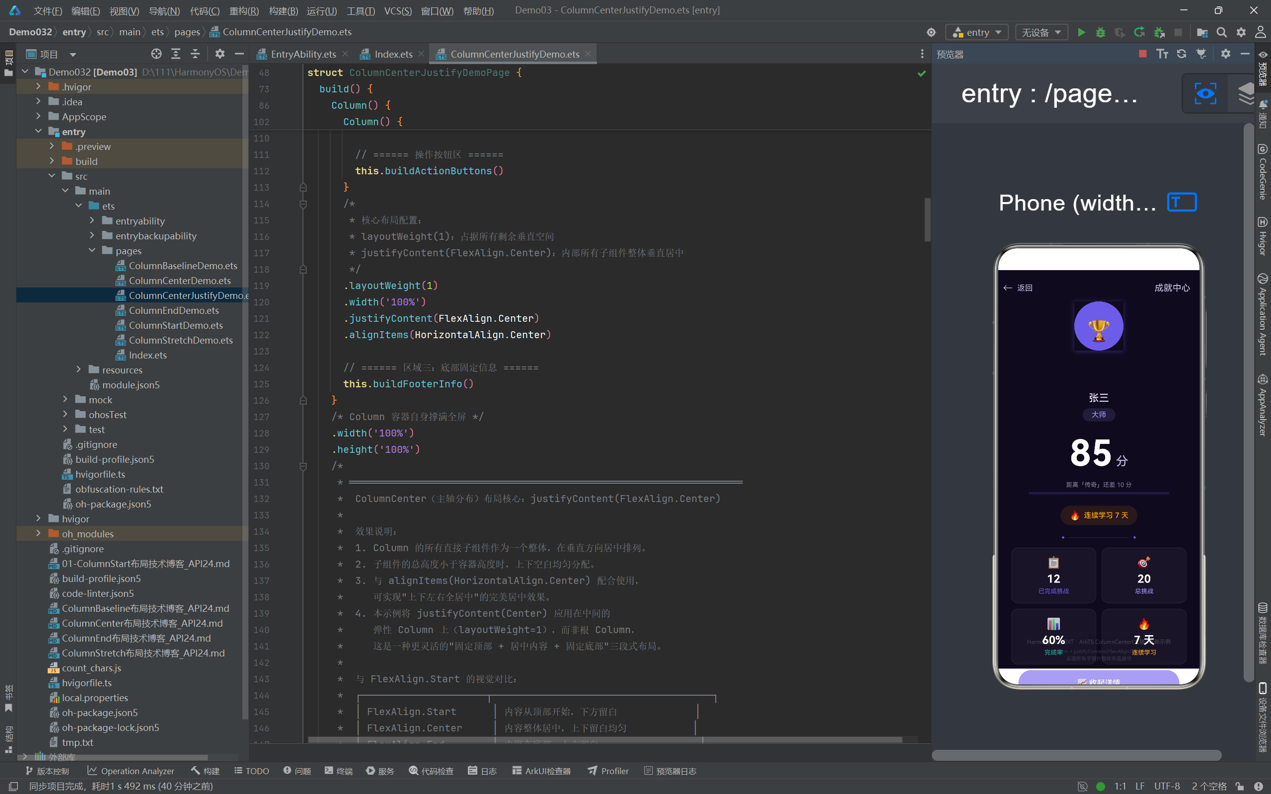
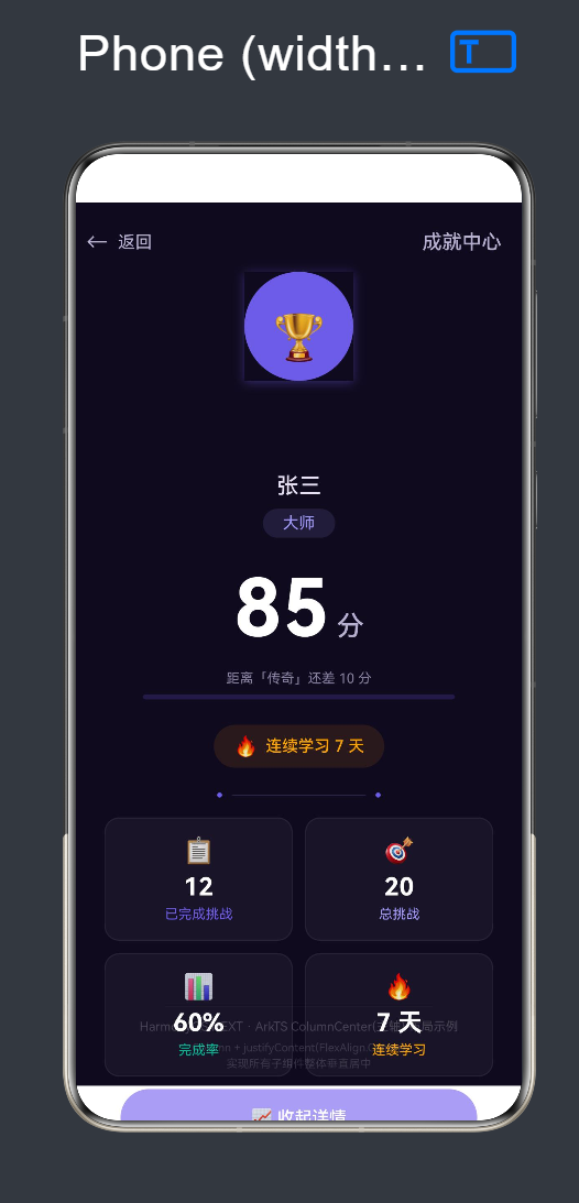
- 【核心布局要点】
-
- Column 组件:纵向(垂直方向)排列子组件,由主轴(Main Axis)控制垂直方向对齐,
- 交叉轴(Cross Axis)控制水平方向对齐。
-
- justifyContent(FlexAlign.Center):设置主轴(垂直方向)排列策略为「整体垂直居中」,
- 即所有子组件作为一个整体,在 Column 容器中垂直方向居中对齐。
- 上方空白和下方空白均匀分配,形成"上下对称"的视觉效果。
-
- alignItems(HorizontalAlign.Xxx):交叉轴(水平方向)对齐方式由 alignItems 控制,
- 与 justifyContent(Center) 组合使用时,可实现"水平居中 + 垂直居中"的完美居中效果。
- 【与 ColumnCenterDemo 的核心区别】
- ┌──────────────────┬──────────────────────────┬──────────────────────────┐
- │ 对比维度 │ ColumnCenterDemo (已有) │ ColumnCenterJustifyDemo │
- ├──────────────────┼──────────────────────────┼──────────────────────────┤
- │ 核心属性 │ alignItems(Center) │ justifyContent(Center) │
- │ 控制方向 │ 交叉轴(水平方向) │ 主轴(垂直方向) │
- │ 布局效果 │ 每个子组件水平居中 │ 所有子组件整体垂直居中 │
- │ 视觉特征 │ 水平对称 │ 上下对称 │
- │ 典型场景 │ 表单、列表 │ 启动页、成就展示 │
- └──────────────────┴──────────────────────────┴──────────────────────────┘
- 【适用场景】
-
- 启动页/欢迎页(Logo + 标题 + 按钮垂直居中)
-
- 成绩展示页(分数 + 等级 + 评语垂直居中)
-
- 支付成功/订单完成页(状态图标 + 金额 + 按钮垂直居中)
-
- 个人成就页(徽章 + 数据 + 分享按钮垂直居中)
-
- 弹窗/浮层内容(轻量级信息展示)
- @Entry 页面入口装饰器,标识该组件为独立页面
- @Component 组件装饰器,定义可复用的自定义组件
- @State 状态装饰器,状态变化时自动刷新 UI
*/
// ========== 导入 ArkUI 路由模块 ==========
import router from ‘@ohos.router’;
/**
- ColumnCenterJustifyDemoPage
- 主页面组件 — 演示 Column + justifyContent(FlexAlign.Center) 布局效果
- 所有子组件作为一个整体,在容器垂直方向居中对齐
/
@Entry
@Component
struct ColumnCenterJustifyDemoPage {
// ---------- 状态变量 ----------
/ 当前得分(0-100) /
@State score: number = 85;
/ 用户姓名 /
@State userName: string = ‘张三’;
/ 已完成的挑战数量 /
@State completedChallenges: number = 12;
/ 总挑战数量 /
private readonly totalChallenges: number = 20;
/ 连续学习天数 /
@State streakDays: number = 7;
/ 是否显示详细数据 /
@State showDetails: boolean = false;
/ 是否已经分享 /
@State isShared: boolean = false;
/ 等级名称列表 */
private readonly levelNames: string[] = [
‘青铜’, ‘白银’, ‘黄金’, ‘铂金’, ‘钻石’, ‘大师’, ‘传奇’
];
/**
-
build 方法 — 组件的 UI 描述入口
-
整个布局使用 Column 容器,所有子组件在垂直方向整体居中
/
build() {
/- 【第一层】根容器:Column 纵向布局
-
- justifyContent(FlexAlign.Center):
- 主轴(垂直方向)整体居中对齐 → 所有子组件作为一个整体,
- 在 Column 容器的垂直方向居中显示。
- 上方空白间距 = 下方空白间距,形成对称的垂直布局。
- alignItems(HorizontalAlign.Center):
- 交叉轴(水平方向)居中对齐 → 所有子组件在水平方向居中。
- 与 justifyContent(Center) 配合,实现"上下左右全居中"。
*/
Column() {
// ====== 区域一:顶部装饰区(可选返回按钮) ======
this.buildTopBar()
/*
- ══════════════════════════════════════════════════════════════════
- 垂直居中核心区域
- 这个 Column 容器设置了 layoutWeight(1),占据除顶部状态栏和
- 底部固定区域之外的所有垂直空间。通过 justify-content 设置为
- FlexAlign.Center,其内部的子组件组将整体垂直居中。
- 这就是 “ColumnCenter 主轴分布” 的核心实现:
- 一个弹性容器 + justifyContent(Center) = 垂直居中
- ══════════════════════════════════════════════════════════════════
*/
Column() {
// ====== 成就展示中心区 ======
this.buildAchievementDisplay()
// ====== 详细数据区(可展开/收起) ======
if (this.showDetails) {
this.buildDetailsSection()
}// ====== 操作按钮区 ======
this.buildActionButtons()
}
/*- 核心布局配置:
- layoutWeight(1):占据所有剩余垂直空间
- justifyContent(FlexAlign.Center):内部所有子组件整体垂直居中
*/
.layoutWeight(1)
.width(‘100%’)
.justifyContent(FlexAlign.Center)
.alignItems(HorizontalAlign.Center)
// ====== 区域三:底部固定信息 ======
this.buildFooterInfo()
}
/* Column 容器自身撑满全屏 /
.width(‘100%’)
.height(‘100%’)
/- ══════════════════════════════════════════════════════════════════
- ColumnCenter(主轴分布)布局核心:justifyContent(FlexAlign.Center)
- 效果说明:
-
- Column 的所有直接子组件作为一个整体,在垂直方向居中排列。
-
- 子组件的总高度小于容器高度时,上下空白均匀分配。
-
- 与 alignItems(HorizontalAlign.Center) 配合使用,
-
可实现"上下左右全居中"的完美居中效果。 -
- 本示例将 justifyContent(Center) 应用在中间的
-
弹性 Column 上(layoutWeight=1),而非根 Column, -
这是一种更灵活的"固定顶部 + 居中内容 + 固定底部"三段式布局。 - 与 FlexAlign.Start 的视觉对比:
- ┌─────────────────────┬─────────────────────────────────────┐
- │ FlexAlign.Start │ 内容从顶部开始,下方留白 │
- │ FlexAlign.Center │ 内容整体居中,上下留白均匀 │
- │ FlexAlign.End │ 内容在底部,上方留白 │
- └─────────────────────┴─────────────────────────────────────┘
- ══════════════════════════════════════════════════════════════════
*/
.justifyContent(FlexAlign.Start)
.alignItems(HorizontalAlign.Center)
.backgroundColor(‘#0F0A1E’)
}
// ================================================================
// 以下每个 buildXxx 方法返回一个 UI 片段
// ================================================================
/**
-
构建顶部状态栏
-
包含返回按钮和页面标题,固定在页面顶部
/
@Builder
buildTopBar(): void {
Row() {
/ 返回按钮 */
Row() {
Text(‘←’)
.fontSize(18)
.fontColor(‘#B8B0D0’)
Text(’ 返回’)
.fontSize(14)
.fontColor(‘#B8B0D0’)
.margin({ left: 4 })
}
.alignItems(VerticalAlign.Center)
.onClick(() => { router.back() })Blank()
/* 页面标题 */
Text(‘成就中心’)
.fontSize(16)
.fontWeight(FontWeight.Medium)
.fontColor(‘#B8B0D0’)
}
.width(‘100%’)
.height(48)
.alignItems(VerticalAlign.Center)
.padding({ left: 8, right: 16 })
.margin({ top: 8 })
}
/**
-
构建成就展示核心区域
-
包含等级徽章、得分、用户名、进度条等
-
这些内容作为一个整体在垂直方向居中
/
@Builder
buildAchievementDisplay(): void {
Column() {
/- 等级徽章(圆形图标)
- 使用 Circle + Text 模拟徽章效果
*/
Circle()
.width(88)
.height(88)
.fill(‘#6C5CE7’)
.margin({ bottom: 16 })
.shadow({
radius: 20,
color: ‘rgba(108, 92, 231, 0.4)’,
offsetX: 0,
offsetY: 4,
})
/*
- 圆形内部图标(使用 Text 覆盖在 Circle 上方)
- ⚠️ overlay 的 slot 参数需要使用 () => {} 函数形式
*/
Text(‘🏆’)
.fontSize(36)
.offset({ y: -72 })
.margin({ bottom: 16 })
/*
- 用户名
- 在垂直居中布局中,用户名位于徽章下方
*/
Text(this.userName)
.fontSize(18)
.fontWeight(FontWeight.Medium)
.fontColor(‘#E8E0F0’)
.margin({ bottom: 4 })
/*
- 等级名称
- 根据得分计算等级
*/
Text(this.getLevelName(this.score))
.fontSize(13)
.fontColor(‘#A29BFE’)
.backgroundColor(‘rgba(162, 155, 254, 0.12)’)
.padding({ left: 16, right: 16, top: 4, bottom: 4 })
.borderRadius(12)
.margin({ top: 4, bottom: 20 })
/*
- 得分大号数字
- 大号字体展示核心数据,突出视觉焦点
*/
Row() {
Text(${this.score})
.fontSize(64)
.fontWeight(FontWeight.Bold)
.fontColor(‘#FFFFFF’)
Text(’ 分’)
.fontSize(22)
.fontWeight(FontWeight.Medium)
.fontColor(‘#B8B0D0’)
.margin({ top: 28 })
}
.alignItems(VerticalAlign.Center)
.margin({ bottom: 8 })/*
- 等级进度条
- 展示距离下一等级的进度
*/
Column() {
Row() {
Text(距离「${this.getNextLevelName(this.score)}」还差 ${this.getScoreToNextLevel(this.score)} 分)
.fontSize(11)
.fontColor(‘#8880A0’)
}
.width(‘100%’)
.justifyContent(FlexAlign.Center)
Progress({
value: this.getLevelProgress(this.score),
total: 100,
type: ProgressType.Linear,
})
.width(‘70%’)
.height(5)
.color(‘#6C5CE7’)
.backgroundColor(‘rgba(108, 92, 231, 0.2)’)
.borderRadius(3)
.margin({ top: 6 })
}
.alignItems(HorizontalAlign.Center)
.width(‘100%’)
.margin({ top: 4 })/*
- 连续学习天数徽章
- 展示额外成就信息
*/
Row() {
Text(‘🔥’)
.fontSize(16)
Text(连续学习 ${this.streakDays} 天)
.fontSize(13)
.fontColor(‘#FFA502’)
.fontWeight(FontWeight.Medium)
.margin({ left: 6 })
}
.alignItems(VerticalAlign.Center)
.margin({ top: 20 })
.padding({ left: 16, right: 16, top: 8, bottom: 8 })
.backgroundColor(‘rgba(255, 165, 2, 0.1)’)
.borderRadius(20)
}
.alignItems(HorizontalAlign.Center)
.width(‘100%’)
}
/**
-
构建详细数据区域(可展开/收起)
-
展示更多统计数据,进一步增强垂直居中布局的内容丰富度
/
@Builder
buildDetailsSection(): void {
Column() {
/ 分隔装饰线 */
Row() {
Circle().width(4).height(4).fill(‘#6C5CE7’)
Divider()
.width(‘30%’)
.height(1)
.color(‘rgba(108, 92, 231, 0.3)’)
.margin({ left: 8, right: 8 })
Circle().width(4).height(4).fill(‘#6C5CE7’)
}
.alignItems(VerticalAlign.Center)
.justifyContent(FlexAlign.Center)
.width(‘100%’)
.margin({ top: 20, bottom: 16 })/* 数据网格:2x2 展示详细数据 /
Row() {
/ 左上:挑战完成数 */
this.buildDataCard(
‘📋’,
${this.completedChallenges},
‘已完成挑战’,
‘#6C5CE7’
)/* 右上:总挑战数 */
this.buildDataCard(
‘🎯’,
${this.totalChallenges},
‘总挑战’,
‘#A29BFE’
)
}
.alignItems(VerticalAlign.Center)
.width(‘90%’)
.margin({ bottom: 10 })Row() {
/* 左下:完成率 */
this.buildDataCard(
‘📊’,
${Math.round((this.completedChallenges / this.totalChallenges) * 100)}%,
‘完成率’,
‘#00B894’
)/* 右下:连续天数 */
this.buildDataCard(
‘🔥’,
${this.streakDays} 天,
‘连续学习’,
‘#FFA502’
)
}
.alignItems(VerticalAlign.Center)
.width(‘90%’)
}
.alignItems(HorizontalAlign.Center)
.width(‘100%’)
}
/**
-
构建单个数据卡片
-
@param icon 图标
-
@param value 数据值
-
@param label 标签文字
-
@param color 主题色
*/
@Builder
buildDataCard(icon: string, value: string, label: string, color: string): void {
Column() {
Text(icon)
.fontSize(20)
.margin({ bottom: 6 })Text(value)
.fontSize(20)
.fontWeight(FontWeight.Bold)
.fontColor(‘#FFFFFF’)Text(label)
.fontSize(11)
.fontColor(color)
.margin({ top: 4 })
}
.alignItems(HorizontalAlign.Center)
.layoutWeight(1)
.padding({ top: 14, bottom: 14 })
.backgroundColor(‘rgba(255, 255, 255, 0.04)’)
.borderRadius(12)
.margin({ left: 5, right: 5 })
.border({
width: 1,
color: ‘rgba(255, 255, 255, 0.06)’,
})
}
/**
-
构建操作按钮区
-
包含展开详情、分享成就等操作按钮
-
这些按钮在垂直居中布局中位于核心内容下方
/
@Builder
buildActionButtons(): void {
Column() {
/ 按钮一:查看详细数据(展开/收起切换) */
Button() {
Row() {
Text(this.showDetails ? ‘📈 收起详情’ : ‘📈 查看详情’)
.fontSize(14)
.fontColor(‘#FFFFFF’)
.fontWeight(FontWeight.Medium)
}
.alignItems(VerticalAlign.Center)
.justifyContent(FlexAlign.Center)
}
.width(‘80%’)
.height(46)
.backgroundColor(this.showDetails
? ‘rgba(108, 92, 231, 0.6)’
: ‘#6C5CE7’)
.borderRadius(23)
.onClick(() => {
this.showDetails = !this.showDetails
})/* 按钮二:分享成就 /
Button() {
Row() {
Text(this.isShared ? ‘✅ 已分享’ : ‘📤 分享成就’)
.fontSize(14)
.fontColor(this.isShared ? ‘#00B894’ : ‘#6C5CE7’)
.fontWeight(FontWeight.Medium)
}
.alignItems(VerticalAlign.Center)
.justifyContent(FlexAlign.Center)
}
.width(‘80%’)
.height(46)
.backgroundColor(this.isShared
? ‘rgba(0, 184, 148, 0.1)’
: ‘rgba(255, 255, 255, 0.08)’)
.borderRadius(23)
.margin({ top: 12 })
.border({
width: 1,
color: this.isShared
? ‘rgba(0, 184, 148, 0.3)’
: ‘rgba(108, 92, 231, 0.3)’,
})
.onClick(() => {
if (!this.isShared) {
this.isShared = true
/ 模拟分享成功后 2 秒恢复 */
setTimeout(() => {
this.isShared = false
}, 2000)
}
})/*
- 布局提示:justifyContent(Center) 效果说明
- 这段文字在所有操作按钮下方,展示核心布局原理
*/
Text(‘💡 核心布局:Column + justifyContent(FlexAlign.Center)\n’- ‘所有子组件作为一个整体,在容器中垂直居中’)
.fontSize(10)
.fontColor(‘rgba(255, 255, 255, 0.3)’)
.textAlign(TextAlign.Center)
.lineHeight(15)
.width(‘80%’)
.margin({ top: 16 })
}
.alignItems(HorizontalAlign.Center)
.width(‘100%’)
.margin({ top: 10 })
}
- ‘所有子组件作为一个整体,在容器中垂直居中’)
/**
-
构建底部固定信息
-
页脚文字,在根 Column 中固定在底部
-
注意:这部分内容不受中间弹性 Column 的 justifyContent(Center) 影响
*/
@Builder
buildFooterInfo(): void {
Column() {
Divider()
.width(‘60%’)
.height(1)
.color(‘rgba(255, 255, 255, 0.06)’)Text(‘HarmonyOS NEXT · ArkTS ColumnCenter(主轴) 布局示例’)
.fontSize(10)
.fontColor(‘rgba(255, 255, 255, 0.2)’)
.margin({ top: 10, bottom: 4 })
.textAlign(TextAlign.Center)
.width(‘100%’)Text(‘Column + justifyContent(FlexAlign.Center)\n实现所有子组件整体垂直居中’)
.fontSize(9)
.fontColor(‘rgba(255, 255, 255, 0.15)’)
.textAlign(TextAlign.Center)
.lineHeight(13)
.width(‘100%’)
.margin({ bottom: 12 })
}
.alignItems(HorizontalAlign.Center)
.width(‘100%’)
.padding({ top: 8 })
}
// ================================================================
// 辅助方法
// ================================================================
/**
- 根据得分获取等级名称
- @param score 得分(0-100)
- @returns 等级名称
*/
getLevelName(score: number): string {
if (score >= 95) return ‘传奇’
if (score >= 85) return ‘大师’
if (score >= 75) return ‘钻石’
if (score >= 65) return ‘铂金’
if (score >= 55) return ‘黄金’
if (score >= 40) return ‘白银’
return ‘青铜’
}
/**
- 获取下一等级名称
- @param score 当前得分
- @returns 下一等级名称
*/
getNextLevelName(score: number): string {
const currentLevel = this.getLevelName(score)
const currentIndex = this.levelNames.indexOf(currentLevel)
if (currentIndex < this.levelNames.length - 1) {
return this.levelNames[currentIndex + 1]
}
return ‘满级’
}
/**
- 获取距离下一等级还差的分数
- @param score 当前得分
- @returns 需要提升的分数
*/
getScoreToNextLevel(score: number): number {
if (score >= 95) return 0
if (score >= 85) return 95 - score
if (score >= 75) return 85 - score
if (score >= 65) return 75 - score
if (score >= 55) return 65 - score
if (score >= 40) return 55 - score
return 40 - score
}
/**
- 获取等级进度百分比
- @param score 当前得分
- @returns 0-100 的进度值
*/
getLevelProgress(score: number): number {
if (score >= 95) return 100
if (score >= 85) return ((score - 85) / (95 - 85)) * 100
if (score >= 75) return ((score - 75) / (85 - 75)) * 100
if (score >= 65) return ((score - 65) / (75 - 65)) * 100
if (score >= 55) return ((score - 55) / (65 - 55)) * 100
if (score >= 40) return ((score - 40) / (55 - 40)) * 100
return (score / 40) * 100
}
}

作为“人工智能6S店”的官方数字引擎,为AI开发者与企业提供一个覆盖软硬件全栈、一站式门户。
更多推荐


 4
4 0
0- 0


 已为社区贡献6条内容

所有评论(0)