
鸿蒙 HarmonyOS ArkTS 背景图片缩放模式深度解析:Fill / Fit / Cover
项目演示
目录
- 概述
- 背景图片基础 API 详解
- Fill 模式深度解析
- Fit 模式深度解析
- Cover 模式深度解析
- 三种模式对比分析
- API 24 新特性与兼容性
- 实战案例:图片画廊应用
- 性能优化策略
- 常见问题与解决方案
- 总结与展望
1. 概述
1.1 背景图片在应用开发中的重要性
在移动应用开发中,背景图片是构建视觉层次、营造氛围的重要手段。一张合适的背景图片可以:
- 提升应用的视觉吸引力和品牌辨识度
- 引导用户注意力,突出关键内容
- 增强用户体验,传递情感和信息
- 区分功能区域,优化界面布局
1.2 缩放模式的必要性
由于不同设备的屏幕尺寸和分辨率存在差异,同一张背景图片在不同设备上的显示效果可能截然不同。为了确保背景图片在各种设备上都能呈现出最佳效果,开发者需要选择合适的缩放模式。
1.3 三种核心缩放模式
HarmonyOS ArkTS 提供了三种核心的背景图片缩放模式:
| 模式 | 名称 | 核心特点 | 适用场景 |
|---|---|---|---|
| Fill | 填充模式 | 拉伸图片以完全填充容器 | 需要图片完全覆盖且不介意变形的场景 |
| Fit | 适配模式 | 保持比例,完整显示图片 | 需要完整展示图片内容的场景 |
| Cover | 覆盖模式 | 保持比例,填满容器并裁剪 | 需要填满容器且保持比例的场景 |
1.4 API 版本说明
本文基于 HarmonyOS API 24(对应 HarmonyOS 6.0 版本)进行讲解。API 24 在背景图片处理方面进行了多项优化和增强,提供了更灵活的配置选项和更好的性能表现。
2. 背景图片基础 API 详解
2.1 backgroundImage 方法
backgroundImage 方法用于为组件设置背景图片,其函数签名如下:
backgroundImage(src: ResourceStr, repeat?: ImageRepeat): T
参数说明:
| 参数 | 类型 | 必填 | 说明 |
|---|---|---|---|
src |
ResourceStr |
是 | 图片资源,支持 $r() 资源引用、网络 URL、本地文件路径 |
repeat |
ImageRepeat |
否 | 平铺方式,默认 ImageRepeat.NoRepeat |
ImageRepeat 枚举值:
| 枚举值 | 说明 |
|---|---|
ImageRepeat.NoRepeat |
不平铺(默认值) |
ImageRepeat.X |
仅沿 X 轴(水平方向)平铺 |
ImageRepeat.Y |
仅沿 Y 轴(垂直方向)平铺 |
ImageRepeat.XY |
沿 X、Y 两个方向平铺 |
使用示例:
// 使用资源引用方式
Column()
  .backgroundImage($r('app.media.background'))
  .width('100%')
  .height('100%')

// 使用网络图片
Column()
  .backgroundImage('https://example.com/image.jpg')
  .width('100%')
  .height('100%')

// 设置平铺方式
Column()
  .backgroundImage($r('app.media.pattern'), ImageRepeat.XY)
  .width('100%')
  .height('100%')
2.2 backgroundImageSize 方法
backgroundImageSize 方法用于设置背景图片的尺寸和缩放模式,其函数签名如下:
backgroundImageSize(value: SizeOptions | ImageSize): T
参数说明:
| 参数 | 类型 | 必填 | 说明 |
|---|---|---|---|
value |
SizeOptions | ImageSize |
是 | 图片尺寸配置,支持两种方式 |
SizeOptions 对象结构:
{
  width: number | string,  // 宽度,数字为 vp 单位,字符串可带单位(如 '200px')
  height: number | string  // 高度,同上
}
ImageSize 枚举值(API 24):
| 枚举值 | 说明 |
|---|---|
ImageSize.Cover |
保持比例,填满容器,超出部分裁剪 |
ImageSize.Contain |
保持比例,完整显示,可能留有空白 |
ImageSize.Auto |
保持原始尺寸,不缩放 |
使用示例:
// 使用 ImageSize 枚举
Column()
  .backgroundImage($r('app.media.background'))
  .backgroundImageSize(ImageSize.Cover)
  .width(300)
  .height(200)

// 使用 SizeOptions 对象
Column()
  .backgroundImage($r('app.media.background'))
  .backgroundImageSize({ width: 300, height: 200 })
  .width(300)
  .height(200)

// 使用带单位的字符串
Column()
  .backgroundImage($r('app.media.background'))
  .backgroundImageSize({ width: '250px', height: '150px' })
  .width(300)
  .height(200)
2.3 backgroundImagePosition 方法
backgroundImagePosition 方法用于设置背景图片在组件内的位置,其函数签名如下:
backgroundImagePosition(value: Position | Alignment): T
参数说明:
| 参数 | 类型 | 必填 | 说明 |
|---|---|---|---|
value |
Position | Alignment |
是 | 位置配置,支持两种方式 |
Position 对象结构:
{
  x: number | string,  // X 轴偏移量
  y: number | string   // Y 轴偏移量
}
Alignment 枚举值:
| 枚举值 | 说明 |
|---|---|
Alignment.TopStart |
左上角 |
Alignment.Top |
顶部居中 |
Alignment.TopEnd |
右上角 |
Alignment.Start |
左侧居中 |
Alignment.Center |
居中(默认) |
Alignment.End |
右侧居中 |
Alignment.BottomStart |
左下角 |
Alignment.Bottom |
底部居中 |
Alignment.BottomEnd |
右下角 |
使用示例:
// 使用 Alignment 枚举
Column()
  .backgroundImage($r('app.media.background'))
  .backgroundImageSize(ImageSize.Cover)
  .backgroundImagePosition(Alignment.TopStart)
  .width(300)
  .height(200)

// 使用 Position 对象
Column()
  .backgroundImage($r('app.media.background'))
  .backgroundImageSize(ImageSize.Cover)
  .backgroundImagePosition({ x: 20, y: 30 })
  .width(300)
  .height(200)
2.4 backgroundColor 方法
backgroundColor 方法用于设置组件的背景色,作为背景图片的补充或替代,其函数签名如下:
backgroundColor(value: ResourceColor): T
参数说明:
| 参数 | 类型 | 必填 | 说明 |
|---|---|---|---|
value |
ResourceColor |
是 | 背景颜色值 |
ResourceColor 支持的写法:
| 写法 | 示例 | 说明 |
|---|---|---|
| Color 枚举 | Color.Red |
系统预定义颜色 |
| 十六进制数字 | 0xE5E5E5 |
不带 # 的十六进制数 |
| 十六进制字符串 | '#FF0000' |
带 # 的颜色字符串 |
| rgba 字符串 | 'rgba(255,0,0,0.5)' |
带透明度的颜色 |
| 资源引用 | $r('app.color.xxx') |
引用资源文件中定义的颜色 |
使用示例:
Column()
  .backgroundColor('#F5F5F5')
  .width('100%')
  .height('100%')

Column()
  .backgroundColor(Color.White)
  .width('100%')
  .height('100%')

Column()
  .backgroundColor('rgba(0, 0, 0, 0.5)')
  .width('100%')
  .height('100%')
3. Fill 模式深度解析
3.1 Fill 模式的定义与原理
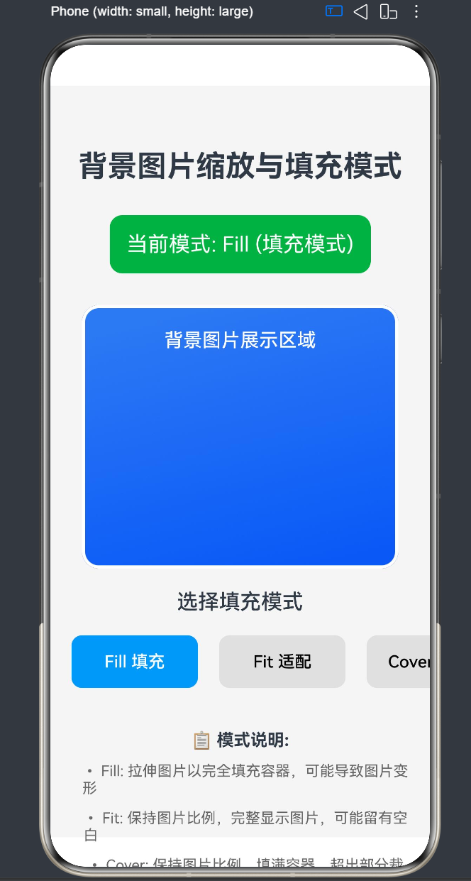
Fill 模式(填充模式)是指将背景图片拉伸以完全填充容器的缩放方式。在这种模式下,图片的宽高比会被忽略,图片会被强制拉伸或压缩以匹配容器的尺寸。
核心原理:
- 获取容器的实际宽度和高度
- 将图片的宽度缩放为容器宽度
- 将图片的高度缩放为容器高度
- 图片完全覆盖容器,不留任何空白
数学公式:
缩放因子X = 容器宽度 / 图片原始宽度
缩放因子Y = 容器高度 / 图片原始高度
最终宽度 = 图片原始宽度 × 缩放因子X
最终高度 = 图片原始高度 × 缩放因子Y
3.2 Fill 模式的实现方式
在 API 24 中,ImageSize 枚举并没有直接提供 Fill 模式。开发者需要通过 SizeOptions 对象来实现:
// 方式一:使用具体数值(与容器尺寸一致)
Column()
  .backgroundImage($r('app.media.background'))
  .backgroundImageSize({ width: 300, height: 250 })
  .width(300)
  .height(250)

// 方式二:使用百分比字符串(API 24 支持)
Column()
  .backgroundImage($r('app.media.background'))
  .backgroundImageSize({ width: '100%', height: '100%' })
  .width(300)
  .height(250)
3.3 Fill 模式的视觉效果
场景描述:
假设有一张原始尺寸为 400×300 的图片,容器尺寸为 300×250。
Fill 模式下的计算:
原始宽高比 = 400 / 300 = 1.333
容器宽高比 = 300 / 250 = 1.2

缩放因子X = 300 / 400 = 0.75
缩放因子Y = 250 / 300 = 0.833

最终宽度 = 400 × 0.75 = 300
最终高度 = 300 × 0.833 = 250
结果:
- 图片被拉伸以完全填充容器
- 宽高比从 1.333 变为 1.2
- 图片会产生一定程度的变形
3.4 Fill 模式的适用场景
Fill 模式适用于以下场景:
- 装饰性背景:图片内容具有较高的对称性或重复性,轻微变形不会影响视觉效果
- 纯色渐变背景:渐变图片在拉伸后依然保持良好的视觉效果
- 图案纹理背景:重复图案在拉伸后仍能保持整体美感
- 动态生成的背景:程序生成的背景图可以根据容器尺寸动态调整
- 模糊背景:经过模糊处理的背景,变形对视觉影响较小
典型应用案例:
- 应用启动页背景
- 登录页面背景
- 渐变色彩背景
- 纹理图案背景
3.5 Fill 模式的优缺点
优点:
- 实现简单,无需复杂计算
- 图片完全填充容器,不留空白
- 适用于多种背景类型
缺点:
- 图片可能产生严重变形,影响视觉效果
- 不适合展示需要保持比例的图片内容
- 在不同宽高比的设备上显示效果差异较大
4. Fit 模式深度解析
4.1 Fit 模式的定义与原理
Fit 模式(适配模式)是指保持图片宽高比,将图片完整显示在容器内的缩放方式。在这种模式下,图片会被缩放至最大尺寸,同时确保图片的所有部分都能在容器内可见。
核心原理:
- 计算图片的原始宽高比
- 计算容器的宽高比
- 选择较小的缩放因子,确保图片完整显示
- 图片在容器内居中显示,可能留有空白
数学公式:
原始宽高比 = 图片原始宽度 / 图片原始高度
容器宽高比 = 容器宽度 / 容器高度

如果原始宽高比 > 容器宽高比:
    缩放因子 = 容器宽度 / 图片原始宽度
    最终宽度 = 容器宽度
    最终高度 = 图片原始高度 × 缩放因子

如果原始宽高比 <= 容器宽高比:
    缩放因子 = 容器高度 / 图片原始高度
    最终高度 = 容器高度
    最终宽度 = 图片原始宽度 × 缩放因子
4.2 Fit 模式的实现方式
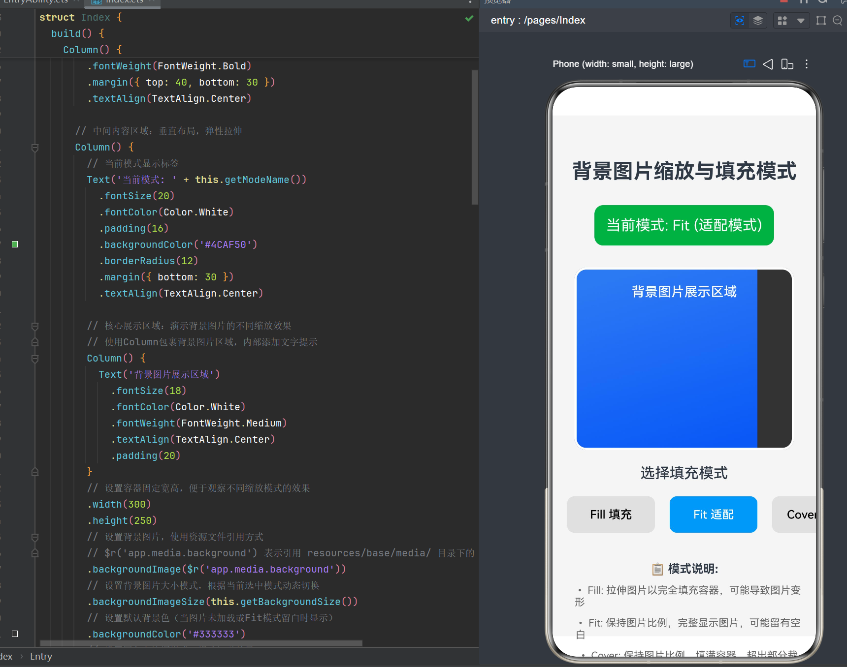
在 API 24 中,Fit 模式对应 ImageSize.Contain 枚举值:
Column()
  .backgroundImage($r('app.media.background'))
  .backgroundImageSize(ImageSize.Contain)
  .width(300)
  .height(250)
4.3 Fit 模式的视觉效果
场景描述:
假设有一张原始尺寸为 400×300 的图片,容器尺寸为 300×250。
Fit 模式下的计算:
原始宽高比 = 400 / 300 = 1.333
容器宽高比 = 300 / 250 = 1.2

因为 1.333 > 1.2:
    缩放因子 = 300 / 400 = 0.75
    最终宽度 = 300
    最终高度 = 300 × 0.75 = 225

空白区域高度 = 250 - 225 = 25
上下各留白 = 25 / 2 = 12.5
结果:
- 图片保持原始宽高比(1.333)
- 图片完整显示在容器内
- 容器上下各留有 12.5vp 的空白
4.4 Fit 模式的适用场景
Fit 模式适用于以下场景:
- 产品展示:需要完整展示产品图片,不允许裁剪
- Logo 显示:Logo 需要保持完整和比例正确
- 信息图表:图表内容需要完整呈现
- 照片展示:人物照片需要完整显示
- 文档预览:文档图片需要完整展示内容
典型应用案例:
- 电商产品图片展示
- 社交平台头像显示
- 文档图片预览
- 照片相册应用
4.5 Fit 模式的优缺点
优点:
- 图片保持原始比例,不会变形
- 图片内容完整显示,不会被裁剪
- 适用于需要完整展示的图片内容
缺点:
- 容器可能留有空白区域
- 图片可能无法填满整个容器
- 在不同宽高比的设备上留白大小不同
5. Cover 模式深度解析
5.1 Cover 模式的定义与原理
Cover 模式(覆盖模式)是指保持图片宽高比,将图片缩放至填满容器并裁剪超出部分的缩放方式。在这种模式下,图片会被缩放至最小尺寸,同时确保图片能完全覆盖容器。
核心原理:
- 计算图片的原始宽高比
- 计算容器的宽高比
- 选择较大的缩放因子,确保图片填满容器
- 图片居中显示,超出容器的部分被裁剪
数学公式:
原始宽高比 = 图片原始宽度 / 图片原始高度
容器宽高比 = 容器宽度 / 容器高度

如果原始宽高比 > 容器宽高比:
    缩放因子 = 容器高度 / 图片原始高度
    最终高度 = 容器高度
    最终宽度 = 图片原始宽度 × 缩放因子
    裁剪宽度 = 最终宽度 - 容器宽度

如果原始宽高比 <= 容器宽高比:
    缩放因子 = 容器宽度 / 图片原始宽度
    最终宽度 = 容器宽度
    最终高度 = 图片原始高度 × 缩放因子
    裁剪高度 = 最终高度 - 容器高度
5.2 Cover 模式的实现方式
在 API 24 中,Cover 模式对应 ImageSize.Cover 枚举值:
Column()
  .backgroundImage($r('app.media.background'))
  .backgroundImageSize(ImageSize.Cover)
  .width(300)
  .height(250)
5.3 Cover 模式的视觉效果
场景描述:
假设有一张原始尺寸为 400×300 的图片,容器尺寸为 300×250。
Cover 模式下的计算:
原始宽高比 = 400 / 300 = 1.333
容器宽高比 = 300 / 250 = 1.2

因为 1.333 > 1.2:
    缩放因子 = 250 / 300 = 0.833
    最终高度 = 250
    最终宽度 = 400 × 0.833 = 333.3
    裁剪宽度 = 333.3 - 300 = 33.3
    左右各裁剪 = 33.3 / 2 = 16.65
结果:
- 图片保持原始宽高比(1.333)
- 图片填满整个容器,不留空白
- 图片左右各被裁剪约 16.65vp
5.4 Cover 模式的适用场景
Cover 模式适用于以下场景:
- 全屏背景图:需要填满整个屏幕的背景图片
- 横幅广告:需要填满横幅区域的广告图片
- 卡片背景:需要填满卡片区域的背景图片
- 轮播图:需要填满轮播区域的图片
- 头像背景:需要填满头像区域的背景图片
典型应用案例:
- 应用首页横幅背景
- 用户个人主页背景
- 卡片式布局背景
- 轮播图展示
5.5 Cover 模式的优缺点
优点:
- 图片保持原始比例,不会变形
- 图片填满整个容器,不留空白
- 视觉效果饱满,适合作为背景
缺点:
- 图片部分内容可能被裁剪
- 重要内容可能被切掉
- 需要精心选择图片构图
6. 三种模式对比分析
6.1 核心差异对比
| 对比维度 | Fill 模式 | Fit 模式 | Cover 模式 |
|---|---|---|---|
| 宽高比保持 | 否 | 是 | 是 |
| 图片变形 | 可能变形 | 不会变形 | 不会变形 |
| 内容完整性 | 完整显示 | 完整显示 | 部分裁剪 |
| 容器填充 | 完全填充 | 可能留白 | 完全填充 |
| 实现方式 | SizeOptions 对象 | ImageSize.Contain | ImageSize.Cover |
| API 支持 | 间接支持 | 直接支持 | 直接支持 |
6.2 视觉效果对比
场景: 原始图片尺寸 400×300,容器尺寸 300×250
┌─────────────────────────────────────────────────────────────┐
│                    原始图片 (400×300)                       │
│  ┌──────────────────────────────────────────────────────┐  │
│  │                    图片内容                          │  │
│  │         宽高比 = 400/300 = 1.333                    │  │
│  └──────────────────────────────────────────────────────┘  │
└─────────────────────────────────────────────────────────────┘

┌─────────────────────────────────────────────────────────────┐
│                    Fill 模式效果                           │
│  ┌──────────────────────────────────────────────────────┐  │
│  │                    图片被拉伸                         │  │
│  │         宽高比 = 300/250 = 1.2 (变形)                │  │
│  │         完全填充,无空白                              │  │
│  └──────────────────────────────────────────────────────┘  │
└─────────────────────────────────────────────────────────────┘

┌─────────────────────────────────────────────────────────────┐
│                    Fit 模式效果                            │
│  ┌──────────────────────────────────────────────────────┐  │
│  │  ┌──────────────────────────────────────────────┐    │  │
│  │  │              图片完整显示                    │    │  │
│  │  │         宽高比 = 1.333 (保持)               │    │  │
│  │  │         上下各留白 12.5vp                   │    │  │
│  │  └──────────────────────────────────────────────┘    │  │
│  └──────────────────────────────────────────────────────┘  │
└─────────────────────────────────────────────────────────────┘

┌─────────────────────────────────────────────────────────────┐
│                    Cover 模式效果                          │
│  ┌──────────────────────────────────────────────────────┐  │
│  │                    图片填满容器                       │  │
│  │         宽高比 = 1.333 (保持)                       │  │
│  │         左右各裁剪 16.65vp                          │  │
│  └──────────────────────────────────────────────────────┘  │
└─────────────────────────────────────────────────────────────┘
6.3 性能对比
| 对比维度 | Fill 模式 | Fit 模式 | Cover 模式 |
|---|---|---|---|
| 计算复杂度 | 低 | 中 | 中 |
| 内存占用 | 中等 | 中等 | 中等 |
| 渲染性能 | 高 | 高 | 高 |
| 适用场景 | 装饰性背景 | 内容展示 | 背景填充 |
6.4 选择建议
选择 Fill 模式的情况:
- 图片内容为对称图案或渐变
- 图片变形对视觉效果影响较小
- 需要图片完全填充容器且不介意变形
选择 Fit 模式的情况:
- 需要完整展示图片内容
- 图片内容有重要信息不能被裁剪
- Logo、图标、文档图片等
选择 Cover 模式的情况:
- 需要图片填满容器且保持比例
- 图片内容允许部分裁剪
- 全屏背景、卡片背景、轮播图等
7. API 24 新特性与兼容性
7.1 API 24 背景图片新特性
SizeOptions 支持百分比字符串(新增):
在 API 24 之前,SizeOptions 对象的 width 和 height 只支持数字类型(vp 单位)。API 24 开始支持百分比字符串:
// API 24 之前(仅支持数字)
.backgroundImageSize({ width: 300, height: 250 })

// API 24 及以后(支持百分比字符串)
.backgroundImageSize({ width: '100%', height: '100%' })
.backgroundImageSize({ width: '50%', height: '50%' })
增强的图片加载性能:
API 24 对背景图片加载进行了优化,包括:
- 异步加载优化,减少主线程阻塞
- 图片缓存机制,提升重复加载性能
- 内存管理优化,减少内存占用
新增的错误处理机制:
API 24 提供了更完善的背景图片加载错误处理:
// 结合 Image 组件的错误处理
Image($r('app.media.background'))
  .onError((error) => {
    console.error('图片加载失败:', error.message)
  })
7.2 兼容性处理
API 版本检测:
在开发过程中,可以通过 API 版本检测来实现兼容性处理:
import { apiVersion } from '@kit.BasicServicesKit'

@Entry
@Component
struct Index {
  build() {
    Column() {
      if (apiVersion >= 24) {
        // API 24 及以上版本的特性
        Column()
          .backgroundImage($r('app.media.background'))
          .backgroundImageSize({ width: '100%', height: '100%' })
          .width(300)
          .height(250)
      } else {
        // API 24 以下版本的兼容处理
        Column()
          .backgroundImage($r('app.media.background'))
          .backgroundImageSize({ width: 300, height: 250 })
          .width(300)
          .height(250)
      }
    }
    .width('100%')
    .height('100%')
  }
}
降级策略:
对于不支持的 API 特性,需要提供降级策略:
// 使用 Image 组件作为降级方案
Column() {
  Image($r('app.media.background'))
    .objectFit(ImageFit.Cover)
    .width('100%')
    .height('100%')

  // 其他内容组件
  Text('内容')
    .fontSize(20)
    .fontColor(Color.White)
}
.width(300)
.height(250)
7.3 API 24 与旧版本对比
| 特性 | API 23 及以下 | API 24 及以上 |
|---|---|---|
| SizeOptions 字符串 | 不支持 | 支持百分比字符串 |
| 图片缓存 | 基础缓存 | 增强缓存机制 |
| 异步加载 | 基础支持 | 优化的异步加载 |
| 内存管理 | 基础管理 | 智能内存管理 |
| 错误处理 | 有限支持 | 完善的错误处理 |
8. 实战案例:图片画廊应用
8.1 需求分析
功能需求:
- 展示多张图片的画廊页面
- 支持三种缩放模式切换(Fill/Fit/Cover)
- 实时预览不同模式的效果
- 响应式布局,适配不同屏幕尺寸
技术需求:
- 使用
@Entry @Component装饰器构建页面 - 使用
@State管理状态 - 使用
backgroundImage设置背景图片 - 使用
backgroundImageSize切换缩放模式
8.2 完整代码实现
@Entry
@Component
struct GalleryPage {
  @State currentMode: string = 'Cover'
  @State selectedImageIndex: number = 0

  private images: string[] = [
    'app.media.background',
    'app.media.foreground',
    'app.media.startIcon'
  ]

  private imageNames: string[] = [
    '背景图片1',
    '前景图片',
    '启动图标'
  ]

  build() {
    Column() {
      // 标题区域
      Text('图片画廊')
        .fontSize(32)
        .fontWeight(FontWeight.Bold)
        .margin({ top: 40, bottom: 30 })
        .textAlign(TextAlign.Center)

      // 图片展示区域
      Column() {
        // 当前模式显示
        Text('当前模式: ' + this.getModeName())
          .fontSize(20)
          .fontColor(Color.White)
          .padding(16)
          .backgroundColor('#4CAF50')
          .borderRadius(12)
          .margin({ bottom: 20 })
          .textAlign(TextAlign.Center)

        // 图片展示容器
        Column() {
          Text(this.imageNames[this.selectedImageIndex])
            .fontSize(18)
            .fontColor(Color.White)
            .fontWeight(FontWeight.Medium)
            .textAlign(TextAlign.Center)
            .padding(20)
        }
        .width('90%')
        .height(300)
        .backgroundImage($r(this.images[this.selectedImageIndex]))
        .backgroundImageSize(this.getBackgroundSize())
        .backgroundColor('#333333')
        .borderRadius(16)
        .border({ width: 3, color: Color.White })
        .shadow({ radius: 20, color: '#00000033', offsetY: 10 })
        .margin({ bottom: 20 })

        // 图片选择器
        Row({ space: 15 }) {
          ForEach(this.images, (image: string, index: number) => {
            Image($r(image))
              .width(60)
              .height(60)
              .borderRadius(8)
              .border({
                width: 3,
                color: this.selectedImageIndex === index ? '#2196F3' : Color.White
              })
              .objectFit(ImageFit.Cover)
              .onClick(() => {
                this.selectedImageIndex = index
              })
          })
        }
        .justifyContent(FlexAlign.Center)
      }
      .flexGrow(1)
      .justifyContent(FlexAlign.Center)

      // 模式选择区域
      Column({ space: 20 }) {
        Text('选择缩放模式')
          .fontSize(20)
          .fontWeight(FontWeight.Medium)
          .margin({ top: 20 })

        Row({ space: 20 }) {
          Button('Fill 填充')
            .width(120)
            .height(50)
            .fontSize(16)
            .borderRadius(10)
            .backgroundColor(this.currentMode === 'Fill' ? '#2196F3' : '#E0E0E0')
            .fontColor(this.currentMode === 'Fill' ? Color.White : Color.Black)
            .onClick(() => {
              this.currentMode = 'Fill'
            })

          Button('Fit 适配')
            .width(120)
            .height(50)
            .fontSize(16)
            .borderRadius(10)
            .backgroundColor(this.currentMode === 'Fit' ? '#2196F3' : '#E0E0E0')
            .fontColor(this.currentMode === 'Fit' ? Color.White : Color.Black)
            .onClick(() => {
              this.currentMode = 'Fit'
            })

          Button('Cover 覆盖')
            .width(120)
            .height(50)
            .fontSize(16)
            .borderRadius(10)
            .backgroundColor(this.currentMode === 'Cover' ? '#2196F3' : '#E0E0E0')
            .fontColor(this.currentMode === 'Cover' ? Color.White : Color.Black)
            .onClick(() => {
              this.currentMode = 'Cover'
            })
        }

        // 模式说明
        Column({ space: 12 }) {
          Text('📋 模式说明:')
            .fontSize(16)
            .fontWeight(FontWeight.Bold)
            .margin({ top: 20 })

          Text('• Fill: 拉伸图片以完全填充容器,可能导致图片变形')
            .fontSize(14)
            .fontColor('#666666')
            .padding({ left: 10 })

          Text('• Fit: 保持图片比例,完整显示图片,可能留有空白')
            .fontSize(14)
            .fontColor('#666666')
            .padding({ left: 10 })

          Text('• Cover: 保持图片比例,填满容器,超出部分裁剪')
            .fontSize(14)
            .fontColor('#666666')
            .padding({ left: 10 })
        }
        .padding({ bottom: 40 })
      }
      .width('100%')
    }
    .width('100%')
    .height('100%')
    .backgroundColor('#F5F5F5')
    .padding(20)
  }

  getBackgroundSize(): ImageSize | Size {
    switch (this.currentMode) {
      case 'Fill':
        return { width: '100%', height: '100%' }
      case 'Fit':
        return ImageSize.Contain
      case 'Cover':
        return ImageSize.Cover
      default:
        return ImageSize.Cover
    }
  }

  getModeName(): string {
    switch (this.currentMode) {
      case 'Fill':
        return 'Fill (填充模式)'
      case 'Fit':
        return 'Fit (适配模式)'
      case 'Cover':
        return 'Cover (覆盖模式)'
      default:
        return 'Unknown'
    }
  }
}
8.3 代码解析
状态管理:
@State currentMode: string = 'Cover'
@State selectedImageIndex: number = 0
使用 @State 装饰器管理当前缩放模式和选中图片索引,实现响应式状态更新。
图片资源数组:
private images: string[] = [
  'app.media.background',
  'app.media.foreground',
  'app.media.startIcon'
]
定义图片资源数组,方便切换不同图片进行测试。
背景图片设置:
.backgroundImage($r(this.images[this.selectedImageIndex]))
.backgroundImageSize(this.getBackgroundSize())
根据选中的图片和当前模式动态设置背景图片和缩放模式。
模式切换逻辑:
getBackgroundSize(): ImageSize | Size {
  switch (this.currentMode) {
    case 'Fill':
      return { width: '100%', height: '100%' }
    case 'Fit':
      return ImageSize.Contain
    case 'Cover':
      return ImageSize.Cover
    default:
      return ImageSize.Cover
  }
}
根据当前模式返回对应的背景图片大小配置。
8.4 运行效果
运行该应用后,用户可以:
- 看到一个图片画廊页面,展示当前选中的图片
- 点击底部三个按钮切换不同的缩放模式(Fill/Fit/Cover)
- 点击下方的缩略图切换不同的图片
- 实时预览不同模式下的图片显示效果
- 阅读模式说明了解每种模式的特点
9. 性能优化策略
9.1 图片资源优化
选择合适的图片格式:
- PNG:适合透明背景、图标、线条图
- JPG/JPEG:适合照片、复杂图像,压缩率高
- WebP:支持透明度,压缩率比 JPG 更高
- HEIF:新一代图像格式,压缩率极高
图片尺寸优化:
- 根据实际显示尺寸准备图片资源
- 使用多分辨率适配(mdpi、hdpi、xhdpi、xxhdpi)
- 避免使用过大尺寸的图片
图片压缩:
- 使用图片压缩工具减小文件体积
- 去除图片中的元数据
- 使用合适的压缩质量参数
9.2 加载策略优化
懒加载:
对于不在当前视口内的图片,延迟加载:
@Entry
@Component
struct LazyLoadPage {
  @State images: Array<{ src: string, loaded: boolean }> = [
    { src: 'app.media.image1', loaded: false },
    { src: 'app.media.image2', loaded: false },
    { src: 'app.media.image3', loaded: false }
  ]

  build() {
    Column({ space: 20 }) {
      ForEach(this.images, (item: { src: string, loaded: boolean }, index: number) => {
        Column()
          .width('100%')
          .height(200)
          .backgroundImage(item.loaded ? $r(item.src) : '')
          .backgroundImageSize(ImageSize.Cover)
          .backgroundColor('#E0E0E0')
          .onAppear(() => {
            this.images[index].loaded = true
          })
      })
    }
    .width('100%')
    .height('100%')
    .padding(20)
  }
}
预加载:
对于即将显示的图片,提前加载到内存:
import { image } from '@kit.CoreKit'

@Entry
@Component
struct PreloadPage {
  build() {
    Column() {
      // 预加载图片
      Image($r('app.media.background'))
        .width(0)
        .height(0)
        .onComplete(() => {
          console.info('图片预加载完成')
        })

      // 实际显示区域
      Column()
        .width('100%')
        .height(300)
        .backgroundImage($r('app.media.background'))
        .backgroundImageSize(ImageSize.Cover)
    }
    .width('100%')
    .height('100%')
  }
}
缓存策略:
利用系统缓存机制提升重复加载性能:
// 系统会自动缓存已加载的图片
Column()
  .backgroundImage($r('app.media.background'))
  .backgroundImageSize(ImageSize.Cover)
  .width('100%')
  .height('100%')
9.3 渲染优化
避免频繁重绘:
减少不必要的状态更新,避免触发组件重新渲染:
@Entry
@Component
struct OptimizedPage {
  @State mode: string = 'Cover'
  @State imageLoaded: boolean = false

  build() {
    Column() {
      if (this.imageLoaded) {
        Column()
          .width('100%')
          .height(300)
          .backgroundImage($r('app.media.background'))
          .backgroundImageSize(this.getBackgroundSize())
      } else {
        // 加载中占位
        Column()
          .width('100%')
          .height(300)
          .backgroundColor('#E0E0E0')
          .justifyContent(FlexAlign.Center)
          .alignItems(HorizontalAlign.Center) {
          Text('加载中...')
            .fontSize(16)
            .fontColor('#666666')
        }
      }
    }
    .width('100%')
    .height('100%')
    .onAppear(() => {
      // 模拟图片加载完成
      setTimeout(() => {
        this.imageLoaded = true
      }, 1000)
    })
  }

  getBackgroundSize(): ImageSize | Size {
    switch (this.mode) {
      case 'Fill':
        return { width: '100%', height: '100%' }
      case 'Fit':
        return ImageSize.Contain
      case 'Cover':
        return ImageSize.Cover
      default:
        return ImageSize.Cover
    }
  }
}
使用合适的缩放模式:
根据图片内容选择合适的缩放模式,避免不必要的计算:
- 对于装饰性背景,使用 Fill 模式(计算简单)
- 对于需要完整展示的图片,使用 Fit 模式
- 对于需要填满容器的背景,使用 Cover 模式
减少层级嵌套:
合理设计布局结构,减少组件嵌套层级:
// 优化前:多层嵌套
Column() {
  Column() {
    Text('内容')
  }
  .backgroundImage($r('app.media.background'))
  .backgroundImageSize(ImageSize.Cover)
}

// 优化后:减少嵌套
Column() {
  Text('内容')
}
.backgroundImage($r('app.media.background'))
.backgroundImageSize(ImageSize.Cover)
10. 常见问题与解决方案
10.1 问题:背景图片不显示
可能原因:
- 图片资源路径错误
- 图片文件不存在
- 图片格式不支持
- 容器尺寸为 0
解决方案:
// 检查资源路径
Column()
  .backgroundImage($r('app.media.background'))  // 确认路径正确
  .backgroundImageSize(ImageSize.Cover)
  .width('100%')  // 确保容器有尺寸
  .height('100%')

// 添加背景色作为兜底
Column()
  .backgroundImage($r('app.media.background'))
  .backgroundImageSize(ImageSize.Cover)
  .backgroundColor('#F5F5F5')  // 当图片加载失败时显示背景色
  .width('100%')
  .height('100%')
10.2 问题:背景图片变形
可能原因:
- 使用了 Fill 模式
- 容器宽高比与图片宽高比差异较大
- 设置了固定的图片尺寸
解决方案:
// 使用 Cover 模式保持比例
Column()
  .backgroundImage($r('app.media.background'))
  .backgroundImageSize(ImageSize.Cover)  // 保持比例,填满容器
  .width(300)
  .height(250)

// 使用 Fit 模式完整显示
Column()
  .backgroundImage($r('app.media.background'))
  .backgroundImageSize(ImageSize.Contain)  // 保持比例,完整显示
  .width(300)
  .height(250)
10.3 问题:背景图片加载缓慢
可能原因:
- 图片文件过大
- 网络请求慢(网络图片)
- 设备性能不足
解决方案:
// 使用压缩后的图片
Column()
  .backgroundImage($r('app.media.background_compressed'))  // 使用压缩版本
  .backgroundImageSize(ImageSize.Cover)
  .width('100%')
  .height('100%')

// 添加加载状态
Column()
  .backgroundImage($r('app.media.background'))
  .backgroundImageSize(ImageSize.Cover)
  .backgroundColor('#E0E0E0')  // 加载时显示占位色
  .width('100%')
  .height('100%')
10.4 问题:背景图片在不同设备上显示不一致
可能原因:
- 设备屏幕尺寸和分辨率不同
- 容器使用固定尺寸
- 没有考虑响应式布局
解决方案:
// 使用百分比尺寸
Column()
  .backgroundImage($r('app.media.background'))
  .backgroundImageSize(ImageSize.Cover)
  .width('100%')  // 使用百分比
  .height('50%')

// 使用 vp 单位适配不同分辨率
Column()
  .backgroundImage($r('app.media.background'))
  .backgroundImageSize(ImageSize.Cover)
  .width(300)  // vp 单位会自动适配
  .height(250)
10.5 问题:backgroundImageSize 设置无效
可能原因:
- 参数类型错误
- API 版本不支持
- 与其他属性冲突
解决方案:
// 确保参数类型正确
Column()
  .backgroundImage($r('app.media.background'))
  .backgroundImageSize(ImageSize.Cover)  // 使用枚举值
  .width(300)
  .height(250)

// 或者使用 SizeOptions 对象
Column()
  .backgroundImage($r('app.media.background'))
  .backgroundImageSize({ width: 300, height: 250 })  // 使用对象
  .width(300)
  .height(250)

// API 24+ 支持百分比字符串
Column()
  .backgroundImage($r('app.media.background'))
  .backgroundImageSize({ width: '100%', height: '100%' })
  .width(300)
  .height(250)
11. 总结与展望
11.1 核心要点回顾
三种缩放模式:
- Fill 模式:拉伸图片完全填充容器,可能变形,适用于装饰性背景
- Fit 模式:保持比例完整显示,可能留白,适用于内容展示
- Cover 模式:保持比例填满容器并裁剪,适用于背景填充
API 24 新特性:
SizeOptions支持百分比字符串- 增强的图片加载性能
- 完善的错误处理机制
最佳实践:
- 根据图片内容选择合适的缩放模式
- 优化图片资源,减小文件体积
- 实现响应式布局,适配不同设备
- 使用状态管理实现动态切换
11.2 未来发展趋势
更智能的图片处理:
未来的 HarmonyOS 版本可能会引入更智能的图片处理能力:
- 自动识别图片内容,选择最佳缩放策略
- 根据设备特性自动优化图片显示
- 支持更多图片格式和特效
性能优化:
- 更高效的图片渲染引擎
- 智能缓存策略
- 内存管理优化
开发体验提升:
- 更丰富的调试工具
- 实时预览功能
- 更完善的文档和示例
11.3 学习建议
入门阶段:
- 熟悉 ArkUI 基础组件和布局
- 掌握背景图片相关 API 的使用
- 理解三种缩放模式的差异
进阶阶段:
- 深入理解图片加载和渲染机制
- 掌握性能优化策略
- 学习响应式布局和多设备适配
高级阶段:
- 实现复杂的图片处理功能
- 开发自定义图片组件
- 参与开源项目,贡献代码
附录:API 参考速查表
backgroundImage
backgroundImage(src: ResourceStr, repeat?: ImageRepeat): T
| 参数 | 类型 | 说明 |
|---|---|---|
src |
ResourceStr |
图片资源 |
repeat |
ImageRepeat |
平铺方式,默认 NoRepeat |
backgroundImageSize
backgroundImageSize(value: SizeOptions | ImageSize): T
| 参数 | 类型 | 说明 |
|---|---|---|
value |
SizeOptions | ImageSize |
尺寸配置 |
SizeOptions:
{
  width: number | string,
  height: number | string
}
ImageSize 枚举:
| 枚举值 | 说明 |
|---|---|
Cover |
保持比例填满容器 |
Contain |
保持比例完整显示 |
Auto |
保持原始尺寸 |
backgroundImagePosition
backgroundImagePosition(value: Position | Alignment): T
| 参数 | 类型 | 说明 |
|---|---|---|
value |
Position | Alignment |
位置配置 |
backgroundColor
backgroundColor(value: ResourceColor): T
| 参数 | 类型 | 说明 |
|---|---|---|
value |
ResourceColor |
背景颜色 |
参考文献

作为“人工智能6S店”的官方数字引擎,为AI开发者与企业提供一个覆盖软硬件全栈、一站式门户。
更多推荐
 0
0 0
0- 0


 已为社区贡献16条内容

所有评论(0)