
鸿蒙HarmonyOS ArkTS背景模糊与磨砂效果深度指南
项目演示
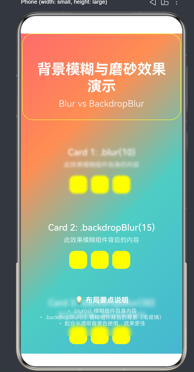
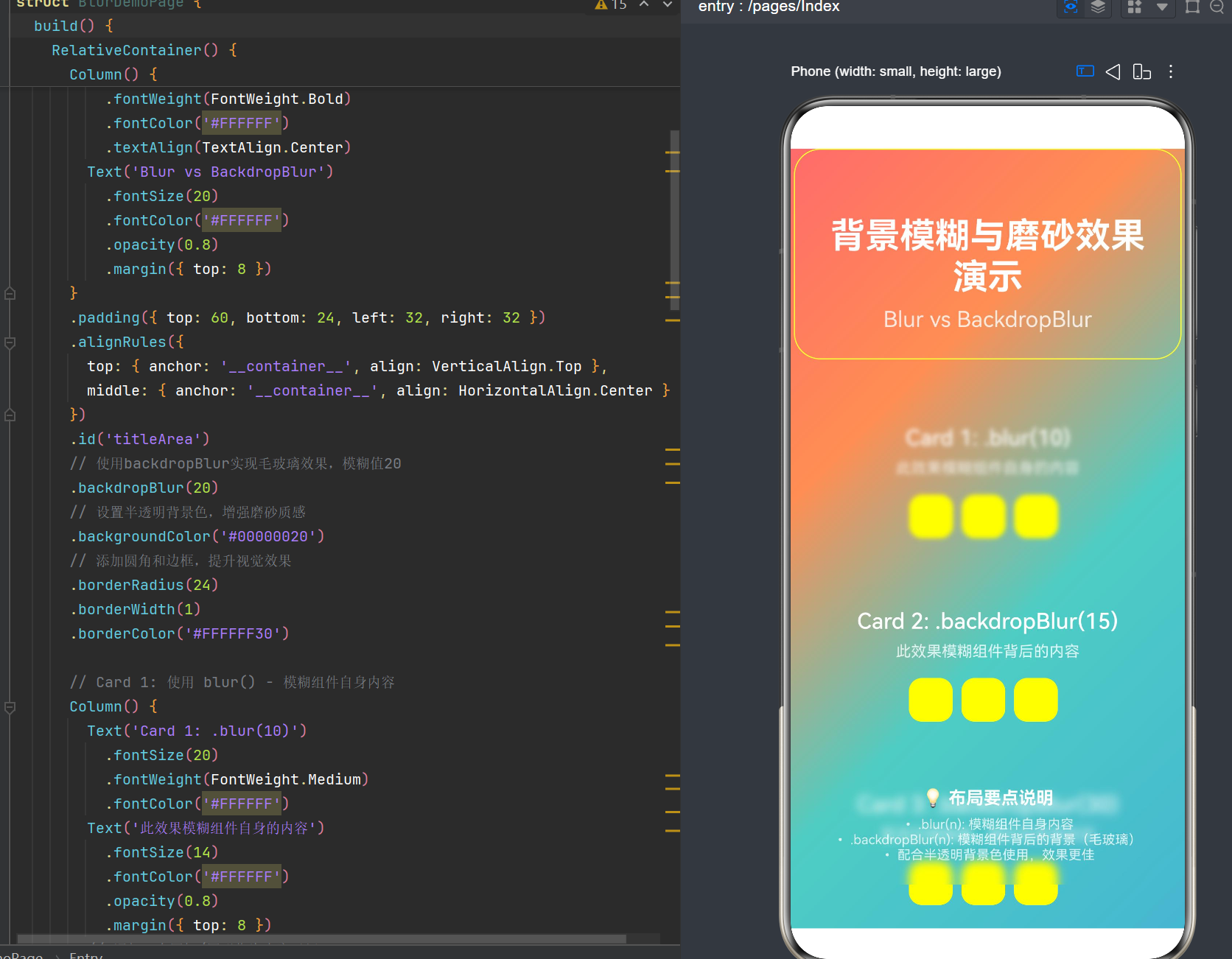
适用版本:HarmonyOS NEXT(API 24)
开发语言:ArkTS(TypeScript超集)
UI框架:ArkUI(声明式UI框架)
资源说明:文中代码示例中使用的
$r('app.media.xxx')资源引用为占位符,读者需要根据实际项目情况创建对应的图片、视频资源文件,或使用渐变背景、颜色等自包含方案替代。
目录
- 引言:模糊效果的视觉设计价值
- 模糊效果体系概览
- 核心API详解:backdropBlur
- 核心API详解:blur
- 核心API详解:backgroundBlurStyle
- 核心API详解:foregroundBlurStyle
- 运动模糊:motionBlur
- 线性渐变模糊:linearGradientBlur
- 效果级联:@ohos.graphics.uiEffect
- API 24新增特性
- 性能优化策略
- 实战场景一:毛玻璃卡片
- 实战场景二:模糊对话框
- 实战场景三:滚动动态模糊
- 实战场景四:视频背景模糊登录页
- 常见问题与解决方案
- ArkTS严格模式规范
- API对比总结表
- 总结与展望
1. 引言:模糊效果的视觉设计价值
在现代UI设计中,模糊效果(Blur)已经成为提升界面质感和用户体验的重要手段。从iOS的毛玻璃效果到Android的Material Design模糊,模糊效果在各大平台都得到了广泛应用。鸿蒙HarmonyOS作为新一代智能终端操作系统,同样提供了丰富的模糊效果API,帮助开发者构建沉浸式、高品质的应用界面。
1.1 模糊效果的设计原理
模糊效果的核心原理是通过高斯模糊算法对图像像素进行加权平均,使图像产生柔和、朦胧的视觉效果。在UI设计中,模糊效果主要有以下几个作用:
(1)增强层次感和深度感
通过对背景进行模糊处理,可以让前景元素更加突出,形成清晰的视觉层级。这种层次感是现代UI设计的重要特征之一。
(2)提升可读性
在复杂背景上显示文本时,通过模糊背景并叠加半透明遮罩,可以有效提升文本的可读性,避免背景干扰用户阅读。
(3)营造沉浸感
模糊效果可以模拟现实世界中的光学现象,如透过磨砂玻璃看物体,从而营造出更加真实、沉浸的用户体验。
(4)引导用户注意力
通过模糊非关键区域,可以将用户的注意力引导到界面的核心内容上,提升信息传递效率。
1.2 鸿蒙ArkUI模糊效果的发展历程
鸿蒙ArkUI框架自诞生以来,模糊效果API经历了多次演进:
| 阶段 | API版本 | 主要特性 |
|---|---|---|
| 基础阶段 | API 7-11 | 初步支持blur、backdropBlur等基础模糊接口 |
| 增强阶段 | API 12-18 | 引入backgroundBlurStyle、foregroundBlurStyle、motionBlur等高级接口 |
| 完善阶段 | API 19-23 | 优化模糊性能,支持更多模糊参数配置 |
| 进阶阶段 | API 24+ | 引入效果级联模块,支持HDR提亮等新特性 |
随着API版本的不断升级,鸿蒙ArkUI的模糊效果能力越来越强大,开发者可以更加灵活地实现各种复杂的视觉效果。
1.3 本文学习目标
通过阅读本文,您将掌握以下核心技能:
- 理解鸿蒙ArkUI中各类模糊效果API的区别与适用场景
- 掌握backdropBlur、blur、backgroundBlurStyle等核心API的使用方法
- 了解API 24新增特性及其应用场景
- 掌握模糊效果的性能优化策略
- 能够在实际项目中灵活运用模糊效果提升界面品质
2. 模糊效果体系概览
鸿蒙ArkUI提供了一套完整的模糊效果体系,涵盖了从基础模糊到高级特效的各种需求。以下是模糊效果API的分类汇总:
2.1 模糊效果分类
| 类别 | API | 作用对象 | API版本 |
|---|---|---|---|
| 背景模糊 | backdropBlur | 组件背后的背景 | API 7+ |
| 背景模糊 | backgroundBlurStyle | 组件背后的背景(预设样式) | API 9+ |
| 内容模糊 | blur | 组件自身的内容 | API 7+ |
| 内容模糊 | foregroundBlurStyle | 组件自身的内容(预设样式) | API 9+ |
| 运动模糊 | motionBlur | 组件运动过程中的动态模糊 | API 12+ |
| 渐变模糊 | linearGradientBlur | 线性渐变方向的模糊 | API 12+ |
| 效果级联 | uiEffect.Filter | 通过Filter实现模糊效果 | API 12+ |
| 效果级联 | uiEffect.VisualEffect | 通过VisualEffect实现视觉效果 | API 12+ |
2.2 核心概念区分
在开始学习具体API之前,我们需要明确两个核心概念的区别:
(1)背景模糊 vs 内容模糊
- 背景模糊(backdropBlur/backgroundBlurStyle):模糊的是组件背后的内容,即父组件或底层元素的渲染结果。这种效果常用于实现毛玻璃(Frosted Glass)效果。
- 内容模糊(blur/foregroundBlurStyle):模糊的是组件自身的内容,即组件内部子元素的渲染结果。这种效果常用于实现文字模糊、图片模糊等。
(2)实时模糊 vs 静态模糊
- 实时模糊:每帧都会重新计算模糊效果,性能开销较大,但效果更加动态、实时。backdropBlur、blur、backgroundBlurStyle等都属于实时模糊接口。
- 静态模糊:一次性计算模糊效果并缓存,性能开销较小,但不支持动态变化。@ohos.effectkit模块提供了静态模糊接口。
2.3 模糊效果的渲染原理
鸿蒙ArkUI的模糊效果基于GPU加速的高斯模糊算法实现。其渲染流程如下:
- 捕获渲染目标:系统首先捕获需要模糊的区域(背景模糊捕获组件下方的渲染结果,内容模糊捕获组件自身的渲染结果)。
- 执行高斯模糊:使用GPU shader执行高斯模糊算法,根据指定的模糊半径对像素进行加权平均。
- 合成渲染结果:将模糊后的图像与原始图像进行合成,形成最终的视觉效果。
需要注意的是,实时模糊效果需要每帧执行上述流程,因此会带来一定的性能开销。在实际开发中,需要根据场景需求选择合适的模糊方案。
3. 核心API详解:backdropBlur
3.1 API定义与参数说明
backdropBlur 是鸿蒙ArkUI中最基础的背景模糊接口,用于为组件添加背景模糊效果。
3.1.1 基础用法(API 7+)
backdropBlur(value: number): T
参数说明:
| 参数名 | 类型 | 必填 | 说明 |
|---|---|---|---|
| value | number | 是 | 模糊半径,单位为px。取值需大于等于0,模糊半径越大,模糊效果越强。模糊半径为0时无模糊效果。 |
3.1.2 进阶用法(API 18+)
backdropBlur(value: number, options?: BlurOptions): T
参数说明:
| 参数名 | 类型 | 必填 | 说明 |
|---|---|---|---|
| value | number | 是 | 模糊半径,单位为px |
| options | BlurOptions | 否 | 模糊选项,包括灰度等配置 |
BlurOptions对象说明:
| 参数名 | 类型 | 必填 | 说明 |
|---|---|---|---|
| grayscale | number | 否 | 灰度值,取值范围为[0, 1],0表示无灰度效果,1表示完全灰度。默认值为0。 |
3.2 使用示例
3.2.1 基础背景模糊
@Entry
@Component
struct BackdropBlurBasicExample {
  build() {
    Stack() {
      // 背景层:渐变背景
      Row()
        .width('100%')
        .height('100%')
        .linearGradient({
          angle: 135,
          colors: [
            [0xFF6B6B, 0.0],
            [0xFF8E53, 0.3],
            [0x4ECDC4, 0.6],
            [0x45B7D1, 1.0]
          ]
        })

      // 前景层:毛玻璃卡片
      Column() {
        Text('毛玻璃效果')
          .fontSize(28)
          .fontWeight(FontWeight.Bold)
          .fontColor('#FFFFFF')
        Text('使用 backdropBlur 实现')
          .fontSize(16)
          .fontColor('#FFFFFF')
          .opacity(0.8)
          .margin({ top: 8 })
      }
      .padding({ top: 32, bottom: 32, left: 48, right: 48 })
      .backdropBlur(20)
      .backgroundColor('#00000020')
      .borderRadius(24)
    }
    .width('100%')
    .height('100%')
  }
}
效果说明:
- 背景层是一个彩色渐变,提供丰富的视觉背景
- 前景卡片使用
backdropBlur(20)实现毛玻璃效果,模糊半径为20px - 配合半透明背景色
#00000020,增强磨砂质感 - 圆角边框提升视觉美观度
3.2.2 带灰度效果的背景模糊
@Entry
@Component
struct BackdropBlurGrayscaleExample {
  build() {
    Stack() {
      // 背景层:图片背景
      Image($r('app.media.background'))
        .width('100%')
        .height('100%')
        .objectFit(ImageFit.Cover)

      // 前景层:带灰度效果的毛玻璃卡片
      Column() {
        Text('灰度毛玻璃')
          .fontSize(28)
          .fontWeight(FontWeight.Bold)
          .fontColor('#FFFFFF')
        Text('grayscale: 0.5')
          .fontSize(16)
          .fontColor('#FFFFFF')
          .opacity(0.8)
          .margin({ top: 8 })
      }
      .padding({ top: 32, bottom: 32, left: 48, right: 48 })
      .backdropBlur(20, { grayscale: 0.5 })
      .backgroundColor('#00000030')
      .borderRadius(24)
    }
    .width('100%')
    .height('100%')
  }
}
效果说明:
- 背景层是一张彩色图片
- 使用
backdropBlur(20, { grayscale: 0.5 })实现带有50%灰度效果的毛玻璃 - 灰度效果会使背景模糊后的颜色更加柔和、偏灰
3.3 使用注意事项
(1)背景模糊的作用范围
backdropBlur 只会模糊组件直接下方的内容,即父容器中位于该组件之前渲染的元素。如果组件没有任何背景内容(如父容器是透明的),则模糊效果不可见。
(2)性能考虑
backdropBlur 是实时模糊接口,每帧都会执行模糊计算。当模糊半径较大或模糊区域较广时,会带来明显的性能开销。建议在实际使用中:
- 合理控制模糊半径,避免过大的值(一般建议不超过30px)
- 限制模糊区域的大小,避免全屏模糊
- 在静态场景中考虑使用静态模糊接口
(3)与其他背景属性的配合
backdropBlur 通常需要配合 backgroundColor 使用,通过半透明背景色增强磨砂质感。如果不设置背景色,模糊效果可能不够明显。
(4)API版本兼容性
backdropBlur 的基础用法从API 7开始支持,而带 BlurOptions 的进阶用法从API 18开始支持。在开发跨版本应用时,需要注意版本兼容性。
4. 核心API详解:blur
4.1 API定义与参数说明
blur 是鸿蒙ArkUI中用于实现内容模糊的核心接口,用于模糊组件自身的内容。
4.1.1 基础用法(API 7+)
blur(value: number, options?: BlurOptions): T
参数说明:
| 参数名 | 类型 | 必填 | 说明 |
|---|---|---|---|
| value | number | 是 | 模糊半径,单位为px |
| options | BlurOptions | 否 | 模糊选项 |
4.1.2 进阶用法(API 18+)
blur(options: BlurStyleOptions): T
BlurStyleOptions对象说明:
| 参数名 | 类型 | 必填 | 说明 |
|---|---|---|---|
| radius | number | 是 | 模糊半径,单位为px |
| grayscale | number | 否 | 灰度值,取值范围为[0, 1],默认值为0 |
4.2 使用示例
4.2.1 文本内容模糊
@Entry
@Component
struct BlurTextExample {
  @State blurRadius: number = 0;

  build() {
    Column({ space: 20 }) {
      // 模糊的文本
      Text('这是一段模糊的文本内容')
        .fontSize(24)
        .fontColor('#333333')
        .blur(this.blurRadius)

      // 模糊控制滑块
      Slider({
        value: this.blurRadius,
        min: 0,
        max: 20,
        step: 1,
        style: SliderStyle.OutSet
      })
      .onChange((value: number) => {
        this.blurRadius = value;
      })
      .width('80%')

      Text(`当前模糊半径: ${this.blurRadius}px`)
        .fontSize(14)
        .fontColor('#666666')
    }
    .width('100%')
    .height('100%')
    .justifyContent(FlexAlign.Center)
    .padding(20)
  }
}
效果说明:
- 用户可以通过滑块动态调整文本的模糊半径
- 模糊效果直接作用于文本内容本身,使文本变得模糊不清
- 这种效果常用于实现密码输入的隐藏、敏感信息的模糊处理等场景
4.2.2 图片内容模糊
@Entry
@Component
struct BlurImageExample {
  @State blurRadius: number = 0;

  build() {
    Column({ space: 20 }) {
      // 原始图片
      Image($r('app.media.demo_image'))
        .width(200)
        .height(200)
        .borderRadius(12)

      // 模糊的图片
      Image($r('app.media.demo_image'))
        .width(200)
        .height(200)
        .borderRadius(12)
        .blur(this.blurRadius)

      // 模糊控制滑块
      Slider({
        value: this.blurRadius,
        min: 0,
        max: 30,
        step: 1,
        style: SliderStyle.OutSet
      })
      .onChange((value: number) => {
        this.blurRadius = value;
      })
      .width('80%')
    }
    .width('100%')
    .height('100%')
    .justifyContent(FlexAlign.Center)
    .padding(20)
  }
}
效果说明:
- 上方显示原始图片,下方显示模糊后的图片
- 用户可以通过滑块实时调整图片的模糊程度
- 这种效果常用于实现图片的模糊预览、背景图模糊等场景
4.2.3 组件内容模糊
@Entry
@Component
struct BlurComponentExample {
  @State isBlurred: boolean = false;

  build() {
    Column({ space: 20 }) {
      // 可模糊的组件容器
      Column() {
        Image($r('app.media.icon'))
          .width(80)
          .height(80)
        Text('组件标题')
          .fontSize(20)
          .fontWeight(FontWeight.Bold)
          .margin({ top: 12 })
        Text('这是组件的详细描述内容,展示了内容模糊的效果')
          .fontSize(14)
          .fontColor('#666666')
          .margin({ top: 8 })
          .textAlign(TextAlign.Center)
      }
      .padding(24)
      .backgroundColor('#F5F5F5')
      .borderRadius(16)
      .blur(this.isBlurred ? 10 : 0)

      // 模糊切换按钮
      Button(this.isBlurred ? '取消模糊' : '添加模糊')
        .onClick(() => {
          this.isBlurred = !this.isBlurred;
        })
    }
    .width('100%')
    .height('100%')
    .justifyContent(FlexAlign.Center)
    .padding(20)
  }
}
效果说明:
- 整个组件容器(包括图片、标题、描述)都会被模糊
- 用户可以通过按钮切换模糊状态
- 这种效果常用于实现组件的禁用状态、加载状态等
4.3 blur与backdropBlur的区别
blur 和 backdropBlur 是鸿蒙ArkUI中最常用的两个模糊接口,它们的区别非常重要:
| 特性 | blur | backdropBlur |
|---|---|---|
| 作用对象 | 组件自身的内容 | 组件背后的背景 |
| 视觉效果 | 组件内容变得模糊 | 透过模糊层看到背景 |
| 典型场景 | 密码隐藏、图片模糊、组件禁用 | 毛玻璃卡片、模糊对话框、磨砂导航栏 |
| 性能开销 | 取决于组件内容复杂度 | 取决于背景内容复杂度 |
记忆技巧:
blur= 模糊"我"自己(内容模糊)backdropBlur= 模糊"我"背后的东西(背景模糊)
5. 核心API详解:backgroundBlurStyle
5.1 API定义与参数说明
backgroundBlurStyle 是鸿蒙ArkUI中用于实现背景模糊的高级接口,通过预设的模糊样式枚举值快速实现毛玻璃效果。
5.1.1 基础用法(API 9+)
backgroundBlurStyle(style: BlurStyle): T
参数说明:
| 参数名 | 类型 | 必填 | 说明 |
|---|---|---|---|
| style | BlurStyle | 是 | 模糊样式枚举值 |
5.1.2 进阶用法(API 18+)
backgroundBlurStyle(style: BlurStyle, options?: BackgroundBlurStyleOptions): T
BackgroundBlurStyleOptions对象说明:
| 参数名 | 类型 | 必填 | 说明 |
|---|---|---|---|
| adaptiveColor | boolean | 否 | 是否自适应颜色,默认值为false |
| policy | BlurStyleActivePolicy | 否 | 模糊激活策略,默认值为BlurStyleActivePolicy.ALWAYS_ACTIVE |
5.2 BlurStyle枚举值
BlurStyle 枚举提供了多种预设的模糊样式,每种样式对应不同的模糊半径、蒙版颜色、透明度等参数组合:
| 枚举值 | 说明 | 适用场景 |
|---|---|---|
| BlurStyle.Thin | 轻薄模糊效果,模糊半径较小 | 轻微磨砂效果,如导航栏、状态栏 |
| BlurStyle.Regular | 常规模糊效果,平衡模糊度与性能 | 通用毛玻璃卡片、对话框 |
| BlurStyle.Thick | 厚重模糊效果,模糊半径较大 | 强烈磨砂效果,如全屏弹窗、底部导航 |
| BlurStyle.BACKGROUND_THIN | 背景轻薄模糊 | 背景层轻微模糊 |
| BlurStyle.BACKGROUND_REGULAR | 背景常规模糊 | 背景层标准模糊 |
| BlurStyle.BACKGROUND_THICK | 背景厚重模糊 | 背景层强烈模糊 |
| BlurStyle.COMPONENT_THIN | 组件轻薄模糊 | 组件级轻微磨砂 |
| BlurStyle.COMPONENT_REGULAR | 组件常规模糊 | 组件级标准磨砂 |
| BlurStyle.COMPONENT_THICK | 组件厚重模糊 | 组件级强烈磨砂 |
5.3 使用示例
5.3.1 不同模糊样式对比
@Entry
@Component
struct BackgroundBlurStyleExample {
  build() {
    Stack() {
      // 背景层:渐变背景
      Row()
        .width('100%')
        .height('100%')
        .linearGradient({
          angle: 135,
          colors: [
            [0xFF6B6B, 0.0],
            [0xFF8E53, 0.3],
            [0x4ECDC4, 0.6],
            [0x45B7D1, 1.0]
          ]
        })

      // 前景层:三种模糊样式的卡片对比
      Column({ space: 16 }) {
        // Thin 样式
        Column() {
          Text('BlurStyle.Thin')
            .fontSize(18)
            .fontWeight(FontWeight.Medium)
            .fontColor('#FFFFFF')
          Text('轻薄模糊效果')
            .fontSize(14)
            .fontColor('#FFFFFF')
            .opacity(0.8)
            .margin({ top: 4 })
        }
        .padding(20)
        .backgroundBlurStyle(BlurStyle.Thin)
        .borderRadius(16)

        // Regular 样式
        Column() {
          Text('BlurStyle.Regular')
            .fontSize(18)
            .fontWeight(FontWeight.Medium)
            .fontColor('#FFFFFF')
          Text('常规模糊效果')
            .fontSize(14)
            .fontColor('#FFFFFF')
            .opacity(0.8)
            .margin({ top: 4 })
        }
        .padding(20)
        .backgroundBlurStyle(BlurStyle.Regular)
        .borderRadius(16)

        // Thick 样式
        Column() {
          Text('BlurStyle.Thick')
            .fontSize(18)
            .fontWeight(FontWeight.Medium)
            .fontColor('#FFFFFF')
          Text('厚重模糊效果')
            .fontSize(14)
            .fontColor('#FFFFFF')
            .opacity(0.8)
            .margin({ top: 4 })
        }
        .padding(20)
        .backgroundBlurStyle(BlurStyle.Thick)
        .borderRadius(16)
      }
      .padding(24)
    }
    .width('100%')
    .height('100%')
  }
}
效果说明:
- Thin:模糊效果最轻,背景细节保留较多
- Regular:模糊效果适中,是最常用的毛玻璃效果
- Thick:模糊效果最强,背景细节几乎不可辨认
5.3.2 带自适应颜色的背景模糊
@Entry
@Component
struct BackgroundBlurStyleAdaptiveExample {
  build() {
    Stack() {
      // 背景层:动态变化的颜色
      Row()
        .width('100%')
        .height('100%')
        .linearGradient({
          angle: 45,
          colors: [
            [0x9B59B6, 0.0],
            [0x3498DB, 0.5],
            [0x1ABC9C, 1.0]
          ]
        })

      // 前景层:自适应颜色的毛玻璃卡片
      Column() {
        Text('自适应颜色毛玻璃')
          .fontSize(24)
          .fontWeight(FontWeight.Bold)
          .fontColor('#FFFFFF')
        Text('背景颜色会自动适配')
          .fontSize(14)
          .fontColor('#FFFFFF')
          .opacity(0.8)
          .margin({ top: 8 })
      }
      .padding(24)
      .backgroundBlurStyle(BlurStyle.Regular, { adaptiveColor: true })
      .borderRadius(20)
    }
    .width('100%')
    .height('100%')
  }
}
效果说明:
- 使用
adaptiveColor: true后,毛玻璃卡片的背景色会根据底层背景自动调整 - 这种效果可以使毛玻璃卡片更好地融入背景,提升视觉和谐度
5.4 backgroundBlurStyle与backdropBlur的区别
backgroundBlurStyle 和 backdropBlur 都用于实现背景模糊,但它们的设计理念和使用方式有所不同:
| 特性 | backdropBlur | backgroundBlurStyle |
|---|---|---|
| 控制方式 | 手动控制模糊半径 | 使用预设样式枚举 |
| 自定义程度 | 高,可精确控制模糊参数 | 中,通过枚举选择预设效果 |
| 便捷性 | 需要手动配置背景色等属性 | 一键实现完整毛玻璃效果 |
| 适用场景 | 需要精确控制模糊效果 | 快速实现标准毛玻璃效果 |
| 额外功能 | 支持灰度效果 | 支持自适应颜色、激活策略 |
选择建议:
- 如果需要快速实现标准的毛玻璃效果,推荐使用
backgroundBlurStyle - 如果需要精细控制模糊参数(如特定的模糊半径、灰度效果),推荐使用
backdropBlur
6. 核心API详解:foregroundBlurStyle
6.1 API定义与参数说明
foregroundBlurStyle 是鸿蒙ArkUI中用于实现内容模糊的高级接口,通过预设的模糊样式枚举值快速实现组件内容的模糊效果。
6.1.1 基础用法(API 9+)
foregroundBlurStyle(style: BlurStyle): T
参数说明:
| 参数名 | 类型 | 必填 | 说明 |
|---|---|---|---|
| style | BlurStyle | 是 | 模糊样式枚举值 |
6.1.2 进阶用法(API 18+)
foregroundBlurStyle(style: BlurStyle, options?: ForegroundBlurStyleOptions): T
ForegroundBlurStyleOptions对象说明:
| 参数名 | 类型 | 必填 | 说明 |
|---|---|---|---|
| adaptiveColor | boolean | 否 | 是否自适应颜色,默认值为false |
6.2 使用示例
6.2.1 组件内容模糊
@Entry
@Component
struct ForegroundBlurStyleExample {
  @State blurLevel: number = 0;

  build() {
    Column({ space: 20 }) {
      // 根据模糊级别条件性渲染组件
      if (this.blurLevel === 0) {
        // 无模糊效果
        this.renderContent();
      } else if (this.blurLevel === 1) {
        // 轻微模糊
        this.renderContent().foregroundBlurStyle(BlurStyle.Thin);
      } else if (this.blurLevel === 2) {
        // 中等模糊
        this.renderContent().foregroundBlurStyle(BlurStyle.Regular);
      } else {
        // 强烈模糊
        this.renderContent().foregroundBlurStyle(BlurStyle.Thick);
      }

      // 模糊程度选择器
      Column({ space: 8 }) {
        Text('模糊程度')
          .fontSize(16)
          .fontWeight(FontWeight.Medium)
        Row({ space: 12 }) {
          ['无模糊', '轻微', '中等', '强烈'].forEach((label: string, index: number) => {
            Button(label)
              .fontSize(12)
              .onClick(() => {
                this.blurLevel = index;
              })
          })
        }
      }
    }
    .width('100%')
    .height('100%')
    .justifyContent(FlexAlign.Center)
    .padding(20)
  }

  @Builder
  renderContent() {
    Column() {
      Image($r('app.media.icon'))
        .width(60)
        .height(60)
      Text('应用名称')
        .fontSize(18)
        .fontWeight(FontWeight.Medium)
        .margin({ top: 8 })
    }
    .padding(20)
    .backgroundColor('#F5F5F5')
    .borderRadius(16);
  }
}
效果说明:
- 用户可以通过按钮选择不同的模糊程度
foregroundBlurStyle会模糊组件内部的所有内容(图片、文本等)- 这种效果常用于实现组件的禁用状态、加载状态或隐私保护场景
6.3 foregroundBlurStyle与blur的区别
foregroundBlurStyle 和 blur 都用于实现内容模糊,但它们的设计理念和使用方式有所不同:
| 特性 | blur | foregroundBlurStyle |
|---|---|---|
| 控制方式 | 手动控制模糊半径 | 使用预设样式枚举 |
| 自定义程度 | 高,可精确控制模糊参数 | 中,通过枚举选择预设效果 |
| 便捷性 | 需要手动配置 | 一键实现内容模糊效果 |
| 额外功能 | 支持灰度效果 | 支持自适应颜色 |
| 适用场景 | 需要精确控制内容模糊 | 快速实现标准内容模糊 |
7. 运动模糊:motionBlur
7.1 API定义与参数说明
motionBlur 是鸿蒙ArkUI中用于实现运动模糊效果的接口,当组件发生缩放或位移变化时,会产生动态模糊效果。
7.1.1 基础用法(API 12+)
motionBlur(radius: number, anchor?: Point): T
参数说明:
| 参数名 | 类型 | 必填 | 说明 |
|---|---|---|---|
| radius | number | 是 | 运动模糊半径,单位为px。取值需大于等于0。 |
| anchor | Point | 否 | 运动模糊的锚点坐标,默认为组件中心点。 |
Point对象说明:
| 参数名 | 类型 | 必填 | 说明 |
|---|---|---|---|
| x | number | 是 | 锚点的X坐标 |
| y | number | 是 | 锚点的Y坐标 |
7.2 使用示例
7.2.1 缩放运动模糊
@Entry
@Component
struct MotionBlurScaleExample {
  @State scale: number = 1;
  @State isAnimating: boolean = false;

  build() {
    Column({ space: 20 }) {
      // 带运动模糊的组件
      Column() {
        Text('运动模糊')
          .fontSize(24)
          .fontWeight(FontWeight.Bold)
          .fontColor('#FFFFFF')
      }
      .width(150)
      .height(150)
      .backgroundColor('#4ECDC4')
      .borderRadius(16)
      .justifyContent(FlexAlign.Center)
      .motionBlur(this.isAnimating ? 10 : 0)
      .scale({ x: this.scale, y: this.scale })

      // 触发动画按钮
      Button('触发缩放动画')
        .onClick(() => {
          this.isAnimating = true;
          animateTo({
            duration: 500,
            curve: Curve.FastOutSlowIn
          }, () => {
            this.scale = this.scale === 1 ? 1.5 : 1;
          });
          setTimeout(() => {
            this.isAnimating = false;
          }, 500);
        })
    }
    .width('100%')
    .height('100%')
    .justifyContent(FlexAlign.Center)
    .padding(20)
  }
}
效果说明:
- 当组件进行缩放动画时,
motionBlur(10)会产生运动模糊效果 - 动画结束后,运动模糊效果消失
- 这种效果可以增强动画的视觉冲击力,使运动更加自然流畅
7.2.2 位移动运动模糊
@Entry
@Component
struct MotionBlurTranslateExample {
  @State offsetX: number = 0;
  @State isAnimating: boolean = false;

  build() {
    Column({ space: 20 }) {
      // 带运动模糊的组件
      Column() {
        Text('飞行动画')
          .fontSize(20)
          .fontWeight(FontWeight.Bold)
          .fontColor('#FFFFFF')
      }
      .width(100)
      .height(100)
      .backgroundColor('#FF6B6B')
      .borderRadius(12)
      .justifyContent(FlexAlign.Center)
      .motionBlur(this.isAnimating ? 15 : 0)
      .translate({ x: this.offsetX, y: 0 })

      // 触发位移动画按钮
      Button('触发位移动画')
        .onClick(() => {
          this.isAnimating = true;
          animateTo({
            duration: 800,
            curve: Curve.Linear
          }, () => {
            this.offsetX = this.offsetX === 0 ? 100 : 0;
          });
          setTimeout(() => {
            this.isAnimating = false;
          }, 800);
        })
    }
    .width('100%')
    .height('100%')
    .justifyContent(FlexAlign.Center)
    .padding(20)
  }
}
效果说明:
- 当组件进行位移动画时,
motionBlur(15)会产生运动轨迹模糊效果 - 运动模糊方向与位移方向一致,模拟真实世界中的运动轨迹
7.3 使用注意事项
(1)运动模糊的触发条件
motionBlur 只有在组件发生缩放(scale)或位移(translate)变化时才会生效。静态组件使用 motionBlur 不会产生任何效果。
(2)性能考虑
运动模糊效果需要在动画过程中实时计算模糊轨迹,会带来一定的性能开销。建议:
- 合理控制模糊半径,避免过大的值
- 只在必要的动画期间启用运动模糊
- 避免在复杂组件上使用运动模糊
(3)锚点的作用
锚点决定了运动模糊的中心点。默认情况下,锚点是组件的中心点。如果需要改变模糊的中心点,可以通过 anchor 参数指定。
8. 线性渐变模糊:linearGradientBlur
8.1 API定义与参数说明
linearGradientBlur 是鸿蒙ArkUI中用于实现线性渐变模糊效果的接口,模糊效果会沿指定方向逐渐变化。
8.1.1 基础用法(API 12+)
linearGradientBlur(options: LinearGradientBlurOptions): T
LinearGradientBlurOptions对象说明:
| 参数名 | 类型 | 必填 | 说明 |
|---|---|---|---|
| start | Point | 是 | 模糊起始点坐标 |
| end | Point | 是 | 模糊结束点坐标 |
| startRadius | number | 是 | 起始点模糊半径 |
| endRadius | number | 是 | 结束点模糊半径 |
8.2 使用示例
8.2.1 从左到右的渐变模糊
@Entry
@Component
struct LinearGradientBlurHorizontalExample {
  build() {
    Column({ space: 20 }) {
      // 原始图片
      Image($r('app.media.demo_image'))
        .width(300)
        .height(200)
        .borderRadius(12)

      // 水平渐变模糊的图片
      Image($r('app.media.demo_image'))
        .width(300)
        .height(200)
        .borderRadius(12)
        .linearGradientBlur({
          start: { x: 0, y: 0 },
          end: { x: 300, y: 0 },
          startRadius: 0,
          endRadius: 20
        })
    }
    .width('100%')
    .height('100%')
    .justifyContent(FlexAlign.Center)
    .padding(20)
  }
}
效果说明:
- 图片从左到右逐渐模糊
- 左侧(起始点)模糊半径为0,保持清晰
- 右侧(结束点)模糊半径为20,完全模糊
8.2.2 从中心向外的渐变模糊
@Entry
@Component
struct LinearGradientBlurRadialExample {
  build() {
    Column({ space: 20 }) {
      // 从中心向外渐变模糊的图片
      Image($r('app.media.demo_image'))
        .width(300)
        .height(300)
        .borderRadius(150)
        .linearGradientBlur({
          start: { x: 150, y: 150 },
          end: { x: 300, y: 150 },
          startRadius: 0,
          endRadius: 30
        })
    }
    .width('100%')
    .height('100%')
    .justifyContent(FlexAlign.Center)
    .padding(20)
  }
}
效果说明:
- 图片中心保持清晰,向四周逐渐模糊
- 这种效果常用于实现聚焦效果,突出中心内容
8.3 使用注意事项
(1)坐标系统
linearGradientBlur 的坐标是相对于组件自身的,左上角为原点(0, 0)。
(2)性能考虑
线性渐变模糊需要计算沿渐变方向的模糊变化,性能开销比普通模糊更大。建议:
- 合理控制起始和结束模糊半径的差值
- 避免在大型组件上使用线性渐变模糊
- 考虑使用静态模糊替代动态线性渐变模糊
9. 效果级联:@ohos.graphics.uiEffect
9.1 模块概述
@ohos.graphics.uiEffect 是鸿蒙ArkUI中用于实现效果级联的模块,提供了更加灵活的效果组合能力。该模块包含两个核心类:
- Filter:用于添加过滤效果,如模糊、提亮等
- VisualEffect:用于添加视觉效果,如边缘扩展等
9.2 导入模块
import { uiEffect } from "@kit.ArkGraphics2D";
9.3 Filter类详解
9.3.1 创建Filter实例
let filter: uiEffect.Filter = uiEffect.createFilter();
9.3.2 blur方法(API 12+)
blur(blurRadius: number): Filter
参数说明:
| 参数名 | 类型 | 必填 | 说明 |
|---|---|---|---|
| blurRadius | number | 是 | 模糊半径,单位为px |
返回值:返回挂载了模糊效果的Filter实例
9.3.3 使用示例
@Entry
@Component
struct UIEffectFilterExample {
  // 创建Filter实例
  private filter: uiEffect.Filter = uiEffect.createFilter().blur(10);

  build() {
    Column({ space: 15 }) {
      Text('UIEffect Filter 模糊效果')
        .fontSize(20)
        .width('75%')
        .fontColor('#333333')

      // 使用Filter实现背景模糊
      Image($r('app.media.foreground'))
        .width(150)
        .height(150)
        .backgroundImage($r('app.media.background'))
        .backgroundImagePosition(Alignment.Center)
        .backgroundImageSize({ width: 140, height: 140 })
        .backgroundFilter(this.filter)
    }
    .width('100%')
    .height('100%')
    .justifyContent(FlexAlign.Center)
    .padding(20)
  }
}
效果说明:
- 通过
uiEffect.createFilter().blur(10)创建一个带有模糊效果的Filter实例 - 使用
backgroundFilter属性将Filter应用到组件的背景上 - 这种方式可以实现更复杂的效果组合,如同时应用模糊和提亮
9.4 VisualEffect类详解
9.4.1 创建VisualEffect实例(API 12+)
let visualEffect: uiEffect.VisualEffect = uiEffect.createEffect();
卡片能力:从API 24开始,该接口支持在ArkTS卡片中使用。
9.4.2 使用示例
@Entry
@Component
struct UIEffectVisualEffectExample {
  // 创建VisualEffect实例
  private visualEffect: uiEffect.VisualEffect = uiEffect.createEffect();

  build() {
    Column({ space: 15 }) {
      Text('UIEffect VisualEffect')
        .fontSize(20)
        .width('75%')
        .fontColor('#333333')

      // 使用VisualEffect实现视觉效果
      Column() {
        Text('视觉效果示例')
          .fontSize(18)
          .fontColor('#FFFFFF')
      }
      .width(200)
      .height(100)
      .backgroundColor('#4ECDC4')
      .borderRadius(12)
      .justifyContent(FlexAlign.Center)
      .effect(this.visualEffect)
    }
    .width('100%')
    .height('100%')
    .justifyContent(FlexAlign.Center)
    .padding(20)
  }
}
9.5 效果级联的优势
@ohos.graphics.uiEffect 模块相比直接使用模糊API具有以下优势:
| 特性 | 直接使用模糊API | 使用uiEffect模块 |
|---|---|---|
| 效果组合 | 一次只能应用一种效果 | 可以级联多种效果 |
| 复用性 | 每次使用都需要重新配置 | 创建一次可多次复用 |
| 灵活性 | 配置选项固定 | 可以自定义效果链 |
| 性能优化 | 无特殊优化 | 支持效果缓存和批处理 |
10. API 24新增特性
10.1 hdrBrightnessRatio(API 24+)
hdrBrightnessRatio 是API 24新增的Filter效果,用于为组件内容添加HDR(高动态范围成像)提亮效果。
10.1.1 方法定义
hdrBrightnessRatio(ratio: number): Filter
参数说明:
| 参数名 | 类型 | 必填 | 说明 |
|---|---|---|---|
| ratio | number | 是 | 提亮倍数,取值范围为[1.0, 设备最大支持倍数] |
10.1.2 使用示例
@Entry
@Component
struct HDRBrightnessRatioExample {
  @State brightnessRatio: number = 1.0;

  build() {
    Column({ space: 20 }) {
      // 创建带有HDR提亮效果的Filter
      let filter: uiEffect.Filter = uiEffect.createFilter()
        .hdrBrightnessRatio(this.brightnessRatio);

      // 使用Filter的图片
      Image($r('app.media.demo_image'))
        .width(300)
        .height(200)
        .borderRadius(12)
        .filter(filter)

      // 提亮倍数控制滑块
      Slider({
        value: this.brightnessRatio,
        min: 1.0,
        max: 3.0,
        step: 0.1,
        style: SliderStyle.OutSet
      })
      .onChange((value: number) => {
        this.brightnessRatio = value;
      })
      .width('80%')

      Text(`当前提亮倍数: ${this.brightnessRatio.toFixed(1)}x`)
        .fontSize(14)
        .fontColor('#666666')
    }
    .width('100%')
    .height('100%')
    .justifyContent(FlexAlign.Center)
    .padding(20)
  }
}
效果说明:
- 用户可以通过滑块调整HDR提亮倍数
- 提亮效果可以使图片更加明亮,突出细节
- 需要设备支持HDR渲染管线才能生效
10.2 VisualEffect卡片支持(API 24+)
从API 24开始,uiEffect.createEffect() 接口支持在ArkTS卡片中使用。这意味着开发者可以在卡片中使用VisualEffect实现更丰富的视觉效果。
10.2.1 使用示例
// 在卡片中使用VisualEffect
@Entry
@Component
struct CardVisualEffectExample {
  private visualEffect: uiEffect.VisualEffect = uiEffect.createEffect();

  build() {
    Column() {
      Text('卡片内容')
        .fontSize(18)
        .fontColor('#333333')
    }
    .width('100%')
    .height(100)
    .backgroundColor('#FFFFFF')
    .borderRadius(12)
    .justifyContent(FlexAlign.Center)
    .effect(this.visualEffect)
  }
}
10.3 API 24其他改进
除了上述新增特性外,API 24还对模糊效果进行了以下改进:
| 改进项 | 说明 |
|---|---|
| 性能优化 | 优化了实时模糊的渲染性能,减少了GPU开销 |
| 兼容性增强 | 增强了模糊效果在不同设备上的一致性 |
| 内存管理 | 改进了模糊效果的内存管理,减少了内存泄漏风险 |
11. 性能优化策略
11.1 实时模糊 vs 静态模糊
鸿蒙ArkUI提供了两种模糊方案:实时模糊和静态模糊。在实际开发中,需要根据场景选择合适的方案。
11.1.1 实时模糊
适用场景:
- 背景内容需要动态变化(如视频背景、动画背景)
- 需要响应用户交互的模糊效果(如滚动时的模糊变化)
- 模糊效果需要实时更新
性能特点:
- 每帧都会重新计算模糊效果
- 性能开销较大,尤其是模糊半径较大时
- 内存占用较高
11.1.2 静态模糊
适用场景:
- 背景内容固定不变(如静态图片背景)
- 模糊效果不需要动态更新
- 对性能要求较高的场景
性能特点:
- 一次性计算模糊效果并缓存
- 性能开销较小
- 内存占用较低
11.2 使用静态模糊
静态模糊可以通过 @ohos.effectkit 模块实现:
import { effectkit } from '@kit.ArkGraphics2D';

// 创建静态模糊图片
let pixelMap: PixelMap = ...; // 原始图片
let blurredPixelMap: PixelMap = effectkit.blur(pixelMap, 20);

// 使用模糊后的图片
Image(blurredPixelMap)
  .width('100%')
  .height('100%')
11.3 性能优化建议
11.3.1 合理控制模糊半径
模糊半径是影响性能的最关键因素。半径越大,模糊计算量越大,性能开销也越大。
建议:
- 普通毛玻璃效果:模糊半径控制在10-20px
- 强烈磨砂效果:模糊半径控制在20-30px
- 避免使用超过30px的模糊半径
11.3.2 限制模糊区域大小
模糊区域越大,需要处理的像素越多,性能开销也越大。
建议:
- 避免全屏模糊,只对需要模糊的区域应用模糊效果
- 使用
clip属性裁剪模糊区域 - 合理设置组件的宽高,避免不必要的模糊计算
11.3.3 使用renderGroup缓存
renderGroup 可以将多个组件的渲染结果缓存起来,减少重复渲染。
Column() {
  // 多个子组件
}
.renderGroup(true) // 启用渲染缓存
.backdropBlur(20)
11.3.4 避免嵌套模糊
嵌套使用模糊效果会导致性能急剧下降,因为内层模糊需要先计算,然后外层模糊再对结果进行计算。
不推荐:
Column()
  .backdropBlur(10)
  .backgroundBlurStyle(BlurStyle.Regular) // 嵌套模糊
11.3.5 在适当的时机启用/禁用模糊
在不需要模糊效果时及时禁用,可以节省性能开销。
@State isBlurEnabled: boolean = true;

Column()
  .backdropBlur(this.isBlurEnabled ? 20 : 0)
11.3.6 使用硬件加速
鸿蒙ArkUI默认使用GPU进行硬件加速渲染,但在某些情况下可能会回退到软件渲染。可以通过以下方式确保硬件加速:
- 避免使用复杂的自定义绘制
- 合理设置组件的渲染属性
- 测试不同设备上的渲染性能
11.4 性能测试方法
在开发过程中,可以使用以下方法测试模糊效果的性能:
(1)使用性能分析工具
鸿蒙DevEco Studio提供了性能分析工具,可以查看帧率、GPU使用率等指标。
(2)手动测试
在不同设备上运行应用,观察以下指标:
- 帧率是否稳定(目标60fps)
- 是否有明显的卡顿现象
- 内存占用是否在合理范围内
(3)对比测试
对比使用模糊效果和不使用模糊效果时的性能差异,评估模糊效果的性能开销。
12. 实战场景一:毛玻璃卡片
12.1 场景描述
毛玻璃卡片是现代UI设计中最常见的模糊效果应用场景。它通常用于在复杂背景上展示信息,通过模糊背景并叠加半透明遮罩,使卡片内容更加清晰可读。
12.2 技术方案
使用 backdropBlur 或 backgroundBlurStyle 实现毛玻璃效果,配合以下技术:
- 半透明背景色增强磨砂质感
- 圆角边框提升视觉美观度
- 阴影效果增强层次感
- 适当的padding和margin布局
12.3 完整代码示例
@Entry
@Component
struct FrostedGlassCardExample {
  // 模拟卡片数据
  private cardData: Array<{
    title: string;
    description: string;
    icon: string;
    color: string;
  }> = [
    {
      title: '音乐',
      description: '正在播放:夜曲 - 周杰伦',
      icon: '🎵',
      color: '#FF6B6B'
    },
    {
      title: '天气',
      description: '今天晴,26°C',
      icon: '☀️',
      color: '#FF8E53'
    },
    {
      title: '日历',
      description: '明天有3个日程',
      icon: '📅',
      color: '#4ECDC4'
    },
    {
      title: '邮件',
      description: '您有5封未读邮件',
      icon: '📧',
      color: '#45B7D1'
    }
  ];

  build() {
    Stack() {
      // 背景层:渐变背景
      Row()
        .width('100%')
        .height('100%')
        .linearGradient({
          angle: 135,
          colors: [
            [0xFF6B6B, 0.0],
            [0xFF8E53, 0.3],
            [0x4ECDC4, 0.6],
            [0x45B7D1, 1.0]
          ]
        })

      // 内容层:毛玻璃卡片网格
      Column({ space: 16 }) {
        Text('毛玻璃卡片示例')
          .fontSize(28)
          .fontWeight(FontWeight.Bold)
          .fontColor('#FFFFFF')
          .backdropBlur(20)
          .backgroundColor('#00000020')
          .padding({ top: 16, bottom: 16, left: 24, right: 24 })
          .borderRadius(24)

        // 卡片网格
        Grid() {
          ForEach(this.cardData, (item: { title: string; description: string; icon: string; color: string }, index: number) => {
            GridItem() {
              Column({ space: 12 }) {
                // 图标
                Text(item.icon)
                  .fontSize(36)

                // 标题
                Text(item.title)
                  .fontSize(18)
                  .fontWeight(FontWeight.Medium)
                  .fontColor('#FFFFFF')

                // 描述
                Text(item.description)
                  .fontSize(14)
                  .fontColor('#FFFFFF')
                  .opacity(0.8)
                  .maxLines(2)
                  .textAlign(TextAlign.Center)
              }
              .width('100%')
              .height('100%')
              .padding(20)
              .justifyContent(FlexAlign.Center)
              // 毛玻璃效果
              .backdropBlur(20)
              .backgroundColor('#00000020')
              .borderRadius(20)
              // 边框和阴影
              .borderWidth(1)
              .borderColor('#FFFFFF30')
              .shadow({
                radius: 10,
                color: '#00000030',
                offsetY: 4
              })
            }
          }, (item: { title: string }) => item.title)
        }
        .columnsTemplate('1fr 1fr')
        .rowsGap(16)
        .columnsGap(16)
        .width('100%')
        .height('60%')
      }
      .width('100%')
      .height('100%')
      .padding(24)
      .justifyContent(FlexAlign.Start)
    }
    .width('100%')
    .height('100%')
  }
}
12.4 效果说明
- 背景层使用彩色渐变,提供丰富的视觉背景
- 标题区域使用毛玻璃效果,增强层次感
- 卡片网格使用2列布局,展示4个毛玻璃卡片
- 每个卡片包含图标、标题和描述信息
- 卡片使用
backdropBlur(20)实现毛玻璃效果 - 配合半透明背景色
#00000020和白色边框,增强磨砂质感 - 添加阴影效果,使卡片具有悬浮感
12.5 技术要点总结
(1)毛玻璃效果实现
.backdropBlur(20)           // 背景模糊,模糊半径20px
.backgroundColor('#00000020')  // 半透明黑色背景
(2)视觉增强
.borderWidth(1)            // 边框宽度
.borderColor('#FFFFFF30')  // 半透明白色边框
.borderRadius(20)          // 圆角
.shadow({
  radius: 10,              // 阴影半径
  color: '#00000030',      // 阴影颜色
  offsetY: 4               // 阴影垂直偏移
})
(3)布局要点
- 使用
Grid实现响应式卡片网格 - 使用
ForEach渲染动态数据 - 合理设置padding和margin,保持布局整洁
13. 实战场景二:模糊对话框
13.1 场景描述
模糊对话框是指在弹出对话框时,对背景内容进行模糊处理,使对话框成为视觉焦点。这种效果可以有效提升用户的注意力,提供更好的交互体验。
13.2 技术方案
使用 CustomDialog 组件配合背景模糊效果实现:
- 对话框弹出时,背景自动模糊
- 对话框关闭时,背景恢复清晰
- 支持自定义对话框内容和样式
13.3 完整代码示例
@Entry
@Component
struct BlurDialogExample {
  @State blurRadius: number = 0;
  // 创建对话框控制器
  dialogController: CustomDialogController = new CustomDialogController({
    builder: BlurConfirmDialog({
      onConfirm: () => {
        this.blurRadius = 0;
      },
      onCancel: () => {
        this.blurRadius = 0;
      }
    }),
    alignment: Alignment.Center,
    autoCancel: false
  });

  build() {
    Stack() {
      // 背景层:渐变背景
      Row()
        .width('100%')
        .height('100%')
        .linearGradient({
          angle: 135,
          colors: [
            [0x9B59B6, 0.0],
            [0x3498DB, 0.5],
            [0x1ABC9C, 1.0]
          ]
        })
        .backdropBlur(this.blurRadius)

      // 内容层
      Column({ space: 20 }) {
        Text('模糊对话框示例')
          .fontSize(28)
          .fontWeight(FontWeight.Bold)
          .fontColor('#FFFFFF')

        Text('点击下方按钮弹出模糊对话框')
          .fontSize(16)
          .fontColor('#FFFFFF')
          .opacity(0.8)

        Button('弹出对话框')
          .width(200)
          .height(48)
          .backgroundColor('#FFFFFF')
          .fontColor('#333333')
          .fontSize(18)
          .borderRadius(24)
          .onClick(() => {
            this.dialogController.open();
            setTimeout(() => {
              this.blurRadius = 20;
            }, 50);
          })
      }
      .width('100%')
      .height('100%')
      .justifyContent(FlexAlign.Center)
    }
    .width('100%')
    .height('100%')
  }
}

// 自定义对话框组件
@CustomDialog
struct BlurConfirmDialog {
  controller: CustomDialogController;
  onConfirm: () => void;
  onCancel: () => void;

  build() {
    Column({ space: 20 }) {
      Text('确认对话框')
        .fontSize(24)
        .fontWeight(FontWeight.Bold)
        .fontColor('#333333')

      Text('这是一个带有背景模糊效果的对话框示例')
        .fontSize(16)
        .fontColor('#666666')
        .textAlign(TextAlign.Center)

      Row({ space: 16 }) {
        Button('取消')
          .width(120)
          .height(44)
          .backgroundColor('#F5F5F5')
          .fontColor('#666666')
          .fontSize(16)
          .borderRadius(22)
          .onClick(() => {
            this.onCancel();
            this.controller.close();
          })

        Button('确认')
          .width(120)
          .height(44)
          .backgroundColor('#4ECDC4')
          .fontColor('#FFFFFF')
          .fontSize(16)
          .borderRadius(22)
          .onClick(() => {
            this.onConfirm();
            this.controller.close();
          })
      }
    }
    .width(300)
    .padding(32)
    .backgroundColor('#FFFFFF')
    .borderRadius(24)
    .shadow({
      radius: 20,
      color: '#00000030',
      offsetY: 8
    })
  }
}
13.4 效果说明
- 点击"弹出对话框"按钮时,背景逐渐模糊(模糊半径从0变为20)
- 对话框从中心弹出,带有阴影效果
- 点击"取消"或"确认"按钮时,背景逐渐恢复清晰,然后对话框关闭
- 整个过程带有平滑的过渡动画
13.5 技术要点总结
(1)背景模糊控制
@State blurRadius: number = 0;

// 弹出对话框时设置模糊
setTimeout(() => {
  this.blurRadius = 20;
}, 50);

// 关闭对话框时取消模糊
this.blurRadius = 0;
(2)对话框动画
通过延迟设置模糊半径,配合 animateTo 可以实现更平滑的动画效果:
.onClick(() => {
  this.showDialog = true;
  animateTo({
    duration: 300,
    curve: Curve.FastOutSlowIn
  }, () => {
    this.blurRadius = 20;
  });
})
(3)CustomDialog使用
CustomDialog({
  builder: BlurDialogBuilder({...}),  // 对话框内容Builder
  alignment: Alignment.Center,        // 对齐方式
  autoCancel: false,                  // 是否允许点击外部关闭
  offset: { dx: 0, dy: 0 }           // 偏移量
})
14. 实战场景三:滚动动态模糊
14.1 场景描述
滚动动态模糊是指在滚动过程中,根据滚动位置动态调整模糊效果。这种效果常用于实现沉浸式导航栏、滚动视差等高级UI效果。
14.2 技术方案
使用 Scroll 组件配合滚动监听实现动态模糊:
- 监听滚动事件,获取滚动距离
- 根据滚动距离计算模糊半径
- 动态更新模糊效果
14.3 完整代码示例
@Entry
@Component
struct ScrollBlurExample {
  @State scrollOffset: number = 0;
  @State maxOffset: number = 300;

  // 模拟列表数据
  private listData: Array<{
    id: number;
    title: string;
    description: string;
    color: string;
  }> = Array.from({ length: 20 }, (_, i) => ({
    id: i,
    title: `列表项 ${i + 1}`,
    description: `这是第 ${i + 1} 个列表项的描述内容`,
    color: `#${Math.floor(Math.random()*16777215).toString(16).padStart(6, '0')}`
  }));

  build() {
    Stack() {
      // 背景层:根据滚动动态模糊
      Image($r('app.media.background'))
        .width('100%')
        .height('100%')
        .objectFit(ImageFit.Cover)
        .backdropBlur(this.getBlurRadius())

      // 内容层:滚动容器
      Column() {
        // 动态模糊的导航栏
        Column() {
          Text('滚动动态模糊')
            .fontSize(24)
            .fontWeight(FontWeight.Bold)
            .fontColor('#FFFFFF')
        }
        .width('100%')
        .height(80)
        .padding({ top: 40 })
        .justifyContent(FlexAlign.Center)
        .backgroundColor(this.getNavBarOpacity())
        .backdropBlur(this.getBlurRadius())

        // 滚动列表
        Scroll() {
          Column({ space: 12 }) {
            ForEach(this.listData, (item: { id: number; title: string; description: string; color: string }) => {
              Column() {
                Text(item.title)
                  .fontSize(18)
                  .fontWeight(FontWeight.Medium)
                  .fontColor('#FFFFFF')
                Text(item.description)
                  .fontSize(14)
                  .fontColor('#FFFFFF')
                  .opacity(0.8)
                  .margin({ top: 4 })
              }
              .width('100%')
              .padding(16)
              .backgroundColor(`${item.color}40`)
              .borderRadius(12)
              .backdropBlur(10)
            }, (item: { id: number }) => item.id.toString())
          }
          .padding(16)
        }
        .width('100%')
        .height('100%')
        .onScroll((offset: number) => {
          this.scrollOffset = offset;
        })
      }
      .width('100%')
      .height('100%')
    }
    .width('100%')
    .height('100%')
  }

  // 计算模糊半径
  getBlurRadius(): number {
    return Math.min(this.scrollOffset / this.maxOffset * 20, 20);
  }

  // 计算导航栏透明度
  getNavBarOpacity(): string {
    const opacity = Math.min(this.scrollOffset / this.maxOffset * 0.8, 0.8);
    return `#000000${Math.floor(opacity * 255).toString(16).padStart(2, '0')}`;
  }
}
14.4 效果说明
- 随着用户向下滚动,背景图片逐渐模糊
- 导航栏的透明度和模糊度也会逐渐增加
- 滚动列表项使用轻微的毛玻璃效果,增强层次感
- 当滚动距离达到最大值(300px)时,模糊效果达到最大(20px)
14.5 技术要点总结
(1)滚动事件监听
.onScroll((offset: number) => {
  this.scrollOffset = offset;
})
(2)动态模糊计算
getBlurRadius(): number {
  return Math.min(this.scrollOffset / this.maxOffset * 20, 20);
}
(3)导航栏透明度计算
getNavBarOpacity(): string {
  const opacity = Math.min(this.scrollOffset / this.maxOffset * 0.8, 0.8);
  return `#000000${Math.floor(opacity * 255).toString(16).padStart(2, '0')}`;
}
15. 实战场景四:视频背景模糊登录页
15.1 场景描述
视频背景模糊登录页是一个高级UI场景,通过在动态视频背景上叠加毛玻璃效果的登录卡片,营造沉浸式的登录体验。
15.2 技术方案
使用 Video 组件作为背景,配合毛玻璃效果实现:
- Video组件播放动态视频作为背景
- 毛玻璃登录卡片悬浮于视频上方
- 渐变遮罩层确保文字可读性
- 弹性动画增强交互体验
15.3 完整代码示例
@Entry
@Component
struct VideoBlurLoginExample {
  @State username: string = '';
  @State password: string = '';
  @State isDark: boolean = false;

  build() {
    Stack() {
      // 底层:视频背景
      Video({
        src: $r('app.media.login_video'),
        currentProgressRate: 1,
        previewUri: $r('app.media.video_cover')
      })
      .width('100%')
      .height('100%')
      .objectFit(ImageFit.Cover)
      .loop(true)
      .autoPlay(true)

      // 中层:渐变遮罩
      Row()
        .width('100%')
        .height('100%')
        .linearGradient({
          angle: 180,
          colors: [
            [0x00000060, 0.0],
            [0x00000040, 0.5],
            [0x00000080, 1.0]
          ]
        })

      // 上层:内容区域
      Scroll() {
        Column({ space: 24 }) {
          // Logo区域
          Column() {
            Text('🎵')
              .fontSize(64)
            Text('欢迎回来')
              .fontSize(28)
              .fontWeight(FontWeight.Bold)
              .fontColor('#FFFFFF')
              .margin({ top: 16 })
            Text('请登录您的账号')
              .fontSize(16)
              .fontColor('#FFFFFF')
              .opacity(0.8)
              .margin({ top: 8 })
          }
          .padding({ top: 80 })

          // 毛玻璃登录卡片
          Column({ space: 20 }) {
            // 用户名输入框
            Column() {
              TextInput({ placeholder: '用户名', text: this.username })
                .width('100%')
                .height(48)
                .backgroundColor('#FFFFFF10')
                .fontColor('#FFFFFF')
                .placeholderColor('#FFFFFF60')
                .borderRadius(12)
                .padding({ left: 16, right: 16 })
                .onChange((value: string) => {
                  this.username = value;
                })
            }
            .backdropBlur(20)
            .borderRadius(12)

            // 密码输入框
            Column() {
              TextInput({ placeholder: '密码', text: this.password })
                .type(InputType.Password)
                .width('100%')
                .height(48)
                .backgroundColor('#FFFFFF10')
                .fontColor('#FFFFFF')
                .placeholderColor('#FFFFFF60')
                .borderRadius(12)
                .padding({ left: 16, right: 16 })
                .onChange((value: string) => {
                  this.password = value;
                })
            }
            .backdropBlur(20)
            .borderRadius(12)

            // 忘记密码
            Text('忘记密码?')
              .fontSize(14)
              .fontColor('#FFFFFF')
              .opacity(0.8)
              .width('100%')
              .textAlign(TextAlign.End)

            // 登录按钮
            Button('登录')
              .width('100%')
              .height(52)
              .backgroundColor('#FFFFFF')
              .fontColor('#333333')
              .fontSize(18)
              .fontWeight(FontWeight.Medium)
              .borderRadius(26)
              .onClick(() => {
                // 登录逻辑
              })

            // 分割线
            Row() {
              Row()
                .width('30%')
                .height(1)
                .backgroundColor('#FFFFFF30')
              Text('或')
                .fontSize(14)
                .fontColor('#FFFFFF')
                .opacity(0.6)
                .margin({ left: 16, right: 16 })
              Row()
                .width('30%')
                .height(1)
                .backgroundColor('#FFFFFF30')
            }

            // 第三方登录
            Row({ space: 24 }) {
              ['微信', 'QQ', '微博'].forEach((platform: string) => {
                Column() {
                  Text(platform === '微信' ? '💬' : platform === 'QQ' ? '🐧' : '🌏')
                    .fontSize(28)
                  Text(platform)
                    .fontSize(12)
                    .fontColor('#FFFFFF')
                    .opacity(0.8)
                    .margin({ top: 4 })
                }
                .padding(16)
                .backdropBlur(15)
                .backgroundColor('#FFFFFF10')
                .borderRadius(16)
              })
            }

            // 注册入口
            Row() {
              Text('还没有账号?')
                .fontSize(14)
                .fontColor('#FFFFFF')
                .opacity(0.6)
              Text('立即注册')
                .fontSize(14)
                .fontColor('#FFFFFF')
                .fontWeight(FontWeight.Medium)
                .margin({ left: 4 })
            }
          }
          .width('85%')
          .padding(24)
          .backdropBlur(25)
          .backgroundColor('#00000020')
          .borderRadius(24)
          .borderWidth(1)
          .borderColor('#FFFFFF20')

          // 版权信息
          Text('© 2024 HarmonyOS 登录页示例')
            .fontSize(12)
            .fontColor('#FFFFFF')
            .opacity(0.4)
            .margin({ bottom: 40 })
        }
        .width('100%')
        .padding(24)
        .alignItems(HorizontalAlign.Center)
      }
      .width('100%')
      .height('100%')

      // 主题切换按钮
      Button(this.isDark ? '🌙' : '☀️')
        .width(48)
        .height(48)
        .backgroundColor('#FFFFFF20')
        .backdropBlur(20)
        .borderRadius(24)
        .margin({ top: 40, right: 24 })
        .onClick(() => {
          this.isDark = !this.isDark;
        })
    }
    .width('100%')
    .height('100%')
  }
}
15.4 效果说明
- 背景是一个动态视频,营造沉浸式视觉体验
- 渐变遮罩层确保上层内容的可读性
- 登录卡片使用
backdropBlur(25)实现强烈的毛玻璃效果 - 输入框单独使用毛玻璃效果,增强输入体验
- 第三方登录按钮使用轻微的毛玻璃效果
- 主题切换按钮悬浮在右上角
15.5 技术要点总结
(1)视频背景配置
Video({
  src: $r('app.media.login_video'),
  currentProgressRate: 1,
  previewUri: $r('app.media.video_cover')
})
.width('100%')
.height('100%')
.objectFit(ImageFit.Cover)
.loop(true)
.autoPlay(true)
(2)多层毛玻璃效果
// 卡片整体毛玻璃
.backdropBlur(25)
.backgroundColor('#00000020')

// 输入框单独毛玻璃
.backdropBlur(20)
16. 常见问题与解决方案
16.1 模糊效果不生效
问题描述:设置了 backdropBlur 或 blur 后,模糊效果不生效。
可能原因:
-
组件没有背景内容:
backdropBlur只会模糊组件下方的内容,如果父容器是透明的或没有内容,模糊效果不可见。 -
模糊半径为0:模糊半径必须大于0才能看到效果。
-
组件层级问题:确保模糊组件在背景内容之上渲染。
-
API版本不兼容:某些模糊API在低版本SDK中可能不支持。
解决方案:
// 确保有背景内容
Stack() {
  // 背景层
  Row().width('100%').height('100%').backgroundColor('#FF0000')

  // 模糊层
  Column()
    .backdropBlur(20)  // 模糊半径必须大于0
    .backgroundColor('#00000020')
}
16.2 模糊效果性能问题
问题描述:使用模糊效果后,应用帧率下降,出现卡顿。
可能原因:
-
模糊半径过大:模糊半径越大,性能开销越大。
-
模糊区域过广:全屏模糊或大面积模糊会消耗大量GPU资源。
-
嵌套模糊:多层模糊嵌套会导致性能急剧下降。
-
动态场景使用实时模糊:在视频背景等动态场景中使用实时模糊,性能开销更大。
解决方案:
// 1. 合理控制模糊半径
.backdropBlur(15)  // 控制在10-20px之间

// 2. 限制模糊区域大小
Column()
  .width(200)
  .height(100)
  .backdropBlur(20)

// 3. 避免嵌套模糊
Column()
  .backdropBlur(20)
  // 不要在子组件上再设置模糊

// 4. 静态场景使用静态模糊
import { effectkit } from '@kit.ArkGraphics2D';
let blurredPixelMap = effectkit.blur(pixelMap, 20);
16.3 模糊效果在预览器中不显示
问题描述:在DevEco Studio预览器中看不到模糊效果,但在真机上可以显示。
可能原因:
-
预览器不支持某些模糊效果:部分高级模糊效果可能在预览器中不支持。
-
资源文件缺失:如果使用了图片资源,预览器可能无法正确加载。
-
预览器版本问题:预览器版本可能与SDK版本不匹配。
解决方案:
- 在真机或模拟器上测试模糊效果
- 使用渐变背景替代图片资源进行测试
- 更新DevEco Studio到最新版本
16.4 模糊效果与背景色冲突
问题描述:同时设置了 backgroundColor 和 backgroundBlurStyle,导致背景色显示异常。
可能原因:
backgroundBlurStyle内部已经包含了蒙版颜色设置,再设置backgroundColor会导致颜色冲突。
解决方案:
// 方案1:只使用backgroundBlurStyle
.backgroundBlurStyle(BlurStyle.Regular)

// 方案2:使用backdropBlur配合backgroundColor
.backdropBlur(20)
.backgroundColor('#00000020')
16.5 运动模糊不生效
问题描述:设置了 motionBlur 后,组件运动时没有产生模糊效果。
可能原因:
-
组件没有发生缩放或位移变化:
motionBlur只有在组件发生缩放或位移变化时才会生效。 -
模糊半径为0:模糊半径必须大于0。
-
动画方式问题:
motionBlur只对scale和translate属性变化产生效果。
解决方案:
@State scale: number = 1;
@State isAnimating: boolean = false;

Column()
  .motionBlur(this.isAnimating ? 10 : 0)  // 动画期间启用运动模糊
  .scale({ x: this.scale, y: this.scale })

// 触发动画
animateTo({ duration: 500 }, () => {
  this.scale = 1.5;
});
17. ArkTS严格模式规范
在鸿蒙HarmonyOS NEXT中,ArkTS默认启用严格模式,对代码质量有更高的要求。以下是使用模糊效果时需要注意的严格模式规范:
17.1 类型注解
所有变量、函数参数和返回值都需要明确的类型注解:
// 正确
@State blurRadius: number = 0;

// 错误(缺少类型注解)
@State blurRadius = 0;
17.2 ForEach Key Generator
ForEach 必须提供第三个参数作为key generator:
// 正确
ForEach(this.data, (item: ItemType) => {
  // 渲染逻辑
}, (item: ItemType) => item.id.toString())

// 错误(缺少key generator)
ForEach(this.data, (item: ItemType) => {
  // 渲染逻辑
})
17.3 禁止未类型化对象字面量
对象字面量必须有明确的类型注解:
// 正确
interface BlurConfig {
  radius: number;
  grayscale: number;
}

let config: BlurConfig = {
  radius: 20,
  grayscale: 0.5
};

// 错误(未类型化对象字面量)
let config = {
  radius: 20,
  grayscale: 0.5
};
17.4 使用@Component而非@ComponentV2
在学习阶段,建议使用 @Component 而非 @ComponentV2,避免装饰器规则冲突:
// 推荐
@Entry
@Component
struct MyPage {
  build() {
    // 渲染逻辑
  }
}

// 不推荐(学习阶段)
@Entry
@ComponentV2
struct MyPage {
  // @ComponentV2有不同的装饰器规则
}
17.5 避免使用any类型
严格模式下禁止使用 any 类型,需要使用明确的类型或 unknown:
// 正确
function processBlur(radius: number): number {
  return radius * 2;
}

// 错误
function processBlur(radius: any): any {
  return radius * 2;
}
18. API对比总结表
为了方便开发者快速选择合适的模糊API,以下是所有模糊效果API的对比总结:
| API | 作用对象 | 控制方式 | API版本 | 性能开销 | 典型场景 |
|---|---|---|---|---|---|
backdropBlur |
背景 | 手动控制模糊半径 | API 7+ | 中 | 毛玻璃卡片、模糊对话框 |
blur |
内容 | 手动控制模糊半径 | API 7+ | 中 | 密码隐藏、图片模糊 |
backgroundBlurStyle |
背景 | 预设样式枚举 | API 9+ | 中 | 快速实现毛玻璃效果 |
foregroundBlurStyle |
内容 | 预设样式枚举 | API 9+ | 中 | 组件禁用、隐私保护 |
motionBlur |
运动轨迹 | 手动控制模糊半径 | API 12+ | 高 | 缩放动画、位移动画 |
linearGradientBlur |
线性渐变方向 | 手动控制起止参数 | API 12+ | 高 | 聚焦效果、渐变模糊 |
uiEffect.Filter.blur |
背景/内容 | 效果级联 | API 12+ | 中 | 复杂效果组合 |
18.1 API选择指南
(1)实现毛玻璃效果
- 快速实现:
backgroundBlurStyle(BlurStyle.Regular) - 精细控制:
backdropBlur(20).backgroundColor('#00000020')
(2)实现内容模糊
- 快速实现:
foregroundBlurStyle(BlurStyle.Regular) - 精细控制:
blur(10)
(3)实现运动模糊
- 缩放/位移动画:
motionBlur(10)
(4)实现复杂效果组合
- 效果级联:
uiEffect.createFilter().blur(10).hdrBrightnessRatio(2.0)
19. 总结与展望
19.1 本文总结
本文详细介绍了鸿蒙HarmonyOS ArkUI中模糊效果的完整体系,涵盖了以下核心内容:
-
模糊效果的视觉设计价值:增强层次感、提升可读性、营造沉浸感、引导用户注意力
-
核心API详解:
backdropBlur:背景模糊的基础接口blur:内容模糊的基础接口backgroundBlurStyle:预设样式的背景模糊接口foregroundBlurStyle:预设样式的内容模糊接口motionBlur:运动模糊接口linearGradientBlur:线性渐变模糊接口@ohos.graphics.uiEffect:效果级联模块
-
API 24新增特性:
hdrBrightnessRatio:HDR提亮效果- VisualEffect卡片支持
-
性能优化策略:
- 合理控制模糊半径(10-20px)
- 限制模糊区域大小
- 使用renderGroup缓存
- 避免嵌套模糊
- 静态场景使用静态模糊
-
实战场景:
- 毛玻璃卡片
- 模糊对话框
- 滚动动态模糊
- 视频背景模糊登录页
-
常见问题与解决方案:
- 模糊效果不生效
- 性能问题
- 预览器显示问题
- 背景色冲突
- 运动模糊不生效
-
ArkTS严格模式规范:
- 类型注解
- ForEach Key Generator
- 禁止未类型化对象字面量
- 使用@Component
- 避免使用any类型
19.2 未来展望
随着鸿蒙HarmonyOS的不断演进,模糊效果API也将持续优化和扩展:
-
性能优化:未来版本可能会进一步优化实时模糊的渲染性能,减少GPU开销
-
新效果支持:可能会引入更多高级模糊效果,如径向模糊、缩放模糊等
-
跨设备适配:进一步增强不同设备上模糊效果的一致性
-
开发者工具:可能会提供更强大的模糊效果调试和预览工具
-
AI赋能:结合AI技术,实现智能模糊效果,根据内容自动调整模糊程度
19.3 学习建议
对于想要深入学习鸿蒙ArkUI模糊效果的开发者,建议按照以下步骤进行:
-
基础阶段:掌握
backdropBlur和blur的基本用法,理解背景模糊和内容模糊的区别 -
进阶阶段:学习
backgroundBlurStyle、foregroundBlurStyle、motionBlur等高级API -
实战阶段:在实际项目中应用模糊效果,积累经验
-
优化阶段:关注性能优化,学习静态模糊和效果级联的使用
-
创新阶段:探索模糊效果的创新应用,打造独特的用户体验
附录:参考资料

作为“人工智能6S店”的官方数字引擎,为AI开发者与企业提供一个覆盖软硬件全栈、一站式门户。
更多推荐

 1
1 0
0- 0


 已为社区贡献16条内容

所有评论(0)