
鸿蒙实战:PhoneLoginPage 6位验证码 Cell 设计与 60 秒倒计时
鸿蒙实战:PhoneLoginPage 6位验证码 Cell 设计与 60 秒倒计时
前言
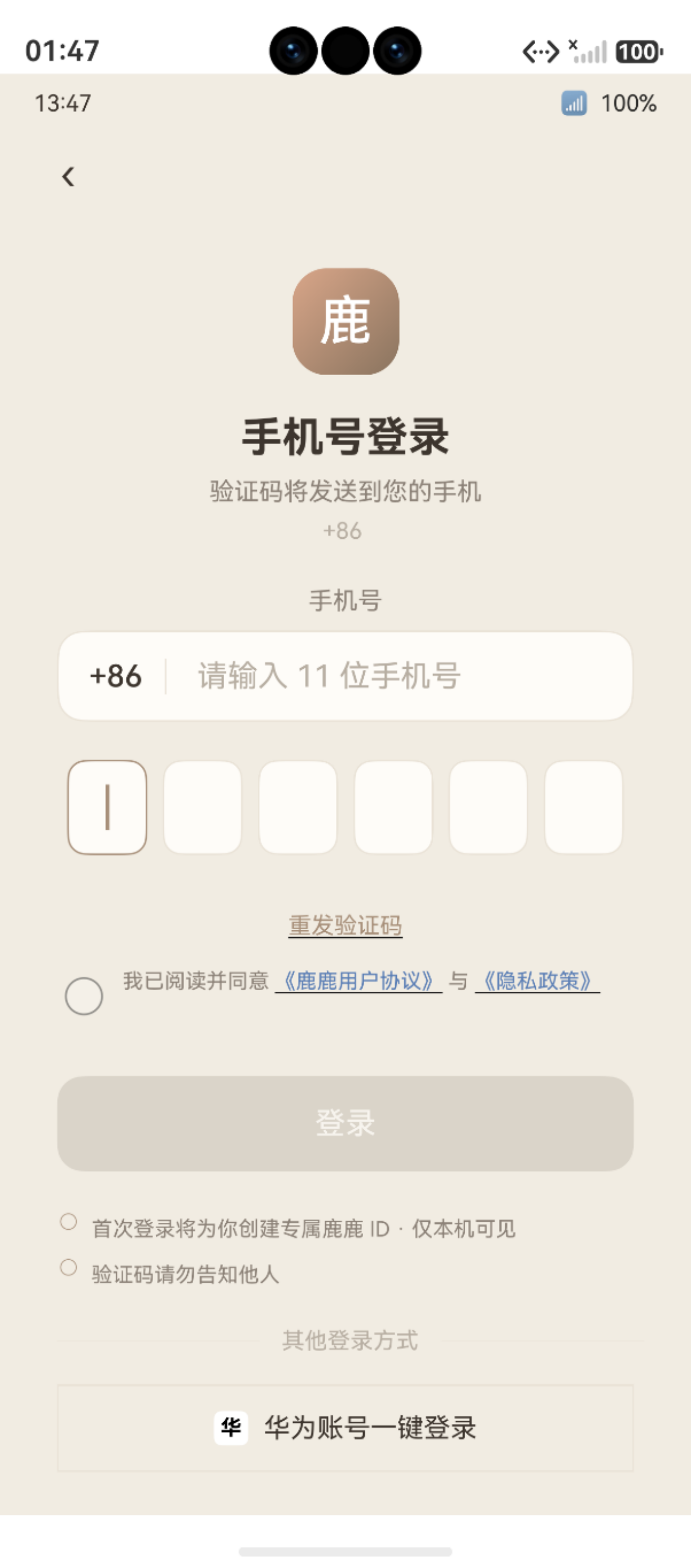
图:鸿蒙实战第90篇:PhoneLoginPage 6位验证码 Cell 设计与 60 秒倒计时 运行效果截图(HarmonyOS NEXT)
手机验证码登录是移动 App 最常见的登录方式之一,但在 ArkUI 中实现"6 格验证码输入框"并不简单——没有现成的 PinInput 或 OtpInput 组件。本篇完整拆解 PhoneLoginPage 的 514 行代码,重点解析:
- 隐藏 TextInput + 6 个 Stack Cell 的组合设计(系统键盘 + 自定义视觉)
- Cell 三态渲染(空白 / 光标 / 数字)
- 60 秒倒计时(
setInterval+ 状态切换) - 手机号正则校验与双输入联合按钮控制
相关文档:TextInput API · setInterval
一、页面整体架构
1.1 状态变量
@Entry
@Component
struct PhoneLoginPage {
  @State phoneNumber: string = ''       // 手机号(11位)
  @State verifyCode: string = ''        // 验证码(6位)
  @State phoneFocus: boolean = false    // 手机号输入框聚焦
  @State codeFocus: boolean = false     // 验证码聚焦
  @State isCountingDown: boolean = false// 倒计时中
  @State countdown: number = 60         // 剩余秒数
  @State isLoggingIn: boolean = false   // 登录中
  private countdownTimer: number = -1  // setInterval 返回的 ID
}
1.2 完整交互流程
二、6 位验证码 Cell 组件设计
2.1 核心思路
ArkUI 没有内置 OTP/Pin 输入组件,需要用以下组合实现:
- 隐藏的
TextInput:opacity: 0、height: 0,只负责接收系统键盘输入 - 6 个可见
StackCell:只负责展示当前输入内容 $$this.verifyCode双向绑定:隐藏输入框的值实时同步到状态变量
2.2 隐藏输入框
TextInput({ text: $$this.verifyCode })
  .type(InputType.Number)
  .maxLength(6)
  .fontSize(0)          // ← 文字大小为 0,实际上"不可见"
  .caretColor(Color.Transparent)  // ← 光标也透明
  .backgroundColor(Color.Transparent)
  .width('100%')
  .height(0)            // ← 高度为 0,不占布局空间
  .opacity(0)           // ← 完全透明
  .focusable(true)
为什么不用
visibility: Hidden?visibility隐藏后组件无法获取焦点,无法触发系统键盘。用opacity: 0+height: 0是兼顾"键盘可弹出"和"视觉不可见"的折中方案。
2.3 6 个 Cell 的三态渲染
@Builder
VerifyCodeCells() {
  Row({ space: 10 }) {
    ForEach([0, 1, 2, 3, 4, 5], (index: number) => {
      Stack() {
        // 背景格子
        Column()
          .width(44)
          .height(56)
          .borderRadius(8)
          .backgroundColor(AppColors.CARD)
          .border({
            width: 2,
            color: index === this.verifyCode.length
              ? AppColors.PRIMARY  // 当前位:主色高亮
              : AppColors.BORDER   // 其他位:默认灰色
          })

        // 三态内容渲染
        if (index < this.verifyCode.length) {
          // 状态 ①:已输入数字
          Text(this.verifyCode[index])
            .fontSize(24)
            .fontWeight(FontWeight.Bold)
            .fontColor(AppColors.TEXT)
        } else if (index === this.verifyCode.length) {
          // 状态 ②:当前输入位,显示光标
          Column()
            .width(2)
            .height(24)
            .backgroundColor(AppColors.PRIMARY)
            .animation({ duration: 600, iterations: -1, playMode: PlayMode.Alternate })
        }
        // 状态 ③:未到达的位,什么都不显示(空格子)
      }
    })
  }
  .onClick(() => {
    // 点击 Cell 区域,触发隐藏 TextInput 获取焦点
    this.codeFocus = true
  })
}
2.4 状态流转图
| Cell 索引 i | 条件 | 显示内容 | 边框颜色 |
|---|---|---|---|
i < length |
已输入 | 对应数字字符 | 默认灰色 |
i === length |
当前位 | 闪烁光标(2×24 竖线) | 主色高亮 |
i > length |
未到达 | 空(空格子) | 默认灰色 |
三、60 秒倒计时实现
3.1 启动倒计时
private startCountdown(): void {
  this.isCountingDown = true
  this.countdown = 60
  this.countdownTimer = setInterval(() => {
    this.countdown -= 1
    if (this.countdown <= 0) {
      this.stopCountdown()
    }
  }, 1000)
}

private stopCountdown(): void {
  if (this.countdownTimer !== -1) {
    clearInterval(this.countdownTimer)
    this.countdownTimer = -1
  }
  this.isCountingDown = false
  this.countdown = 60
}
3.2 按钮的两种状态
Button(this.isCountingDown
  ? `${this.countdown}s 后重发`   // 倒计时中:显示剩余秒数
  : '获取验证码'                   // 倒计时结束:可重新发送
)
.enabled(!this.isCountingDown && this.isPhoneValid())
.backgroundColor(
  (!this.isCountingDown && this.isPhoneValid())
    ? AppColors.PRIMARY
    : AppColors.TEXT_3
)
.animation({ duration: 250, curve: Curve.EaseOut })
.onClick(() => {
  if (!this.isCountingDown && this.isPhoneValid()) {
    this.sendVerifyCode()
  }
})
3.3 组件销毁时清理定时器
aboutToDisappear(): void {
  this.stopCountdown()  // ← 防止页面销毁后 setInterval 仍在执行
}
内存泄漏风险:如果不在
aboutToDisappear中clearInterval,即使页面已销毁,计时器仍会每秒触发setState,导致"更新已销毁的组件"异常。这是setInterval使用的必须注意事项。
四、表单校验设计
4.1 正则校验函数
private isPhoneValid(): boolean {
  return /^1[3-9]\d{9}$/.test(this.phoneNumber)
}

private isCodeValid(): boolean {
  return /^\d{6}$/.test(this.verifyCode)
}
| 正则 | 含义 | 示例 |
|---|---|---|
^1[3-9]\d{9}$ |
以 1 开头,第二位 3-9,共 11 位 | 13812345678 ✓ |
^\d{6}$ |
恰好 6 位纯数字 | 123456 ✓ |
4.2 登录按钮联合控制
登录按钮需要手机号和验证码同时有效才可用:
Button('登录')
  .enabled(this.isPhoneValid() && this.isCodeValid() && !this.isLoggingIn)
  .opacity(
    (this.isPhoneValid() && this.isCodeValid()) ? 1.0 : 0.5
  )
  .animation({ duration: 300 })
.opacity(0.5) 而非 .backgroundColor 变色——视觉上"变暗变淡"的方式对用户更友好,不会让他们以为按钮"消失了"。
五、输入框聚焦高亮
5.1 手机号输入框聚焦
TextInput({ placeholder: '请输入手机号' })
  .type(InputType.PhoneNumber)
  .maxLength(11)
  .border({
    width: 1.5,
    color: this.phoneFocus ? AppColors.PRIMARY : AppColors.BORDER
  })
  .animation({ duration: 250, curve: Curve.EaseOut })
  .onFocus(() => { this.phoneFocus = true })
  .onBlur(() => { this.phoneFocus = false })
聚焦时边框颜色从 BORDER(灰色)过渡到 PRIMARY(棕色),.animation 让颜色变化有 250ms 的平滑过渡。
六、调试模式与生产模式
6.1 发送验证码(双模式)
private async sendVerifyCode(): Promise<void> {
  try {
    // ===== 生产代码(预留)=====
    // import { cloudSms } from '@hmscore/sms'
    // await cloudSms.sendVerificationCode(this.phoneNumber)

    // ===== 调试代码(当前运行)=====
    await new Promise<void>(resolve => setTimeout(resolve, 800))
    hilog.info(0x0000, TAG, '调试模式:验证码已"发送"到 %{private}s', this.phoneNumber)

    this.startCountdown()
    promptAction.showToast({ message: '验证码已发送(调试:任意6位数字均可)' })
  } catch (e) {
    promptAction.showToast({ message: '发送失败,请重试' })
  }
}
注意手机号日志安全:
hilog.info中手机号使用%{private}s而非%{public}s,确保手机号在 Release 构建的日志中被隐藏。
6.2 验证码校验(双模式)
private async handleLogin(): Promise<void> {
  this.isLoggingIn = true
  try {
    // 生产:
    // const result = await cloudSms.verifyCode(this.phoneNumber, this.verifyCode)
    // if (!result.success) throw new Error('验证码错误')

    // 调试:任何 6 位数字均视为正确
    await new Promise<void>(resolve => setTimeout(resolve, 600))

    await this.initUserAfterLogin(
      'PHONE_' + this.phoneNumber.slice(-4),
      '鹿鹿用户'
    )
  } finally {
    this.isLoggingIn = false
  }
}
七、常见问题
7.1 键盘弹出后 Cell 被遮挡
现象:输入验证码时,软键盘弹出后 6 个 Cell 消失在键盘下方
解决:在根 Column 外套 Scroll,并设置 .padding({ bottom: 300 }),让内容区有足够的滚动空间:
Scroll() {
  Column() {
    // ... 所有内容
  }
  .padding({ bottom: 300 })
}
7.2 光标动画不闪烁
现象:当前 Cell 显示的光标不闪烁,只是一条静止的竖线
解决:光标需要 iterations: -1(无限循环)+ playMode: PlayMode.Alternate(来回播放):
Column()
  .width(2).height(24)
  .backgroundColor(AppColors.PRIMARY)
  .animation({
    duration: 600,
    iterations: -1,
    playMode: PlayMode.Alternate,
    curve: Curve.Linear
  })
  .opacity(1)  // 通过 opacity 来回 0→1 实现闪烁效果
八、注意事项与常见问题
8.1 开发注意事项
在实际开发过程中,需特别注意以下几点:
- API 兼容性:部分接口仅在特定 HarmonyOS NEXT 版本中可用,需做版本条件判断
- 权限模型:采用静态声明(module.json5)+ 动态申请(requestPermissionsFromUser)的两阶段授权
- 生命周期:合理使用
aboutToAppear()和aboutToDisappear()管理资源初始化与释放 - 状态同步:跨页面数据通过 AppStorage 共享,组件内状态使用
@State/@Prop/@Link装饰器
8.2 常见错误与解决方案
开发过程中的高频问题汇总:
| 错误现象 | 可能原因 | 解决方案 |
|---|---|---|
| 权限被系统拒绝 | 未在 module.json5 中静态声明 |
添加 requestPermissions 权限配置项 |
| 页面跳转后白屏 | 路由路径未在 main_pages.json 注册 |
检查并补充路由配置文件 |
| UI 状态不刷新 | 状态变量未添加响应式装饰器 | 为变量加 @State / @Observed 装饰器 |
| 数据库查询返回空 | 查询条件与存储数据格式不匹配 | 使用 hilog.debug 打印 SQL 条件排查 |
| 相机预览黑屏 | 运行时相机权限未获取 | 先调用 requestPermissionsFromUser 申请 |
总结
PhoneLoginPage 的 514 行代码的核心亮点:
- 隐藏输入框 + 自定义 Cell 组合:最优雅的 ArkUI 原生 6 位验证码实现方案
- 三态 Cell 渲染:
i < len/i === len/i > len三种分支,代码清晰逻辑无歧义 - setInterval + aboutToDisappear 联动:计时器必须在页面销毁时清理
- 双输入联合校验:手机号正则 + 验证码正则 AND 组合控制按钮状态
%{private}s手机号隐私:生产日志不暴露用户隐私信息
下一篇预告:第91篇 AnalyzingPage——AI 分析数据流水线与五步进度动画
如果这篇文章对你有帮助,欢迎点赞👍、收藏⭐、关注🔔,你的支持是我持续创作的动力!
相关资源:
- TextInput API 文档
- Timer(setInterval)API
- HMS Cloud SMS 服务
- animateTo 显式动画
- ForEach 列表渲染
- Button 组件 API
- 第89篇 LoginPage Canvas 插画
- 第88篇 UserDao 用户持久化
如果这篇文章对你有帮助,欢迎点赞👍、收藏⭐、关注🔔,你的支持是我持续创作的动力!
PhoneLoginPage 技术亮点:在没有系统级 OtpInput 组件的 ArkUI 中,通过 ForEach 渲染 6 个独立 TextInput + 焦点自动跳转 + 键盘监听,手工实现了媲美原生的 PIN 码输入体验。
关键技巧总结:
- 验证码框:
TextInput({ placeholder: '' }).maxLength(1)× 6 - 焦点自动跳转:
focusControl.requestFocus('pin_${index + 1}') - 60 秒倒计时:
setInterval+@State countdown驱动 UI 更新 - 防抖提交:
isSubmitting标志位防止重复触发验证逻辑

作为“人工智能6S店”的官方数字引擎,为AI开发者与企业提供一个覆盖软硬件全栈、一站式门户。
更多推荐

 0
0 0
0- 0


 已为社区贡献9条内容

所有评论(0)