
鸿蒙HarmonyOS ArkTS商品详情页布局:图文混排的实现
项目演示
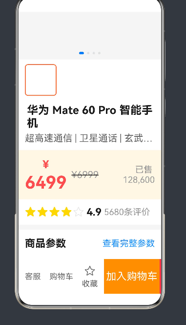
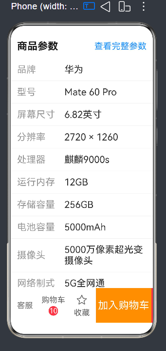
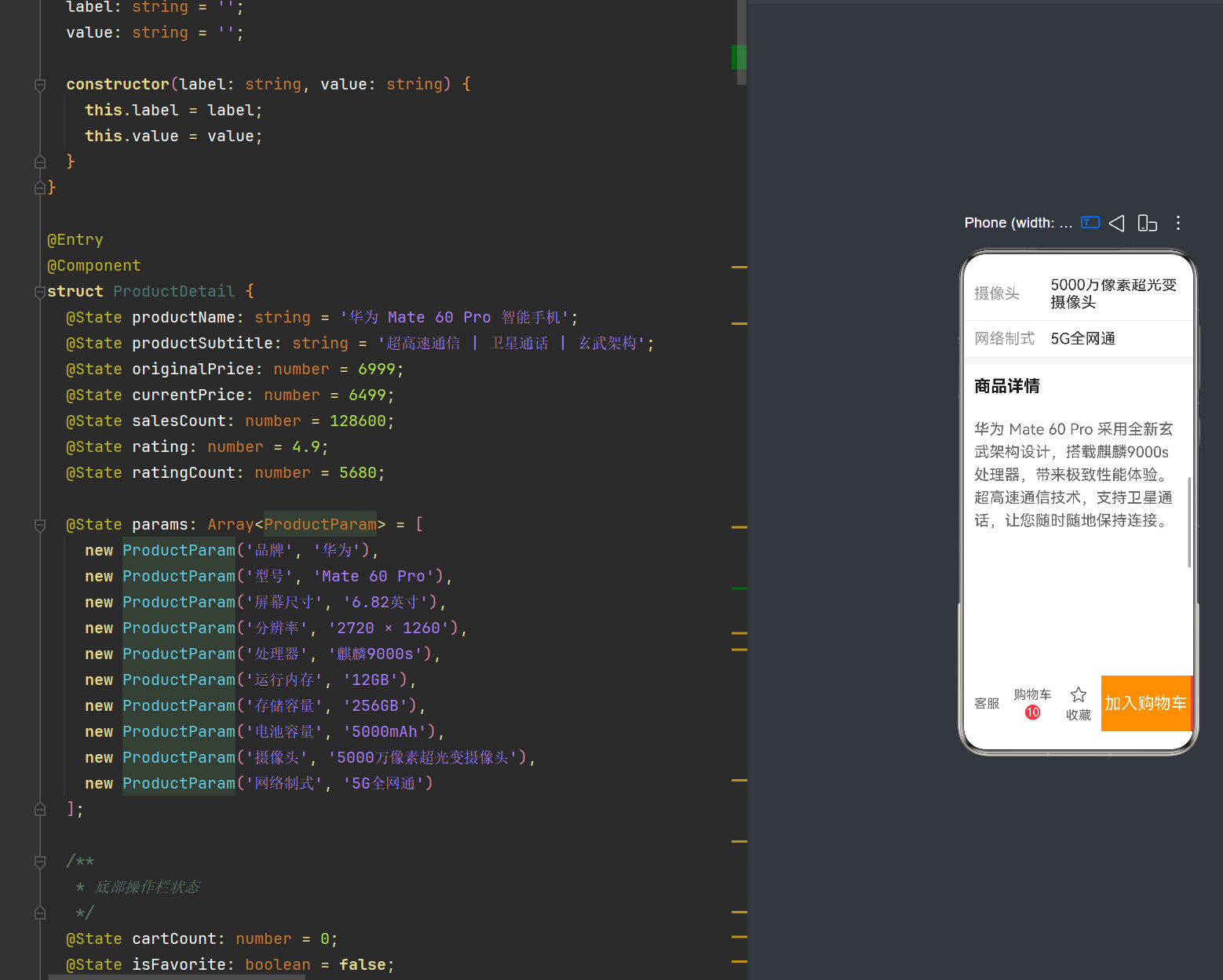
一、概述
商品详情页是电商类应用的核心页面之一,其布局设计直接影响用户体验和转化率。在鸿蒙HarmonyOS NEXT中,采用ArkTS语言和声明式UI框架构建商品详情页,能够充分发挥鸿蒙原生应用的性能优势和开发效率。
本文将基于一个完整的商品详情页示例,详细讲解如何使用ArkTS实现图文混排的复杂布局,涵盖以下核心内容:
- ArkTS声明式UI基础概念
- Column/Row布局容器的嵌套使用
- 图文混排布局技巧
- @Builder装饰器的最佳实践
- @State状态管理
- 交互组件的实现
二、开发环境与API版本
2.1 开发环境要求
- DevEco Studio 5.0+
- Node.js 18.19+
- HarmonyOS SDK API 24
2.2 API 24关键特性
API 24(HarmonyOS NEXT)引入了多项重要特性:
- 声明式UI增强:更强大的组件树构建能力
- @Builder装饰器:支持组件复用和代码组织
- 响应式布局:灵活的布局权重和自适应机制
- 状态管理:@State、@Prop、@Link等状态装饰器
三、页面整体架构设计
3.1 页面结构规划
商品详情页通常包含以下功能区域:
| 区域名称 | 功能描述 | 布局特点 |
|---|---|---|
| 商品图片区 | 主图轮播+缩略图列表 | Swiper横向滚动 |
| 商品标题区 | 标题+副标题 | Column垂直布局 |
| 商品价格区 | 现价+原价+销量 | Row横向混排 |
| 商品评分区 | 星级评分+服务标签 | Row横向布局 |
| 商品参数区 | 参数标签+参数值 | 两列对齐布局 |
| 商品详情区 | 图文混排描述 | 文本与图片交替 |
| 底部操作栏 | 客服+购物车+购买按钮 | 固定底部布局 |
3.2 布局架构图
Column (根容器)
├── Scroll (可滚动内容区)
│   ├── Column
│   │   ├── ProductImageSection (商品图片区)
│   │   ├── ProductTitleSection (商品标题区)
│   │   ├── ProductPriceSection (商品价格区)
│   │   ├── ProductRatingSection (商品评分区)
│   │   ├── ProductParamsSection (商品参数区)
│   │   ├── ProductDescriptionSection (商品详情区)
│   │   └── Blank (底部占位)
│   └── layoutWeight(1)
└── BottomActionBar (底部操作栏)
四、数据模型设计
4.1 类型定义原则
在ArkTS中,对象字面量不能直接作为类型声明,必须使用显式声明的类或接口。这是ArkTS严格类型检查的重要规则。
4.2 ProductParam类定义
class ProductParam {
  label: string = '';
  value: string = '';

  constructor(label: string, value: string) {
    this.label = label;
    this.value = value;
  }
}
设计要点:
- 类成员初始化:所有成员变量必须在声明时初始化或在构造函数中赋值
- 构造函数参数:通过构造函数注入数据,确保对象创建时状态完整
- 类型安全:避免使用对象字面量作为类型,提高代码可维护性
4.3 页面状态数据
@Entry
@Component
struct ProductDetail {
  // 商品基本信息
  @State productName: string = '华为 Mate 60 Pro 智能手机';
  @State productSubtitle: string = '超高速通信 | 卫星通话 | 玄武架构';
  @State originalPrice: number = 6999;
  @State currentPrice: number = 6499;
  @State salesCount: number = 128600;
  @State rating: number = 4.9;
  @State ratingCount: number = 5680;

  // 商品参数列表
  @State params: Array<ProductParam> = [
    new ProductParam('品牌', '华为'),
    new ProductParam('型号', 'Mate 60 Pro'),
    new ProductParam('屏幕尺寸', '6.82英寸'),
    new ProductParam('分辨率', '2720 × 1260'),
    new ProductParam('处理器', '麒麟9000s'),
    new ProductParam('运行内存', '12GB'),
    new ProductParam('存储容量', '256GB'),
    new ProductParam('电池容量', '5000mAh'),
    new ProductParam('摄像头', '5000万像素超光变摄像头'),
    new ProductParam('网络制式', '5G全网通')
  ];

  // 底部操作栏状态
  @State cartCount: number = 0;
  @State isFavorite: boolean = false;

  // 商品图片列表
  @State images: Array<string> = [
    'https://neeko-copilot.bytedance.net/api/text2image?prompt=modern%20smartphone%20product%20photo%20white%20background%20professional%20studio%20lighting&image_size=portrait_16_9',
    'https://neeko-copilot.bytedance.net/api/text2image?prompt=smartphone%20back%20view%20camera%20module%20detail%20white%20background&image_size=portrait_16_9',
    'https://neeko-copilot.bytedance.net/api/text2image?prompt=smartphone%20side%20view%20thin%20design%20white%20background&image_size=portrait_16_9',
    'https://neeko-copilot.bytedance.net/api/text2image?prompt=smartphone%20display%20screen%20beautiful%20interface%20white%20background&image_size=portrait_16_9'
  ];
}
状态管理要点:
- @State装饰器:用于管理组件内部状态,状态变化会触发UI更新
- 数组类型:使用
Array<T>而非T[],更符合ArkTS类型规范 - 数据初始化:所有状态变量必须在声明时初始化
五、根布局容器实现
5.1 构建方法结构
ArkTS组件的build()方法是UI构建的入口,每个组件必须且只能有一个根节点。
build() {
  Column() {
    Scroll() {
      Column({ space: 0 }) {
        this.ProductImageSection()
        this.ProductTitleSection()
        this.ProductPriceSection()
        this.ProductRatingSection()
        this.ProductParamsSection()
        this.ProductDescriptionSection()
        Blank().height(100)
      }
      .width('100%')
      .backgroundColor('#f5f5f5')
    }
    .width('100%')
    .layoutWeight(1)

    this.BottomActionBar()
  }
  .width('100%')
  .height('100%')
}
布局要点:
- Column根容器:使用Column作为根容器,实现垂直方向的布局
- Scroll滚动区域:使用Scroll包裹可滚动内容,设置
layoutWeight(1)使其占据剩余空间 - 内部Column:Scroll内部的Column负责组织各个功能区域
- Blank占位:底部预留100vp高度,防止内容被底部操作栏遮挡
5.2 layoutWeight属性详解
layoutWeight是ArkTS布局中的重要属性,用于在Row或Column中分配剩余空间:
- 值为1:该组件将占据所有剩余空间
- 值大于1:按比例分配剩余空间
- 值为0:组件大小由内容决定
Scroll() {
  // ...
}
.layoutWeight(1)  // Scroll占据除BottomActionBar外的所有空间
六、商品图片区域实现
6.1 Swiper轮播组件
商品主图通常采用轮播方式展示,使用Swiper组件实现:
@Builder ProductImageSection() {
  Column() {
    Swiper() {
      ForEach(this.images, (image: string) => {
        Image(image)
          .width('100%')
          .height(400)
          .objectFit(ImageFit.Cover)
      })
    }
    .width('100%')
    .height(400)
    .indicator(true)
    .autoPlay(true)
    .interval(3000)
    .displayMode(SwiperDisplayMode.Stretch)
  }
}
Swiper属性说明:
| 属性 | 类型 | 说明 |
|---|---|---|
| indicator | boolean | 是否显示指示器 |
| autoPlay | boolean | 是否自动播放 |
| interval | number | 自动播放间隔(毫秒) |
| displayMode | SwiperDisplayMode | 显示模式(Stretch等比拉伸) |
6.2 缩略图横向滚动列表
在主图下方添加缩略图列表,支持横向滚动:
@Builder ProductImageSection() {
  Column() {
    // ... Swiper代码 ...

    Scroll() {
      Row({ space: 8 }) {
        ForEach(this.images, (image: string, index: number) => {
          Image(image)
            .width(80)
            .height(80)
            .objectFit(ImageFit.Cover)
            .borderRadius(8)
            .borderWidth(index === 0 ? 2 : 0)
            .borderColor('#ff6b35')
        })
      }
      .width('100%')
      .padding({ left: 16, right: 16, top: 12 })
    }
    .scrollBar(BarState.Off)
    .width('100%')
    .backgroundColor('#ffffff')
  }
}
缩略图布局要点:
- Scroll横向滚动:默认Scroll为垂直滚动,包裹Row后实现横向滚动
- space属性:Row的space参数设置子组件间距
- 选中状态标识:通过borderWidth和borderColor区分选中的缩略图
- scrollBar隐藏:使用
scrollBar(BarState.Off)隐藏滚动条
七、商品标题区域实现
7.1 标题与副标题布局
标题区域包含商品名称和副标题,采用Column垂直布局:
@Builder ProductTitleSection() {
  Column({ space: 8 }) {
    Text(this.productName)
      .fontSize(28)
      .fontWeight(FontWeight.Bold)
      .fontColor('#1a1a1a')
      .maxLines(2)
      .textOverflow({ overflow: TextOverflow.Ellipsis })

    Text(this.productSubtitle)
      .fontSize(24)
      .fontColor('#666666')
      .maxLines(1)
      .textOverflow({ overflow: TextOverflow.Ellipsis })
  }
  .width('100%')
  .padding({ left: 16, right: 16, top: 20, bottom: 16 })
  .backgroundColor('#ffffff')
}
文本布局要点:
- 字体大小:标题使用28vp,副标题使用24vp,形成视觉层次
- 字体粗细:标题使用Bold加粗,突出显示
- 颜色区分:标题使用深色(#1a1a1a),副标题使用灰色(#666666)
- 文本溢出处理:使用
maxLines和textOverflow处理超长文本
7.2 textOverflow属性详解
textOverflow用于处理文本溢出时的显示方式:
.textOverflow({ overflow: TextOverflow.Ellipsis })
常用值:
TextOverflow.Ellipsis:省略号显示TextOverflow.Clip:裁剪显示TextOverflow.None:不处理(默认)
八、商品价格区域实现
8.1 价格混排布局
价格区域需要展示现价、原价和销量,是典型的图文混排场景:
@Builder ProductPriceSection() {
  Row({ space: 12 }) {
    Column({ space: 4 }) {
      Text('¥')
        .fontSize(28)
        .fontWeight(FontWeight.Bold)
        .fontColor('#ff4d4f')
        .baselineOffset(-4)
      Text(`${this.currentPrice}`)
        .fontSize(44)
        .fontWeight(FontWeight.Bold)
        .fontColor('#ff4d4f')
    }

    Text(`¥${this.originalPrice}`)
      .fontSize(24)
      .fontColor('#999999')
      .decoration({ type: TextDecorationType.LineThrough })

    Text(`已售 ${this.salesCount.toLocaleString()}`)
      .fontSize(22)
      .fontColor('#999999')
      .layoutWeight(1)
      .textAlign(TextAlign.End)
  }
  .width('100%')
  .padding({ left: 16, right: 16, top: 16, bottom: 16 })
  .backgroundColor('#fff7e6')
}
价格布局要点:
- 现价展示:使用Column嵌套Text实现"¥"符号和价格数字的上下对齐,通过
baselineOffset微调对齐位置 - 原价处理:使用
decoration添加删除线,表示原价 - 销量靠右:使用
layoutWeight(1)和textAlign(TextAlign.End)实现销量信息右对齐 - 背景色区分:使用暖黄色背景(#fff7e6)突出价格区域
8.2 baselineOffset属性
baselineOffset用于调整文本的基线位置:
Text('¥')
  .fontSize(28)
  .baselineOffset(-4)  // 向上偏移4vp,使¥符号与价格数字更好对齐
8.3 decoration属性
decoration用于设置文本装饰效果:
.decoration({ type: TextDecorationType.LineThrough })
常用类型:
TextDecorationType.None:无装饰(默认)TextDecorationType.Underline:下划线TextDecorationType.LineThrough:删除线TextDecorationType.Overline:上划线
九、商品评分区域实现
9.1 星级评分动态渲染
星级评分需要根据评分值动态渲染实心和空心星星:
@Builder ProductRatingSection() {
  Row({ space: 16 }) {
    Row({ space: 6 }) {
      Row({ space: 2 }) {
        ForEach([1, 2, 3, 4, 5], (star: number) => {
          Text(star <= Math.floor(this.rating) ? '★' : '☆')
            .fontSize(28)
            .fontColor(star <= Math.floor(this.rating) ? '#ffd700' : '#e8e8e8')
        })
      }

      Text(`${this.rating}`)
        .fontSize(26)
        .fontWeight(FontWeight.Bold)
        .fontColor('#1a1a1a')

      Text(`${this.ratingCount}条评价`)
        .fontSize(22)
        .fontColor('#999999')
    }

    Row({ space: 8 }) {
      Text('正品保障')
        .fontSize(20)
        .fontColor('#52c41a')
        .padding({ left: 8, right: 8, top: 4, bottom: 4 })
        .backgroundColor('#f6ffed')
        .borderRadius(4)

      Text('顺丰包邮')
        .fontSize(20)
        .fontColor('#52c41a')
        .padding({ left: 8, right: 8, top: 4, bottom: 4 })
        .backgroundColor('#f6ffed')
        .borderRadius(4)
    }
    .layoutWeight(1)
    .justifyContent(FlexAlign.End)
  }
  .width('100%')
  .padding({ left: 16, right: 16, top: 16, bottom: 16 })
  .backgroundColor('#ffffff')
}
评分区域布局要点:
- 星级渲染:使用ForEach遍历数组[1,2,3,4,5],根据评分值判断显示实心★还是空心☆
- 颜色区分:实心星星使用金色(#ffd700),空心星星使用灰色(#e8e8e8)
- 服务标签:使用绿色背景和边框实现标签样式
- 右侧对齐:服务标签区域使用
layoutWeight(1)和justifyContent(FlexAlign.End)靠右对齐
9.2 ForEach组件详解
ForEach是ArkTS中用于列表渲染的核心组件:
ForEach(
  array: Array<T>,          // 数据源数组
  (item: T, index?: number) => { /* 渲染函数 */ },  // 渲染函数
  (item: T, index?: number) => string  // 键生成函数(可选)
)
使用要点:
- 数据源:必须是数组类型
- 渲染函数:返回单个组件或组件树
- 索引参数:第二个参数index可选,用于获取当前项的索引
十、商品参数区域实现
10.1 参数列表布局
商品参数采用两列布局,左侧标签固定宽度,右侧值自适应:
@Builder ProductParamsSection() {
  Column({ space: 0 }) {
    Row() {
      Text('商品参数')
        .fontSize(26)
        .fontWeight(FontWeight.Bold)
        .fontColor('#1a1a1a')

      Text('查看完整参数')
        .fontSize(22)
        .fontColor('#1890ff')
        .layoutWeight(1)
        .textAlign(TextAlign.End)
    }
    .width('100%')
    .padding({ left: 16, right: 16, top: 20, bottom: 16 })

    Column({ space: 0 }) {
      ForEach(this.params, (param: ProductParam) => {
        Row() {
          Text(param.label)
            .fontSize(24)
            .fontColor('#999999')
            .width(120)
            .flexShrink(0)

          Text(param.value)
            .fontSize(24)
            .fontColor('#333333')
            .layoutWeight(1)
        }
        .width('100%')
        .padding({ left: 16, right: 16, top: 14, bottom: 14 })

        if (this.params.indexOf(param) < this.params.length - 1) {
          Divider()
            .width('100%')
            .color('#f0f0f0')
            .strokeWidth(1)
        }
      })
    }
  }
  .width('100%')
  .backgroundColor('#ffffff')
  .margin({ top: 12 })
}
参数布局要点:
- 区域标题:左侧标题加粗,右侧"查看完整参数"链接靠右对齐
- 两列布局:左侧标签固定宽度120vp,设置
flexShrink(0)防止被压缩 - 右侧值自适应:使用
layoutWeight(1)占据剩余空间 - 分割线:使用Divider组件实现参数项之间的分隔,最后一项不显示
10.2 flexShrink属性
flexShrink控制组件在空间不足时的收缩行为:
Text(param.label)
  .width(120)
  .flexShrink(0)  // 不收缩,保持固定宽度
- 值为0:不收缩,保持原始大小
- 值大于0:按比例收缩(默认值为1)
十一、商品详情描述区域实现
11.1 图文混排布局
商品详情区域是典型的图文混排场景,文本和图片交替展示:
@Builder ProductDescriptionSection() {
  Column({ space: 16 }) {
    Text('商品详情')
      .fontSize(26)
      .fontWeight(FontWeight.Bold)
      .fontColor('#1a1a1a')
      .width('100%')
      .padding({ left: 16, right: 16, top: 20, bottom: 16 })

    Column({ space: 16 }) {
      Text('华为 Mate 60 Pro 采用全新玄武架构设计,搭载麒麟9000s处理器,带来极致性能体验。超高速通信技术,支持卫星通话,让您随时随地保持连接。')
        .fontSize(24)
        .fontColor('#666666')
        .lineHeight(36)
        .width('100%')
        .padding({ left: 16, right: 16 })

      Image('https://neeko-copilot.bytedance.net/api/text2image?prompt=smartphone%20camera%20module%20close%20up%20macro%20photo%20professional%20product%20shot&image_size=landscape_16_9')
        .width('100%')
        .height(280)
        .objectFit(ImageFit.Cover)

      Text('5000万像素超光变摄像头,支持F1.4-F4.0可变光圈,无论是暗光环境还是远景拍摄,都能呈现出色画质。')
        .fontSize(24)
        .fontColor('#666666')
        .lineHeight(36)
        .width('100%')
        .padding({ left: 16, right: 16 })

      Image('https://neeko-copilot.bytedance.net/api/text2image?prompt=smartphone%20battery%20charging%20fast%20charge%20technology%20infographic%20style&image_size=landscape_16_9')
        .width('100%')
        .height(280)
        .objectFit(ImageFit.Cover)

      Text('5000mAh大电池,支持88W有线快充和50W无线快充,续航持久,充电更快。')
        .fontSize(24)
        .fontColor('#666666')
        .lineHeight(36)
        .width('100%')
        .padding({ left: 16, right: 16 })
    }
  }
  .width('100%')
  .backgroundColor('#ffffff')
  .margin({ top: 12 })
}
图文混排要点:
- 文本段落:使用
lineHeight设置行高,提高阅读体验 - 图片展示:使用
objectFit(ImageFit.Cover)保持图片比例并填充容器 - 间距控制:使用Column的
space参数控制内容间距 - padding设置:文本添加左右padding,避免边缘紧贴
11.2 lineHeight属性
lineHeight用于设置文本行高:
Text('...')
  .fontSize(24)
  .lineHeight(36)  // 行高36vp,约为字号的1.5倍
合适的行高可以提高文本可读性,通常设置为字号的1.4-1.6倍。
11.3 objectFit属性
objectFit控制图片的缩放方式:
Image(imageUrl)
  .width('100%')
  .height(280)
  .objectFit(ImageFit.Cover)
常用值:
ImageFit.Cover:保持比例填充容器,裁剪超出部分ImageFit.Contain:保持比例适应容器,不裁剪ImageFit.Fill:拉伸填充容器,不保持比例ImageFit.None:不缩放,居中显示
十二、底部操作栏实现
12.1 底部固定布局
底部操作栏需要固定在页面底部,包含客服、购物车、收藏、加入购物车和立即购买按钮:
@Builder BottomActionBar() {
  Row({ space: 0 }) {
    Column({ space: 4 }) {
      Text('客服')
        .fontSize(20)
        .fontColor('#666666')
    }
    .width(72)
    .height('100%')
    .justifyContent(FlexAlign.Center)

    Column({ space: 4 }) {
      Text('购物车')
        .fontSize(20)
        .fontColor('#666666')
      if (this.cartCount > 0) {
        Text(`${this.cartCount}`)
          .fontSize(18)
          .fontColor('#ffffff')
          .backgroundColor('#ff4d4f')
          .width(24)
          .height(24)
          .borderRadius(12)
          .textAlign(TextAlign.Center)
      }
    }
    .width(72)
    .height('100%')
    .justifyContent(FlexAlign.Center)

    Column({ space: 4 }) {
      Text(this.isFavorite ? '★' : '☆')
        .fontSize(28)
        .fontColor(this.isFavorite ? '#ff4d4f' : '#666666')
        .onClick(() => {
          this.isFavorite = !this.isFavorite
        })
      Text('收藏')
        .fontSize(20)
        .fontColor('#666666')
    }
    .width(72)
    .height('100%')
    .justifyContent(FlexAlign.Center)

    Row({ space: 0 }) {
      Text('加入购物车')
        .fontSize(26)
        .fontColor('#ffffff')
        .width(140)
        .height('100%')
        .textAlign(TextAlign.Center)
        .backgroundColor('#ff9500')
        .onClick(() => {
          this.cartCount++
        })

      Text('立即购买')
        .fontSize(26)
        .fontColor('#ffffff')
        .width(140)
        .height('100%')
        .textAlign(TextAlign.Center)
        .backgroundColor('#ff4d4f')
    }
    .layoutWeight(1)
    .height('100%')
  }
  .width('100%')
  .height(88)
  .backgroundColor('#ffffff')
  .shadow({ radius: 8, color: '#00000020', offsetY: -4 })
}
底部操作栏布局要点:
- 左侧功能按钮:客服、购物车、收藏三个按钮,每个固定宽度72vp
- 购物车角标:当
cartCount > 0时显示红色圆形角标 - 收藏状态切换:点击星星切换实心/空心状态
- 右侧操作按钮:加入购物车(橙色)和立即购买(红色),使用
layoutWeight(1)占据剩余空间 - 阴影效果:使用
shadow属性添加顶部阴影,增加层次感
12.2 onClick事件处理
ArkTS使用onClick属性绑定点击事件:
Text('加入购物车')
  .onClick(() => {
    this.cartCount++
  })
事件处理要点:
- 箭头函数:使用箭头函数保持this指向组件实例
- 状态更新:在事件处理函数中更新@State变量,触发UI重新渲染
12.3 shadow属性
shadow用于为组件添加阴影效果:
.shadow({
  radius: 8,        // 阴影模糊半径
  color: '#00000020',  // 阴影颜色(带透明度)
  offsetY: -4       // Y方向偏移,向上4vp
})
十三、@Builder装饰器深度解析
13.1 @Builder作用与优势
@Builder装饰器用于定义可复用的UI片段,具有以下优势:
- 代码复用:避免重复编写相同的UI结构
- 代码组织:将复杂页面拆分为多个功能模块
- 可读性提升:通过命名清晰表达功能意图
- 维护性增强:模块化结构便于定位和修改
13.2 @Builder使用规范
规范1:Builder只负责渲染,不声明状态
@Builder ProductTitleSection() {
  // 正确:使用组件的@State变量
  Text(this.productName)
    .fontSize(28)

  // 错误:不能在Builder内声明@State
  // @State temp: string = ''
}
规范2:Builder参数使用明确类型
// 正确:使用显式类类型
@Builder ItemBuilder(param: ProductParam) {
  Text(param.label)
}

// 错误:使用对象字面量作为类型
// @Builder ItemBuilder(param: { label: string; value: string }) { ... }
规范3:Builder调用方式
build() {
  Column() {
    // 直接调用Builder方法
    this.ProductImageSection()
    this.ProductTitleSection()
  }
}
十四、状态管理机制详解
14.1 @State装饰器
@State是最基础的状态管理装饰器,用于管理组件内部状态:
@State cartCount: number = 0;
@State isFavorite: boolean = false;
@State特性:
- 响应式:状态变化会触发依赖该状态的UI自动更新
- 组件内部:状态仅在当前组件内有效
- 初始化必需:必须在声明时初始化
14.2 状态更新机制
当@State变量被修改时,ArkTS框架会自动执行以下步骤:
- 状态变更检测:检测到变量值发生变化
- 依赖收集:找出依赖该状态的UI组件
- UI更新:重新渲染受影响的组件
.onClick(() => {
  this.cartCount++  // 状态更新
  // 框架自动更新显示cartCount的Text组件
})
14.3 状态传递
在商品详情页中,状态主要用于:
- 购物车数量:
cartCount在BottomActionBar中显示并更新 - 收藏状态:
isFavorite控制收藏按钮的显示状态 - 商品数据:商品信息状态在各个Builder中共享使用
十五、布局容器深度解析
15.1 Column垂直布局容器
Column用于垂直方向排列子组件:
Column({ space: 8 }) {
  Text('第一行')
  Text('第二行')
  Text('第三行')
}
Column属性:
| 属性 | 类型 | 说明 |
|---|---|---|
| space | number | 子组件之间的间距 |
| alignItems | HorizontalAlign | 水平对齐方式 |
| justifyContent | FlexAlign | 垂直对齐方式 |
15.2 Row水平布局容器
Row用于水平方向排列子组件:
Row({ space: 12 }) {
  Text('左侧')
  Text('中间')
  Text('右侧').layoutWeight(1)
}
Row属性:
| 属性 | 类型 | 说明 |
|---|---|---|
| space | number | 子组件之间的间距 |
| alignItems | VerticalAlign | 垂直对齐方式 |
| justifyContent | FlexAlign | 水平对齐方式 |
15.3 布局嵌套原则
在实际开发中,Column和Row经常嵌套使用:
Column() {                    // 外层垂直布局
  Row() {                     // 内层水平布局
    Column() {                // 更深层垂直布局
      Text('¥')
      Text('6999')
    }
    Text('原价')
  }
}
嵌套原则:
- 避免过深嵌套:建议嵌套层级不超过4层
- 语义化命名:通过@Builder将复杂嵌套封装为有意义的名称
- 布局职责分离:每个容器只负责一层布局逻辑
十六、编译错误排查与解决方案
16.1 常见编译错误
在开发过程中,可能遇到以下常见错误:
| 错误代码 | 错误信息 | 原因 |
|---|---|---|
| 10605040 | Object literals cannot be used as type declarations | 使用对象字面量作为类型声明 |
| 10605043 | Array literals must contain elements of only inferrable types | 数组元素类型无法推断 |
| 10605038 | Object literal must correspond to some explicitly declared class or interface | 对象字面量未绑定显式类型 |
16.2 错误解决方案
问题1:对象字面量类型错误
// 错误:使用对象字面量作为类型
@State params: Array<{ label: string; value: string }> = [...]

// 正确:使用显式类声明
class ProductParam {
  label: string = '';
  value: string = '';
  constructor(label: string, value: string) {
    this.label = label;
    this.value = value;
  }
}
@State params: Array<ProductParam> = [
  new ProductParam('品牌', '华为'),
  ...
]
问题2:build方法多根节点错误
// 错误:build方法中有多个根节点
build() {
  Scroll() { ... }
  BottomActionBar()  // 错误!不能有多个根节点
}

// 正确:使用容器包裹
build() {
  Column() {
    Scroll() { ... }
    BottomActionBar()
  }
}
16.3 调试技巧
- 查看错误位置:错误信息会显示具体的文件和行号
- 检查类型声明:确保所有类型使用显式的class或interface
- 检查布局结构:确保build方法只有一个根节点
- 使用GetDiagnostics:在IDE中使用诊断工具检查语法错误
十七、性能优化建议
17.1 布局优化
- 减少嵌套层级:过深的布局嵌套会影响渲染性能
- 使用layoutWeight:合理使用布局权重,避免固定尺寸导致的适配问题
- 避免不必要的容器:直接使用组件属性实现布局,减少额外容器
17.2 图片优化
- 图片懒加载:对于长列表中的图片,考虑使用懒加载
- 图片尺寸适配:根据设备分辨率提供合适尺寸的图片
- 缓存策略:合理使用图片缓存,减少重复加载
17.3 状态管理优化
- 最小化状态范围:将状态声明在最小作用域内
- 避免频繁状态更新:对于高频更新的状态,考虑使用防抖或节流
- 使用@Prop和@Link:在父子组件间传递状态时,使用合适的装饰器
十八、响应式设计考虑
18.1 尺寸单位选择
在ArkTS中,推荐使用vp(virtual pixel)作为尺寸单位:
Text('标题')
  .fontSize(28)  // 28vp,自动适配不同屏幕密度
单位说明:
- vp:虚拟像素,自动适配屏幕密度
- fp:字体像素,用于字体大小
- px:物理像素,不推荐使用
18.2 布局适配策略
- 百分比宽度:使用
width('100%')实现自适应宽度 - 布局权重:使用
layoutWeight分配剩余空间 - 弹性布局:结合Column/Row的space和alignItems属性实现弹性布局
十九、完整代码结构总结
19.1 文件结构
Index.ets
├── ProductParam类定义(数据模型)
├── ProductDetail组件
│   ├── @State状态变量(商品数据)
│   ├── build()方法(根布局)
│   ├── @Builder ProductImageSection()(商品图片区)
│   ├── @Builder ProductTitleSection()(商品标题区)
│   ├── @Builder ProductPriceSection()(商品价格区)
│   ├── @Builder ProductRatingSection()(商品评分区)
│   ├── @Builder ProductParamsSection()(商品参数区)
│   ├── @Builder ProductDescriptionSection()(商品详情区)
│   └── @Builder BottomActionBar()(底部操作栏)
19.2 核心技术点回顾
- 声明式UI:使用组件树描述UI结构
- @Builder复用:将页面拆分为多个功能模块
- @State状态管理:响应式状态更新
- Column/Row布局:灵活的布局容器
- 图文混排:Text和Image组件的组合使用
- 交互实现:onClick事件绑定
二十、扩展与进阶
20.1 数据请求集成
实际项目中,商品数据通常从网络获取:
async fetchProductData() {
  // 使用@ohos.net.http发起网络请求
  // 将返回数据赋值给@State变量
}
20.2 路由跳转
从商品列表页跳转到详情页:
// 列表页
Text('商品名称')
  .onClick(() => {
    router.pushUrl({
      url: 'pages/Index',
      params: { productId: '123' }
    })
  })
20.3 动画效果添加
为交互添加动画效果:
Text('★')
  .onClick(() => {
    animateTo({
      duration: 300,
      curve: Curve.EaseOut
    }, () => {
      this.isFavorite = !this.isFavorite
    })
  })
结语
通过本文的学习,我们掌握了鸿蒙HarmonyOS ArkTS中商品详情页图文混排布局的完整实现方法。关键要点包括:
- 使用@Builder将页面拆分为多个功能模块
- 灵活运用Column/Row实现复杂布局
- 正确处理图文混排场景
- 遵循ArkTS严格类型规范
- 使用@State管理组件状态
希望本文能为您的鸿蒙应用开发提供有价值的参考!

作为“人工智能6S店”的官方数字引擎,为AI开发者与企业提供一个覆盖软硬件全栈、一站式门户。
更多推荐
 0
0 0
0- 0


 已为社区贡献7条内容

所有评论(0)