
鸿蒙HarmonyOS ArkTS视频信息流布局深度解析
项目演示
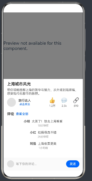
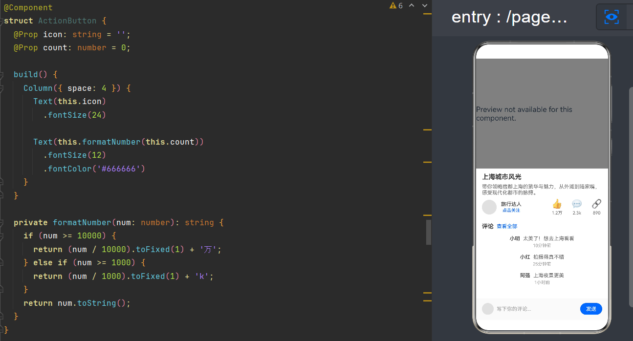
一、项目概述
1.1 背景与目标
在移动互联网时代,短视频信息流已经成为用户获取信息和娱乐的主要方式之一。从抖音、快手到微信视频号,短视频平台的崛起深刻改变了人们的内容消费习惯。作为HarmonyOS开发者,掌握视频信息流布局是构建现代化应用的必备技能。
本项目旨在通过一个完整的示例应用,深入讲解如何使用鸿蒙ArkTS(HarmonyOS NEXT)构建视频信息流页面,实现"视频 + 描述 + 评论"的经典布局模式。
1.2 核心技术栈
- 语言: ArkTS(HarmonyOS NEXT)
- UI框架: ArkUI(声明式UI)
- API Level: 24
- 布局模式: 垂直滚动列表 + 组件化拆分
1.3 预期效果
运行应用后,用户可以看到一个垂直滚动的视频信息流页面,每条视频卡片包含:
- 视频播放区域(自动播放、循环播放)
- 视频描述区域(标题、描述、作者信息、互动按钮)
- 评论区域(评论列表、评论输入框)
二、开发环境准备
2.1 DevEco Studio安装
首先需要安装最新版本的DevEco Studio(建议6.0及以上),支持HarmonyOS NEXT开发。
2.2 工程创建
创建新的HarmonyOS工程时,选择以下配置:
- 模板: Empty Ability (Stage)
- Language: ArkTS
- API Level: 24
2.3 项目结构
entry/
├── src/
│   └── main/
│       ├── ets/
│       │   ├── entryability/
│       │   │   └── EntryAbility.ets
│       │   └── pages/
│       │       └── Index.ets
│       └── resources/
│           ├── base/
│           │   └── profile/
│           │       └── main_pages.json
│           └── rawfile/
├── oh-package.json5
└── build-profile.json5
三、布局设计思路
3.1 整体架构
视频信息流页面采用三层垂直布局结构:
┌─────────────────────────────────────┐
│           Video Section             │  ← 视频播放区域
│  ┌─────────────────────────────┐    │
│  │                             │    │
│  │         Video Player        │    │
│  │                             │    │
│  └─────────────────────────────┘    │
├─────────────────────────────────────┤
│           Info Section              │  ← 信息描述区域
│  ┌─────────────────────────────┐    │
│  │        标题 (2行)           │    │
│  │        描述 (3行)           │    │
│  │  ┌───┐ ┌─────────┐ ┌───┐   │    │
│  │  │头像│ │ 作者名  │ │👍 │   │    │
│  │  │   │ │ 关注按钮│ │💬 │   │    │
│  │  └───┘ └─────────┘ └───┘   │    │
│  └─────────────────────────────┘    │
├─────────────────────────────────────┤
│         Comment Section             │  ← 评论区域
│  ┌─────────────────────────────┐    │
│  │  评论  │  查看全部          │    │
│  │─────────────────────────────│    │
│  │  用户A: 评论内容1           │    │
│  │  用户B: 评论内容2           │    │
│  │  用户C: 评论内容3           │    │
│  │─────────────────────────────│    │
│  │ ┌───┐ ┌──────────────┐ ┌──┐│    │
│  │ │头像│ │ 写评论...    │ │发送││    │
│  │ └───┘ └──────────────┘ └──┘│    │
│  └─────────────────────────────┘    │
└─────────────────────────────────────┘
3.2 组件拆分策略
为了实现代码复用和模块化管理,我们将页面拆分为以下组件:
| 组件名称 | 职责描述 | 核心属性 |
|---|---|---|
| VideoFeedPage | 主页面容器 | 视频列表数据 |
| VideoSection | 视频播放区域 | VideoItem对象 |
| InfoSection | 信息描述区域 | VideoItem对象 |
| ActionButton | 互动按钮组件 | icon, count |
| CommentSection | 评论区域 | VideoItem对象 |
| CommentItemComponent | 单条评论组件 | CommentItem对象 |
3.3 数据模型设计
VideoItem 视频数据模型
class VideoItem {
  id: number = 0;           // 视频ID
  videoUrl: string = '';    // 视频地址
  coverUrl: string = '';    // 封面图地址
  title: string = '';       // 视频标题
  description: string = ''; // 视频描述
  author: string = '';      // 作者名
  avatarUrl: string = '';   // 作者头像
  likes: number = 0;        // 点赞数
  comments: number = 0;     // 评论数
  shares: number = 0;       // 分享数
  commentList: CommentItem[] = []; // 评论列表
}
CommentItem 评论数据模型
class CommentItem {
  id: number = 0;       // 评论ID
  userName: string = ''; // 用户名
  content: string = '';  // 评论内容
  time: string = '';     // 评论时间
}
四、核心代码实现
4.1 主页面组件
主页面是整个信息流的入口,负责管理视频列表数据和整体布局结构。
@Entry
@Component
struct VideoFeedPage {
  videoList: VideoItem[] = [
    new VideoItem(
      1,
      'https://www.w3school.com.cn/i/video/shanghai.mp4',
      '',
      '上海城市风光',
      '带你领略魔都上海的繁华与魅力,从外滩到陆家嘴,感受现代化都市的脉搏。',
      '旅行达人',
      '',
      12345,
      2345,
      890,
      [
        new CommentItem(1, '小明', '太美了!想去上海看看', '10分钟前'),
        new CommentItem(2, '小红', '拍摄得真不错', '25分钟前'),
        new CommentItem(3, '阿强', '上海夜景更美', '1小时前')
      ]
    ),
    // ... 更多视频数据
  ];

  build() {
    Column({ space: 0 }) {
      List({ space: 0, initialIndex: 0 }) {
        ForEach(this.videoList, (item: VideoItem) => {
          ListItem() {
            Column({ space: 0 }) {
              VideoSection({ videoItem: item })
              InfoSection({ videoItem: item })
              CommentSection({ videoItem: item })
            }
            .width('100%')
            .backgroundColor('#ffffff')
          }
          .width('100%')
        }, (item: VideoItem) => item.id.toString())
      }
      .width('100%')
      .height('100%')
      .scrollBar(0)
    }
    .width('100%')
    .height('100%')
    .backgroundColor('#f5f5f5')
  }
}
布局要点解析:
-
外层 Column: 使用
Column({ space: 0 })作为根容器,设置背景色为浅灰色#f5f5f5 -
List 组件:
- 使用
List({ space: 0, initialIndex: 0 })创建垂直滚动列表 space: 0表示列表项之间没有间距initialIndex: 0表示从第一个视频开始显示.scrollBar(0)隐藏滚动条,提供沉浸式体验
- 使用
-
ForEach 渲染:
- 遍历
videoList数组,为每个视频创建一个ListItem - 第三个参数是 key 生成函数,使用视频 ID 作为唯一标识
- 遍历
-
内层 Column: 每个列表项包含三个子组件:视频区域、信息区域、评论区域
4.2 视频播放组件
视频区域是信息流的核心,负责展示视频内容。
@Component
struct VideoSection {
  @Prop videoItem: VideoItem = new VideoItem(0, '', '', '', '', '', '', 0, 0, 0, []);

  build() {
    Column() {
      Video({
        src: this.videoItem.videoUrl,
        previewUri: this.videoItem.coverUrl
      })
        .width('100%')
        .height(300)
        .autoPlay(true)
        .loop(true)
        .controls(true)
    }
    .width('100%')
    .backgroundColor('#000000')
  }
}
Video 组件属性详解:
| 属性 | 说明 | 值 |
|---|---|---|
| src | 视频源地址 | URL字符串 |
| previewUri | 预览图地址 | 封面图URL |
| width | 宽度 | ‘100%’ 充满父容器 |
| height | 高度 | 300px 固定高度 |
| autoPlay | 自动播放 | true |
| loop | 循环播放 | true |
| controls | 显示控制栏 | true |
设计要点:
- 固定高度: 将视频区域高度设置为300px,确保布局稳定
- 黑色背景: 设置
backgroundColor('#000000'),避免视频加载前出现空白 - @Prop 装饰器: 使用
@Prop接收父组件传递的视频数据,确保响应式更新
4.3 信息描述组件
信息区域展示视频的标题、描述、作者信息和互动按钮。
@Component
struct InfoSection {
  @Prop videoItem: VideoItem = new VideoItem(0, '', '', '', '', '', '', 0, 0, 0, []);

  build() {
    Column({ space: 8 }) {
      Text(this.videoItem.title)
        .fontSize(18)
        .fontWeight(700)
        .fontColor('#333333')
        .maxLines(2)
        .width('100%')

      Text(this.videoItem.description)
        .fontSize(14)
        .fontColor('#666666')
        .maxLines(3)
        .width('100%')

      Row({ space: 12 }) {
        Image(this.videoItem.avatarUrl)
          .width(40)
          .height(40)
          .borderRadius(20)
          .backgroundColor('#e0e0e0')

        Column({ space: 2 }) {
          Text(this.videoItem.author)
            .fontSize(14)
            .fontWeight(500)
            .fontColor('#333333')
          Text('点击关注')
            .fontSize(12)
            .fontColor('#0066ff')
        }

        Blank()

        Row({ space: 24 }) {
          ActionButton({ icon: '👍', count: this.videoItem.likes })
          ActionButton({ icon: '💬', count: this.videoItem.comments })
          ActionButton({ icon: '🔗', count: this.videoItem.shares })
        }
      }
      .width('100%')
    }
    .width('100%')
    .padding({ left: 16, right: 16, top: 12, bottom: 12 })
    .backgroundColor('#ffffff')
  }
}
布局解析:
-
标题区域:
- 字体大小18px,加粗(700),深灰色
maxLines(2)最多显示两行,超出部分省略
-
描述区域:
- 字体大小14px,中等灰色
maxLines(3)最多显示三行
-
作者信息行:
- 使用
Row横向布局 - 左侧是40x40的圆形头像(
borderRadius(20)) - 中间是作者名和关注按钮
Blank()占据剩余空间,将互动按钮推到右侧- 右侧是三个互动按钮
- 使用
-
间距控制:
Column({ space: 8 })子元素间距8pxRow({ space: 12 })作者信息间距12pxRow({ space: 24 })互动按钮间距24px
4.4 互动按钮组件
互动按钮是一个独立的可复用组件,展示图标和数字。
@Component
struct ActionButton {
  @Prop icon: string = '';
  @Prop count: number = 0;

  build() {
    Column({ space: 4 }) {
      Text(this.icon)
        .fontSize(24)

      Text(this.formatNumber(this.count))
        .fontSize(12)
        .fontColor('#666666')
    }
  }

  private formatNumber(num: number): string {
    if (num >= 10000) {
      return (num / 10000).toFixed(1) + '万';
    } else if (num >= 1000) {
      return (num / 1000).toFixed(1) + 'k';
    }
    return num.toString();
  }
}
数字格式化逻辑:
| 数值范围 | 显示格式 | 示例 |
|---|---|---|
| >= 10000 | X.X万 | 12345 → 1.2万 |
| >= 1000 | X.Xk | 1567 → 1.6k |
| < 1000 | 原始数字 | 890 → 890 |
4.5 评论区域组件
评论区域包含评论标题、评论列表和评论输入框。
@Component
struct CommentSection {
  @Prop videoItem: VideoItem = new VideoItem(0, '', '', '', '', '', '', 0, 0, 0, []);

  build() {
    Column({ space: 0 }) {
      Row({ space: 8 }) {
        Text('评论')
          .fontSize(16)
          .fontWeight(700)
          .fontColor('#333333')

        Text('查看全部')
          .fontSize(14)
          .fontColor('#0066ff')
      }
      .width('100%')
      .padding({ left: 16, right: 16, top: 8, bottom: 8 })

      List({ space: 0 }) {
        ForEach(this.videoItem.commentList, (comment: CommentItem) => {
          ListItem() {
            CommentItemComponent({ comment: comment })
          }
        }, (comment: CommentItem) => comment.id.toString())
      }
      .width('100%')
      .height(this.getCommentHeight())

      Row({ space: 8 }) {
        Image('')
          .width(32)
          .height(32)
          .borderRadius(16)
          .backgroundColor('#e0e0e0')

        Text('写下你的评论...')
          .fontSize(14)
          .fontColor('#999999')
          .flexGrow(1)

        Button('发送')
          .width(60)
          .height(32)
          .fontSize(14)
          .backgroundColor('#0066ff')
          .fontColor('#ffffff')
          .borderRadius(16)
      }
      .width('100%')
      .padding({ left: 16, right: 16, top: 12, bottom: 16 })
      .backgroundColor('#fafafa')
    }
    .width('100%')
    .backgroundColor('#ffffff')
  }

  private getCommentHeight(): number {
    let height: number = this.videoItem.commentList.length * 60;
    if (height > 200) {
      height = 200;
    }
    return height;
  }
}
布局要点:
-
评论标题栏:
- "评论"标题加粗显示
- "查看全部"链接使用蓝色字体,引导用户查看更多评论
-
评论列表:
- 使用
List组件展示评论 - 通过
getCommentHeight()动态计算高度 - 每条评论约60px,最大高度200px(约3-4条评论)
- 使用
-
评论输入框:
- 使用
Row横向布局 - 左侧32x32的用户头像
- 中间评论输入占位符,使用
flexGrow(1)占据剩余空间 - 右侧发送按钮,圆角16px,蓝色背景
- 使用
4.6 单条评论组件
@Component
struct CommentItemComponent {
  @Prop comment: CommentItem = new CommentItem(0, '', '', '');

  build() {
    Column({ space: 4 }) {
      Row({ space: 8 }) {
        Text(this.comment.userName)
          .fontSize(14)
          .fontWeight(500)
          .fontColor('#333333')

        Text(this.comment.content)
          .fontSize(14)
          .fontColor('#666666')
          .flexGrow(1)
      }

      Text(this.comment.time)
        .fontSize(12)
        .fontColor('#999999')
        .padding({ left: 0 })
    }
    .width('100%')
    .padding({ left: 16, right: 16, top: 8, bottom: 8 })
  }
}
设计要点:
- 用户名: 加粗显示,深灰色
- 评论内容: 普通字体,中等灰色,
flexGrow(1)确保内容完整显示 - 评论时间: 12px字体,浅灰色,显示相对时间
五、状态管理与组件通信
5.1 @Prop 装饰器详解
在ArkTS中,@Prop 是一种常用的状态装饰器,用于父子组件间的数据传递。
@Component
struct ChildComponent {
  @Prop data: string = '';  // 必须提供默认值
}
@Prop 的特点:
- 单向数据流: 父组件向子组件传递数据,子组件修改不会影响父组件
- 默认值必须: ArkTS要求所有属性必须有默认值
- 响应式更新: 当父组件数据变化时,子组件会自动更新
5.2 组件通信流程
VideoFeedPage (父组件)
    │
    ├── VideoSection (@Prop videoItem)
    │
    ├── InfoSection (@Prop videoItem)
    │       │
    │       └── ActionButton (@Prop icon, @Prop count)
    │
    └── CommentSection (@Prop videoItem)
            │
            └── CommentItemComponent (@Prop comment)
5.3 数据初始化
所有 @Prop 属性必须提供默认值,这是ArkTS的语法要求:
@Prop videoItem: VideoItem = new VideoItem(0, '', '', '', '', '', '', 0, 0, 0, []);
@Prop icon: string = '';
@Prop count: number = 0;
@Prop comment: CommentItem = new CommentItem(0, '', '', '');
六、ArkTS语法规范
6.1 不支持的特性
在开发过程中,需要特别注意ArkTS不支持的TypeScript特性:
| 特性 | TypeScript | ArkTS |
|---|---|---|
| 解构赋值 | const { a, b } = obj | ❌ 不支持 |
| 接口声明 | interface Item {} | ❌ 使用class替代 |
| any类型 | let x: any | ❌ 必须指定具体类型 |
| 枚举 | enum Color { Red } | ❌ 使用const常量替代 |
| 命名空间 | namespace NS {} | ❌ 不支持 |
| 函数表达式 | const fn = function() {} | ❌ 使用箭头函数 |
6.2 数据类型定义
ArkTS要求使用 class 代替 interface:
// ✅ 正确:使用class
class VideoItem {
  id: number = 0;
  title: string = '';
  // ...
}

// ❌ 错误:不支持interface
interface VideoItem {
  id: number;
  title: string;
}
6.3 组件属性声明
组件属性必须使用状态装饰器:
// ✅ 正确:使用@Prop
@Component
struct VideoSection {
  @Prop videoItem: VideoItem = new VideoItem(...);
}

// ❌ 错误:缺少装饰器
@Component
struct VideoSection {
  videoItem: VideoItem;  // 编译报错
}
七、性能优化策略
7.1 列表渲染优化
在视频信息流中,列表可能包含大量数据,需要注意性能优化:
-
唯一Key: 使用
ForEach的第三个参数提供唯一keyForEach(this.videoList, (item) => {...}, (item) => item.id.toString()) -
按需加载: 实现分页加载,避免一次性加载所有数据
-
虚拟滚动: List组件默认支持虚拟滚动,只渲染可见区域的内容
7.2 视频播放优化
视频播放是性能消耗较大的操作:
- 自动播放控制: 只有当前可见的视频自动播放,其他视频暂停
- 预加载: 预加载下一个视频,提升流畅度
- 硬件加速: Video组件默认使用硬件加速
7.3 图片优化
- 占位符: 在图片加载前显示占位背景色
- 懒加载: 图片进入可视区域后再加载
- 尺寸适配: 根据设备分辨率加载合适尺寸的图片
八、扩展功能建议
8.1 播放控制
实现视频播放状态管理:
// 添加播放状态管理
currentPlayingId: number = 0;

// 监听列表滚动,暂停非当前视频
.onIndexChange((index: number) => {
  this.currentPlayingId = this.videoList[index].id;
})
8.2 点赞动画
为点赞按钮添加点击动画效果:
@State isLiked: boolean = false;

build() {
  Column() {
    Text(this.isLiked ? '❤️' : '👍')
      .fontSize(24)
      .onClick(() => {
        this.isLiked = !this.isLiked;
      })
  }
}
8.3 评论输入
实现真实的评论输入功能:
@State commentText: string = '';

// 输入框
TextInput({ placeholder: '写下你的评论...', text: this.commentText })
  .onChange((value: string) => {
    this.commentText = value;
  })

// 发送按钮
Button('发送')
  .onClick(() => {
    if (this.commentText.trim()) {
      // 发送评论逻辑
      this.commentText = '';
    }
  })
8.4 分享功能
实现视频分享功能:
import { share } from '@kit.AbilityKit';

Button('分享')
  .onClick(() => {
    share.share([this.videoItem.videoUrl], {
      title: this.videoItem.title
    });
  })
九、常见问题与解决方案
9.1 导入报错
问题: import { Video } from '@kit.ArkUI'; 报错
原因: 不同API Level版本的导入路径不同
解决方案:
- API Level 24+: 使用
@kit.ArkUI - 确保工程配置正确,在
build-profile.json5中设置正确的API Level
9.2 组件属性报错
问题: videoItem: VideoItem; 报错
原因: ArkTS要求组件属性必须使用状态装饰器并提供默认值
解决方案:
@Prop videoItem: VideoItem = new VideoItem(0, '', '', '', '', '', '', 0, 0, 0, []);
9.3 数据类型报错
问题: interface VideoItem {} 报错
原因: ArkTS不支持interface,必须使用class
解决方案:
class VideoItem {
  id: number = 0;
  // ...
}
9.4 事件回调报错
问题: .onIndexChange((index: number) => {...}) 报错
原因: ArkTS事件回调中不支持参数类型注解
解决方案:
.onIndexChange((index) => {
  this.currentPlayingId = this.videoList[index].id;
})
十、总结与展望
10.1 学习成果
通过本项目的开发,我们掌握了:
- 视频信息流布局设计: 掌握了"视频 + 描述 + 评论"的经典布局模式
- ArkUI组件使用: 熟练使用List、Column、Row、Video、Image、Text、Button等组件
- 状态管理: 理解并掌握@Prop装饰器的使用
- 组件化开发: 学会将页面拆分为多个可复用组件
- ArkTS语法规范: 了解ArkTS与TypeScript的差异
10.2 技术亮点
- 模块化设计: 将页面拆分为6个独立组件,职责清晰
- 数据驱动UI: 使用数据模型驱动界面渲染
- 响应式布局: 使用百分比和flex布局,适配不同屏幕尺寸
- 代码复用: ActionButton和CommentItemComponent可在其他页面复用
10.3 未来方向
- 视频播放优化: 实现更复杂的播放控制逻辑
- 互动功能: 添加点赞、评论、分享等完整交互
- 数据持久化: 使用数据库存储视频和评论数据
- 网络请求: 从服务器获取真实的视频数据
- 动画效果: 添加更丰富的交互动画
附录:完整代码
完整的Index.ets文件代码如下:
import { window } from '@kit.ArkUI';

class VideoItem {
  id: number = 0;
  videoUrl: string = '';
  coverUrl: string = '';
  title: string = '';
  description: string = '';
  author: string = '';
  avatarUrl: string = '';
  likes: number = 0;
  comments: number = 0;
  shares: number = 0;
  commentList: CommentItem[] = [];

  constructor(id: number, videoUrl: string, coverUrl: string, title: string, description: string,
              author: string, avatarUrl: string, likes: number, comments: number, shares: number,
              commentList: CommentItem[]) {
    this.id = id;
    this.videoUrl = videoUrl;
    this.coverUrl = coverUrl;
    this.title = title;
    this.description = description;
    this.author = author;
    this.avatarUrl = avatarUrl;
    this.likes = likes;
    this.comments = comments;
    this.shares = shares;
    this.commentList = commentList;
  }
}

class CommentItem {
  id: number = 0;
  userName: string = '';
  content: string = '';
  time: string = '';

  constructor(id: number, userName: string, content: string, time: string) {
    this.id = id;
    this.userName = userName;
    this.content = content;
    this.time = time;
  }
}

@Entry
@Component
struct VideoFeedPage {
  videoList: VideoItem[] = [
    new VideoItem(
      1,
      'https://www.w3school.com.cn/i/video/shanghai.mp4',
      '',
      '上海城市风光',
      '带你领略魔都上海的繁华与魅力,从外滩到陆家嘴,感受现代化都市的脉搏。',
      '旅行达人',
      '',
      12345,
      2345,
      890,
      [
        new CommentItem(1, '小明', '太美了!想去上海看看', '10分钟前'),
        new CommentItem(2, '小红', '拍摄得真不错', '25分钟前'),
        new CommentItem(3, '阿强', '上海夜景更美', '1小时前')
      ]
    ),
    new VideoItem(
      2,
      'https://www.w3school.com.cn/i/video/shanghai.mp4',
      '',
      '美食制作教程',
      '手把手教你制作经典红烧肉,肥而不腻,入口即化,全家人都爱吃!',
      '美食家',
      '',
      8923,
      1567,
      567,
      [
        new CommentItem(1, '吃货小王', '看起来好好吃', '5分钟前'),
        new CommentItem(2, '大厨', '步骤很详细', '30分钟前')
      ]
    ),
    new VideoItem(
      3,
      'https://www.w3school.com.cn/i/video/shanghai.mp4',
      '',
      '户外运动挑战',
      '极限攀岩挑战,勇气与技巧的完美结合,感受肾上腺素飙升的快感!',
      '极限运动爱好者',
      '',
      23456,
      4567,
      1234,
      [
        new CommentItem(1, '勇者', '太厉害了!', '3分钟前'),
        new CommentItem(2, '新手小白', '想学攀岩', '15分钟前'),
        new CommentItem(3, '冒险家', '有机会一起', '45分钟前'),
        new CommentItem(4, '路人甲', '安全第一', '2小时前')
      ]
    )
  ];

  build() {
    Column({ space: 0 }) {
      List({ space: 0, initialIndex: 0 }) {
        ForEach(this.videoList, (item: VideoItem) => {
          ListItem() {
            Column({ space: 0 }) {
              VideoSection({ videoItem: item })
              InfoSection({ videoItem: item })
              CommentSection({ videoItem: item })
            }
            .width('100%')
            .backgroundColor('#ffffff')
          }
          .width('100%')
        }, (item: VideoItem) => item.id.toString())
      }
      .width('100%')
      .height('100%')
      .scrollBar(0)
    }
    .width('100%')
    .height('100%')
    .backgroundColor('#f5f5f5')
  }
}

@Component
struct VideoSection {
  @Prop videoItem: VideoItem = new VideoItem(0, '', '', '', '', '', '', 0, 0, 0, []);

  build() {
    Column() {
      Video({
        src: this.videoItem.videoUrl,
        previewUri: this.videoItem.coverUrl
      })
        .width('100%')
        .height(300)
        .autoPlay(true)
        .loop(true)
        .controls(true)
    }
    .width('100%')
    .backgroundColor('#000000')
  }
}

@Component
struct InfoSection {
  @Prop videoItem: VideoItem = new VideoItem(0, '', '', '', '', '', '', 0, 0, 0, []);

  build() {
    Column({ space: 8 }) {
      Text(this.videoItem.title)
        .fontSize(18)
        .fontWeight(700)
        .fontColor('#333333')
        .maxLines(2)
        .width('100%')

      Text(this.videoItem.description)
        .fontSize(14)
        .fontColor('#666666')
        .maxLines(3)
        .width('100%')

      Row({ space: 12 }) {
        Image(this.videoItem.avatarUrl)
          .width(40)
          .height(40)
          .borderRadius(20)
          .backgroundColor('#e0e0e0')

        Column({ space: 2 }) {
          Text(this.videoItem.author)
            .fontSize(14)
            .fontWeight(500)
            .fontColor('#333333')
          Text('点击关注')
            .fontSize(12)
            .fontColor('#0066ff')
        }

        Blank()

        Row({ space: 24 }) {
          ActionButton({ icon: '👍', count: this.videoItem.likes })
          ActionButton({ icon: '💬', count: this.videoItem.comments })
          ActionButton({ icon: '🔗', count: this.videoItem.shares })
        }
      }
      .width('100%')
    }
    .width('100%')
    .padding({ left: 16, right: 16, top: 12, bottom: 12 })
    .backgroundColor('#ffffff')
  }
}

@Component
struct ActionButton {
  @Prop icon: string = '';
  @Prop count: number = 0;

  build() {
    Column({ space: 4 }) {
      Text(this.icon)
        .fontSize(24)

      Text(this.formatNumber(this.count))
        .fontSize(12)
        .fontColor('#666666')
    }
  }

  private formatNumber(num: number): string {
    if (num >= 10000) {
      return (num / 10000).toFixed(1) + '万';
    } else if (num >= 1000) {
      return (num / 1000).toFixed(1) + 'k';
    }
    return num.toString();
  }
}

@Component
struct CommentSection {
  @Prop videoItem: VideoItem = new VideoItem(0, '', '', '', '', '', '', 0, 0, 0, []);

  build() {
    Column({ space: 0 }) {
      Row({ space: 8 }) {
        Text('评论')
          .fontSize(16)
          .fontWeight(700)
          .fontColor('#333333')

        Text('查看全部')
          .fontSize(14)
          .fontColor('#0066ff')
      }
      .width('100%')
      .padding({ left: 16, right: 16, top: 8, bottom: 8 })

      List({ space: 0 }) {
        ForEach(this.videoItem.commentList, (comment: CommentItem) => {
          ListItem() {
            CommentItemComponent({ comment: comment })
          }
        }, (comment: CommentItem) => comment.id.toString())
      }
      .width('100%')
      .height(this.getCommentHeight())

      Row({ space: 8 }) {
        Image('')
          .width(32)
          .height(32)
          .borderRadius(16)
          .backgroundColor('#e0e0e0')

        Text('写下你的评论...')
          .fontSize(14)
          .fontColor('#999999')
          .flexGrow(1)

        Button('发送')
          .width(60)
          .height(32)
          .fontSize(14)
          .backgroundColor('#0066ff')
          .fontColor('#ffffff')
          .borderRadius(16)
      }
      .width('100%')
      .padding({ left: 16, right: 16, top: 12, bottom: 16 })
      .backgroundColor('#fafafa')
    }
    .width('100%')
    .backgroundColor('#ffffff')
  }

  private getCommentHeight(): number {
    let height: number = this.videoItem.commentList.length * 60;
    if (height > 200) {
      height = 200;
    }
    return height;
  }
}

@Component
struct CommentItemComponent {
  @Prop comment: CommentItem = new CommentItem(0, '', '', '');

  build() {
    Column({ space: 4 }) {
      Row({ space: 8 }) {
        Text(this.comment.userName)
          .fontSize(14)
          .fontWeight(500)
          .fontColor('#333333')

        Text(this.comment.content)
          .fontSize(14)
          .fontColor('#666666')
          .flexGrow(1)
      }

      Text(this.comment.time)
        .fontSize(12)
        .fontColor('#999999')
        .padding({ left: 0 })
    }
    .width('100%')
    .padding({ left: 16, right: 16, top: 8, bottom: 8 })
  }
}

作为“人工智能6S店”的官方数字引擎,为AI开发者与企业提供一个覆盖软硬件全栈、一站式门户。
更多推荐



 7
7 0
0- 0


 已为社区贡献34条内容

所有评论(0)