
鸿蒙HarmonyOS ArkTS设置页面布局深度解析:列表 + Switch + 分组
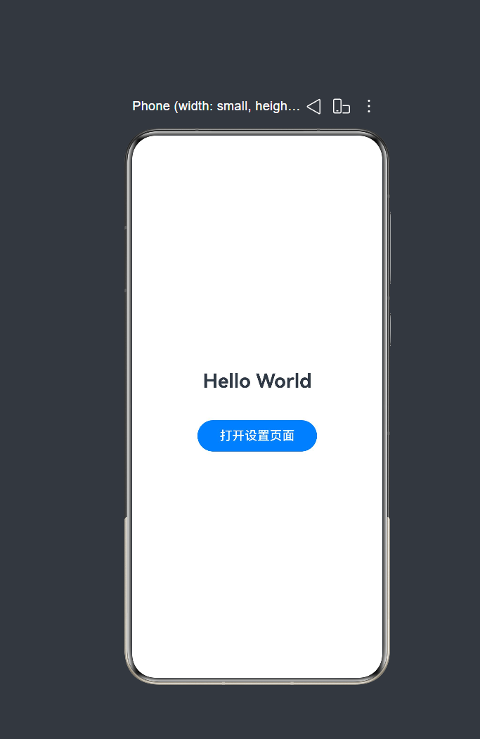
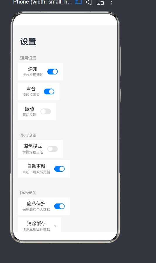
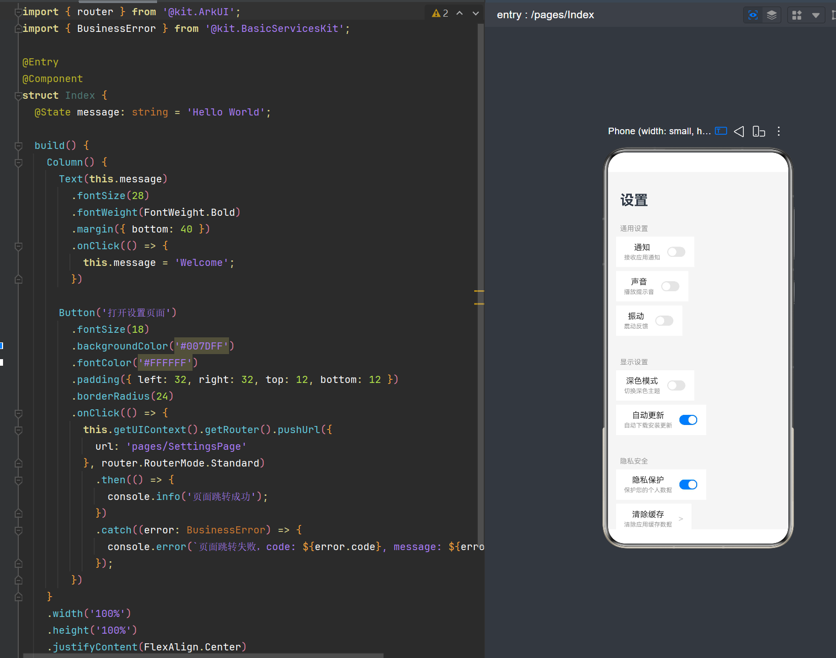
项目演示
一、引言
在移动应用开发中,设置页面是用户与应用交互的重要入口,承载着用户个性化配置、功能开关、隐私安全等核心功能。一个设计良好的设置页面不仅能提升用户体验,还能让用户快速找到所需功能。
HarmonyOS NEXT 作为华为新一代操作系统,引入了全新的 ArkTS 语言和 ArkUI 框架,为开发者提供了强大的 UI 构建能力。本文将基于 API 24,深入讲解如何使用 ArkTS 构建经典的设置页面布局——列表 + Switch + 分组。
本文将涵盖以下核心内容:
- 设置页面的布局设计思路
- List、ListItemGroup、ListItem 组件的使用
- Toggle(Switch 类型)开关组件的实现
- @State 状态管理机制
- @Builder 装饰器实现 UI 复用
- 路由跳转与页面导航
二、开发环境准备
2.1 开发工具
在开始开发之前,确保你已安装以下工具:
- DevEco Studio:HarmonyOS 官方 IDE,版本建议 5.0 及以上
- Node.js:建议版本 18.x 或更高
- 鸿蒙 SDK:API 24 及以上版本
2.2 项目创建
创建一个新的 HarmonyOS 工程,选择 Stage 模型:
# 使用 DevEco Studio 创建项目
# 模板选择:Empty Ability
# 语言:ArkTS
# 设备类型:Phone
2.3 工程结构
创建完成后,工程结构如下:
MyApplication10/
├── AppScope/
│   └── resources/
├── entry/
│   ├── src/
│   │   ├── main/
│   │   │   ├── ets/
│   │   │   │   ├── entryability/
│   │   │   │   │   └── EntryAbility.ets
│   │   │   │   └── pages/
│   │   │   │       └── Index.ets
│   │   │   └── resources/
│   │   │       └── base/
│   │   │           ├── element/
│   │   │           ├── media/
│   │   │           └── profile/
│   │   │               └── main_pages.json
│   └── build-profile.json5
└── build-profile.json5
三、设置页面布局设计思路
3.1 布局结构分析
一个典型的设置页面通常包含以下几个部分:
- 页面标题:显示"设置"字样,位于页面顶部
- 分组列表:将相关设置项分组展示,每组有独立的标题
- 设置项:
- 带开关的设置项(如通知、声音)
- 导航型设置项(如清除缓存、关于我们)
- 背景色:通常使用浅灰色背景,列表项使用白色背景
3.2 组件选型
根据设计需求,我们需要以下组件:
| 组件 | 用途 | API 版本 |
|---|---|---|
| Column | 垂直布局容器 | 8+ |
| Row | 水平布局容器 | 8+ |
| List | 滚动列表容器 | 8+ |
| ListItemGroup | 列表分组容器 | 8+ |
| ListItem | 列表项 | 8+ |
| Toggle | 开关控件 | 8+ |
| Text | 文本显示 | 8+ |
| Button | 按钮组件 | 8+ |
3.3 布局层次图
Column (根容器)
├── Text ("设置"标题)
└── List (分组列表)
    ├── ListItemGroup (通用设置组)
    │   ├── ListItem (通知)
    │   │   └── Row
    │   │       ├── Column (标题+描述)
    │   │       └── Toggle (Switch)
    │   ├── ListItem (声音)
    │   │   └── Row
    │   │       ├── Column (标题+描述)
    │   │       └── Toggle (Switch)
    │   └── ListItem (振动)
    │       └── Row
    │           ├── Column (标题+描述)
    │           └── Toggle (Switch)
    ├── ListItemGroup (显示设置组)
    │   ├── ListItem (深色模式)
    │   └── ListItem (自动更新)
    └── ListItemGroup (隐私安全组)
        ├── ListItem (隐私保护)
        ├── ListItem (清除缓存)
        └── ListItem (关于我们)
四、核心组件详解
4.1 List 组件
List 组件用于构建可滚动的列表,是设置页面的核心容器。
4.1.1 基本用法
List({ space: 20 }) {
  // 列表内容
}
.width('100%')
.flexGrow(1)
4.1.2 关键参数
| 参数 | 类型 | 说明 |
|---|---|---|
| space | number | 列表项之间的间距(单位:vp) |
| initialIndex | number | 初始滚动位置的索引 |
| scroller | Scroller | 滚动控制器,用于控制列表滚动 |
4.1.3 常用属性
width('100%'):宽度占满父容器flexGrow(1):剩余空间全部占用padding():内边距backgroundColor():背景色
4.2 ListItemGroup 组件
ListItemGroup 用于对列表项进行分组,支持设置分组标题(header)和底部内容(footer)。
4.2.1 基本用法
ListItemGroup({ header: this.buildGroupHeader('通用设置') }) {
  // 分组内的列表项
}
4.2.2 关键参数
| 参数 | 类型 | 说明 |
|---|---|---|
| header | CustomBuilder | ResourceStr | 分组标题,支持自定义构建器或字符串资源 |
| footer | CustomBuilder | ResourceStr | 分组底部内容,支持自定义构建器或字符串资源 |
4.2.3 事件
onGroupExpand():分组展开时触发onGroupCollapse():分组折叠时触发
4.3 ListItem 组件
ListItem 是 List 的子组件,定义列表中的每一项。
4.3.1 基本用法
ListItem() {
  // 列表项内容
}
.margin({ bottom: 8 })
4.3.2 常用属性
margin():外边距,用于列表项之间的间距onClick():点击事件
4.4 Toggle 组件(Switch 类型)
Toggle 组件提供勾选框、状态按钮和开关三种样式。在设置页面中,我们主要使用 Switch 类型。
4.4.1 基本用法
Toggle({ type: ToggleType.Switch, isOn: this.notificationEnabled })
  .selectedColor('#007DFF')
  .switchPointColor('#FFFFFF')
  .onChange((isOn: boolean) => {
    this.notificationEnabled = isOn;
  })
4.4.2 关键参数
| 参数 | 类型 | 说明 |
|---|---|---|
| type | ToggleType | 开关样式,可选值:Checkbox、Switch、Button |
| isOn | boolean | 是否开启,支持双向绑定 $$ |
4.4.3 常用属性
| 属性 | 说明 |
|---|---|
| selectedColor | 开启状态下的背景色 |
| switchPointColor | 开关圆点的颜色 |
| switchStyle | 开关样式配置(API 12+) |
4.4.4 事件
onChange((isOn: boolean) => void):开关状态变更时触发
4.5 Row 和 Column 组件
Row 和 Column 是 ArkUI 中最基础的布局容器,分别用于水平和垂直排列子组件。
4.5.1 Row 组件
Row({ space: 12 }) {
  // 水平排列的子组件
}
.padding({ left: 16, right: 16, top: 12, bottom: 12 })
.backgroundColor('#FFFFFF')
4.5.2 Column 组件
Column({ space: 4 }) {
  // 垂直排列的子组件
}
.flexGrow(1)
4.5.3 关键参数
| 参数 | 类型 | 说明 |
|---|---|---|
| space | number | 子组件之间的间距 |
| alignItems | HorizontalAlign / VerticalAlign | 交叉轴对齐方式 |
| justifyContent | FlexAlign | 主轴对齐方式 |
五、状态管理机制
5.1 @State 装饰器
@State 是 ArkTS 中最常用的状态管理装饰器,用于管理组件内部状态。当状态值发生变化时,ArkUI 框架会自动触发 UI 刷新。
5.1.1 基本用法
@Entry
@Component
struct SettingsPage {
  // 定义状态变量
  @State notificationEnabled: boolean = true;
  @State soundEnabled: boolean = true;
  @State vibrationEnabled: boolean = false;

  build() {
    // 使用状态变量
    Toggle({ type: ToggleType.Switch, isOn: this.notificationEnabled })
      .onChange((isOn: boolean) => {
        // 更新状态
        this.notificationEnabled = isOn;
      })
  }
}
5.1.2 响应式原理
@State 的响应式机制基于 依赖收集 和 脏检查:
- 依赖收集阶段:组件首次渲染时,框架会收集所有依赖于
@State变量的 UI 组件 - 状态变更阶段:当
@State变量的值发生变化时,框架会标记依赖该变量的组件为"脏"状态 - UI 更新阶段:框架在下一帧会重新渲染所有"脏"状态的组件
5.1.3 注意事项
@State变量必须在组件内部声明- 状态变更必须是同步的,异步操作需要使用
@Watch装饰器或Promise - 避免在循环中频繁更新
@State,以免影响性能
5.2 双向绑定
从 API 10 开始,Toggle 组件支持双向绑定语法 $$:
// 双向绑定:状态变更会自动同步到开关,开关操作也会自动更新状态
Toggle({ type: ToggleType.Switch, isOn: $$this.notificationEnabled })
使用双向绑定可以简化代码,无需手动处理 onChange 事件。
六、@Builder 装饰器实现 UI 复用
6.1 什么是 @Builder
@Builder 装饰器用于定义可复用的 UI 片段,可以在组件内部或全局范围内定义。
6.1.1 组件内 @Builder
@Entry
@Component
struct SettingsPage {
  @Builder
  buildGroupHeader(title: string) {
    Text(title)
      .fontSize(14)
      .fontColor('#999999')
      .padding({ left: 8, top: 16, bottom: 8 })
      .width('100%')
  }

  build() {
    ListItemGroup({ header: this.buildGroupHeader('通用设置') }) {
      // ...
    }
  }
}
6.1.2 全局 @Builder
@Builder
function globalBuildGroupHeader(title: string) {
  Text(title)
    .fontSize(14)
    .fontColor('#999999')
    .padding({ left: 8, top: 16, bottom: 8 })
    .width('100%')
}

@Entry
@Component
struct SettingsPage {
  build() {
    ListItemGroup({ header: globalBuildGroupHeader('通用设置') }) {
      // ...
    }
  }
}
6.2 设置页面中的 @Builder 方法
在设置页面中,我们定义了三个 @Builder 方法:
6.2.1 buildGroupHeader - 分组标题
@Builder
buildGroupHeader(title: string) {
  Text(title)
    .fontSize(14)
    .fontColor('#999999')
    .padding({ left: 8, top: 16, bottom: 8 })
    .width('100%')
}
6.2.2 buildSettingsItem - 带开关的设置项
@Builder
buildSettingsItem(label: string, sublabel: string, isOn: boolean, onChange: (value: boolean) => void) {
  ListItem() {
    Row({ space: 12 }) {
      Column({ space: 4 }) {
        Text(label)
          .fontSize(16)
          .fontColor('#333333')
        Text(sublabel)
          .fontSize(12)
          .fontColor('#999999')
      }
      .flexGrow(1)

      Toggle({ type: ToggleType.Switch, isOn: isOn })
        .selectedColor('#007DFF')
        .switchPointColor('#FFFFFF')
        .onChange((isOn: boolean) => {
          onChange(isOn);
        })
    }
    .padding({ left: 16, right: 16, top: 12, bottom: 12 })
    .backgroundColor('#FFFFFF')
  }
  .margin({ bottom: 8 })
}
6.2.3 buildNavigationItem - 导航型设置项
@Builder
buildNavigationItem(label: string, sublabel: string) {
  ListItem() {
    Row({ space: 12 }) {
      Column({ space: 4 }) {
        Text(label)
          .fontSize(16)
          .fontColor('#333333')
        Text(sublabel)
          .fontSize(12)
          .fontColor('#999999')
      }
      .flexGrow(1)

      Text('>')
        .fontSize(18)
        .fontColor('#CCCCCC')
    }
    .padding({ left: 16, right: 16, top: 12, bottom: 12 })
    .backgroundColor('#FFFFFF')
  }
  .margin({ bottom: 8 })
  .onClick(() => {
    console.info(`点击了: ${label}`);
  })
}
6.3 @Builder 的优势
- 代码复用:避免重复编写相似的 UI 代码
- 可维护性:统一修改一处,影响所有使用该 Builder 的地方
- 可读性:将复杂的 UI 逻辑封装为有意义的方法名
七、完整代码实现
7.1 SettingsPage.ets
@Entry
@Component
struct SettingsPage {
  /**
   * @State 装饰器用于管理组件内部状态,状态变更时会自动触发 UI 刷新
   * 以下定义了各个开关的初始状态
   */
  @State notificationEnabled: boolean = true;
  @State soundEnabled: boolean = true;
  @State vibrationEnabled: boolean = false;
  @State autoUpdateEnabled: boolean = true;
  @State darkModeEnabled: boolean = false;
  @State privacyEnabled: boolean = true;

  build() {
    // Column 作为根容器,垂直排列子组件
    Column() {
      // 页面标题栏:设置页面的标题
      Text('设置')
        .fontSize(28)
        .fontWeight(FontWeight.Bold)
        .padding({ top: 40, left: 24, right: 24, bottom: 16 })
        .width('100%')

      /**
       * List 组件用于构建可滚动列表,space 参数设置列表项之间的间距
       * ListItemGroup 用于对列表项进行分组,支持设置分组标题(header)
       * 这种组合是鸿蒙设置页面的经典布局方式:分组列表
       */
      List({ space: 20 }) {
        /**
         * 第一组:通用设置
         * 使用 ListItemGroup 包裹一组相关的设置项
         * header 参数接收一个 @Builder 方法,用于渲染分组标题
         */
        ListItemGroup({ header: this.buildGroupHeader('通用设置') }) {
          // 通知开关项
          this.buildSettingsItem(
            '通知',
            '接收应用通知',
            this.notificationEnabled,
            (value: boolean) => { this.notificationEnabled = value; }
          )
          // 声音开关项
          this.buildSettingsItem(
            '声音',
            '播放提示音',
            this.soundEnabled,
            (value: boolean) => { this.soundEnabled = value; }
          )
          // 振动开关项
          this.buildSettingsItem(
            '振动',
            '震动反馈',
            this.vibrationEnabled,
            (value: boolean) => { this.vibrationEnabled = value; }
          )
        }

        /**
         * 第二组:显示设置
         * 每个 ListItemGroup 可以包含多个 ListItem
         */
        ListItemGroup({ header: this.buildGroupHeader('显示设置') }) {
          // 深色模式开关项
          this.buildSettingsItem(
            '深色模式',
            '切换深色主题',
            this.darkModeEnabled,
            (value: boolean) => { this.darkModeEnabled = value; }
          )
          // 自动更新开关项
          this.buildSettingsItem(
            '自动更新',
            '自动下载安装更新',
            this.autoUpdateEnabled,
            (value: boolean) => { this.autoUpdateEnabled = value; }
          )
        }

        /**
         * 第三组:隐私安全
         * 该组混合了开关项和导航项(箭头跳转)
         */
        ListItemGroup({ header: this.buildGroupHeader('隐私安全') }) {
          // 隐私保护开关项
          this.buildSettingsItem(
            '隐私保护',
            '保护您的个人数据',
            this.privacyEnabled,
            (value: boolean) => { this.privacyEnabled = value; }
          )
          // 清除缓存导航项(无开关,带箭头)
          this.buildNavigationItem('清除缓存', '清除应用缓存数据')
          // 关于我们导航项(无开关,带箭头)
          this.buildNavigationItem('关于我们', '查看应用信息')
        }
      }
      .width('100%')
      .flexGrow(1)
      .padding({ left: 16, right: 16 })
    }
    .width('100%')
    .height('100%')
    .backgroundColor('#f5f5f5')
  }

  /**
   * @Builder 装饰器定义可复用的 UI 片段
   * buildGroupHeader 方法用于渲染分组标题
   * 通过 this 访问组件状态,确保响应式绑定生效
   */
  @Builder
  buildGroupHeader(title: string) {
    Text(title)
      .fontSize(14)
      .fontColor('#999999')
      .padding({ left: 8, top: 16, bottom: 8 })
      .width('100%')
  }

  /**
   * buildSettingsItem 方法用于渲染带开关的设置项
   * 布局结构:左侧为文字区域(标题+副标题),右侧为开关控件
   *
   * @param label - 设置项标题
   * @param sublabel - 设置项副标题/描述
   * @param isOn - 开关当前状态
   * @param onChange - 开关状态变更回调
   */
  @Builder
  buildSettingsItem(label: string, sublabel: string, isOn: boolean, onChange: (value: boolean) => void) {
    // ListItem 是 List 的子组件,定义列表中的每一项
    ListItem() {
      // Row 水平布局,space 设置子组件间距
      Row({ space: 12 }) {
        // 左侧文字区域:垂直排列标题和副标题
        Column({ space: 4 }) {
          Text(label)
            .fontSize(16)
            .fontColor('#333333')
          Text(sublabel)
            .fontSize(12)
            .fontColor('#999999')
        }
        .flexGrow(1)

        /**
         * Toggle 组件用于创建开关控件
         * type: ToggleType.Switch 指定为开关类型
         * isOn: 绑定开关状态
         * selectedColor: 开关开启时的背景颜色
         * switchPointColor: 开关圆点的颜色
         * onChange: 状态变更时的回调函数
         */
        Toggle({ type: ToggleType.Switch, isOn: isOn })
          .selectedColor('#007DFF')
          .switchPointColor('#FFFFFF')
          .onChange((isOn: boolean) => {
            onChange(isOn);
          })
      }
      .padding({ left: 16, right: 16, top: 12, bottom: 12 })
      .backgroundColor('#FFFFFF')
    }
    .margin({ bottom: 8 })
  }

  /**
   * buildNavigationItem 方法用于渲染导航项(无开关,带箭头)
   * 布局结构:左侧为文字区域,右侧为箭头图标,表示可点击跳转
   *
   * @param label - 导航项标题
   * @param sublabel - 导航项描述
   */
  @Builder
  buildNavigationItem(label: string, sublabel: string) {
    ListItem() {
      Row({ space: 12 }) {
        // 左侧文字区域
        Column({ space: 4 }) {
          Text(label)
            .fontSize(16)
            .fontColor('#333333')
          Text(sublabel)
            .fontSize(12)
            .fontColor('#999999')
        }
        .flexGrow(1)

        // 右侧箭头图标,表示可点击
        Text('>')
          .fontSize(18)
          .fontColor('#CCCCCC')
      }
      .padding({ left: 16, right: 16, top: 12, bottom: 12 })
      .backgroundColor('#FFFFFF')
    }
    .margin({ bottom: 8 })
    .onClick(() => {
      console.info(`点击了: ${label}`);
    })
  }
}
7.2 Index.ets(入口页面)
import { router } from '@kit.ArkUI';
import { BusinessError } from '@kit.BasicServicesKit';

@Entry
@Component
struct Index {
  @State message: string = 'Hello World';

  build() {
    Column() {
      Text(this.message)
        .fontSize(28)
        .fontWeight(FontWeight.Bold)
        .margin({ bottom: 40 })
        .onClick(() => {
          this.message = 'Welcome';
        })

      Button('打开设置页面')
        .fontSize(18)
        .backgroundColor('#007DFF')
        .fontColor('#FFFFFF')
        .padding({ left: 32, right: 32, top: 12, bottom: 12 })
        .borderRadius(24)
        .onClick(() => {
          this.getUIContext().getRouter().pushUrl({
            url: 'pages/SettingsPage'
          }, router.RouterMode.Standard)
            .then(() => {
              console.info('页面跳转成功');
            })
            .catch((error: BusinessError) => {
              console.error(`页面跳转失败,code: ${error.code}, message: ${error.message}`);
            });
        })
    }
    .width('100%')
    .height('100%')
    .justifyContent(FlexAlign.Center)
    .alignItems(HorizontalAlign.Center)
  }
}
7.3 main_pages.json(路由配置)
{
  "src": [
    "pages/Index",
    "pages/SettingsPage"
  ]
}
八、样式设计与主题
8.1 颜色设计
设置页面通常采用以下颜色方案:
| 元素 | 颜色值 | 说明 |
|---|---|---|
| 页面背景 | #f5f5f5 | 浅灰色,减轻视觉疲劳 |
| 列表项背景 | #FFFFFF | 白色卡片,突出内容 |
| 标题文字 | #333333 | 深灰色,清晰可读 |
| 描述文字 | #999999 | 浅灰色,辅助说明 |
| 开关开启色 | #007DFF | 蓝色,系统标准色 |
| 箭头图标 | #CCCCCC | 浅灰色,指示可点击 |
8.2 字体设计
| 元素 | 字号 | 字重 |
|---|---|---|
| 页面标题 | 28vp | Bold |
| 分组标题 | 14vp | Normal |
| 设置项标题 | 16vp | Normal |
| 设置项描述 | 12vp | Normal |
8.3 间距设计
| 元素 | 间距 |
|---|---|
| 列表项间距 | 20vp(List 的 space) |
| 列表项内边距 | 16vp(左右),12vp(上下) |
| 文字间距 | 4vp(标题与描述之间) |
| 文字与开关间距 | 12vp(Row 的 space) |
8.4 使用系统资源
为了更好地适配主题和深色模式,建议使用系统资源代替硬编码:
// 使用系统颜色
.backgroundColor($r('sys.color.ohos_id_color_bg_page'))
.fontColor($r('sys.color.ohos_id_color_text_primary'))
.selectedColor($r('sys.color.ohos_id_color_component_activated'))

// 使用系统字体
.fontSize($r('app.float.page_title_font_size'))
九、路由跳转与页面导航
9.1 路由概述
在 HarmonyOS NEXT 中,页面导航使用 Router 模块。从 API 18 开始,推荐使用 UIContext.getRouter() 获取 Router 实例。
9.2 跳转方式
9.2.1 pushUrl - 压入新页面
this.getUIContext().getRouter().pushUrl({
  url: 'pages/SettingsPage'
}, router.RouterMode.Standard)
  .then(() => {
    console.info('页面跳转成功');
  })
  .catch((error: BusinessError) => {
    console.error(`页面跳转失败,code: ${error.code}, message: ${error.message}`);
  });
9.2.2 replaceUrl - 替换当前页面
this.getUIContext().getRouter().replaceUrl({
  url: 'pages/SettingsPage'
}, router.RouterMode.Standard);
9.2.3 back - 返回上一页
this.getUIContext().getRouter().back();
9.3 路由模式
| 模式 | 说明 |
|---|---|
| RouterMode.Standard | 标准模式,页面进入栈顶 |
| RouterMode.Single | 单例模式,如果目标页面已在栈中,则移动到栈顶 |
9.4 传递参数
// 跳转时传递参数
this.getUIContext().getRouter().pushUrl({
  url: 'pages/SettingsPage',
  params: {
    userId: '123',
    userName: '张三'
  }
}, router.RouterMode.Standard);

// 在目标页面接收参数
@Entry
@Component
struct SettingsPage {
  aboutToAppear() {
    const params = this.getUIContext().getRouter().getParams();
    console.info(`userId: ${params.userId}`);
  }
}
十、数据持久化
设置页面的开关状态通常需要持久化保存,以便应用重启后恢复用户的配置。
10.1 使用 Preferences
import dataPreferences from '@ohos.data.preferences';

@Entry
@Component
struct SettingsPage {
  @State notificationEnabled: boolean = false;
  private preferences: dataPreferences.Preferences | null = null;

  aboutToAppear() {
    this.loadSettings();
  }

  async loadSettings() {
    try {
      this.preferences = await dataPreferences.getPreferences(getContext(), 'settings');
      this.notificationEnabled = this.preferences.get('notificationEnabled', false);
    } catch (error) {
      console.error('加载设置失败', error);
    }
  }

  async saveSetting(key: string, value: boolean) {
    if (this.preferences) {
      try {
        await this.preferences.put(key, value);
        await this.preferences.flush();
      } catch (error) {
        console.error('保存设置失败', error);
      }
    }
  }

  build() {
    Toggle({ type: ToggleType.Switch, isOn: this.notificationEnabled })
      .onChange((isOn: boolean) => {
        this.notificationEnabled = isOn;
        this.saveSetting('notificationEnabled', isOn);
      })
  }
}
十一、最佳实践与常见问题
11.1 性能优化
11.1.1 列表懒加载
List 组件默认支持懒加载,只渲染可见区域的列表项。但在某些情况下,仍需注意:
- 避免在 ListItem 中使用复杂的计算逻辑
- 避免创建过多的子组件
- 使用
@Builder复用 UI 片段,减少重复渲染
11.1.2 状态管理优化
- 合理使用
@State、@Prop、@Link等装饰器 - 避免在
build()方法中进行状态变更 - 使用
@Watch装饰器处理状态变更后的副作用
11.2 常见问题
11.2.1 开关状态不更新
问题现象:点击开关后,UI 没有变化。
原因分析:@Builder 方法中的参数是按值传递的,状态变更后 UI 不会自动刷新。
解决方案:使用组件内的 @Builder 方法,通过 this 直接访问状态变量。
11.2.2 路由跳转失败
问题现象:调用 pushUrl 后页面没有跳转。
原因分析:
- 目标页面未在
main_pages.json中注册 - URL 路径错误
- Router 实例获取方式错误
解决方案:
- 检查
main_pages.json是否包含目标页面 - 确保 URL 路径与文件路径一致
- 使用
this.getUIContext().getRouter()获取 Router 实例
11.2.3 列表项点击无响应
问题现象:点击列表项没有触发 onClick 事件。
原因分析:ListItem 的 onClick 事件被其子组件拦截。
解决方案:确保子组件没有设置 onClick,或使用 propagation 属性控制事件传播。
11.3 代码规范
11.3.1 命名规范
- 组件名:大驼峰(PascalCase),如
SettingsPage - 变量名:小驼峰(camelCase),如
notificationEnabled - 方法名:小驼峰(camelCase),如
buildSettingsItem - 常量名:全大写,下划线分隔,如
MAX_LIST_ITEMS
11.3.2 注释规范
- 使用 JSDoc 风格注释
- 为组件、方法、参数添加说明
- 注释应清晰简洁,避免冗余
11.3.3 代码结构
- 组件属性按功能分组
build()方法按布局层次组织@Builder方法放在组件末尾
十二、扩展功能
12.1 添加图标
为设置项添加图标,提升视觉效果:
@Builder
buildSettingsItem(label: string, sublabel: string, icon: Resource, isOn: boolean, onChange: (value: boolean) => void) {
  ListItem() {
    Row({ space: 12 }) {
      Image(icon)
        .width(24)
        .height(24)

      Column({ space: 4 }) {
        Text(label)
          .fontSize(16)
          .fontColor('#333333')
        Text(sublabel)
          .fontSize(12)
          .fontColor('#999999')
      }
      .flexGrow(1)

      Toggle({ type: ToggleType.Switch, isOn: isOn })
        .selectedColor('#007DFF')
        .switchPointColor('#FFFFFF')
        .onChange((isOn: boolean) => {
          onChange(isOn);
        })
    }
    .padding({ left: 16, right: 16, top: 12, bottom: 12 })
    .backgroundColor('#FFFFFF')
  }
  .margin({ bottom: 8 })
}
12.2 添加分组折叠功能
为 ListItemGroup 添加折叠/展开功能:
@Entry
@Component
struct SettingsPage {
  @State groupsExpanded: Record<string, boolean> = {
    'general': true,
    'display': true,
    'privacy': true
  };

  build() {
    List({ space: 20 }) {
      ListItemGroup({
        header: this.buildGroupHeader('通用设置'),
        isExpanded: this.groupsExpanded['general']
      }) {
        // ...
      }
      .onGroupExpand(() => {
        this.groupsExpanded['general'] = true;
      })
      .onGroupCollapse(() => {
        this.groupsExpanded['general'] = false;
      })
    }
  }
}
12.3 添加搜索功能
在设置页面顶部添加搜索框:
@Entry
@Component
struct SettingsPage {
  @State searchText: string = '';

  build() {
    Column() {
      // 搜索框
      TextInput({ placeholder: '搜索设置' })
        .width('100%')
        .height(44)
        .margin({ left: 16, right: 16, top: 16 })
        .backgroundColor('#FFFFFF')
        .onChange((value: string) => {
          this.searchText = value;
        })

      // 列表
      List({ space: 20 }) {
        // ...
      }
    }
  }
}
十三、总结
本文详细介绍了如何使用 HarmonyOS ArkTS 构建设置页面布局,涵盖了以下核心知识点:
- 布局组件:List、ListItemGroup、ListItem、Row、Column
- 开关控件:Toggle(Switch 类型)
- 状态管理:@State 装饰器
- UI 复用:@Builder 装饰器
- 路由导航:Router 模块
- 数据持久化:Preferences
通过本文的学习,你应该能够:
- 理解设置页面的布局设计思路
- 掌握核心组件的使用方法
- 实现状态管理和 UI 响应式更新
- 编写可复用的 UI 代码
- 实现页面导航和数据传递
设置页面是应用中非常常见的页面类型,掌握其布局技巧对于 HarmonyOS 应用开发至关重要。希望本文能为你的开发工作提供帮助。
附录:API 参考
A.1 List 组件
interface ListInterface {
  (value?: { space?: number; initialIndex?: number; scroller?: Scroller }): ListAttribute;
}
A.2 ListItemGroup 组件
interface ListItemGroupInterface {
  (value?: { header?: CustomBuilder | ResourceStr; footer?: CustomBuilder | ResourceStr }): ListItemGroupAttribute;
}
A.3 Toggle 组件
interface ToggleInterface {
  (options: { type: ToggleType; isOn?: boolean }): ToggleAttribute;
}
A.4 Router 模块
interface Router {
  pushUrl(options: RouterOptions, mode?: RouterMode): Promise<void>;
  replaceUrl(options: RouterOptions, mode?: RouterMode): Promise<void>;
  back(options?: BackRouterOptions): Promise<void>;
  getParams(): Record<string, Object>;
}
A.5 状态装饰器对比
| 装饰器 | 作用域 | 数据流向 | 适用场景 |
|---|---|---|---|
| @State | 组件内部 | 双向 | 组件私有状态 |
| @Prop | 父子组件 | 单向(父→子) | 父组件向子组件传递数据 |
| @Link | 父子组件 | 双向 | 父子组件共享状态 |
| @ObjectLink | 父子组件 | 双向(对象) | 父子组件共享对象状态 |
| @Provide/@Consume | 跨组件 | 双向 | 祖先组件向后代组件传递数据 |

作为“人工智能6S店”的官方数字引擎,为AI开发者与企业提供一个覆盖软硬件全栈、一站式门户。
更多推荐



 0
0 0
0- 0


 已为社区贡献1条内容

所有评论(0)