
鸿蒙 ArkTS 布局技术全栈实战:从 LoadingProgress 到 Canvas 游戏渲染
第一章 项目架构总览
1.1 整体目录结构
一个规范的鸿蒙 Stage 模型项目采用模块化分层架构。本项目的核心代码集中在 entry/src/main/ets/ 目录中:
entry/src/main/ets/
├── entryability/
│   └── EntryAbility.ets        # 应用入口 UIAbility,控制页面加载
├── pages/
│   ├── LoadingProgressDemo.ets # LoadingProgress 加载动画演示(820 行)
│   ├── BindMenuDemo.ets        # bindMenu 弹出菜单演示(714 行)
│   ├── ContextMenuDemo.ets     # bindContextMenu 上下文菜单(670 行)
│   ├── PopupDemo.ets           # bindPopup 弹窗浮层演示(817 行)
│   ├── ToastDemo.ets           # Toast 短提示演示(619 行)
│   ├── RunnerPage.ets          # 单键跑酷游戏(611 行)
│   ├── Index.ets               # AI 推理大师游戏(584 行)
│   └── AIChatService.ets       # AI 流式对话服务(321 行)
├── components/
│   └── CommonComponents.ets    # 通用可复用组件库
├── model/
│   ├── AppModel.ets            # 数据模型接口与枚举
│   ├── SampleData.ets          # 示例数据
│   └── SpacedRepetition.ets    # 间隔重复算法
└── module.json5                # 模块配置
1.2 应用入口分析
EntryAbility.ets 是应用的门户,通过修改 windowStage.loadContent() 的参数即可切换演示页面。这种设计使得本项目成为一个可组合的"布局技术演示台"——每个页面独立展示一种核心技术,便于学习和复现:
import { AbilityConstant, UIAbility, Want } from '@kit.AbilityKit';
import { hilog } from '@kit.PerformanceAnalysisKit';
import { window } from '@kit.ArkUI';

export default class EntryAbility extends UIAbility {
  onWindowStageCreate(windowStage: window.WindowStage): void {
    // ★ 修改此处的 pages/xxx 即可切换演示页面
    windowStage.loadContent('pages/LoadingProgressDemo', (err) => {
      if (err.code) {
        hilog.error(0x0000, 'App', 'Failed: %{public}s', JSON.stringify(err));
      }
    });
  }
}
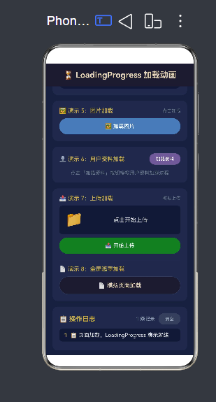
第二章 LoadingProgress 加载动画布局
2.1 核心 API
LoadingProgress 是鸿蒙内置的加载动画组件,无需引入任何第三方库。它提供了最简单的加载状态展示方式:
LoadingProgress()
  .color('#C9A84C')    // 设置动画颜色
  .width(36)            // 设置宽度
  .height(36)           // 设置高度
这个组件的核心优势在于:动画效果由系统驱动,开发者完全不需要关心动画的实现细节,只需要控制组件的显示与隐藏即可。
2.2 基础用法
@State isLoading: boolean = false;

build() {
  Column() {
    if (this.isLoading) {
      // 显示加载动画
      Column() {
        LoadingProgress()
          .color('#C9A84C')
          .width(40).height(40)
        Text('加载中...')
          .fontSize(14).fontColor('#8899AA')
          .margin({ top: 12 })
      }
      .width('100%').padding(24)
      .alignItems(HorizontalAlign.Center)
    } else {
      // 加载完成后的内容
      Text('加载完成 ✅').fontSize(16).fontColor('#E0E0E0')
    }
  }
}
2.3 自定义颜色
LoadingProgress 支持 8 种主色调,通过 color() 方法设置,下方的完整代码展示了如何构建一个颜色选择面板:
private colors: string[] = [
  '#C9A84C', '#4A7AB5', '#2E7D32', '#C0392B',
  '#6B5B95', '#FF6B35', '#1ABC9C', '#E74C3C'
];
private colorNames: string[] = [
  '金色', '蓝色', '绿色', '红色',
  '紫色', '橙色', '青色', '朱红'
];
@State currentColorIndex: number = 0;

// 在 UI 中渲染颜色选择网格
ForEach(this.colors, (color: string, index: number) => {
  Column() {
    LoadingProgress()
      .color(color)            // 动态切换颜色
      .width(28).height(28)
    Text(this.colorNames[index])
      .fontSize(10).fontColor('#8899AA')
  }
  .onClick(() => { this.currentColorIndex = index; })
})
2.4 自定义尺寸
通过 width() 和 height() 方法,可以精确控制加载动画的大小。项目中演示了四种尺寸:
// Small — 24px
LoadingProgress().color('#4A7AB5').width(24).height(24)

// Medium — 36px(默认尺寸)
LoadingProgress().color('#4A7AB5').width(36).height(36)

// Large — 52px
LoadingProgress().color('#4A7AB5').width(52).height(52)

// XL — 64px
LoadingProgress().color('#4A7AB5').width(64).height(64)
2.5 全屏遮罩加载层
一种典型的加载模式是使用 Stack 组件实现全屏遮罩加载。遮罩层覆盖在主内容之上,阻止用户操作并提示加载状态:
build() {
  Stack() {
    // 主内容层
    Column() {
      // 页面标题、滚动内容等...
    }
    .width('100%').height('100%')

    // ★★★ 全屏遮罩加载层 ★★★
    if (this.isPageLoading) {
      Column() {
        LoadingProgress()
          .color('#C9A84C')
          .width(48).height(48)
        Text('页面加载中...')
          .fontSize(15).fontColor('#E8D5B7')
          .margin({ top: 16 })
        Text('请稍候,正在准备内容')
          .fontSize(12).fontColor('#667788')
          .margin({ top: 6 })
      }
      .width('100%').height('100%')
      .backgroundColor('rgba(22,33,62,0.92)')  // 半透明遮罩
      .justifyContent(FlexAlign.Center)
      .alignItems(HorizontalAlign.Center)
    }
  }
  .width('100%').height('100%')
}
这种模式的关键在于:
Stack组件让遮罩层覆盖在主内容之上- 半透明背景色
rgba(22,33,62,0.92)既能遮挡背后内容,又保持了界面整体色调一致 - LoadingProgress 配合文字居中,形成完整的加载状态
2.6 模拟真实加载流程
项目中通过 @State + setTimeout 模拟了四种真实场景的加载过程:
// 文章分步加载:获取中 → 解析中 → 完成
@State isArticleLoading: boolean = false;
@State articles: Article[] = [];
@State articleLoadStep: string = '点击加载';

loadArticles(): void {
  this.isArticleLoading = true;
  this.articleLoadStep = '正在获取文章列表...';

  setTimeout(() => {
    this.articleLoadStep = '正在解析数据...';
    setTimeout(() => {
      this.articles = [ /* 4 篇文章数据 */ ];
      this.isArticleLoading = false;
      this.articleLoadStep = '点击重新加载';
    }, 1500);
  }, 1000);
}

// 图片加载:网格布局中的每个占位符显示 LoadingProgress
// 用户资料加载:骨架屏效果(文字占位符 + LoadingProgress)
// 文件上传:LoadingProgress + 进度条百分比逐步增长
第三章 bindPopup 弹窗浮层布局
3.1 核心 API
bindPopup 用于为任意组件绑定浮层弹窗。与 bindMenu 和 bindContextMenu 不同,popup 的弹出方向可以通过 placement 属性精确控制:
Button('触发')
  .bindPopup(
    () => this.buildPopupContent(),     // @Builder 构建浮层内容
    {
      placement: Placement.Bottom,       // 弹出方向
      onStateChange: (v: boolean) => {   // 状态监听
        this.popupVisible = v;
      },
      enableArrow: true,                // 是否显示箭头
      autoCancel: true,                 // 点击外部自动关闭
    }
  )
3.2 三种弹窗方式的对比
鸿蒙提供了三种弹窗绑定方式,它们各有适用的场景:
| 特性 | bindPopup | bindMenu | bindContextMenu |
|---|---|---|---|
| 触发方式 | 点击/悬停 | 点击 | 长按/右键 |
| 展示内容 | 任意 @Builder | Menu 列表 | Menu 列表 |
| 方向控制 | placement(8 方向) | 系统自动 | 系统自动 |
| 箭头指示 | enableArrow | 无 | 无 |
| 典型场景 | 提示浮层/详情卡片 | 下拉选择菜单 | 上下文操作菜单 |
3.3 方向控制(Placement)
bindPopup 支持 8 种弹出方向,通过 placement 属性动态控制。项目中构建了完整的演示:
// 8 种 Placement 方向
const placements = [
  { name: 'Top',       value: Placement.Top },
  { name: 'Bottom',    value: Placement.Bottom },
  { name: 'Left',      value: Placement.Left },
  { name: 'Right',     value: Placement.Right },
  { name: 'TopLeft',   value: Placement.TopLeft },
  { name: 'TopRight',  value: Placement.TopRight },
  { name: 'BottomLeft',value: Placement.BottomLeft },
  { name: 'BottomRight',value: Placement.BottomRight },
];

// 动态绑定 placement
Text('当前方向: ' + this.placementName)
  .bindPopup(
    () => this.buildPlacementPopup(this.placementName),
    {
      placement: this.currentPlacement,    // ← 动态切换
      onStateChange: (v) => { this.popupVisible2 = v; },
      enableArrow: true,
      autoCancel: true,
    }
  )
3.4 复杂浮层内容
bindPopup 的浮层内容通过 @Builder 构建,因此可以是任意复杂的布局。项目中演示了四种复杂的浮层:
产品详情浮层:展示名称、价格、评分、描述等,从右侧弹出:
@Builder
buildProductPopup(product: ProductItem) {
  Column() {
    // 标签
    Row() {
      Text(product.tag).fontSize(11).fontColor('#FFFFFF')
        .padding({ left: 8, right: 8, top: 3, bottom: 3 })
        .backgroundColor('#C9A84C').borderRadius(4)
      Blank()
      Text('⭐ ' + product.rating).fontSize(13).fontColor('#FFD700')
    }.margin({ bottom: 8 })

    Text(product.name).fontSize(18).fontWeight(FontWeight.Bold)
    Text('¥' + product.price).fontSize(24).fontColor('#CC4444')
    Text(product.desc).fontSize(13).fontColor('#666666').lineHeight(20)
    Text('已售 ' + product.sales.toLocaleString() + ' 件').fontSize(12).fontColor('#999')
  }
  .padding(16).backgroundColor('#FFFFFF').borderRadius(12).width(220)
  .shadow({ radius: 8, color: '#30000000', offsetX: 0, offsetY: 4 })
}
通知列表浮层:包含多条通知,支持在浮层内交互操作(标记已读):
@Builder
buildNotificationPopup() {
  Column() {
    // 标题栏
    Row() {
      Text('🔔 通知').fontSize(16).fontWeight(FontWeight.Bold)
      Blank()
      if (this.unreadCount > 0) {
        Text(this.unreadCount + ' 条未读')
          .padding({ left: 6, right: 6, top: 2, bottom: 2 })
          .backgroundColor('#CC4444').borderRadius(10).fontSize(11).fontColor('#FFFFFF')
      }
    }.margin({ bottom: 10 })

    // 通知列表(可交互)
    ForEach(this.notifications, (notif) => {
      Row() {
        Text(this.getNotifIcon(notif.type)).fontSize(18)
        Column() {
          Text(notif.title).fontWeight(notif.isRead ? FontWeight.Regular : FontWeight.Bold)
          Text(notif.content).fontSize(12).fontColor('#666').maxLines(1)
        }
      }
      .padding(8).onClick(() => {
        // ★ 浮层内部交互:标记已读 ★
        this.notifications = this.notifications.map(n =>
          n.id === notif.id ? { ...n, isRead: true } : n
        );
        this.popupVisible4 = false;  // 关闭浮层
      })
    })

    // 底部操作
    Text('全部标记为已读').fontSize(12).fontColor('#C9A84C')
      .onClick(() => {
        this.notifications = this.notifications.map(n => ({ ...n, isRead: true }));
        this.popupVisible4 = false;
      })
  }
  .padding(16).backgroundColor('#FFFFFF').borderRadius(12).width(300)
  .shadow({ radius: 12, color: '#30000000', offsetX: 0, offsetY: 4 })
}
操作面板浮层:包含 6 个快捷操作按钮的网格布局。
第四章 Toast 短提示布局
4.1 核心 API
promptAction.showToast() 是鸿蒙中最轻量的用户反馈方式——一行代码即可弹出提示,无需创建组件、无需管理状态:
import { promptAction } from '@kit.ArkUI';

// 最简单的用法
promptAction.showToast({
  message: '操作成功',      // 提示文字(必填)
  duration: 1500,           // 显示时长(毫秒,默认 1500)
});
4.2 Toast 的设计哲学
Toast 的设计有五个核心特性:
- 零侵入:不创建任何 UI 组件,不修改页面布局
- 自动消失:显示指定时长后自动消失
- 不阻塞操作:Toast 显示期间用户仍然可以正常操作界面
- 排队机制:多个 Toast 连续调用会排队依次显示
- 固定位置:显示在屏幕底部(系统固定位置,不可更改)
4.3 多场景实战
项目中展示了 8 种 Toast 应用场景:
// 基础时长对比
promptAction.showToast({ message: '短提示', duration: 1000 });
promptAction.showToast({ message: '中提示', duration: 2000 });
promptAction.showToast({ message: '长提示', duration: 3000 });

// 操作结果反馈
promptAction.showToast({ message: '✅ 操作执行成功', duration: 1500 });
promptAction.showToast({ message: '❌ 操作执行失败,请重试', duration: 2000 });

// 网络状态变化
promptAction.showToast({ message: '📶 已连接 Wi-Fi 网络', duration: 1500 });
promptAction.showToast({ message: '⚠️ 网络已断开,部分功能不可用', duration: 3000 });

// 内容操作
promptAction.showToast({ message: '📋 已复制: "鸿蒙 ArkTS 布局指南"', duration: 2000 });

// 连续调用(排队效果)
promptAction.showToast({ message: '🥇 第一', duration: 800 });
setTimeout(() => {
  promptAction.showToast({ message: '🥈 第二', duration: 800 });
}, 1000);
setTimeout(() => {
  promptAction.showToast({ message: '🥉 第三', duration: 800 });
}, 2000);
4.4 与其它弹窗组件的对比
| 特性 | Toast | Dialog | Popup | Menu |
|---|---|---|---|---|
| 交互性 | 只读 | 可交互 | 可交互 | 可交互 |
| 显示时长 | 短暂自动消失 | 手动关闭 | 手动关闭 | 手动关闭 |
| 阻隔操作 | 否 | 是(遮罩层) | 否 | 否 |
| 开发成本 | 一行代码 | 多行代码 | @Builder | @Builder |
| 适用场景 | 简单操作反馈 | 确认/输入弹窗 | 浮层详情 | 操作菜单 |
第五章 bindMenu 弹出菜单布局
5.1 核心 API
Button('排序')
  .bindMenu(() => this.buildSortMenu())
bindMenu 的语法非常简洁——它将一个 @Builder 构建的菜单绑定到任意组件上。系统会自动处理菜单位置、关闭逻辑和动画。
5.2 @Builder 构建菜单
@Builder
buildSortMenu() {
  Menu() {
    // 标题项(禁用状态,仅展示)
    MenuItem({ content: '选择排序方式', startIcon: '🔀' })
      .enabled(false)

    // 分隔线
    MenuItem({ content: '' })
      .enabled(false).height(1).backgroundColor('#EEEEEE')

    // 使用 ForEach 批量生成菜单项
    ForEach(this.sortOptions, (option) => {
      MenuItem({
        content: option.label,
        startIcon: option.icon,
      })
        .fontColor(this.currentSort === option.label ? '#C9A84C' : '#333')
        .onClick(() => {
          this.currentSort = option.label;
          promptAction.showToast({ message: `已切换「${option.label}」`, duration: 1500 });
        })
    })
  }
}
5.3 MenuItemGroup 分组
鸿蒙的 Menu 组件支持通过 MenuItemGroup 实现菜单项分组:
Menu() {
  MenuItemGroup({ header: '文件操作' }) {
    MenuItem({ content: '新建', startIcon: '📄' }).onClick(() => {})
    MenuItem({ content: '打开', startIcon: '📂' }).onClick(() => {})
  }
  MenuItemGroup({ header: '视图设置' }) {
    MenuItem({ content: '列表视图', startIcon: '📋' }).onClick(() => {})
    MenuItem({ content: '网格视图', startIcon: '🔲' }).onClick(() => {})
  }
}
MenuItemGroup 会自动在组间添加分隔线,并在每组上方显示 header 标题。
第六章 bindContextMenu 上下文菜单布局
6.1 核心 API
bindContextMenu 与 bindMenu 类似,但专门为上下文操作场景设计,支持长按触发:
Row() { /* 联系人行 */ }
  .bindContextMenu(
    () => this.buildContactContextMenu(contact),
    ResponseType.LongPress    // 长按触发
  )
6.2 三组菜单的实战演示
项目中的 ContextMenuDemo.ets 展示了三种不同场景的上下文菜单:
联系人菜单(三组结构):
Menu {
  ── 标题:联系人姓名 + 部门
  ── 分隔线
  ── MenuItemGroup "沟通"
  │     发消息 | 打电话 | 发邮件
  ├── MenuItemGroup "管理"
  │     编辑资料 | 移动分组
  ├── 红色分隔线
  └── MenuItemGroup "危险操作"
         删除联系人(红色文字)
}
笔记菜单(动态图标切换):
MenuItem({
  content: note.isPinned ? '取消置顶' : '置顶笔记',   // 文字动态切换
  startIcon: note.isPinned ? '⭐' : '⬜',               // 图标动态切换
}).onClick(() => {
  this.notes = this.notes.map(n =>
    n.id === note.id ? { ...n, isPinned: !n.isPinned } : n
  );
})
文件菜单(条件渲染):
// 不同类型的文件显示不同的操作
if (file.type === 'image') {
  MenuItem({ content: '设为壁纸', startIcon: '🖼️' }).onClick(() => {})
}
if (file.type === 'music') {
  MenuItem({ content: '播放', startIcon: '▶️' }).onClick(() => {})
}
6.3 与 bindMenu 的区别
| 特性 | bindMenu | bindContextMenu |
|---|---|---|
| 触发方式 | 点击 | 长按(RightClick) |
| 典型场景 | 下拉选择菜单 | 文件/联系人右键菜单 |
| 菜单位置 | 组件固定位置 | 触摸点附近 |
第七章 Column + layoutWeight 弹性布局
7.1 弹性布局原理
layoutWeight 是鸿蒙 ArkUI 中最强大的弹性布局手段,其工作方式类似于 CSS Flexbox 的 flex-grow:
子组件高度 = (父容器总高度 − 所有固定组件之和)
            × (该组件 layoutWeight ÷ 所有弹性组件 layoutWeight 之和)
关键前提:父容器必须设置 height('100%')。
7.2 跑酷游戏全屏布局
RunnerPage.ets 使用 Column + layoutWeight 实现了完整的游戏全屏自适应布局:
build() {
  Column() {
    // 固定顶部区(height: 50,不参与弹性分配)
    Row() {
      Text('🏃 单键跑酷')
      Blank()
      Text('得分: ' + this.score)
    }.height(50).backgroundColor('#2d5f8a')

    // ★ 弹性区 A:游戏主场景(layoutWeight = 1.0 → 50%)
    Canvas(this.ctx).layoutWeight(1.0)

    // ★ 弹性区 B:状态信息(layoutWeight = 0.3 → 15%)
    Row() {
      Text('最高分: ' + this.bestScore)
      Text('速度: ' + this.speedDisp)
    }.layoutWeight(0.3)

    // ★ 弹性区 C:跳跃按钮(layoutWeight = 0.7 → 35%)
    Button('🦘 跳跃!')
      .layoutWeight(0.7)
      .onClick(() => { this.jump(); })
  }
  .width('100%').height('100%')   // ← 必须设置!
}
布局计算示例(屏幕高度 800vp):
- 固定区:50vp
- 剩余空间:800 − 50 = 750vp
- 弹性总权重:1.0 + 0.3 + 0.7 = 2.0
- Canvas:750 × (1.0 ÷ 2.0) = 375vp
- 状态区:750 × (0.3 ÷ 2.0) = 112.5vp
- 按钮区:750 × (0.7 ÷ 2.0) = 262.5vp
第八章 Canvas 游戏渲染引擎
8.1 Canvas 基础用法
RunnerPage.ets 使用 CanvasRenderingContext2D 和 setInterval 实现了完整的 2D 游戏渲染:
@Component
struct RunnerPage {
  private ctx: CanvasRenderingContext2D = new CanvasRenderingContext2D();
  private playerY: number = 0;
  private playerVY: number = 0;
  private obstacles: Obstacle[] = [];
  private timerId: number = -1;
  @State private score: number = 0;

  // 游戏循环(每 24ms 执行一次 ≈ 42 FPS)
  startGameLoop(): void {
    this.timerId = setInterval(() => {
      this.updatePhysics();
      this.updateObstacles();
      this.checkCollision();
      this.spawnObstacle();
      this.drawScene();
    }, 24);
  }

  // 物理更新
  updatePhysics(): void {
    const GRAVITY = 0.55;
    const JUMP_VEL = -9.0;
    this.playerVY += GRAVITY;
    this.playerY += this.playerVY;
    // 地面碰撞
    const groundY = this.canvasH * 0.78;
    if (this.playerY >= groundY) {
      this.playerY = groundY;
      this.playerVY = 0;
    }
  }

  // Canvas 渲染
  drawScene(): void {
    const ctx = this.ctx;
    ctx.clearRect(0, 0, this.canvasW, this.canvasH);
    // 地面
    ctx.fillStyle = '#8B4513';
    ctx.fillRect(0, this.canvasH * 0.78, this.canvasW, 5);
    // 角色
    ctx.fillStyle = '#FF6600';
    ctx.fillRect(40, this.playerY, 22, 22);
    // 障碍物
    ctx.fillStyle = '#CC0000';
    for (let obs of this.obstacles) {
      ctx.fillRect(obs.x, this.canvasH * 0.78 - 28, 16, 28);
    }
  }
}
8.2 SSE 流式网络请求
AIChatService.ets 使用 @kit.NetworkKit 实现了 SSE 协议的流式数据接收:
import { http } from '@kit.NetworkKit';

const httpRequest = http.createHttp();

// 监听数据流
httpRequest.on('dataReceive', (data: ArrayBuffer) => {
  const text = arrayBufferToString(data);
  buffer += text;
  const lines = buffer.split('\n');
  buffer = lines.pop() ?? '';
  for (const line of lines) {
    const trimmed = line.trim();
    if (!trimmed.startsWith('data:')) continue;
    if (trimmed === 'data:[DONE]') { /* 流结束 */ continue; }
    const content = parseSSEDataLine(trimmed);
    if (content) callbacks.onData(content);
  }
});
第九章 @Builder 装饰器与组件化
9.1 @Builder 的三种用法
@Builder 装饰器在 ArkTS 中有三种核心使用场景,理解它们对掌握 ArkTS 至关重要:
场景一:组件内部 UI 复用
@Entry
@Component
struct MyPage {
  @Builder
  buildSectionTitle(title: string) {
    Row() {
      Text(title).fontSize(18).fontWeight(FontWeight.Bold)
      Blank()
      Text('更多 >').fontSize(12).fontColor('#999')
    }.width('100%').margin({ bottom: 12 })
  }

  build() {
    Column() {
      this.buildSectionTitle('推荐内容')
      this.buildSectionTitle('热门排行')
    }
  }
}
场景二:bindXxx 的参数传递
这是 bindMenu / bindContextMenu / bindPopup 的核心模式——将 @Builder 方法的引用传递给绑定 API:
// 传递 @Builder 引用(注意不是调用结果!)
Button('弹出').bindMenu(() => this.buildMenu())

// 带参数的 @Builder 传递:
.bindContextMenu(() => this.buildFileContextMenu(file), ResponseType.LongPress)
场景三:@BuilderParam 插槽注入
ArkTS 的子组件不能像传统前端框架那样使用 children 插槽,取而代之的是 @BuilderParam:
@Component
export struct Card {
  @BuilderParam content: () => void = this.defaultContent;
  @Builder defaultContent() { Text('默认内容') }

  build() {
    Column() {
      this.content()    // 渲染注入的内容
    }.padding(16).backgroundColor('#FFF').borderRadius(16)
  }
}

// 父组件使用
@Builder customContent() {
  Text('自定义标题').fontSize(18)
  Button('操作').onClick(() => {})
}

Card({ content: this.customContent })   // 注入 Builder
9.2 通用组件库
CommonComponents.ets 构建了四个可复用组件:
| 组件 | 功能 | 核心 Props |
|---|---|---|
Card |
通用卡片容器 | cardPadding, cardColor, content(@BuilderParam) |
ProgressRing |
圆形进度条 | ringProgress, ringSize, ringColor |
ModuleEntryCard |
模块入口卡片 | entryIcon, entryLabel, onClickAction |
AppHeader |
顶部标题栏 | headerTitle, showBack, onBack |
第十章 总结与最佳实践
10.1 核心技术速查表
| 技术 | 核心 API | 典型场景 | 代码行数 |
|---|---|---|---|
| 加载动画 | LoadingProgress().color().width().height() |
页面/局部加载 | 1 行 |
| 弹窗浮层 | bindPopup(@Builder, {placement, ...}) |
详情浮层/提示 | @Builder + 绑定 |
| 短提示 | promptAction.showToast({message, duration}) |
操作反馈 | 1 行 |
| 弹出菜单 | bindMenu(@Builder) |
下拉选择 | @Builder + Menu |
| 上下文菜单 | bindContextMenu(@Builder, ResponseType) |
长按操作 | @Builder + Menu |
| 弹性布局 | Column + layoutWeight |
全屏自适应 | 按比例分配 |
| Canvas 渲染 | CanvasRenderingContext2D + setInterval |
游戏/可视化 | 帧循环 |
| SSE 流请求 | @kit.NetworkKit + on('dataReceive') |
AI 流式对话 | 缓冲区解析 |
10.2 常见陷阱
LoadingProgress 不显示:检查是否用 @State 控制显示状态,普通变量变化不会触发 UI 重绘。
bindPopup 位置不对:确认 placement 是否正确设置,注意不同 Placement 值的影响。
Toast 不出现:确认 message 不为空字符串,duration 为正数。
layoutWeight 不生效:父容器 Column 必须设置 height('100%'),否则没有剩余空间可分配。
@Builder 未渲染:确认是在 build() 方法内或通过 bindXxx 调用,@Builder 不能在任意时机调用。
10.3 总结
鸿蒙 ArkTS 提供了一套完整的声明式 UI 框架。从最简单的 LoadingProgress 加载动画到复杂的 Canvas 游戏引擎,从一行代码的 Toast 提示到完整的 @Builder 组件化体系,每一层都遵循一致的设计哲学——声明式、响应式、组件化。

作为“人工智能6S店”的官方数字引擎,为AI开发者与企业提供一个覆盖软硬件全栈、一站式门户。
更多推荐
 0
0 0
0- 0


 已为社区贡献39条内容

所有评论(0)