
鸿蒙原生 ArkTS 布局实战:从弹窗到游戏,构建全场景 HarmonyOS NEXT 应用
第一章 项目架构概览
1.1 项目目录结构
一个规范的鸿蒙项目采用 Stage 模型,其目录组织遵循模块化原则。本项目核心代码集中在 entry/src/main/ets/ 下,按功能分层:
entry/src/main/ets/
├── entryability/
│   └── EntryAbility.ets          # 应用入口,Ability 生命周期
├── pages/
│   ├── Index.ets                 # 主页面:重生 AI 推理大师
│   ├── DatePickerDialogDemo.ets  # DatePickerDialog 日期弹窗演示
│   ├── RunnerPage.ets            # 单键跑酷游戏页面
│   └── AIChatService.ets         # AI 对话服务(SSE 流式网络)
├── components/
│   └── CommonComponents.ets      # 通用可复用组件库
├── model/
│   ├── AppModel.ets              # 数据模型定义
│   ├── SampleData.ets            # 示例数据
│   └── SpacedRepetition.ets      # 间隔重复算法
├── resources/
│   ├── base/
│   │   ├── element/
│   │   │   └── string.json       # 字符串资源
│   │   └── media/                # 图片资源
│   └── en_US/                    # 英文资源
└── module.json5                  # 模块配置
1.2 应用入口分析
EntryAbility.ets 是应用的门户,继承自 UIAbility,负责页面的生命周期管理和窗口创建:
import { AbilityConstant, UIAbility, Want } from '@kit.AbilityKit';
import { hilog } from '@kit.PerformanceAnalysisKit';
import { window } from '@kit.ArkUI';

export default class EntryAbility extends UIAbility {
  onWindowStageCreate(windowStage: window.WindowStage): void {
    // 加载起始页面
    windowStage.loadContent('pages/DatePickerDialogDemo', (err) => {
      if (err.code) {
        hilog.error(0x0000, 'App', '加载页面失败: %{public}s', JSON.stringify(err));
      }
    });
  }
}
这里的关键 API 是 windowStage.loadContent(),它决定了应用的首页。通过修改第一个参数(页面路径),可以灵活切换不同的演示页面。页面路径需要与 module.json5 中的 pages 配置相匹配。
第二章 弹窗系统深度解析
弹窗是移动应用中最常见的交互模式之一。鸿蒙原生提供了两套弹窗方案:CustomDialog(自定义弹窗) 和 DatePickerDialog(系统日期弹窗)。前者给予开发者完全的 UI 控制权,后者则针对日期选择这一高频场景提供了开箱即用的体验。
2.1 CustomDialog 自定义弹窗
2.1.1 核心概念
CustomDialog 是鸿蒙提供的自定义弹窗容器,它通过 @CustomDialog 装饰器标记弹窗的结构体,通过 CustomDialogController 控制弹窗的生命周期。
其核心工作流程如下:
① 定义 @CustomDialog struct → ② 创建 CustomDialogController → ③ controller.open() 打开
                                                                     ↓
                                                              ④ 用户交互
                                                                     ↓
                                                              ⑤ controller.close() 关闭
                                                                     ↓
                                                              ⑥ 回调数据传回页面
2.1.2 自定义弹窗的完整实现
下面的代码展示了两个完整的 @CustomDialog 弹窗,分别演示了信息展示型和操作列表型两种常见场景:
import { promptAction } from '@kit.ArkUI';

// ========== 弹窗一:信息详情弹窗 ==========
@CustomDialog
struct InfoDetailDialog {
  controller: CustomDialogController;          // 弹窗控制器
  @Link dialogCount: number;                    // @Link 双向绑定
  private dialogTitle: string = '';             // 外部传入数据
  private dialogContent: string = '';
  private dialogIcon: ResourceStr = '';
  private onClose?: (result: string) => void;   // 回调函数
  @State private userFeedback: string = '';     // 弹窗内部状态

  build() {
    Column() {
      // 顶部图标
      if (this.dialogIcon !== '') {
        Text(this.dialogIcon).fontSize(48).margin({ bottom: 8 })
      }
      // 标题
      Text(this.dialogTitle)
        .fontSize(20).fontWeight(FontWeight.Bold)
        .fontColor('#1A1A2E').margin({ bottom: 12 })
      // 可滚动的正文
      Scroll() {
        Text(this.dialogContent).fontSize(15)
          .fontColor('#555555').lineHeight(24)
      }.height(120)
      // 用户输入
      TextInput({ placeholder: '请输入你的反馈...', text: this.userFeedback })
        .height(40).fontSize(14)
        .onChange((value) => { this.userFeedback = value; })
      // 操作按钮
      Row() {
        Button('取消').onClick(() => { this.controller.close(); })
        Button('确认').onClick(() => {
          this.dialogCount++;                    // @Link 同步更新
          if (this.onClose) { this.onClose(this.userFeedback); }
          this.controller.close();
        })
      }
    }.padding(24).backgroundColor(Color.White).borderRadius(16)
  }
}

// ========== 弹窗二:操作列表弹窗 ==========
@CustomDialog
struct ActionSheetDialog {
  controller: CustomDialogController;
  private title: string = '';
  private actions: string[] = [];
  private onSelect?: (index: number, label: string) => void;

  build() {
    Column() {
      Text(this.title).fontSize(18).fontWeight(FontWeight.Bold)
      Divider().height(1).width('100%').color('#E8E8E8')
      // 使用 ForEach 循环渲染操作项
      ForEach(this.actions, (action: string, index: number) => {
        Row() {
          Text(`0${index + 1}`).fontColor('#C9A84C')
          Text(action).fontSize(16).layoutWeight(1)
          Text('›').fontSize(20).fontColor('#CCCCCC')
        }.height(48).onClick(() => {
          if (this.onSelect) { this.onSelect(index, action); }
          this.controller.close();
        })
        if (index < this.actions.length - 1) {
          Divider().height(1).color('#F0F0F0').margin({ left: 24 })
        }
      })
      Button('取消').onClick(() => { this.controller.close(); })
    }.padding(24).backgroundColor(Color.White).borderRadius(16)
  }
}
要点说明:
| 装饰器 / API | 作用 | 注意事项 |
|---|---|---|
@CustomDialog |
标记结构体为弹窗组件 | 必须包含 controller: CustomDialogController |
CustomDialogController |
控制弹窗的打开和关闭 | 一个 controller 对应一个弹窗实例,不可复用 |
controller.open() |
打开弹窗 | 在 build() 或 onPageShow() 中创建 controller |
controller.close() |
关闭弹窗 | 安全释放弹窗资源 |
@Link |
弹窗与页面的双向绑定 | 弹窗内修改会同步到页面 |
| 回调函数 | 弹窗将数据传回页面 | 通过类属性函数传递 |
2.1.3 CustomDialogController 的创建与管理
控制器需要在页面生命周期内创建,通常选择 onPageShow() 或 build() 方法中实例化:
@Entry
@Component
struct AlertDialogDemo {
  private infoController: CustomDialogController | null = null;

  initControllers(): void {
    this.infoController = new CustomDialogController({
      builder: InfoDetailDialog({
        dialogCount: this.dialogCount,
        dialogTitle: '系统通知',
        dialogContent: '欢迎体验鸿蒙原生 CustomDialog!',
        dialogIcon: '🚀',
        onClose: (feedback) => {
          if (feedback.trim()) {
            this.feedbackLog = [feedback, ...this.feedbackLog];
          }
        }
      }),
      autoCancel: true,                     // 点击遮罩层自动关闭
      alignment: DialogAlignment.Center,    // 居中显示
      offset: { dx: 0, dy: 0 },
      customStyle: true,                    // 启用自定义样式
      cornerRadius: 16,                     // 弹窗圆角
    });
  }
}
CustomDialogControllerOptions 配置说明:
| 配置项 | 类型 | 说明 |
|---|---|---|
builder |
CustomDialog 实例 |
传入弹窗结构体,支持传参 |
autoCancel |
boolean |
是否允许点击遮罩层关闭 |
alignment |
DialogAlignment |
弹窗对齐方式(Center / Top / Bottom / Left / Right) |
offset |
{dx: number, dy: number} |
弹窗偏移量 |
customStyle |
boolean |
是否启用自定义样式(启用后可以自定义圆角、背景等) |
cornerRadius |
Length |
弹窗圆角(customStyle=true 时生效) |
onWillDismiss |
回调 | 弹窗即将关闭时触发 |
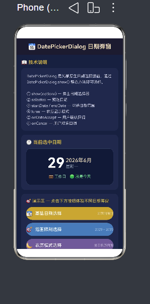
2.2 DatePickerDialog 系统日期弹窗
DatePickerDialog 是鸿蒙内置的日期选择弹窗,相比 CustomDialog,它的特点是零 UI 开发——系统提供了完整的年月日滚轮选择器 UI。
2.2.1 基础用法
DatePickerDialog.show({
  selected: new Date(),          // 预选日期(默认当天)
  onDateAccept: (value: Date) => {
    // 用户确认选择
    console.info('选中日期:' + value.toISOString());
  },
  onCancel: () => {
    // 用户取消选择
    console.info('用户取消了选择');
  }
});
就这么简单!一行 DatePickerDialog.show() 即可唤醒一个功能完整的日期选择器。
2.2.2 四种实战场景
在实际项目中,日期选择的需求往往各不相同,下面展示四种典型场景及其代码实现:
场景一:基础日期选择(无范围限制)
showBasicDatePicker(): void {
  DatePickerDialog.show({
    selected: this.selectedDate,
    onDateAccept: (value: Date) => {
      this.selectedDate = value;
      this.chineseDate = `${value.getFullYear()}年${value.getMonth() + 1}月${value.getDate()}日`;
    },
    onCancel: () => {
      console.info('用户取消了选择');
    }
  });
}
场景二:范围限制(仅可选 2020 ~ 2030)
showRangeDatePicker(): void {
  DatePickerDialog.show({
    startDate: new Date(2020, 0, 1),      // 最早可选的日期
    endDate: new Date(2030, 11, 31),       // 最晚可选的日期
    selected: this.selectedDateInRange,
    onDateAccept: (value: Date) => {
      this.rangeDateStr = formatChineseDate(value);
    },
    onCancel: () => { /* 取消处理 */ }
  });
}
通过 startDate 和 endDate 可以限定用户的可选范围,超出范围的日期在滚轮中会显示为灰色不可选状态。
场景三:农历模式显示
showLunarDatePicker(): void {
  DatePickerDialog.show({
    selected: this.selectedLunarDate,
    lunar: true,                           // 开启农历显示
    onDateAccept: (value: Date) => {
      this.lunarDateStr = formatChineseDate(value);
    }
  });
}
设置 lunar: true 后,日期滚轮上会同时显示公历和农历日期,这对于中国用户场景(如农历生日、传统节日选择)非常实用。
场景四:事件倒计时(限定未来日期)
showEventDatePicker(): void {
  const today = new Date();
  DatePickerDialog.show({
    startDate: today,                      // 不能选择过去
    endDate: new Date(today.getFullYear() + 5, 11, 31),
    selected: new Date(today.getTime() + 30 * 24 * 60 * 60 * 1000), // 默认30天后
    onDateAccept: (value: Date) => {
      this.daysUntilEvent = daysBetween(today, value);
      this.addDateLog(`距离事件还有 ${this.daysUntilEvent} 天`);
    }
  });
}

// 计算日期差值工具函数
function daysBetween(date1: Date, date2: Date): number {
  const d1 = Date.UTC(date1.getFullYear(), date1.getMonth(), date1.getDate());
  const d2 = Date.UTC(date2.getFullYear(), date2.getMonth(), date2.getDate());
  return Math.floor(Math.abs(d2 - d1) / (1000 * 60 * 60 * 24));
}
2.2.3 配套的日期工具函数
围绕 DatePickerDialog,项目封装了一套完整的日期工具函数,展示了 ArkTS 中函数的模块化写法:
// 完整日期格式化:YYYY-MM-DD HH:mm:ss
function formatDate(date: Date): string {
  const y = date.getFullYear();
  const m = String(date.getMonth() + 1).padStart(2, '0');
  const d = String(date.getDate()).padStart(2, '0');
  const h = String(date.getHours()).padStart(2, '0');
  const min = String(date.getMinutes()).padStart(2, '0');
  const s = String(date.getSeconds()).padStart(2, '0');
  return `${y}-${m}-${d} ${h}:${min}:${s}`;
}

// 中文日期:YYYY年MM月DD日
function formatChineseDate(date: Date): string {
  return `${date.getFullYear()}年${date.getMonth() + 1}月${date.getDate()}日`;
}

// 星期中文名
function getWeekdayName(date: Date): string {
  const weekdays = ['星期日', '星期一', '星期二', '星期三', '星期四', '星期五', '星期六'];
  return weekdays[date.getDay()];
}

// 判断是否为周末
function isWeekend(date: Date): boolean {
  const day = date.getDay();
  return day === 0 || day === 6;
}

// 判断是否为同一天
function isSameDay(date1: Date, date2: Date): boolean {
  return date1.getFullYear() === date2.getFullYear() &&
    date1.getMonth() === date2.getMonth() &&
    date1.getDate() === date2.getDate();
}
第三章 弹性布局:Column + layoutWeight
3.1 layoutWeight 的原理
在鸿蒙的声明式布局体系中,layoutWeight 是最核心的弹性布局手段之一。它的工作机制类似于 Flexbox 中的 flex-grow:在父容器分配完所有固定尺寸的子组件后,将剩余空间按照各子组件的 layoutWeight 值进行比例分配。
其计算公式如下:
子组件高度 = (父容器总高度 - 所有固定组件高度之和) × (该组件 layoutWeight / 所有弹性组件 layoutWeight 之和)
3.2 跑酷游戏的弹性布局实战
RunnerPage.ets 是一个极简的横版跑酷游戏,其布局方案完美诠释了 layoutWeight 的精髓:
build() {
  Column() {                        // 全屏容器,必须有 height('100%')
    // 固定顶部区(不参与弹性分配)
    Row() {
      Text('单键跑酷')
      Text('得分: ' + this.score)
    }
    .height(50)                     // 固定高度 50vp

    // ★ 弹性区 A:游戏主场景(50.0%)
    Canvas(this.gameContext)
      .layoutWeight(1.0)            // weight = 1.0

    // ★ 弹性区 B:游戏状态信息(15.0%)
    Column() {
      Text('最高分: ' + this.highScore)
      Text('速度: ' + this.speed)
    }
    .layoutWeight(0.3)              // weight = 0.3

    // ★ 弹性区 C:跳跃按钮(35.0%)
    Button('跳跃!')
      .layoutWeight(0.7)            // weight = 0.7
  }
  .width('100%')
  .height('100%')                   // 必须设置,否则 layoutWeight 无效
}
布局计算示例:
假设设备屏幕高度为 800vp:
- 固定区总高度 = 50vp
- 剩余空间 = 800 - 50 = 750vp
- 弹性区总 weight = 1.0 + 0.3 + 0.7 = 2.0
- 弹性区 A 高度 = 750 × (1.0 / 2.0) = 375vp
- 弹性区 B 高度 = 750 × (0.3 / 2.0) = 112.5vp
- 弹性区 C 高度 = 750 × (0.7 / 2.0) = 262.5vp
这种布局的优势在于屏幕自适应——不论是在 6.1 英寸的手机上还是 10.4 英寸的平板上,各区域的视觉比例始终保持一致。
3.3 layoutWeight 使用注意事项
- 父容器必须显式设置
height('100%'),否则弹性布局没有剩余空间可分配 layoutWeight只在 Column 的垂直方向(或 Row 的水平方向)生效- 固定高度的子组件应在弹性组件之前定义,确保正确的 Z 轴顺序和空间分配
- 各弹性区的权重值可以是小数,系统会按比例自动计算
第四章 Canvas 游戏渲染引擎
4.1 Canvas 生命周期与帧动画
RunnerPage.ets 使用 Canvas 实现了完整的 2D 游戏渲染,其核心是 CanvasRenderingContext2D 和基于 setInterval 的游戏循环:
@Component
struct RunnerPage {
  private gameContext: CanvasRenderingContext2D = new CanvasRenderingContext2D();
  private gameInterval: number = -1;
  private playerY: number = 0;           // 角色 Y 坐标
  private playerVY: number = 0;          // 角色垂直速度
  private obstacles: Obstacle[] = [];    // 障碍物数组
  private score: number = 0;
  private gameRunning: boolean = false;

  // 启动游戏循环
  startGameLoop(): void {
    this.gameRunning = true;
    this.gameInterval = setInterval(() => {
      this.updateGame();     // 更新游戏状态
      this.renderFrame();   // 渲染画面
    }, 16);                  // 约 60 FPS
  }

  // 更新游戏状态(物理 + 碰撞检测)
  updateGame(): void {
    // 角色物理:重力加速
    this.playerVY += 0.6;
    this.playerY += this.playerVY;
    // 地面碰撞
    if (this.playerY > GROUND_Y) {
      this.playerY = GROUND_Y;
      this.playerVY = 0;
      this.isJumping = false;
    }
    // 障碍物移动
    for (let obs of this.obstacles) {
      obs.x -= this.speed;
    }
    // 碰撞检测
    this.checkCollision();
    // 生成新障碍物
    if (/* 生成条件 */) {
      this.obstacles.push({ x: CANVAS_WIDTH, y: GROUND_Y, width: 30, height: 40 });
    }
  }

  // 渲染画面
  renderFrame(): void {
    const ctx = this.gameContext;
    ctx.clearRect(0, 0, CANVAS_WIDTH, CANVAS_HEIGHT);
    // 绘制地面
    ctx.fillStyle = '#8B4513';
    ctx.fillRect(0, GROUND_Y, CANVAS_WIDTH, 5);
    // 绘制角色
    ctx.fillStyle = '#FF6600';
    ctx.fillRect(PLAYER_X, this.playerY, PLAYER_SIZE, PLAYER_SIZE);
    // 绘制障碍物
    ctx.fillStyle = '#CC0000';
    for (let obs of this.obstacles) {
      ctx.fillRect(obs.x, obs.y - obs.height, obs.width, obs.height);
    }
  }

  // 跳跃动作
  jump(): void {
    if (!this.isJumping) {
      this.playerVY = -12;   // 向上的初速度
      this.isJumping = true;
    }
  }
}
4.2 Canvas 渲染的性能优化要点
- 使用
clearRect局部清除:只清除变化区域,而非整个 Canvas - 避免在循环中频繁创建对象:障碍物对象池化复用
- 控制绘制频率:setInterval 16ms(60FPS)是流畅与性能的最佳平衡
- 使用整数坐标:避免子像素渲染带来的性能开销
第五章 装饰器体系与状态管理
ArkTS 的装饰器体系是实现响应式 UI 的基石。理解这些装饰器的工作原理,是写出高质量鸿蒙应用的前提。
5.1 装饰器总览
| 装饰器 | 适用对象 | 特点 |
|---|---|---|
@Entry |
struct | 标记页面入口,只能有一个 |
@Component |
struct | 标记可复用的组件 |
@CustomDialog |
struct | 标记自定义弹窗 |
@State |
成员变量 | 组件内部状态,变化触发 UI 刷新 |
@Prop |
成员变量 | 从父组件传入的不可变数据 |
@Link |
成员变量 | 与父组件双向绑定的可变数据 |
@Watch |
成员变量 | 监听状态变化,执行回调 |
@Builder |
方法 | 构建可复用的 UI 片段 |
@BuilderParam |
成员变量 | 接收外部传入的 @Builder |
5.2 @State 状态驱动 UI
@State 是最基础也最常用的状态装饰器。被它修饰的变量发生变化时,框架会自动重新渲染依赖该变量的 UI 部分:
@Entry
@Component
struct Demo {
  @State count: number = 0;           // 状态变量
  @State items: string[] = [];        // 状态数组
  @State isLoading: boolean = false;

  build() {
    Column() {
      Text(`计数: ${this.count}`)      // 依赖 count,自动响应
      Button('增加').onClick(() => {
        this.count++;                  // 状态变化 → UI 自动刷新
      })
    }
  }
}
5.3 @Builder 与 @BuilderParam 实现插槽
在 ArkTS 中,子组件不能像传统前端框架那样使用 children 插槽。取而代之的是 @BuilderParam 装饰器,它允许父组件将一段 UI 构建逻辑注入到子组件中:
// 子组件定义插槽
@Component
export struct Card {
  @Prop cardPadding: number = 16;
  @Prop cardRadius: number = 16;
  @BuilderParam content: () => void = this.defaultContent;

  @Builder
  defaultContent(): void {
    Text('默认卡片内容').fontSize(14).fontColor('#888');
  }

  build() {
    Column() {
      this.content()    // 渲染注入的内容
    }
    .padding(this.cardPadding)
    .backgroundColor('#ffffff')
    .borderRadius(this.cardRadius)
    .shadow({ radius: 4, color: '#1a000000', offsetX: 0, offsetY: 2 })
  }
}

// 父组件使用
@Entry
@Component
struct Parent {
  @Builder
  customCardContent(): void {
    Column() {
      Text('自定义标题')
      Text('自定义描述内容')
      Button('点击操作')
    }
  }

  build() {
    Card({ content: this.customCardContent })
  }
}
@BuilderParam 的实现机制与 React 的 render props 或 Vue 的 slot 有相似之处,但它在编译时类型更安全,且完全由 ArkTS 编译器静态分析。
5.4 @Prop 单向数据流
@Prop 用于从父组件向子组件传递不可变数据。当父组件更新传递的值时,子组件会同步更新;但子组件内部不能修改 @Prop 变量:
@Component
struct ChildComponent {
  @Prop title: string = '';
  @Prop count: number = 0;

  build() {
    Text(`${this.title}: ${this.count}`)
  }
}

@Entry
@Component
struct ParentComponent {
  @State parentCount: number = 0;

  build() {
    ChildComponent({ title: '子组件', count: this.parentCount })
  }
}
5.5 @Watch 状态变化监听
当需要在某个状态变化时执行副作用(如持久化存储、网络请求、日志记录),可以使用 @Watch:
@Entry
@Component
struct WatchDemo {
  @State @Watch('onCountChange') count: number = 0;

  onCountChange(): void {
    console.info(`count 变化为: ${this.count}`);
    // 执行副作用:数据持久化、日志上报等
  }

  build() {
    Button('增加').onClick(() => {
      this.count++;
    })
  }
}
第六章 AI 流式交互:SSE 网络请求实战
6.1 SSE 协议与服务架构
Server-Sent Events(SSE)是一种基于 HTTP 的服务器推送协议,AI 聊天场景中广泛应用。与 WebSocket 不同,SSE 是单向的(服务器→客户端),但胜在实现简单、与标准 HTTP 协议兼容。
SSE 的数据格式如下:
data: {"choices":[{"delta":{"content":"部分响应内容"}}]}

data: {"choices":[{"delta":{"content":"更多内容"}}]}

data: [DONE]
6.2 基于 @kit.NetworkKit 的流式请求实现
项目中的 AIChatService.ets 使用 @kit.NetworkKit 实现了完整的 SSE 流式请求:
import { http } from '@kit.NetworkKit';
import { BusinessError } from '@kit.BasicServicesKit';

export interface ChatMessage {
  role: string;
  content: string;
}

export interface AICallbacks {
  onData: (text: string) => void;      // 每次收到 token
  onDone: () => void;                   // 流式结束
  onError: (errMsg: string) => void;    // 错误处理
}

let httpRequestTask: http.HttpRequest | null = null;

export function queryAI(callbacks: AICallbacks, messages: ChatMessage[]): void {
  const httpRequest = http.createHttp();
  httpRequestTask = httpRequest;

  let buffer = '';
  let isDone = false;

  // 监听 SSE 数据流
  httpRequest.on('dataReceive', (data: ArrayBuffer) => {
    const text = arrayBufferToString(data);
    buffer += text;

    // 按行解析 SSE
    const lines = buffer.split('\n');
    buffer = lines.pop() ?? '';

    for (const line of lines) {
      const trimmed = line.trim();
      if (!trimmed.startsWith('data:')) continue;
      if (trimmed === 'data:[DONE]') {
        if (!isDone) { isDone = true; callbacks.onDone(); }
        continue;
      }
      const content = parseSSEDataLine(trimmed);
      if (content) callbacks.onData(content);
    }
  });

  httpRequest.on('dataEnd', () => {
    if (!isDone) { isDone = true; callbacks.onDone(); }
    httpRequestTask = null;
  });

  // 发起 POST 请求
  httpRequest.request(
    'https://api.example.com/v1/chat/completions',
    {
      method: http.RequestMethod.POST,
      header: {
        'Authorization': `Bearer ${API_KEY}`,
        'Content-Type': 'application/json',
        'Accept': 'text/event-stream',
      },
      extraData: JSON.stringify(requestBody),
      connectTimeout: 30000,
      readTimeout: 120000,
    },
    (err, resp) => {
      if (err) { callbacks.onError(`请求失败: ${JSON.stringify(err)}`); return; }
      // 非流式回退逻辑
      if (!receivedAnyData && resp.result) {
        // 解析完整响应体……
      }
    }
  );
}

// 取消请求
export function cancelAI(): void {
  if (httpRequestTask) {
    httpRequestTask.destroy();
    httpRequestTask = null;
  }
}
6.3 流式响应的 UI 渲染
在主页面 Index.ets 中,流式数据通过 onData 回调逐步拼接到页面状态中:
queryAI({
  onData: (text: string) => {
    rawContent += text;              // 逐步拼接
  },
  onDone: () => {
    this.isLoading = false;
    const parsed = JSON.parse(rawContent) as CaseData;
    this.caseData = parsed;          // 状态更新 → UI 自动刷新
    this.revealedHints = new Array(parsed.hints.length).fill(false);
  },
  onError: (errMsg) => {
    this.errorMsg = '请求失败:' + errMsg;
  }
}, chatHistory);
第七章 组件化设计与复用
7.1 通用组件库设计
项目中的 CommonComponents.ets 构建了一套可复用组件库,包含四个通用组件:
| 组件名 | 功能 | 核心 Props |
|---|---|---|
Card |
通用卡片容器 | cardPadding, cardColor, cardRadius, content(@BuilderParam) |
ProgressRing |
圆形进度条 | ringProgress, ringSize, ringStroke, ringColor |
ModuleEntryCard |
模块入口卡片 | entryIcon, entryLabel, entryColor, onClickAction |
AppHeader |
顶部标题栏 | headerTitle, headerSubtitle, showBack, onBack |
7.2 Card 容器的组件化实践
@Component
export struct Card {
  @Prop cardPadding: number = 16;
  @Prop cardMargin: number = 12;
  @Prop cardColor: string = '#ffffff';
  @Prop cardRadius: number = 16;
  @BuilderParam content: () => void = this.defaultContent;

  @Builder
  defaultContent(): void {
    Text('卡片内容').fontSize(14).fontColor('#888');
  }

  build() {
    Column() {
      this.content()
    }
    .width('100%')
    .padding(this.cardPadding)
    .backgroundColor(this.cardColor)
    .borderRadius(this.cardRadius)
    .margin({ bottom: this.cardMargin })
    .shadow({ radius: 4, color: '#1a000000', offsetX: 0, offsetY: 2 })
  }
}
这个 Card 组件通过 @BuilderParam 实现内容插槽,允许外部传入任意 UI 内容,同时又保持卡片的外框样式统一。这种设计模式在大型项目中被广泛使用。
7.3 圆形进度条组件
ProgressRing 组件使用 Canvas 绘制圆形进度条,展示了 Canvas 自定义绘图的组件化封装思路:
@Component
export struct ProgressRing {
  @Prop ringProgress: number = 0;
  @Prop ringSize: number = 80;
  @Prop ringStroke: number = 6;
  @Prop ringColor: string = '#3a7bd5';
  @Prop ringValue: string = '';

  private ringContext: CanvasRenderingContext2D = new CanvasRenderingContext2D();

  drawRing(ctx: CanvasRenderingContext2D, value: number, isBg: boolean): void {
    const cx = this.ringSize / 2;
    const cy = this.ringSize / 2;
    const r = (this.ringSize - this.ringStroke) / 2;
    const startAngle = -Math.PI / 2;
    const endAngle = startAngle + (value / 100) * 2 * Math.PI;

    ctx.beginPath();
    ctx.arc(cx, cy, r, startAngle, endAngle);
    ctx.strokeStyle = isBg ? '#e8ecf0' : this.ringColor;
    ctx.lineWidth = this.ringStroke;
    ctx.lineCap = 'round';
    ctx.stroke();
  }

  build() {
    Stack() {
      Canvas(this.ringContext)
        .width(this.ringSize).height(this.ringSize)
        .onReady(() => { this.drawRing(this.ringContext, 100, true); })
      Canvas(this.progressContext)
        .width(this.ringSize).height(this.ringSize)
        .onReady(() => { this.drawRing(this.progressContext, this.ringProgress, false); })
      Text(this.ringValue).fontSize(16).fontWeight(FontWeight.Bold)
    }
    .width(this.ringSize).height(this.ringSize)
  }
}
第八章 数据层架构
8.1 数据类型定义
AppModel.ets 统一管理项目中的所有数据类型,采用 TypeScript 的 interface 和 enum 进行类型约束:
// 难度枚举
export enum Difficulty { EASY = 1, MEDIUM = 2, HARD = 3 }

// 词性枚举
export enum PartOfSpeech { NOUN = 'n.', VERB = 'v.', ADJ = 'adj.', ADV = 'adv.' }

// 单词接口
export interface WordItem {
  id: number;
  word: string;
  phonetic: string;
  translation: string;
  partOfSpeech: string;
  exampleSentence: string;
  exampleTranslation: string;
  difficulty: Difficulty;
  category: string;
  audioPath: string;
}

// 学习记录接口
export interface StudyRecord {
  wordId: number;
  reviewCount: number;
  correctCount: number;
  lastReviewTime: string;
  masteryLevel: number;
}
8.2 间隔重复算法
SpacedRepetition.ets 实现了间隔重复(Spaced Repetition)算法,这是语言学习类应用的核心算法之一:
// 间隔重复算法核心逻辑
export function calculateNextReview(record: StudyRecord): number {
  // 根据掌握程度计算下次复习间隔(小时)
  const mastery = record.masteryLevel;
  if (mastery < 0.3) return 4;           // 不熟练:4小时后
  if (mastery < 0.6) return 24;          // 一般:1天后
  if (mastery < 0.8) return 72;          // 较好:3天后
  return 168;                             // 熟练:7天后
}
数据的合理分层(界面层 → 业务层 → 数据层)是构建可维护应用的关键。在本项目中,model/ 目录承担数据层和部分业务逻辑,pages/ 目录承担界面层和页面逻辑,components/ 承担 UI 复用层。
第九章 资源管理与国际化
9.1 字符串资源
鸿蒙的 string.json 文件集中管理所有字符串文本,便于国际化:
{
  "string": [
    { "name": "module_desc", "value": "鸿蒙英语学习应用" },
    { "name": "home_title", "value": "英语学习" },
    { "name": "word_study", "value": "词汇学习" },
    { "name": "listening", "value": "听力训练" }
  ]
}
在代码中通过 $string('resource_name') 引用资源,实现多语言适配。
9.2 模块配置
module.json5 是 Stage 模型的核心配置文件,定义模块的元信息、能力(Ability)和设备类型:
{
  "module": {
    "name": "entry",
    "type": "entry",
    "mainElement": "EntryAbility",
    "deviceTypes": ["phone"],
    "pages": "$profile:main_pages",
    "abilities": [
      {
        "name": "EntryAbility",
        "srcEntry": "./ets/entryability/EntryAbility.ets",
        "exported": true,
        "skills": [
          {
            "entities": ["entity.system.home"],
            "actions": ["action.system.home"]
          }
        ]
      }
    ]
  }
}
第十章 总结与最佳实践
10.1 核心要点回顾
通过本项目的实践,我们系统掌握了鸿蒙 ArkTS 开发的以下核心能力:
| 技术领域 | 核心知识点 | 应用场景 |
|---|---|---|
| 弹窗系统 | CustomDialog + DatePickerDialog | 信息展示、日期选择、操作确认 |
| 弹性布局 | Column + layoutWeight | 全屏自适应、游戏布局 |
| 状态管理 | @State @Prop @Link @Watch | 响应式 UI、组件通信 |
| 组件化 | @Builder @BuilderParam | 可复用组件库构建 |
| Canvas 渲染 | CanvasRenderingContext2D | 游戏、数据可视化 |
| 网络请求 | @kit.NetworkKit + SSE | AI 流式对话 |
10.2 常见陷阱与避坑指南
问题 1:弹窗控制器重复创建
CustomDialogController 不可复用。每次调用 new CustomDialogController() 都会创建一个新的弹窗实例。如果需要在同一个页面多次打开同一个弹窗,必须在每次打开前重新创建或更新 builder 参数。
问题 2:layoutWeight 不生效
最常见的错误是父容器没有设置 height('100%')。layoutWeight 分配的是剩余空间,如果父容器高度不确定(由内容撑开),就没有"剩余空间"可言。
问题 3:状态更新但 UI 不变
检查状态变量是否被正确的装饰器修饰。只有 @State、@Prop、@Link 等装饰器修饰的变量变化才会触发 UI 重绘。普通成员变量(private、public)的变化不会触发更新。
问题 4:弹窗闪烁或显示异常
确保 CustomDialogController 的 customStyle 设置为 true,并显式设置 cornerRadius 和 backgroundColor。另外,弹窗内部的最小宽度建议设置为 '100%',避免内容撑不满弹窗区域。
10.3 展望
HarmonyOS NEXT 的 ArkTS 框架正在快速进化。随着 API 版本的迭代,更多的原生能力正在开放:自由流转、多设备协同、元服务卡片等。建议开发者持续关注以下方向:
- ArkUI 跨平台能力:一套代码运行在手机、平板、车机、智慧屏上
- TaskPool 多线程:脱离主线程执行计算密集型任务
- ArkCompiler 性能优化:AOT 编译 + 运行时 PGO,实现原生级性能

作为“人工智能6S店”的官方数字引擎,为AI开发者与企业提供一个覆盖软硬件全栈、一站式门户。
更多推荐
 1
1 0
0- 0


 已为社区贡献39条内容

所有评论(0)