
鸿蒙原生 ArkTS 布局深度解析:Column 百分比宽度约束完全指南
鸿蒙原生 ArkTS 布局深度解析:Column 百分比宽度约束完全指南
一、前言
在鸿蒙原生应用开发中,宽度控制是 UI 布局最基础也最关键的环节。不同于传统的前端开发中 CSS 提供了一整套完善的宽度控制体系,ArkTS 作为鸿蒙原生声明式 UI 框架,有其独特且强大的宽度约束机制。
当开发者需要在 Column 容器中精确控制子组件的宽度时,会遇到三个核心问题:
- 如何让子组件宽度相对于父容器按百分比自适应?
- 如何在内容伸缩时对组件施加最大/最小宽度限制?
- 如何在纵向布局中让子组件按权重比例瓜分剩余空间?
这三个问题分别对应 ArkTS 中的 width('%')、constraintSize() 和 layoutWeight() 三个核心技术。本文将从零开始,通过一个完整的可运行示例,逐层深入剖析这三种宽度控制方式的原理、用法与最佳实践。
二、项目结构与环境准备
2.1 开发环境
| 项目 | 版本 |
|---|---|
| 操作系统 | Windows 11 |
| IDE | DevEco Studio |
| HarmonyOS SDK | HarmonyOS NEXT 6.1.1(API 24) |
| 构建工具 | Hvigor 6.26.1 |
| 目标设备 | Phone(API 24) |
2.2 项目目录结构
MyApplication5/
├── entry/
│   └── src/
│       └── main/
│           ├── ets/
│           │   └── pages/
│           │       ├── Index.ets                       ← 应用入口页(菜单式导航)
│           │       ├── ColumnSpaceAroundDemo.ets       ← 上一篇演示(SpaceAround)
│           │       └── ColumnPercentWidthDemo.ets      ← 本篇核心演示
│           └── resources/
│               └── base/
│                   └── profile/
│                       └── main_pages.json             ← 页面路由注册
2.3 页面路由注册
所有使用 router.pushUrl 导航的页面都必须在 main_pages.json 中注册:
{
  "src": [
    "pages/Index",
    "pages/ColumnSpaceAroundDemo",
    "pages/ColumnPercentWidthDemo"
  ]
}
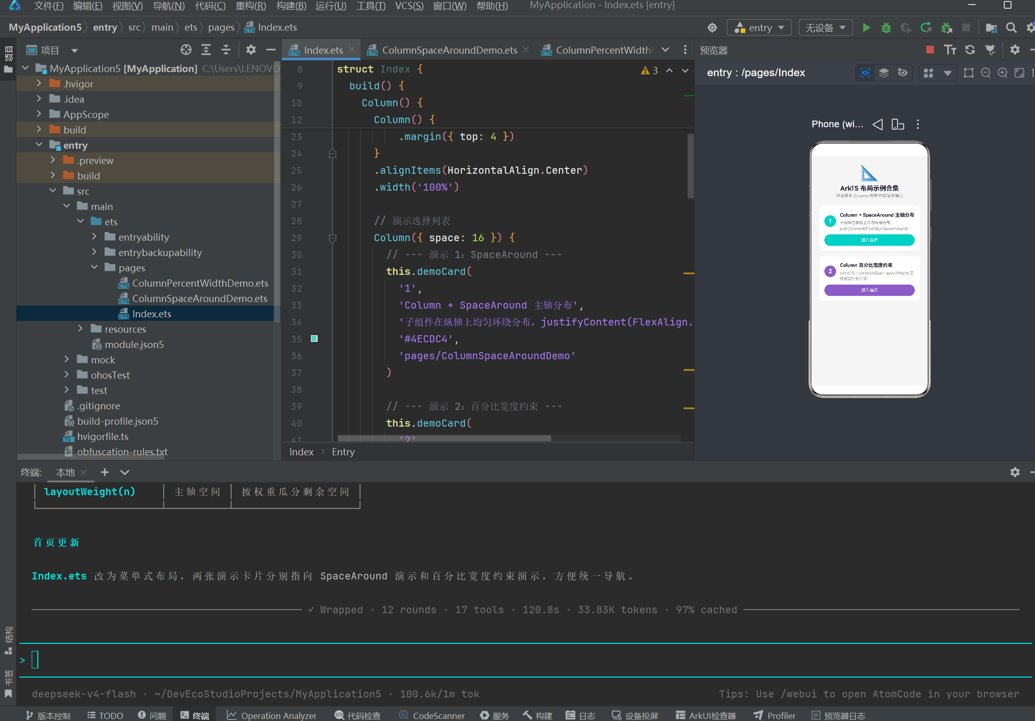
2.4 首页入口代码
应用首页 Index.ets 升级为菜单式布局,通过卡片列表统一导航到各个演示页面:
import { router } from '@kit.ArkUI';

@Entry
@Component
struct Index {
  build() {
    Column() {
      // 标题区
      Column() {
        Text('📐')
          .fontSize(48)
        Text('ArkTS 布局示例合集')
          .fontSize(20)
          .fontWeight(FontWeight.Bold)
          .fontColor('#1A1A2E')
          .margin({ top: 8 })
        Text('鸿蒙原生 Column 布局方式深度演示')
          .fontSize(13)
          .fontColor('#888888')
          .margin({ top: 4 })
      }
      .alignItems(HorizontalAlign.Center)
      .width('100%')

      // 演示卡片列表
      Column({ space: 16 }) {
        this.demoCard('1', 'Column + SpaceAround 主轴分布',
          '子组件在纵轴上均匀环绕分布', '#4ECDC4',
          'pages/ColumnSpaceAroundDemo')

        this.demoCard('2', 'Column 百分比宽度约束',
          'width(%) / constrainSize / layoutWeight 三种宽度控制方式',
          '#845EC2', 'pages/ColumnPercentWidthDemo')
      }
      .width('100%')
      .padding({ top: 24 })
    }
    .width('100%')
    .height('100%')
    .justifyContent(FlexAlign.Start)
    .alignItems(HorizontalAlign.Center)
    .backgroundColor('#F5F5F5')
    .padding(24)
  }

  @Builder
  demoCard(index: string, title: string, desc: string,
           color: string, pageUrl: string) {
    Column() {
      Row() {
        // 序号圆圈
        Text(index)
          .fontSize(18).fontWeight(FontWeight.Bold)
          .fontColor('#FFFFFF').textAlign(TextAlign.Center)
          .width(36).height(36).backgroundColor(color).borderRadius(18)

        Column({ space: 4 }) {
          Text(title).fontSize(15).fontWeight(FontWeight.Bold)
            .fontColor('#1A1A2E').lineHeight(22)
          Text(desc).fontSize(12).fontColor('#888888').lineHeight(18)
        }
        .alignItems(HorizontalAlign.Start).margin({ left: 12 })
        .width(0).layoutWeight(1)    // ← layoutWeight 使文本区占满剩余宽度
      }
      .width('100%').alignItems(VerticalAlign.Center)

      Button('进入演示')
        .width('100%').height(36).backgroundColor(color)
        .borderRadius(18).fontColor('#FFFFFF').fontSize(13)
        .fontWeight(FontWeight.Medium).margin({ top: 10 })
        .onClick(() => {
          router.pushUrl({ url: pageUrl })
            .catch((err: Error) => console.error('导航失败: ' + JSON.stringify(err)))
        })
    }
    .width('100%').padding(16).backgroundColor('#FFFFFF')
    .borderRadius(12).shadow({ radius: 6, color: 'rgba(0,0,0,0.04)', offsetY: 3 })
  }
}
首页的精妙之处在于它本身就已经使用了 layoutWeight(1) 来让描述文本区占满剩余宽度——这意味着你在进入演示页之前,已经在首页体验到了 layoutWeight 的效果。
三、核心演示页完整代码
这是全文的核心。ColumnPercentWidthDemo.ets 包含 4 个演示场景 + 1 个 API 速查表,总长约 407 行。
@Entry
@Component
struct ColumnPercentWidthDemo {
  @State parentWidth: number = 340
  @State parentHeight: number = 700
  @State sliderMin: number = 200
  @State sliderMax: number = 400

  build() {
    Scroll() {
      Column({ space: 20 }) {
        this.titleSection()
        this.scenePercentWidth()       // 场景一
        this.sceneConstrainSize()      // 场景二
        this.sceneLayoutWeight()       // 场景三
        this.sceneCompareAll()         // 场景四
      }
      .width('100%')
      .padding({ top: 24, bottom: 48, left: 16, right: 16 })
    }
    .width('100%').height('100%').backgroundColor('#F5F5F5')
  }

  // ===== 标题区 =====
  @Builder
  titleSection() {
    Column({ space: 6 }) {
      Text('Column 百分比宽度约束')
        .fontSize(22).fontWeight(FontWeight.Bold)
        .fontColor('#1A1A2E').textAlign(TextAlign.Center).width('100%')
      Text('width(%) · constraintSize · layoutWeight')
        .fontSize(13).fontColor('#888888')
        .fontFamily('Courier New').textAlign(TextAlign.Center).width('100%')
    }
  }

  // ===== 场景一:百分比宽度 =====
  @Builder
  scenePercentWidth() {
    Column({ space: 10 }) {
      Text('📏 场景一:百分比宽度 width(\'%\')')
        .fontSize(16).fontWeight(FontWeight.Bold).fontColor('#1A1A2E').width('100%')
      Text('子组件的 width 值取父容器宽度的百分比,实现相对宽度自适应')
        .fontSize(12).fontColor('#888888').width('100%')

      Column() {
        this.percentBar("width('25%')", '25%', '#FF6B6B')
        this.percentBar("width('50%')", '50%', '#4ECDC4')
        this.percentBar("width('75%')", '75%', '#845EC2')
        this.percentBar("width('100%')", '100%', '#FF9671')
      }
      .width('100%').backgroundColor('#FFFFFF')
      .borderRadius(10).padding({ top: 12, bottom: 12 })
      .shadow({ radius: 4, color: 'rgba(0,0,0,0.04)', offsetY: 2 })
    }.width('100%')
  }

  @Builder
  percentBar(label: string, percent: string, color: string) {
    Column() {
      Row()
        .width(percent)                // ★ 百分比宽度核心
        .height(36).backgroundColor(color)
        .borderRadius({ topRight: 18, bottomRight: 18 })
        .margin({ top: 4, bottom: 4 })

      Row() {
        Text(label).fontSize(12).fontColor(color)
          .fontWeight(FontWeight.Medium).fontFamily('Courier New')
        Text('← 相对于父容器 100% 宽度')
          .fontSize(10).fontColor('#AAAAAA').margin({ left: 12 })
      }
      .width('100%').padding({ left: 8 })
    }.width('100%')
  }

  // ===== 场景二:constraintSize =====
  @Builder
  sceneConstrainSize() {
    Column({ space: 10 }) {
      Text('🔒 场景二:constraintSize 约束')
        .fontSize(16).fontWeight(FontWeight.Bold).fontColor('#1A1A2E').width('100%')
      Text('constraintSize 可限制容器的最大/最小宽高,超界时自动截断或撑开')
        .fontSize(12).fontColor('#888888').width('100%')

      this.constrainDemoCard('① 无约束', 'Text 自然宽度', true, false, false)
      this.constrainDemoCard('② 设 maxWidth(200)', '超出 200vp 时自动换行截断',
        false, true, false)
      this.constrainDemoCard('③ 设 minWidth(300)', '内容不足 300vp 时强制撑宽',
        false, false, true)
    }.width('100%')
  }

  @Builder
  constrainDemoCard(title: string, desc: string,
    _noConstraint: boolean, useMax: boolean, useMin: boolean) {
    Column({ space: 6 }) {
      Text(title).fontSize(14).fontWeight(FontWeight.Bold).fontColor('#333333')
      Text(desc).fontSize(11).fontColor('#888888')

      Column() {
        Text('这是一段超长文本,用于测试 constraintSize 的约束效果,观察换行与截断行为。')
          .fontSize(13).fontColor('#333333').lineHeight(20)
      }
      .width('100%').backgroundColor('#FFFFFF').borderRadius(8)
      .border({ width: 1, color: '#E0E0E0' }).padding(12)
      .alignItems(HorizontalAlign.Start)
      .constraintSize({                     // ★ 约束核心
        maxWidth: useMax ? 200 : undefined,
        minWidth: useMin ? 300 : undefined
      })
    }
    .width('100%').padding(12)
    .backgroundColor('rgba(255,255,255,0.7)').borderRadius(10)
    .border({ width: 1, color: '#E8E8E8' })
  }

  // ===== 场景三:layoutWeight =====
  @Builder
  sceneLayoutWeight() {
    Column({ space: 10 }) {
      Text('⚖️ 场景三:layoutWeight 权重分配')
        .fontSize(16).fontWeight(FontWeight.Bold).fontColor('#1A1A2E').width('100%')
      Text('layoutWeight 让子组件按权重比例瓜分主轴(纵向)的剩余空间')
        .fontSize(12).fontColor('#888888').width('100%')

      this.weightDemoCard('A · 三等分 layoutWeight(1:1:1)',
        [1, 1, 1], ['#FF6B6B', '#4ECDC4', '#845EC2'])
      this.weightDemoCard('B · 比例 1:2:3',
        [1, 2, 3], ['#FF9671', '#FFC75F', '#00C9A7'])
      this.weightDemoCard('C · 混合模式(第一个固定 60vp,后两个按 1:2 分配剩余)',
        [0, 1, 2], ['#008F7A', '#6C5B7B', '#355C7D'])
    }.width('100%')
  }

  @Builder
  weightDemoCard(title: string, weights: number[], colors: string[]) {
    Column({ space: 6 }) {
      Text(title).fontSize(13).fontWeight(FontWeight.Bold).fontColor('#444444').width('100%')

      Column() {
        // 子项 1
        Row()
          .width('90%')
          .height(weights[0] === 0 ? 60 : undefined)   // 混合模式:固定高度
          .layoutWeight(weights[0] === 0 ? undefined : weights[0])  // 权重或 undefined
          .backgroundColor(colors[0]).borderRadius(6)
          .justifyContent(FlexAlign.Center).alignItems(VerticalAlign.Center)

        // 子项 2
        Row().width('90%').layoutWeight(weights[1])
          .backgroundColor(colors[1]).borderRadius(6)
          .justifyContent(FlexAlign.Center).alignItems(VerticalAlign.Center)

        // 子项 3
        Row().width('90%').layoutWeight(weights[2])
          .backgroundColor(colors[2]).borderRadius(6)
          .justifyContent(FlexAlign.Center).alignItems(VerticalAlign.Center)
      }
      .width('100%').height(180).backgroundColor('#FFFFFF')
      .borderRadius(8).border({ width: 1, color: '#E0E0E0' }).padding(8)
      .alignItems(HorizontalAlign.Center)
    }
    .width('100%').padding(12)
    .backgroundColor('rgba(255,255,255,0.7)').borderRadius(10)
    .border({ width: 1, color: '#E8E8E8' })
  }

  // ===== 场景四:API 速查对比 =====
  @Builder
  sceneCompareAll() {
    Column({ space: 10 }) {
      Text('📊 核心 API 速查对比')
        .fontSize(16).fontWeight(FontWeight.Bold).fontColor('#1A1A2E').width('100%')

      Column({ space: 4 }) {
        this.compareRow('API', '作用对象', '效果', true)
        this.compareRow("width('50%')", '自身宽度', '相对于父容器百分比', false)
        this.compareRow('constraintSize({})', '自身宽高', '限制最大/最小值', false)
        this.compareRow('layoutWeight(n)', '主轴空间', '按权重瓜分剩余空间', false)
      }
      .width('100%').backgroundColor('#FFFFFF').borderRadius(10).padding(8)
      .shadow({ radius: 4, color: 'rgba(0,0,0,0.04)', offsetY: 2 })
    }.width('100%')
  }

  @Builder
  compareRow(col1: string, col2: string, col3: string, isHeader: boolean) {
    Row() {
      Text(col1).fontSize(isHeader ? 13 : 12)
        .fontWeight(isHeader ? FontWeight.Bold : FontWeight.Regular)
        .fontColor(isHeader ? '#1A1A2E' : '#333333')
        .fontFamily('Courier New').width('35%')
      Text(col2).fontSize(isHeader ? 13 : 12)
        .fontWeight(isHeader ? FontWeight.Bold : FontWeight.Regular)
        .fontColor(isHeader ? '#1A1A2E' : '#666666').width('30%')
      Text(col3).fontSize(isHeader ? 13 : 12)
        .fontWeight(isHeader ? FontWeight.Bold : FontWeight.Regular)
        .fontColor(isHeader ? '#1A1A2E' : '#888888').width('35%')
    }
    .width('100%').padding({ top: 6, bottom: 6, left: 8, right: 8 })
    .backgroundColor(isHeader ? 'rgba(78,205,196,0.1)' : 'transparent')
    .borderRadius(4)
  }
}
四、ArkTS 宽度体系全景
在深入每个场景之前,我们需要先建立对 ArkTS 宽度控制体系的整体认知。
4.1 宽度的三种来源
ArkTS 中组件的宽度可以来自三个层次:
| 层次 | 来源 | 特点 | 优先级 |
|---|---|---|---|
| 显式宽度 | width(value) |
明确指定,忽略内容宽度 | 最高 |
| 隐式宽度 | 内容自然撑开 | 由子组件/文本内容决定 | 最低 |
| 约束宽度 | constraintSize() |
限制 max/min,内容在范围内自适应 | 中等 |
4.2 百分比宽度的计算基准
在 ArkTS 中,width('50%') 的百分比基准是直接父容器的内容区宽度(content box)。所谓内容区宽度,是指父容器的总宽度减去 padding 后的剩余宽度。
父容器总宽度   = 400vp
父容器 padding = { left: 16, right: 16 } → 总计 32vp
父容器内容区   = 400 - 32 = 368vp
子组件 width('50%') = 368 × 50% = 184vp
重要规则:
- 百分比总是相对于直接父容器,不对祖父容器生效
- 如果父容器本身没有明确的宽度(例如父容器宽度由内容撑开),百分比计算可能得到
0 vp单位是鸿蒙的虚拟像素,在不同密度的设备上自动缩放
4.3 三种技术的分工定位
| 技术 | 解决的问题 | 类比传统 CSS | 适用场景 |
|---|---|---|---|
width('%') |
相对于父容器按比例设定宽度 | width: 50% |
响应式布局、自适应列宽 |
constraintSize() |
限制组件的最大/最小宽高 | min-width + max-width + 类似 min-height + max-height |
防止组件过小/过大、文本换行控制 |
layoutWeight() |
在主轴方向按权重分配空间 | flex-grow |
等分排列、比例布局、自适应填充 |
五、场景一深度解析:百分比宽度 width(‘%’)
5.1 核心概念
百分比宽度是 CSS 体系中最为基础的宽度控制手段。在 ArkTS 中,其核心理念完全一致:子组件的宽度 = 父容器内容区宽度 × 百分比值。
5.2 演示布局
在本示例的场景一中,我们创建了一个宽度为 100% 的白色卡片容器,内部放置四个不同颜色的条块,宽度分别为 25%、50%、75% 和 100%。
┌──────────────────────────────────────────┐
│ ████████░░░░░░░░░░░░░░░░░░░░░░░░  25%   │
│ ████████████████░░░░░░░░░░░░░░░░  50%   │
│ ████████████████████████░░░░░░░░  75%   │
│ █████████████████████████████████  100%  │
└──────────────────────────────────────────┘
5.3 代码剖析
@Builder
percentBar(label: string, percent: string, color: string) {
  Column() {
    // 彩色宽度条
    Row()
      .width(percent)           // ← 核心:百分比宽度
      .height(36)
      .backgroundColor(color)
      .borderRadius({ topRight: 18, bottomRight: 18 })
      .margin({ top: 4, bottom: 4 })

    // 标签行
    Row() {
      Text(label).fontSize(12).fontColor(color)
        .fontWeight(FontWeight.Medium).fontFamily('Courier New')
      Text('← 相对于父容器 100% 宽度')
        .fontSize(10).fontColor('#AAAAAA').margin({ left: 12 })
    }
    .width('100%').padding({ left: 8 })
  }
  .width('100%')
}
关键点:
- 外层
Column()设置了.width('100%'),表示该 Column 占满其父容器的宽度 - 内层
Row()通过.width(percent)获取相对于该 Column 的百分比宽度 percent是字符串参数,传入'25%'、'50%'、'75%'、'100%'
5.4 百分比宽度的计算验证
假设父容器(白色卡片 Column)的内容区宽度为 340vp:
| 设定值 | 计算过程 | 实际宽度 | 视觉效果 |
|---|---|---|---|
width('25%') |
340 × 25% | 85vp | 约占四分之一 |
width('50%') |
340 × 50% | 170vp | 约占一半 |
width('75%') |
340 × 75% | 255vp | 约占四分之三 |
width('100%') |
340 × 100% | 340vp | 占满全部 |
5.5 百分比宽度的特点总结
| 特点 | 说明 |
|---|---|
| 相对性 | 始终相对于直接父容器的内容区宽度 |
| 自动适应 | 父容器宽度变化时,子组件宽度自动等比缩放 |
| 字符串类型 | 参数是字符串格式,如 '50%',注意必须带单引号 |
| 精度 | 支持任意浮点数值,如 '33.33%'、'12.5%' |
| 与数值宽度混合 | 同一容器中可混合使用百分比和数值宽度 |
5.6 常见错误
// ❌ 错误:宽度值带了 vp 单位
.width('50%vp')

// ❌ 错误:使用了数字类型
.width(50 + '%')

// ✅ 正确:纯字符串百分比
.width('50%')

// ✅ 正确:数值 vp(非百分比)
.width(200)
六、场景二深度解析:constraintSize 约束
6.1 核心概念
constraintSize 是 ArkTS 提供的尺寸约束 API,允许开发者为组件设置最大宽度、最小宽度、最大高度和最小高度四个约束维度。当组件的内容尺寸超出约束范围时,系统会按约束值进行截断或撑开。
6.2 API 签名
.constraintSize({
  maxWidth?: number,
  minWidth?: number,
  maxHeight?: number,
  minHeight?: number
})
所有参数均为可选的 number 类型,单位默认为 vp。未设置的约束项保持组件原生行为。
6.3 三种演示效果
① 无约束(自然宽度)
┌──────────────────────────────────────────┐
│ 这是一段超长文本,用于测试 constraintSize │
│ 的约束效果,观察换行与截断行为。          │
└──────────────────────────────────────────┘
→ 文本在 Column 中自然换行,宽度占满父容器
② 设 maxWidth(200)
┌────────────────────┐
│ 这是一段超长文本,  │
│ 用于测试            │
│ constraintSize 的   │
│ 约束效果,观察换行  │
│ 与截断行为。        │
└────────────────────┘
→ 容器最大宽度被限制为 200vp,超出的文本自动换行
③ 设 minWidth(300)
┌──────────────────────────────────────────┐
│ 这是一段超长文本,用于测试 const...      │
└──────────────────────────────────────────┘
→ 即使内容较少的文本,容器宽度也不低于 300vp
6.4 代码剖析
@Builder
constrainDemoCard(title: string, desc: string,
  _noConstraint: boolean, useMax: boolean, useMin: boolean) {

  Column({ space: 6 }) {
    Text(title).fontSize(14).fontWeight(FontWeight.Bold).fontColor('#333333')
    Text(desc).fontSize(11).fontColor('#888888')

    // 被约束的文本容器
    Column() {
      Text('这是一段超长文本,用于测试 constraintSize 的约束效果,观察换行与截断行为。')
        .fontSize(13).fontColor('#333333').lineHeight(20)
    }
    .width('100%')
    .backgroundColor('#FFFFFF').borderRadius(8)
    .border({ width: 1, color: '#E0E0E0' }).padding(12)
    .alignItems(HorizontalAlign.Start)
    // ★★★ 核心:constraintSize 约束 ★★★
    .constraintSize({
      maxWidth: useMax ? 200 : undefined,
      minWidth: useMin ? 300 : undefined
    })
  }
  .width('100%').padding(12)
  .backgroundColor('rgba(255,255,255,0.7)').borderRadius(10)
  .border({ width: 1, color: '#E8E8E8' })
}
关键点:
- 通过
useMax和useMin布尔参数控制是否应用约束 undefined表示不对该维度施加约束,让组件保持自然行为maxWidth: 200意味着组件宽度最大不超过 200vpminWidth: 300意味着组件宽度最小不小于 300vp
6.5 约束的计算逻辑
constraintSize 的约束逻辑遵循以下优先级:
最终宽度 = clamp(minWidth, 自然宽度, maxWidth)

其中 clamp(a, x, b) = min(max(x, a), b)
| 条件 | 结果 |
|---|---|
| 自然宽度 < minWidth | 宽度 = minWidth(被撑开) |
| minWidth ≤ 自然宽度 ≤ maxWidth | 宽度 = 自然宽度(无影响) |
| 自然宽度 > maxWidth | 宽度 = maxWidth(被压缩) |
6.6 constraintSize vs width 的区别
| 对比项 | width() |
constraintSize() |
|---|---|---|
| 作用方式 | 强制设定精确宽度 | 设定宽度范围 |
| 灵活性 | 固定值,无伸缩空间 | 在范围内自适应 |
| 组合使用 | 可与 constraintSize 叠加 | 可与 width 叠加 |
| 适用场景 | 需要精确控制宽度 | 需要弹性控制宽度 |
两者可以叠加使用:如果同时设置了 width('80%') 和 constraintSize({ maxWidth: 300 }),组件宽度取两者中更严格的值。
6.7 最佳实践
- 在自适应布局中,优先使用
constraintSize而非width来设置软限制 - 为文本容器设置
maxWidth可控制阅读宽度,提升可读性 - 为按钮设置
minWidth可保证最小触控面积(建议 ≥ 48vp) - 为图片容器设置
maxWidth和maxHeight可防止图片溢出
七、场景三深度解析:layoutWeight 权重分配
7.1 核心概念
layoutWeight 是 ArkTS 中最强大的弹性布局工具之一。它允许 Column(或 Row)中的子组件按权重比例瓜分主轴方向的剩余空间。如果把 Column 看作一个蛋糕,layoutWeight 就是告诉系统如何按比例切分这块蛋糕。
7.2 数学公式
容器主轴总长度 = H
固定高度子组件总高度 = Σh_fixed
可变高度子组件总权重 = Σw_weights
子组件 x 的高度 = (H - Σh_fixed) × (w_x / Σw_weights)
7.3 三种演示效果
A · 三等分 layoutWeight(1:1:1)
┌────────────────────────────┐
│         1/3                │  ← weight: 1
├────────────────────────────┤
│         1/3                │  ← weight: 1
├────────────────────────────┤
│         1/3                │  ← weight: 1
└────────────────────────────┘
→ 三个子组件高度相等,各占 180vp / 3 = 60vp
B · 比例 1:2:3
┌────────────────────────────┐
│         1/6                │  ← weight: 1  → 180 × 1/6 = 30vp
├────────────────────────────┤
│         2/6                │  ← weight: 2  → 180 × 2/6 = 60vp
├────────────────────────────┤
│         3/6                │  ← weight: 3  → 180 × 3/6 = 90vp
└────────────────────────────┘
→ 高度比为 1:2:3,视觉效果一目了然
C · 混合模式(固定 + 权重)
┌────────────────────────────┐
│       固定 60vp            │  ← 不使用 layoutWeight,设 height(60)
├────────────────────────────┤
│       剩余 1/3             │  ← weight: 1 → (180-60) × 1/3 = 40vp
├────────────────────────────┤
│       剩余 2/3             │  ← weight: 2 → (180-60) × 2/3 = 80vp
└────────────────────────────┘
→ 固定组件高度不受影响,剩余部分按权重分配
7.4 代码剖析
@Builder
weightDemoCard(title: string, weights: number[], colors: string[]) {
  Column({ space: 6 }) {
    Text(title).fontSize(13).fontWeight(FontWeight.Bold).fontColor('#444444').width('100%')

    Column() {
      // 子项 1
      Row()
        .width('90%')
        .height(weights[0] === 0 ? 60 : undefined)       // 固定高度模式
        .layoutWeight(weights[0] === 0 ? undefined : weights[0])  // 权重模式
        .backgroundColor(colors[0]).borderRadius(6)
        .justifyContent(FlexAlign.Center).alignItems(VerticalAlign.Center)

      // 子项 2
      Row().width('90%').layoutWeight(weights[1])
        .backgroundColor(colors[1]).borderRadius(6)
        .justifyContent(FlexAlign.Center).alignItems(VerticalAlign.Center)

      // 子项 3
      Row().width('90%').layoutWeight(weights[2])
        .backgroundColor(colors[2]).borderRadius(6)
        .justifyContent(FlexAlign.Center).alignItems(VerticalAlign.Center)
    }
    .width('100%').height(180).backgroundColor('#FFFFFF')
    .borderRadius(8).border({ width: 1, color: '#E0E0E0' }).padding(8)
    .alignItems(HorizontalAlign.Center)
  }
  .width('100%').padding(12)
  .backgroundColor('rgba(255,255,255,0.7)').borderRadius(10)
  .border({ width: 1, color: '#E8E8E8' })
}
关键要点:
layoutWeight只作用于主轴方向:在 Column 中,layoutWeight分配的是高度;在 Row 中,分配的是宽度layoutWeight与height互斥:如果同时设置了height和layoutWeight,layoutWeight优先生效,height被忽略undefined即不使用权重:当weights[0] === 0时,不设置layoutWeight,而是固定height(60)- 权重可以是任意正数:不要求整数,
0.5、2.5等浮点数均支持
7.5 layoutWeight vs justifyContent
很多开发者会混淆 layoutWeight 和 justifyContent(SpaceBetween/Evenly/Around) 的区别:
| 对比项 | layoutWeight |
justifyContent |
|---|---|---|
| 空间分配方式 | 子项本身大小按比例变化 | 子项大小不变,间距变化 |
| 子项高度 | 动态变化 | 保持原始高度 |
| 使用场景 | 需要子项自适应高度 | 需要均匀分布间距 |
| 权重控制 | 精确的分值控制 | 只有均匀、环绕、两端等方式 |
直观理解:
layoutWeight是分蛋糕——每个人得到不同大小的块justifyContent是摆放蛋糕——每个人得到相同大小的块,调整块之间的距离
7.6 layoutWeight 的典型应用场景
| 场景 | 权重方案 | 示例代码 |
|---|---|---|
| 三等分布局 | layoutWeight(1:1:1) |
顶部导航栏、底部操作栏 |
| 主次布局 | layoutWeight(1:2) |
左侧菜单 + 右侧内容区 |
| 固定+弹性 | 固定高度 + layoutWeight(1) |
顶部标题固定 + 内容区填满 |
| 比例分配 | layoutWeight(1:2:3) |
排行榜、占比图 |
八、场景四:API 速查对比
在本示例的末尾,我们提供了一个简洁的 API 速查对比表,帮助开发者在实际开发中快速选择正确的方案:
| API | 作用对象 | 效果 |
|---|---|---|
width('50%') |
自身宽度 | 相对于父容器百分比 |
constraintSize({}) |
自身宽高 | 限制最大/最小值 |
layoutWeight(n) |
主轴空间 | 按权重瓜分剩余空间 |
选择决策树
你想控制组件的什么?
├── 宽度本身
│   ├── 相对于父容器比例 → width('%')
│   ├── 限制最大/最小范围 → constraintSize()
│   └── 精确数值 → width(vp)
├── 高度本身
│   ├── 在 Column 中按比例 → layoutWeight()
│   ├── 限制最大/最小范围 → constraintSize()
│   └── 精确数值 → height(vp)
└── 多个组件之间的空间分配
    ├── 子项自身大小变化 → layoutWeight()
    └── 子项大小不变,间距变化 → justifyContent()
九、三者组合使用的进阶技巧
在实际开发中,width('%')、constraintSize() 和 layoutWeight() 经常被组合使用,创造出灵活而强大的布局效果。
9.1 百分比 + 约束组合
Column() {
  // 宽度占父容器 80%,但最大不超过 400vp,最小不小于 200vp
  Text('自适应内容')
    .width('80%')
    .constraintSize({
      maxWidth: 400,
      minWidth: 200
    })
}
此时组件宽度 = clamp(200, 父容器宽度 × 80%, 400)。在手机竖屏(父容器窄)时趋近 200vp,在平板横屏(父容器宽)时被限制在 400vp。
9.2 layoutWeight + 固定值组合
Column() {
  // 顶部操作栏:固定高度
  Row().height(48).backgroundColor('#FF6B6B')

  // 中间内容区:占满剩余空间
  Row().layoutWeight(1).backgroundColor('#4ECDC4')

  // 底部操作栏:固定高度
  Row().height(56).backgroundColor('#845EC2')
}
.width('100%')
.height('100%')
这是移动端最经典的三段式布局——顶部栏固定、底部栏固定、中间内容区自适应填满。
9.3 三者联动的复杂布局
Column() {
  // 顶部固定高度 + 百分比宽度
  Row()
    .width('90%')
    .height(50)
    .backgroundColor('#FF6B6B')

  // 中间自适应 + 约束
  Column()
    .layoutWeight(1)
    .constraintSize({ minHeight: 100 })
    .width('100%')
    .backgroundColor('#4ECDC4')

  // 底部固定 + 百分比 + 约束
  Row()
    .width('75%')
    .height(60)
    .constraintSize({ minWidth: 200 })
    .backgroundColor('#845EC2')
}
.width('100%')
.height('100%')
十、典型案例:移动端自适应布局
10.1 问题描述
实现一个"自适应卡片列表",要求:
- 每个卡片宽度占屏幕宽度的 90%
- 卡片最大宽度不超过 400vp
- 卡片最小宽度不低于 280vp
- 卡片高度由内容决定,但整体在 Scroll 中垂直排列
10.2 实现方案
@Builder
adaptiveCard(title: string, content: string) {
  Column() {
    Text(title)
      .fontSize(18)
      .fontWeight(FontWeight.Bold)
    Text(content)
      .fontSize(14)
      .margin({ top: 8 })
      .lineHeight(22)
  }
  .width('90%')                                    // 占父容器 90%
  .constraintSize({ maxWidth: 400, minWidth: 280 }) // 软约束
  .backgroundColor('#FFFFFF')
  .borderRadius(12)
  .padding(16)
  .shadow({ radius: 4, color: 'rgba(0,0,0,0.06)', offsetY: 2 })
  .margin({ bottom: 12 })
}

// 使用
Column() {
  this.adaptiveCard('标题 1', '内容...')
  this.adaptiveCard('标题 2', '内容...')
  this.adaptiveCard('标题 3', '内容...')
}
.width('100%')
.padding({ top: 16 })
10.3 效果说明
| 设备 | 父容器宽度 | 卡片宽度计算 | 结果 |
|---|---|---|---|
| 手机竖屏(360vp) | 360 - 32 = 328vp | 328 × 90% = 295vp | 在 [280, 400] 内 → 295vp |
| 手机横屏(640vp) | 640 - 32 = 608vp | 608 × 90% = 547vp | 超 400 → 截断为 400vp |
| 小屏手机(300vp) | 300 - 32 = 268vp | 268 × 90% = 241vp | 不足 280 → 撑开为 280vp |
这就是 width('%') + constraintSize() 组合的威力——跨设备自适应,且不越界。
十一、开发中的常见错误与调试
11.1 编译错误案例分析
本示例在开发过程中遇到了以下典型错误,这里分享给读者:
错误一:HorizontalAlign 与 VerticalAlign 混用
ERROR: Argument of type 'HorizontalAlign' is not assignable
       to parameter of type 'VerticalAlign'.
❌ 错误写法:
// Row 组件的 alignItems 期望 VerticalAlign(交叉轴为纵向)
Row()
  .alignItems(HorizontalAlign.Center)   // ← 类型错误
✅ 正确写法:
// Row → alignItems 用 VerticalAlign
Row()
  .alignItems(VerticalAlign.Center)

// Column → alignItems 用 HorizontalAlign
Column()
  .alignItems(HorizontalAlign.Center)
记忆口诀:justifyContent 沿主轴,alignItems 沿交叉轴。Column 的主轴=纵向→justifyContent,交叉轴=横向→alignItems(HorizontalAlign)。Row 则相反。
错误二:constrainSize 拼写错误
ERROR: Property 'constrainSize' does not exist on type 'ColumnAttribute'.
       Did you mean 'constraintSize'?
❌ 错误写法:
.constrainSize({ maxWidth: 200 }) // 少了一个 t
✅ 正确写法:
.constraintSize({ maxWidth: 200 }) // 完整拼写:constraint
错误三:layoutWeight 与固定高度同时使用
Row()
  .height(100)             // 被 layoutWeight 覆盖
  .layoutWeight(1)         // 覆盖 height,height 无效
如果既设定了 height 又设定了 layoutWeight,layoutWeight 优先生效,height 被忽略。如果希望某个子组件固定高度不使用权重,应省略 layoutWeight。
11.2 运行时调试技巧
| 问题 | 排查方法 |
|---|---|
| 百分比宽度不生效 | 检查父容器是否设置了明确的宽度 |
| constraintSize 无效果 | 检查约束值与自然宽度的关系 |
| layoutWeight 分配异常 | 检查权重值是否为正数,容器是否设定了固定高度 |
| 布局溢出 | 使用半透明背景色观察容器边界 |
| 导航页面空白 | 检查 main_pages.json 是否注册了页面路由 |
十二、综合对比:三种宽度约束技术
12.1 特性速查表
| 特性 | width('%') |
constraintSize() |
layoutWeight() |
|---|---|---|---|
| 参数类型 | 字符串(如 '50%') |
对象 {maxWidth?, minWidth?} |
数字(正数) |
| 作用于轴 | 交叉轴 + 主轴 | 两个轴 | 仅主轴 |
| 是否依赖父容器 | ✅ 是 | ❌ 否 | ✅ 是 |
| 能否与 height 共存 | ✅ 可以 | ✅ 可以 | ❌ 会覆盖 height |
| 多个组件同时使用 | 各自独立 | 各自独立 | 相互影响(按比例分配) |
| 常用值示例 | '33.33%' |
{maxWidth: 300, minWidth: 100} |
1, 2, 3 |
| 动画过渡 | ✅ 支持 | ✅ 支持 | ❌ 不支持自动过渡 |
12.2 何时使用哪种方案
你需要的宽度行为是?
│
├── 固定百分比 → width('百分比')
│   ├── 列宽分配:'50%'、'33%'
│   └── 响应式留白:'80%' 居中
│
├── 有上下限的自适应 → constraintSize()
│   ├── 文本容器:maxWidth 控制阅读宽度
│   ├── 按钮:minWidth 保证最小点击区域
│   └── 弹性卡片:在 [min, max] 范围内伸缩
│
└── 按比例瓜分剩余空间 → layoutWeight()
    ├── 等分排列:1:1:1
    ├── 主次布局:1:3(侧边栏+内容区)
    └── 固定+弹性:固定高度 + weight 填满
十三、性能与最佳实践
13.1 百分比宽度的性能
width('%') 在布局时需要进行百分比计算,但这个计算成本极低,对性能几乎没有影响。在数百个组件级别无需担忧。
13.2 constraintSize 的性能
constraintSize 的约束逻辑在布局阶段完成,同样对性能影响极小。但需要注意的是,如果大量组件同时使用 maxWidth 且父容器宽度频繁变化,可能触发多次重排。
13.3 layoutWeight 的性能
layoutWeight 的权重计算涉及容器内所有使用权重的子组件,因此当子组件数量较多(> 100)时,建议优先考虑其他方案。
13.4 通用最佳实践
- 优先使用百分比宽度实现响应式布局,而不是硬编码 vp 值
- 为所有可能内容溢出的容器设置 constraintSize,防止 UI 异常
- 使用 layoutWeight 实现动态自适应,避免手动计算高度
- 复合使用三种技术可以达到最佳的布局效果
- 为布局容器添加半透明调试背景色,快速定位问题
十四、总结
本文从零开始构建了一个完整的鸿蒙原生 ArkTS 示例应用,深入剖析了 Column 布局中三种宽度约束技术的原理、用法与最佳实践。
14.1 核心要点回顾
| 技术 | 一句话总结 |
|---|---|
width('%') |
子组件宽度相对于父容器百分比,实现响应式自适应 |
constraintSize() |
对组件施加最大/最小宽高约束,防止溢出或过小 |
layoutWeight() |
子组件在主轴方向按权重比例瓜分剩余空间 |
14.2 三条核心公式
百分比宽度:childWidth = parentWidth × percent%
约束逻辑:  finalWidth = clamp(minWidth, naturalWidth, maxWidth)
权重分配:  childHeight = (containerHeight - fixedHeight) × (weight / totalWeight)
14.3 设计哲学
在 ArkTS 的布局体系中,宽度控制不是单一的、孤立的技术选择,而是一个分层协作的系统:
- 百分比宽度解决的是"相对比例"问题——让 UI 随设备自适应
- 尺寸约束解决的是"安全边界"问题——防止布局在极端条件下崩溃
- 权重分配解决的是"弹性伸缩"问题——让 UI 智能地填满可用空间
这三者组合使用,可以构建出既灵活又健壮的跨设备自适应界面。
14.4 后续学习方向
- Row 中的等价技术:
layoutWeight在 Row 中分配宽度,原理完全相同 - Flex 容器:更通用的弹性布局容器,支持更多布局方向
- Grid 网格布局:二维布局坐标系
- 自适应单位:
vp(虚拟像素)、fp(字体像素)、lpx(逻辑像素) - 响应式断点:
@State+breakpoints实现不同屏幕尺寸的布局切换
附录:完整项目运行指南
步骤 1:创建项目
在 DevEco Studio 中创建新项目,选择 “Empty Ability” 模板,Language 选择 ArkTS。
步骤 2:替换代码
| 文件 | 内容 |
|---|---|
pages/Index.ets |
菜单式首页,导航到两个演示页 |
pages/ColumnPercentWidthDemo.ets |
本篇核心演示页(407 行) |
pages/ColumnSpaceAroundDemo.ets |
(可选)上一篇 SpaceAround 演示 |
步骤 3:注册页面路由
编辑 resources/base/profile/main_pages.json:
{
  "src": [
    "pages/Index",
    "pages/ColumnSpaceAroundDemo",
    "pages/ColumnPercentWidthDemo"
  ]
}
步骤 4:编译运行
点击 DevEco Studio 工具栏的 Run 按钮(▶),选择模拟器或真机设备,等待编译完成即可。
步骤 5:验证布局效果
- 启动应用 → 进入菜单首页
- 点击 “Column 百分比宽度约束” 卡片
- 依次查看四个演示场景
- 在场景一中观察不同百分比宽度的视觉效果
- 在场景二中观察 constraintSize 对文本宽度的约束
- 在场景三中对比 1:1:1、1:2:3、混合模式三种权重分配
- 在场景四中速查三种 API 的定位差异
本文所有代码基于 HarmonyOS NEXT 6.1.1(API 24)构建并验证通过。随着鸿蒙生态的持续演进,API 细节可能发生变化,请以官方最新 SDK 文档为准。
构建工具:Hvigor 6.26.1 · ArkTS · DevEco Studio

作为“人工智能6S店”的官方数字引擎,为AI开发者与企业提供一个覆盖软硬件全栈、一站式门户。
更多推荐
 0
0 0
0- 0


 已为社区贡献5条内容

所有评论(0)