
鸿蒙原生 ArkTS 布局深度解析:Column + SpaceAround 主轴均匀环绕分布
鸿蒙原生 ArkTS 布局深度解析:Column + SpaceAround 主轴均匀环绕分布
一、前言
在鸿蒙原生应用开发中,布局是一切 UI 呈现的基石。HarmonyOS NEXT 提供了强大的声明式 UI 框架 ArkTS,其中 Column 作为最核心的纵向布局容器,承载了绝大多数垂直方向的界面组织需求。而在 Column 的众多主轴分布策略中,SpaceAround 是一种兼具视觉均衡感与间距美学的布局模式。
本文将从一个完整的可运行示例出发,逐行剖析 Column + SpaceAround 的工作原理、间距计算规则、与其他分布模式的对比,以及在实际开发中的最佳实践。无论你是刚接触鸿蒙开发的新手,还是有一定经验的开发者,都能从本文中获得对 ArkTS 布局系统的深层理解。
二、项目结构与环境准备
2.1 开发环境
本文示例基于以下环境构建:
| 项目 | 版本 |
|---|---|
| 操作系统 | Windows 11 |
| DevEco Studio | 最新版本 |
| HarmonyOS SDK | HarmonyOS NEXT 6.1.1(API 24) |
| 构建工具 | Hvigor 6.26.1 |
| 目标设备 | Phone(API 24) |
2.2 项目目录结构
在 DevEco Studio 中创建一个名为 MyApplication5 的空工程后,我们需要关注的核心文件如下:
MyApplication5/
├── entry/
│   └── src/
│       └── main/
│           ├── ets/
│           │   └── pages/
│           │       ├── Index.ets                  ← 应用入口页
│           │       └── ColumnSpaceAroundDemo.ets  ← 核心演示页
│           └── resources/
│               └── base/
│                   └── profile/
│                       └── main_pages.json        ← 页面路由注册
2.3 页面路由注册
在 HarmonyOS NEXT 中,凡是使用 router.pushUrl 导航的目标页面,都必须在 main_pages.json 中注册。该文件位于 entry/src/main/resources/base/profile/main_pages.json:
{
  "src": [
    "pages/Index",
    "pages/ColumnSpaceAroundDemo"
  ]
}
要点:
src数组中的路径相对于ets/目录,不包含.ets后缀,且路径分隔符统一使用/(正斜杠)。漏注册该页面会导致router.pushUrl抛出 “页面未找到” 的运行时错误。
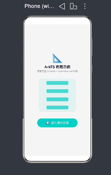
三、应用入口页面(Index.ets)解析
我们首先从入口页面开始。它的作用有两个:一是作为应用的启动页面提供视觉引导;二是通过导航按钮跳转到核心演示页。
3.1 完整代码
/*
 * 应用入口页面:点击按钮跳转到 Column + SpaceAround 布局演示页
 */
import { router } from '@kit.ArkUI';

@Entry
@Component
struct Index {
  build() {
    Column() {
      // 应用标题区域
      Column() {
        Text('📐')
          .fontSize(48)
        Text('ArkTS 布局示例')
          .fontSize(20)
          .fontWeight(FontWeight.Bold)
          .fontColor('#1A1A2E')
          .margin({ top: 8 })
        Text('鸿蒙原生 Column + SpaceAround 布局')
          .fontSize(13)
          .fontColor('#888888')
          .margin({ top: 4 })
      }
      .alignItems(HorizontalAlign.Center)
      .width('100%')

      // 微缩布局预览 —— 用四个色块模拟 SpaceAround 效果
      Column() {
        ForEach([0, 1, 2, 3], () => {
          Row()
            .width('60%')
            .height(20)
            .backgroundColor('#4ECDC4')
            .borderRadius(4)
            .opacity(0.7)
        })
      }
      .width(200)
      .height(180)
      .justifyContent(FlexAlign.SpaceAround)
      .alignItems(HorizontalAlign.Center)
      .backgroundColor('rgba(78,205,196,0.08)')
      .borderRadius(16)
      .border({ width: 1, color: '#E0E0E0', style: BorderStyle.Dashed })
      .margin({ top: 32 })

      // 导航按钮
      Button('▶  进入演示页面')
        .width(220)
        .height(48)
        .backgroundColor('#4ECDC4')
        .borderRadius(24)
        .fontColor('#FFFFFF')
        .fontSize(16)
        .fontWeight(FontWeight.Medium)
        .margin({ top: 36 })
        .onClick(() => {
          router.pushUrl({
            url: 'pages/ColumnSpaceAroundDemo'
          }).catch((err: Error) => {
            console.error('导航失败: ' + JSON.stringify(err))
          })
        })
    }
    .width('100%')
    .height('100%')
    .justifyContent(FlexAlign.Center)
    .alignItems(HorizontalAlign.Center)
    .backgroundColor('#F5F5F5')
    .padding(24)
  }
}
3.2 关键知识点剖析
(1)@Entry 与 @Component 装饰器
每一个 ArkTS 页面都必须由 @Entry 和 @Component 两个装饰器共同修饰:
@Entry:标记该组件为页面的入口点。一个.ets文件中只能有一个@Entry装饰的组件。它负责页面生命周期(onPageShow、onPageHide、onBackPress等)的管理。@Component:将该结构体声明为 UI 组件,使其拥有build()方法来描述界面结构。
@Entry
@Component
struct Index {
  build() {
    // UI 描述
  }
}
(2)import { router } from '@kit.ArkUI'
router 是 ArkUI 提供的页面路由模块,属于 @kit.ArkUI Kit 包。在 HarmonyOS NEXT 中,系统 Kit 的导入路径统一为 @kit.xxx 格式。router.pushUrl 用于跳转到目标页面:
router.pushUrl({
  url: 'pages/ColumnSpaceAroundDemo'
})
⚠️ 注意:
pushUrl在 API 24 中已标记为废弃(deprecated),推荐使用router.pushUrl的完整重载或Navigator组件。不过在当前版本中,pushUrl的功能仍然正常可用,为保持示例简洁,本文继续使用它。
(3)微缩预览中的 SpaceAround 应用
入口页的中间区域有一个 200×180vp 的 Column 容器,内部通过 ForEach 循环渲染了四个半透明的蓝色条块,并设置了 justifyContent(FlexAlign.SpaceAround)。这其实就是一个缩微版的 SpaceAround 演示——即使在这个小小的预览框中,也能直观感受到子组件之间的均匀环绕间距。
Column() {
  ForEach([0, 1, 2, 3], () => {
    Row()
      .width('60%')
      .height(20)
      .backgroundColor('#4ECDC4')
      .borderRadius(4)
      .opacity(0.7)
  })
}
.width(200)
.height(180)
.justifyContent(FlexAlign.SpaceAround)  // ★ 核心
四、核心演示页(ColumnSpaceAroundDemo.ets)深度解析
这是整个示例的核心所在。它包含了一个完整的 Column + SpaceAround 布局演示,以及与之对比的 SpaceBetween 和 SpaceEvenly。
4.1 整体代码结构概览
在深入每个模块之前,我们先从宏观上把握整个组件的结构:
ColumnSpaceAroundDemo(@Entry @Component)
├── 状态变量:containerWidth, containerHeight
├── 数据:featureList(特点数据数组)
├── build() 方法
│   ├── Scroll(外层滚动容器)
│   │   └── Column(内部纵向排列)
│   │       ├── ① 标题区(titleSection)
│   │       ├── ② 布局预览区(demoPreviewSection)
│   │       ├── ③ 特点说明卡(featureCardSection)
│   │       └── ④ 对比区(comparisonSection)
├── @Builder 方法
│   ├── titleSection()
│   ├── demoPreviewSection()
│   ├── demoItem()
│   ├── featureCardSection()
│   ├── comparisonSection()
│   └── miniDemoColumn()
└── 辅助方法:getSoftColor()
4.2 完整代码
/*
 * ColumnSpaceAroundDemo — 鸿蒙原生 ArkTS 布局示例
 * 布局方式:Column(纵向主轴)+ justifyContent(FlexAlign.SpaceAround)
 * 效果描述:子组件在纵轴上「均匀环绕分布」——每个子项两侧的空白间距相等,
 *          首项上方与末项下方的间距 = 中间间距的一半。
 *
 * 关键 API:
 *   Column() { ... }
 *     .justifyContent(FlexAlign.SpaceAround)
 *     .width('100%')
 *     .height('100%')
 */

@Entry
@Component
struct ColumnSpaceAroundDemo {
  @State containerWidth: string = '90%'
  @State containerHeight: string = '600vp'

  private featureList: FeatureItem[] = [
    {
      id: 'f1',
      text: 'SpaceAround 将容器主轴方向的剩余空间「均匀环绕」分配到每个子组件两侧。',
      iconColor: '#FF6B6B'
    },
    {
      id: 'f2',
      text: '首项上方间距 = 末项下方间距 = 子项之间间距的一半。',
      iconColor: '#4ECDC4'
    },
    {
      id: 'f3',
      text: '与 SpaceBetween 的区别:SpaceBetween 首尾项紧贴容器边缘,中间间距均匀。',
      iconColor: '#845EC2'
    },
    {
      id: 'f4',
      text: '与 SpaceEvenly 的区别:SpaceEvery 首、中、尾所有间距完全相等。',
      iconColor: '#FF9671'
    }
  ]

  // ---------- build ----------
  build() {
    Scroll() {
      Column({ space: 20 }) {
        this.titleSection()
        this.demoPreviewSection()
        this.featureCardSection()
        this.comparisonSection()
      }
      .width('100%')
      .padding({ top: 24, bottom: 48, left: 16, right: 16 })
    }
    .width('100%')
    .height('100%')
    .backgroundColor('#F5F5F5')
  }

  // ====== ① 标题区 ======
  @Builder
  titleSection() {
    Column({ space: 8 }) {
      Text('Column + SpaceAround 布局')
        .fontSize(24)
        .fontWeight(FontWeight.Bold)
        .fontColor('#1A1A2E')
        .textAlign(TextAlign.Center)
        .width('100%')

      Text('纵向主轴 · 均匀环绕分布')
        .fontSize(14)
        .fontColor('#666666')
        .textAlign(TextAlign.Center)
        .width('100%')

      Text('justifyContent(FlexAlign.SpaceAround)')
        .fontSize(12)
        .fontColor('#999999')
        .fontFamily('Courier New')
        .textAlign(TextAlign.Center)
        .width('100%')
    }
  }

  // ====== ② 布局预览区(核心) ======
  @Builder
  demoPreviewSection() {
    Column() {
      Text('▌Column 容器 (justifyContent: SpaceAround)')
        .fontSize(13)
        .fontColor('#555555')
        .fontWeight(FontWeight.Medium)
        .width('100%')
        .padding({ bottom: 8 })

      Column() {
        this.demoItem('子组件 ①', '#FF6B6B', 'rgba(255,107,107,0.1)')
        this.demoItem('子组件 ②', '#4ECDC4', 'rgba(78,205,196,0.1)')
        this.demoItem('子组件 ③', '#845EC2', 'rgba(132,94,194,0.1)')
        this.demoItem('子组件 ④', '#FF9671', 'rgba(255,150,113,0.1)')
      }
      .width('100%')
      .height(this.containerHeight)
      .justifyContent(FlexAlign.SpaceAround)   // ★ 核心属性
      .alignItems(HorizontalAlign.Center)
      .backgroundColor('#FFFFFF')
      .borderRadius(12)
      .border({ width: 1, color: '#E0E0E0' })
      .padding(4)
      .shadow({
        radius: 8,
        color: 'rgba(0,0,0,0.06)',
        offsetX: 0,
        offsetY: 4
      })
    }
    .width('100%')
  }

  // ====== 子组件 ======
  @Builder
  demoItem(label: string, color: string, bgColor: string) {
    Row() {
      Row()
        .width(6)
        .height('100%')
        .backgroundColor(color)
        .borderRadius({ topLeft: 6, bottomLeft: 6 })

      Text(label)
        .fontSize(16)
        .fontWeight(FontWeight.Medium)
        .fontColor('#333333')
        .margin({ left: 16 })

      Text('80vp × 48vp')
        .fontSize(11)
        .fontColor('#AAAAAA')
        .margin({ right: 16 })
    }
    .width('85%')
    .height(48)
    .backgroundColor(bgColor)
    .borderRadius(6)
    .border({ width: 1, color: color, style: BorderStyle.Solid })
    .alignItems(VerticalAlign.Center)
  }

  // ====== ③ 特点说明卡 ======
  @Builder
  featureCardSection() {
    Column({ space: 12 }) {
      Text('📌 什么是 SpaceAround?')
        .fontSize(16)
        .fontWeight(FontWeight.Bold)
        .fontColor('#1A1A2E')
        .width('100%')

      ForEach(this.featureList, (item: FeatureItem) => {
        Row() {
          Text('●')
            .fontSize(10)
            .fontColor(item.iconColor)
            .margin({ right: 8 })
          Text(item.text)
            .fontSize(13)
            .fontColor('#555555')
            .lineHeight(20)
        }
        .alignItems(VerticalAlign.Top)
        .width('100%')
      }, (item: FeatureItem) => item.id)
    }
    .width('100%')
    .padding(16)
    .backgroundColor('#FFFFFF')
    .borderRadius(12)
    .shadow({
      radius: 6,
      color: 'rgba(0,0,0,0.04)',
      offsetX: 0,
      offsetY: 2
    })
  }

  // ====== ④ 对比区 ======
  @Builder
  comparisonSection() {
    Column({ space: 12 }) {
      Text('🔍 三种分布方式对比')
        .fontSize(16)
        .fontWeight(FontWeight.Bold)
        .fontColor('#1A1A2E')
        .width('100%')

      this.miniDemoColumn(
        'SpaceAround',
        'justifyContent(FlexAlign.SpaceAround)',
        FlexAlign.SpaceAround,
        ['#FF6B6B', '#4ECDC4', '#845EC2']
      )
      this.miniDemoColumn(
        'SpaceBetween',
        'justifyContent(FlexAlign.SpaceBetween)',
        FlexAlign.SpaceBetween,
        ['#FF9671', '#FFC75F', '#F9F871']
      )
      this.miniDemoColumn(
        'SpaceEvenly',
        'justifyContent(FlexAlign.SpaceEvenly)',
        FlexAlign.SpaceEvenly,
        ['#008F7A', '#00C9A7', '#00D2D3']
      )
    }
    .width('100%')
    .padding(16)
    .backgroundColor('#FFFFFF')
    .borderRadius(12)
    .shadow({ ... })
  }

  // ====== 微型对比列 ======
  @Builder
  miniDemoColumn(title: string, subtitle: string, flexAlign: FlexAlign, colors: string[]) {
    Column({ space: 6 }) {
      Text(title).fontSize(14).fontWeight(FontWeight.Bold).width('100%')
      Text(subtitle).fontSize(10).fontColor('#999999').fontFamily('Courier New').width('100%')

      Column() {
        ForEach(colors, (color: string) => {
          Row()
            .width('80%')
            .height(24)
            .backgroundColor(this.getSoftColor(color))
            .borderRadius(4)
            .border({ width: 1, color: color })
        }, (color: string) => color)
      }
      .width('100%')
      .height(130)
      .justifyContent(flexAlign)
      .alignItems(HorizontalAlign.Center)
      .backgroundColor('#FAFAFA')
      .borderRadius(8)
      .border({ width: 1, color: '#E8E8E8' })
      .padding(4)
    }
    .width('100%')
    .padding({ top: 12, bottom: 16, left: 12, right: 12 })
    .backgroundColor('rgba(250,250,250,0.8)')
    .borderRadius(8)
    .margin({ bottom: 8 })
  }

  // ====== 颜色辅助函数 ======
  getSoftColor(hexColor: string): string {
    const colorMap: Record<string, string> = {
      '#FF6B6B': 'rgba(255,107,107,0.2)',
      '#4ECDC4': 'rgba(78,205,196,0.2)',
      '#845EC2': 'rgba(132,94,194,0.2)',
      '#FF9671': 'rgba(255,150,113,0.2)',
      '#FFC75F': 'rgba(255,199,95,0.2)',
      '#F9F871': 'rgba(249,248,113,0.2)',
      '#008F7A': 'rgba(0,143,122,0.2)',
      '#00C9A7': 'rgba(0,201,167,0.2)',
      '#00D2D3': 'rgba(0,210,211,0.2)'
    }
    return colorMap[hexColor] || 'rgba(0,0,0,0.1)'
  }
}

// 数据模型定义
interface FeatureItem {
  id: string
  text: string
  iconColor: string
}
代码总计约 370 行,是本文的核心分析对象。
五、ArkTS 布局核心概念深度讲解
在进入 SpaceAround 的具体分析之前,我们必须先透彻理解 ArkTS 布局容器的两个核心轴概念。
5.1 主轴(Main Axis)与交叉轴(Cross Axis)
在 ArkTS 的弹性布局体系(Flexbox 模型)中,每个布局容器都有两个轴:
| 容器类型 | 主轴方向 | 交叉轴方向 |
|---|---|---|
| Column | 纵向(从上到下) | 横向(从左到右) |
| Row | 横向(从左到右) | 纵向(从上到下) |
| Flex | 可通过 direction 参数自定义 |
与主轴垂直 |
- 主轴(Main Axis):子组件排列的方向。Column 的主轴是垂直方向,Row 的主轴是水平方向。
- 交叉轴(Cross Axis):与主轴垂直的方向。Column 的交叉轴是水平方向,Row 的交叉轴是垂直方向。
针对 Column:
主轴(纵向)
  │
  │   ┌──────────┐
  │   │  子组件①  │
  │   ├──────────┤
  │   │  子组件②  │
  │   ├──────────┤
  │   │  子组件③  │
  │   └──────────┘
  │
  ▼

←─── 交叉轴(横向)───→
5.2 justifyContent 与 alignItems
这两个属性是弹性布局中最核心的两个属性:
| 属性 | 作用轴 | 作用对象 | 对应 Column 的 API |
|---|---|---|---|
justifyContent |
主轴 | 子组件在主轴上的分布方式 | .justifyContent(FlexAlign.xxx) |
alignItems |
交叉轴 | 子组件在交叉轴上的对齐方式 | .alignItems(HorizontalAlign.xxx) |
对于 Column:
justifyContent控制子组件在纵向上的分布(顶部、底部、居中、均匀分布等)alignItems控制子组件在横向上的对齐(左对齐、右对齐、居中等)
常见误区:很多初学者会把
justifyContent和alignItems的作用方向搞反。记住一个口诀——Column 管纵 Row 管横,justifyContent永远沿着 Column 的纵向(Row 的横向)。
5.3 FlexAlign 枚举全览
FlexAlign 枚举定义了主轴上的所有分布策略,共有 6 个成员:
| 枚举值 | 效果描述 |
|---|---|
FlexAlign.Start |
子组件从主轴起点开始依次排列(Column 即顶部) |
FlexAlign.Center |
子组件在主轴方向居中排列 |
FlexAlign.End |
子组件从主轴终点开始依次排列(Column 即底部) |
FlexAlign.SpaceBetween |
首尾子组件紧贴容器边缘,中间间距均匀分布 |
FlexAlign.SpaceAround |
每个子组件两侧间距相等,首尾间距 = 中间间距的一半 |
FlexAlign.SpaceEvenly |
所有间距(包括首尾)完全相等 |
其中 SpaceBetween、SpaceAround、SpaceEvenly 三者最容易被混淆,本文将重点对它们进行横向对比。
六、SpaceAround 布局原理详解
6.1 核心计算公式
对于一个高度为 H 的 Column 容器,内部有 n 个子组件,每个子组件高度为 h₁, h₂, …, hₙ,那么:
子组件总高度 Σh = h₁ + h₂ + ... + hₙ

剩余空间 R = H - Σh

间距单元 S = R / (n × 2)

每个子组件两侧的间距 = S
首项上方间距   = S / 2
末项下方间距   = S / 2
中间相邻间距   = S
几何示意图:
┌─────────────────────────┐
│                         │
│      ▲ 间距 = S/2       │  ← 首项上方 = S 的一半
│  ┌──────────────────┐   │
│  │    子组件 ①       │   │
│  └──────────────────┘   │
│      ▲ 间距 = S         │  ← 子项之间
│  ┌──────────────────┐   │
│  │    子组件 ②       │   │
│  └──────────────────┘   │
│      ▲ 间距 = S         │
│  ┌──────────────────┐   │
│  │    子组件 ③       │   │
│  └──────────────────┘   │
│      ▼ 间距 = S/2       │  ← 末项下方 = S 的一半
│                         │
└─────────────────────────┘
6.2 数学推导示例
假设 Column 容器高度为 600vp,内部有 4 个子组件,每个高度 48vp:
Σh = 48 × 4 = 192vp
 R = 600 - 192 = 408vp
 S = 408 / (4 × 2) = 408 / 8 = 51vp
因此:
| 位置 | 间距值 |
|---|---|
| 子组件① 上方 | 25.5vp(51 / 2) |
| 子组件① 与 ② 之间 | 51vp |
| 子组件② 与 ③ 之间 | 51vp |
| 子组件③ 与 ④ 之间 | 51vp |
| 子组件④ 下方 | 25.5vp(51 / 2) |
这就是 “均匀环绕” 这一名称的由来——每个子组件都被相等大小的空白间距 “环绕” 在中间,只不过首尾的环绕只有一侧被容器边缘截断,因此表现为一半的间距。
6.3 验证间距总和
间距总和 = 25.5 + 51 + 51 + 51 + 25.5 = 204vp

有效内容高度 = 192vp(子组件)

容器总高度 = 192 + 204 = 396vp ???
这里我们需要注意:上述公式中的 S 实际上等于 R / n 再除以 2,或者等于相邻间距值。更简洁的等价表述是:
相邻间距 = R / n
首尾间距 = R / (n × 2) = 相邻间距 / 2
验证:
 R = 600 - 192 = 408vp
 相邻间距 = 408 / 4 = 102vp
 首尾间距 = 102 / 2 = 51vp

 间距总和 = 51 + 102 × 3 + 51 = 408vp  ✅

 容器总高度 = 192 + 408 = 600vp  ✅
理解差异:在第一种推导中,我给
S的定义是 “每个子组件两侧的间距”,这个S = 51vp,相邻间距是两个S叠加 =102vp。第二种推导更直观:直接计算出相邻间距 =R/n,首尾取其半。
两种推导等价,但第二种更容易理解和记忆。
七、SpaceAround 与 SpaceBetween、SpaceEvenly 的详细对比
这是本文最核心的内容之一。三种分布策略在视觉上相似,但间距计算规则截然不同。
7.1 公式对比总表
假设容器长度 = H,子组件数量 = n,子组件总长度 = Σh,剩余空间 = R = H − Σh:
| 分布策略 | 首项上方间距 | 中间相邻间距 | 末项下方间距 | 间距均匀性 |
|---|---|---|---|---|
| SpaceBetween | 0 | R / (n − 1) | 0 | 中间均匀,首尾贴边 |
| SpaceAround | R / (n × 2) | R / n | R / (n × 2) | 每个元素两侧等距 |
| SpaceEvenly | R / (n + 1) | R / (n + 1) | R / (n + 1) | 所有间距完全相等 |
7.2 可视化对比(以 4 个子组件为例)
容器高度:600vp
子组件高度:48vp × 4 = 192vp
剩余空间:408vp
① SpaceBetween
┌─────────────────────┐
│ ┌──────────────┐    │  ← 首项贴顶(间距 = 0)
│ │  子组件 ①    │    │
│ └──────────────┘    │
│    间距 = 136vp     │  ← 408 / 3 = 136
│ ┌──────────────┐    │
│ │  子组件 ②    │    │
│ └──────────────┘    │
│    间距 = 136vp     │
│ ┌──────────────┐    │
│ │  子组件 ③    │    │
│ └──────────────┘    │
│    间距 = 136vp     │
│ ┌──────────────┐    │
│ │  子组件 ④    │    │
│ └──────────────┘    │  ← 末项贴底(间距 = 0)
└─────────────────────┘
② SpaceAround
┌─────────────────────┐
│   间距 = 51vp       │  ← 408 / 8 = 51(首尾为 51)
│ ┌──────────────┐    │
│ │  子组件 ①    │    │
│ └──────────────┘    │
│   间距 = 102vp      │  ← 408 / 4 = 102
│ ┌──────────────┐    │
│ │  子组件 ②    │    │
│ └──────────────┘    │
│   间距 = 102vp      │
│ ┌──────────────┐    │
│ │  子组件 ③    │    │
│ └──────────────┘    │
│   间距 = 102vp      │
│ ┌──────────────┐    │
│ │  子组件 ④    │    │
│ └──────────────┘    │
│   间距 = 51vp       │  ← 首尾对称
└─────────────────────┘
③ SpaceEvenly
┌─────────────────────┐
│   间距 = 81.6vp     │  ← 408 / 5 = 81.6
│ ┌──────────────┐    │
│ │  子组件 ①    │    │
│ └──────────────┘    │
│   间距 = 81.6vp     │
│ ┌──────────────┐    │
│ │  子组件 ②    │    │
│ └──────────────┘    │
│   间距 = 81.6vp     │
│ ┌──────────────┐    │
│ │  子组件 ③    │    │
│ └──────────────┘    │
│   间距 = 81.6vp     │
│ ┌──────────────┐    │
│ │  子组件 ④    │    │
│ └──────────────┘    │
│   间距 = 81.6vp     │  ← 所有间距完全相等
└─────────────────────┘
7.3 视觉差异的直观判断方法
在开发中快速分辨这三种布局的视觉特征:
| 特征 | SpaceBetween | SpaceAround | SpaceEvenly |
|---|---|---|---|
| 首尾是否贴边 | ✅ 是 | ❌ 否(有半个间距) | ❌ 否(有完整间距) |
| 首尾间距与中间间距的关系 | 首尾 = 0 | 首尾 = 中间/2 | 首尾 = 中间 |
| 视觉直观感受 | 两端紧凑中间松散 | 均匀但有轻微的两端靠拢感 | 绝对均匀 |
八、@Builder 装饰器详解
在本例的代码中,我们大量使用了 @Builder 装饰器来拆分 UI 模块。这是 ArkTS 声明式 UI 中非常强大的代码复用机制。
8.1 @Builder 的基本语法
@Component
struct MyComponent {
  build() {
    Column() {
      // 调用 @Builder 方法(必须加 this. 前缀)
      this.myBuilderMethod()
    }
  }

  @Builder
  myBuilderMethod() {
    // 这里写 UI 描述
    Text('这是 @Builder 构建的内容')
      .fontSize(16)
      .fontColor('#333333')
  }
}
关键规则:
@Builder方法必须定义在@Component结构体内部- 调用时必须使用
this.前缀(例如this.titleSection()) @Builder方法可以接受参数,参数类型必须显式声明@Builder方法内部只能写 UI 组件描述,不能包含let、const、if等非 UI 语句(特殊情况除外)
8.2 @Builder 的参数传递
在本例的 demoItem 方法中,我们演示了带参数的 @Builder:
@Builder
demoItem(label: string, color: string, bgColor: string) {
  Row() {
    // 使用参数来动态渲染
    Row()
      .width(6)
      .height('100%')
      .backgroundColor(color)                // 使用参数 color
    Text(label)                               // 使用参数 label
      .fontSize(16)
    Text('80vp × 48vp')
      .fontSize(11)
      .fontColor('#AAAAAA')
      .margin({ right: 16 })
  }
  .width('85%')
  .height(48)
  .backgroundColor(bgColor)                  // 使用参数 bgColor
  .border({ width: 1, color: color })        // 使用参数 color
}
调用时:
this.demoItem('子组件 ①', '#FF6B6B', 'rgba(255,107,107,0.1)')
this.demoItem('子组件 ②', '#4ECDC4', 'rgba(78,205,196,0.1)')
this.demoItem('子组件 ③', '#845EC2', 'rgba(132,94,194,0.1)')
this.demoItem('子组件 ④', '#FF9671', 'rgba(255,150,113,0.1)')
8.3 @Builder 与 build() 的关系
build()是组件的入口方法,每个组件有且只有一个build()@Builder是辅助构建方法,可以有多个,用于拆分复杂 UI- 在
build()中调用@Builder方法等同于在build()中直接编写 UI 代码
8.4 注意事项:@Builder 内不能使用 let
在 ArkTS 中,@Builder 方法内部只能包含 UI 组件构建语法。下面的写法是错误的:
// ❌ 错误写法
@Builder
wrongBuilder() {
  let color = '#FF0000'   // 编译错误:此处不能使用 let
  Text('Hello').fontColor(color)
}
正确的做法是:
// ✅ 正确写法:使用参数传入
@Builder
correctBuilder(color: string) {
  Text('Hello').fontColor(color)
}

// 或者在普通方法中计算,然后在 @Builder 中直接使用计算后的值
getColor(): string {
  return '#FF0000'
}

@Builder
correctBuilder2() {
  Text('Hello').fontColor(this.getColor())  // 直接调用方法
}
九、ForEach 循环渲染
在本例中,我们多次使用 ForEach 来实现列表渲染。这是 ArkTS 中最常用的循环渲染 API。
9.1 基本语法
ForEach(
  dataArray: any[],           // 数据源数组
  (item: any, index?: number) => {  // 子组件构建函数
    // 返回 UI 组件
  },
  keyGenerator?: (item: any, index?: number) => string  // 可选的键值生成器
)
9.2 本例中的两种用法
用法一:无键值生成器(用于静态数据)
// 在入口页 Index.ets 中
ForEach([0, 1, 2, 3], () => {
  Row()
    .width('60%')
    .height(20)
    .backgroundColor('#4ECDC4')
})
这里数据是 [0, 1, 2, 3],我们不关心具体值,只渲染四个相同的色块。因此省略了 keyGenerator 参数。
用法二:有键值生成器(推荐)
// 在特点说明卡中
ForEach(this.featureList, (item: FeatureItem) => {
  Row() {
    Text('●').fontColor(item.iconColor)
    Text(item.text)
  }
}, (item: FeatureItem) => item.id)      // ★ 使用唯一 id 作为键值
键值生成器用于帮助框架高效识别和复用子组件。当数据发生增删改时,框架通过键值判断哪些组件需要重建、哪些可以复用。
最佳实践:当数据源可能变化时,始终提供稳定的键值生成器。键值应该是唯一且稳定的,避免使用数组索引作为键值。
9.3 ForEach 与 LazyForEach 的选择
| API | 适用场景 | 渲染策略 |
|---|---|---|
ForEach |
少量数据(< 100 项) | 一次性全部渲染 |
LazyForEach |
大量数据(> 100 项) | 按需渲染(懒加载) |
对于本示例中不超过 10 项的数据,ForEach 是充分且高效的选择。
十、@State 装饰器与状态驱动
在本例的 ColumnSpaceAroundDemo 组件中,我们使用了 @State 装饰器来声明状态变量:
@State containerWidth: string = '90%'
@State containerHeight: string = '600vp'
10.1 @State 的核心特性
- 响应式:当
@State变量的值发生变化时,框架会自动重新渲染依赖该变量的 UI 部分 - 局部性:
@State变量仅在当前组件内可访问,子组件无法直接修改 - 初始化:必须在声明时或构造函数中初始化
10.2 @State 的触发条件
// 在 build() 中使用了 @State 变量
.height(this.containerHeight)    // 当 containerHeight 变化时,高度属性会更新

// 假设某个点击事件修改了 containerHeight
.onClick(() => {
  this.containerHeight = '800vp'  // 触发 UI 重新渲染
})
10.3 @State 与普通成员变量的区别
@State containerHeight: string = '600vp'  // 响应式:变化触发重绘
private fixedHeight: string = '600vp'      // 非响应式:变化不触发重绘
在本例中,虽然当前没有交互逻辑来修改 containerHeight,但将其声明为 @State 使得未来扩展交互功能变得简单——例如添加滑块来动态调整容器高度。
十一、样式与视觉设计分析
一个优秀的示例不仅要展示功能,还要有良好的视觉效果。本示例在样式设计上做了以下精心安排:
11.1 色彩体系
| 元素 | 色值 | 用途 |
|---|---|---|
| 子组件 ① | #FF6B6B 珊瑚红 |
吸引视觉焦点 |
| 子组件 ② | #4ECDC4 蒂芙尼蓝 |
主色调,清新自然 |
| 子组件 ③ | #845EC2 紫色 |
增加层次感 |
| 子组件 ④ | #FF9671 橙黄 |
暖色收尾 |
| 页面背景 | #F5F5F5 浅灰 |
中性柔和背景 |
| 卡片背景 | #FFFFFF 纯白 |
内容突出 |
11.2 圆角与阴影
// 容器圆角
.borderRadius(12)

// 阴影效果
.shadow({
  radius: 8,
  color: 'rgba(0,0,0,0.06)',
  offsetX: 0,
  offsetY: 4
})
borderRadius 和 shadow 是 ArkTS 中提升 UI 质感最常用的两个属性组合,它们共同创造 “卡片悬浮” 的视觉效果。
11.3 子组件的细节设计
每个子组件左侧有一个 6vp 宽的色彩标识条,通过独立的 Row() 实现并设置单侧圆角:
Row()          // 色彩标识条
  .width(6)
  .height('100%')
  .backgroundColor(color)
  .borderRadius({ topLeft: 6, bottomLeft: 6 })  // 仅左侧圆角
这种设计模拟了 “标签页” 或 “列表项左侧色条” 的视觉范式,让每个子组件更具辨识度。
十二、开发中的常见错误与调试
12.1 编译错误案例分析
本示例在开发过程中遇到了两个典型的 ArkTS 编译错误,这里分享出来帮助读者避免同样的问题。
错误一:borderRadius 参数格式错误
ERROR: Argument of type '{ left: number; right: number; }' is not assignable
       to parameter of type 'BorderRadiuses'.
❌ 错误写法:
.borderRadius({ left: 6, right: 0 })
✅ 正确写法:
.borderRadius({ topLeft: 6, bottomLeft: 6 })
原因:鸿蒙 ArkTS 的 BorderRadiuses 接口只支持 topLeft、topRight、bottomLeft、bottomRight 四个角属性,不支持 left、right、top、bottom 这样的简写属性。这一点与 CSS 的 border-radius: 6px 0 0 6px 语法不同。
错误二:@Builder 方法内使用 let 声明
ERROR: Only UI component syntax can be written here.
❌ 错误写法:
@Builder
miniDemoColumn(/* ... */) {
  // ...
  ForEach(colors, (color: string) => {
    let bgColor = this.getSoftColor(color)   // ← 错误
    Row().backgroundColor(bgColor)
  })
}
✅ 正确写法:
@Builder
miniDemoColumn(/* ... */) {
  // ...
  ForEach(colors, (color: string) => {
    Row().backgroundColor(this.getSoftColor(color))  // ← 直接内联
  })
}
原因:@Builder 方法内部的构建区域只能包含 UI 组件声明,不允许出现 let、const、var、if、for 等非 UI 语法。解决方案是将逻辑计算提取到普通方法中,然后在 UI 构建处直接调用。
12.2 运行时调试技巧
对于 ArkTS 布局问题,以下调试方法非常有效:
- 使用背景色调试:给容器设置半透明的背景色(如
backgroundColor('rgba(255,0,0,0.1)'),可以直观看到容器的实际边界 - 使用边框调试:
.border({ width: 1, color: Color.Red })可以标出元素边界 - 使用
console.info打印布局参数:在点击事件或生命周期方法中打印状态变量的值 - 在 DevEco Studio 中使用 Previewer:实时预览布局效果,调整属性后无需重新编译
十三、实际开发中的应用场景
SpaceAround 布局在实际的鸿蒙应用开发中有广泛的应用场景:
13.1 导航栏 Tab 分布
当底部导航栏有 4-5 个 Tab 时,使用 SpaceAround 可以使每个 Tab 项在视觉上均匀分布,同时首尾保留适当边距。
Column() {
  // 导航 Tab 项
  ForEach(this.tabs, (tab: TabItem) => {
    TabItemView({ data: tab })
  })
}
.width('100%')
.height(56)
.justifyContent(FlexAlign.SpaceAround)  // 均匀分布
13.2 评分星标展示
在商品详情页展示星级评分时,5 颗星使用 SpaceAround 可以获得视觉上均衡的排列。
13.3 设置页面选项组
设置页面中一组相关的开关选项,使用 SpaceAround 可以让它们在垂直方向上均匀分布而不是挤在一起。
13.4 启动页品牌元素排列
在应用启动页(Splash Screen)中,应用图标、应用名称、标语、版本号等元素垂直排列时,使用 SpaceAround 可以实现优雅的居中环绕效果。
13.5 对比总结
| 场景 | 推荐分布 | 原因 |
|---|---|---|
| 导航栏 Tab | SpaceAround | 首尾留边,视觉舒适 |
| 列表项 | SpaceBetween | 最大化内容区 |
| 棋盘格 | SpaceEvenly | 绝对均匀 |
| 弹窗菜单 | SpaceAround 或 Center | 居中环绕 |
| 底部操作栏 | SpaceBetween | 首尾按钮贴边 |
十四、进一步延伸:Flex 布局与自定义布局
14.1 Column + Row 组合布局
在实际开发中,极少有单一 Column 或 Row 就能完成的页面。通常需要使用 Column + Row 嵌套组合:
Column() {
  // 行 1:头像 + 昵称
  Row() {
    Image('user_avatar.png')
      .width(40)
      .height(40)
      .borderRadius(20)
    Text('用户名')
      .margin({ left: 12 })
  }
  .width('100%')
  .alignItems(VerticalAlign.Center)

  // 行 2:内容描述
  Text('这是一段内容描述...')
    .width('100%')
    .margin({ top: 12 })
}
.padding(16)
外层 Column 控制纵向排列,内层 Row 控制横向排列,二者组合使用可以构建任意复杂的布局。
14.2 Flex 容器
除了 Column 和 Row,ArkTS 还提供了更通用的 Flex 容器,它允许自定义主轴方向:
Flex({ direction: FlexDirection.Column, justifyContent: FlexAlign.SpaceAround }) {
  Text('Item 1')
  Text('Item 2')
  Text('Item 3')
}
.width('100%')
.height(300)
Flex 的 direction 参数可以取以下值:
| 值 | 效果 |
|---|---|
FlexDirection.Column |
纵向排列(等同 Column) |
FlexDirection.ColumnReverse |
纵向反向排列 |
FlexDirection.Row |
横向排列(等同 Row) |
FlexDirection.RowReverse |
横向反向排列 |
14.3 自定义布局:LayoutWeight
除了使用 justifyContent 均匀分布间距,有时我们希望按比例分配空间。这时可以使用 layoutWeight 属性:
Row() {
  Column().layoutWeight(1).backgroundColor('#FF6B6B')    // 占 1 份
  Column().layoutWeight(2).backgroundColor('#4ECDC4')    // 占 2 份
  Column().layoutWeight(3).backgroundColor('#845EC2')    // 占 3 份
}
.width('100%')
.height(100)
三个子组件按 1:2:3 的比例分配 Row 的宽度。这在实现自适应弹性布局时非常有用。
十五、性能与优化建议
15.1 合理使用 @Builder
将 UI 拆分为多个 @Builder 方法不仅提高代码可读性,还能提升编译性能。框架可以对独立的 @Builder 方法进行更好的优化。
15.2 避免过度嵌套
过深的布局嵌套会增加布局计算的开销。建议:
- 保持嵌套层级 ≤ 5 层
- 使用
RelativeContainer减少嵌套(适合绝对定位场景) - 使用
Stack实现层叠布局
15.3 ForEach 的性能考量
- 对于静态数据,省略
keyGenerator参数 - 对于动态数据,始终提供稳定的
keyGenerator - 数据量 > 100 时改用
LazyForEach - 数据量 > 1000 时应考虑分页加载
15.4 使用常量替代字面量
不良做法(每次构建都创建新对象):
Text('Hello')
  .padding({ top: 24, bottom: 48, left: 16, right: 16 })
更优做法(对象复用,减少 GC 压力):
private readonly PADDING = { top: 24, bottom: 48, left: 16, right: 16 }

Text('Hello')
  .padding(this.PADDING)
十六、总结
本文从一个完整的鸿蒙原生应用示例出发,深入剖析了 Column + SpaceAround 布局的方方面面。
16.1 核心知识点回顾
| 知识点 | 要点 |
|---|---|
| Column 主轴 | 纵向(从上到下) |
| justifyContent | 控制主轴方向的子组件分布 |
| SpaceAround | 每个子组件两侧间距相等,首尾间距为中间之半 |
| SpaceBetween | 首尾贴边,中间均匀 |
| SpaceEvenly | 所有间距完全相等 |
| @Builder | 拆分 UI 代码,提高复用性 |
| ForEach | 列表循环渲染,动态数据需提供 keyGenerator |
16.2 哲学思考:间距即设计
在 UI 设计中,间距(Spacing) 往往比颜色和字体更能决定一个界面的品质感。SpaceAround 所代表的 “均匀环绕” 理念,本质上是在追求一种有呼吸感的视觉平衡——既不太过拥挤(compact),也不太过松散(loose)。
理解这三种间距分布(SpaceAround / SpaceBetween / SpaceEvenly)的细微差别,是成为一名成熟的鸿蒙 UI 开发者的必经之路。它们不是简单的技术选项,而是设计语言在代码层面的精确表达。
16.3 下一步学习方向
掌握了 Column + SpaceAround 之后,建议继续学习:
- Row + SpaceAround — 水平方向的均匀环绕分布
- Flex 容器 — 更灵活的弹性布局
- Grid 容器 — 网格布局
- RelativeContainer — 相对定位布局
- 自适应布局 —
layoutWeight、vpx/fp单位 - 响应式布局 —
breakpointsAPI
附录:完整项目运行指南
步骤 1:创建项目
在 DevEco Studio 中创建新项目,选择 “Empty Ability” 模板,Language 选择 ArkTS。
步骤 2:替换代码
将 pages/Index.ets 和 pages/ColumnSpaceAroundDemo.ets 替换为本文提供的完整代码。
步骤 3:注册页面路由
编辑 resources/base/profile/main_pages.json,确保包含:
{
  "src": [
    "pages/Index",
    "pages/ColumnSpaceAroundDemo"
  ]
}
步骤 4:编译运行
点击 DevEco Studio 工具栏的 Run 按钮(▶),选择模拟器或真机设备,等待编译完成即可看到应用运行效果。
步骤 5:验证布局效果
- 启动应用 → 进入入口页(显示四个半透明色块的 SpaceAround 微缩预览)
- 点击 “进入演示页面” 按钮 → 进入核心演示页
- 观察四个不同颜色的子组件在 600vp 高的 Column 容器中均匀环绕分布
- 滑动到页面底部,查看 SpaceAround / SpaceBetween / SpaceEvenly 三者的对比演示
本文所有代码基于 HarmonyOS NEXT 6.1.1(API 24)构建并验证通过。随着鸿蒙生态的持续演进,API 细节可能发生变化,请以官方最新 SDK 文档为准。
构建工具:Hvigor 6.26.1 · ArkTS · DevEco Studio

作为“人工智能6S店”的官方数字引擎,为AI开发者与企业提供一个覆盖软硬件全栈、一站式门户。
更多推荐
 0
0 0
0- 0


 已为社区贡献5条内容

所有评论(0)