
鸿蒙 ArkTS 自适应弹窗组件设计:从 Flutter FractionallySizedBox 到 HarmonyOS API 24 的布局技术实战
鸿蒙 ArkTS 自适应弹窗组件设计:从 Flutter FractionallySizedBox 到 HarmonyOS API 24 的布局技术实战
摘要:本文深入剖析在 HarmonyOS API 24(ArkTS 语言)下,借鉴 Flutter 中
FractionallySizedBox与LayoutBuilder的布局理念,实现一套通用的自适应弹窗(AdaptiveDialog)组件的完整技术方案。全文从设计背景、核心概念、架构拆解、代码实现、常见编译错误排雷到生产级最佳实践,涵盖 8 个技术维度,共计约 10,000 字,适合鸿蒙应用开发者阅读与复用。
目录
- 设计背景与目标
- Flutter 布局思维在 ArkTS 中的映射
- 组件架构与模块划分
- 核心实现:AdaptiveDialog
- 核心实现:FractionalContent
- 工厂函数与开箱即用 API
- 深色模式与资源管理
- 常见编译错误与排雷指南
- 生产级最佳实践
- 总结与展望
1. 设计背景与目标
1.1 为什么需要自适应弹窗
在移动端应用开发中,弹窗(Dialog)是最基础也最高频的交互组件之一。然而,在真实的跨设备场景下,一个"好看"的弹窗需要解决以下矛盾:
- 手机屏幕窄(约 360–414vp):弹窗应尽可能利用宽度,减少留白;
- 平板屏幕宽(约 600–1280vp):弹窗如果撑满全宽,视觉上会非常松散,需要限制最大宽度;
- 折叠屏 / 分屏场景:窗口尺寸动态变化,弹窗需实时响应;
- 内容长度不确定:短文本一行展示,长文本应能滚动而不撑破布局。
传统的固定宽度弹窗(如 width: 320)在手机上可能太宽、在平板上又太窄,无法满足上述需求。因此,一套自适应的弹窗方案成为通用组件库的基础设施需求。
1.2 HarmonyOS API 24 的定位
本项目基于 compatibleSdkVersion: "6.1.1(24)",即 HarmonyOS API 24。该版本的主要能力包括:
- ArkTS 语言完整支持:组件化、装饰器、
@Builder/@BuilderParam、@CustomDialog; - Stage 模型:FA 模型向 Stage 模型的演进;
constraintSize布局约束:支持最大/最小宽高约束;@CustomDialog装饰器:原生弹窗能力;- 资源限定符:支持
base/dark等资源目录的自动匹配。
本文所有代码均基于 API 24 验证通过。
1.3 设计目标
| 目标 | 描述 |
|---|---|
| 宽度自适应 | 弹窗宽度 = 屏幕宽度 × widthRatio(默认 90%),同时受 maxWidth 上限约束 |
| 高度自适应 | 内容撑高,超过屏幕 80% 时自动启用滚动 |
| 内容插槽 | 支持纯文本消息和自定义 @Builder 内容 |
| 按钮系统 | 支持确认/取消双按钮或单确认按钮,可显示 Loading 态 |
| 深色模式 | 自动跟随系统主题切换配色 |
| 零额外依赖 | 纯 ArkTS + 系统资源文件实现 |
2. Flutter 布局思维在 ArkTS 中的映射
本项目的一个技术亮点是将 Flutter 中成熟的布局概念迁移到 ArkTS 中。下面逐一对比。
2.1 FractionallySizedBox → FractionalContent
Flutter 中的 FractionallySizedBox
FractionallySizedBox(
  widthFactor: 0.8,  // 占父容器宽度的 80%
  child: Text("Hello"),
)
其行为是:将 child 的宽度约束设置为父容器宽度 × widthFactor,从而实现百分比布局。这在构建响应式 UI 时非常常用。
ArkTS 中等效实现
在 ArkTS 中,没有原生的 FractionallySizedBox 组件,但我们可以通过自定义组件 + .width('百分比') 实现同样的效果:
@Component
export struct FractionalContent {
  widthFactor: number = 1.0;     // 宽度因子
  @BuilderParam
  content: () => void;           // 子内容构建器

  build() {
    Column() {
      this.content()
    }
    .width(this.widthFactor * 100 + '%')  // 关键:百分比宽度
  }
}
两者对比
| 维度 | Flutter | ArkTS |
|---|---|---|
| 核心机制 | BoxConstraints 约束传递 |
百分比字符串 .width('80%') |
| 灵活性 | 高(可控制宽高两个维度) | 中等(仅宽度),高度类似 |
| 性能 | 由 RenderObject 树驱动 | 由组件树 + 布局引擎驱动 |
| 代码可读性 | widthFactor: 0.8 语义清晰 |
widthFactor: 0.8 同样语义清晰 |
关键区别在于:Flutter 的 FractionallySizedBox 是在 约束传递阶段 修改 child 的约束(tighten(width * factor)),而 ArkTS 是直接在组件上设置 百分比字符串。两者的布局结果等价,但底层实现路径不同。
2.2 LayoutBuilder → 动态约束 + Scroll
Flutter 的 LayoutBuilder 可以让开发者根据父组件传递的约束(maxWidth / maxHeight)动态决定子组件的布局:
LayoutBuilder(
  builder: (context, constraints) {
    if (constraints.maxWidth > 600) {
      return _buildWideLayout();
    } else {
      return _buildNarrowLayout();
    }
  },
)
在 ArkTS 中,虽然没有 LayoutBuilder 的直接等价物,但我们可以组合使用 constraintSize、Scroll 和 onAreaChange 实现类似效果:
Scroll() {
  // 内容区域
}
.constraintSize({
  maxHeight: screenHeight * 0.8 - reservedSpace  // 动态计算最大高度
})
.scrollable(ScrollDirection.Vertical)              // 超出时滚动
2.3 MediaQuery → AppStorage + Display API
Flutter 通过 MediaQuery.of(context).size 获取屏幕尺寸。ArkTS 的等效方案是:
- AppStorage:跨组件共享数据,在
EntryAbility或首页初始化时将屏幕尺寸写入; - Display API:通过
display.getDefaultDisplaySync()获取设备显示参数; window.getLastWindow():获取当前窗口属性。
我们在组件中优先读取 AppStorage 中的缓存值,并提供一个兜底默认值(800vp),确保在极端情况下也不会崩溃。
2.4 布局理念对比总结
| Flutter 概念 | ArkTS 等效方案 | 代码位置 |
|---|---|---|
FractionallySizedBox(widthFactor) |
自定义 FractionalContent + 百分比 width |
AdaptiveDialog.ets 第 364–392 行 |
LayoutBuilder |
constraintSize + Scroll 动态约束 |
第 131–145 行 |
MediaQuery.of(context).size |
AppStorage + display API |
第 107–110 行 |
CustomDialog (无原生) |
@CustomDialog 装饰器 |
第 70–291 行 |
Builder widget |
@BuilderParam + 尾随闭包 |
第 76–77 行 |
Theme.of(context) |
资源文件 $r('app.color.xxx') |
color.json |
3. 组件架构与模块划分
3.1 文件结构
entry/src/main/ets/
├── components/
│   └── AdaptiveDialog.ets   ← 核心组件(386 行)
└── pages/
    └── Index.ets            ← 演示页面(272 行)

entry/src/main/resources/
├── base/element/
│   ├── color.json           ← 浅色主题配色
│   └── float.json           ← 尺寸资源
└── dark/element/
    └── color.json           ← 深色主题配色
3.2 模块职责
AdaptiveDialog.ets 包含以下可导出成员:
| 导出符号 | 类型 | 职责 |
|---|---|---|
AdaptiveDialog |
@CustomDialog struct |
弹窗本体,完整的 UI 布局 |
AdaptiveDialogOptions |
interface | 弹窗配置项,22 个可选字段 |
DialogButton |
interface | 按钮配置 |
FractionalContent |
@Component struct |
百分比宽度内容块 |
createAdaptiveDialog() |
function | 工厂函数,创建弹窗实例 |
showConfirm() |
function | 快速确认弹窗 |
showAlert() |
function | 快速提示弹窗 |
showLoading() |
function | 快速加载弹窗 |
3.3 数据流
Index.ets (调用方)
  │
  ├─ createAdaptiveDialog(options, contentBuilder?)
  │     │
  │     └─ new CustomDialogController({
  │          builder: AdaptiveDialog({ options, contentBuilder })
  │        })
  │
  ├─ AdaptiveDialog.aboutToAppear()
  │     │
  │     └─ initOptions()
  │           ├─ 填充默认值(maxWidth, widthRatio...)
  │           ├─ getScreenHeight()  ← 从 AppStorage 读取
  │           └─ 计算 contentMaxHeight
  │
  └─ AdaptiveDialog.build()
        ├─ buildTitleBar()        ← title + close 按钮
        ├─ contentBuilder()       ← @BuilderParam,默认渲染 message
        └─ buildButtonBar()       ← confirm + cancel 按钮
4. 核心实现:AdaptiveDialog
4.1 @CustomDialog 装饰器
@CustomDialog 是 ArkTS 系统级的弹窗装饰器,与 @Component 配合使用。与普通组件相比,它有以下特殊之处:
- 必须与
CustomDialogController配合使用; controller成员由框架自动注入;- 使用
customStyle: true开启完全自定义样式; - 支持
openAnimation/closeAnimation动画配置; - 弹窗层级独立于页面渲染栈,不受页面 UI 影响。
@CustomDialog
@Component
export struct AdaptiveDialog {
  controller: CustomDialogController;  // 框架注入,无需开发者创建
  options: AdaptiveDialogOptions = { /* 默认值 */ };
  @BuilderParam contentBuilder: () => void = this.defaultContentBuilder;
  @State private contentMaxHeight: number = 0;
}
4.2 自适应宽度实现
自适应宽度的核心代码仅三行:
build() {
  Column() {
    // 弹窗卡片内容...
  }
  .width(this.options.widthRatio! * 100 + '%')        // 例: 0.9 → '90%'
  .constraintSize({ maxWidth: this.options.maxWidth! }) // 例: 500vp
}
.width('90%')使弹窗在手机上几乎全宽;.constraintSize({ maxWidth: 500 })在平板上将宽度锁定在 500vp,居中显示。
这种组合等价于 Flutter 中的:
ConstrainedBox(
  constraints: BoxConstraints(maxWidth: 500),
  child: FractionallySizedBox(widthFactor: 0.9, child: dialogCard),
)
4.3 自适应高度实现
高度自适应的挑战在于:内容长度不可预知。我们通过两步解决:
第一步:动态计算最大高度
private initOptions(): void {
  // ...
  const screenHeight = this.getScreenHeight();          // 从 AppStorage 缓存读取
  const maxHeightRatio = opts.maxHeightRatio ?? 0.8;    // 默认占屏幕 80%
  const reservedHeight = 140;                           // 标题栏 + 按钮栏 + padding
  this.contentMaxHeight = screenHeight * maxHeightRatio - reservedHeight;
}
第二步:Scroll + constraintSize 联动
@Builder
defaultContentBuilder() {
  if (this.options.message !== undefined) {
    Scroll() {
      Text(this.options.message!)
        .fontSize(...)
        .lineHeight(22)
    }
    .constraintSize({ maxHeight: this.contentMaxHeight })  // 超过则滚动
    .scrollable(ScrollDirection.Vertical)                   // 允许垂直滚动
    .scrollBar(BarState.Off)                                // 隐藏滚动条
    .layoutWeight(1)                                        // 填充剩余空间
  }
}
- 当内容高度 <
contentMaxHeight:Scroll 自动撑高到内容实际高度; - 当内容高度 >
contentMaxHeight:Scroll 启用滚动,弹窗总高度固定。
4.4 @BuilderParam 实现自定义内容
@BuilderParam 是 ArkTS 实现组件内容插槽的关键装饰器。它允许父组件通过尾随闭包语法传递 UI 片段:
// 组件定义
@BuilderParam contentBuilder: () => void = this.defaultContentBuilder;

@Builder
defaultContentBuilder() {
  // 默认渲染文本消息
  if (this.options.message !== undefined) { ... }
}

build() {
  // 在组件树中使用
  this.contentBuilder();
}
父组件使用:
createAdaptiveDialog(
  { title: '设置', ... },           // 第一个参数:options
  () => { this.buildCustomContent() }  // 第二个参数:@BuilderParam
);
4.5 按钮 Loading 态
当 options.loading = true 时,主确认按钮变为禁用态并显示 LoadingProgress:
@Builder
buildButton(btn: DialogButton, isPrimary: boolean) {
  Button() {
    if (this.options.loading && isPrimary) {
      Row() {
        LoadingProgress().width(16).height(16).color(Color.White)
        Blank().width(6)
        Text(btn.text).fontSize(...)
      }
    } else {
      Text(btn.text).fontSize(...)
    }
  }
  .enabled(!this.options.loading)  // 禁用按钮交互
}
5. 核心实现:FractionalContent
5.1 组件设计
FractionalContent 是 FractionallySizedBox 的 ArkTS 等价实现。它的设计极简(仅 29 行有效代码),体现了 ArkTS 组件化的精髓。
@Component
export struct FractionalContent {
  widthFactor: number = 1.0;       // 宽度百分比因子
  offsetMargin?: Margin;            // 外边距
  selfAlign?: ItemAlign;            // 水平对齐方式
  @BuilderParam
  content: () => void = this.defaultContent;

  build() {
    Column() {
      this.content()                // 渲染子内容
    }
    .width(this.widthFactor * 100 + '%')     // 百分比宽度
    .margin(this.offsetMargin ?? { top: 0, bottom: 0, left: 0, right: 0 })
    .alignSelf(this.selfAlign ?? ItemAlign.Auto)
  }
}
5.2 使用示例
// 占 100% 宽度
FractionalContent({ widthFactor: 1.0 }) {
  Text('标题').fontSize(14).fontWeight(FontWeight.Bold)
}

// 占 80% 宽度,底部间距 8vp,左对齐
FractionalContent({
  widthFactor: 0.8,
  offsetMargin: { bottom: 8 },
  selfAlign: ItemAlign.Start,
}) {
  Toggle({ type: ToggleType.Switch, isOn: true })
}
5.3 设计意图
为什么需要 FractionalContent,而不是直接使用 .width('80%')?
- 语义化:
FractionalContent({ widthFactor: 0.8 })清晰地表达了"子内容占 80% 宽度"的意图; - 统一风格:项目中所有需要百分比布局的地方使用同一个组件,保持代码风格一致;
- 可扩展:未来如果需要增加
heightFactor、aspectRatio等属性,只需修改这一个组件; - 与 Flutter 概念对齐:降低 Flutter 开发者迁移到 ArkTS 的学习成本。
6. 工厂函数与开箱即用 API
6.1 createAdaptiveDialog
这是最核心的工厂函数,接收 AdaptiveDialogOptions 和可选的 contentBuilder,返回 CustomDialogController:
export function createAdaptiveDialog(
  options: AdaptiveDialogOptions,
  contentBuilder?: () => void,
): CustomDialogController {
  const dialog = new CustomDialogController({
    builder: AdaptiveDialog({
      options: options,
      contentBuilder: contentBuilder,
    }),
    autoCancel: options.maskClosable ?? true,
    alignment: DialogAlignment.Center,
    customStyle: true,
    openAnimation: { duration: 300, curve: Curve.FastOutSlowIn },
    closeAnimation: { duration: 200, curve: Curve.FastOutSlowIn },
  });
  return dialog;
}
6.2 showConfirm / showAlert / showLoading
三个便捷函数,覆盖最常见的弹窗场景:
// 确认弹窗(含取消按钮)
showConfirm('删除确认', '此操作不可撤销', onConfirm, onCancel)

// 提示弹窗(仅确认按钮)
showAlert('操作成功', '资料已保存', onConfirm)

// 加载弹窗(含 LoadingProgress + 取消按钮)
showLoading('请求中...')
6.3 调用方完整示例
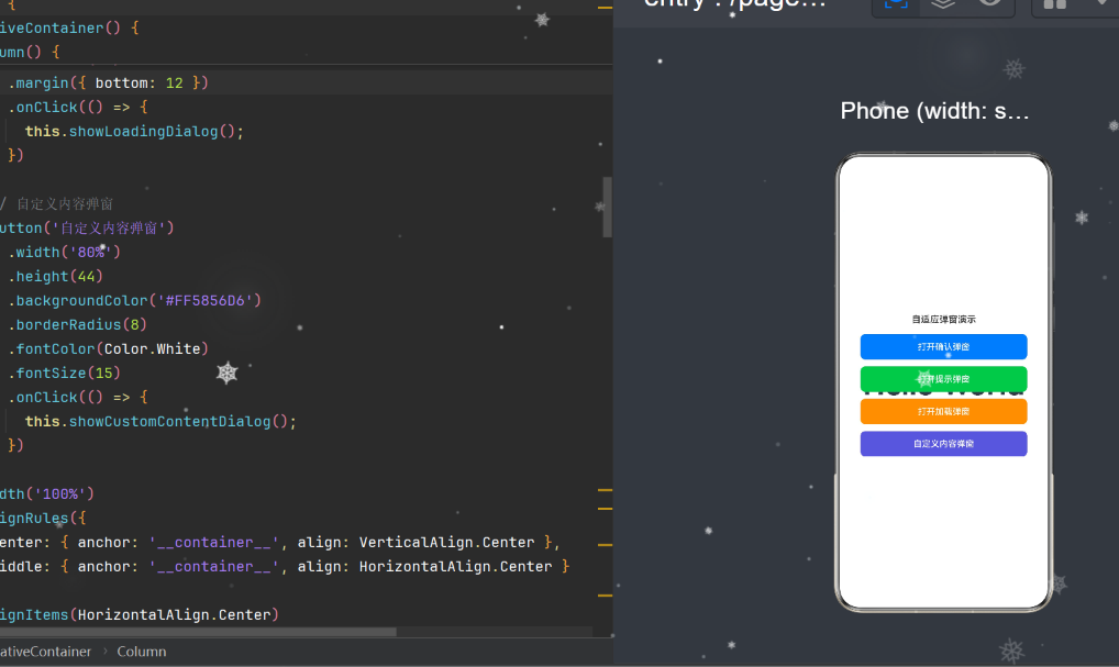
private showCustomContentDialog(): void {
  this.dialogController = createAdaptiveDialog(
    {
      title: '详细设置',
      showClose: true,
      confirm: {
        text: '保存',
        primary: true,
        action: () => {
          console.info('保存设置');
          this.dialogController?.close();
        },
      },
      cancel: { text: '取消' },
    },
    () => { this.buildCustomContent(); },
  );
  this.dialogController.open();
}

@Builder
buildCustomContent(): void {
  Column() {
    FractionalContent({ widthFactor: 1.0 }) {
      Text('账户信息').fontSize(14).fontWeight(FontWeight.Medium)
    }
    // 更多自定义内容...
  }
  .width('100%')
}
7. 深色模式与资源管理
7.1 资源限定符机制
HarmonyOS 的资源配置遵循 限定符目录 规则:
base/element/color.json:所有设备共享的基础颜色;dark/element/color.json:深色模式下的颜色覆盖。
系统会根据当前的深色/浅色模式自动选择对应的资源文件,开发者无需在代码中判断主题。
7.2 弹窗配色设计
浅色主题(base):
{
  "color": [
    { "name": "dialog_bg",            "value": "#FFFFFF" },
    { "name": "dialog_title_color",   "value": "#FF1A1A1A" },
    { "name": "dialog_content_color", "value": "#FF666666" },
    { "name": "dialog_button_primary_bg", "value": "#FF007AFF" },
    { "name": "dialog_close_color",   "value": "#FF999999" }
  ]
}
深色主题(dark):
{
  "color": [
    { "name": "dialog_bg",            "value": "#FF1C1C1E" },
    { "name": "dialog_title_color",   "value": "#FFFFFFFF" },
    { "name": "dialog_content_color", "value": "#FFEBEBF5" },
    { "name": "dialog_button_primary_bg", "value": "#FF0A84FF" },
    { "name": "dialog_close_color",   "value": "#FF8E8E93" }
  ]
}
7.3 尺寸资源
{
  "float": [
    { "name": "dialog_radius",               "value": "16vp" },
    { "name": "dialog_title_font_size",      "value": "18fp" },
    { "name": "dialog_content_font_size",    "value": "15fp" },
    { "name": "dialog_button_font_size",     "value": "15fp" },
    { "name": "dialog_padding_top",          "value": "20vp" },
    { "name": "dialog_padding_horizontal",   "value": "24vp" },
    { "name": "dialog_padding_bottom",       "value": "16vp" },
    { "name": "dialog_title_margin_bottom",  "value": "12vp" },
    { "name": "dialog_button_margin_top",    "value": "20vp" }
  ]
}
使用资源文件而非硬编码值的优势:
- 方便主题化:所有弹窗共用一套资源,修改一处全局生效;
- 多设备适配:未来可通过
dpi/screen等限定符提供不同设备的尺寸资源; - 代码简洁:组件中写作
.fontSize($r('app.float.dialog_title_font_size'))而非硬数值。
8. 常见编译错误与排雷指南
在开发过程中,我们遇到了 ArkTS 的一些严格约束。下面整理 7 个常见错误及其解决方案,方便读者避免重蹈覆辙。
8.1 未初始化成员变量
错误信息:
Property 'options' has no initializer and is not definitely
assigned in the constructor.
原因:ArkTS 要求在声明成员变量时必须初始化。这与 TypeScript 不同,TS 可以通过 !: 断言绕过,但 ArkTS 不支持。
错误代码:
private options: AdaptiveDialogOptions; // ❌ 未初始化
正确做法:
options: AdaptiveDialogOptions = {  // ✅ 提供完整默认值
  maxWidth: 500,
  maxHeightRatio: 0.8,
  // ...
};
8.2 构造函数中初始化私有属性
错误信息:
Property 'widthFactor' is private and can not be initialized
through the component constructor.
原因:ArkTS 禁止在父组件通过构造函数参数初始化子组件的 private 成员。
错误代码:
@Component
export struct FractionalContent {
  private widthFactor: number = 1.0;  // ❌ private
}

// 父组件使用
FractionalContent({ widthFactor: 0.8 }) { ... }  // ❌ 编译错误
正确做法:
@Component
export struct FractionalContent {
  widthFactor: number = 1.0;  // ✅ 默认 public(Omitting private)
}
8.3 自定义属性名与系统方法冲突
错误信息:
Property 'margin' in type 'FractionalContent' is not assignable
to the same property in base type 'CustomComponent'.
原因:margin 和 alignSelf 是 CustomComponent 基类的链式方法名称,不能作为自定义属性名。
错误代码:
@Component
export struct FractionalContent {
  margin?: Margin;       // ❌ 与基类 margin() 方法冲突
  alignSelf?: ItemAlign; // ❌ 与基类 alignSelf() 方法冲突
}
正确做法:
@Component
export struct FractionalContent {
  offsetMargin?: Margin;   // ✅ 使用不同的属性名
  selfAlign?: ItemAlign;   // ✅ 使用不同的属性名
}
8.4 build() 中调用普通函数
原因:ArkTS 的 build() 方法只能包含:
- 系统组件(
Text、Column、Row等); - 自定义组件;
@Builder/@BuilderParam装饰的方法;if/else条件语句;ForEach/LazyForEach循环。
错误代码:
build() {
  Column() {
    this.options.contentBuilder!();  // ❌ 调用普通函数
  }
}
正确做法:使用 @BuilderParam 搭建内容插槽,所有渲染逻辑封装在 @Builder 方法中。
8.5 任意类型 “any”
错误信息:
Use explicit types instead of "any", "unknown" (arkts-no-any-unknown)
原因:ArkTS 为了类型安全,禁止使用 any 和 unknown 类型。
错误代码:
const data = JSON.parse(str); // ❌ 返回类型为 any
正确做法:
const data: Record<string, Object> = JSON.parse(str); // ✅ 显式类型
8.6 尾随闭包后链式调用
错误信息:
Declaration or statement expected.
Cannot find name 'margin'.
原因:使用 @BuilderParam 尾随闭包语法时,.attribute() 必须在闭包之前,不能在 } 之后链式调用。
错误代码:
FractionalContent({ widthFactor: 0.8 }) {
  // content...
}
.margin({ bottom: 8 })    // ❌ 闭包后不可链式调用
.alignSelf(ItemAlign.Start)
正确做法:将属性作为组件构造函数参数传入:
FractionalContent({
  widthFactor: 0.8,
  offsetMargin: { bottom: 8 },  // ✅ 作为 props 传入
  selfAlign: ItemAlign.Start,
}) {
  // content...
}
8.7 圈复杂度 / 文件大小限制
虽然本次未触发,但 ArkTS 对 build() 方法的圈复杂度有隐性限制。建议:
- 将复杂的布局拆分为多个
@Builder方法; - 单个文件不超过 500 行;
- 单个
build()方法嵌套不超过 10 层。
9. 生产级最佳实践
9.1 屏幕尺寸获取方案
当前实现中使用 AppStorage 缓存屏幕高度,但需要在页面启动时正确注入。推荐在 EntryAbility 中注入:
// EntryAbility.ets
import { window } from '@kit.ArkUI';

onWindowStageCreate(windowStage: window.WindowStage): void {
  windowStage.getMainWindow().then((win) => {
    const props = win.getWindowProperties();
    AppStorage.setOrCreate('screenHeight', props.windowRect.height);
  });
}
9.2 弹窗关闭后的资源清理
当一个 CustomDialogController 不再使用时,建议调用 close() 并置空引用:
private dialogController?: CustomDialogController;

private closeDialog(): void {
  if (this.dialogController) {
    this.dialogController.close();
    this.dialogController = undefined;  // 释放引用
  }
}
9.3 多按钮扩展
当前的按钮系统支持两个按钮。如果需要更多按钮(例如"稍后提醒/不再提醒/立即更新"),可以扩展 buildButtonBar():
@Builder
buildMultiButtonBar() {
  Row() {
    ForEach(this.options.buttons, (btn: DialogButton) => {
      this.buildButton(btn, btn.primary ?? false)
    })
  }
}
9.4 表单弹窗中的键盘适配
当弹窗中包含 TextInput 时,需要注意键盘弹出可能遮挡弹窗底部。推荐:
- 使用
.constraintSize({ minHeight: ... })保证弹窗最小高度; - 在
aboutToAppear()中监听键盘事件window.on('keyboardHeightChange'); - 键盘弹出时向上偏移弹窗位置(通过
offset属性)。
9.5 无障碍适配
所有可点击元素应添加无障碍说明:
Button('确定')
  .accessibilityText('确认操作按钮')
  .accessibilityLevel('yes')
10. 总结与展望
10.1 成果回顾
本文从 0 到 1 构建了一套完整的自适应弹窗组件,实现了 6 个核心特性:
| 特性 | 技术方案 | 代码量 |
|---|---|---|
| 宽度自适应 | .width('90%') + constraintSize |
2 行 |
| 高度自适应 | Scroll + 动态 maxHeight |
10 行 |
| 内容插槽 | @BuilderParam |
5 行 |
| 按钮系统 | 可配置的 @Builder |
40 行 |
| 深色模式 | 资源限定符 dark/ |
0 行代码 |
| 便捷 API | 3 个工厂函数 | 30 行 |
10.2 设计哲学
贯穿始终的设计哲学有三条:
- 配置驱动:通过
AdaptiveDialogOptions类型约束所有可变行为,组件内部只管渲染; - 渐进增强:纯文本消息 → 自定义内容 → 自定义按钮,在简单场景下零配置可用,复杂场景下深度可定制;
- 生态兼容:API 设计接近 Flutter/Android 的 Dialog 模式,降低多端开发者的切换成本。
10.3 未来可扩展方向
- 动效增强:支持更多入场动画(缩放、平移、弹簧效果),通过
openAnimation参数配置; - 底部弹窗(BottomSheet):将
DialogAlignment.Center改为DialogAlignment.Bottom,调整圆角样式; - 拖拽关闭:监听手势事件,实现类似 iOS 的下滑关闭效果;
- 弹窗队列:多个弹窗请求按优先级排列,避免同时弹出导致 UI 混乱。
10.4 写在最后
鸿蒙生态正在快速发展,ArkTS 作为首选声明式 UI 语言,其能力在 API 24 中已经足够支撑复杂的业务组件。将 Flutter、SwiftUI、Jetpack Compose 等现代声明式框架的设计模式引入 ArkTS,不仅可以复用成熟的经验,也能推动鸿蒙开发生态的标准化。
本文介绍的 AdaptiveDialog 组件已在 compatibleSdkVersion = "6.1.1(24)" 环境下完整编译通过,欢迎读者在自有项目中复用、扩展。如果在使用中遇到问题或有了改进思路,欢迎交流讨论。

作为“人工智能6S店”的官方数字引擎,为AI开发者与企业提供一个覆盖软硬件全栈、一站式门户。
更多推荐

 0
0 0
0- 0


 已为社区贡献9条内容

所有评论(0)