
【共创季稿事节】鸿蒙原生 ArkTS 布局方式之 Stack + zIndex 层叠顺序布局
摘要:本文深入讲解 HarmonyOS NEXT 中 Stack 容器与 zIndex 属性的搭配使用,通过一个可交互的方块层叠示例,展示如何在 ArkTS 中手动控制子组件的 Z 轴层叠顺序,并给出完整的工程代码与避坑指南。
一、什么是 Stack 布局?
Stack 是鸿蒙 ArkUI 提供的一种层叠容器,它的核心特性是:
所有子组件在 Z 轴(深度方向)上重叠排列
默认情况下,后声明的子组件盖在先声明的子组件之上
子组件通过 .position() 在容器内自由定位,互不影响
这类似于 CSS 中的 position: absolute + z-index,或者 Android 中的 FrameLayout。
┌─────────────────────────────────┐
│ ┌──── 子组件 A ────┐ │
│ │ │ │
│ │ ┌── 子组件 B ─────┐ │ ← 默认 B 在 A 上方
│ │ │ │ │
│ │ │ ┌── 子组件 C ────┐ │ ← 默认 C 在 B 上方
│ │ │ │ │ │
│ └───┼───┼───────────────┘ │
│ └───┼─────────────────────│
│ └─────────────────────│
└─────────────────────────────────┘
二、zIndex 属性的作用
.zIndex(value: number) 是鸿蒙 ArkUI 提供的一个通用属性,用于显式指定组件在 Z 轴上的层叠顺序:
规则 说明
值越大越靠上 zIndex: 10 的组件显示在 zIndex: 1 的组件上方
默认值 0 未设置 zIndex 时,组件的默认层叠值为 0
负值可用 zIndex: -1 可以让组件沉到所有默认组件之下
不受声明顺序影响 使用 zIndex 可以覆盖默认的"后声明在上层"规则
声明顺序 vs zIndex
// 场景一:不使用 zIndex,后声明的在上
Stack() {
Text(‘A’).backgroundColor(Color.Red) // 在底层
Text(‘B’).backgroundColor(Color.Green) // 在中间
Text(‘C’).backgroundColor(Color.Blue) // 在最上层
}
// 场景二:使用 zIndex,调换顺序
Stack() {
Text(‘A’).backgroundColor(Color.Red).zIndex(3) // 最上层
Text(‘B’).backgroundColor(Color.Green).zIndex(2) // 中间
Text(‘C’).backgroundColor(Color.Blue).zIndex(1) // 最底层
}
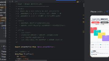
三、完整示例代码
以下是一个完整的 .ets 文件,演示了 Stack + zIndex 的核心用法。
文件位置:entry/src/main/ets/pages/StackZIndexDemo.ets
/**
- Stack + zIndex 层叠顺序布局演示
- ====================================
- 核心概念:
-
- Stack 容器 — 所有子组件在 Z 轴上重叠排列,默认后声明的在上层
-
- zIndex 属性 — 显式控制层叠顺序,值越大越靠上(默认值为 0)
-
- 两者结合可精确控制任意子组件的上下层级关系
- 交互方式:
-
- 点击「增加 / 减少 选中方块 zIndex」按钮,实时调整当前高亮方块的层叠顺序
-
- 点击「重置层叠」恢复默认状态
-
- 点击方块可切换「选中」状态,被选中的方块带有高亮边框
*/
- 点击方块可切换「选中」状态,被选中的方块带有高亮边框
import promptAction from '@ohos.promptAction';
/** 方块数据结构 */
interface BoxItem {
id: number;
label: string;
color: Color | string;
x: number; // 相对 Stack 左侧偏移 (px)
y: number; // 相对 Stack 顶部偏移 (px)
w: number; // 宽 (px)
h: number; // 高 (px)
z: number; // 当前 zIndex 值
}
@Entry
@Component
struct StackZIndexDemo {
/** 方块列表 — 使用 @State 驱动 UI 刷新 */
@State private boxes: BoxItem[] = [
{ id: 1, label: '方块 A', color: '#FF6B6B', x: 20, y: 40, w: 160, h: 120, z: 0 },
{ id: 2, label: '方块 B', color: '#4ECDC4', x: 90, y: 90, w: 160, h: 120, z: 1 },
{ id: 3, label: '方块 C', color: '#FFE66D', x: 160, y: 140, w: 160, h: 120, z: 2 },
{ id: 4, label: '方块 D', color: '#A78BFA', x: 230, y: 190, w: 160, h: 120, z: 3 },
];
/** 当前选中的方块 id(-1 表示无选中) */
@State private selectedId: number = -1;
/** zIndex 调整步长 */
private readonly Z_STEP: number = 1;
/** 获取选中方块的索引 */
private getSelectedIndex(): number {
return this.boxes.findIndex((b) => b.id === this.selectedId);
}
/** 增加选中方块的 zIndex */
private increaseZ(): void {
const idx = this.getSelectedIndex();
if (idx === -1) {
promptAction.showToast({ message: '请先点击一个方块选中它', duration: 1500 });
return;
}
// 深拷贝数组 — ArkTS 不允许展开运算符,使用 for 循环逐属性拷贝
const newBoxes: BoxItem[] = [];
for (let i = 0; i < this.boxes.length; i++) {
const b = this.boxes[i];
if (i === idx) {
newBoxes.push({
id: b.id, label: b.label, color: b.color,
x: b.x, y: b.y, w: b.w, h: b.h,
z: b.z + this.Z_STEP,
});
} else {
newBoxes.push({
id: b.id, label: b.label, color: b.color,
x: b.x, y: b.y, w: b.w, h: b.h,
z: b.z,
});
}
}
this.boxes = newBoxes;
promptAction.showToast({
message: `${this.boxes[idx].label} zIndex → ${this.boxes[idx].z}`,
duration: 1000,
});
}
/** 减少选中方块的 zIndex */
private decreaseZ(): void {
const idx = this.getSelectedIndex();
if (idx === -1) {
promptAction.showToast({ message: '请先点击一个方块选中它', duration: 1500 });
return;
}
const newBoxes: BoxItem[] = [];
for (let i = 0; i < this.boxes.length; i++) {
const b = this.boxes[i];
if (i === idx) {
newBoxes.push({
id: b.id, label: b.label, color: b.color,
x: b.x, y: b.y, w: b.w, h: b.h,
z: b.z - this.Z_STEP,
});
} else {
newBoxes.push({
id: b.id, label: b.label, color: b.color,
x: b.x, y: b.y, w: b.w, h: b.h,
z: b.z,
});
}
}
this.boxes = newBoxes;
promptAction.showToast({
message: `${this.boxes[idx].label} zIndex → ${this.boxes[idx].z}`,
duration: 1000,
});
}
/** 重置所有方块的 zIndex */
private resetZ(): void {
this.boxes = [
{ id: 1, label: '方块 A', color: '#FF6B6B', x: 20, y: 40, w: 160, h: 120, z: 0 },
{ id: 2, label: '方块 B', color: '#4ECDC4', x: 90, y: 90, w: 160, h: 120, z: 1 },
{ id: 3, label: '方块 C', color: '#FFE66D', x: 160, y: 140, w: 160, h: 120, z: 2 },
{ id: 4, label: '方块 D', color: '#A78BFA', x: 230, y: 190, w: 160, h: 120, z: 3 },
];
this.selectedId = -1;
promptAction.showToast({ message: '已重置所有 zIndex', duration: 1000 });
}
/** 切换选中状态 */
private toggleSelect(id: number): void {
this.selectedId = this.selectedId === id ? -1 : id;
}
/** 获取选中方块标签(用于展示) */
private getSelectedLabel(): string {
if (this.selectedId === -1) return '';
const sel = this.boxes.find((b) => b.id === this.selectedId);
return sel ? `${sel.label} | zIndex = ${sel.z}` : '';
}
build() {
Scroll() {
Column() {
// 标题
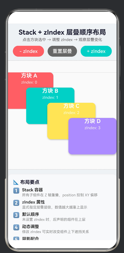
Text('Stack + zIndex 层叠顺序布局')
.fontSize(22).fontWeight(FontWeight.Bold)
.fontColor('#1a1a2e').margin({ top: 16, bottom: 4 })
Text('点击方块选中 → 调整 zIndex → 观察层叠变化')
.fontSize(13).fontColor('#666').margin({ bottom: 12 })
// 操作按钮行
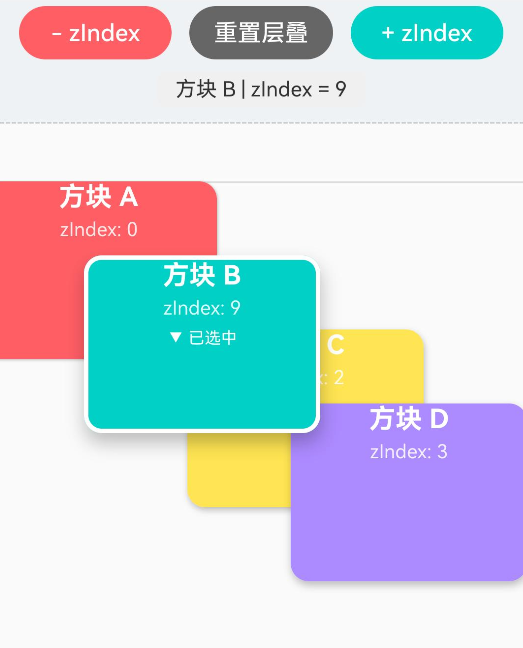
Row() {
Button('- zIndex').type(ButtonType.Capsule).height(36)
.layoutWeight(1).margin({ right: 6 })
.backgroundColor('#FF6B6B').fontColor(Color.White)
.onClick(() => this.decreaseZ())
Button('重置层叠').type(ButtonType.Capsule).height(36)
.layoutWeight(1).margin({ left: 6, right: 6 })
.backgroundColor('#666').fontColor(Color.White)
.onClick(() => this.resetZ())
Button('+ zIndex').type(ButtonType.Capsule).height(36)
.layoutWeight(1).margin({ left: 6 })
.backgroundColor('#4ECDC4').fontColor(Color.White)
.onClick(() => this.increaseZ())
}
.width('100%').padding({ left: 16, right: 16, bottom: 8 })
// 当前选中方块的 zIndex 展示
if (this.selectedId !== -1) {
Text(this.getSelectedLabel())
.fontSize(14).fontColor('#333')
.backgroundColor('#F0F0F0').borderRadius(6)
.padding({ top: 4, bottom: 4, left: 12, right: 12 })
.margin({ bottom: 6 })
}
// ========== 核心:Stack + zIndex 演示 ==========
Stack() {
// 背景网格线(zIndex 最低,仅作位置参考)
Row().width(420).height(1).backgroundColor('#ddd')
.position({ x: 0, y: 40 }).zIndex(-1)
Column().width(1).height(360).backgroundColor('#ddd')
.position({ x: 20, y: 0 }).zIndex(-1)
// 动态渲染 4 个方块
ForEach(this.boxes, (item: BoxItem) => {
Column() {
Text(item.label).fontSize(18)
.fontWeight(FontWeight.Bold).fontColor(Color.White)
Text(`zIndex: ${item.z}`)
.fontSize(13)
.fontColor('rgba(255,255,255,0.85)')
.margin({ top: 4 })
if (this.selectedId === item.id) {
Text('▼ 已选中').fontSize(11)
.fontColor(Color.White).margin({ top: 6 })
}
}
.width(item.w).height(item.h)
.position({ x: item.x, y: item.y }) // 【关键】自由定位
.zIndex(item.z) // 【关键】层叠顺序
.backgroundColor(item.color)
.borderRadius(12)
.border({
width: this.selectedId === item.id ? 3 : 0,
color: Color.White,
style: BorderStyle.Solid,
})
.onClick(() => this.toggleSelect(item.id))
.shadow({
radius: item.z * 3 + 4,
color: 'rgba(0,0,0,0.25)',
offsetX: 2,
offsetY: item.z * 2 + 2,
})
})
}
.width(420).height(360)
.backgroundColor('#FAFAFA')
.border({ width: 1, color: '#CCC', style: BorderStyle.Dashed })
.borderRadius(8).margin({ top: 4, bottom: 16 })
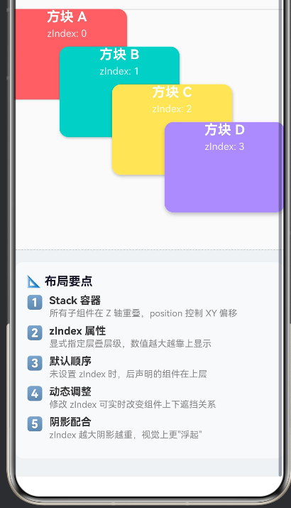
// 布局要点说明
Column() {
Text('📐 布局要点').fontSize(16)
.fontWeight(FontWeight.Bold).fontColor('#1a1a2e')
.width('100%').margin({ bottom: 8 })
this.buildTipRow('1️⃣', 'Stack 容器', '所有子组件在 Z 轴重叠,position 控制 XY 偏移')
this.buildTipRow('2️⃣', 'zIndex 属性', '显式指定层叠层级,数值越大越靠上显示')
this.buildTipRow('3️⃣', '默认顺序', '未设置 zIndex 时,后声明的组件在上层')
this.buildTipRow('4️⃣', '动态调整', '修改 zIndex 可实时改变组件上下遮挡关系')
this.buildTipRow('5️⃣', '阴影配合', 'zIndex 越大阴影越重,视觉上更"浮起"')
}
.width('100%').padding(16)
.backgroundColor('#F8F9FA').borderRadius(12)
.margin({ left: 16, right: 16, bottom: 24 })
}
.width('100%').backgroundColor('#F0F2F5')
}
.width('100%').height('100%').scrollable(ScrollDirection.Vertical)
}
@Builder
private buildTipRow(icon: string, title: string, desc: string) {
Row() {
Text(icon).fontSize(18).margin({ right: 8 })
Column() {
Text(title).fontSize(14).fontWeight(FontWeight.Bold)
.fontColor('#333').width('100%')
Text(desc).fontSize(12).fontColor('#888')
.width('100%').margin({ top: 2 })
}
.layoutWeight(1).alignItems(HorizontalAlign.Start)
}
.width('100%').alignItems(VerticalAlign.Top).margin({ bottom: 8 })
}
}
四、关键代码解析
4.1 Stack 容器 + position 自由定位
Stack() {
  // 每个子组件通过 .position({ x, y }) 在 Stack 内自由定位
  Column() { /* ... */ }
    .position({ x: 20, y: 40 })
    .zIndex(0)
}
.position() 的参数是相对于 Stack 容器左上角 的偏移量(单位为 vp)。这与 CSS 的 position: absolute; left: X; top: Y 行为一致。
4.2 zIndex 动态控制层叠
// 值越大越靠上
.zIndex(item.z)
// 负值可沉到最底层
.zIndex(-1)
在示例中,每个方块的 zIndex 是 @State 驱动的数据,通过按钮点击修改后,ArkUI 自动重新渲染并调整层叠顺序。
4.3 阴影与 zIndex 的视觉配合
.shadow({
  radius: item.z * 3 + 4,    // zIndex 越大,阴影扩散越大
  color: 'rgba(0,0,0,0.25)',
  offsetX: 2,
  offsetY: item.z * 2 + 2,   // zIndex 越大,阴影偏移越远
})
利用 zIndex 数值动态计算阴影参数:zIndex 越高 → 阴影越大、偏移越远 → 视觉上更"浮起",增强了层叠的立体感。
五、路由注册与导航
为了让 StackZIndexDemo 页面可访问,需要完成两个步骤:
5.1 注册页面路由
修改 entry/src/main/resources/base/profile/main_pages.json:
{
  "src": [
    "pages/Index",
    "pages/StackZIndexDemo"
  ]
}
5.2 添加导航入口
在 Index.ets 中添加跳转按钮:
import router from '@ohos.router';

Button('打开 Stack + zIndex 演示')
  .type(ButtonType.Capsule)
  .width('80%').height(48)
  .backgroundColor('#4ECDC4').fontColor(Color.White)
  .fontSize(16)
  .onClick(() => {
    router.pushUrl({
      url: 'pages/StackZIndexDemo'
    }).catch((err: Error) => {
      console.error(`路由跳转失败: ${err.message}`);
    });
  })
六、Stack + zIndex 的典型应用场景
场景 说明
弹窗 / 浮层 使用高 zIndex 值让弹窗盖在所有页面内容之上
拖拽排序 拖拽中的元素提升 zIndex,避免被其他元素遮挡
卡片堆叠 相册、卡片列表的层叠效果(如 CoverFlow)
标记 / 标注 地图上的标记点、游戏中的角色与道具层级
底部导航栏 导航栏使用固定 zIndex,确保始终在内容的上方
骨架屏 加载中的骨架屏组件置于内容上方,加载完成后降低 zIndex
七、避坑指南
❌ 坑1:用展开运算符修改数组
ArkTS 语法规范禁止使用 JavaScript 的 … 展开运算符:
// ❌ 编译错误:arkts-no-spread
const newBoxes = […this.boxes];
newBoxes[idx] = { …newBoxes[idx], z: 5 };
// ✅ 正确:使用 for 循环 + 逐属性拷贝
const newBoxes: BoxItem[] = [];
for (let i = 0; i < this.boxes.length; i++) {
const b = this.boxes[i];
newBoxes.push({
id: b.id, label: b.label, color: b.color,
x: b.x, y: b.y, w: b.w, h: b.h,
z: i === idx ? b.z + 1 : b.z,
});
}
this.boxes = newBoxes;
❌ 坑2:在 build() 内声明变量
// ❌ 编译错误:Only UI component syntax can be written here.
build() {
Column() {
if (this.selectedId !== -1) {
const sel = this.boxes.find(…); // 不允许
Text(sel.label);
}
}
}
// ✅ 正确:通过方法返回值替代局部变量
build() {
Column() {
if (this.selectedId !== -1) {
Text(this.getSelectedLabel()); // 方法内查找并返回字符串
}
}
}
❌ 坑3:对 Column 直接使用 .scrollable()
// ❌ 编译错误:scrollable 不是 Column 的属性
Column() { /* 大量内容 */ }
.scrollable(ScrollDirection.Vertical)
// ✅ 正确:使用 Scroll 包裹
Scroll() {
Column() { /* 大量内容 */ }
}
.scrollable(ScrollDirection.Vertical)
❌ 坑4:忘记用新数组替换旧数组来触发刷新
// ❌ 不会触发 UI 刷新
this.boxes[idx].z += 1;
// ✅ 必须赋值新的数组引用
const copy = this.boxes.map(b => ({ … }));
copy[idx].z += 1;
this.boxes = copy;
八、总结
Stack + zIndex 是鸿蒙 ArkUI 中实现层叠布局的核心组合:
Stack 提供 Z 轴重叠容器,子组件通过 .position() 自由定位
zIndex 显式控制每个子组件的层叠顺序,值越大越靠上
二者结合可以精确实现弹窗、拖拽、卡片堆叠等复杂交互场景
搭配阴影参数动态计算,可以增强层叠的立体视觉反馈
注意 ArkTS 的语法约束(禁止展开运算符、build 内变量声明等)
掌握这套布局模式后,你会发现很多原本需要复杂嵌套的布局,用 Stack + zIndex 可以更简洁地实现。
配套源码:Demo062203 — entry/src/main/ets/pages/StackZIndexDemo.ets
运行环境:HarmonyOS NEXT / API 12+ / DevEco Studio 5.0+

作为“人工智能6S店”的官方数字引擎,为AI开发者与企业提供一个覆盖软硬件全栈、一站式门户。
更多推荐

 0
0 0
0- 0


 已为社区贡献2条内容

所有评论(0)